A Daily History of Holes, Dots, Lines, Science, History, Math, Physics, Art, the Unintentional Absurd, Architecture, Maps, Data Visualization, Blank and Missing Things, and so on. |1.6 million words, 7500 images, 4.9 million hits| Press & appearances in The Times, Le Figaro, Mensa, The Economist, The Guardian, Discovery News, Slate, Le Monde, Sci American Blogs, Le Pont, and many other places… 5000+ total posts since 2008.

  • Different Forms of Writing 1: Big Writing With Light—Nollet, Citroen, Barnum and Packard

    JF Ptak Science Books  Post #97

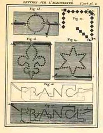
    The fabulously over-usage of light-polluting electricity in advertising finds its beginning 220 years ago with the work of a modest, family-friendly French country priest.  The image to the left is  the first example of writing via electricity—basically, the basis for the earliest electric signs, more than 110 years before Edison’s (et alia ) electric incandescent bulb, and about twenty years before the presumptive “first” electrical experiments of Sir Humphrey Davy) on the first arc/carbon filament electrical light in 1809).   \

    Bloglighting_nollet_2

    They were the product of the electrical mind of Jean-Antoine Nollet (1700-1770), a peasant boy who was educated for the priesthood (becoming Abbe), whose extensive curiosity soon led him to physics and then to electricity—he was well educated and taught at numerous prestigious schools, admitted to the Academy of Sciences as a member in 1742,  finally winding up in 1740 tutoring the dauphin at Versailles.  He published widely, was the first person to experiment with the Leyden jar in France, and made wide contributions in the conduction of electricity through different media. (He also had numerous public disagreements, some of which stood with Benjamin Franklin, whose theories Nollet referred to  as “les pretenetions de l’ecole de Philadelphie”.)  The image above was published in Lettres sur l’electricite, (part II), published in Paris in 17601 (with part I located at Gallica, here);  see the interesting Le Blog du Bibliophile, des Bibliophiles, de la Bibliophilie et des Livres Anciens, here, hosting some useful information and images relating to Nollet.  [Thanks to Jaime Day for pointing out the misattribution of the plate.]

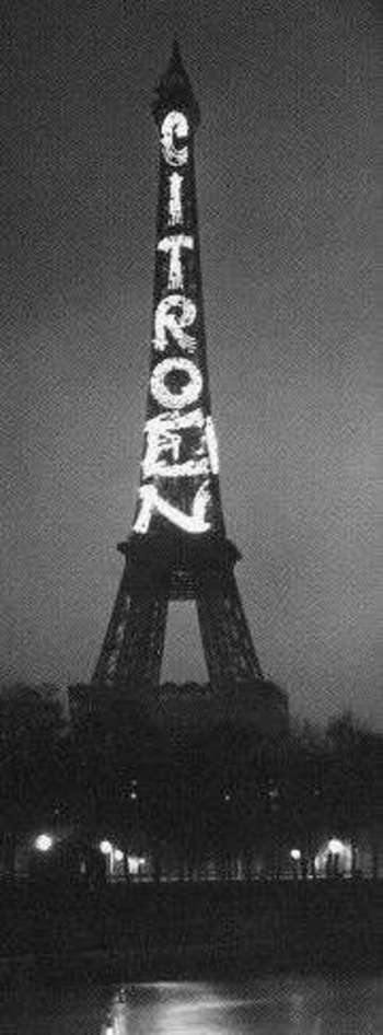
    The, um, adventurous PT Barnum contracted  the  first electric bulb writing (utilizing the Edison invention) in Manhattan in 1892 to envious attention, resulting in less than 15 years with the Great White Way.  The world’s largest electric bulb writing was on the Eiffel Tower, with Andre Citroen agreeing to light the outline of the tower if he could put his name on the rest of it.  I’m not sure how this was seen as a good idea, but the sides of the tower were used for this purposes until somebody wised up and put an end to it all in 1937.

    Bloglightingcitroen_2

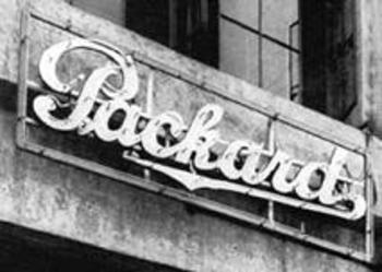
    But as white and as bright as the light bulb was in advertising, it was completely overwhelmed by the invention of the bold, brassy (and with a high potential “trashy” factor) neon sign, which was first used in the United States by Earle Anthony’s Packard dealership in Los Angeles in 1924.

    Bloglightingpackard_2
    (Mr. Anthony paid $24,000 1924 dollars for the two “Packard” signs, which in today’s dollars, employing the kindest inflation factor in the comparative CPI, would be about $3,000,000.  Mr. Anthony could afford it, and the signs were a sensation.

    Notes

    1.  The full title:   Lettres sur LÉlectricité. Dans lesquelles on examine les dernieres Découvertes qui ont été faites sur cette Matiere, & les conséquences que l’on en peut tirer (part I), 1753; and Lettre sur L’electricité; Dans laquelle en soutient le principe des Effluences & Affluences simultanées contre la doctrine de M. Franklin, & contre les nouvelles prétentions de ses partisans. Avec Figures en Taille-douce. Seconde Partie, published in 1760. 


  • Different Forms of Writing 2: Recording Movement. Dance Notation

    JF Ptak Science Books LLC Post #98
    Blogwritingdanceorch_tp

    It’s intriguing to think of writing systems standing for things other than words—for example, one has the whole of the mathematical sciences, chemical notation, Feynman diagrams, weather patterns, and on and on.  Lines and dots and squiggles and the like, not forming words, but something entirely else, an amanuensis for words. 
    Blogwritingdance

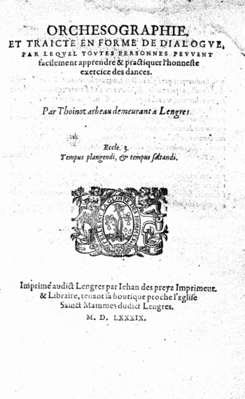
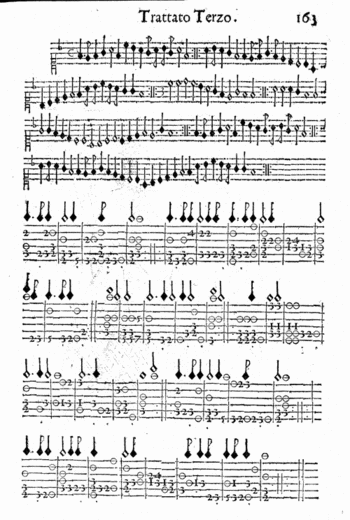
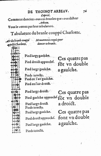
    The idea of adopting a written dance iconography—replacing drawings and written descriptions of dances—is nearly as old as the dance instructional itself.  The notation used by Lana in the 1920’s was the first image that came into my mind for this alternative wiring scheme, but in fact there were several systems for recording the simple movement and placement of the feet that reach back into the 16th century.  The first of these books to attempt to codify the movement of dance via non-descriptive writing is the letter codes employed by Thoinot Arbeau in his 1588 book Orchesographie.   In this Socratic introduction to dance Arbeau showed foot and movement patterns and linked them (visually) with the music.  What Arbeau was describing was solely the movements of the feet—everything else beyond that—position of the legs,
    Blogwritingdanceitlaian_1604

    arms, head, etc.—was left unaddressed in the iconographie though he did connect them with engravings showing how the rest of the body should look at some point during the dance.   

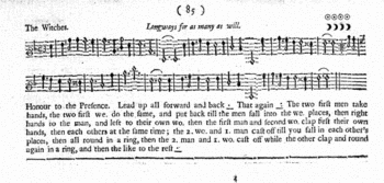
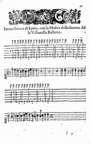
    A similar system was employed in the 1680 Nvove inventioni di balli; opera…(left) , and then again in The dancing master; or, Directions for dancing country dances, with the tunes to each dance, for the treble-violin, “10th ed. corrected; with addition of several new dances and tunes never before printed”, by Henry Playford (in London) in 1698 (below). 
    Blogwritingdancuingplayford

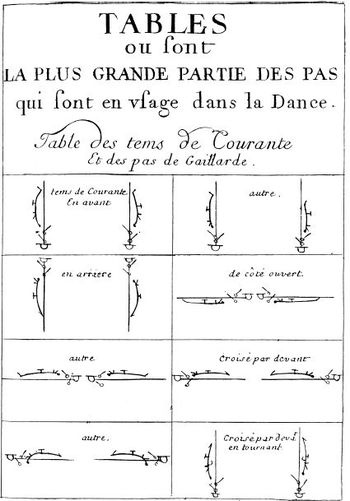
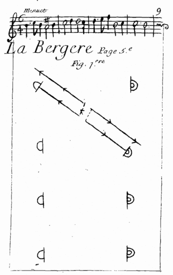
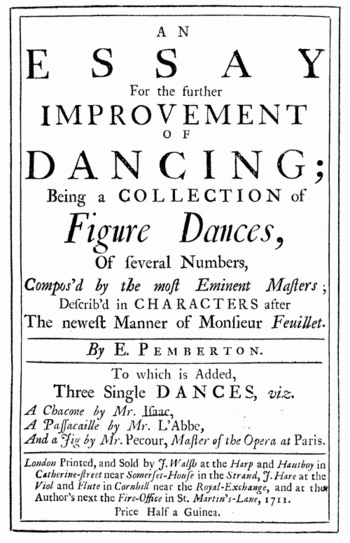
    A major development occurs in the Choregraphie of Pierre Beauchamps (and published by Raoul Feuillet, and known perhaps unfairly as the”Feuillet System”), which instituted a floor plan of sorts, showing the movement of the feet by symbol and viewed from . As better described by the Library of Congress site:   “Feuillet’s procedure was analytical; he broke up the steps into their mechanical parts, invented symbols for each of those parts, and organized them temporally by bars on the progression line. These bars reflect the temporal sequence of the steps according to the musical score.” (The Feuillet illustration is below.)
    Blogwritingdancefeuillet

    The view from above, or bird’s-eye view, was replaced in one 19th century system of annotation with stick figures, which were viewed from the front.  Again, from the Library of Congress: . “In his Stenochorégraphie, published in Paris and St Petersburg in 1852, Arthur Saint-Léon used a scheme consisting of five horizontal lines for the movements of the legs and one additional line for the actions of the upper body. The figurative notation signs appear directly above the musical score, relating them approximately to the musical values.”
    Movement was also recorded on whatr appears to be a musical template, using bars an staffs and musical-note-like notation to record movement, which seems to hjave possessed a more lyrical quality, with the potential for capturing more of the movemente than foot arrangements and speed of motion.  The Library of Congress writes about this in reference to the system of Vladimir Stpeanov’s 1892 Alphabet du Corps Humain, “…Procedures of sound notation are transferred to movement notation: addition (a movement is, just like a musical sound, the sum of several elements) and duration (the temporal value of a movement is indicated by the time value of the note). described the human body within a scheme consisting of nine lines, divided into three parts. The top two lines are used for the movements of the head and torso, the three middle lines indicate the actions of the arms, and the bottom four lines the movements of the legs. The position of the tail of a note indicates whether the movement concerns the left or the right body part: for the left parts, the tail is directed upwards, for the right parts, it is directed downwards. “

    In 1910 Vaclav Nijinsky published a very similar system of notation to Stepanov, using the basic template and then adding five more lines to the figure to denote movements throughout the core of the body.
    Laban

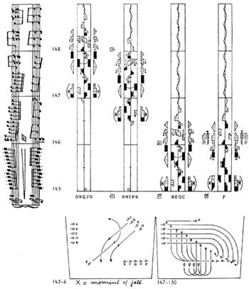
    It seems to me that the greatest pre-WWII advancements in all of this is Kinetography Laban  (and afterwards known as Labanotation), which belongs to Rudolf von Laban, who seems to have incorporated movement of the feet, the body, the head, arms, as well as expression and speed, as well as relating it all to music in his own (famous) writing system.  I call again on the authorless Library of Congress work on dance notation to for a superior and extended description of the notation:

    “Kinetography, and Labanotation use geometrical shapes as symbols that indicate not only directions, but also specific levels and duration. Direction symbols modify the basic rectangular shape and show the directions forwards/backwards and left/right as well as the diagonal directions in between; the shading of the shape indicates the direction upwards/downwards, and its length shows duration. The body is represented within a vertical system from behind that is to be read from the bottom of the paper towards the top: following the central line, the right side of the dancer is also the right side of notation. The central line represents the vertical centre line of the body, and also the progression of the movement. Next to this line, on both sides, there are the columns for all movements transferring weight. The body parts themselves are identified by particular symbols. Their various movements are observed and notated separately and then synchronized in the notation score.”

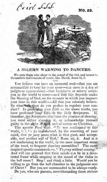
    This post would somehow seem incomplete without at least mentioning the contrary to this notation–the warnings by some religions that The Dance itself would lead humans directly to Hell.  So, not only should people not have recorded dance, but they shouldn’t be dancing in the first place.  OR thinking about dancing, for that matter.
    Blogwritingdancegoing_to_hell

    The article that I have quoted from here is found HERE.

    Some other interesting, and beautiful alternative means of writing in regard to recording dance include:

    Blogwritingdancearbot_notes

    Wilson, Thomas dancing master; An analysis of country dancing: wherein are displayed all the figures ever used in country dances, in a way so easy and familiar, that persons of the meanest capacity may in a short time acquire (without the aid of a master) a complete knowledge of that rational and polite amusement. To which are added, instructions for dancing some entire new reels; together with the rules, regulations, and complete etiquette of the ball room. By T. Wilson … Embellished and illustrated with engravings on wood, by J. Berryman; London, Printed by W. Calvert, to be had to Mr. Dutton [etc.] 1808

    Nvove inventioni di balli; opera vaghissima nella quale si danno i giusti modi del ben portar la vita, et di accommodarsi con ogni leggiadria di movimento alle creanze et gratie d’amore. Convenevoli a tutti i cavalieri, & dame, per ogni sorte di ballo, balletto, & brando d’Italia, di Spagna & di Francia. Con figure … in rame et regole della musica et intavolatura quali si richieggono al suono et al canto. Divisa in tre trattati …Blogwritingdanceitalian_note

    Blogwritingdance_tp_pember

    ·Posted by :

    ·in:

    — —
  • Pre-Columbian American “Exploration”–St. Brendan, the Island Whale, and All That

    JF Ptak Science Books LLC   Post #99
    Blogamericabrendan
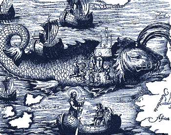
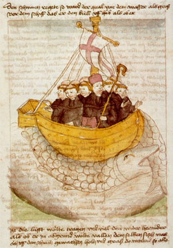
    The pre-Columbian voyages to the Garden of America– by the Phoenicians, the Vikings, the Irish, the Greeks (Euphemus the Greek navigator in the 2nd century ACE) the Welsh (Madoc), the Chinese (as found in the Shan Hai King or Shanhai Jing, adapted, enlarged, engorged fictional classic some 3,000 years old), the Japanese and English–mostly have frothy, creamy icings over a rich, textured legend.  One of the frothiest belongs to Saint Brendan, the Irish priest (of Clonfert or Bréanainn of Clonfert , c. 484 – c. 577, called “the Navigator”, “the Voyager”, or “the Bold”) whose voyage to America was particularly enhanced and layered as he arrived on the back of a whale sometime in the 530’s. His legend has him  exploring some of the high Texas country, though the Texans and most other won’t have him, be he one of the twelve apostles of Ireland or not.

    Blogamrewicabrenadan_manu

    Part of the problematic part of this Irish myth of North American exploration is Jasconius, the enormous fish/whale/island that Brendan made camp upon.  He and his followers (sometimes numbered in the 30’s, and other times in the 60’s), actually celebrated Easter on its back and only disturbed the creature after lighting afire on its back to prepare a meal.  I’ve always loved this engraving of St. Brendan celebrating Mass on the back of the beast, his trusty ship parked on the hindquarters of the accepting creature.

    There are other instances of adventurers or the lost mistaking a fish for an island and landing on it—this occurs in the tales of Sinbad, the Adventures of Baron von Munchhausen and also in the fibbing world of Pinocchio.  St. Branden’s is the only instance however of using a fish/island in an effort to reach America. 

  • Art Made of Fat: Boneless Sculpture in a Boney World

    JF Ptak Science Books   Post 100    [See also my latest post on fat:  Fat Redux, 1920’s Fat  Quack Cures].


    Luminousfatcvr111

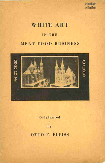
    In the world of found-book-objects, few I think are as deeply removed and as deeply obscure as the work by Otto F. Fleiss, a butcher and sculptor in fat. And lard.  The pamphlet’s title is a throw-back to an earlier day of titling, when the title page was pretty much fully overtaken by the title, though as a common practice it say its heyday 300+ years ago. Fleiss’ 50-word title: White Art in the Meat Food Business.  A Practical Handbook for Butcher, Pork Stores, Restaurants, Hotels and Delicatessens on How to Make Lasting and Transferable White Art Decorations out of Bacon Fat Back for Window Displays, Ornaments on Meat Food Cold Buffets and for Exhibits and Advertising Purposes.  Enrich yourself with Personal Knowledge. 

    Luminousfatman_top

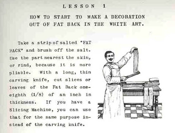
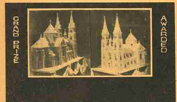
    If the title of this book could itself be described in terms of food, I think that I’d have to call it a (warm) Slim Jim Egg Frosty with a crust of French fries, baked.  Or something like that.  If the exhaustive, exhausting title didn’t stop you in your tracks, though, the slim pamphlet holds some indelible, indigestible, eyebrow-burning, flat-out remarkable images. Working your way through this pamphlet is as much fun as stringing together dirty diapers:  you can enjoy instructions on how to make a vase of roses out of strips of fat, or produce the reverse (?!) portrait of Santa Claus in slabs of fat, or marvel at the photos of Mr. Fleiss’ “first prize” (?) 200-pound fat sculpture of a cathedral done entirely in slips and chunks and strips of fat.

    Luminousfatcvr_detail This simply must be the most sublime work ever produced on Fat Art.

    And, in the annals of art, I should think that Black Velvet Sparkly Liberace paintings may have moved up a level from the most secret depths of the inferno to make way for Fat Art–or, dare I say it, “FART”.


    A Note on the Origin of this Pamphlet:

    The Fleiss work comes from a singular collection that we purchased of the Library of Congress some years ago.  It was called, simply, “The Pamphlet Collection”, and included 90,000 or so pamphlets stored in 2,355 blue document boxes.  They were all categorized and alphabetized, but not according to any truly discernible methodology.  Their greatest common denominator was that the great majority of them simply did not exist.

    By “they did not exist” I mean that they were not catalogued in the massive (70 million item)  database and librarian’s tool WorldCat/FirstSearch which lists books in libraries world wide.   And they continually do not show up in the mass bookseller databases, or in Google/Yahoo searches, and so on.

    The pamphlets in the collection also weren’t added, in large part, to the Library of Congress collection, nor were they ever circulated.  They were just kept in their blue boxes, waiting to a-moulder away.  But they didn’t, and here they are, and will be, making appearances over the next number of years.

    There will also be many other images from much more public and published sources that have simply slipped away from us here in our present—unexpected bits of revelatory history wrapped in a simple image that speak volumes from the dim, deep forgotten.

    Additional Images:

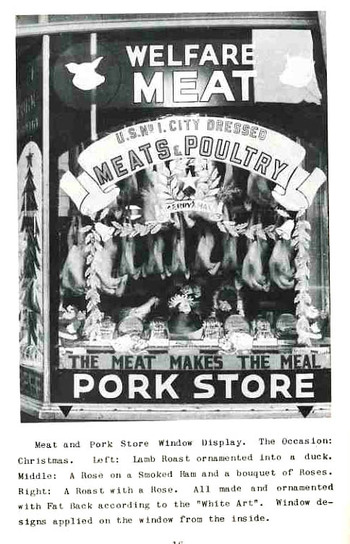
    Perhaps the most incredible of the photographs in this unleafy work by Fleiss is of that below, of the Welfare Meat Pork Store.  The legend describes “lamb roast ornamented into a duck”, meaning that all of the duck-like things hanging there in the window were actually made of lamb roast covered in pork fat.  (One doesn’t get to write that ever day.) Then we see a “roast with a rose” (and as we saw in the text the roses in the ornamentation were made out of fat), as well as a “rose on a smoked ham and a bouquet of roses”.  Again, virtually everything in the wind of this store was constructed of fat.Luminousfatlamb115


    Mr. Fleiss also did Christmas ornamentation.
    In fat.

  • Early “Clip Art” Books: Amman, Vogtherr and the Mustard Seed Garden

    JF Ptak Science Books LLC   Post #102
    Artists’ pattern books of the 16th century are, in a way, somewhat like our present
    clip art books.  They were certainly used by artists and students for details that
    they were not privy to as well as for inspiration; they were in some sense meant to
    be copied directly by those looking for bits and pieces to help flesh out a design
    for an armorial or coat of arms or bit of a title page.  So they were in fact intended to
    function somewhat like a clip art book. 
    Blogpattern_book_amman120

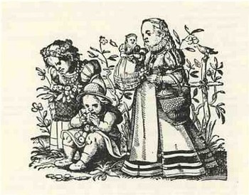
    One of the great pattern books printed in the second half of the sixteenth century belonged to Jobst Amman and began publication in Frankfurt in 1578: Kunstbuchlin.  Kunst und Lehrbuchlein fur die anfahenden Jungen Daraus reissen und Malen zu lernen Darinnen allerley Art lustige. ..(Art and instruction book for young beginners, from
    which to learn how to draw and paint; containing all sorts of cheerful and pleasant illustrations of men and women, also of little children, little animals and other
    subjects; published for the benefit of all young people who love this art
    ).  It really was intended for instruction in the arts for children but also served as a
    comprehensive pattern book for artists, jobber printers, craftsmen and the
    like-basically a clip art book of the 16th century, without the “clip” part.  (This
    book would’ve been studied, copied, and studied again, used for inspiration-it was
    not meant to have the images cut out and applied.)  There were 293 images in this
    book-each woodcut printed on its own page, with book standing about 12 inches
    tall-and for the most part featured women, children, pagan gods, religious leaders,
    emblemata, allegorical scenes, and perhaps most interesting from my point of view,
    scenes of people in different professions from all stations of life.  Amman was
    interested really in performing an artistic function, and really didn’t have a
    religious or moral authority that he was trying to sell to the reader.  So, in that
    way, his work was really pretty unusual, and, if you look hard enough, a delightful
    insight into some aspects of “common life” of 1578, from the styles of unpretentious
    clothing to how and where people worked.  His attention to detail and minuatiae
    makes this work a valuable, snap-shot like visualizations of tiny aspects of a past
    world. 

    In his later years,  Jost Amman created woodcuts for some of the greatest
    illustrated books of his time, including  titles as the Bible, Livy’s History of
    Rome, Flavius’s Jewish War, Reynard the Fox, the Kunstbuchlin, (1578), books on
    hunting, warfare, cooking and women’s fashion.>  He was truly prodigious, though it
    is unlikely that he created every work of art by himself-what probably happened was
    that he undertook all of the designs and then (again, probably) fanned out the work
    to be finished, with artists helping him to finish the original designs and
    woodcutters to actually make the woodblocks. 

    Sadly, A later edition of the Kunstbuchlin appeared in 1599-after Amman was
    dead-which was expanded to include previously-published Amman images that,
    beautiful as they were, had nothing really to do with the stated subject of the
    book, and seemingly undertaken to do a little cashing-out for the publisher.  The
    newly added images included images from Amman’s work on Turkey, horsemanship,
    =coasts of arms and pedigrees, horse breeding and a number of other unrelated
    things. 

    It is fitting that this book was reprinted in 1968 by the glorious Dover Publishers,
    as, so far as I can tell, they were the first mega-publishers of very affordable
    collections of clip -art art
    Blogpattern_book119
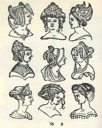
    Another example of an artists’ pattern book is Heinrich Vogtherr’s Kunstbuerchlin vonn Allerly seltzamen und wunderbarren frembden Stucken.published in Strassburg at around the same time as Amman (ca. 1575), but with an entirely different approach to the subject.  Vogtherr included hundreds of woodcut designs for workpeople in the
    arts (such  as “painters, sculptores, goldsmiths, stonemasons, and armorers” Heitz, Elsaessische Buechermarken) depicting the unusual and the semi-fantastical:  bizarre and extended headdresses for men and woman, incredible hairstyles (watch out, Ballmer), outrageous hands and feet, armaments real and imagined, as well as true but perhaps enhanced coats of arms, armorials, swords, halberds, and so on. 

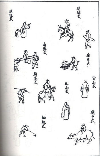
    Somehow and with perhaps very limited understanding is has led in my mind to the superb translation of the enormously revered manual of Chinese painting, The Mustard Seed Garden (Chieh Tzu Yuan Hua Chuan by Wang Kai,  first published in 1679) by Mai-Mai Sze, The Tao of Painting. A Study of the Ritual Disposition of Chinese Painting, 1956.  They’re not understating the secondary title whatsoever: this is basically a catalog which offers the student of Chinese art everything they need to know about forms  and shape and content and genre, along with how to draw these things, where to place them, how to establish the boundaries of the artwork, the different sorts of brushwork to use, and on to the end.
    Blogpattern_book_mustardIt describes the (eighteen) basic principles and rules, including the Six Canons (including the circulation of Ch’i), the Six Essentials (“action of the Ch’i and powerful brushwork go together” and “color (if used) should enrich” and “to exhibit originality even to the point of  eccentricity, without violating the LI of things”), The Three Faults (all concerned with brushwork), and  The Twelve Things to Avoid (“mountains without Ch’i, the pulse of Life”). 

    This is followed by notes on the preparations of colors and other materials used in painting.

    The next 600 pages or so is a very detailed visual description of how things should look and  takes up 15 pages of index in its very minute description.  For example, the section on trees discusses
    how trees should appear in the distance, methods for painting vines on trees, describing autumn willows,  dotting fruits in blossoms, and much more.  this treatment extends to rocks, humans, houses and structures, boats, furniture, city walls, palaces, waterwheels, and etc.  There is a longer section devoted to the painting of flowers and plants, where we see entries such as “rules of painting flowers phrased for  memorizing”, “flowers with eight and nine large petals”, “rules for painting sleeping birds phrased for memorizing” (a title for a poem if I’ve ever heard one), “painting thick leaves that withstand winter”, “a hanging and bent branch”, “plants with thorns and furry leaves”, and hundreds of other pages. 

    It is a stupendous work that I find beautiful and relaxing for reasons I don’t understand.

    The great Kenneth Rexroth said it most forcefully/grumpily, probably, when he reviewed the book for The Nation in 1957:
    “This is a book every American artist and art critic should buy and study—every night for several years.  Nothing could be a better answer to the problems and dilemmas of modern abstract expressionism.  Nothing could be a better antidote to the enervating poisons which have diluted modern painting.  This is a lucid, profound, exhaustive explanation of what you think you are doing, but aren’t, what you would like to do, but can’t.  Furthermore, the larger second volume consists of more than two hundred detailed pictures, with complete explanation of how it was done, long ago, by far better men than you.  It is all there—a complete alphabet of expression…”

    ·Posted by :

    ·in:

    —
  • Finding Hidden Images in Antique Prints: 18th Century Forensic Social X-Rays of Florence by Guiseppe Zocchi

    Blogsanta121JF Ptak Science Books LLC   Post #103

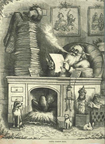
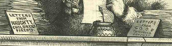
    I do love Santa.  But I was struck by something in this (30 December 1871) wood engraving—one of the very earliest of the now-recognizable form of Santa, created (his image that is , of course) by the incredibly prolific, and almost-entirely socially responsible (except for Catholics and the Irish) Thomas Nast.  (Nast created the standard, iconic image of Santa, plus the Republican elephant, the Democratic donkey, the Tammany tiger, and much more).  I’ve never noticed that the letters that Santa is reading are being taken *from* the piles on his desk, and that they are not from children, but from their parents.

    What?  How does this work out?  Were the “naughty” children being ratted out by their parents?  Does Santa really need to be told all of this?  And who on earth really is deserving of a lump of coal, anyway?  I’m guessing though that this was simply a warning cartoon to children, saying to them that they’d better damn well be good or a letter will be going out to Santa in the afternoon mail. 

    On the other hand this would make more sense if the cartoon wasn’t published five days after Christmas. 

    Blogsanta121detail

    These questions aside, the lesson yet again for me is to look very closely when looking at complex images like this—especially when you think that you already know what you’re looking at.

    Listen:  this is especially poignant when you think that you’re looking at not much at all. Having an antiquarian map (and print) shop puts me into contact with all manner of printed images.  As a result of this I have seen many thousands of images of important buildings in this and that city.  What I’ve found most interesting are the in situ images of the buildings, the structures as they were in the time of the artist, and situate din a street scene, showing other buildings, and other aspects of city life.

    It is all of this other stuff that can be extremely compelling, and sometimes, shocking, weird, odd, unexpected.  I have found that in big scenes of big buildings in big streets that the artist sometimes takes a little creative licenses with the people inhabiting the scene.  Sometimes it takes a magnifying glass to reveal the artist’s (or engraver’s) secrets and whimsies, but often the oddments are plainly there, just simply overwhelmed by everything else in the world that is happening.

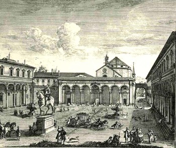
    Take for example the following two engravings, both by Giuseppe Zocchi (1711-1767) who was commissioned by he Marchise Andre Gerini at mid century to record the greatest of Florentine landmarks.  The first shown here is the Veduta della Piazza della SS Nunziata Statua Equeftre di Ferdinando Primo, Fonti, e Loggie Laterali.
    Bloglooking_closely_1_96123

    It would’ve been easier certainly to leave the plaza empty, but Zocchi doesn’t, filling in the empty spaces with several dozen people, most of  whom are really rather busy.  In addition to royal coaches and animated discussions, we can find a number of unusual images.  There is a very curious sub-scene of a women with three children, one of whom seems to be falling, or leaping, the woman holding her hand straight out in front of her.  Directly above them we can see a man pulling a small carriage with another person in it.  Is this person a child?  Are they elderly?  Infirmed?  And what about the (probably elderly) figure who we can half see, leaning their back against the equestrian statue, holding a staff?  Why bother adding half of figure (from the rear)?  Why on earth did Zocchi choose to add

    Bloglooking_closely_1__carriage_2

    characters like these when it would be substantially easier to show a gent walking with a stick?  Is the artist expressing a little semi-invisible artistic freedom, or just using his powers of observation to make the commissioned part of the art more interesting?  Or perhaps Zocchi has nothing whatsoever to do with these tiny figures—perhaps it is all the work of the engraver, who was responsible for translating Zocchi’s paintings into metal, adding these figures as he went? 

    I think it is fascinating!  Perhaps what the story is here is that these were really just simple street scene, common street life, and the artist simply included them in the work?  That would make them 18th century snapshots of common life in Florence, something that wasn’t ordinarily captured by very many artists at all.
    Bloglooking_closely_1__man_cane

    Is it possible to collect all of these odd images—uncommon people, children playing (nameable?) games in the street, sellers of bits and pieces, people pushing homemade wagons, unusual modes of conveyance—and have a little bit of an unintended societal X-Ray of common life

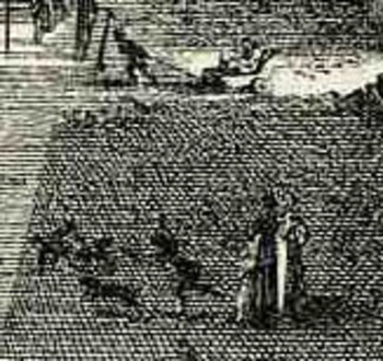
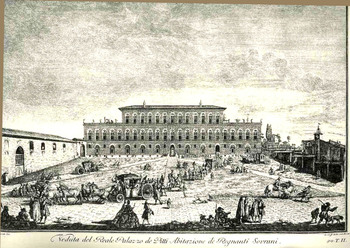
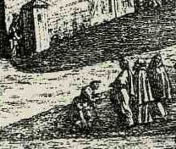
    Let’s look at another example from Zocchi:  Veduta del Reale Palazzo de Pitti Abitazione de Regnanti Sourani. Here we can see a rather long royal procession across a problematic grassy area, with most of the people not caring the least bit for the splendor.  As a matter of fact most of the people in the foreground of the image look to be homeless travelers, one of whom at the extreme bottom right) has a dog

    Bloglooking_closely_b124

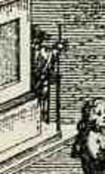
    on a leash, a backpack, and seems to be accompanied by a child.  Scurrying over to the left of the image, right before the procession, we can see a person on their knees seemingly begging for money from a more wealthy-looking group.  And above them is a singular little structure with a person entering—is this a guard’s shack, or a public convenience?  Probably it is the former as there is a very heavy door in a fortified wall just to its right (with some high weeds growing up against the wall as well).
    Bloglooking_closely_b_dog_fight

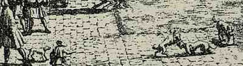
    Why does the artist include this minutiae?  Why weeds?  Why the beggars, the homeless with children, the lazy?  Why did he include those dogs play fighting right in the middle of the scene?

    I think it is fantastic, and to me it is ultimately far more interesting looking for these bits than it is to see just another image of the Pitti.
    Bloglooking_closely_b_kneeling_man

    ·Posted by :

    ·in:

  • The Best Images of Horses, Ever: Hans Beham and Perspective, 1528

    JF Ptak Science Books LLC Post #105
    Blogmodel_bookhorses129

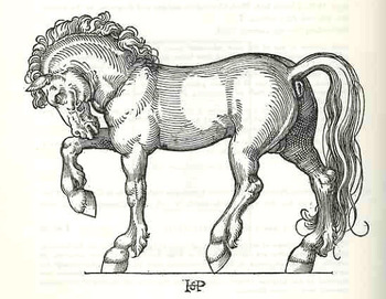
    Hans Sebald Beham wrote—produced, rather, the text and illustrated—Dises buchlein zeyget an und lernet ein mass oder proporcion der Ross, nutzlich iungen gesellen, Malern und goltschmiden, a tremendous, inspired model book for artists and observers, back there in 1528.  Amidst the heavy, blocky Gothic type of the book lie a series of just beautiful, proportional studies of horses.  It is probably the single greatest illustrated work on horses done in the history of printing to this time; and it has stood the test of time as a work of art, rather well.

    It is also, evidently, the work of an anti-Lutherian and certified “godless” painter, expelled by the city of Nurnberg (along with his brother and as it turns out the subject of yesterday’s Saturn post, George Pencz).  He, and his brother Barthel, and Pencz—with whom he shares birth and death dates of 1500 to 1550—were shaken by the city half way through his life in 1525 for having bad thoughts about religion and the proper way of not avoiding it. The decision by the city didn’t affect his art, as we can well see
    Blogmodel_bookhorses2130

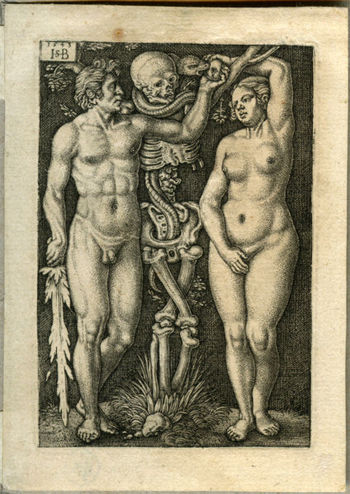
    Beham’s model book on the horse was followed by one on the human figure.  He was an extraordinary talent whose fine, deft touch can be recognized across the room, miniature or not.

    Behamadam_and_eve
     

    ·Posted by :

    ·in:

    —
  • Gigantic and Unbuildable Buildings: Leroy Buffington, 1889

    JF Ptak Science Books LLC   Post #106

    This is the first in a series taking a little look at some big buildings—very big buildings, that is, monstrously putting the “b” in “big”, altogether too-big, impossibly-big, buildings.)   There have been grotesquely, morph-aided, Babel-like buildings proposed that are bigger than the ones I’ve got in mind, but those tended to live in the science fiction world, or even more removed, in the self-published beyond-the-pale world—but what these later buildings have in common is that no one intended to actually build them, while the ones we’ll take a look at were serious proposals looking for real world serious money. 
    Big_arch136_2

    (For example of the former category, I own a 1935 pamphlet in which the self-published author proposed a 60-mile (?!) tall building with a bell on the top to summon all world peoples to celebration of unitary religion and other, odder, needs.) 

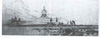
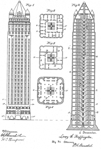
    The first of these intentional  buildings was a proposal of a busy, respected and advanced architect named Leroy Buffington, of Minneapolis.  His put forward this plan in 1889 to be considered for an exhibition building in the Chicago Columbian Exposition of 1893.  It was rejected out of hand because of the obvious expense, but when you take a closer look at the thing it just seems to have been an impossible structure to build given the contemporary technology.

    The building was meant to be a “steel tent”, with a corkscrew-like electric railway winding its way around the building to a globe with a cross on the apex at the top of the structure.   (The detail  below is from about the exact middle of the building and shows the railway cars.)
    Big_arch136detail_2

    By my reckoning, the structure in this image is 150mm long; each of the railway cars on it seem to be about 3mm; if each railway car/pair  was a relatively modest 30-feet long in real life, this would make the building about 1500 feet long, with a height of about 400 (measuring to the base of the globe).  Since we know the structure was to be elliptical, this would give it a circumference of nearly a mile and an area of about 2 million square feet. Given that the skyscraper was basically invented at about this time, and that the idea of the steel skeleton was also practically brand new, and given the structure’s very odd shape and dimensions, and given the weight of the roof, well, thus building was just not getting done.

    As a matter of fact Buffington himself tried to patent the idea of a steel skeleton building (U.S. Patent No. 383,170, presented May 1888)—a claim which has been refuted and dismissed by modern scholars (such as Adam Lathrop, formerly of the University of Minnesota, who said that Buffington drew direct inspiration from LeBaron Jersey) with documentary evidence—Buffington should’ve known better.  Perhaps his proposal in 1889 was just a platform for publicity for his patent; perhaps not.  But it just seems that the state of the art for the big structure, as we see in the patent drawings for this imaginary 28-story building, was just nowhere near the realistic edge of being able to support a steel roof that was something like 1/12th of a square mile.
    Blogarchbuffington

    Even though the building was enormous, and impossible to build, it was also very not pretty.

    And for some reason Buffington just couldn’t get enough of his idea-that-wouldn’t die, as he presented it, again, for consideration for a pavilion for the 1933 Chicago World’s Fair.  It was rejected then, too. 

  • An Alphabetical Return to Fat:1920’s Fat (Reduction) Scams; Fat Soap, Strychnine Pills, and Sugar

    JF Ptak Science Books   Post 107
    Blogfatobesity_cures132
    Quackery in general has survived in spite of itself over many fields, not the least of which is astrology and creation science, cult religions and
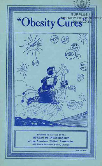
    walking-with-the-dead.  In the U.S. in the 1910-1925 period however there was a attempt at investigating the most outrageous frauds in the medical profession by the American Medical Association, and of the many sorts of quacks and frauds-liver cures, neuralgia miracles, electro-vibrator hair restorers and lump removers, anti-droopy happiness pills, cocaine nervous system remedies, and so on-what I’d like to look at right now is concerned with “flesh reduction”, or, fat cures. 

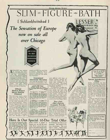
    According to the AMA (in a 1934 retrospective) the chief stimulant to the obesity industry was the rise of womens’ fashions.  I think that the reasoning might wind itself around the growth of expendable money in the American rising middle class, where Americans, in general, had more money to spend on the non-essentials than any time in the history of the country.  That leads to more consumables, and that leads to more advertising, and that leads to more idealized images of what people should look like, and that leads to wanting to look like that, and that opens the door to scammers who offer a way to get to the not-actual ideal without effort and for little money.  And so in the ’20’s there was a spike in quack remedies for obesity, as there was little or no control over the content of what was being sold nor the claims about what the product did, medically speaking-there was general protection from fraud, of course, but the medical compliment for establishing what that actually was wasn’t quite yet in place. 

    There is a veritable alphabet (soup) of mondo bizarre cures that the AMA attacked and ripped apart during the 1920’s, publishing the findings of their labs on the ingredients of the cures and the possibilities of whether any of the hundreds (thousands?) of these things worked at all. 

    And what the AMA found was really pretty remarkable-lots of water, sugar, tartar, tinctures of useless this and that, desicated liver, seaweed, salt, lemon, and that sort of thing, none of which had any value for weight reduction whatsoever..  A major ingredient, for some reason, was focus vesiculosus, also known as bladderwrack, sea-wrack, kelp-ware and sea-oak-there was no indication of why this ingredient was so popular, especially since it was used in some farms as a pig feed to make the animals fat.
    Blogfat_slim_chicago133
     

    So, aside from the pig-fattening ingredient for human “flesh reduction”, we’ll have a quick alphabetical tour of some of the outrageous (and bizarrely-named) products and their components promising hope and physical happiness to the woman of 1925. (Let’s note that the following are just locally-applied or ingested cures-there’s an entire universe of external applications and devices that were used to solve the problem of fat.  For example, the Violet Ray Machine claimed that in addition to obesity it would cure “Problems with circulation of the blood, the heart’s action, bumps of the funny-bone, germ infections, weakness, the waste of the body, congestion, impaired physical development, pains and aches, complexion and skin diseases, facial and body blemishes, hair loss, headaches, inflammation of joints, muscles, nerves, Atrophy, circulatory disorders, constipation, deafness, goitre, high blood pressure, arteriosclerosis, insomnia (sleeplessness-Brain Fag), indigestion, dyspepsia, neuritis, nervousness, hysteria, melancholia, neurasthenia, neuralgia, obesity, pain, paralysis, prostate gland problems, scalp diseases, falling hair, dandruff, asthma, anemia, bronchitis, catarrh, hay fever, rose fever, colds and other inflammations of the upper air passages, and, of course, cancer.”  This quote with thanks from the Museum of Quack Meidcal Therapy Devices

    And so to the consumable and applied quack fat cures:

    A

    Absorbit Reducing Paste-one of my favorites.  This was a nighttime sleeping paste
    which was composed of 44% lard as well as beeswax, oil and milk.  After slathering
    yourself in this oily, waxy, milky fat cocoon (the sheets!) you were also supposed
    to ingest an accompanying night aid pill, which was 24% sulphur and 61% sugar.  So
    not only would you be oily milky waxy lardy, you’d also be stinky and, at the end of
    it all, hyper. 

    Allmans Anti Fat Anti Pon (?)).  According to its label, it was a “powerful and
    entirely harmless specific”, which the AMA revealed to be composed of citric acid,
    water and food coloring.  Sounds like Kool Aid. 

    Arbolone tablets.  These guys were made of desiccated thyroid, starch, lime and sugar.

    B

    Basy Bread was a “anti growth” bread which turned out to be just a course wheat bread

    C

    Clark’s Thinning Salts was almost entirely washing soda.

    D

    Dalloff’s Time Pills were made of lavender and bearberry.

    E

    Elfin Fat reducing Gum Drops (continuing its spectacular name by saying it was a
    product of the Pep-Giving Product Co., Inc.), was actually one of the only items
    that might have contributed to weight loss, if only for the fact that in addition to
    consuming its drops made of laxative and sugar you were supposed to adhere to a
    pretty regimented, difficult exercise routine.  Big sweat and potent laxative does
    in fact produce weight loss.  Maybe not a good weight loss, but aa weight loss
    nevertheless. 

    Elimiton (!) was a product made of caffeine and rhubarb.

    Every Woman’s Flesh Reducer promised a new figure with their mixture of Epsom salt
    and camphor.

    F

    Fatsoff, a soap product that you washed with, was not surprisingly made of soap.
    Fayro was another soap and washing flesh reduction “package” that asserted that by
    using their secret flesh reducing salve (i.e., “soap”), you would “open your pores
    to let the blood cells sweat off fat”.  I could just about see the AMA guy who was
    writing their description of this thing slamming his pen and screaming.

    Some other F’s included Fells Reducing Tablets (which were milk), Figurroids (salty
    baking soda), Floradona (sodium thiosulphate, the photographer’s “hypo”), and Folt’s
    Reducing Soap (which was, again, soap). 

    G

    Get Slim was a vile purgative of sugar, tartar and baking soda, plus perfumes.

    H

    Hall’s Tablet Triturates were ginger and a big shake of chalk; Hargreaves Reducing
    Wafers (bread and liquorice).

    J

    J.Z. Obesity tablets–were the same product as Absorbit which was the same as
    Zobeide (minus the ox mucus). 

    L

    LaMar reducing Soap (“to wash away fat”) was soap.

    M

    Marmola, “a thyroid-containing obesity cure” was composed of cornstalk, borax, baking
    soda and tartaric acid, with a special “constipation agent” (?), as well as a lot of
    salt. 

    Morlene would reduce goitersm neck fat, bust size and tumors, somehow, with the
    application of its cleansing elements (soap).

    N

    Neutroid seems to have been the most lethal of the hundreds tested, contaning bad
    dollops of magnesium carbonate and iodol, and was taken internally (where external
    application could prove fatal). 

    O

    Oil of Korein was pretty nasty stuff, containing sassafrass and about 75% petrolatum
    (a semi-solid mixture of hydrocarbons, or petroleum jelly), though it also offered
    some really good advice on foods to avoid if you didn’t want to actually gain
    weight. 

    P

    Phy-thy-rin was a calcium and sugar coated pill of iodine and dried thyroid, with
    plenty of sugar, and liquorice. 

    R

    Rusell’s Anti-Corpulent {reparation was a powdered added to water that would
    effectively produce orange Kool-Aid.

    S

    Sangra Bath Salts was perhaps the most outrageously simple, being just colored bath
    salt.  Slendaform (“just gently rub it in, and watch yourself get thin”), was a
    half-pound jar of oil of turpentine, white vinegar and milk curd.  Slyphine, which
    crowded its ads with tremendous claims to be “Absolutely The Best Weight Reducer
    Ever Discovered” and other very shouty claims (by somehow “attracting surplus
    fat”), was simply borax and talc. 

    V

    Dr. Vincent’s Anti-Stout Pills contained a pretty sounding mixture of aloes, jalap,
    cloves and bladderwrack.

    Y

    Mme. Yale’s Fertilizer Tablets-I’m not sure about the real use of “fertilizer”
    here.) was actually one of the earliest of these frauds to be attacked by the
    government, being charged with fraud by “misbranding” in 1909, as federal chemists
    could find no connection between weight loss and its sole ingredients of sugar,
    charcoal and cream of tartar. 

    Z

    Lastly, we offer Zobeude, which was just Absorbit Reducing Paste relabled for
    British consumption, though it seems to have contained an added ingredient of
    “purified ox bile”.  We are told in Bruce’s Materia Medica of 1884 that “Purified ox
    bile has the composition of fresh bile, less the mucus .”
    ·Posted by :

    ·in:

    — — —
  • Little Science—the Scientific Readiness of Water Bottles

    Blogmonolith
    There’s plenty of room for Big Science, as Big Science makes room for itself:  the Manhattan Project, RADLAB at MIT, CERN, Los Alamos, Human Genome Project are all examples of (really) big science, not to mention science cities like Oak Ridge, Tsukuda Academic Center (Japan)  and Akademorduk (Russia).  There’s  a much bigger list of big science, but what I want to get at right now is a look at Little Science, teeny-tiny science, and the home of the Good Idea.

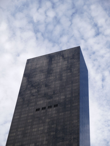
    During the Anita Hill/Clarence Thomas hearings (which was constantly on the radio in the background) my friend Walter Johnson and I set out to move a half-ton piece of equipment,. in the dead of night, with no tools.  The object of course had no wheels, measured a very cubey 7x4x3 feet (or so), and presented itself in a primal crouch, like 6 refrigerators on their sides.  The Thing, a color photographic developer, needed to be put on its side, then moved down a 75’ hallway, then placed on end (!!) and then placed in a truck.

    We had a ratchet set and a few screwdrivers for tools—plus three roundish fence posts that we found in the trash outside.

    We removed as much of the innards as possible (it was a working machine so it needed to be put back together again), and were able to get it on its side so that it would fit through a door and down the hall.  I think that being bearish brutes we just muscled the thing over.  We of course used the logs to roll the beast down the hallway, a la the way we used to imagine the Egyptians moving monoliths.  We even knew how to get the thing upright—the big deal, though, was to get it back down again, horizontally, to get it into the truck.
    Monolithfz

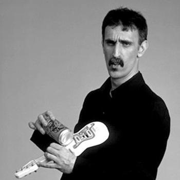
    This was, as Frank Zappa would say, the crux of the biscuit.

    Walter was and is a severely, acutely intelligent man with great creativity and a big sense of humor.
    Looking at our little bit of Stonehenge, trying to think of a way to move it from vertical to horizontal without damaging this slippery heavy stinking machine, and to continue using cave-man tools, was a thorny issue.

    Walter cracked it in an instant.

    We had five or six one-gallon jugs of water with screw tops—I think Walter had already consumed two gallons of it (he’s a big man, too)—that would serve the purpose.  Walter duct-taped the tops back on four of the empty jugs, taped the jugs across the top of the Beast, and then pushed the thousand-pound brute over.  The jugs acted perfectly, like shock absorbers; the caps stayed on, the machine never touched the ground, and we moved it into the truck and off into the night, celebrating our victory with warm Guinness. 
    Gallon_big

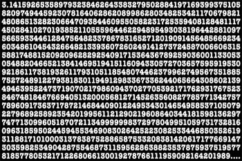
    It was a gorgeous and instant solution to a knotty problem, and a perfect application of a little sci and mechanics.  Of course you had to be able to see the simplest, most direct solution to the problem, which Walter did, and then have the necessary tools in the trash around you to make the dream come true.  But we hadn’t thought of that end bit, the lowering of the machine without damaging it part, which was such a heart breaker for the moment before Walter said that he knew how to do it.  But Walter was always like this, always hyper-smart and intuitive—he can master complex issues quickly and remember it all (I showed him Bergmann’s book on pi one day and without prompting he began to recite the pi through at least 50-places)—but the big deal was to recognize the shortest, best, most elegant solution to a problem.  And seeing that thousand pound behemoth fall safely to the ground as if on pillows is about the best exclamation mark that I can think of when talking about solutions like this.

    Happy 50th Birthday, Walter Johnson

    Monolithpi_2

    Here’s an unusual musical bit using the first thousand places of pi for a piano solo.

    ·Posted by :

    ·in:

  • The Strength of Iridescence–Visualizing Mental Calculations, Part II

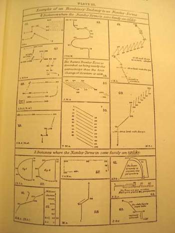
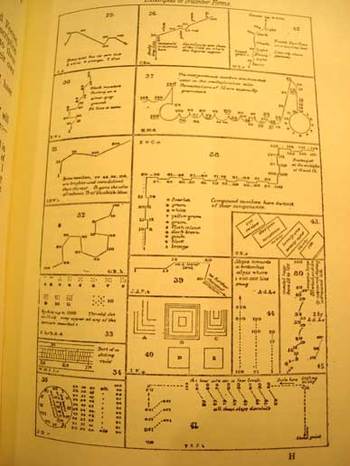
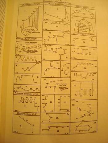
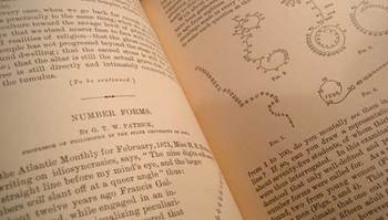
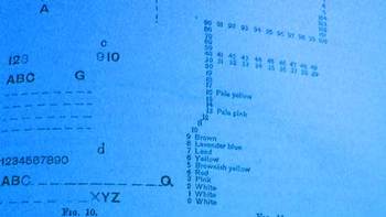
    I wanted to return and add a bit to an earlier notice concerning a series of drawings that I found utterly fascinating—the earliest illustrations of the active formation representing visualized human thought.  (I know that this titling is ungainly, but it seems to be the least inelegant solutions to stating the idea of what the images represent.)  It so happens that Francis Galton approached this same issue—though without pictorial representation—in an earlier paper with the unusual and provocative title of “Visions in Sane Persons” (1881).  Working further through this thesis and publishing an illustrated report in 1882, he continued, and greatly expanded, the study in a 26-page chapter called “Number-Forms” in his book Inquiries into Human Faculties and its Development (1883, with a second edition appearing in 1909).  Galton includes another 71 images of visualizing arithmetic, plus others on general images of mental images of numbers and letters—there is also a small but beautiful section on associations between colors and numbers and letters.  (These are all depicted in the first four images on this page.)

    Bloggalton1

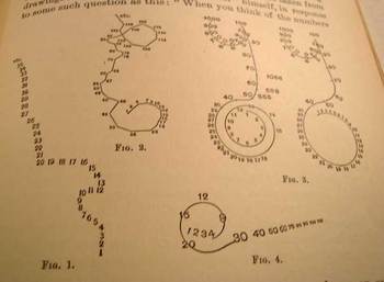
    G.T.W. Patrick (a professor of philosophy at the state university of Iowa) published one of the earliest papers in response to Galton’s work.  In “Number-forms”, published in the Popular Science Monthly in February 1893 (pp 504-515, and “illustrated”), Patrick addresses and expands Galton’s work somewhat, including another eighteen wonderful illustrations of similar images.

    But the path back to Galton is not quite a straight one.  Galton was initially concerned with imaging of numbers and numbers forms while people were performing mental calculations.  Patrick on the other hand asked his subjects if they had associative images in their mind of numbers—formally, he asked them if the number series of 1-9 presented itself in a visual, representative way in their minds.  In the second and third parts of his three-part inquiry, he asked the same question about letters and the alphabet, and then, thirdly, if they perceived any sense of color from letters and numbers, and what then what those exact relationships were.

    Bloggalton2_4

    It is interesting that in the studies of Galton and Patrick that over time in each of the subjects tested that (in Galton’s words) the images were “absolutely unchangeable except for a gradual development of complexity”.  Since I (like Galton, which is probably the only time I will ever be able to associate myself with this man
    in terms of familiar traits) have no such images in my head when I think about mathematics or numbers or letter or words in general, it is remarkable to me on the human scale that people who have these associations would have the same ones time after time.  A movable feast, as it were.  Of course it would make sense that this reference system would be constant—but for someone that doesn’t ‘see” these images at all, the fact that they are so flowing and lucid and unchanging is simply difficult for me to imagine. (In a few weeks I’ll return to this issue, looking at how some prodigiously gifted people “see” with their special attributes.)

    Bloggalton3_2

    Images below are from the Patrick paper:

    Bloggalton5

    Bloggalton6


    Bloggalton4blue

    ·Posted by :

    ·in:

Recent Posts

Archives

Categories