A Daily History of Holes, Dots, Lines, Science, History, Math, Physics, Art, the Unintentional Absurd, Architecture, Maps, Data Visualization, Blank and Missing Things, and so on. |1.6 million words, 7500 images, 4.9 million hits| Press & appearances in The Times, Le Figaro, Mensa, The Economist, The Guardian, Discovery News, Slate, Le Monde, Sci American Blogs, Le Pont, and many other places… 5000+ total posts since 2008.

  • Thematic Maps: Finding Russia in the U.S. Midwest


    JF Ptak Science Books  Post 1899

    Putting objects of different classifications into the same scale for the sake of comparison is a relatively recent idea in the history of printing.  It really wasn’t until Etienne Durand’s architectural textbooks of the 1850’s that buildings by different architects were displayed on the same scale on the same page. Likewise, too, the cartographic depiction of mountain heights and islands and lakes and rivers side-by-side and on the same scale didn’t take place in earnest until mid-19th century. 

    My favorites relating to geographical items are those that take, say, all of the major islands in the world and remove them to a single sheet of paper, all in scale, so that it would be easier to compare their sizes without the distraction of the rest of the map.

    Here’s another, just recently found in the warehouse:
    Thematic europe in Russia 782_edited-3

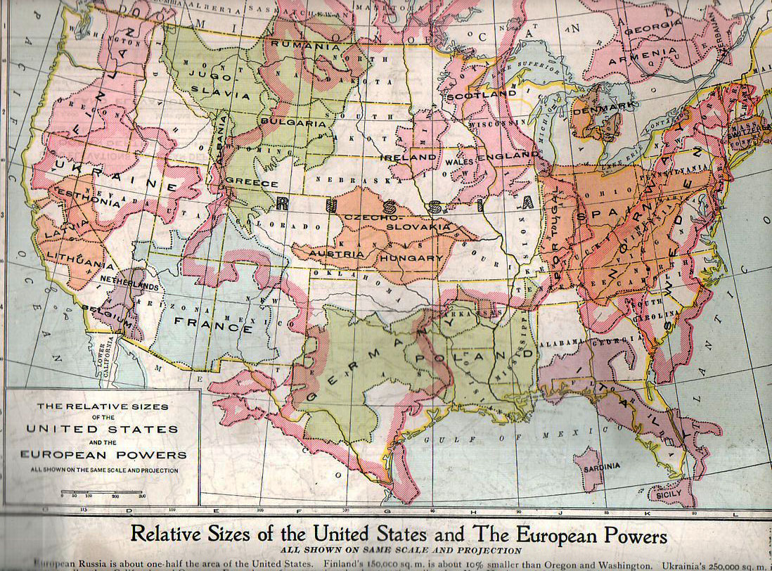
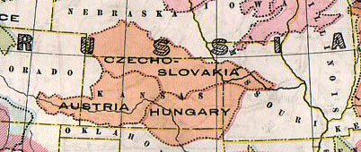
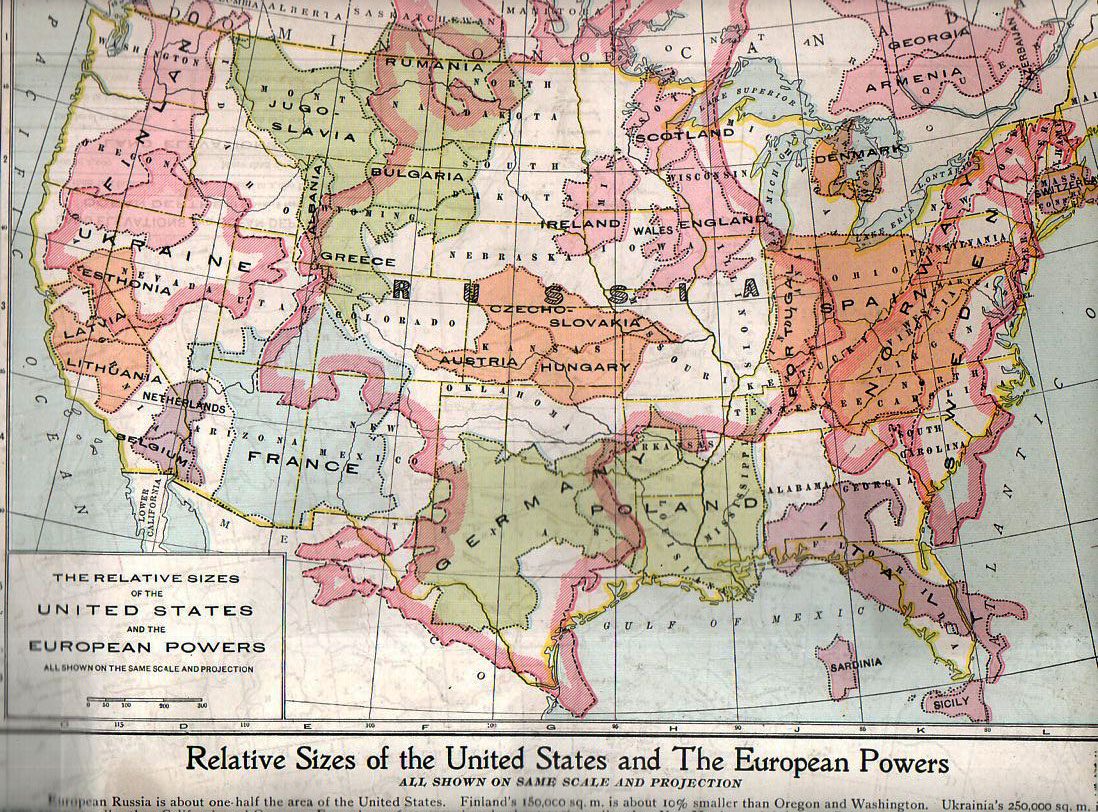
    This map, “Relative Sizes of the United States and the European Powers” was published by the People’s Handy Atlas of the World in ca. 1920,  appearing in print just a couple of  years after the map of Europe was changed by WWI.  (As a matter of fact this map very liberally used and without credit an earlier version published by the Geo. F. Cram company in their war atlas of 1914; it again appeared in the European War Book (by Canfield, published in 1917), calling on the information in this version and adding color. The People’s History also published a 1913 version of this map though I cannot find an example of it.)  Here’s the map in full:
    Thematic europe in  us782

    It really does put things into perspective, giving the reader a good, strong look at just how small some of these countries were in comparison with the United States. Many of the combatants of WWI are here–and its quite sobbering to think of the enormous casualties incurred in some countries and the very small area that those millions of dead and wounded would have taken if placed in a similar locale in the U.S.  An excellent example of this is Belgium, fitting very nicely into less than a tenth of the state California, where so much killing and suffering occurred.  Thinking of France as battlefield that was limited to about 60% of the size of the combined four states of New Mexico, Arizon, Utah and Colorado, and then thinking of most of the largest battles of WWI taking place in an area about a quarter of that is, well, incredible.  Using this as a guide, less han half the state of Colorado would’ve been the seat of the battles of Verdun (976,000 casualties), Marne (750,000), Somme (1.2 million), Cambrai (700,000) Arras (278,000), the Spring Offensive (1.5 million) and the Hundred Days Offensive (1.8 million),plus all of the rest of the action, and you get a little bit of a better idea of the bloodiness of that acreage. 

    Placing things in comparison in the same scale, side-by-side, is an excellent means of insight. 

    Casualties in World War One (taken with thanks from the site First World War

    Country Dead Wounded Missing Total
    Africa 10,000 – – 10,000
    Australia 58,150 152,170 – 210,320
    Austria-Hungary 922,000 3,600,000 855,283 5,377,283
    Belgium 44,000 450,000 – 494,000
    Britain 658,700 2,032,150 359,150 3,050,000
    Bulgaria 87,500 152,390 27,029 266,919
    Canada 56,500 149,700 – 206,200
    Caribbean 1,000 3,000 – 4,000
    France 1,359,000 4,200,000 361,650 5,920,650
    Germany 1,600,000 4,065,000 103,000 5,768,000
    Greece 5,000 21,000 1,000 27,000
    India 43,200 65,175 5,875 114,250
    Italy 689,000 959,100 – 1,424,660
    Japan 300 907 3 1,210
    Montenegro 3,000 10,000 7,000 20,000
    New Zealand 16,130 40,750 – 56,880
    Portugal 7,222 13,751 12,318 33,291
    Romania 335,706 120,000 80,000 535,706
    Russia 1,700,000 5,000,000 – 6,700,000
    Serbia 45,000 133,148 152,958 331,106
    South Africa 7,000 12,000 – 19,000
    Turkey 250,000 400,000 – 650,000
    USA 58,480 189,955 14,290 262,725


  • Blankness and Design in the Title Pages of Great Scientific Works (Part 1)

    JF Ptak Science Books   Post 1900

    As I’ve written about on this blog before, Blank, Empty, Blank and Missing Things can be of great importance.  For example, if human conversation wasn’t mostly filled with nothing, it would be difficult for us to process anything, everyone sounding like several mockingbirds calling away at once, all of the time.  Music would be difficult if there were no silent interludes. And of course since existence is made up vastly of nothingness, to have it be filled would present a, um, problem.  It also might be interesting to invent an 18th century board game based on the discovery of nothing through the ages…or maybe 16th century, when the idea of zero in mathematics was first coming into widespread use.

    My interest in Nothing today comes along with design and epochal scientific publications–or at least highly significant appearances of great ideas.  Sometimes the typography and design of the title pages of Great Works turn out to be very surprising–and sometimes that surprise in blankness is an unintentional result.  

    Also we’ll just discuss relatively recent works of the past 150 years or so. Design changes quite a bit from the 18th to the 19th century so far as scientific and technical title pages go–the earlier design (and particularly the illustrated versions) are another matter.

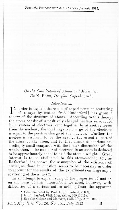
    First, the intentional bits, like this fine example of Niels Bohr’s superb introduction to the rest of the world of modern atomic theory (based upon the Rutherford model and Planck’s quantum theory),  “On the Constitution of Atoms and Molecules” (in the Philosophical Magazine for July 1913).  In this case (which actually is a three-part paper), the offprint to the publication has an upper part that is blank because it excludes the closing paragraphs of the preceding article–offprints being the separately-published and bound author’s article that were meant to be distributed privately and prior to publication of the appearance of the contribtution in the journal.  

    Blank title bohr790
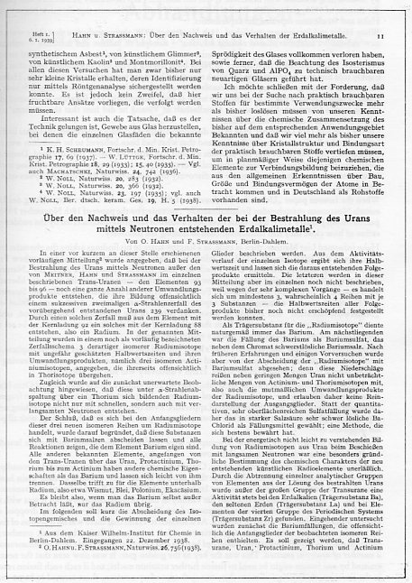
    Before I proceed though perhaps it would be interesting to see an attempt at anti-nothingness in design, which in many cases can be a work of high design art in themselves. For example, even though most of the white page is filled up, 

    Blank title hahn788
    this is still somehow quite balanced and pleasing. (Otto Hahn and Fritz Strassmann delivered a series of eleven seminal papers from 1933 to 1939, this being one of the most important, signaling the discovery of nuclear fission, an event that started its own sort of chain reaction in physicists who awoke with the sudden realization of how very doable all of this was, and how close so many other scientists were to having discovered this themselves.)

  • German Rocketry, 1920’s & 1930’s: Cover Designs

    JF Ptak Science Books   Post 1901

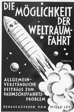
    Rockets ley794

    I’ve selected a few representatives of design for the covers of pamphlets and books published in the field of rocket development and space flight published in Germany in the 1920’s and 1930’s (with one from the 1951).  They have a certain expectant sameness them, and, as leading publications in their field, have a remarkable similarity in their (black and white) design.  The combined efforts of these works wound up in the engineering labs of Peenemuende and then int he V-1 and V-2 rockets that pulverized the United Kingdom during WWII.  Later this same expertise, and some of the same engineers, “wound up” in the United States developing the American space program.  The most famous of these Paperclipped scientists was Wernher von Braun, whose name is so intimately connected with the Vengeance Weapons as well as the Apollo space program.  It is interesting to note that for many years if twas impossible to find von Braun’s name on any exhibition description in the Air and Space Museum in D.C.–it just wasn’t there, so far as I could tell, on no displays, even though I went looking for it pretty closely.  On the 30th anniversary of the Moon landing, I went to von Braun’s grave to see if it had been remembered in any way–there wasn’t anything there, just his simple small slab, next-door to and within eyesight of a Jewish cemetery. 

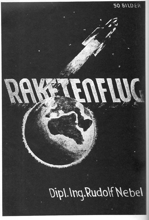
    Rudolf Nebel (1894-1978), very early member of the Raketenflugplatz, assistant to Hermann Oberth and very nearly the first to successfully conduct an experiment with a liquid-fueled rocket, beaten to the finish line by a man whose work he was not familiar with, Robert Goddard.  He defined right-wing in the Weimar era, and was part of a paramilitary organization called Stralheim; Wernher von Braun seems to have succeeded in the avenue that Nebel tried to travel along.  Nebel published this work in 1932, a year before the Nazi party came into power, and before his crotchety problems with teh SA began.

    Rocket nebel797

  • The Source that Inspired Many Copies and Imitations: The Teacher, 1496

    JF Ptak  Quick Post

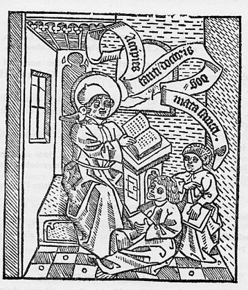
    Well, this is more properly called “the Acciples”, but for the sake of modernity we’ll keep to “the teacher”, and it is a beautifuil woodcut image has been reproduced and copied many times over the centuries.  The source for it all is Promptuarium argumentorum dialofice ordinatorum, which was printed in Cologne by Henricus Quentell in 1496.  The work is in the field of pedagogics and philology, and so the stout attention of the pupils and teacher to one another.

    Reading802

  • Housekeeping and Categories

    JF Ptak Science Books

    We’re in the midst of having a new blog site! In addition to the new big coming changes, I’ve been told for the first time how many posts are in my various categories. And that there are 6,630 images posted in the blog. 

    So, the 2,400 posts (including 1902 full-blown “posts” and nearly 500 “quick posts”) break down in the following way…some of the 96 categories are clearly just under-employed (like “Art” and “Zoomology” and “Contraries”), but that I think is my own sloppy categorization hurriedness:


    Absurdist, Unintentional (474) 
    Alphabets (14) 
    American History: Western Exploration & Native Americans (37) 
    Anticipation, History of (118) 
    Architecture and Building (123) 
    Art (32) 
    Art History (256) 
    Astronomy (68) 
    atomic and nuclear weapons (101) 

    ·Posted by :

    ·in:

  • The History of Lines #35: Complicated Text Design, 1474

    JF Ptak Science Books   Post 1902    Part of  the History of Lines series

    Rolevinck  canon
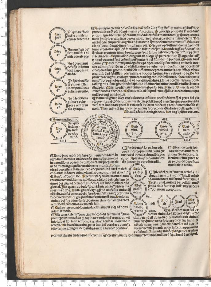
    This work was one of the early best-sellers from the time of the Incunabula, a book that went into 33 editions between 1475 and 1500, and into five different languages, and a number of different authors/annotators and publishers–a book with a very full publishing history.  The Fasiculus temporum, by Werner Rolevinck (a Monk and renowned historian at Cologne, 1425-1502), and printed originally in 1474, is an early history reaching back to the Roman times, and perhaps one of the very earliest chronological histories. It was a compendium of reaches into dim dust, histories including plagues, epidemics, diseases, monsters and other interesting bits.

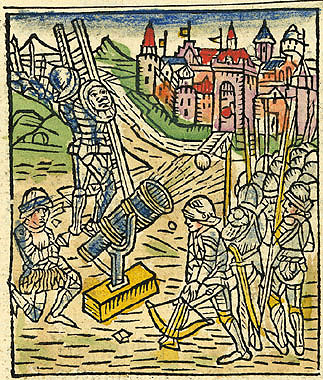
    It was also illustrated; some of the woodcuts were used several times in the course of the book; many were quite interesting. For example, the image above, showing the storming and siege of a town, features the normal allotment of soldiers, plus–extraordinarily–a cannon. 

    What brings us to the History of Lines series is that the structure of the book is very impressive–and complex.  It must have been quite a chore to set into type, as the text lines vary impressively–that, and the chronological nature of the work has text running normally, and then top-to-bottom, occasionally upside down, and then quite frequently in circles.  Anyone with any experience in letterpress printing could quickly appreciate the effort it took to put this book into print. 

    Rolevinck  text

    ·Posted by :

    ·in:

    —
  • Children in the Workforce, 1880

    JF Ptak Science Books  Quick Post

    (On discovering and photographically documenting children at work in the 1920’s and ’30’s, see here.)

    Here’s an interesting bit I just slipped into while looking for something else.

    Children at work.

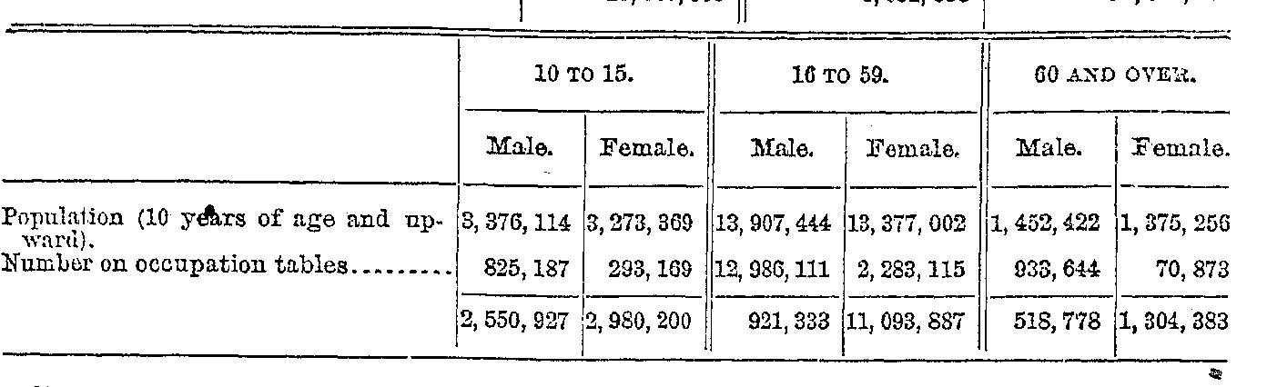
    10-15 years of age. 

    In 1880, half of the population was 10+ years old. There were 17 million people at work, and of these 1.1 million were children, making about 6% of the entire workforce.  And that’s about as truthful as we’ll ever know about that statistic–given the relatively primitive way in which these numbers were corralled, my guess is that there were considerably more children at work than this.        


    And it looks like of the total population of male children aged 10-15 (3.37 million) that 1.1 million of them–about 29%–were working, mostly it seems in the fields. 


  • Exercise in Irony: the Usually-Invisible Chinese Rail Worker and the Highly Visible Photographer, 1869

    JF Ptak Science Books   Post 1903   Part of the series on the History of Blank, Empty and Missing Things:  Chinese Rail Workers, 1869. 

    Chinese promontory

    One thing that you seldom see so juxtaposed in the photographic history of the American West are the people who were so important to it placed in proximity to those who were no well disposed to recording their existence. 

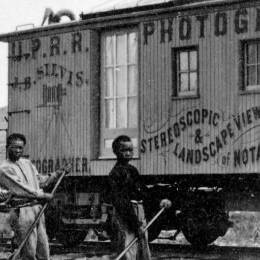
    For example:  this image by J.B. Silvis, “China Section Gang Promontory”, a photograph published as a stereocard between  1869 and 1870, shows a small group of Chinese workers setting two rails in Utah–they are the ubiquitously missing elements in historical images of transcontinental railroad construction. There were many thousands of these workers who were set to notoriously difficult tasks in bad situations and under time constraints with little liberty or pay (and not well-afforded much protection under the law), and in the history of documenting the expansion of the railroad across the West these workers are very seldom seen.

    They are set incongruously in front of a photography car that so often saw through or around them.   The  car was labeled  “U.P.R.R. Photograph J.B. Silvis Stereoscopic & Landscape Views of Notable Points on line of Pacific R.R. Always on Hand”, and I found it tempting to try to see in the photograph that it was made solely for the photographer’s advertisement, but the central placement of the workers makes a good argument against this.  On the other hand, when you look at some of the other work of Silvis documenting his railway car (see here), there are a number of group images where he gathers cowboys or Indians  or makes a photo with his car in an unusual place, he is definitely using those people and locales to establish the idea of remoteness and wildness of the places in which he was working. It seems to me that in the end, he was using the Chinese laborers as a piece of his advertising ensemble more than documenting them. Again, this is very speculative.

    It is a very unusual image which I think is knee-deep in irony. 

    I should also like to point out that most of the workers have taken care to sew  large leather patches on their breeches–that to help their thighs when pulling that heavy metal lever across their bodies while setting and moving track. 

    [All images via Denver Public Library, here.]

  • Hidden Stories in Prints–Renaissance Ladders in the Brooklyn Bridge, 1876

    JF Ptak Science Books   Post 1904

     blog 18 brooklyn bridge big707I’ve long been interested in the hidden, or the obscure, or the secondary, or the non-essential backgrounds and foreground in prints–more so at times than the subject of the print itself.  This thinking certainly applies for me nowadays when looking at another engraving of Winchester or another view of Rome or another prosaic cityscape–the main focus of the images are of course beautiful, but since I’ve seen this stuff so much my eye started wandering around to the small and inconsequential bits in the scene, and found that this is where odd richness might be.  blog 18 brooklyn bridge ladder708

    And so on to what is in my mind, at least, an iconic wood engraving
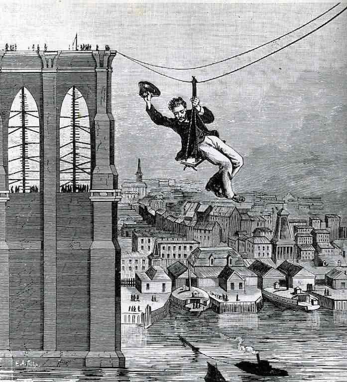
    of the half-completed* Brooklyn Bridge, showing master mechanic and chief engineer of the project E.F. (Frank) Farrington making his slidy way as the first person to cross between the two spans (on 26 August 1876). 

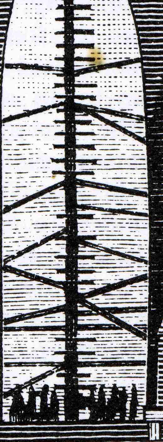
    What we see in the background of this print, on the Brooklyn-side tower, is a group of people watching Farrington, and in their midst, two gigantic, ramshackle ladders, straight out of the Renaissance.  Farrington was supposed to be showing how safe everything thing was for the workers–27 men died in the construction of the bridge, which given the times and difficulties is tragic but actually not too  bad–but I think he simply couldn’t resist the impulse of making the dangerous, wind-swept way across the river to the Manhattan side.  The ladders don’t seem to speak much to security and safety, but I guess that they worked

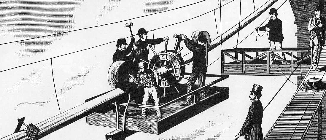
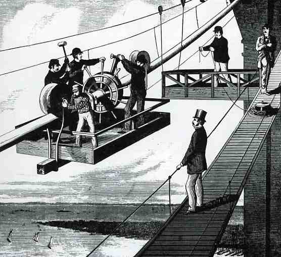
     Another interesting peep into the times is seen in this wood engraving from 1877, showing a crew working on the cables.  As much as eyewitnesses claimed that Farrington performed his stunt to exhibit the safety of the cables, looking closely at this print shows the relative danger faced by the workers.  The railing around the support car here looks more like a hindrance than a help, seemingly making it easier for a worker to trip on it, and fall into the water 300+ feet below.  

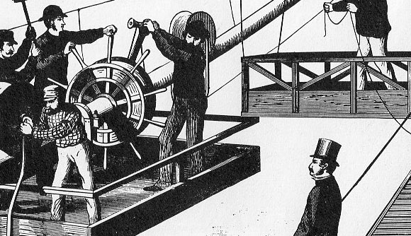
    Below-knee-level barricades surely does not make for a safety fence–it is very probably anti-safety.  That said, if you look closely at the man on the extreme right, he seems to be sitting on the safety cable, leg up, nonchalant, watching the application of the cable. Tempting fate.


    Banner brooklyn const805

    And the detail:

    Banner brooklyn cons editedt805_edited-1

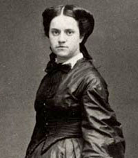
    I guess though that the most hidden aspect of the building of the Brooklyn Bridge was the identity of the chief and overriding builder:  Mrs. Emily Roebling.

    It turns out that the original designer for the bridge, John Roebling, was killed early on in an explosion and was replaced by his son, Washington, who in turn (in 1871) was terrifically incapacitated; Washington was ‘aided” by his wife Emily (1843-1903), who became the most recognizable spokesperson and sub rosa engineer of record.  She was supposed to be assisting Washington, but it was far more so than that.  Probably it was an inappropriate time for society in general to believe that a woman was capable of supervising the construction of the world’s longest suspension bridge.

    “The work which is most likely to become our most durable monument, and
    to convey some knowledge of us to the most remote posterity, is a work
    of bare utility; not a shrine, not a fortress, not a palace, but a
    bridge.” Emily_roebling– Harper’s Weekly (1883) 

    *The bridge was about half-way done, following the construction beginning in 1870 and its opening in 1883.

  • Artistic Comparative Display of Quantitative Data–Winning the Battle of the Atlantic by Flying Over It

    JF Ptak Science Books   Quick Post    

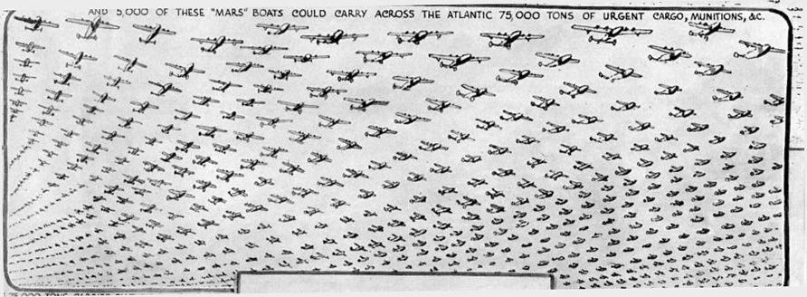
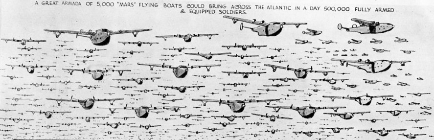
    I simply love infographics like this—especially big skies filled with airplanes.  I’ve written about other similar descriptions of sky-filled aircraft here.

    Brit troop carriers729
    In October 1942 the war was shifting to the way of the Allies–the United States had come into the fight ten months earlier, Operation Barbarossa (begun in June 1941) was at this time being recognized as a complete failure (though the operation would continue on for two more years, costing 5 million German army lives, 20 million Soviet civilian lives, and 9 million Soviet army lives and more when all was said and done), and American military production was very well underway and unbeatable, and so on. The Battle of the Atlantic however was still very much underway, with action returned their, again, during the summer and autumn of 1942. 

    Brit troop carriers728
    One way of defeating the U-Boot was to not sail the Atlantic much at all, and flying troops and supplies above it.  As we can see in this compelling graphic from The Illustrated London News of 17 October 1942, the editors of that magazine made a case for the Mars flying boat.  It was a theoretical case, as the 5,000 Mars planes depicted in the graphic never materialized–actually, it seems as though only seven were made. 

    But the case looked very compelling.

  • Bad Idea Department: F Lloyd Wright and the Goodness of the Bombing of Britain

    JF Ptak Science Books  Post 1866  

    [I’ve written earlier on a related and very bad idea, Atomurbia, for atom-bomb-proofing American cities, here.]

    Reading Nicholson Baker’s Human Smoke I found a set of very unflattering and semi-unbelievable quotes from the unpretty Frank Lloyd Wright.  Present at a MoMA exhibition he was sharing with D.W. Griffith (detailed in the publication Two Great Americans published by the museum in 1940), Wright chose the background of the Battle of Britain, in which German bombs were falling on English cities killing thousands, to promote his city design idea of Broadacre (among other things).

    In development since 1932 (appearing in his book The Disappearing City) and kept on until his death in 1959, Wright’s idea for city /suburban development spread a “city” ti its limits, nearly stripping it of its citiness and expanding it towards the horizon in a wide and low wave of a complete suburbia.  With this, Wright must have reasoned, Broadacre City must have seemed “bomb-proof” compared to the normal concept of the city, and decided to make the best of a horrible situation to promote his idea.

    And with this, he was quoted in November 1940 in the New York Times, saying:

    “I would not say that the bombing of Europe is not a blessing, because at least it will give the architects there a chance to start all over again”

    To say that this was an idea best left to the imagination rather than in the pages of the Paper of Record goes without saying.

    And what of the architects whose buildings were lost during the Blitz?  Say, like Christopher Wren?

    “I don’t think that anyone will miss Wren’s work very much” (This, and the quote above, found in Baker, page 248.)

    I’ve had a problem with Wright for a long time, but had never bumped into this part of his thinking before.

    [Wright’s wrongs on the Bombing of Britain are also recorded in Peter Shedd Reed (ed), The Show to End All Shows: Frank Lloyd Wright and The Museum of Modern Art, 1940 (MoMA 2004, here), and here, in the Milwaukee Journal for 22 June 1941, and also in the News Chronicle of London in”How I would Rebuild London”]


Recent Posts

Archives

Categories