A Daily History of Holes, Dots, Lines, Science, History, Math, Physics, Art, the Unintentional Absurd, Architecture, Maps, Data Visualization, Blank and Missing Things, and so on. |1.6 million words, 7500 images, 4.9 million hits| Press & appearances in The Times, Le Figaro, Mensa, The Economist, The Guardian, Discovery News, Slate, Le Monde, Sci American Blogs, Le Pont, and many other places… 5000+ total posts since 2008.

  • Food Bomb, 1942

    JF Ptak Science Books  Post 285
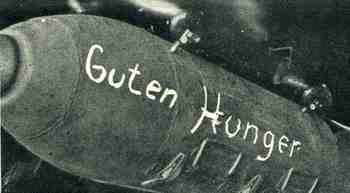
    1ebay_sept_30food_bomb694 In an earlier post (The Most LIterary Fireworks Catalog Ever Published?  The Naming of Explosions) I wrote a little bit about names found on shells and the naming of explosions.  The chances for adding to this category are slim, given the ephemeral nature of the item of discussion–I did however stumble upon this Food Bomb, found in the 25 April 1942 issue of The Illustrated London News.  “Guten Hunger”, the inscription on this “bomb”  (basically “good appetite” or “eat well” or “down the hatch”) was actually “not a weapon of destruction, but an enormous food container” that was going to be dropped on the German soldiers on some slender part of the Eastern Front.  In April the situation was turning now away for the Germans with the Soviet counter offensive, and it was still cold. Something like 3 million German soldiers would be awarded the service medal for the Winterschlacht im Osten 1941/42–not many of them would get to look at it after 1945.   The campaign in the east against their former allies started on 7 June 1941 (and named variously die Ostfront 1941-1945, der Rußlandfeldzug 1941-1945 (Russian campaign) or der Ostfeldzug 1941-1945 (Eastern Campaign)) and lasted to mid-May, 1945, when the campaign line shrunk from as far away as Moscow back down to east Berlin. 
    ·Posted by :

    ·in:

    —
  • Found Images: Carrying Baby Coffins at London Stone?

    JF Ptak Science Books Post 286

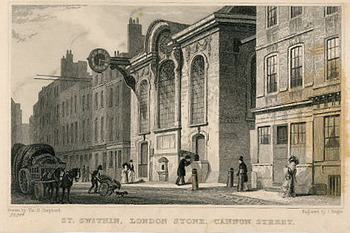
      This image has always been a little troubling to me, and one that I’ve never figured out.  Unfortunately I cannot now find the original to get a better, deeper scan of the curious object being carried by the oldish man in the center of the picture. This is another in a series of generic topographic prints of famous churches/buildings/streets and so on, decorated with figures some of whom are just going about their daily days as well as others who are quirkily adventurous–but those quirky actions are most often buried in the smallness of their representation. sometimes almost to small to see, especially considering that they are just there for scale.

    File0760saved

    File0760saved_detailLooking at this image of St. Swithin’s* and the London Stone, even a quick, noncommittal  look at the people filling up the foreground reveals this most unusual character with an uncommon box, right there at stage-center.
    I make this out to be a child’s coffin, largely because I want it to be for the sake of the print and also because there aren’t many other easy, logical choices.  I remember it looking even more so in the original under 20X magnification, with the figure carrying it buckling slightly from more than just the weight of the box he was bearing.  What else could be in there?  A big set of engineer’s scales?  A precision pantograph?  Legs?  I don’t know–its kind of too big and bulky to be a carrier for everyday work material, as tools filing the box would make it too hard to hoist to the shoulder. The figure seems sad somehow rather than burden, and the question, again, as in the other posts dealing with this subject matter, is why the artist bothered with some a complicated figure to simply people-up the street at St. Swithin.  Did the artist  or engraver just suffer the loss of a child and is displaying their grief, or is it a reminder of the dance of grim death just outside the doors of the church door?  Or is it just some guy carrying a heavy box filled with table scraps? 

    * The famous “London Stone”, a solid block of oolite such as used by the Romans in their buildings, is set in a large stone case,     protected by an iron grille, and let into the wall on Cannon Street. It originally stood on the south side of the street opposite St Swithin’s Church until it was moved and set  into the wall of the church itself (in 1798). According to Camden, it was a Milliarium or  Milestone from which the British high roads radiated, and from which the distance on them was reckoned, similar to the one in the forum at Rome (16th Street in Washington D.C., once upon a time named Meridian Strete, was also supposed to perform this chore.  Meridian Hill Park, now renamed Malcolm X  Park, is about all that is left of that idea. And it seems like a good notion lost  now that the rest of the world isn’t setting their timepieces to an imaginary line running right through a big desk in an oval office at 1600 Pennsylvania Ave.)

  • The Beauty of Drill Bits in the Dark Days of 1918

    JF Ptak Science Books  Post 287

    1ebay_sept_30drill_bit697

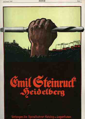
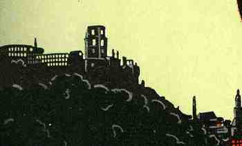
     This striking ad for Emil Steinrurck’s drill bit manufacturing company (Verlangen Sie Spiralbohrer-Katalog und Lagerlisten) appeared in the magazine Motor for July/.August 1918, just a few months away from the German defeat in WWI.  Steinruck’s Heidelberg business was making some massive, industrial  drill bits is all I can say, and they had a designer and artist who figured out exactly how to relate this to the motorheads reading this magazine–all care being taken and monies spent just as the guns of August turned into the corrupted plougshares of November.  What self-respecting machinist wouldn’t, or couldn’t, appreciate the beauty and depth of this thing even if a rusty old railway car was waiting just minutes in the future to spirit away the immediate future of Europe?  The small detail (of the factories and whatever weirdly empty buildings there were in the background) were miniature works in themselves.1ebay_sept_30drill_bit_detail698


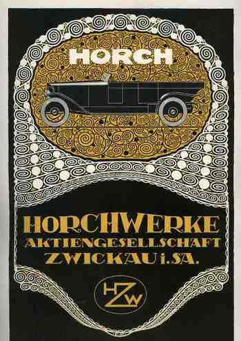
    On the other hand, on the back of this full page ad appears another–a frilly, high-nouveau-y grillwork ad for the Horch automobile, forming the other representative book end to the manufacturing process.  Horch began producing 4.5 hp automobiles as early as 1901, and by 1918 had improve and upgraded to produce high-end luxury automobiles. I can’t determine what exact model of Horch this is in the ad, but I can tell that it is massive, with a tremendous wheelbase.  (Horch would merge/found Audi in 1932 and meet its fate in Allied bombing raids during the war.  It survived but in the hands of the Soviets who used the machinery to produce the Yugo-like Trabant (Trabbi”) sub-compact “car”. I guess that the artwork is sorta beautiful in its way. 
    1ebay_sept_30drill_bit_detail699

    1ebay_sept_30drill_bit_detail700

  • “Irreplaceables” of Industry: the Grindstone, 1866

    JF Ptak Science Books LLC Post 218

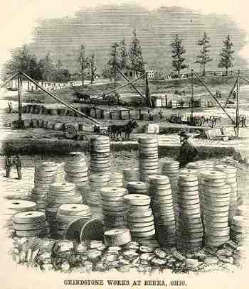
    When we think today of irreplaceable aspects of technical society
    electricity and petroleum loom large as the juice of progress.  These
    “irreplaceables” have hanged greatly over time, with perhaps one of the
    most benign being the simple grindstone.  These images (below) from The Scientific American of 7 April 1866 show
    work at the quarry of F.M. Stearns & Co. of Cuyahuga County, Ohio
    (near Cleveland), and located n the Cleveland, Columbus &
    Cincinnati Railroad.  These round disks were cut out of the earth here
    in 2 foot and 200 foot (long) sections which were 6 inches and 6 feet
    thick.  The grindstone was an absolute necessity in just about every
    corner of commerce, almost all of which is gone or replaced, today.
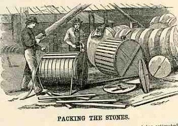
    What really gave me pause wasn’t the image of the quarrying of the
    stones or the cutting of their eyes or their shaping–it was the
    packaging.  How awesome is it to think of packing up ten 400-pounders into a wooden barrel?  A barrel full of grindstones, one after the other, filling a railway car, with car after call of them, sending them out into the country in their dense inertness. I can just about smell the Progress in those cars.
    fBlogaugust_25_grindstone448                                                                                                                     

    Blogaugust_25_grindstone_packing449

    ·Posted by :

    ·in:

  • Opium Warehouses, 1851

    JF Ptak Science Books LLC  Post 219

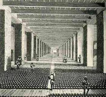
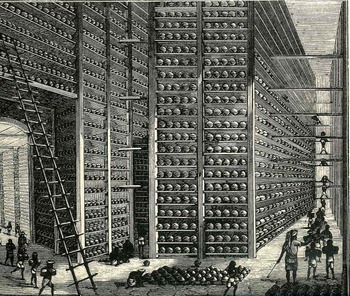
    In general, when looking at these two images we know that we are looking at ALOT of something; when that “something” is opium, it just seems like a whole lot more.  And this whole lot more is exactly that, drawn by Walter S. Sherwill (a Bengal Army Revenue Surveyor, 1815-1890, and published by The Scientific American on 29 July 1882)–these are the warehouses at the Patna opium factory in Bengal as they were in 1851. (The original drawings were published as Illustrations of the Mode of Preparing the Indian 
    Opium Intended for the Chinese Market,
    published by J. Madden in London.)  And that would be the government-controlled warehouses for the state crop, showing some of the 12,000,000 pounds of “poppy juice”  produced yearly in that district, this part intended for the captive Chinese audience, which brought to that country war(s), peonage, a ruined economy and  vast addiction.                                                                                          
    Blogaugust_25_opium_long445

    cvcvcv
    cvcvc
    cv
    Blogaugust_25_opium_long3_ladder447

    ·Posted by :

    ·in:

  • Nazi Propaganda: Scare Tactics in a Hearts and Minds Campaign, 1940

    JF Ptak Science Books   Post 220

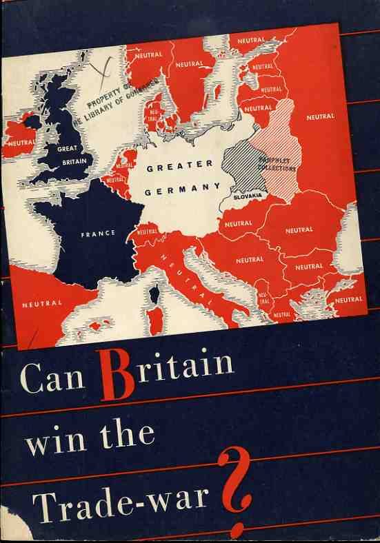
    The Nazi propaganda office published this effort (printed in August 1940) with every intent of making it seem as though it was produced in the U.K. as a sober reconsideration of fighting against the Germans, casting much of the argument in terms of economics. It was a relatively soft-sell effort in a hearts-and-minds campaign, hitting its target audience with reminders of how alone everyone on the British Isles were in the hard summer of 1940. 
                                                                   
    Nazi Propaganda Map  Can Britain win trade war


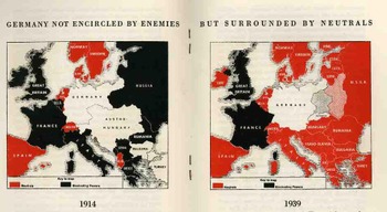
    These two maps compare the economic and trade situation of 1914 and 1939, from the Nazi perspective.  In 1914, the British, “as a preliminary condition for the success of the hunger-Blockade, only achieved, however after four years if struggle during which Britain was to sustain heavy losses”.   They announce with exclamation (!) that for 1939 there was:

    “a totally different situation! The encirclement of Germany miscarries, leaving way for the expansion of Germany, and the way for her trade with neutral countries, especially with the Balkans and Russia…thus is the blockade against Germany a hopeless enterprise”.   

    The Nazis’ state that “Britain…energetically refuses to admit the hopelessness of her winning this trade war and tenaciously grasps upon all kinds of unfounded rumours…”, all the while refusing to discus the bombing of Britain or any other aspect of military war

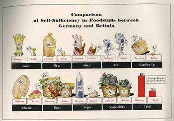
    Blogaugust_26_nazi_prop_2_map450                                                                                                                                                           After a dozen pages of making the case against the British position in being able to take care of itself, there is this folding quantitative display, making a diametrical-pictorial presentation of the British failings.  The Nazis show that they overpower the British in the ability to supply itself with grain, flour, meat, cooking fat, cheese, eggs, sugar and vegetables–in every area, in fact, except for fish. 
    Blogaugust_26_nazi_prop_food454

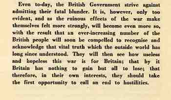
    This is the summation of the pamphlet, the last paragraph, asking the Brits to just give it up and quit their fight. 

    Blogaugust_26_nazi_prop_text452

  • Blank and Missing People and Things Part 10: Fat Embarassment

    JF Ptak Science Books  Post 221

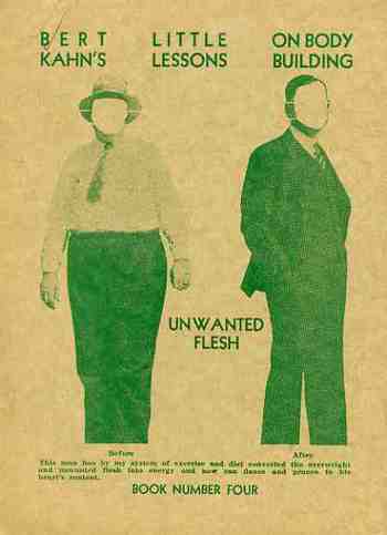
    The newest entry in the continuing series of Blank and Missing Things and People  is an odd, removed little pamphlet by a former wrestling champion on the attack on unwanted flesh.  (I’ve come across this unusual phrase a number of times now:  “unwanted flesh”, doesn’t exactly roll off the tongue…)  It was published in 1933 and tried to convince its readers that one can “never be too fat to reduce”.  It certainly singles out married women as a new and lucrative market:  “most fat women are married and of middle age and the latest and most approved method of taking flesh off the human form is by means of well regulated physical culture exercise…”   He states:  “the plump woman is out of style”.  In any event I was attracted to the pamphlet for its culture and the two faceless men waiting for an identity…
    Blogaugust_26_missing455

  • Graffiti and Prison Technology ca. 1800

    JF Ptak Science Books   Post 222

    Bloggraffiti
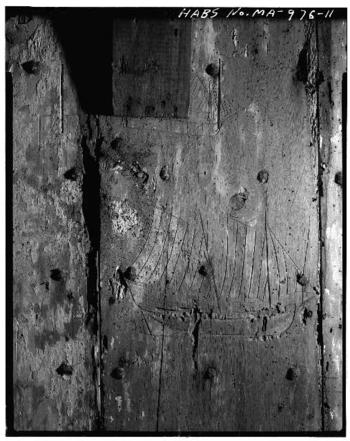
    Here’s a compelling vignette on two sides of the same door.  It comes in two images from the Historic American Building Survey and are of the  Old Jail (built in 1690 and located on State Route 6A & Old Jail Lane) of Barnstable, Massachusetts.  What is so shocking to me is the graffiti of an American schooner picking its way through a sea of tapered nails on the bad side of the door.  It is just heartbreaking (if you can remove from your mind whatever offense this fellow was in jail for) to think of someone scratching away at something this personal on what looks like massive, first-growth, very hard hardwood:  and certainly within smelling distance of the water. 

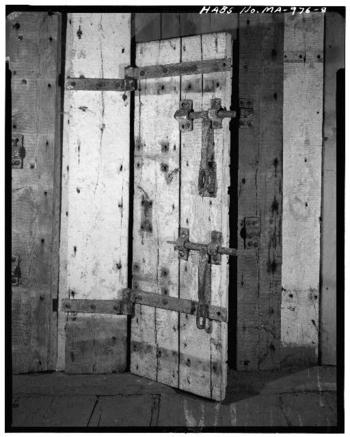
    Seeing the picture below gives a better idea of the primitive weight of the door and the impossibility of getting away from what seemed essentially to be a windowless room of tight two-inch thick hardwood.  If you’ve ever been in an old New England barn in June you would have found that the place could still be cold inside–and not a simple cold, either, but a bone-breaking cold.. This jail must’ve been pretty inhospitable in the winter, what with the wet windy northers and the frozen mist coming in from Barnstable Harbor.  It just plain wouldn’t have been good.

    The other–good–side of the door, and the better place to be, if you had to be in that building:

    Bloggraffiti_other_side

    ·Posted by :

    ·in:

  • Chemical Warfare Architecture: Dugway Proving Ground’s German and Japanese Villages

    JF Ptak Science Books  Post 223

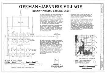
    Dugway Provong Grounds (DPG) was selected in 1943 to test all manner of toxic agents and their antidotes, chemical dispersal systems and the nasty chemical that they would spray, the horrendous and effective (and new-ish) flamethrower and other allied bits. It was established way up in the northwest corner of Utah, in the Great Desert Basin and part of the Bonneville Salt Flats—a very tough, isolated, severe environment for being in the continental U.S., sitting where the waters of the freshwater  Pleistocene  Lake Bonneville used to lap up.  It was at Granite Peak in  DPG that biological warfare weapons were tested until that aspect of research was phased out at the end of the war in August 1946, which is the origin for these architectural plans for test combatant towns.  It seems to me that these buildings were built for offensive purposes for the chemical warfare division, and primarily (?) concerned with the effects of different sorts of incendiaries against typical German and Japanese structures.  i’m not sure that I’ve seen these images before. 

    DPG continues today to research chemical dispersal and micro environments, as well as toxins, pathogens and chemical agents; it also tests the reliability and survivability of military hardware subjected to biological and chemical attack—it is still a major facility and still does very major stuff.  DPG is also a bizarre grail of some sort for the UFO people. 

    Atomic_bomb_german_jap_text


    Atomic_bomb_german_jap_text2

    ·Posted by :

    ·in:

    —
  • Atomic Bomb–Historic American Building Survey, Trinity Site

    JF Ptak Science Books  Post 224

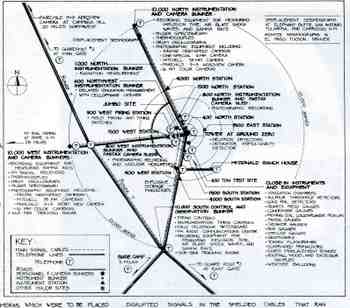
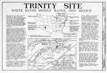
    I just came across these engineering drawings for a detailed survey of the Trinity Site in New Mexico,  location of the first detonation of an atomic bomb (16 July 1945).  The work was completed by Rossana Santos for the DARCOM Recording Project as part of the American Historic Building Survey (Historic American Engineering Record NM-1-B, Department of the Interior).  There are a number of interesting renderings, but the most useful (and scarcest) is the map showing the location of bunkers and instrumentation for the 16 July event. (Click on the images to enlarge.)  This series of drawings pretty much speak for themselves. 
    Blogaugust_27_trinity_map2466


    Blogaugust_27_trinity_1461

    ·Posted by :

    ·in:

  • Book Design–The Weight of Humanity on Book Covers

    JF Ptak Science Books  Post 225

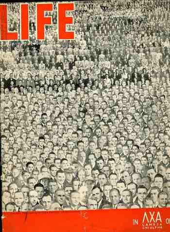
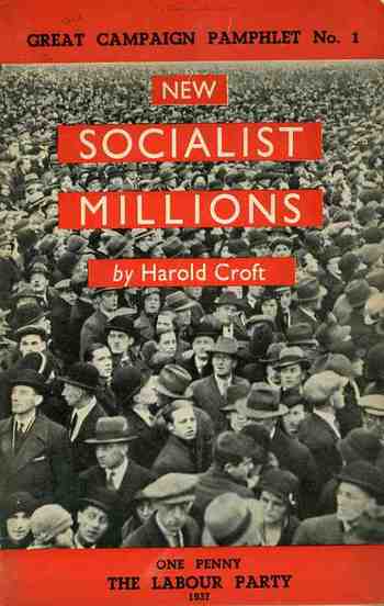
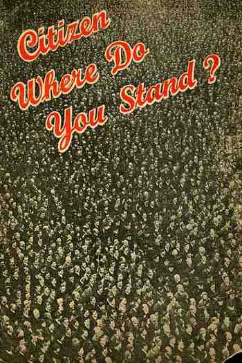
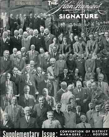
    I don’t often see covers of pamphlets featuring hundreds–or thousands–of people as a part of the design.  In my continuing role as finder and re-finder of things found I have re-surfaced four of these designs, and I feel I should post them before they’re captured in the un-finding process.  Again. Back to the design:  these are very striking, persuasive images, unavoidable in many ways, completely intriguing, beguiling.  People just have to look at these things.  Look:  I made a little experiment today placing ten  very interestingly-designed pamphlets on display, all with compelling and distinct merits, and including one with a big spread of humanity on the cover (the “Life” pamphlet. The very unscientific results is that people were generally first drawn to the complex people image, and stayed longer looking at it–by far–than any other image.  Perhaps its the same sort of reaction going on when you watch people walking in front of a mirror or reflective surface, with the vast majority of folks checking themselves out in it.  Maybe its just people looking for something familiar.  Maybe the faces are simply, strictly more interesting than just points o the page.  I’m not sure. 

    The first image is Life, the story of the fraternity lamda chi alpha, published around 1935; second, a one penny Labour Party publication coming from the National Executive Committee of the Labour Party, published in London in 1937; third, a program for the Liberal Party, published in London in c. 1938; lastly, fourth, a program for some course of semi-statistical study with the John Hancock life insurance company.  These beautiful designs were much more interesting than the very casual contents they covered. 

    Blogaugust_27_crowds_life459

    Blogaugust_27_crowds_socialist_mil4     

    Blogaugust_27_crowds_stand456


    Blogaugust_27_crowds_hancock460

Recent Posts

Archives

Categories