A Daily History of Holes, Dots, Lines, Science, History, Math, Physics, Art, the Unintentional Absurd, Architecture, Maps, Data Visualization, Blank and Missing Things, and so on. |1.6 million words, 7500 images, 4.9 million hits| Press & appearances in The Times, Le Figaro, Mensa, The Economist, The Guardian, Discovery News, Slate, Le Monde, Sci American Blogs, Le Pont, and many other places… 5000+ total posts since 2008.

  • Really, Really Big Plans: Filling in the East River and Parts of NYC Bay, 1911-1916

    JF Ptak Science Books   Post 1470

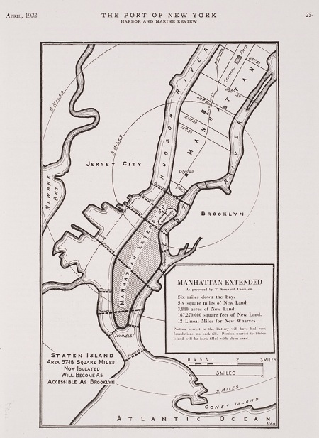
    Last week I wrote a post on  Herman Soergel’s  plan for extending the landmass of the countries around the Mediterranean Sea by damming the straits of Gibraltar, lowering the sea and irrigating the Sahara–an original, interesting but not very good idea, filled with briney cultivation and racial politics. In the past on this blog I’ve written about other city plans–and in particular, for New York City–that have involved floating Manhattan into the harbor, or filling up large chunks of the Narrows, or floating the city on an enormous anti-gravity platform, and so on. Some of those plans were real, some science fiction, and some were plainly beyond both.  The plan presented above is another monster, but at least this one could work, if not for the doing of it, and the expense. And the will.
    NYC Really Big
    But the bottom line, according to the engineer doing the thinking on this project, Kennard Thomson, would supposedly net the city a cool billion dollars after everything was said and done, and that would be 1916 dollars–that was equal to about 5% of the American GDP (!) in 1916, which would be about $400 billion in terms of 2010 GDP.  I’m not sure how Thomson came up with this very big/very round number, though it must have been done for effect–I can just imagine him standing before a smokey room filled with civil engineers talking about his massive plan for enlarging NYC and throwing out the billion-dollar figure, watching the cigars glow red in exhaled disbelief.

    Thomson did know what he was talking about–he was a busy (and “leading” according to the NYT) Manhattan civil engineer of stature, working on the Canal Barge and being the principal engineer for the Municipal and Singer buildings, for example–and his project seems to be well within the scope of possibility.  Their sensical aspects however are, well, questionable. 

    Here’s the story–around 1911, while examining proposals to repair and extend New York’s wharves, Thomson came upon the idea–a magnificent, fabulous idea–of adding new wharves by adding new lands to the city.  In short, the overall plan was to fill in the East River (!!) and reclaim the new land for city living,  dam Hell Gate,  construct a New East River (from Flushing to Jamaica Bay),  extend the tip of Manhattan Island from the Battery to within a quarter-mile of Staten Island (!), create a new 40-square-mile island between Sandy Hook and Staten Island, extend the Jersey shoreline, add two new Manhattan-sized appendages to the east shore of Staten Island, and more.  All of this would be connected by various new bridges and roads and tunnels, as well as a 6-track elevated railway that would circumnavigate the city.  The purpose of all of this would be to add 100 miles of new docks, an enormous amount (“50 square miles of reclaimed land”) of new land and the capacity for NYC to house 20+ million people, all of which would be worth a billion dollars. 

    Thomson really meant “really” in the title for the proposal. There have been reclamation projects undertaken in New York Bay since then of course, and I think that virtually all of what Thomson talked about could be done.  I think it would be a very interesting project for a class of some sort to undertake an estimation of what such a thing would cost today (and I would guess to duplicate the idea in real terms now would take up a sizable chunk of the GDP).  Maybe all of this will make sense at some more future point. 
  • Backwards Atlas?

    JF Ptak Science Books   Quick Post

      Atlas470
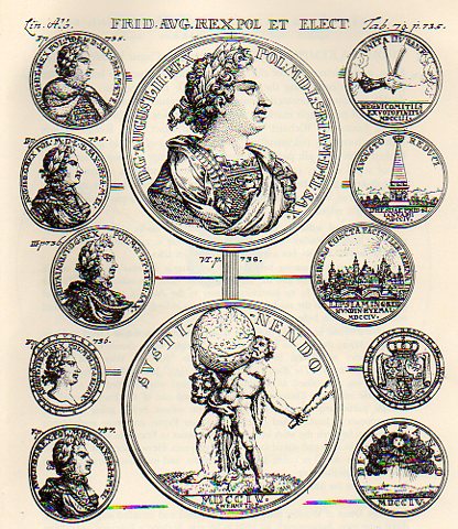
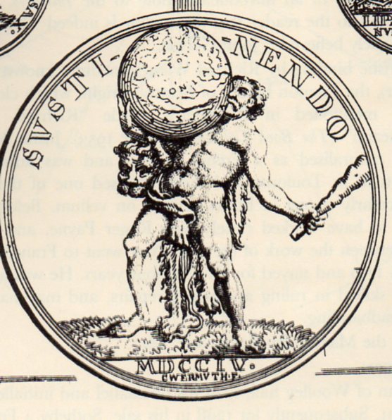
    I found a rather unusual image in this sniffy but no doubt very useful book on heraldry.  On the reverse side of a medal shown below (“Augustus II D.G. Rex Pol M. D Lit. D. Sax. I.C.M.A.”, or declouded it is August II, D.G., King of Poland, Grand Duke of Lithuania, Duke of Saxony, Julich, Cleves, Berg, Angria, and Westphalia) we see a compromised image of Hercules, the only time that I can remember seeing him balancing the sphere on his chest.  It looks very uncomfortable. 

    Atlas469

    Originally Atlas was supporting a sphere representing the sky, a punishment that he stand on the Earth and support the Heavens so that the two did not meet.  Over modern time Atlas has been given a new burden to bear, and generally it is that of the Earth rather than all creation. 

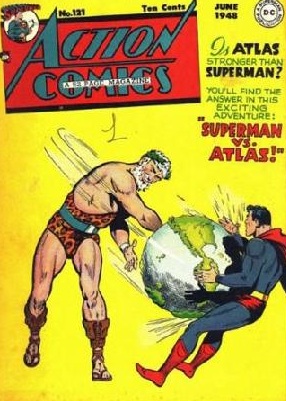
    Of course if we went looking a little further to see what else Atlas might be doing with his burden, there is the following:

    Atlas
    where for ten cents it would have been possible to see the outcome of this epic battle; but since I can’t spend the ten cents here, we’ll never know.  It is interesting to see the representations of the mountains on the globe–given their bumpiness I’d say that their scale would relate to those peaks being 50 miles high.

    And just for the sake of it “Atlas” became associated with a colletion of maps bound in a volume in  Antonio Lafreri’s  Tavole Moderne Di Geografia De La Maggior Parte Del Mondo Di Diversi Autori (1572) not because he employed the word first, but rather because he used an image of Atlas on the book’s title page–the first use of he word comes a little later in the work of Gerald Mercator. 


  • Black Soils of the Renaissance (from the Things-out-of-Place Department)

    JF Ptak Science Books   Post 1471

    It is interesting to see things as they aren’t, particularly when the time things were being what they weren’t was a long time ago.  An example of this appears in an earlier post here about the use of red skies in Renaissance painting, which was something completely unexpected to me, a spectacular use of beauty found in an alternatively beautiful place, a reminder of why it looks so odd to us to see a clock running backwards.

    Why does a clock run clockwise, anyway?  It seems to me that most other things that go ’round seem to do so “counter clockwise”, and seeing a clockface with the hands sweeping themselves backwards ticking off the minutes and hours seems antithetcal, even though the same function is being performed–its just happening in a slightly different manner. 

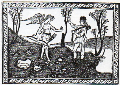
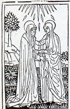
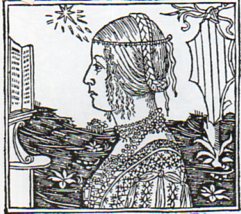
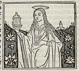
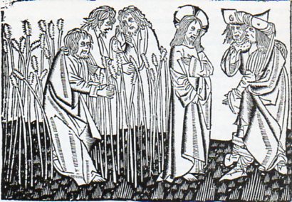
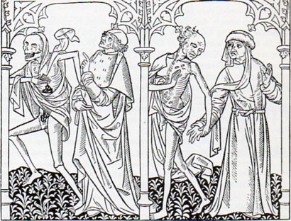
    And so to the question of the ground.  If skies can be red, why not the ground black?  Especially in wood engravings that are 500 years old?  No reason for it not to be so, especially when you’re working in black ink and nothing else but the suggestion of open, unused white spaces, with no midtones.  And once you think about it a little, the use of black as a ground color makes perfect sense, differentiating it from the sky. Its just that we don’t think of the ground in that way, and so when it appears it seems quite out of place its a bit of a shock–but then we get over it, nearly instantly. And so the fortress of normalcy fails.

    Here’s a few examples of Black Soils of the Renaissance.

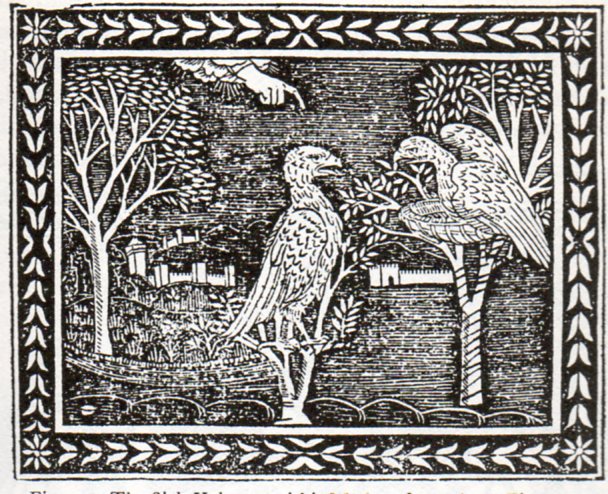
    “The Sick Vulture and his Mother”, from Aesop,  Vita Esopi, printed in Florence, 1508:

    Black soil 1471
    “Christ entering Jerusalem”, from Bonaventura, Meditazioni sopra la Passione, printed in Florence, about 1494.

    Black soil 2472
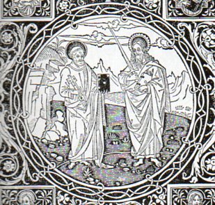
    Detail of the frontispiece to Epistolo e Evangelii, printed in Florence in 1495:

    Black soil 3473
    Frontispiece to Frederico  Frezzi, Il Quadriregio, printed in Florence, 1508:

    Black soil 4474
    Christophoro Landinus, Formulario di Epistole, “The Visitation”, Bologna, 1485:

    Black soil 5475

    “Damisella Trivulzia”, image from Giacomo Filippo Foresti, De Claris Mulieribus, printed in Ferrara, 1497

    Black soil 5476 Black soil
    Ludolphus de Saxonus, Levenons Heeren, “Disciples Plucking the Ears of Corn”, printed in Delft, 1488.

    Black soil 5477

    The Danse Macbre des Hommes, printed in Paris by Couteau and Menard, showing Death visiting the astrologer and the bourgeoise, 1492. 

    Black soil 5478
    There are no doubt many more, but these willl do for now.

    Did anyone mention the Solids in Uccello?


    ·Posted by :

    ·in:

    — —
  • Archaeology of Bombing, 1913

    JF Ptak Science Books   Post 1472

    This is another in a longish series of posts on this blog on the archaeology of bombing, aerial bombing, and today’s installment comes from its earliest period.  The first air assault belongs to the Italians, who used the weapons from the air in bombing Tripoli in 1911, which they also found to be within the defensible scope of international law, even when used against a noncombatant population (which came on the heals of the Italian army’s massacre of civilians there).  Bombing from the air had happened earlier of course, but also entirely in fiction:  for example, Jules Verne bombed civilians in The Flight of Engineer Roburs (1886), and H.G. Wells had New York City in flames in The War in the Air (1908).

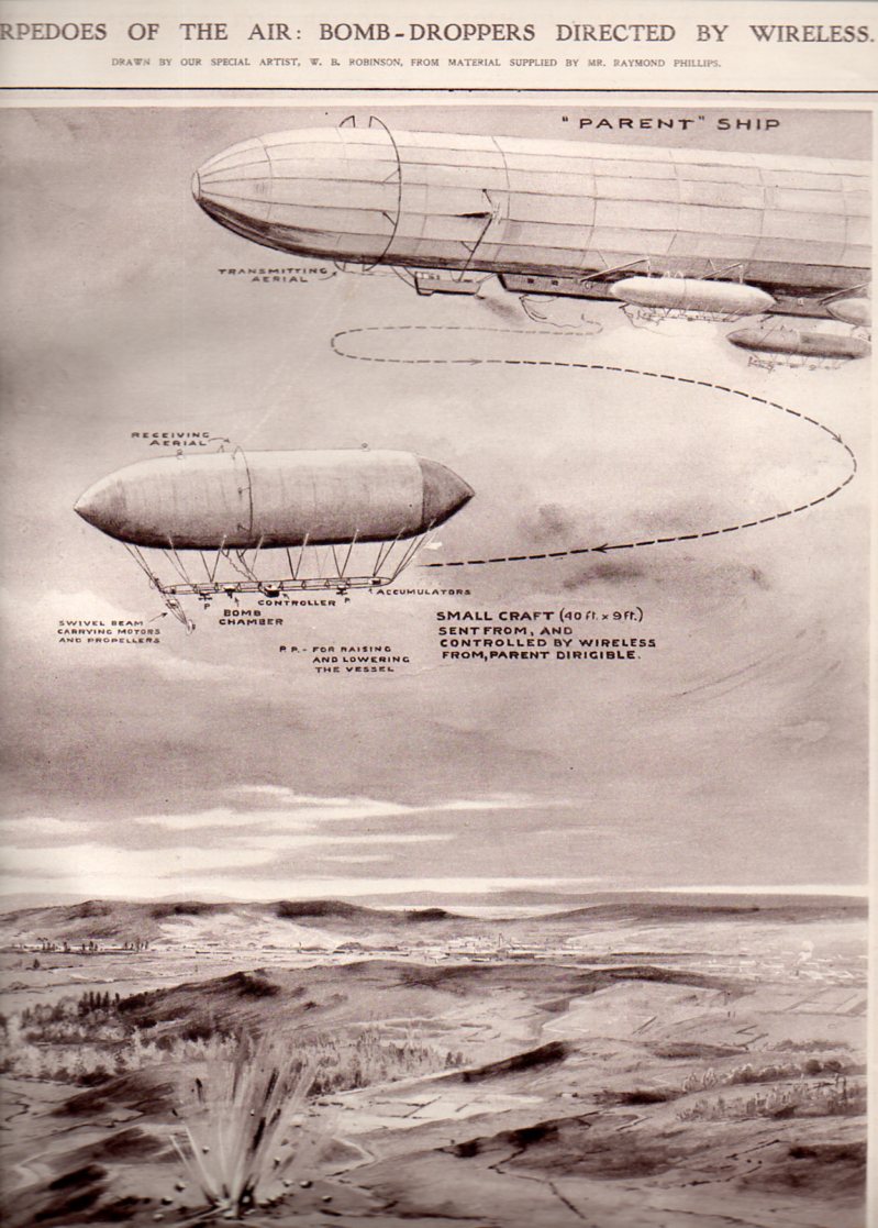
    “Torpedoes of the Air:  Bomb-Droppers Directed by Wireless”, a graphical story that appeared in The Illustrated London News on 6 September 1913, and drawn by W.B. Robinson, describes a sort of two-tier remote controlled aerial bombing arrangement of dirigibles.  The “parent” ship hosts a number of smaller dirigibles which are radio-controlled elements sent in to do the actual bombing, which allows for no human interaction with dropping the bombs and exposes only materiel to enemy fire.  (I should point out that each one of these early drones were 40′ long, making the parent dirigible something like 400′ in length if we are seeing about half of it in the illustration, and enabling the thing to carry perhaps 10 of these remote controlled units.  This dirigible would have been about as big as the monster Zeppelin LZ1.)

    Dirigibl e torpedoes481

    And this two years after this remarkable graphical display:

    Info display dreadnought237

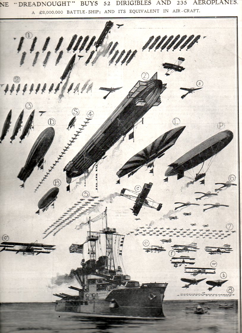
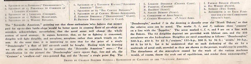
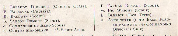
    There’s nothing quite so satisfying as seeing a representation of quantitative data like this where the graphical displays are flying.  “One Dreadnought Buys 52 Dirigibles and 235 Aeroplanes” is a full-page diagram appearing in the 3 June 1911 , making a very strong point that in the new air-age 2 million pounds for one battleship buys a lot of aircraft.  Of course this is a British journal and the ship is flying an American flag–the image originally appeared in the Scientific American just a short while before this publication, and so it also enumerates American and international aircraft, making for a lovely representation of a broad range of airplanes filling up the same sky.  (This image is available for purchase from our blog bookstore, here.)

    Info display dreadnought238
    Info display dreadnought239
    Info display dreadnought240

  • A High Achievement in Obstetric Art, 1781

    JF Ptak Science Books   Post 1473

    Anatomy bauldeqocue483

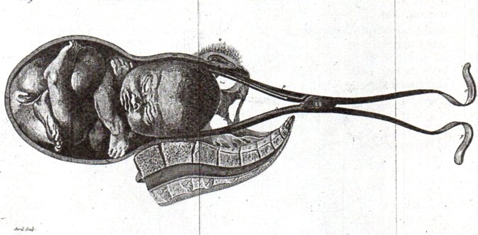
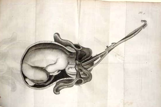
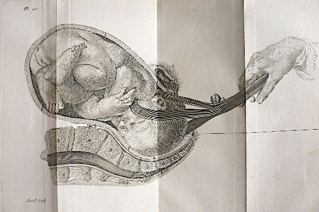
    One of the great thinkers in the history of gynecology was Jean Louis Baudeloque, whose 1781 book L’Art des Accouchemens was perhaps one of the most significant works in the history of obstetrics. This work was important not only for its great clarity and ease of explantion and control of its subject, but also for the exceptional illustrations.  I find them incredible not only for their spectacular detail but also for their control of blank space, a feat not easily accomplished…and I think a somewhat courageous approach to illustration during this era.

      Baudelocque

    For example, in the accompanying engravings (all of which are second generation and so are not nearly as sharp as the originals), we are left with a detailed image of only what was necessary for the explanation in the text, a terribly modern approach to illustration and clarity, so much so that it seems almost impossible that the image was made more than 230 years ago. 

    Baudelocque 2

    Obviously the representation and the subject matter give away the age of the image, but certainly not the design or placement.
    Note:  It should also be pointed out that chief among Baudeloque’s contributions was his teaching career, during which he would instruct upwards of 150 pupils per year (mainly at the Ecole de Sante) in clear and precise terms on his approach to obstetrics, not the least of which was in the use of instruments such as the foreceps and pelvimeter, a distribution of a very useful information base which seemed to have spread exponentially as his students went out into the midwifery field. 

  • Architecture of Insanity

    JF Ptak Science Books   Post 1474

    Insane asylum485

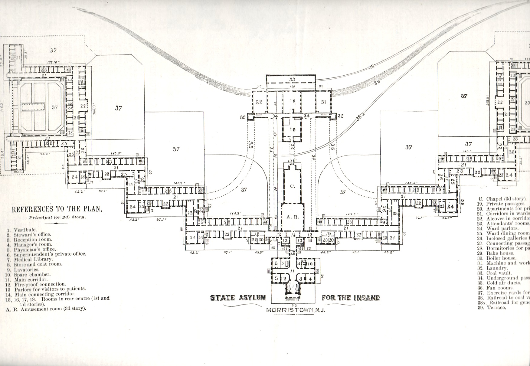
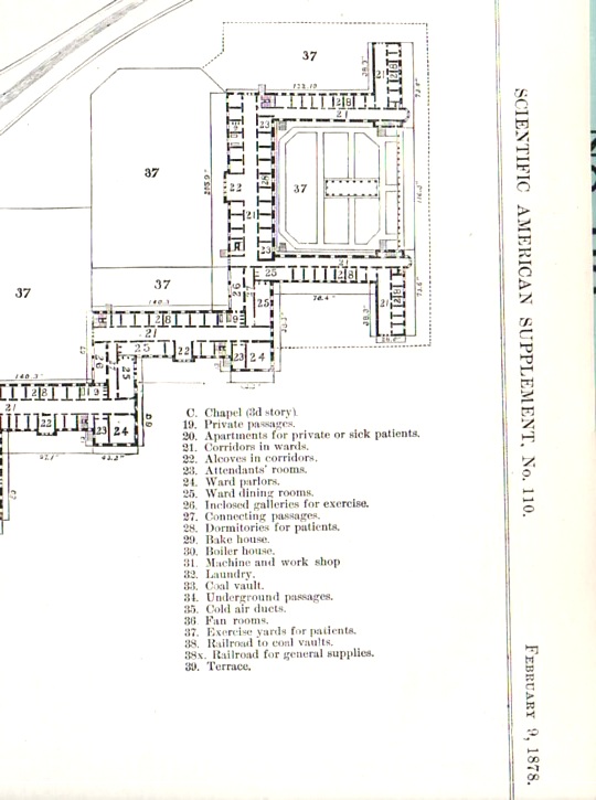
    I was browsing an 1878 issue of The Scientific American, looking for an article on torpedoes, when I came across this stunning architectural plan of the Morristown (New Jersey) State Asylum for the Insane–I recognized its design as something I had seen before, several times, at least.  This design required a lot of land and a lot of bricks–the building was a few stories high and laid out far and wide, built to accommodate 2,000 patients.  The design was intended to allow patients comfortable living space, room for privacy as need be, exercise area and plenty of open yards around the structure for sun and fresh air.  Of course building like this were quickly filled and filled some more, requiring the space for rehabilitation to be used for stockpiling other patients until more appropriate situations arose, which they mostly seemed not to.
    Insane asylum486

    And so I went looking around the web for other examples of mental/insane asylums, places constructed for the good of the society and partially to aid people who were suffering from some sort of yet-to-be-defined mental illness.  From what I have found so far, there is a definite them to a good many of them, resembling in some fair manner the Morristown design (above). 

    (An interesting and lush/ruinous photo essay on Morristown can be found here.)

    I suppose that in some ways these architectural plans are maps, outlines to an elusive wellness; given the (generally) small staffs, the abilities of the time to diagnosis mental illnesses, the limited capacities for treatment, and general overcrowding, that the “wellness” part of the desired ends of these plans/maps was almost entirely allegorical. I suspect that if for some reason you found yourself in an extended stay in a place like this and weren’t insane, then you would be after a while.

    The Glasgow Lunatic Asylum, designed by the  architect William Stark (1770 – 1814):

    Lunatic  glasgow

    [From:  Thompson, John D. & Grace Goldin. The Hospital. A Social and Architectural History. Yale University Press, New Haven and London. 1975.]


    Insane asylum maryland state hospital

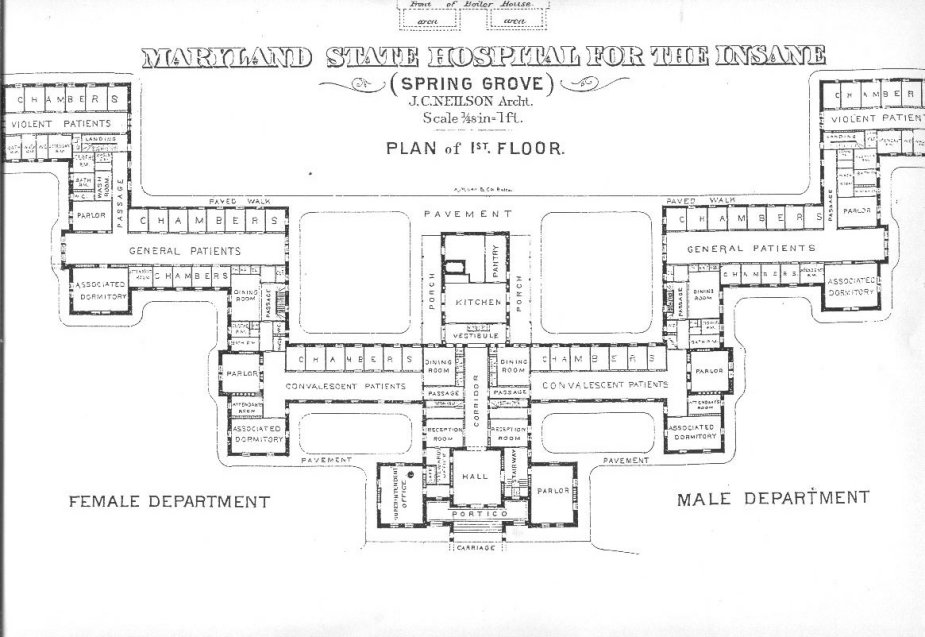
    Maryland State Hospital for the Insane (here)–in this plan, the further away you get from the main entrance, the more deeply “disturbed’ the patients.  It must have been a long walk from the “violent” ward to freedom. 

    Lunatic cane hill

    Cane Hill, the Third Surrey County Pauper Lunatic Asylum, built 1882 (details here)


    Lunatic claybury county

    Claybury Lunatic Asylum, Woodford, Essex:

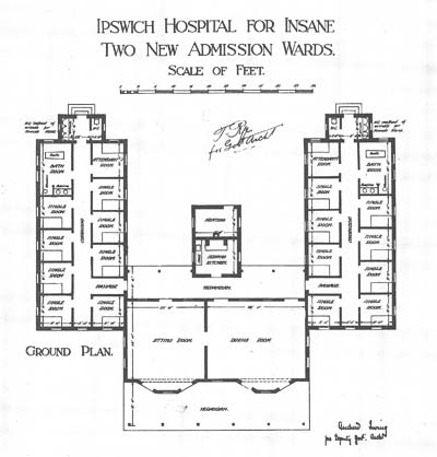
    Insane ipswich

     The Byron House, constructed 1915, at the Ipswich Lunatic Asylum (Byron house was to become the infamous Karrala House.)

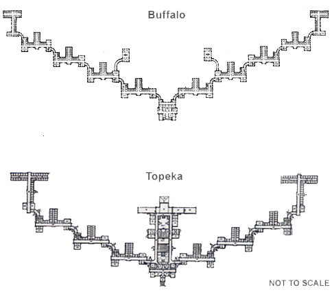
    Lunatic buffalo richardson

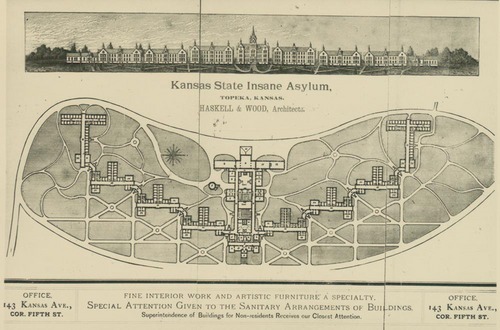
    Buffalo lunatic asylum, a spectacular structure designed by H.H. Richardson, with grounds and landscaping by none other than Frederiick Law Olmstead and Charles Vaux  The image above (and below) are the Kansas State Lunatic Asylum constructed 1880.  Information on these two institutions and the man who brought them about is located at the Kirkbride Buildings blog, here.

    Lunatic kansas


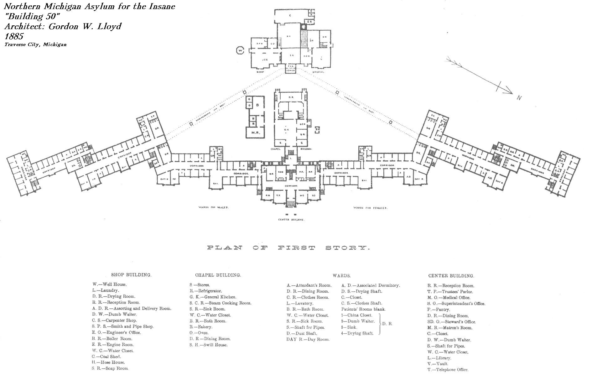
    Northern Michigan Asylum for the Insane, built by Gordon W. Lloyd in 1888:

    Lunatic  northern michigan

    Seacliff Lunatic Asylum, New Zealand:

    Lunatic seacliff


    HArrisburg (PA) State Lunatic Asylum, the first to be built according to the Kirkbride Plan:

    Lunatic  harrisburg

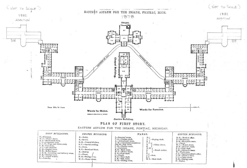
     Eastern Asylum for the Insane, Pontiac, Michigan, constructed 1882:
    Lunatic  eastyern asylum


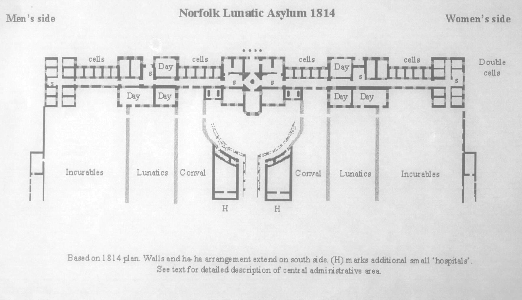
    Norfolk, England, Lunatic Asylum, 1814

    Lunatic norfolk

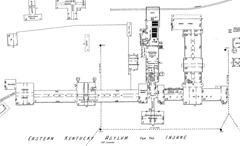
     Eastern Kentucky Asylum for the Insane:

    Lunatic--eastern KY hospital for the insane


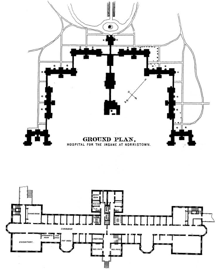
    Norristown Hospital for the Insane:

    Lunatic--norristown hop for the insane

  • Postcards from the Edge: Picture Postcards featuring Insane Asylums

    JF Ptak Science Books   Post  1475   

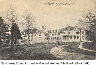
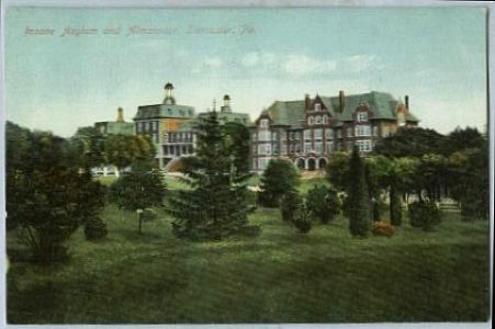
    Following up on yesterday’s post on the Architecture of Insanity is this selection of postcards featuring insane asylums.  They are all American, and all manufactured ca. 1900-1920, when the thirst for picture postcards depicting local history and structural vignettes was in its heyday.  I am uncertain why these images were appealing enough for people to use and send through the mail, but there certainly seems to have been a lot of them–a quick pursuit of them found these in a hurry, and I suspect that there may be hundreds more. 

    The content certainly would have been interesting to read.  And now that I think about it a little, there is material enough to create a version of Wisconsin Death Trip with these images. 

    New Jersey Hospital for Feeble-Minded Women:

    Lunatic feeble

    Insane Asylum and Almshouse, Lancaster, Pennsylvania:

    Insane asylum postcard  pennsylvania

    ·Posted by :

    ·in:

  • Blank and Missing Things Series–Antiquarian Anatomical Skin (Appended)

    JF Ptak Science Books   Post 1476  -part of the Blank, Missing and Empty Things series.

    Carl Ernst Bock (1809-1874) was a physician and anatomist (and son of the anatomist August Carl Bock of Leipzig, 1782-1833), whose many publications include the very popular  Hand-Atlas der Anatomie des Menschen  nebst einem tabellarischen Handbuche der Anatomie.(first printed in 1841).  This is a good example of his reaching out across the social strata to publish something that was accessible to the public-at-large, making him a pioneer in the distribution of medical information.

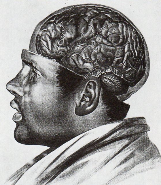
    I’m sorry to say that in all of this man’s beautiful work I  focused on this superior full-body anatomical–the odd thing here is that the only skin remaining on the body is on the head, where we see a  face and full head of hair.  To my experience this is a very highly unusual visualization.

    Anatomy bock482

    In an almost-the-opposite approach (which is much more common) Albert Adamkiewwicz (in his Taflen zir Orientierung an der Gehirnoberflaeche des lebenden Menschen...(printed in 1894, in Vienna) offers the following:

    Anatomy adamkiewicz484

    As with the other image above I only have a second generation image of this, and only in black and white–the color original is truly remarkable. 

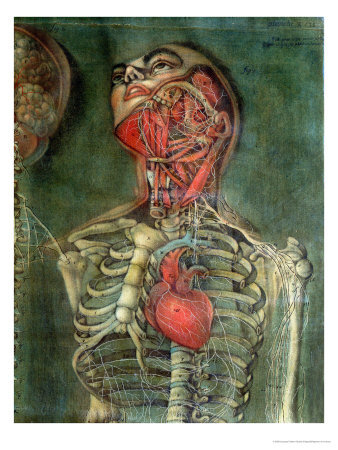
    Another excellent example of an anatomical dissection leaving the face intact occurs several times in the massively interesting work of Jacques Gauthier Dagoty, whose work I remembered but whose name I forgot, making it fairly difficult to find the illustrations.  But here they are, from Anatomie des parties de la generation de l’homme et de le femme, published in Paris, in 1773, with Dagoty (1717-1785)  acting in multiple roles of author/designer/anatomist/painter, who produced these magnificent painterly dissection studies of great detail and warmth.

    Anatomie des parties by Gautier D’Agoty and Duverney

    And this:

    Missing skin b
    There are many other studies in the volume, but few retain the face.

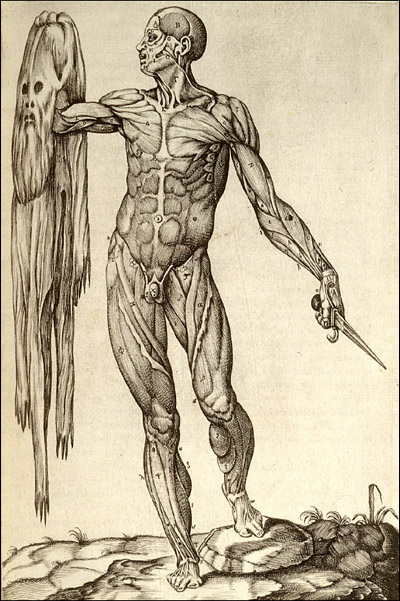
    Then there’s this, the other end of the spectrum, where we see the flayed anatomical specimen and its skin though not in contact with one another, which is a special category indeedy:

    Missing skin c

    This copperplate engraving comes from Juan Valverde de Amusco (Valverde) (1525-1588 or thereabouts), Anatomia del corpo humano… (printed in Rome in 1559), and stands quite apart (though not alone) from the rest of the anatomical oeuvre of the 1550-1750 period.  

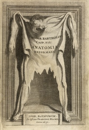
     And let’s not forget Thomas Bartholin’s frontspiece for his Anatomoa, published by F. Hackis in Leyden in 1651, which is similar to the Valverde:

    Anatomy skin bartholoiin


  • Ultra Realism in Anatomical Illustration, 18th Century.

    JF Ptak Science Books   Post 1477

    [In case there are younger readers here, this is a notice that some may consider the following images disturbing.]

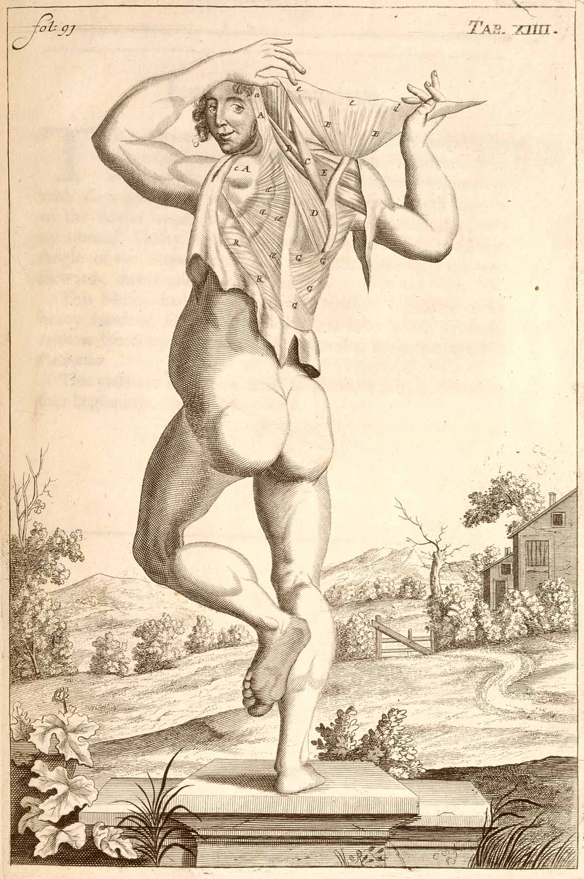
    Anatomy john brown dancing In the antiquarian world of anatomy books dissection and presentation take place on many different levels–there are very straightforward, unadorned displays of various body parts on blank backgrounds and with no attention paid whatsoever to anything beyond the dissection; there are others that place the dissections and cadavers and whatever the subject of dissection might be in prosaic fields, or against a distant cityscape, or in a well-appointed room, or against a generic table, or within some sort of Baroque ornamentation, and so on.  (We’ll be seeing more of these presentations in the next few posts.)  In general though the work of the anatomist is presented in  a basically “finished” state–that is, the dissection is presented in an artistic manner, with a sense of design for the subject material. (Here’s one example of hundreds of possibilities: John Browne’s A Compleat Treatise of the Muscles, as they appear in the Human Body...1681.)

    There are not many examples (before, say 1850) in the history of anatomical display that show the specimens in the stage of display that was almost entirely unadorned, as though we are looking directly at the anatomist’s table.  Such is the case in the extraordinary work of the anatomist Govard Bidloo (1649-1713) and (artist) Gerard de Lairesse (1640-1711) called Ontleding des menschelyken lichaams…, published in Amsterdam in 1690, which is an unremitting attack on realism in the art of anatomy.  There is absolutely no favoritism paid to anything in these images except for truthful display, right down to the nails and pins used to give messy stuff a more-recognizable (to the layman) form. 

    Ontleding des menschelyken lichaams by Govard Bidloo and Gerard de Lairesse
    Ontleding des menschelyken lichaams... by Govard Bidloo and Gérard de Lairesse
    Engravings of the bones, muscles, and joints by John Bell

    Another, later, uncommon example of this realism is found in the 1804 work of John Bell’s Engravings of the Bones, Muscles, and Joints, Illustrating the First Volume of the Anatomy of the Human Body

    Illustrations of dissections by Ellis and Ford

    These images are a world away from the overwhelming majority of works of anatomy produced from the 16th to the 19th centuries; and that Bidloo’s work was so early makes it that much more remarkable. 

    Source note:  all images courtesy of the National Institutes of Health National Library of Medicine, here.

  • Things-out-of-Place Department: Books in Anatomies and Bridges in Impressionist Paintings

    JF Ptak Science Books   Post 1478

    I’ve been making a few entries over the last few days on antiquarian anatomy books, and wonder now about books in anatomies. I’m not certain what the appeal is, but it has a strange and immediate affinity for me to bridges in pre- and early Impressionism, a direct line to these bridges and to the other technological and engineering entities that were depicted in these canvases.  I’m not sure what the connection is to the two outside of the obvious verb-y part of “bridge”, but there seems to be an innate connection between the two, for me.  Somehow the book shouldn’t be of interest to the lifeless and dissected cadaver, but it is, and images of the two together turn up here and there in the history of anatomical illustration.  As much as the anatomist and artist work together to try to remove their subject from the confines of a book so that their work is freer and more accessible to the reader, to remove the illustrations from the pages of the book in which they appear, they do sometimes employ the image of the book to make a more prosaic and allegorical point.And as the object of design and wonder and beautiful geometry, one might think of the bridge as a object in Impressionist paintings from that movement’s earliest periods would be not quite the sort of thing that would be the subject of as many paintings as they were.  The unnatural angles of their supplementary parts  seem to make them not quite the fit for the early Impressionists.  But they were, and probably so for their 90-degree assaults on the natural landscape. 

    Perhaps what I think of the aesthetics of the treatment of bridges during the Renaissance, and the adoration of the Rialto and Pone Vecchio and all the rest, just wouldn’t make their way to the Impressionists’ canvases. But of course basically most ot them did paint bridges–Seurat, Cezanne, Van Gogh (a fantastic, small stone-and-wood miniature drawbridge), Derain, Pissarro, Renoir (the Pont-Neuf), Marquet, Sisley and of course and perhaps most famously, Monet (Charing Cross, Giverny, and all the rest)–all painted bridges.  I guess the bridge is just a shorthand for the representation of engineering and technology in general in Impressionism, which to my eye seems quite strong. 

    But getting back to books in anatomies:

    Ontleding des menschelyken lichaams by Govard Bidloo and Gerard de Lairesse

    Govard Bidloo approached the issue of the book in a most unusual fashion, making it appear as though the dissected hand and forearm were emerging from a semi-opened book, the long index finger coming to a pointing pose, suggesting perhaps that the viewer take heed of what is contained in the work. The image appers in Bidloo’s Ontleding des menschelyken lichaams (or Anatomia Humani Corporis) and was printed in Amsterdam (at what may have been the pinnacle decade of Dutch book publishing) in 1690; the book was illustrated by Gerard de Lairesse (1640-1711), a leading light in the Golden Age of Dutch painting, and perhaps one of the most famous painters alive there after the death of Rembrandt. There’s all manner of symbolism going on here, but what I like the most is the little crutch under the cadaver’s hand’s thumb. 

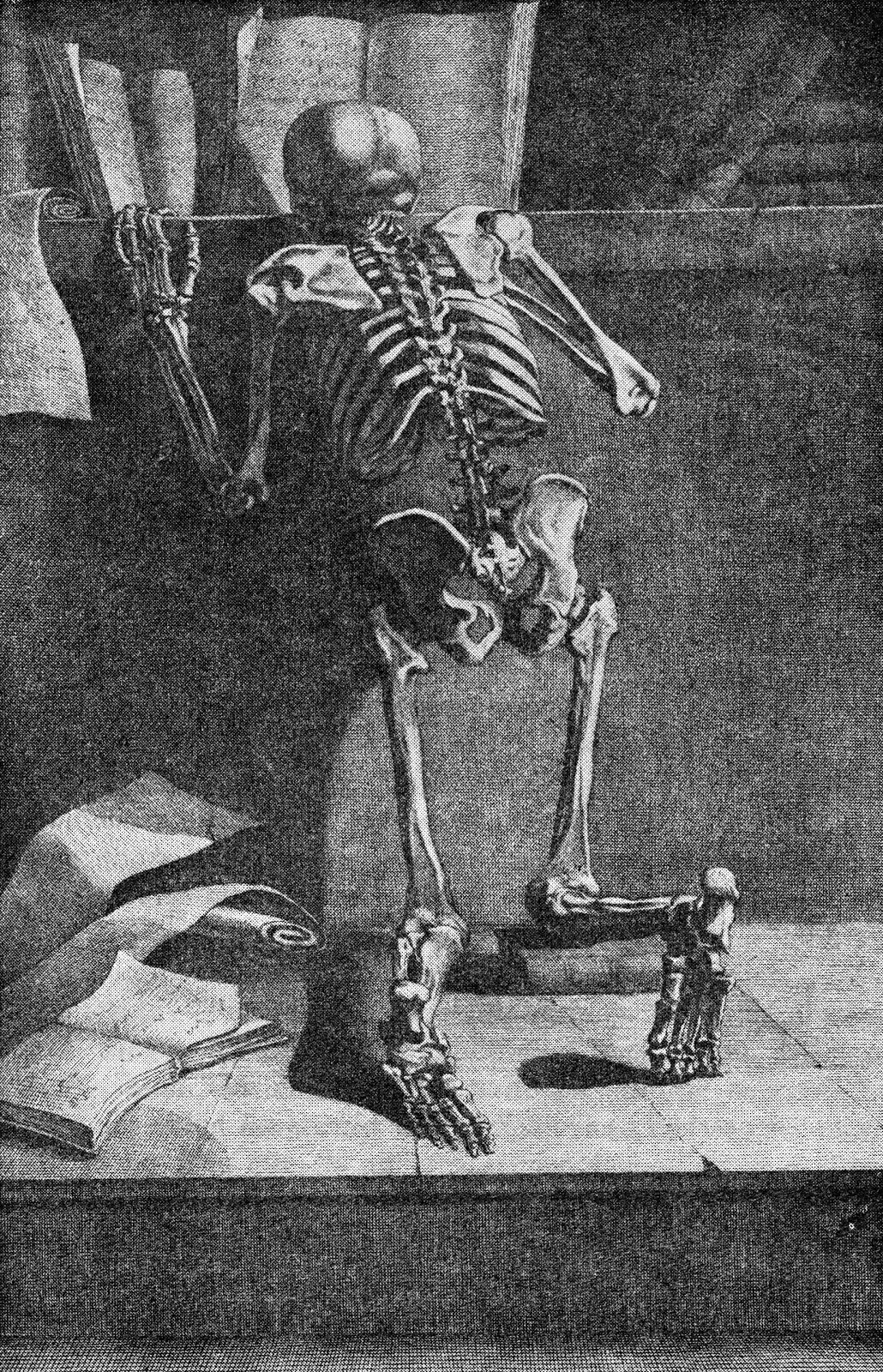
    Jacques Gamelin’s Nouveau reueil d’osteologie et de myologie, dessine d’apres nature (1779)  places skeleton and books togehter again, though this time their can be little doubt about the overall message that the designer and author tried to send to their readers. 

    Int he long run, and I guess in the short run as well, neither the bridge in Impressionism nor the book in anatomies is quite so much out-of-place as they are simply unexpected.

    Note:

    Van Gogh’s bridge at Arles–not an essential image whatsoever for this post–I just like the bridge. Van Gogh painted the bridge four times in oil and once in watercolor, all in a very short time.  (His stay at Arles was about 444 days, during which he made about 200 paintings, being some of his greatest work.

    Vincent Van Gogh Miscellaneous Buildings Technology Modern Age Impressionism Neo-Impressionism


  • Species of Explosions: Human Anatomy, Explained

    JF Ptak Science Books   Post 1479

    Anatomia universale... by Paolo Mascagni and Antonio Serantoni

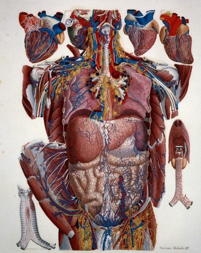
    Species of explosions come in all sorts of shapes and sizes, and basically release some sort of energy (chemical, nuclear, mechanical and so on), but in the cases we’ll look at here they are none-of-the-above.  The energy released in these explosions are in the form of potential, a knowledge-driven, controlled and reversibly ordered demolition, a deconstruction in slow motion.  The medical “explosion view” for the study of anatomy is a remarkable thing, especially when you considered not only the pre-Cat and pre-MRI times, but also the pre-Xray (1895) days of imaging the inside of the body–the images not only show you the bits and pieces alone but also in relation to the other bits around them.  The body becomes an archaeological dig, each level preserved so that a viewer could easily see the dependencies and relations between one thing and another. 

    Take for example Paolo Mascagni’s (1755-1815) beautiful Anatomia universale (an example seen above), which was printed in Florence in 1833 and has the look and sensibility of something much later.  Mascagni is able to achieve this depth not only from the exploded view, but also for the (somewhat exaggerated) coloring setting the specimen on top of a blank background the combination of the color and the background giving the whole thing a 3-D-ish feel–and if not that, then certainly a living image in which there is some fair amount of depth. 

    Anatomy exploded
    Another version of the exploded view which is also quite effective from the same work by Mascagni is his “exploded thorax”, showing a more limited display of the more closely-aligned organs. 

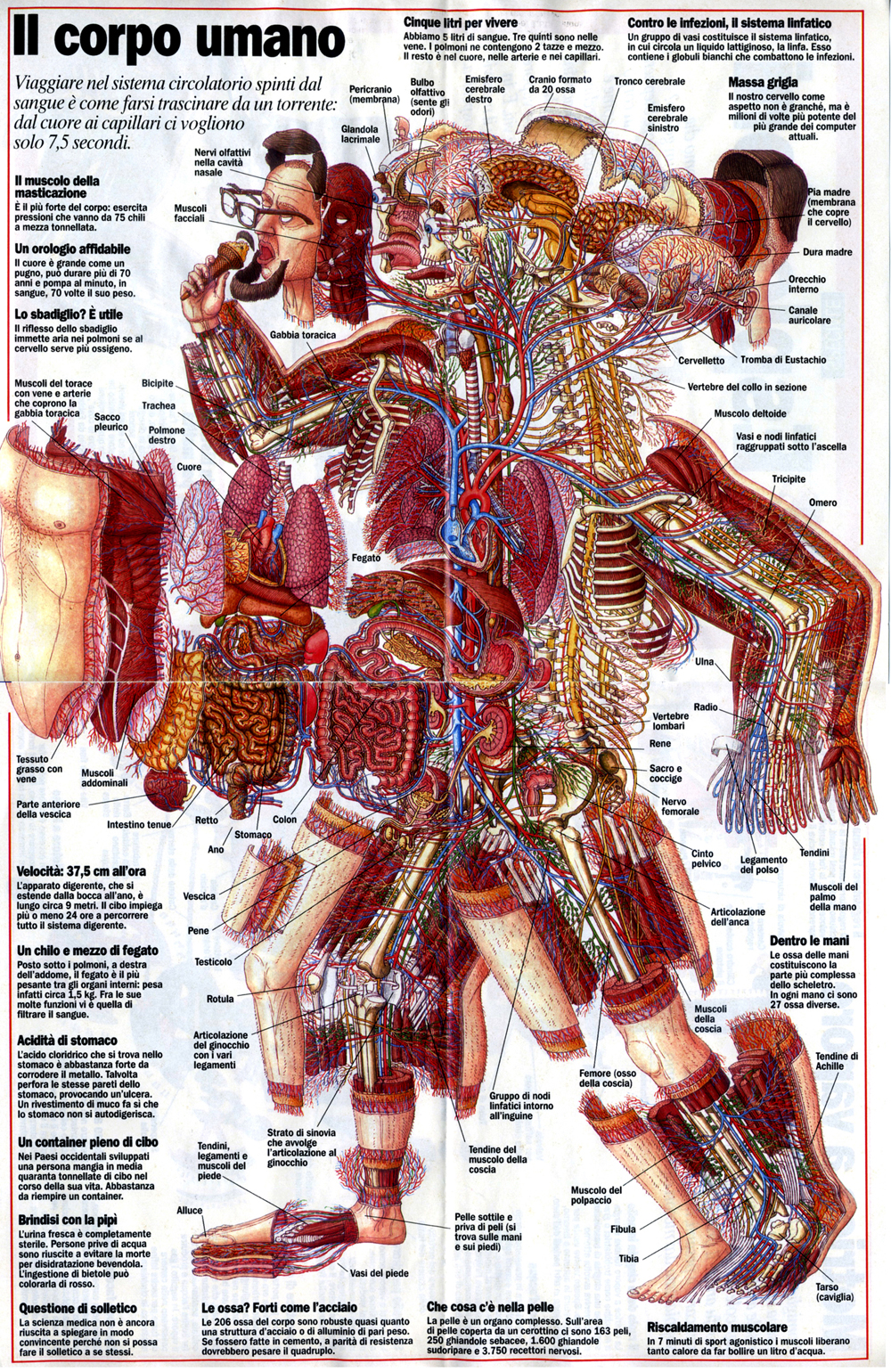
    When these views appear today–which is generally much more uncommon given the other technical ways of envisioning multiple layers of complex associated items–they have more of a sense of the antiquarian, retro feel to them, though they are no less useful for it.  As a matter of fact  I still prefer these views for understanding technical and engineering  and architectural complexes than anything else. And the modern master of this genre for me is Stephen Beisty, who performs his magic mostly in the tech and engineering fields, but who occasionally dips into the messy wet stuff of biology, as we can see in this fabulous exploded view:

    Anatom exploded beisty

    There are of course many other examples of (drawn) exploded views in the history of anatomical illustration, but I think these will do for now as good examples of the art.


Recent Posts

Archives

Categories