A Daily History of Holes, Dots, Lines, Science, History, Math, Physics, Art, the Unintentional Absurd, Architecture, Maps, Data Visualization, Blank and Missing Things, and so on. |1.6 million words, 7500 images, 4.9 million hits| Press & appearances in The Times, Le Figaro, Mensa, The Economist, The Guardian, Discovery News, Slate, Le Monde, Sci American Blogs, Le Pont, and many other places… 5000+ total posts since 2008.

  • A Monumentally Questionable Idea: Screw Coffins

    JF Ptak Science Books  Quick Post     Part of the History of Goodbye series.

    “May I touch it?”

    “Please don’t, it will leave a mark”– on corpses, from Evelyn Waugh’s The Loved One. 

    In the vast history of humans and their disposing of the dead, of the great rituals and spectacular belief systems pertaining to the body and the non-corporeal bits and flavorings within, there is probably not much at all dealing with the creation of screw coffins with duckies on top.

    Such is the very recent idea of  this painful looking piece of business:  slide the body in, stand the screw coffin upright, and then by motive force either human or mechanical screw the thing into the Ea rth.  This is all done for the theoretical modesty of economical land usage.  And I guess this would make sense, even more so, than putting a corpse in  a very expensive box, a corpse that has been treated so that it will decay very slowly over long periods of time, stuck in a box that is made to further prevent decay, and then place the whole thing (horizontally) into the ground, where no one will ever see it again. It seems like such a great effort to undertake to simply hide a body under a thousand pounds of dirt, when the corpse might as well not even be there.  SO I guess if it makes sense to observe this practice, you might as well take up less ground. 

    The logistics might be a problem–after all, you’ll need a casket for the coffin to transport the thing from the church or wherever to The Place of Last Repose, as I don’t very well imagine the look of the torpedo screw in the confines of some holy relic or draped-up maudlin-eseum.  I mean, the thing would look repulsive. 

    And the little bits that go on top really don’t help it, either:

    I’m not sure why these coffins are placed in a swamp, or why one of the statuettes is a fish. 

    The whole “placement” business seems rather indelicate–I can’t imagine anyone’s elderly Auntie standing around to watch The Beloved twisted underground by a John Deere:

    This is actually one of a number of different contempo-coffins designed to both save space and disgust.  Here’s the Vampire Stake coffin:

    And the bullet coffin:

    And the pleasure-tipped Probe coffin:

    And of course the artificial flower tapered urn coffin:

    As I said, perhaps when it comes to burying people, looking at the practice under a macroscope, it is all the same. 

    It does, however, seem as though it is dramatic evermore with each turn of the screw.  It also looks pretty difficult to do.


  • Incontestable Oddness: Inflatable Puffy Shirts for the Dead & Coffins with Retractable Legs

    JF Ptak Science Books   Quick Post

    Some things that seem perfectly odd seem to take on another life, an extra life, when you put moveable things on it.  For example, coffins that have anything “retractable” seems a little much. As corpse receptacles, coffins as a box seem, I guess, an odd thing–scooping out a body’s innards and replacing them with packing, toxic preservative, gums, paint, glue, plastic, rubber, wire, pins, needles and such seem to be a little on the extreme side, especially when you are going to put that body into a hole in the ground and cover it with dirt.  What better thing than to enclose the corpse in a container so that the horrible idea will be further kept from deterioration?  Then there’s the container for the coffin, and the slumber vault cement liner, and so on. 

    This weirdness turns professional (to paraphrase the Good Doctor) when movable/retractable bits are added to the coffin.  In a long “is this really necessary?” list, one of the last/first would concern retractable legs on a coffin, or perhaps the retractable flower vases, or the inflatable puffy shirt.  There’s a strange sociological history going on in the thousands of death/corpse/funeral-related reports from the U.S. Patent Office, which will make it much easier for the anthropologists of the future to understand our present concerns with death, or life. 

    [Most of the following patent reports are entirely understandable by their titles.  The first in the list though needs a little explanatory help–this is a garment was made with numerous openings to accommodate different forms of corpse body shapers, including inflatable balloons, putty, clay and other material that would help the dead body look a little more not-dead.]

    [And then of course the explanation of the thing, which has a distinct federal-ese flavoring.]

    [I like this one because of the name association with the Norden bomb sight, a once-top secret improvement in delivering bombs dropped from planes, and which helped put many people into a coffin, if only figuratively.] />/>/>

    />/>

  • FearNaughtia Coffins: Life Detectors, Escape Ladders, Breathin’ Pipes and Premature Burial

    JF Ptak Science Books   Post 1526

    I’ve written here before on the wonderful book by Jan Bondeson, Buried Alive, the Terrifying History of our Most Primal Fear 1(Norton, 2001) and on the difficulties of determining death in the 19th century, and the various ways that people sought to deal with and sidestep the possibilities of premature burial.  In continuing those posts I’d like to add the following  drawings from hopeful reports of the U.S. Patent Office, some of which really didn’t make that much applicable sense, but, well, you can patent just about anything if it hasn’t already been patented. 

    These coffins were constructed to allow their occupants to ring or telephone or telegraph or signal with smoke or light and so on should the dead respond to their lost life while buried.  As I point ou tin the earlier (linked) post, determining death was a difficult task in the 19th century, so there wsa a legitimate fear-of-being-buried-alive concern.  OF course, the best way yo determine death would be to allow the supposed-dead to lay out for three days at the end of which the body became a corpse and putrefy–the decay part was the true determiner of death. WHy people had to bury the dead into a coffin and be placed underground faster than the three days is a mystery, particularly if there were so many people who lived in fear of waking up in an underground coffin. 

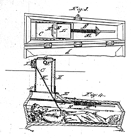
    And so to the solutions, the first of which was brought to the world by Franz Vester of beautiful Newark, New Jersey.  Well, Newark was probably beautiful when this patent was granted in 1868, and maybe this idea seemed so, too.  Here’s what would happen if a dead body awoke in Vester’s safety coffin:  their hands were attached to a rope that would be connected to a top-side bell, and the not-deceased would tug on it for all they were worth.  After that, a sliding door above the face would be moved, and the coffin’s occupant was then supposed to pull themselves up to a short laddered tunnel that was connecting the living world from the sleep-of-worms-world.  Were there problems?  Yes, of course, but so far as it has been recorded no person ever saved themselves suing this coffin, in spite of Vester’s very strenuous exercises to promote his invention.

    http://www.americanartifacts.com/smma/life/g13.gif

    [Image source:  American Artifacts, via VanVleck]

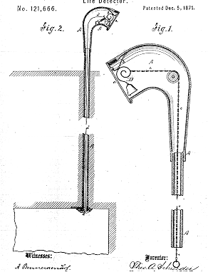
    A few years later from just downthe road in Hoboken, Theodore Schroeder and Hermann Wuest were granted a patent for another rope-activated sounding device.  The 1871 patent revealed what was pretty much a common thread to come–rope, hands, bell.  Theoretically, if the dead awoke they would tear away at the bell until the prefect or whomever arrived to dig them out.  The pair from Hoboken added a few tweaks here and there–one that allowed a release of fresh air into the coffin, and another which used an electromagnetic deice to replace the hand engine.  I’m not sure how long someone can last in a coffin underground, but it can’t be very long at all.  Why someone would think that adding an air vent to a coffin where the dead have been underground for a few days already doesn’t seem to make much sense, except to the coffin manufacturers. 

    http://www.americanartifacts.com/smma/life/g1.gif


    The next example comes from the beautifully-named Albert Fearnaught, who although not from mid-Jersey patented a device again using a rope around the wrist of the dead, this time though the rope was attached to a spring-loaded device that would release a flag when activated from below. 

    This next (1885) patent has a slight variant on the rope-hand solution:  the string-finger. Well, there was also some electromagnetic stuff involved, but basically the string on the finger of a moving not-dead-corpse would activate an electric bell and yadda yadda yadda people would come to help and release.  The added extra here, the clear-coat undercoating, is a device that would allow the folks topside to peer down and see the face of the interred, and whether or not it was animated, I guess. 

    http://www.americanartifacts.com/smma/life/g4.gif

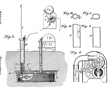
    Hubert Deveau evidently had grown tired of all of these hand/finger-operated back- from-the-dead resurrection devices, and constructed (in his patent of 1894) a relatively simple groundskeeper-alerting-breathing-device combo–a pipe that could be moved up by the head of the person int he coffin which would in turn activate a spring-something that would keep the pipe poking-up above the ground.  It would deliver fresh air to the buried, and would evidently be a warning sign to the cemetery man that something was afoot, underfoot.

    Funny thing her is that most of the systems I looked at for this post involved a single device to release the prematurely-buried–it seems to me that there should have been at least one back-up system in case the main apparatus failed.  I mean, if you’re going to become intensely psychotic, why would you then depend on one thing to get you out of your buried coffin?  And that one thing is, basically, a rope.  What if the thing failed?  I’m just saying that I expected to see a little more comfort juice applied to these solutions than I saw. 

     And why current radio talk show fearmongers like Glenn Beck isn’t all over these things, I don’t know–they Fearnaughts for just about everything else…

    Notes:

    1. A fine article on patent remedies for premature burial can be found here: “Signals from the Grave, Early Patents for Detecting Life in Buried Persons”, by Richard Van Vleck, in American Artifacts, issue 45, July 1999. 


  • H-Bomb Wipes out Brooklyn. And Chicago. And New York.

    JF Ptak Science Books  Post 1527          Part of the Atomic and Nuclear Weapons series

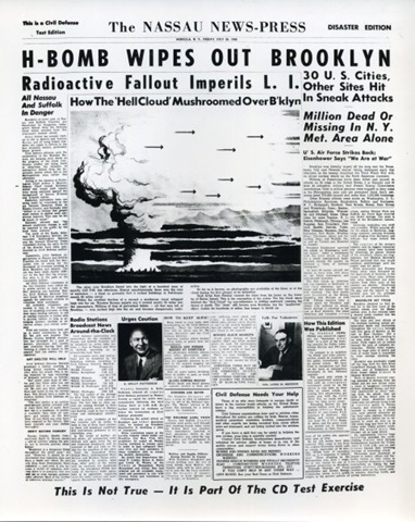
    Wipe out Brooklyn

     [Source:  Conelrad blog and also at the website]
    I stumbled on this bombing of Brooklyn article at the excellent Conelrad website–it is an excellent addition to my slight collection of vintage depictions of American cities being nuked.  As part of the necessary scare tactics in the pursuit of the arms end of MAD, the destructive power of these weapons were shown against a background that Americans could readily understand.  Thinking of atomic and then nuclear holocaust in terms of multiple units of Hiroshimas and Nagasakis was one thing–showing the effects of these weapons on an American grid was something else.

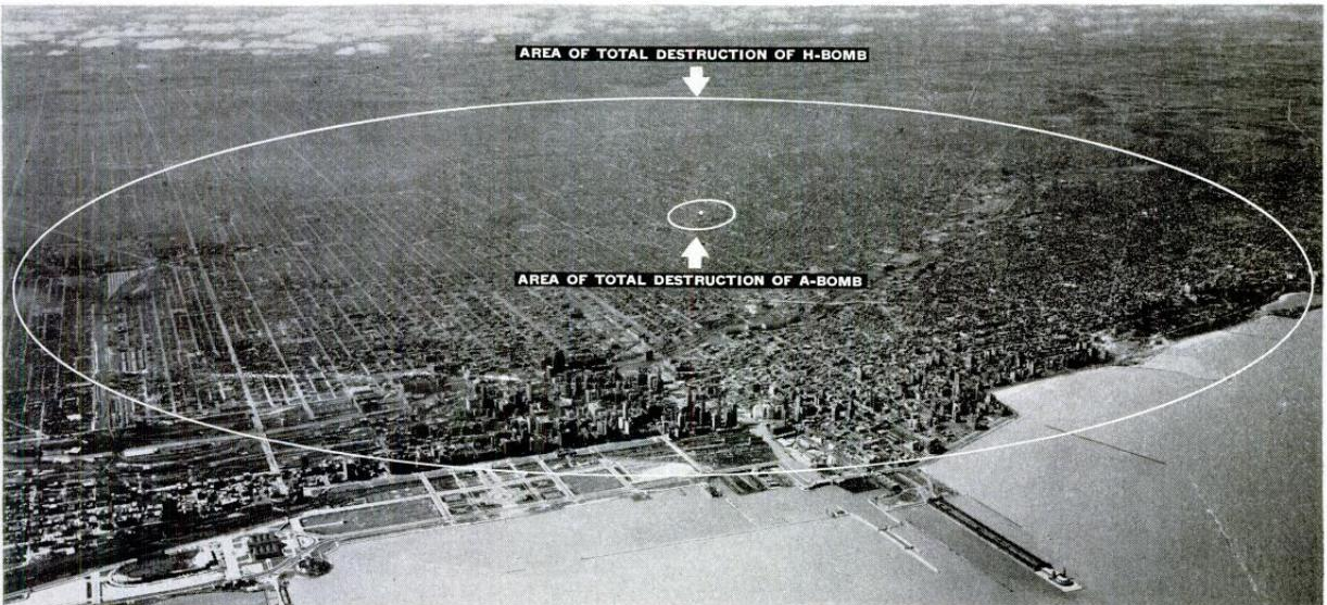
    This next  graphic shows the difference in destructive capacity of an atomic bomb (small circle beneath an air-burst detonation) and a hydrogen bomb (the large circle showing area of total destruction, which in this case would be about 50 square miles) on the city of Chicago.

    Wipe out chicago
    [Source:  LIFE Magazine, 30 Jine, 1950]

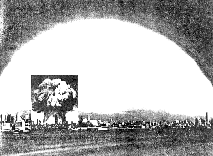
     The next image is much like the preceding, only showing a profile of Manhattan and the difference between the explosions of a Hiroshima bomb and a hydrogen bomb (of 20 megatons).

    http://bioinfo.mbb.yale.edu/~mbg/fun/both-bombs.gif

    [Source: BioInformatics Lab, Yale  http://bioinfo.mbb.yale.edu/~mbg/fun/both-bombs.gif]]

    But don’t worry, even if the Chicago and Brooklyn and New York and so on were destroyed, the U.S. Navy would survive, which would  be either great or horrible if you were a sailor:]

      H-Bomb  WIpe out NAvy
    And as usual, the point is made with one weapon being detonated, rather than the x-number that would actually be deployed.  Depicting, say, 10 weapons being used against these cities–while being a more accurate portrayal of what nuclear war might look like–might have looked like something beyond the usefulness of propaganda. 

  • The Heaven of Disappeared Details

    JF Ptak Science Books   Post 1528   Part of this blog’s Blank, Empty & Missing Things series.

    What is the opposite of “the Devil is in the details”, without getting too terribly religious? Expressing detail in the history of art has been a progressive process, and perhaps in some sense that is what art was all about–adding detail, becoming more representational, more life-like, more expressive of the world and nature.   Perhaps that is what one essential element of art was all about for hundreds, or thousands, of years–a progression that marched its way through time with greater effectiveness and representation, for the most part, until relatively recently, when–in the early part of the 20th century–details began to disappear, until in some cases there were no details at all.  Or at least the details that people had been comfortable with for so long, like folds in dresses, or lustre in eyes, or thinness in clouds, or even the correct perspective in the re-invention of three-dimensional representation. 

    http://www.moma.org/collection_images/resized/042/w155h170crop/CRI_211042.jpg

    Detail changed with the  Romantics, and then definitely with the Impressionists, and then on into the the Cubists and the Abstract,  until the detail of what we would recognize as elemental objects would disappear altogether.  Corot, Cezanne, Gauguin, Whistler,  Seurat, Van Gogh, Picasso, Braque, Duchamp.  And then everything goes away with Kandinsky.  1911.  Details of references to the physical world slipping away into general sense impressions.

    It would probably make more sense to look at the Kandinsky at this point–I’d rather look at the Pierre Bonnard (1867-1947) and his La petite blanchisseuse (Roger-Marx 42, also known as the Small Washerwoman).  The wide expanse of her black working gown is a primary link to solid blankness, without detail of nearly any sort, missing parts of reality, allowed to go to Disappeared Detail Heaven.

    Photo

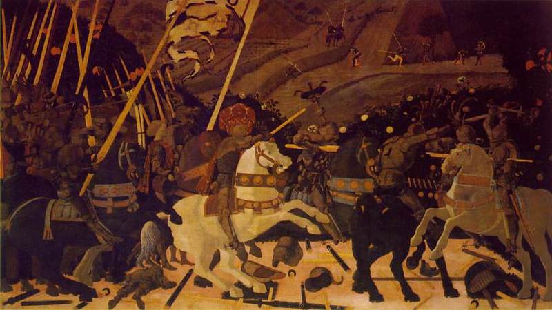
    The occupants of the Heaven was begun centuries ago, though the details banned there on purpose really only begins in earnest with the missing details of the solids in (Paolo)1 Uccello.  This great master (dissed terribly by Bernard Berenson I don’t know why) was one of the very few exceptions of artists who purposefully banned details from his work, just as the reality of the world crept deeper into the works of the late Siennese masters pointing out the details of their rediscovery of perspective. 

    There would be a long period in between Uccello and the other detail disappearers. 

    _____________

    1.  The phrase “the solids in Uccello” comes of course from the Great American Novel, William Gaddis’ The Recognitions, discovered and shared to my by the lovely Patti Digh. In some of his enomrous cnvases it is quite easy to find wide expaneses of nthing where detail should be…

  • A Great Graphic Fumbled–What 300,000 Army Trucks Almost Looked Like, 1944

    JF Ptak Science Books   Post 1529

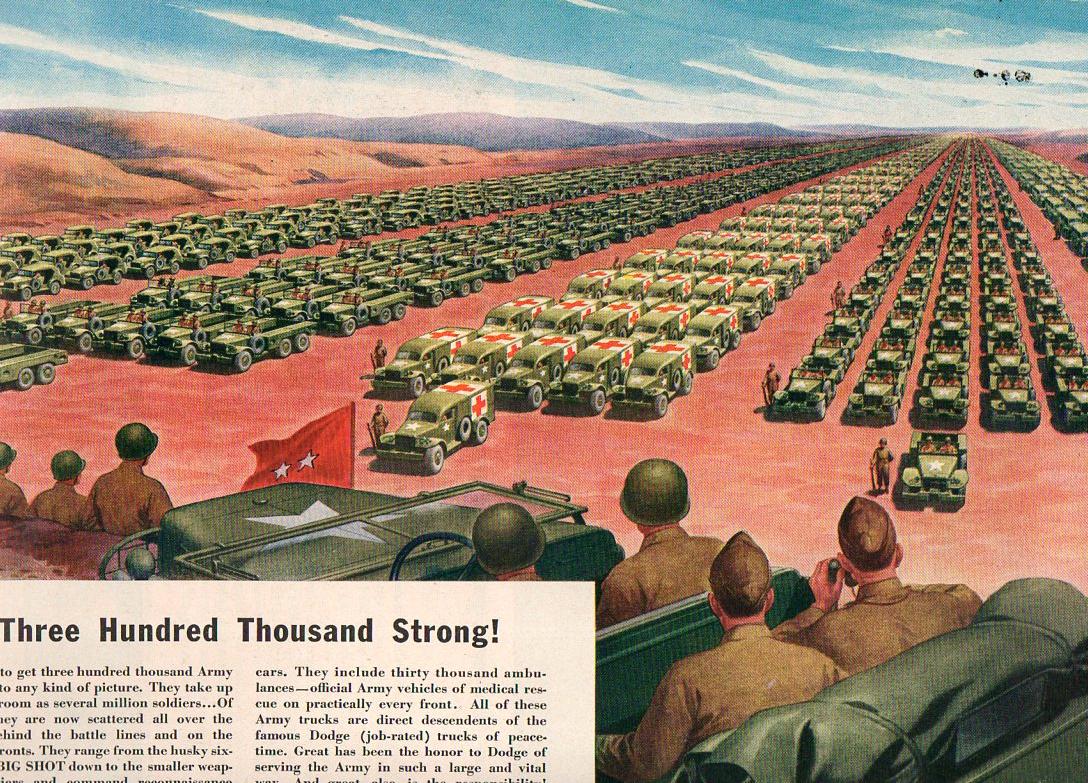
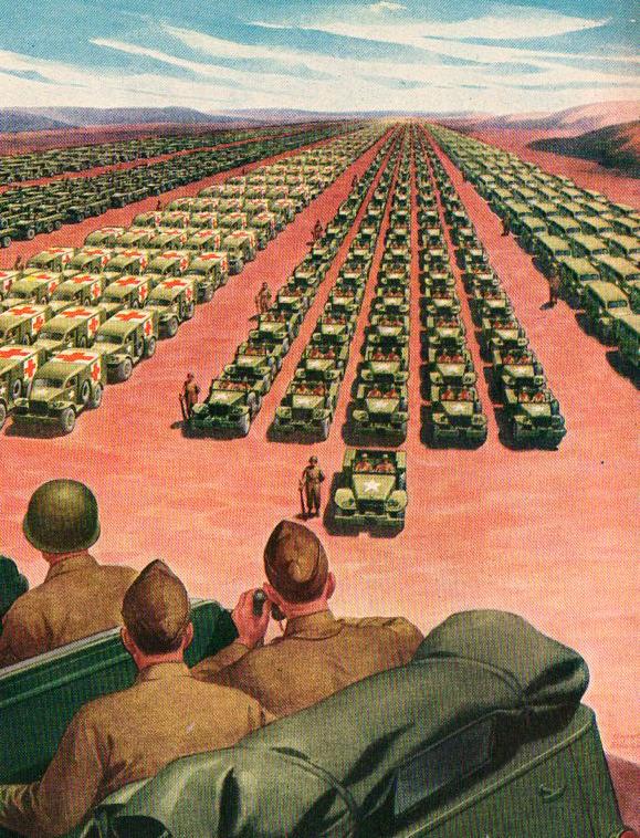
    If each of the 2,000 trucks pictured below carried $100,000,000 dollars in hundred dollar bills, how many trucks would it take to carry away the national debt?  Every one of them–this entire scene.  70 times.  Twenty miles of this convey, each truck carrying $100,000,000, would carrying off the debt.  Actually it would take 40 trucks (each with 100 million) to cart away the amount of debt accrued in daily interest on the national debt of 14 trillion dollars.

    Massive graphic548
    This Life magazine ad for the Chrysler Corporation–makers of Dodge–took the form of a public service announcement and a push to buy more ear bonds, though it really was an advertisement for itself and its wartime efforts.  What it proposed to graphically portray were the 300,000 trucks that it manufactured (to that point) for the U.S. Army–and the image that they use to get the point across is arresting, but it doesn’t come close to doing the job.

    It seems to me that the visible trucks here number about 2000 for the five columns; and I calculate that each of what we can see of the columns to be about 1500 feet long.  In order to show 300,000 trucks we’d need to show this page 150 times; or what Chrysler is showing is 1/150th of their total wartime production of trucks.  To show them all would take a lot of time for the two-star to review, hours, in fact.  I reckon that the five-column-wide display for the 300k trucks would be about 150 miles long. 

    Massive graphic549

    So even though this image is very persuasive and impressive, it doesn’t come close to the magnitude of the number’s display.

    Similar to the Chrysler ad is this:

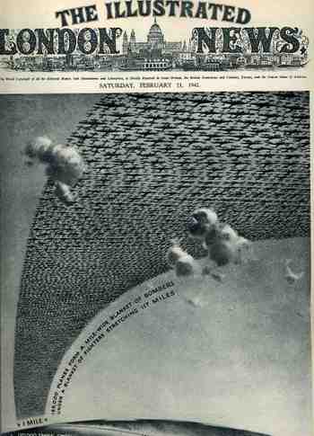
    1ebay_sept_30185000_planes695This arresting cover image for The Illustrated London News of 21 February 1942 illustrates the (new) American production program for planes and tanks for 1942 and 1943  The caption reads: “185,000 planes form a mile-wide blanket of bombers under a blanket of fighters stretching 117 miles” which is actually a double blanket of planes–if they were thinned out to form one layer it would stretch one mile wide from Washington D.C. to New York City, which is quite an unimaginable ribbon.

    The numbers and depiction are in some aspects similar, though it is still very difficult to get the point across of how massive these numbers really are.

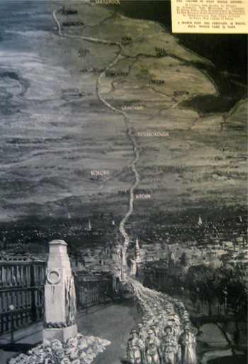
    The Chrysler ad says that the depiction of the trucks would “take up as much room as several million soldiers”, though it seems to me that any of the columns alone would do so. A while ago in this blog appeared a short piece on what 1,100,000 British war dead would look like, as presented by the Illustrated London News:

    Blogmarch

    The image (printed in 1933) shows the column stretching from London to Durham–London through Hitchin, through Bedford and Peterborough and Grantham, past Sheffield and Leeds and York, and then on to Durham–a distance of 269 miles or so.  Four across, a 269-mile column of dead soldiers.  That makes a pretty big point on an extraordinary sacrifice. 

    So the short end of the story is that back there during 1944, the Chrysler Corporation somehow managed to vastly underplay their war effort in an advertisement to themselves. 

  • Hearing Patterns in Gases, 1894

    JF Ptak Science Books   Post 1530

    I was about to start a new series of posts on the History of Lines , something left out of this blog, oddly, given the different posts on the History of Dots and the History of Holes (and the History of Blank and Empty Things).  A lot of that–the History of Lines business–has to do with the interpretation of things on paper:  heart rate, “brain waves”, the motion of a bumble bee, navigation, and of course, words.  (The great Kickapoo tracker Famous Shoes  in Larry McMurtry’s Streets of Laredo, one of the Lonesome Dove tetralogy, found that the one thing he couldn’t track in this world were the marks on the pages of a book.)

    But I was distracted by the idea of seeing something in a different context, of associating something with a sense experience far beyond its origin, and so the History of Lines will wait just a little–something just a little beyond seeing some electrical function of the brain inscribed as a long line on a skinny piece of paper.  What I found was this–the invention of Mr. E. Hardy, whose “Formenephone” detected the presence of combustible fire-damp or any other gas in mines, and which would then emit sounds on the accompanying (small) organ pipe.  The apparatus would actually vibrate more rapidly as the gas content of the air increased.  At the time (the notice of the invention appearing in the Scientific American Supplement #945 for 10 February 1894) the only other means of detecting these gases was by the change of the glow of a candle. 

    Perhaps this is in a way like the application of musical notes to the numbers pi or tau, though actually useful.

    I’ll return to the History of Lines tomorrow.

    Notes:

    Formene, or marsh gas, is a “hydrocarbon which produces chloroform when the hydrogen in it is replaced with chlorine, loses hydrogen and yields anthracene”.

  • Mark Twain: Bra and Blank Book Patenter

    JF Ptak Science Books   Quick Post

    Samuel Clemens (1835-1910), who became Mark Twain in 1863 and then mostly stayed that way, had a great mind and was a superb writer and story teller–he wasn’t necessarily a great inventor, however.  In the ear;y sea of his great achievements, in 1871–just after the publication of his first real best-seller, Innocents Abroad, 1869)–Clemens applied for and was granted a patent for a bra clasp.  I don’t know if it is the bra clasp, or not, but for whatever reason Clemens pursued this interest all the way to the end. 


    In the year after the publication of Roughing It, and three years before the publication of The Adventures of Tom Sawyer, Clemens patented–essentially–a blank book. It was a special book/holder for the very-popular practice of scrap booking, and it seems rather ironic that someone who filled up so many books with words would get a patent for the sale of books that didn’t have any.   Curious.

  • Discovering RED in Advertising, 1942: Candy as Food and Cigarettes as Tasty

    JF Ptak Science Books  Quick Post

    Part of the luxury of doing what I do is that I can down to the basement and pull out a giant bound volume of Life magazine from a long wall’s worth of Life magazines and browse/graze away–a much easier thing to do with the volume in hand than it is to do online at the Life site.  (Let me tell you that there is simply no comparison, and that you retain far more leafing through the volumes than scrolling down the monitor–try it out at the library next time.)  For this particular volume–part of 1942–there was a growing realization that there was an awful lot of the color red being used in the advertisements, as though it had just been “discovered”.  And there was a lot of it being used to sell candy, cigarettes and, of course, meat. 

    This ad for Camel cigs is one with a minimal amount of red, though the use of it seems judicious and expansive to the major points of the message.  Odd that the idea of “taste” appears almost as a secondary item of attention, and that the thrust of the copy is that lots of doctors happen to smoke Camel, without mentioning why.  Well, the ad implies smoothness of smoke to the throat and the “T” section, for taste and easy impact on the throat, but the overwhelming message to me seems to be the smoking doctors giving an Rx to the cigarette.

    Candy550

    On the other end of the attack to the human body was the notion that candy=food, an interesting way of moving a heart-busting luxury product, all wrapped in red outlining a white heart, evoking Valentine’s Day and love, though this was love for candy itself, as the ad appeared in June. 

    Candy551

    The Meat Team–not a particular type pf meat; just meat, a red advertisement putting the “eat” in “meat”.  Red was also used for SPAM, which is a very democratic type of meat byproduct. 

    +  meat pork chop 001

    Another boost to candy as a food.

    Blogcandy282

    I’m probably all wrong on this, but that was the sense-impression I got from leafing through six inches of Life magazine for 1942.

    ·Posted by :

    ·in:

    —
  • Invasion Routes to the U.S.,1940

    JF Ptak Science Books  Post 1532

    This is a supplement to some earlier posts on this blog relating to the possibilities of the invasion of America:  Mapping the Invasion of America, 1942 (which is the most-viewed post from this blog, with over 500k readers), The Invasion of America, 1935,  and The Invasion of America, 1942, Part II to name a few examples.
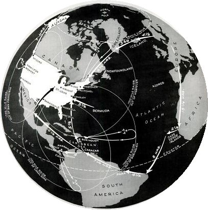
    INVASION us  INVASION ROUTES

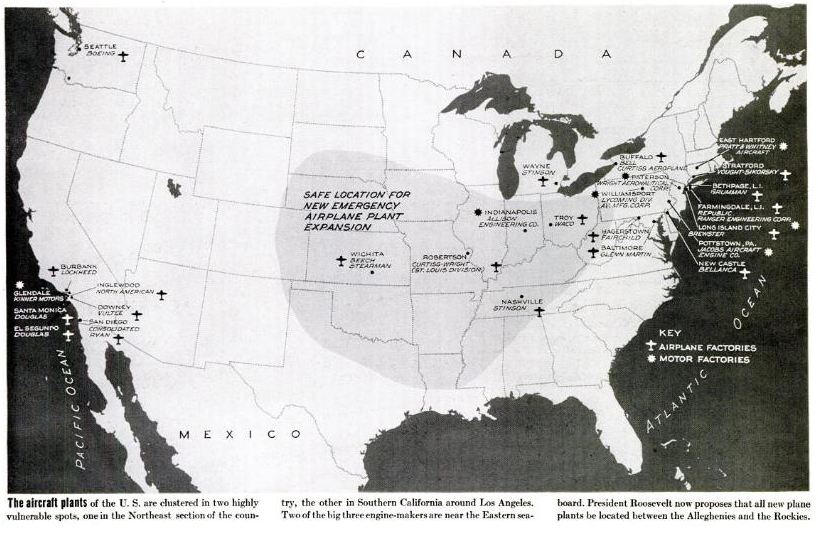
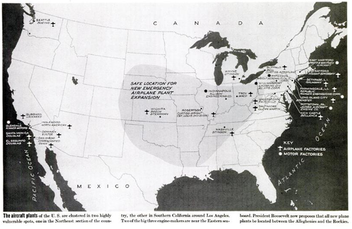
    In the 27 May 1940 issue of Life magazine appeared an article on Franklin Roosevelt’s call to American action in constructing an entirely new air force.   For years the air corps arm of the American military lingered in a kind of low-numbers unresolved limbo–but by May of 1940, it became painfully obvious that something drastic must be done.  By this point the European War was about eight months old, and the possibility of Nazi victory looked very real.  After all, the Blitzkrieg had been very successfully employed in Poland, and in May was used in the invasions of Finland, Norway, Denmark, Belgium, the Netherlands and Luxembourg. And France, of course.  By late May, 1940, France was already pretty much done, the Parisian capital falling weeks later on 23 June, with the country capitulating ten days later.  May also saw the collapse of the British and French armies along France’s northern coastline.  (The rescue of the 350,000 troops on the beach and in the harbor of Dunkerque had not yet taken place (but would within the next few days). It was bad stuff.)  In the light of the Nazi victories and the imminent fall of France, it was also time for people to start thinking about the invasion of England.

    Invasion-US

    Roosevelt and his adviser knew that America was headed into conflict, and knew that the country needed to get onto a war-time production basis. One way to begin preparations was for FDR to call for the increased production of the newest and one of the most important aspects of modern warfare, the airplane.  And not only an “increase” in production did the President call for, but a mountainous bump, an order of magnitude more in manufacturing of military planes. Earlier in 1938 the call for a 5,000-plane-a-year air force was shot down as being unrealistic–and perhaps so, even though the Nazis were just at the beginning of their outward thrust.  So in May, 1940, Roosevelt stepped up and asked for 50,000 aircraft. 

    No doubt the war in Europe gave everyone great pause, or scared them silly.  Two years before the number of 5,000 planes produced per year was seen as ridiculous–now the business of producing 50,000 a year seemed feasible–incredible, even, but the means of production were present, and so was the raw material and manpower.  It was seen that of the 84 aircraft production plants then functioning only 23 were producing military planes, so there could be a modernization of existing plants as well as the construction of new aviation installations. The production totals for the year 1939-1940–1,247 aircraft, including 477 produced for the U.S. Army and Navy, 311 for Great Britain, and 459 for France–represented only a small percentage of what the existing factories could actually produce. (And it turned out of course to be just the case, as we can see from the production numbers in the “notes” section, below.)

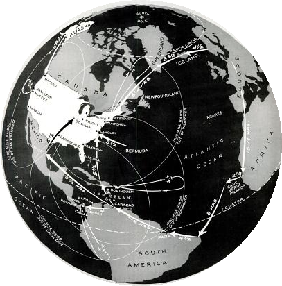
    There was also a certain amount of scare factor involved with waking up the American public to the needs for getting involved in the European conflict in the year-and-a-half before Pearl Harbor–that the Nazis wouldn’t stop in Great Britain, and that “invaders” could and would attack the United States. The need for increasing American war production was not only to supply the allied forces in Europe for stopping Hitler, but also would keep the Nazis away from the United States.  (Summarizing the points discussed by the President and other government officials, the map of the invasion of America looked something like the global view we see above.)  So if Roosevelt couldn’t stir the hearts and minds of the American public for keeping Europe aloft in American-built planes, then keeping the Nazis off Main Street might work. 

    What the map shows are the lines of attack for the un-named Nazi invaders–their aircraft making their way slowly across the Atlantic via Iceland-Greenland–Newfoundland, and across Europe -Africa-Cape Verde-Brazil-Paraguay-then across the Caribbean and right into Wilmington, North Carolina; and then of course all of the way across the Soviet Union to Alaska and then into Washington state.  The plan was that these advanced forces would come in, establish an airfield, grow , and then move closer to the U.S., stopping to construct bases all along the way.  The response, oddly enough, was for us to build “bombers” so that the airbases could be blown up.  That would also extend the effective range of air coverage from the United States to deal with the very-slowly-approaching enemy.  The circles on the map show the effective round-trip range of loaded American bombers and the territory that they could cover.  In general the map, in its own way, portrayed the United States as approachable to foreign invasion.  Some of this reasoning is a little inscrutable, but Washington was playing a game that needed to be won. 
    Invasion us 2
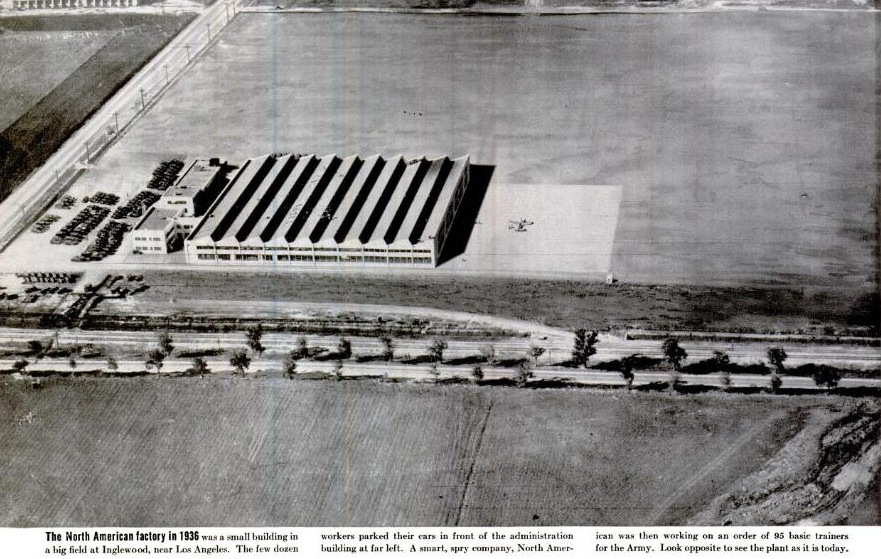
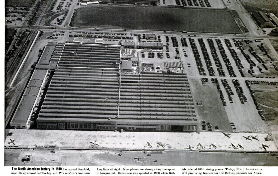
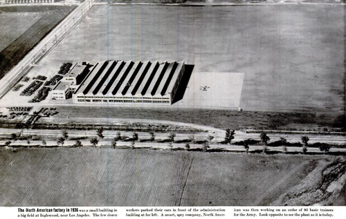
    These interesting before and after pictures of a ramped-up aircraft production industry were to supply some proof that the job could be done, and that this factory could very well be a template that the dozens of others could follow:

    [Aircraft production facility, “before”]
    Invasion US factory before [Aircraft production facility, “after”]
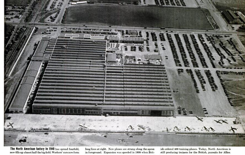
    Invasion US  factory after

    Notes

    Production numbers for U.S. aircraft manufacturing, 1940-1945:

    Type of airplane Total 1940¹ 1941 1942 1943 1944 1945²
    Grand total 295,959 3,611 18,466 46,907 84,853 96,270 45,852
    Combat airplanes 200,443 1,771 8,395 24,669 53,183 74,564 37,861
    Very heavy bombers 3,740 – – 4 91 1,147 2,498
    Heavy bombers 31,685 46 282 2,513 9,574 15,057 4,213
    Medium bombers 21,461 52 762 4,040 7,256 6,732 2,619
    Light bombers 39,986 453 2,617 5,954 11,848 12,376 6,738
    Fighters 99,465 1,157 4,036 10,721 23,621 38,848 21,082
    Reconnaissance 4,106 63 698 1,437 793 404 711
    Support airplanes 95,516 1,840 10,071 22,238 31,670 21,706 7,991
    Transports 23,900 164 525 1,887 6,913 9,925 4,486
    Trainers 58,085 1,676 9,294 17,237 20,950 7,936

    1,352

                   
  • Maps of Imaginary Places, Part III–a Preliminary Listing of Images

    JF Ptak Science Books  Post 1469

    “To wander in an empty cave / Is fruitless work, ’tis said: / What must it be for one like me / To wander in his
    head?”–Selected Letters of Lewis Carroll, 5t, to Margaret Cunnyghame.

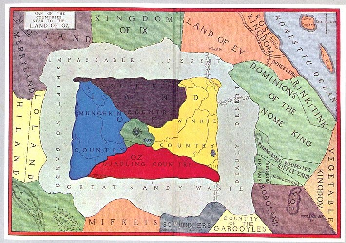
    This is part of a developing thread on the mapping of imaginary places–primarily in work that is done before, say, 1900. There’s much more imaginary cartography in the 20th century than in the entire history of cartography preceding it, and 1900 jsust happens to be a nice arbitrary cut-off date which also coincides with L. Frank Baum’s map of his The Wonderful Wizard of Oz. 

    And so what follows is a simple list, a familiar placeholder for the cumulative list which will soon follow.


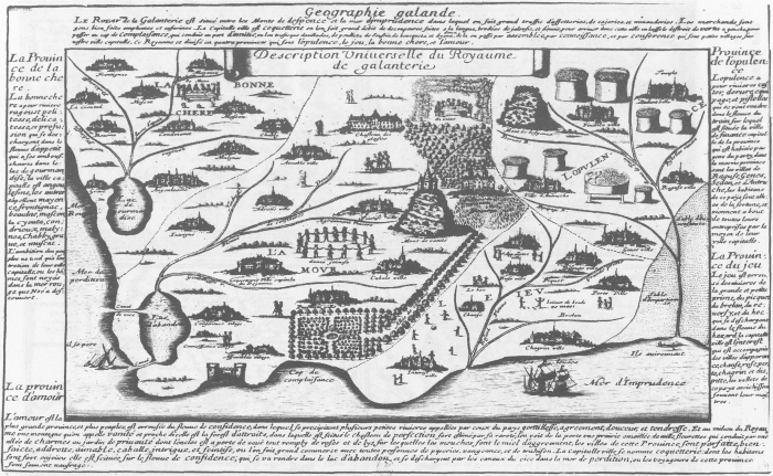
    Voyage au Rayaume de Galanterie (1652), by Delphine Denis. ( In:  Espaces classique, volume 34, numéro 1-2, hiver 2002, p. 179-189.  Source here.)

    Maps imagination galantrie

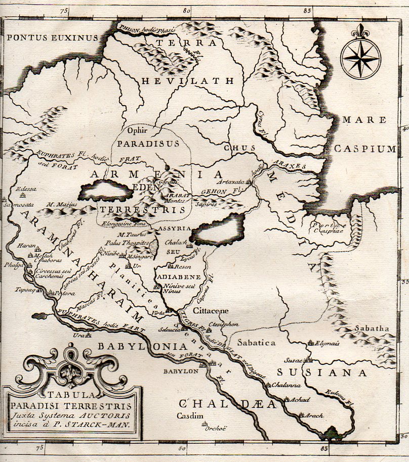
    Map of the Location of Eden,  1785:

    Eden 2358

    The mostly-imagined coastline of Australia, one of the earliest speculations on the place, ca. 1593:

    CORNELIS DE JODE Novae Guinea
    (Novae Guinea. From the Speculum Orbis Terraum published in Antwerp in 1593, by Cornelius de Jode.  The first landfall in “real-life” wouldn’t be made their until 1605/6, and so the speculation on the existence of Australia was fancifiul and based mostly on hearsay, unsubstantiated data and hope.)
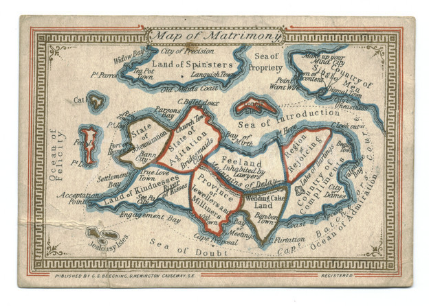
    Map of Matrimony, chromolithographed ca. 1870:
    Aps imagination  z matrimony

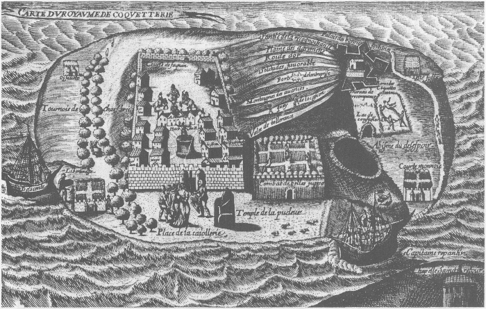
    Map of the Kingdom of Coquetterie
    Maps Imagination--royaume de Couquetterie
    Royaume de Coquetterie, by J. Sadeler.
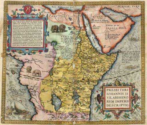
    Kingdom of Prester John
    Maps Imagination map_prester_john_by_ortelius_1572
    Map of Prester John’s realm, by Abraham Ortelius (1527 – 1598), 1572.  The kingdom of Preser John was supposed to be that of exiled Christians surrouned by non-believers, set in Central Asia, or norther Africa, or India, or Ethiopia.  Bordering such places as Paradise and the Fountain of Youth, and ruled by a descendent of one of the Three Magi who was wealthy and benevolent, this place was an object of much travel and considerable expectations. 
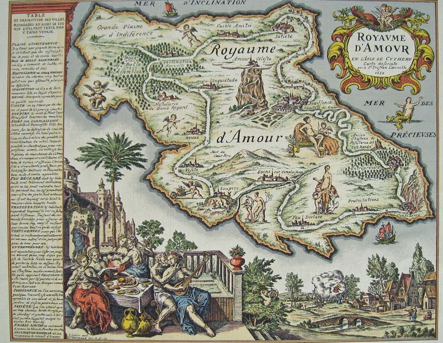
    Royaume d’Armour, by J. Sadeler, ca. 1659. 
    Maps imagination carte-du-royaume-damour
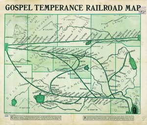
    G. E. Bula, “Gospel Temperance Railroad Map” (1908), unearthed by Frank Jacobs at Strange Maps.

    Gospel Temperance Railroad Map


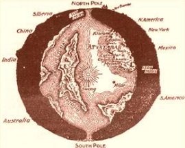
    Map of interior world, from “The Goddess of Atvatabar” (1892) Maps Imagination Z Atvatabar
    by William Bradshaw:


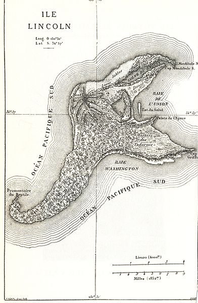
    Map of Isle Lincoln, from Jules Verne Mysterious Island, 1874:

    Maps imagination Z mysterious island

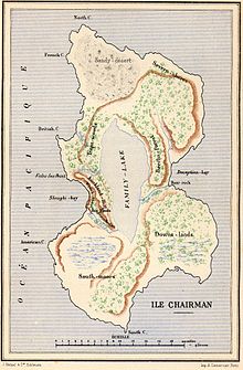
    And another from Verne: Two Years’ Vacation (Deux ans de vacances), Chairman Island:

    Maps Imagination Z  Chairman Island
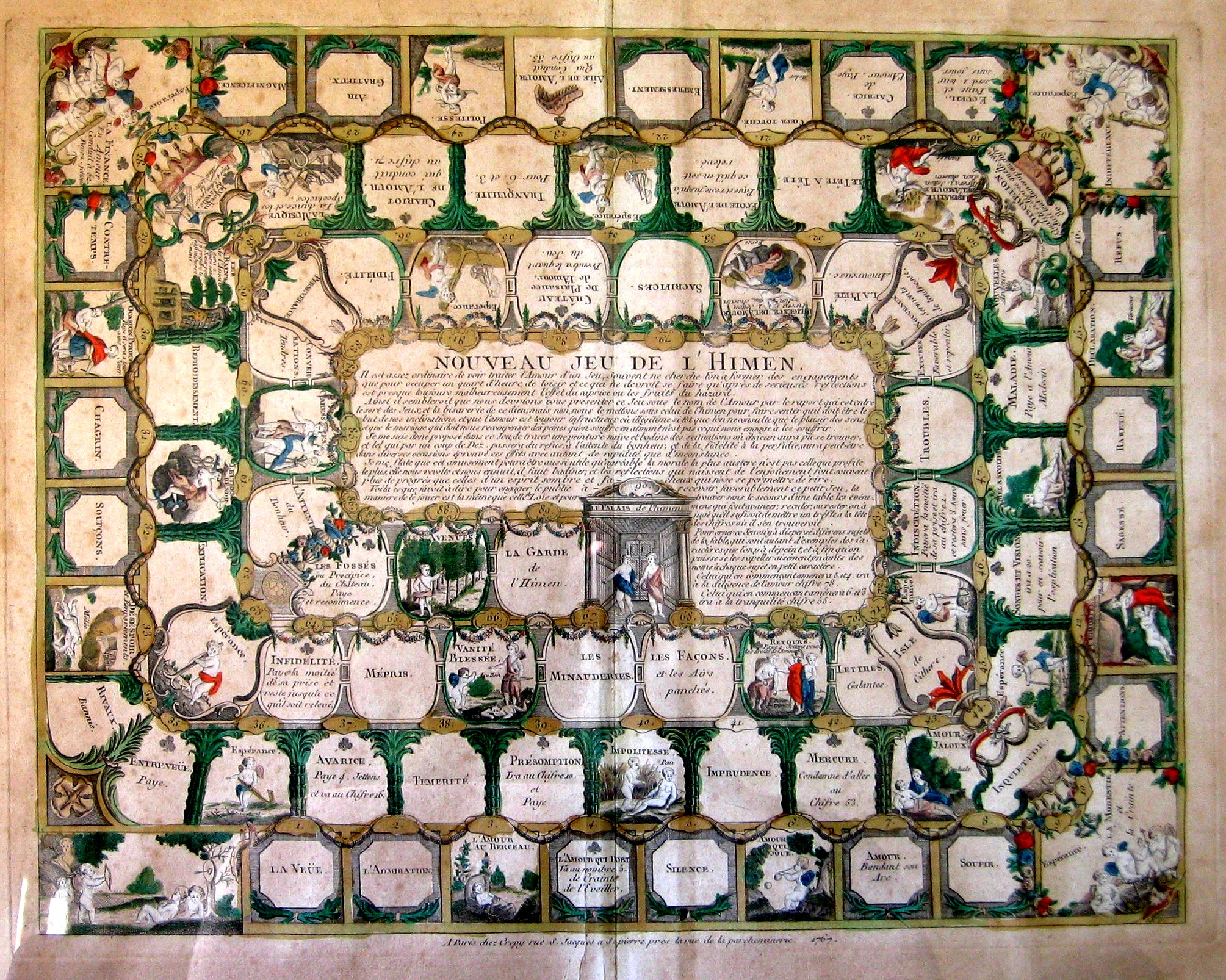
    Nouveau jeu de l’Himen

    Maps Imagination Himen
    Complete description here.

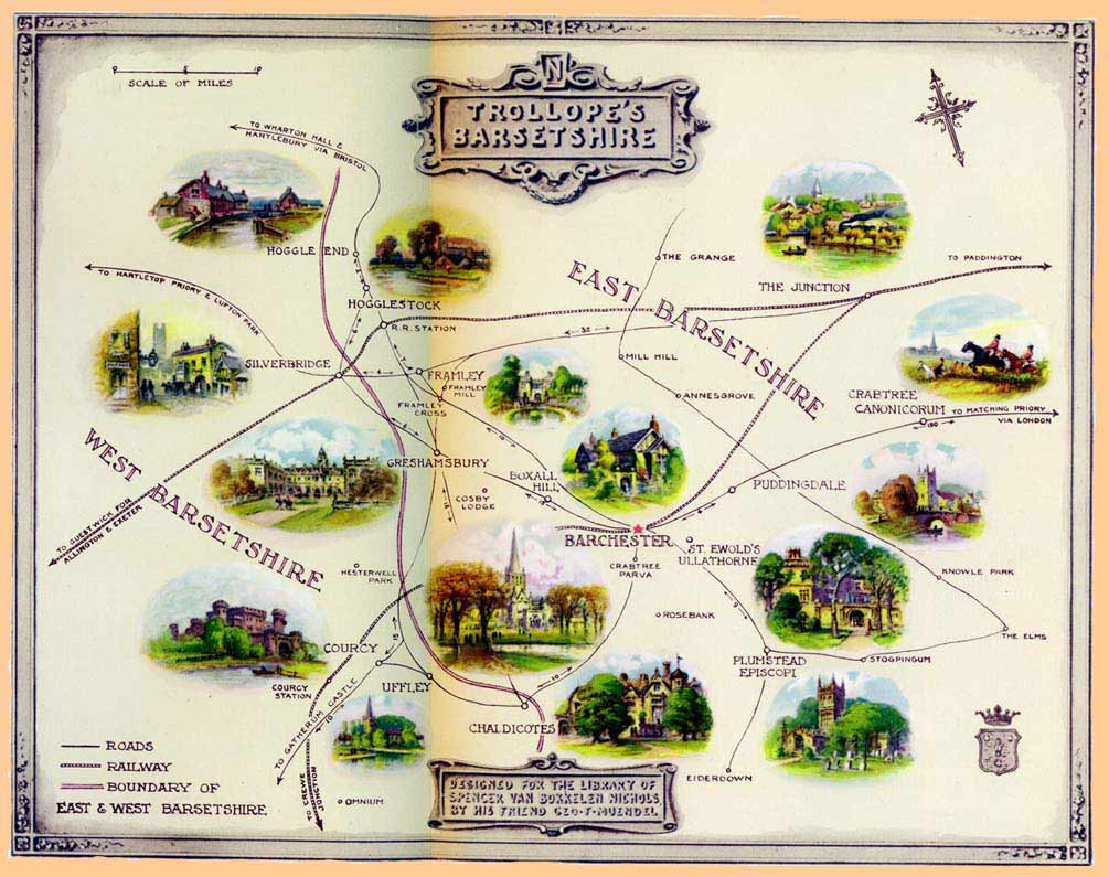
    Barsetshire, from the novels of Anthony Trollope:

    Maps Imagination Z  Trollopes

    the-road-to-success


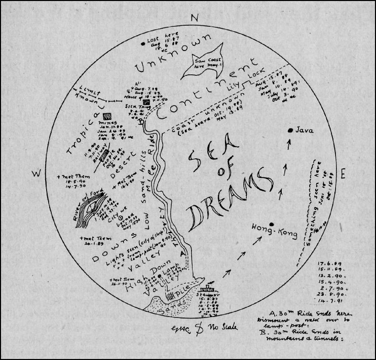
    Rudyard Kipling’s (George Coattar’s)  map of the Sea of Dreams from the “Brushwood Boy”,

    Maps Imagination  Z  brushwood_map_800

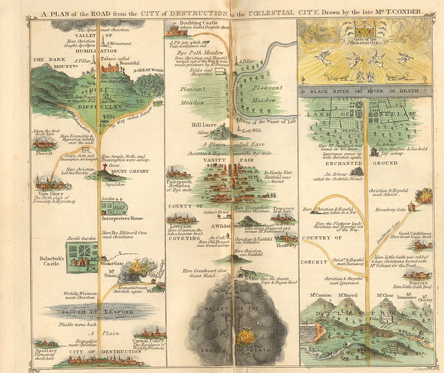
    Pilgrim’s Progress, 1840.

    photo
    The engraving is Thomas Conder’s, originally printed in A. Hogg’s 1778 edition.

    Map of Oz, or at least the first map of Oz, as it appeared in L. Frank Baum’s book The Wonderful Wizard of Oz in 1900:

    Maps of Imagination Z  Oz-and-surrounding-countrie

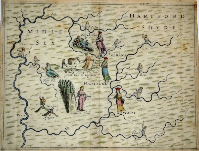
    Michael Drayton’s  (1563-1631) love-poem to England and Wales, the Poly-Oblion (published in 1612), mapped the reaches of the two countries and decorated them with allegorical iamges–it seems to me that the images were given far more work an understanding than the maps, which come off as outlines and suggestions of the real thing. (The maps were interestingly the work of one of the earliest British mapmakers, William Hole.)

    Map of Imagination-Michael-Drayton-s-PolyOlbion-c-1613

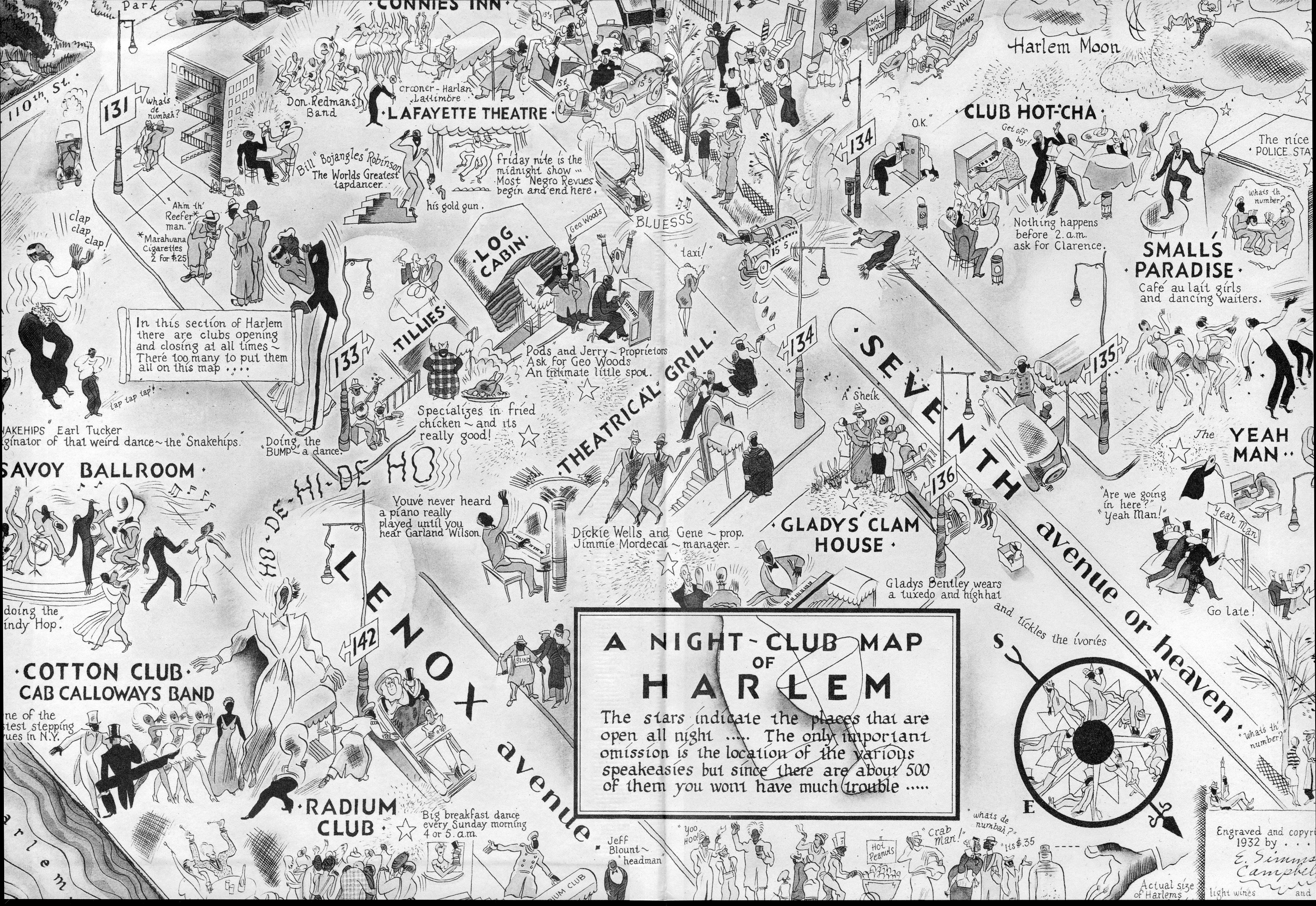
    Map of Harlem Nights, 1932, a fantastic map of a real place and real people and real happenings that I just couldn’t leave alone.  It doesn’t belong here–I just like it. 

    Maps imagination harlem


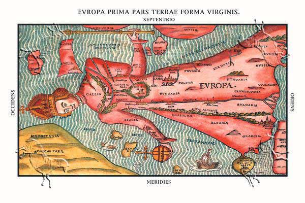
    Heinrich Bunting, 1581. 

    MAPS iMAGINATION eUROPA pRIMA buNTING vIRGIN

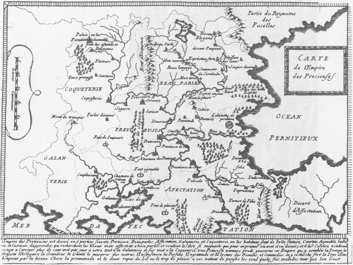
    Map of the Empire of the Precieuse, 1652.

    Maps Imagination Carte de l’Empire des Precieuses,

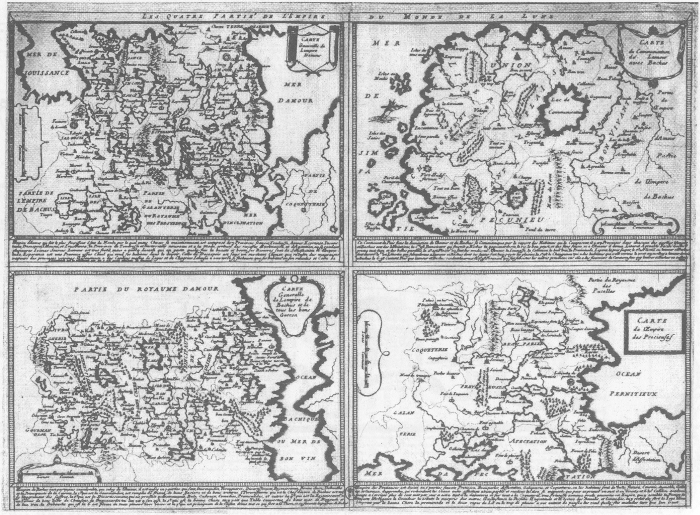
    Les Quatre parties de l’Empire du Monde de la Lune

    Maps Imagination Les Quatre parties de l’Empire du Monde de la Lune

    Clover-leaf map of the world, 1581, a wonderful map designed to increase the savoir faire of the mapmaker Heinrich Bunting’s hometown of Hannover, which appears at the center of the map.  I have a map somewher here that depicts world trade and the importance of Knoxville, Tennessee–the only city depicted on the map.


Recent Posts

Archives

Categories