A Daily History of Holes, Dots, Lines, Science, History, Math, Physics, Art, the Unintentional Absurd, Architecture, Maps, Data Visualization, Blank and Missing Things, and so on. |1.6 million words, 7500 images, 4.9 million hits| Press & appearances in The Times, Le Figaro, Mensa, The Economist, The Guardian, Discovery News, Slate, Le Monde, Sci American Blogs, Le Pont, and many other places… 5000+ total posts since 2008.

  • History of Holes–the First Images of Holes Made by Insects?

    JF Ptak Science Books   Post 1995   Part of a series on The History of Holes #45Follow Me on Pinterest

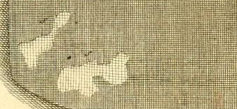
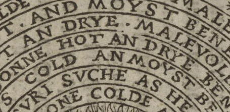
    Reaumur close-up det
    [Detail from one of the earliest images of holes made by insects? From Reaumur, citation following.]

    There are many different ways of looking at antique (or any other) scientific images.  Sometimes you see exactly what they’re supposed to be showing, and other times the viewer sees something more. Sometimes this “something more” is useful, and sometimes it is simply a side bit, not adding to the understanding of the image content, but curious nonetheless, useful in other ways.

    And so is the case with this miniature/micro observation of this engraving which appears in the great work on the lives of insects by  René-Antoine Ferchault de Réaumur:  Memoires pour servir a l’histoire des insectes, which was printed in six impressive volumes (some 26cm tall) in Paris from 1734 through at least 1742,  illustrated throughout with 269 engraved plates, many depicting more than one subject. This was the masterwork of its time on insects, a great effort made and achieved on insect architecture, biology, and behavior–it was a careful and exacting work, magisterial.  Reaumur (1683-1757) was an exceptional talent and observer, writing for the Academie des Sciences on a really wide variety of subjects for over fifty years–and even with this large output, most of his work was delivered posthumously to the Academy.   

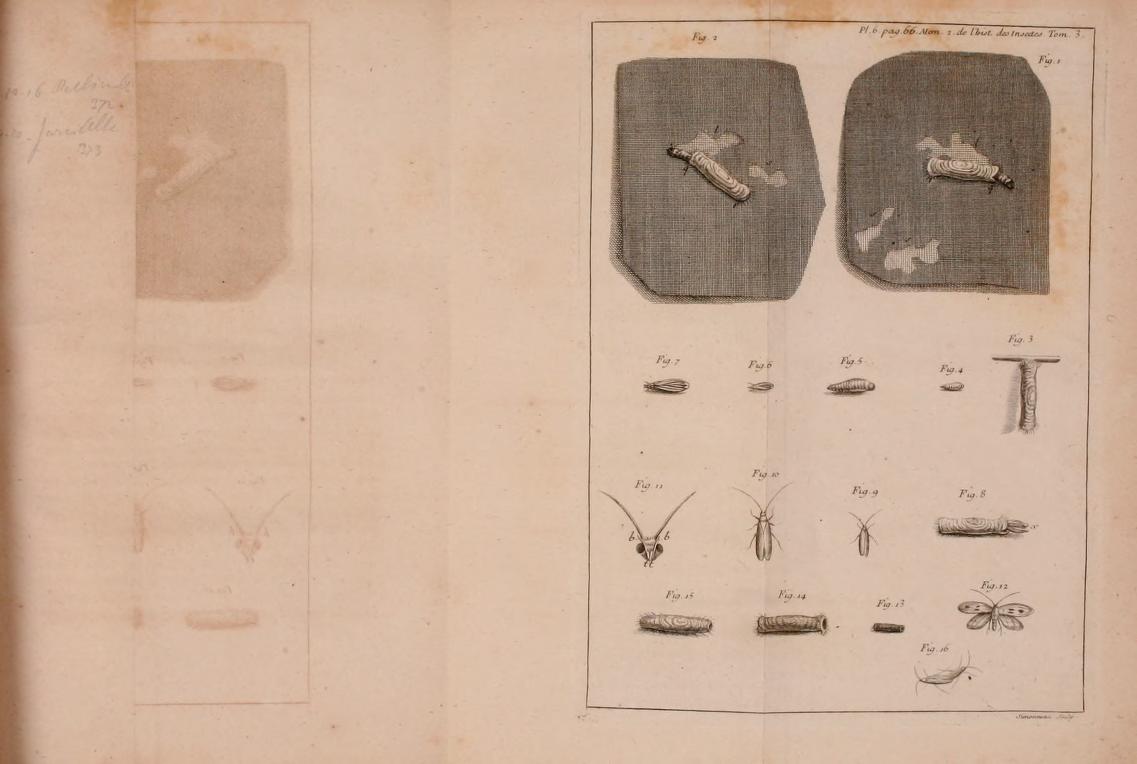
    My attention was drawn to him from an illustration in Barbara Maria Stafford’s Good Looking, Essays on the Virtue of Images (MIT, 1996, palte 93), which depicted the holes made by moths in cloth in volume 3 of the Memoires.  The first image, above, is a detail from the Reaumur engraving, with the full plate, following:
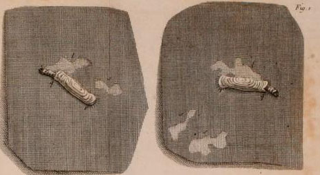
    Reaumur holes detail
    [Reaumur, Memoires pour servir a l’histoire des insectes… volume III,  from the Internet Archive, here.]

    And more:
    Reaumur holes
    The series on this blog concentrating on the history of holes may or may not make any contribution to anything at all, save for perhaps serving as an outpost on looking at images from a different perspective. 

    And just for good measure, here’s an image of the ghost of the image of the mothy hole, an image imprinted on the page opposite the page on which the original image was printed, the ghosted mirror image of the hole captured in an ink/iron impression on paper. 

    Reaumur holes ghost

     Here are the links for the six volumes of Reamur’s Memoires:

    Mémoires pour servir à l’histoire des insectes (1734-1742)

    • Tome I : Sur les Chenilles et les Papillons, Imprimerie royale, Paris, 1734, 654 p., 50 pl. ;
    • Tome II : Suite de l’Histoire des Chenilles et des Papillons et l’Histoire des Insectes ennemis des Chenilles, Imprimerie royale, Paris, 1736, 514 p., 38 pl. ;
    • Tome III : Histoire des Vers mineurs des feuilles, des Teignes, des fausses Teignes, des Pucerons, des ennemis des Pucerons, des faux Pucerons et l’Histoire des Galles des Plantes et de leurs Insectes, Imprimerie royale, Paris, 1737, 532 p., 478 pl. ;
    • Tome IV : Histoire des Gallinsectes, des Progallinsectes et des Mouches à deux ailes, Imprimerie royale, Paris, 1738, 636 p., 44 pl. ;
    • Tome V : Suite de l’Histoire des Mouches à deux ailes et Histoire de plusieurs Mouches à quatre ailes, savoir des Mouches à Scies, des Cigales et des Abeilles, Imprimerie royale, Paris, 1740, 728 p., 44 pl. ;
    • Tome VI : Suite de l’Histoire des Mouches à quatre ailes avec un supplément des Mouches à deux ailes, Imprimerie royale, Paris, 1742, 608 p., 48 pl. ;
    • Tome VII : Histoire des fourmis, Paul Lechevalier éditeur, Paris, 1928, 116 p. & Histoire des scarabées, Paul Le Chevalier éditeur, Paris, 1955, 340 p., 21 pl.
    ·Posted by :

    ·in:

    — — —
  • On Interior Views–Looking Someone Else’s Inside, Out

    JF Ptak Science Books  Follow Me on Pinterest Post 1996

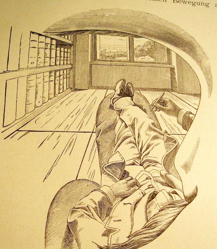
    I cannot think of another illustration by a scientist or philosopher who attempts to explain their own–literal, interior, physical–view of the world and then offer what this looks like to the reader from inside his own head, looking out through his own eye.  That’s exactly what the (unnamed but very Escher-esque?) artist did for Ernst Mach, who is doing precisely that right here on page 15 of his influential book  Die Analyse der Empfindungen. (That’s the  fourth German edition, also known in translation as The Analysis of Sensations and the Relation of the Physical to the Psychical, published in Jena in 1903.) It is a very unusual point of perspective, seeing the world under someone else’s eyebrow and over their moustache.Mach perspective copy
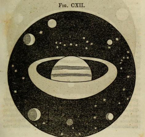
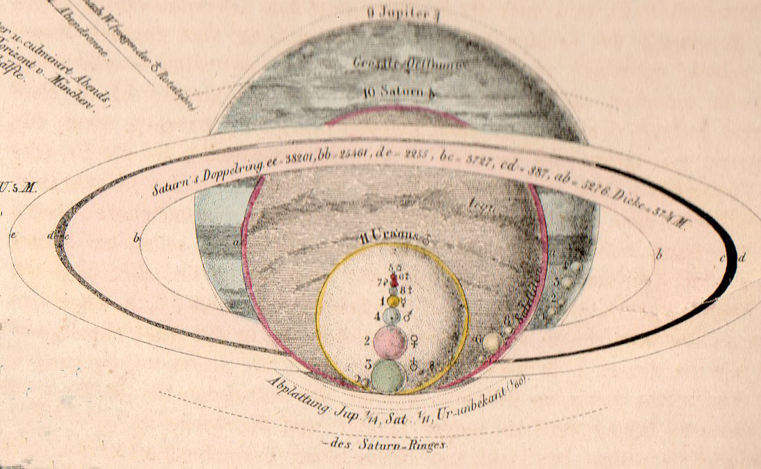
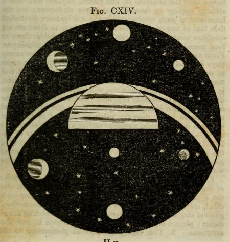
     In a sort-of-similar vein, there is another point of view that is extremely uncommon, another you-are-there perspective, though not interior to the person making the observation, but nearly so.  Here’s an example, just found, and an early one, this imagined from the far side of one of Saturn’s rings, looking back on the planet, and experiencing the distorition in perspective due to the closesness of the observer. 

    Astronomy dick view of sat from ring
    Another image, this one showing the view directly from “the first or second satellite” of Saturn, looking back and across the planet’s rings:

    Astronomy dick view saturnn's rings from satellite
    [Source:  Thomas Dick, Celestial Scenery, 1838, available in full at the Internet Archive, here.]


    ·Posted by :

    ·in:

    — —
  • Anti-Bolshevist Propaganda of High Impact, 1934

    JF Ptak Science Books  Quick Post

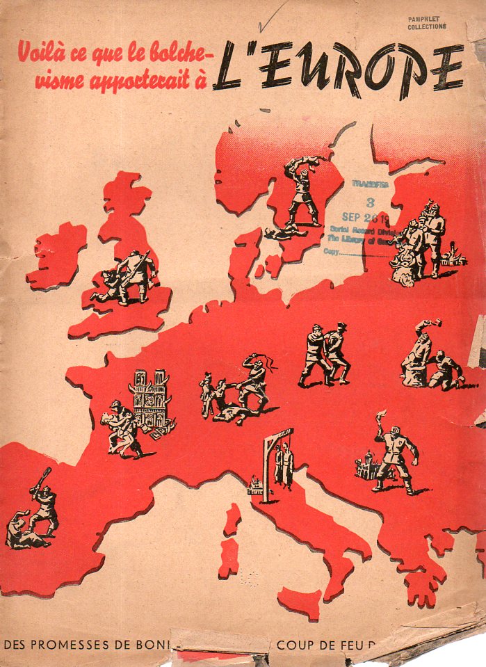
    This pamphlet is very strong–very deeply, drippingly, rippingly, troublingly, strong.  It is an anti-Soviet French publication, Voila ce que le bolchevisme apporterait a l’Europe, (Des Promesses de Bonneur Jusqu’au Coup de Feu dans la Nuque), anti-Socialist/Soviet/Bolshevist of the highest order.  “This is What the Bolshevist will Bring to Europe” has a cover based on a 1934 poster, and was so published in 1934 or 1935.  It is, essentially, a brutal portrayal of Stalinist Russia and what the coming of that communism would mean to Europe and the U.K.

    Anti-bolshevic164

    The poster–which is slightly larger and reaches deeper to the East–is available here.

    ·Posted by :

    ·in:

  • Ibsenity, 1891: “Not Only Should the Play be Spared Discussion, but also Performance”

    JF Ptak Science Books   Quick Post 

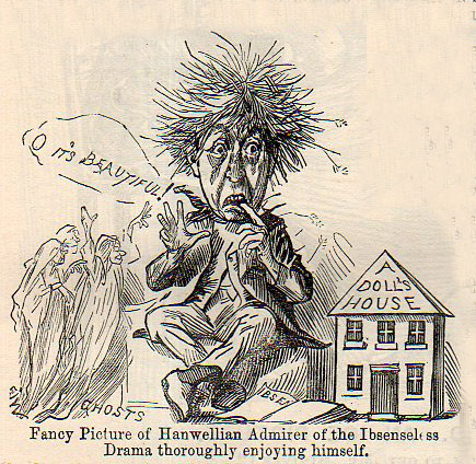
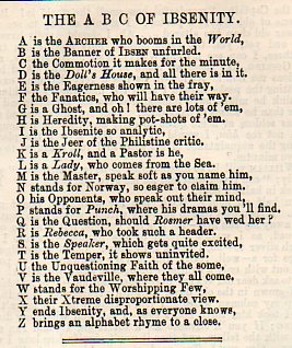
    These bits just caught my eye, found in the 1891 volume of Punch magazine, a smart and sharp-as-broken-glass humorous/satirical/social commentary popular English mag.  It takes Henrik Ibsen to a rough task: evidently, if Ibsen were a color-by-number portrait to be painted, Punch would give him the numbers “1” and “2”, and then color everything in one color.  Somestimes something can be revolutionary and essential and unlikable, even when it has become the modern world’s most-often-performed play. 

    Ibsen169I’m partial to created alphabets:

    Ibsenity166

    And the review of A Doll’s House that accompanies the satirical image above:

    ·Posted by :

    ·in:

  • Melville on the Depiction of Whales

    JF Ptak Science Books  Quick Post

    I was digging a little in Herman Melville and Moby-Dick and fell into eleven pages of his scholarly ruminations on the depictions of whales in art and literature, fictional and otherwise.  Its really a very fine little gem, bobbing there in the nearly the exact middle of the book. (It is not the middle of the middle of the middle like Gettysburg in Mr. Foote’s The Civil War, a Narrative, where as it happens the battle appears in the middle chapter if the middle volume, but it is close enough.)  Here it is, from the full text at the University of Virginia:

    ·Posted by :

    ·in:

  • History of Holes: Lakes and Holes and Imaginary Tears

    JF Ptak Science Books   Quick Post

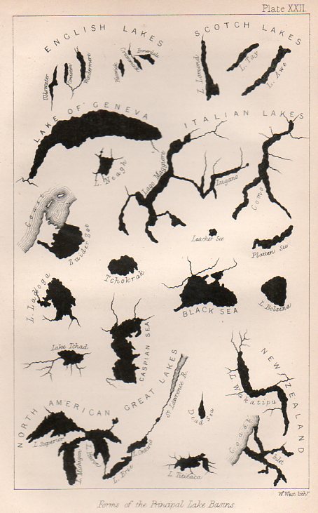
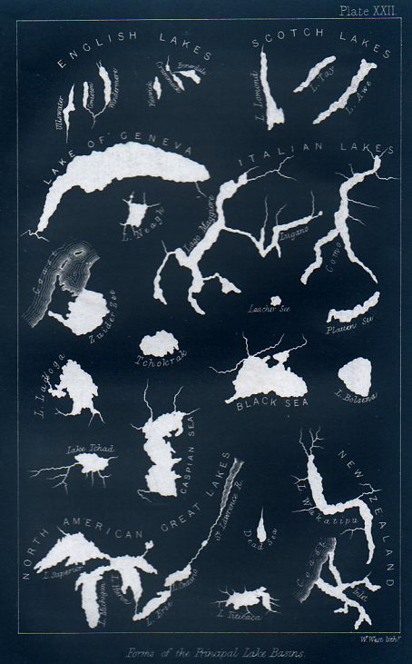
    This engraving was very nearly very interesting–I mean, it is interesting in that it shows the shapes of lakes together on a single sheet of paper, their shapes presented devoid of any other non-lakes.  Its really quite an arresting presentation, and coming at a relatively early time in presenting data in this fashion.  What the engraving doesn’t relate, unfortunately, is the size of the lakes relative to one another. 

    LAkes161

    And if the lakes were to be presented proportionally, Lake Geneva (surface area of 225 miles2 would be quite a speck compared to the likes of the Great Lakes, and Lake Superior (31,000 miles2) would speck-ish compared to the great Caspian (clocking in at 152,000 miles2). 

    This graphic appears still in the first decade or so of cartographic physical attributes being placed together, and was published in 1865 in the Popular Science Monthly. 

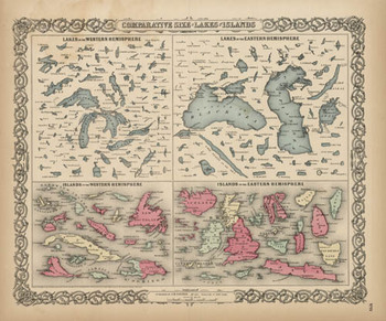
    Blogjuly_19_comparative_big_colton Here we go with a good representation of an engraving (above), this from 1856 and which may have been the first time that these 150+ lakes and islands of  the Western and Eastern Hemisphere were ever been printed on the same  page and in the same scale exclusive of their associative land masses  and placed contiguously, side-by-side.  They were, of course, seen in a  common perspective before on any world map, but I think that this is the  first year in which the islands and lakes of the world were displayed  without oceans and land masses, and the effect is a little odd.  If you  take away the color and the text the image takes on a very definite  biological flavor (I keep thinking of that tiny bone in the ear for the  small lakes…)  In any event it is far easier to compare these features  without the distractions of the non-lakes and non-islands clouding and  confusing our perspective fields.

    The largest lakes, here.

    And as long as we’re at, let’s have a look at the first image inverted, which gives the lakes a good healthy dose of anthropomorphism via imaginary rips, tears, moth- and bullet-holes.

    LAkes inverted


  • A Very Uncommon USA-Cuba Celebration

    JF Ptak Science Books   Quick Post

    Cuba USA 4th july174

    This pamphlet was full of hope and the prospects of engineering an economic relationship with the United States during a period of turbulence in Cuba, two years before the ratification of the progressive constitution of 1940. Printed in Havana in July 1938, it calls for “A frontierless Fourth of July” and “Dedicated by the Socio-Economic Union of Cuba to the people and Government of the United States of America”.  It came to me via the Library of Congress which in turn acquired it from the U.S. Supreme Court, which got rid of the document only a few months after it was received.  Let’s just say that this was a most unexpected piece of cover art. 

    ·Posted by :

    ·in:

  • On Filling-in-the-Blanks, 1757

    JF Ptak Science Books  Quick Post   Follow Me on Pinterest


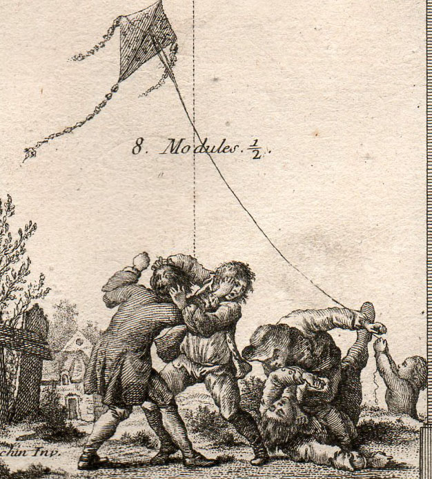
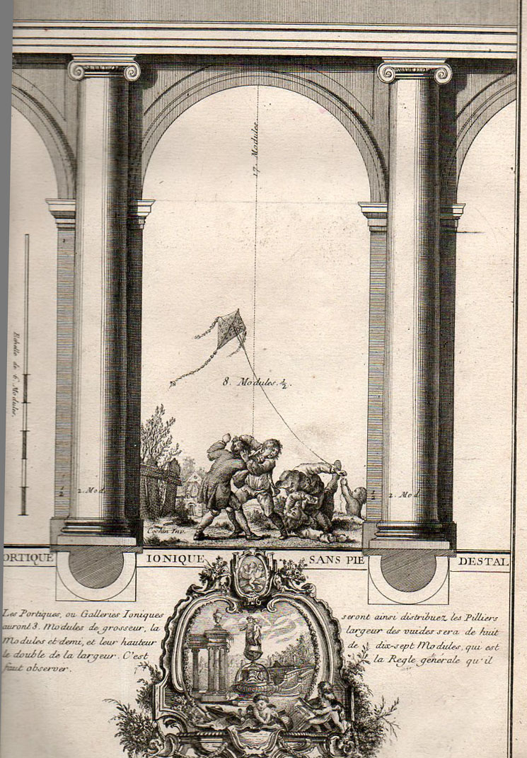
    This Rococo edition of Vignola [Jacopo (Giacomo) Barozzi da Vignola (Italian, Vignola 1507–1573 Rome)] features fabulous interpretations of the classic textbook, the images of columns and plans of buildings and designs of rooms and so on all are decorated with bits and pieces of 18th century humanism.  The detail above (with the nearly-full engraving below) is embellished with a very uncommon scene of children fighting and playing. It is one of many that are illustrated with scenes of everyday life which really have nothing to do with the image in which they find themselves, a little bit of When Worlds Collide happiness. 

    [Source: private.  The full title of the book:  Livre nouveau, ou, Regles des cinq ordres d’architecture / par Jacques Barozzio de Vignole ; nouvellement revù, corrigé et augmenté par Monsieur B*** architecte du roy ; avec plusieurs morceaux de Miche-Ange, Vitruve, Mansard, et autres célebres architectes tant anciens que modernes … ; le tout d’après Mrs. Blondel, Cochin et Babel, graveurs ..Edited by Jacques-François Blondel (French, Rouen 1705–1774 Paris); designed by Pierre Edmé Babel (French, 1720–1775); engravings designed by Charles Nicolas Cochin II (French 1715–1790); title page engraved by Jean-Charles Le Vasseur (French, 1734–1816).]


    Arch vignole 159

    Which is a detail from:

    Arch vignole 158


    ·Posted by :

    ·in:

  • Splendid Small Astronomical Image–Paper Microscope Exercises,1856

    JF Ptak Science Books   Follow Me on PinterestQuick Post


    These small images are elements composing an engraving from the atlas volume to accompany the polymathic Alexander von Humboldt’s (1769-1759) Kosmos, published in 1856 (the atlas volume online here, at the Biodiversity Library). Each of the small images is about 1.5″ square, with great detail–tiny and remarkable, and very well designed.

    Astronomy von Humboldt det137

  • A Note on the Very Very Quiet Beginnings of Pi

    JF Ptak Science Books   Quick Post

    It seems that for such a great number as pi the naming of had little (where “little” = “no”) fanfare in its introduction.

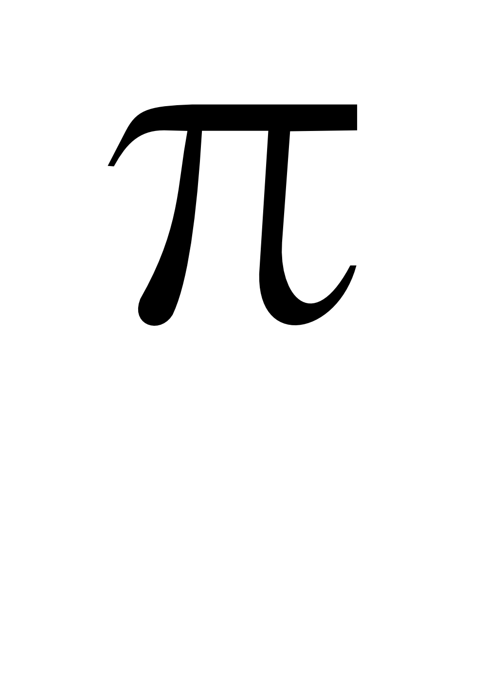
    Since it is just after 1:59 on this pi day of 2013 (3.14159…) it might be nice to have small bit of history on the first use of the symbol for pi. Pi the idea is ancient (on the ratio between the diameter of a circle and its circumference) but using the Greek symbol for the word is relatively new.  It shows up for about he first time here:

    on page 267 of William Jones’ (1675-1749) Synopsis Palmariorum…, which was in general a book for beginners in semi-advanced mathematics, and which was published in 1706.  Pi is represented as a square or the Hebrew letter “mem” in John Wallis’ Arithmetica infinitorum (published in Oxford in 1655), according to Florian Cajori in his A History of Mathematical Notations (volume II page 8), though William Oughtred had used the Greek letter in fractional form to designate the ratio as the periphery and the denominator as the diameter. Still, it was Jones who introduced the letter pi as the sign for the ratio, and he did it without saying very much at all about it.  Actually, he says nothing about it at all–just states the case, and that was it. 

    Cajori writes on to say that Jones used the symbol earlier in the book, but in a different context, and that the immediate reaction to the symbol (if there was a reaction) was also a bit of nothing, with many writers continuing to use different symbols to talk about pi for several more decades, and that it didn’t really come into use in general textbooks in German and French until nearly 1800. 

    And such was the quiet beginnings of

    Pi

    (Full text here.)

  • The Plurality of the Heavens, 1613

    JF Ptak Science Books    Post 1999

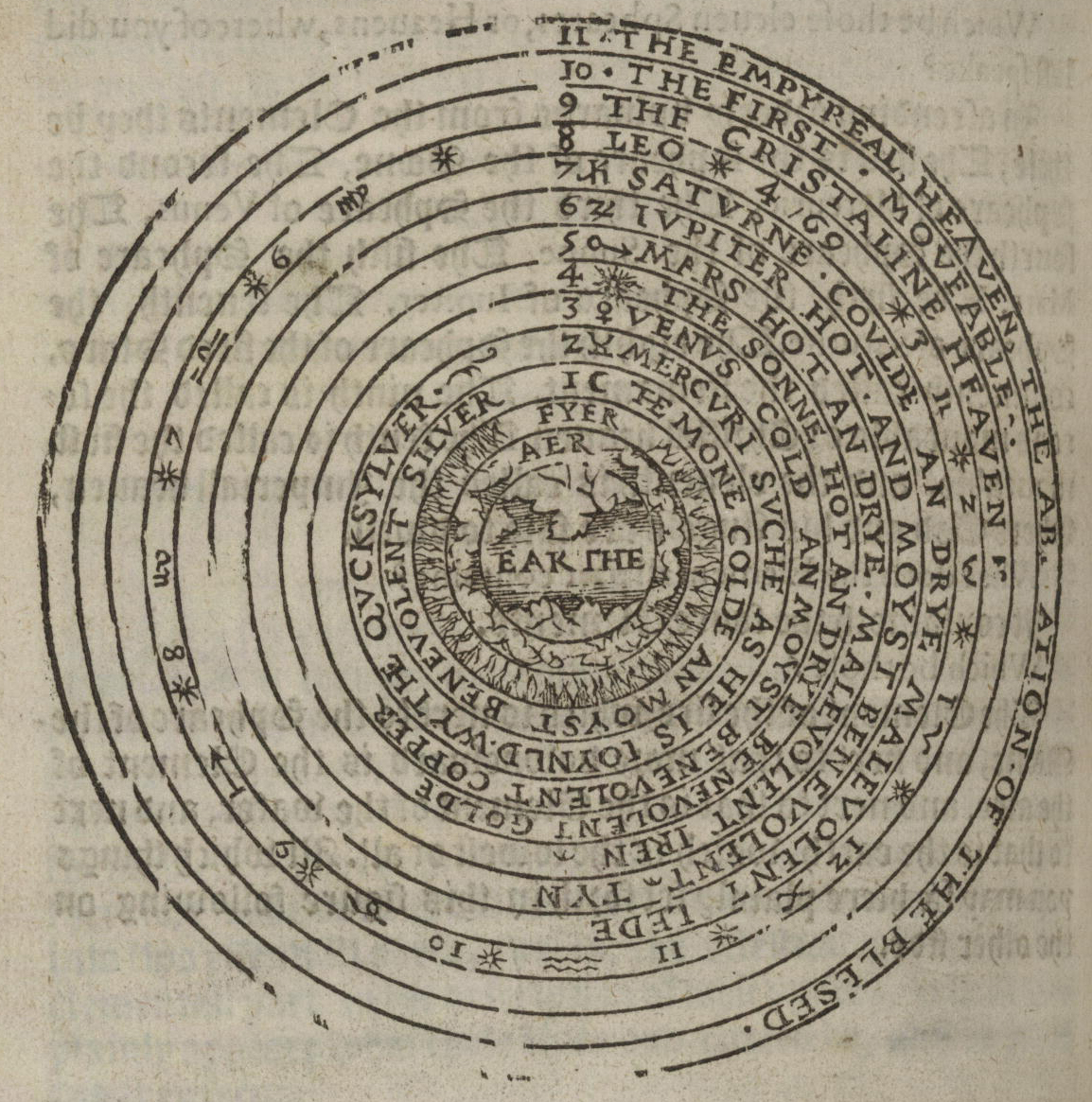
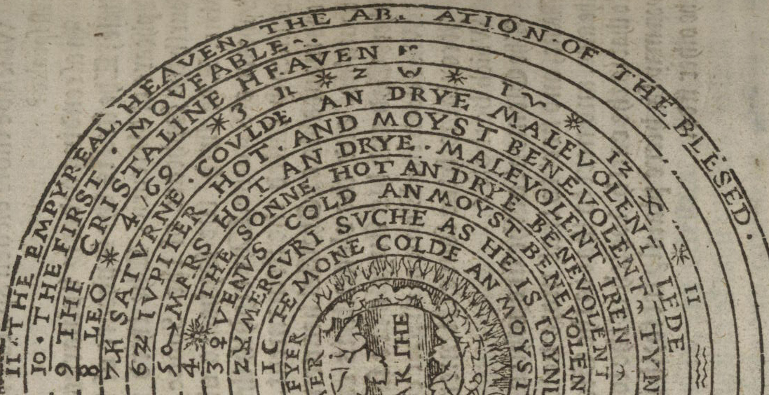
    This copy of Thomas Blundeville’s (1522-1606) work on astronomy and navigation contains some very fine examples relating to imaging the history of astronomy–a high-Renaissance work of scholarship and humanism.

    Cosmology Blundeuille 1607 detai text

    Cosmology Blundeuille 1607

    Cosmology Blundeuille 1607 detail big
    The book has a long and detailed title: M. Blundeuile his exercises : containing eight treatises, the titles
    whereof are set down in the next printed page : which treatises are very
    necessarie to be read and learned of all young gentlemen, that haue not
    beene exercised in such disciplines, and yet are desirous to haue
    knowledge as well in cosmographie, astronomie, and geographie, as also
    in the art of nauigation, in which art it is impossible to profite
    without the helpe of these, or such like instructions : to the
    furtherance of which art of nauigation, the said M. Blundeuile specially
    wrote the said treatises ..
    with this copy being the fourth edition (corrected and augmented), and printed in London in 1613–an interesting edition, which contained the new data of the circumnavigation of Sir Francis Drake.  

    [Sources: full text here via the Library of Congress; found via the pinterest collection of Trevor Owens.]

    Cosmology Blundeuille 1607 text

Recent Posts

Archives

Categories