A Daily History of Holes, Dots, Lines, Science, History, Math, Physics, Art, the Unintentional Absurd, Architecture, Maps, Data Visualization, Blank and Missing Things, and so on. |1.6 million words, 7500 images, 4.9 million hits| Press & appearances in The Times, Le Figaro, Mensa, The Economist, The Guardian, Discovery News, Slate, Le Monde, Sci American Blogs, Le Pont, and many other places… 5000+ total posts since 2008.

  • The Phonograph as a “Philosophical Toy” in April 1878, and then not so in May.

    JF Ptak Science Books    Post 2568

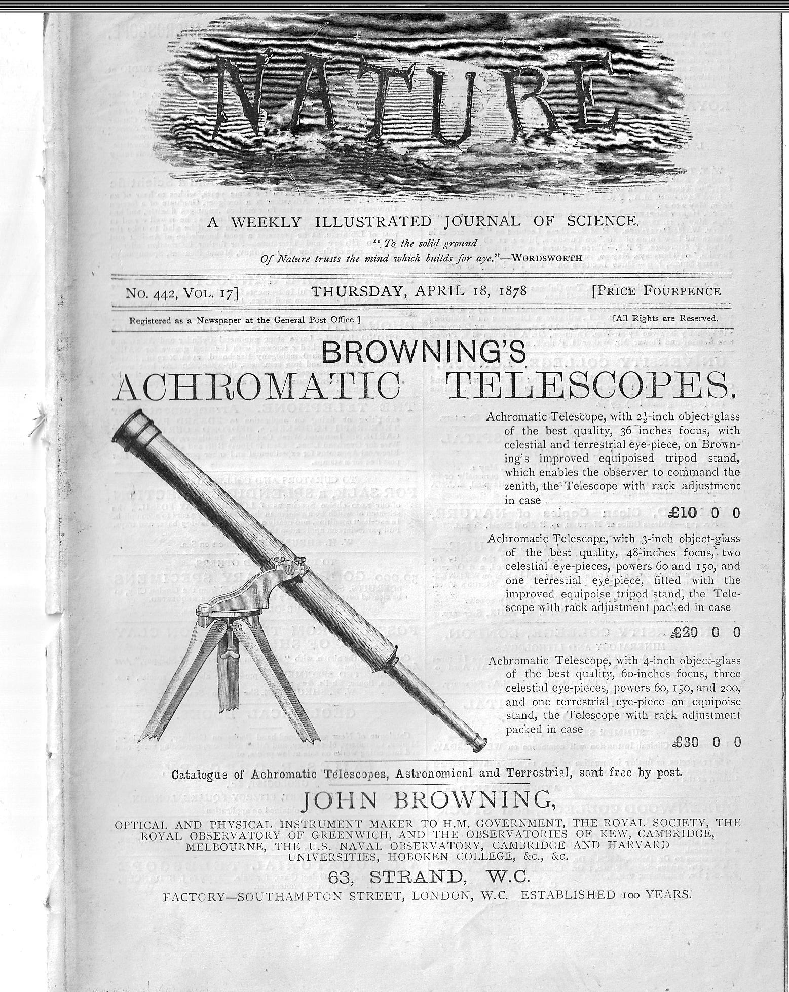
    Only months into the invention of the phonograph by Thomas Edison (at Menlo Park in December of 1877 and patented in January 1878) Alexander J. Ellis reviewed a version of it constructed in London by Mr. Stroh, and found it, well, wanting.  Ellis (1814-1890) was a product of Eton, Cambridge, Trinity, and was a gifted mathematician, philologist, and a groundbreaking ethnomusicologist, and did see some limited utility of the machine to restricted areas of his research. In the short note he wrote for Nature in their April 18, 1878 issue1, he mostly found that the phonograph was generally flawed in its reproductive capacity, and did not venture far from this interpretation so far as the possible applications of the machine was concerned, which seems iconically short-sighted from my perch here in the future. Even though Ellis recognized that “the effects produced are sometimes startling (as in cries, coughs, laughter, music), the philosophy of the process (making a permanent impression of a very complex compound vibration, and using it as a mould to reproduce that vibration is exceedingly attractive, but at present the instrument–at least the one that I saw…” he concludes that the status of the invention “…has not risen beyond a lecture illustration or a philosophical toy”.  
    Nature 1878 phonograph _good_

    That said, Mr. Bell himself didn’t see that much utility in the invention at the time, although with time it became his favorite invention, his “baby” so to speak.  In 1878, though, the the use of the phonograph was pictured in exceptionally narrow terms.

    Mr. Ellis was cautious enough though to qualify his statements in the April Nature issue by restricting his phonograph experience to the one constructed by Mr. Stroh.  And then, a month later, Ellis returns to Nature with a new appreciation of the phonograph–this one constructed by the beautifully-named Fleeming Jenkin, which evidently was superior to the Stroh machine, as Ellis has a newer appreciation for the invention, though its future still seems limited to the study of phonetics and speech. 

    • “The phonograph as I have said resembles rather a worn print than a proof of the human voice. This means of course that the delicate upper partial on which all brilliancy depends are absent In some respects this is advantageous for the very elaborate inquiry which Prof Fleeming Jenkin has instituted for it enables him to catch the bold outlines en which genera depend without being at first bewildered by the delicate details which give specific differences. Our speech sounds are of course individual and what is recognised as the same speech sound varies in the same speaker within the limits of its genus almost every time it is used. We shall do much if we establish the genus. The extent of Prof Jenkin’s researches as he contemplates them end the ease with which his initial experiments tracings and analyses have been conducted lead us to hope that we have at least got an instrument which will enable us to solve the elementary problems of phonetics that have hitherto almost baffled us although it is not suited as yet to fix those delicacies of utterance which were my own special object of investigation.” (Nature, May 9, 1878.)

    Mr. Ellis does rescind many of the negative things he had found in the phonograph in this new May letter, though he still seems not so happy with it, and can see thus far in two letters that see only a very limited history for the invention.  At the very least though Mr. Ellis did say that the new machine constructed by Jenkin was definitely no longer merely a philosophical toy.  

    Notes:

    1. “The Phonograph”, being an article in the April 18, 1878 issue of Nature, volume 17, No 442, pp 485-6 in the weekly issue of pp 481-500. This issue comes complete with the scarce outer wrappers and ads, comprising another 7pp.  The issue has been removed from a larger bound volume, and shows that effect on the spine; that said the weekly is in crisp and bright condition. 
  • A Note on Venn and his Diagrams (continued)

    A Note on Venn and his Diagrams

    JF Ptak Science Books   Post 1952 from 2013, expanded

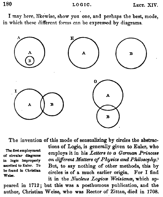
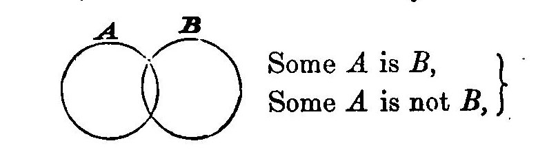
    It seems so unlikely that the Venn diagrams took so long to appear, that it hadn’t been Aristotle’s Diagrams, or Cartesian Diagrams; rather, these elegant creations–about a different way to represent propositions by diagrams– belong to Mr. Venn’s invention in 1880. Mostly. It was in that year that these famous more fully-developed diagrams first appeared in a paper entitled “On the Diagrammatic and Mechanical Representation of Propositions and Reasonings“ in the Philosophical Magazine and Journal of Science.  They seem so beautiful, and so simple, and so powerful, and so elegant. So necessary.  And so why-did-they-take-so-long-to-appear, so obvious.  In a way, they are in that category of The Great Obvious Invention, in a similar vein to Mr. Luke Howard first classifying the names of clouds  in 1803.  Sometimes things are not obvious until they are.  

    Venn diagram
    [Source: Internet Archives, John Venn, Symbolic Logic, 1881]

    Well, almost.  The diagrams did mostly make an appearance earlier–though not in the Venn form–in the work of Christian Weise (d. 1708) and then in that of Leonhard Euler  (1707-1783), that according to the great William Rowan Hamilton, explained in his work Metaphysics and Logic (1858-1860). But the final form seems to be that of Venn.  

    Hamilton’s work appears so:

    Euler diagram

    They also appeared in the Proceedings of the Cambridge Philosophical Society, volume 4, 1880, in his article “On the employment of geometrical diagrams for the sensible representation of logical propositions” in which he discusses the history of the diagrams, including the Hamilton history.  Venn also includes this beautiful logic template of Bolzano:

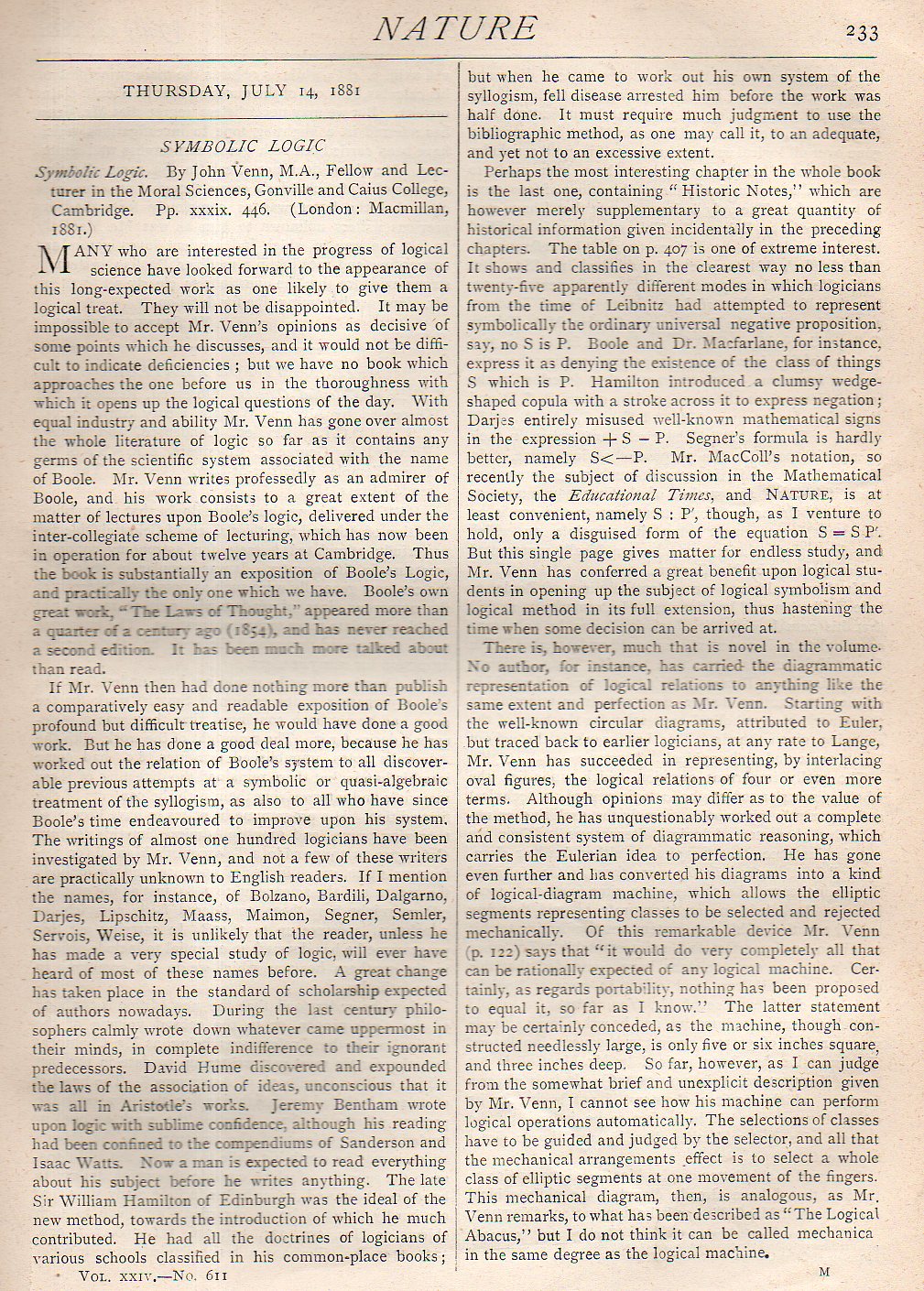
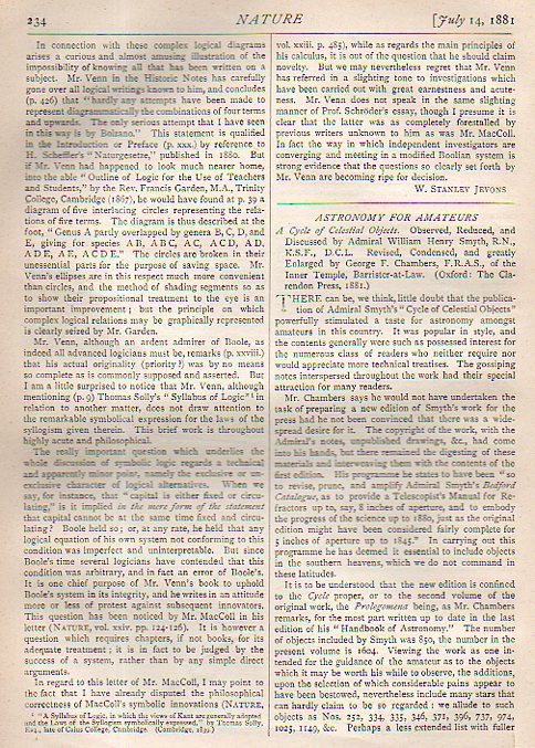
    All of this brings us back to where I silently started,  finding  a wonderful book review of the 1880 Venn Symbolic Logic, and that appeared the following year in the journal Nature on 14 July 1881. The review is by one of my favorite 19th century figures, the inimitable W. Stanley Jevons, and is reproduced below.


    Venn nature954
    Venn nature955

  • Stalin and France, 1945 (And a Mention of the “Great Terror”)

    JF Ptak Science Books   Quick Post

    Stalin in FranceG. Sudiene’s Le Communisme Stalien en France certainly has a great piece of design for its cover.  The pamphlet was printed–it looks like–in May 1945, right at the time of the Allied victory in Europe. By this time Stalin had bullied his way halfway across eastern Europe and certainly was no longer the friendly face of an ally as it may or may not have been in 1942/3. In any event, I found it interesting that while thumbing my way through the pamphlet I bumped into a section heading called “La Grande Peur des Communistes Staliens”, which uses the intellectually-straightening phrase, “the Great Fear” or “the Great Terror”.  I’m familiar with the phrase mostly because of the title of the 1968 Robert Conquest book, and so far as I can recall I hadn’t encountered it much during the contemporary-ish time in which the plague of terror was occurring. This one comes close, coming six years or so after the end of that particular piece tragedy (the Great Terror ranging from 1936-1938 in Conquest’s book). In this pamphlet this period is expanded to 1933-1939. I couldn’t find anything about the author in a quick-search, and the pamphlet itself nearly escapes mention. (On the other hand I did see the phrase “judeo-Comministe”, which is usually meaning “Jewish Bolshevism”, which is a standard and long-established piece of anti-Semitic propaganda, though I didn’t see anything in the text to support it…that’s a pretty big bomb to drop, though, on an unsuspecting reader.

    ·Posted by :

    ·in:

  • Color and Its Abuses–the New York World’s Fair, 1939

    JF Ptak Science Books   Post 2569

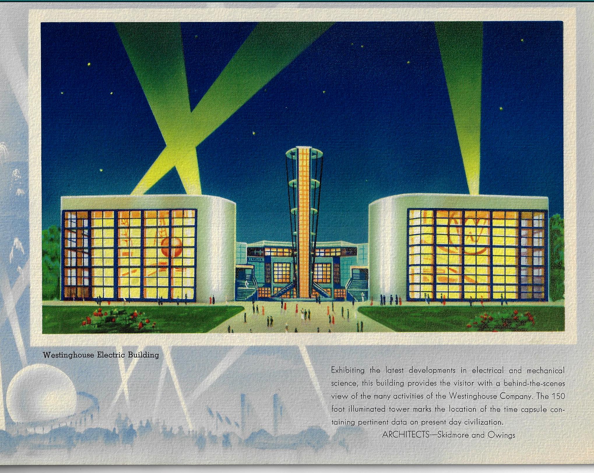
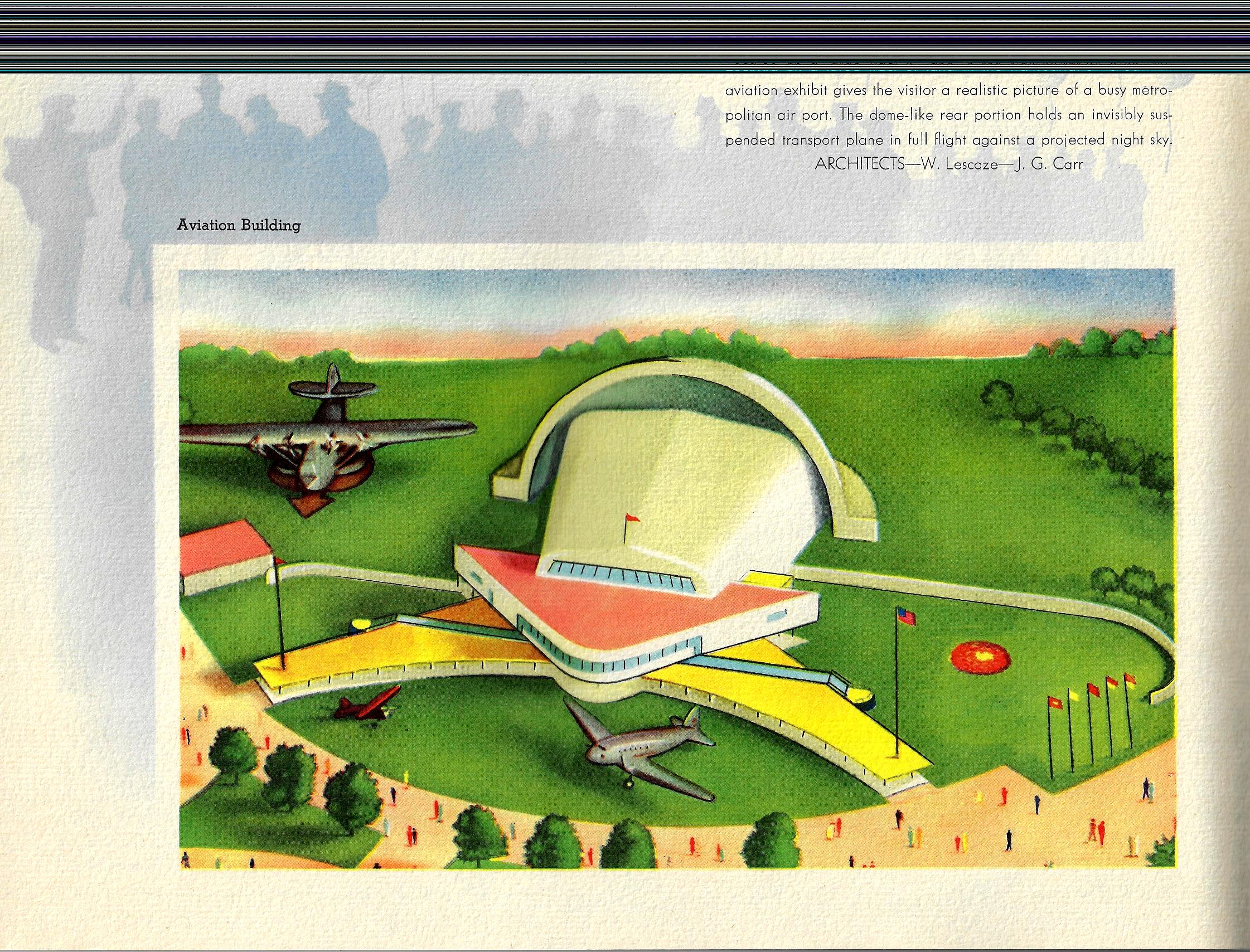
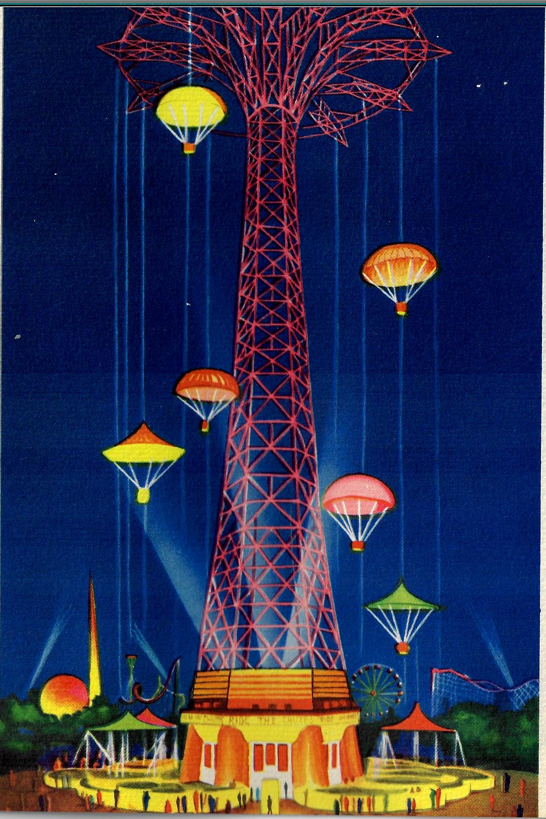
    Color and its use and abuse is a very personal thing—especially the “abuse” part. The pamphlet below (Views of the New York World’s Fair, 1939, and published that year) to me is certainly one of those entries in the history of the abuse of color, not so much that the colors used in it are odd together, but the saturation of color across the board leads to something like Splendorama hyper color. I’m not sure why the colors are like this–they remind me of a color equivalent of a laboriously and not-very-good translation of a tech manual. It isn’t as though color printing was new in the publishing industry, as books had been printed in different colors besides black for at least 300 years by this time;  even full-color printing had been around for 120+ years, so it isn’t as though they were experimenting with the color equivalent of newly-available typefaces in a 1985 word program. Color photography in books is brand new at this point, the wide-scale use taking place this year, but these images are not photos, so I doubt that this had much of an effect on the creativity of the designer. 

    COlor NYC Worlds Fair 1939 _1_

    Since a few of these images are quasi-sci-fi, I even wondered about the color influence in speculative novels and movies.  Color was very adventurously used int he early sci fi pulps and monthlies, but that stuff was already being employed for two decades by this point so their newness in regard to publishing experimentation is not an issue.  And so far as sci fi and color in the movies goes, that also wasn’t an issue because it didn’t exist yet, as the first color film1 in that genre didn’t appear until Lesley Selander’s awful Flight to Mars (1951).

    Color NYC Worlds Fair airport

    In short, I don’t know what is going on here, color-wise.  

    Color NYC Worlds Fair _3_

    Notes:

    1.  Flight to Mars, from Monogram Studios, was about a manned flight to Mars in 2000,  There was another unusual film, I think it was Destination Moon at about the same time, where the spaceship overshot the Moon and went to Mars instead. This note though is in regard to the Georges Melies film, Le Voyage dans la Lune (1902), which did have some color, though that was tediously applied by hand in post production.  (Invaders from Mars (1953), by the director William Cameron Menzies, was the next sci fi flic made in color.  

      Color World fari 1939 _4_

  • Naming Numbers and Pieces of a Dollar (1836)

    JF Ptak Science Books  Quick Post

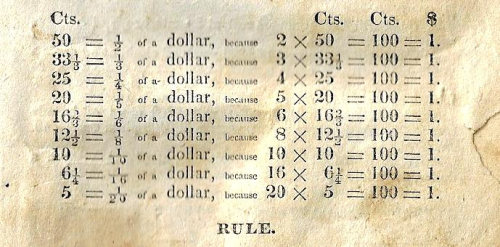
    I’ve posted a couple of other bits about the wonderful book by Roswell Smith (Practical and Mental Arithmetic on a New Plan...which was published in Hartford in 1836) here and there, as this elementary text is really chock full of interesting insights into early 19th century life in the U.S. as well as some good, logical approaches to arithmetic. It is a small book, about five inches high, and mine is particularly worn from use–its paper cover with the title page imprinted on it is half gone and mostly illegible, and is smooth to the touch from (I guess) constant handling.  I particularly like this breakdown of components of a dollar, divided into nine sections instead of four–the dollar buying quite a bit in 1836, including the purchasing power of five copies of the Smith book.  

    Math pieces of a dollar


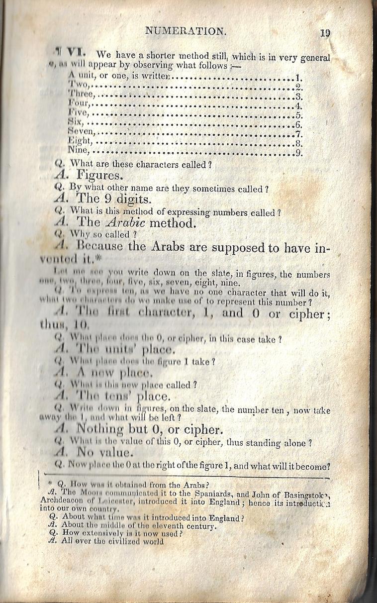
     And this fine chart, nineteen pages into the work, addressing about the most basic bits of arithmetic, being numbers:


    Math basics


    ·Posted by :

    ·in:

  • Electricity in Prometheus, 1879

    JF Ptak Science Books    Post 2570

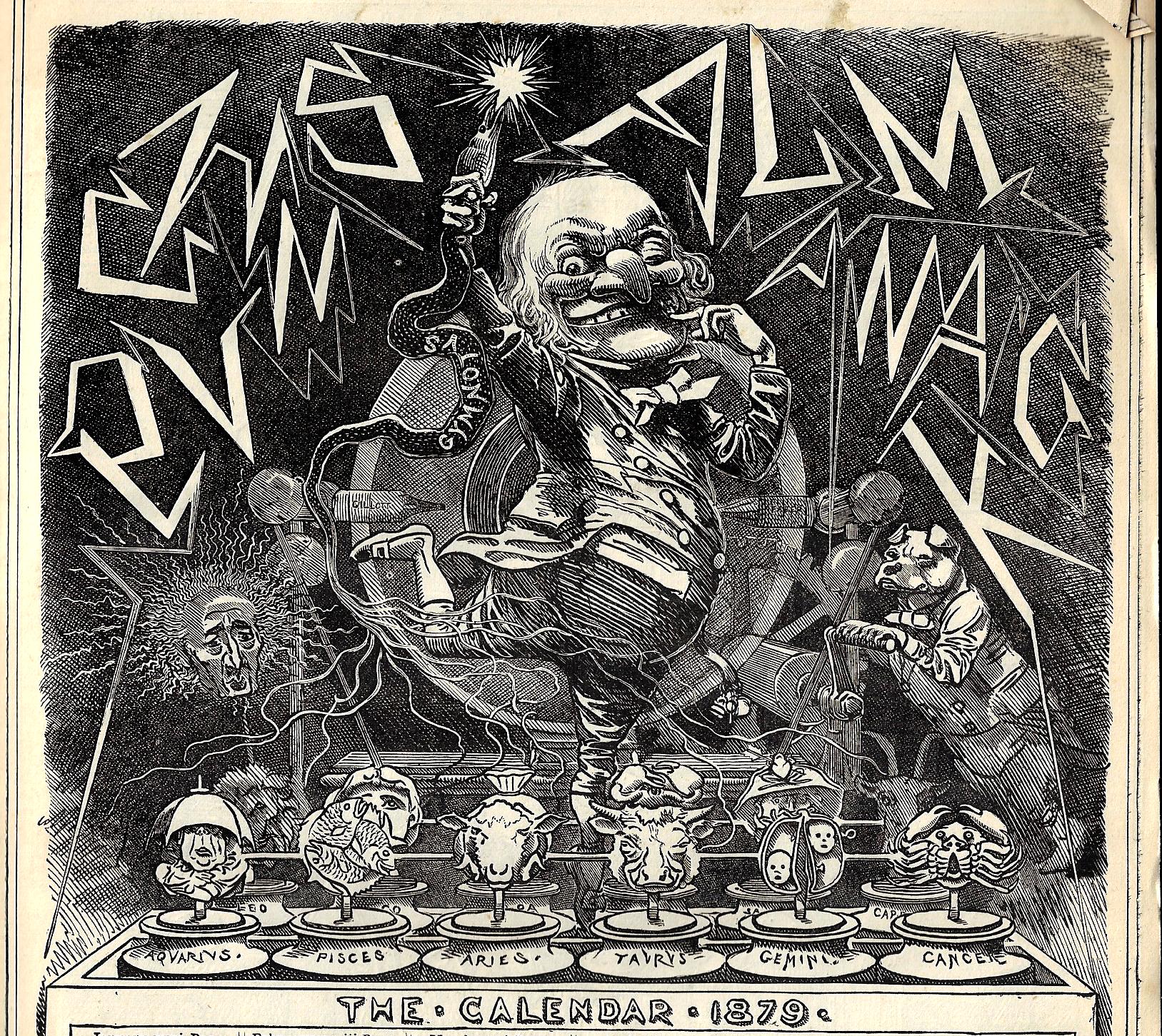
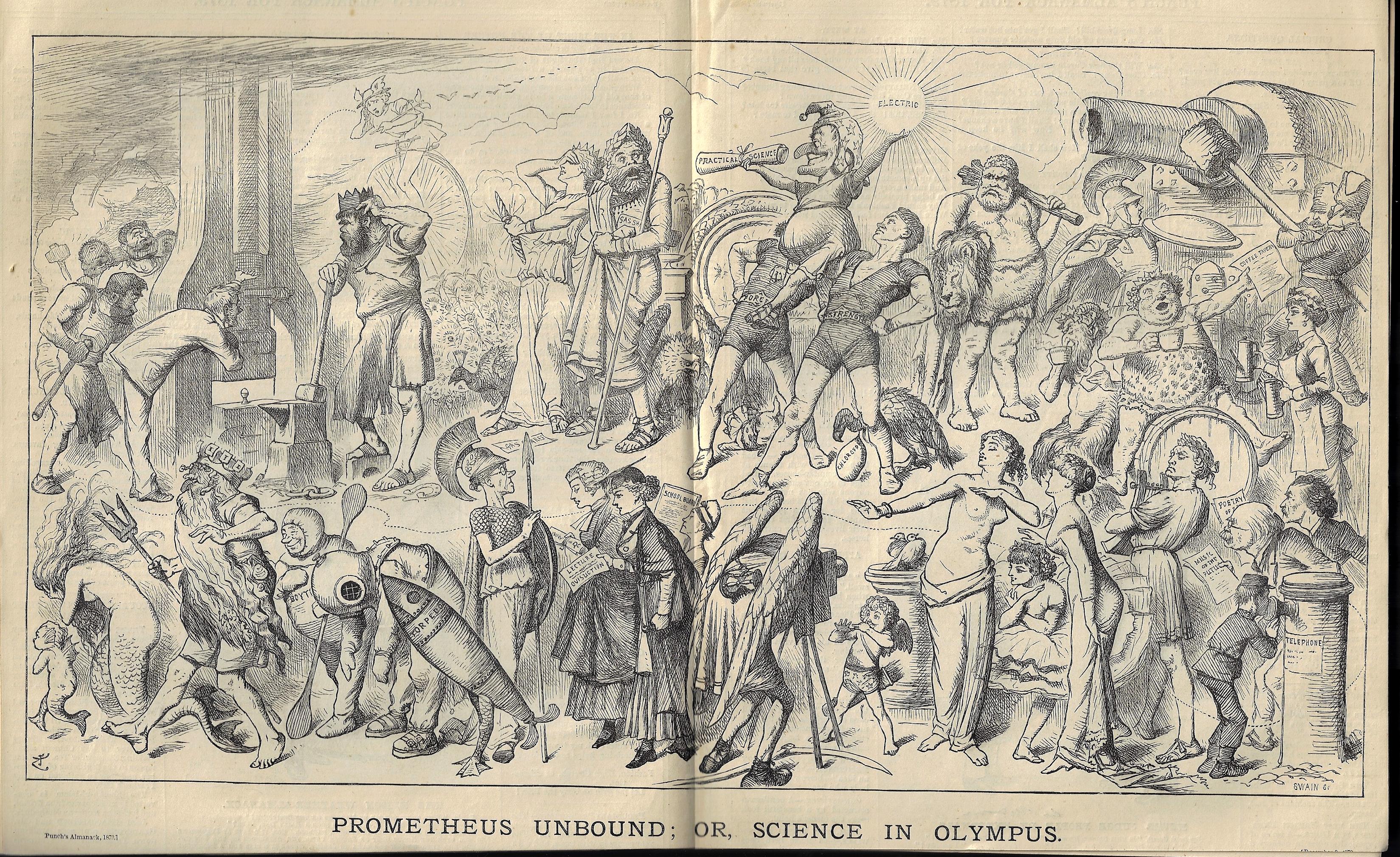
    The first twenty pages or so of Punch, or the London Charivari, for the year 1879 are far and away my favorites of that periodical. They are absolutely loaded with visions of the past and future technologies, and most of that centered on the newest electrical inventions–and this of course is one of the greatest periods for electrical developments, seeing (all in a couple of years) electric lighting, the telephone, the phonograph, and more. In those few pages (of two issues, the first and bound first is the “Punch Almanack” for 1879 and published December 11, 1878, and then followed by the first issue for 1879, published January 11, 1879) there is a three-illustration on Thomas Edison’s anti-gravity underwear (!), a full-page “Museum of Modern Antiques”, “Edison’s Telephonoscope…”, and then the two-page “Prometheus Unbound, or Science in Olympus”, while in the second issue is “The Electric Light, Pro and Con”.  I’ve written about all of these save for the cover of the “Almanack” and the “Prometheus Unbound”–the posts for the three images of Edison’s Anti-Gravity Underwear have been very popular over the years. 

    The image on the cover of the “Almanack” features Mr. Punch introducing the shocking bit of techy newness in electricity–here though he is dancing on the cells of a Wimshurst machine, which for some reason is being operated by a dog: 

    Punch 1879 electrical


    And the big two-pager for science in Olympus:

    Punch electrical double page 1879

    Lording over the scene is Mr. Punch, resting on the shoulders of “strength” and “force”, holding a scroll (“practical science”) in one hand and in the other, high above, is an orb of “electricity”. To Punch’s left is an astonished Zeus, who holds under his a scroll labeled (“Gas Shares”), representing no doubt gas technologies that was being replaced by electricity. There’s a lot going in in this print: Vulcan wondering about the steam hammer being brought to bear on an egg; Neptune being shoved away by the naval developments of deep-sea diving equipment and a torpedo (as a Mermaid retreats in tears); a boy at a telephone (in the bottom-right corner);Time as an old man under the hood of a camera, and then a few others.  The obvious message here is that the previous and Olympian technologies were being overtaken by the new and electrically-based technologies of the modern age.  

  • A Euclidean Proof of the Parallelogram of Love (1879)

    JF Ptak Science Books   Quick Post

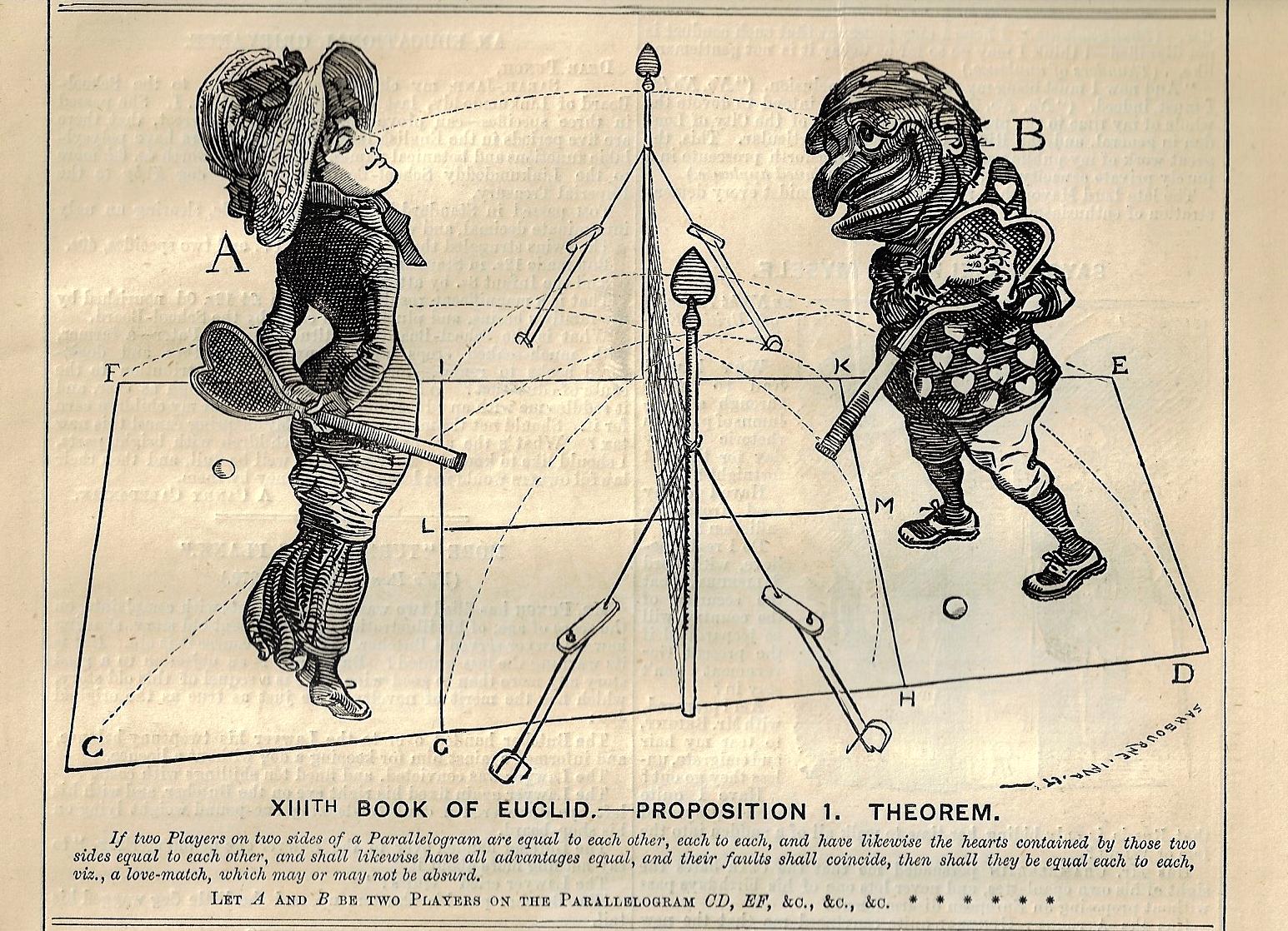
    I don’t encounter “love” and “Euclid” together very often outside of “I Heart Euclid” tee shirts and mugs and such, but what we have below is a satirical/comical proof of the existence of love (within limited contexts) employing a parallelogram and Euclid. The cartoon (from Punch, printed in London in 1879) has nothing really to do with Euclid, though it does lay the 13th book, proposition 1, of his Elements (“If a straight line is cut in extreme and mean ratio, then the square on the greater segment added to the half of the whole is five times the square on the half”) on top of things.  The court (as in “courting”) for the two players actually doesn’t look much like a parallelogram, though if it is a standard tennis court, it must be a rectangle and so a parallelogram, the odd shape a result of a cartoon drawn in probably two hours with a little bit of distortion in the perspective. The lady is coy-ish, and Mr. Punch–dressed in a heart-drench tunic and clearly removed from our mortal coil–is definitely feeling something for the young lady, as we can plainly see with the various lines connecting them.  And of course Mr. Punch is clearly a prize in anyone’s estimation.

    I guess some of this must have to do with the contemporary tennis craze, as this issue of Punch hosts a number of cartoons regarding seemingly everyone at play with tennis. that part of the point tally is the score “love”, the cartoonist didn’t have to go far to spread Euclid on top of the geometric situation.  

    Punch Parallelogram of Love

    ·Posted by :

    ·in:

  • Measuring Things with Mt. Everest (and the Empire State Building), 1933

    JF Ptak Science Books  Post 2465

    I was just looking for a good link for the full text of Donald Knuth’s 1965 paper on “Very Magic Squares” when instead I found mention of his earliest publication, a playful paper that was published in MAD magazine in issue #33 for June 1957.  The work by the 19-year-old Knuth, “The potrzebie system of weights and measures”, suggested that, among other things, the “potrzebie” as a standard unit of measure–and that was equal to the width of the issue #33 or  2.263348517438173216473. There were more fanciful measures for Knuth, which suggests that these “standard” units are infinite, one measure of infinite being the length of the finite over its negative.  

    Dataviz Measuring with Mt  Everest787

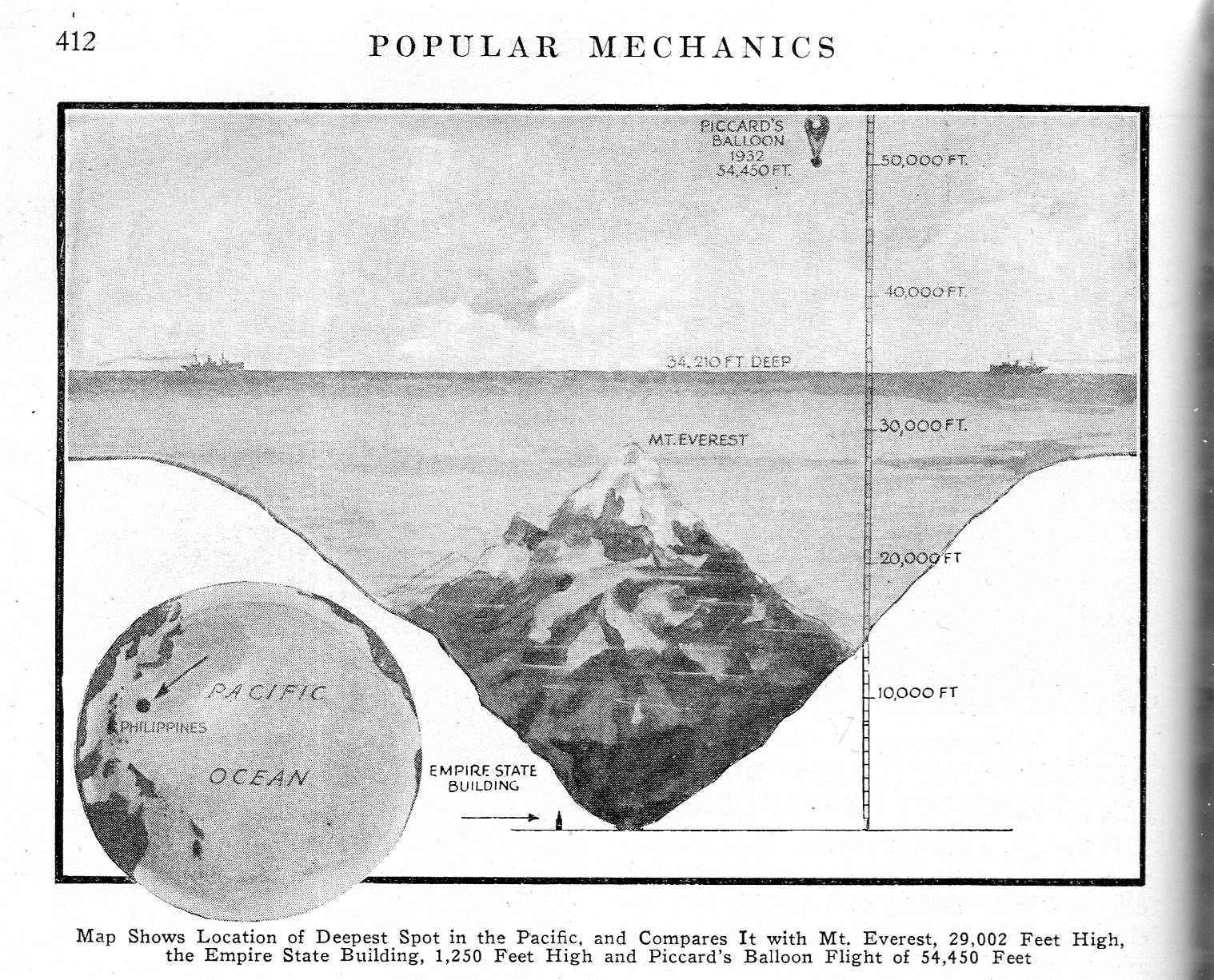
    This brings us to measuring things in terms of units of Mt. Everests found in this short notice in Popular Mechancis for September 1933. Truthfully this is a simple dataviz tool, comparing the depth of one unknown and not visualized entity–in this case, the “deepest spot in the Pacific”–with another that is known and highly visible (after a fashion), and so we get to appreicate the great depth  by comparing it to Mt. Everest.  There are no stackings of Everests in this image though I can see a future use for the visual–I have after all posted many unusual pieces to this blog where heights/depths are measured in terms of stacks of Eiffel Towers, or mammoth bread, or gigantic piles of wood, or nails, and uprighted ships, and of course numerous Great Pyramids filled with excavated dirt from the digging of the Panama Canal and stretched over the island of Manhattan.  Those are more involved, while the present unit of measure is just suggesting itself for future use.

    On the other hand it might be more beneficial to use stacks of the Empire State Building to convey the sense of deep depth.  In 1933 it was just two years old and a world-wide sensation as an icon art deco building and the tallest building in the world, so if you said that the deepest depth could absorb 32 Empire State Buildings one on top of the other, there may have been a greater understanding of the consequences of that much depth.  In any event, I like that more as a unit of measure.  

    Notes:

    Knuth. Selected Papers on Fun and Games, http://www-cs-faculty.stanford.edu/~uno/fg.html  (From the website: “I’ve never been able to see any boundary between scientific research and game-playing. … The topics treated here were often inspired by patterns that are visually compelling, or by paradoxical truths that are logically compelling, or by combinations of numbers and/or symbols that fit together just right. These were papers that I couldn’t not write.)

    Knith’s c.v. http://www-cs-faculty.stanford.edu/~uno/vita.html

  • The Geologic Clock (1920)

    JF Ptak Science Books   Quick Post

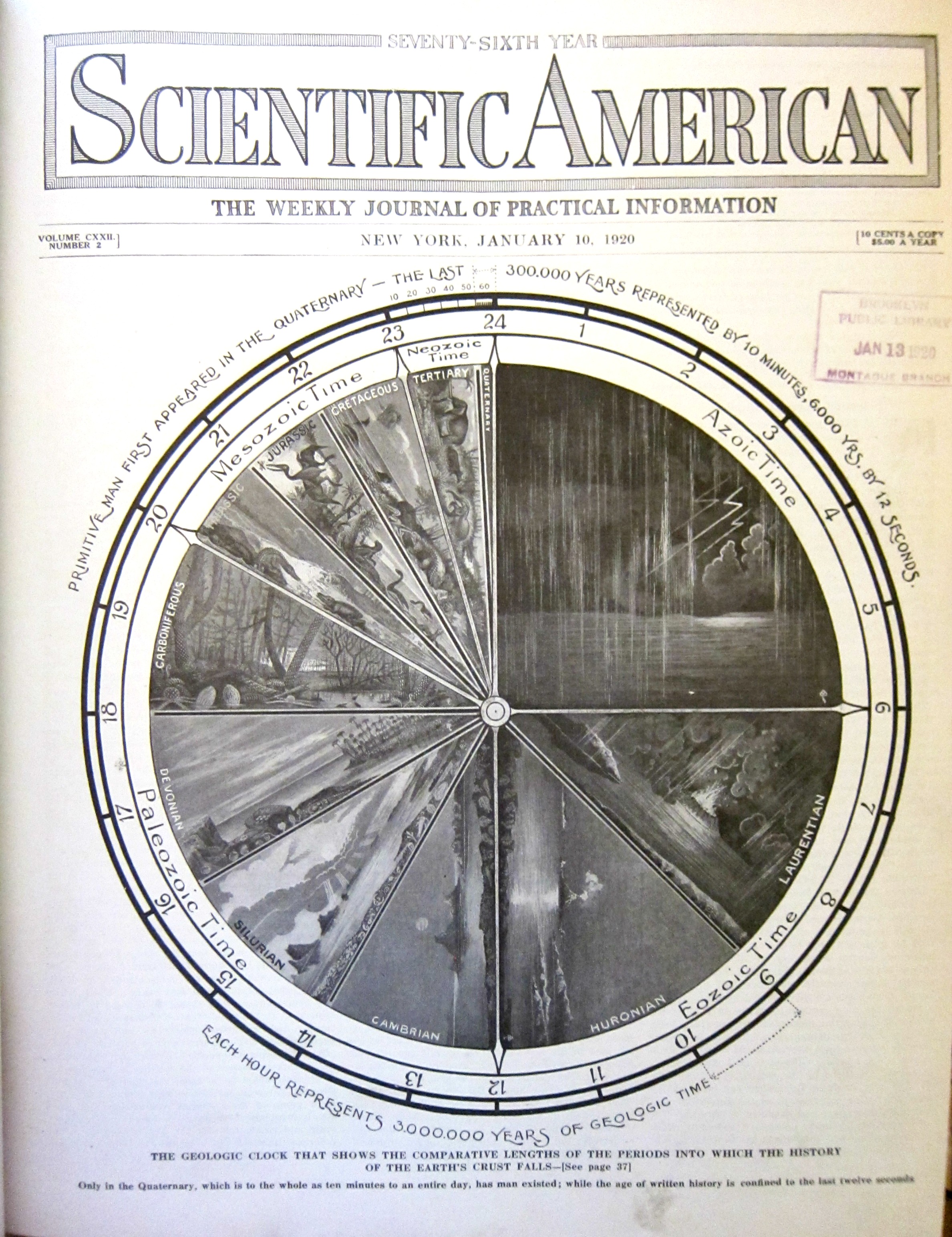
    Here’s another found bit whilst looking for an article in the 1920 Scientific American by Robert Goddard–no Goddard though I did find this fine “geologic clock” in the January 10 issue for that year.  As you can see if you look a little closely, the Quaternary is about the last 10 minutes of the 24-hour clock of existence on Earth, with the last 6000 years occupying the last 12 seconds.  In any event,it is an artistic and informative representation of data, created nearly 100 years ago.  (It would be interesting to know when the first graphical representation of geologic time as a clock face appeared–offhand, I do not have that answer.)

    Dataviz geological time

  • Selling Never-Flown U.S. Navy Aircraft, 1920

    JF Ptak  Quick Post

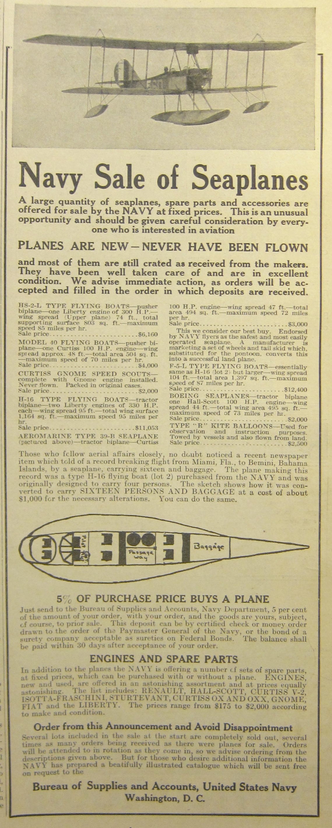
    Evidently the U.S. Navy determined to sell off some segment of its seaplanes 18 months after the end of WWI. The half-page advertisement appeared in Scientific American for May 1, 1920, and promised “planes are new–never have been flown”. There is no mention of how many complete aircraft were available for purchase, though it is stated (with a little detail) that eight different types of seaplanes and flying boats, priced from $2000 to $12,000, were available–all of which could be purchased with just 5% down (and the balance paid out to the U.S. Navy in 30 days). 

    NAvy plane sale 1920

    ·Posted by :

    ·in:

  • A Radium Shadow (1920)

    JF Ptak Science Books   Quick Post

    Undark.

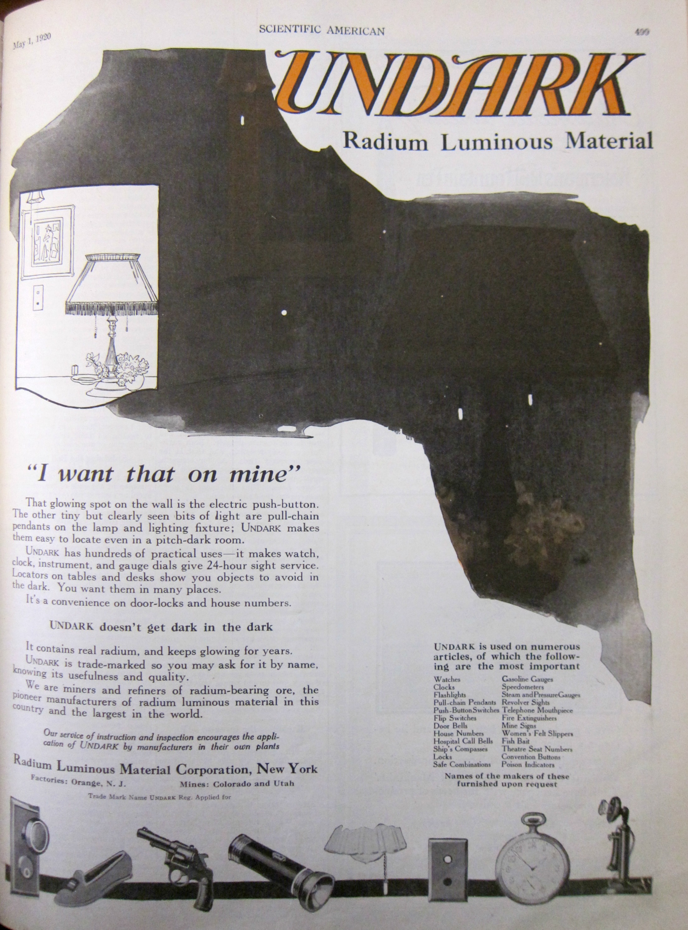
    UndarkNow, that is quite a name for a product–for a glow-in-the-dark product, for something that will not darken. The advertisement displayed here was for a product that “doesn’t get dark in the dark”, and appeared in the Scientific American on May 1, 1920.  The particularly cringeworthy part of Undark, viewed from the future of this advertisement, is that the spots of light on the wall and etc. that make Undark what it was was an applied radium paint. And it was the famous or infamous case of “The Radium Girls” (that really brings the cringe into sharp focus, as it was this same company and product that was being advertised (left) that brought all of those workers into their sometimes-lethal encounter).  

    [It is a little difficult to make out what is going on in that dark patch, but essentially it is the room at left, in the dark, and the little specks of white are the items on which the Undark has been painted. So if you needed to find the fobs of a lamp or the edge of a table or a gun in the dark, Undark will get you there.]

    The women were workers for the U.S. Radium Corporation–which started out its business life as the Radium Luminous Materials Corporation–who worked with radium and luminous paints and who contracted radiation poisoning from their close contact (and ingestion) of the paint, a result of  “sharpening” their paint brush tips by touching it to their lips and tongues.  The injurious effects of radium was well known to the chemists and executives at U.S. Radium, but that information was kept from the women hired to apply the paint to (in this case) watch dials. 

    Historic litigation ensued in the early 1920’s, and when the case was settled in 1928 the workers received relatively modest settlements–the result of the case though was wide-reaching in labor rights law and also in occupational health and safety–all of that was a lot more valuable than the $10k payment and $660/year annuity awarded to the Radium Girls. 

    Evidently the inventor of the first radium-based luminescent paint, Sabin Arnold von Scohocky (1883-1928) developed aplastic anemia (a developing deficiency and failure to produce all three blood cell types) most probably as a result of his prolonged exposure to radioactive material. Marie Curie, Max Valier, Otto Lillienthal (and so on) also died as a result of working on their discoveries/breakthroughs, though what ultimately cost von Scohocky his life was nowhere near as significant as the work of the other three.  


    ·Posted by :

    ·in:

Recent Posts

Archives

Categories