A Daily History of Holes, Dots, Lines, Science, History, Math, Physics, Art, the Unintentional Absurd, Architecture, Maps, Data Visualization, Blank and Missing Things, and so on. |1.6 million words, 7500 images, 4.9 million hits| Press & appearances in The Times, Le Figaro, Mensa, The Economist, The Guardian, Discovery News, Slate, Le Monde, Sci American Blogs, Le Pont, and many other places… 5000+ total posts since 2008.

  • Unusual Questions 1: Are the London Bridges Too Far Apart? 1904

    JF Ptak Science Books LLC   Post 136

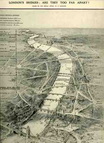
    This image (from the Illustrated London News of 10 July, 1909) asks an unlikely question, and one that I’ve never heard asked before of London:  are the London bridges too far apart?  The “new bridge” which was to be built was scheduled to be located between Southwark and Blackfriars bridges (for what looks like today to be a fabulous deal of 1.5 million pounds, or about 6 million USD, or about 95 millions dollars today), and would’ve been about where the Millenium Bridge is now. The bridge would be 80 feet wide and carry a double deck of trams, running on a diagonal  with the access nearly at Blackfirars.  I’m not terribly sure how to interpret the question, because the answer seems a little obvious to me, what with 14 bridges on just one side of the Tower Bridge in just a few miles.
    Bloglondon_bridges208


    [Image greatly expandable.]

    I’m not so sure what the engineers were expected to do, short of tunneling a great length of river and delivering land on top of it.

    This reminds me somewhat of a report that I saw some years ago about the plans for Rock Creek Park and Parkway in Washington, D.C. The park runs roughly north-south in the top center half of the city, and around 1890 the Federal government was trying to figure out how to best multi-task the area for parkland and roadway.  One (incredible) plan called for the creek, which in many places is bounded by some pretty steep embankments (25-75 feet or so) and extends about 8 miles north of downtown, to be filled in, leveled off, and paved over.  Now that, dear readers, would’ve been a lot of dirt.  The final plan was perfectly fine and had a series of small roads snaking their way through the park, making it one of the nicest rides (Central Park-like) of any major metropolitan cities in North America.
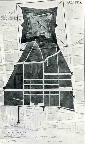
  • Fantastic and Unbuildable Architecture #6: the Pyramids of Gizeh in Detroit (Michigan), 1908

    JF Ptak Science Books  Post 137

    Because strait is the gate, and narrow
    is the way which leadeth vnto life,
    and few there be that finde it.

    –Matthew 7:14

    Blogprymmidelevtion216

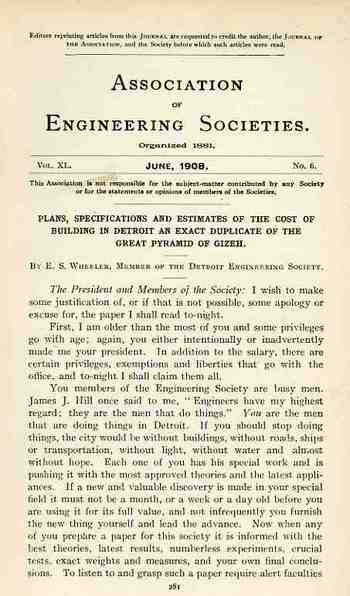
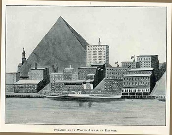
    And so it came, somehow, to be that E.S. Wheeler, president of the austere and august Association of Engineering Societies, presented a paper at its annual meeting in June 1908, on building an exact replica of the great pyramid of Gizeh.  I suspected that because of the intentionally fantastoid title that Mr. Wheeler intended the paper as a show, exhibition, to the younger engineers in the audience about how one might approach an unusual engineering problem, as an imaginative course of instruction.  That would be quite nice. 

    Except though that Wheeler presented the paper as though he was serious.  He delivered  it evidently with a high dryness, and people took him seriously.
    Blogprymmidpln215

    The pyramid was to be built on the site of the village of Cadillac (of 1701), in central Detroit, occupying that site and then some, covering it with 13 square acres of stone.  Oh, yes, and it was also to be excavated, scooped first into a shockingly cavernous prism 759’ on each side and 120’ deep, or about 2.6 million cubic yards of stuff.

    The pyramid itself was to be built almost entirely of limestone, 760’ on each side, and 485’ high, set on the 13 acre base—where those 13 acres in the center of Detroit was left open to debate. Wheeler also intended to reproduce the interior of the pyramid as well (so far as it was known in 1908), and had a set of plans to accomplish that goal. 

    Wheeler figured that the material cost (exclusive of the base), would be $36,000,000 1908 dollars, which he considered a fair price.  The conclusion of his paper was a superb slash of logic and possibilities—he calculated that if each person in the United States contributed the equivalent of a day’s labor on the building of the pyramid, that the great structure could be built in a day and a half.  Wheeler closes with this superior gem, a sentence unlikely to be repeated in any subsequent technical journal”  “If the United States should stop all other work and devote itself entirely to building pyramids, as was probably the case in Egypt, it would, after it got fairly running, be able to turn out two every three days.
    Blogprymmidtp214    

  • Three Great First F’s: Forks, Forts, Fission, (and one plain non-first F (Nobel))

    JF Ptak Science Books LLC  Post #139
    Blogfsfork210

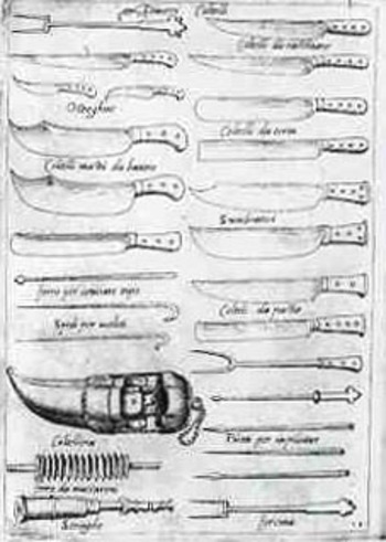
    Apropos of nothing whatsoever, I’d like to look at four “first” F’s.  the first is the first known published image of a fork , or forcina in Italian.  This was a prickish utensil (seen in the image at the bottom-right), hiding none of its stabbing qualities with a middle tine, and shows for us all its direct decent from Mother Knife.  It appears in the Opera dell’arte del cucinare by the great Renaissance chef  and cook to Pope Pius V Bartolomeo Scappi (c. 1500 – 13 April 1577, buried in the church of SS. Vincenzo ad Anastasio alla Regola, dedicated to cooks and bakers) was published in 1573. In the book he lists approximately 1000 recipes of the Renaissance cuisine (some of which, for Renaissance salads, appear at bottom) includes many images of kitchenware, the fork being perhaps the most famous.  (I used to know the first time that a fork appeared in a painting–of the Last Supper of course, but I’ve forgotten, though it does come right on the heals of Scappi.)

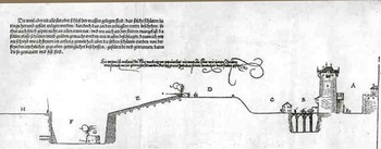
    The second unrelated but interesting first “F” is perhaps the first image of a modern, canon-proofed fort, by none other than Albrecht Durer.  This image appears in 1527 in his Etliche underricht zu bestestigung der Stat, Schloss und Flecken, and although his designs were impracticable (massive and massively expensive forts and fortified cities;
    Blogfsfort211_2

    pretty but very costly), there were certain elements of the work that were very useful—namely, the new face of some of te walls that he offered to the modern canons of the 1520’s.  These weapons were vast improvements over their earlier brethren, and Durer responded to the extra and more accurate firepower by lowering and thickening the walls and giving them greater slope—this would aid in deflecting many of the shots that were not directly spot-on, and also would improve the chances of the fort’s survival against those hits by having thicker walls. 

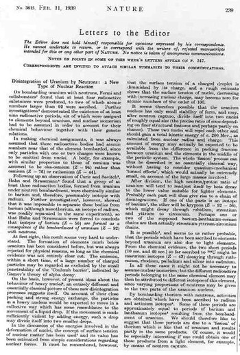
    The third F is slightly related to Durer’s fort walls—this is the first appearance of the word “fission”.  It appeared as so many of these sorts of 20th century announcements appeared with great sotto voce--this one, in a “Letter to the Editor” of the journal Nature (11 February 1939), by Lise Meitner and Otto Frisch.
    Blogfsfission212

    The communication, “Disintegration of Uranium by Neutrons:  a New Type of Nuclear Reaction”  wasn’t a letter to the editor in the conventional sense of course but was meant to be the quickest line of communication of an important result and thus appeared somewhat truncated though the great stuff of the announcement was made known and understood.     Niels Bohr’s “The Mechanism of Nuclear Fission” in the Physical Review (1 September 1939) may I think be the first use of “fission” in the title of a paper.) 

    There is a very big story here with Meitner and fission and Nazis and the Nobel.  This leads to our fourth F:  and that would be “F” as in “Failure” to the Nobel committee who in 1944 awarded the Nobel Prize to (German, non-Jewish) Otto Hahn for the discovery of nuclear fission while completely ignoring (purposefully, I would say) Meitner, who really, by all  rights, should’ve gotten the award, and probably by herself.  This is a more complex tale than I would care to deal with now, but I think that it is beyond doubt that the Nobel committee again (think Einstein and others) severely screwed this up in favor of maintaining their dislike for people with Meitner’s heritage.  (And yes, she was Jewish; Einstein suffered too at the hands of the committee, not receiving his award, unbelievably, until 1921, *16 years* following what was probably the best single year  that anyone ever had in the history of physics, ever, and then 14 years following his great year of 1907 and five years following 1916’s paper.  And so on.)   Yes, Meitner hung on in a not-good way in Germany for six bad years 1933-1938) until she finally get the hell out, but that really doesn’t tell the story very much.  The fission bit with Hahn and Strassmann is a little bedeviling, but it really was Meitner who recognized the whole thing as being the process of fission.  Period.  And shame again on the Nobel people for getting it wrong, again, on purpose. 

    ·Posted by :

    ·in:

    —
  • The Longest Surrender in U.S. History—Native Americans and the Rationing of Food, 1870-1925 (+)

    JF Ptak Science Books LLC Post 140

    Blogindian_ration194

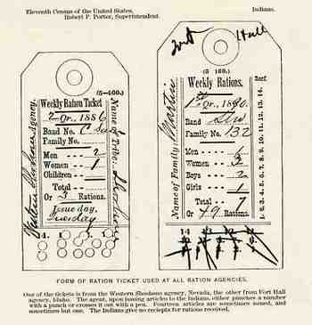
    These images of the Indian ration card and the Indian Police button were found opposite page 76 in the monumental Report on Indians Taxed and Indians Not Taxed in the United States (except Alaska) at the Eleventh Census 1890 (published in Washington DC in 1891, the best single-volume statement on the conditions of the Indian tribes in the U.S. in the 19th century). 

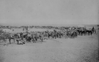
    Generally tribe members would wear the white ration card on a string and attached to a button.  When you see old photographs of the Indians queued up to receive their food and provisions, the little white cards stand in sharp contrast to everything else, when they are in focus,.  When not (as the lens weren’t necessarily fast enough to capture things in motion) they look semi-invisible, like a puff of smoke on the chests of so many people.  I can imagine then these people standing in line, waiting for food, having entered reservation life with enforced “sale” of their lands, still except for the fluttering of their ration cards, small white flags of surrender that they would fly for generations.  Certainly no other element of our society would be forced to surrender so often for the need of food.  And considering too the number of Indians who would die of starvation over decades’ time at the hands of this system and in the care of the federal government, it was a surrender that didn’t necessarily entitle them to the sort of treatment that a POW would receive.  (The following photo is of a queue for ration distribution at camp Supply, Oklahoma Territory, 1871.)
    Rationscamp_supply

    The amount of the ration was mysteriously worded, at least to me; I couldn’t really tell how much food people were allowed.  The explanation reads as follows:  “the table of quantity allowed to 100 rations is:  bacon, 10 pounds; beans, 3 pounds; beef (net) 150 pounds; baking powder, 1 pound; coffee, 4 pounds; ham, 50 pounds; salt, 2 pounds; soap, 2 pounds; sugar, 7 pounds; tobacco, ½ pound.”  (The salt part is curious; salt was very important, and ion relation to everything else, 2 pounds wasn’t really very much salt at all.  I am reminded of the very last part of the negotiations between John Ross, who was the principal chief representing the Cherokees, and the flatulent Gen.Winfield Scott, the head liaison between the Cherokees and the U.S. government, in the terrible last phases of the preparation for the Cherokee removal.  Ross pleaded, and in effect offered to buy, more provisions of salt for the walking winter journey for his 12,000 charges (children included).  That this was a point of negotiation is cruel and sickening.  Scott “gave in” and allowed the extra salt…his other practices in this enforced emigration though resulted in the deaths of about a third of the Cherokee people.  And Scott was about the best, most “Indian-friendly” general that the government had to offer.)

    It continues, badly written:  “Still, it frequently happens that issue same day finds the agency short of supplies and frequently rations are issued, and of limited quantity. 

    And closes:  “The Indian, however, arrives promptly on the appointed day, no matter whether he receives or not”. 

    Blogindian_ration_button195

    The button pictured here belonged to the uniform of the Indian Police. 
    It shows an Indian guiding a plow, with the legend written around the figure that reads:  “God helpeth those who help themselves”.  Or not. 

    ·Posted by :

    ·in:

  • Fantastic and Unreachable Intellectual Claims: Psychology and Dr. Strangelove


    JF Ptak Science Books LLC  Post 141


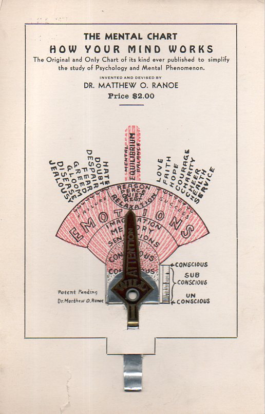
    Ranoe903 det

    Blogpychologrnoefull

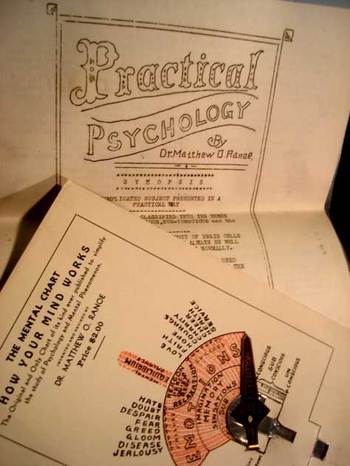
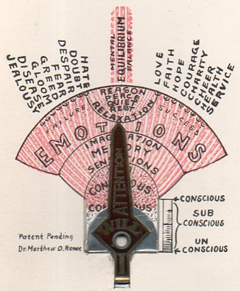
    How could one argue with the simplex simplicity of this slightly mechanical reader’s aids, “The Mental Chart, How Your Mind Works”?  It continues “The Original and Only Chart of its Kind Ever Published to Simplify the Study of Psychology and Mental Phenomenon”.  Indeed.  It was issued to simplify the ideas contained in the 1936 pamphlet entitled “Psychology Simplified”, by Dr. Matthew Ranoe, itself a pretty uncomplicated and unpaginated affair of 18 pages.  I bought it and 94,000 other or so pamphlets from the Library of Congress some years ago, which explains why I have this table-top production copy sent by Dr. Ranoe to secure and protect his copyright; and it also explains why any copy of this exists at all, as the pamphlet/screed/contemplation never did get published. 

    Somehow it was Dr. Ranoe’s idea that since the brain was a mysterious formulation of ethery-directional electrical cells not necessarily connected to intelligence that it somehow was associated with the photo-electric cell—Ranoe claims that this is the first use of the photoelectric cell to explain the organization of human brain cells, and was not the last. (I’m not sure how this works given the “photo-” aspect of the thing, and it doesn’t really fit with what I know of the hisory of photo-voltaic cells and the effect, and that stretching back to Antoine Becquerel in 1839…1)   It is also associated in an odd, Dr. Strangeloveian, General Jack (“precious bodily fluids”) Ripperian way, discussing  the dissipation of our vitality during our conscious state” as it was affected by “tissue fatigue” and low-running “vibratory force”.  And so on runs Dr. Ranoe into the distant night. 
    Ranoe901
    [In Stanley Kubrick’s brilliant 1964 film Dr. Strangelove, actor and squealer (he did badly with HUAC) Sterling Hayden’s insane character General Jack D. Ripper seeks to protect his “purity of essence”, his “precious bodily fluids” from Soviet fluoridation attack by ingesting only distilled water and grain alcohol.  This diet does not serve him in a sprightly way, as he winds up starting WWIII, destroying all humankind.]

    Ranoe902
    [Everyone must know this by now but I’d still like to point out that most of the characters in this movie have sexual, excretory or depraved names. For example:  Jack D. Ripper, Mandrake, Buck Turgidson, Merkin Muffley, Col. ‘Bat’ Guano, Dmitri Kissof Desadeski (De Sade ski),  Maj. T.J. “King” Kong (who rides the hydrogen device named “Dear John” that would ignite the war) are all pretty clear. This is a picture of Hayden’s General Ripper.]]
    Kubrickrippper

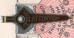
    The “calculator” included with the pamphlet doesn’t calculate anything, so far as I can see.  It does have a great pointer though—made of metal, and labeled “WILL ATTENTION” on the top with “I” on the bottom, it makes pointerly exaltations tosixteen different types of emotions, and that’s about it.

    The device is “patent pending”.

    ·Posted by :

    ·in:

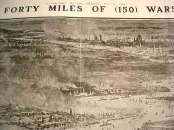
  • The British Navy Displayed, 1904: Forty Miles of Ships in an Early-ish Example of Good Display of Quantitative Data

    JF Ptak Science Books LLC  Post 142

    Blogbritihnvythmebig
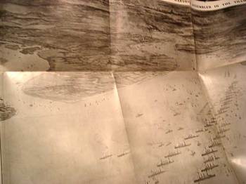
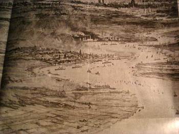
    July 17, 1909 was a red-letter day in the history of the graphical display of quantitative data.  It was this issue of the Illustrated London News that appeared two large folding images depicting significant chunk of the British Navy.  The fleet—or the greatest part of the Home and Atlantic Fleets under the command of Admiral Sir William May—was parked in the Thames for the better part of a week, and displayed for the lucky Londoners an unparalleled view of naval might, stretching out for some 40 miles.

    The images depict 24 battleships, 16 armored cruisers, 55 torpedo craft, 20 protected cruisers, and 35 submarines, making about 150 vessels altogether, manned by 42,000 sailors.  The list can go on for some bit, but what does this display of naval might the greatest imaginative leverage is this image that shows the fleet from a bird’s-eye view.
    Blogbritihnvythmedetilmid

    This picture certainly would’ve given fancy flight to even the most staid of British hearts*, seeing the ships displayed so rather than seeing simple numbers, and coming as it did during a time when the Foreign Office was making particularly loud noises about the continued imposing threats of the German naval machine.  This was certainly a way of showing the people footing the bill just what their money was going towards, and it turns out that this is actually a pretty early effort at displaying everything in a statistic rather than justice describing it.

    *There is actually a quote in the description of this scene from Rudyard Kipling, who upon seeing the armada weighed in with some tremendously turgid scribbling, a sort of pornography of bad prose, ending it all with a huge dollop of racially energetic solipsism.
    Blogbritihnvythmedetiltop

  • Pre-histories of Great Ideas: Mandelbrot and the Fractal, 1967-1975

    JF Ptak Science Books LLC  Post 143
    Blogmandelbrot217_2
    This is the first of a few short essays of the idea of
    pre-historic appearances of important ideas. I use the word “pre-historic” in its literal sense—that is, these papers
    were published before the concepts that they discussed were recognized and published,
    later, in more complete form and of course to greater fame. One will certainly be Gregor Mendl’s paper (Versuche
    über Plflanzenhybriden
    ) published in the obscure Verhandlungen des
    naturforschenden Vereines in Brünn, (Brno),
    and to be resurrected at the hands of Gregory Bateson thirty-odd years
    later. Another example is Vannevar Bush’s
    “As We May Think”, published in The Atlantic Monthly in June 1945, and which
    was a definite intellectual precursor to the construction of the Internet. A third

    Right now, though, I’d like to look at the pre-birth of
    fractals in Benoit Mandelbrot’s precursor (1967) paper (and in a weird,
    probably not-correct way, scooping himself) to his more famous effort of 1975,
    in which he coins the term and fully describes fractals, showing the
    measurement of the coastlines behave like a fractal over a range of measurement
    scales.

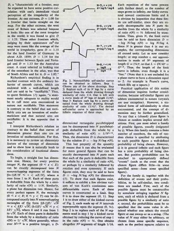
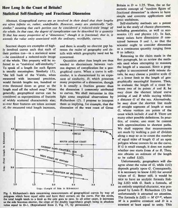
    The seminal paper, How Long Is the Coast of Britain? Statistical Self-Similarity and Fractional Dimension, published in Science
    magazine in 1967, is an introduction to the concept of fractals (which
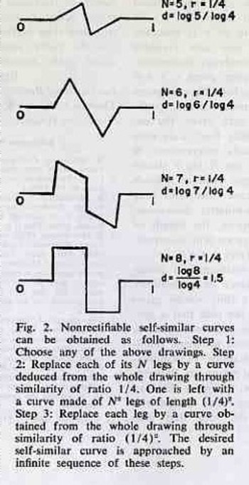
    Mandelbrot would name in later in1975), The kernel of it all is found in the Lewis Fry Richardson graphs and
    more so in the small illustration on page three of the paper—the peek into the future
    world of fractals, seeing a fractal before it was named so.

    Blogmandelbrot2218

    Blogmandelbrot217_3

    Richardson (a kind of Jevons, Marey-like American figure on the history of 20th century
    science) did some very good thinking about the elusive nature of naming such a
    thing as the lengths of coastlines and other natural constructions: namely he determined that their measured
    length was dependent upon the scale of measurement. That is to say the measured length, L(G), is
    ruled the scale of G, approximating the function as L(G)=M(G)1-0 

    Mandelbrot moves on to discuss the coastline in terms of it
    being a self-similar object, which is something that is nearly exactly similar
    to a part of itself, or the whole having the same shape of one or more than one
    of its parts, and regresses.

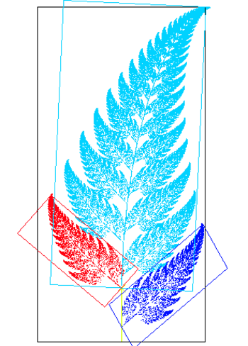
    Mandelbrotfern


    The Mandelbrot Fern (courtesy of http://en.wikipedia.org/wiki/Image:Fractal_fern_explained.png) displaying self-similar properties. 

    ·Posted by :

    ·in:

  • Ghost Trails of the Mississippi River: Harold Fisk’s Geological Map of 1944

    JF Ptak Science Books   Post 144

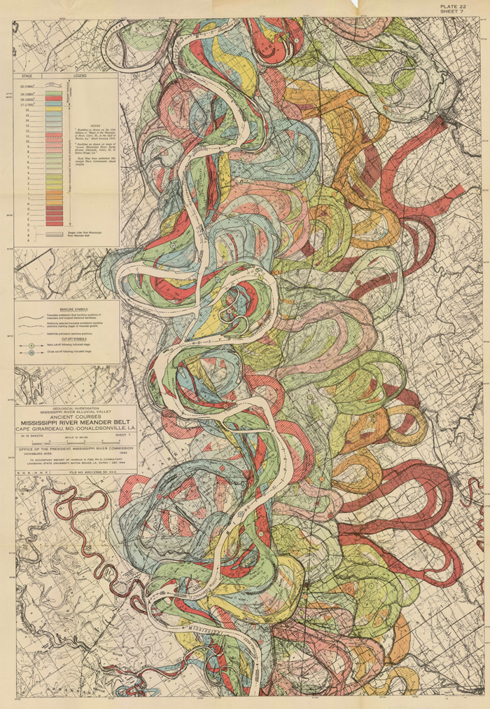
    Fisk map plate 22

    Understanding the Mississippi River was the skeleton key to understanding pre-Civil War America.  There was really nothing else quite like it—the Ohio River and the attention paid it by Collot and others  was of great importance to understanding the early far Western (east of the Mississippi River) adventures of Colonial and Post-Revolutionary America, as was the Missouri to early 19th century American exploration and settlement, but the Mississippi loomed over all.  Like saying that Babe Ruth was a fabulous baseball player or that Richard Feynman was a brilliant physicist is a bland statement of the obvious—the understatement hollowing and becoming more brittle the more deeply their “records” are studied showing how truly incomparable they were—the Mississippi, “The Father of Waters”, is really the Big Deal in the history of the U.S. 

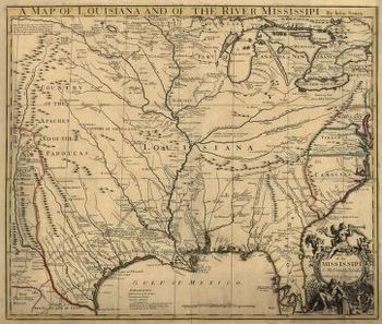
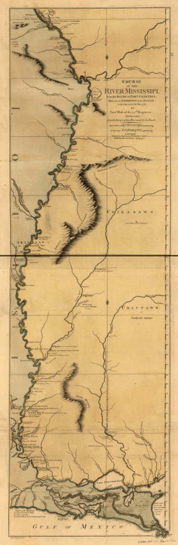
    And in spite of the fantastic maps made of river through the 18th and 19th centuries (like these gorgeous and iconic examples by John Senex in 1721 (A map of Louisiana and of the river Mississipi [i.e. Mississippi] : this map of the Mississipi [i.e. Mississippi] is most humbly inscribed to William Law of Lanreston, esq.)  or Robert Sayer  (Course of the river Mississippi, from the Balise to Fort Chartres; taken on an expedition to the Illinois, in the latter end of the year 1765. By Lieut. Ross of the 34th regiment: Improved from the surveys of that river made by the French. in 1772, or even Coloney & Fairchild’s Ribbon Map of the Father of Waters (below, a whopper, measuring in at 337 cm (and which was issued on a wooden spool for the use of travelers on board steamships moving along  the river), there were very few that gave you an idea of the *history* of the river.

    That was achieved in spectacular flourish by  Harold Fisk (in the map above) in 1944 in his Geological Investigation of the Alluvial Valley of the Lower Mississippi River (U.S. Department of the Army, Mississippi River Commission, 78p) The map showed the very ghost trails of the river over time, and trying to show where it wasn’t was the great question.  He tried to reveal the history of the valley by mapping  and dating all physiological features of the river and tried to reconstruct the channel changes with what were to become speculative appreciation.  Nevertheless, he did make a tremendous attempt at explaining the courses of the Mississippi over time by utilizing his own excellent maps and a little generative thought.  This might not be the most accurate map of the courses of the Mississippi over time, but in 1944 it was really a spectacular achievement in cartography and general thought.  And the thing was just drop-dead beautiful.

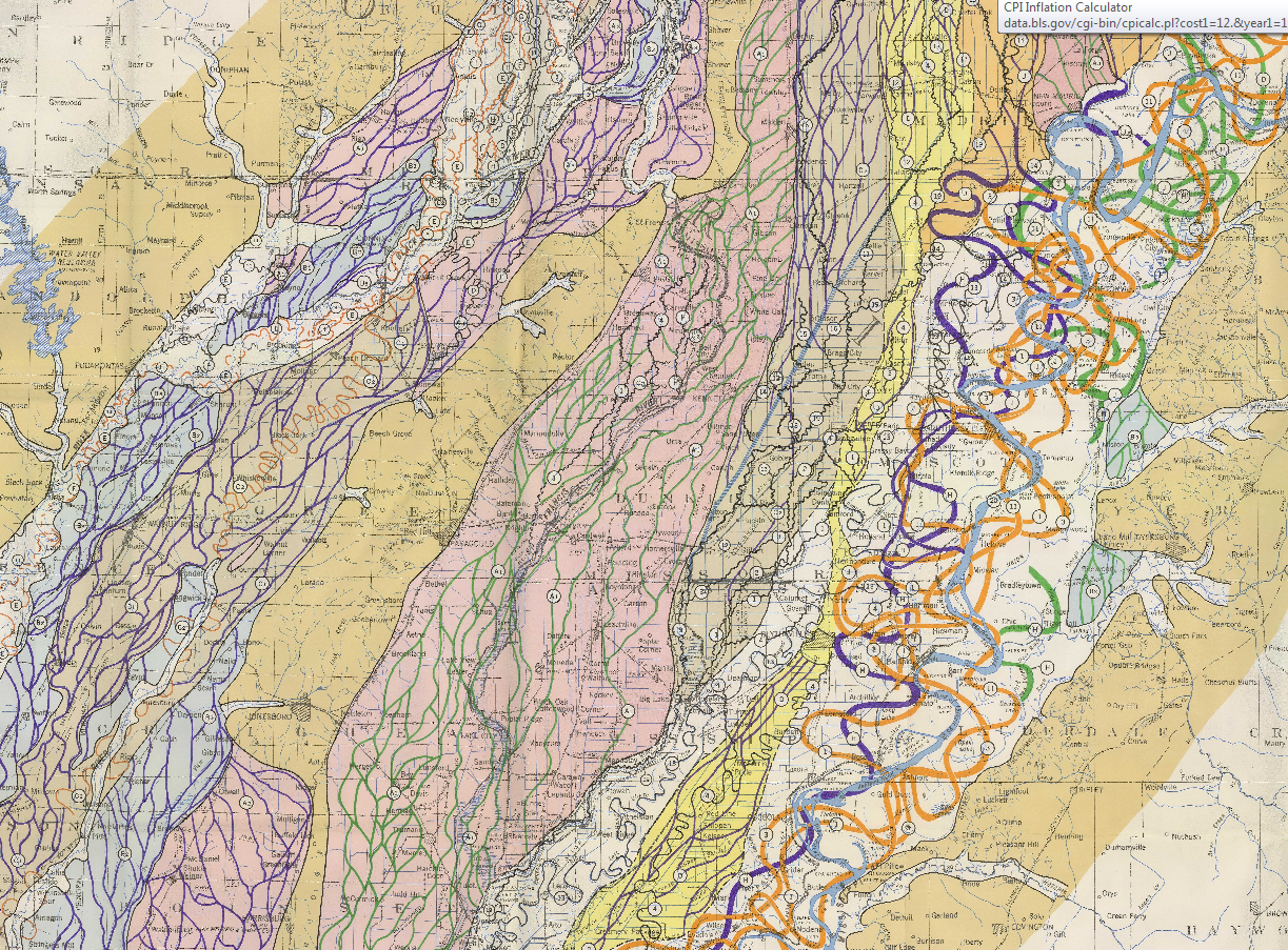
    Here’s another sample from the suite of maps:

    Fisk Map

    [Source: http://biotech.law.lsu.edu/climate/mississippi/fisk/plate_15-1.pdf]

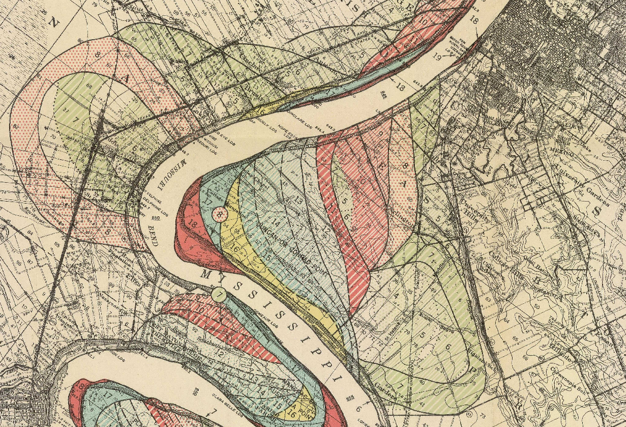
    And another detail, from map 15, in the vicinity of Baton Rouge:

    Fisk map baton rouge

    • The full text is available here from the LSU library: http://biotech.law.lsu.edu/climate/mississippi/fisk/fisk.htm
    • For a very quick, elegant overview see Radical Cartography which has all 15 of the maps displayed at once, along with a key chart :  http://www.radicalcartography.net/index.html?fisk
    • Also go to the U.S. Army Corps of Engineers site and click on the “Fisk oversize” link in the left-hand “documents” column:  http://lmvmapping.erdc.usace.army.mil/index.htm


    Mississippisenex

    Mississippi_1765

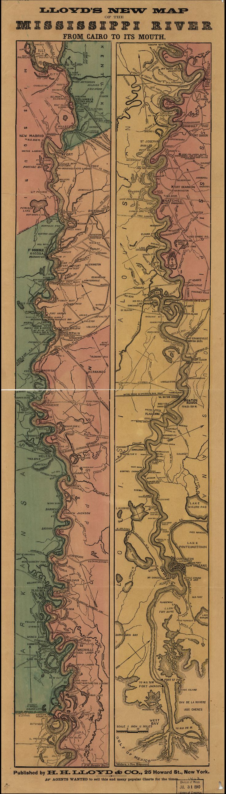
    Lloyd’s new map of the Mississippi River from Cairo to its mouth:

    Mississippi Lloyd map[Source: Library of Congress, http://www.loc.gov/item/99447107/]


    And the great “Ribbon map of the [Fa]ther of Waters.Created / PublishedSt. Louis, Mo. : Coloney & Fairchild, 1866”: 

    (Very zoomable version here:  http://www.loc.gov/resource/g4042m.ct000797/  The initial image comes up about 4mm wide (1)–don;t be discouraged, just start clicking away at the magnifier and it will zoom right in…)

    Mega-long scroll follows:

  • Weird and Bad Ideas Department: Animal Pus as the Cause of Cancer and the Plagirized Wrongness of Louis Pasteur, 1938

    JF Ptak Science Books LLC   Post 145
    Blogand_they_dont_cancer229
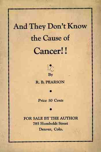
    R.B. Pearson (of Denver,Colorado), the author of this neglect (published in 1938), makes the claim in 24 sparse pages that cancer is caused by vaccination.  In the thousand words that are thinly spaced over this small pamphlet (held together by two staples, which must’ve been embarrassing to them), Pearson’s posts his quantitative evidence in a  graph he constructed showing the steady climb of cancer rates following the introduction of Jenner’s vaccine.  And nothing else.  In fact all he did was plot the number of cancer cases against the flow of time, and that cwas it–no aknowledgement of, say, an increase in general population leading to more cases o fcancer or anything subtle like that.  (This may be one of worst uses of the graphical display of data that I have seen.) Pearson makes a graphic display and explanation that cancer dramatically increased after Jenner’s introduction of vaccination.  He nails this loose statistic to the mast of the Pequod, and proclaims vaccination to be a crime.  His claims are supported by almost nothing save for a few specific and inapplicable cases:  for example, he “cites” a nameless family, distributed over a great distance, where one branch is vaccinated and the other, not; the vaccinated branch all get cancer while the vaccinated-free people don’t; ergo, vaccinations cause cancer.

    Pearson’s publishing life makes him seem a humbug and a scamp.  He would write a little later, in 1942,  a book called Pasteur, Plagiarist, Imposter--a title that bears the entire story of the book’s contents, which runs an impossible 352 pages (!?!)  Pearson complains in the opening sentences:  “The writer has made an effort in his prior books and pamphlets to show that the germ theory is false, and that illness was practically always due to errors of diet or manner of living, the germs being present solely as scavengers of dead and waste tissues and foods, and not as the cause of the disease.”  And that he was writing the book to expand the mind of his reading universe:  “the erroneous belief that germs cause disease and must be controlled or eliminated before it can be cured is so widespread as to close the minds of many people to any other ideas on this subject.”  Indeed,  the man was very cranky. He didn’t read French, either, and for his translations of Pasteur’s work he relied on the work of Miss Ethel Douglas Hume’s Bechamp or Pasteur? (1923), who claimed that Pasteur stole all of his ideas from this fellow Bechamp.  Oy vey.

    In his double-exclamation-pointed boisterously-titled “And They Don’t Know the Cause of Cancer!!” Pearson claims that cancer cells, the “animal-pus biologicals” are “equivalent to the cells of an animal lower down in the evolutionary scale…I believe they actually are cells from the tissues of a lower animal introduced into the human body in the guise of various biologicals”.  He continues, “cancer may arise OUT OF CLUMPS OF SIMPLIFIED CELLS.”   And, incredibly, (with the exploratory words left intact): “Would it be lese majesty” and ter-ril-la-bly wicked to hold that these degenerate cells are nothing more than animal pus cells introduced into the body as or with some so-called biological?”

    As it turns out the author had cured himself of a tumour of twenty-years standing with a thirty-day fast (“with enemas”) following a fruitarian diet, allowing the “clean and healthy blood” to “absorb and eliminate tumourous growths”.

    The one good thing that can be said about this effort is that the author didn’t try to sell anything except this pamphlet. Of course he did try and convince the reader not to be vaccinated, so he might as well have told them to start smoking cigarettes.  

    ·Posted by :

    ·in:

  • Weird and Bad Ideas Department: The Skinny on Fat and Vice Versa, 1936

    JF Ptak Science Books LLC   Post 146

    Bloghow_to_reduce235
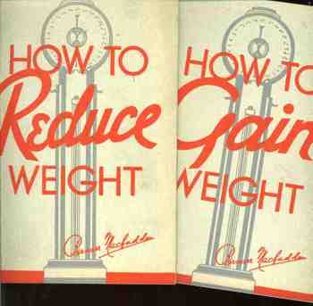
    Here’s a pair of somewhat-suspect publications, written by Bernarr Macfaddon,  which taken separately would seem perfectly fine according to their times, but together, well, they just won’t “do”.  The problem is that not only is their exterior and interior design identical, and that they were both printed in 1936, and that they both had 48 pages, but they both used the same photographic illustrations preaching and instructing opposite results.  (Both pamphlets were published in NYC, and were received by the
    Library of Congress Copyright Deposit section on 22 May 1936, and were
    given copyright deposit control numbers of 205,406 and 205,407,
    respectively, or irrespectively, as the case might be.) They are not the same book, exactly, but reading them side by side for about 15 minutes makes me think that one book is the anti-book of the other.  It might not make for good thinking, but it does make for fast writing. 

    I’d include a category here for books-and-their-exact-opposites, but I’m not sure how many more entries like this stunner that there can be.

    Each is entertaining in unintended ways, and have a number of  blatantly hidden gems:  for example, in the GAIN book, we are faced with a subject heading of BATHING AND UNDERWEIGHT, and are told that “another cause of underweight not infrequently met with…is the injudicious use of water in bathing”.   Within 200 words of each other we are also told that “eyestrain taxes the energy” and causes underweight, as does “sexual over-indulgence” because of “over stimulation of certain of the glands of internal secretion”.    Part of the author’s recommendations for weight-gaining foods as part of his program include bananas, white bread, butter, cornstarch pudding, cream, egg yolks, hominy, white macaroni, whole milk, oatmeal, pop corn, white potatoes, prunes, white rice, white corn, and tapioca custard.   Basically, if its white, its right. 

    On the “Surplus Flesh Can Be Reduced” side of the Reducing Book’s anti-book we find that although fat is “an enemy of beauty” and “causes more friction as you pass through life”, it can also give back, as it also may “develop keener mentalities due to physical inactivity”.  (Does that mean that skinnier people are less intelligent?)  The author contradicts himself almost immediately, saying that ”the mind tends to become as sluggish as his body, and often he cannot defend himself mentally…he is slow in his mind as in body”.  This all seems to be because the brain is “more or less” overwhelmed by “an excess of food elements” coursing their ways through the body.  Macfaddon’s sub-chapter heading on page 7 screams “FAT PERSONS TO BLAME FOR OBESITY and then, on page 10, and even more National Inquirish FAT CANNOT EVAPORATE THROUGH THE SKIN.  There’s much more, but since there’s a time limit on dealing with these sorts of nonsensical nostrums, we’ll stop right here.   

    ·Posted by :

    ·in:

  • Weird and Bad Ideas Department: Scientific Comb Fingers and Hair Restoration, 1936

    JF Ptak Science Books LLC   Post 147

    Blogcomb_hair230

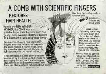
    Well. This item is of
    course lost on me, but the new “wonder-worker comb” somehow did an
    anti-crushing  something to the scalp and
    the hair root that promoted/restored and fictionalized hair health. The secret to understanding  it all, evidently, is that “bad scalp” is “crushed thin”.  This is brought about by “HAND pressure”, from  “strong fingers that
    mash and force the elastic scalp to become thin and such” causing  hair to be “more
    crowded, flattened”. For some reason the
    inventor didn’t speculate on whether other sorts of combs did this, or not; it looks as
    though he/she was targeting only those who combed their hair with their own
    non-plastic fingers, clearly elucidating this primal contest in a “wonder worker comb” vs. crushing/flattening comb fingers vocabulary.

     The comb with the adjustable fingers “pulls, exercises,
    stretches, thickens and loosens the scalp as it passes through” (the hair, the
    scalp?). It makes the scalp “roomy
    inside”, allowing the extra room that the hair needs “to function”. These hair restorative miracles is the result
    of the simple use of the comb, providing “complete results all by itself, no
    wasted efforts…”.

    The comb also, it seems, controls dandruff, and improves “thin,
    Lifeless, Dry-hair (sic)”.
    That’s a lot to ask of a piece of plastic.

    This  somewhat-scary item is a photographic postcard sent to the Library of Congress as a Copyright Deposit copy–part of the process of securing protection from intellectual theft via American copyright.  One is set to wonder about who–and why–this idea would be stolen.

    ·Posted by :

    ·in:

Recent Posts

Archives

Categories