A Daily History of Holes, Dots, Lines, Science, History, Math, Physics, Art, the Unintentional Absurd, Architecture, Maps, Data Visualization, Blank and Missing Things, and so on. |1.6 million words, 7500 images, 4.9 million hits| Press & appearances in The Times, Le Figaro, Mensa, The Economist, The Guardian, Discovery News, Slate, Le Monde, Sci American Blogs, Le Pont, and many other places… 5000+ total posts since 2008.

  • Nails and Screws: Beautiful and Well-Designed Simplicity

    JF Ptak Science Books  Post #148

    Here we have two glorious, lovely examples of craftsmanship of simple things. The first is The Republic Steel Corporation (Chicago) manufacturer’s catalog for their production of nails and other wire goods.  It is about fifty pages long, and a third or so of it is devoted to the history of nail and nail-making as well as the history of the company.  The rest is all about the product.  And mostly about nails.  All sorts.  It is just fantastic!  I must say in all the years of my own nail consumption I didn’t know that there were so many different sorts of nail POINTS (diamond, blunt, chisel, needle, duck bill, side, and so on) ion addition to the various widths and lengths and special uses.  The points just never entered into the equation to me, but, of course, it is very important. 

    Blognails_cover225

    And speaking of special uses, there are a number of interesting specified nails in this catalog that, I think, are long gone from modern hardware store  shelves, as the needs they addressed are gone:  beer case strap nails (oh my god I love the sound of that) AND beer case hinge/lock/latch nails AND beer case cleat nails, basket nails, shade roller pins, pole marking and dating (!) nails, barbed berry box nails, and egg case fasteners are among what I imagine to be extinct nails. 

    Blognails_barre227

    Then there’s the beautifully designed Southington Hardware Manufacturing Company’s screw catalog, called, wonderfully, Screws, (Wood, Sheet Metal, Phillips Head, Slotted Head), catalog 41 (with prices) for 1935.  There’s page after page (actually, forty-five pages) of very detailed specifications (dimensions of heads, diameter, thread and tolerance, each description accompanied by two (or more) engineering drawings of the screw itself. 
    Now THIS is a way to describe a product.

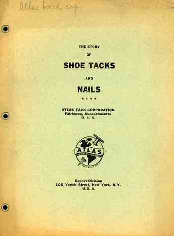
    This is followed up by a concise, nine-page (3,500 word) pamphlet published by the Atlas Tack Company (Varick St, NYC) on the history of shoe tacks and nails, bound, I’m happy to say, with metallic eyelets.  It contains pretty much all you need to  know on the history of shoe tacks, and I’m 100% behind the publication of odd-obscure histories such as this.  (I own perhaps a hundred “different” histories like this, including the massive non-classic “The History of Refrigerated Nuts”.) 

    Blognails_screws231

  • Fantastic Titles: “Mud, Its Romantic Story”, 1935

    JF Ptak Science Books LLC   Post 149

    Blogmud236I have a collection of some fantastically-titled pamphlets and books.  After considering their reaching, speculative, bizarre and surreal titles, they fall into a number of sub-categories, including:

    –titles with question marks “?” (like the two wonderful pamphlets simply entitled “What ?” and of course the two that have no titles but question marks);
    –title with exclamation points “!” (these two marks actually don’t occur very often at all in titles, especially when the title itself already has a built in question/exclamation mark);
    –titles that include the phrase “the history of…” or “the story of….” so long as that history/story is (very) unusual;
    –titles that demand something or other of  “America”  (i.e., “Will America be Invaded?” or “America, Mussolini or Moscow” or “Sandbags, Worms and America”);
    –title pages with American flags.

    This excludes a lot of the general naïve-surreal and historical pamphlet collection, but these, I think, would make a great exhibition of book of books, simply because so many of them have an unquestionable “what in the _” reaction capacity to them.

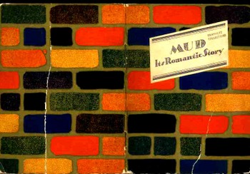
    This pamphlet, Mud, its Romantic Story, (by Richard G. Collier, for the Common Brick Manufacturer Association of America, Cleveland, Ohio)  is a prime example:  a terrific title and a beautiful design.  Point of fact though is that it is a lively little history of brick making in America.  The good content almost takes away from the fantastic title, but so it goes.

    Blogmud2237

    So from time to time I’ll post these titles here even though they really don’t have much to do with the supposed mission of this blog—I’m sure that they’ll be entertaining. 

    ·Posted by :

    ·in:

  • Weird and Bad Ideas Department: Shell’s Happy Herbicide, 1960

    JF Ptak Science Books  Post 150
    Blogbizarre_shell_mower244_2

    This image appeared on the inside cover of Scientific American for May 1960.  Our happy diver (with a mask but no way for air intake) is mowing some sort of nefarious weeds in a pretty and clear environment.  This was Shell Chemical Company’s advertisement for their new chemical herbicide Aqualin, sort of an underwater napalm.  Of course the human weed eater wouldn’t want to be around (see below) when the liquid mower was applied, but he surely gives a homey, care-free face to their new acutely toxic chemical application. 

    Here’s some interesting, acute data on this amazing New Mower! (from  the Cornell University website):

    • Aqualin (product discontinued by Shell Chemical Co., Chemical Intermediates); Magnacide H Herbicide. FORMULATION(S): 92% acrolein, 0.78 kg ai/l (6.5 lb ai/gal.
    • Important Weeds Controlled: Used to control submerged and floating aquatics as well as algae.  Also kills snails.  Toxic to seeds.  Some fungicidal effects.
    • ACUTE TOXICITY/DERMAL:  LD50 = 50 mg/kg (rat); 30 mg/kg (mouse); 562 mg/kg (rabbit, undiluted); 1022 mg/kg (rabbit, 10% aqueous solution).  Severe skin irritant. Causes vesiculation and a chemical burn if not removed immediately.  1 ppm of acrolein in air produces detectable nose irritation in 2 to 3 min and is intolerable in 5 min.
    • FREQUENT SYMPTOMS AND SIGNS OF POISONING: HEADACHE, DIZZINESS, NAUSEA, and vomiting are prominent early symptoms of excessive exposure to these gases.  Acrolein is a strong irritant causing BURNING SENSATIONS in the nose and throat, TEARING,COUGH, and sometimes hoarseness and wheezing.  DROWSINESS, TREMORS, double vision, and weakness are the common early manifestations of central nervous system impairment.  Tremors may progress to myoclonic movements, then to generalized SEIZURES, UNCONSCIOUSNESS, and death.


    ·Posted by :

    ·in:

  • Beautiful Technical Illustration: Heck’s “Iconographic Encyclopedia”, 1851

    JF Ptak Science Books   Post 151

    J.G. Heck wrote and compiled a fascinating and complex work entitled The Iconographic Encyclopedia of Science, Literature and Art, and was published in America for the first time in 1851 following Spencer Baird’s translation from its original German.

    Blogtunnel_full239

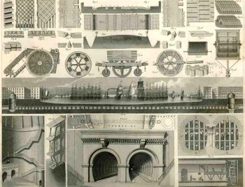
    The key to his work is the amount of data displayed on each of the 500 engraved plates illustrating this work and the way in which it is arranged.  The design and layout of the 30,000 items on these 500 plates was a work of genius, and for my money it is easily the best-presented complex means of the display of data and objects that was published in the 19th century.   

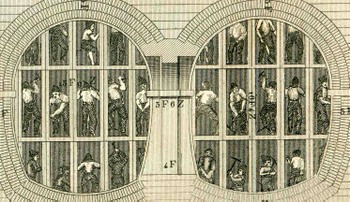
    Take for example this illustration in the technology section (a subdivision of the applied arts which is a sub division of the plastic arts) and, continuing in this complicated scheme, was Plate 1 from Section X Number A1 with a description found in the text on a dozen pages in Section 2 of Volume 2 on section pages 134-150 and overall page numbers 835-851 (!).  The plate contains 35 figures, very finely executed and rendered (many of the other of the 500 plates have 100 or more figures), and is in general related to the construction of roads and tunnels (and further, part of the “communications” section).

    This of course would be a perfect Hypertext candidate.

    Blogtunnel_top240

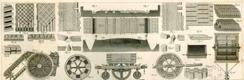
    The illustration itself contains an enormous amount of information.  The row along the top third or so is dedicated to street construction and paving stone, showing stones in plan and profile, as well as a cross section and ground plan of a “typical” street (including sidewalks).  It is interesting to note the detail of the cross section and the stonework that is placed beneath the horse and wagon section of the street.  There are some other beauties here as well–details of wooden paving blocks, the plan for a Laves of Hanover road, different ways of cutting stone blocks—but we won’t deal with those right now, except to point out that there are several renderings of street cleaners and road rollers (of Shettenmann and another of Schaefer) used to border the street section from the tunnel section. 

    Blogtunnel_middle241 The middle section of the engraving is of course a cross section of the Thames tunnel of the beautifully-named Isambard Kingdom Brunel (begun in 1825 and completed 1843, the tunnel 35 feet wide (11 m), 20 feet (6 m) high and 1,300 feet (396 m) long, running between Wapping and Rotherhithe at a depth of 75 feet (23 m)).  The representation here is only one inch high and ten inches long but is loaded with just fabulous detail, no the least of which are the (less than) 1mm tall workmen that can still be seen in the tunnel.
    Blogtunnelbig_detailig247
     
    The enlarged detail shows a section of the tunnel being built according to Brunel’s new specifications:  a larger, shielded tunnel being constructed around the interior construction of 12 individual tunnels (each about tall enough to allow a (short) man to stand erect. 

    In short, the engraving is a superb example of *correct* design of great artistic  ability, all accomplished while displayed heaps and gobs of interconnected, complex information. 


  • Sensitive Flames, 1874

    JF Ptak Science Books  Post #74
    Sensitive_flame

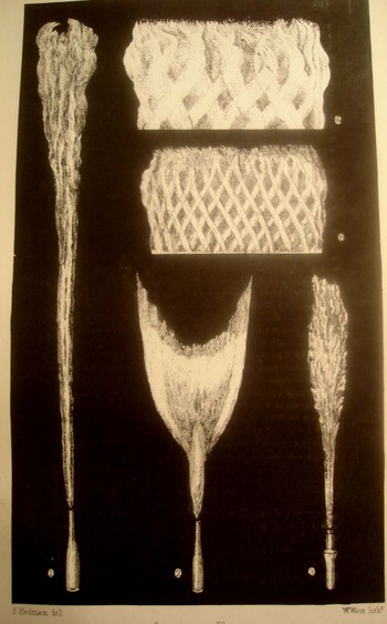
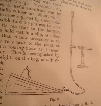
    I was drawn (like a moth to a …) to these images that appeared in the journal Popular Science (New York), 1874, in an article by W.F. Barrett entitled “Sensitive Flames”.  Actually I was more drawn to the title than the images, trying to conjure the differences between the other sorts of vaguely ethereal antiquarian flames that I imagined I was familiar with:  quiet flames, singing flames, and the present sensitive flames.  More or less “discovered” in 1857 by Joseph Le Conte (and then hammered in close comforting years soon after by Govi, Tyndall, Barry and Geyer), sensitive flames were noticed because they reacted to acoustic variations.  These gas flames changed their shape according to the sorts of sounds and music that they were subjected to.  (There are other factors involved here too of course, like the amount of gas used and the way in which the gas is released and so on—basically though they were the subject of change depending of their sensitivity to different sounds.)
    Sensitive_flame_appar
    Sensitive flames fall into a special category of  reactive agents like Kundt’s dust figures and Cholodni’s watery acoustic images (and maybe even the wonderful dances of Brown’s dust particles and Einstein’s Brownian motions—unexpected, interesting and arresting images to watch produced by sound in an unexpected medium).


    Early notices on the subject of “sensitive flames” appearing in the London-based journal Nature
    :

    (1)  Letters to Editor, Nature (03 December 1874)

    Sounding and Sensitive Flames by A. S. HERSCHEL  (Abstract)

    IN a letter which I have just received from Dr. A. K. Irvine, of Glasgow, my
    attention is drawn to a short abstract of some of his experiments with Barry’s
    sensitive flame, which appeared in the English Mechanic of Dec. 15, 1871, a few
    months previously to the appearance in the Journal of the Franklin Institute, and in
    the American Journal of Science, of the description, referred to briefly in my last
    letter (NATURE, vol. xi. pp. 6 to 8), of Mr. Geyer’s researches on the acoustic
    properties of the same flame, some particulars of which Dr. Irvine appears also to
    have noticed independently. The few lines in which his observations are recorded
    corroborate so fully the character and mode of action of the flame as now pretty
    perfectly established, that a short extract from them will scarcely be without
    interest, from the satisfactory support which it offers to the accounts and
    explanations that other investigators of this flame have elsewhere given ii graphic
    terms of its appearance.

    (2)  Letters to Editor, Nature 11, 45-47 19 November 1874) Sounding and Sensitive Flames, II
    (Abstract)

    ANOTHER example of a highly sensitive flame was recently described to me which seems to show that air-currents flowing through gauze at a proper speed are sensitive
    without the intervention or simultaneous superaddition of a flame. A special kind of Bunsen burner was made with a spiral mixing tube coiled in an inverted cup, at the
    centre of which is a small chamber covered with wire-gauze at the foot of a short
    tube or flame-pipe. The gas is admitted by a single jet passing through a cap of
    wire-gauze covering the conical opening of the spiral tube, the object of this cap
    of gauze being to distribute the air in its approach, and to protect the gas-jet
    from ignition. The gas-flame burns with a small bright green cone, surmounted by a
    larger envelope of pale reddish flame, and it is intensely hot. The green cone
    indicates combustion of the most complete explosive mixture of air and coal-gas, and
    when the burner is properly adjusted it can only burn on the top of the flame-tube,
    where it finds the additional required supply of oxygen; but it descends to the
    wire-gauze at the foot of the tube if the air-supply exceeds, or the gas supply
    falls short of the right proportion. In some of these burners the slightest noise of
    the kind that commonly affects sensitive flames causes the cone of green flame to
    retreat into the tube and settle on the wire-gauze at its foot, whence it rises
    again immediately to the top of the tube, when the sound ceases. The explanation
    seems to be that the air-current entering the mixing-tube through the outer gauze
    cap is in a sensitive condition, and that when thrown into disturbance by the
    external sounds, it is more quickly seized and is drawn into the mixing tube more
    rapidly by the gas-jet than when it is flowing over the jet in a tranquil state. The
    inventor of these burners, Mr. Wallace, assures me that some of them exhibit the
    most sensitive of sensitive flames, and that he has more than once thought of
    sending one of them as a most singularly effective illustration of such flames to
    Prof. Tyndall.


    ·Posted by :

    ·in:

  • Great Cases of Understatement in Scientific Discoveries—Lister, Bell, the Wrights and Philo Farnsworth.

    JF Ptak Science Books LLC  Post #75

    Some of the fundamental discoveries and their announcements in the history of science have come with great fanfare—and some have come with barely a notice.  Granted their impact would not be felt for some time to come, but, still, there are some fabulous champions of understatement.
    Lancet

    Joseph Lister (1827-1912) came quite close in 1871 to the discovery of penicillin—as had Louis Pasteur (1822-1895), Jules Francois Joubert (1834-1910) and William Roberts (1830-1899)—but his research in this area was abandoned when he wasn’t able to identify the agent in the mold he found in urine which inhibited further growth of bacteria; he then proceeded with  his discoveries in the antiseptic procedure in the operating room (sanitizing the instrument and the surgeons) instead  Lister’s great work seems exceptionally simple and obvious to us here in the present, but it wasn’t back then, which is why he was the first to do it, saving the lives of thousands of people by increasing their chances of serving surgery by reducing the chances of infection (caused by the surgical procedure itself).  Yet his initial announcements, couched in reflective Victorian drama less scientific prose, never really hinted at the greatness which lurked just below the surface of his announcement, “Antiseptic Principle of the Practice of Surgery” in Volume 90, Issue 2299 of The Lancet published on 21 September 1867.  It actually took a number of years for physicians to react positively to Lister’s phenomenal discovery, called by Dr. Henry Morris, ‘probably second only to Pasteur’s contribution to the saving of human lives’.
    Blogunderstatebell_2

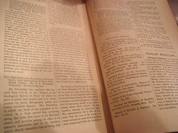
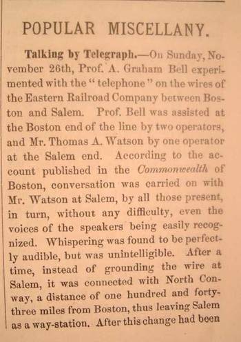
    One of the earliest mass popular announcements of Alexander Graham Bell’s invention of the telephone is in The Popular Science Monthly for February 1877—though you’d be a little hard pressed to find it off-hand in this 130pp issue.  Following twelve articles (including George Beard on “The Physiology of Mind Reading” and Chamberlain’s “Nature and Life in Lapland”), and following seven pages of literary notices, and following another five pages of “Popular Miscellany”, one may find the slight reference to the telephone.  (Pictured here is the two-page spread in which the Bell story is announced—don’t be careless, or you’ll miss it.)
    Blogunderstatebelldetai

    The article, or notice, is called “Talking by Telegraph”, and recalls the Sunday of 26 November in 1876 when Bell’s invention is first revealed, using parenthesis (“telephone”) when referring to the instrument.  The story is less than 200 words long and is tucked away in almost total obscurity.  There is no mention of its possible use or importance. 

    Such was also the case with the announcement of the Wright Brothers’ first successful powered flight in 1903.  The announcement in Scientific American was far less than auspicious, given two paragraphs almost at the end of the weekly issue in the automotive and aviation section.  Actually their earlier successes in unpowered gliding flight in 1901 were treated with similar nonchalance in the Scientific American as well as other popular magazines (of LIFE-like stature in those times), including a fleeting reference in the Illustrated London News and the Illustrierte Zeitung (Leipzig).  It took almost no time at all following the Scientific American publication for the rest of the thinking world to react with proper enthusiasm to their spectacular accomplishment. 

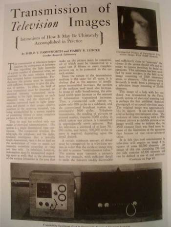
    Our last example here is that of Philo T. Farnsworth (1906-1971), inventor of the first all-electronic television, owner of a spectacularly geeky first name, and one of Time Magazine’s 100 Most Influential Americans of the 20th century
    Blogunderstatephilo

    Perhaps some of the downplay of Farnsworth’s annoncuement and achievement was diluted by the longish list of precursors to his invention—the electro-mechanical television for example was the object of the work of Alexander Bain, Paul Nipkow, Aleksandr Stoletov, Karl Ferdinand Braun, Boris Rosing, Herbert E. Ives, and John Logie Baird, while even the electronic television was nearly completed by Boris Rosing, Alan Archibald Campbell-Swinton, Kalman Tihanyi, Vladimir Zworykin and Kenjiro Takayanagi.  Nevertheless the achievement of the 23-year old boy wonder still found an enormous pinnacle of understatement, all things being equal.  In the article by Fasrnsworth and Harry R. Lubke, “Transmission of Television Images”, in Radio, December 1929, the authors describe their breakthroughs, particularly with what they called their “image dissector”, which differentiated them from the major aspects of the Zworykin invention.   With photographs of the invention as well as the successful televised transmission, the authors go on to say that the transmission of moving pictures “could well be considered as having entertainment value”.  Indeed.  There was some patent litigation ahead, particularly involving Zworykin and RCA, but by 1935 Farnsworth prevailed, though somehow not economically.

  • 18th Century Calculator for the Blind–Nicholas Saunderson, Mathematician

    JF Ptak Science Books LLC   Post #76
    Blogblindsaunderson_calc
    Nicholas Saunderson (1682-1739)  was an extraordinary mathematical talent—he was also blind (from about the age of one), and invented, principally for his own uses, what I think is the first mathematical calculator designed specifically for the use of the blind.  He was supremely gifted and creative, and rose to become the fourth Lucasian professor at Cambridge, succeeding the expelled William Whiston, who had in turn succeeded Isaac Newton—Saunderson also held the post for one of the longest periods of time, 1711-1739.  HE was friend and associate to Newton, Whiston, Roger Cotes, Halley, De Moivre and others during a particularly rich intellectual period in the history of physics and the maths. 

    Blogblindsaunderson_geo

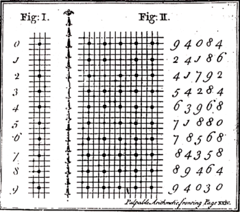
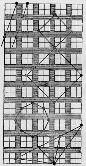
    His calculator was smart and simple, based on a cribbage-board –like device, that was able to perform arithmetical and algebraic functions—it consisted of nine rows and was worked with two pins, the positioning of the pins on the engraved board telling the user their value. (There was another calculator for the blind constructed by Meyer (below, left)  using a sort of reverse principle to the Saunderson model where it was the shape and placement (leaning or not, for example) of the pegs in the hole that annotated value rather than their placement on the board.
    Blogblindparis

    The Saunderson computer was described in his The Elements of Algebra…, published at Cambridge in the first edition just after the author’s death, in 1740.  The device was described in the book by John Colson (who succeeded Saunderson to the Lucasian chair), who commented that it was via the use of the device that
    Saunderson could compose his treatise on algebra. (At right is another Saunderson-based calculator allowing for the construction and study of geometrical figures).  

    ·Posted by :

    ·in:

  • Science and Art; True Science or Science Fiction? #1: Tinguely, Oliver Byrne, Vredeman de Vries and the Theatrophone

    JF Ptak Science Books   Post #79

    Blogrealtinguely
    There are encyclopedias to be written on the not-obvious in the history of science, dictionaries of “what is it”, codexes of “is that real?”, handbooks to distinguish things that look like scientific apparatus but are actually works of art, and vice versa. This is my first installment looking at the occasionally squishy visual line that distinguishes images that are “true” scientific creations from those that are not. 

    Case #1.  FALSE 
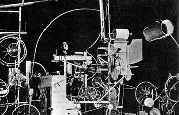
    Our first example comes from Jean Tinguely (1925 – 1991)  a Swiss painter and sculptor, best known for his Dadaist kinetic sculpture, officially known as metamechanics. This photo shows Tinguely in the midst of trying to make his self destructing sculpture, Homage to New York (1960), self destruct. His collection of wheels and cogs and connected motors and techno bric-a-brac, which in their way stood for the embarrassment of overproduction and  self-satisfaction with material goods, embarrassingly failed to self destruct during its unveiling at MOMA.

    Blogrealbyrne
    Case #2. TRUE.
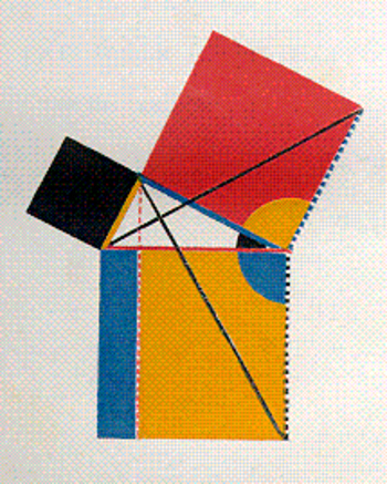
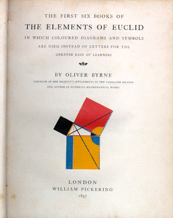
    Oliver Byrne’s semi-insane but gorgeous interpretive work of the first six books of Euclid  published by William Pickering in London, is problematic.  Byrne’s use of color in place of letters in defining and explaining the propositions just doesn’t work very fluidly–it is a great, perhaps the great, example of something that is visually pleasing, beautifully rendered, and sort of functionless.

    Blogrealbyrne_tp
    Blogrealtelegraphone_2

    Case #3. TRUE
    This is the distributing board of the central London “theatrophone”, a telephone relay device that “broadcast” theatrical and symphonic productions to telephone subscribers.  The idea is base on installations of this device during the International exposition in Paris in 1881.  The article appears in Scientific American, Supplement No. 1002, March 16, 1895.  The second image is the switchboard in the central office of the Theatrophone Company.


    Blogrealvredmanbw_2

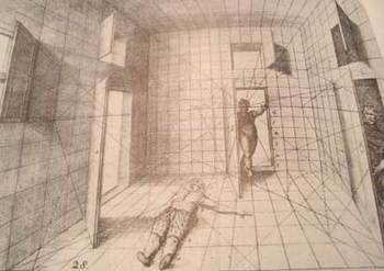
    Case #4, TRUE:  Hans Vredeman de Vries (1527 – c. 1607),a Dutch Renaissance architect and engineer, produced a superb book on perspective in 1604, from which this image was selected.  Of course we manipulated it a little in p-shop, dumping it into mosaic, cheating a little, but, well, there you have it. Vredeman’s production was luscious and smart, and was highly utilized and prized for hundreds of years as a
    useful tool in determining perspective.  It’s a mysterious image, bizarre, even–why, for example did the humble artist use a prone/dead/injured human there on t he floor when he could’ve selected something more benign? The odd figure entering the room through the secret door adds to the general threatening atmosphere of this interesting image.  Base line though–it is undeniably an excellent instructional on drawing with perspective.


    ·Posted by :

    ·in:

    — —
  • Dismantling Reality–Euclid, Mondrian, Malevich, Lobachevsky and the Appearance and Disappearance of Form Through Geometry.

    JF Ptak Science Books Post #80

    Today’s post comes via my wife Patti’s phoney baloney sandwich for our four-year-old Tessie.  It was a tight fit of geometric pieces made to cover slim pieces of bread that would fit into her bento boxes.  The form was lovely!  And—on the heels of yesterday’s post—it reminded me of the remarkable qualities of geometry, and the role it has played in the creation of the known and visible parameters of our world(s). Geometry has also played a very visible role in removing those parameters, for as much as the art has forced regularity in our thought, it has played just as large a role in challenging that structure.  What Euclid has given, Lobachevsky has both taken away (and added to). (Nikolai Lobachevsky [1792-1867] and Janos Boylai [1802-1860] each independently developed non-Euclidean geometries:  that is, they replaced Euclid’s parallel postulate with the postulate that there is more than one parallel line through any given point, saying that the foundational fifth postulate of Euclid was not true.)
    Bloggeometry_byrne
    Take for example an image and idea from yesterday’s post regarding the engineer and art-geometer Oliver Byrne (who replaced much of the text of Euclid’s first six books by using an odd index of color) and Piet Mondrian.   The approach (as noted by Augustus de Morgan among others) is gorgeous but hokum—the effect though is pretty and it does define the areas of the geometric solids that I’d like to use here.  The approach that Byrne tried to develop and simplify Euclid for more general readers was to employ a peculiar art form of geometry to help classify the structure of the world—ordering the universe, and vice versa.
    Bloggeometrymondrian
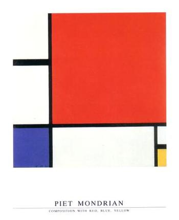
    Piet Mondrian, who was one of the earliest artists to practice the new, revolutionary form of non-representational art—that is, producing art with no recognizable subject matter, no humans, or landscape or animals or bugs or whatever—uses very similar geometrical solids to reclassify all of existence into sensations and color forms.  Mondrian is more correctly classified as a constructivist, or cubist, and he uses the same tools to re-identify nature as Euclid developed to help classify the structure of the world.  This is his “Composition with red, Yellow and Blue” which was painted in 1930, a full eighteen years after Kandinsky created the first painting in this field. But there were other early pioneers in the non-representation field who exhibited a more mathematical aesthetic in liberating the object than we see in the first works than the great Kandinsky.  Umberto Boccioni (1912), Frank Kupka (1913), Olga Rozanova (1913), Liubov Popova (1914), Felix del Marle (1914) come quickly to mind,
    Bloggeometryyubov_popova
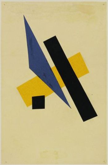
    though none leap to consciousness as quickly as Kasimir Malevich.  Malevich begins this work before 1910, and by 1913 he has produced such works as “samovar” in which the (samovar) object is dissected and moved to different places in the visual field on the back of geometrical objects.  But it is in 1915 that we are introduced to his extraordinary “Black and red Square”, where we find that he has removed all representation of objects—not only that, he has removed almost all of the forms, period.

    On the other hand there is certainly a very long history of artistic adventures which have no recognizable subject, though the artists in these cases I am relatively certain about were not trying to replace the known stuff of our world with the not-yet-known.  Geometrical artistic expression at its base has been seen in mazes, labyrinths and mosaics for thousands of years.  I guess you could even make a case for architecture fulfilling this role as well it the buildings were taken as art forms.  But I’m interested here mostly with the artist intentionally choosing to obscure the known subject.

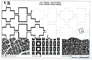
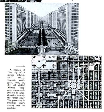
    This leads to the troublesome forms of the French architect Le Corbusier (Charles-Édouard Jeanneret-Gris, 1887 –1965).  Leafing through his The Radiant City (Elements of a Doctrine of Urbanism to be Used as the Basis of Our Machine-Age Civilization, 1933) is a confusing affair.  As much as the man wants to rectify and save the world (his words, salve me fons pietatis) with his geometrical cities, replacing the mess of disorderly human civilization, his results, while giving a crispy clean order, are formidably lifeless (to me, at least), the organic and messy bits of human life de-fractured and placed in 90-degree containers.  Le Corbu complains about the American successes, there in 1930 or so, saying that the U.S. is a monument of achievement but for achieving the wrong things.  A little later in 1932 and 1933 however he does take time to make positive comments about the interesting experiments going in Fascist/Mussolini Italy and Stalin’s Soviet Union…it was common I know for thinking people to have such harmonious thoughts about these regimes, but there were plenty of others who kew and wrote about what was
    Bloggeometrycorbu_city066
    really happening in those places, and Le Corbu was not one of them.)  The so-called positive elements of American advancements that Corbu took away with him back to France– Taylorist and Fordist (Henry was a vehement anti Semite and Nazi sympathizer)  strategies adopted from American models to reorganize society—I think come vividly alive in his geometrical replacement of human habitation—call me old fashioned, but I just don’t like it.  I also don’t like it because it smacks so much of his disgust of capitalism (which he talks about as consumerism) and of his own right-wing political beliefs.  Le Corbusier followed these thoughts into the camps of philosophies like  the right-wing syndicalism of the French politician Hubert Lagardelle.  These also eased him into a position with the traitorous Vichy government during the Nazi occupation of France during WWII—he did cut ties with it in 1942, though only after the architectural plans he had developed for various projects were rejected.
    Bloggeometrycorbu_litl_squ067  

    [Another leading 20th century architect, Philip Johnson, had his own problems with admiration of fascist ideas, though the amoral and whorish Johnson would’ve have seen these ideas as “problematic” only insofar as they would keep them from working.  He was a decade-long Nazi sympathizer, and among many other things actually followed the Nazis as they stormed their way through Poland—something Johnson described as a (positively) “stirring” experience. He was in a separate class from the kinda-stupid Charles Lindbergh and the empty-suited-but-still-dangerous Prince Harry as Fascist trumpeters.  He was more on the level of detestable fascist intellectuals like Martin Heidegger and Ezra Pound. He was awful.]

    It just so happens that two of the most towering names in 20th century architecture were embroidered into the fabric of Fascism, and I think that these ideas burn their way directly through the geometrical imagination of Le Corbusier. His brand of geometries lead us towards the human cog-and-wheel, tight-box, suffocating proclivities of his right-wing extremism, and is perhaps the worst sort of illustration for the use of that beautiful branch of mathematics

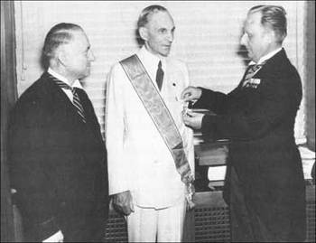
    Just for the sake of clarity I’ve included this photo of Henry Ford becoming the third recipient of the Nazi Grand Cross of the German Eagle,  presented by Karl Kapp, German consul-general of Cleveland (left), and Fritz Hailer, German consul of Detroit (right). The other two recipients were Benito Mussolini and Count Ciano.

      Fordnazimedal


    ·Posted by :

    ·in:

    — —
  • Digital “Computers” 1450-1750: Memory and Calculating on the Fingers and Hands

    JF Ptak Science Books Post #81  (Expanded)

    Bloghands_memory072_2
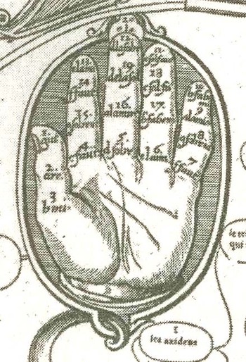
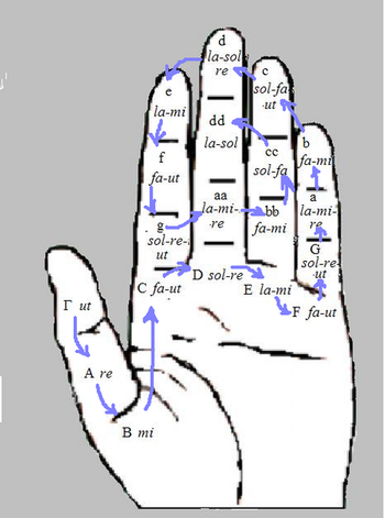
    These lovely images weren’t intended to show people living in the Renaissance and Baroque eras how to actually record data on their hands—they were intended rather as templates to show how they could use their fingers and hands for calculating and as memory devices.  Much like Frances Yates has shown us so beautifully in The Art of Memory and how info and data was stored in imagined and compartmental palaces in the mind (relying upon images), the hands were also used as a theatre of memory in addition to extended calculation. 

    These mnemonic devices were necessary—especially during the Renaissance—because of the general lack of and access to affordable vellums or paper and writing instruments.  Having notebooks filled with memoir or history of calculation was generally not something that was happening for even the not-wealthy but not struggling class.  These mental images were used widely in the areas of religion, palmistry, astrology mathematics, astronomy, astrology, alchemy, music, and other such fields. 
    Bloghands_big074_3

    The first image (from a German manuscript) of the hand-theatre was found and deciphered by Claire Richter Sherman (Folger Shakespeare Theatre) and is religious in nature, an intentional piece of memory for the devoted and for devotions.  The needs of religion were splayed out as the hand was opened and fingers flexed, and working from thumb to pinkie, from finger tip and joint—“do God’s will, examine  your conscience, repent, confess”, and so on, and above all be content with your lowly penitente stature.  If there were 28 of these admonitions or reminders at different points of the hand and you memorized them all, it would be a much simpler time to recall and keep them in order if you merely had to touch a part of your hand where that memory should be to invoke what it was you were supposed to do.  Therefore you could theoretically cast about with your creator with your hands in your pockets—if you had pockets. 

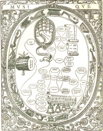
    The next two images (including the enlargement of the hand section) are from a work from 1587 entitled Musique and are attributed to John Cousin the Younger (1522-1597).
    The basic premise for this device—it seems to me—was to be able to order the different chords of 20 different instruments. 
    Bloghands070_2

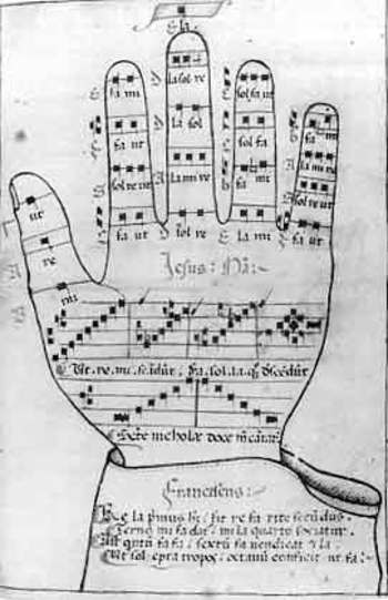
    Another musical hand mnemonic was the Guidonian hand, a survivor of Medieval times, and possibly named after Guido of Arezzo (a musical theorist), and was an aid to singers learning to sight sing.   

    The entry for the Guidonian hand in Wiki explains it use rather well:  “The idea of the Guidonian hand is that each portion of the hand represents a specific note within the hexachord system, which spans nearly three octaves from “Γ ut” (that is, “Gamma ut”) (the contraction of which is “gamut”, which can refer to the entire span) to “E la” (in other words, from the G at the bottom of the modern bass clef to the E at the top of the treble clef). In teaching, an instructor would indicate a series of notes by pointing to them on their hand, and the students would sing them. This is similar to the system of hand signals sometimes used in conjunction with solfege…”
    Bloghands_bodies071

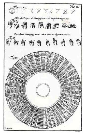
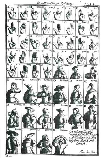
    The final two examples come from Jakob Leupold’s  (1674-1727) Theatrum Machinarum (1724)—this was a complex work involving nine sections and addressed the theoretical  aspirations of engineering (load, flexure, that sort) and its applications to its daily practitioners.  In one section of the book he sought to explain the connections (and correlations) of hand motion and symbolism to the origins of the number systems, carrying it out further still into body language, so that two people conversant in these symbols could talk and bargain between themselves in economic/body terms.  Barbara Maria Stafford, in her Artful Science, Enlightenment,

    Bloghand_guido

    Entertainment and the Eclipse of Visual Education (1994) points out the long history of this tradition, and that it reached far back into misty time:  Leupold knew that Appian, the Venerable Bede, and Aventinus had been fascinated by manuloquio, or natural language with the hands.  He thus linked counting to a global….medium of prearranged gestures…”

    Bloghandguido_2_2


    ·Posted by :

    ·in:

    — — —
  • The Big Cycle—the Beginning and the End of the World and the Weight of All Things, Depicted 1445-1550.

    Blogcyclethe_endJF Ptak Science Books  Post #82

    (1)  The End

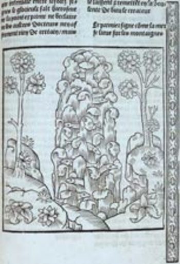
    I came to this post through the interest in an image that shows life as we know it in its very last teetering stage, at the crystalline moment just before the bullet hits the bone, just before the wave breaks, just before the shade swallows the light.  The image is incredible, seemingly far beyond the reach of the 15th century, far above its naïve absolutism, showing a tower of water, the oceans risen from their depths and towering over the mountains, just before the cascade and inundation begins.  It is by Antoine Vérard  and was published in 1493/4 in André Bocard’s (b. 1453)   L’Art de bien vivre et de bien mourir .  Those little poking-out bits are indeed fish, the sign of life and the aymbol for Christ in that unimaginable column of Earth-killing water, one of the Christian indicators that the Judgment Day was near.  Actually I think that we’ve moved far beyond Judgment at this point, and that the print shows the watery effectuator of the warnings and promises heaped down on the readers of Revelations and Apocalypse, among other things. 

    (2)  The Beginning
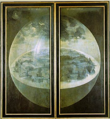
    Blogcyclebosxc_beginnng
    I love this painting by Bosch showing the creation of the universe , mainly because we associate the hyper-imaginative old man (Bosch, not God) with dripping and dire images of the other end of the space time continuum.  This view of the cosmos is quiet and benign—Bosch to me seldom *waits* for things to happen, as in this painting, which seems all about anticipation and possibility.  The canvas is empty, quite unlike the very full, kinetic, no-time-for-reflective-action images that we usually associate with this painter.

    (3) The Beginning of the Beginning and the Beginning of the End.

    The Bible is a relatively long book, but the space between creation and the (quick?) ultra-final desiccation of Paradise happens in such short word-distance from one another that you can barely get comfortable in your chair before the race to the end begins.  (My wife Patti Digh says that this action is so quick because we need forward action in the telling of the story—we need the wolf to make Little Red Riding Hood more interesting.) 
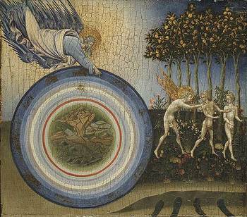
    The painting, Creation of the World and Expulsion from Paradise, is by Giovanni di Paolo, and was completed in 1445.
       Blogcycledi_apolo  
    The expulsion part was particularly gloomy for all non-human things because, as I am told, it is from this point (day?) forward that animals no longer live in harmony with one another, and that their vast majority is made to eat each other, consuming each other for energy sources, in a vast, incredible orgy of killing and death.  That’s quite a price to pay for human insouciance.  It seems to me that if you added up the weight of everything on earth that killed other living things for energy versus the weight of everything else gaining energy from the sun or chemically or whatever, that the later would compose only a fraction of the killers’ weight.  (As Gus McRae says in Lonesome Dove,”the Earth is just one big boneyard”. 

    One interesting part of this painting is di Paolo’s depiction of the nine spheres of creation, which he depicts in eight.  (The earth at center, followed by the elements   water, air, and fire, then the moon and planets, then the fixed stars with signs of the zodiac, the primum mobile and finally the undefined Empyrean heaven, the place where God and all of its components sit.  Perhaps di Apolo felt that he could not contain the Empyrean, and so left it unbounded.

    (4) The Cycle of Cosmic Life
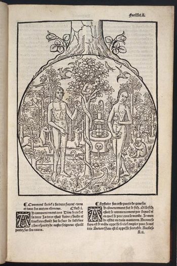
    Blogcycle_of_life_eden_4
    This interesting woodcut by Antoine Verard in his French Bible of 1517 shows Adam and Eve in the Garden in the opening moments of Genesis, its incubating sphere seemingly at the root of a great tree, which, for all  of its great beauty, seems backwards. Perhaps the message would be different if you put the Garden at the top of the tree, the tree of life; having the garden and its quick demise (where did the garden “go”, anyway?) seems to symbolize death at the root of all that followed the expulsion, as great trees all wind up lichen-bait at some point.

    (5)  The Cycle of Life on Earth

    This wonderful woodcut from Jean de la Garde’s  The Heart of Philosophy (1504)—an amalgam and witches brew of hermetic and astrological texts and conjectures—and is perhaps the most brilliant of the sixty-two woodcut illustrations in the wide-ranging, over-reaching book.  The complex message here shows the influences of the earth and cosmos on the life of humans, the astrological signs and symbols of the seasons and etc. all bearing down very hard on the flower in the lap of the woman at the center of it all. It just seems so odd that there should be so much forebearance and such an extraordinary concentration of effort to be brought to bear against a solitary womb.  With all of that reigning down on us, I wonder how it is that we are expected to breathe?
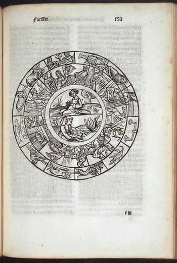
    Blogcycle_of_life_life_2

    ·Posted by :

    ·in:

    —

Recent Posts

Archives

Categories