A Daily History of Holes, Dots, Lines, Science, History, Math, Physics, Art, the Unintentional Absurd, Architecture, Maps, Data Visualization, Blank and Missing Things, and so on. |1.6 million words, 7500 images, 4.9 million hits| Press & appearances in The Times, Le Figaro, Mensa, The Economist, The Guardian, Discovery News, Slate, Le Monde, Sci American Blogs, Le Pont, and many other places… 5000+ total posts since 2008.

  • Manly Purity & Beauty; Soap vs. The Royal Evil, 1889

    JF Ptak Sceince Books  LLC  Post 400

    0--blog---Nov 28 crimson chin146

    This is 1889’s mini-version of a gorgeous male, a man of purity, virility, and pimple-free skin.  Also of scrofula-free skin, a condition description that seems to have faded from use after wide popularity for 500 years.  The picture of this man was used by the Cuticura Soap Company (actually the Potter Chemical and Drug Company of Boston) to promote its product, a soap with a bit of prussian blue tincture and some other stuff whose manufacturers claimed would (not could) cure all manner skin aliments, including the loss of hair.  The cure of scrofula–a form of tuberculosis affecting the lymph nodes of the neck and appearing as large welt-like dry abscesses–was no minor claim.  Aside from its quack connection, the claim was also an affront to royalty, as for hundreds of years the skin condition of scrofula (“the Royal Evil”)  was thought to be curable by a monarch’s touch; Henry IV was said to have touched thousands of people in this way.   There was also a religious connection to the sovereign touch cure, with a ceremony included in the Book of Common Prayer from the Anglican Church.  It survived in England until George I found the practice offensive and “too Catholic”. 

    An offshoot, Cuticura Resolvent, was offered to cure “every sort of blood disease”, while yet another product, Cuticura Anti-Pain Plaster, would cure rheumatism and kidney “pains and weaknesses”.  That’s quite a heap of expectation from soap, and the American Medical Association too it to task as early as 1912, calling the soap’s effectiveness as a curative “remote”; somewhat earlier, in 1908, the British Medical Association found the use of Cuticura for its stated curative capacities for syphilis to be “without basis”.  Pretty benign and reserved, I’d say, compared to what the AMA and BMA had to say about similar products. 

    The Cuticura identity is still in use–and popular–today, 143 years old, though so far as I know the modern makers make no claims for its soap to cure the Royal Evil.  Today its just soap.

    Crimson chin

    I’ll take this opportunity to reference this ideal of Manliness and Purity to a certain character from my younger daughter Tessie’s cartoon program, The Fairly Oddparents--this old man bears some resemblance to one Mr. Crimson Chin from that show.  (I just like referencing kids’ shows.)
    ·Posted by :

    ·in:

    —
  • Extra-Earth Humano-Alien Souls From Outer Space Repopulate Earth-Hell!!(??) Blank & Missing Things XXVII

    JF Ptak Science Books  LLC Post 401


    (Extra-Earth alert! This is the third time that I have found a pamphlet illustrating a view of the earth with an extra alien-earth in the background.)

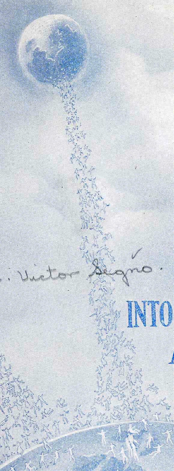
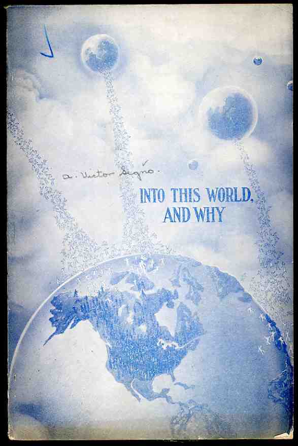
    This 1929 pamphlet by Dr. (?!) Victor Segno is the poster child for  the sub-category of Advanced Strangeness in the Naive Surreal Collection of our store. Segno is no stranger to dislocated and fractured ideas, and has a long history of preaching and extracting money from the preached-to.  Early on in his career he spawned a not-terribly original idea called “mentalism” which involved getting your “brain waves” correct and “harmonizing” your surroundings with them, which somehow also had something to do with leadership and success.  But all of that involved sending Segno a dollar for a pamphlet on brain-wave distribution.  According to Segno’s home-town paper, the LA Tribune, there were something like 12,000 people who were part of the runaway Segno train wreck–the Tribune couldn’t understand why, and didn’t much care for Segno’s quacky successes.

    0--blog---Nov 29 into this world149

    Suffice to say that quite a bit happens between 1902 and this 1929 effort, some of which involves considerable success and tiny-empire building in Echo Park.  But Segno really does break the bonds of treacly abnormalism with “Into this World and Why”, which offers a curriculum of soul/ghost extra-terrestrial astrological-astro dead/reborn beings to come and re-(!!) populate humans on earth.  (Wait a minute–that idea gets picked up by L. Ron Hubbard, yes?  Except that when L. Ron gets a hold of this idea there are 10,000 atom bombs involved and a new added process called “the clear”. But that’s another story.)  After kind of reading this pamphlet, I have come to determine that the best thing about it–bizarro ideas or not–is the cover. 

    0--blog---Nov 29 into this world151The cover, though is magnificent.  Look closely, and you’ll see that there are five other earth’s floating above the earth, all of which are contributing not bodies but souls, souls a-piling up like clustered grapes in places, souls being deposited back on earth for another go around in existence. Segno explains to the humble reader that the universe is divided into twelves sections, each populated with a planet that looks like earth, all of which are superior to the earth.  These are soul-abodes for the dead of earth whose souls leave and travel blah blah blah along the means of an undescribed process called “radiography” of the brain waves. As you can see the humanish forms falling onto earth are empty, waiting as they were to fill up a body.  Oy, vey.


    And so the thing drags on for 52 pages, a length probably determined by the paper on hand.  (But that wouldn’t stay the case, as this  pamphlet went into a self-stated 26th edition…if true, then there is no justice in publishing,)  The only reasonably entertaining and proto-sci-fi idea that comes into play here is that in all of the universe it is the earth that is Hell.  Earth is the place of punishment that souls are sent to until they get things right, at which time they leave for one of the other twelve earths.  So it goes.  

    0--blog---Nov 29 into this world150

    The other interesting bit on the cover is the representation of the giant mountains of Europe, which erupt above the earth’s horizon.  I figure that for these bumps to be so prominent that the mountains needed to be at least a hundred mile high. 

  • The Tomb of Broken Dolls–an Appeal for Respect for Outgrown and Disabled Toys

    JF Ptak Science Books  Post 349

    “No two toys are ever broken in the same way or with the same emotional results.” RobertGraves, Poetic Unreason

    000-ebay--Nov 1 doll tomb975


     I first wrote about this fabulous idea–a tomb or memorial for broken and lost toys–on this blog almost three years ago–it still seems like an utterly fantastic practice.

    000-ebay--Nov 1 doll tomb975

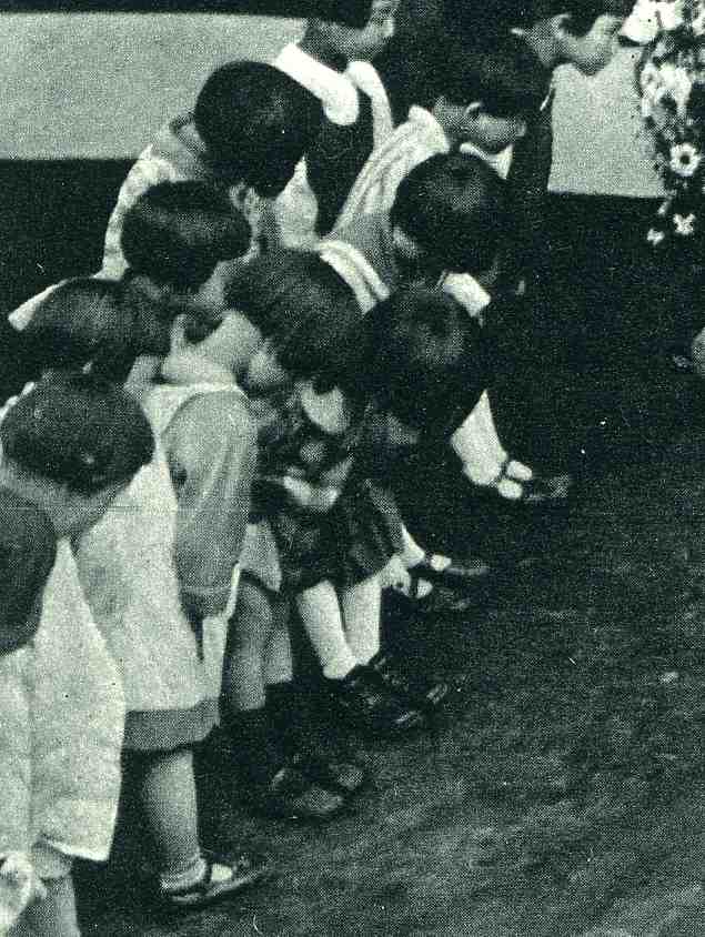
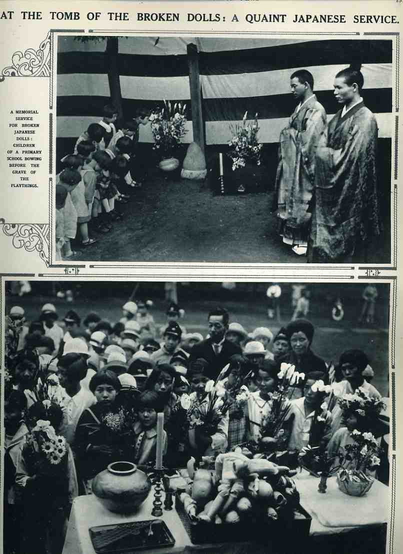
     This is an absolutely outstanding concept, and I simply have no notion as to why we don’t have such observations in the United States.  (The following two details are from the larger images, below, found  in the 27 July 1929 issue of The Illustrated London News, page 157.) The story provides these two pictures and unfortunately scant details of the ceremony which was held at the Imperial Primary School at Sugamo, Japan. 

    The first photo shows the detail of children offering flowers for the altar on which their tray of broken dolls is being venerated; and to the right is the detail of children bowing to the grave of “broken playthings”, though the markings on the (grave?) stone indicate that it is for dolls.  It also seems to be a marker for a mass of toys, not that each toy would have its own marker; I suspect it to be enough to have a place where allot of kids could come to venerate objects in which they might have invested countless hours of their time, effort, attention and affection.  That it is a shared place and experience makes the monument all the more so powerful.

    000-ebay--Nov 1 doll tomb976

    There are few better things to teach a child than to pay respects for something that has given them pleasure or helped them, or, say, for returning the love which has been showed them from their doll or toy.  It has always struck me as not-quite-right that a toy can be a beloved object one day and a dust-magnet the next, destined for the trash heap.  Certainly these are holy objects in themselves, and deserve a better and more kinder fate than being mixed with broken glass and greasy unmentionables. 

     000-ebay--Nov 1 doll tomb974


    Are there greater things to be concerned with?  Yes, of course, but only on the face of it–I think that helping kids understand the underlying dignity of inanimate objects such as their playthings could give them a greater awareness for the other seemingly invisible things that they will find throughout their lives. Further I think that a visible, constant reminder for these objects would be really more like a memory-monument for a period of time, a place in nearly everyone’s life in which held a certain purity and promise, a protected and beloved frailty of the human experience shared by all.  I can honestly think of no other monument that could reach across religious or philosophical or belief systems to arouse a feeling of common goodness than this. Everyone has had a toy that they’ve loved, and I have no doubt that if remembered these would be powerful emotions, and could be about the most common denominator we have on the planet.  I can think of no divisive element in such a monument of veneration.

  • A Magnficiently Bad How-to on Writing: a Card Deck of Limited and Stolen Creativity

    JF Ptak Science Books LLC  Post 351

    000-ebay--Nov 3 plotkey981
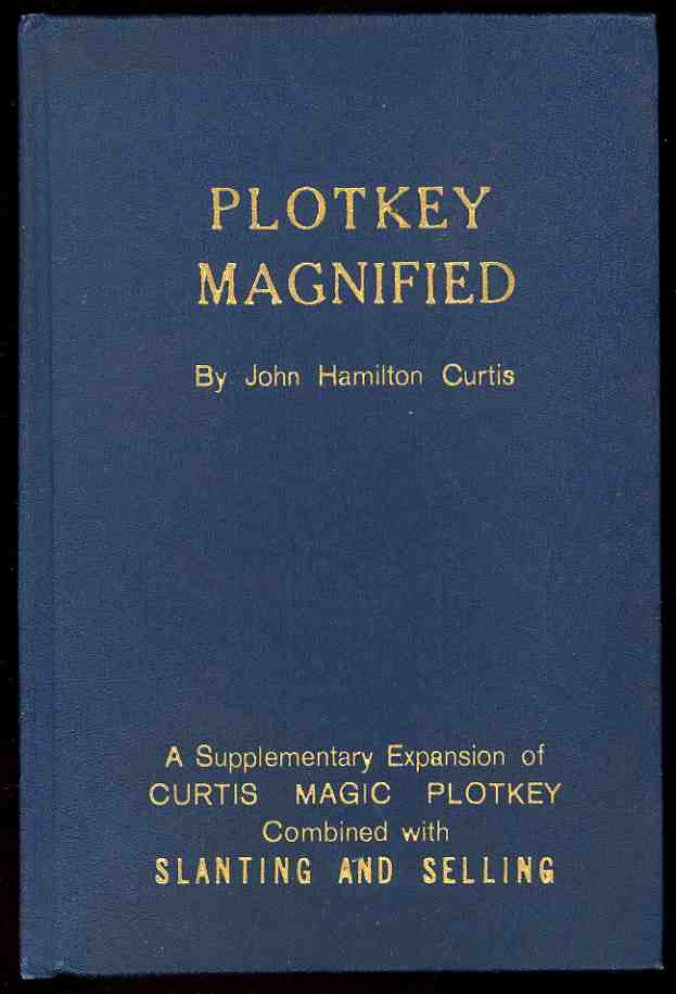
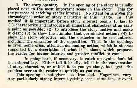
    The title to this post probably does live up to itself–this bit, The Plotkey Magnified, by John Hamilton Curtis, reads as though it were written by a long-down-the-list loser of a Hemingway-imitation contest, and thunk-up with the vigor of a five-beer bar date. (Interestingly, the work, printed but not published in 1937, was prepared by the author for himself–we learn this info on the title page, along with the author’s address, which was PO Box D, Eagle Rock, California.. It must’ve been a pretty small post office if their boxes were identified with letters.)  The subtitle to this work pretty much sums it up:  A Supplemetary Expansion of Curtis Magic Plotkey Combined with Slantng and Selling.  The one thing that the author forgot was punctuation and grammar, which somehow shook themselves loose of his book, and which I’m guessing were sold in those now-disappeared tiny paper bags that you used to get at Reiman’s Hardware store in 1966.  He also forgot how to write, as some of his efforts are just truly bad, and occasionally painful.  For example, we have the following exceptional declaration:

    000-ebay--Nov 3 plotkey984

    And so, these two paragraphs speak for themselves in their own special way.

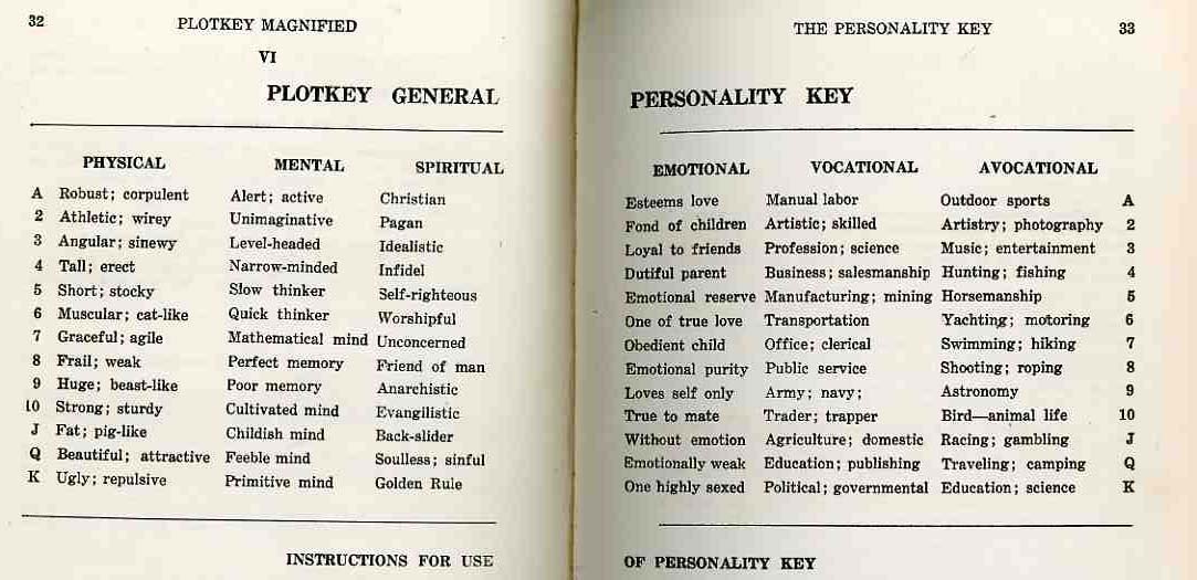
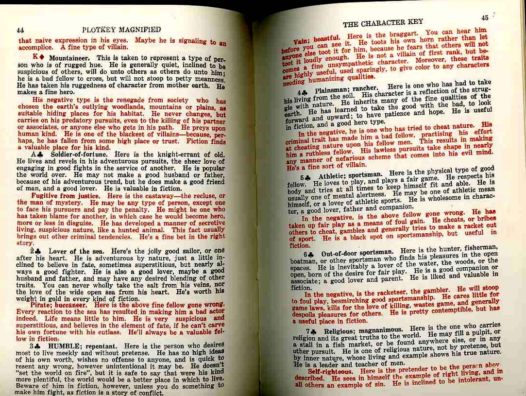
    What Mr. Curtis was trying to do here with this publication was (a) make a little money  and (b) selling a manual of some calculated “ideas” for story and character development to people writing detective fiction for detective novels.  Nothing really works here–the author shouldn’t have written it because he couldn’t write, and certainly couldn’t teach all of the stuff about writing that he couldn’t have known;and the readers shouldn’t have bought it because if they couldn’t write before reading the book they doubley-couldn’t write after using it. And I do mean “using” it rather than “reading” it.  Incredibly, the book is set up to have its ideas dismembered and set up in the fashion of a card deck, the reader dealing themselves out pieces of characters and scenes and locales, with Mr. Curtis offering more than two dozen (!)  different types of physical, mental, spiritual, emotional, vocational and avocation descriptions encompassing the totality of human nature.   Even though these descriptions of the human condition are minimal, liminal and sturdily stupid, they are funny in an outsider, disturbed vein of insight.    The ‘physical personality” aspects like  athletic/wirey; fat/pig-like(?) rub up hard against things like the removed “spiritual” personality traits, which  include “christian, pagan, idealistic, infidel, unconcerned, back-slider, soulless-sinful”.  Throw in the mental, and emotional stuff plus the interest and jobs sections and you can concoct some spectacular Frankensteinian-monster personality assignments:  for example, at random, you can develop a character for your detective story who is fat and pig like with a poor memory, a back-slider  who loves themselves only, is a trapper, and is interested in “entertainment”.  Wow.  These ingredients can get mixed and coddled into a witches brew of old tripe that would compose an unlikely and heinous small town population that should probably be buried rather than read about–remember, you’re supposed to use this cookbook as The Guide to Creativity for the short story you’re trying to sell to “Muscle Culture”. 

    I must say though that what I take away with me from this experience is an idea for turning this book into some sort of naive-surreal card/board game that is made to produce purposefully bad fiction, the sort of writing that is really hard to do; writing good bad, where the loser is the winner in a game of retro-badness. Not easy. Soldier.

    000-ebay--Nov 3 plotkey983

    000-ebay--Nov 3 plotkey982

    ·Posted by :

    ·in:

  • A Forgotten (?) Photographic Protest of the 1933 Chicago World’s Fair

    JF Ptak Science Books  Post 352

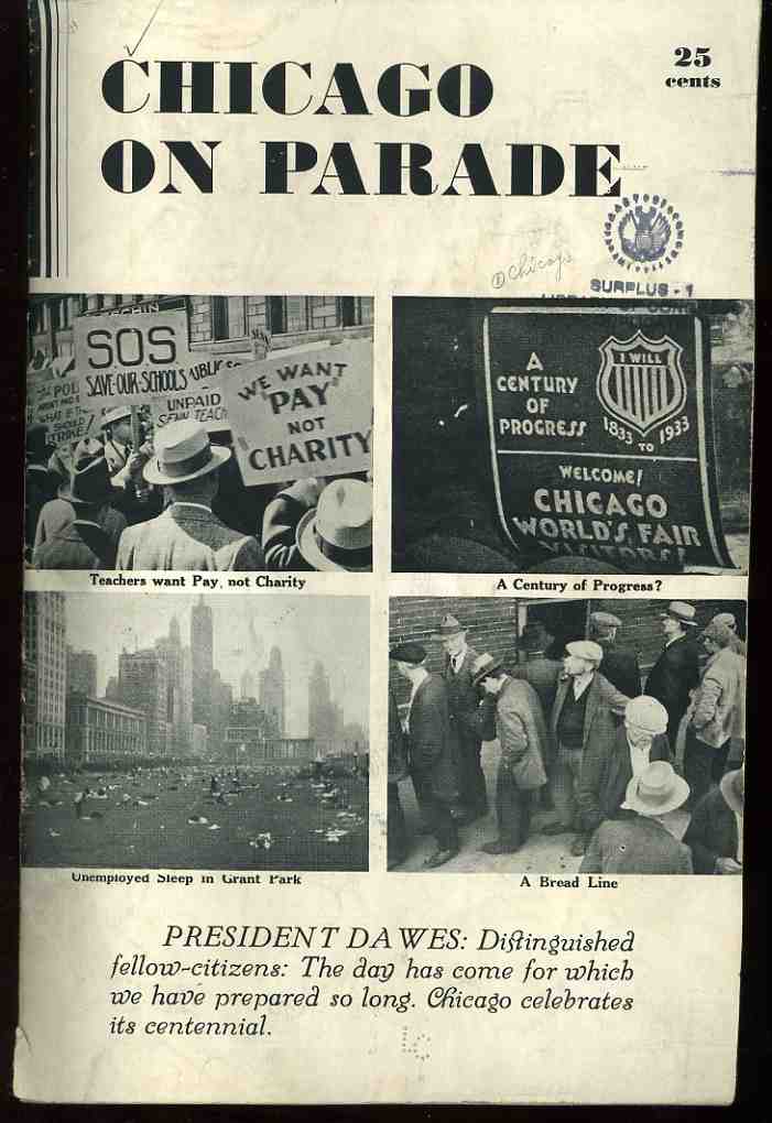
    000-ebay--Nov 4--chic 1985 This short pamphlet is a very strong tonic to those thinking about Chicago’s “Century of Progress” celebration and World’s Fair that was taking place in the middle of the Depression in 1933. (It was intended to instill hope and foster a little forgetfulness during a time in which the Depression in full swing nationwide, plus native-Chicago problems of gangsterisms, race riots, red scare, and economic distress ) As a matter of fact this pamphlet didn’t seem to find much distribution, or at the very least it didn’t get saved in spite of the fantastic documentary images that it contains.  This copy of Herman O. Duncan’s Chicago on Parade (1933), was his own, sent to the Library of Congress as a gift in 1942 before it came to me in 1999. I can find only three other copies of this pamphlet located in libraries world wide (Oxford, Duke, Chicago), and it seems very strangely underrepresented. 

    Duncan addressed the work directly to the Rufas Dawes (President of the Century of Progress Celebration), and to the mayor of  Chicago and governor of Illinois as a very blunt request to not forget the actual world of real Chicagoans living in dire straits within site of the fairgrounds.  Duncan was obviously taking issue with the many statements of wonderment and flourishes of progress that accompanied the propaganda surrounding the fair, so that the attention of the public would not be “diverted by our political and civic leaders”.  Duncan continued that these photographs, “none of which had been published previously in the United States” could “perhaps suggest a point of reference from which Chicago can measure its Second Century of Progress”. 000-ebay--Nov 4--chic 6 det991

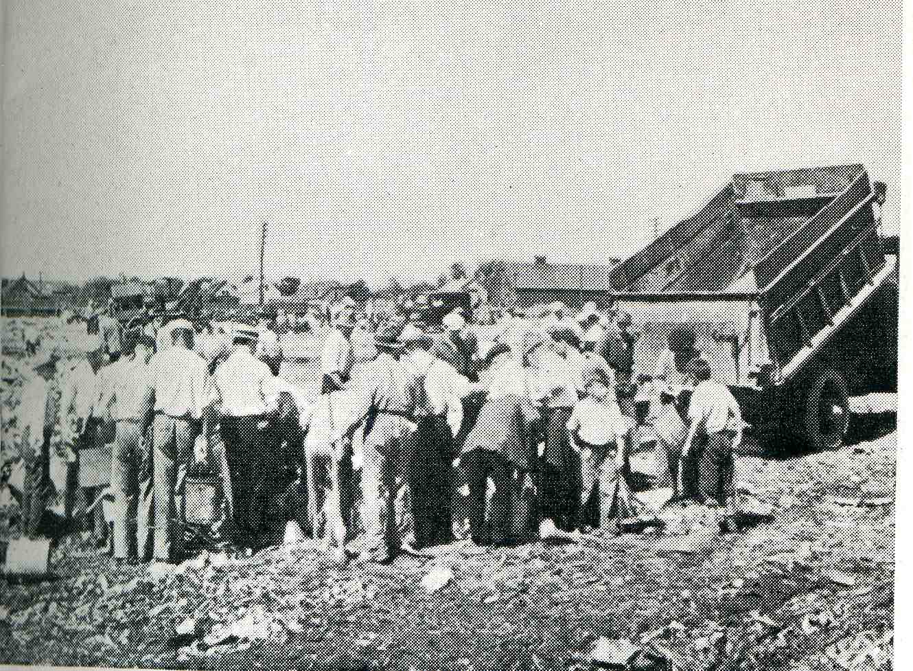
    Duncan (who unfortunately did not identify the photographer(s)) was very strong in the use of images.  He was not afraid to show long bread lines, people (including children) scavanging at the city dumps, blacks and whites marching together in protest of police brutality, (many hundreds) of people sleeping out of doors in Grant Park (Chicago’s “front yard”),because they had no where else to go, and much more.  The photographs had a real touch of journalistic acumen, and none of the images look forced or posed–they are the real stuff of social documentary, and how they have escaped wide notice is not known to me
    . 

    000-ebay--Nov 4--chic 2986
    Perhaps the strongest statement (outside of the
    photos of the children scrounging for food in dustbins and at the dump) is this series (below) showing views of the city of Chicago that were within site of the tower for the Century of Progress Sky Ride (“See the Fair / Come Up in the Air”).  The series make an elegant and strong and incontrovertible point, and that there was definitely something very wrong going on outside the walls of the celebration which had been scooped out of the city’s east side.  (The images remind me of series of photos of the US Capitol Building that appeared in the great classic of social and cultural recording of class division, Neglected Neighbors, which my friend Andy Moursund introduced me to many years ago in Georgetown.)

    The logo design for the event is terrific and I’m sure that everyone had seen it at least once in their lives, but out of the many hundreds of other pamphlets and display materials that I have here for the expo I’ve got to say that the overwhelming majority of them are luridly colored with a palette found outside nature.

    And anti-nature colors are somewhat schizoid-happy  colors, like MGM technicolor cartoons from 1949, which applies a massively ugly chromo-palette to the blight of the surrounding Depression problems.  Mr. Duncan was determined that this not happen, at least so far as he could help it, and published these arresting images to remind the rest of Chicago that the vividly colored happy face placed over the city like a stamp for the Century of Progress was not the case in fact. 

    There are another few images in the “continued reading” section.

    Note:  click on the photos for a larger, more detail view.


  • Why Are Mailboxes So Ugly?

    JF Ptak Science Books  Post 288
     

    Blogtucholsky Really–how is it that such ubiquitous American objects are so ugly? Evidently the first public mailbox in the U.S. was a “street letter box” designed and patented by P.B. Downing, and African American inventor, 27 October 1891, 48 years after the first box appeared in Britain; and the design of these things has gone downhill ever since.

    I remember reading about this issue being addressed somewhere—I thought it might’ve been Walter Benjamin, buried somewhere in his weirdly beautiful Arcades Project; but, no, it was in Kurt Tucholsky’s Deutschland Deutschalnd Ueber Alles. The Tucholsky book originally appeared in 1929 (the same year the author dumped Germany for Sweden) and was illustrated by photo montage by the great John Heartfield.

    Tucholsky stated “for some unknown reason mailboxes have to be ugly. Why?” Addressing the German postal boxes he wrote “these mailboxes were designed in complete ignorance of the principle that simple things an be beautiful if their proportions are related. Because the post office mentality is limited. Because the post office has a monopoly. Because bureaucracies, in their limitless self-importance, will take a single step forward only when the technologies are miles ahead…because there is no reason in the world why the state should employ people for life. Because it is insane to breed apathy, and because the company needs interested workers, not an army of officials…any well run business moves faster. A multitude of bureaucrats is death to the taxpayer.”

    “And that’s why mailboxes are so ugly.”

    This was one of the least of Tucholsky’s biting, driven observations about his failing state. And still correct.
     

    ·Posted by :

    ·in:

  • A 117×1 Mile Blanket of Planes: What 185,000 Planes Looks Like

    JF Ptak Science Books  Post 289

    1ebay_sept_30185000_planes695

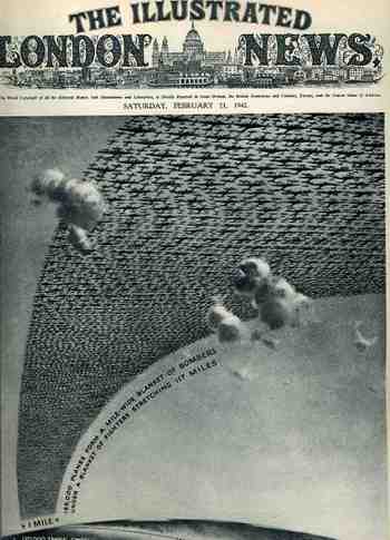
    This arresting cover image for The Illustrated London News of 21 February 1942 illustrates the (new) American production program for planes and tanks for 1942 and 1943 (It reminds me too of an earlier post I did with a similar cover for LIFE magazine here.) The caption reads: “185,000 planes form a mile-wide blanket of bombers under a blanket of fighters stretching 117 miles” which is actually a double blanket of planes–if they were thinned out to form one layer it would stretch one mile wide from Washington D.C. to New York City, which is quite an unimaginable ribbon.

    1ebay_sept_30185000_planes_detail69

    The reality of the situation was greater than this:  by 1945 over 300,000 planes were produced, 275,000 of them after Pearl Harbor.  And this from a combined aviation industry which before 1939 had produced fewer than 6,000 planes a year.  The war effort increased this by orders of magnitude, and by war’s end there were 81 production facilities with a combined area of 175 million feet, all bumped up within four years.   I’ve never read about it, but I have no doubt that one of the key ingredients to this sort of hyper-successful undertaking was organization–the oversight and control for this process must’ve been fast and decisive, with little room for mid-level anything.  I think that this is the only way the whole thing could’ve worked so well. 

  • Electric Surf and the First Touch of the Ocean by Blind Children; Coney Island, 1878

    JF Ptak Science Books LLC   Post 290

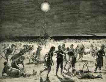
    1ebay_oct_1coney_island_electric711 This woodcut is from the Leipzig equivalent of LIFE or The Illustrated London News:  Illustrirte Zeitung, and was published in August 1878.  It appeared in the same issue as the very first image of Edison’s phonograph in a European publication (just two pages away)  It was a big issue for Edison in Germany, as he was of course principally responsible for not only integrating minor discoveries of others into a revolutionary discovery of his own (the electric light and light bulb), but was also reasonable in the largest part for the physical distribution of energy to those light bulbs.  And so it came to be that the beach at Coney Island–one of metropolitan New York’s greatest recreational sites–was lighted by a  portable electric “floodlight”  (though I don’t know what the illuminating part was–perhaps it was a carbon-arc something or other, as I’m pretty sure it wasn’t a light bulb” as we would think of it…nevertheless the source was electrical).  It had never in human history happened before that people could frolic in the surf under an artificial source of illumination–it had to have been an extraordinary sensation.  The light appeared in the same year that the The Camera Obscura
    Observatory was established (borrowed from 1876 Philadelphia
    Exposition) and just nine short years after the “great” Charles Feltman
    invented the Coney Island hot dog (though my favorites of the boardwalk
    was Nathan’s big crinkly french fries in a paper cone).

    1ebay_oct_2_blind_beach721

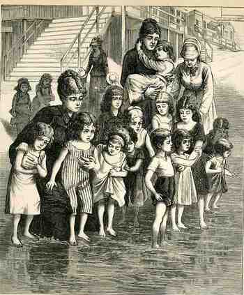
    Right above this image was this extremely emotional wood engraving of blind children being taken to the beach for the first time (at Sheepshead Bay)–my German is pretty rough, but it seems as though they were on a field trip from their  institutional home, which was something like a  “waif” school for the “deaf, dumb and blind” or something 19th-centuryish like that. 

    1ebay_oct_1coney_island_blind712_3
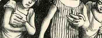
    It is a deeply touching image to me, showing tremendous touch and care…these children, drawn tightly together, feeling and smelling the vastness of the ocean, feeling the full sun on their faces, experiencing it together and separately, overwhelmed, gentle–thirteen children and three matrons and not a smile, all deep  in a private world flooded with feeling.

  • Ships in the Skyline Part III

    JF Ptak Science Books LLC   Post 291

    1ebay_sept_30cunard_skyline_detail6
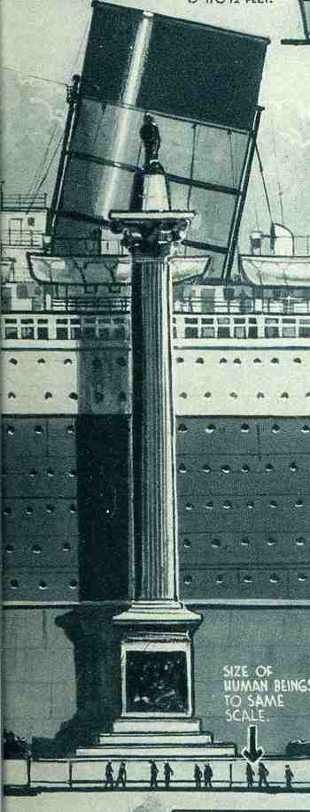
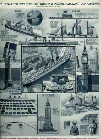
    In another unlikely-to-be-added-to category, Ships in the Skyline, I’ve found, surprisingly, a third installment. (I guess that there are many more as I’ve found these guys without actually looking for them, though perhaps that is the trick to finding things (that you don’t need).)  The comparisons that we see here for the ship The Cunarder, appeared in The Illustrated London News for 29 September 1934, and the skyline that it  is favored against is  London’s Big Ben.  Interestingly, the graphic goes on to compare the powertrain of the ship to 100 “Cock o’ the North type locomotives” to generate its 200,000 horsepower; also, the amount of steel frame found in the ship  (32,000 tons) is comparable to the steel framing of the brand-new Empire State Building (58,000 tons in the steel framework).  Of further interest is the relief of a human set against the Nelson Column in Trafalgar Square and the top of the ship’s fore funnel (reaching 170′).  This is just fantastic design and some good thinking about how to make the dimensions of the ship more understandable in everyday terms, and thus compares it in size and capacity to stuff that people see most every day, or at least know.

    1ebay_sept_30cunard_skyline_detai_3
       

    1ebay_sept_30cunard_skyline690

  • A River of Men: French Prisoners in Laon, May, 1918

    JF Ptak Science Books  LLC  Post 292

    1ebay_oct_2_prisoners_det_3731
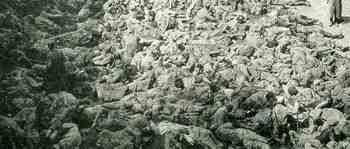
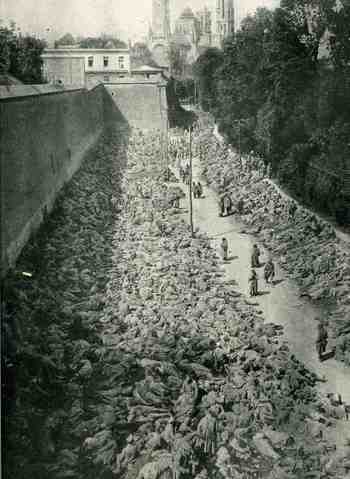
    I came across this impossible  image in the 6 June 1918 issue of Illustrierte Zeitung (Leipzig)  It is almost unbelievable that the bumps and twists and angles of this mass were humans, though at least they were alive. The original was taken on 21 March and shows part of the  210,000  prisoners that were being held in Laon–they seem, at least by their helmets, to be French soldiers.  (The 210,000 figure is German and wartime and intended for German readership; it seems that the real figure was 85,000–still massive.)

    1ebay_oct_2_prisoners728

    Laon is a French Medieval city of magnificent architecture–its cathedral can be seen in the background, in stark contrast to this human blanket. Looking at this image with a magnifying glass, I can see virtually no open ground space in the mass of men.  I estimate that in this photo are 7500 men:  I also figure that the area that we see here (to the left of the open path)  is approximately 400 feet long and 40 feet wide, or roughly a third of an acre.  I’m not sure what was going on here, though it looks like they might be on the move, with the men in the right-hand part of the image stretching off into the distance.  What is also troubling is that so many of these men seem to be asleep, and judging from the way the shadows have fallen it seems to be mid-morning (not early).  Perhaps they’ve just been marched in from battle and are totally exhausted.  I just don’t know–they just don’t look like people.

  • Hidden, Odd Actions in Empty Spaces

    JF Ptak Science Books LLC  Post 293

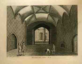
    This engraving (on copper) of an interior of a structureBlog1sept_6_niave_surreal512
    houses
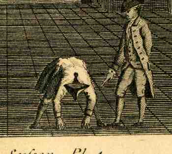
    some interesting perspective, as well as a very unusual pose by one of the four gentleman who were added to the image to give a sense of depth and scale.  I’ve written earlier about such hidden artistic virtues and micro-sub-arts, and this print fits nicely for its naive oddness of character placement.

    One just has to wonder what in the world the artist had in mind by placing this figure in such an uncommon stance?  I cannot remember seeing a three-square hat like this looking at it straight on from the top; more important, though, is what is this fellow doing?  I’d suspect measuring, but under very close inspection he’s holding nothing at all in his hands.  Also that unit of measurement would be pretty short for a job measuring a room such as this.
    So:  what is he doing?

    Blog1sept_6_niave_surreal_det513_2

Recent Posts

Archives

Categories