A Daily History of Holes, Dots, Lines, Science, History, Math, Physics, Art, the Unintentional Absurd, Architecture, Maps, Data Visualization, Blank and Missing Things, and so on. |1.6 million words, 7500 images, 4.9 million hits| Press & appearances in The Times, Le Figaro, Mensa, The Economist, The Guardian, Discovery News, Slate, Le Monde, Sci American Blogs, Le Pont, and many other places… 5000+ total posts since 2008.

  • Big, Big Guns (Real and Imagined)

    JF Ptak Science Books   Post 2763

    While looking for an article on the imaginary gatekeepers of Martian canals in The Electrical Experimenter (1915) I found this illustration for a piece of speculative military tech (first image, below). The annoyingly-capitalized caption states this to be an “Electro Magnetc” gun 90′ long and rapid-firing 19-inch (480mm) HE. I guess they were somewhere along the very early reaches for the idea of what would become the contemporary EM rail gun being developed by the U.S. Navy. The power source for the gun shown above is not quite what the Navy has developed, as they employ something along the lines of a multi-million ampere pulsed DC power supply that creates the conductance to launch a shell with a muzzle velocity of 3500 m/s. At this point you don’t need explosives to cause damage at the other end–you just need a projectile. The 1915 version is far offline, except for the initial idea, which is a good one. Besides the shortcomings in the implementation realm of this weapon the writer here doesn’t have a very long vision for the future of warfare, saying that his cannon would be devastating to “forts”. This idea I thought was certainly quaint when written given that WWI was already into its second year, and unless by “forts” the writer meant “trenches”, this visioneer was very visioneering.  
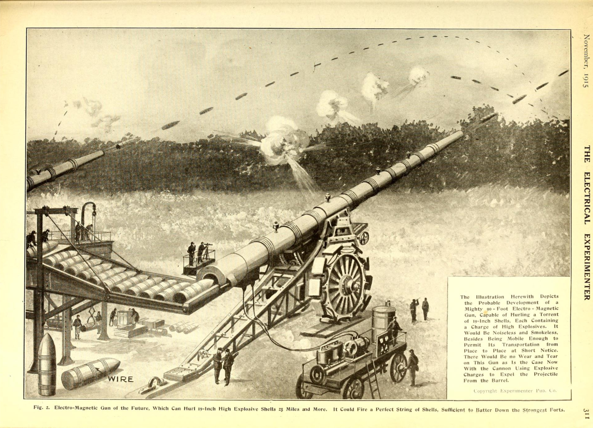
    Electrical experimenter 1915 long gun[Image source: https://archive.org/details/electricalexperi03gern/page/350  Click to expand for a clearer image.]

    Massive, monster cannons have existed for many years in idealized and theoretical, speculative worlds, like Tom Swift and his Monster Cannon.  In the history of early imaginary big guns H.G. Wells’ Babel-like cannon (pictured below in a still from the movie Things to Come (1936), an adaptation his The Shape of Tings to Come from 1931) is monumentally fabulous –1500 feet tall, with what looks like a  750′ base, all of which launched a 75′ tall capsule beyond the Earth’s
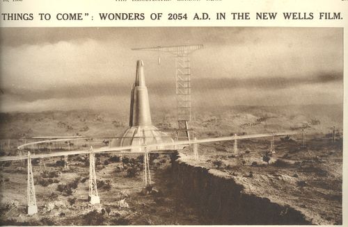
    Canons big wells

    gravitational pull with a spectacular explosiveness that would’ve made its occupants into instant jelly.  Tangentally-speaking here the launching of an object to escape the Earth’s gravity didn’t occur until 1946 when the highly-problematic but nevertheless-genius Fritz Zwicky fashioned a device to an experimental V-2 and via an electric explosive charge punched some object into space.
  • Vanderpoel’s Futuristic Designs and a Color Tile Catalog

    JF Ptak Science Books  Quick Post 

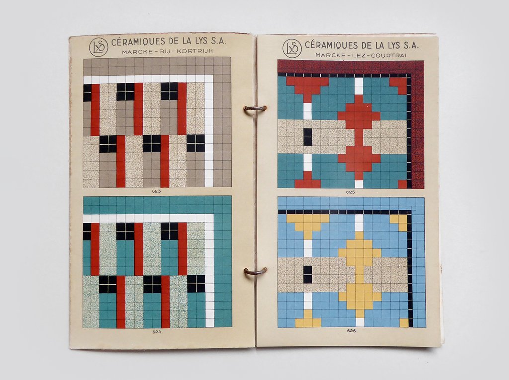
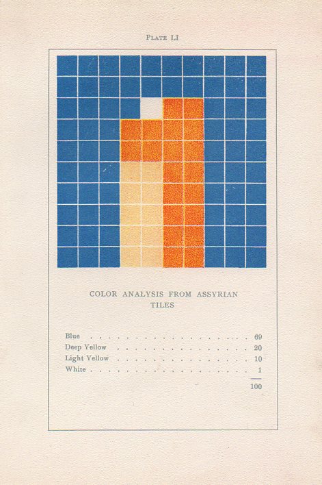
    Vanderpoel assyrian tilesWhile looking through a London stationer’s website for Blackwing pencils I found on their site a catalog for a floor tile maker that strongly reminded me of a gorgeous turn-of -the-century art book.

    I’ve written several times1 on this blog about the non-pre-discovery and non-pre-discovery-recognition of nonrepresentational art by the fabulous art theoretician Emily Vanderpoel. She wrote a a lovely and mysterious book in 1901 (a second edition appearing two years later)  called Color Problems for the Layman, in which she sought not so much to analyze the components of color itself, but rather to quantify the overall interpretative effect of color on the imagination–I think.  I know this sounds begging and vague, but I really haven’t been able to make much headway in the work, though it seems to display the occurrence and frequency of general colors in 100-block distributions. Vanderpoel seems to take the overall sense of the colors of, say, a Greek vase or mummy cloth or a teacup and saucer, and display the overall effect in her grid. As I said the procedure escapes me but the net result is beautiful. 

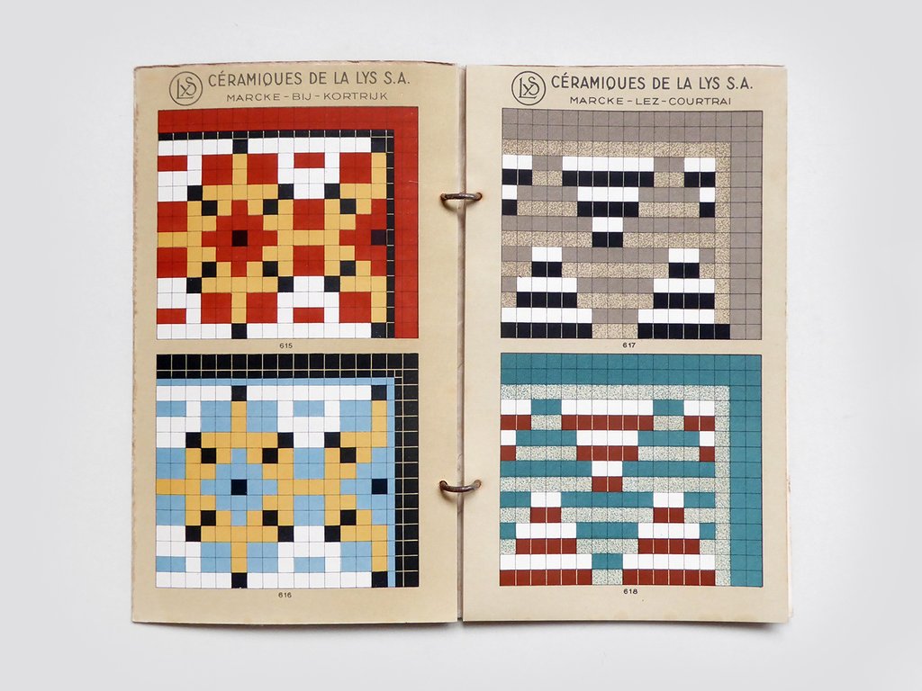
    The 1940’s tile maker’s illustrations of samples of their work are also quite strong, and as you can see bear some similarities with the Vanderpoel:

    Tile catalog Belgian _1_

    Tile catalog Belgian _2_
    [Tile image source: from the store perfectly-named Present and Correct https://www.presentandcorrect.com/collections/ephemera/products/tile-catalogue-1940s]

    Offhand I guess you could say that any of cubist/block/tile/mosaic designs could remind you of Vanderpoel–but not so, and in ways I can’t fully explain. It is something about the distribution and very involved nature of these tiles that pull it towards Vanderpoel…and perhaps it is the color selection. I’m not sure.  I have perhaps a dozen tile manufacturer catalogs from about this period (1930’s/1940’s) and none have struck me as strongly as this one does in its “relation” to Vanderpoel. In any event, there seems to be a “there” there. 

    Notes:

    1. Here are some links to the posts on Vanderpoel:

    • https://historyofideasblog.com/thesciencebookstore/2010/12/what-color-is-an-unintentional-modernist-masterpiece-of-book-illustration.html
    • https://historyofideasblog.com/thesciencebookstore/2008/04/shaping-space-a.html
    • https://historyofideasblog.com/thesciencebookstore/2015/02/mummyii.html
  • Bad Places to Be (continued)

    JF Ptak Science Books   Quick Post

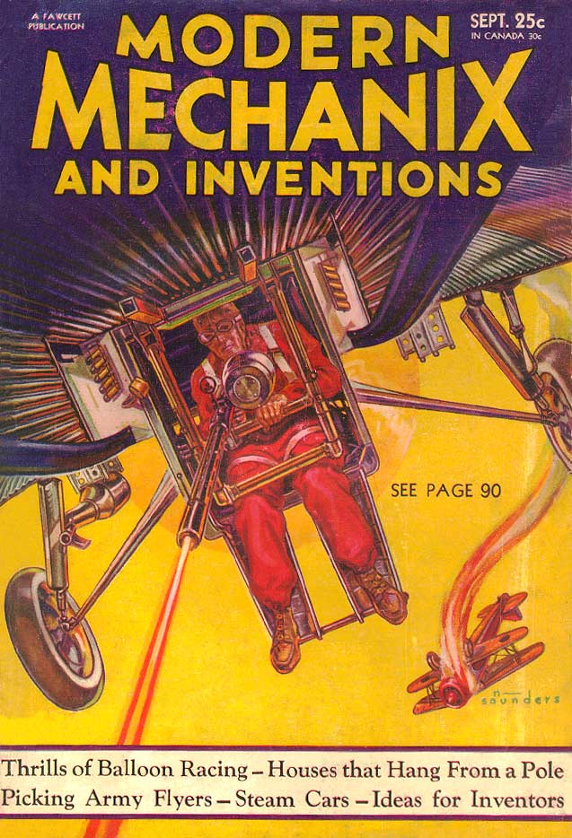
    I used to think that the belly gunner (in a ball turret) in a B-17 (or B-25, or PB4Y-1) was about the most dangerous/wrenching position to be in an aircraft. Here’s another, slightly earlier version of that, s cringeworthy effort without the protection that went along for the gunners in those other aircraft: 

    ModernMechanix Oct 1932

    [Source: http://www.magazineart.org/main.php/v/technical/modernmechanix/ModernMechanix1932-09.jpg.html]

    This is from Modern Mechanix for October, 1932–that’s a date I needed to check out because the position of this gunner looked so treacherous and exposed.

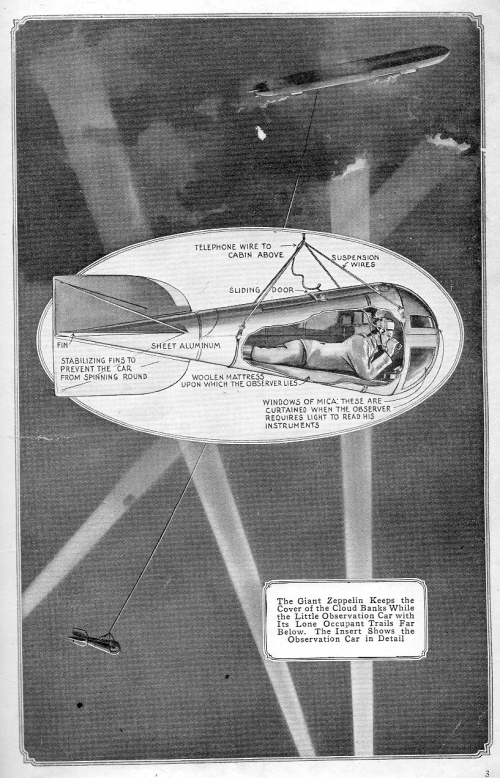
    In the same vein is this stone-cold illustration found in the January 1917 issue of Popular Mechanics. This was just a bad place to be: in a 14′-long bomb-like aluminum casing, hanging from a 3000′ 3/8″ cable suspended from a Zeppelin, trying to relay the positions of whatever you could find, and with people shooting at you. At least, though, the observer had a woolen mattress on which to lie (so says the caption).

    Aviation zeppelin bad place

    ·Posted by :

    ·in:

  • A Declaration of Future Independence (1942)

    JF Ptak Science Books   Quick Post

    “I am speaking to you once again since the time of the bloody persecutions to which you have been subjected from the inhuman German regime since the shooting of Heydrich”

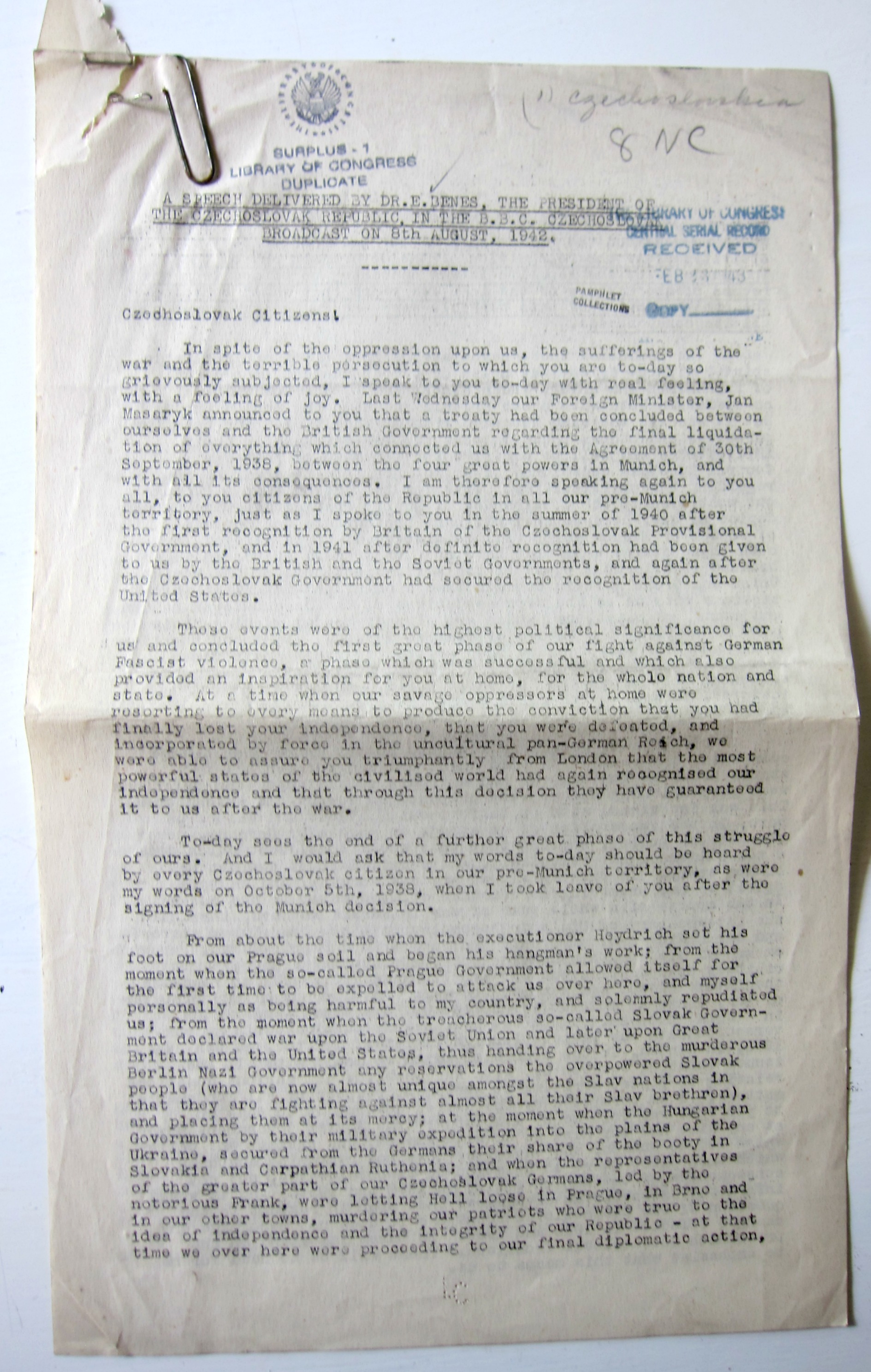
    This morning I’m sharing a scarce document1of a radio broadcast for 8 August 1942 made by the president of the Czechoslovka Republic, Edvard Benes. In this address Benes (1884-1948) announces the formal nullification of the dreaded Munich Agreement (or Munich Diktat in Czechoslovakia) of 30 September 1938 in which the infamous “Peace in Our Time” appeasement was made with Hitler granting the Nazis annexation of certain parts of Czechoslovakia, and without the participation of the Czech government. Benes, who was the president of Czechoslovakia then in exile in London, reports on the action of Jan Masaryk concluding a treaty with the British government on the “final liquidation” of the Munich agreement and the return of the seized lands come war’s end.

    I’m sharing this now as I can find no trace of the address online nor is there any sighting of it in WorldCat or OCLC.  The full document follows the page-break:

    Benes 1942 front


  • The Skies of the “Electrical Experimenter”

    JF Ptak Science Books   Quick Post

    The Electrical Experimenter is my new favorite magazine, and here’s why:

    Electrical Experimenter Skies MONTAGE _2_

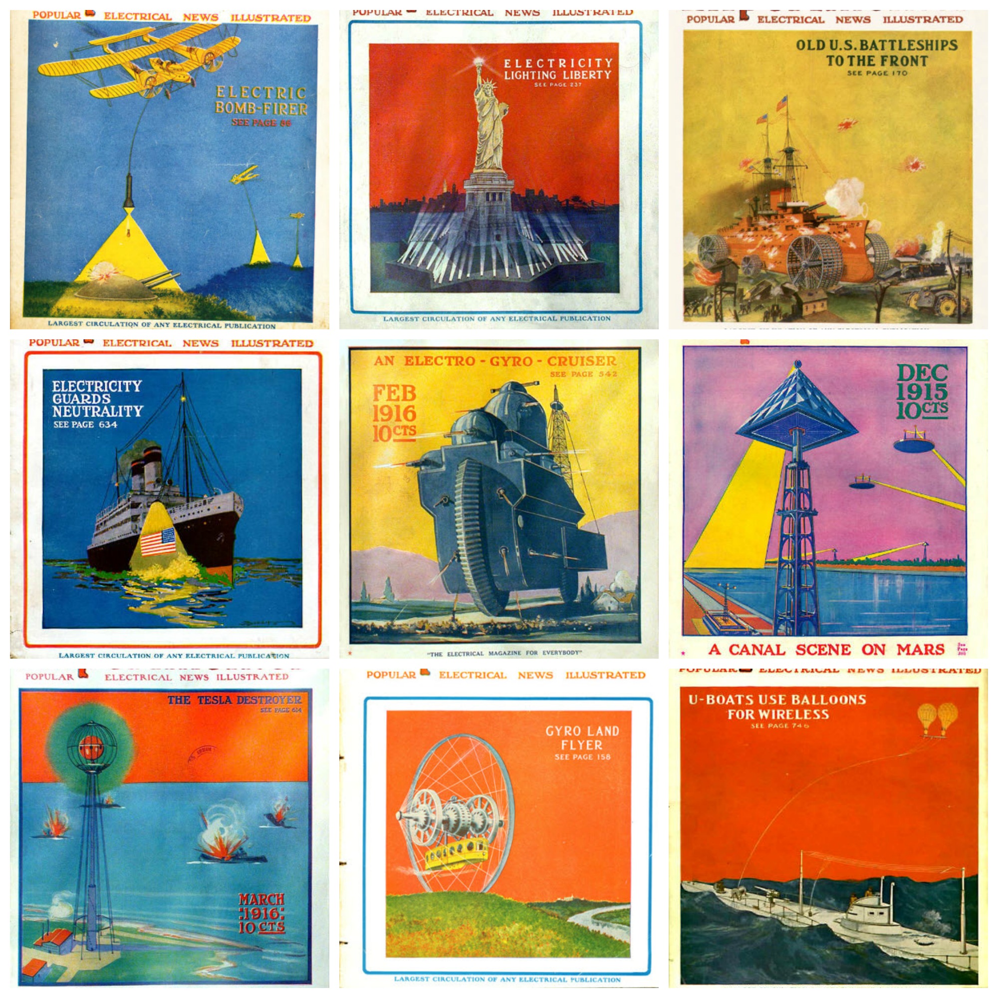
    In addition to being thick and full of real electrical necessities and scientific bric-a-brac, it also held a fair amount of speculative thinking and just plain old science fiction (when sci fi wasn’t “plain” or “old”).  The EE was created and edited by the very busily creative Hugo Gernsback (1884-1967), a pioneer in science fiction, who held the magazine together from 1913 until 1929 (as the Electrical Experimenter from 1913-1920 and then as Science and Invention from then until the finale in 1931). There was evidently no holding back on cover design–at least from September 1915 until the end, when glorious ideas were display with flat design dominated by unusual and contrasting colors. For example, in the montage above, I was able to find glassy unadorned background skies that were red, yellow, purple, blue, and orange, with variation on each. Not only were the skies unusual, so were the surface colors: unusual blues, deep blacks, n=unnatural greens, purples, and so on. All of this framed some occasionally Highly Unusual and Not Expected Ideas. For example, in these WWI-era images–working right to left on the montage–there was an aerial bombing assistant of a light that illuminated the target through which a bomb could be deployed; a land battleship; an enormous motorcycle-like land megaship; a Martian canal-governing apparatus; a Tesla death weapon; an overland trolley housed in a gigantic spoked wheel; and a relatively tame portrayal of a communication system for a submarine. These are terrifically entertaining, and of course all they are are the covers. So, The Electrical Experimenter: terrific. 


  • On Not Repudiating Versailles–Yet (1932)

    JF Ptak Science Books   Quick Post

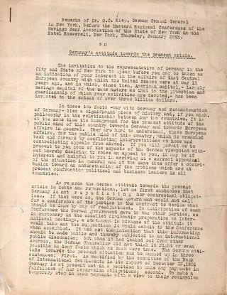
    WWII Liep repudiating VersailleI found this scarce, offset publication1 written in 1932 by Dr. Otto Kiep (who was the German Consul General in New York) which addressed the worldwide Depression and the German interpretation of it. At this point, nearly two years after the U.S. market collapse, and still in the last lingering months of the Hoover presidency, the Depression had not yet earned the sobriquet “Great”, though that would come soon enough. In these dark days before the Dark Days Kiep  addressed the German intention of honoring the Versailles Treaty, stating that “Germany is not  r e p u d i a t in g [sic] her contractual obligations” and that no government had anything to fear. Of course that would not last long, though it is highly doubtful that Kiep had anything to do with the Nazi plans shaping up behind his back. 

    Following his great success in the election of 1930, Hitler decided in February 1932 to run for the presidency against von Hindenburg, from which emerged the Great and Impossible Tragedy, and the series of horrific events that would see Hitler in power in 1933. It was then, nearly immediately following his consolidation of power that Hitler promptly decided to drop the Versailles Treaty in all of its ways and means.  

    So, if this pamphlet was printed in January/February 1932 there was only a year left to Kiep’s claim of non-repudiation. Kiep moved on from his position and in short order would advance to a new job in charge of the Reich’s Press Office. It turns out that Kiep was an ardent German and fervent anti-Nazi, and became one of the nearly 5000 people Hitler executed for their real or imagined role in the assassination attempt of July 20, 1944. He was tried by the reprehensible Freisler2, found guilty, and like the great mass of others was hanged or shot within two hours of his verdict. 


    Notes:

    1. [KIEP, Otto.] Germany’s Attitude Towards the Present Crisis (Remarks of Dr. O.C. Kiep, German Consul General in New York, before the Eastern Regional Conference… No place and no date, though it is dated February 1932 by hand on the back of the first sheet. 11×8″, 6 leaves. Provenance: H.L. Mencken, and then the Library of Congress. WorldCat/OCLC locates 0 copies. 
    2.  Roland Freisler was a Wannsee attendee and President of the People’s Court, an architect of the Nazification of German law enabler of the Holocaust. He died in February 1945, killed by falling debris in a bombing raid in Berlin. He was a widely despised man who was the presiding judge of countless show trials, and his death was evidently mourned by no one. 

    ·Posted by :

    ·in:

  • Invading England with 50,000 Planes (1908)

    JF Ptak Science Books    Post 2764

    Blogaeroplane_2

    Some of the most striking things in my collection/store/accumulation are the hundreds of images that portray data for display purposes–even more so, those that use a vernacular setting to put some anthropomorphic breath into a statistic.

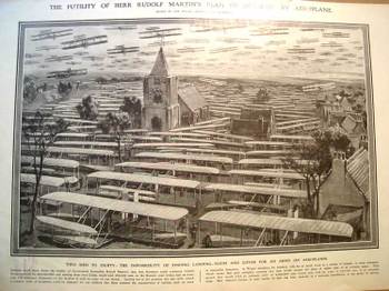
    The print that we’re looking at here appeared in the 19 December 1908  issue of The Illustrated London News and is entitled “The Futility of Herr Rudolf Martin’s1 Plan of Invasion by Aeroplane”, and reports on a possible German invasion scenario of Great Britain that was delivered in Berlin on 2 October 1908. This fantastic piece of  artwork by Hermanus Willem Koekkoek (1867-1929) graphically depicts what the author maintained was the impossibility of a German force to invade England by landing 50,000 flying machines and 100,000 men on the Kentish coast of England–undoable because “of the impossibility of finding landing-room (for the planes) and cover for an army on aeroplanes. The artist depicts a small town and what I guesstimate to be 60 planes in the air and 75 or so on the ground, leaving it to the imagination of the reader where the other 49,875 might go. He DOES make a point, and very vividly. 

    Blogaerooplanedetail “Nothing could show better the futility of Government Councillor Rudolf Martin’s idea that Germany could construct 50,000 flying machines for 50-million pounds…and land 100,000 men on the Kentish coast from Calais within half an hour.” I would imagine that this illustration drove the point home to the folks who didn’t actually bother to read anything about the Martin defense plan. (It was in a similar way that Thomas Nast was able to control public opinion and sway political refuge and protection away from Boss Tweed. Tweed famously boasted that he didn’t care what the newspapers said about him because his power base didn’t read–he might’ve been and probably was correct here, so Nast took after Tweed via the political cartoon, and big too, and frequently; and the cartoons, even if the people looking at them couldn’t read, told the whole story graphically, and it was this that brought an end to Tweed more than anything else.)
    In 1908 Martin gave an interview to the Daily Mail in which he outlined another plan by which he felt Germany could launch 3,500 “specially design” airships (I’m guessing dirigibles) and land 350,000 (!) men in England in a half-hour. This evidently whipped itself into a frothy aeroplanitis in 1909, despite such efforts as this graphical reasoning by the ILN to dispense with the unreasonable fears.

    The airplane flown by the Wrights (the first powered heavier-than-air flight) occurred barely six years prior to these frantic events.  Their invention was still fresh (and basically “foreign”, as the Brits lagged well behind the other major powers in flight until WWI) and understandable in a way that the fears were not understandable, not really, because of the newness and exotic aspect of the possibly-threatening invention. Also it should be noted that the first heavier-than-air airplane crossing of the Channel didn’t take place until the next year, by Louis Bleriot, who claimed a 1000-pound prize for being the first to do so. The first passenger wasn’t taken across until 1910, and the first airship didn’t make a flight across until 1915. So no doubt Martin was looking into a far off future, except that the planes were still mostly of Wright design. 

    • For a tour of the chronological history of the graphical representation of quantitative data as well as innovations in statistical and representational cartography, please have a look at Michael Friendly’s fantastic work at York University https://datavis.ca/milestones/index.php?group=1900%2B–it is an historical site the way it should be done, complete with all the trimmings, as well as the usually-absent but very important citations to the original articles used in the chronology. 

    Notes:

    1. I don’t know much about Mr. Martin at all except that in Richard P. Hallion’s Taking Flight, Inventing the Aerial Age, from Antiquity to the First…. (pg 298) we find Martin being mentioned among other “popular authors” as Verne, Wells, Kipling, and Fawcett as being somewhat responsible for forming the perception of future flight. Martin was also the president of the German Airship League and author of The Coming War in the Air.


  • An Uncommon “First” in the History of Data Visualization and Cartography (1874)

    JF Ptak Science Books   Post 2765

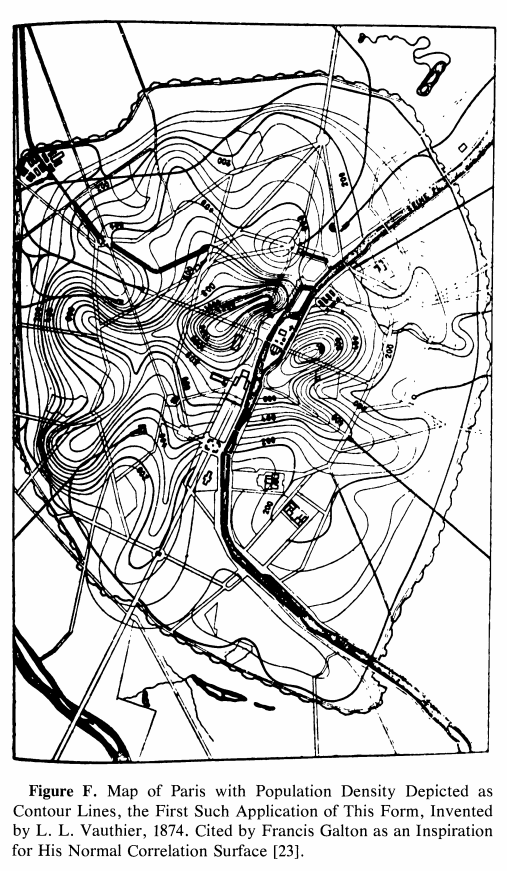
    So this is a loose-and-pulled-thread post–I bumped into something that led me somewhere coming face-to-face with an interesting reference to an unusual “first” in the history of cartography. I found the map and (correct) reference and tracked it down to the great Comptes Rendus. The map is the first one to use contours to convey statistical information. It was a short article and I was very curious to see the illustration of the map–I discovered that the paper written on an significant innovation on the display of information did not display the information. No image! This is one of those scarce article describing a breakthrough in the visual representation of data that doesn’t use an illustration of the pioneering work. After I figured it out that the description of the map was for the breakthrough map in question and satisfied with my read and translation of it, I went ahead and wrote a description for its sale on my blog bookstore.  I was about to upload it but stopped to check out the mass database for booksellers called Addall dot com and found somebody had a loose issue of the document offered for sale at eight bucks! That was a disappointing end to an hour+ of research. The person selling the paper for $8 did not know what the article was all about, I reckon, since I thought it was slightly valuable…still, it was a damp blanket to shoulder on a wet and stormy night. Lastly, I should note that I haven’t yet found the original source for the map’s image that I was able to display here–I’ll hopefully do that in due course. 
    Map Vauthier

    The paper was by the lyrically-named Louis Leger Vauthier (1815-1901) and titled “Note sur une carte statistique figurant la rapartition de la population de Paris” (found in the Comptes Rendus des Seaances de L’Academie des Sciences, 1874, vol 78, pp 264-267). It is evidently the “first statistical use of a contour map” according to  https://infovis.info/ In a more expanded and restrictive description from Wikipedia, we see that Vauthier “…is credited with one of the earliest (if not the first) thematic map to use contour lines to display a non-geographic variable on map— a contour map of the population of Paris in 1874”. This is probably the more accurate and definitely more qualified description. 

    In any event the map as I said is described, but not pictured, which is pretty unusual to my experience. I did find a picture of the map here: James R. Beniger and Dorothy L. Robyn, “Quantitative Graphics in Statistics: A Brief History”, in The American Statistician, vol. 32, no. 1, pp. 1–11, 1978

    And: https://www.sci.utah.edu/~kpotter/Library/Papers/beniger:1978:QGSH/index.html

    The Vauthier article starts out with a simple statement about the map adopting the use of the terrain relief  and using it to show the distribution of the population of Paris, using terms and descriptions that were already established and “quite familiar”:

    • “Cette carte a pour objet de figurer, au moyen du procédé graphique  généralement adopté aujourd’hui pour représenter le relief du terrain, la manière dont la population de Paris est répartie.  En topographie, le relief s’acccuse par des courbes de niveau, s’échelonnant à diverses hauteurs au-dessus ou au-dessous du plan de comparaison adopté. Les plans, ou, plus généralement, les surfaces de niveau contenant ces courbes sont, d’habitude, pour la facilité de l’interprétation, conçus équidistanis, et l’on complète la description en inscrivant sur chaque combe la distance au plan de comparaison.”
    • “La carte de la popidation procède de notions tout à fait analogues. Les courbes sinueuses qui y sont tracées passent chacune par des points ou la population est la même: ce sont, quant à la population, de véritables courbes de niveau. Elles sont équidistantes, en ce sens qu’elles s’échelonnent par degrés égaux de variations de la population ; quant  aux nombres inscrits sur chaque courbe, ils représentent le nombre d’habitants à l’hectare. Ces brèves indications nous paraissent suffisantes pour que toute personne habituée à la lecture des cartes topographiques lise la nôtre sans difficulté. 11 nous reste à expliquer ce qu’est la surlace que nous avons représentée, quelle est sa génération et comment, en dehors des courbes de niveau qui y sont tracées, elle doit être conçue dans l’espace.”

    The article continues in depth in the description of the data and how it was collected.

  • On the Great Beauty and Importance of Graph Paper (1874)

    JF Ptak Science Books  Post 2766

    It is difficult sometimes to be appreciative of the smaller things when we are so used to the bigger ones–like in the writing life life, complaining of occasional slow bits in connectivity that will allow you to 

    In the old days if it used to be necessary to go to the library, use reference tools, locate the journal, locate the article, put in a request to see the volume, wait for the deliveries,  and then perhaps one of them will actually be what you’re looking for–and this is just the first step after you’ve done the initial reading and research, the digging through footnotes and etc. for what led or inspired people in their thinking had just begun. Then there’s the driving to the library, and finding a spot of park (in my case that was for the LC and parking was no easy matter), and then came the distraction of the greasy spoon on PA Ave and the drive home, all of which could take part or most of the day. That was all fine, because in my case, one of the world’s greatest libraries was a half-hour away–much less depending upon traffic. In the older days, well, if you weren’t in a large city you would not have had access to what you needed, which meant correspondence to acquire the materials and so on, turning the process I experienced in a day into weeks, or longer. IT all gets more complicated the further back you go, and once you get to the point preceding a general postal system, stuff gets hard. Also, someone like I would be out pulling potatoes out of the ground instead of researching who-cares-about-THAT stuff in the library. 

    I try to remember that when I complain that my connectivity is slower than it usually is. 

    All of this came to mind seeing these paragraphs (literally and figuratively!)  by the one of my favorite figures of the 19th century, the  polymathic W. Stanley Jevons1 (1835-1882), who wrote on how to use graph paper.  

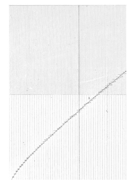
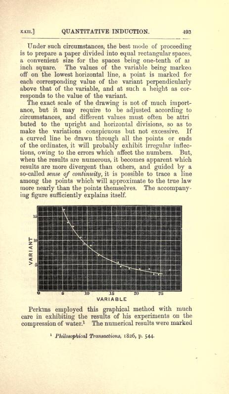
    The creation of graph paper came decades after the creation of the bar graph (William Playfair in 1786), monuments in the history of the visual display of information.  It was a great and very highly useful creation–or creations, I should say, for the idea of the graph and for the paper. Jevons did not invent graph paper, though he may be the first to write about it as a tool.  He give credit to an earlier writer for using graph paper for the first time:  J. Perkins’  “On the Progressive Compression of Water by High Degrees of Force, with Some Trials of Its Effects on Other Fluids” in the Philosophical Transactions for 1826,  (p 544, see below for one of the images from the paper).   

    Source: William Stanley Jevons, The Principles of Science, a Treatise on Logic and Scientific Method, 1874,  the chapter “Graphical Methods”.  See:  https://archive.org/details/theprinciplesof00jevoiala/page/492 

    Graphic Jevons graph paper


  • Meeting the Pretercomputer and the Pseudo-Computer (1956 and 1963)

    JF Ptak Science Books   Post 2767

    In just a few minutes of browsing in a pile by the desk last night I came across three terrific titles of papers, two of which used terminology I had never encountered before. The papers were on “pretercomputers” and “pseudocomputers”, with a third using familiar terms in a very unfamiliar pairing, “uneconomical robots”. Finding all three from two slender sources within that time frame was a real eyebrow-raiser.

    The first work was found in a loose issue of  the Journal of the Association for Computing Machinery  (April 1956, vol 2/no. 3, pp 65-73): Robert Perkins’ “EASIAC1, a Pseudo-Computer”. It seems that the EASIAC (EASy Instruction Automatic Computer) was developed to make it easier for a newbie to program a computer, or at least easier to program compared to the MIDAC ( Michigan Digital Automatic Computer) with which it was associated.  (The MIDAC was developed by the  Willow Run Research Center of the Engineer­ing Research Institute, U Michigan, the first digital automatic computer in the Midwest.)

    Next in the pile was a 1963 issue of Cybernetica2, and the first title in that issue leapt from the page: C.K. Gordon, Jr.’s “In defense of the Search for the Pretercomputer”. Gordon seems to be looking for foundations of some next level of computer (“preter”=”praeter”, Latin for “beyond”, or past what is normal), writing on machine thinking, and “awareness”, and an approach to expression of thought by a computer in a “preter-linguistic response”(?).  I rushed to the conclusion of the paper where the author states that ”much mathematical groundwork has been laid in logically demonstrating the constructibility of certain types of automata” citing work by Burkes, Culbertson, Kleene, Minsky, McCulloch/Pitts, Turing, Uttley, von Neumann, and others. He also points out the “construction of a number of rudimentary devices, showing their learning behavior and a remarkable degree of adaptability” by Ashby, Chapman, Miner, Pask, Shannon, Uttley and Walter.

    Checking out the bibliography for this paper I found this delightful-sounding title of what I think is a semi-famous work by James T. Culbertson, “Some Uneconomical Robots”. The paper was published in Shannon and McCarthy’s Princeton Studies series Automata Studies, which unlike the other two papers mentioned in this post was at least one that I had seen before, a noteworthy effort in a volume of noteworthy efforts.  (Culbertson also wrote a paper called “Hypothetical Robots” in 1952, plus The Minds of Robots (1963, U of Illinois), in which he makes a philosophical case for there being some at least low-level consciousness in everything, and therefore the same is true for machines.)  I’ve determined that I don’t have this volume of the Princeton series, nor can I find it (yet) online, and although there are some strong references to the paper I haven’t yet found much to tell me of its contents, though I did find Herbert Keller (in his “Finite Automata, Pattern Recognition and Perceptrons” in the JACM in 1960) describe it as arithmetic and “fanciful”. 3 I realize I’ve said nothing yet about the Culbertson, but my time allowed on this post–like the robo-cops tracking down Robert Duvall’s character in THX-1138–has run out. I’ll return to this post and extend it shortly.

    Readers of my post this morning may be thinking these papers are far less extraordinary-sounding than I found them to be, especially finding them in such rapid succession. I don’t do all that much work in the history of computers, so to a more-general history of science person like myself these titles were captivating, burnished with a deep golden hue of possible whimsical and sci-fi interpretations…the possibilities there are endless.  It was a funny little adventure that was populated with many extensions and absorbing titles that begged to be pulled out-of-context. They seemed on one hand to be the stuff of speculative history of the future material–except of course they were far more “real” than that. 

    ·Posted by :

    ·in:

  • The Nazis, Seudetenland, and Budweis (1938)

    JF Ptak Science Books   Quick Post

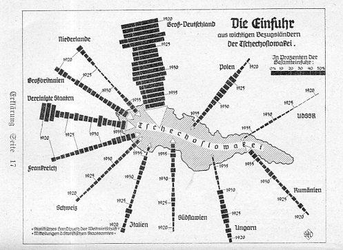
    This pamphlet1 by Karl Janovsky seems to be a very thorough and heavy piece of German-interest propaganda regarding the Seudetenland, and seems to have been printed prior to the “annexation”.  The tragic front cover bears a label for the meeting of the NSDAP Council in Budweis, Czechoslovakia, for June 4, 1939. Unfortunately we see the famous 16th century Black Tower desecrated by two large Nazi banners. The tower survived; the Nazis didn’t. (Also–Budweiser, the U.S. beer, was originally supposed to be a knockoff of the famous bier brewed here since the 14th century–after a while, Budweiser USA “changed directions” in the taste of their beer, but kept the marketing and brand, which is enormously valuable.) And so one of the statistical maps, showing a chart of imports from Germany into Czechoslovakia:

      Maps WWII Seudeten

Recent Posts

Archives

Categories