A Daily History of Holes, Dots, Lines, Science, History, Math, Physics, Art, the Unintentional Absurd, Architecture, Maps, Data Visualization, Blank and Missing Things, and so on. |1.6 million words, 7500 images, 4.9 million hits| Press & appearances in The Times, Le Figaro, Mensa, The Economist, The Guardian, Discovery News, Slate, Le Monde, Sci American Blogs, Le Pont, and many other places… 5000+ total posts since 2008.

  • War After the Peace: American, Philippine and Japanese Guerrillas, September 1945

    JF Ptak Science Books     Post 566

    Several years ago I purchased part of an archive of David Katcher*, who was the founding editor of the journal Physics Today. Before that, several years before that, in 1945, David Katcher was Lt. Katcher, serving as a correspondent/writer in the public relations office of the U.S. Army Headquarters of the Western Pacific (GHQ USAFPAC). There’s a 6-inch stack of paper here with what seems to be his (and associated) mimeographed offprints of the daily grind of running the PR department of the Army in the Philippines, which, taken as a whole, is pretty interesting, showing the concerns and trials of the Army in reestablishing the government and infrastructure of the country.  Some of the individual reports/publications are stand-alone, straight-up fabulously interesting things, and so far as I can determine, have not been published anywhere else.  These two examples are both related to the subduing of the last remnants of the Japanese Army still fighting in the dense nether lands of northern Luzon, the Philippines, fighting after the surrender had been made (14 August 1945) and  signed (formally, on the USS Missouri, 2 September) , fighting after the war had ended. 

    There’s much more than can be written about fighting after  peace treaties ending wars–I know that the Germans were running around in Africa following WWI–but that’s a very big story, and not for here.


    DOCUMENT 1      (Issued 28 September 1945)

    The first document relates the extraordinary story of Col. Russell W. Volckmann who from 1942 led a force of thousands of guerrillas against the Japanese and who, by September 1945, led a force of 20,000 in routing the last elements of the Japanese army.    (The entire text of his memoir written in 1954 as We Remained Behind: Three Years Behind the Enemy Lines in the Philippines  can be found here.)                                                                                                 
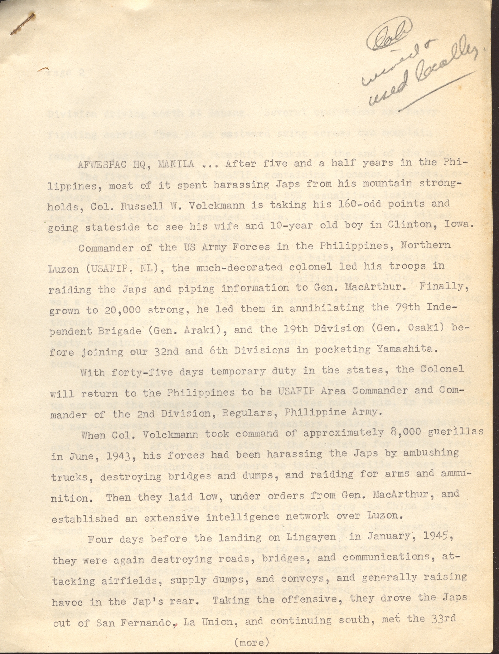
    Volckmann1

    (see Continued Reading section, below, for the rest of this document)

    DOCUMENT 2  (Issued 25 September 1945)

    This short document relates the story of the capture of the last of the Japanese forces in Luzon, including the capture of some 40,000 troops, including General Yamashita (“The Tiger of Malaya”) and soon-to-be-executed war criminal and beast of Manila.

    I’ll let the documents speak for themselves.
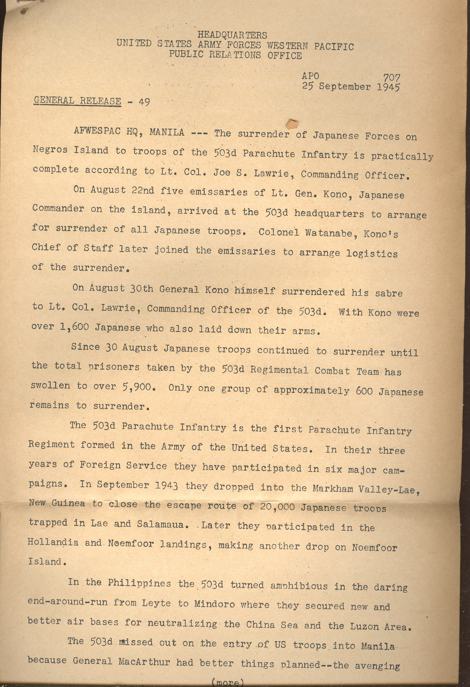
    Volckmann4

    (Read more, below)

    *from the Washington Post, 2 June 2002, the following obituary of David Katcher:

    “David Katcher, 87, who retired in 1979 as special assistant in science and technology to the undersecretary of state for security assistance, science and technology, died of cancer May 31 at his Chevy Chase home.

    Mr. Katcher was also senior policy analyst in the White House Office of Science and Technology policy during the Carter administration. He was the 1947 founding editor of Physics Today monthly magazine, published by the American Physics Association, and he edited the journal for four years.

    He had been an editor at the Naval Ordnance Laboratory before World War II and later executive secretary of a theoretical physics division of the Institute for Defense Analysis.”
    ·Posted by :

    ·in:

  • The First Fisheye View? Vienna, 1529

    JF Ptak Science Books LLC  Post 567

    Fisheye


    This magnificent woodcut,
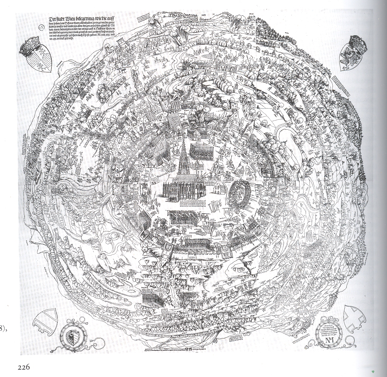
    The Siege of Vienna*, executed by Nicolaus Meldmann, was published in 1529/30 and depicts a view of the city of Vienna from an extraordinary and perhaps unprecedented perspective.  I’ve paid some attention to antique images that look straight down at things (Looking Straight-on At Things  and  Looking  Straight-Down on Things) and I can say that they are in general pretty uncommon–this is the first time though that I’ve noticed a fish-eye view looking straight down, an image conveying a 360-degree horizon-to-horizon landscape.  It is just simply phenomenal, even if a fair number of the buildings in town are missing and so on–the (unnamed) artist-on-the-spot actually climbed a high spire and made a number of sketches, extrapolating it all into this horizon-bending whole.  But the representation of the city wasn’t the paramount concern in the print–it was the placement of what was going on outside of it that was important. And what was happening concerned all of Europe–it was the invasion by the Muslim Ottoman
    Empire
    , led by Sultan Suleiman I (the magnificent)
    , and in 1529 they had made their way through Hungary and into central Europe, laying  seige to the principal city of Vienna with an army of 150,000 (or 300,00) soldiers. . It was the high point of the Ottoman expansion, as they were ultimately turned back by the Austrians in a determined and complex series of battles of mining/tunnels versus anti-mining and anti-tunnels (such battles being fought, still, deeply into World War I).  So this print was made for a wide audience of Europeans, trying to get a glimpse of the siege of Vienna and the positions of the Ottoman forces, knowing that the outcome of the siege could very well hold the fate of the rest of Europe.  

    If you check out the other posts in this blog on “Looking Straight Down” you’ll see a number of examples of early straightdownedness–none though approach the vast area that the artist of this print had taken under control and displayed. 

    *I found this reproduction in Landau and Parshall’s beautiful, attentive and intuitively incisive The Renaissance Print,1470-1550, published by Yale University Press in 1994.  It is a rich book, with very deep depth and a light touch, hard to do in an academic/historical work.  But they did it. 

  • Elements of Social Delinquency, 1947: Books and Records as Faithless Elements of the Decline of Morality

    JF Ptak Science Books LLC  Post 499

    0 blog jfeb 2deliqunency502
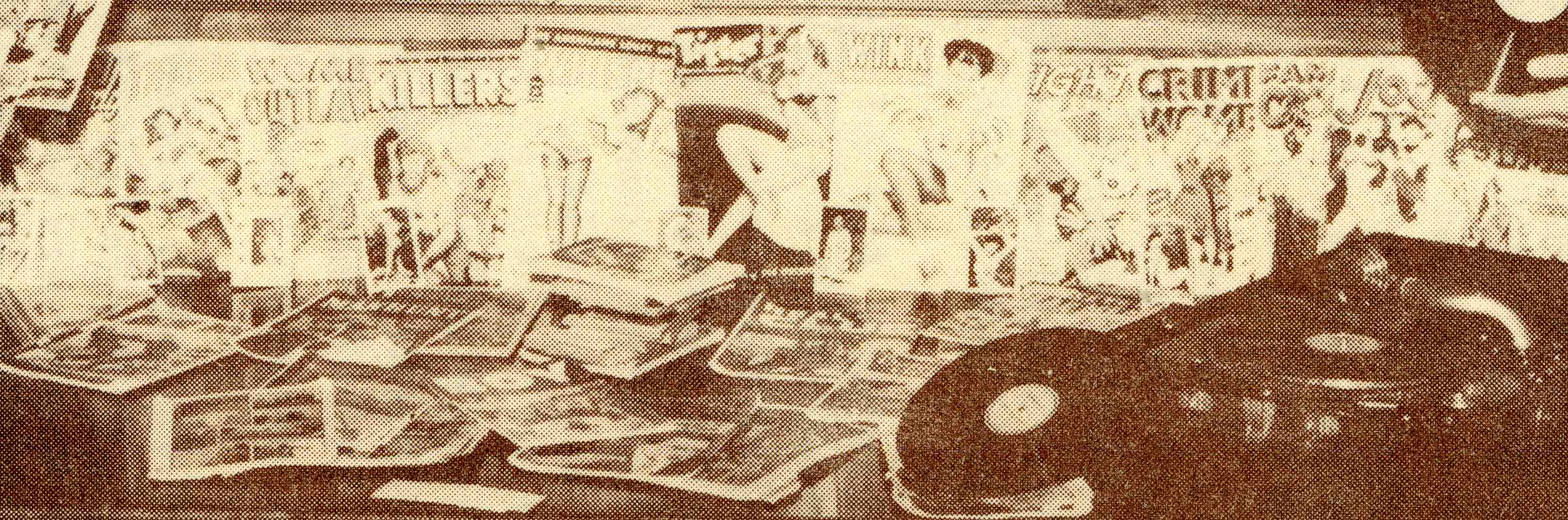
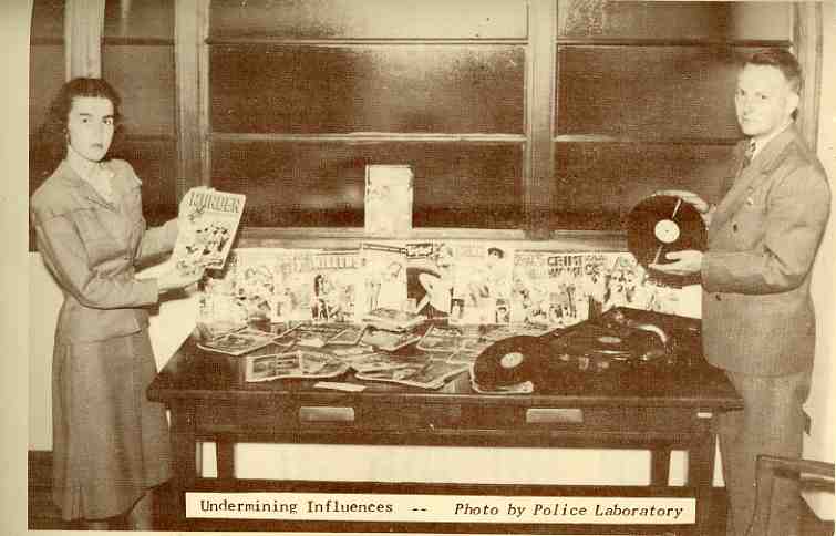
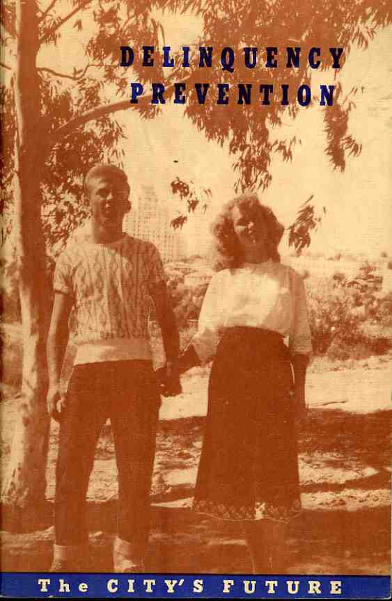
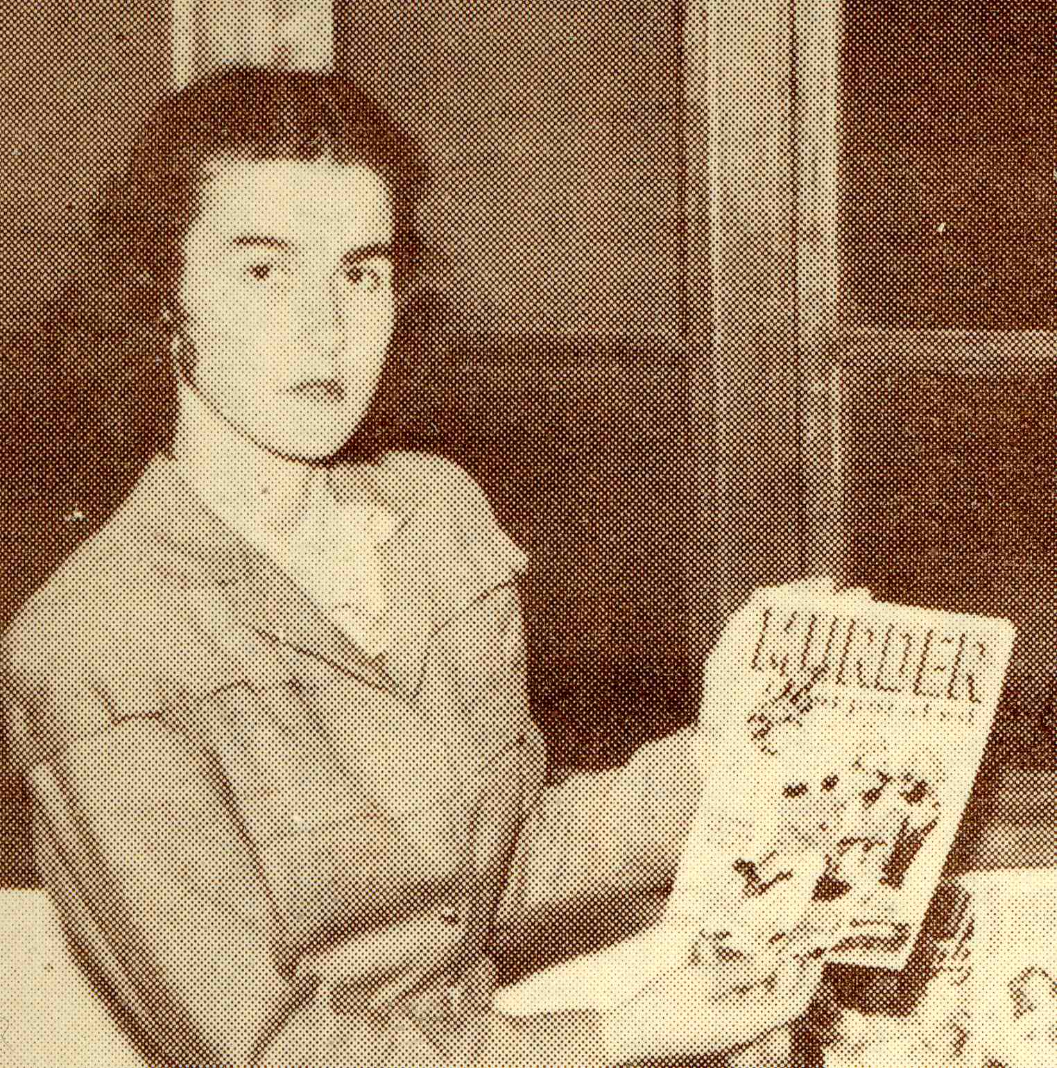
    Only 62 years ago the basic contributors to the delinquency of American youth were recklessness, idleness, books and records, and this helpful pamphlet, Delinquency Prevention, the City’s Future, published unattributed in 1947 for the Youth Protection and Delinquency Prevention Program for the city of San Diego, California, had many of the basic answers to the knotty questions of raising good-spirited anti-corrupt young folks.  This young woman, appearing on page 27 in the photo captioned “Undermining Influences–photo from Police Laboratory” stood before a neatly laid table packed with expediencies of social decay, and from the looks of it, she could barely stand to be there, even though she was protected by a mighty and invisible cloak of superiority.  (It seems that she is caught in mid-sentence, gingerly holding her MURDER magazine, jaw thrust forward, fixing the camera with a sharp left eye which was fortressed by a mighty and disproportionately-sized eyebrow.) 

    0 blog jfeb 2deliqunency503

    0 blog jfeb 2deliqunency501
    Unfortunately, given the large-grain halftone of the original, I can’t quite make out all of the titles of the offending magazines and records–most of the “men’s journals” seem to deal with murder-kill-bang-bang-stockings and god knows that the records in 1947 were probably by Johnny Mercer (as I can hardly believe the SDPD could even acknowledge anything like the fantastic bluesy music on so-called “race labels”).  Anyway the message here was that “wrong” reading and listening were corrupters and would lead to the end of society, inhabiting the young with “social ill” found “outside the hours of school and work”. 

    0 blog jfeb 2deliqunency500
    This program sought to remedy this invasion of “untoward influence” by more fiercly regulating the idle time of children, which meant filling that up with more school or workl or church or other fulsome and halo-inducing activities.  The city council also sought to diminish the capacity of the “juvenile hang out” of the soda fountain–who knows how many future SDS-ers were born right there in the Rexall on Main Street of Great Barrington, Massachusetts? Nursing a 10-cent coke and a 25-cent hamburger for as long as possible doesn’t seem like sedicious activity from here in the future–and as a matter of fact, the soda fountain looks to me to be one of the first places where American teenagers could go socially to enjoy food and drink and spend money solely (or sort of) with members of their own age group.    This must’ve been a radical change from the other regulated avenues that teenagers could frequent in the earlier decades of the century. In any event, the soda fountain was a place where social callousness was begging to happen, waiting to be unleashed in its youthful fury to cripple The City.  I’m sure that San Diego was not alone its its 1947-American-desire to get crooked-standing girls and short-sleeved-sweater boys to go to school, “do activities related to school”, go to church, and then stand *almost* holding hands in a problematic setting of shade and brightly dappled sun.  If these two are the final successful products of juvenile delinquency prevention and naive social engineering,, what is it that their very distinctive body language is saying? 

    ·Posted by :

    ·in:

  • Points of View: Inside Looking Out, Outside Looking in, and in-Between

    JF Ptak Science Books LLC  Post 500

    0 blog feb 2 outsdide in512

    One of the exercises I’ve undertaken in this blog is to try and see stuff from a different perspective, or from an uncommon point of view, which can give a little bit of fire to the common bit.  And so that brought categories of posts like Blank and Empty Things, History of Smallness, Outsider Logic, Naive Surreal, the History of Dots, Bad Ideas, and the like.  One small category (with only a few posts) is Looking Straight at Things, where the point of view for the observer is directly in front of the object, giving it a flat perspective–from my experience, this is an uncommon antiquarian  viewpoint, especially when one looks straight up or straight down at something.  Another small posting is


    0 blog feb 2 outsdide in513

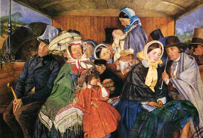
    You Are There, where the observer is placed inside the body of the subject of the print, so that “you” can see “your” hands drawing the first map ever drawn in an aeroplane, and that sort of thing.  Following on the heals of these last two is a new category, Inside Looking Out & Outside Looking In, where the viewer is rewarded with a similar you-are-there experience, as we see in these three examples.  The first (above)  is by Charles Rossiter (1827-1890), whose painting To Brighton and Back for 3/61 done in 1859 (almost exactly at the mid-point of the artist’s life), puts the viewer on the opposing bench of the open-windowed railway car, with an oddly blank view of the passengers in the opposing section of the car.  I can almost see my knees in the bottom of this panting, as I sit, sandwiched between a big-thighed someone and a big-armed someone-else, watching the small trials of human destinies unfold before my squinty-closed eyes, trying to enjoy the memory of the beach as we jostled our way back to London.  (I would hope that I was decent enough to stand and allow the young mother and her baby standing there in the middle of the painting to have my seat, but it looks like this viewer is as unmoved as the rest of the semi-gentlemen of the car.)

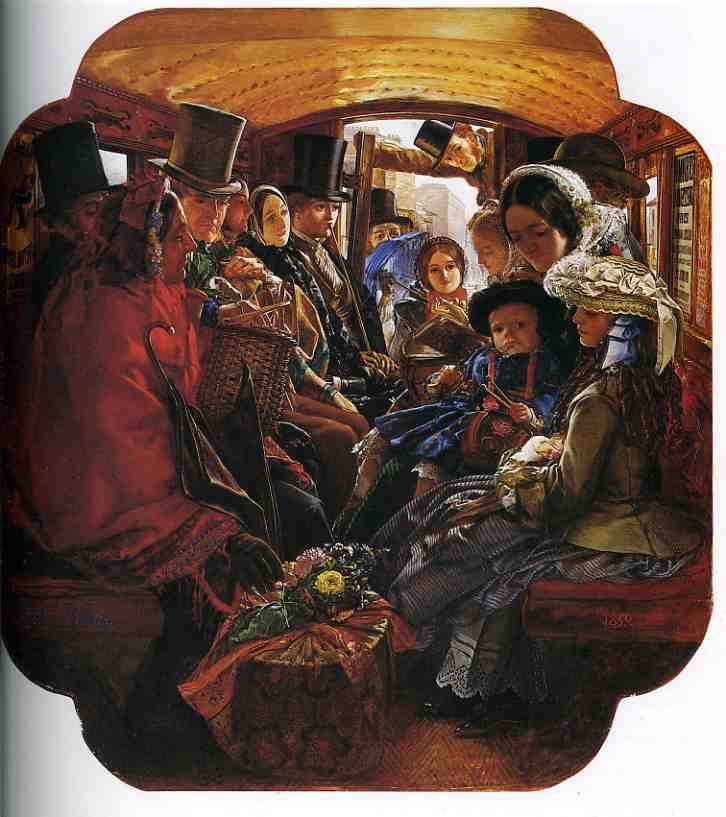
    Next is William Maw Egley (1826-1916), whose Omnibus Life in London2, also published in 1859, gives a wonderful view from beyond the back of the cab/bus, giving a very colorful overview of flouncy and mega-dressed inner-city mass transit.  The red shawl business woman in the front-left definitely seems a little at odds with the rest of her traveling companions, though most are taking an interest in her beautiful basket of flowers. 


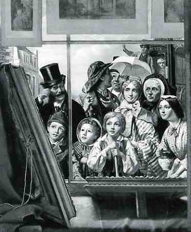
    0 blog feb 2 outsdide in514 The next and last image is a little odd, showing a view from the inside of a print shop looking out at people who are looking in.  The print, One Touch of Nature Makes the Whole World Kin (1867)  by Thomas P. Hall, is otherwise semi-satisfying in a mid-Victorian kinda way, what with the luminous and wondrous eyes filled with the beauty of the painting at left.  Hall’s work does live up to its name, though, the artist interestingly including a silk-hatted fob connoisseur with a monocle, some few children, a child laborer (a street sweeper, I guess, not unlike The Last Picture Show),  three generations of women, a drayman with a pipe, and an omnibus driver–a good assortment and spectrum of people in such a small group.  

    There are no doubt collections of such images, not the least of which is a vast array of 17th century Dutch artists (like Gerard Dou) whose metier is of people looking through/resting on windows/windowsills.  But I just happened upon these three in the course of my day, and liked them, and tried somehow to string them together  so that they could be strung along with other like-positioned images some time in the future. 

    Notes:


    ·Posted by :

    ·in:

  • A History of Dots: Microscopical Embryology, 19th Century

    JF Ptak Science Books LLC   Post 501

    0 blog feb 3 dots518

    0 blog feb 3 dots517

    In 1837 the hemispheric frontal lens for the compound achromatic
    microscope developed by Giovan Battista Amici (1786-1863) vastly
    improved magnifying power to open an entirely new submicrospic
    world–this somewhat on the order of the introduction of Robert
    Hooke’s (1635–1703), investigation in Micrographia (1655).  G.C. Ehrenberg (Die Infusiontheirschen als volkommene Organismen,
    Leipzig 1838) was among the first to use this new development, showing
    almost immediately that infusoria was not what was seen to be as
    Buffon’s “organic molecules” (or unified wholes) but something far more
    complex.  Theodor Schwann and Jacob Mathias Schleiden  in just the next
    year, using this same new technology, put forward the cell theory, with
    images produced in Schwann’s Microscopical Researches
    (1847)–according to Pearce Williams this development of cell theory
    “did for biology what Lavoisier’s definition of chemical elements had
    done for chemistry”.  The bottom line here was that the cell theory was
    the best, basic element in biology. 

    All of this to get at dots.  My goodness.  Before Amici (who by the way
    as an astronomer and microscopist, working both ends of the optical
    visual field like few before him had), most of these elucidated
    complexes seemed to even the slight magnification of earlier
    microscopes as dots.  Unexplained, seemingly inexplicable, dots.  (And
    the same could be said too of the planets and stars, and our moon and
    sun, before the introduction of Galileo’s introduction of the
    telescope).  Some of the most famous of these post-cell-theory dots
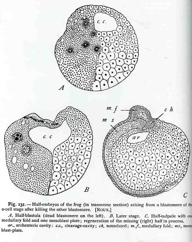
    belong to Wilhelm Roux (1850-1924) who in his Über die Entwicklungsmechanik der Organismen (1890)
    offered the first experimental intervention and experimentation at the
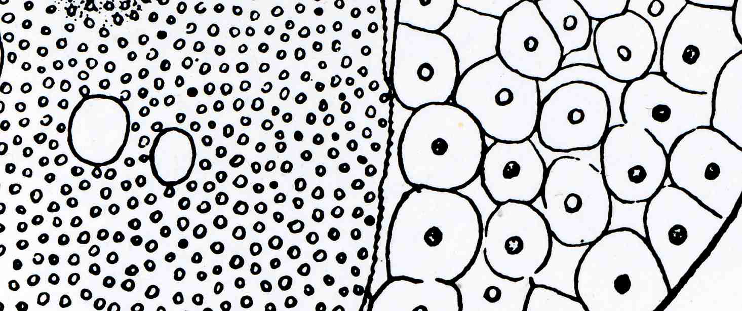
    embryological level.  The “dots” here are frog cells, half of which
    Roux destroyed in his attempt to influence the development of the
    embryo.  The experiment resulted in some results that would be abandoned within two decades, but the methodology employed by Roux (but not his reductionism) would be one of the most significant biological events in the 19th century. 


    ·Posted by :

    ·in:

  • Blank and Empty Things, XXX: Maps of Lunar Nothingness; or, When Nothing is Something

    JF Ptak Science Books  LLC  Post 502

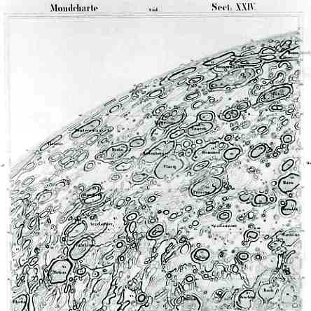
    0 blog feb 3 nothing scmidt515Actually, these maps are hardly maps of lunar nothingness–on the contrary, they are among the most detailed  maps ever produced (to their times)  of the lunar surface. The first, to the left, is by J.F. Julian Schmidt (1825-1894), who produced his monumental  opus to close observation and ultra-tidy detail in Mondkarte in 1878, a spectacular map of the Moon in 25 contiguous sections, which surpassed all other earlier maps–it shows riles, contours, valleys and thousands of new craters, not to mention the fact that Schmidt also calculated the heights of more than 1000 mountain peaks.  The map was produced with enormous precision by this careful observer, the lunar features presented in such a way as to be easily readable and extraordinarily detailed. It is this representation that gives the map an initially curious appearance of emptiness, when in fact the opposite is true.  (For a very useful and illustrated timeline of lunar history, see the blogsite of Chuck Wood.). 

    0 blog feb 3 nothing scmidt516

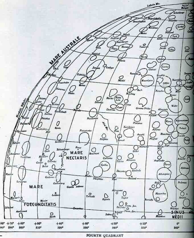
    The second example of nothingness is from William Pickering’s (1858-1938)  1903 index map of the Moon, which was constructed from his careful photographic surveys, and offers a very precise rendering of the major features of the lunar surface. It was made to accompany his exhaustive The Moon : A Summary of the Existing Knowledge of our Satellite, an atlas published in New York in 1903. The outline map is another example of something that appears to be somewhat empty while holding a vast amount of information.

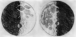
    A little beyond the scope of these two maps is that of Galileo Galilei (1564-1642), who in 1610 produced the first drawings* of the Moon made with the benefit of a telescope.  It was a shocking revelation for all those who saw it (when published in his Sidereus Nuncius, or “The Starry Messenger”, which was also the first published treatise on the Moon)  and I can only imagine what the common person with an average amount of scientific curiosity could’ve felt when seeing the image for the first time.  It was mostly a map of nothing, but the details present were extraordinary and fantastic–they revealed undisputed features of the Moon, images of contours that had been only rendered via considerable eyestrain for thousands of years. It also showed peaks and mountains and other jagged stuff, which disproved the running theory that the Moon was a perfect sphere devoid of such things. And then here, in 1610, was the first “close-up” vision of this complex object that had been followed by billions of eyes for thousands of years–it just had to be shocking. It was mostly nothing, but the bits of something that were present were a phenomenal vision.  

    1610-GalileoMoon *(Before people start writing in about the chronology of Galileo and the “first” claim, I know that the issue is a little knotty and a little more complex than old Galileo being the first on the scene.  William Gilbert–ultra-famous for things outside astronomy–drew an odd, wrong and surprisingly non-detailed map of the moon in 1603, though this wasn’t published until after his death and a lot of other lunar-related stuff happened in 1651.  There’s also some recently re-discovered telescopic renderings of the Moon made in 1609/10 or so by the Englishman Thomas Harriot which are of the same quality as Galileo’s. Within three years of the Galileo publication came the work of two astronomers on mapping the Moon: G. C. La Galla (publishing in Venice in 1612) and  P. Christoph Scheiner (in Germany) between 1611 and 1613.)

  • Children’s Games in Art in the 16th & 17th Centuries: van de Venne and Brueghel

    JF Ptak Science Books LLC  Post 503

    0 blog feb 5 van de venne537
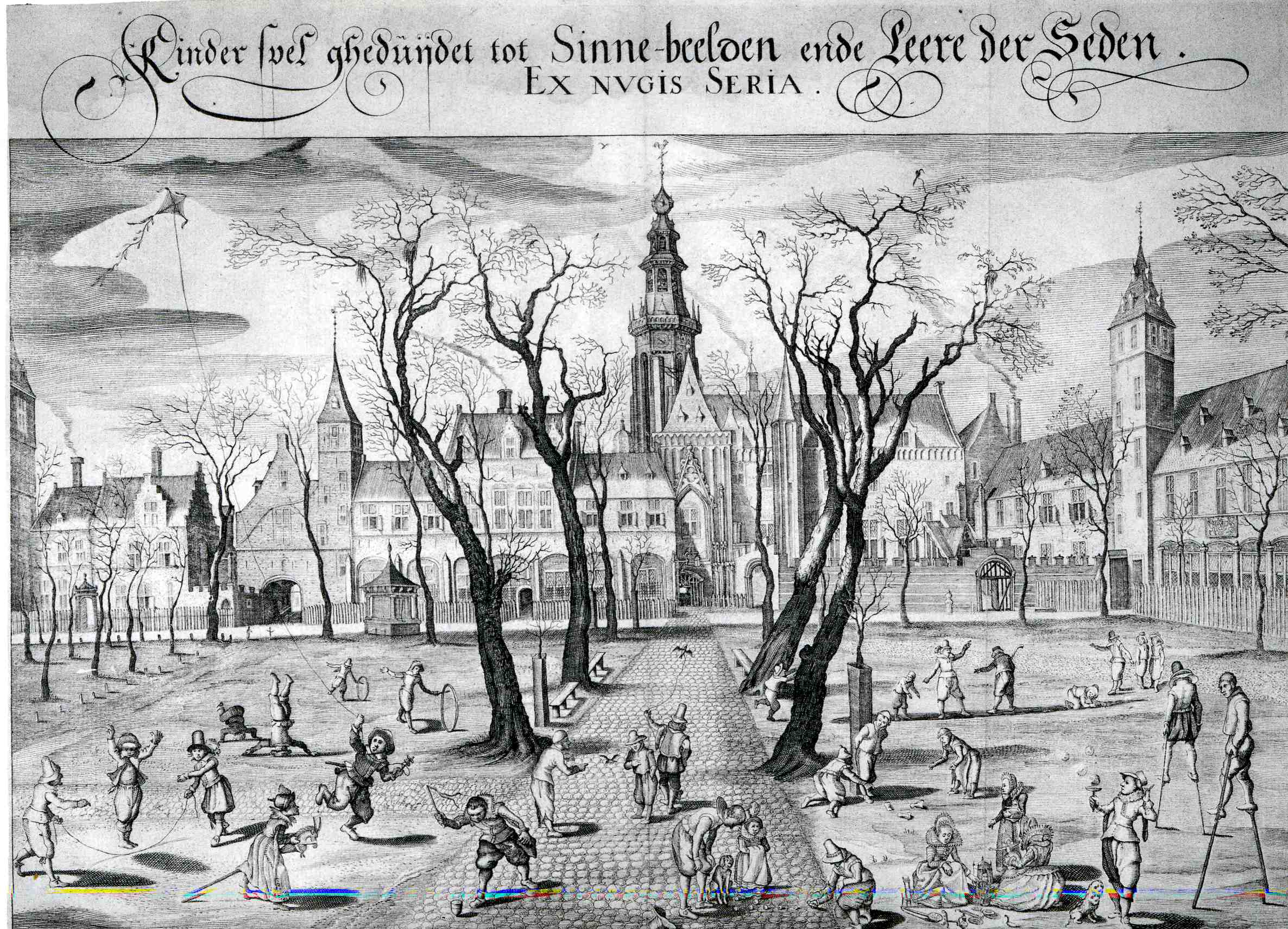
    Adrieaen Pietersz vasn de Venne, must’ve been familiar with
    the work of Peter Brueghel.  I’m not
    saying that Brueghel owned the genre of vernacular allegory, but he certainly
    comes pretty close to that.  In any
    event, van de Venne (1589-1662), a Delft artist who produced this illustration which so much reminds me of Brueghel worked
    a hundred years after the great master—(the elder Brueghel belonged to the
    Netherlands Renaissance, and died in 1569). 
    Having been raised in Deflt, studied in Leiden and died in the Hague, I
    suspect it would’ve been impossible not to come under the influence of Peter or
    the others in the Brueghel family collective, though it would’ve been Peter
    (the elder, who was also known as “the Peasant”) who it seems to me lays the
    greatest claim to some of van de Venne’s thinking.    

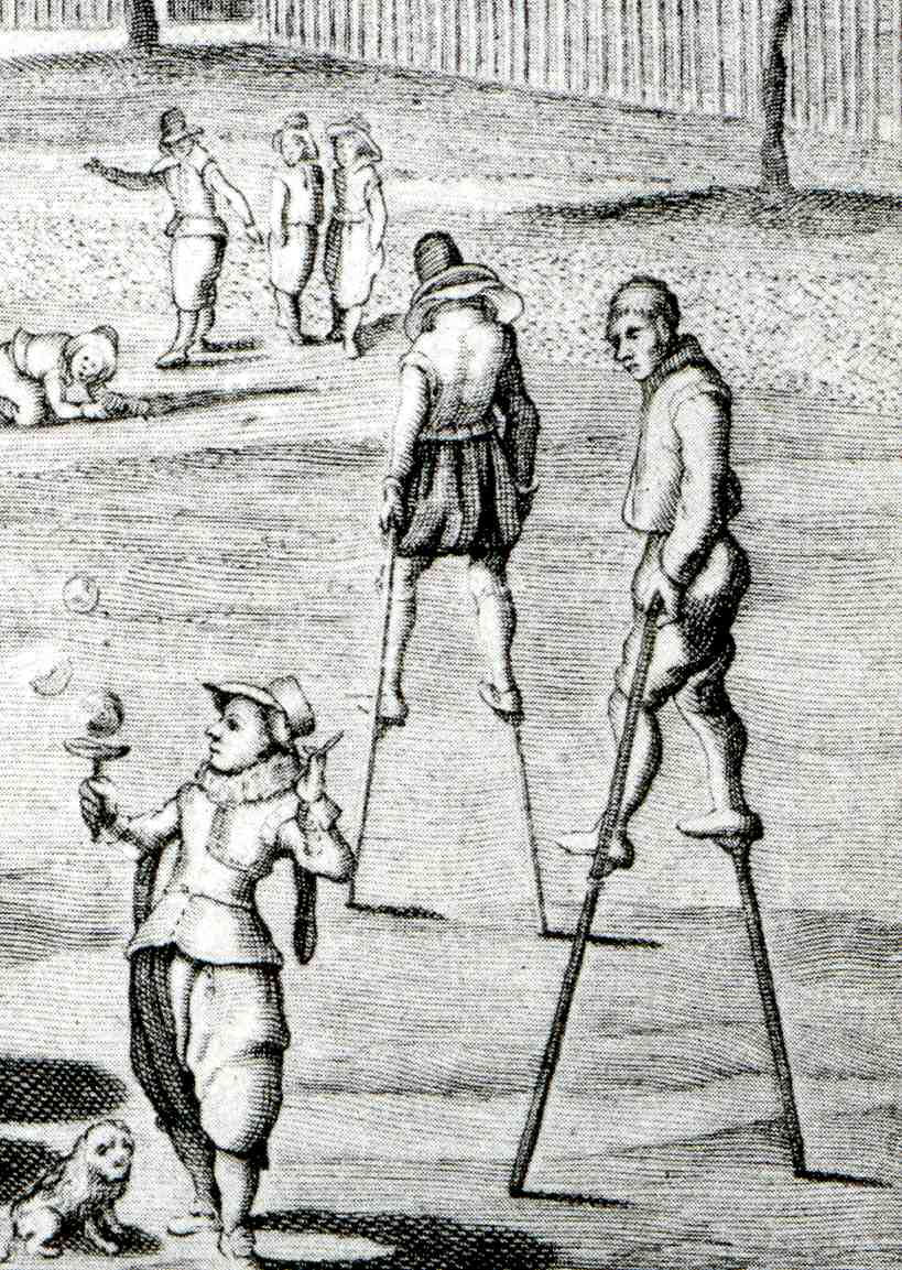
    The subject of van de Vene’s painting (shown here above)  of children’s game is as much a
    parable as it is a recording of games that kids played in the Netherlands in the
    early 17th century.  The
    children are occupying themselves with supreme simplicity, allowing their
    imaginations to form the areas that the physical toy could not; around them we
    see older folks, walking on stilts, seemingly above all of the childish
    bric-a-brac of living.  I think too that
    the spare trees decorating the walk in front of the square of churches in the
    background are there to illustrate what he saw as the lack of imaginative
    fertility of the churches’ reach into the world of the living.  It seems a pretty harsh painting to me once
    you get beyond the fantastic depiction of children at play.  (This genre, of kids playing, is not a very
    wide one in the history of art, believe me.) 

    I think that when you look at the works of van de Venne and
    then at those of Peter Brueghel, there is a close 0 blog feb 5 van de venne538
    connection, as though the
    later painting was simply an intellectual descendant of Brueghel  This is especially true when you look for
    example  at such Brueghel paintings
    as  Ass at School, 1556, Parable
    of the Sower
    , 1557, Landscape with the Fall of Icarus,
    c.1554-55,  Netherlandish Proverbs, 1559,The Fight Between Carnival and Lent,
    1559, Portrait of an Old Woman, 1560, and Temperance, 1560.  This becomes especially, easily clear when

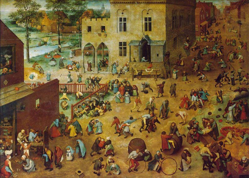
    you see the Children’s Games, Brueghel’s spectacular
    1560 achievement in which 250+ children are shown at play at some 80+ games,
    seemingly taking over the square of this small town.  This is a painting of enormous importance in
    the preservation of time spent at play. Evidently the experts have identified
    almost all of the games being played and toys being used;  the toys are all known, but there are a few
    games that remain a mystery to 21st century eyes. 

    Van de Venne seemed not to have had followers in his footsteps,
    exactly.  He went on in the later quarter
    of his career to specialize in depicting his subject matter in painting in
    various forms of gray, with his principal subjects in his genre paintings being
    peasants, the poor, the maimed, the ugly, the infirmed, the out-of-place, and
    children.  Seems as though this approach
    did not lend itself to the glorious revival of sumptuousness and color that was
    coming to the Netherlands just at the time of van de Venne’s death.  

    And, just  for the record, the Brughel painting:

    Bruegel_games 

    Richard Muhlberger, in What Makes A Bruegel A Bruegel? (New York: Metropolitan Museum of Art and Viking, 1993, pages 15-16)
    tells us that:

    “Brueghel painted an entire town inhabited by about two
    hundred fifty children. At first the image seems to capture a
    holiday, but soon it becomes clear that the painting is meant to be an
    encyclopedia of children’s games. Because most of them are still
    played today, eight-four have been identified, while others not known
    to the twentieth century have yet to be recognized.”

    “Brueghel did not want to emphasize one game above the others. Not
    able to crowd them all up front, he painted them as if looking down at
    them from above so that none is blocked from view. While the distant
    children are smaller than the ones up front, their costumes are still
    bright. No matter where the children are, even in the shadows, Brueghel
    painted them as if they were in the noonday sun… At first it looks as
    though the boys and girls are scattered at random, like jacks thrown on
    the ground. Brueghel knew how to organize large crowds into patterns.
    The figures in the foreground of the painting are arranged in lines
    that fan out from the lower left corner and catch the viewer’s eye
    first. Of course, being formed of children, the lines refuse to be
    exactly straight! The youngsters in the street behind them are placed
    in small groups that form a back-and-forth curving line… Brueghel
    made all of the children’s faces similar. Differences in clothing are
    slight, and not many colors are used. But each child looks like an
    individual because of the way the artist painted bodies: No two are
    alike. After all, it is in the figures’ movements that the viewer can
    tell what games are being played. By focusing not on personalities but
    on the games, Brueghel gave them a universal meaning.”

  • Blank and Missing Things #31: Missing Earth

    JF Ptak Science Books LLC     Post 504


    Scan0001
    In 1830 when Amos Eaton, filling up his chair and burning
    the  midnight oils in his home in Albany New York, was figuring out the
    insides of the earth  He had but little direct evidence to go on, and the publications on the topic of the center of the earth were left to speculation not much better then than science fiction (a term which had not been invented yet; neither for that matter had the word “scientist”).  
    A  very careful  observer, Eaton applied what he knew about the strata
    of the earth to a theory of how the landforms of the upper/outer mantle
    were formed. (Eaton (1776-1842) was as influential a teacher as he was a
    theorist and observer:  some of his
    students include the following Big Names (for which many buildings on university
    grounds are named for ):  James Dwight
    Dana
       (geologist, zoologist), James Eights
     (Antarctic
    explorer), Asa Gray
    ( greatest 19th c American botanist), James Hall 
    (first New York State Geologist), Joseph Henry
    (developed electromagnetism, all-around smart guy who
    communicated with everyone, secretary of the Smithsonian and so on.)

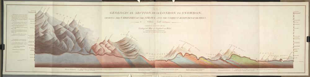
    He applied the discoveries of stratum of William Smith (1759-1839, the “father of English Geology”) drawing on a number of maps of his, such as “Strata
    Identified by Organized Fossils. : Containing Prints on Coloured Paper of the
    Most Characteristic Specimens in each Stratum” of 1815  and “Geological section from London to Snowdon; showing the varieties of the
    strata, and the correct altitude of the hills” of 1815 (pictured below), plus much else.  

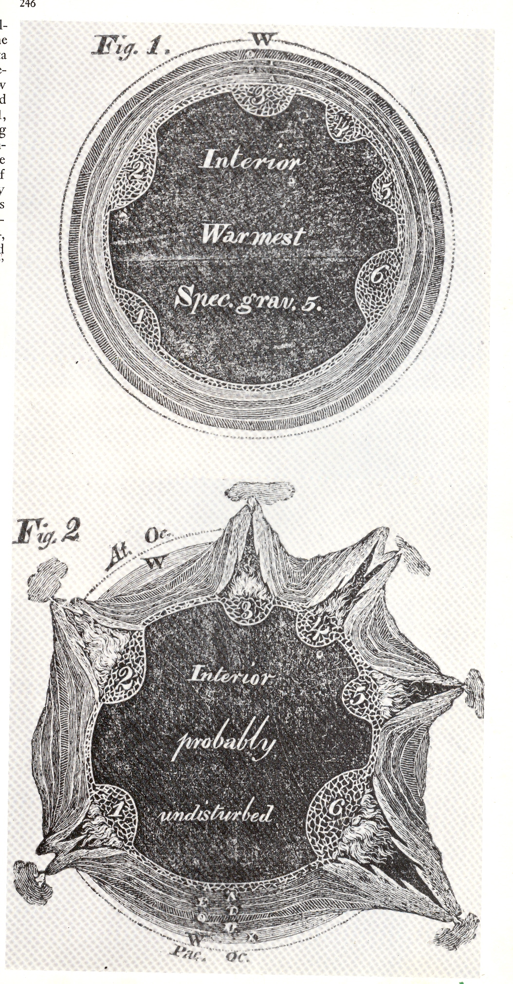
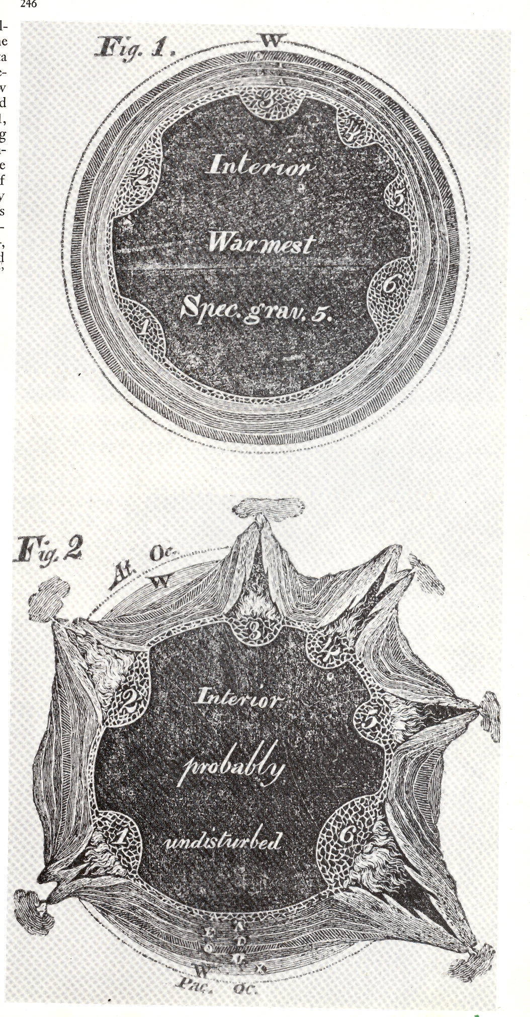
    These two images (left) of cross-sections of the earth appeared in Eaton’s Geological Textbook, (1830). The top shows the earth in perfect harmony and in cross-section, depicting the strata in six layers beneath a calm and palcid ocean.  There was trouble though located inside the six bulbous bulbs on the interior of the innermost strata:  as we see in the second image, the six bulbs, filled with
    Scan0003
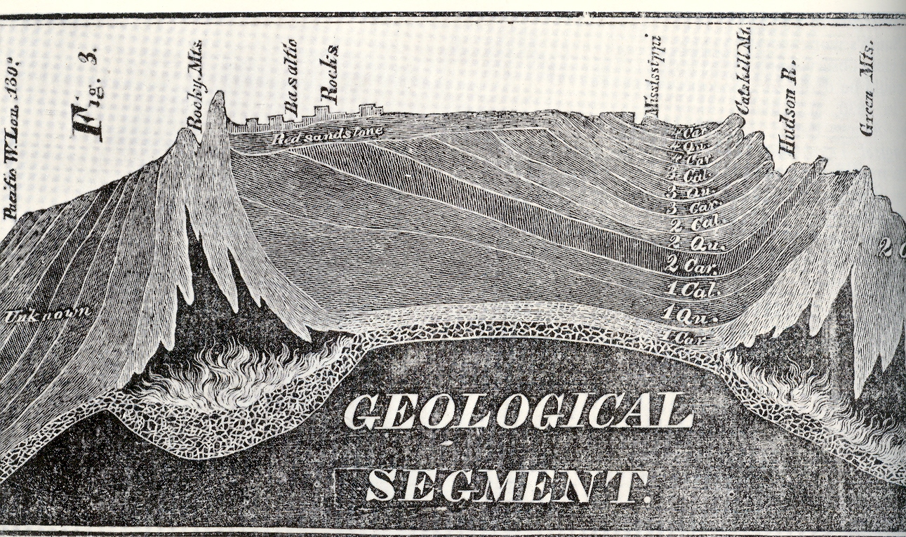
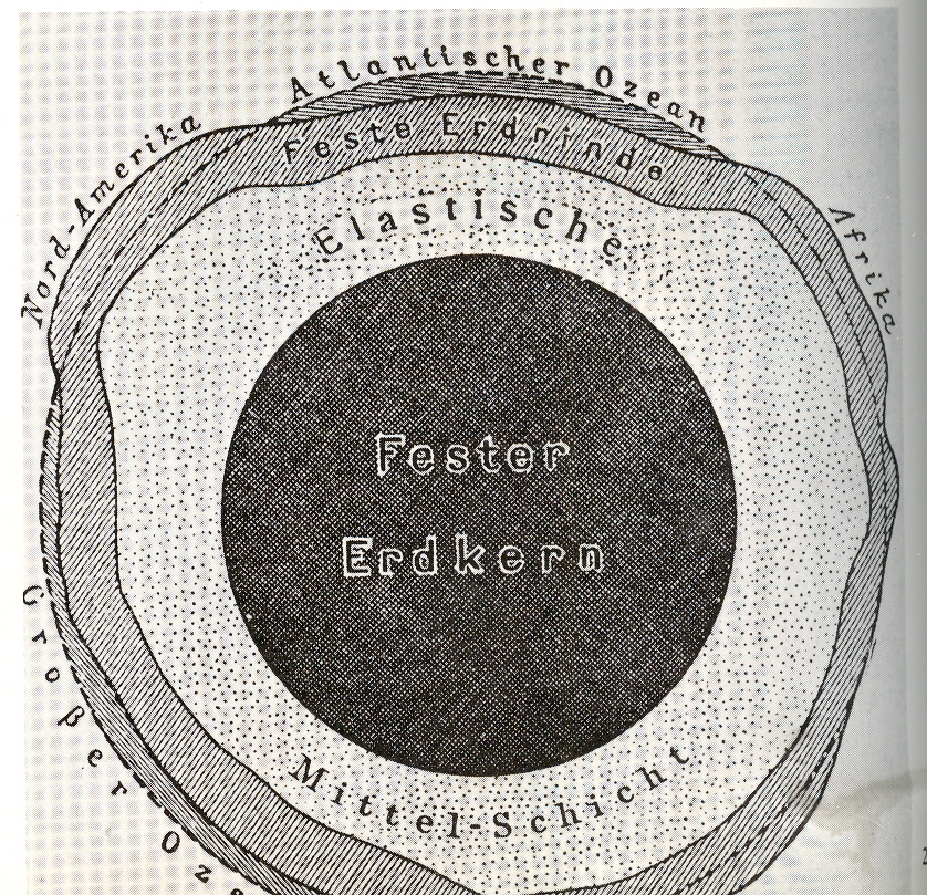
    “combustible material”, combusted, forming volcanoes and such, thereby parting the waters and forming the continents. It was some pretty  good thinking for the time.  But what attracted me to these images was the labeling of the interior of the newly-exploded earth, “interior probably undisturbed”, and blank beyond that point.  a dark, blackish mass, unknown and from where Eaton sat, unknowable.  But Eaton did do an extraordinary job in trying to imagine this stuff, piecing things together from the geological record in those pre-Darwin, pre-Lyell days.  The woodcut at right appeared in the same publication as that above–this incredible rendering depicts the entirety of  North America  in profile, which was a vast leap of faith, an image so severe in its accomplishment that it is difficult today to realize how shocking it must’ve seemed to the readers of 1830.  I believe this was the first time a true geological cross-section like this was attempted–again to see an X-ray (pre-dating that discovery by 65 years by the way) of the earth and to have it be not so terribly bad (compared to today) was just a phenomenal achievement

    ________

    Just for the record, Smith’s map of the London area–which presages the Eaton map somewhat–appears below:

    Blog--earth nothing smith


  • Things out of Place Department: the Moon

    JF Ptak Science Books LLC  Post 505

    Blog--things out of place
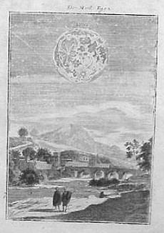
     This is a short entry in the “Things out of Place”
    department.  The image is lovely enough,
    and the depiction of the Moon is excellent, especially given the time of publication,
    which was 1683.  The Moon though, of course,
    is enormously out of proportion with the setting—I’m not sure why it needed a
    setting at all, but it has one, and it is odd. 
    The work is that of the prolific Manesson Mallet, who published this
    engraving as one of 677 in his massive Description de l’Univers, which appeared
    in five volumes.  I’m also not sure of
    how Mallet came to such greatness and capacity, as he started out his life
    (1630-1706) as a simple foot soldier under Louis XV, rising and rising in
    promotion and ability over the years until he became the chief inspector of
    forts.  He also wrote military books,
    including the three volume Les Travaux de Mars ou l’Art de la Guerre
    (1684), which he was somehow able to accomplish in the year after publishing
    his magnum opus.

    I really couldn’t figure out where to put his image, categorically speaking that is–it sort of fits into the small Extra Earth series, simply because the extra earths are big and way out of proportion.  But this is not “extra”, and not the earth, but it is out of proportion and belongs in the sky; and, taken out of context, the image is very unusual, in a naive surreal kind of way…

  • A History of Blank & Empty Dots: the Discovery of (Smooth) Muscle, 1700

    JF Ptak Science Books LLC  Post 506

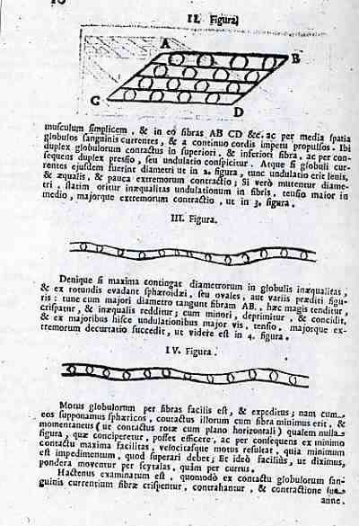
    0 patti horse533In a rare confluence of odd bits, today’s post joins the categories of Blank and Missing Things with A History of Dots to form a probably-not-to-be-used-very-often category of A History of Blank and Missing Things:  Dots.  These text illustrations come from (page 10) of the great Girogio Baglivi’s De Fabra Motrice et morbosa..., a 58-page section found in Alessandro Pascoli’s Il Corpo-Umano o Breve storia…., all published in Venice in 1700.  Baglivi (1668-1707) was an ethnic Armenian raised in Italy who rose to the rank of physician to Pope Innocent XII, and who was also a distinguished author and professor of anatomy at the Sacred College at Rome.

    In spite of living only 39 years (dying,  probably, from the consequences of a severe malarial attack) Baglivi had a long list of accomplishments, primary among these was his description and distinction of the smooth and striped muscle, the subject of the engraving at left.  This is one of the giant milestones in the history of physiology in general, also making crucial contributions to medical/clinical education.  It is the illustration of these muscle types that display the “empty dots”, not so much empty, of course, but just devoid of detail for the sake of illustration–but for my purposes, these simple empty spheres signify so much with so little.  Nothing, really. 

    Some sort of interesting and perhaps overall numbing quotes of Baglivi:

    Let the young know
    they will never find a more interesting, more instructive book than the patient
    himself. …

    The doctor is the
    servant and the interpreter of nature. Whatever he thinks or does, if he
    follows not in nature’s footsteps he will never be able to control her.

     De
    Praxi Medica
    (1696).

    The origin and the causes
    of disease are far too recondite for the human mind to unravel them.
    — Giorgio Baglivi  Praxi Medica (1696).

    The two fulcra of medicine
    are reason and observation. Observation is the clue to guide the physician in
    his thinking.
      — Giorgio Baglivi Praxi
    Medica
    (1696)


  • Rare and Possibly Unique Presentation Department: Dead Murdered Brothers and the (Second) War of the Three Henries

    JF Ptak Science Books LLC  Post 507

    Scan0005
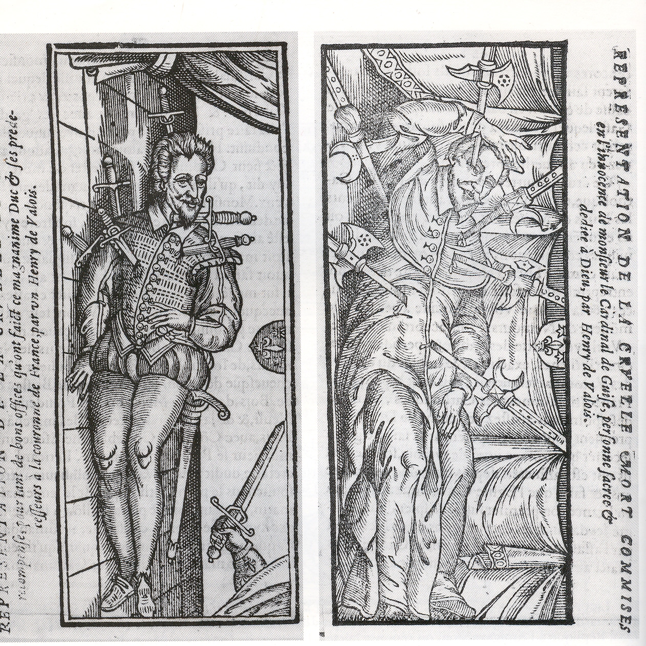
    I’m not sure where this image falls in the classifying scheme of this blog–I knew that I had to save it before it disappeared into the memory hole, lost forever.  These are a remarkable, a pair of full-page images depicting the murder of two brothers, two famous brothers, in very much the same way.  They appear in a popular pamphlet written by “Ligue” (Jean Boucher) called La Vie et faits Notables de Henry de Valois… which is innocuous enough as a starting title, then gets peppered up quite a bit, continuing ou sont contenues les trahisons...et hontes de cest Hypocrite, Apostat, ennemy de la relgion Catholique, which was pretty strong stuff uttered against a former monarch, Henry III (1551-1589), and which was published in the year of the king’s death. .  Boucher intended to lance the king, and did so very successfully, his small pamphlet outlining and cataloging the various shames and travesties of the problematic Henry reaching at least six editions.   The two images here are victims of Henry:  the first is Henry de Guise, who was murdered in Blois on 23 December 1588; the second is of his brother, the Cardinal de Guise, who was murdered the previous day, invited as they were to visit with the king at his palace.

    Their murders was one of the final acts of the final bit of
    the last of the religious wars in France: 
    this was part of the closing curtains of the War of the Three Henrys
    (1584-1589), involving Henry III of France (Catholic), Henry of
    Navarre
    , eventually Henry IV of France (Protestant), and Henry of
    Guise
    (Catholic)). This confusing bit is not to be confused with an
    earlier war of Henrys, the War of the Three Henries (977-978).  Henry and his Cardinal brother were put down under direct royal
    order by the Forty-five, (a hit team operating exclusively at the please of
    Henry III, 15 of which were always attending the person of the King) for his mis-allegiance to the monarch. The war would come toppling down with  King Henry’s own assassination in the next year,  put down by a blade to the belly by a Franciscan.

    The two brothers were exhibited in their last states in adjoining woodcuts in the Boucher pamphlet, comparing their cuts side-by-side…I cannot remember seeing such an image like this before.

Recent Posts

Archives

Categories