A Daily History of Holes, Dots, Lines, Science, History, Math, Physics, Art, the Unintentional Absurd, Architecture, Maps, Data Visualization, Blank and Missing Things, and so on. |1.6 million words, 7500 images, 4.9 million hits| Press & appearances in The Times, Le Figaro, Mensa, The Economist, The Guardian, Discovery News, Slate, Le Monde, Sci American Blogs, Le Pont, and many other places… 5000+ total posts since 2008.

  • Odd Art Department: Art Brut in Advertising?

    JF Ptak Science Books LLC  Post 810  Blog Bookstore

     + blog 10.26 tauranga

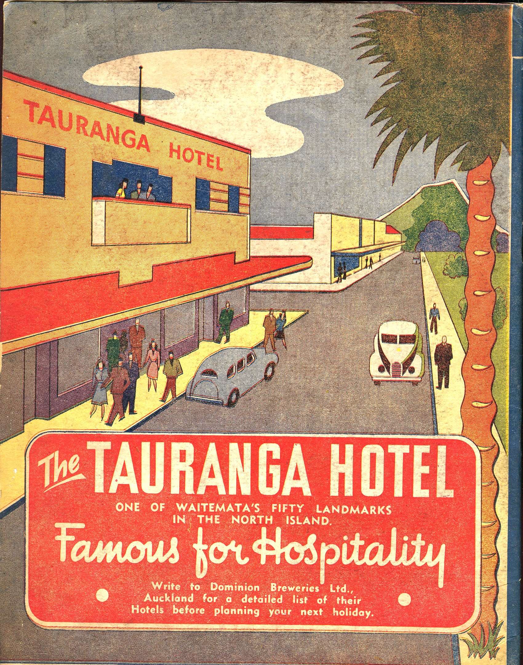
    There’s not much in this illustration–the entire back page of an oversize pulbicity tourist pamphlet–to suggest any sort of professionalism, or training, or, well, ability.  But there it is, badly drawn, with unusual (if not bad) coloring, trying to entice people to visit this seaside resort in New Zealand. 

    Maybe this is more “outsider art”
    than Art Brut.  Art Brut was a term used by
    Jean Dubuftet to describe raw/rough art produced by non-artists (and those
    mostly mental asylum residents1).  Art
    critic Roger Cardinal coined “outsider art” as a English-language adaptation of
    the Dubuffet term2, and has since come into use to describe unusual,
    technically naïve and unschooled Otherness of artworks.  This cover illustration is certainly bearing
    a pretty good-sized helping of otherness to it, from its pale, weird coloring
    to its basic inability to draw.  Somehow
    though it is attractive to me, and ultra-calming when it is not troubling.  It is just one of those peculiar works that
    is good and bad at the same time.

    Notes:

    1. A spectacular and early example
    of Art Brut is found in the phenomenally detailed, insightful-of-other-worlds
    work of  Adolf Wolfli.

    2. “Those works created
    from solitude and from pure and authentic creative impulses – where the worries
    of competition, acclaim and social promotion do not interfere – are, because of
    these very facts, more precious than the productions of professionals. After a
    certain familiarity with these flourishings of an exalted feverishness, lived
    so fully and so intensely by their authors, we cannot avoid the feeling that in
    relation to these works, cultural art in its entirety appears to be the game of
    a futile society, a fallacious parade.” – Jean Dubuffet. Place à
    l’incivisme
    (Make way for Incivism). Art and Text no.27 (December 1987 –
    February 1988).

  • Bad, Odd Jobs Department: Door-to-door Rabbit Meat Salesman. 1942

    JF Ptak Science Books LLC   Post 811  Blog Bookstore


    + blog 10.28 cries art

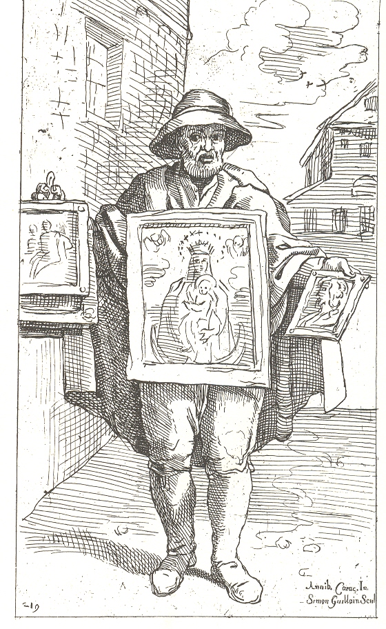
    Artists seem to have discovered street vendors a long time ago, beginning at
    least as far back as the 15th century.  Annibale
    Carracci
    (1560 – 1609), a great Baroque master, committed dozens
    of street sellers to his notebooks but were all lost to time except for the
    copies of them that were made and etched by Simom Guillain in 1664.  These and prints like these provide glamor and
    realistic fragrance to the complexity (read=”grit”) of city life 400 years ago.
    The etching of the painting seller gives us an insight into what may have been
    a broken and glutted art market in Bologna
    in the 1590’s. 

    + blog 10.28 cries peep

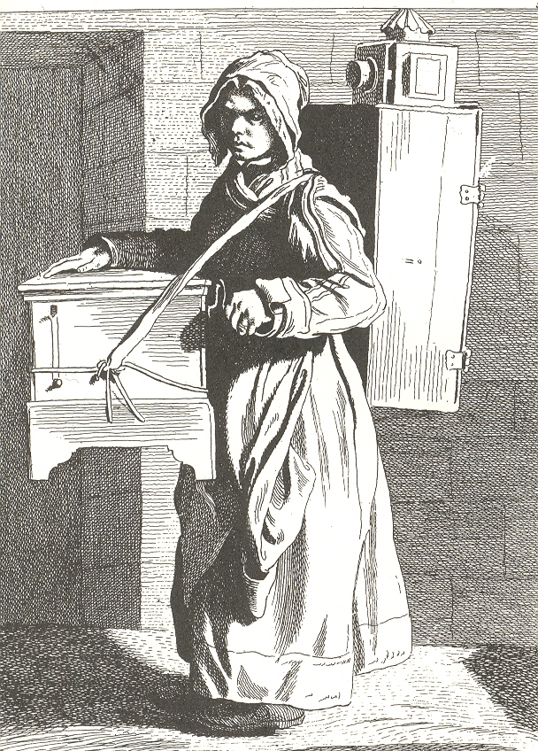
    Another master of common life was the sculptor
    Edme Bourchardon who engraved a series of dozens of such folks selling their
    stuff in the street, walking here and there, waiting to be given some
    money.  Bouchardon more so than
    Carracci/Guillain provides a little more grit to his grit, showing some more
    wear and tear to faces and clothing, giving the backgrounds some darkness and
    depth.  For example, “L’Orge de Barbarie”
    shows an itinerant woman peddler, playing her (revolving disk?) organ with a vieu optique  cabinet on her back:  neither of which was particularly light, nor made
    of some handy light asian hardwoods bought down at the local China-friendly
    Megalo-Mart.  *This* was a working
    woman. 

    Fast forward a bit to the 20th century
    and to an unusual pamphlet I found on the virtues and economic possibilities of
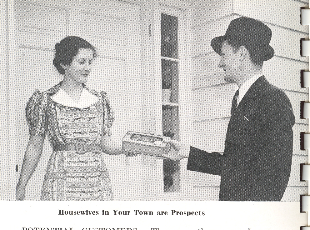
    selling rabbit meat from door-to-door.   It is just such a  sad little work; it looks like

    + blog 10.28 cries modern doornobody in the
    pamphlet wanted to be there, at all.  The
    woman in this picture being sold a box of rabbit choppings by the
    undertaker-like salesman (“you!”) looks at the gift as though she hoped for it
    to be a box of donuts.  And who wouldn’t?  Wouldn’t it be easier to imagine someone
    hopping out of their chair at the sound of the doorbell saying “hey, that’s the
    Do-Nut Man!” rather than “hot damn! The rabbit-pieces-in-a-box guy is here!”.   I should
    say so.  And that’s why I’m voting for
    itinerant rabbit-bit salesman as elevated in the Bad Jobs department. 

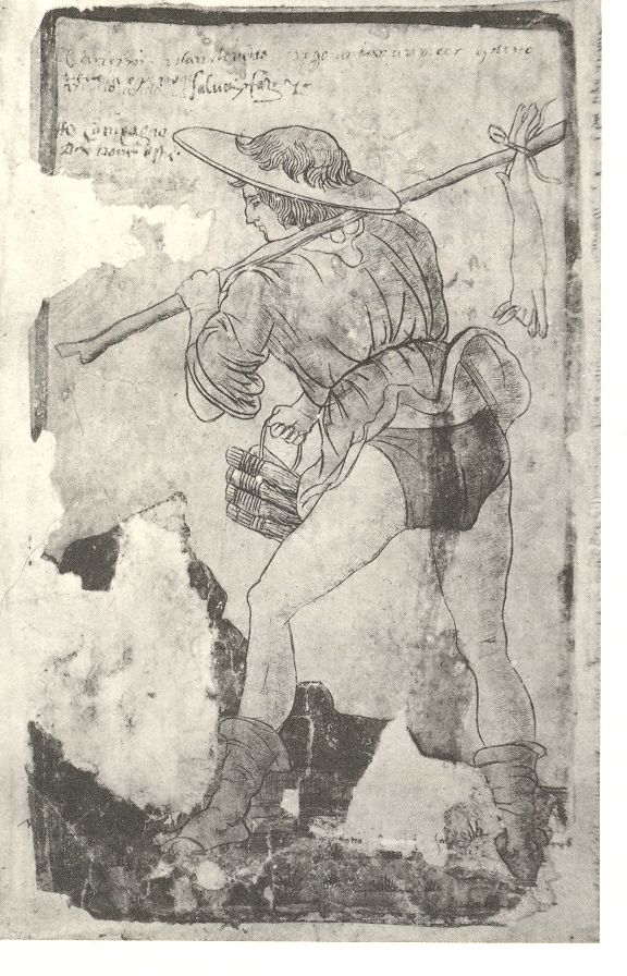
    + blog 10.28 cries bumnny Oddly enough, one of the earliest surviving Renaissance artworks depicting street vendors is this:  a man selling rabbits.

    The great money maker here might have simply been
    the publisher, Ralston Purina Company (of St.
    Louis
    , MO
    ), which
    sponsored and published this pamphlet to excite people to grow their own small rabbit
    farms and to feed their bunnies Purina Rabbit Chow. 

    There is an entire section of this pamphlet
    devoted to rabbit skin selling (illustrated), but I just can’t go there, what with
    section headings of “Skins from Meat Rabbits” and “Prime, Full-Furred Skins”.
    Also the bunny eared-nosed-eyed angora baby slippers  was just bloody indecent. (Did people really
    wear rabbit pelt coats? )

    + blog 10.28 cries modern cvr

    ·Posted by :

    ·in:

  • The History of the Internet: Remembering Vannevar Bush and the Memex (1945)

    JF Ptak Science Books LLC  Post 812  Blog Bookstore

    On this day, which may or not be the 40th anniversary of the
    first use of the internet (and the 80th anniversary of the collapse
    of the stock market of ’29, and Lucy A’s anniversary of her birth) it might be
    good to remember an earlier version of the internet and the semi-invention of
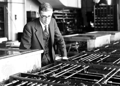
    the concept of hypertext: the MEMEX machine of the under-remembered Vannevar Bush. 

    Bush

    Vannevar (pronounced “van ee var”) was a flinty no-nonsense New Englander
    who was an organizational and mechanical genius who as a professor at MIT
    developed a remarkable analog computer that greatly advance computation
    capacities for solving differential equations. 
    This was in the 1930’s, and even after creating an improved
    electromechanical version of the machine still chose the wrong way to go in the
    soon-to-materialize digital computer revolution.  During WWII Bush was one of the most
    important Americans in the war effort, overseeing the entire scientific effort
    of the U.S.—an
    enormous effort dispatched beautifully (and successfully).  His importance in this regard is difficult to
    overstate.

    But right there at the end of the war, when he was organizing a still-secret
    effort of controlling the spread of atomic weapons (before Hiroshima), Bush was also thinking about the
    future of the organization of human knowledge and memory.  And published it, too, in the popular Atlantic magazine in July 1945. (It was
    republished in a shortened version a few months later in September—it remains
    to this day, according to an editor at Atlantic, one of the most
    often-requested reprints) where it reached a reading audience of millions.  The article, “As We May Think”, outlined his
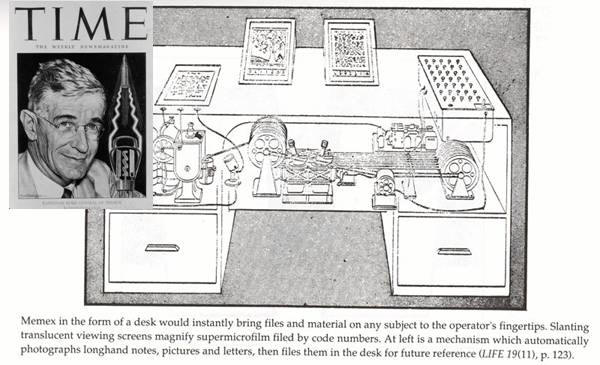
    idea for a device he called the MEMEX1 (“memory” and  “index”), which compressed and organized all
    that its user could remember and whatever information would be obtained in the
    future via electromechanical apparatuses, and available with associative tracking
    between the microtext frames.  So all
    manner of book and papers and reports and newspapers and images would be
    microphotographed and stored in a beautifully-indexed mechanical retrieval
    system where it would live with the information of others.  There was also the possibility of real-time
    textual additions to whatever it was that was retrieved, the genetic precursor
    of hypertext.  Bush’s thinking has been deeply
    recognized (and also by the creators of the internet) as the intellectual
    grandparent of the modern internet. 

    Bush Memex

    I just thought on this day that the man who saw more clearly into the future
    on advanced global communication and societal memory should be remembered on a
    day when his grandchild came into being.

    Notes:

    1. According to Bush, “the MEMEX is a sort of mechanized private file and
    library…. It uses methods such as microfilm storage, dry photography, and
    analog computing to give postwar scholars access to a huge, indexed repository
    of knowledge-any section of which can be called up with a few keystrokes.”
     Wardrip-Fruin, Noah and Nick Montfort,
    ed (2003). The New Media Reader. p. 35. The MIT Press

    The physical plant of the MEMEX:  “A
    memex consists of a desk, where on top are slating translucent screens on which
    material can be projected for convenient reading. Within the desk were
    mechanisms that stored information through microphotography. Most of the memex
    contents are purchased on microfilm ready for insertion. On the top of the
    memex is a transparent platen. When a longhand note, photograph, memoranda, and
    other things are in place, the depression of a lever causes it to be
    photographed onto the next blank space in a section of the memex film, dry
    photography being employed.”  Manovich, Lev. “As We May
    Think”, The New Media Reader and
    wiki on The Memex. 

  • The Ape of God

    JF Ptak Science Books LLC  Post 813 

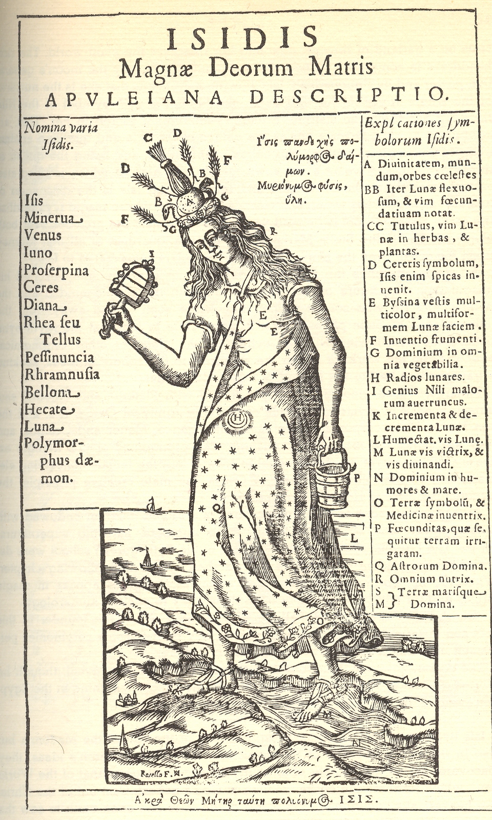
    These two interesting and complex images of the goddess Isis1, dripping as they are with symbolism and reference, are most interesting to me because of the depiction of man as the ape of god.  (No, not the Wyndham Lewis  Apes of God reference to poseurs and scumbags and indolents in the art world, just man in general.)
    + blog 10.30 isis
    The first and second image both show Isis standing on land and in the water, bridging the two, being the goddess of each; she stands slightly bent over in each, and has long flowing hair, a symbol of her as the nurturer of the Earth, as is the  adornment of the fertility symbol of the Moon in her stomach/womb.  The two Isis carry different things: the first, a pail (symbolizing the Nile, which she controls and floods with her tears for the loss of her Osiris) and a sistrum (a musical instrument peculiar to her celebration).  The second image’s hand-connections are more complex:  Isis’ right hand is connected directly to the creator, reaching from a cloud above the upper firmament of angels; her left hand is connected to our title’s interest, the ape of god—man.  The ape/man is seated on the

    + blog 10.30 isis 2  

    Earth, surrounded by concentric spheres of animals, minerals, intellectual practices (I can easily see “arith”metic, “geom.”etry, “musica” and others represented), water and Earth, the planets(including the Sun) in their courses, the starry realms, and then several spheres of I’m-not-sure but heavenly and ethereal. Man as ape is seated chained to Isis, the giver of life, and contemplates (with dividers) a model of the sphere on which he is seated.

    Notes

    1. Isis (also know to different cultures as Minerva, Aphrodite, Ceres, Hecate) was an ancient Egyptian/Greco/Roman goddess, idealized as the perfect mother, the Great Mother, patron and issuer of nature, magic and fertility—the giver of life, a Madonna.  She was the daughter of Geb and Nut (god of the Earth and goddess of the sky) and husband of Osiris, and was in general very high-power stuff.

    + blog 10.30 isis 2 man ape

  • The Value of Money and Almost-Useful Information

    JF Ptak Science Books LLC  Post 814   Blog Bookstore

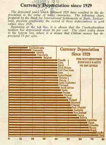
    I initially chose this pamphlet to be part of a larger series on terrific/unusual/bizarre cover designs–unfortunately its contents got in the way, a little.  The cover still borders safely on the unique, and so does most of its contents, except for the graphical analysis of the depreciation of worldwide currencies that appears on its back cover.  Here the information is actually pretty useful and unusual. It would’ve been more useful had the author included an end date for his comparisons–all we know is that he is looking at 1929 and the beginning of the Depression as a jump-off point, and we can assume that the end date is before the date of publication of the pamphlet (which actually isn’t stated).  Still, the graph is almost very useful.  It is for this reason that Money and its Uses Winds Up in the “Blank and Empty Department” for its diligent but ultimately useless graphical display of data.

    1blog_oc_t_9_money795

    1blog_oc_t_9_money796

  • Anthropomorphic Display of Quantitative Data: Flight Safety, 1912

    JF Ptak Science Books LLC  Post 815

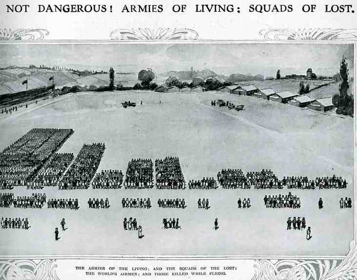
    Even though masses of people had been used in panoramic photography for some years (thousands of people, usually soldiers, gathered to form a living liberty bell, or portrait of George Washington, or some such thing) , I cannot recall the use of humans as a direct statistical aid as in this bio-bar graph, found in the pages of The Illustrated London News for 1912 (page 357).  000-ebay--Nov 7 air death005

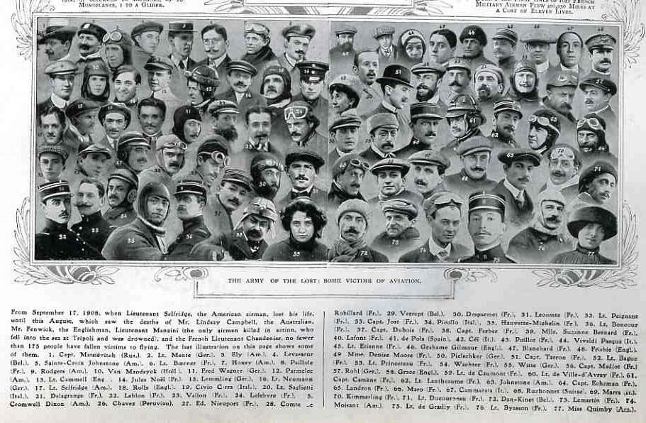
    The article asks the question of whether air travel (and flight in general) was “safe”, and responded by graphing its “yes” response with this image. The larger groups in the top half of the image represent the number of flyers flying for that particular country; the small groups below show the number of aviators killed.  (There is no date of reference in particular but it seems to me that these are total deaths since flying began in Europe in earnest in 1905.) The photomontage below shows a selection of some of the most famous dead aviators. The number of deaths as a percentage of those flying seemed quite acceptable in the year of publication (1912) ; however if these figures were iterated forward to 2009 the death rate would be staggering, sending many thousands of aviators (and crew and passengers) to their deaths each year.  In the United States we save that safety failure for deaths in automobile accidents, which still kill about the same number of Americans each year as were U.S. soldiers lost for the entire war in Vietnam.  In spite of this the odds for survival looked pretty good in 1912. 

    000-ebay--Nov 7 air death portrait006

  • The Memorial for Broken Dolls–an Appeal for Respect for Outgrown and Disabled Toys

    JF Ptak Science Books   Quick Post

    This is one of my favorite posts, published here last year on 3 November 2008. It is a fantastic idea, this memorial for lost and worn-out toys, and one which I think could work well in the U.S.

    “No two toys are ever broken in the same way or with the same emotional results.” Robert Graves, Poetic Unreason

    000-ebay--Nov 1 doll tomb975 


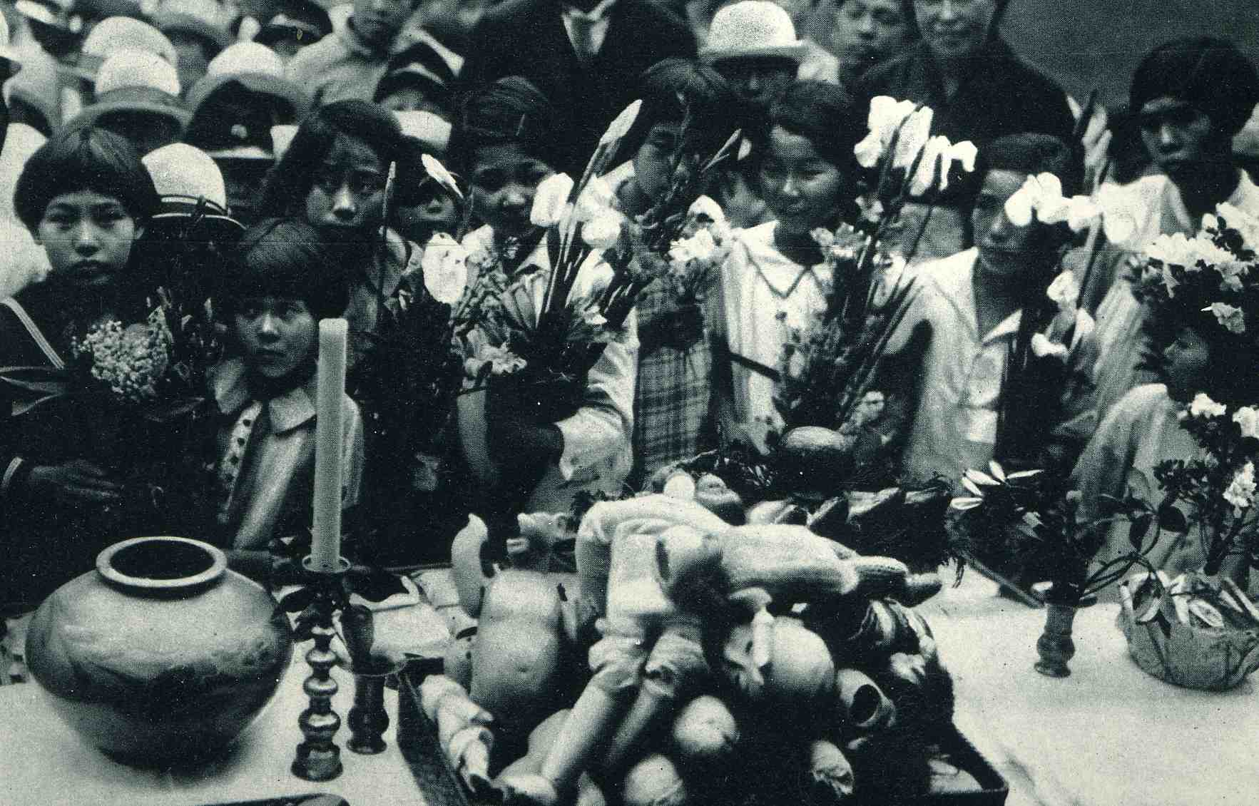
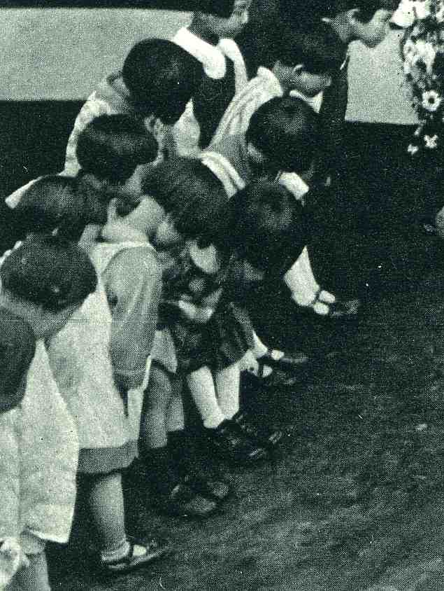
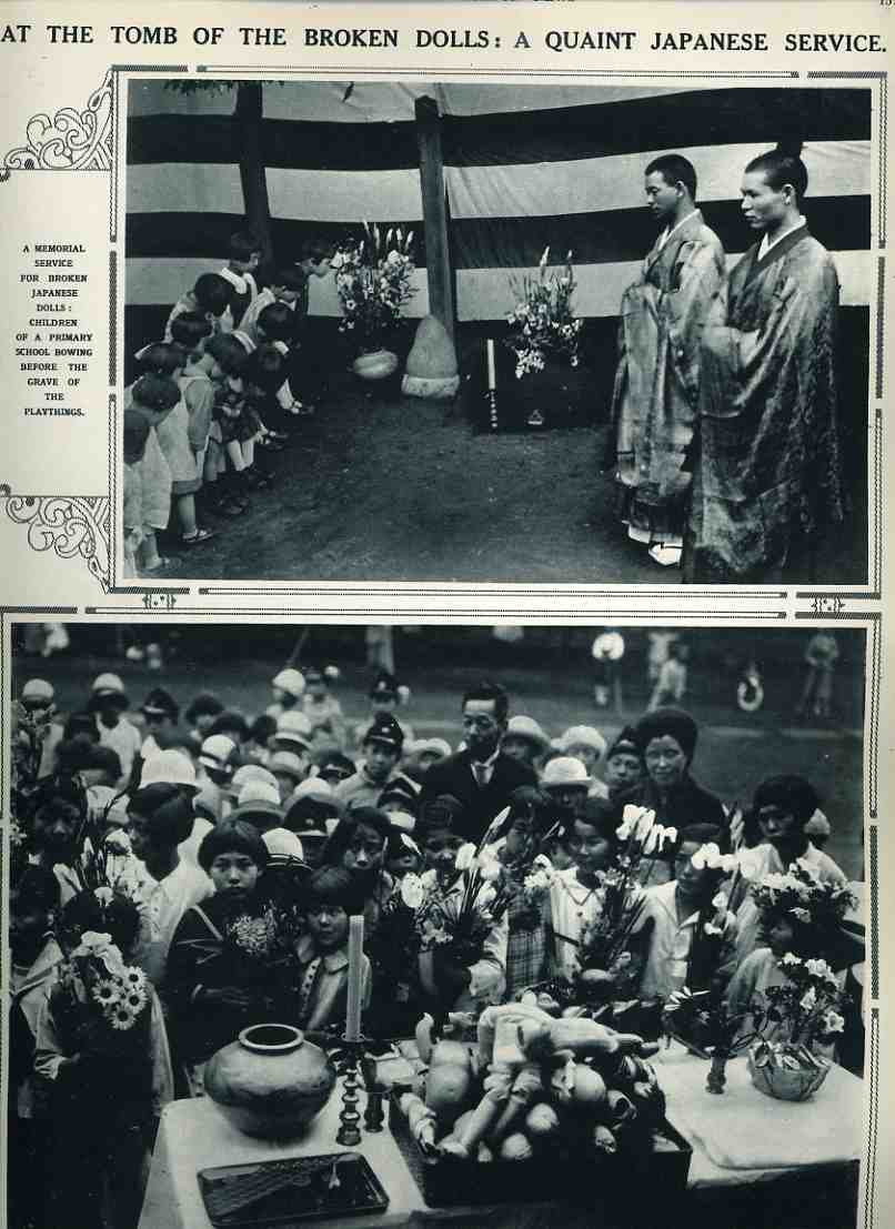
    At the beginning of my 10th month of blogging I’d like to open with these images showing the practice of an utterly fabulous idea–an eternal resting place and shrine for broken playthings.  This is an absolutely outstanding concept, and I simply have no notion as to why we don’t have such observations in the United States.  (The following two details are from the larger images, below, found  in the 27 July 1929 issue of The Illustrated London News, page 157.) The story provides these two pictures and unfortunately scant details of the ceremony which was held at the Imperial Primary School at Sugamo, Japan. 
    000-ebay--Nov 1 doll tomb976

    The first photo shows the detail of children offering flowers for the altar on which their tray of broken dolls is being venerated; and to the right is the detail of children bowing to the grave of “broken playthings”, though the markings on the (grave?) stone indicate that it is for dolls.  It also seems to be a marker for a mass of toys, not that each toy would have its own marker; I suspect it to be enough to have a place where allot of kids could come to venerate objects in which they might have invested countless hours of their time, effort, attention and affection.  That it is a shared place and experience makes the monument all the more so powerful.

    There are few better things to teach a child than to pay respects for something that has given them pleasure or helped them, or, say, for returning the love which has been showed them from their doll or toy.  It has always struck me as not-quite-right that a toy can be a beloved object one day and a dust-magnet the next, destined for the trash heap.  Certainly these are holy objects in themselves, and deserve a better and more kinder fate than being mixed with broken glass and greasy unmentionables. 


    000-ebay--Nov 1 doll tomb974

    Are there greater things to be concerned with?  Yes, of course, but only on the face of it–I think that helping kids understand the underlying dignity of inanimate objects such as their playthings could give them a greater awareness for the other seemingly invisible things that they will find throughout their lives. Further I think that a visible, constant reminder for these objects would be really more like a memory-monument for a period of time, a place in nearly everyone’s life in which held a certain purity and promise, a protected and beloved frailty of the human experience shared by all.  I can honestly think of no other monument that could reach across religious or philosophical or belief systems to arouse a feeling of common goodness than this. Everyone has had a toy that they’ve loved, and I have no doubt that if remembered these would be powerful emotions, and could be about the most common denominator we have on the planet.  I can think of no divisive element in such a monument of veneration.

    ·Posted by :

    ·in:

  • A Not-Obvious Gross Understatement: Bomb + Plane = Drop, 1915.

     JF Ptak Science Books LLC  Post 737 Blog Bookstore

    ===blog==aug 30==bomb overview

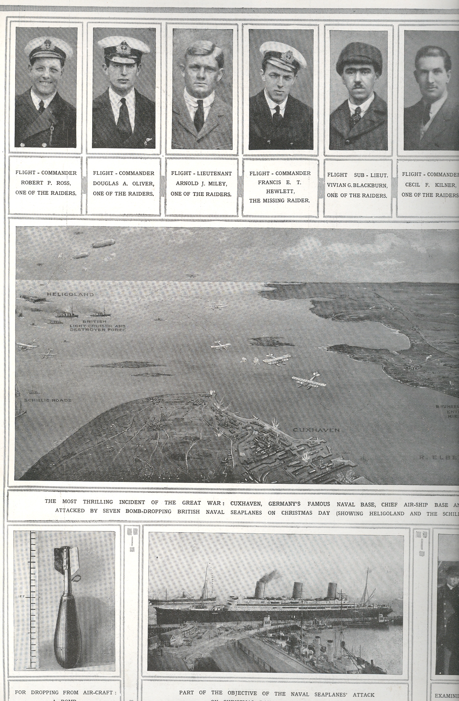
    In the young history of the beginning of the Twentieth Century’s Thirty-One
    Year War, in the very young history of bombing1, came this adventurous “first”
    in warfare:  the attack of a target from
    the air, sea and under the sea. The British launched an assault against the German
    installation at Cuxhaven,
    trying to get at its Zeppelins and navy, sending a task force of destroyers,
    subs and cruisers in support of eight search and destroy seaplanes. The
    tactical results were mixed (there are many places to check out this part of
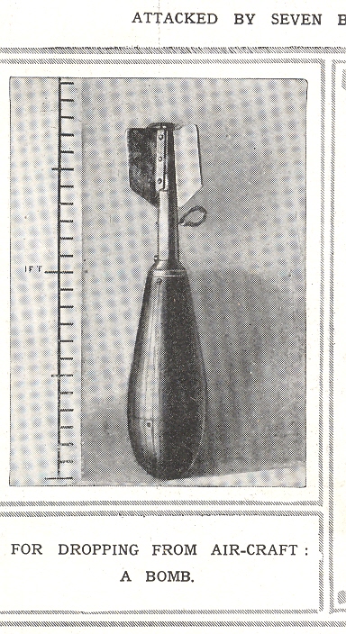
    the war) but the strategic outcome was enormous:  it was a new approach to warfare.  The technical aspect of bombing was so new,
    really, that the picture of the bomb at lower left had to be identified as
    such, and===blog==aug 30==bomb det that it could be used as an offensive weapon dropped from a plane (“for
    Dropping from Air-Craft: a Bomb”). 

    1. It was the Italians who conducted the first aerial bombardment, against a
    very creatively-named military “target”– consisting primarily of civilians–outside
    of Tripoli in October
    1911.

    From the Flight/global Archive:

    “The Cuxhaven raid marks the first employment of the seaplanes of the Naval Air Service (sic)
    in an attack on the enemy’s harbours from the sea, and, apart altogether from
    the results achieved, is an occasion of historical moment. Not only so, but for
    the first time in history a naval attack has been delivered simultaneously
    above, on, and from below the surface of the water.”— United Kingdom Flight
    Magazine: the “Official Organ of the Royal Aero Club of the “, 
    Flight
    Magazine Global Archive: Aircraft
    in Warfare
    , 1 January 1915.

    Notes:

    A lovely site with many links for early aviation: Airminded; and an unusual and wonderful book on the history of bombing in general, called, of course, A History of Bombing, by Sven Lindqvist.

  • Very Early Films of NYC, 1903

    JF Ptak Science Books LLC  Post 738 Blog Bookstore

    I came across another fantastic part of the Library of Congress site:  The Life of the City, Early Films of NewYork, 1896-1906. I’ve quoted liberally from the descriptions of the films, and also provided a chronological listig of many of the films that are found at the site.  They are spectacular things, like pieces of eidetic memories, offering wide swaths of minuate detail in corners of pockets of life from a hundred years ago. 

    NOTE:  To view the films just follow the link and click on the MPEG format for best viewing.

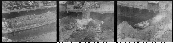
    NYC Garbage Dumping Scene 1903
    Nyc dumping wharf

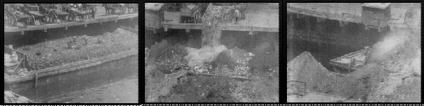
    Yes, this is what people did when they worked, not so long ago, when thousands and thousands of people worked at making The City go–in the streets picking pulling pushing prying pumping preening polishing purging.  What grabs me are the three workers working beneath the horse-drawn carriages, working on the barges, spreading around the waste.  The topsiders dump their cargo, letting it fall twenty feet or so, landing very closely to the men below.  It seems like an unending process

    From the LC site:
    “The film shows a wharf where a barge is being loaded with trash from
    two-wheeled, horse-drawn wagons. The trash is dumped off the edge of the pier
    onto the barge, where men with shovels are spreading the piles of debris. The
    camera pans left to the next barge, where four-wheeled carts are shown dumping
    excavation rubble. Probably filmed on the East River,
    this is one of several New York City Sanitation Department dumping wharves in
    operation at the time.”

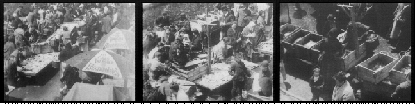
    “Ghetto” Fish Market
    Nyc--fish market

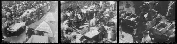
    I love what the kids do when they see this camera–they pretty much uniformly stand still, their fingertips pressed together in wonder and worry, and stare at the strange goings-on fifteen feet above the crowd.  At one point three officials stroll through the crowds, coming in at top right; they are very sharp eyed, and the one guy at the end of these three looks like every other guy who has played a corrupt NYC official in every other movie made before WWII. 
    “The view, photographed from an elevated camera position, looks down on
    a very crowded New York City street market. Rows of pushcarts and
    street vendors’ vehicles can be seen. The precise location is difficult
    to ascertain, but it is certainly on the Lower East Side, probably on
    or near Hester Street, which at the turn of the century was the center
    of commerce for New York’s Jewish ghetto. Located south of Houston
    Street and east of the Bowery, the ghetto population was predominantly
    Russian, but included immigrants from Austria, Germany, Rumania and
    Turkey. According to a description in a 1901 newspaper, an estimated
    1,500 pushcart peddlers were licensed to sell wares (primarily fish) in
    the vicinity of Hester Street. At one point the film seems to follow
    three official looking men (one in a uniform) as they walk among the
    crowd. They may be New York City health inspectors, who apparently
    monitored the fish vendors closely.”

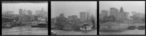
    NYC Waterfront
    Nyc-ncy skyli


    From the LOC site:
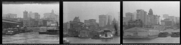
    “Filmed from a moving boat, the film depicts the
    Hudson River (i.e., North River) shoreline and the piers of lower
    Manhattan beginning around Fulton Street and extending to Castle Garden
    and Battery Park. It begins at one of the American Line piers (Pier 14
    or 15, opposite Fulton Street) where an American Line steamer, either
    the “New York” or “Paris,” is seen docked [Frame: 0120]. The camera
    passes one of the Manhattan-to-New Jersey commuter ferries to Jersey
    City or Communipaw [0860]. Proceeding south, the distinct double towers
    of the Park Row, or Syndicate Building, erected in 1897-98, can be seen
    in the background [0866]. A coastal freighter is next [1560], then
    Trinity Church appears, to the left of which can be seen the Surety
    Building, as a tug with a “C” on the stack passes in foreground [2032].
    Several small steamboats come into view [2136], and the B.T. Babbitt
    Soap factory at Pier 6 is seen [2300], followed by the Pennsylvania
    Railroad piers (#5 & #4), with a group of docked railroad car
    floats [2556], and the Lehigh Valley Railroad piers (#3 & #2), also
    with car floats [3030]. Next are the Bowling Green Building
    (rectangular, with facade to camera) [3208], the Whitehall Building
    (vertical, thin side to camera) [3388], followed by Pennsylvania
    Railroad Pier #1 [3630]. Pier A (with a clock tower) is seen with the
    New York Harbor Police steam boat “Patrol” at its end [4654]. The
    Bowling Green Offices and the Produce Exchange at Bowling Green are
    visible in the background. The breakwater (sheltered landing) and the
    New York City Fireboat House appears [5270] and the distinctive round
    structure, Castle Garden, once a fort and immigrant station, but at the
    time of filming the City Aquarium, comes into view [5438]. The camera
    then pans east along the Battery Park promenade: the Barge Office (with
    tower) is visible in the distance [5804], and further out the Brooklyn
    shoreline with the grain elevators at Atlantic Avenue can be seen
    [6088]. This view is continued, with only a minor break in continuity,
    in the film Panorama of Sky Scrapers and Brooklyn Bridge From the East
    River. Together they comprise a sweep around the southern tip of
    Manhattan, from Fulton Street on the Hudson to the Brooklyn Bridge.”

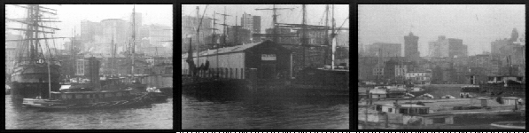
    Brooklyn Bridge to the Battery, waterfront
    Nyc--brooklyn

    Another beautiful water-side continuous panorama, from just above the Brooklyn Bridge to the battery.

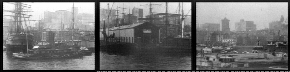
    From the LOC site:  “This film depicts the East River shoreline and the piers of lower
    Manhattan starting at about Pier 5 (the New York Central Pier) opposite
    Broad Street, and extending to the Mallory Line steamship piers just
    south of Fulton Street and the Brooklyn Bridge. The film begins with
    shots of canal boats or barges (from the Erie Canal via the Hudson
    River) docked at and around Coenties Slip [Frame: 0106]. As the film
    progresses, the New York Produce Exchange located at Bowling Green,
    Manhattan, with its distinct tower, comes into view in the background
    [0346]. Between here and the Wall Street ferry, there follows in order
    of appearance: steam tugs [0308 and 0422], a wooden hull barkentine
    [1032] with box barges alongside, a docked iron hull sailing ship,
    probably British [1448], an ocean steamer with yards on the foremast
    [1748], a derrick lighter laden with barrels docked at the end of a
    pier [2134], and a fruit steamer [2612]. In the Wall Street Ferry slip
    (between Piers 15 and 16) there is a Wall St., Manhattan-to-Montague
    St., Brooklyn, double-ended steam commuter boat [2896]. The ferry is
    visible immediately before a shot of the large advertising billboards
    on Pier 16. The film next shows the Ward Line piers (J.E. Ward &
    Co., New York and Cuba Steamship Co.) [3040], a Pennsylvania Railroad
    tug [3190], a derrick lighter [3320], and the Mallory Line piers
    [3692]. A Mallory Line steamer can be seen on the south side of one of
    the Mallory Piers [3736]. The camera begins panning out into the East
    River after passing pier 20, catching the fog bell at the end of pier
    21 [3922]. A car float is visible passing under the Brooklyn Bridge
    [4202]. The pan follows the line of the Brooklyn Bridge eastward to
    Brooklyn Heights, where the Hotel Margaret (tall building in
    background) is visible just before the end of the film [4464]. This
    film continues the view begun in the film Sky Scrapers of New York City
    From the North River. Together they comprise a sweep around the
    southern tip of Manhattan, from Fulton Street on the Hudson to the
    Brooklyn Bridge.”

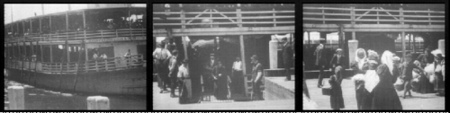
    Immigrants Arriving at Ellis Island 1903
    Nyc--ellis

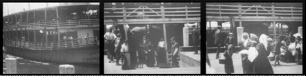
    Here comes everyone, from everywhere, emerging from a ferry, delivering immigrants from Manhattan to Ellis Island, where the process of the beginning of the rest of the lives of all these people began.  Between 1892 and 1954 some 12.5 million people were processed into the U.S. through Ellis, and in the early days, say 1892-1920, most of them looked just like these folks–the grandparents and great-grandparents of a quarter of the country.

    From the LOC site:  “The film opens with a view of the steam ferryboat “William Myers,”
    laden with passengers, approaching a dock at the Ellis Island
    Immigration Station. The vessel is docked, the gangway is placed, and
    the immigrant passengers are seen coming up the gangway and onto the
    dock, where they cross in front of the camera.”
    ·Posted by :

    ·in:

  • Propaganda in Maps: the Polish “Corridor”, 1939

    JF Ptak Science Books LLC  Post 739  Blog Bookstore
    +++korridor 2
    There’s a war on?  Really?  You wouldn’t know it from the cover page of the most popular magazine in Germany, the (Leipzig) Illustrirte Zeitung, published 7 September 1939. The odd thing is that for months, years, previously there was a huge and occasionally overwhelming militaria scent to this magazine (a sort of LIFE magazine-like affair in its way), paving the way for the reading population (which I’m sure must’ve been in the millions) for the stuff to come.  I’ve looked at every issue of this magazine from 1933 to 1939, and there is simply no mistaking the under- and over-current of the war preparation.  It was just relentless.  And so to finally come to the real fighting part of the beginning of the war it is a little odd to see the cover of the mag decorated with Mother Earth in the herb garden.  The contents of the issue is not what I expected either–not much dedicated to fighting outside of happy and relieved Gdanskers saluting their warm welcome to the advancing Nazi machine, images of the “mongrels” who were living in the places that had once been occupied by Germans, and an “apology” of sorts as to why all of this was necessary.All of which was bluster and diatribe–its hard to imagine, really, how someone living in Leipzig reading this thing over breakfast could’ve nodded their head in logical consent with the magazine’s specious arguments.

    Which brings us to the small inset map depicting what was one of the major “problems” for  Germany with Poland–the northern stretch of Polish land that touched the Baltic, the so-called Polish “Corridor“.  This polemical affair shows exactly what the Germans thought of the territory, a piece of Germany now in enemy hands, a dagger struck through the heart of Prussia.  

    +++korridor Poland of course didn’t think of the land in terms of a “corridor”, and as a matter of fact the term was an offensive one.  It was simply a part of Poland, one which was returned to the Poles with the rest of the country (which had been disappeared, absorbed, with the Treaty of Vienna in 1815) in 1920.  It was essential with repatriation that this land be included, giving Poland a natural access to the Baltic, and an ability to follows it major river (the Vistula) all the way to the sea.  Without access to the Baltic, Poland’s economy would have been strangled, the country simply wouldn’t have had a good stake to survival.  It was a return of land that had been connected to the Polish Crown from 1466-1772.

    The ethnicity issues are long and deep, and something I can’t get into right here. But Germany certainly made the claim that there were huge German populations in the corridor who needed to be rescued, and who suffered under the control of the inferior Polish people. But as I said, this is a complex issue–the population in the area was probably around 45% in 1920, and this before the huge repatriation efforts to bring those German people home.  There may have been so many Germans in that area because of a massive Germanization of the area in the 19th century…and on and on.

    The Polish government did sign a Non-Aggression Pact with Germany in 1934, after which everything got on the slow boat to hell.  In the months before the Germans attacked, through the summer, there was much frenzied back-and-forth, an awful lot of negotiations that were so much meaningless talk as a mask for the inevitable.  Whatever was agreed upon and signed, Germany was going to attack, anyway, come what may.  And so they did.

    [I should point out in closing that, just a few days ago, the Airminded.org site reminded us all of H.G. Wells’ 1933 The Shape of Things to Come, and his prediction on the start (or re-start) of the next great war, right there at the Polish “corridor”, and right soon.] 

  • A History of Blank and Empty Things #53: Painting by Number and Pop Art

    JF Ptak Science Books LLC  Post 740  Blog Bookstore

    I wonder if Mr. Billy Collins has ever approached the
    ineffable connection between paint-by-number art and Andy Warhol?  It seems that paint-by-number (PBN) came from
    nearly nowhere, a near state of being nowhere and nothing, just after WWII, to
    the point of selling millions of sets by 1952. 

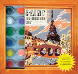
    Paint by number 1

    It was an astonishing thing, really, how the PBN craze took over America.  And it just so happens that 1952 was the
    first one-man show for Andy Warhol, and was also the beginnings of the Pop Art
    movement, which seems to me a rush to the most common denominator trough the commoditization
    of consumerism and popular culture, creating art out of visible
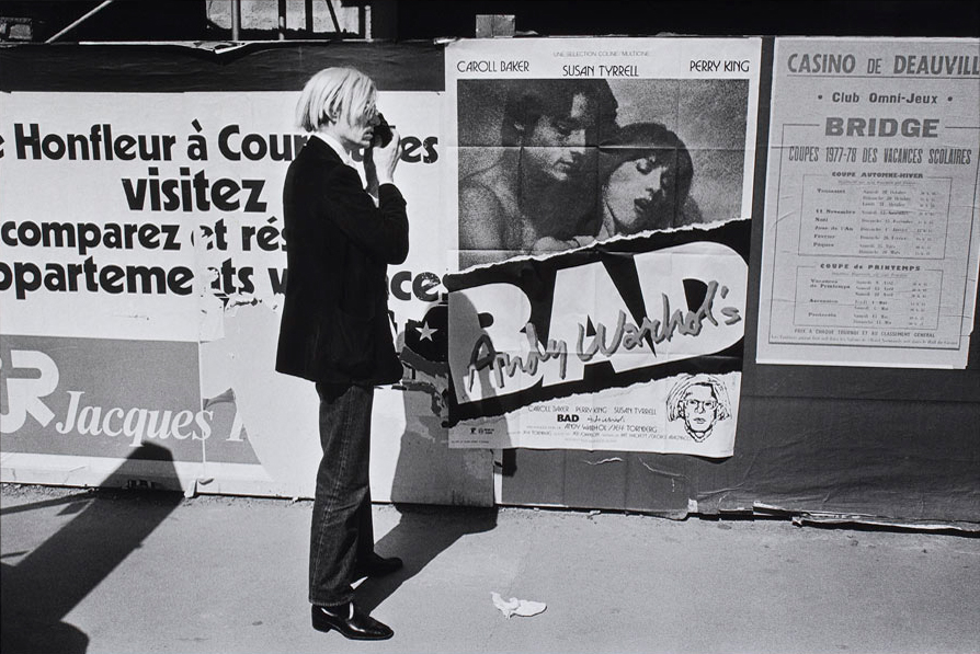
    nothingness.   Warhol in particular
    trained his sites on images that were already twisted around people’s neurons
    and living in their memories.  Art was
    made from images injected into the heads of consumer buying units, a delightful
    confusion of imagination and the already imagined, a reaction to a familiar sub
    rosa
    advertised image.

    Perhaps Warhol’s art was part of a larger whole, an
    illustrator to a bigger point, a performance unintended to stand alone.  But that is what happened, the art separated
    from the wider message, and soared to great acclaim. 

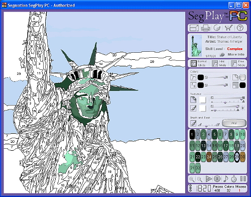
    Paint by number 2

     Warhol seems more like a paint-by-number color memorist,
    filling in the blanks of an already-mostly-formed memory burned into the long
    term memory via years of advertising and severe repetition.  Nearly the entire broadcast industry was
    created to support this memory-making process: 
    Seinfeld, Spongebob, The Office, Your Show of Shows, and all the rest,
    created not necessarily for your pleasure but as a series of  interchangeable 11-minute-long placeholders
    to hold the viewer/listener to the point where they would be exposed to 180
    seconds of product identification.  It is
    the repetitious memory formation that the folks depended upon so that when you
    go down the supermarket aisle looking for an 89-cent can of tomato squeezings
    called “soup” that the 799 exposures to the Campbell Soup Company’s product
    line will direct you their way, a primitive bit of biological programming.  And for all of the trimmings and
    philosophical-critical digressions, Warhol capitalized on creating art on vast
    shared memories, coloring in a shared image, reaching into the minds of
    millions for something that everyone could see and understand—and not have to
    think about, not lose one neuron in interpretation, and enjoy it like an comfy
    old slipper. 

    Paint by number 3

    Where Warhol succeeds and PBN fails is at the art/appreciation
    point—few people took the PBN seriously as an art form, mainly because it wasn’t
    presented as such, except for those who somehow took the thing too seriously.
    Warhol took his creations seriously from the very beginning—and perhaps there
    was really nothing more than the defense of his art that was the art
    itself.  It just seems to me that, in the
    history of art, it tool 1500 years or so for linear perspective to be
    rediscovered, another 500-odd years beyond that to bend and mystify nature in
    the form of Impressionism, and another 30 years to lose all recognizable
    natural forms all together.  And then after
    Braque and Duchamp and Kandinsky and the Blaue Reiter, and the Fauvism,
    Suprematism, Vorticism, Dadaism, Deco, De Stijl, Surrelaism, Concrete art,
    Abstract Impressionism, and on and on, that after all of this since Nude
    Descending, that we are lead to Pop Art and silkscreens of soup cans.  It just seems to me to be more about the
    packaging than the package, which might just well be a wrapped bit of
    nothing. 

Recent Posts

Archives

Categories