A Daily History of Holes, Dots, Lines, Science, History, Math, Physics, Art, the Unintentional Absurd, Architecture, Maps, Data Visualization, Blank and Missing Things, and so on. |1.6 million words, 7500 images, 4.9 million hits| Press & appearances in The Times, Le Figaro, Mensa, The Economist, The Guardian, Discovery News, Slate, Le Monde, Sci American Blogs, Le Pont, and many other places… 5000+ total posts since 2008.

  • The Fires of London, 1832

    JF Ptak Science Books  Quick Post

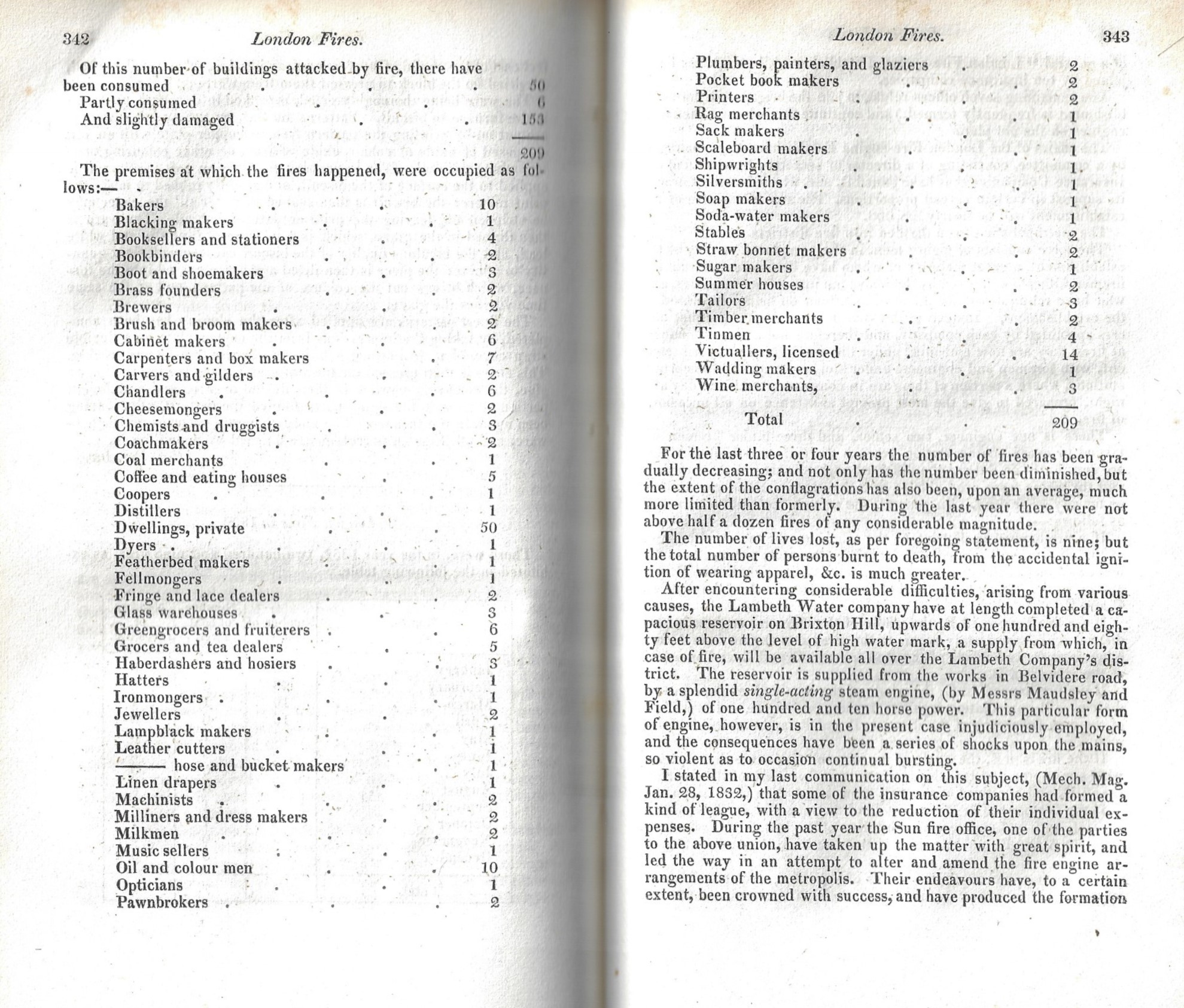
    This bit of not-common data (below) just came to me while I was fussing around in a volume of the Journal of the Franklin Institute (January-June, 1833), and details the fires and the businesses in which they started. It is a curious bit, reminding me of a post I did some years ago about Charles Babbage’s tour of the broken windows of London. There were 209 fires, which really doesn’t seem to be an awful lot, all things considered. The business, though (“the buildings attacked by fire”), the ones consumed by fire, are mostly in themselves consumed now by time. Blacking makers, brass founders, brush makers, carvers and gilders, coachmakers, coopers, feltmongers, fringe makers, lampblack makers, milkmen,, , oil and color men, rag merchants, sack makers, scaleboard makers, straw bonnet makers, tinmen, and wadding makers, are all pretty much gone as standard enterprises. 

    JFI 1833 Fires in London

    ·Posted by :

    ·in:

    —
  • An Uncommon (?) Display of Scientific Discovery (1833)

    JF Ptak Science Books  Quick Post

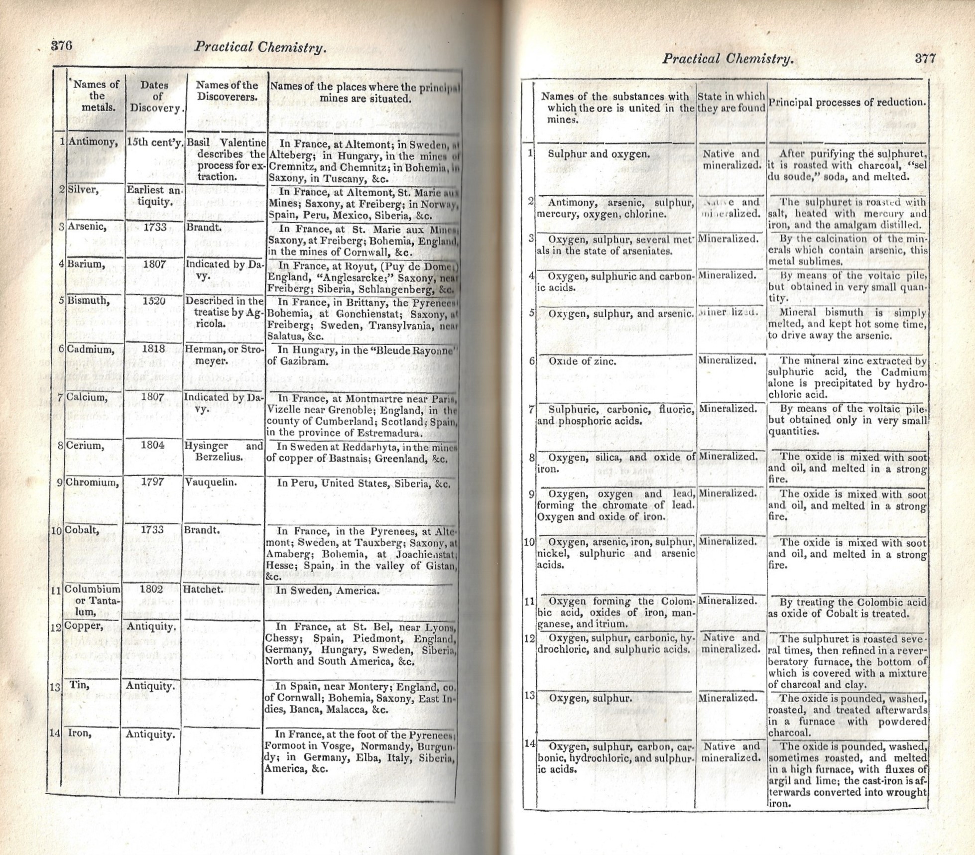
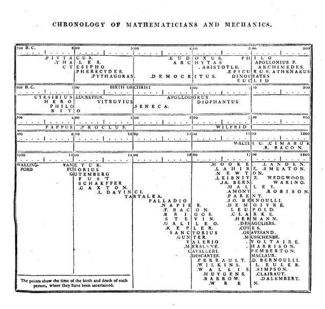
    When I saw this series of tables in a volume of the Journal of the Franklin Institute1 it struck me that I really didn’t recall very many instance at all of seeing chronological history of science (etc.) displays of info in antiquarian scientific texts. The practice was not terribly uncommon in atlases that would occasionally (as in Lavoisne’s Complete Genealogical, Historical, Chronological and Geographical Atlas of 1822) be illustrated with chronological historical tables. This one was a tabular presentation of 34 metals, listed alphabetically, and listing the year of discovery and discovery first—that was the unusual part. I recall that Thomas Young’s (1773-1829) A course of lectures on natural philosophy and the mechanical arts contained a series of timelines for the different disciplines (a sample of which is below)–including an unexpected entry for optics.

    In any event, I’ll save a longer post on this subject for later—for right now I’m going to share the entire article from the JFI:

    JFI 1833 Metals _1_

    The article is continued below; also find following a sample from the Thomas Young with a link to the full work:

    Thomas Young LEctures Timeline

    The link to the Young:

    https://archive.org/details/lecturescourseof02younrich/page/n6

    Notes:

    Franklin Peale, “Table of Properties &c., of the Metals, taken from a table by M. Chaudet of the Paris Mint”, pp 375-385. This is basically a tabular report on 34 metals, listed alphabetically, and including dates of discovery and the names of discoverers, plus the names and locations of the principle mines, plus color, character, stability, specific gravity, state in which the metals are found, and several other properties. Journal of the Franklin Institute, Philadelphia, 1836; volume 17 (new series) and volume 21 overall, with text illustrations and four plates, 440 pp

  • One of the Earliest Appearances in Print of One of the World’s Most Famous Series of Dots (1838)

    JF Ptak Science Books  Post 2790   Part of the “History of Dots” series

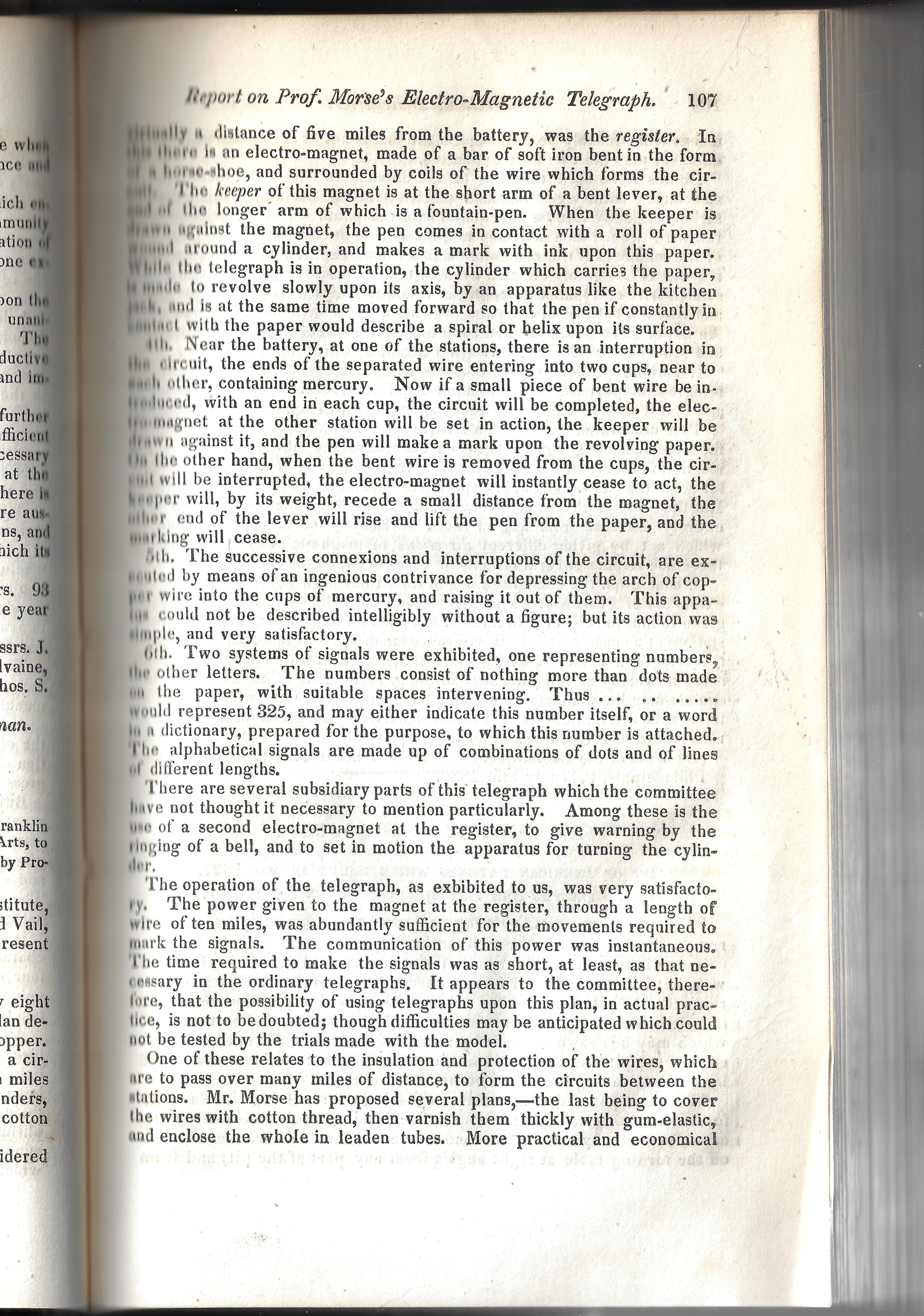
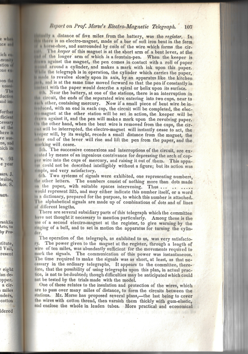
    I was looking in Journal of the Franklin Institute (1838) for what I thought was an important report by Charles Goodyear on his “vulcanization” process, where he is finally able to present the results of his experiments on saving rubber from itself for commercial use. But I was wrong–the report was a step in the correct direct, the finalization occurring the next year (and not a moment too soon for the very highly economically challenged Goodyear). Anyway, I poked around the index (which is a half-miserable affair) grazing for something else interesting when I saw the entries for “telegraph”, with subdivisions for “electric” and “electromagnetic”. Now, both of these types of telegraphs had been around for a score or three of years, but just for the play of it I checked out the “electromagnetic telegraph” on page 106.  And there he was: Samuel Morse. And Alfred Vail. And their electromagnetic recording telegraph–all of which appeared in the paper called “Report on Prof. Morse’s Electro-Magnetic Telegraph“.1

    This was a significant report. As it turns out Morse makes the first public demonstration of his and Alfred Vail’s recording electromagentic telegraph on January 6 1838 at Speedwell Ironworks near Morristown, New Jersey, just weeks before this JFI appearance.  On this success, Morse went south to Philadelphia and demonstrated his invention to the Franklin Institute on February 8, 1838 (summarized in the present report), appearing two weeks later on February 21 1838 midway between Phila and home in Washington D.C., demonstrating the apparatus to President Van Buren and members of the Congressional Committee on Commerce2,3.

    This may well be the one of the two earliest journal appearances of the successful demonstration of the Morse/Vail electromagnetic recording telegraph, and is perhaps the very first appearance of the “dot” end of the Morse Code.
    Morse dots _2_

    The demonstration in January and February 1838 used the Vail register (accentuated in italics in the JFI report) and did away with the Morse pendulum apparatus for recording the message–this was evidently a great improvement.

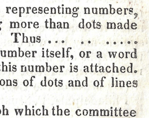
    The narrative identifies two systems of signals (“…one representing numbers, the other letters”) that were displayed in the demonstration. The first “representing numbers” were a series of dots. This is perhaps the first publication in a journal of the dot method of transcribed signals of a recording electromagnetic telegraph. The dots are pictured “…   ..   …..” on page 107, representing the number “325” or as explained could also mean the word represented by the number “325” in Morse’s code book (“indicate…a word in a dictionary, prepared for this purpose…”). The second, “alphabetical signals are made up by a combination of dots and lines of different lengths”), an example of which is not shown. 
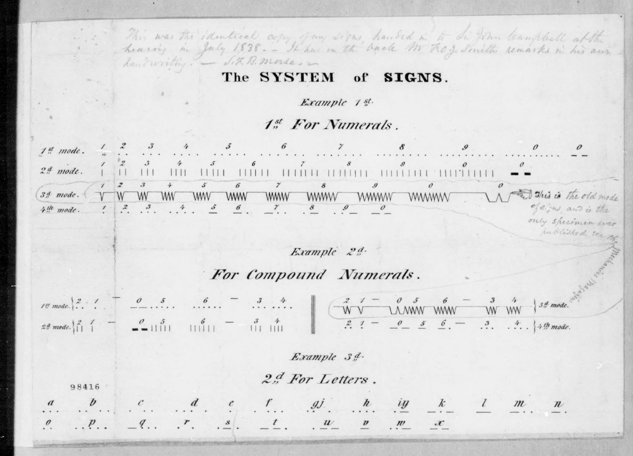
    Morse dots _1_I have only been able top locate a symbolic system of the code in published journal reports (and a newspaper article) showing a “V” system, as in the American Journal of Science and the Arts (vol 33 #1, 1838), which prints an image of the register, and shows a “specimen of telegraphic writing” using this “V”: so, “V   VV   VVV” governed by spaces of long and short intervals,  would stand for 1,2,3 or 123, or to some word designated “123” in a code book. (I should point out that this article is about half the length of the JFI article.) 

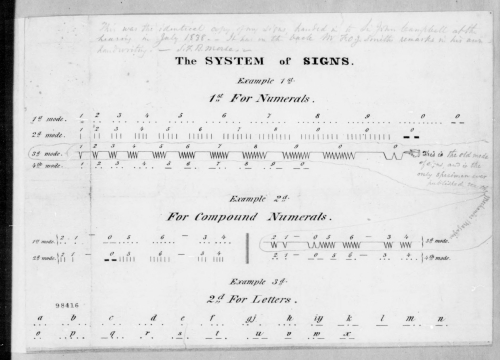
    What is surprising is to see what Morse himself had to say on this issue. Here are his notes on the system of notation, from the SFB Morse papers at the Library of Congress, Manuscripts Division, bound volume 28 November 1835-18 April 1838, page 154 (“Drawings to Accompany Copy of Caveat of Oct 6 1837”). The penciled note states “this is old mode of sign and is the only specimen ever published. See the Mechanics Magazine”.  It was also evidently published in the American Journal of Science and Arts at about the same time. There is no reference to the JFI report or the “dots” (or “1st Mode”).  It may simply be the case that at the time of his writing this that Morse was simply unaware of the JFI report, as the three appearances were all published at about the same time (within weeks of one another). 
    Morse system signs _2_

    The famous “first” telegraph “What Hath…”1  transmission (at least seven years after the true “first”) was made of a series of raised symbols corresponding to Morse’s dictionary. 

    I’m no expert in this field, but I haven’t been able to turn out any earlier use of the dots than this report. 

    Notes:

    1. The full quote, suggested by a young girl, was from Numbers xxiii, 23:

    “22…Surely there is no enchantment against Jacob, neither is there any divination against Israel: according to this time it shall be said of Jacob and of Israel, What hath God wrought!

    24 Behold, the people shall rise up as a great lion, and lift up himself as a young lion: he shall not lie down until he eat of the prey, and drink the blood of the slain.”

           2.  Reports of the Capitol demonstration were published in the American Journal of Science and Arts, vol 33, pg. 168, and then in the Mechanics’ Magazine (London) for 10 February 1838.

           3.  There was also an earlier attempt made at Morse’s New York (City) University on 2 September 1837, though this appears to have been unsuccessful. 
  • Word Images on the Longevity of Coal (1859)

    JF Ptak Science Books Quick Post

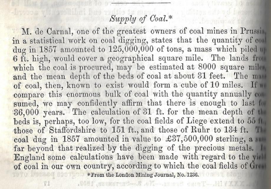
    In the last 24 hours I’ve come across two antiquarian outlooks on the longevity of the world coal supply after not having seen hardly anything of the sort written in the 19th century.  (The 20th century, even in its first decade or two, is another story.) The first was an article by the engineer John Ericsson, who wrote on the temperature of the heliosphere of the Sun in  Nature for 1871 (and came quite close) which led to an earlier paper from 1868 in which he hypothesized a short lifespan of coal and advocated for forms of “solar energy”. Then came this article from 1859 (in the month of publication of On the Origin of Species which hypothesized a much more abundant future for coal deposits, which the writer figured to be 36,000 years. Unfortunately his terms aren’t very well defined–was he addressing the coal production of Prussia or Europe or the world when discussing “the quantity of coal dug in 1857”? When stating “the lands from which the coal is procured” may be 8,000 square miles, did that mean an 8,000 square mile swath of Germany, or 8,000 square miles of mined coal in Europe, or etc.? New Hampshire is about 8,000 square miles, and the entire Prussian Monarchy was about 110,000 square miles, so maybe that meant packets of mining surfaces here and there? 

    I don’t know. But it was an interesting problem the writer set to work on, even though he didn’t really do the necessary work on the parameters or what the future might hold in reference to coal usage. The writer also painted several nice mental images in trying to visualize the great numbers involved with coal production and consumption.  Here’s the article in full: 


    JFI 1859 supply of coal

  • To the Moon on a Plume of U-235

    JF Ptak Science Books  Quick Post    

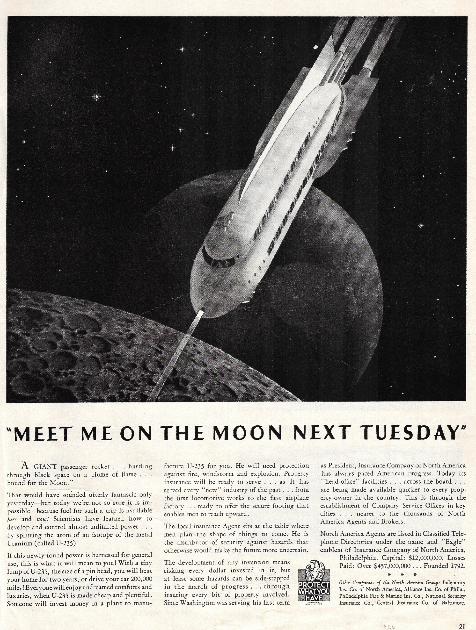
    This reaching image appeared as an ad for a life insurance company (?) in the pages of Life magazine for 1942. What the company latched on was the uranium isotope 235U (uranium discovered in 1789 by Klaproth and its radioactive state found by Henri Becquerel in 1896, 235U discovered by the mass spectrometer guy Dempster in 1935, and soon followed by the nuclear fission paper of 1938 by Hahn/Strassmann/Leitner) and how it would effectively be the power source (“cheap and plentiful) for, well, a lot, including cars and spaceflight. Anyway, the drawing is neat even if the Earth is way out of proportion, and so on:

    Space flight 1942

    ·Posted by :

    ·in:

  • An Episode in the History of Mud: Heavy and Stuck in 1918

    JF Ptak Science Books  Quick Post

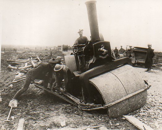
    What is this man smiling about?

    WWI steamroller full

    [Source: from the store’s WWI news service photo collection, 500 strong!]

    He’s satisfied or at least amused with his place there in the steamroller, rather than his soldier brothers who were trying (impossibly) to leverage the beast out of a shell-made muck hole. The guys on foot appear to  have had a comic sense of what their task was supposed to be. 

    ·Posted by :

    ·in:

  • The Wright Brothers at the Bottom of the Pile? (1909)

    JF Ptak Science Books  Post 2774

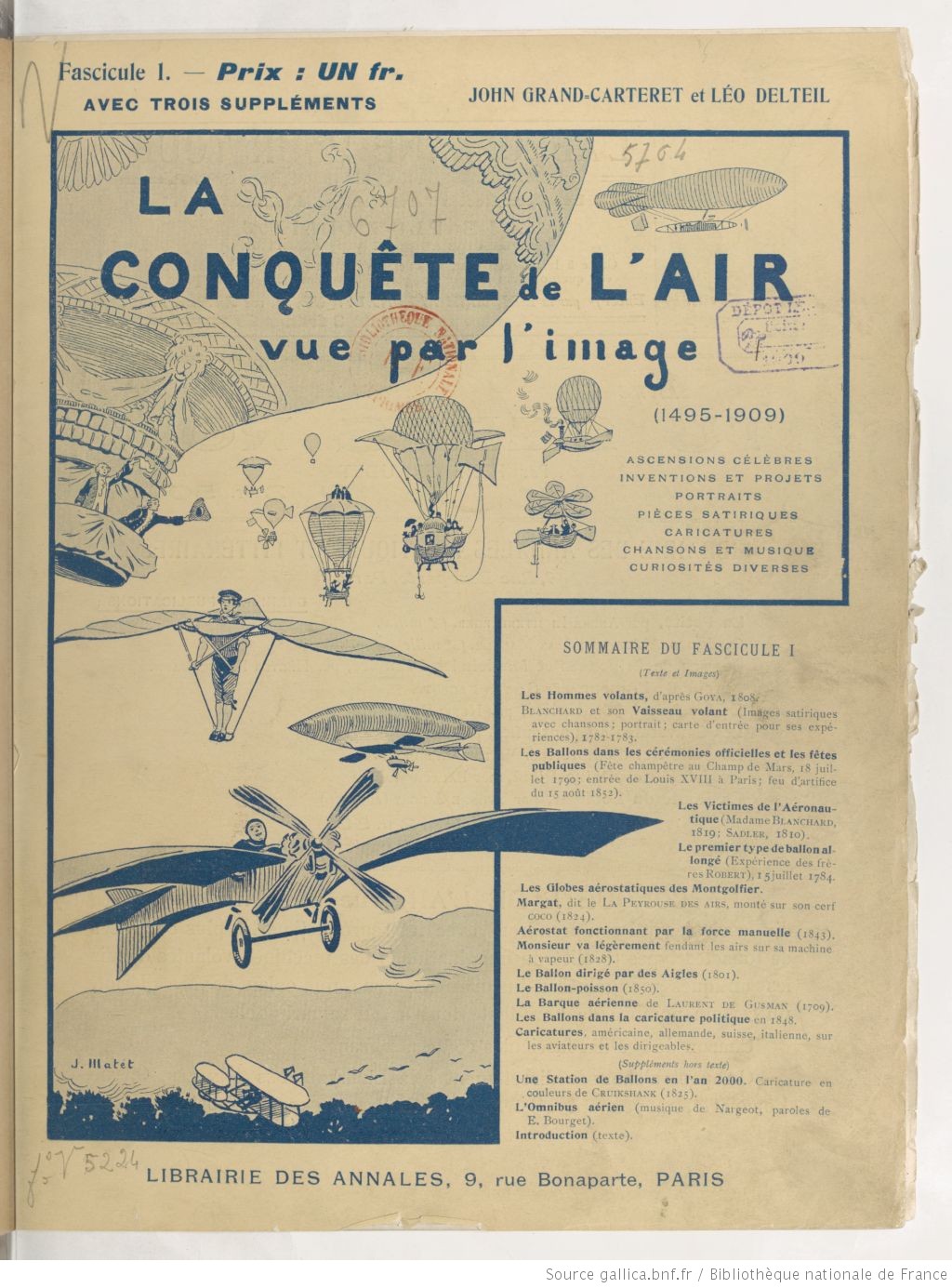
    Here’s a busy title page of an interesting fairly early aviation work published in 1909 by John Grand-Carterett  and Leo Delteil, La conquête de l’air vue par l’image (1495-1909) : ascensions célèbres, … The funny thing about all of the flying machines on the cover is that the Wright machine is way down on the bottom, and small.

    Aviation conquest of the air 1909The other thing about the Wright flyer: it fits in very comfortably with the only birds that are depicted o the cover. The brothers figured out that it was easy to get into the air; the hard part was staying there. And what kept you in the air was maneuvering the wings to control your flight—that was a mega-important realization, the inspiration for which came from watching birds in flight for some years on end. Anyway the French establishment in general was antagonistic to the Wrights, many people not believing that the Wrights had actually flown, and considered them fakers.

    The French in general were leading the field in flight in Europe, but in the year that this publication appeared, they still were nowhere near where the Wrights had been in 1902/3. The Wrights worked mostly privately with only a couple of skilled hands, accepting money from no one, financing everything from their bike shop. (In the end the brothers spent just slightly under $1000 to finance their entire undertaking, from theory to powered flight, including shipping and travel, to the end of 1903. Their counterparts in France for the most part were of some sort of money, and did not have to work a demanding job to finance their pursuit. Ion any event when the brothers were turned down again by the U.S. Army for a sale of their aircraft, they left in 1908 to pursue sales on the continent.

    Perhaps it was their secrecy which led to the French discontent, perhaps it was the relative nothingness that greeted their enormous accomplishment in the U.S. And perhaps that is why in 1909 their flyer is depicted as a smallish thing at the bottom of a page.

    The thing is that it was in 1908 that the Wrights became truly famous, finally showing their flyer before large crowds, and showing absolutely that their work was far superior to others in the field, that their aircraft was more maneuverable, and more dependable, and their flying skills were unsurpassed. Wilbur famously performed at Le Mans in France to help secure European contracts, and Orville at Ft. Myer for a performance for the U.S. Army. (Orville’s flight was successful enough, though one resulted in a crash that killed his passenger and severely injured him.) So this in hand in 1908, why are the Wrights featured in such a lowly position? Perhaps the cover design was contracted and completed before all of the 1908 successes? I don’t know—its just annoying that they are down there at the bottom of the page, when in fact they delivered a working Magna Carter to aviation.


    ·Posted by :

    ·in:

  • The Metropolitan Life Tower as a Unit of Measurement: (Air)Ships and 1700′-Tall Corn Cobs in the Skyline, Part 7 (1909)

    JF Ptak Science Books  Quick Post

    • This is a slight deviation from the Ships in the Skyline series: the first difference is that the “ship” is an airship; the second is that in the next example there is no “ship” at all, though the enormous sacks of agricultural goods pictured there are measured against the Metropolitan Life Tower, the standard of measurement used in the first example.

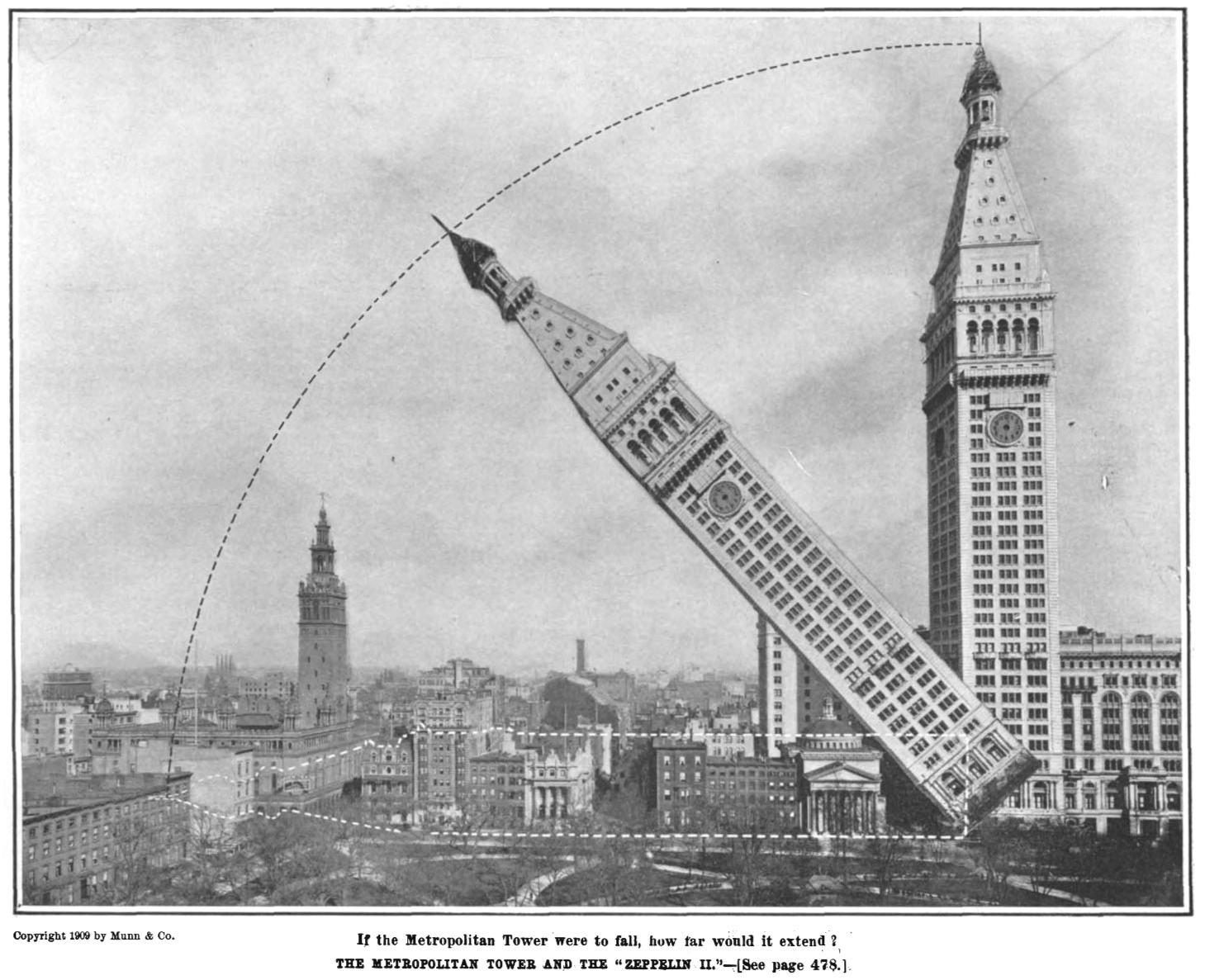
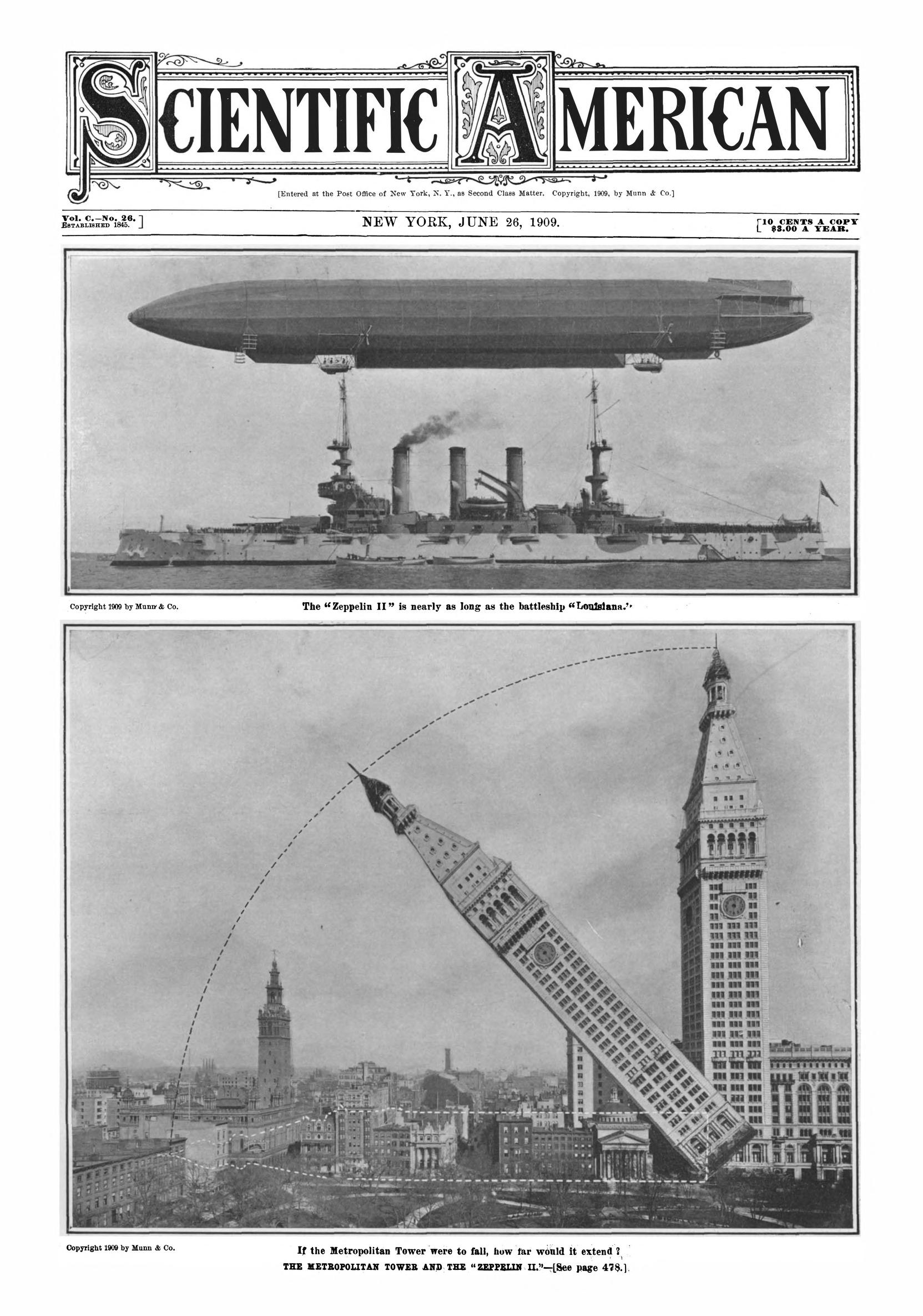
    This is another segment in the series of measuring newly-constructed monster ships against familiar architectural objects–like the Woolworth Building, Eiffel Tower, the Hoover Dam, and such–to use for a sense of perspective in judging the size of the naval wonders.  In this example, found in Scientific American (June 26, 1909) reckons another sort of ship–an airship–and in this case, it is the Zeppelin ZII being measured against the newly familiar Metropolitan Life Tower, which was just finished that year. (Unfortunately, the Zeppelin met with disaster, crashing jus tweeks prior to the publication of this image.) The Met Life building stood 700′ feet tall and was the world’s tallest from 1909-1913, when it was superseded  by the Woolworth Building. (Interestingly the Met Life was patterned after the companie of St. Mark’s Basilica in Venice (323′) which at about a thousand years old was patterned after the older-still St. Mercuriale.) The Zeppelin was 436′ long, which was an enormous flying machine in 1909, and more than 60% of the length of the laid-down tallest skyscraper.

    Here’s a variation on this measured comparison, an image category that I’m pretty sure I’ve not seen before–laying down a tall building:

    Sci Am 1909 Zepp in the skyline

    This is a detail from the front page:

    Sci Am 1909 Zepp in the skylineIn any event, this is a terrific image. 

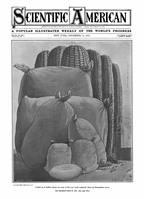
    And as long as we’re at it, here’s another data visualization from the same year of Scientific American, this one again using the Met Tower to compare the amount of barley, flaxseed, rye, buckwheat, potatoes, wheat, oats, and corn produced in the U.S., the output collected in gargantuan city-crushing burlap sacks and 1700′-tall corn cobs: 

    Sci Am 1909 MEauring Things

    The image was irresistible!

  • WWI Parade of Snow, 1917/1918

    JF Ptak Science Books   Post 2775

    WWI Snow PArade _5_

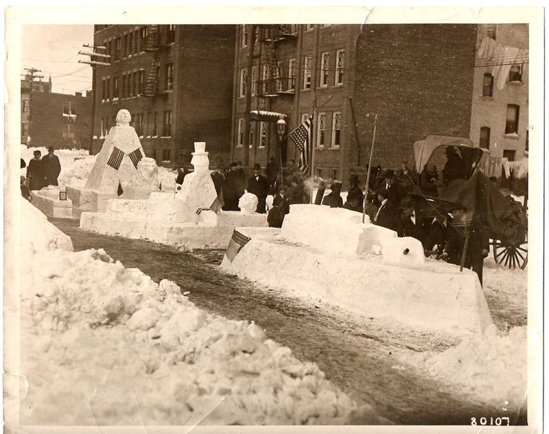
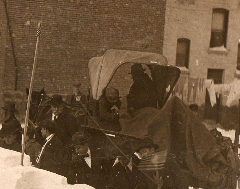
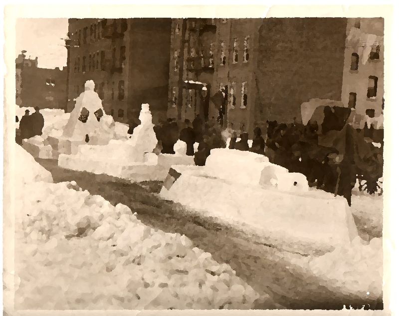
    This news photo service image–stamped “Hearst-Pathe News Agency” on the back–is from the winter of 1917/1918 and shows a patriotic snow parade somewhere in the United States.  The snow looks prodigious, judging from the piles in the foreground and also the accumulated snow on the windowsills, and I imagine that all of the snow floats were sculpted mainly out of exiting snow in the street.  It is a delightful scene, to me, and hosts a variety of smaller, lovely images in vignette. 


    WWI Snow PArade _5_


    The man in shadow and sleeping figure (boy) in the buggy complement the white-mustachioed bowler-wearing man to the left; the men looking on in the foreground are interesting, too–plus there’s that laundry in the background.  Given that the laundry is out (and wasn’t just left out during the storm) and that no one seems to be particularly bundled up against cold, I’m going to guess that there was a break in the weather that pushed the temperature higher than normal, with almost everyone taking advantage of the warm snap, as people do everywhere, all the time.  I also like the tiny American flag on the tall pole at left.

    ·Posted by :

    ·in:

  • The Sun in Type (1909)

    JF Ptak Science Books   Quick Post

    Typewriter Sun 1909This is a small 1.5″ ad that appeared in a premier issue of Scientific American, June 11, 1909. It is tiny and attractive, a sunburst design for a Sun typewriter, the text claiming that it wasn’t sold door-to-door but via paper advertising to save costs in production and delivery, offering it for what was then a discounted price of $40. That 40 bucks is equal to about $1000 now according to the inflation calculator at the Bureau of Labor Statistics site–better though perhaps to think of it in terms of monthly/yearly income: laborers earned about $300-$600 a year in 1910, whereas an engineer or accountant would make between $2000 and $5000 a year; that would make the machine somewhat expensive at about a week’s salary or less, but affordable.

    The address says to apply at 317 Broadway–the building is still there and a fine structure it is; presently the address is broken up on the ground floor and shared by a booze shop and pizza place, sandwiched by a 7-Eleven and a McDonald.

    (I say “premier” issue of the SA because the cover is dedicated to the Wright Brothers, the first such honor paid them by the magazine in over five years of mounting successes following their huge accomplishment at Kill Devil in December 1903. A fine acknowledging article appeared in 1908, but there’s precious little in the way of support to the brothers in the magazine between 1904 and 1908. This issue ended that drought.)


    ·Posted by :

    ·in:

  • Washington D.C. Smothered in Salt (1908)

    JF Ptak Science Books  Quick Post

    SAlt

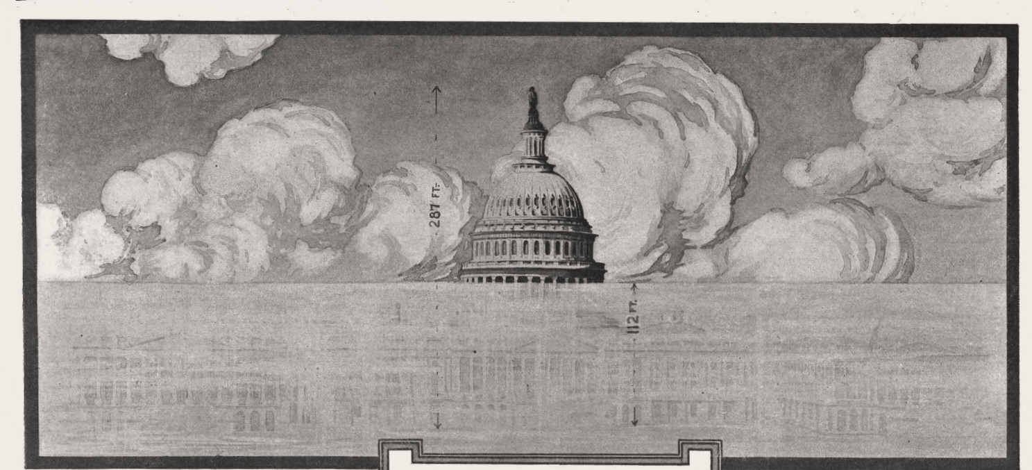
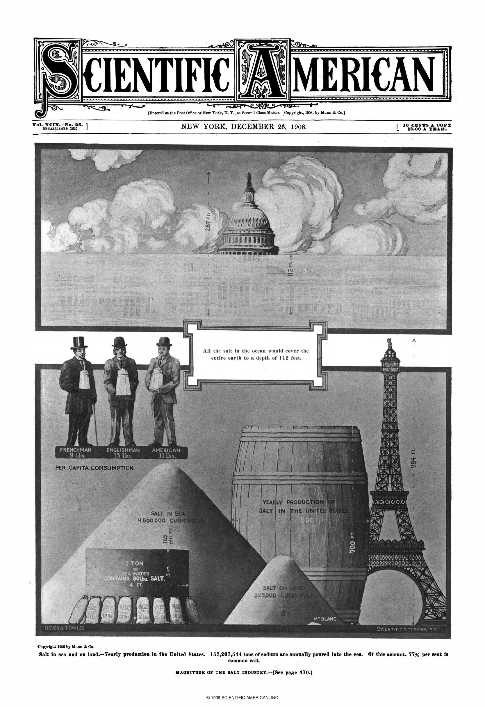
    This is a simple integrative and comparative display of information that has a decided and unexpected twist to it. The graphic is on salt and salt production, and appears in the Scientific American in December 1908, and it is in the top frame that I find the extracurricular attraction. Here we see the representation of what one part of the world–Capitol Hill in Washington D.C.–would look like it if all the oceans in the world were dehydrated:  the globe would be covered by 112 feet of salt. When I think of salt I can come up with the curative and ceremonial uses of it, plus as a wound disinfectant, an exchange unit, being the “salt of the earth”, and so on. But when I see the dome of the Capitol building being smothered by salt it becomes very Old Testament-y to me: Lot’s wife, putting salt in a wound, and of course the big one, salting your defeated enemy’s  lands to ruin their soil and force them to move on.  Anyway, that’s just me–the image puts me in a very J.G. Ballard/Drowned World  frame of mind. The rest of the graphic is pretty good, measuring salt production with an Eiffel-towered-sized barrel; but it is the D.C. image that is the most striking thing about this think-piece. Sci Am 1908  Salt in the sky

Recent Posts

Archives

Categories