A Daily History of Holes, Dots, Lines, Science, History, Math, Physics, Art, the Unintentional Absurd, Architecture, Maps, Data Visualization, Blank and Missing Things, and so on. |1.6 million words, 7500 images, 4.9 million hits| Press & appearances in The Times, Le Figaro, Mensa, The Economist, The Guardian, Discovery News, Slate, Le Monde, Sci American Blogs, Le Pont, and many other places… 5000+ total posts since 2008.

  • A History of Blank, Empty & Missing Things: Lipless Kissing in the Golden Age of Comics

    JF Ptak Science Books   Post 1077

    [A History of Blank, Empty & Missing Things, #78]

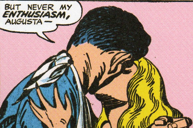
    Kiss 185
    The indefatigable team of Joe Simon and Jack Kirby (Joseph H. Simon, born 1913 and still going and Jacob Kurtzberg,1917-1994, respectively) produced some of the enduring heroes and ideas of the Golden Age of Comics. In capacities as comic book writers, artists, editors and publishers they knocked the bottom out of the creativity bin, affecting all manner and aspects of that industry, as well as  introducing the genres of horror and modern romance comics.

    And as necessary as it is scary, the nearly unrecognizable forensic pathology of the kiss in pink (above):

    Kiss--pink kiss det

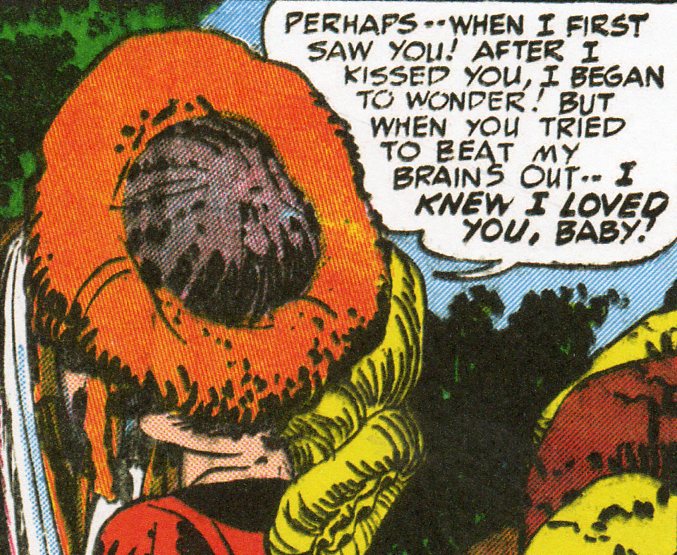
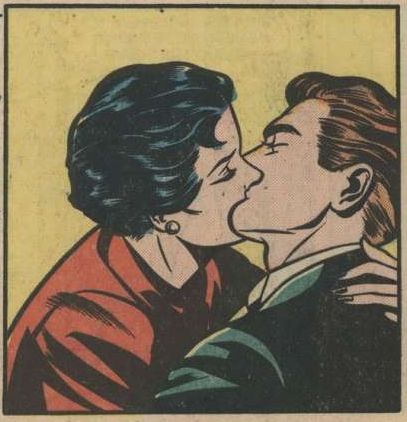
    I was initially drawn to their harsh colors,  blocky characters and un-magnificent dialog looking for wonderbits of non sequitor images and thought/word balloons populated with broken english.  They’re marvelous and easy to find, though I did get distracted by the unexpected part that I’m posting about right now–the missing, blank kiss.  Since they started the romance comics angles there’s plenty of 1940’s kisses to be found, but what I found was that although the kissing aspect wasn’t missing, the act of kissing was.  There’s plenty of heads smashed together that don’t leave a lot of room for faces, and in general it might be the sensitivities of the Golden Age’s age that cast away the kiss itself, their characters rushing face first into bad screen kisses. 

    Kiss 186

    There’s nothing wrong with this, and perhaps the kids never really noticed this, rushing to get ahead to the end of the confusing romantic interests.

    Kiss 187


    Kissing--comic book kiss

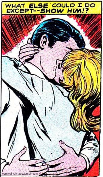
    Kissing--what else could I do

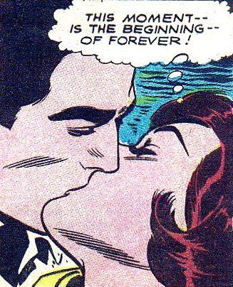
    Kissing--begining of forever

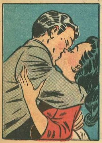
    There is a hint of a lip in this one, below, though it wasn’t supposed to be a passionate cheek kiss.

    Kissing in teal

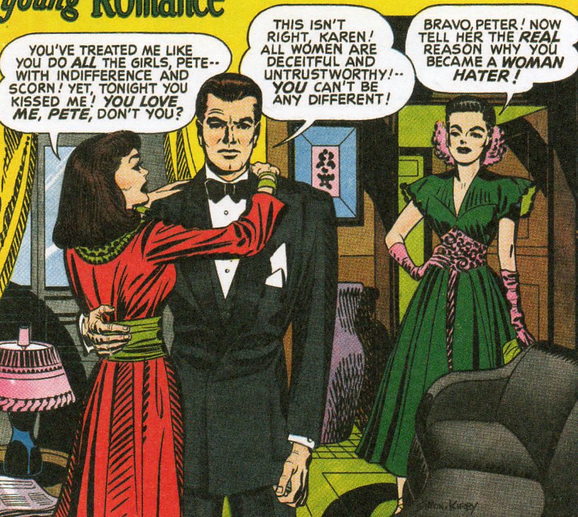
    This one has more to do with anti-kissing than anything else; I’m sorry that I don’t know what the “real reason” was….

    Kiss 189
      
  • History of Dots #29: Making Things Abstract and Concrete at the Same Time

    JF Ptak Science Books   Post 1078

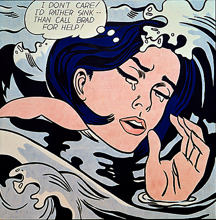
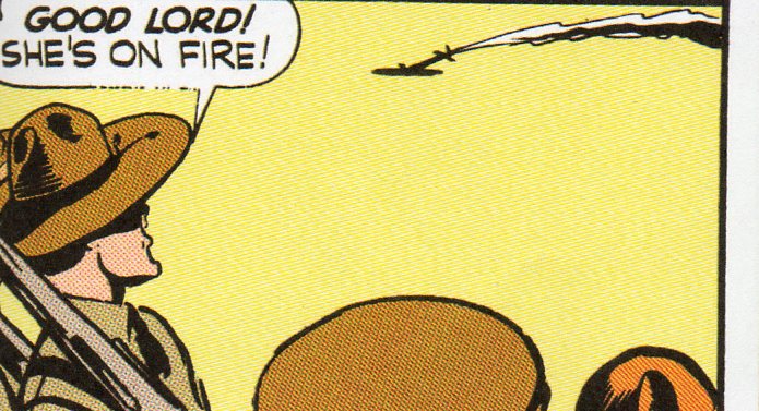
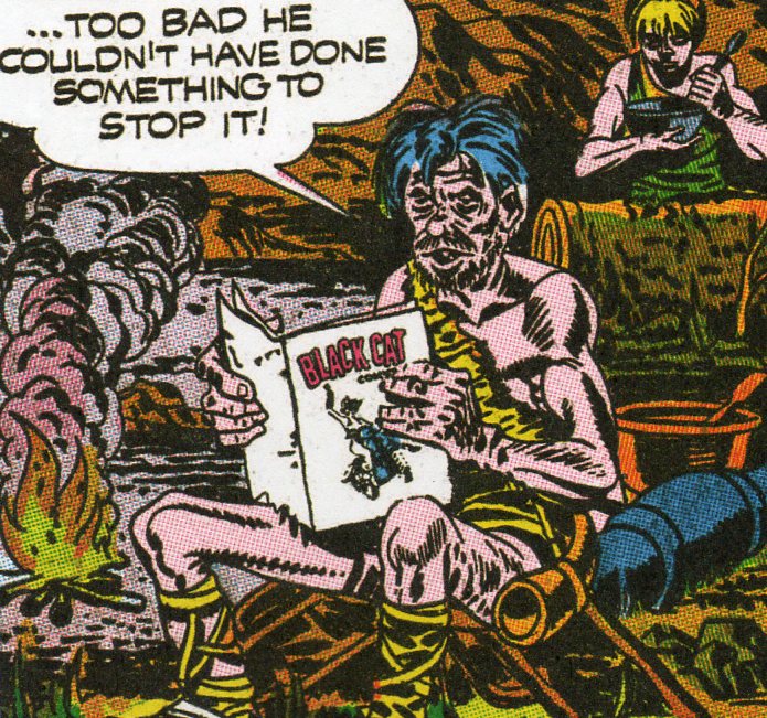
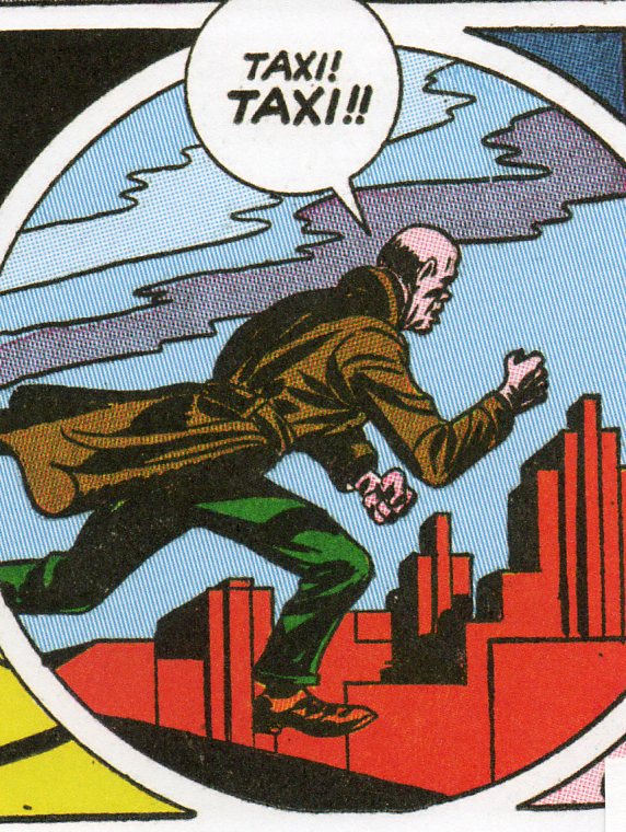
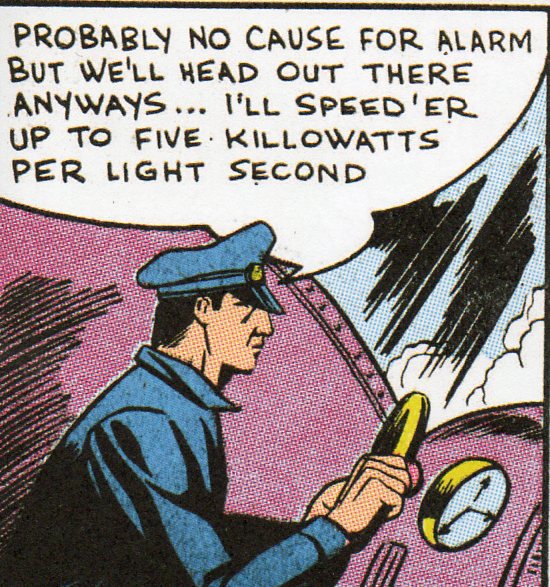
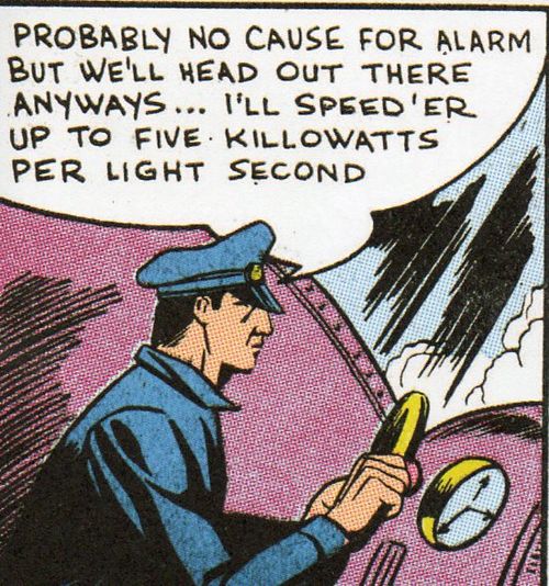
    [History of Dots series #29//Note: all images below except for Lichtenstein’s “Drowning Girl” are from Simon & Kirby comic books.]

    How are deep abstractions visualized?  Science and art were becoming
    more densely abstract at about the same time, the new modern age for
    both beginning 1905-19301 or thereabouts, when so many of the
    revolutionary advancements were made.

    Non sequitor193

     The representational world of art was slipping and disappearing (with the beginning of Cubism(s), Dadaism, De Stijl, Abstract and so on), replaced by forms and shades and colors, the subject of the art becoming less and less recognizable  as “things” until, finally, the recognition of the general stuff of nature (except for color) was gone.  Light, the interaction of molecules, the motion of atoms, were all becoming less comfortable as visual images and were being represented in terms of mathematics 

    How do we get to Roy Lichtenstein from here? I think that it is via abstraction and his connection to  the found non sequitor2 of the speech balloons in comic book images.  Lichtenstein’s style is very heavily derived from comic books and strips, except that he painted his images based on Ben-Day dots, strong lines and ultra-vibrant primary
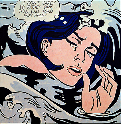
    Lichtenstein_drowning_girl colors of Golden Age era comics.  And I must say that his work–in images and in captions–seem much less non sequitor than the enormous amount of these things that you can pull out at random from the history of comic books–that is, one can still see where the frames that he was painting came from in the sequence of the comic book story.  It seems more interesting to me if the one frame being depicted could mean absolutely anything, and that the story line was completely obliterated, sop that this one frame out of context really had no context at all.

    Lichtenstein’s style came about around the time that he started teaching at Rutgers, and in short order–in less than five years–he had a solo show at Leo Castelli Gallery (1962). His work was instantly recognizable, a true Popular Art, almost everyone having some sense of recognition for the origin of his artwork.  Beyond that, and whether his art was seen as art, is another story3.
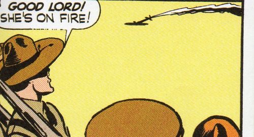
    Non sequitor191

    But what I’m trying to get at here is this: did  Roy Lichtenstein create a template of  an abstract dialogic equivalent in a concrete, non-abstract way of the non-representational creation of Kandinsky and Braque and Mondrian?  Are the Ben-day dots that are the foundations of Lichtenstein’s style–and the images that can be simply found in comics from the Golden Age–the very concrete bits that compose a very concrete, non-abstract image-with-text that is totally recognizable but without any apparent meaning?  Just decades after dots–the compositions that were normally used to visually introduce ideas in physics and astronomy and chemistry and biology–were abandoned as the visual signifiers of enigmatic and increasingly-abstract domains, they were adopted as the foundation stones for an art that moved in the opposite direction from abstraction, except that its message was anything if not abstract.    

    I think that it is in this way that images of Schroedinger’s cat should’ve been illustrated using the Ben-day dot method, plucked from the pages of a Golden Era comic, all basic red, yellow and black, the uncertain image never at rest, always with the possibility of being the same and not the same, its great and simple representation having not necessarily anything at all to do with its message, a concrete thing that is totally abstract.
    ____________

    Notes

    1. You could break this period out a bit, expanding it from, say the pre-Impressionists (1860 or so) to the period just after Abstract art and the introduction of the new quantum theory (again, say 1930). Epochal changes took place across the sciences, medicine, the arts, literature….virtually everything. I cannot think of any period in intellectual history that approaches this 70-year period. Actually, the gargantuan changes can be shaved down to the period of Einstein’s living memory beginning with the stunning discovery of Roentgen’s x-rays in 1895 to the invention of non-representational painting in 1911. But for the larger piece, the longer time reference, we have Roentgen, Poincare, Boltzmann, Planck,  Strindberg,  Schoenberg, Cezanne, Seurat, Picasso, Braque, Leger, Joyce, Woolf, Malevich, Duchamp,  Kandinsky, Klee, Bohr, Heisenberg, and. Einstein–to name just a few–of the folks making monumental changes in their field. 

    2. By “non sequitor” I simply mean to say that the image, or text, or both, when pulled out of context, when removed from the story line, are almost entirely without reference to what happened before the panel or what would happen next.

    3.  Maybe Lichtenstein is art, maybe not.  Another art, Art Spiegelman,  commented that “Lichtenstein did no more or less for comics than Andy Warhol did for soup”.  Maybe so. :ichtenstein did say this about his own art:”I think my work is different from comic strips- but I wouldn’t call it transformation; I don’t think that whatever is meant by it is important to art”.http://en.wikipedia.org/wiki/Roy_Lichtenstein#cite_note-rlf-Coplans-1

    This might all seem terribly wrong, and maybe–worse yet–it might seem like nothing at all.  Perhaps if it were nothing it would be more appropriate, in keeping with what Lichtenstein said about his own work, what seems to me to be an inscrutable nothingness: “”The closer my work is to the original, the more threatening and critical the content. However, my work is entirely transformed in that my purpose and perception are entirely different. I think my paintings are critically transformed, but it would be difficult to prove it by any rational line of argument”.

    Non sequitor192 


    Non sequitor194
    Non sequitor195

    Non sequitor196

    Non sequitor197 Non sequitor198
     

  • Welcome (Again!) Jezebel Readers! (On the History of Women)

    I’m happy to report that one of this blog’s “History of Women” bits has  been posted on one of  the top-25-popular websites, Jezebel.  I thought that this was the ninth post from here that they’ve shared, but I can only find six. Jezebel is a wide, varied site with considerable interest.  Have a look and have fun!
    The
    Hidden, Mysterious Kisses In Vintage Comics


    Over on John F. Ptak’s site, there’s a post about what

    kisses looked like in the Golden Age of Comics.
    Hint: Lipless and faceless!  Views: 3,8413,841 views on this post, 60 new visitors 
    Comments: 62


    Girlie
    Shooting Gallery Is A Terrible Party-Game Idea


    An innocent Life magazine photo of dinner guests aiming
    harmless toy rifles — so nostalgic, so quaint! Actually, no. Not at all.
    More » Views:5,4115,411 views on this post, 87 new visitors Comments: 30


    The
    Average Housewife’s Workweek: Staggering Since 1947


    “35 beds to be made, 750 items of glass/china and 400 pieces of
    silverware to wash, 174 lbs. of food to prepare, some 250 pieces of
    laundry” — it added

    up to some 100 hours of joy per week. [PtakScienceBooks] Views:3,508 Comments: 69

     
    Click here
 to read A History Of
 Fainting Spells, Headaches, And Sexual Indifference


    A
    History Of Fainting Spells, Headaches, And Sexual Indifference


    “The manual is a codex of denial, submission, ignorance, boredom,
    tiredness, exasperation and triviality so far as sexuality is concerned
    for women—there is no hint of pride, or of enjoyment.” It’s a vintage
    medical hard sell!Views: 4,9654,965 views on this post, 240 new visitors Comments: 23 


    Giant
    Woman Sets Hemline Record!


    We’re not arguing with the

    claim that this image demonstrates “what must be the female record
    for the most distance between the ankle and the hemline.” But the nifty
    hemline chart has us sold.

    Views: 5,1635,163 views on this post, 74 new visitors Comments: 4


    Click here to read "Did You Give Him A
 
Chance To Impress You?"


    “Did
    You Give Him A Chance To Impress You?”


    Writer John Ptak has
    posted 1940s Ladies

    Home Journal piece that instructs young women on date conduct.
    The response of Ptak’s 17-year-old daughter? “It was simply beyond
    listening to…and certainly not anywhere near worthy of a response.”Views:3,9893,989 views on this post, 14 new visitors Comments: 34


  • The War of the Diagonals: Mondrian, Van Doesburg and Star Trek

    JF Ptak Science Books  Post 1079

    In a world constructed of nothing but right angles in horizontals and verticals,  how would a diagonal fare?

    Would it be like extraordinary confusion and then recognition of a sphere in a flat two dimensional world (as in Edwin Abbott’s Flatland), or would it be an astonishing moment of discovery like Robert Hooke’s Micrographia images, or a creeping, sweeping acknowledgment of first-seen perspective in Paolo Uccello? 
    De Stijl Mondrian_CompRYB
    In the case of the cubist Piet Mondrian, it would be revulsion and disgust.  Mondrian helped establish1 De Stijl (1917or thereabouts), with a philosophy of using lines to transform artistic thought onto canvas, and the lines were all horizontal or vertical, with square and rectangular shapes. These would represent the pure harmonies of expression, along with the primary colors as well as black and white. 
     

    Mondrian wrote “:… this new plastic idea will ignore the particulars of appearance, that is to say, natural form and colour. On the contrary, it should find its expression in the abstraction of form and colour, that is to say, in the straight line and the clearly defined primary colour.”

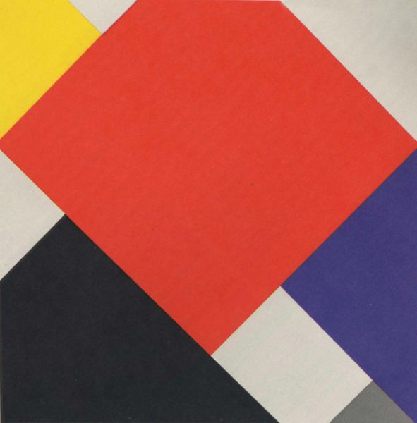
    Stijl co-founder, popularist, artist and editor of the movement’s journal, Theo van Doesburgh and his work (1924) introduced diagonals into the horizontal/vertical field in his painting “Arithmetische Compositie” and Mondrian quits the group.Van Doesburgh felt that the diagonal was more vital and important than the vertical and horizontal.  Mondrian felt that this was wrong, and clearly raked the original ideals of De Stijl, and so quit the movement, which he felt to be compromised by one of its co-founders.
    De Stijl van_Doesburg_Counter-CompositionV_(1924)
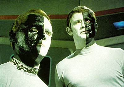
    I can certainly appreciate Mondrian’s need to go; though, honestly, what the debate and reticence reminds me of is an episode from the original Star Trek series, “Let That Be Your Last Battlefield” (1969).  The story is about an intractable difference between two seemingly identical factions of the planet Cheron2–it turns out that the differences between the two sides is a physical one that was inconsequential to the crew of the Enterprise, but of all-consuming importance to the Cheronites.  They were both white and back, their skin color cleanly halving  their bodies on the vertical.  But the “inconsequential” difference was that one person was black on the right side and white on the left; the other was the opposite.  It was this difference that led to their planet-wide schism and abandonment of each other. 

    Its no wonder that the writers of that episode chose the name “Cheron”, which is another accepted spelling of “Charon”, the Greek ferryman who transports the dead to Hades.

    Bele_lokai That’s where this particular schism falls to me, though to those involved I’ve no doubt that the differences were as significant as 2D vs. 3D and flat perspective vs. real perspective, the blatant if not micrographic differences looming mighty small to everyone but those involved. 
    ______
    Notes

    1. In 1917 it was Mondrian who coined the term Nieuwe Beelding (“the New Plastic”) , or Neo-Plasticism, from which De Stijl took its meaning.  He set out the philosophy of the group in that same year in a series of twelve articles in the group’s journal, De Stijl

    2. From Wikia Entertainment:  “Cheron is a Class M planet located in the southern region of the galaxy near the Coalsack, which once supported a humanoid civilization of Cheron natives. In the 23rd century, the area of space was largely unexplored by Starfleet, so the race was previously unknown to the Federation.”

    ·Posted by :

    ·in:

    —
  • Human Bombs, part II: the Ohka and Jinrai Butai, 1944/5

    JF Ptak Science Books   Post 1080

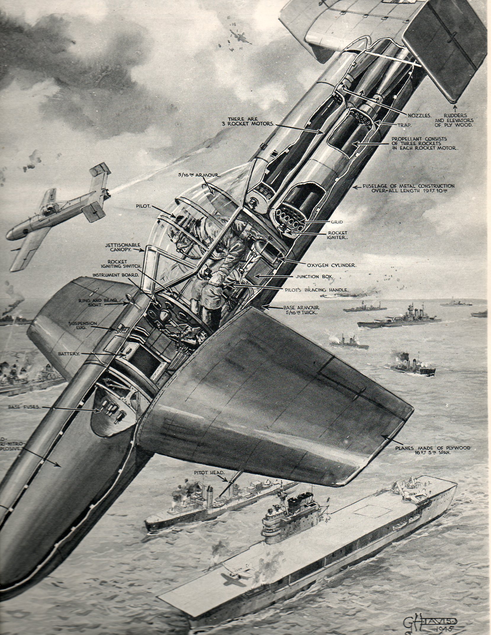
    My favorite mid-century illustrator–G.H. Davis of the Illustrated London News–has provided yet another remarkably clear and well-designed series of images on a difficult topic for a main-line popular audience.  This time (appearing as a two-page spread on 28 July 1945 in the ILN) showed the structure, strategy and deployment of one of the late war’s

    Human bomb japan202

    most feared weapons–the jet-powered human bomb of the Japanese naval air force. (In practice though the weapon didn’t produce that must damage though it did produce the fear: “the operational record  includes three ships sunk or damaged beyond repair and three other ships with significant damage; seven US ships were damaged or sunk by Ohkas throughout the war”1).  The Yokosuka MXY-7 Ohka was a purposefully designed and built rocket powered suicide rocket whose sole purpose was to attack and destroy ships. They were first produced in 1944 as unpowered glider aircraft, and then later in November 1944 the rocket propulsion system was added.  All tolled, the Yokosuka and the Kasumigaura Naval Air Arsenal together built about 850 of them–fewer than 3 dozen survived.

    It was a relatively simple construction and was easily deployed: dropped from a bomber it would glide until near it target and then the rockets would be ignited, powering the thing to a near-unstoppable 500+mph, sending it, its pilot and the 2,300 lb ammonal warhead (an explosive made up of ammonium nitrate, trinitrotoluene (TNT), and aluminum  powder) into its target, detonating on impact.
                                       

    ·Posted by :

    ·in:

    — —
  • Quantitative Display of Information: What was Left of the Japanese Navy, 1945

    JF Ptak Science Books  Post 1082

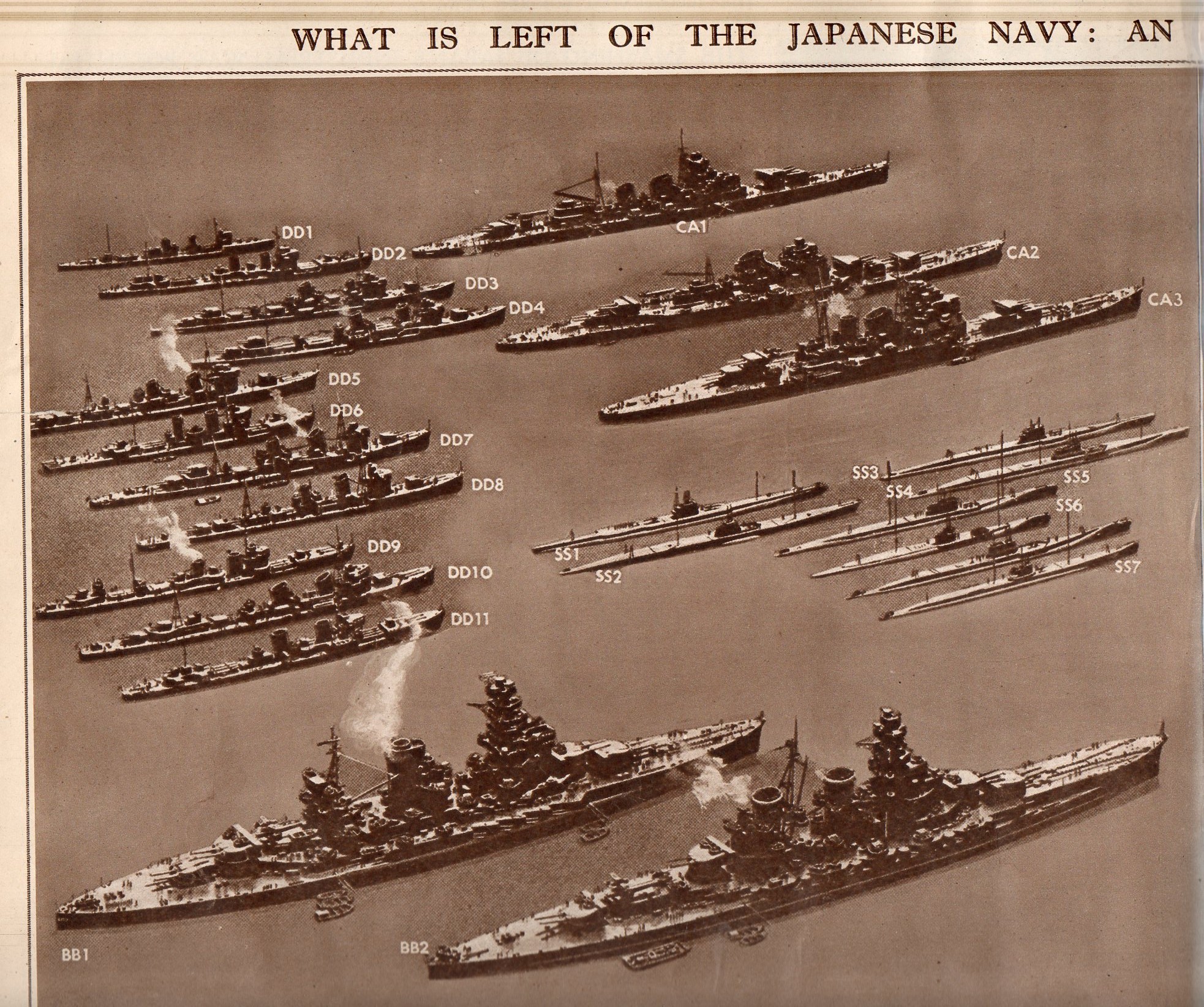
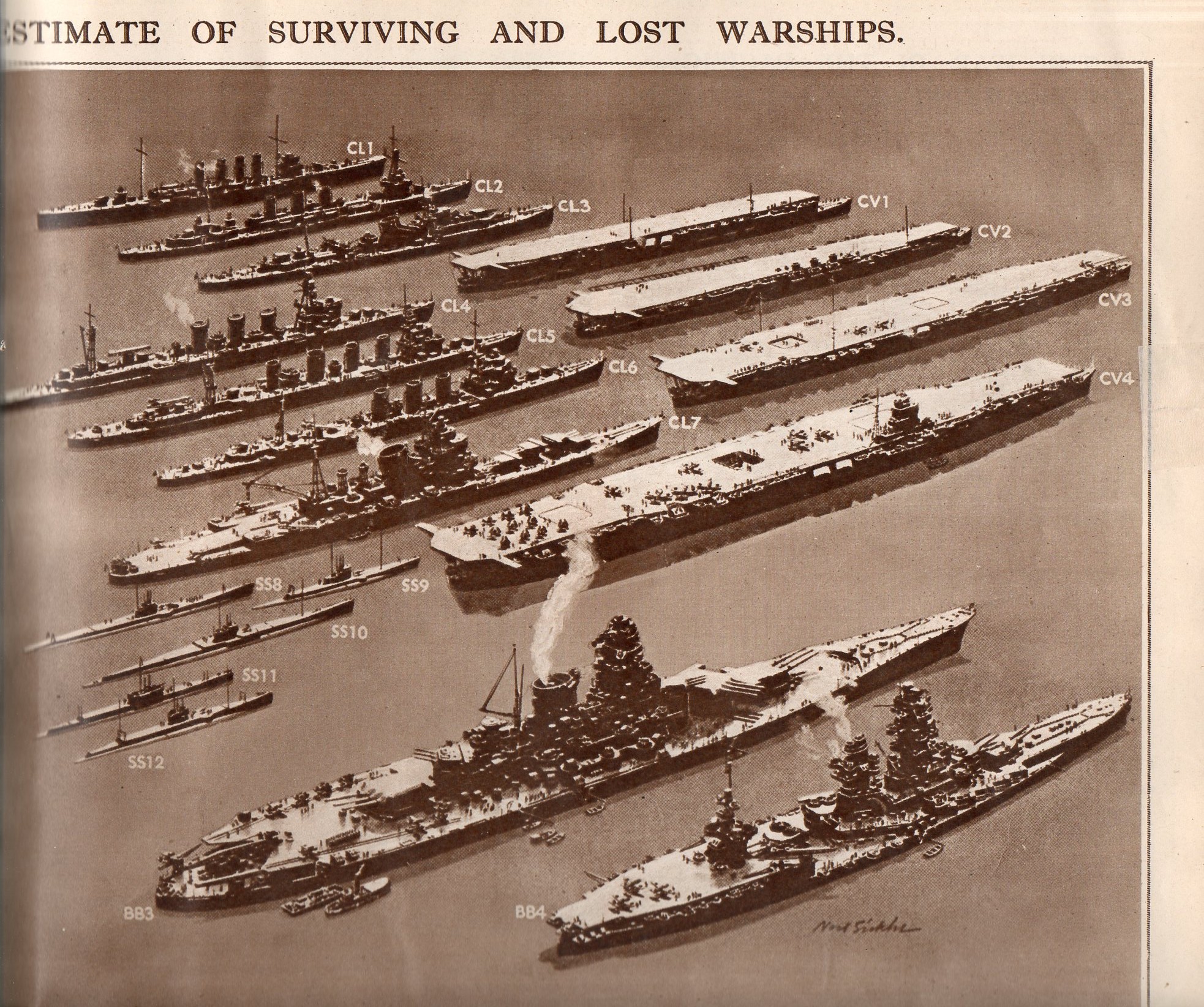
    This double-page spread in the Illustrated London News for 28 July 1945 displays what was left of the Japanese Navy.  Originally appearing in LIFE magazine a few weeks earlier, the image represents classes of Japanese naval ship, multiplied by the estimated number of ships in that class.  Even after all of the great  losses of 1942/3, the Japanese Navy was still the third largest afloat. 

    The navy consisted of an estimated 10 battleships, 6 carriers, 15-30 cruisers, 60-80 destroyers,and an not-estimated number of subs (though there were at this point use din patrol and to accompany the fleet.  

    This is an excellent display of a significant amount of historical data, made quickly understandable to even a quick reader, or even to a non-reader.  Two weeks from this date would find this information moot.

     Japanese Navy 1205 

    Japanese Navy 2206

    Japanese Navy 3207

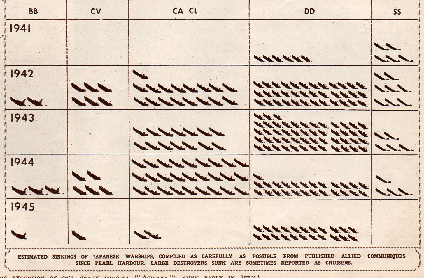
    This chart shows the numbers of each class of vessel sunk by year:

    Japanese Navy 4208


  • 50,000 Watt Design: WLS Station Catalogs, 1938

    JF Ptak Science Books     Post 1084 

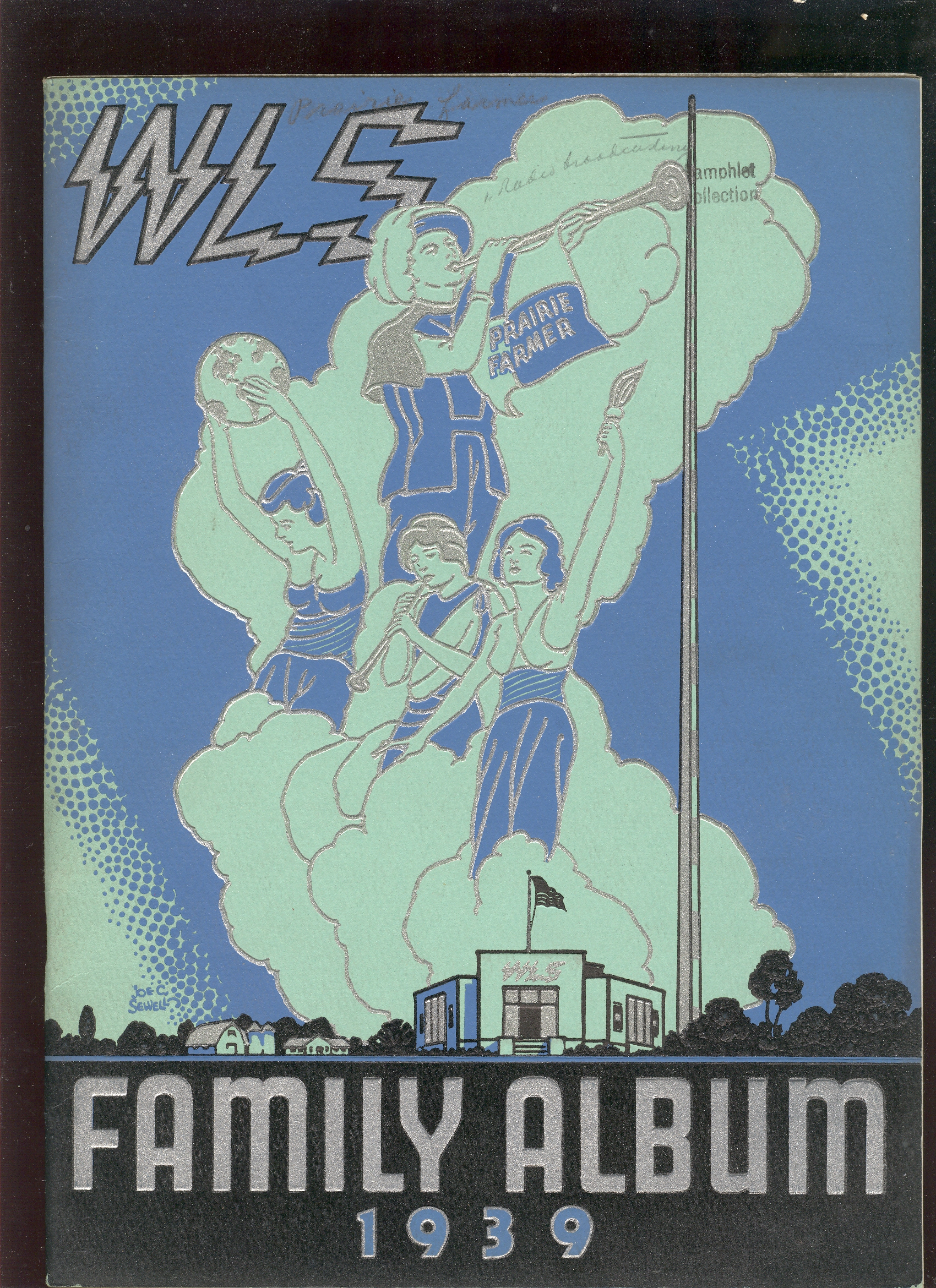
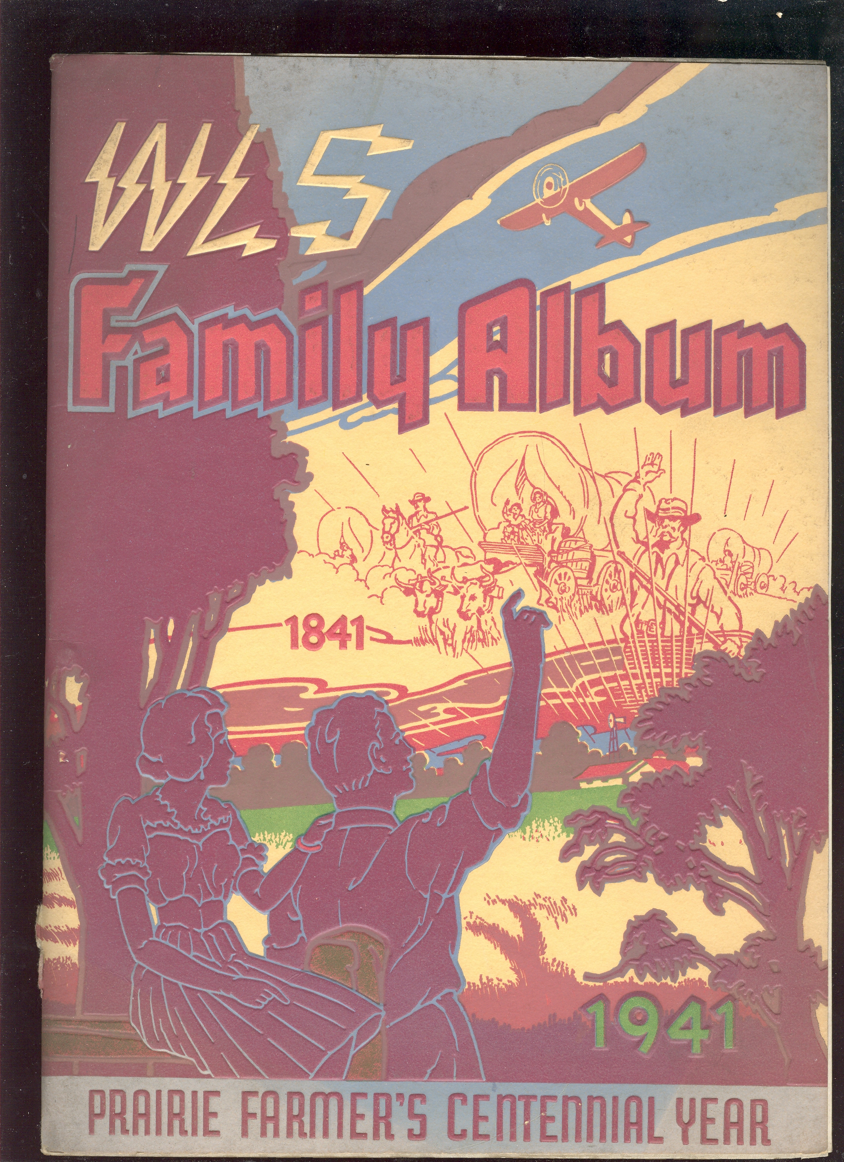
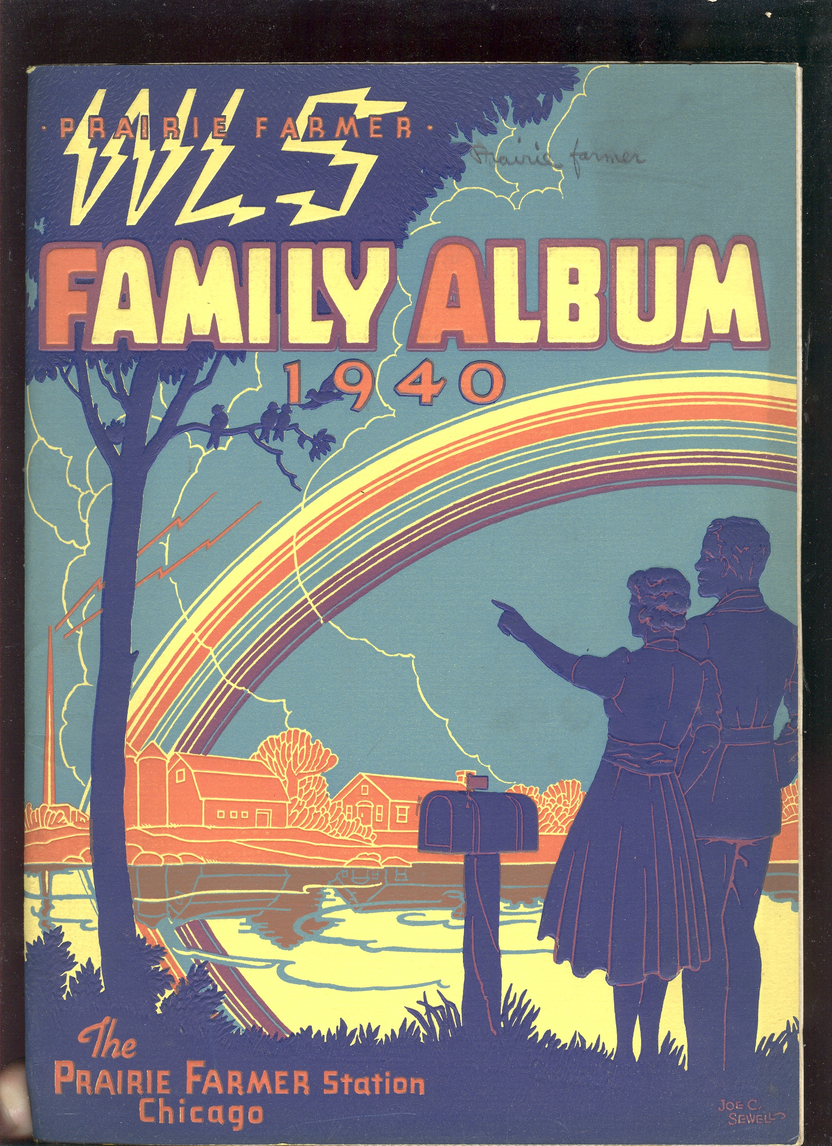
    Radio station WLS of Chicago, the home station of Sears, Roebuck and Company, and named for it (“WLS” is “World’s Largest Store”) is an old, famous station, home of ideas  burnt into the memories of folks within the broadcasting range of the station, stretching west to Colorado and southeast to North Carolina.

    I just wanted to share these four annual “family albums” published by the station between 1938 to 1941–they are lovely and elicit a certain hopefulness of those great high days of radio.

    ++00++ 9.23 wls 1938

    ++00++ 9.23 wls 1939

    ++00++ 9.23 wls 1940

    ++00++ 9.23 wls 1941

    ·Posted by :

    ·in:

  • Curious about Our Books?

    Don’t forget that we sell most of what you see here in this blog, plus many thousands of things more.
    + book guys reading
    See our Blog Bookstore (which has selected items with longer, illustrated description) and the general bookstore (which has much, much more). 

    ·Posted by :

    ·in:

  • The Road to the Economic Abyss: Visual Display of Quantitative Data, 1909

    JF Ptak Science Books  Post 1084

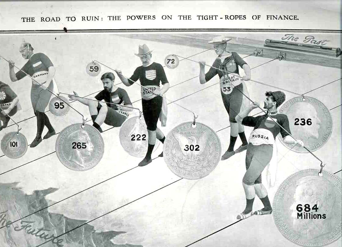
    The road to ruin is one of the oldest roads known to humanity; and, come to think of it, it was probably a road before roads existed, just an idea waiting for something concrete to show up and claim for its metaphor.  But certainly ever since the creation of money came (1) the need to have more, (2) the need to get it, in some fashion and (3) the possibility of losing it (though not necessarily in this order).  This image from the 4 September 1909 issue of The Illustrated London News is one in a long, ancient series of appreciating the way to financial doom, although this one happens to be a relatively early attempt at showing this idea via popular metaphor in the visual display.  And its pretty effective, too.
    00-blog-Oct 27 economic road to ruin938

  • “Woman Bagatelle”, ca. 1905

    JF Ptak Science Books   Post 1085

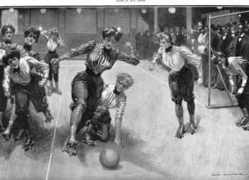
    I’m not sure why these women needed roller skates for this sport, but I guess that they were necessary for the good of this cross-“sport” between soccer and hockey.  The women put their hair up and got down to business, pushing the ball forward to the somber delight of the male audience.  I must say that I was attracted to this image because of the word “bagatelle”, which was nomrally reserved at this time to describe table-top marble game, a sort of passive pinball.  And perhaps that’s all this was, to the spectators, men rarely getting a chance to see women in such exertions, wearing so little. 
    File0180

  • Beautiful Title Pages: the Flight of the House of the Virgin Mary, 1524

    JF Ptak Science Books   Post 1086

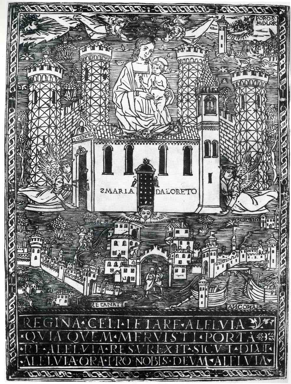
    00-blog-Oct 25 mary flying919


    This is an interesting,
    almost (?)-revolutionary and curious woodcut depicting the flight of
    Santa Maria
    di Loreto, and was printed in 1524.  At the bass of it all the
    print depicts the first of a series of moves of the house of the Virgin
    Mary (mother
    of Jesus) to safe harbors, away from the Moslem/Turkish army that
    invaded
    Nazareth in 1291.  The myth states that
    the structure was picked
    up and moved by angels from
    Nazareth to the Dalmatian town of Tersatto (near Fiume, which is today’s Rijeka, Croatia).  It then made its way to its
    final resting
    place at Loretto, Italy via the two other Italian towns (identified at the bottom corners of the print) of Recanati and Ancona.

    One of the most interesting aspects of
    the print to my eye though is its attempt to display an oblique perspective of the
    town of Loretto, the house being lowered by angels on the other side of the town’s fortifications.

     (In 1854 Pius
    IX consecrated the house as a miracle in his Bull “Inter Omnia” of 26 August 1852, declaring

    “Of all the shrines consecrated to the Mother of God, Immaculate Virgin,
    one is in first place and Shines incomparable radiance: the venerable and most
    August House of Loreto … (…)
    In Loreto, in fact, it venerates the House of Nazareth, so dear to the Heart of God, and
    that manufactured in the Galilee, was
    later (moved) from foundations, and for the divine power, was
    transported
    far beyond the seas, first
    in Dalmatia
    and then to Italy. “
    And it was for this enormous feat of air travel that Pope
    Benedict XV declared St. Mary the patron saint of aviators, on
    24 March 1920.)


    ·Posted by :

    ·in:

    — — —

Recent Posts

Archives

Categories