A Daily History of Holes, Dots, Lines, Science, History, Math, Physics, Art, the Unintentional Absurd, Architecture, Maps, Data Visualization, Blank and Missing Things, and so on. |1.6 million words, 7500 images, 4.9 million hits| Press & appearances in The Times, Le Figaro, Mensa, The Economist, The Guardian, Discovery News, Slate, Le Monde, Sci American Blogs, Le Pont, and many other places… 5000+ total posts since 2008.
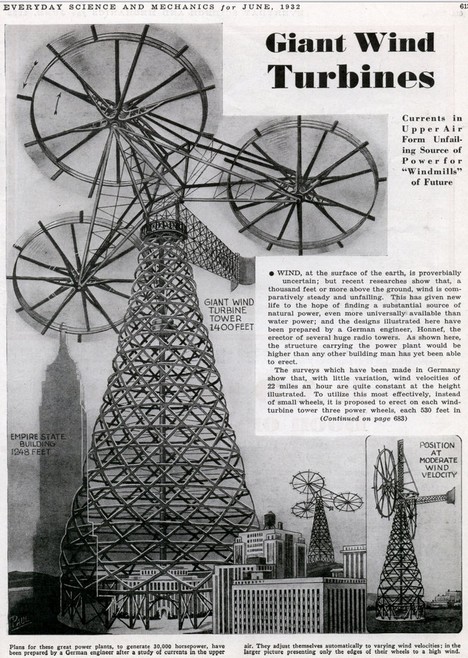
Here’s a big idea: a fantastically oversized, super-heavyweight wind turbine from 1932. This monster was 1400 feet tall, fully 700 feet taller than the tallest modern wind turbine. Actually, by conjecture, it looks as though the wind collecting units (or blades, or whatever these things are) might be 250′ long just by themselves, forming collecting space over 500 feet wide. So that’s six blades at 250′ each per collecting unit, times three. 18 250′-foot long blades per structure. It feels as though you could ride this thing to the Moon. I have no idea how much the structure weighed.
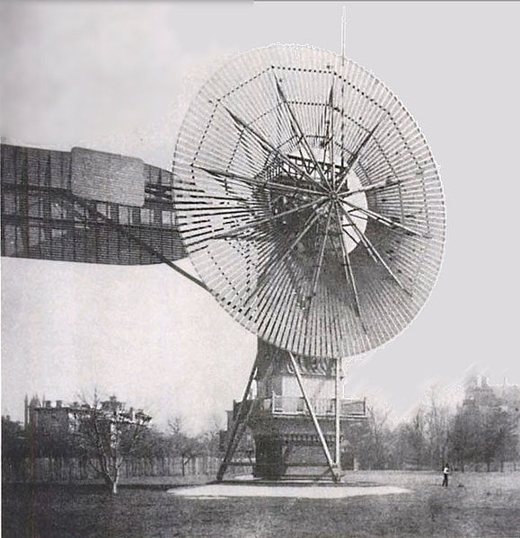
For comparison’s sake, here’s a photo of the first successful wind turbine:
Charles F. Brush’s 1887 accomplishment, built in Cleveland (Ohio) was 60 feet tall and weighed 4 tons. The beast above would have single blades that were four times the size of this entire structure. (Or thereabouts–the 60′ tall thing doesn’t look quite right in this photo, seems to be somewhat taller.)
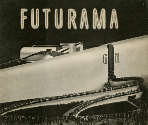
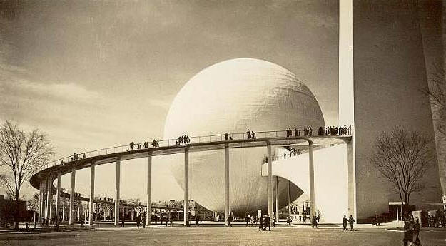
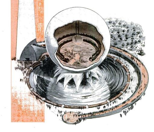
The 1939 World’s Fair in NYC famously exhibited a spherical attraction that exhibited a semi-robotic display of what the future would be like–a future that was only 21 years away, in 1960. There would be an enormous amount of weight on the shoulders of 1960, given what the World’s Fair had to say about it in 1939. Few things were very right, and many of course were necessarily wrong–but that must be the case when looking into the short-ended future with a monstrous amount of anticipation. That–and since this was a feel-good celebration–nobody was talking about the world war that had already started.
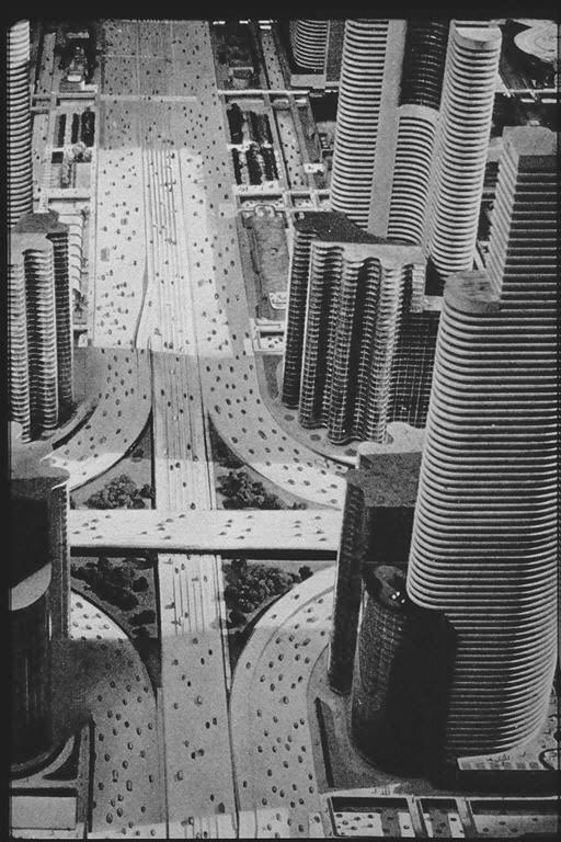
One thing is for sure–the pavilion’s creator, General Motors, did foresee that highways and automobiles will be in high demand up there in the tomorrowland of 1960. The display was designed by the fantastic Norman bel Geddes, who actually expanded on his superhighway theme in the next year with his book Magic Motorways (which can be read here). Anyway people were very excited by the whole affair–waiting in line for a few hours, winding their way through the pavilion to take their seats in a circular gallery overlooking a vast and complex assemblage of miniature societal models, the seating arena rotated to give the viewers views of the entire display. More than 26 million people saw the display over a six month period.
26 million is a big number. Futurama drew as many people in six months as the three New York City baseball teams (the Yankees, Giants and Dodgers) brought in for almost the entire decade. It is also equal to all of the deaths suffered by the Soviet Union during WWII.
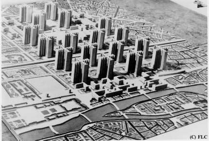
I guess this was as good a vision as any–or at least it didn’t seem to involve very much planning outside the new automatic automobile nervous system that would leech into the life-blood of the country. Other planned visions of the future do not look quite so good. For example, Le Corbuser’s demolition of central Paris to make way for his Soviet apartment block reconstruction in his Voisin Plan (1925):
Again, this is not a wholesale look into the future, just the resurfacing of one of the world’s greatest cities.
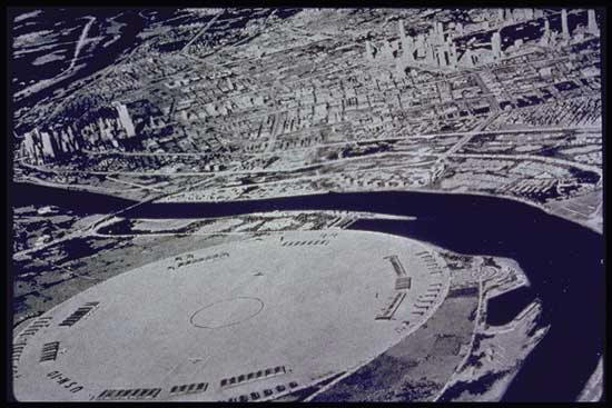
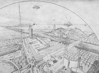
A man with a little bigger vision, Frank Lloyd Wright, saw a heavier future in his Broadacre CIty:
I’m not sure how these domed cities worked. B. Fuller had an idea like this for central Manhattan that I wrote about earlier in this blog, but his idea escaped me too.
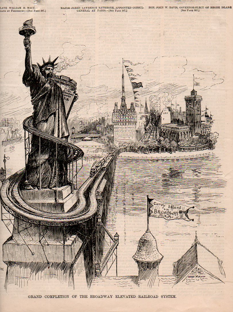
This peep into a possible future appeared in Harper’s Weekly on 18 May 1887. It is the work of artist W.A. Rogers and depicts a filling-up lower Manhattan, complete with broad avenues lined by elevated trains whose reach evidently knows no bounds. The new elevated subway winds its way across the harbor to Liberty Island, where it wraps itself around the feet and up the body of the newly-dedicated Statue of Liberty (opened in October of the previous year). In the foreground is the cupola of a transit station with a fluttering flag advertising “Coney Island via Broadway”–I’m not sure what this is all about, as the placement of the island has nothing to do with anything except making a point in the cartoon.
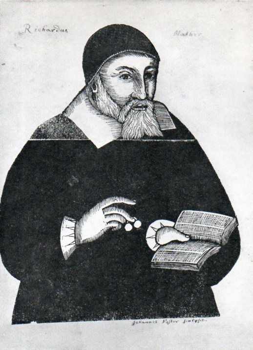
This installment to the thread on the History of Dots takes us to the very first print made in America–John Foster’s portrait of Richard Mather. Mather was ordained in England in 1620 but his Puritanism came to be a point of departure for him, and he sailed to America for his taste of religious freedom, arriving in 1635. He was a pastor in Dorchester, Massachusetts, for the next 34 years until his death in 1669 at the age of 73.
As it turns out this portrait was made of him by John Foster just prior to his death and was not published until 1670, when Mather–who as it turns out who be the founding member of what would become a long-established and important family of clerics, including Cotton Mather–was already dead for a year.
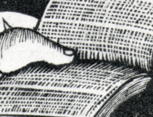
He is shown holding a book, which—since this is the first print made in America–is also the first image of a book. The book is held open by Mather’s enormous thumb–and what do we see in this book for words but dots. Perhaps there are some dots, and perhaps there are some dashes, but its close enough for me.
I do wonder about that horizontal line running across the image, appearing just under Mather’s whiskers. It seems like the woodblock was broken and pieced back together. Perhaps it was just an accident. Perhaps it was broken on purpose so that Foster could use an interchangeable body and replace the head, so that the next series of portraits would be easier for the artist, which he may not have been. He did take the care to render Mather’s spectacles, even if they are but little mites of specs.
In any event, Foster did a great job with very limited ability, and I think that the great blackness of Mather’s body, which formulates the print’s large power, may have been done by mistake. It really doesn’t matter, as the overall effect works beautifully well.
Fortune, good night, smile once more; turn thy wheel!. King Lear, Act II Scene I
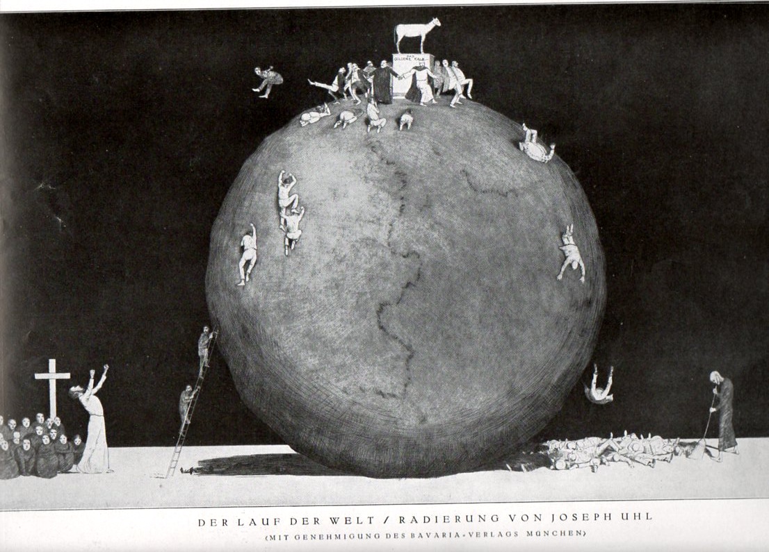
Not to be confused with another, earlier, engraving by Abraham Bach (the Elder, “d.A”) of the same title (published in Nuremberg in the late 17th century), this work by Joseph Uhl (published in the Illustrirte Zeitung, Leipzig, 24 October 1926) seems far more pessimistic, a scene of symmetrical futility. The title translates roughly into the Triumph of the World, or the World Conquers All, or something along those lines, I think, and we definitely see the old orb impassively withstanding whatever it was that was happening on it–and whatever it was, it didn’t matter.
The cleric at bottom left seems to be extolling the heavens in support of those who ascend the world to his favor (?), and as they reach the apex they either protect or try to repeal those who are supporting the golden calf. At bottom right we see the ultimate disposition of the players, swept into a pile by an unconcerned sweeper.
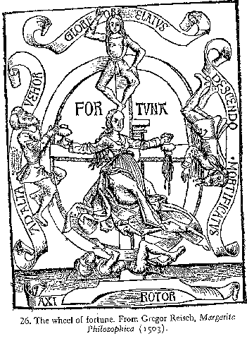
My thanks to the commenter Redtarts for communicating “rota fortuna”–wheel of fortune–which I hadn’t connected to this image but which does of course make sense. It does bear some striking similarity to the more classical wheels, which generally depict four (or more) figures of people in various stages of rising or declining in the course of life, the person on the top of course reigning supreme. The allusion may have begun in early Roman times with the goddess Fortuna, famously depicted here in 1502 by Albrecht Durer:
The image of the wheel though is much earlier,, most people recognizing it so:
This is the basic desin that is seen so often through the Medieval and Renaissance periods.
Carmina Burana:
Fate – monstrous
and empty,
you whirling wheel,
status is bad,
well-being is vain
always may melt away,
shadowy
and veiled
you plague me too;
now through the game
bare backed
I bear your villainy.
. . . . . . . . .
The wheel is turned by Fortuna;
I go down, demeaned;
another is carried to the height;
far too high up
sits the king at the summit –
let him beware ruin!
for under the axis is
Dante’s Divine Comedy/the Inferno:
No mortal power may stay her spinning wheel. The nations rise and fall by her decree. None may foresee where she will set her heel: She passes, and things pass. Man’s mortal reason cannot encompass her She rules her sphere as the other gods rule theirs. Season by season her changes change her changes endlessly, and those whose turn has come press on her so, she must be swift by hard necessity.
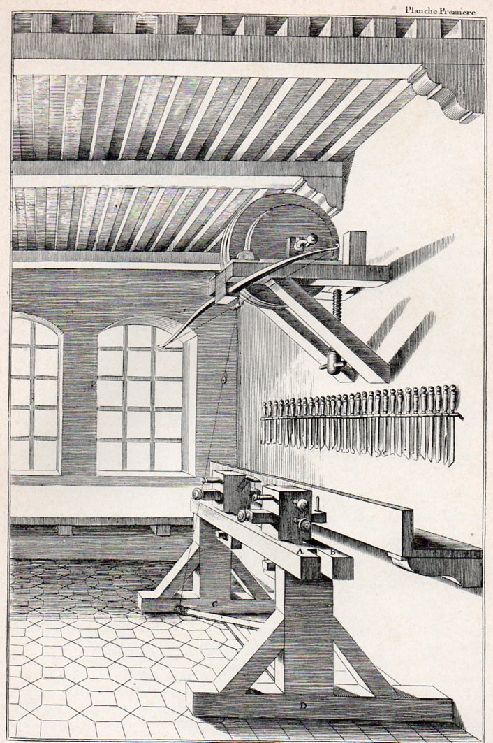
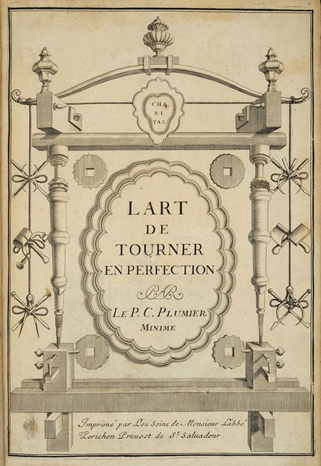
The turner’s workshop, from Charles Plumier’s L’Art de Tourner, ou de Faire en Perfection Toutes Sortes d’Ouvrages au Tour...and published in 1701. It is spartan except for a large selection of in-place tools, and I can just about hear the room’s echoes. The title page for the work is also quite lovely, a piece of airy/baroque, featuring elements of the turner’s trade as ornamentation.
As it runs out M. Plumier’s beautful fascination with turning was only a side-attraction to his life’s work, which was botany. Plumier published a number of significant works with a particular emphasis on the botany of America, including: Description des plantes de l’Amérique (Paris, 1693) and Nova plantarum americanarum genera (Paris, 1703-04), “with 40 plates; in this work about one hundred genera, with about seven hundred species, were redescribed”. “At a later date Linnæus adopted in his system, almost without change, these and other newly described genera arranged by Plumier. Plumier left a work in French and Latin ready to be printed entitled Traité des fougères de l’Amérique (Paris, 1705), which contained 172 excellent plates. The publication Filicetum Americanum (Paris, 1703), with 222 plates, was compiled from those already mentioned….At his death Plumier left thirty-one manuscript volumes containing descriptions, and about 6000 drawings, 4000 of which were of plants, while the remainder reproduced American animals of nearly all classes, especially birds and fish.” (Quoted parts from the Catholkic Encyclopedia.)
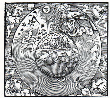
This woodcut comes to us from Biblia: Dat ys De gantze Hillige Schrifft Vordudeschet dorch D. Mart. Luth. Vth der lesten Correctur mercklick vorbetert, and published in Mageburg by Michael Lotter in 1554. I’d say that it depicts the Eath-centered cosmology of the creation just after the introduction of Eve, where everything seems to be in perfection and harmony, there (perhaps) inthe sixth day of the creation story.
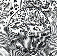
In the detail we can clearly see the Garden:
There doesn’t seem to be any sign of the serpent, though Eve does seem to be covering herself in some sort of modesty, even though we are told in the OT that the two humans were naked but not ashamed.
The world seems to be divided into quarters, following the symbolic depiction of the world into sections, though more commonly seen as a three-section map,m the T-O, as seen below:
Soylent Green is the touchstone for me whenever I see the name “General Foods”. After all, can anything be so large and multi-directional than this, a firm whose name implies that they deal with so many different sorts of foods from so many different sources that it is impossible for them to choose any direction whatsoever? Like General Electric, except that General Foods is much more diverse.
And who would be best for General Foods to address in the pamphlet of their general stockholders annual meeting than the General Mom? They evidently found her, and imaged her inside the kitchen of a cushioned little home outside of Everywhereville, right there on the bottom-left of the cover of the report.
She’s right there, right above us, right now. If you turn over the pamphlet, you get a close-up:
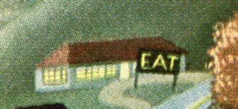
She’s resting her thinking brain, taking a bit of a break while she thinks of other General Foods merchandise to buy from the grocer to add to her food collection–right now she is distracted. Her attention is not directed to her daughter holding the frozen peas, but rather at the other stuff in the freezer–if you follow her line of sight, that’s where she winds up, I think. There’s a lot of wavey, Thomas Hart Benton-y stuff going on in the artwork on the front cover; homey, small town naive graciousness, with a large farm between it and the distant city. It is dusk, the houses are glowing, and there’s nothing but wholesome American qualities of the imagined good life for the eyes of the stockholders of General Foods, the annual report of which lies within. As a matter of fact just about the only bit on the cover to remind us of food is the kitchen seen at bottom, the “general market” just above, and the distant diner, reminding or demanding everyone to “EAT”.
I’ve written quite frequently on this blog about the forensic components of crowds, seeing the interesting bits of smallness inherent in virtually every crowd scene ever made. [For example, see Ephemeral Uniqueness of Large Crowds here, or just enter “crowds” in the “search” box at left.] Today’s installment looks at some older representations of crowds, or people or things just packed tightly together.
It seems a little trite to lift this image from a superb example of Renaissance printing, and to attach it to a short post about crowds and being crowded, but so be it. The image in question is from the semi-great Hypnerotomachia Poliphili1 (from Greek hypnos, ‘sleep’, eros, ‘love’, and mache, ‘fight’, or something like Poliphilo’s Strife of Love in a Dream), which was a dreamscape novel hat was richly illustrated and beautifully designed, if not well written. Be that as it may, whether or not it was/is a dripping romance of sodden accomplishments and drippy sentimentality, it did encompass a weird allegorical element that linked architecture and feminine appreciation of sexuality with Poliphlio’s dream-search for his beloved Polia. The book seems to have everything going for it except for a good story line and an author.
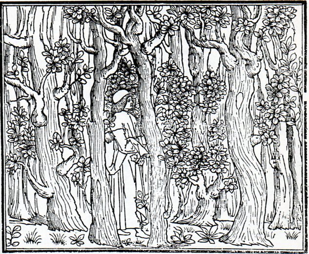
Be that as it may, I liked this image of Poliphilo entering the woods in his search for love–crowded, dense, low growing branches, and so on. Visually it is very striking with lots of verticals; allegorically, it is extremely sweet.
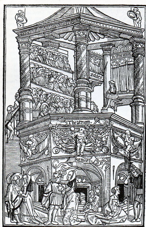
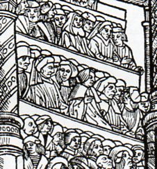
Next (above) is this lively theatre image from Terence’s Comediae, printed in Lyon in 1493. The Comedies of Terence were probably the thing that gave Latin a more-appealing public personae, something that was approachable to all and involved bits of life from all stations, much more so entertaining than a droning speech from the floor of the Roman Senate. (And in detail the crowded bit:)
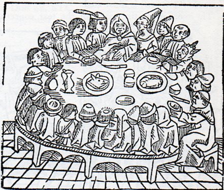
And here’s some jowl-to-cheek seating in “The Pilgrims at Table”, from the Westminster edition of the Canterbury Tales, printed in 1484 by the great William Caxton:
There are no forks yet on the table–they wouldn’t come about for another few decades.
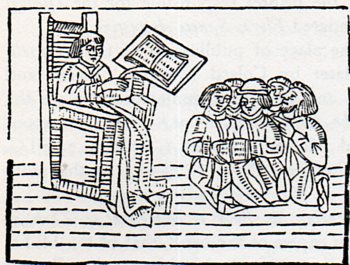
And what are we to make of this scene–are these students as fearful of their instructor as they seem?
No–I think that its all about the book. Books were very expensive when this woodcut was printed in William Caxton’s fantastic Mirrour of the World (1481), and so if there was one book allowed for the classroom it was a lot, and all these people were trying to do was to huddle together so that everyone could get a look at the printed page.
There’s a certain stillness to the crowds above, much more so than most–there’s definitely no granular behavior about them, no extra-sensory physics to the ebb and flow. They’re mostly just sedentary, but packed closely together.
Notes
1. This book was printed almost at the last moment of the 15th century, in December 1499, by Aldus Manutius in Venice.
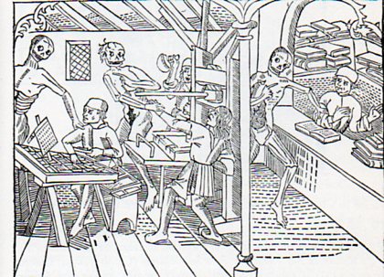
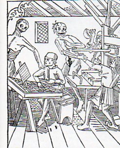
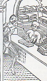
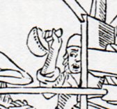
This is intended to be a short mini-post on the end of printing, and the end of bookselling, such as we know it, or knew it–this image comes from 1499 (Le Grand Danse Macabre, Lyon), and tells us that death to these occupations is nothing new. Of course when we speak of the death of the book nowadays we’re discussing something different–the death of the printed format. But here in this print, which is also the first depiction of a mechanized book press, we see ironically that Death has come to claim its operators, or at least two of them. The inkman in the background, the yelling third of a departing party of two, is spared for the time being. Just as the reader is for the first time seeing this machine, they are also seeing Death in its in grim glory snatching away the machine’s main operators.
The image and the functions of the people working the press are well described in the excellent history of all things books at the Bookn3rd website, here.
Here’s Death coming for the bookseller–at least the man was reading at the time of the departure. This is also a very early depiction of a book store, which again as the first visual information on such a place to the reader is wrapped around the visitation of the Great Inevitable.
I’ve found this article1 by physicist Louis A. Turner to be very helpful over the years. He was an I-was-there guy (and actually an I-am-here guy) who wrote a stuccato article on the history of nuclear fission which was top heavy in references, and did so in 1940, just before the clamp came down on publication on the topic. Certainly there are other more modern efforts in this area that are far more detailed, but few have managed to do so good a job in as limited space as Turner, which the fabulous John A. Wheeler recognized as a “great and timely” review2.
Notes:
1. Louis Turner. “Nuclear Fission.” Lancaster: American Physical Society, 1940. An article in the Reviews of Modern Physics, vol 12/1, January 1940, pp 1-30 of an issue of 85pp Original orange wrappers. Fine condition. Also contains articles by Seaborg and Zwicky.
2. J.A. Wheeler, “Fission in 1939, the Puzzle and the Promise” Annual Reviews, 1989.
The original article can be purchased through our blog bookstore, here.
His 133 references can be read as a succession of one-line histories of the subject (barring the permissions to reproduce the entire article):
E. Fermi, Nature 133, 898 1934.
E. Amaldi, O. D’Agostino, F. Rassetti and E. Segrè, Proc. Roy. Soc. A146, 483 1934.
I. Noddack, Zeits. f. angew. Chimie. 37, 653 1934.
O. D’Agostino and E. Segrè, Gaz. Chim. Ital. 65, 1088 1935.
I. Curie, H. von Halban and P. Preiswerk, J. de phys. [7] 6, 361 1935; C.R. 200, 1841 1935; 200, 2079 1935.