A Daily History of Holes, Dots, Lines, Science, History, Math, Physics, Art, the Unintentional Absurd, Architecture, Maps, Data Visualization, Blank and Missing Things, and so on. |1.6 million words, 7500 images, 4.9 million hits| Press & appearances in The Times, Le Figaro, Mensa, The Economist, The Guardian, Discovery News, Slate, Le Monde, Sci American Blogs, Le Pont, and many other places… 5000+ total posts since 2008.

  • The History of Dots: anti-Dots, Bubbles and Circles

    JF Ptak Science Books   Post 1433

    This blog’s series on the History of Dots needs to be folded into the History of Circles section–it seems that whenever I see interesting circles that I am seeing dots, and vice versa; and after all, aren’t circles just unfilled dots?  An anti-dot (or at least so in two dimensions)?  I like the idea, especially since one of the great and revolutionary ways in which particles were found was with the device pioneered by D.A. Glaser (Nobel physics, 1960), the bubble chamber, which through the use of superheated hydrogen (usually) it was possible to track electrically charged particles, often producing dots in their signatures.

    Which leads me to bubbles and anti-bubbles.  We all know what a bubble is–at least a physical one–but what about its opposite?  Its not quite that, really, though there are bubbles that are liquids surrounded by gas rather than the much more conservative and popular way.  And so it is this way that I came to the anti-dot, the circle, and then of course one of its three dimensional relatives, the bubble (and the sphere).

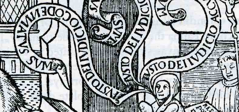
    Earlier in this blog I’ve written a few times about the speech and though bubble/balloon, which was a fantastic invention, enabling to make literal the thinking of the subjects in a painting (and seen probably for the first time in a printed book in 1523, in this work about Bruno Carthasisienna):
    0 blog feb 18 balloon599


    I’m sure that there must’ve been some number of people who regarded it as base and retrograde, that the view of a print or painting should by the art’s elements know what the characters might be thinking, and that by showing the specifics of thought, by boldly stating the thought or speech itself, that the experience is removed from the viewer’s imaginations.  Perhaps these thoughts were common to the people who considered the telephone as an affront to communication as an attempt to replace the written letter, and so on to fax to email to tweet and so on. 

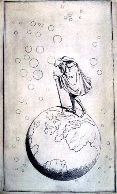
    I have no idea when the first bubble as a bubble appeared in print, though a gorgeous version of a bubble-maker is seen on the cover of another “first”:  the first full-cover illustration on the front cloth cover of a published book1, Sir Francis Bond Heads (1793-1875) Bubbles from the Brunnens of Nassau, which was published by in 1834 by John Murray of London, who 25 years later would publish Darwin’s Origin (where the word “bubble” by the way does not appear).
    Dots  bubbles princeton
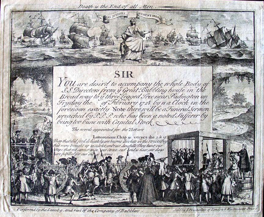
    There are many illustrations and paintings of people blowing bubbles–I’m not sure which one is the most famous but Gerit Dou (1613-1675) certainly comes to mind (with his Still Life with a Boy Blowing Bubbles).  Perhaps a ittle more unusual and also involving a great scientist is the economic bubble, which is the subject of this great print called “A Bubbler’s Funeral”.  An economic bubble is one in which the value of a share of stock in a company or interest becomes hyper-inflated, expanding outward until the price bubble found its pin, and once contact is made, the whole thing goes to shamble, and anyone left holding the enormously inflated stock finds themselves with a stock worth next to nothing. 
    Dots bubbler funeral
    This image was a satire on the Ages of Man, professing to be a ticket for a Bubblers funeral, and was in 1720 aimed at the directors of the South Sea Company, a notorious early 18th century bubble, which had just burst.  Many people lost fortunes in this, including the aged Sir Isaac Newton.   The invitation was for a funeral profession to  “accompany the whole Body of S.S. Directors from ye Bubbling house in the Broad way… to ye three Legged Tree near Padington on Fryday the of February 1720/1″.

    And so ends this first bot on folding the story of circles and bubbles  into this blog’s History of Dots.  I should point out that one of the great bubbles of the last hundred years or so imploded only a dozen yers or so ago–the dot coms. 

    I wonder if the History of Holes thread should also be folded in?

    Notes:

    1. From Princeton University:  “Ellen Morris puts it in anything way, “This period also produced the first full-cover designs: John Murray’s 1834 issue of Bubbles from the Brunnens of Nassau is reputedly the earliest publisher’s cloth binding with a full pictorial design on its cover.” (The Art of Publishers’ Bookbindings 1815-1915).

     

  • Strange Things in the Sky Department: the Suburbs

    JF Ptak Science Books   Post 1434

    A continuing thread on this blog (this post is a good example) has surfaced unusual thing that have been found floating in the sky in prints, photographs and ideas:  there have been “extra Earths”, holes leading to heaven, massive stone tetrahedra, swimming pools, hangars, airports, downloaded aliens from extra moons, flying Woolworth buildings, and much else (not limited to 19th century balloon-hoisted horses, here). Today’s unusual thing to be found in the sky is the suburbs.

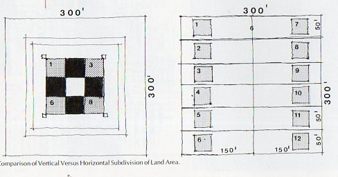
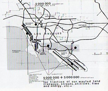
    The Romanian architect Harlan Georgesco came up with an idea to prevent suburban sprawl from making one city out of the land from San Diego to San Francsico–put the suburbs in the sky.  The story is in the wonderful Unbuilt America by Sky and Stone under the subheading “Relocation of Los Angeles”, where they quote Mr. Georgesco saying that the sprawl of a plan to develop 300×300 foot “horizontal plots” in a larger scheme of an endless horizon of such housing could be made into “vertical tracts”.

    Vertical suburbs360

    The vertical tracts of 300×300 feet (90,000 square feet or about two acres) oe chunks thereof would be suspended via “steel in tension” (giving the Golden Gate Bridge as an example of this system) in a structure 640 feet tall, which is labeled as a “medium high rise”).  (I should point out that the WTC was 208′ square.)

    Mr. Georgesco’s proposal called for a total reorganization of dwelling life in California–he was thinking of housing 5 million people in this way.  The little squares on his map (below) shows the emplacement of colonies like this vertical city. 

    Vertical suburbs362

    It seems to me that as a futurist the architect’s plans contained an abundantly fatal flaw in assuming the construction of suburban houses on a platform 600′ tall.  To be concerned with waste by stacking cul de sacs one on top of one another seems to miss the point, some. 

    Vertical suburbs361

     Notes:

    I would be curious to know about Mr. Georgesco’s life in Romania during the 1939-1945 period.  He certainly became successful and accomplished, though the period in Romania was–lightly put–complicated.  Starting out the war as a neutral, Romania moved quickly to be an ally of the Nazis, participating in Barbarosa, and over the next 3 years lost hundreds of thousands of soldiers, and civilians.  And of course there was a participation in the Holocaust.  By 1944 the King of Romania was able to lead a revolt and Romania joined the war on the Allied side, declaring war on Germany.  They were almost immediately overtaken by the Soviets, who would stay for quite a long time.  When the Soviets arrived, they basically “took” the Romanian army (of 130,000 men or so) back to the Soviet Union–the vast majority never to return.  Mr. Georgesco left in ’47.


  • Remaking Chicago, 1945–a Map of the Future

    JF Ptak Science Books   Post 1435

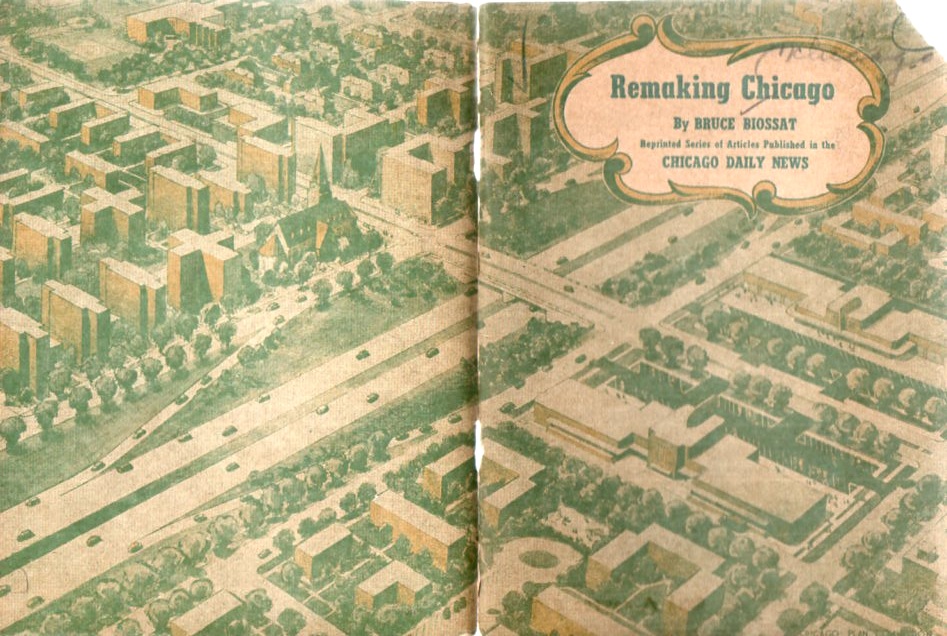
    Earlier today a post appeared here on re-envisioning the “one city” megalopolis of San Diego–Los Angeles–San Francisco by hoisting 2-acre neighborhoods into the sky to support some 5 million people or so.  Bruce Biossat, a writer for the Chicago Daily News, also had an ambitious plan for the city of Chicago, though in the face of putting thousands of acres of neighborhoods (with years) into massive highrises, Mr. Boissat’s plan–while massive–is not nearly so as the L.A. scheme.

    Chicago devel367

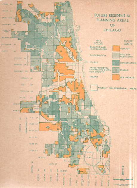
    For reasons I cannot determine, this small pamphlet1 (available at our blog bookstore) seems to be nowhere–no mention on the web, nothing in city planning databases, nothing in WorldCat (an actually nothing at all in this massive database about Mr. Biossat).  It was a massive undertaking, part of a project of the Chicago Plan Commission, and sought to relieve “blighted” areas from the city by replacing them with new housing and neighborhood design. This was part of a larger construction scheme nationwide:

        “The goal most mentioned as the desired postwar level of home construction is 1,000,000 units a year.  Both major labor organizations call for higher objectives, with the A.F.L. demanding 1,500,000 and the C.I.O urging 1,750,000 annually.”

    That is a lot of building, and I have no doubt that the ALF/CIO would’ve been behind a spending/earning opportunity like this 100%.  I’m not sure where all of this money was coming from, though I guess there would’ve been enough workers to handle the job.

    Chicago devel366

    In any event, the plan was massive, as we can see in the map above–perhaps the designers/developers felt the end of the war coming, the return of millions of soldiers, and an opportunity to make some major changes in the development of the future of Chicago. 

  • Microworlds in Prints: sub-millimeter Action Figures, ca. 1660

    JF Ptak Science Books   Post 1435

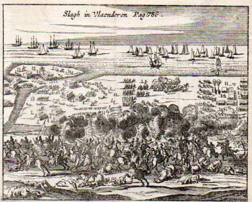
    This small engraving, Slagh in Vlaenderen (Battle in Flanders or thereabouts), is about 3×4 inches, a tiny engraving (on copper, I believe) depicting a large action between what I would guess to be the Dutch, or the army at Flanders, and the Spanish, sometime in the late 15th century to the early/mid 17th century.  There were a number of different years in which this action could have taken place, so I’m not sure what this image actually depicts.  The print was made sometime in the mid 17th century, possibly earlier.  (The original is available for purchase at our blog bookstore.) 

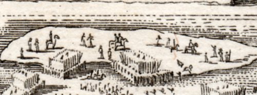
    What attracted me to this print was the minuteness of the figures in the background–the horse depicted here is not a millimeter long in the original, but we can see that the artist took enough care and had the imagination to make the horse run. (There is a long thread on this blog, “Prints–Looking Hard/Deeeply at” that takes a micro cruise along teh surface of large and complex prints into their perhaps seldom-scene embedded small worlds.)

    Flanders battle373
    Ditto for the soldier just to the left of the horse and out of formation–even when you hold the print close, you really can’t see that there’s a figure there unless you use a magnifying glass.  This sample was scanned at 1000 dpi and represents a section of the print that is maybe 8 mm across. 

    The next sample shows an island that in the original is about an inch across, and as you can well see the sub-detail from the image above is just a fragment of this detail.

    Flanders battle372

    And the print in all of its glory, appearing on your monitor at about full scale. 

    Flanders battle371

    I am constantly amazed at the precision and care and artistry of these early engravers, and how much they cared to include interesting details that were all but invisible to the majority of its viewers.  But that’s not the point. 

  • Very, very Heavy Metal–the Woolwich Infant, 1876

    JF Ptak Science Books    Post 1436

    One very controlling interest of the naval metal arms race of the 19th century was the thickness of metal armor being carried by a ship of war.  The thicker plate on ships made it extremely important to develop cannons that were powerful enough to throw a projectile with enough weight and velocity so that an armored ship could be pierced and sunk.

    Woolwich infant374

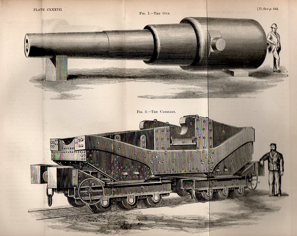
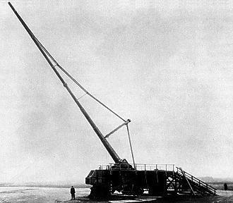
    And such a beast is what is described here in the 1876 issue of the Popular Science Review, addressing  “The Eighty-Ton Gun, or Woolwich Infant” (a copy of the original of which is found at our blog bookstore).  The first armored ships starting appearing around 1860, and things progressed rapidly enough so that by the time this gun was made in 1876 it was capable of penetrating 20 inches of iron from a distance of 1,000 yards.  It was a beast, taking a 240-pound charge to throw a 1,200 pound projectile.  It was actually (at least) the second Woolwich Infant, coming after an earlier version of the gun that was 35 tons. 

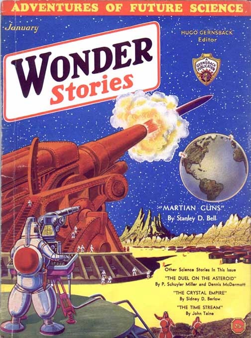
    Of course this weapon looked puny in comparison to the Mars Canon, but this didn’t exist.

    Strange things in sky--martian guns

    This is the cover art by the fabulous Frank R. Paul for Stanley D. Bell’s “Martian Guns” found in the January 1932 issue of Wonder Stories.  There’s really no way to determine how big the gun is except to say that it is probably “big”–there’s just nothing to place the thing in perspective, as the figures in the foreground, being Martian, don’t have a specific height.  They could be 6′ tall, or 60′–perhaps they’re only 1/10 of an inch tale, and the projectile they’re firing to the earth is so devastatingly powerful that size doesn’t matter.

      Back here on Earth and in the real world,  the Kaiser Wilhelm gun (or “Paris Gun”, the Kaiser Wilhelm Geshutz) was

    http://farm4.static.flickr.com/3169/2951816593_c2d2e5c875_o.jpg


    a long-barreled, light shelled monster: its 92′ long barrel (plus a 20′ extension) launched a 94kg shell about 130 km, reaching a maximum height of 40km (about 25 miles) high. For all of its mass (the gun weighed 256 tons without the railway cars) the shell that it fired didn’t weigh much at all….though the shell did reach an extreme height.

    The Schwerer Gustav was a 1350 ton beast which fired a 14,000 pound shell (!) about 20 miles. A  little later came the Nazi V-3 (the lesser known of the V-weapons), the Vergeltungsewaffe 3, a 130 metre (!) long, 150mm gun built along the side of a hill, launching a 140 kg shell. The Iraqi Big Babylon gun was sort of like this one, though never built–it was to have a 500′ barrel and would be supported by a hillside. Then there was the Nuclear Tube: the Atomic Annie (M65) cannon, which was another bruiser, being an enormous 85′ cannon that delivered the worst punch of all cannons, a nuclear warhead.  The weapon was test-fired in 1953 at Frenchman Flat at the Nevada Test Site and delivered a 15kt explosive device to a target seven miles away. There were 20 of these made, but given their difficult-to-deploy-and-keep-secret status, and the nature of the shells, and the development of more sophisticated weapons, the M65 was obsolete almost as quickly as it was introduced, but was removed from the front line only in 1963.

    But this is all getting ahead of ourselves, all in the future.  I really just wanted to address the Woolwich Infant and its anti-metal-armor capacity. 


    ·Posted by :

    ·in:

  • The Display of Data–an Archaeological Dig in Fossilized Information

    JF Ptak Science Books  Post 1437

    There is a recurring thread in this blog on resurrecting displays of information–data that was presented in an interesting way, but which has been passed over by time and forgotten interests. 

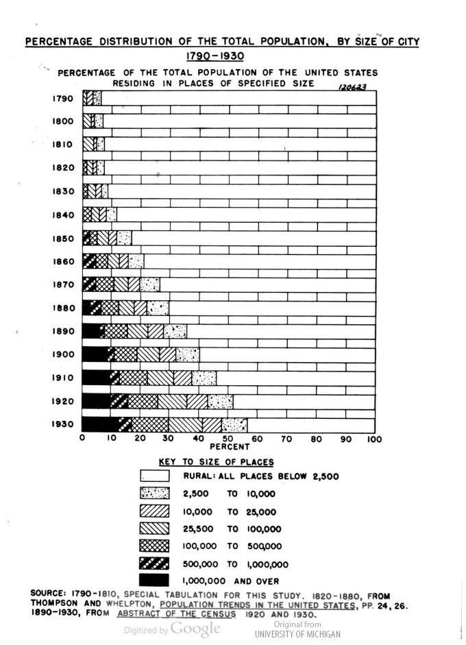
    That’s how I came to the Interim Report to the National Resource Committee by the Research Committee on Urbanism, by C(larence) A. Dykstra (1883-1950), published by the NRC in 1936.  There were some interesting and odd bits of info in this report, not the least of which was this graph, which shows the steady growth of urbanism–of people living in cities, and progressively larger ones at that–and how quickly it occurred.

    Urbanism, NRC
    [This image as you can see was taken from Google digitized books–I used this rather than spread this book out beyond how it wanted to be spread on the scanner.] 

    For example, in 1880, fifty years before this study began, 18% or so of the U.S. population lived in a city with a population of 25,000 or more.  By 1900, that number had increased nearly double, to 32%; 30 years later, the number was up to 40%.  It was an interesting graphic, especially considering it was done for background information for people working for the NRC who were going to go out and collect census-like material with the goal of establishing the condition of American cities in the height of the Depression.  It was an unexpected find, this graphical semi-precious stone, and I’m happy to have seen it.  Although I’ve seen this data displayed elsewhere–mainly I think in the Statistical Atlas for the census of 1920–I do not remember it being presented in this manner, or with this clarity.  And of course it was deeply buried.

  • Stylizing a Sameness in Early Flight Images

    JF Ptak Science Books  Post 1438

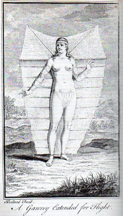
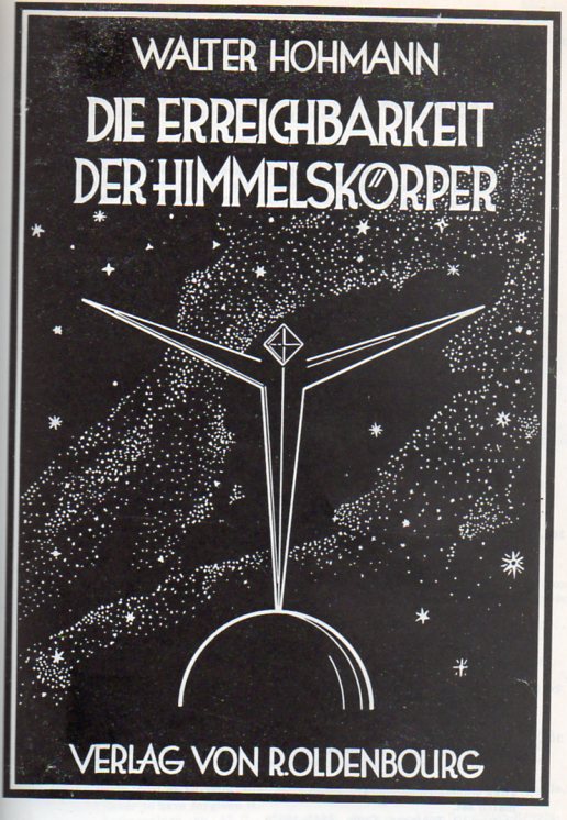
      Space flight379 Space flight378

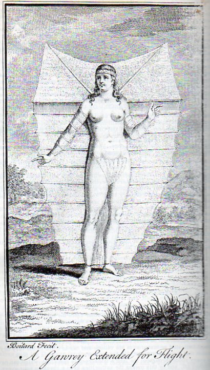
    I found these elements of sameness in design, spanning prehistoric flight and prehistoric space flight eras, separated by 170 years or so, and they just seemed fascinating.  The first, by Boitard for Robert Paltock’s (or Pultock, 1697–1767) The Life and Adventures of Peter Wilkins, a Cornish Man, Relating Particularly, His Shipwreck near the South Pole; his Wonderful Passage thro a Subterraneous Cavern into a kind of New World, his there Meeting with a Gawry or Flying Woman, was published in London in 1751 pictures the flying woman from the title (which also pretty much sums up the Robinson Crusoe-like story.  Wilkins does become shipwrecked and then has an extraordinary adventure underground at the South Pole–which is interesting in and off itself, to set the stage at the South Pole, since the exploration of Antarctica is really a 20th century endeavor.  (The first accurate summation of Antarctica as a continent isn’t made until Charles Wilkes’ expedition in 1839/40.)

    Space flight378

    The flying woman is striking, especially for the mid 18th century:  she is quite lovely, muscular, and tall, and has her limbs attached to a flying/gliding canopy which seems as though it would be operated in a way in which the people of that time thought birds to fly. 

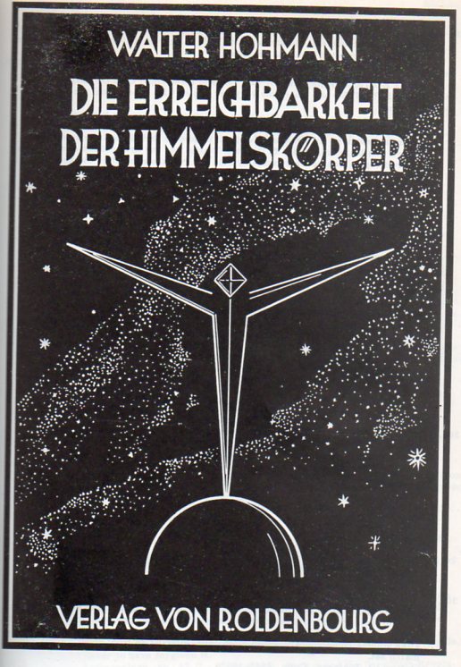
    The associated image is Walter Hohmann’s prescient work on rockets and rocket flight, Die Erreichbarkeit der Himmelskoerper, Untersuchungen ueber das Raumfahrtproblem, which was published in that great heyday of German flight engineering, in 1925.  It was published very soon after the important work of Hermann Oberth2, whose style, illustration and design are closely aligned. It is very interesting to note here that Hohmann (and Oberth) both suggested using teh Earth’s gravitational field to orbit the spacecraft and then slignshot it off into space, rather than to try to simply lift of from Earth and then go directly into space. 

    Space flight379

    Notes:

    1. Biographical Dictionary of English Literature was not impressed by it saying: “The description of Nosmnbdsgrutt, the country of the flying people, is a dull imitation of Swift, and much else in the book is tedious.

    2.  Oberth’s book, Die Rakete zu den Planetenraum was printed in 1923 by the same publisher as Hohmann, and was a cornerstone study of the issue of interplanetary space travel–the first of its kind, really, to address the full theoretical and practical aspects of rockets and space flight.  Oberth–who wrote this at age 28–could not submit the work for his thesis because of its advanced treatment of a little-known subject.

  • An Antiquarian Print Rarity: Depicting the Destruction of the Earth

    JF Ptak Science Books  Post 1439

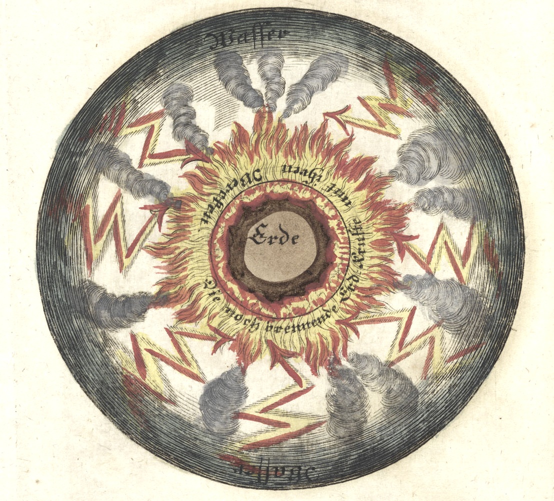
    There appeared earlier in this blog a bit on an engraving depicting an exploding Earth, one of a series of twelve images, eleven of which were unavailable at that time–not so anymore.  So an update to this post is happily made, starting with the exploding part (below), a nasty millennial vision steeped in a volcanological/geological/meteorological 18th-century primordial stew, the Earth in a sea of fire and blasted volcanoes, lightning striking from above:

      Frisch 5
    [All image sources:    Herzogin Anna Amalia Bibliothek, Weimar.]

    Hades, Heaven, Meru, Valhalla, Elysium, Olympus–the places at the end of the terrestrial road, the great emancipation. In some theological doctrines these places are reached collectively after the great conflict at the end of time; the end of days in the Old Testament, when the earth is devoured by holy vengeful wrath and reconstituted for godly comings –and-goings.

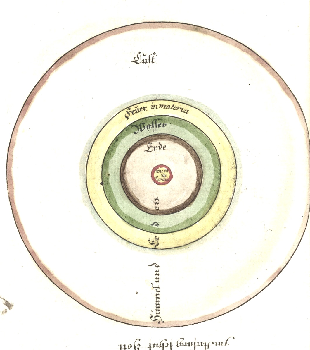
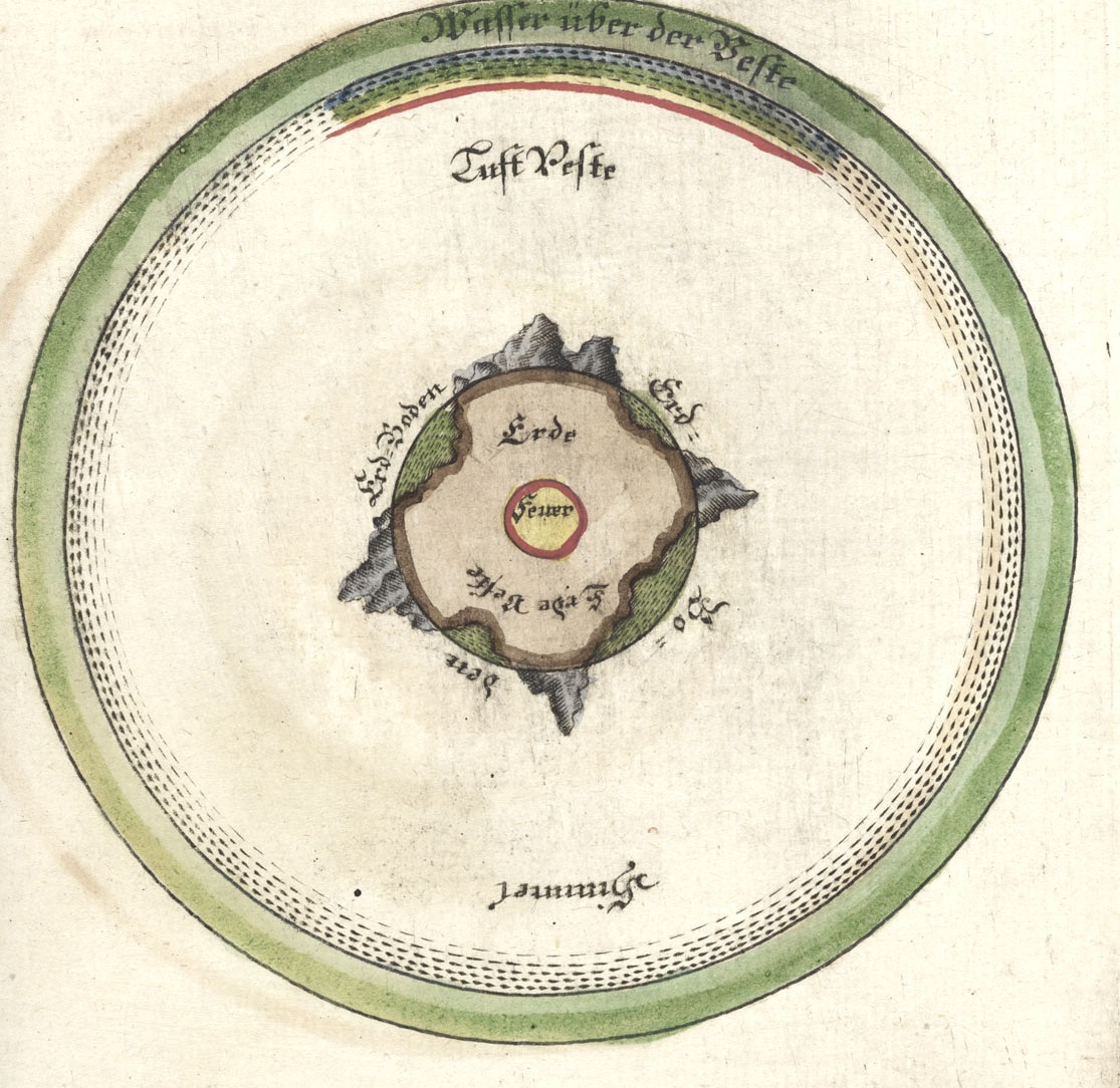
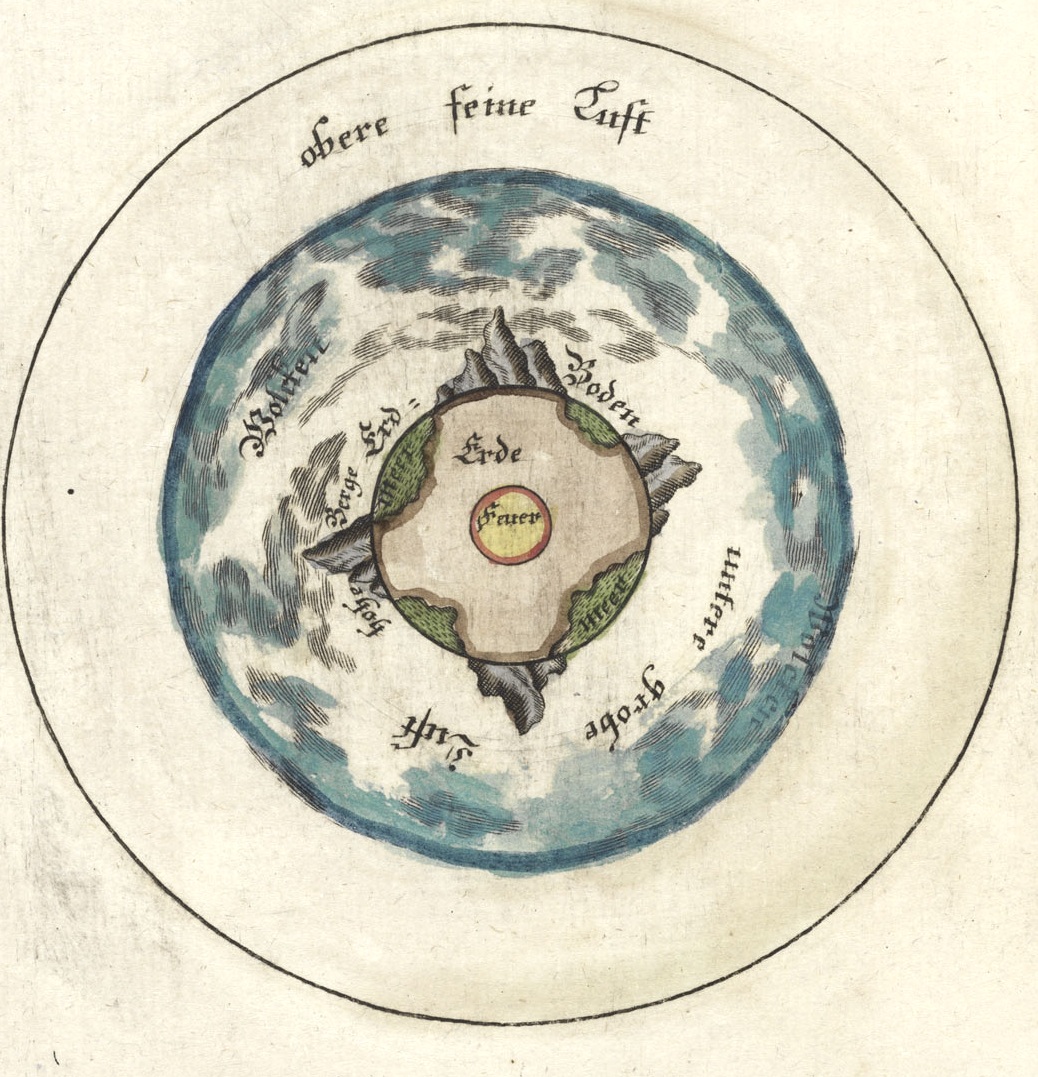
    This engraving is one of twelve found in a fine little book, the brainchild of clergyman/semi-scientist Jodocus Frisch (1714-1787), who delivered to the (un-) waiting world his vision of how the earth and heaven will come to an end, there at the end of days.   Die Welt im Feuer, Oder das Wahre Vergehen und Ende der Welt, Durch den letzten Sünd-Brand  (printed in Sorau by Gottlob Heboldm in 1746) is one of very few works that depict (in  illustration) the destruction of the Earth, and even though Frisch illuminates biblically-based theory, the idea of the earth exploding into bits in primordial fire and so on was extraordinary.  The images were done in four colors representing the four elements:  yellow, brown, green and white represented (respectively) fire, earth, water and air. In this image, we see the fire-centric earth encircled by a sphere of water, which is surrounded by a sphere of fire, which in turn is surrounded by a sphere of air,  with much bad stuff happening. 

    Not having the book in hand I’m relying on the  description of the Dutch bookseller Asher & Company, an old-line bookseller of very fine antiquarian works, which wrote the following descriptions of the other images in the book (and which appears for sale right now at their site):

    “The second and third engravings show how the sphere of water disappeared after the torrential rains of the deluge, leaving the earth directly exposed to the sun. In the fourth and fifth engravings the earth is consumed by fire from within and without, demonstrating in what way the biblical prophecies about the destruction of heaven and earth may come to pass. Plates 6 and 7 depict the new heaven and earth that look entirely similar to plates 1 and 2, the first heaven and earth. Plates 8 and 9 show heaven and earth in their present state with precise specifications of what the biblical vocabulary names “heaven.” Plate 10 shows how the sphere of water breaks the rays of the sun in such a way that they shine on all parts of our planet in equal manner, wherefore all regions have a temperate climate. However without the tempering function of the sphere of water, the air focuses the rays of the sun in the equatorial zone.”

      Frisch 1 page 26

    The water of the great deluge now gone, revealing the land masses, plate 2:

    Frisch 2
     And so again, in plate 3:

    Frisch 3


  • An Ad for Darwin’s “Origin”, November 1859

    JF Ptak Science Books   Quick Post

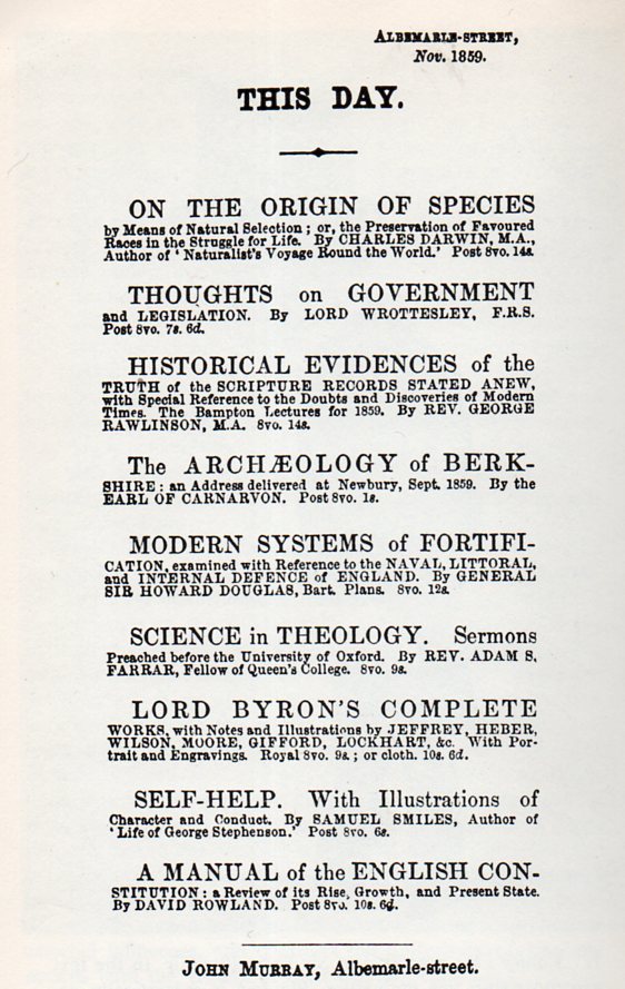
    I stumbled across this today, in volume of a series of volumes here of the journal The Athanaeum.  I have a dozen or so volumes between 1839 and 1866, luckily including 1839 (with a number of articles about the new invention of photography) and 1859 (which includes a number of contributions on Darwin’s On the Origin of Species1), and also including the following short notice:

      Darwin ad380

    I’ve included some links to review of Darwin’s Origin below.  I’d like to point out the closing of the Saturday Review (London) pieces, which in its final paragraphs begins its summation not very hopefully:

    “In regard to that which is peculiar to Mr. Darwin’s theory, we are far from thinking that the fruits of his labour and research will be useless to natural science.”

    Happily, the author gains a little steam, becoming happier with the work as he/she speeds to the end:

    “On the contrary, we are persuaded that natural selection must henceforward be admitted as the chief mode by which the structure of organized beings is modified in a state of nature.”

    From the great website  DARWIN-ONLINE (Darwinonline.org.uk):

    Anon. 1859. Charles Darwin on the origin of species. Chambers’s Journal 11: 388-391. Text Image A507

    Anon. 1859. [Review of] On the origin of species. Saturday Review (London) (24 December): 775-776. Text Image [Including 15 October 1859 advertizement for Origin of species] A514

    Anon. 1860. Darwin on the Origin of Species. New Englander 18 (70) (May): 516-519. Text Image A561   [This for the first American edition of 1860.]

    Anon. 1860. Natural selection. All the Year Round 3 no. 63 (7 July): 293-299. Text Image A509

    Anon. 1860. [Review of] On the Origin of Species, by Means of Natural Selection. Charles Darwin. Living Age 66, Issue 848 (1 September): 474-506. Text Image A58  

      Notes:

    1. On the Origin of Species by means of Natural Selection or the Preservation of Favored Races in the struggle for life. By CHARLES DARWIN, M. A., Fellow of the Royal Geological, Linnæan, &c. Societies.

    ·Posted by :

    ·in:

  • History of Normalcy Series: Warehousing Epileptic “Defectives”, 1912

    JF Ptak Science Books   Post 1450

    This series is meant to illustrate the very transitory, shadowy and basically non-existent nature of “normal”.

    “It is thus with regard to the disease called Sacred: it appears to me to be nowise more divine nor more sacred than other diseases, but has a natural cause like other affections. . .”–Hippocrates on epilepsy and recognizing it as just another brain disorder devoid of mysticism, about 2400 years ago.

    Epilepsy383 One stop in the history of normalcy is the perception of brain disorders, which is a long and complex history–very long in the case of epilepsy, its epidemiology stretching back thousands of years before Hippocrates.  It particular normalcy for the vast majority of that time was that people who exhibited the results of the disorder were cursed, or touched by the gods as holders of some possible divine inspiration, or touched by the gods as accursed and punished people, or bewitched (I wonder about the number of epileptics put to the flame during the Witch Hunt crazes), and so on.  The first pharmaceutical treatments for the disorder really didn’t come about until Emil Fischer and Bayer introduced phenobarbitol in 1902/04, which was able to calm the seizures of some people with epilepsy.  Until that point, most treatments were generally topical, plus the quack ingestives and various sorts of incantations, spells and prayers. 

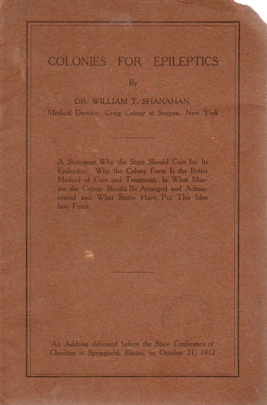
    In Dr. William T. Shanahan’s Colonies for Epiletpics, (the original available for purchase through our blog bookstore) written in 1912, the treatment of epileptics was seculsion, warehousing them in state asylums in the countryside.  Shananhan felt that the epileptic needed “its” own environment, “apart from the the defectives”–and by that he meant apart from the wide classification of people who did not fit the scheme of 1912 normalcy, like “morons, imbeciles, the insane, the sexual addict, the recurring syphlitic [and] the criminally insane…”.  Actually this as a good move in some cases–apart from the vocabulary–as epileptics were stored away in almshouses and prisons along with the criminal element and the hopelessly insane, and at least removed the epileptic from a different sort of horror and disgrace. 

    Dr. Shanahan’s aim was to remove the epileptic from society because they “couldn’t adjust to a life in the ordered community” and that holding a job for them was “impossible”–that plus what he saw as the need to protect society from the epileptic’s “progressive mental deterioration”.   He felt that “the great majority should be committed[to the epileptic colonies] as are the insane”, and also to remove them to these places “from a young age”, to an “institution for defectives”, there separated according to “sex and mental grade”. 

    Overall, though, it was Shanahan’s other aim to provide as “normal” a life for epileptics as could be arrived at, and outside of his trying to save society from them–at a time when the eugenics people were out castrating epileptics–, he was arguing that this method was the best of all possible worlds for people with this disorder.  He does however seem to be totally ignorant of any medical approach to dealing with epilepsy.

    By the way, there’s a very curious imprint on the back cover of this pamphlet showing who printed it and where.  I cannot recll ever having seen such a small thign, placed so centrally, in such an obvious place. Its obvious and present, yet tiny.  Here it is, before magnification:

    Epilepsy384

    And here is what the slug says:

    Epilepsy385
    Its just a very curious thing.


  • Unintentional Proto-Impressionist Photography, ca. 1863.

    JF Ptak Science Books   Quick Post

    Civil War Art b

    There is a continuing categorized thread in this blog called “Unintentional Absurdist“; there is another which follows intentional efforts that wind up being unintentional pieces of modern art that have surfaced before their time.  This later category includes the inscrutable color theory pre-Cubist work of Emily Vanderpoel, the spirit drawings of Georgina Houghton, the absolutely impressionist paintings of Victor Hugo (see here for examples of their work)–all of which were decades ahead of movements that would become standards of art, those these people were generally left behind. 

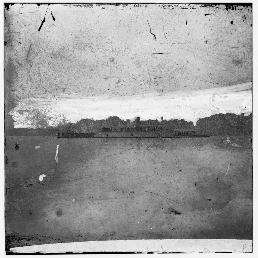
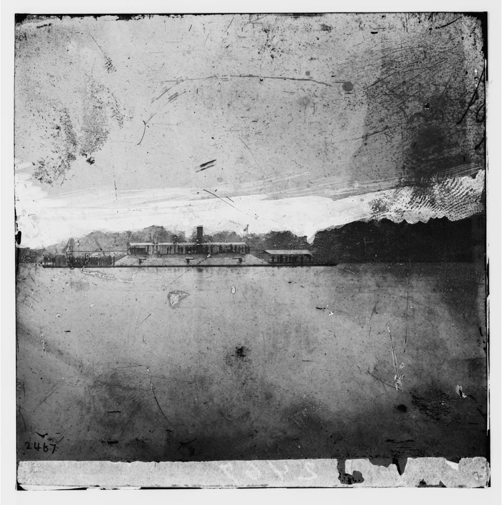
    In yet another flavor of this category is the unintended works which either in their whole or pieces seem to be very modern, like this half of a stereocard of the CSN ram Atlanta.  It was a documentary photograph that has perhaps printed not-so-well and which has suffered changes to it surface over time–the result of which though, in my head, has rendered a terrific pre-Impressionist Impressionist photograph.  I think it is beautiful.

    James River, Virginia. Confederate Ram ATLANTA after her capture.  Source; Prints andf Photographs Division, the Library of Congress.  

     Here’s the other half, complete with fingerprint:

    CIVIL WAR ART C


    ·Posted by :

    ·in:

Recent Posts

Archives

Categories