A Daily History of Holes, Dots, Lines, Science, History, Math, Physics, Art, the Unintentional Absurd, Architecture, Maps, Data Visualization, Blank and Missing Things, and so on. |1.6 million words, 7500 images, 4.9 million hits| Press & appearances in The Times, Le Figaro, Mensa, The Economist, The Guardian, Discovery News, Slate, Le Monde, Sci American Blogs, Le Pont, and many other places… 5000+ total posts since 2008.

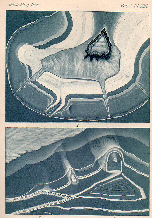
  • Found-Modern Art in Stone: Cartographic Concretions, 1868

    JF Ptak Science Books   Post 2200
    Concretions199

    People have been seeing physical and biological objects in agate for thousands of years.  You can stare and imagine all manner of things in agate and concretions–they have potentially beautiful cartographic-like nodules, with bright and finely grained microcrystalline silica and found in volcanic and metamorphic rocks.  

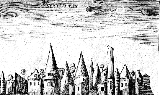
    When Kircher looked closely enough at his agates, he saw hidden objects: sometimes a Madonna, other times animals, and still others–and perhaps more famously–town skylines encased in the rock, as with this example from his Mundus Subterraneus(an undefined edition but ca. 1668):
    Kircher agate
    If you looked close enough at the agate-ified Malabar engraving like Fr. Kircher did you’ll probably be able to find a town–and just about anything else.

    It is an odd twist of Kandinsky-esque modernism where the recognizable attributes of something that exists in reality and in thought is unrecognizable in the art–on the other hand, the forms in some of these found-art concretions go from completely abstract to something much less so:
    Concretions200

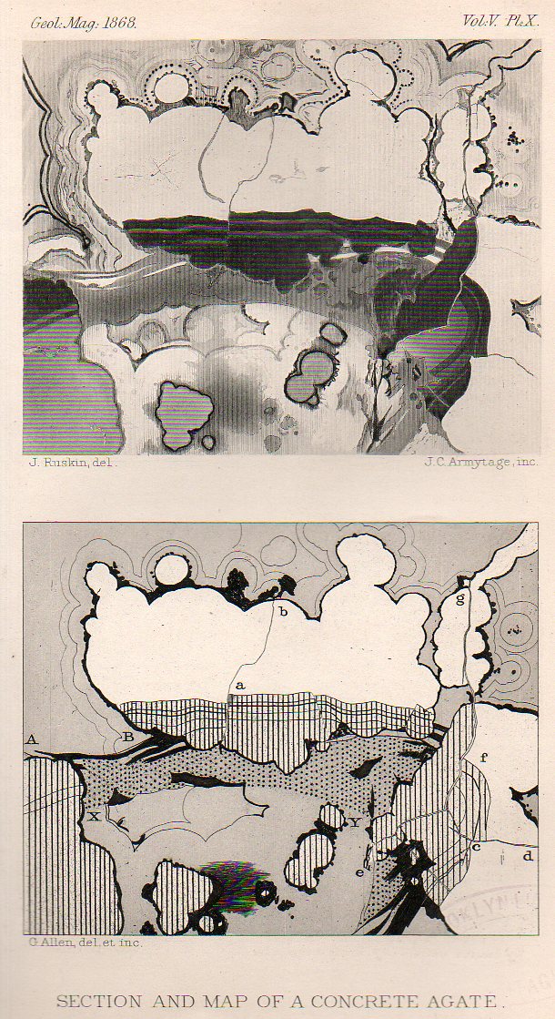
    First of all in all of my years I’ve never come across any cartographic-anything that suggested a map of a single rock, let alone a rock section. But there it is, presented in 1868 without a hint of romanticism.  A little unfocused concentration will bring this concretion into some sharp relief as a map of some sort. In the top half of the engraving it is even possible to see an elevation and a plan in the two parts of the image–and then, with either more or less focus, the map disappears and you’re back into the art of the scientific data transmission.  

    They are beautiful things, and their design can mean as much or as little as you care or try to see.

    Ditto concretions.  These have similar capacities for wonder–they’re geometrical artwork made of rock embedded in layers of stone, compact masses formed by precipitation of mineral cement…and potentially fabulous things, works of great beauty that could be considered works of pre-modernist art if they were presented in 1912 rather than when these current samples were exhibited in 1868–especially if you looked at the images in sections and detail.  
    ·Posted by :

    ·in:

  • The First Printing of an Interaction of a Child with a Telephone (1880)?

    JF Ptak Science Books  Quick Post

    The first practical and public and successful demonstration of a working telephone occurred on 10 March 1876. Four years and five months later, after an explosion of interest and use and application of perhaps the greatest technical invention of the 19th century, after many lawsuits and many different interpretation of patents and additions to the field of telephony, an unusual note appeared in the pages of Nature.  It is singular, I think–and I can say this after having read about the early years of the telephone for many years–that this article may contain the first conversations by a child on the new invention.  The conversation was all one-sided, and mostly imaginary, but still it must count for a first-something in regards to children. 

     [Source:  Nature, September 9, 1880, page 442.]

  • Space Station, 1783

    JF Ptak Science Books   Quick Post

    Balloon air station[Image source: Lily Library, here.]

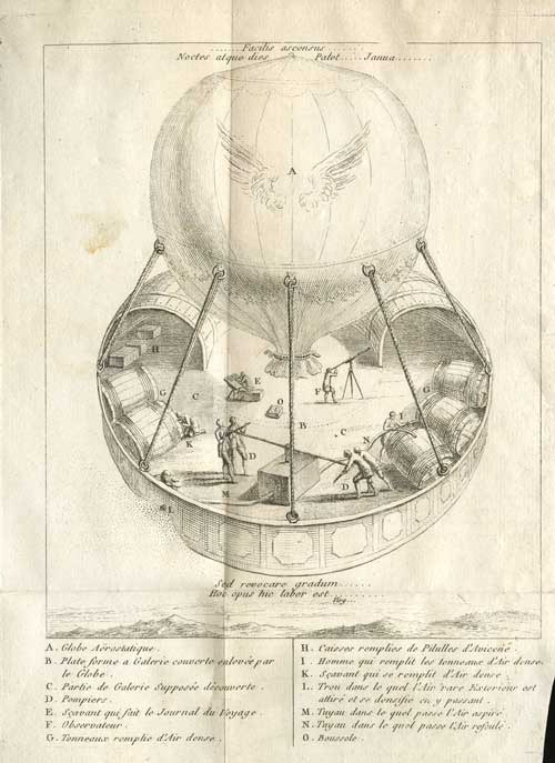
    This is perhaps the earliest image of a flying observatory, appearing rapidly in print in the same year as the revolutionary first flight by the Montgolfier brothers. It isn’t a “space” station, of course, but it was close to being one in the 18th century. (The title of the work:Lettre à M. de ***. Sur son projet de voyager avec la sphere aërostatique de M. de Montgolfier. Avec figure, which was printed in Paris by Marchands de Feuilles Volantes in 1783.) From what we can see of the platform there is an astronomer, someone taking notes, barrels of provisions, and five crew members operating an air pump, as well as two sheds. 

    The interesting quote at the bottom  from Virgil’s (Aeneid vi) “sed revocure gradum hoc opus hic labor est” and in English, “It is easy into Hell to fall, but to get back from thence is all”.

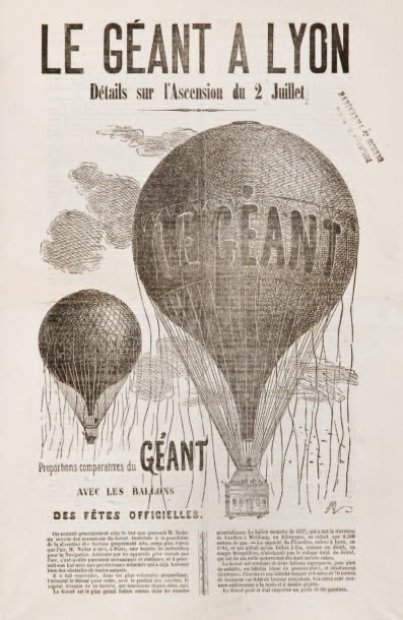
    It does remind me some of the Nadar “le Geant” balloon, which was a six-bedroom monster that saw only two flights before crashing–it was however the largest thing ever to fly up to that point. (Nadar was the first person to make aerial photographs among many other photo-firsts–and outside that he was the first to host an Impressionist exhibit of art.)

    Balloo nadar[Source, Druot catalog, here.]


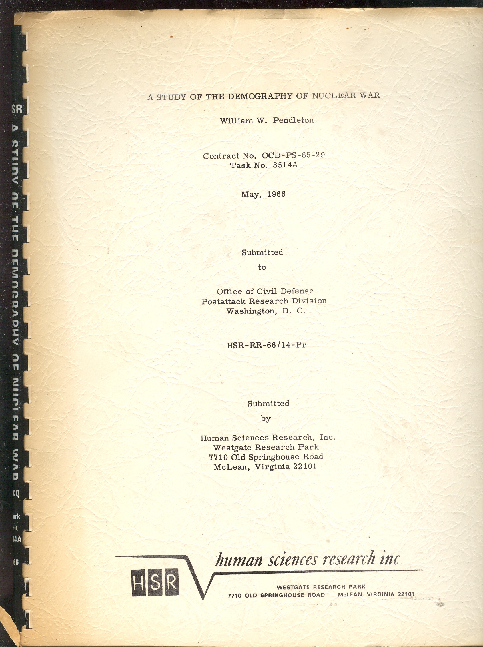
  • Controlling the Vocabulary of Nuclear Warfare

    JF Ptak Science Books   Post 2201–expandedAbomb-cvr

    [Part of the Atomic and Nuclear Weapons series.]

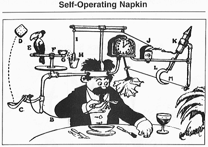
    I think no plumb line was ever so worked with pulleys and wheels, strings and catclaws and other Rube Goldberg devices as were the demographic studies of nuclear warfare.  It is as though their compass rose had no compass, with everything centered on the center, no way out, no way in. just there.  A faceless clock face describing “G-2 o’clock” whenever it pleased.  These studies seem to me the nuclear warfare equivalent of the Bellman’s map (described earlier in this blog as the most perfect map ever constructed): a pretty polygon describing a totally blank surface.


    I have a number of these things here, some of which are restricted-distribution publications, works of statistical fancy/fantasy meant for other eyes in the same community dedicated to the fancies described, a tautological audience for self-referential. 

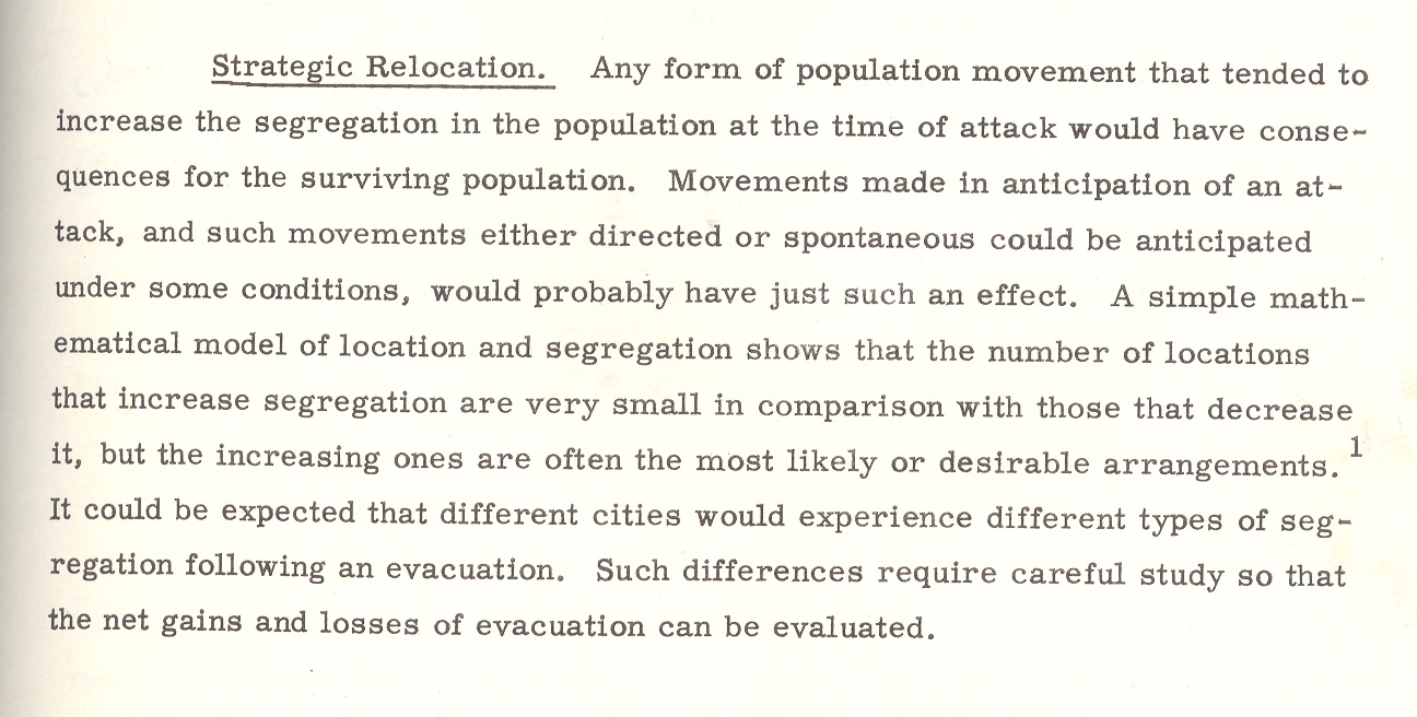
    One such bit, plucked from this pile is William W. Pendleton’s A Study of the Demography of Nuclear War produced by “Human Sciences Research, Inc.” [This item is available for purchase from our blog bookstore.] Outside of its statistical foray in survivability and the procreative prospects of the left-overs of vast nuclear exchanges, the work is a solemn attempt at institutionalizing the death requirements of nuclear combat.  The necessity of overwhelming carnage is presented in ironic and underwhelming language, the first bits of which are seen in the conclusion of pamphlet’s abstract1:

    “Cities differ in the kinds and magnitudes of change to which they might be subjected. Considerable variation in the demography of surviving populations can be expected; that variation would be related to policy decisions; and those decisions should therefore be examined for their demographic implications.” [Emphasis mine.]

    Atomic goldberg

    Put another way, the city is the main focus of the survivability equations, and the chances of the humans being bombed in those cities would change with—god help us—the amount of bombing.

    Cities differ in the kinds and magnitudes of change to which they might be subjected.

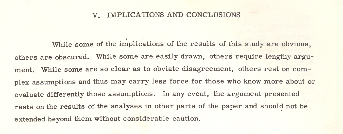
    This is the key I think to understanding documents like this, making a simple foundation statement so convoluted and tortured that it and most of what follows make any sense outside of restating themselves. Which I guess is a strength.Abomb-conclu 1

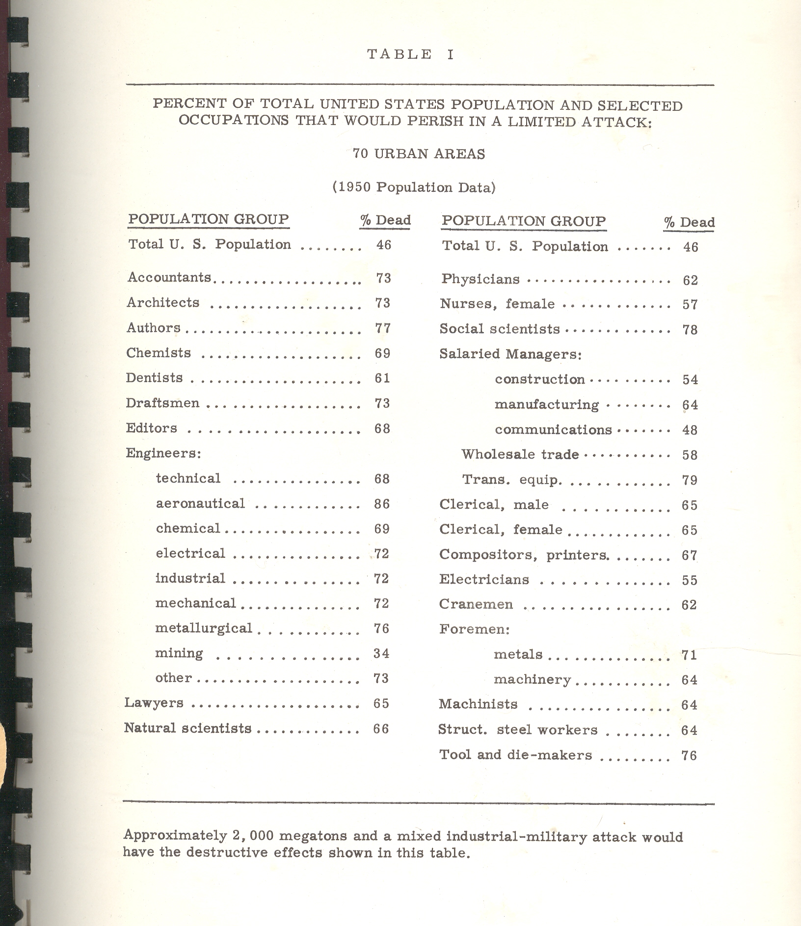
    Back to the pamphlet and the interesting table that attracted my attention.  According to one study [and for the sake of brevity I’m not going to describe the scenarios or data estimation methods and so on] the U.S. would suffer 46% casualties [meaning immediate deaths and not as a result of radiation or illness or starvation or the encyclopedia of whatever that would lead to death somewhere down the road].  The resulting demographic of the “perished” by job description postulates that the most-killed category of worker would be: (#1) aeronautical engineers, 86% dead; (#2) transportation equipment salaried manager, with 79% killed; (#3), social scientists, with 78% of them going down with their clients; (#4), authors, with 76% gone.

    Abomb-casualties2

    Authors?  Of what, I wonder?  The good ones with the bad?  Are authors different from writers?  And what do you call folks who produce tv shows?  Since the stats here are for 70 cities there’s no wonder that there aren’t any farmers in this table, as the majority target areas (some 450 cities cited elsewhere as targetable, including my own little burgh of Asheville, N.C.) would naturally have city folk in them.  And so I’m guessing that three-quarters of all “authors” in 1960/6 were living in these target cities and were going to go up in smoke.  The aeronautical engineers category is more understandable as every one of those industries employing 50 or more people would be a target; frankly I’m surprised that given the possible firepower of the Soviet Union in 1966 that 14% would survive; I’d guess offhand that the number would be 2%. 

    Abomb-conclu 2
    Even though this stuff is spread out in only 98 pages or so it would keep a person busy segregating the Orwellian gems from those not; it would be a tricky business as most of the “text” in the “not” category would be largely limited to prepositions. 

    Here’s another bit:  a parenthetic poke at the post-attack composition of Congress. It is stated that the “postattack” (hyphenated no longer) Congress would be “quite different”.It would also be (“in their eyes”) “more Conservative than the pre-attack (hyphenated!)  Congress.  It isn’t a cause for great prognosticational (?) liberty to assume that the Congress might be more Conservative, but why on Earth did the author qualify the assumption by saying “their eyes”?  Pish and posh.

    The paper goes on its merry way, connecting the necessaries of Goldbergian delight, and somehow nothing ever happened, which to me is a secret miracle.  Especially given the weight of papers like this one, which seems to medicate the effects of war, assuming that there will be a Congress and that people will report back to work once the factories are rebuilt and that there will be more segregation in the colossal world of post-attack America, and on and on into the red dawn. 


    Mr. Mencken’s view of Warren Harding comes to mind when I read this stuff and wonder about how it was that we didn’t blow the whole place up:

    “I rise to pay my small tribute to Dr. Harding. Setting aside a college professor or two and a half dozen dipsomaniacal newspaper reporters, he takes the first place in my Valhalla of literati. That is to say, he writes the worst English that I have ever encountered. It reminds me of a string of wet sponges; it reminds me of tattered washing on the line; it reminds me of stale bean soup, of college yells, of dogs barking idiotically through endless nights. It is so bad that a sort of grandeur creeps into it. It drags itself out of the dark abysm of pish, and crawls insanely up to the topmost pinnacle of posh. It is rumble and bumble. It is flap and doodle. It is balder and dash.”

    Notes

    1. The abstract from the above paper: “The basic problem with which this report is concerned is that of determining the kinds of demographic change that might result from a range of nuclear attacks, ascertaining the effects of those changes on the future of the surviving populations, and indicating possible areas for Civil Defense action and planning. Earlier studies of the demography of nuclear war were examined and their relevant conclusions and methodology incorporated in the report. A different methodology–expected to be more sensitive to compositional effects–was then designed. The new methodology was tested and found to be more effective than the old. Surviving populations representing a wide range of variation in attack conditions were created on the basis of both old and new methodologies, and the demographic significance of these populations was examined. Assuming a range of post-attack demographic conditions, a series of projections was made on the surviving populations. The demographic significance of the recovering populations was then examined. On the basis of the analysis a series of recommendations relevant to Civil Defense planning was made: Within the framework of this analysis the crucial variable is the demographic pattern of the city. Changes in composition, as well as size, could be of substantial magnitude and would last for generations in some cases. Cities differ in the kinds and magnitudes of change to which they might be subjected. Considerable variation in the demography of surviving populations can be expected; that variation would be related to policy decisions; and those decisions should therefore be examined for their demographic implications.”

    ·Posted by :

    ·in:

  • An All-Roads-Lead-to-Soap Map

    JF Ptak Science Books   Daily Dose from Dr. Odd

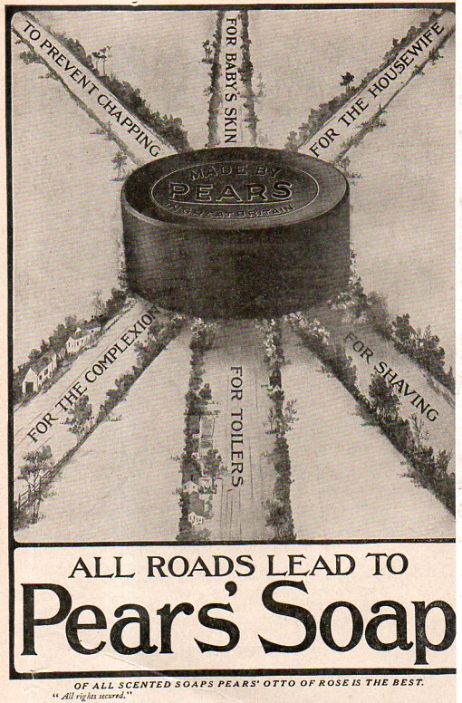
    Soap map002

    Evidently all roads lead someplace other than Rome–a bold statement of imaginary cartographic exactness to come from a soap company.  What perhaps trumps this oddness is that this ad was improbably featured as a big back-of-the-cover ad in the relatively new Astrophysical Journal for November 1908.  I’m not suggesting that astronomers and astrophysicists don’t use soap, of course, but to find this ad as about the only piece of external revenue in this journal is very surprising.  Perhaps the owner/manufacturer had an interest in astronomy and gave a little funding to the publication…

    Here’s a more global outlook of the capacity of a soap-like cure:

    ·Posted by :

    ·in:

  • When was the First Computer-Generated Poetry?

    JF Ptak Science Books   Post 2202

    All I have in this question is the question, and one that I believe I have not seem before. There are certainly much earlier ideas published on writing machines–Lemuel Gulliver encounters such a beast in Laputa in his third voyage, and there’s also Ramon Lull’s writing device–but they were more popularly published. In this case I’m referring to poetry made by a computer that is composed by the machine, not hypertext mark-up digital poetry, and not a poem-generator, nor code poetry, nor visual programming, but a computer Poe, and published in a technical journal.  It is unknown to me when this first happens, though I did find an unusual and very early appreciation of such a thing in the May 1956 issue of Computers and Automation.  A snippet from this early effort is here:

    Computert poetry003

    Computers and Automation is the first semi-popular magazine dedicated to the computer (the first professional computer journal was Mathematical Tables and Aids to Computation, begun in 1943) and this bit appeared in its fifth volume, in a story called “The Mechanized Muse” written by Elizabeth W. Thomas.  It is a sci-fi/speculative story, which makes what seems to be an odd appearance in a journal such as this, which is the reason why this is a “semi-popular” mag. (As it turns out there are a number of other sci-fi pieces in here over the years, including Arthur Clarke’s “The Nine Billion Names of God”, which appeared in the sixth volume in 1957.)

    So this is a satirical story about the possibilities of computer intelligence, told mostly tongue-in-cheek, resident in a machine called the YERP, built by a 67-year old scientist from Austria named Carl Jonus Yaffee, who built a number of other electronic devices all using a piece of his name in their’s. In any event the YERP was designed to treat solutions of words rather than mathematical equations, and was composed of “500 vacuum tubes, 10,000 transistors, 30,000 crystal diodes, 350 pluggable units, 1,356 miles of wiring, a magneto-electronic storage unit with a 5,000,000 word capacity…with a 1,500,000 word vocabulary all of which are punched on cards” and operated by a team of 56 technicians.  

    The machine worked to some degree and was seen as a success, and would be made available to poets and writers after it was installed in the New York Public Library, though it seems from the results that as remarkable as it was to be envisioning  a writing machine  in 1956, that it was really not a necessary addition to the cultural canon. At least not yet.  


    ·Posted by :

    ·in:

  • Dangerous & Impossible Books: Writing that Hurts When Read

    JF Ptak Science Books  Post 2203 (an earlier post continued and expanded)

    “Sometimes a book is just entirely bad, and sometimes it is entirely nothing. It is impossible for a book to be both very bad and very nothing. Impossible.  Except for this book, whose badness is exceeded only by its nothingness, and vice versa“.  (probably not) Oscar Wilde

    And so into this black hole of imaged Wildeian description we go, into a very real-ish book.

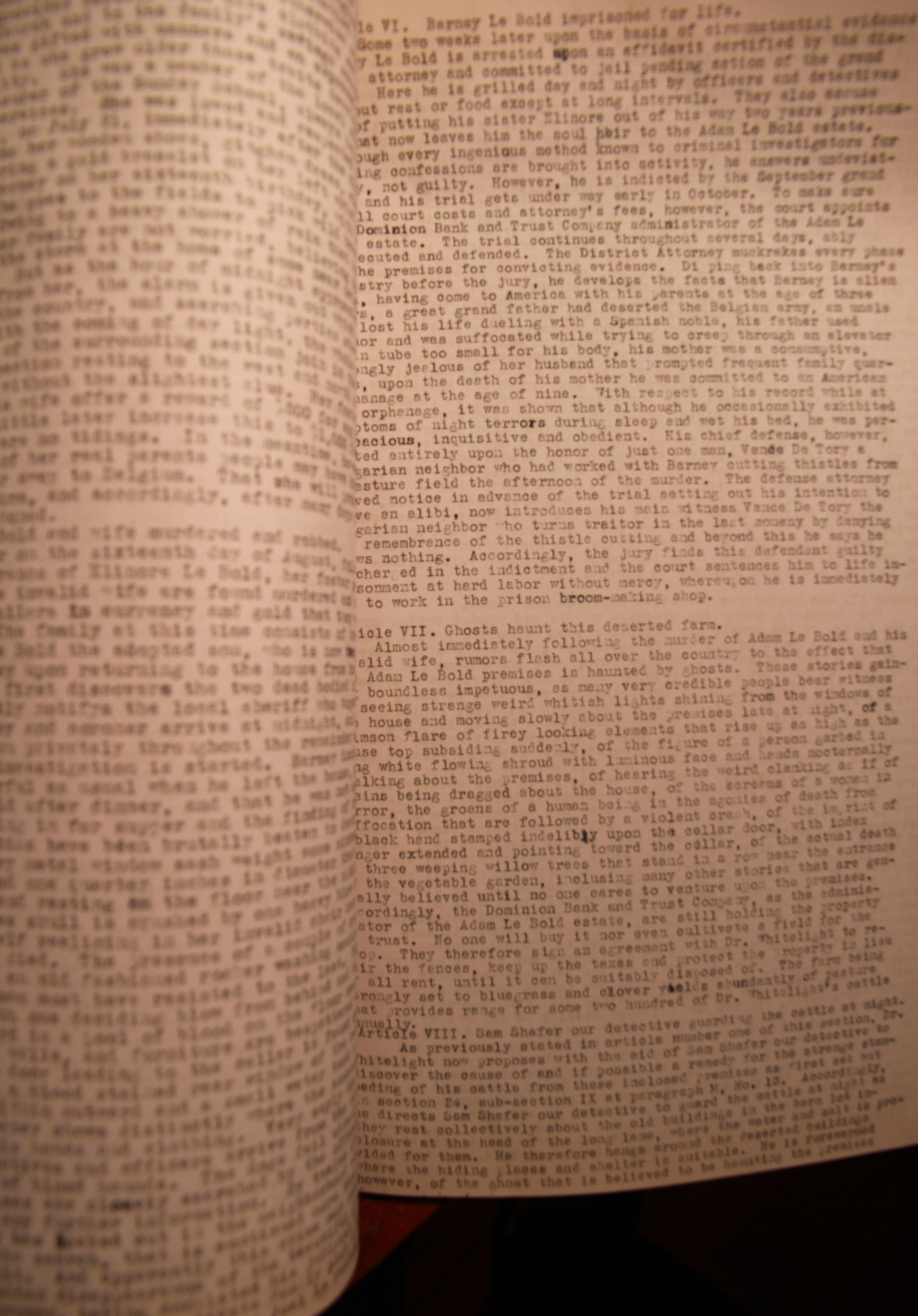
    I found a novel tonight, bought long ago and long ago mostly lost.  It was written by a doctor who worked in the District Hospital in Lima, Ohio, and written in 1934.  The Lima Hospital was the largest poured concrete structure in the world when it was built in 1915, and stayed so until the Pentagon was completed.  The hospital was established for the criminally insane, had 14″-thick walls, and reinforced steel bars laid into the walls that went “right down to bedrock”. 

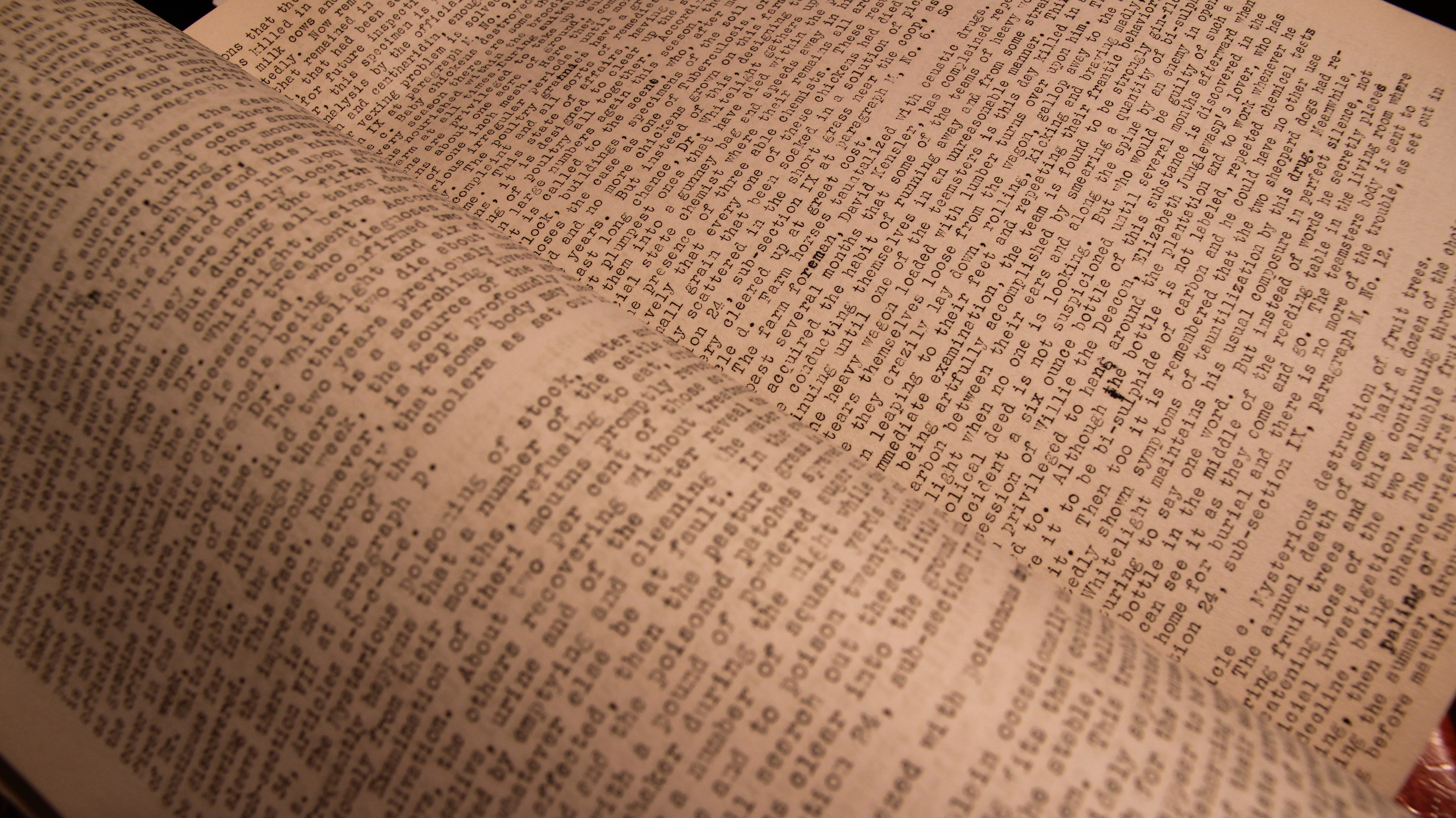
    It was somewhere in there that this doctor wrote something that was really so toweringly bad that it escapes comprehension. I own the carbon copy of the unpublished work, which is typed on 14×8.5″ sheets of paper, front and back, running 94 pages. It is a very crowded affair, with 90 lines of single-space typed lines, making the work about 115,000 words long. 

    There wasn’t enough space evidently for paragraphs, which gives the work a kind of insistent, casket-cramped cruelty.  To read it takes your breath away for its dullness–the book moves so weirdly and at the same time so very slowly that it doesn’t move at all even while moving.

    Manuscript insane one

    A few months ago I found the seven-foot-long scroll of the book’s plan–a work of crowded magnificence of nothing and confusion, being very orderly at the same time.  It went to a friend of mine who created artwork around it, and as it happens made a very noticeable appearance in a very significant yearly show in NYC last week. I was stunned to find that there was actually a text to go with the scroll-outline–it emerged from the warehouse this week, so perhaps this too will find a very celebrated life as art as well. Certainly the book would go nowhere on its own as a book, though it stood a chance at surviving on the grounds of its considerble design weirdness, which is of a complexified beauty.

    Manuscript insane two

    In the meantime, before all of the letters slide themselves off the page from sheer boredom and before the thing is resurrected as a magnificent artistic effort, I’ll share some ianges of the extra-ordinary book of reversed brilliant badness. I’ve also culled a few imaginary descriptions of the book from writers known and not:

    Potboiler scribbler:

    “He couldn’t speak.  He could barely see. Blinded by the flames ignited inside his eyeballs from the novel in his lap.  The words were like molten lead, sucked off the page by his eyes, forming a vacuum in his brain.  It was a bad book”.

    The first-time published novelist’s approach:

    “He couldn’t speak the words of the thoughts in his head, because they and all of his breath were stolen by the magic of the complete badness of the book in his lap”.

    Gertrude Stein:

    “The book was bad and bad, and bad was the book. Even the badness of the bad was bad, a whole new insight into being bad. It was the bad book by which bad books are called bad”.

    Ernset Hemingway:

    “He didn’t read the book so much as he looked through it.  It was easy–there was nothing there. As bad as it was, it could get no worse. So he shot it, and poured a drink”.

     You might wonder what this book is about.  Me too.

    ·Posted by :

    ·in:

    —
  • An Image of the Enormity of War, 1918

    JF Ptak Science Books  Quick Post     Part of the series of WWI Photography

    WWI riqueval1918
    [Source:  Wikipedia  and originally from the  Imperial War Museums]

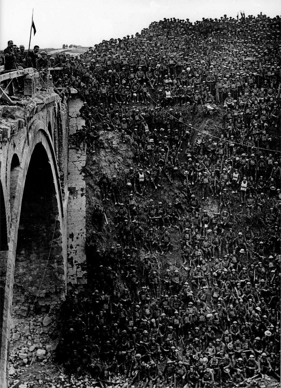
    This increible image shows an enormous gathering of the 137 Brigade, 46th Division, gathered post-battle on the banks of the St Quentin Canal, next to the Riqueval Bridge. It was one in a series of pivotal battles to bring the war to a close, this breaking the Hindenburg Line (a major element of the German defence system) which came which formed part of the German defence system, the Hindenburg Line, which was broken on 29 September 1918. They are being addressed by Brigadier General J C Campbell VC CMG DSO on the Riqueval Bridge.

    The close-up below was taken directly from the Imperial War Museum (here), and shows the reason or major reason for the assembly, which was an address by Brigadier-General J.C. VC CMG DSO Campbell to his  troops, more visible with his cap off, at extreme left on the bridge.  

    Riqueval bridge closeup


    ·Posted by :

    ·in:

  • About a Vocabulary for the Punctuation Period

    JF Ptak Science Books   Post 2204      History of Dots series

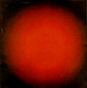
      Black_circle

    It is very odd how in the History of Stuff that clouds really were 
    never studied or named until the early 19th century–
    not even the great classifiers reaching back to Aristotle did so.  
    Clouds are enormous and changing moving statuary, 
    and bring pain and joy and everything and nothing, 
    and still they escaped notice. 
    Even the invisible Winds have been named 
    and codified going back millennia.
     
    It makes me think of things that we have control over now, 
    modifiers of expression, that have been basically the same
    for decades of centuries or longer, and escape notice for improvement.
     
    I was thinking of the markers/signifiers on the keypad I’m using right now. 
     The “.”/period, for example. Outside of  “…” which signifies (mostly) 
    a trailing away or reticence of some sort, 
    the period has stayed the same for 500 years.  
    But not all sentences end in the same manner–
    some come beautifully to a halt, 
    some struggle for existence and then die at the end,
     others are seemingly both eternal and lifeless, 
    some find themselves at a screaming halt, and so on.  
    There must be different sorts of “.”‘s, no?
      Dot--Rodchenko White Circle, 1918
    [Alexsandr Rodchenko, White Circle, 1918. Source: Radicalart.info, here]
     
    There have been additions like we see in that last sentence “?”, 
    where a sentence is ended in a question or questioning. 
    And of course there’s the “!” and then combinations 
    of those two “?!”, “!?”, “??”, “!!”, and so on.
     
    But the period seems to stay about the same. 
    Perhaps a color or three could be added, like a red period 
    when the sentence comes to a hot and firey end.  
    Or a period within a white circle to indicate variency or aloofness from its conclusion.  
    Perhaps a change in size, or several concentric rings, 
    could indicate coming to an end in exasperation, 
    or mensuration, or perspiration, or whatever other number of -ations there might be.
    DOTs--kljunRedLight-SpherComp23S[Ivan Kljun, Red Light, 1923. Source: Radicalart.info, here]
     
    The problem is then a person could use a keyboard for just the period–
    same too could be said for the comma and the delivery of pause and effect.
     
    And then again, if the sentence was written well enough, 
    a person wouldn’t need all of that extra cabbage at the end–
    plus, well-written or not, the reader could supply their own ending.
     
    So I guess we’ll just leave the period alone.
     
    The “dot” however is another story.
    It probably didn’t make a triumphant appearance until the printer’s tray, 
    and then stayed that way
    for hundreds of years, half a millennium, until, suddenly, it was much more.
    It became the point of pointilism, getting an enormous independent life in the hands of 
    Seurat and Pissaro in the 1880’s, and Signac and Van Gogh in the ’90’s, and Metzinger and Delauny in the ‘oughts, 
    and were filled with color and division and reflection and endless possibilities, 
    all dependent on where you stood and the proximity to the artwork.  
     
    And then in 1915 the dot became a point became a circle became an icon, 
    artwork again but without almost every other visual aspect of all the other painters who 
    ever painted before, 
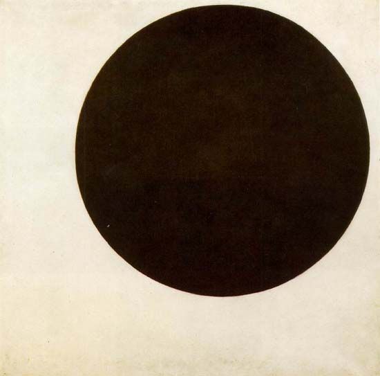
    a beautiful simple place on a canvas by Kasimir Malevich.
    That’s the image up at the top of the page, the Mona Lisa of Suprematism.
     
    It came just a few years at about the end of the greatest revolutionary period of change 
    that has ever occurred to/with humans, from about 1885-1915, when almost everything became ‘modern”.  Centuries/millennia of artwork became completely different with the pre-Impressionsts, and then again with Kandinsky who removed all representation of identifiable forms and replaced them with shapes and colors, and then with Malevich who removed almost all of those and wound up with his monumentally simple forms, a deceptively simple thing leading to great complexity.  
     
    Pixels are an entirely ‘nother thing.

    ·Posted by :

    ·in:

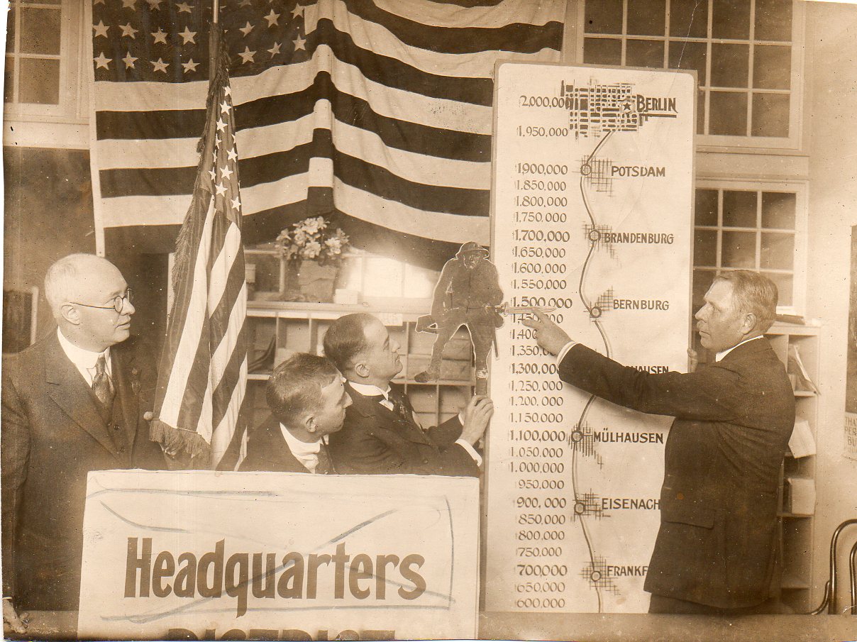
  • A March of Millions to Berlin, 1917

    JF Ptak Science Books  Quick Post   World War I Photography series

    Authorization hotel011

    I’m not sure at what point during the War this image  was made (though I suspect it was midway through the American experience) and shows what I think is the enlistment and draft numbers for U.S. soldiers. The progress of the growth of the Army is charted against German cities that were to be conquered or had already been engaged.  The Doughboy in the graphic along with everything else looks clean and hopeful and determined–the end result of all of this determination was Victory and Defeat and people dead everywhere.  

    ·Posted by :

    ·in:

    —
  • An Unusual Look at the World by Lord Kelvin, 1880

    JF Ptak Science Books   Quick Post

     The great Sir William Thomson, Lord Kelvin–one of the leading lights of the physics world of the 19th century and a man who worked deep and wide and over and under and around and through many different fields–contributed the following bit of unusual and interesting thinking. It came at the Swansea Meeting of the British Association (1880).

    ·Posted by :

    ·in:

Recent Posts

Archives

Categories