A Daily History of Holes, Dots, Lines, Science, History, Math, Physics, Art, the Unintentional Absurd, Architecture, Maps, Data Visualization, Blank and Missing Things, and so on. |1.6 million words, 7500 images, 4.9 million hits| Press & appearances in The Times, Le Figaro, Mensa, The Economist, The Guardian, Discovery News, Slate, Le Monde, Sci American Blogs, Le Pont, and many other places… 5000+ total posts since 2008.

  • First Light to Good Night–Putting a Telescope to Sleep

    JF Ptak Science Books  Post 2372

    “In the old Telescope’s tube we sit, and the shades of the past around us flit; His requiem sing we, with shout and din, while the old year goes out and the new comes in”–Verses composed by a child of John Herschel, on final resting place of the great 40′ telescope, 1840

    A “Mad King” entered the world’s greatest telescope just before it was completed; 51 years later after a good life in the skies, children played inside of it in a garden, the telescope horizontal and asleep.  Between those times William, Caroline, and John Herschel used it and the data it produced to perhaps the greatest end of any family that has ever worked in the field of astronomy. They were the great classifiers in astronomy, and their telescope, constructed between 1785 and 1789, 40′ long and with 48″ mirrors, was a contributor to that, and was the largest telescope in the world for about 50 years.   
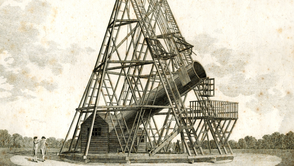
    Herschel telescope[Institute of Astronomy via The Economist]

    Even though the telescope wasn’t laid to rest until 1840, it stayed in use only until 1815, having come online in August 1789.  Magnificent as the 40′ was,  there were certain problems with it, and occasionally the great bulk of the instrument worked against itself, and it sometimes proved less effective than smaller telescopes.

    The telescope was a result of some fantastic work by William Herschel (1738-1822),  who built hundreds of superb instruments over his lifetime, and whose prodigious work lead to many discoveries, not the least of which was the discovery of Uranus, which was the first planet added to the night sky since antiquity and which (sky!) rocketed Herschel to international fame. (There were serious suggestions among the leading figures in astronomy that the planet be called “Herschel”. The British  Crown responded to the utter beauty of his work and offered funds to construct the great telescope.  When it was nearly constructed King George III visited and stepped inside the tube of the great thing, stating something to the effect that it was the stairway to the stars. 

    George III had a certain set of issues–well, it was all mostly issues, due to some physical malady that caused the poor King to live a very strange intellectual and interpersonal existence, bursting the known limits of “normalcy”. But he was certainly correct in his appraisal of the telescope.

    George III survived his failure with the Colonies by 31, as well as the useful life of the telescope by five. I’m not sure how long he survived himself.

    Back to the children and the retirement of the telescope.  It was about 25 years after the telescope drew its last useful breaths that John Herschel, William’s son, decided to haul the iconic instrument down. He was concerned about the deterioration of the telescope, namely the wooden casing that was rotting around the metal tube–and the fear that the thing would collapse. A big, heavy, wood and metal 4′ wide tube crashing down from its perch, possibly injuring his children. And so down it came.  The wood casing came off, the mirrors came out,  and the telescope was laid horizontally of wooden blocks in the garden–the “broad bright eye” was consigned to its final rest.

    There was a ceremony to the resting bequest of the telescope, and it reminded me not so much of funerary customs, but of memory more so than remembrance.  It was to me more like the beautiful and simple Japanese monuments to lost and broken children’s toys rather than burying something on a hill under a lonesome pine. The Herschel telescope, which figured to be one of the great and iconic images of telescopes (and perhaps astronomy?) in the history of science, was laid to rest with a family-and-friends ceremony at the Herschel’s. Like the idea behind the Japanese monument to toys, and their memory and importance, whether the toys existed or not–the ceremony for each discriminated the importance of the object that made it more than the “thing” it started out to be. The ceremony elevated the object to the place it deserved to be, living or not.  

    “No two toys are ever broken in the same way or with the same emotional results.” Robert Graves, Poetic Unreason

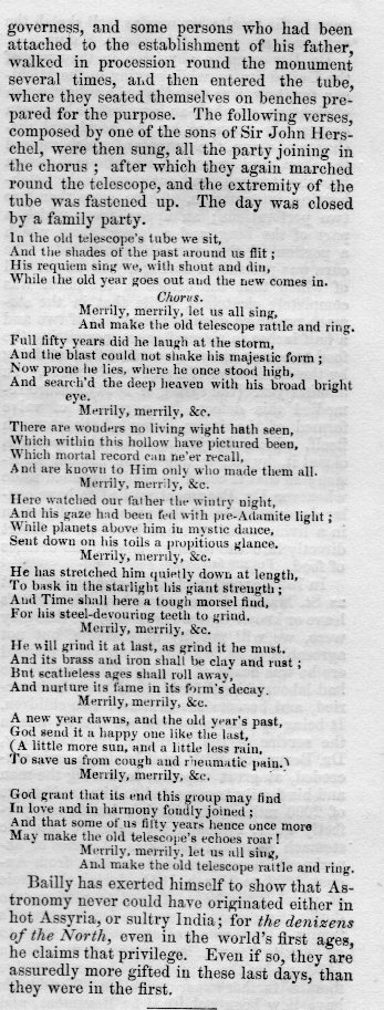
    And there was a ceremony (on January 1, 1840) for the telescope: the Herschels and their seven children and the children’s governesses and assorted friends who had known the telescope and William Herschel formed a procession that circled the telescope several times, after which the entire party entered it and sat on benches provided for the occasion.  There were verses sung (reprinted below)–evidently to make as much noise in the old telescope as possible, after which the group exited, circled the instrument a few more times, at which point the open end of the telescope was sealed.  

    “God grant that its end this group may find

    In love and harmony fondly joined; 

    And that some of its fifty years hence once more,

    May make the old telescope’s echoes roar?

            Merrily, merrily, let us sing, an dmae the old telescope rattle and ring”

    I found this lovely story in an issue of The Mirror of Literature, Amusement, and Instruction, for Saturday, April 25, 1840, page 281.  

    I mentioned above that the telescope is one of the iconic history of science images of the last few centuries–as it turns out the early photographic portrait of the man (John Herschel) who put the telescope down with great dignity is another iconic image, with that in the history of astronomy. The work is by Julia Margaret Cameron (1815-1879), and the image was made in 1867:
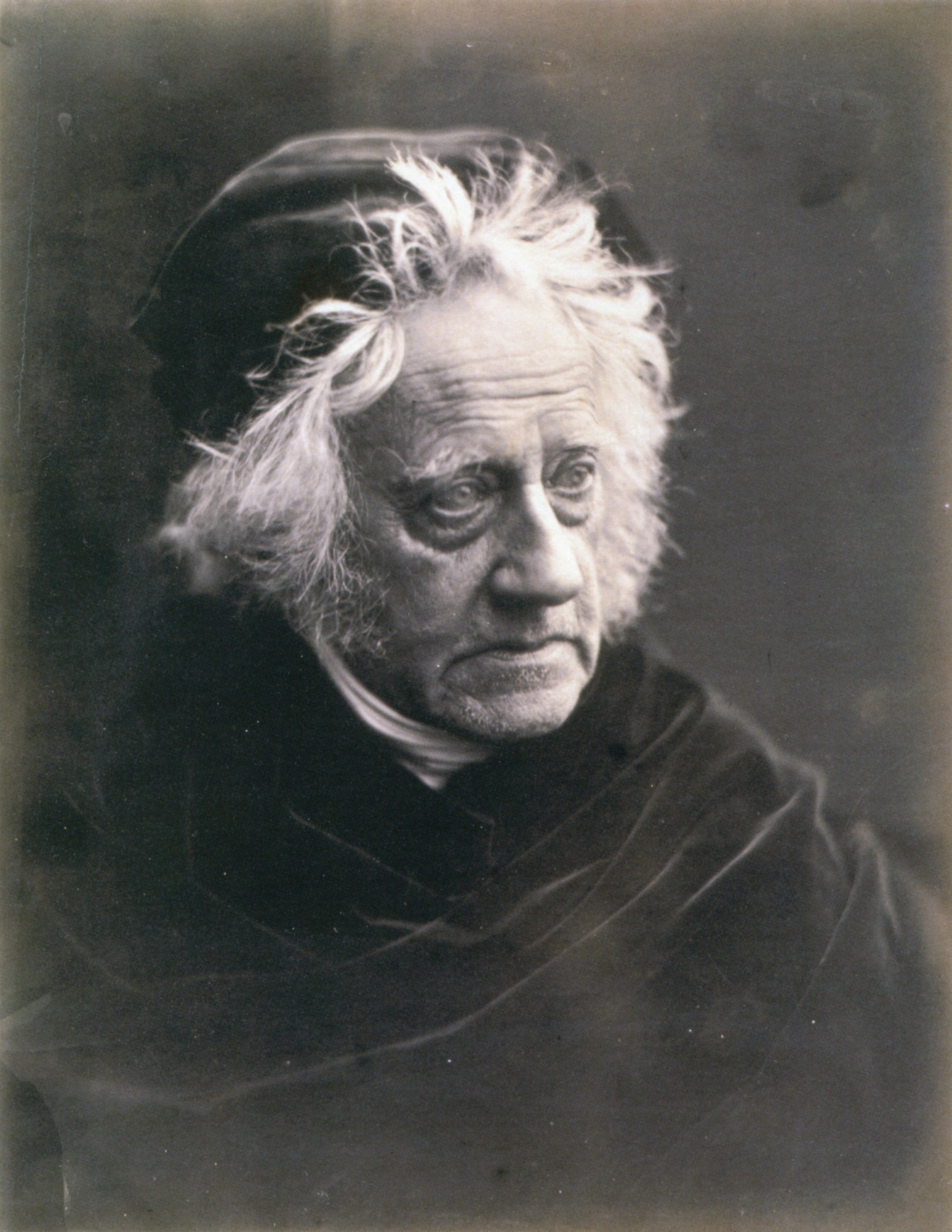
    Herschel, John portrait

    Image source: The National Portrait Gallery, via wiki commons

    The piece from The Mirror follows: 
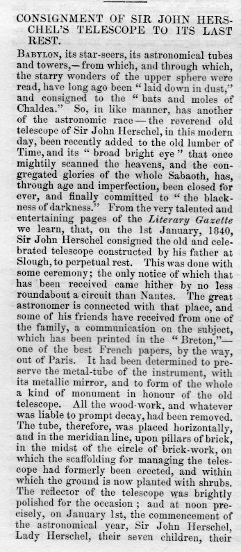
    Hershcel telescope517

    Hershcel telescope518

     It is interesting to note here that not long ago the BBC’s “Stargazing Live” built a modern version of the 40′–using a sewer pipe. 
     

    ·Posted by :

    ·in:

  • Diagrams, the Display of Information, and Trees

    JF Ptak Science Books (An earlier post, expanded)


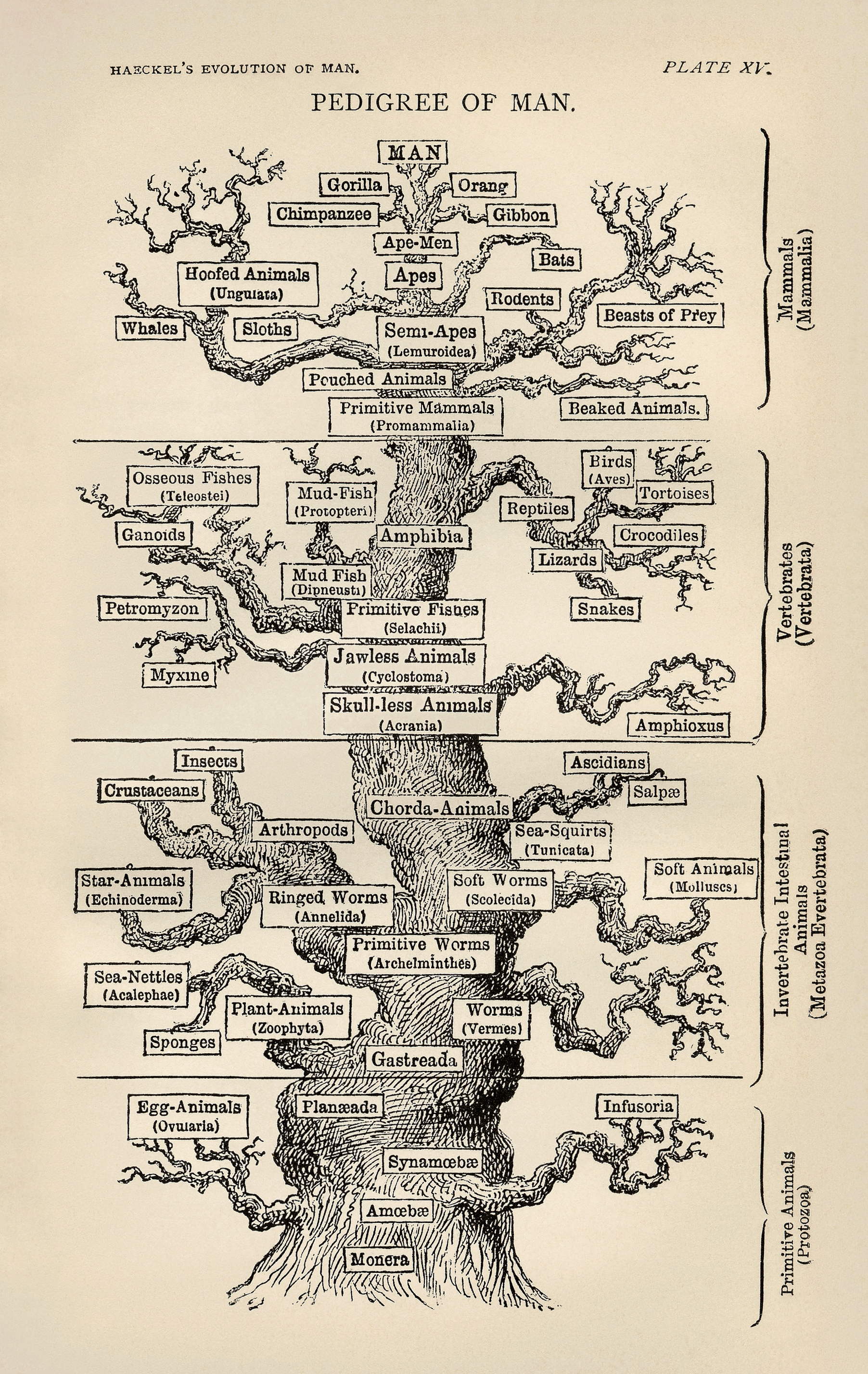
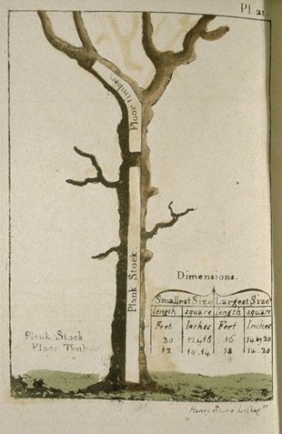
    I’m fond of images of trees, but mostly if they are forensic or employed to display relationships between ideas or data.  One of my favorites for the former is this great image from Peter Guillet’s  Timber Merchant’s Guide. Also, a Table, Whereby, at One View, May Be Seen the Solid and Superficial Measure of Any Square or Unequal Hewed Logs or Plank…1 (printed in Baltimore by J. Longrove in 1823).  Guillet was basically a tree dissector, a harvester of wood for the construction of naval ships.  His book shows how to make the best—the most efficient—use of various varieties of trees, displaying how to employ different sections of trees for different parts of a ship. The book must’ve been an indispensable handbook down at the mill.   At the every least, it certainly introduced a novel way of looking at trees.  

    Tree--timber guillet


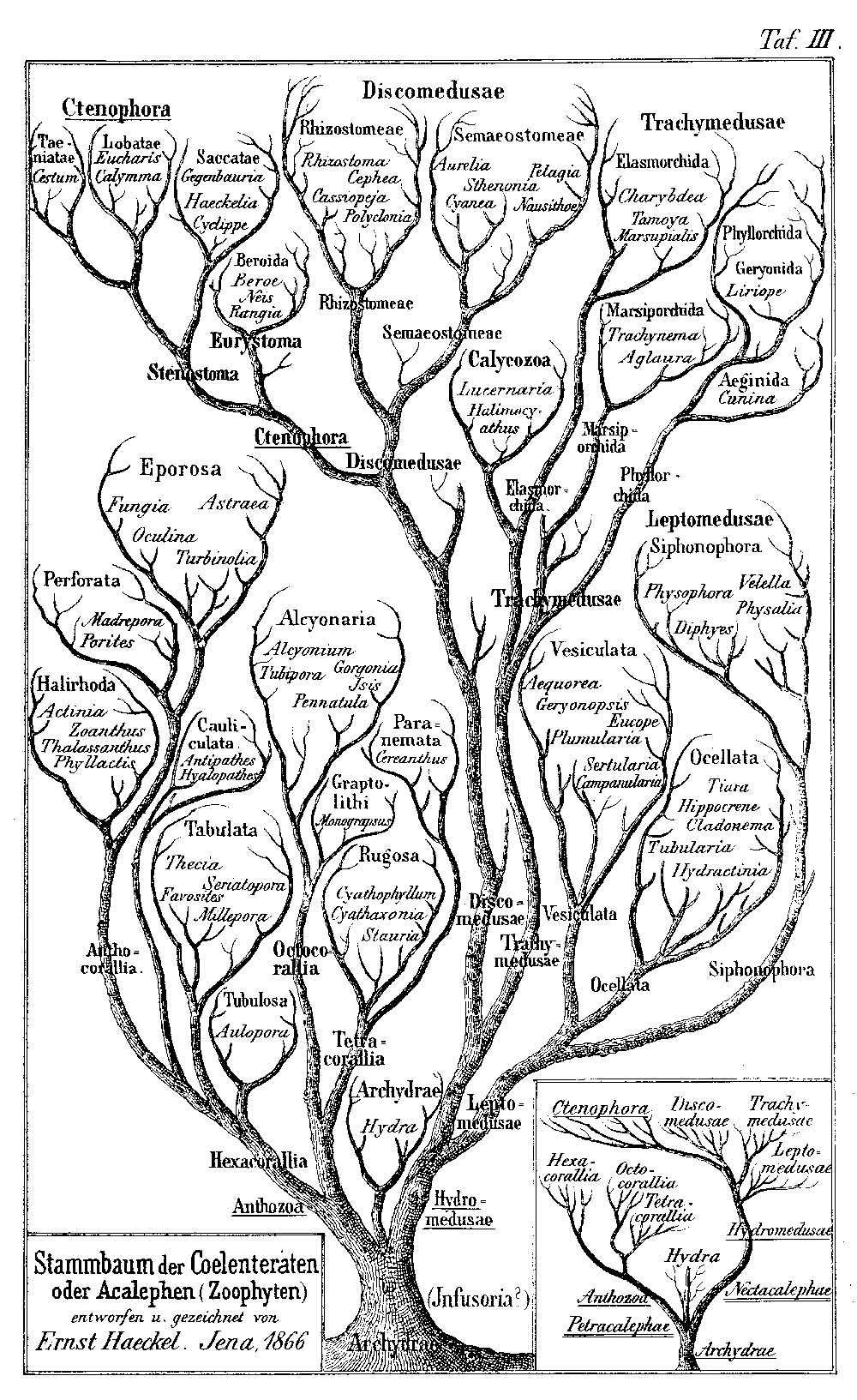
    This tree2 was a figure drawn by biologist and eminent Darwinian Ernst Haeckel3 (1834-1919), the branch spaces relating to intervals which were unrepresented in the fossil record. The image was perhaps the most popularly successful part of his two-volume double-wristbender—it was a difficult book, not well written or presented, with Charles Darwin himself finding it “impossible to read”.

    Tree-haeckel


  • A Nickel-Plated Low-priced Arithmetical Godsend (1922)

    JF Ptak Science Books  Quick Post

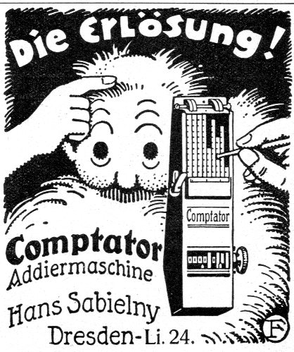
    The small $25 miracle/godsend to number crunchers everywhere was this small, nine-place, sliding-digit chain-adder mechanical calculator, set in nickel-plated metal, and which we see in this fantastic and half-bizarre ad in Illustrirte Zeitung for June 1922. The instrument was about eight inches long and came in its owns hard case, and was a very good instrument for the lowish-end market.  The add of course is fantastic. (“Die Erloesung” could I guess be transliterated as “Deliverance!” from the drudgery of making calculations by hand.) 

    German--comptator520


  • Life Expectancy Graphs and Charts

    JF Ptak Science Books   Reference Tools

    I’ve put together several interesting graphs and maps displaying historic human life expectancies–perhaps they will be useful.  

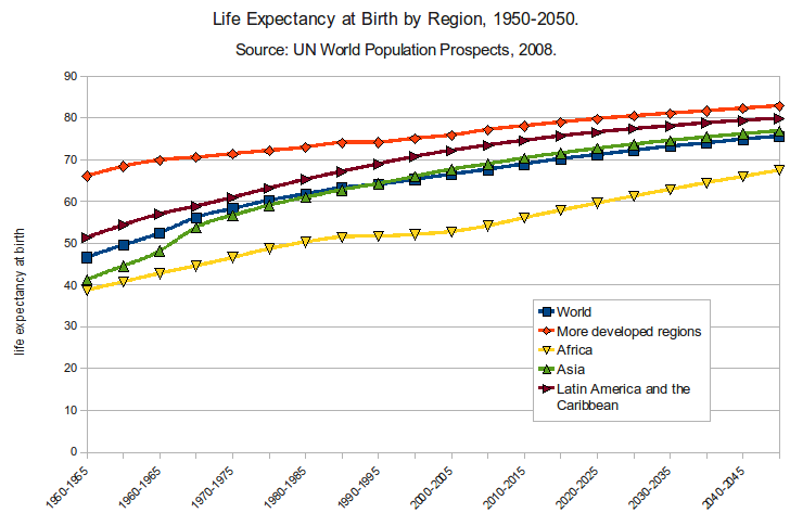
    • Life Expectancy at Birth by Region, 1950-1050
    • Male Life Expectancy via Region
    • Life Expectancy and Retirement Years
    • Life Expectancy by Region
    • Life Expectancy by Region, Concnetrating on Africa
    • Life Expectancy, U.S., 1850-2000
    • World Life Expectancy Map


    Life Expectancy--MapSource: http://upload.wikimedia.org/wikipedia/commons/2/29/Life_Expectancy_at_Birth_by_Region_1950-2050.png


    Life Expectancy graph

    Source: http://en.wikipedia.org/wiki/Life_expectancy#mediaviewer/File:Comparison_gender_life_expectancy_CIA_factbook.svg

  • L.A. Through the Looking Glass, 1912

    JF Ptak Science Books   Quick Post

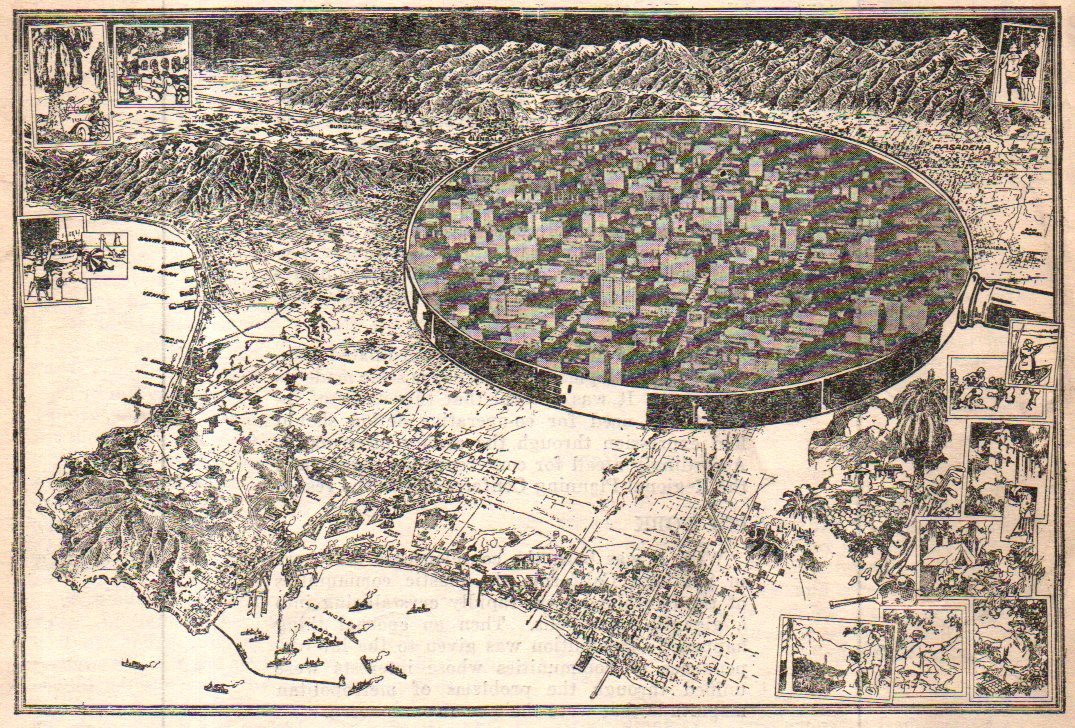
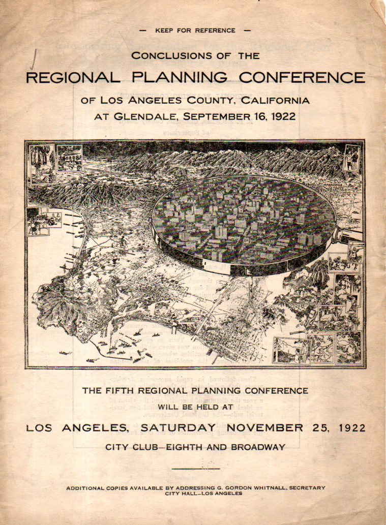
    This is an unusual bird’s-eye view of the Great Los Angeles area, the downtown area shown larger under a magnifying glass. It forms the central image of the cover of a pamphlet on the regional planning conference for L.A. County which took place in September 1912. I have not seen an image of the map online, and checking WorldCat I see that there is only one copy of the work located in libraries world wide (and this at Harvard), and so I’ll share it here.  

    LA Map529

    The metal ring of the magnifier does have the appearance of a 20-story tall wall, but it really is part of the instrument. It reminds me too of a mirror, of the mirror of the other Alice, the one from Lewis Carroll’s  Through the Looking-Glass, and What Alice Found There (1871), where Alice steps through the looking glass–in this case what we see in this lookig glass is the L.A. of the future that the planners could see.  

    The map is a detail from:

    LA Map530

  • The Beauty of Repair—Moving Heavy Stuff and Fixing the Impossible: Zabaglia and Fontana

    JF Ptak Science Books

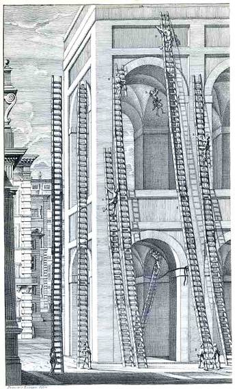
    Blogzabaggi043web

    This gorgeous, near-dadist image belongs to Niccola Zabaglia, who published it in his book Castelli, e ponti di maestro Niccola Zabaglia con alcune ingegnose practice, e con la descriziojne del trasporto dell’obelsico Vaticano, e di altri del cav. Domenico Fontana, in Rome, in 1743.  This is the literal and absolute height of pre-modern, pre-mechanized building construction in the soaring Roman Baroque, ordained by “maestro”, the master, Zabaglia (1664-1750), a spectacular (and necessary) proponent of practical mechanics as applied to the building trades.  Among the “Castles” and churches and bridges alluded to in the title of his book, Zabaglia was responsible for affecting the maintenance and repair of St. Peter’s (more particularly to the basilica and the vault)—specifically, he had to figure out how to get the workmen and materials into place, and into very difficult and very high places, without damaging or destroying any of the existing decoration, artwork, sculpture, frescoes, and so on.  This was no easy feat to perform back there in the dim, 265+ years-ago pre-electric pre-power past, with enormous technical and operational difficulties, and Zabaglia accomplished this was superior affect, devising complex and elegant moving and stationary scaffolds, hoisting and holding mechanisms for the ladders, and much else.  He did just beautiful work, and he is a patron saint in the history of repair. 

    Ladders and scaffolds were important of course but were among the least of Zabaglia’s numerous accomplishments and inventions—they were so plentiful and useful that two Pope Benedicts ago (Pope Benedict the 14th) ordered their publication with actual teams of artists and engravers performing specific tasks.

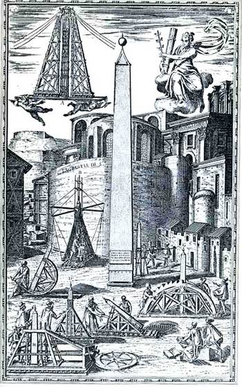
    Blogfontana045web

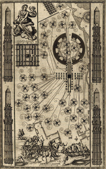
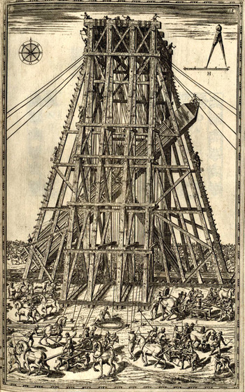
    This second image pertains to the tail-end of the Zabaglia title-page—the moving of the 500,000-pound Egyptian (carved during the reign of Nebkaure Amenemhet II, 1992-1985 BCE, and originally standing in the Temple of the Sun at Heliopolis) obelisk in 1586 by Domenico Fontana, which was one of the greatest engineering feats of the Renaissance.  Moving this enormous and relatively delicate object (from the Circus Nero, where it was placed by the emperor Caligula in 37 ACE,  to St. Peter’s Piazza del Popolo, 50 years or so before it would be more enveloped by Bernini’s flying wings) took years of (very) careful planning and months of motion and movement, not to mention an extra month to get everything into place and slowly raise the obelisk into its final position.  Fontana had to be cautious and correct, and he was, performing a not-so-minor miracle of pre-industrial magic to move the priceless 250-ton iconic relic and place it perfectly down in the center of Christianity.  now that must have been one hot Roman summer, especially for Fontana. 

    This image comes from Domenico Fontana’s Della trasporatione dell’obelisco Vaticano…(published in Rome by Bassa in 1590), and shows some seven scale models for the armature of movement (in the foreground) of the great obelisk  An even more famous and luscious image is the plan of the moving implements as seen here, below:

    Blogfontana_moving

    And again, another beautiful engraving showing the placement of the obelisk:

    Blogfontana_placing

  • A Bestiary of Bob

    JF Ptak Science Books  Quick Post

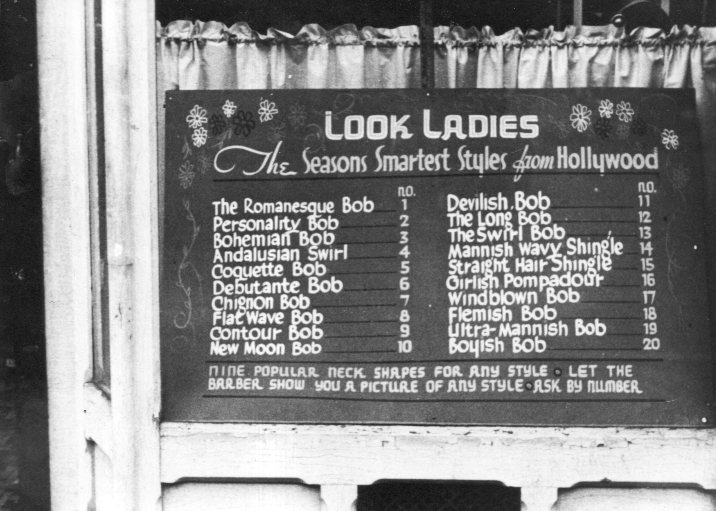
    Years go when this photograph was first made the vast majority of women who were having their hair cut not-at-home went to barber shops, with their hair cut by men–so explaining the “see the barber” part of this style menu in the window of a chop shop.  Unfortunately I do not have the reference for the photograph–the image I am working with is from a newly-found set of photographs I made years ago copying FSA photographs from the mid-1930’s found at the  Prints & Photographs Division at the Library of Congress. Of the 20 style cuts 16 were “Bobs” of one sort or another, including the beguiling “Ultra-mannish Bob”…

    Barber Bob531

    ·Posted by :

    ·in:

  • When Did Ads Begin to Show *Speeding* Cars? (1922)

    JF Ptak Science Books   Quick Post

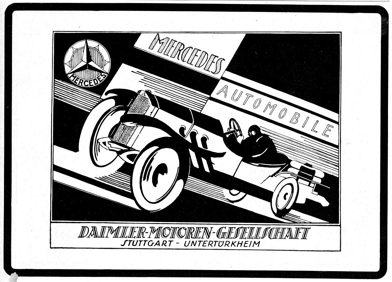
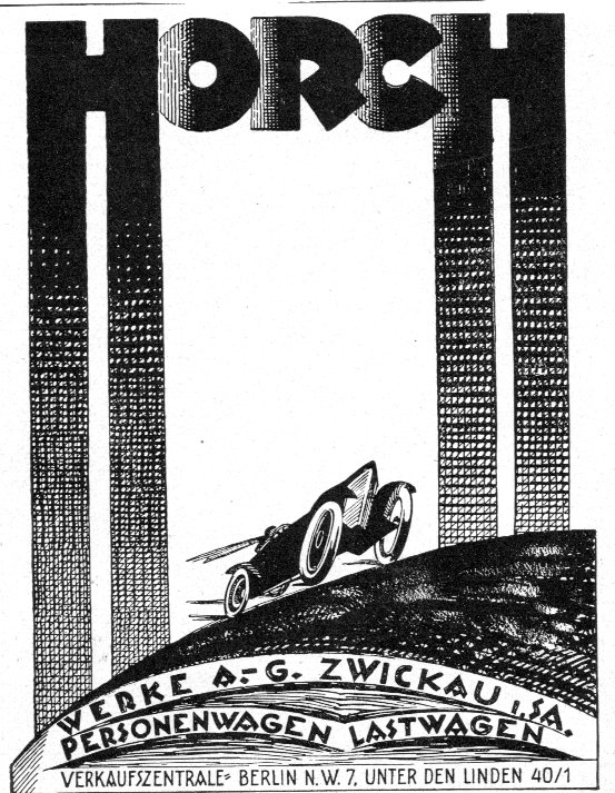
    In browsing bits and pieces of a January-June 1922 volume of the Illustrirte Zeitung (Leipzig) I  took notice of several ads that appeared in the back of each weekly issue. Cars.  Fast cars.  Fast cars going fast. It occurred to me that I really didn’t have any knowledge about when “speed” was shown in the sale of an automobile, though these ads were definitely in attendance here in 1922:

    German--cars 1922524

    The are other ads to follow, images depicting great speed…though it strikes me that these sorts of displays come a little late in the history of the depiction of speed, especially given the experimentation in the art world with space and time. I’ll have a look at earlier volumes to see if I can determine when the ads began to appear, though it seems to my intuition and deep memory that 1922 is actually “early”.

    German--cars 1922525


    ·Posted by :

    ·in:

  • A Really, Really Good Radio Talk Show (1940)

    JF Ptak Science Books    Post 2372

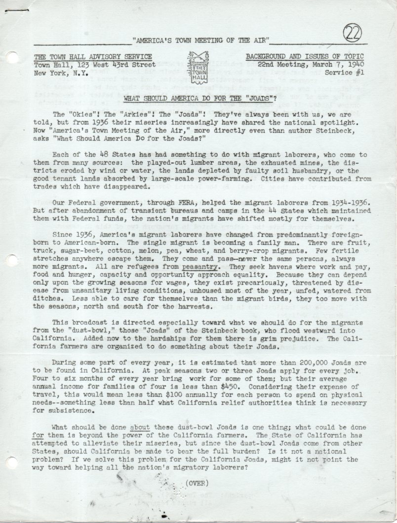
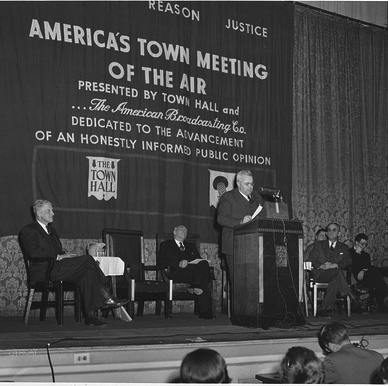
    It turns out that I own a good stack of guideline publications for what was America’s first news talk show,1 “America’s Town Meeting of the Air”, produced by the Town Hall Advisory board between 1935 and 1956.2  It was a weekly show, and in general–at least for the 90 examples I have for the 1938-1941 period–each broadcast came with a three-sheet guideline for the listeners on the subject of the weekly topic.

    The first sheet was a general statement of the show’s interest–for example, “What Shall We Do With the Joads?”, for March 7, 1940 (the Joads being the family in the Steinbeck mega-epic The Grapes of Wrath). These intro pages are usually very concise, very well written, logical, and provocative. 

    America's town meeting of the air534

    The second sheet is really what surprised me so–a bibliography and suggested reading for the discussion.  That means that before the radio program was broadcast the producers provided listeners a handy sheet with material to read so that they could better follow the discussion–this seems truly exceptional by today’s sub-standards of a great chunk of radio political discussion, where volume/noise dictates correctness over recognized references. I wondered before looking at the list if The Grapes of Wrath would be there, because, well, it wasn’t necessarily a popular read everywhere in spite of the book’s critical reception. It was there, along with (shockingly) Dorothea Lange and Paul Taylor’s (her husband) An American Exodus;  Carey McWilliams’ Factories in the Field the Story of Migratory Farm Labor in California; and You Have Seen Their Faces, by Erskine Caldwell and Margaret Bourke-White (described as “the Southern sharecropper in photographs and prose”).  Actually all of the books and articles are given a similarly very-short description like this, in spite of their Great Classic status of today–the photographs by Bourke-White and Lange and McWilliams and their accompanying texts are really nothing short of masterpieces, difficult and challenging exposes of a national tragedy –and here they are, suggested reading for listeners of a radio talk show.

    America-town-meeting-otrcat.com[Image source: Old Time Radio, here.]

    The third sheet was a “Who’s Who” of the speakers for the show. In this case, they included Rexford Tugwell (an economist and former Director of the Resettlement Administration); Hugh Bennett (Chief, U.S. Soil Conservation Service); Carey McWilliams (the author of Factories in the Fields and at the time Chief, Division of Immigration and Housing for the state of California); and Philip Bancroft (a member of the executive committee of the Associated Farmers of California, the farmers of that state being a particular target of Steinbeck’s in The Grapes of Wrath).  There were serious people.  And this was a serious radio show. Each week six pages of tight typescript on 11×8.5″ sheets would be sent out, and each we the shows were of similar quality…just very impressive stuff.  

    [A sample broadcast-on Social Security–can be heard here at the Social Security Administration.]

    The topics for conversation make for interesting discussion in themselves, and pretty much serve as a social barometer for the period.  Here’s a sample: 

    ·Posted by :

    ·in:

  • Marble Clouds and their Emotional Shadows: Cloud Geometries in Art

    JF Ptak Science Books   Post 1942 (Part I, reposting from 2012) 

    I silently laugh at my own cenotaph 
    	And out of the caverns of rain.  Percy B. Shelley, "The Cloud", 1820

    [John Ruskin, Cloud Perspectival, 1860. Source for all Ruskin images:  “Cloud Studies: The Visible Invisible”, by Mary Jacobus, here.]

    John Ruskin (1819-1900) was still a very young man when he published the start of a series of works in art criticism,Modern Painters, in 18431.  To refer to it as a great work in critical theory is painting the work with a narrow brush, though–it had a very sweeping overall effect, and addressed all manner of issues integral to art, and was a developing vision of what art was looking at in the 19th century.  Ostensibly it began as a defense of the work of J.M.W. Turner and the way in which that man represented nature in his pre-Impressionist, pre-Expressionist work. Ruskin makes the case that the works that were so grating part of the art world i the 1830’s were highly consistent with centuries of representing nature in art–and not only that, but presenting evidence that turner did so like no other artist in history.  Ruskin would weave further volumes of Modern Painters through the body of his other work for the next 17 years, publishing the last installment in a fifth volume in 1860.

    Turner (1775-1851) was a great Romantic and a lot of that work tends towards a very full and very early expression of Impressionism and Expressionism, something that not everyone was ready for in the first quarter of the 19th century. This is particularly so in his paintings of clouds, and even more so in cloud/ocean interaction.  They are sweeping and breath-taking and very emotional works, in some ways like the late string quartets of Beethoven–powerful, provocative, internal dialogs of the deep power of nature. He must stand with John Constable as the Cloud Man of the 19th Century, or perhaps Constable stands with him.  They both in a way stand with Luke Howard, the scientist who was really the first classifier of clouds–an undertaking which in some impossible way escaped the recognition of the greatest classifiers it he history of science–and who did so in a paper in 1802, written at a time when Constable and Turner were both young artists.

    Turner and Constable both painted clouds like perhaps no others before them; and Ruskin, in his deep appreciation for the importance of the representation of nature int he art, also made a contribution to the understanding of clouds that was of an extraordinary nature. In the fifth volume of his Modern Painters Ruskin attempts a perspective study of clouds, and may have been about the first to do so. The illustrations of this effort I think are incredible, and remind me very much of installing a sort of rigidity to clouds, a cloud geometry, veritable studies of stones and blocks in the sky.  The imaging part of this exercise must have been an enormous thing back there in 1860, to think of clouds in a perspectival way, floating very large geometric objects in the sky. The astonishing results are seen (above) and following:

     And this:

    [John Ruskin, Cloud Perspective: Curvilinear., Modern Painters, Vol. V, Plate LXV.]

     In a way the first image reminds me of Andrea Pozzo’s work in his monumental   Rules and examples of perspective proper for painters and architects (1693):
     Pozo

    but really more in the way that Pozzo’s work seems to be elevated and floating in a heavy perspectivist space, bigger and blockier sky-borne marble than with ruskin.  But still, the disembodied floatiness of the Pozzo work is ethereal.

    Ruskin does round out his blocky and beautiful geometry, which definitely reminds me of work w=that would appear 90 years later:  Ruskin, again:

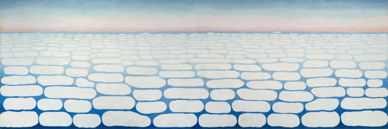
    And  Georgia O’Keefe’s Clouds III (1963), though her clouds tend towards a more rigid geometry in Clouds IV (1965, following):

    Clouds O'KeefeO’Keefe, Clouds Above the Sky III, 1963

    Clouds okeefe sky above iv 1965

    O’Keefe, Clouds Above the Sky IV, 1965

    Ms. Georgia is definitely seeing her clouds with different eyes than Ruskin, and they are entirely different creatures–but still, the two come together in my head as relatives. The clouds, I mean.

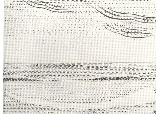
    I started looking around for early hard-line cloud geometries and thus far I haven’t found very much, though there is a tremendous example by Henry Van de Velde’s (1863-1957) “Sun at Ocean (Rhythmic Synthesis”) which I found in  Werner Hoffman’s Turning Points in Twentieth century Art, 1890-1917 and which was executed in 1888/9, looks to me to be absolutely incredible for its time, a nearly non-representational, proto-abstract something, done three decades before these genres came into being.

    Clouds van de velde
    I don’t know where the designer Van de Velde fits in the early history of non-representational art, but his effort in the second to last decade of the 19th century certainly seems to be very unusual for its time, and a good example of creative cloud representation. 

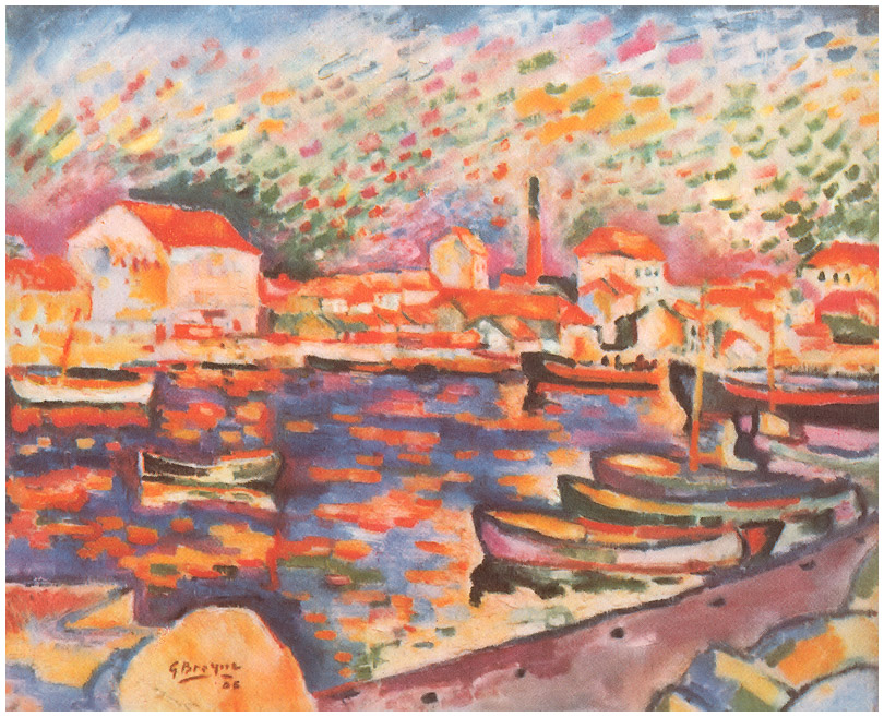
    Non-standard cloud imagery is much easier to finding the 20th century, like those of Georges Braque in his La Ciotat Harbor (1906):

    Clouds braque
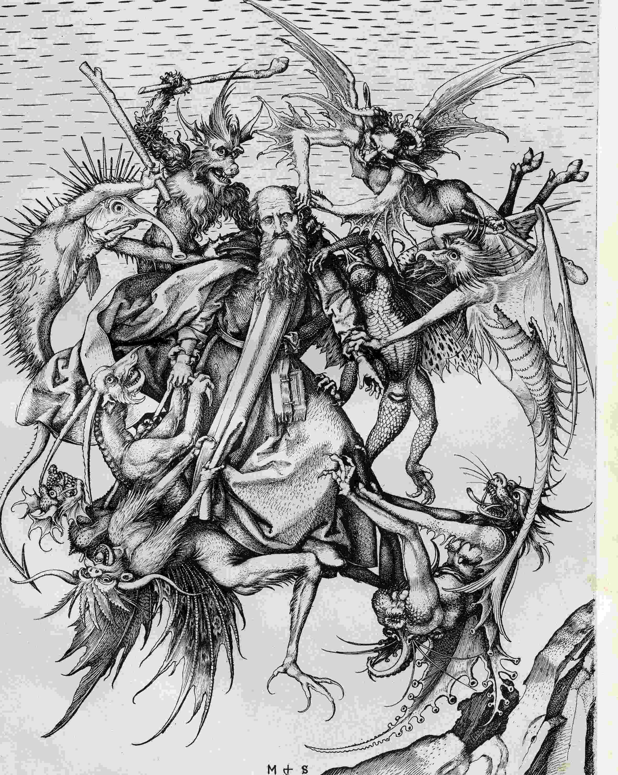
    Even this starts to have the look of something earlier, particularly if you turned the clouds-in-art clock way back, say, into the Renaissance. For example Martin Schoengauer‘s spectacular  The Temptation of St. Anthony, which was printed in 1470/5, has a beautiful, fluid circularity to it, full of an earthy roundness even as the saint is pursued by demons.  But the sky in the background is populated with nothing but dashes to suggest clouds, and which also starts to look something like the Fauvist and Expressionist works to come, 400/500 years later.

    Clouds schoengauer

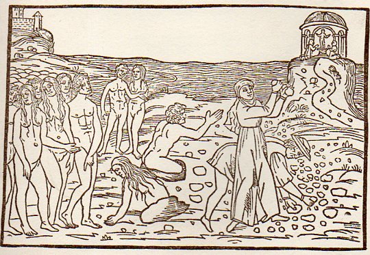
    (There are many examples of the sky being simply not represented at all, particularly in woodblock,

    like this image from Ovid (Accipe Studiose Lector P. Ouidij Metamorphosin...printed in Venice in 1509:

    Clouds no couds livy913

    “You could not see a cloud, because
    No cloud was in the sky:
    No birds were flying overhead —
    There were no birds to fly”.–Lewis Carroll, Through the Looking Glass.

    There are many non-sky images like this. 

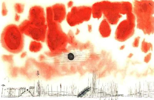
    Another interesting modern example is this Paul Klee (though it comes fairly late in that career, in 1940):

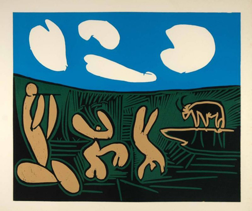
    Clouds Paul Klee 1940And an example from the ubiquitous Picasso, still later, in 1962:

    Clouds Picasso

    But earlier images are harder to locate.  The obvious early-ish source (though still much later in the century) would be Van Gogh (say, with Starry Night) and Monet, though the fractalesque Van Gogh gets much closer to the re-interperative power of the Ruskin images than the reflected impressionist beauty of the Monet.

    Clouds Monet
    On a cursory look around the antiquarian painterly sky-world, it is becoming obvious that the cloud geometries of Ruskin are very uncommon. 

    Notes

    1.  For full text of Ruskin’s  Modern Painters , see  (1873)volume 5 for (1860) and  (1873)

  • Diagrams of Outsider Logic, with Synesthesic Angels (1925)

    JF Ptak Science Books  Post 2341  (Poster Series 5)

     [A cleaned-and-colorized 13×19″ version of this cover design is available in the new Posters section of this blog.]

    +()+outsider cover

    There are some other more recent contributions in our Outsider Logic collection that reach the limits of outside, reaching far into the aspects of knowledge that lies more or less completely hidden and inaccessible to the vast majority of readers.  Sometimes bumping into outré thinking like this is very useful because it is just so very different; and sometimes this thought process is just and only that: very different.

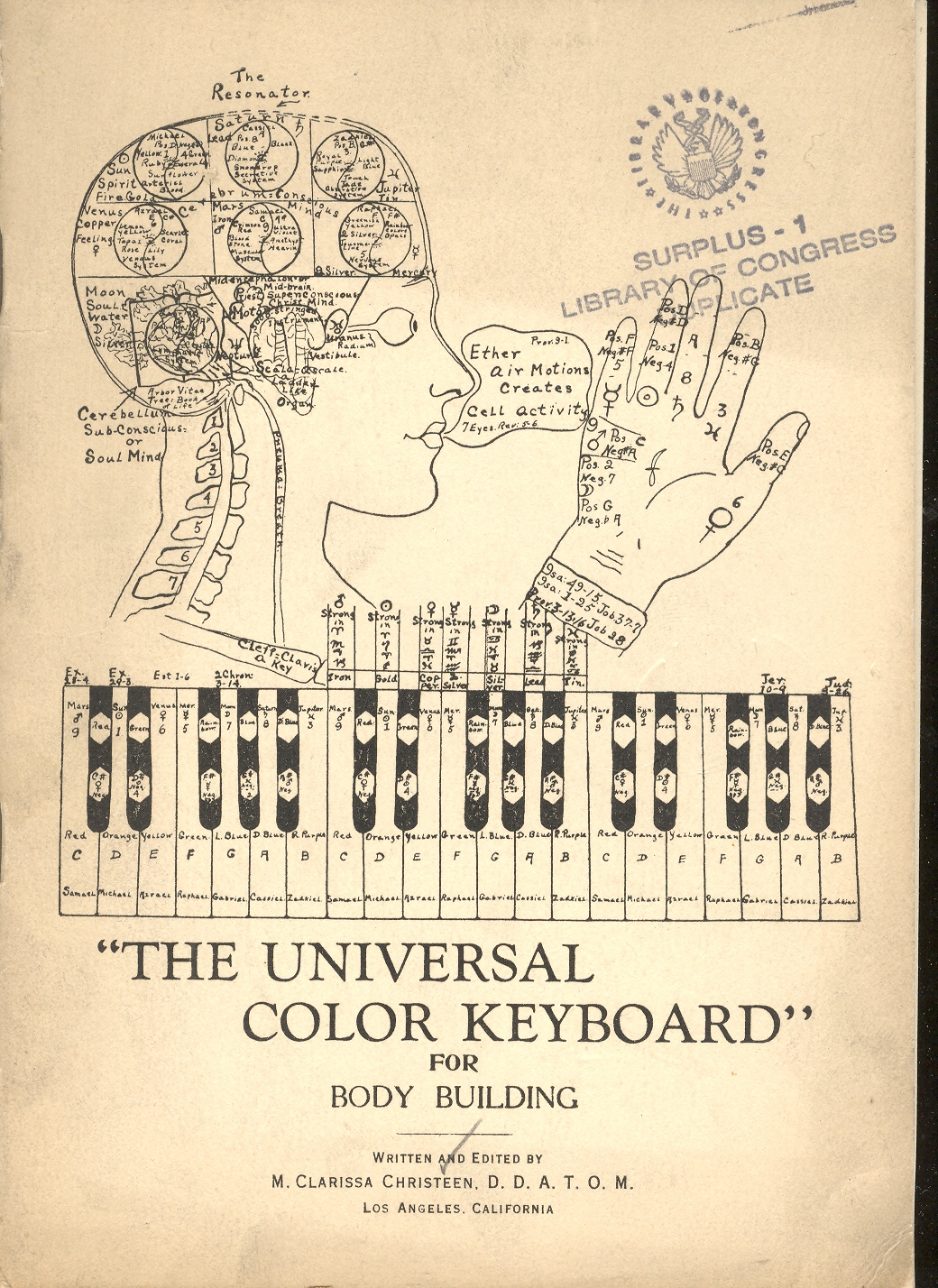
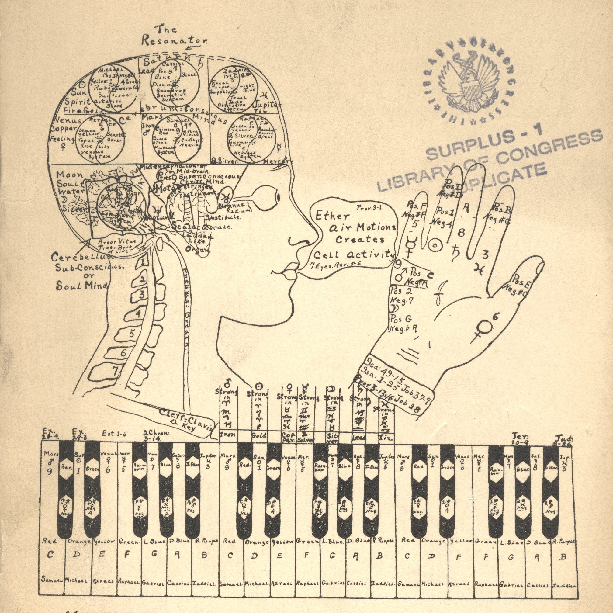
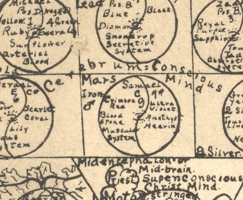
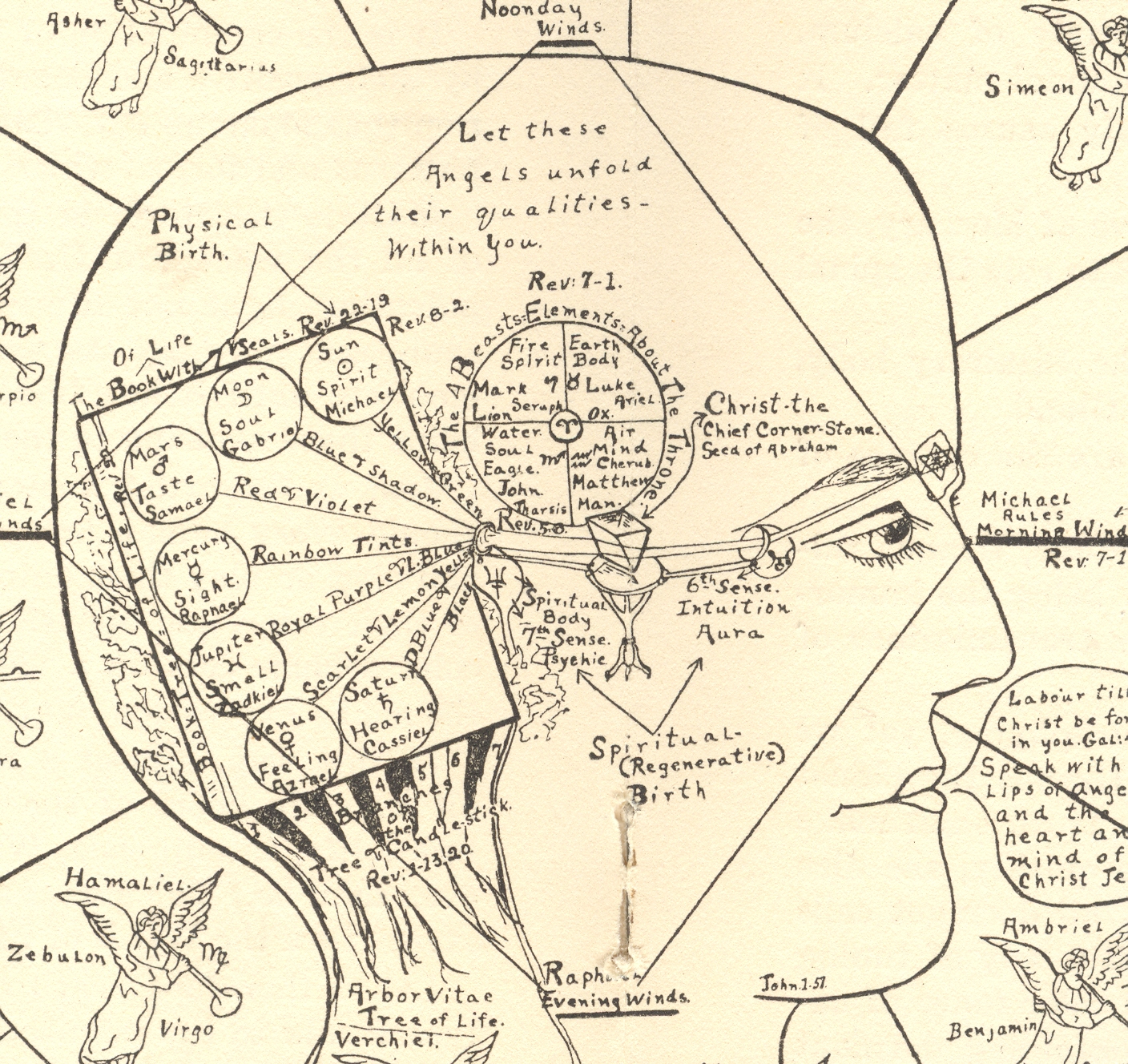
    This last bit is probably the case for W. Clarissa Christeen’s  (“D.D.A.T.O.M.”)The Universal Color Keyboard for Body Building, published in beautiful Los Angeles in 1925. In the many eyebrow-raising and vastly unexpected segments that she manages to share in her thin pamphlet she certainly strays into many unknown conclusion-processes and uniquely personal observations about the physical and spiritual world, testing the reader’s patience in many ways in 16 pages. But what Ms. Christeen absolutely does have going for her is her and which is easily appreciated is her artwork, which is, in its own special way, quite sensational—I’m really sorry that the pamphlet is limited to only two pieces of her work, as I’d really like to see more.  +()+outsider cover det

    Her philosophy is at the very least odd, though it may spring from a synesthesia.  Or not. 

    “Syn” (Greek, “together” and “Aisthesis” (“sensation”) combine to form this very interesting word and ability, being an automatic response to a stimulus by one sense when that stimulus is usually associated with another sense.  For example, there are “synesthetes” who perceive color as an auditory input, basically hearing yellow and so on; more famously are the musicians composing tone poems associating sound with color.  There are letter-color and number-color associatons, as well as taste-senses from colors and sounds and so and on.  For example in Kandinsky’s On the Spiritual in Art there is an attempt to relate color theory to touch and smell; Franz Liszt wrote color music; Isaac Newton attempted to establish the common distribution and association between color and tone frequencies; Rameau constructed a clavencin oculaire while Rimington made a color organ; Richard Feynman spoke of colored equations, and Nabokov recorded  (Speak, Memory) letter/color visions.  These are just a few examples of some of the more well-known practicing synesthetes. 

    In any event Ms. Christeen may be of that mold, and is attempting the universal perfection of mind and body through the combination of color and music (and scent), which “is valuable in building body-tissues of a harmonized order…the music chosen for social functions, the key notes being for the planet ruling or governing the day or the hours etc..  This brings celestial and terrestrial vibrations in direct contact, without interrupted angles which produce in harmony; in other words the creative powers which produce these various waves f light and sound or color or tone, acts upon the lower octave, matter or material manifestations recreating it, transforming it, and raising the vibrations of the said matter or material manifestations, thus, refining the temperature and quality of germ or tissue, etc.”

    This is a long passage, but I include it because, well, I just had no idea when an abrupt turn was going to be made in the discourse; nor did I have any idea of what the principles were of what was being discussed.  And this is still all on page one.  Sometimes passages like these are breathtaking, as in leaving you without breath, because their foundation for understanding is so elusive.  All you’re left with, sometimes, is a “wow!” reaction, like appreciating a pitcher who has just struck you out on three roughed-up-greasy-spit-laden nastiness pitches that were invisible and illegal, and didn’t matter at all.(What the figure in the cover illustration is saying. by the way, is “Ether air motions creates cell activity”, with a couple of Biblical references, somehow.)

    +()+outsider cover ultra det


    +()+outsider insideI do know that the major divulged secret is the Universal keynote (and “keyboard”) and its control through music and fragrance of all that is, “each individual is to harmonize his or her astral colors to the universal keynote that he or she may be surrounded by a correcting aura, which sends out its streamers of light rays into the cosmos”.  Things get more deeply possessed after this, stretching into the Old Testament and astrology, which we don’t need to get into here.  

    +()+outsider insidedetAs I said, perhaps Ms. Christeen was a synesthete, and perhaps multiply so.  In 1925, when this book was written, there mayn’t’ve been a place for people to go who had advanced sensibility of seeing colors in music, and perhaps colors in fragrance. Perhaps Ms. Christeen was working out there in Los Angeles completely alone, trying to figure out just what her special and very different gift actually was.  Perhaps her life was greatly enlivened by her synesthesia, and sent herself out on a mission to the world to have other people experience it, too,, with the help of her color-relational charts.  I do feel for her, though I have absolutely no connection to what she was trying to explain.  I do find the artwork fascinating—a true “outsider” contribution. 

    (By the way, I don’t think that we ever got to the “body building” part in this work.  Also, I think the “DDATOM” after Ms. Christeen’s name meant something like “Doctor of Divinity of the Atom” or something like that–it wasn’t mentioned in the text.)

     And so there you have it.  I think that I’m just making the point that the outcome of some of this very provocative work doesn’t necessarily come into play in its ultimate evaluation, and that it should all be judged by what short of thinking that it excites in its reader. 


Recent Posts

Archives

Categories