JF Ptak Science Books Reference Tools
I’ve put together several interesting graphs and maps displaying historic human life expectancies–perhaps they will be useful.
- Life Expectancy at Birth by Region, 1950-1050
- Male Life Expectancy via Region
- Life Expectancy and Retirement Years
- Life Expectancy by Region
- Life Expectancy by Region, Concnetrating on Africa
- Life Expectancy, U.S., 1850-2000
- World Life Expectancy Map
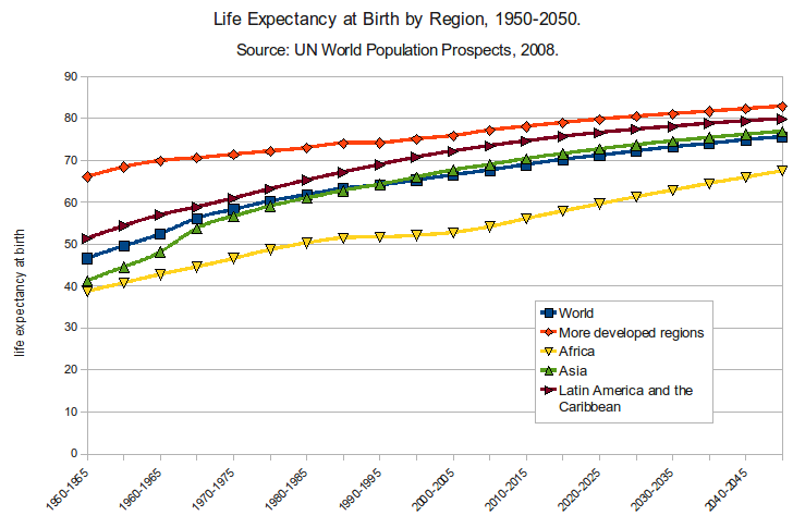 Source: http://upload.wikimedia.org/wikipedia/commons/2/29/Life_Expectancy_at_Birth_by_Region_1950-2050.png

Source: http://en.wikipedia.org/wiki/Life_expectancy#mediaviewer/File:Comparison_gender_life_expectancy_CIA_factbook.svg