A Daily History of Holes, Dots, Lines, Science, History, Math, Physics, Art, the Unintentional Absurd, Architecture, Maps, Data Visualization, Blank and Missing Things, and so on. |1.6 million words, 7500 images, 4.9 million hits| Press & appearances in The Times, Le Figaro, Mensa, The Economist, The Guardian, Discovery News, Slate, Le Monde, Sci American Blogs, Le Pont, and many other places… 5000+ total posts since 2008.

  • A Victorian YouTube and the Anti-Hermit Hermit

    JF Ptak Science Books  

    The “eccentric” versus the “insane” in Victorian England may well have been identified by the amount of available disposable income–if you could afford your whimsy and misery, then you were “eccentric”; if not, then you  were “insane”, which also meant that you were culpable of being scooped up by The Authorities and interned if you turned out to be a larger/smellier/more obnoxious nuisance than a simple dot of the street.   That or you may have wound up as an electrically-prodded subject in an experiment by Charles Darwin (Expression of Emotions….).   In this way the past telescopes nicely into the present, less the electrical stimulation bit. 
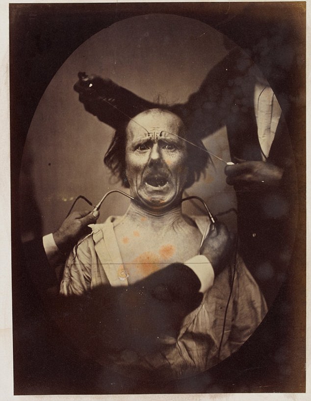
    Darwin Expression[Image Source:  Daily Mail, here.]

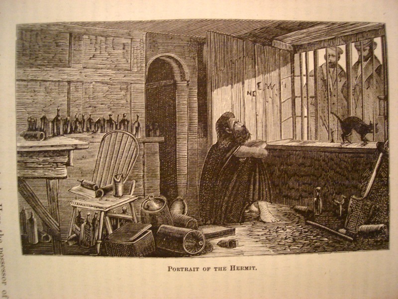
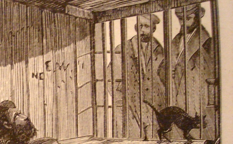
    The image shown below is that of Mr. James Lucas, “the Hermit of Red-Coat’s Green, (near Hitchens)”, living his life in a most uncommon hermit-like fashion, even for a hermit.  Seems to me that a hermit would be removed from society and be away from people; Mr. Lucas may be of a singular caste of that genre, living his life alone in the very midst of society–he lived in the kitchen of his townhouse, in a single room with a window to the street.  There he lived out his life in full and constant view of the passersby on the busy sidewalk.  Crowds would come by and stare, and Mr. Lucas would stare back–he would rarely, if ever, communicate, though he would (“he was not miserly”) give out “farthings and gin” to “swarms of tramps”, no to mention sweetmeats to children.   He’d watch people watching him.
    Hermit Insane

    He also didn’t write (except we are told “upon a check”), and made no physical effort to retain anything that he thought about; nor was the reason for his uncommon lifestyle made known.

    He was one son of “an opulent London merchant”, and in time proved to be an incorrigible and strong-willed non-conformist (with the funds to do so in some comfort).  He evidently went completely over the edge when his mother died, and after a year of keeping her body in the house removed to the kitchen, where he spent the rest of his days (living there from 1850 to 1874).
    Hermit Insane detail

     After he died and his room cleaned out for the sale of the family’s property, it was discovered that the floor was covered in two feet of ashes and soot from the kitchen fireplace.  Without the family money Mr. Lucas surely would’ve wound up on a cadaver table long before his seventieth year, suffering real social Dickensian travail rather than that which existed just in his mind.
    ·Posted by :

    ·in:

    — —
  • A Slightly Surreal Image from Mimbres Culture

    JF Ptak Science Books  Post 2497

    Alfred V. Kidder’s  Peabody Museum expedition to the Mimbres Valley, New Mexico : Season of 1927 is a beautiful little production. Given that it is illustrated with 19 original pasted-in photographs and the offset text seems just to be type pages, I’d ay that it received a fairly tight distribution.  Kidder (1885-1963) was perhaps the leading U.S. expert on the Southwest and Mesoamerica, and led the Harvard-based Peabody Museum of Archaeology and Ethnology expeditions into the heart of the ancient lands in Arizona and New Mexico from 1915 to 1929 and published extensively on his excavations and observations.

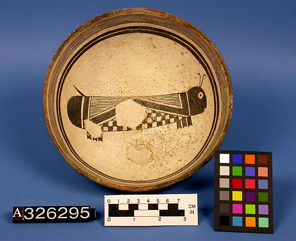
    The present volume addresses the somewhat mysterious Mimbres peoples, a branch of the Mogolion culture who lived in the  southwestern New Mexico and northeastern Arizona area during the period of about 1000-1150 CE. Perhaps they are mostly mysterious to me, and that based on the hyper-ethereal nature of the pottery designs produced by those people–the pottery is enormously beautiful. 

    Mimbres pottery

    [Source: National Museum of Natural History, Smithsonian Institution http://anthropology.si.edu/cm/images/mimbres-11-a326295.jpg]

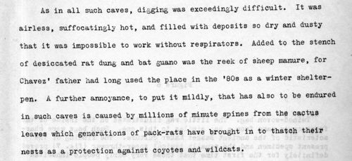
    Kidder has a very clear expository style, especially in describing the environment of the excavations.  His description of the caves in this area are very compelling and spot-on, and remind me somewhat of George Orwell’s observations on coals mines and mining conditions.

    Here he is:

    • Mimbres223[The original document is for sale at teh blog’s bookstore, here.]

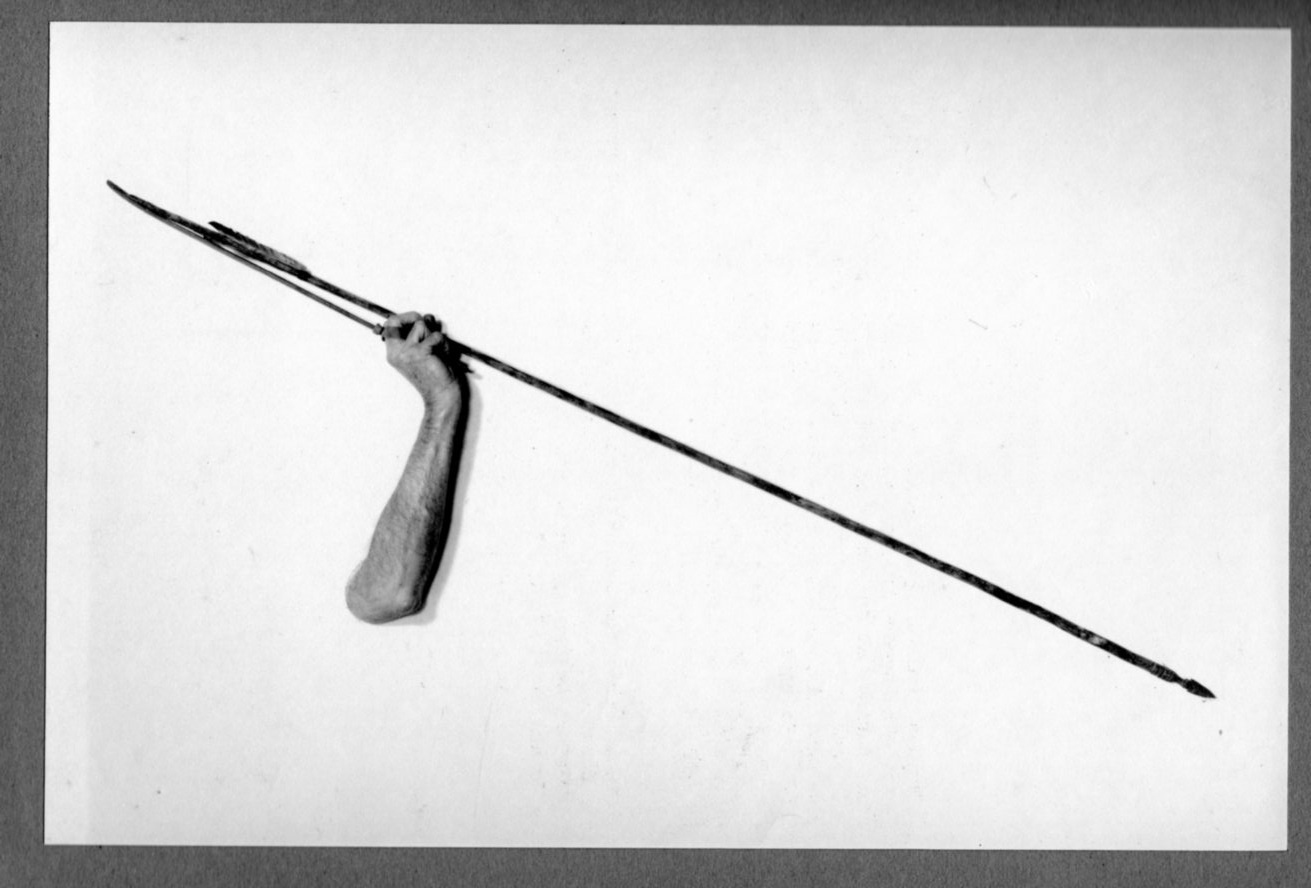
    I apologize for concentrating off-topic here, but the illustration showing how a leather strap was used in aid of throwing a spear is really quite spectacular in its way, a bit of the unintentional surreal (even though the finding of the strap was very exciting, archaeologically-speaking):

    Mimbres225

    Actually this sort of found articulation has something in common with the designs in the pots, which seem sometimes to have a definite modern 1920’s-30’s flavor rather than something from 12 centuries before. 

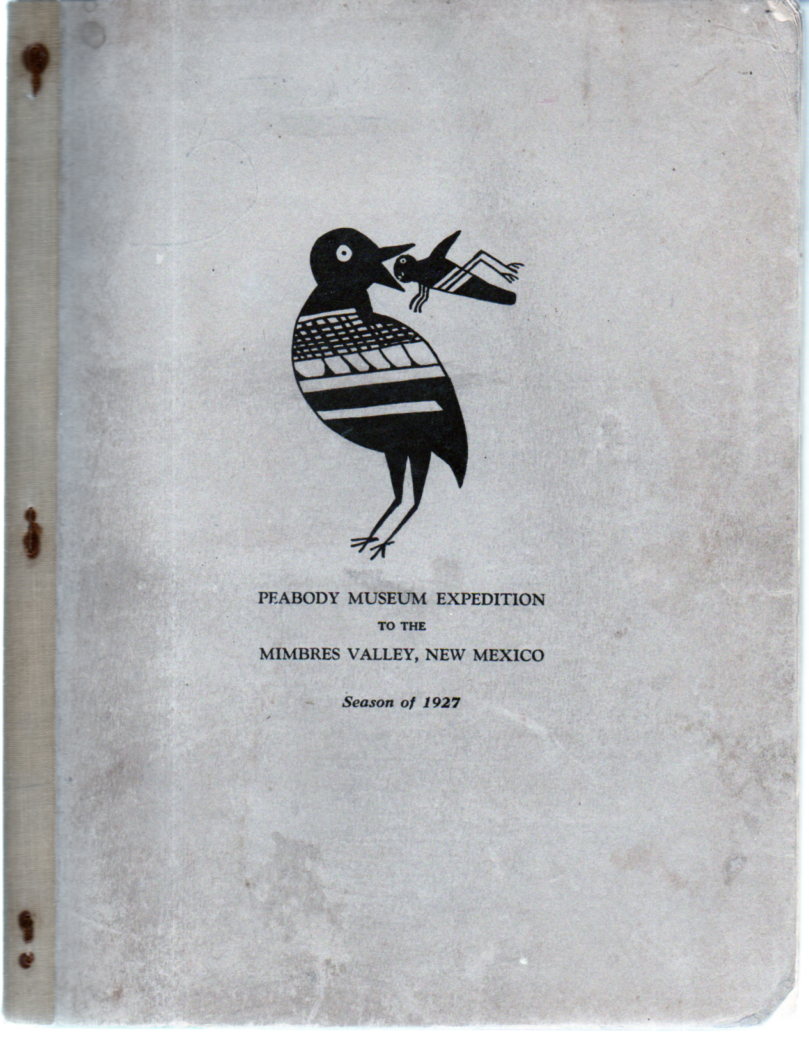
    And the cover:

    Mimbres226

    ·Posted by :

    ·in:

  • Recovery to Normal Existence: Found-Surreal Images in Nuclear Survival Handbook

    JF Ptak Science Books    Post 2499

    Nuclear Attack LIVE230
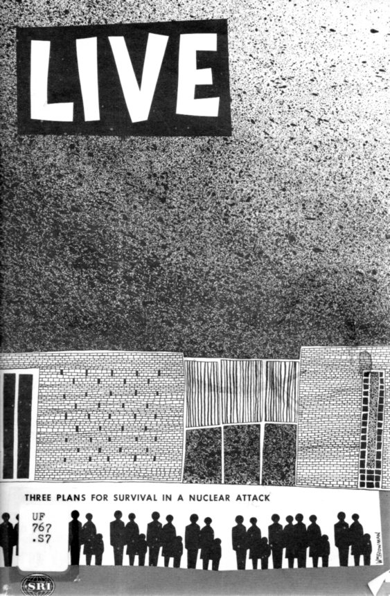
    In the not-modest stream of thin paperback  nuclear holocaust survival literature in the 1950’s and 1960’s appears this effort: LIVE, Three Plans for Survival in a Nuclear Attack. It was published by the Stanford Research Institute in 1960, and was part of nuclear health physics pioneer Lauriston Taylor’s donation to the National Council on Radiation Protection and Measurement, where I bought it some time ago when they were thinning out their stuff.  It is an unusual publication to me for its illustrations, some of which are odd, and a few of which are positively semi-surreal when view out of context.

    The pamphlet overall is fairly helpful, assuming that you had as much time to get yourself together in an impending attack, and that is a major assumption.  But I’m sharing this tonight for some of those images–and the cover, which is an unusual design in itself, not the least of which is the heavily-borrowed part from LIFE Magazine.

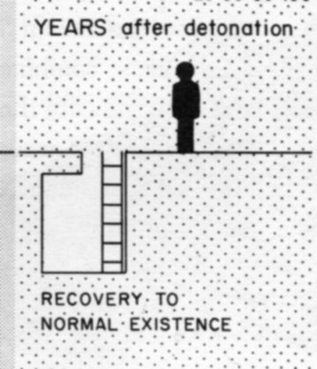
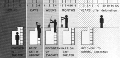
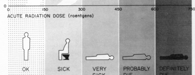
    So the first of the few that I’ll post here (above) is a detail from this illustrated graph, a march of teh intellect and survival from being in a dark hole to a rather stiff return to normal existence:

    Nuclear Attack LIVE229

    Here’s another sobering bit, showing a progression of NOT-recovering to normal existence:

    Nuclear Attack LIVE231

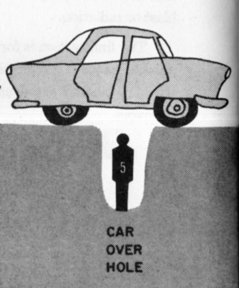
    And of course the hole:

    Nuclear Attack LIVE233

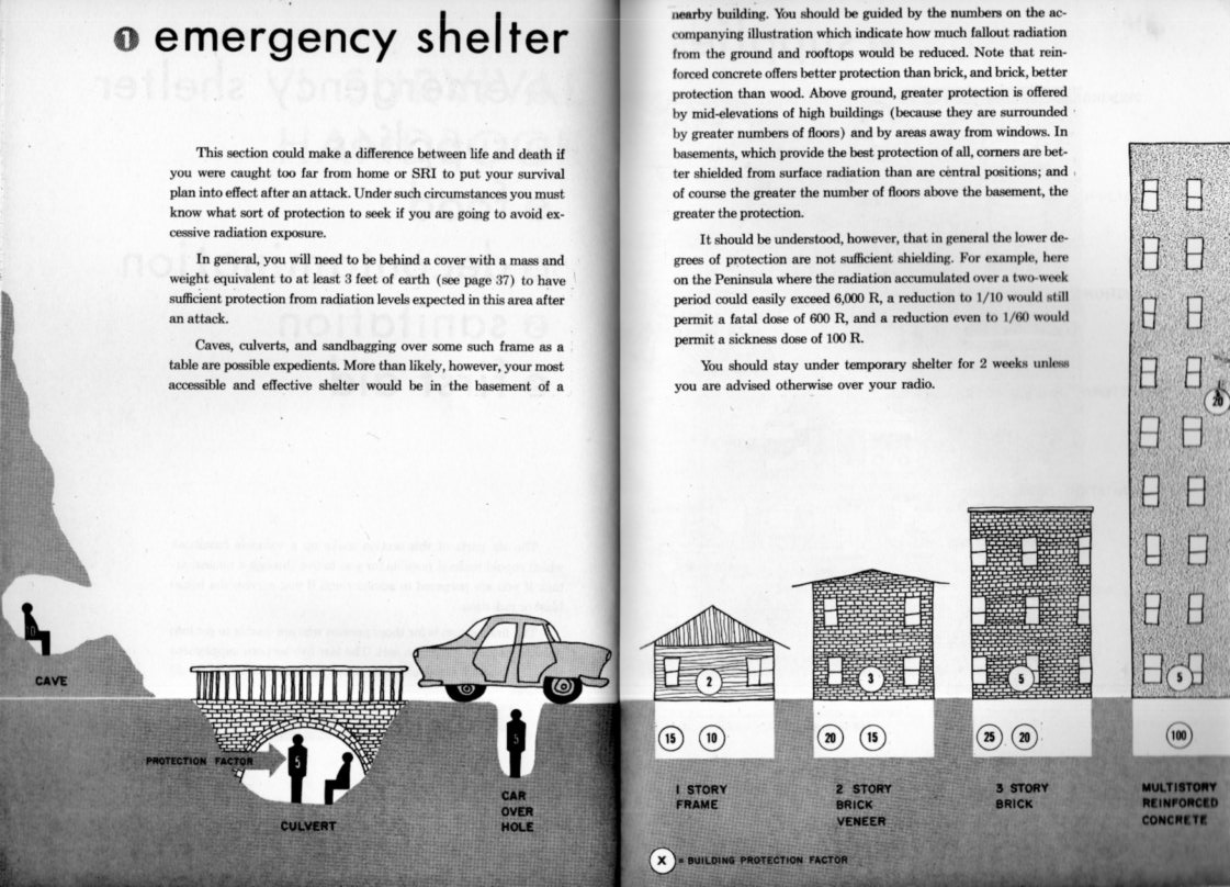
    Which is a detail from:

    Nuclear Attack LIVE232

    And the cover, which has some blotchy Ralph Steadman-y elements:


    Nuclear Attack LIVE228

    And so, there are some of the major themes.  I found the work unsettling in general for using mostly dark silhouettes for the people, that profile having been sort of established to represent dead folks.  Ah, well.

  • The Man with a Camera, Soviet Union, 1929

    JF Ptak Science Books   Post 2500

    So. Welcome to Post #2,500. As it turns out this was in line as a continuation of an earlier post and is not entirely fresh for today, but so it goes.  Post 2,500 is also overall the 3,751st post to this blog, which began in January 2008. The numbered posts all usually have at least 400 words, or a bunch of time-consuming pics; there are also 1,351 “Quick Posts”, which are the little guys, 100-400 words long.  (There are also another 1,500 posts in the books-for-sale section, but that’s a separate issue.) 

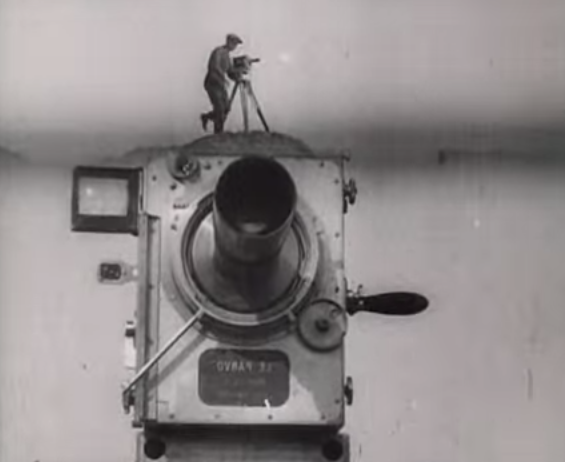
    Man with camera235

    The man with the camera was David Abelevich Kaufman (Vertov) (1896-1954), who made it along with his editor-wife Elizaveta Svilova (who worked on a number of films, mainly propaganda from the looks of it, though I would really like to see The Fall of Berlin, 1945, and also her film about Auschwitz).

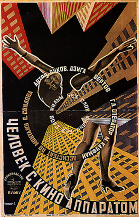
    Poster man with a camera

    The film was evidently a ground-breaker1–Roger Ebert points out one facet of the work, the average shot length, which is by far shorter here than anywhere previous works, meaning that there was more editing and selection done than normally:  “In 1929, the year it [Man…] was released, films had an average shot length (ASL) of 11.2 seconds. “Man With a Movie Camera” had an ASL of 2.3 seconds. The ASL of Michael Bay’s “Armageddon” was — also 2.3 seconds…”)  

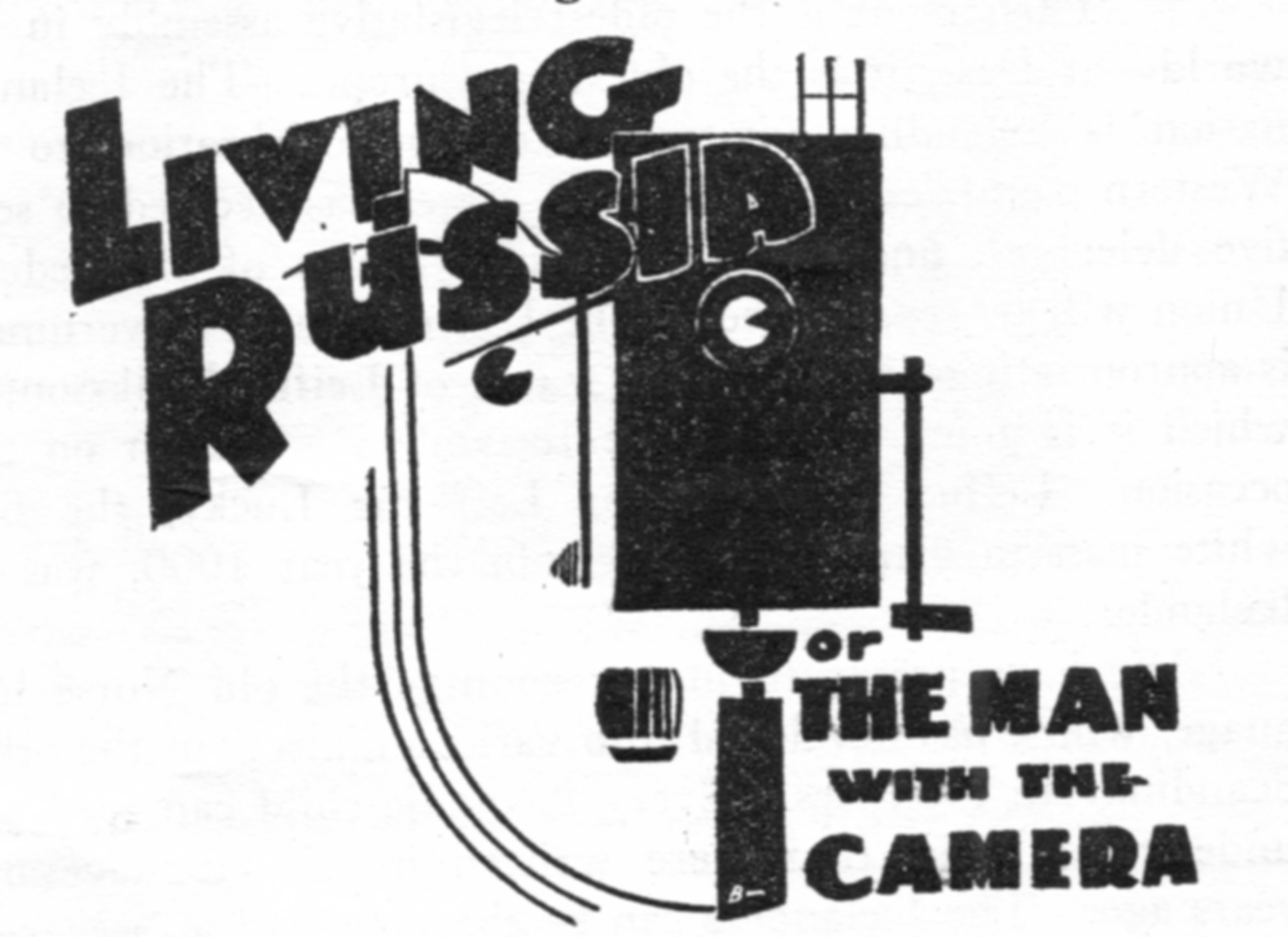
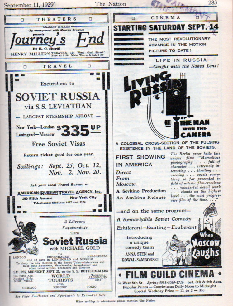
    Here’s an interesting ad for a U.S. release of the movie, appearing here in the same year that it was made, and appearing in the pages of the old-time old-school leftie magazine, The Nation, which was already 64 years old at that time.  It appeared alongside other ads featuring excursions to the Soviet Union for those interested in Russia culture and for the others who were still admirers of what was supposed to be The Union. 

    Man with camera234

    I’ve included a link to the film (below) but honestly what attracted me to it was its poster, created by the indomitable and prolific Stenberg Brothers. Not only does the poster seem to me to be a masterpiece and iconic, it also uses an unusual perspective–straight up.  I’ve done several posts here on the perspective of looking straight down and straight across, but there have been very few opportunities to write something about looking straight up (in the antiquarian image world).  But here it is, in all of its glory.   

    The full movie, here:

    Man with a Movie Camera

    [Source: http://en.wikipedia.org/wiki/Man_with_a_Movie_Camera]

    Notes:

    1. Studio Daily lists Man with a Movie Camera as the 8th best movie ever made.  http://www.studiodaily.com/2012/08/sight-sound-revises-best-films-ever-lists/

    ·Posted by :

    ·in:

  • A Call for Relief from Britons Overseas, 1916

    JF Ptak Science Books  Post 2501

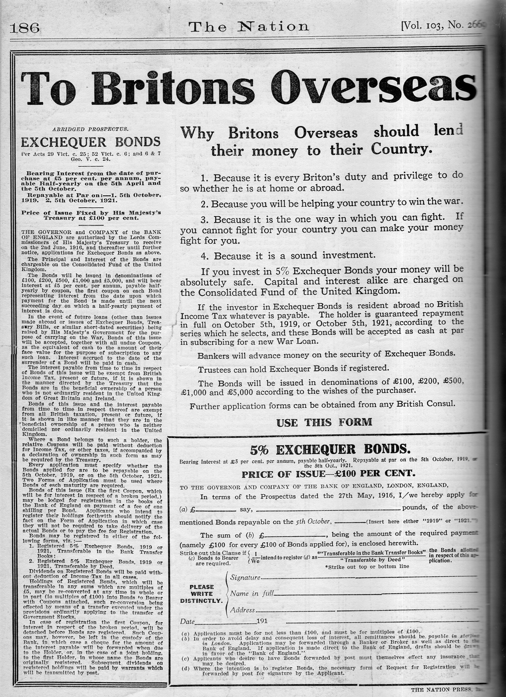
    In nearly the very middle of WWI, on August 24, 1916, there appeared this remarkable ad in the pages of the decidedly this-is-what-left-wing-magazines-look-like NYC-published magazine, The Nation:

    Britons overseas236

    It is interesting to think of the “middle” of this war with the “middle” of other wars, because, well, this doesn’t look like the middle of anything except for the post facto chronometer of fighting. In the U.S. Civil War, the almost-perfect middle turns out to be Gettsyburg, and that looked considerably past the middle so far as the Confederacy was concerned.  (And as a matter of fact, the section on Gettysburg in Shelby Foote’s great classic (The Civil War, a Narrative) comes in the near-exact middle of the middle volume of the three-volume work…the “capstone” of the book, as he referred to the battle.)  With WWII, the chronological middle, which is right around New Year’s 1943, doesn’t look like anywhere in the middle if you were there, though with the involvement of the U.S. and its enormous industrial/production capacity spelled the eventual end of the Axis; in January 1943, it still looked like a very hard road ahead. 

    It is highly probable that teh nature of being in the middle of anything is apparent only in hindsight.

    Anyway, the ad shown above was an appeal for financial support, to help fight a war that was enormously expensive, and soliciting from overseas sources one one approach. 

    The U.K. had been consumed by the war since August, 1914, and would wind up with enormous losses totaling more than 10% of the entire soldiers-in-unfirom for the war, with more than 800,000 soldiers killed (and more than 1.6 million wounded)–the fatalities being roughly twice the number of people buried in Arlington Cemetery. 

    As a matter of fact, the U.K lost more soldiers in WWI than the U.S. lost in the Revolutionary War (25,000), War of 1812 (15,000), Mexican American War  (13,000), Spanish American/Philippine American Wars (6,000), WWI (116,000), World War II (405,000), Korea (36,000), Vietnam (58,000), Iraq (3,600) and Afghanistan (1,800) combined, and then some. The U.S. Civil War, though, is another thing entirely, so far as these numbers go. (That said, and speaking of “another thing entirely, there was the Taipei Rebellion of 1850-1864, ending just before the U.S. war, claimed the lives of an unbelievable 20 million.)

    Other nations fared even worse: Austria-Hungary suffered 1.2 million soldiers dead, France 1.4 million, and Russia and Germany each with about 2 million dead. 

    I’m not sure how I got here in this short post–all of the above generated by this advertisement for financial help to fight the war and to keep a country solvent.  Now that I’ve had a quick look through the full years for 1916 and 1917 this seems to be the only appearance of the ad, and it is also I think the only full-page ad in The Nation for that time.  I have no idea what happened to the U.S. appeal–perhaps they were reaching out to the wrong audience, because in spite of the time and the spirit of the magazine, prior to U.S. involvement in the war for 1916 and 1917 there wasn’t much war coverage beyond the first page or two of general war news.  Interesting.

    ·Posted by :

    ·in:

  • The Flat Earth Dumpster Fire of 1891

    JF Ptak Science Books   Quick Post     Part of the History of Nothing series

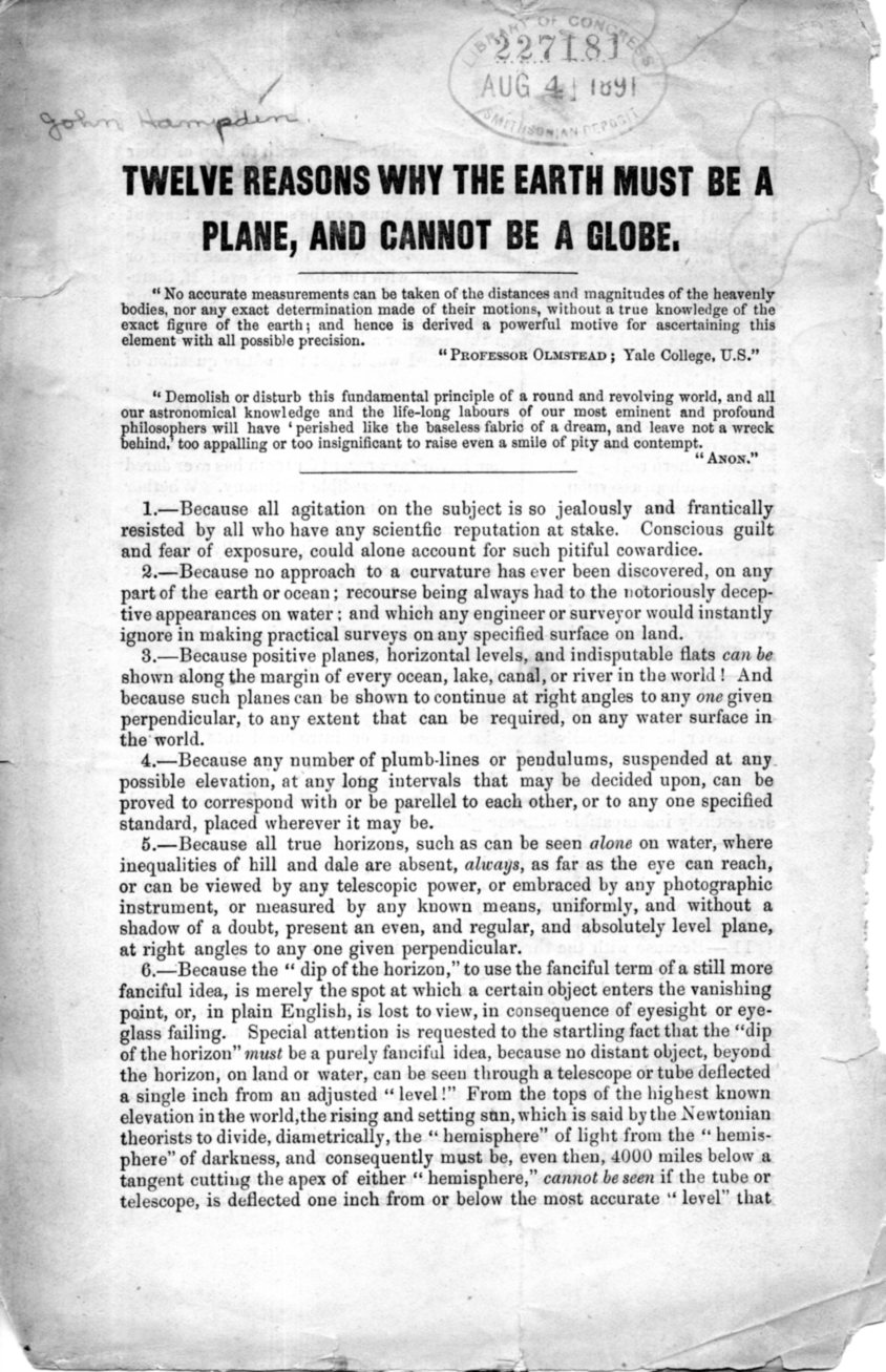
    The most disappointing thing about this tiny pamphlet is that it is not illustrated–I would have loved to see the representation of the flat Earth and its relation to the rest of the solar system.  Unfortunately, there’s nothing, only word-pictures that are not altogether descriptive in spite of liberal sprinklings of exclamation points in the midst and end of some irregular and turgid prose.  So, I’m not reporting on it, the thing being too demanding for not feasible return, but I will reproduce the thing in toto so that the curious reader may take the adventure themselves.

    The pamphlet (actually just a folded sheet of paper) was the work of John Hampden, whose name is probably recognizable to those who have read in the swollen knuckle  religious/scientific strife literature. He was a long opponent of the Earth as a sphere, basing much of his deep assertions on scripture. Hampden was that terrible mix of unctious and litigious, and fought with folks for decades, most famously with Alfred Russell Wallace, to whom he lost several libel suits costing him money and freedom over the long course of that inextinguishable dumpster fire.

    In any event, here is the text (printed I think around 1890, some 20 years after his troubles with Wallace began); this copy is the Smithsonian Institution Deposit copy via the Library of Congress, and now lives here in the studio:

    Flat Earth004

  • Hitler Youth Diary for Girls, 1937

    JF Ptak Science Books  Post 2502

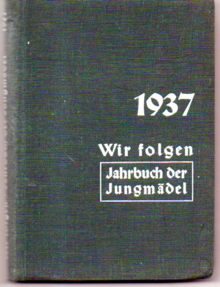
    Hilterjunge diary008There’s a bookcase in the house that has a top shelf for small books, most of which I haven’t written about, though there is a clutch of them that have gotten some exposure here on the blog, with most of them being unused diaries, and most of those being Nazi-oriented.  I’ve wondered about the people who would have sat down with those things blank-ish books, thinking about scheduling their time, or recording events, and then deciding not to. Maybe they didn’t want to be reminded of Nazi holidays and/or the birth of Hitler, or the right of duty and the proper way to respond to current events based on the policies of the NSDAP. The diaries are all pretty much like-new, and aren’t even all that old in the scheme of things, though their distance in time doesn’t match their distance in historical “space” (so to speak). 

    This diary was for German girls who were members of the Young Girls League (Jungmädelbund), which in the German stratification of Nazism was part of the League of German Girls (Bund Deutscher Mädel), which in turn operated under the broader gender-divided organization of Hitler Youth.

    It is difficult as a father of two daughters–one of whom is of the correct age to have been using this diary had circumstances been enormously different–and it is painful to imagine her looking through these pages, at the red-letter days and inspiration photographs, filling in the book and responding to these enormous and not necessarily subtle social pressures.

    “Wir folgen!” states the cover of the diary, and it meant it. “We follow”. 

    Hilterjunge diary009

    The book itself is not-at-all-fluffy, and pretty adult, set up with five days per page, and with plenty of Nazi propaganda and history. Al of that occupies the first 157 pages; from there to page 220 is a textual review of Hitler Youth philosophy, plus stories of brave young party members, twelve pages of explanation of rune symbology, maps, diagrams, and the like. 

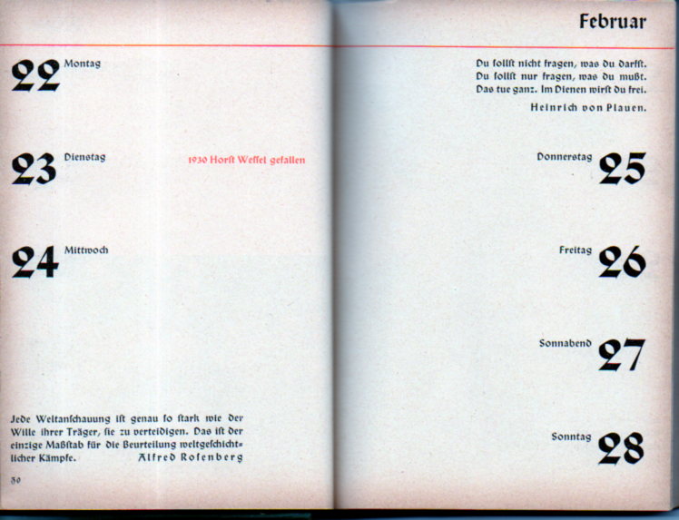
    Liberally sprinkled throughout the diary section are many quotes by Hitler and other party sub-luminaries.   For example, opening to the two pages covering December 20-27, we see nothing for Christmas except for its lonely date. Right next door, on the 26th, there is a note marking the day for the death of  Dietrich Eckart–he was one of the founders of the Deutsche Arbeitspartei which became the NSDAP, and was one of the leaders in the Putsch of 1923, jailed in Landesburg with Hitler, though he was released early to die of a heart attack in Bertschesgaden that same year. (I’m sorry that I know that much about such an inferior person, but I do.)  On the page opposite is a note stating that Hitler was released from prison on that day, December 20, 1924, to begin his work again. It is a homely two pages.

    There are also a few loose quotes for the writer Hans Baumann, who became a significant nationalist figure in the indoctrination of German youth via his many works for children. Mr. Baumann’s work was not-so-pretty, and after surviving years on the Eastern front and imprisonment he somehow rose up again to become a popular international writer of childrens books and a winner of several awards, all in spite of his great popularity among the National Socialists.  He died in 1988. 

    Oh–and this note for April 13, noting that on that day in 1932 “S.A., S.S., H.J, verboten”, referring to the Weimar government banning the S.A., S.S. and Hilterjunge (H.J.) .

    And of course February 24 for the 1930 death of  Nazi martyr Horst Wessel, and at the bottom of the same page as long quote from the odious Alfred Rosenberg. 

    On and on it goes. 

    The book was published by Eher-Verlag (Franz Eher Nachfolger GmbH), which was the central publishing arm for the Nazi Party, and which published, well, pretety much everything, including Mein Kampf, from 1925 to the end.  The building at Thierschstrasse 11 in Munich still stands, a piano company occupying the ground floor now. 

    ·Posted by :

    ·in:

  • An Extraordinary Protest Document to the Chicago World’s Fair of 1933

    JF Ptak Science Books  [An earlier post from 2008, expanded and updated now to August 2017]

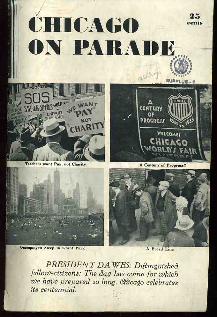
     This short pamphlet is a very strong tonic to those thinking about Chicago’s “Century of Progress” celebration and World’s Fair that was taking place in the middle of the Depression in 1933. Its intent is to reveal the “real” Chicago that took place surrounding the flourished confines of the Fair, protesting that there was a lot of real life beyond the fairgrounds that was far more important than whatever the fair represented in the best that’s-not-real-but-this-is documentarian fashion.  (The Fair was intended to instill hope and foster a little forgetfulness during a time in which the Depression in full swing nationwide, plus relieve some negative impressions of  native-Chicago problems of gangsterisms, race riots, red scare, and economic distress.) As a matter of fact this pamphlet didn’t seem to find much distribution, or at the very least it didn’t get saved in spite of the fantastic documentary images that it contains.  This copy of Herman O. Duncan’s Chicago on Parade (1933), was his own, sent to the Library of Congress as a gift in 1942 before it came to me in 1999. I can find only five other copies of this pamphlet located in libraries world-wide in WorldCat/OCLC (Oxford, Duke, Chicago History Museum, Wisconsin Historical Society, BYU) which makes it seem very strangely underrepresented.

    Chicago on PArade

    Duncan addressed the work directly to the Rufas Dawes (President of the Century of Progress Celebration), and to the mayor of  Chicago and governor of Illinois as a very blunt request to not forget the actual world of real Chicagoans living in dire straits within site of the fairgrounds.  Duncan was obviously taking issue with the many statements of wonderment and flourishes of progress that accompanied the propaganda surrounding the fair, so that the attention of the public would not be “diverted by our political and civic leaders”.  Duncan continued that these photographs, “none of which had been published previously in the United States” could “perhaps suggest a point of reference from which Chicago can measure its Second Century of Progress”.

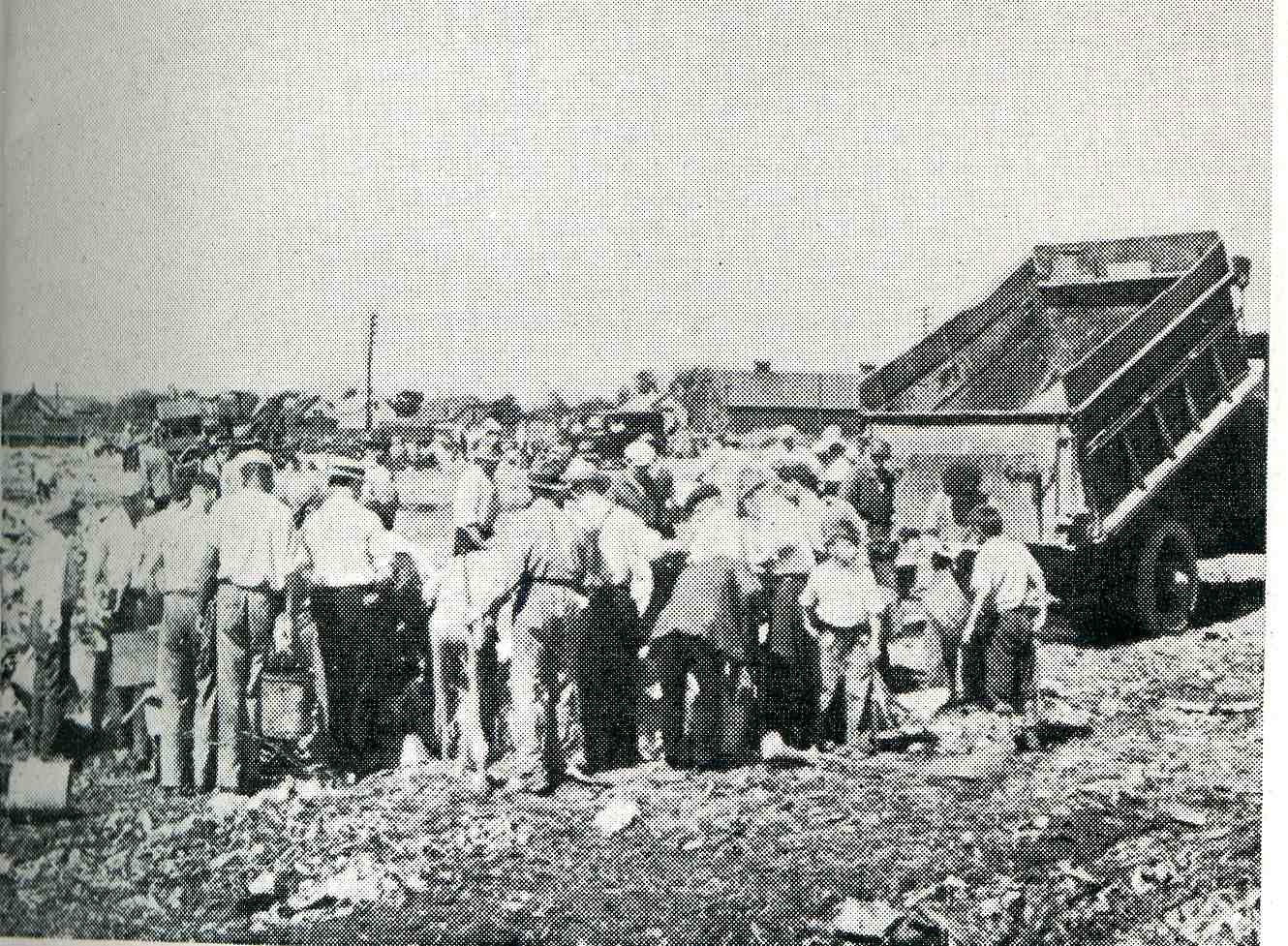
    CHicago on parade dump[Anxious men, women, and children welcoming the rubbish from a garbage truck.]

    Duncan (who unfortunately did not identify the photographer(s)) was very strong in the use of images.  He was not afraid to show long bread lines, people (including children) scavanging at the city dumps, blacks and whites marching together in protest of police brutality, (many hundreds) of people sleeping out of doors in Grant Park (Chicago’s “front yard”),because they had no where else to go, and much more.  The photographs had a real touch of journalistic acumen, and none of the images look forced or posed–they are the real stuff of social documentary, and how they have escaped wide notice is not known to me
    . 

    000-ebay--Nov 4--chic 2986
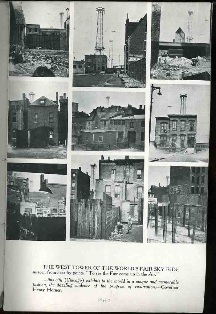
    Perhaps the strongest statement (outside of the
    photos of the children scrounging for food in dustbins and at the dump) is this series (below) showing views of the city of Chicago that were within site of the tower for the Century of Progress Sky Ride (“See the Fair / Come Up in the Air”).  The series make an elegant and strong and incontrovertible point, and that there was definitely something very wrong going on outside the walls of the celebration which had been scooped out of the city’s east side.  (The images remind me of series of photos of the US Capitol Building that appeared in the great classic of social and cultural recording of class division, Neglected Neighbors, which my friend Andy Moursund introduced me to many years ago in Georgetown.)

    The logo design for the event is terrific and I’m sure that everyone had seen it at least once in their lives, but out of the many hundreds of other pamphlets and display materials that I have here for the expo I’ve got to say that the overwhelming majority of them are luridly colored with a palette found outside nature.

    And anti-nature colors are somewhat schizoid-happy  colors, like MGM technicolor cartoons from 1949, which applies a massively ugly chromo-palette to the blight of the surrounding Depression problems.  Mr. Duncan was determined that this not happen, at least so far as he could help it, and published these arresting images to remind the rest of Chicago that the vividly colored happy face placed over the city like a stamp for the Century of Progress was not the case in fact. 

    There are another few images in the “continued reading” section.

    Note:  click on the photos for a larger, more detail view.


    ·Posted by :

    ·in:

    —
  • The $1/64,000th Dollar Question

    JF Ptak Science Books  Quick Post

      Fraction adding machine010

    There’s a box in the studio that is filled with all manner of antique and semi-antique adding/calculating/etc. instruments, from slide rules to blast effects of a nuclear weapon to air speed to the gas mileage for a 1959 Rambler.  Some are wood, some metal, but my favorites I think are those made of paper (a large revolving baseball from 1961 for calculating world series records is my favorite in that area….that, or the radiation measurer made of paper to place alongside A Body Part to check on its incremental-or-not growth following nuclear detonation).

    The there are the little bits that maneuvered the little bits, as seen in this uncovered little gem, the “Fraction of an Inch Adding Machine” (shown above).  It was patented in 1952 by K.P. Jaeger (http://www.google.com/patents/USD169941), and is stamped   “Sheradco, Inc., Detroit” on the reverse of the metal plate. 

    It does a relatively simple task as stated–adding diverse fractions–and it does so quickly; as a matter of fact, it is far quicker than you can do it online, even with a converter. This is basically two steps–you put a pen or pencil head in the outer ring hole for the first fraction and move the dial clockwise until you come to the stop; then you do the same for the next fraction, and the result is instantly displayed. For operations above 1, you just need to keep track of the whole numbers yourself.  Unfortunately it doesn’t teach you anything about fractions, but neither does your digital calculator teach you about anything calculating. 

    This is just a smart and pretty instrument that works very nicely indeed, and I just wanted to share it. 

    [I did find a lovely post on how to make your own!  It also provides a pdf of base plate and the rest of it as well:  http://www.evilmadscientist.com/2007/make-your-own-1952-fraction-of-an-inch-adding-machine]

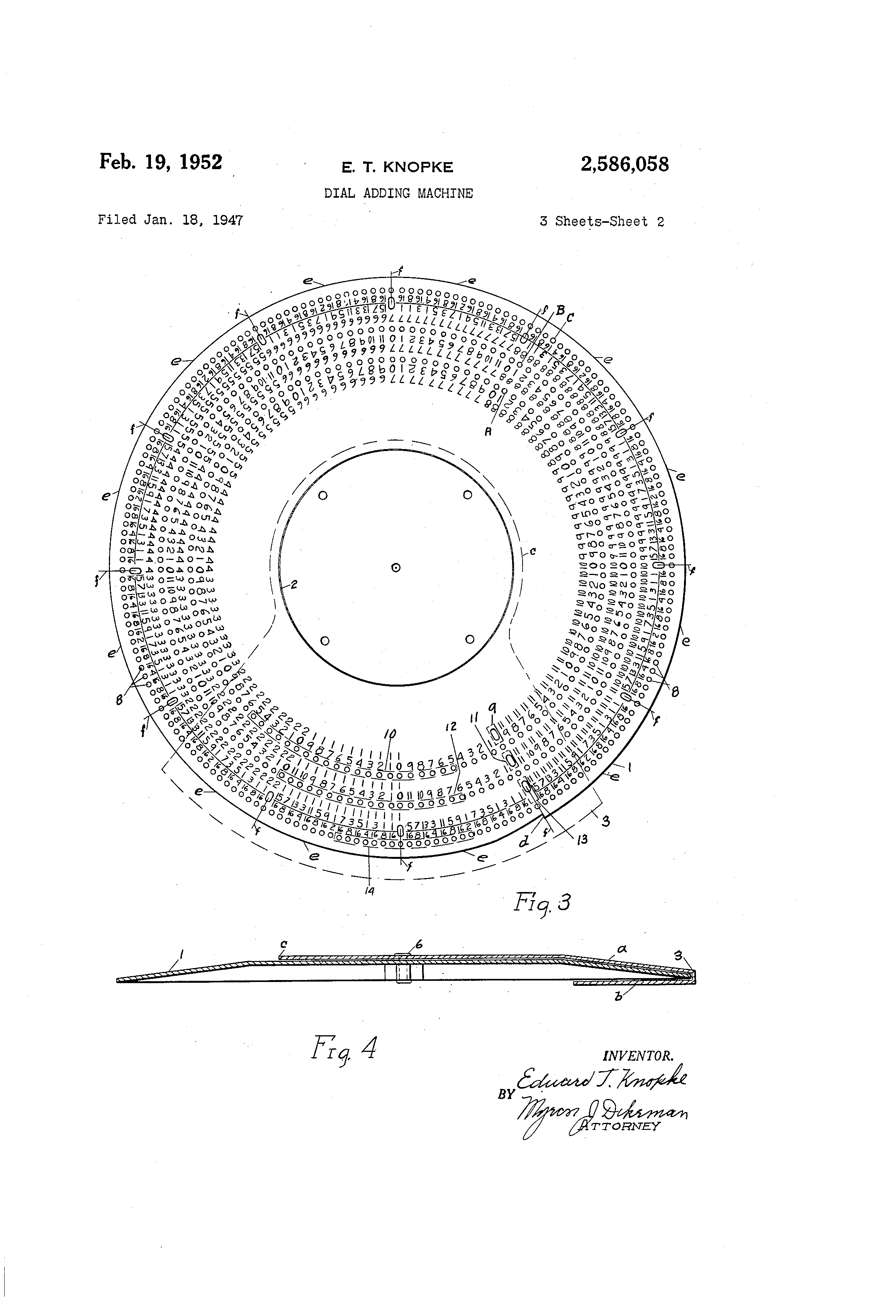
    While looking for it on Google Patent Search I bumped into some other similar devices, and I just wanted to take a moment to note the beauty of the possibility of their interior base dials. Just one sample here for the moment: the “Dial Adding Machine” of E.T. Knopke, 1952, which is so full of numbers and potential and mathematical poetry:

    Patent--adding machine dial

    [Source: Google Patents]

    Feb. 19, 1952 E. T. KNOPKE 2,586,058


    ·Posted by :

    ·in:

  • Outsider Logic in the Poli-Prophecy Realm, 1940

    JF Ptak Science Books   Post 2503

    How does that saying go?  “The more things stay the same, the more they stay the same?” Something like that.  New stories are just sometimes the old stories that people forget from one generation to the next, with a societal memory that is possibly nullified or flimsy. Some stories that dictate a a particular outcome–like the example we are getting to below–are often repeated, sometimes for millennia, the same outcome retold with variations on the premise. 

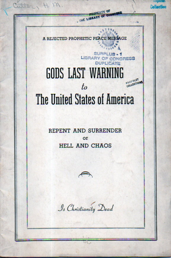
    God’s Last Warning to the United States of America, Repent and Surrender or Hell and Chaos is an example of this cyclically forgotten memory.

    Most of this short poli-prophesy tract calls upon the creator of the universe to come to Earth and establish a holy kingdom to combat a “SATANIC POVERTY CRISIS”, an “unfulfilled Prophetic Political Kingdom Message” which thee author “gives FREE to the United States of America and the WORLD”. [Note: all use of caps in quotations are found in the original; caps and the lack of them.]

    It is a prophesy that even as it is being ministered has also been rejected–and this right on the cover of the pamphlet, above the title, which makes it all seem a little too late, though the author pleas and prays the case, anyway. (He also asks the question, “Is Christianity Dead?”, though forgets the question mark. The title is a good indicator for the possibilities of the text being promisingly problematic, and it does not mislead.)

    Political Prophesy 1940014
    The author’s prose is difficult and oddly one-dimensional, floating tenses here and there, declaring tautologies, and lowering the needs of logical argument. For example , Mr. Cutter states that the ultimate message sent from the Lord of warning “will fit the conditions as they now exist. Former messages have been given that have revealed truths he wanted to make known to the World at the time they were given”, which is a fairly problematic double-statement. Mr. Cutter suggests a solution for the Depression, which he labeled as a “total collapse of our present Economic system known as Capitalism, or the Price Profit system, the writer is presenting a brief message outlining a repent surrender program by which we can get the PRINCE OF PEACE back to earth and our people prepared for His reception”.

    There is also a prediction of the Brotherhood of Man Political party (in 1940), and “a sane-sensible use of our can-be-amended National Constitution are tow keys that will unlock the door and make it possible for the Prince of Peace to establish his KINGDOM in the United States here and now…and to take over the Governmental Role of the WORLD”.

    There were evidently “wholly overlooked” parts of the Bible that would deliver us from the “Satanic depression” to allow the appropriate number of votes “will be the ordering of sufficient amendments to our National Constitution , so our lawmaker can pass the necessary Legislation in order that the Kingdom of JUSTICE can be established in the United States…”

    And so it goes.  This little tract is nothing particularly new or old to the U.S., and the title with some slight revision could have been printed today, or 150 years ago. 

    The pamphlet is 19 pages long, with the prophecy occupying 9pp of it, with the balance being reprints of letters that the author sent to the Nobel Prize Committee offering himself as a candidate for the Nobel Peace Prize of 1939.  The last three letters concern Cutter’s reprinting of the correspondence for publication, which the Nobel representative asks Cutter not to do.  Cutter then spends two pages in a response explaining why he needs to do so.  And the rest of the story, as they say, is not-history.


  • Paolo Ucello and the Forest of Pikes

    JF Ptak Science Books   Quick Post

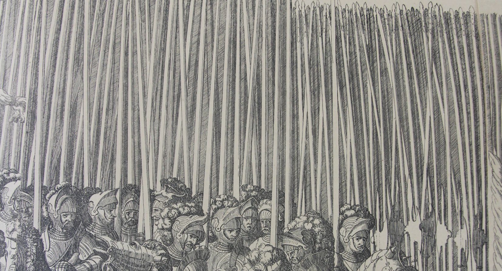
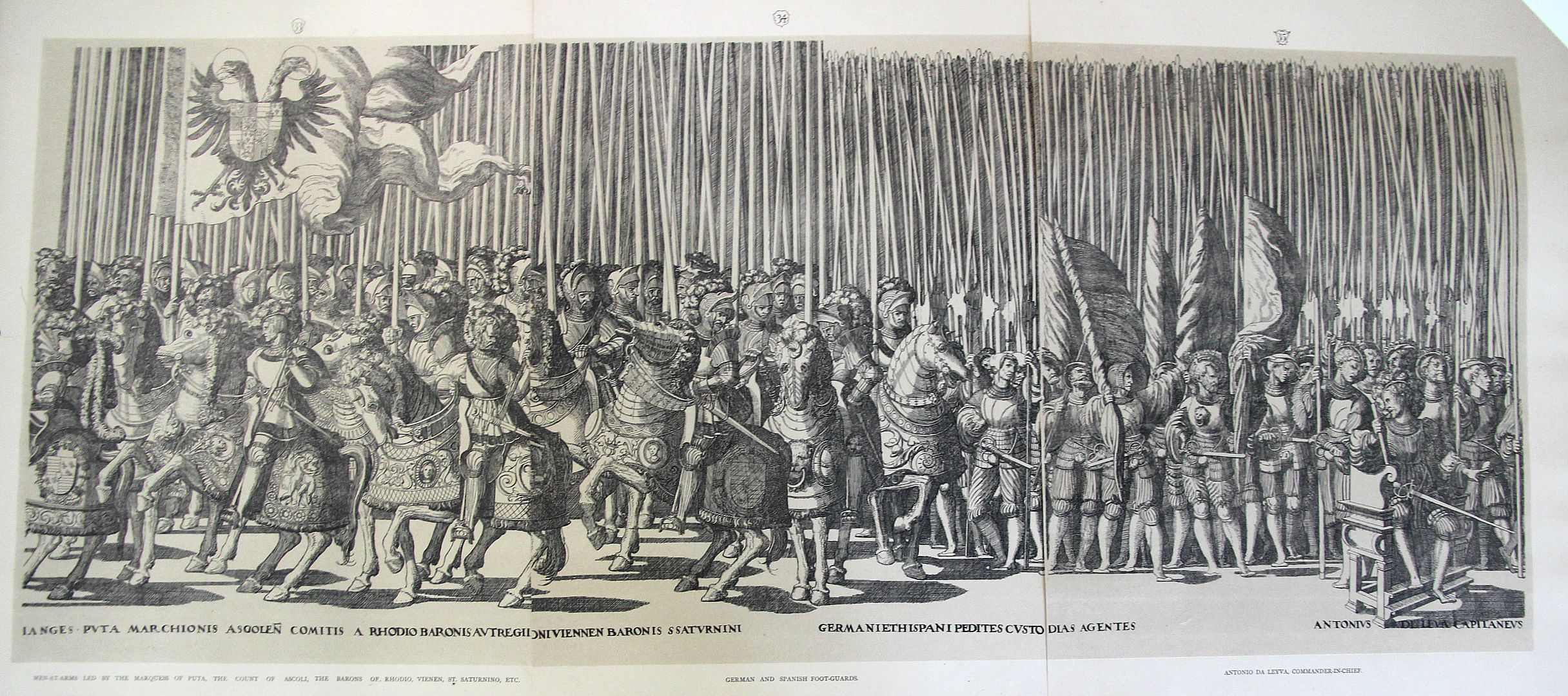
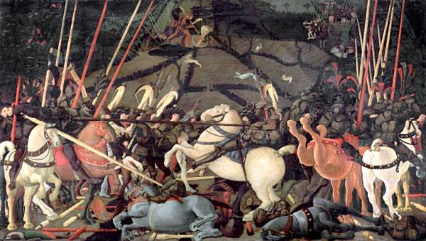
    Yes, yes, I know this isn’t the work of the beautiful Paolo Uccello, but it does remind me of his Battle of San Romano (ca. 1435, and 60 sq ft of brilliance) one of the great works by one of the leading early Renaissance artists.  It is the spears, which is about the first thing that I see in Uccello–that and of course the horse rumps, which are part of the issue in William Gaddis’ great American novel, The Recognitions, in which he discusses the famous “solids in Uccello”.  And he’s right–there is little or no detail in some big splashes of color, as in the horses. Big, solid, colors–what in the world was Uccello thinking about using those great blocks, nearly 600 years ago?

    Processional spears detail

    This is a detail from the larger three-section image (below) which is itself a small detail from the 20-section whole of one of the most famous festival books of the mid-Renaissance, this the work of Nicolaus Hogenberg (c.1500-1539). Gratae et laboribus aequae posteritati. Caesareas sanctique patris longo ordine turmas aspice. The original was published in 1540 and excessively rare (very valuable) in the first and second editions–my copies come from much later, int he late 19th century.  That said, it is at least a thrill to have them right there in front of you, in their great massiveness.  

    Processional large

    • [ The full original work can be seen at the British Library collection of Festival Books, the Coronation of Charles V http://special-1.bl.uk/treasures/festivalbooks/pageview.aspx?strFest=0086&strPage=049&print=1]

    And the Battle of San Romano that I’m dreaming of:

    Uccello romano

    [Source: the National Gallery,  http://www.nationalgallery.org.uk/articulate/projects/bf/bf_painting.html]

    ·Posted by :

    ·in:

    —

Recent Posts

Archives

Categories