A Daily History of Holes, Dots, Lines, Science, History, Math, Physics, Art, the Unintentional Absurd, Architecture, Maps, Data Visualization, Blank and Missing Things, and so on. |1.6 million words, 7500 images, 4.9 million hits| Press & appearances in The Times, Le Figaro, Mensa, The Economist, The Guardian, Discovery News, Slate, Le Monde, Sci American Blogs, Le Pont, and many other places… 5000+ total posts since 2008.

  • Tubular, Streamlined Boat Constructiuon, 1935/6

    JF Ptak Science Books   Post 2504
    Bester _5_

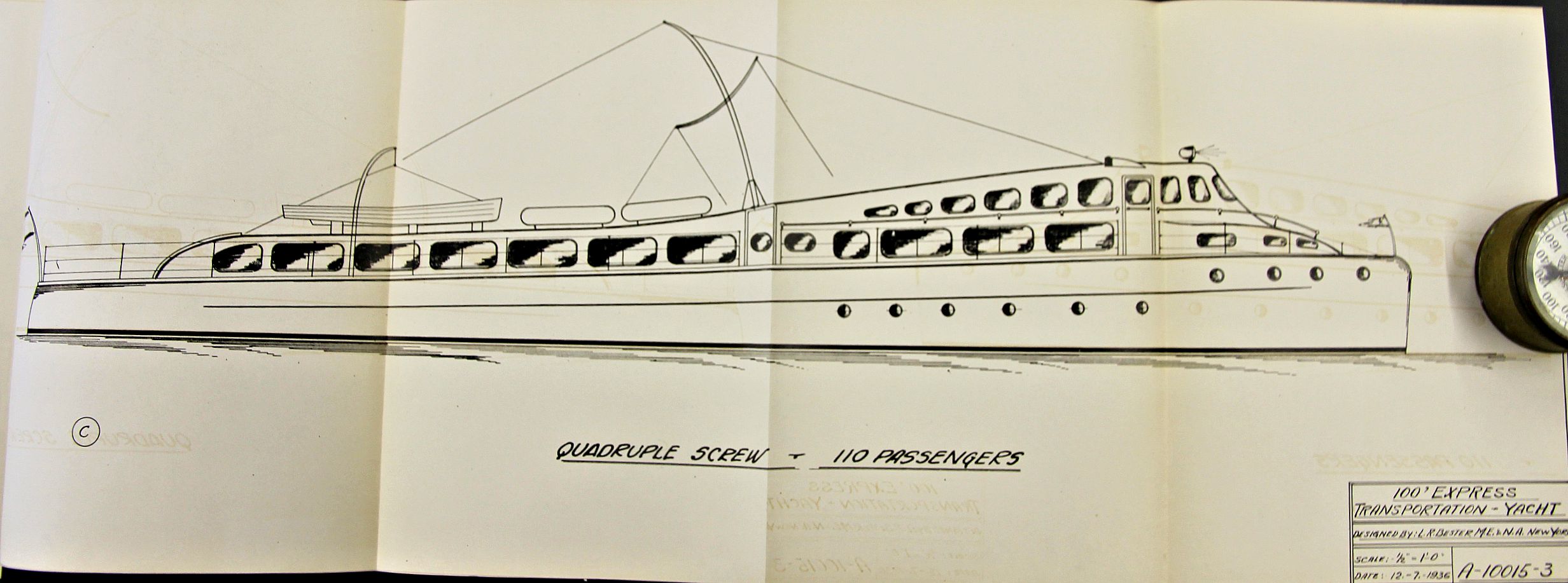
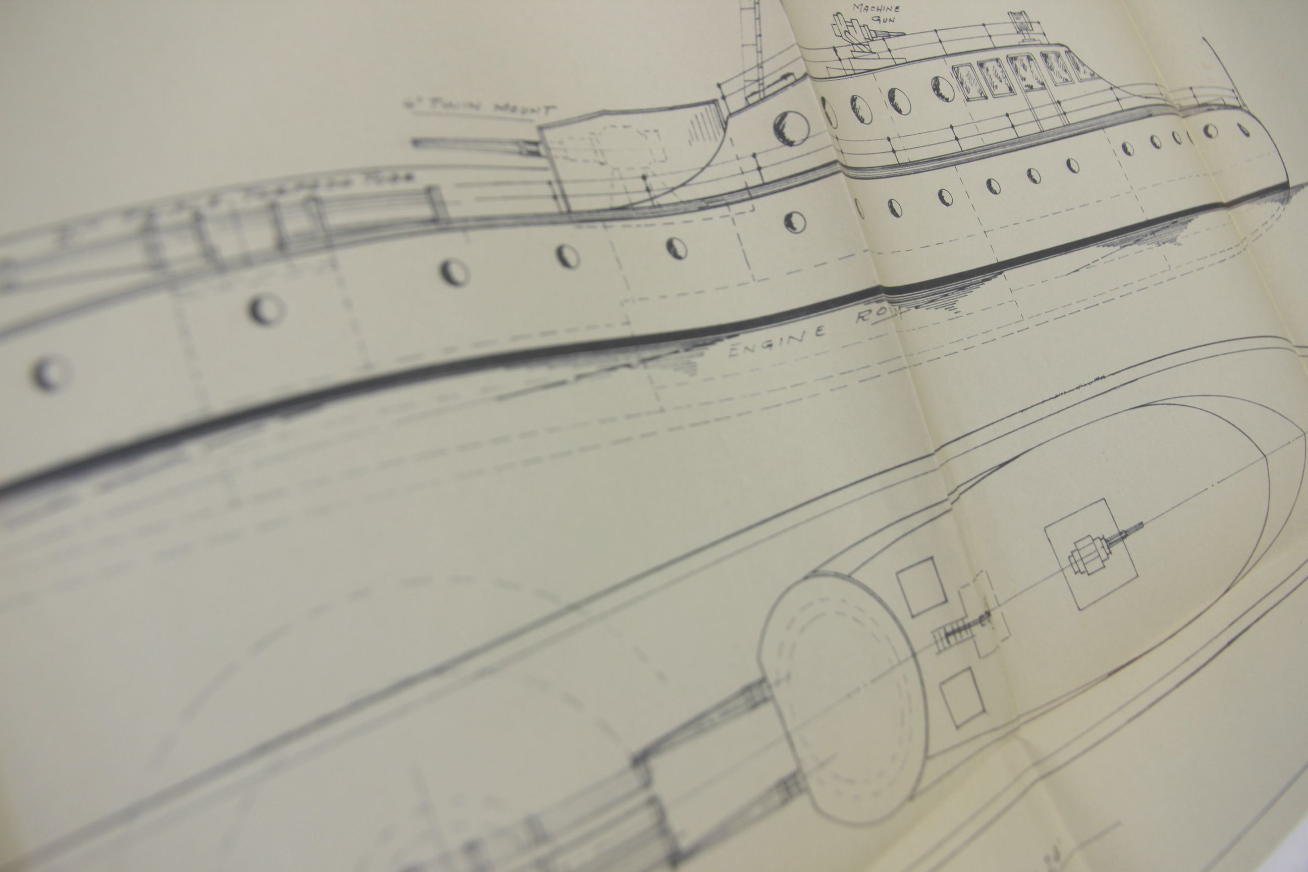
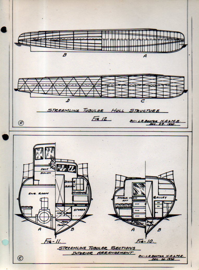
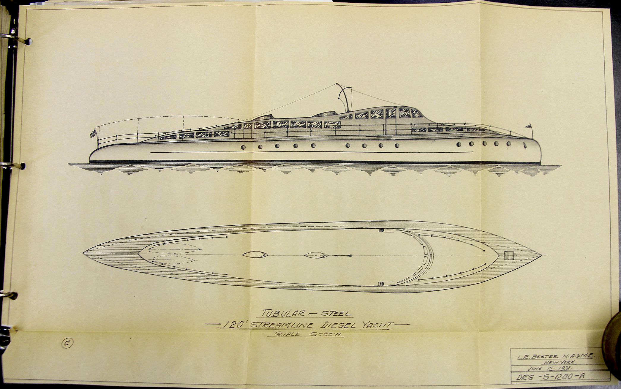
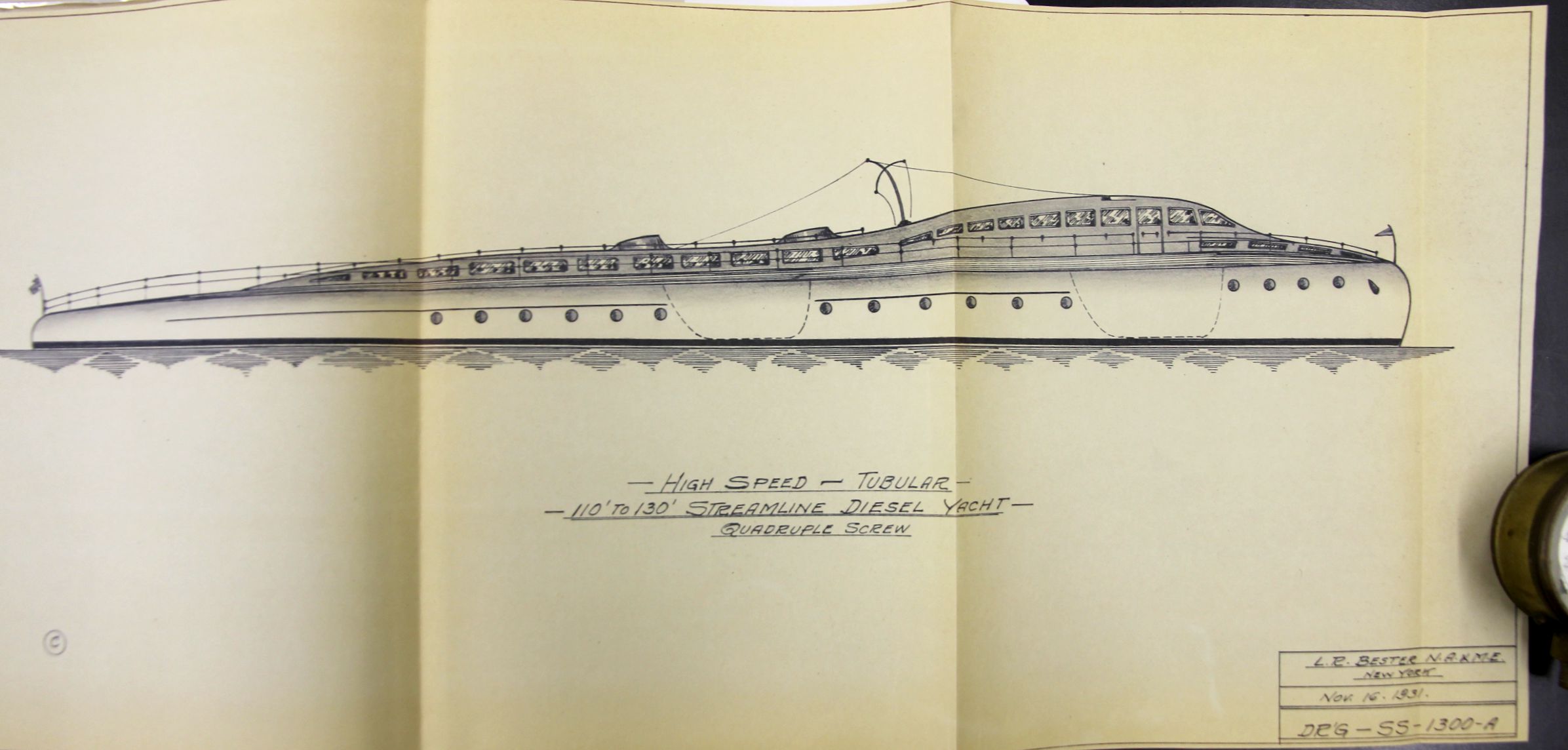
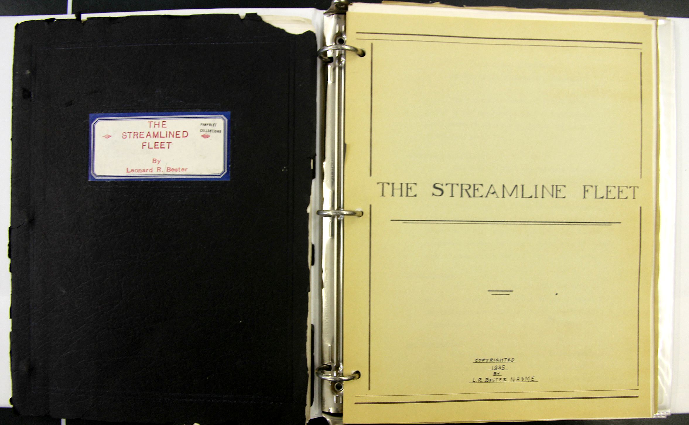
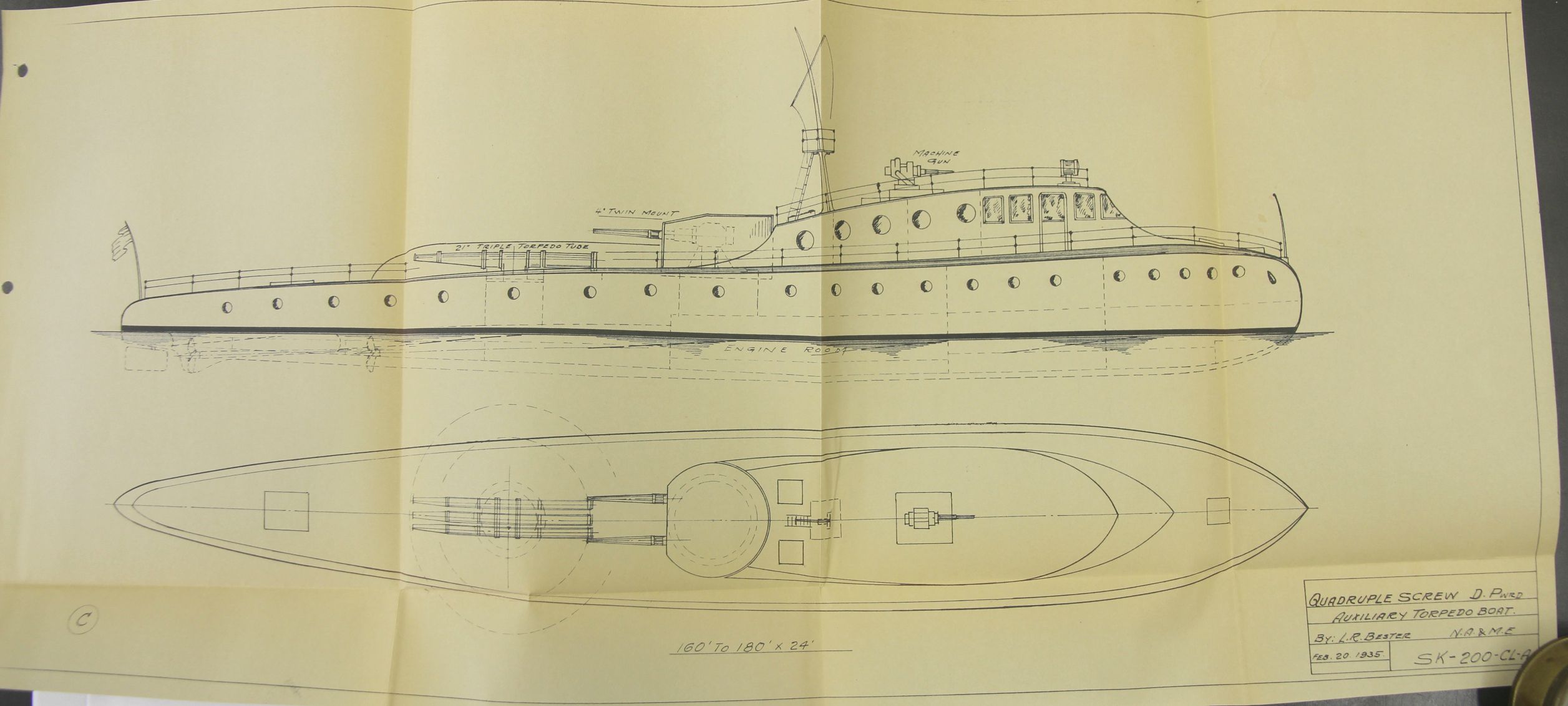
    Leonard R. Bester was a marine architect and naval engineer who produced this very interesting document on his highly-stylized concepts for boat/ship design. The vessels are all  certainly streamlined, and are long and narrow, and share the same “tubular” hull construction. He recorded them in these documents (below) which were sent by him to secure copyright protection to the U.S. copyright office, one copy of which was sent on to the Library of Congress.  They were certainly produced on a very small production scale, perhaps only a few copies made, given what looks like their home-cooked flavor–in any event, they did not receive any circulation that I can find, and are not listed anywhere in WorldCat (which is a librarian’s tool for recording and documenting books) showing that nothing by Bester is listed in any contributing library worldwide.  
    Bester _3_

    Bester was definitely a working naval architect who possessed at least several patents1 who worked for the Todd Shipping Company (NYC) and who was listed by 1919 as a member of the Society of Naval Architects and Marine Engineers2 . The work looked interesting and intriguing to me, but is also in a field that I know basically nothing about, so I thought that given the possible interest in it to designers and engineers that I would at least enter the information about the work here in internettubewebland where it might be findable to someone interested in this sort of creative thinking. 

    • All of this is offered for sale at the blog bookstore, here. 
    Bester _6_

    Bester _7_

    The work seems to be divided into two section, each section with three parts,  and although not dated per se the title pages such as they are are copyrighted 1935 and 1936, with the later having a copyright/Library of Congress acquisitions stamp for 1936. The blueprints, on the other hand, date back as far as 1931, so there’s a bit of a mix. The work certainly is not passed 1936.  Altogether there are 19 folding blueprints of boats, 36 pages of text, 12 photographs on three leaves, and several folding charts. 

    Section I:  The Streamline Fleet (1935), divided into three sections.

    Part I

    • “Features and Advantages of the New Tubular Type Boat”, pp 3-6
    • Tech illustrations in 12 figures, pp 7-9, followed by 6 leaves  of 2 figur/leaf of various cross-sections
    • “Design Features”, pp 10-14, with a folding plate: “Comparative plate of tubular type hull structure”, 13×18″
    • “Main points of advantages of tubular design”, pp 15-17
    • “Summary of the Streamline Tubular Boat”, pp 18-19
    • “High Speed Yachts”, p. 22
    • “Future of the Yachting Industry”, pp 23-26
    • Conclusion, p. 27

    Part II

    • “Propulsion Machinery, Diesel Power”, pp 28-30, with 3 leaves of tables and 2 folding plates on the turbine

    Part III

    • “Navy Boats”, pp 31-36.

    Part IV (folding plates)

    • “High Speed tubular 50′ to 60′ streamline diesel cruiser, twin screw”, 11×17″, 1931
    • High Speed tubular 54′ streamline diesel cruiser, twin screw”, 11×17″, 1931
    • “Strealine 85′ Diesel Yacht”, 11×17″, 1932
    • “Tubular steel 100′ streamline diesel commuting yacht, twin or triple screw” 11×17 inches (1931)
    • Schematic: “tubular design showing strong and light construction”, 12×16″
    • “Tubular steel 120′ streamline diesel yacht,  triple screw” 1931 11×17
    • “High Speed Turbine–Tubular–110 to 130′ Streamline Diesel Yacht, quadruple screw”, (1931)  11×24″
    • “High Speed Turbine–Tubular–150′ Streamline Diesel Yacht, quadruple screw”, (1931)  11×24″
    • “Quadruple screw diesel powered auxiliary torpedo boa”, 1935, 12×30″
    Bester _2_


    Bester _1_

    Section II:  Streamlined Tubular Hull Structure, Design, Layouts, and Interior Arrangement of Cruisers and Yachts

    Part I contains seven folding plans and cross section blueprints of the design, includes the following sections:

    • Streamlined Diesel Cruiser, 1936, 34×8′, 10×13 inches
    • Streamlined Diesel Cruiser, 1936, 40×8′, 10×13 inches
    • Streamlined Diesel Cruiser, 1936, 45×9′, 10×13 inches
    • Streamlined Diesel Cruiser, 1936, 50×10′, 10×13 inches
    • Streamlined Diesel Cruiser, 1936, 57×11′, 12×17 inches
    • Streamlined tubular twin screw diesel commuting yacht, 23×16 inches
    • another copy of Streamlined tubular twin screw diesel commuting yacht, 23×16 inches, though with different applications.

    Part II contains 3 leaves, each with four original photographs each, with tissue guards. These are photos of scale models of Bester’s designs, though the dimensions are unfortunately not mentioned.

    Part III concentrates on “express transportation yachts”, and contains five folding cross section blueprints:

    • 65′ Express Transportation Yacht, drawing measuring 17×11 inches
    • 65′ Express Transportation Yacht for 60 people, 19×11 inches
    • 75′ Express Transportation Yacht for 75 people, 10×22″
    • 85′ Express Transportation Yacht for 85 people, 10×23″
    • 100′ Express Transportation Yacht for 110 people, 10×30″

    And some hull lines:
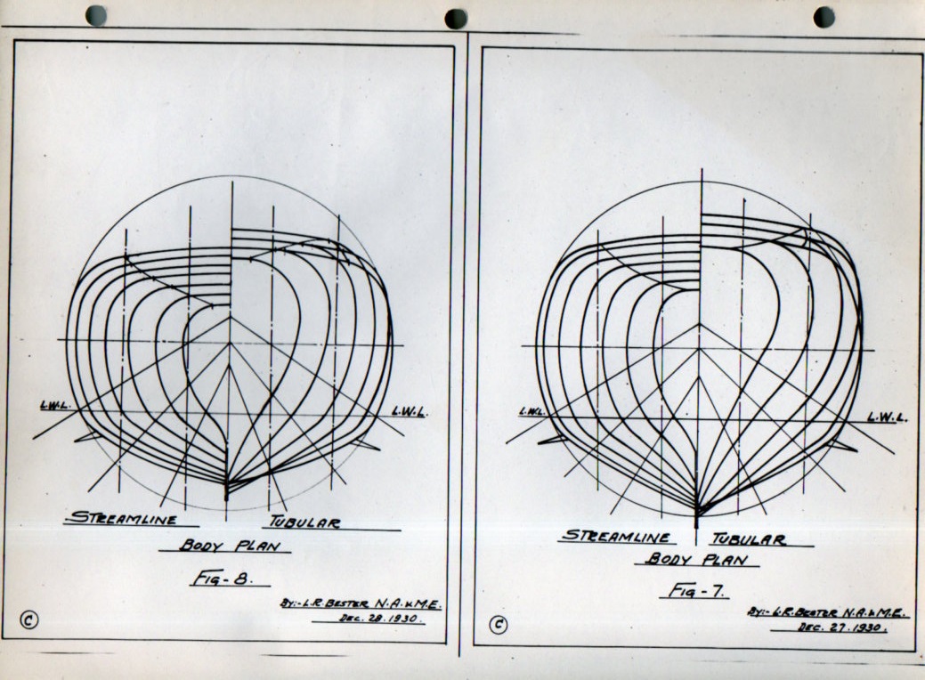
    Bester hull line026


    Bester hull line025

    Notes:

    1. Bester patented an approach to “tubular” hull construction (“Ship hull design”, filed in 1936 and patented in 1939, US2158214A), which seems reasonable to me (as a non-engineer). He describes it so:  “It has been the practice in the making of steel vessels such as are commonly used, to provide framework consisting essentially of transverse web frames coupled with longitudinal members, whereby to give form and rigidity to the vessel. Even where the vessels were oval or cylindrical in general cross-section, the framing invariably embodied straight pieces. This type of construction had the considerable disadvantage that it was quite heavy and it was not possible to attain any great amount of saving in weight by variations in the arrangement and size of the several frame members. It was also impossible in such construction to reduce the labor cost in the building there of and also to reduce the cost of propulsion or materially increase the speed of the vessel without overstraining the hull structure.”   Source:  Google Patents, http://www.google.com/patents/US2158214

    2. Proceedings of the Society of Naval Architects and Marine Engineers, volume 25, 1918, listing of the Society’s leadership and membership.
    ·Posted by :

    ·in:

  • The $5,000,000 Powur Fonetic Alfabet (1890)

    JF Ptak Science Books   Quick Post

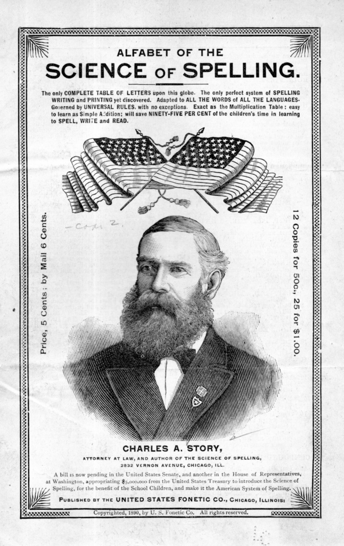
    Just two years before the 400th anniversary celebrating Columbus, and in the city celebrating it with a world’s fair (Columbian Exposition) of 1892, Charles A. Story set out on his own voyage, seeking support to change the way the United States wrote in ts native tongue. It seems high in the century for this sort of expedition, and Story was not nearly the first to get that, not even the first of 1890, as spelling reform has been a subdued meme in this country for a long time.

    Phonetic alphabet017

    What make’s Story’s story so momentarily interesting is that he sought government intervention to make his dream come true. He was preceded in this strategy by Robert Fulton (who received $300K+) and Samuel Morse ($30k), which was money well spent by  as usually very tight Congress; Story sought $5,000,000 1890’s dollars to change the alphabet, at the end of which you would get an alphabet of 66 letters of which only 45 were really necessary.  And 100 schools to teach the new alphabet. And so on.

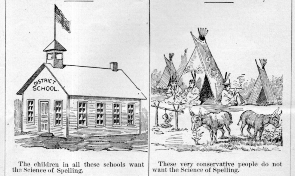
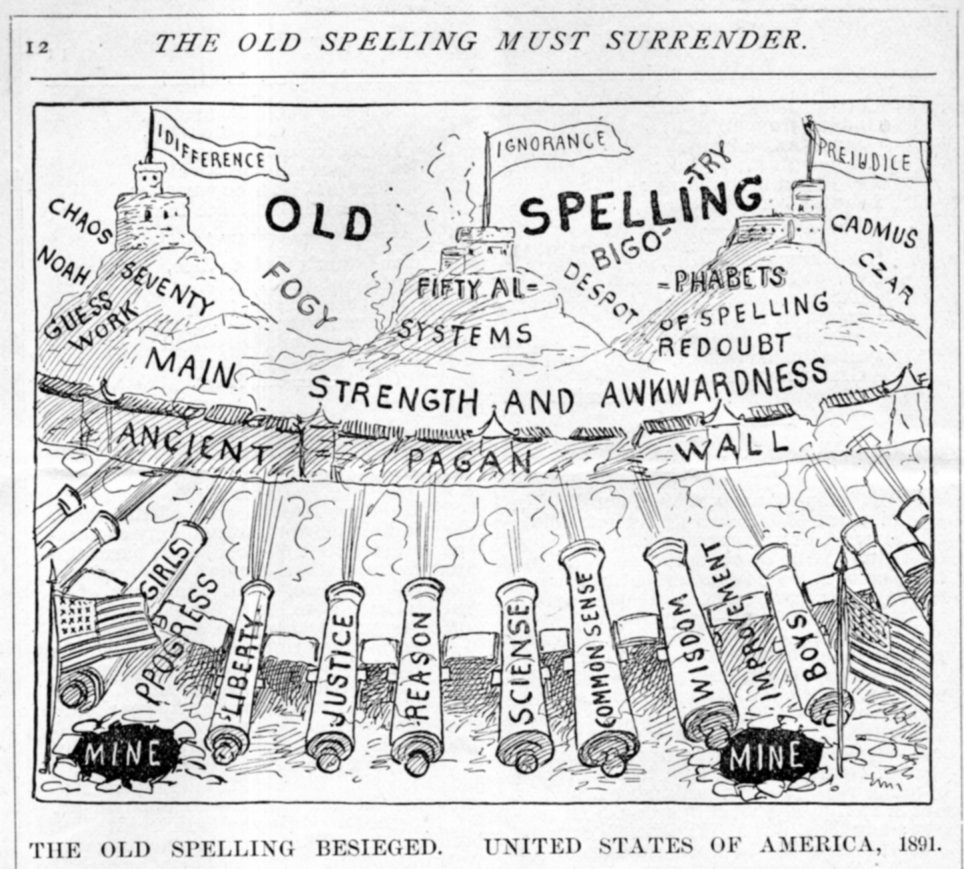
    A curious and Outsidery text illustration illustrative of some misty point:

    Phonetic alphabet016

    $5,000,000 was a h of a lot of money back then, and could have been spend of better things and maybe on some worse things (though perhaps not on the latter). 

    Mr. Story had a nicely designed cover for his plea; he didn’t do quite so nicely on the text illustrations. 

    Here’s another unfortunate text illustration; this one isn’t so much like an Outsider as it is just plain creepy:

    Phonetic alphabet018

    How this was supposed to enhance the language, or create new words, in the fine tradition of the development of the English language from the languages of the Aryan, Persian, Sanskrit, Greek, Latin, and so on, is a $500,000  mystery. 

  • Superior Designs in Red

    JF Ptak Science Books   Quick Post

    There’s something about a strong design in brilliant red:

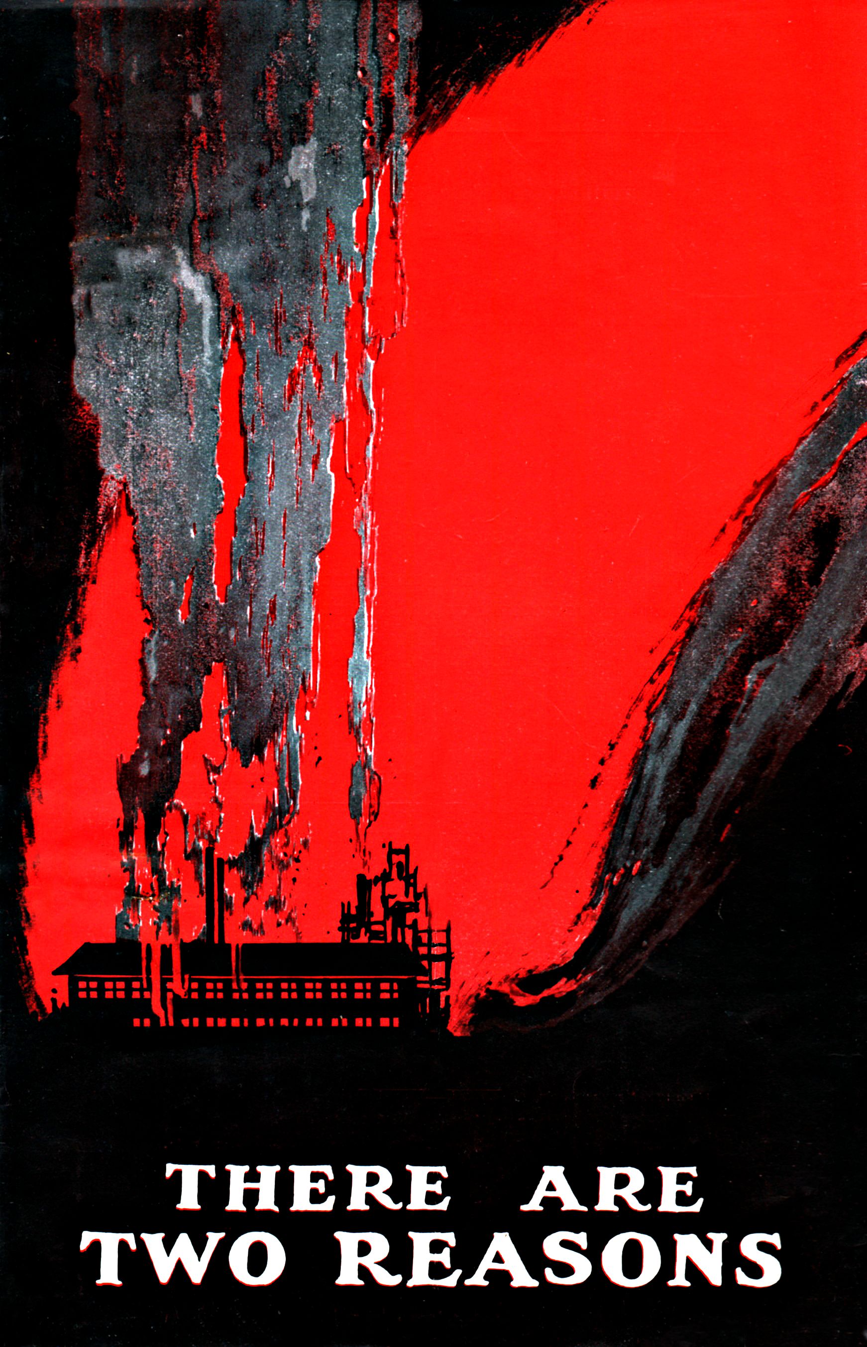
    Posters There are two reasons BIG

    This striking work is the cover for a circular produced by the National Fire Protection Association in 1929.  It is a simple folded sheet, with some basic data about joining the association, and someone did a very good job of creating artwork for the front cover of this simple publication.

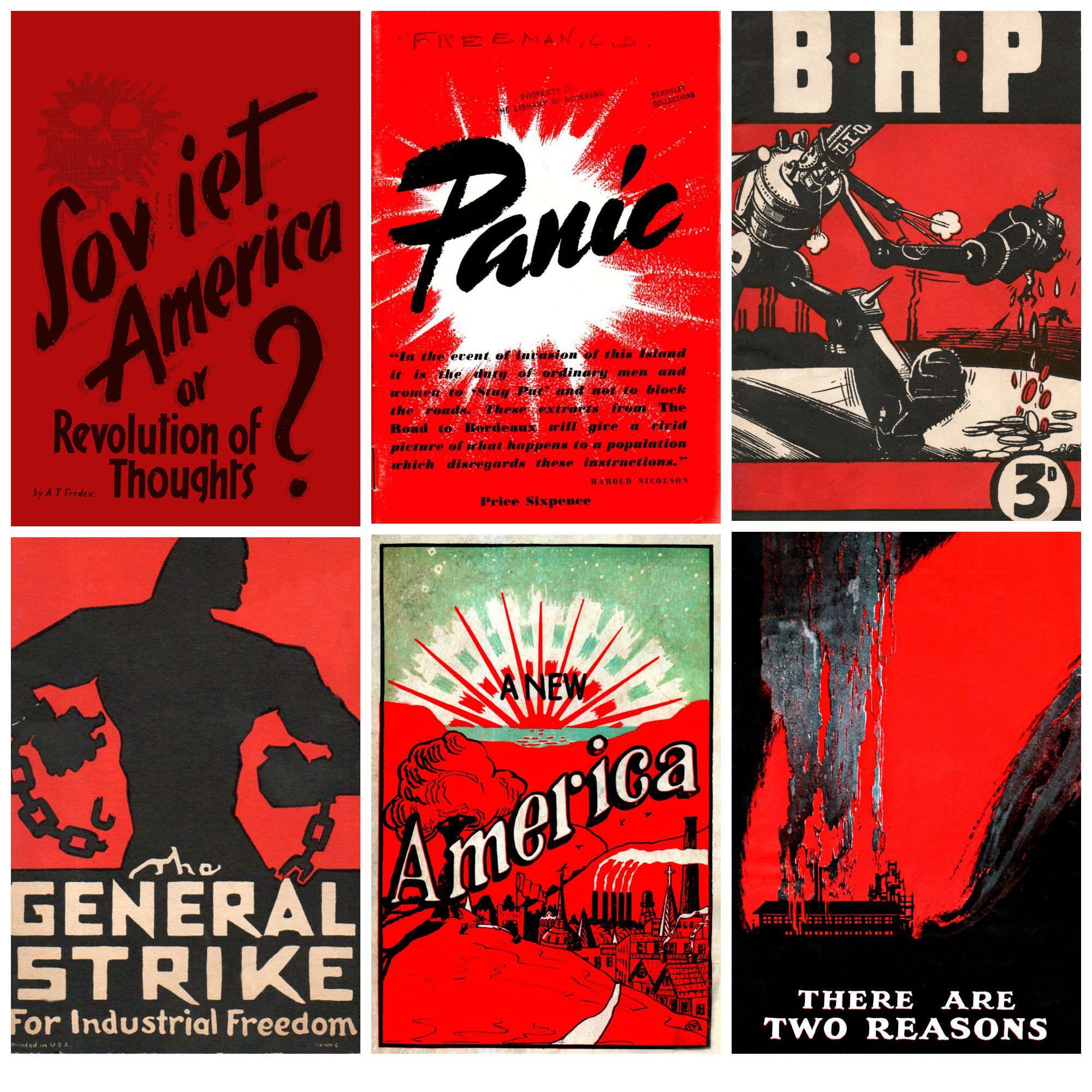
    Here are some other small designs for pamphlet covers that I’ve found, and scanned, and cleaned  up, and made into 14×19 posters, which look pretty good and which are also crazily color-hungry:

    Poster Red design And just at the last moment, another found design in red:

    Posters a new Americareasons022

    This is the cover of a small pamphlet by W. Howard Grady, published in Kansas City, in 1925.  From what I can tell in a quick read there seems to be no overriding approach to the New America outside of faith, freedom, and “buy American”. 

    ·Posted by :

    ·in:

  • A Beautiful Maintenance Manual–The Double Wasp Rotary Engine, 1946

    JF Ptak Science Books   Quick Post

    I just wanted to take a moment and compliment those responsible for crafting these fine engine catalogs for the famous Pratt & Whitney Twin Wasp engines. The 46 liter twin-row, 18-cylinder air-cooled radial engines were among the finest of their kind ever constructed, and were flown in some of the greatest aircraft produced by the United States (including the A-36 Invader, P-61 Black Widow, P-47 Thunderbolt (!), F4U Corsair (!), DC-6, C-46 Commando, and others).

    Twin Wasp024
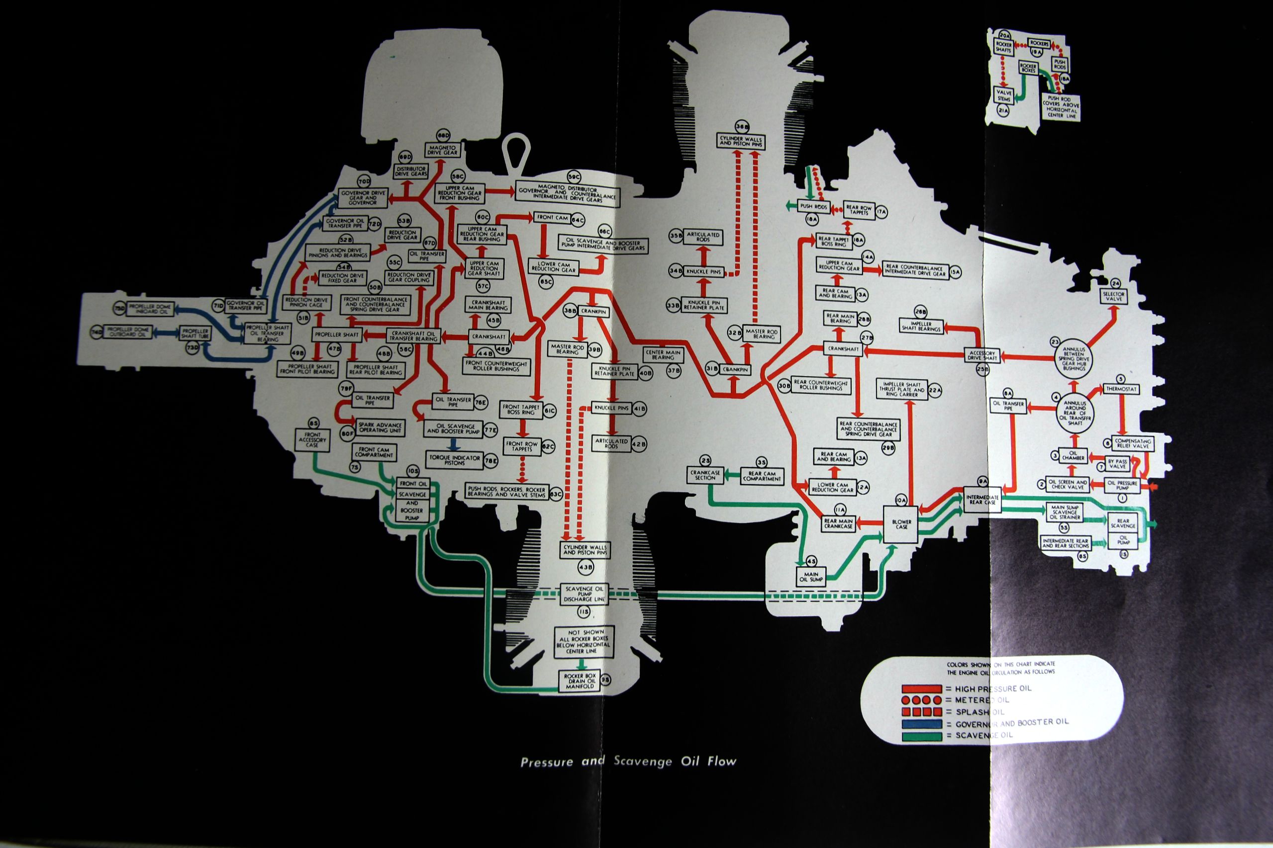
    The first of two catalogs here for the Double Wasp R-2800-CA was produced by Pratt & Whitney in 1946 and for its 112 pages looks like a superior maintenance catalog, with concise and well written explanations and clear illustrations.  It also has a great cross section which utilizes a black background, making the image jump from the page. (You can compare it with a similar image taken from a Twin Wasp catalog four years later; I’m not sure more use of the black background is not made.)

    Twin Wasp

    Twin wasps two

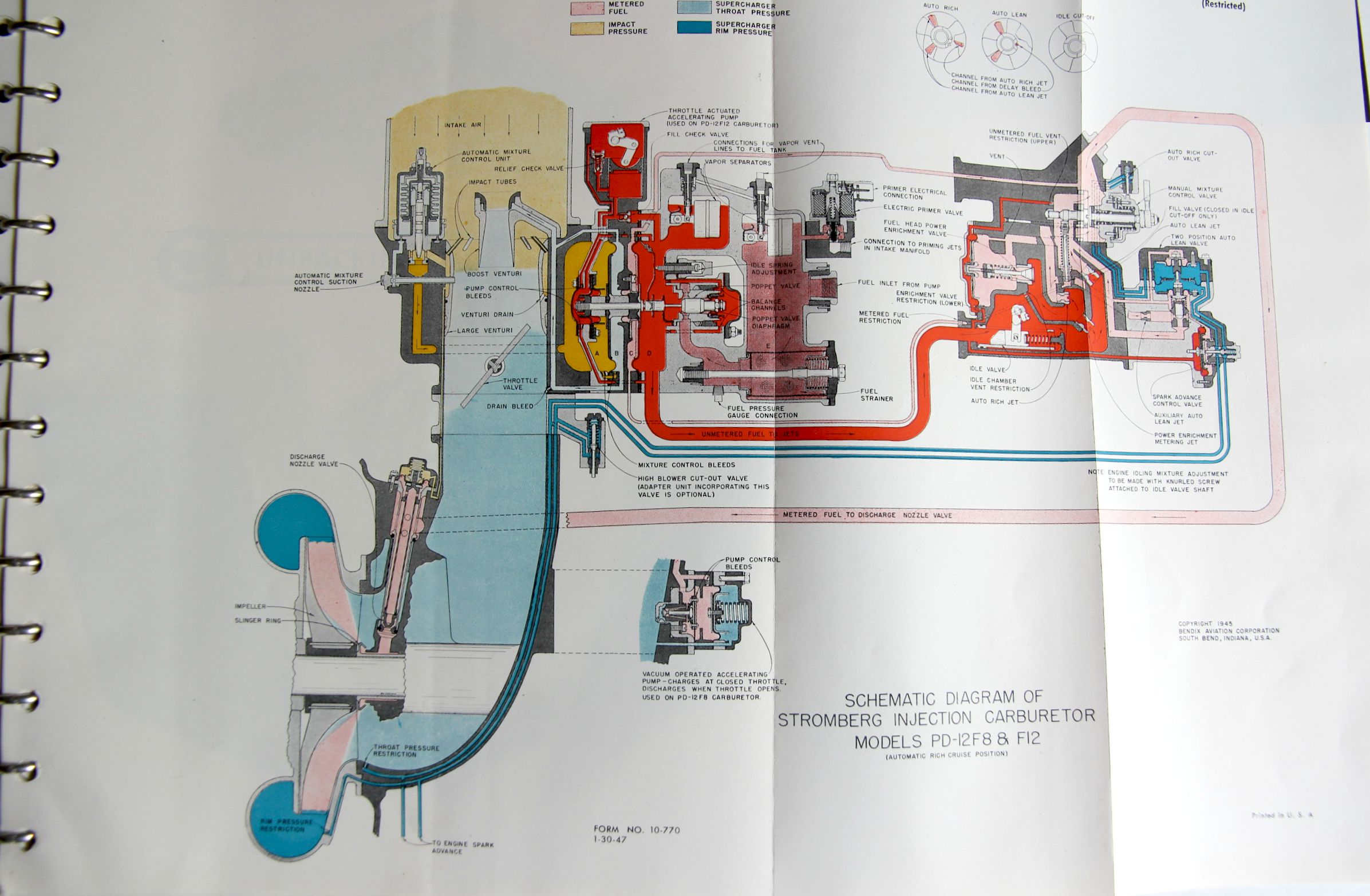
    The second manual (Twin Wasp 2SD13-G and D5 Engines) was a restricted document when produced in 1949, and was much chunkier (170+pp), and somehow seems a lot more accessible to the not-a-mechanic writer.  There is even a six-page “Unpacking the Engine” chapter with many photo illustrations–now it seems like reading the table of contents and seeing the six pages dedicated to unpacking was a little over the top, it turns out when you read the section and see the gigantic wood en box it came in and the other packing bits around it, you actually could use an unpacking manual.  It is just an impressive document. 

    • If you had use for such thing they are both offered for sale in the blog’s bookstore, here. 

    ·Posted by :

    ·in:

  • Should There be a Post about Question Marks?

    JF Ptak Science Books  Post 2506

    • “You talkin’ to me?”–Travis Bickle
    • “Is it safe?” — Christian Szell
    • “Who’s on first?”–Bud Abbott & Lou Costello

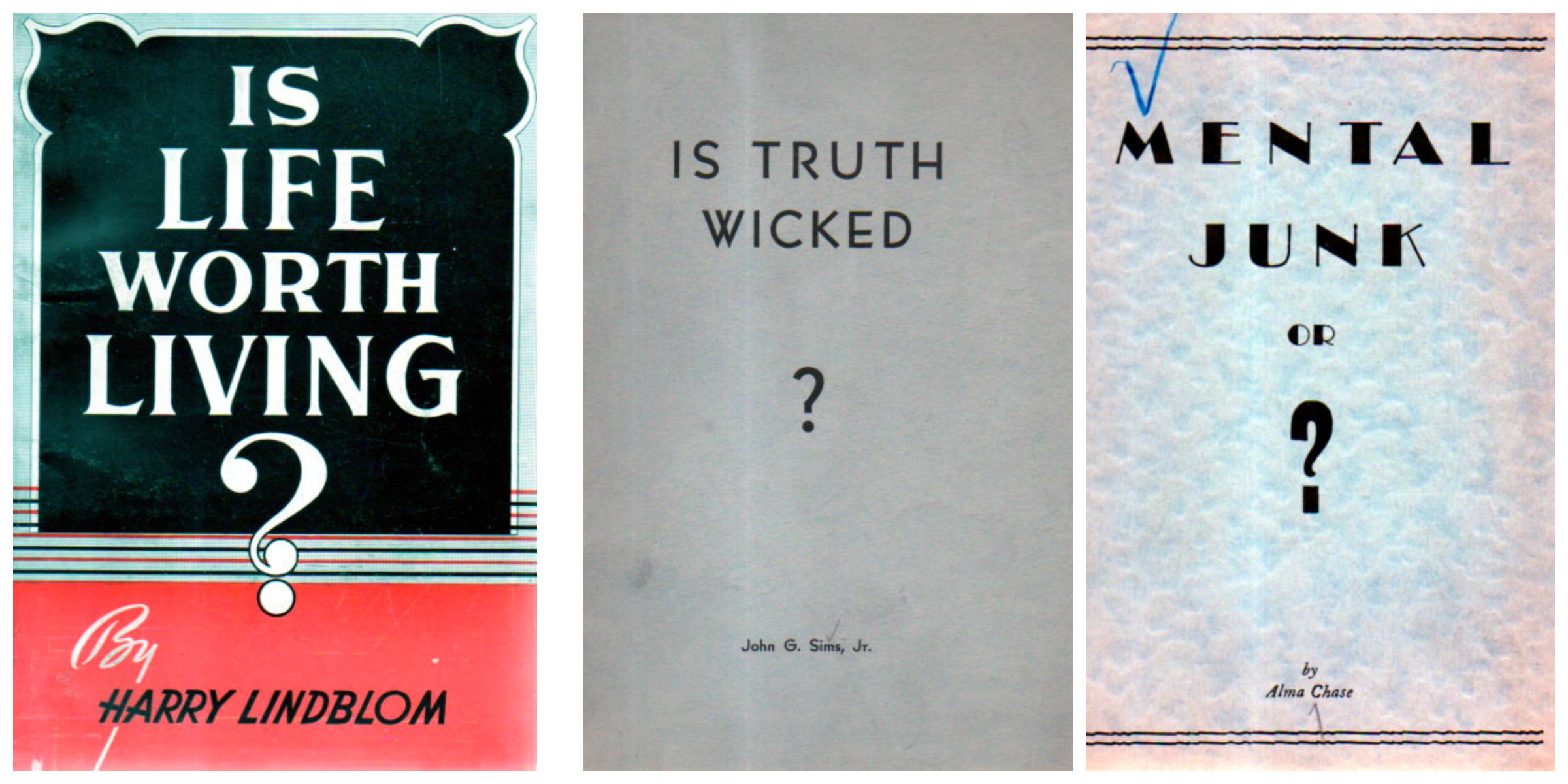
    Question mark trio

    Well, almost a post.

    In my haul of the 90,000-item Pamphlet Collection from the Library of Congress some number of years ago oh my brothers and sisters I created many standard and many odd categories into which the pamphlets would hopefully fall into some sort of wishful order. One of the straightforward categories was Titles with Questions, which was actually a combination of a great number of other categories, including the Found-Absurd, the Found-Surreal, and the Glibly Naive, including more-standard selections.  The Question Marks could stand on their own, though, because they were ungainly, so stark, and bizarre, and unexpected–they just demanded a certain consideration for themselves. 

    Sometimes these question marks could easily be an exclamation point. 

    For some reason these three were separated from the pack, but they’re good enough to stand as representatives of the collection, all of which gathered together might make for an interesting exhibition. But for now, three will do.

    They bring up a larger though perhaps not-very-interesting issue of other more interesting works in other fields where the title is a question.

    For example, here are some good questions, (one in translation):

    • “Is the inertia of a body dependent on its energy content?” (“Ist die Trägheit eines Körpers von seinem Energieinhalt abhängig?”)1
    • “Can quantum-mechanical description of physical reality be considered complete”2

    As a matter of fact, they’re  really good questions–and the person putting the question mark into the title of these papers was Albert Einstein in the first case and then Albert Einstein, Boris Podolsky, and Nick Rosen in the second.

    There are many others to be sure, but it is a difficult question to answer offhand, like this, and will take a much longer think.  (Another good question comes in the title of Richard Courant’s book, What is Mathematics?)

    There is a recent paper3 of questionable use for someone like me that looks at the rise of the use of question marks in scientific papers over the last fifty odd years or so. (I must commend the author though as he utilized more than 2 million papers in the comparison.)

    But then there are the great philosophical questions like “Why did the chicken cross the road?”,”Does God Exist?”, “If a tree falls…?,” “Is there Life after Death?”, “Father, Why Have You Forsaken Me?”, and “Where’s Waldo?”

    And of course great books have their fair share of questions–I can quickly come up with the following examples and no doubt some real thought will produce many more: P.D. Eastman’s Are You My Mother?, Horace McCoy They Shoot Horses, Don’t They?, Ed Albee Who’s Afraid of Virginia Woolf?, PK Dick’s Do Androids Dream of Electric Sheep?

    Political (Lenin, What is to be Done?), musical (“Will You Miss Me When I’m Gone?” by the Carter Family), and question marks in film (“O Brother, Where Art Thou?”, “Whatever Happened to Baby Jane?”), all need to be addressed for such a future post.  

    But not right now–for the moment, it is just these three delightful pamphlets.

    Notes:

    1.  One of the four miracle papers of 1905, published in the Annalen der Physik 18(13):639-641

    2. This is the EPR Partadox, a great contribution to physics published in the Physical Review in 1935,  47(10):0777-0780

    3.  “The titles of scientific articles have a special significance. We examined nearly 20 million scientific articles and recorded the development of articles with a question mark at the end of their titles over the last 40 years. Our study was confined to the disciplines of physics, life sciences and medicine, where we found a significant increase from 50% to more than 200% in the number of articles with question-mark titles. We looked at the principle functions and structure of the titles of scientific papers, and we assume that marketing aspects are one of the decisive factors behind the growing usage of question-mark titles in scientific articles.”– “Scholarly communication in transition: The use of question marks in the titles of scientific articles in medicine, life sciences and physics 1966–2005”, by Rafael Ball, in Scientometrics, June 2009, Volume 79 #3, pp 667-679,

  • The Leech Explorers of 1833

    JF Ptak Sciene Books   Post 2507

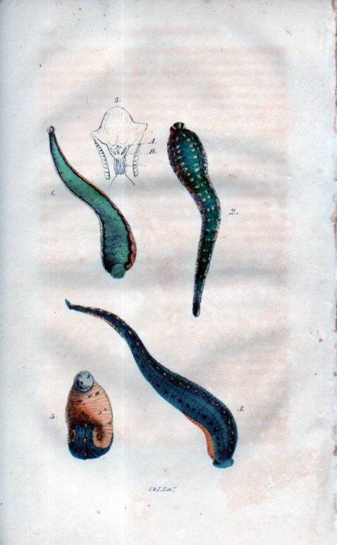
    D.B. Smith’s “On Medicinal Leeches”, which appeared in the Journal of the Philadelphia College of Pharmacy (January, 1833, pp 265-271), may or may not have the first illustration in a U.S. journal of a medical leech. Or at least that’s according to what D.B. Smith says, who claims that an image of the little critters with multiple jaws and lots of teeth “appeared here for the first time”. It seems to be a little late for that to be happening for the first time, as using leeches in medical practice to prevent disease and infection goes back a long way before this article, far beyond the earliest written mention of it goes (in a Galen manuscript, about 2,000 years ago). On the other hand the medical journal was still a pretty new idea at this point in the history of science in the U.S.A–the very first medical (and scientific) journal in general does not appear until 1797 (with the Medical Repository) so it is possible that in the 36 years of scientific/medical journal publishing history to this point it is entirely possible that this short article can claim its “firsts”.

    Leeches030The article is not without its very muted bells and whistles, but what attracted me instantly was the bit in it about the leech explorers. The Leech Explorers of 1833–it is an exploit-ish title, perhaps even needing a bit of a Busby Berkeley dance routine to support it in a Leechy Atlas sort of way. 

    We find out that at about that time, in the 1820’s and 1830’s at least, there was a bit of a European leech mania.  Of course, manias are difficult to explain in their appearance but not so much in their disappearance, and the leeches just got in line with the rest of the other manias, like the dancing mania, tulip mania, bibliomania, arithomania, fortune telling, magnetism mania, and so on. 

    What happens with the leeches at 1833 is there was a definite leech supply failure–in Paris alone 5 million leeches were used every year, emptying out 300,000 litres of Parisian blood (according to the Encyclopedia Britannica). The demand for leeches was so great that leech dealers would extend their range to Spain, Corsica, Germany, and even to the far reaches of Turkey, and finding no satisfaction, opened their hearts for new and true sources of leeches, and “explored”. 

    For some reason this struck me as enchanting and exotic–images of leech dealers and leech dealer mule trains hauling large buckets of dirt filled with leeches, bumping slowly along at very slow speeds for thousands of miles.  And since leeches are living things and need to stay that way in order to function in the medical sense, they need to make the long journey alive and well. I wonder if there were ever leech highwaymen?  Or leech saboteurs–competing leech explorer/dealers making life difficult for their competitors, like you might encounter with gold miners.  In any event, the Leech Explorers idea was a bright and confused point of light in an otherwise not terribly interesting story about American leeches of 1833. 

    Notes:

    See:  Charles McKay, Memoirs of the Extraordinary Delusions and Popular Madness of Crowds, full text: http://www.gutenberg.org/files/24518/24518-h/dvi.html

    ·Posted by :

    ·in:

    —
  • Before the Storm Comes the Chocolate (1923)

    JF Ptak Science Books  Post 2508

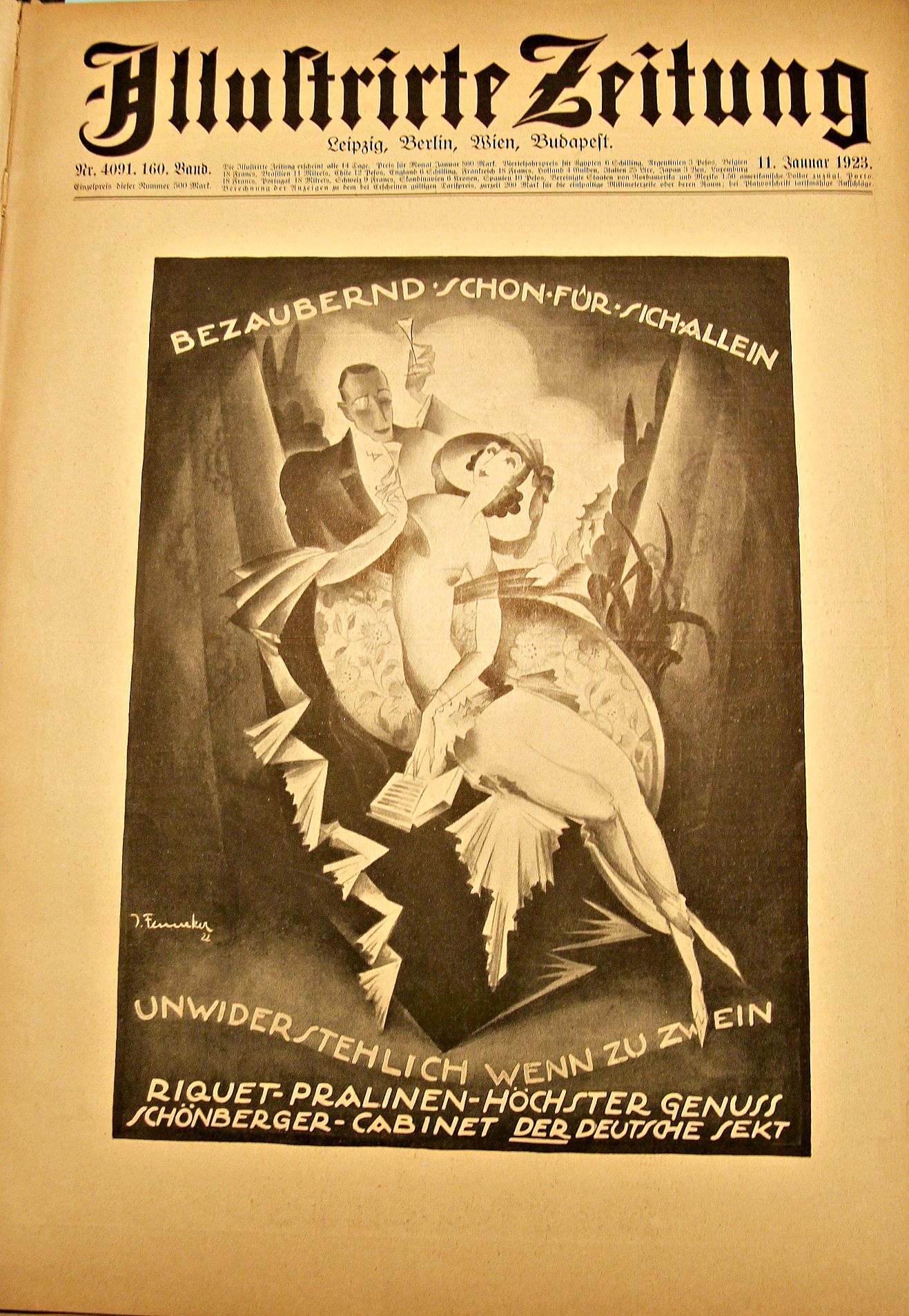
    1923 was a tough year for most Germans so far as chocolate was concerned, though Riquet (the advertiser in the striking graphic, below) was promoting their (“enchanting” and “irresistible”) goods very prominently, so I guess there was still some good demand for it no matter what happened to the fabric of social/economic Germany.  But it was in January–when this ad was published in Illustrirte Zeitung–that things started to go very badly for Germany.  By the end of 1922 it was apparent in Germany that they could make their next reparations installment payment (in January, 1923); the French and Belgians, among others, didn’t believe it and got very quickly pissed, and within days responded very aggressively, militarily occupying the Ruhr district. The Ruhr was home to German industry and electrical production, and manufactures in general, and the government-led response to the invading force was peaceful though it did  call on the workers to go on a general strike. And so it came to pass that no production to speak of was happening, and the tight-cashed German government, which was still under obligation to pay the strikers, did so, but created the money out of nothing,  just printing it as necessary.  This would be the start of  a disaster that would lead to a greatly debilitating and damaging hyper-inflation, which helped pave the way to a failure of the Weimar government, and finally helping to give rise to Adolf Hitler–it was all downhill from there.  

    Chocolate of course had been around for a long time by this point–especially in Central and South America, where it reaches back about 3700 years to to Olmecs, and carried forward to the Aztecs. Christopher Columbus bumped into it during his fourth voyage, but chocolate as “chocolate” really didn’t make it to high society consumption until the late 16th century; then some more years, until in the early 17th century came the chocolate craze, eventually winding its way to anyone with a little disposable income, to the modern day when some chocolates (like Hershey Kisses) are hardly chocolate anymore, but have the near-scent of it.

    At this point in 1923, five years after the war, and more years than that into a crippled economy, it would have been a luxury for most people in Germany to be able to afford some of this Riquet chocolate.  It was certainly not uncommon to see advertisements for luxury goods during hard times, though.  Having looked at every page of the popular weekly magazines like the Illustrated London News, Illustrirte Zeitung, and Scientific American for the 1914-1918 period,  I can safely but not experimentally say that there was plenty of advertising revenue collected by these mags for the sale of luxury goods. This extends too to Life magazine for 1936-1945, where there was also “a lot” of advertisement for common and semi-luxurious goods that wrapped themselves up in patriotic war efforts (cigarettes are among the most conspicuous of these win-the-war/smoke-Lucky-Strikes ad campaigns).

    I’m not taking issue with Ricquet, not at all–I think that the ad was simply “standard”.  But it did strike me as being somewhat loaded with potential zeitgeist, like the ad I found for traveling to Czechoslovakia for “wintertime fun!” dated October 1, 1938.  

    German graphics riquet pralinen

  • An Outstanding Window That is Almost Not-a-Window (13th Century)

    JF Ptak Science Books  Quick Post

    “Rose is a rose is a rose is a rose.”–G. Stein,  (Sacred Emily, Geography and Plays)

    “A rose is a rose is an onion.”–E. Hemingway, For Whom the Bell Tolls

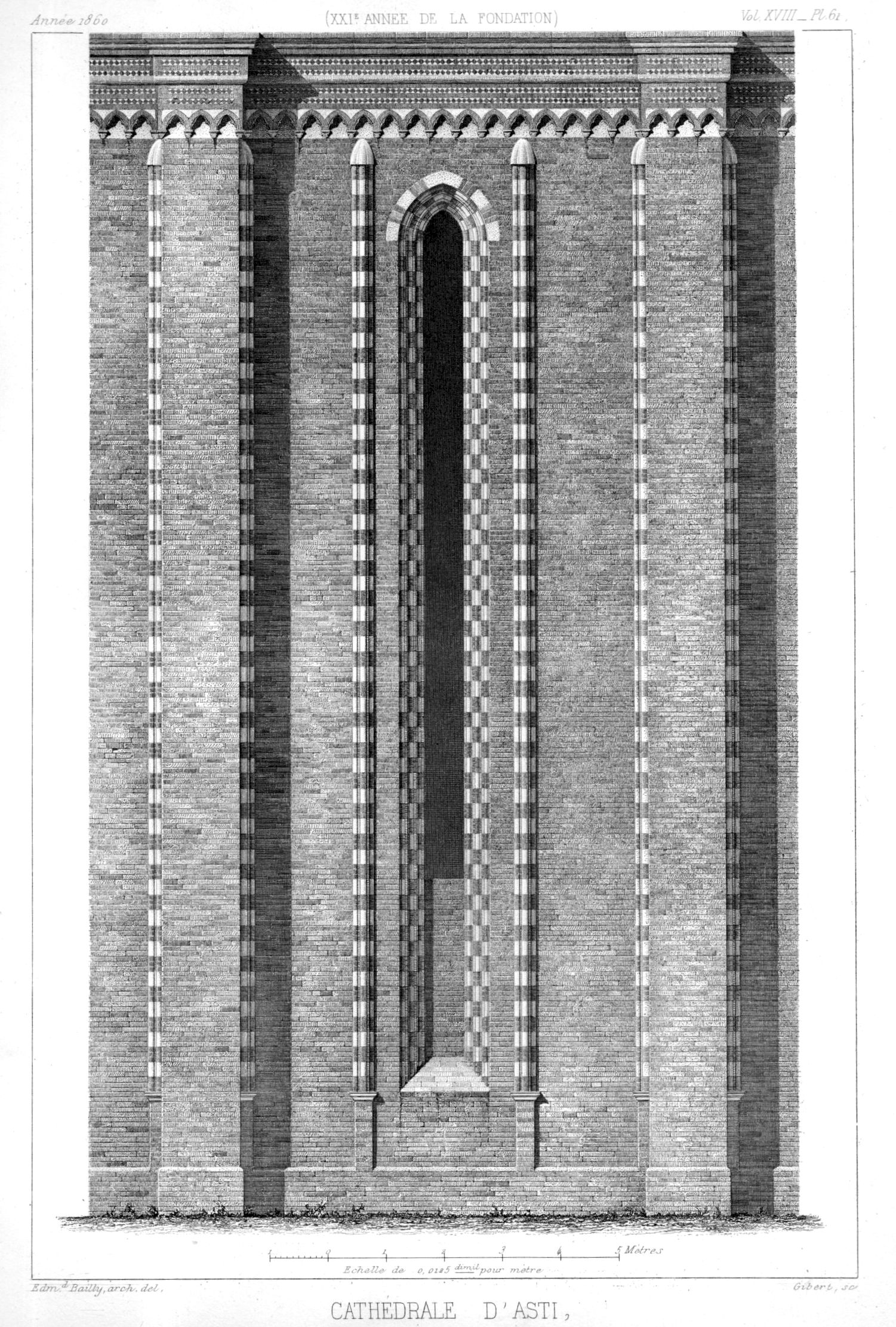
    By all measures, this window is of course a window. It is almost not a window because in the mass of the structure it is almost not there. But it certainly was–even if its height is great than ten times its width–when this cathedral at Asti was being built in the 13th century (and into the 14th). In any event, whatever the “is” might be here and in spite of the apparent isn’tness, it has a very appealing appeal.

    Architecture Asti036–Cattedrale di Santa Maria Assunta, found in Cesar Daly (editor), Revue Generale de l’Architecture et des Travaux Publics, ca. 1860 (not sure of the volume).  

  • Judging Two Books by their Ten-Cent Covers

    JF Ptak Science Books   Quick Post

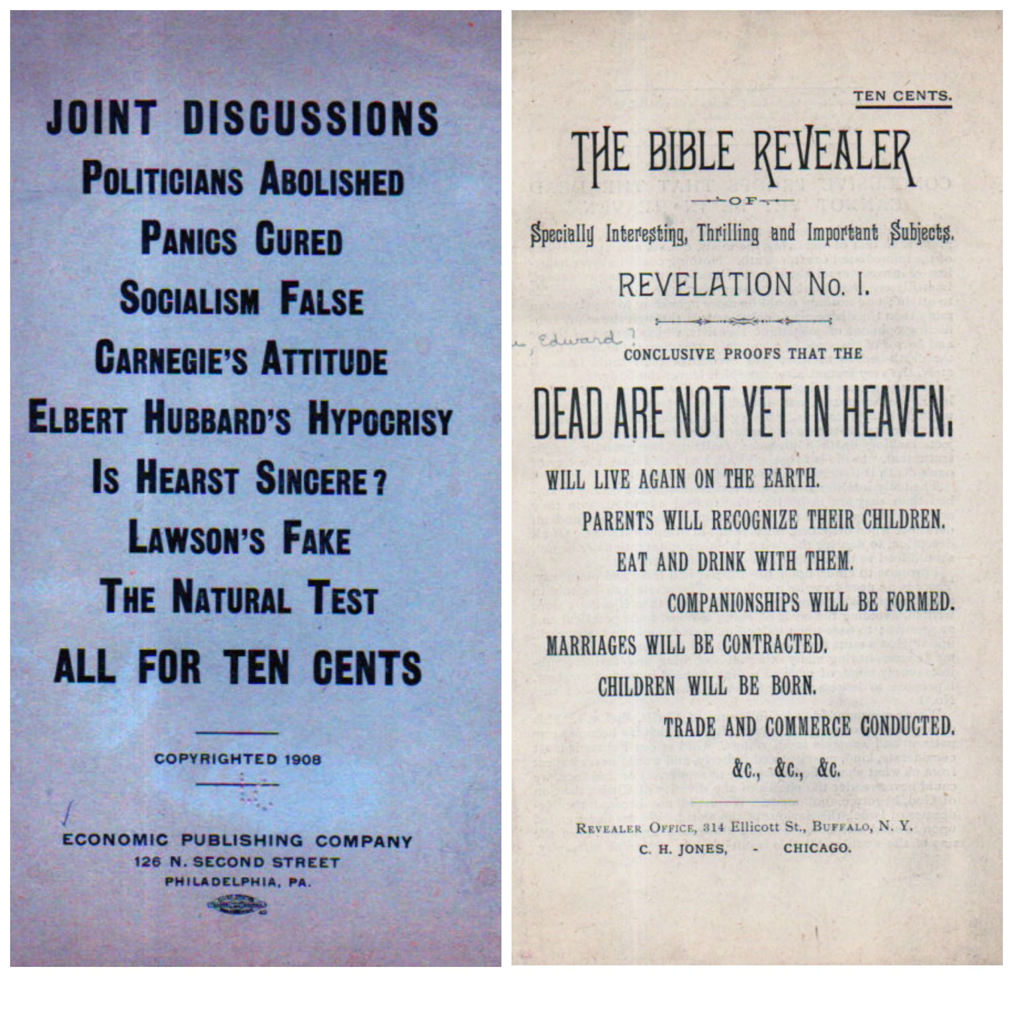
    These are two full-cover pamphlets that promise a compelling amount for the ten-cent admission fee.  The first is newer, published for ten cents in 1932; the second was printed in 1908, and for the same amount (and worth about 14 cents in 1908 monies, according to the Bureau of Labor Statistics inflation calculator).  They are each Outsidery-flavored efforts in their fields, so far as I can tell–they are also not quite interesting enough to spend any time with outside of remarking on their remark-able covers, which is sometimes that is all you need.  (The second pamphlet is actually by a very well known and influential theological person, Edward Hine, who may have achieved his greatest fame I try to establish that England is Israel, among other things, and developed a considerable following.)

    Ten Cent CollageI have other remarkable books with title similar to these in length, and composition–I’ll need to pull them all together, someday. I think that the most glorious days of enormous titles are hundreds of years in the past, and mostly 17th century from my perspective; these more-modern examples are not only long, but they are challenging and promising, all at the same time. 
     

  • History of Squares-within-Squares

    JF Ptak Science Books   Quick Post

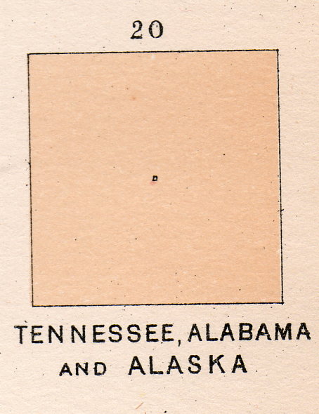
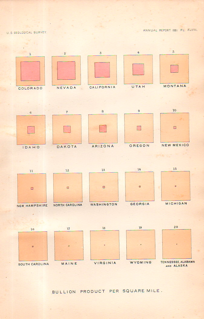
    This square-within-a-square appears in a table of squares in several pages of square collections. They represent “Bullion product per capita” for U.S states and territories, and published in the U.S. Geological Survey Annual Report for 1881 (plate XLIX).  The “bullion” is silver bullion, and as we can there twelve leading states for silver production worth discussing before the rest become melded into one solid whole in square 13.  It is a beautiful display, in its pre-non-representational-art sort of way.  Kandinsky was still more than 30 years away from calling this sort of thing “art”, and the representation itself was 95 years after the first graphic displays to convey info (in Playfair’s Commercial and Political Atlas of 1786)and still, it is very captivating in a simple, squarey sort of way. 


    Squares, history of141


    Squares, history of140

  • The Wondrous Telephone–Sheet Music from 1877

    JF Ptak Science Books   Quick Post

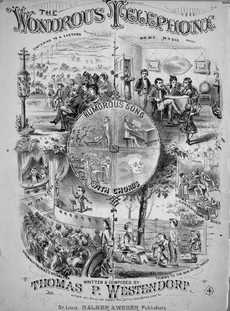
    Just a year after the invention of the telephone appeared this wonderful piece of music–with great cover art that actually took a pretty strong and accurate look into the future.  In 1877 we are told in the lyrics that “all of our secrets will be known” which isn’t such a great thing, and that the “prattle of the distant Mothern’ Law” will become fully available; on the other hand, “the whole world” will be united , and that in the end “we will never be alone” because of the telephone.  For a quick sonnet to the new invention the lyricist invoked a number of fair insights into the future of the telephone.

    SOURCE: Johns Hopkins University,  http://levysheetmusic.mse.jhu.edu/catalog/levy:032.121

    Telephone sheet music

    And the lyrics:

    ·Posted by :

    ·in:

Recent Posts

Archives

Categories