A Daily History of Holes, Dots, Lines, Science, History, Math, Physics, Art, the Unintentional Absurd, Architecture, Maps, Data Visualization, Blank and Missing Things, and so on. |1.6 million words, 7500 images, 4.9 million hits| Press & appearances in The Times, Le Figaro, Mensa, The Economist, The Guardian, Discovery News, Slate, Le Monde, Sci American Blogs, Le Pont, and many other places… 5000+ total posts since 2008.

  • When the Knife That Cuts Both Ways Cuts Only One

    JF Ptak Scienec Books    post 2511        Part of the series on the Graphic Display of Information

    Knife of protection053

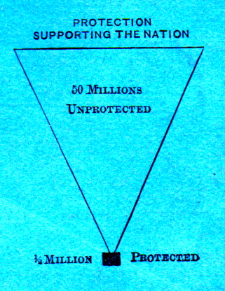
    This is a good example of relatively-though-not-really graphic representations of data for popular consumption. (I have to apologize straight-away for the uneven color here–my scanner had a very tough time with the deep blue of this pamphlet…)

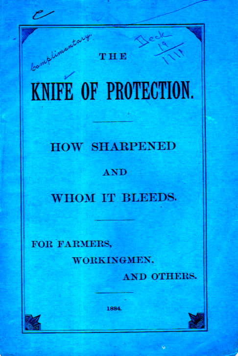
    The case being made here was for changing tariffs which at this time in 1884 were seen by the author as harmful to the common producer.  Here’s the cover of the pamphlet with its provocative title::

    Knife of protection051

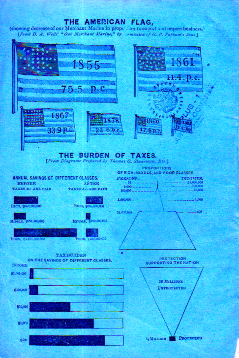
    And the back cover, where the graphic displays live, including the unusual smei-pyramid at bottom left:

    Knife of protection052


    The proportion of classes of the U.S. drawn here is probably relatively correct though some of the numbers may be wrong–granted they are for the upper classes and I think even with revision doesn’t change the structure of the graphic part of the display too much at all.  Here there are listed 59 individuals in the U.S. making $1 million per year, which seems to be a little low.  I have seen a number of references that by the end of the 1890’s  there were around 4,000 people who could be called landed millionaires though so far as I have seen they all were not making $1 million per year.  I am unsure at this point–it is possible that in, say, the 3,000 millionaires in the U.S. in 1880-1884 that 1.5% of them would be making a million/year–it seems plausible that if there were 4,000 people making a million in a year that there would be another superclass of 1% making ten times that a year…so maybe that 59 number is correct, after all.  In any event, I don not think that the correct would alter the shape of the pyramid by any measurable difference.  

    The real purpose of the pamphlet seems to have been for the wealthy to pay more than the average working person. The subtitle being “Who Pays? The Tax Payer and the Tax Eater Compared. Every Farmer Should read This”, which seems to mean that the author found farmers to be paying more than their fair share–and considering that of the 50 million people living in the U.S. (1880 census figures here and following) more than 22 million lived on farms, the issue was addressed to a near-majority of U.S. citizens.  

    I haven’t read the pamphlet–I’m just passing along the data.  

  • Curious: *Two* Copies of a Quasi-Unique Work?

    JF Ptak Science Books   Quick Post

    I was cataloging some WWI material today and came across this book–again.  I thought I had placed it in with the early mimeograph/reprographic materials but then there it was, with the WWI pamphlets.  But then it struck me that I had seen it in that mimeo collection–and so I decided to check out my associative memory and, oh weird joy of weirdness, there was another copy of the work. Generally this would be rather uncommon with my stock since so much of it is really fairly obscure and scarce, but this one is exceptionally odd because it seems already to be near-unique.  

    The book is History of the Second Division (Regular) AEF. Text. -AND- History of the Second Division (Regular) AEF, Notes., and reads “Copyright 1936, The Second Division Historical Committee, Major General Preston Brown, Chairman”.  The work stands in two tall (13.5×8″)  volumes, a chunky 282+156pp; each page contains about 550 words, giving the work a length of about 250,000 words.   

    This is evidently an earlier version of a work that would be popularly published in 1937 as the The Second Division, American Expeditionary Force in France, 1917-1919, by J.W. Wright (text) and Oliver L. Spaulding (Notes), as the work above and this share the same copyright number. The authors are not identified in this work, and for its year of publication there are no copies located in the OCLC/Worldcat.  


    ·Posted by :

    ·in:

    —
  • Table of the Compass of Voices and Instruments (1814)

    JF Ptak Science Books   Quick Post 

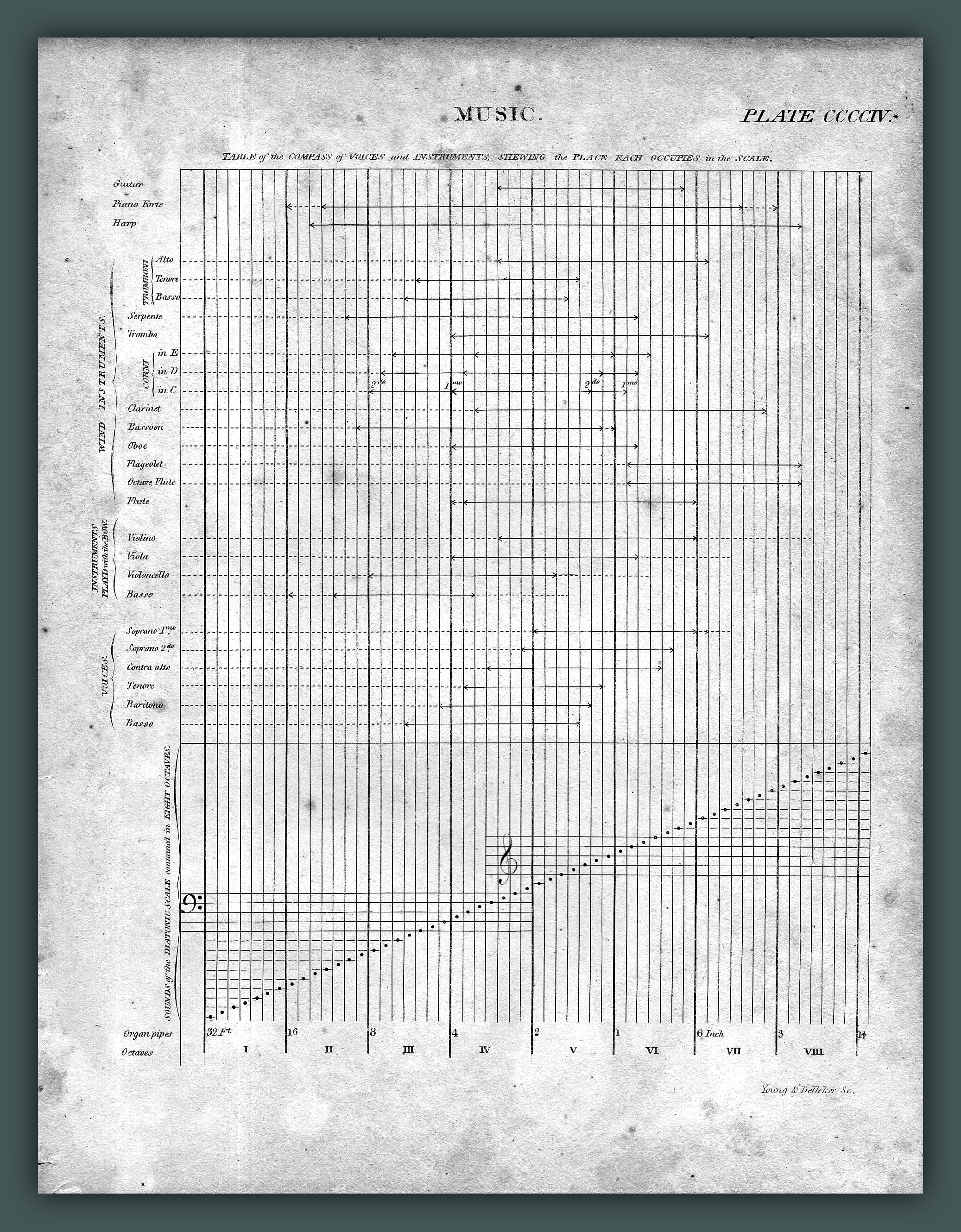
    This engraved plate from Abraham Rees’  Cyclopedia… is the wonderful invention of Alexandre Choron (1771-1834), and appeared (perhaps for the first time in an English press) in London in 1814.  It is a concise and interesting display of the comparisons of the reach of instruments along the eight octaves, and is a very strong example of clear and useful graphical display of quantitative data.  Choron graph056

     Here’s another version of the chart, expanded somewhat, and published using the bones of this earlier work, in the eighth edition (1858) of the  Encyclopedia Britannica:

    [Sopurce: the article on “Music”, Encyclopedia Britannica, via Google Books]

    The full subtitle:  “Table of the Compass of Voices and Instruments, Shewing the Place Each Occupies in the Scale”.  (The original print is also available for purchase through our blog bookstore.)

    From Grove Music Online:

    Choron, Alexandre(-Etienne)

    (b Caen, 21 Oct 1771: d Paris, 29 June 1834). French writer on music, instructor, publisher and composer. While still a boy, he taught himself Hebrew and German and acquired a permanent interest in scientific experiment and a fascination for music theory and the techniques of composition. Although he reached the age of 16 before taking music lessons, he had already attained elementary skill on keyboard and other instruments. He greatly valued a friendship with Grétry which began in his 20th year and which suggests that he moved to Paris after his father’s death.

    Choron’s earliest publications, the three-volume Principes d’accompagnement des écoles d’Italie (1804) and Principes de composition des écoles d’Italie (whose publication was announced for 1806 even though it did not appear until the end of 1808 or early 1809 – the preface is dated 9 December 1808), include courses in thoroughbass together with instruction in counterpoint and fugue, implemented by exercises from Sala, Martini, Marpurg and Fux. In February 1806 he undertook the editing for August Leduc of the scores of Haydn’s symphonies. He began his activities as a music publisher in partnership with Leduc in November of that year, in order to exploit a licence for lithographic printing bought from Frédéric André in 1807. His partnership with Leduc ended in late 1811. Choron published works by Josquin, Goudimel, Palestrina and Carissimi, as well as Italian and German music up to the time of Bach. In 1827 his daughter Alexandrine (d 1835) took over the running of her business, which after her marriage in 1832 to the composer and teacher Stéphano Nicou took the company name of the Société Nicou-Choron. There followed the two-volumeDictionnaire des musiciens (1810–11) in which Fayolle was his collaborator. Choron was too idealistic to be financially successful, and his attention to business was limited by his scholarly and scientific pursuits. What might have been his magnum opus, Introduction à l’étude générale et raisonnée de la musique, remained unfinished. He was forced to teach music and accept public appointments.

    In 1811 he was appointed a corresponding member of the Beaux-Arts class of the Institut de France in succession to Framery. From 1812 until Napoleon’s downfall he was Directeur de la Musique des Fêtes Publiques. His essays on plainsong and church music led to his nomination for the task of reorganizing music in French cathedrals and in the royal chapel after the restoration of the Bourbon monarchy. In January 1816 Louis XVIII made him régisseur général of the Académie Royale de Musique. According to Fétis he turned the Opéra ‘into a trial theatre’, and his dismissal after little more than a year enabled him to devote his energy to the founding of his Institution Royale de Musique Classique et Religieuse. He secured public grants for it between 1826 and the Revolution of 1830, but Charles X’s attempt to revive absolutism led the new government under Louis Philippe to discontinue expenditure associated with royal privilege.

    The reduced budget not only proved disastrous for Choron but incurred disappointment for music lovers in general, as Choron’s students associated with other schools to give choral festivals in Notre Dame, St Sulpice and provincial cathedrals. The programmes included unaccompanied works of the Renaissance, together with Baroque oratorios with orchestra and music of later periods. After years of decline his school was revived by Niedermeyer and renamed Ecole de Musique Religieuse Classique. It remains the most substantial testimony to the work of an influential idealist during a time when French musical life badly needed ideals.

    Although a few Conservatoire pupils sought Choron’s instruction, his school produced no outstanding composers until the Niedermeyer régime after 1836; yet Choron had a widespread influence on teachers, organists, choralists and those who were awakening to the importance of music history. His inexpensive editions of polyphonic and choral music were invaluable, despite the later issue of most of the works in better format by Proske and the Regensburg scholars and by English and German publishers; nor were his labours towards the revival of plainsong in vain, though the work of the Benedictine monks of Solesmes superseded them. His interest in the Baroque masters was more a revival than a novelty, and contributed indirectly to the demand for scholarly editions. The Manuel complet de musique vocale et instrumentale, published after his death by his collaborator, La Fage, was uniquely valuable in its day. In a country whose musical tradition was almost entirely unscholarly, and focussed on the capital, Choron stimulated interest that made his own publications impermanent.

    He composed chiefly sacred music, including a Messe brève, a Magnificat, a Stabat mater and numerous motets, both a cappella and with organ accompaniment. His opera, Nadir et Salyha, was produced in Kassel in 1811. He also wrote a number of songs, of which La sentinelle (1810) was popular in his lifetime.

  • Outsider Politics & the Apotheosis of Religico-Governmental Control

    JF Ptak Science Books   Post 2513

    Compass057[Woodcut image by J.J. Grandville, [Jean-Ignace-Isodore Gerard (1803-1847)] from Bilder aus dem Leben der Thiere (“The Public and Private Life of Animals”) vol II, p. 224  =>For a good summary of Grandville’s fantastic work, which is completely unrelated to this post, see Opinionated Art, here.]

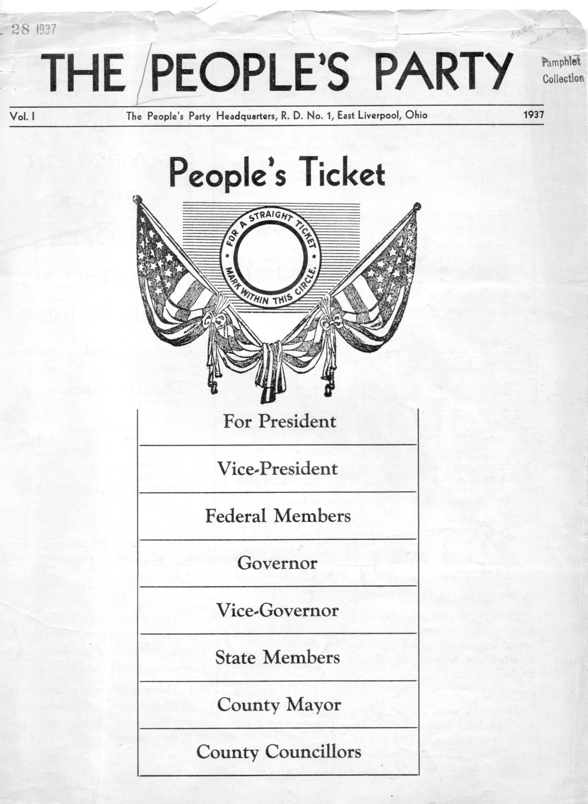
    People's Party058

    This wisp of a pamphlet (printed in 1937), set out on a task to introduce the idea of a theocracy and government according to Christian revelation, winds up in a rather odd and unexpected place.  If you were to remove the religious aspect of the proposals and the “theomendments” of The People’s Party, you wind up with an extreme form of dictatorship in which “the Government” and “Government-Nation” is a sort of totally-dominating  Socialist-Scriptural-Brutalista melange.

  • When Buckets were Buckets and Picks were (really) Picks

    JF Ptak Science Books   Quick Post

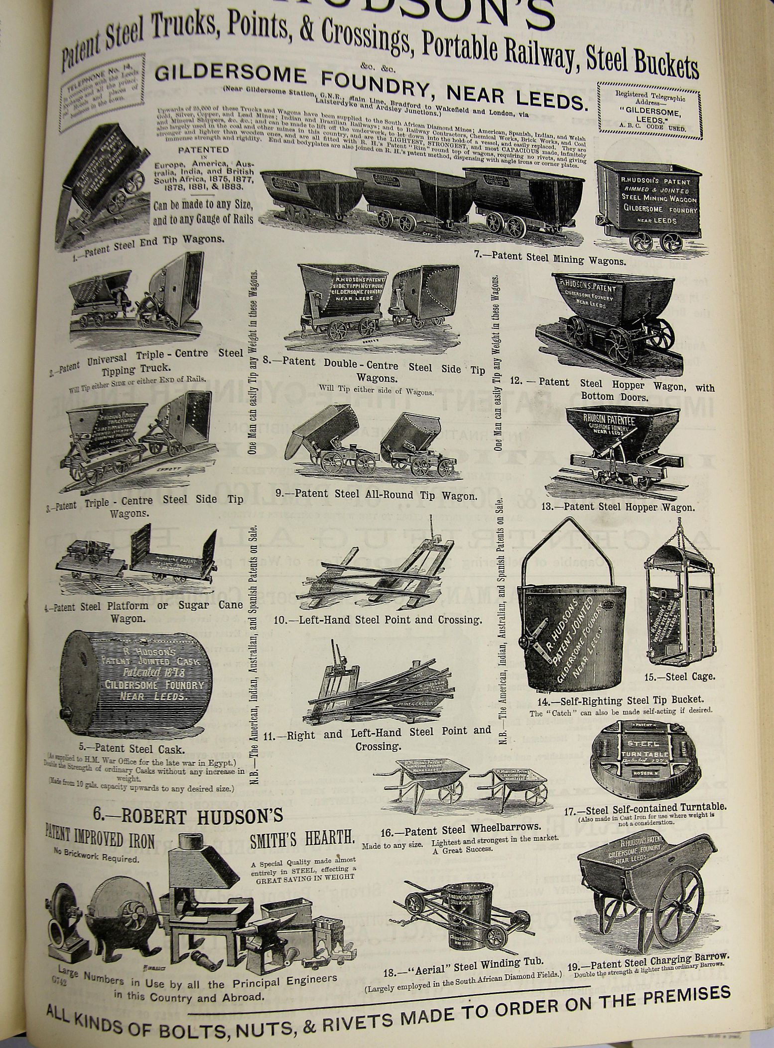
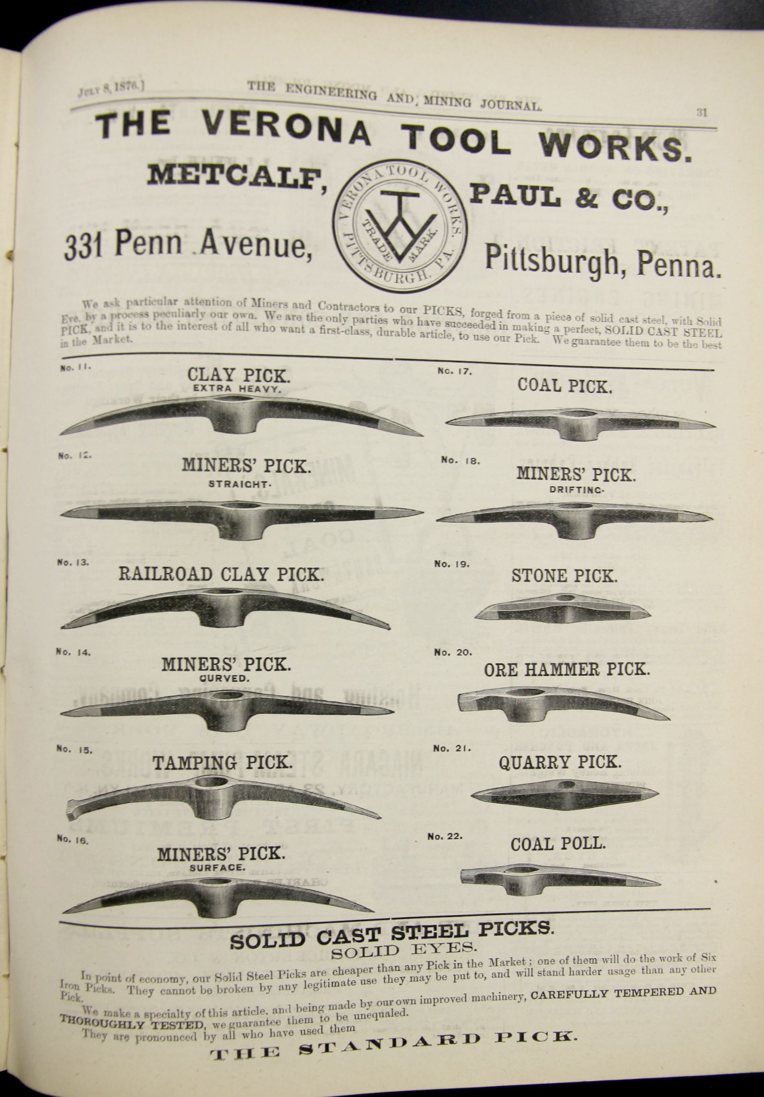
    Rose is a rose is a rose is a rose as Ms. Stein has said, though that doesn’t necessarily apply to buckets and picks.  Once upon a time there was a solid and universal need for many varieties of each one of these (exclusive of the not-elusive Ms. Hyacinth Bucket-pronounced-bouquet as the Major would say),and we get a taste for them in these pages of advertisements.  

    The first is for Hudson’s hardware (“steel trucks, points, crossings, portable railway, steel buckets”) and so on, presumably mostly for mining, and it appeared in The Engineer for July 4, 1884:

    Mining buckets

    The ad has a superb aroma of engineering heavy finery.  

    The second is from the Engineering and Mining Journal, July 8, 1876, and the ad trumpets a “perfect, solid cast metal pick” for all sorts of segmented work.  Different jobs, different surfaces, different environments, different people–different picks for the job.  

    Mining picks

  • A History of Holes: the Hole in the Clouds Over Nagasaki, revisited

    JF Ptak Science Books  (An earlier post from 2010, revised)    [Atomic and Nuclear Weapons Series]

    This post is one in a continuing series on the history of holes–the appearance of this particular hole meant the difference of life and death for hundreds of thousands of people, and it killed almost as many people as it didn’t kill. 

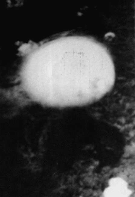
    The hole was in a cloud.  It was a corollary cloud to missing clouds from a few days earlier. 

    NagasakiCloud1Large


    On 6 August, 1945, the primary target of the first atomic bomb to be dropped on Japan was Hiroshima1–had there been unfavorable weather conditions, had the target been obscured by clouds or haze, a second target would be engaged–that was the Kokura Arsenal on the north shore of  Kyushu.  But conditions were bomb-favorable on that day, and Hiroshima was the city that was killed. Little Boy, the U-235 bomb dropped by Paul Tibbets from the Enola Gay  exploded 1,900 feet above Hiroshima. The bomb detonated and–with blast and shock wave and the ensuing damage and conflagration–70,000-80.000 people were killed (and at least double that number within five years).       

    It was a day before the news of the bombing was verified for Tokyo, and another day before the Big Six leaders of the Japanese army and government decided that they couldn’t decide in what to do with the Potsdam declarations and order of surrender.  It was a raging debate among those leaders, and it was a failure.           

    The second bomb, the plutonium Fat Man, was to be dropped by Major Charles Sweeney from Frederick Bock’s  B-29  Superfortress Bockscar on the next target, which was decided to be the  Kokura Arsenal.  And so Fat Man was taken over Kokura on 9 August, but by the time Major Sweeney (who had piloted the Great Artiste behind the Enola Gay on the Hiroshima bombing)  had arrived the previously comfortable atmospheric conditions had turned cloudy, overcast, the target obscured. Sweeney made three runs over the target, but it stayed hidden from the bombardier, and so the people of Kokura were spared. Major Sweeney tuned to his secondary target, Nagasaki.  With fuel running out, the clouds were also running thick over Nagasaki, until the last moment, when a hole opened in the canopy and the bomb was released through it,  exploding  with the impact of 22,000 tons of TNT at about 1640 feet above the city, killing 70,000 people (by the end of the year, 140,000 by 1950).

    The hills around Nagasaki confined the blast and protected those on the other side of them.  Kokura had no such terrain, which means that had the bomb been dropped there, even more people would have been killed outright and many more so over time. 

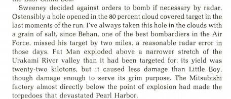
    The hole theory though is not necessarily complete–there may not have been a hole. Nobelist (physics) Luis Alvarez, who made major contributions to the firing mechanism for the weapon and a genius-in-general, and who flew as part of an Aerial Observation Team to assess the yield of the bombs, thought that perhaps there was a hole in the clouds and perhaps there wasn’t–“ostensibly” there was a hole, he wrote. Perhaps the bombardier saw the target, and perhaps not. In his Adventures of a Physicist (1989), Alvarez writes about the misery and the snaufedness of the mission, the clouds over Kokura and the multiple runs, the very low fuel which allowed only for one run on the Nagasaki secondary, and the growing accuracy of the flak from below. On page 145 he states that pilot Sweeny had decided against orders to attempt a radar-guided bombing of the 80% cloud-covered target–until suddenly the famous hole appeared, and bombardier Kermit Behan found the target and released the weapon.  Alvarez records that the bomb detonated about 2 miles off-target, which he said would have been a “reasonable error” for a radar-controlled drop, which would fit nicely with the his claim that Behan was Air Forces’s “best bombardier”.  Alvarez said that he took the report of the hole “with a grain of salt”2.  (See extract below.)

    In any event, some sort of hole opened for Nagasaki, and closed for Kokura.

    It is interesting to note that “the luck of Kokura” or “Kokura luck” is a translated Japanese euphemism for the unknown avoidance of disaster, of escaping a tremendous fate without knowing it.  (This appears often on the internet though I am using as a source The History and Science of the Manhattan Project, by Bruce Cameron Reed, Springer, 2014, pg 400.)

    Notes:

    New York Times correspondent William L. Laurence flew in the Great Artiste, following Bockscar  that delivered the bomb 1640 feet over Nagasaki. His report on Nagasaki appeared a month later in the newspaper, and the full text is available via the Atomic Archive blog here.  

    1. The targets discussed  by the Targeting Committee (“Minutes of the second meeting of the Target Committee, Los Alamos, May 10-11, 1945″) on 10 and 11 May 1945 included the following:
    (1) Kyoto (the former capital with one million people, a center of religious and intellectual life in Japan This target is an urban industrial area with a population of 1,000,000. It is the former capital of Japan and many people and industries are now being moved there as other areas are being destroyed. From the psychological point of view there is the advantage that “Kyoto is an intellectual center for Japan and the people there are more apt to appreciate the significance of such a weapon as the gadget”;  (2) Hiroshima (listed as an Army depot though “due to rivers it is not a good incendiary target”; (3) Yokohama (one of the largest remaining untouched industrial centers in Japan); (4) Kokura Arsenal (one of the largest in Japan and situated by urban industrial sprawl); (5) Nigata (port on Honshu) and (6)the Emperor’s palace (which was discussed  as a possible target but dismissed almost immediately).[Yawata was also considered (as an industrial center) (during the preliminary meeting of the targeting committee on 2 May 1945) (along with Tokyo, Nagoya, Osaka, Kyoto, Kobe, Hiroshima and Nagasaki.]
    .
    The members of the targeting committee (source for this material is Gene Dannen at Dannen.com, transcribing targeting material of the U.S. National Archives, Record Group 77, Records of the Office of the Chief of Engineers, Manhattan Engineer District, TS Manhattan Project File ’42-’46, folder 5D Selection of Targets, 2 Notes on Target Committee Meetings) included (on 10 May): “General Thomas  Farrell,  Dr. Charles C. Lauritsen, Colonel L.E. Seeman, Dr. Norman Ramsey, Captain Parsons,  Dr. Robert L. Dennison, Major John A. Derry, Dr. John von Neumann, Dr. Stearns, Dr. Robert R. Wilson, Dr. Richard C. Tolman, Dr. William G. Penney, Dr. Robert Oppenheimer.”  In attendance for the 11 May discussion was  Dr.Hans Bethe and Dr. Brode, plus: Colonel Seeman,  Dr. Stearns, Captain William S. Parsons, Dr. John von Neumann, Major Derr, Dr. Robert L. Dennison, Dr. Richard C. Tolman, Dr. Penney, Dr. Oppenheimer , Dr. Ramsey and Dr. Wilson.”

    2.  Alvarez on the hole:
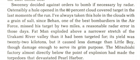
    Alvarez nagasaki[Source, Luis Alvarez, Adventures of a Physicist, 1989, p 146.]
  • When a Six-Cent Tax Was a Nickel Too Much (1938)

    JF Ptak Science Books    Post 2514

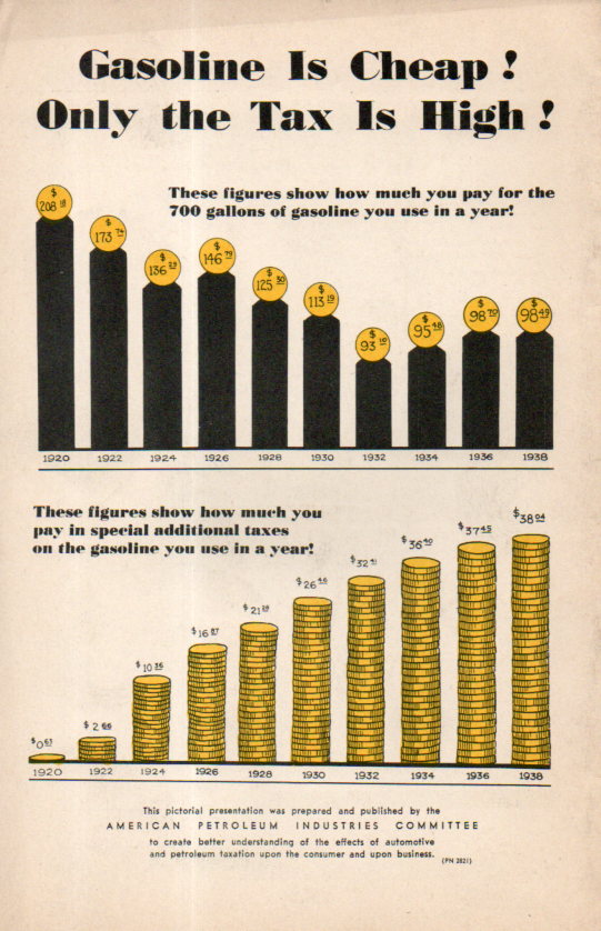
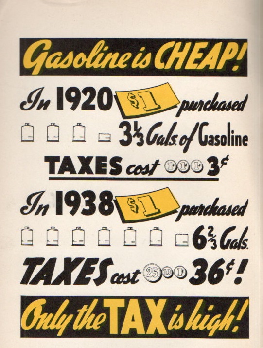
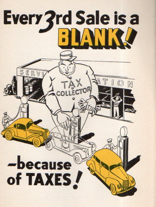
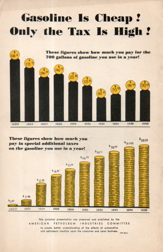
    Gas Tax062Although the artist/author created some great and 30’s-bubbly cartoons, I’m not sure about what he was so grouchy about–plus I don’t know about his number sources, either. The main graphic that gets to his point shows that in 1920 $1 bought 3.5 gallons of gas and paid  6 cents in taxes; in 1938 that dollar bought 6 gallons but the taxes were 36 cents.  So the screed was about getting even more gasoline for the buck even though it was buying nearly twice as much anyway.  Since the federal excise tax in gasoline actually went down from 1.5 cents to 1 cent a gallon at this time, the additional taxes would have come from the states, which I guess were not part of the equation in 1920. But the extra nickel or so per gallon looks to be about average for state taxes on gas in 1938 (as we see in Notes #1 below).

    [The image at left is the rear cover of the pamphlet under discussion–it really doesn’t have a title, just a series of statements.]


    This was sort of a long way to go in looking at a cartoon-illustrated sweaty tax screed from 1938, but as it turns out  there was a little surprise in the results.  The author/artist is uncredited but the pamphlet was produced and published by the American Petroleum Industries Committee, which no doubt was lobby for a decrease in state (and federal?) taxes to lower the price of gasoline and perhaps to increase consumption.  They made it abundantly clear that they did not like taxes.  And as it turns out they really don’t identify the source of the taxes, just gas taxes in general, though they made it seem as though it was a unified approach to lowering federal and state taxes together as a unit, and not as 48 individual governing bodies for state taxes. On the one hand the penny tax wasn’t really so bad; ont he other the state taxes could be 4-5-6 cents, which turns out to be a lot more than states charge today (CPI adjusted). 

    Gas Tax063So, given for example 5,000 miles/year at 15mpg1 average for 1938 is 333 gallons at 10 cents gallon making $33.33/year in gas expenses or 1.9% of a yearly average salary of $1,731. 

    In 2015, 5,000 miles/year at 20mpg=250 gals x $3.20 = $800/year in gas, and with the average salary (according to the Bureau of Labor Statistics) of $850/week or $43,700/year, the gas expense would be 1.8%  of the yearly income. I have seen other figures stating the individual average salary to be about $30,000–the discrepancy is considerable and I’m not sure of the origin. Using the lower figure the gas expenses jump to about 2.6%.  

    In any event I found it odd that working with a few found and not-quite arbitrary stats that the average percentage of the cost of gasoline via yearly salary would be so very similar.  Of course the cars have gotten much more expensive and also far more powerful and safer to operate, and car insurance has no doubt increased, as has maintenance, so the overall cost of keeping and using a car is quite a lot more today than in 1938–still the similarity of gas/yearly income was pretty cool to see.  

    Now the taxes that these guys were complaining about: that 1 cent in 1938 (according to the BLS inflation calculator) is equal to about 17 cents in 2015 dollars, which is just about what the federal excise tax is today in 2015. The 5 cent state tax in 1938 winds up being quite a bit more than state taxes today–for example North Carolina was charging 6 cents ($1.01) in 1938 compared to its 38 cents today.  

    And so where does this leave us? I really don’t know, except that when there are general complaints about things costing too much it is interesting to see how expensive things really are in a longitudinal perspective.  That, and always consider the source.  

      Gas Tax064

    Notes: 

    1.   First of all the 5k/yr average driving is arbitrary. Secondly I’ve found the stat several times now in quick searches that Ford Model A cars got about 20mpg in 1928.  Cars got heavier/more powerful by 1938 and for the sake of this exercise assume that the average mileage decreased with the increase in power and weight.  It is a little bit of a long shot but probably not to far from the mark. 


    IRS stats for federal excise taxes on gasoline, http://www.irs.gov/pub/irs-soi/00gastax.pdf

  • Looking Up at Buildings at Strong Angles

    JF Ptak Science Books  Quick Post

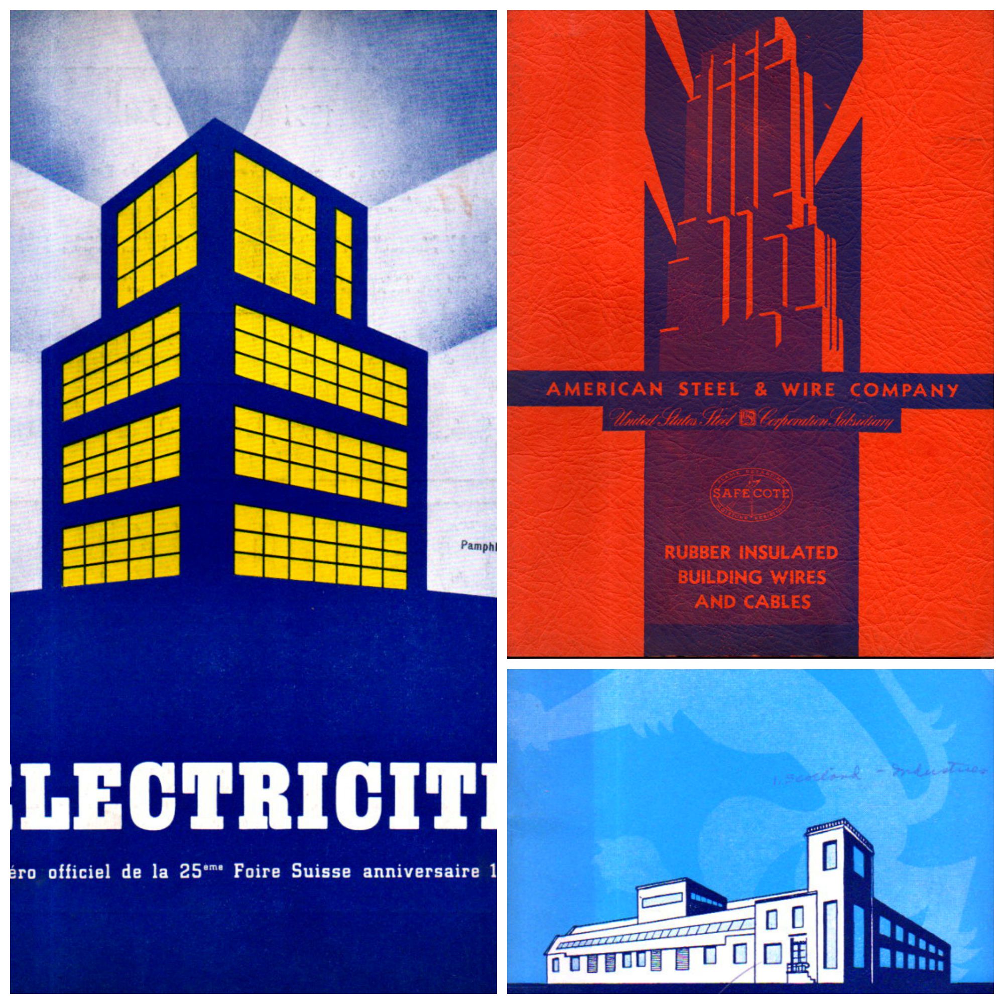
    I’m just taking a moment to share these three unusual pamphlets, with their very striking and unusual covers. The buildings suggest a different perspective, one from below-grade and looking up obliquely–something not-usual to me. There are small categories on this blog for views looking straight up, and views looking straight down–neither very common things–and this little gathering may be a new category of “uncommon perspective”.  

    Building light collage

  • JANCFU on Yellow: Nagasaki, August 9, 1945

    JF Ptak Science Books   Post 2515  [Part of the Atomic and Nuclear Weapons Series]

    Somewhere between transporting the Fat Man bomb to the loading lift and raising it up into the bomb bay of Major Charles Sweeny’s B-29 Superfortress Bockscar,  it acquired a stencil-painted acronym: JANCFU, right on its nose.  

    JANFU detail

    [Source:  http://military.wikia.com/wiki/Fat_Man]

    It was black on a bomb painted mostly yellow, a zinc-chromate yellow.  The yellow similar to the cover of Dr. Seuss’ One Fish, Two Fish…; the color yellow symbolizing courage/nobility in Japan, Wisdom in Islam, and a deity-color in Hinduism; the color so fond of many great writers like London and Doyle, and Harte and Stevenson that they employed in in titles of the books.  The favorite color of Van Gogh1, and perhaps not-so-favorite of Shakespeare (appearing in references to bile and melancholy and falling leaves), it is usually a positive color–except that it also can signify cowardice, ego, caution, and illness (malaria, jaundice).  It is also the color of the Star of David worn by Jewish people living under Nazi-occupied/controlled places/  

    JANFU

    Fat Man was yellow.  But it was yellow because like a fire truck it was the easiest and quickest thing for the eye to register, and what needed to be registered with Fat Man was its trajectory on its way down to detonate 1640 feet above Nagasaki.  

    JANCFU, painted or airbrushed on the nose of the bomb at the last moment, or so it seems, stood for “Joint Army Navy Civilian Fuck Up”.

    It was hardly that.  It was like another yellow–Yellowstone–but of a different sort of indescribable awesomeness, this more like an impending enormity, too large to be known.  

    Fat Man movie

    [Source: Business Insider, For the video, see here:  http://www.businessinsider.com/nagasaki-raw-video-2014-2   The article is worth the read, but if you just want the video, scroll to the end.]  

    Notes:

    1. The Van Gogh museum’s “Van Gogh Letters” is a must-visit if you are interested in his correspondence. http://vangoghletters.org/vg/  Actually the word “green” pops up about 15% more often than “yellow” as the most often mentioned color in the correspondence, though I think that the scholars say that his favorite color hands-down was yellow.  

    John Coster-Mullen’s  Atom Bombs: The Top Secret Inside Story of Little Boy and Fat Man must be the most complete description of the bombs ever published.  And it was accomplished by the relentless study of the “nuclear archaeologist” Mr. Coster-Mullen, a truck driver by trade who had no formal education in physics or metals or engineering.  He produced not only this remarkable work, but also created a life-size nearly perfect replica of Fat Man. I’m pulling up this reference because in there Coster-Mullen states that it was Project Alberta engineer Harlow Russ who painted the JANCFU on the bomb.  There was other stuff written on the bomb, but nothing quite so surprising, or shocking, than this.  Perhaps the small tattoo underneath the acronym is almost as shocking, but not really–the Fat Man bomb profile with the letters “FM” (“Fat Man”) in the interior of the design has its moment of shock/recognition, as though any identifier was needed for the thing.  (It is like the surgeon circling the correct kidney he needs to remove, drawing on their patient–just in case there was any confusion, this stencil assured everyone that this was indeed what it was.)  See this great article in The New Yorker about Coster-Mullen, here.  


    ·Posted by :

    ·in:

  • Air Raid Instructions, Westminster, 1941–With Videos

    JF Ptak Science Books  Quick Post

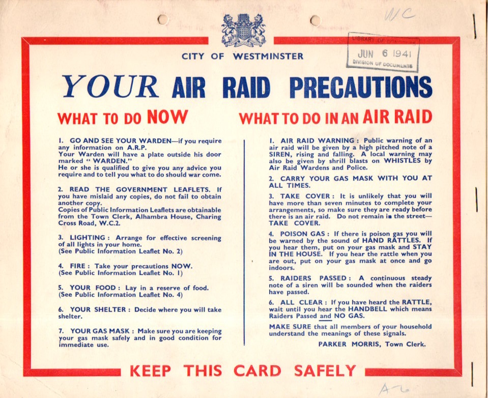
    I recovered this sample Air Raid Precaution poster from a box of WWII material, received by the Library of Congress on the very day that many historians declare to be the very end of the Blitz.  Of course the poster was printed earlier, collected in this case by the OSS and put in a folder and then sent off to the Library of Congress.  

    WWII Air Raid Precaution068

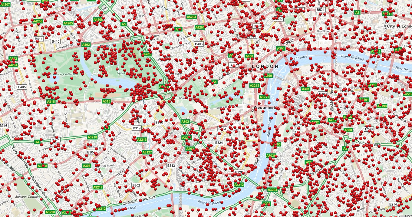
    It is a remarkably level-headed document, clear and concise, very stiff-upper-lip.  And these posters were very necessary, as we can see by the map following: 

    WWII Bomb Map London

    This incredible story (centered on Westminster) is a detail from an incredible (and interactive) map showing every bombed dropped by the Germans on London during the Blitz  7th October 1940 to 6th June 1941 [Source:  http://bombsight.org/?#14/51.5005/-0.1281]

    The following are instructional newsreels (all found on youtube) about what to do in an air raid (1940), while the second demonstrates the sounds of the air raid sirens discussed in the document above, and the third is a short history of the Blitz:


    Ource: https://www.youtube.com/watch?v=mHep5WA9qqU

  • DIY: 2-D Paper Math Models into 3-D Forms

    JF Ptak Science Books   Post 2516

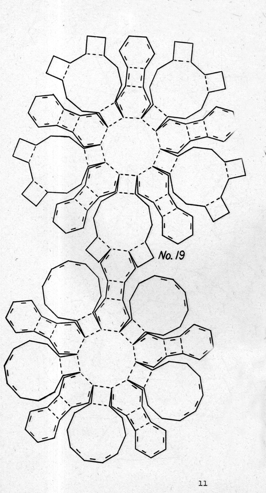
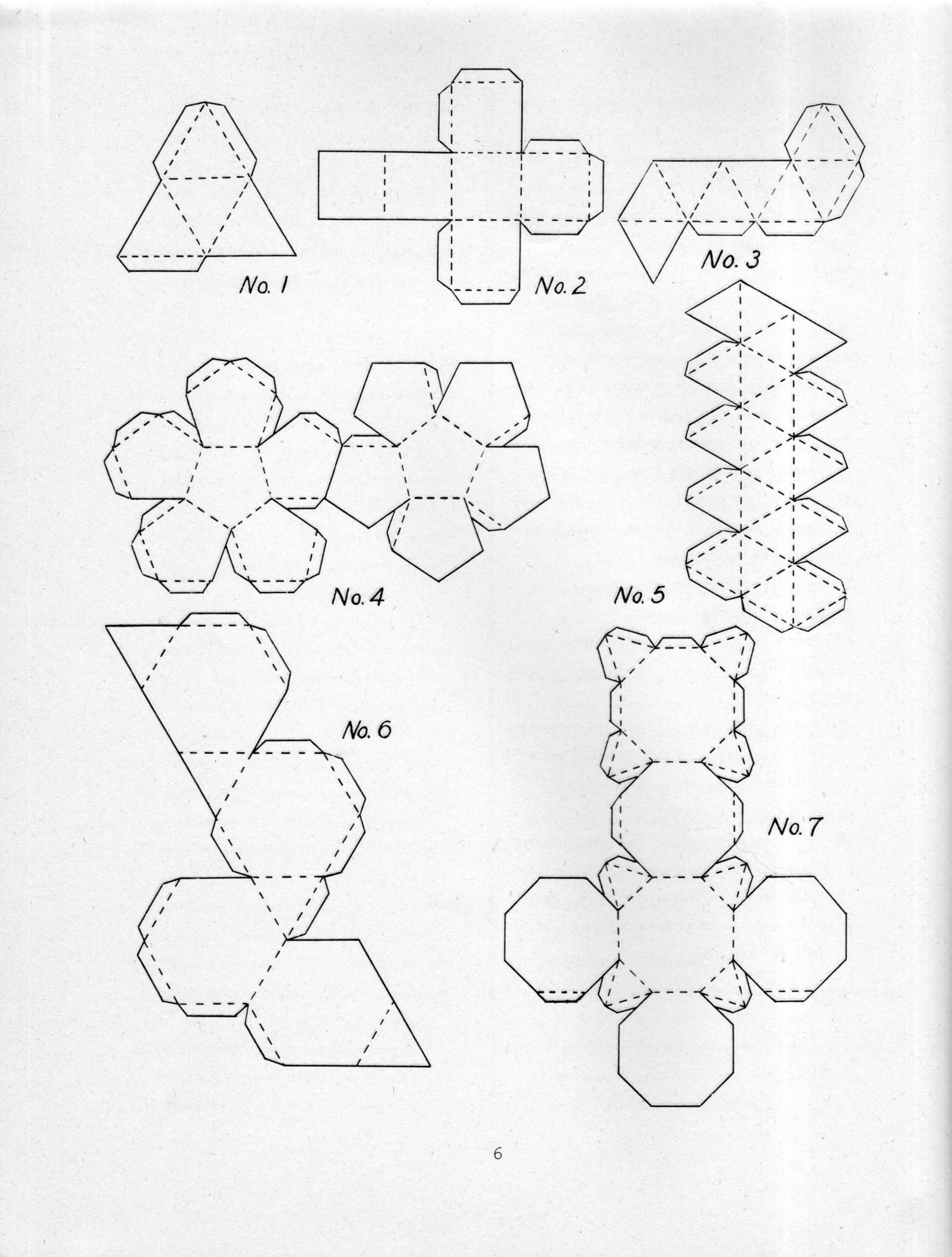
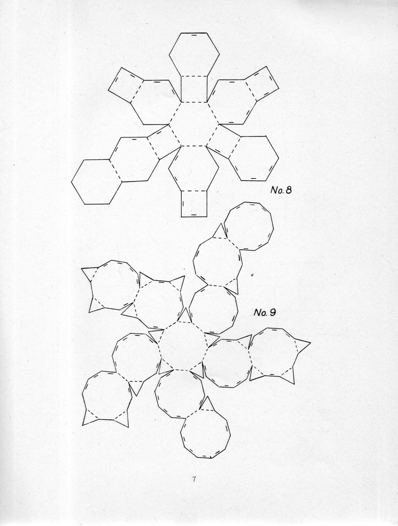
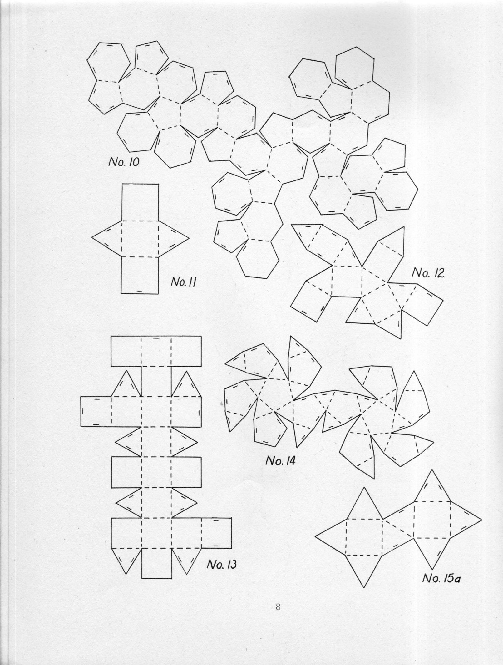
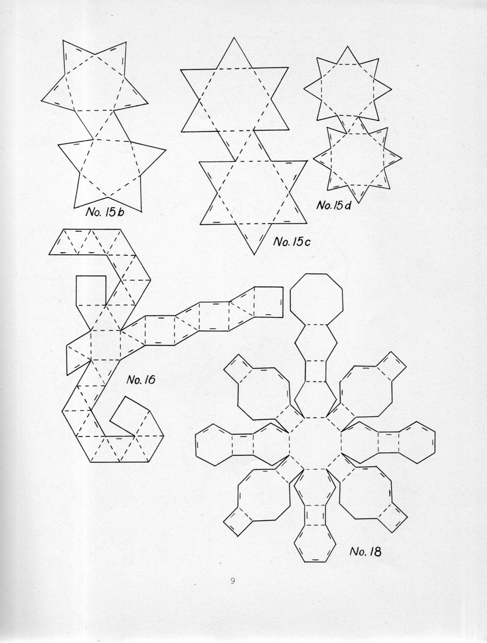
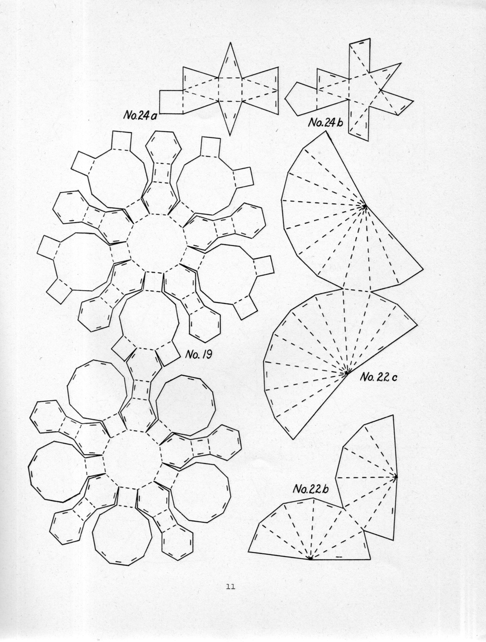
    I’ve missed this pamphlet for years–tall, slender, no spine title–until this morning, when it came to life.  It is the work of Miles C. Hartley, who deconstructed polyhedron for the purpose of reconstructing them in a classroom as “sensory experiments”. This was his method of keeping students interested in math, or at least keeping students interested in something that hopefully led to an interest in math. Hartley recognizes that many textbooks will include models for the five regular polyhedron, and stop there, the students “stalemated”. Hartley goes on to include 69 models, many of them fairly complicated, in the hope of creating a deeper interest in solid geometry and symmetry.  

    For example, this is a great rhombicuboctahedron, scooped out of the fourth image below, and which nicely fills a larger sheet of paper for cut-fold-paste:

    Polyhedron074

    If I could determine that the book was out of copyright and not just out of print I would just reprint the thing right here–but for now I’ve included the first 22 diagrams with scans tight enough to allow them to be printed, cropped, enlarged, and printed out again with each design on a 11×8 sheet of paper.  Enjoy!

    [Source: Hartley, Miles C., Patterns of Polyhedrons. This copy is the first edition of 1941, printed by Edwards Brothers lithography, 27x22cm, 29pp, and which seems to be fairly scarce. The reprints that are available in one form or another seem to all come from the “revised edition” of 1948 and 1951, which is the same size but with 48pp. I’ve not seen one of these and don’t know if the diagrams are just spaced differently or if there are more.]  

    Polyhedron069

    Polyhedron070

    Polyhedron071

    Polyhedron072

    Polyhedron073


Recent Posts

Archives

Categories