A Daily History of Holes, Dots, Lines, Science, History, Math, Physics, Art, the Unintentional Absurd, Architecture, Maps, Data Visualization, Blank and Missing Things, and so on. |1.6 million words, 7500 images, 4.9 million hits| Press & appearances in The Times, Le Figaro, Mensa, The Economist, The Guardian, Discovery News, Slate, Le Monde, Sci American Blogs, Le Pont, and many other places… 5000+ total posts since 2008.

  • Striking Unintentional Proto-Modernist Image (1853)

    JF Ptak Science Books  Quick Post

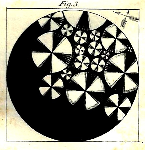
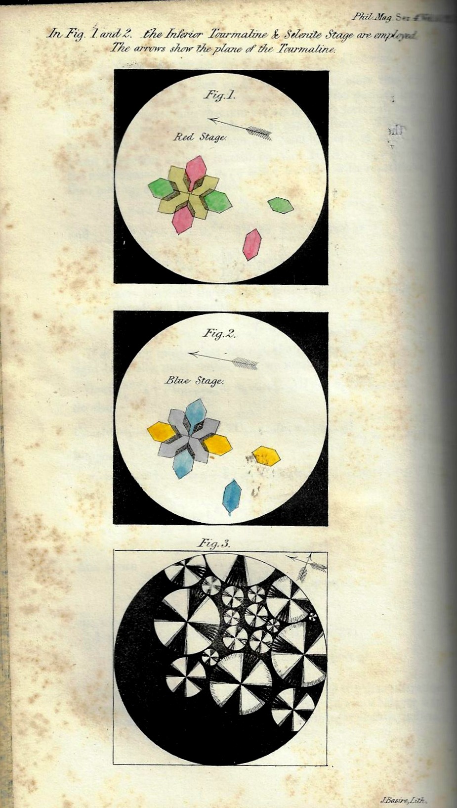
    I thought to share this image, a detail of an engraved plate illustrating and article by the I-can-do-anything David Brewster, “On the Optical Phaenomena of Tourmaline, &c., within Mica and other Minerals”, appearing in the Philosophical Magazine for 1853 (plate opposite page 185). I believe it is a magnification of titanium set in mica: “…the transparent groups are much more beautiful than the opake ones, the crystalline ramifications having the most diversified forms, resembling often regular organizations (page 265).

    The detail:

    Phil Mag 1853 detail

    And the full engraving:

    Phil Mag 1853

    ·Posted by :

    ·in:

  • A Big Head of Nothing (1865)

    JF Ptak Science Books  Quick Post 

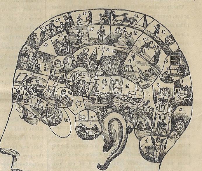
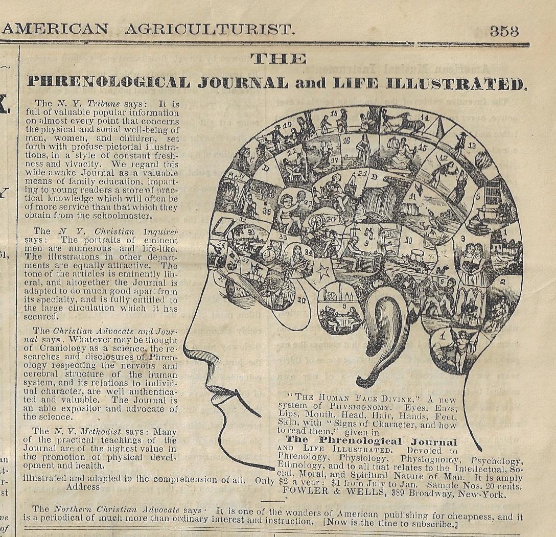
    This advertisement to subscribe to the Phrenological Journal appeared in November, 1865, with promises of profuse understanding of the connection of the nervous and mental life and its connection to, well, bumps on the head. There was also the promise of higher intellectual life by infusing the journal with devotion to psychology, ethnology, physiology, and of course physiognomy. It is interesting to note that four of the five endorsements come from religious newspapers, G_d knows why.

    American Agriculturalist 1865 phreology detail


    American Agriculturalist 1865 phreology

    ·Posted by :

    ·in:

    —
  • A Tunnel Long in the Making (1881)

    JF Ptak Science Books   Quick Post

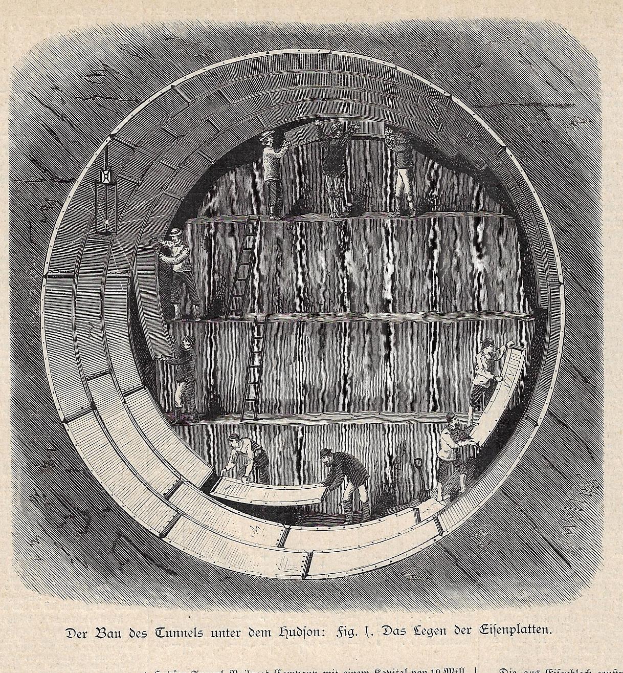
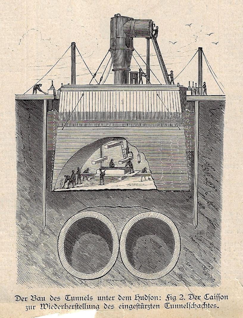
    This is an interesting addition to the collection (though not designated as a category) of several dozen cross section/tomographic/cutaway technical and medical illustration posts to this blog, though this one has a more complicated and perhaps more tragic history than most. It depicts work being done on the ill-fated Hudson River tubes, which began life as a project in 1874 with construction starting in 1878; unfortunately there were at least three different companies that undertook the difficult project before going bust, and there was also one major disaster in 1883 in which more than 20 workers were killed.  The project got underway for the final time in 1899, and was opened to traffic in 1908.  In the top image workmen are installing a shielding that would later be abandoned, working I think via one electric spark lamp at upper left; below we see a casson in which a number of laborers were, that being sunk lower and lower as the excavations proceed.  

    These two images are about-life size from when they appeared in Illustrirte Zeitung (Leipzig), on 29 January 1881–though they no doubt appeared a few months earlier in Harper’s Weekly or Scientific American or some such.  

    Cross section tunnel Hudson 1881


    Cross section tunnel Hudson 1881 _2_

  • Objects as their Own Context (1872)

    JF Ptak Science Books   Quick Post

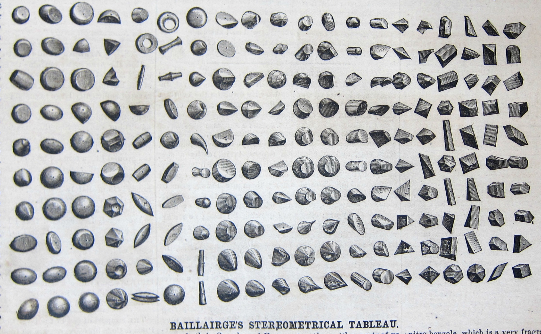
    That snarky little title simply references this fine collection of shapes for the schoolroom, objects for their own sake, to help kids understand form and its relationships.  The were actually 200 wooden of them in a 6’x4′ display case sold as a teacher’s aid by the Canadian Charles Baillairges:

    Sci American 1872 Baillairge Stereometrical

    We read in the promotional/instructional that comes with the blocks: 

    “In a large number of schools in Germany the pupils are taught from the time they commence the alphabet to judge of color and geometrical form by the regular use and comparison of colored slips and small blocks of wood representing the elementary principles which will in after years be called into study. The advantages of this early manifest all of the superiority of this…” The blocks “comprising so to say all the elementary forms their segments and sections and numerous other solids both simple and compound” and that  “the instruction conveyed by this tableau appealing as it does to the uneducated eye and mind is the inventor thinks destined to be of great use in developing the intelligence of the beginner and the untaught masses of mankind.”

    I found this image and nearly-identical text (without attribution) in the Scientific American for June 7, 1872.  

  • The Heavy Stuff, #15–Big Pistons (1872)

    JF Ptak Science Books  Quick Post

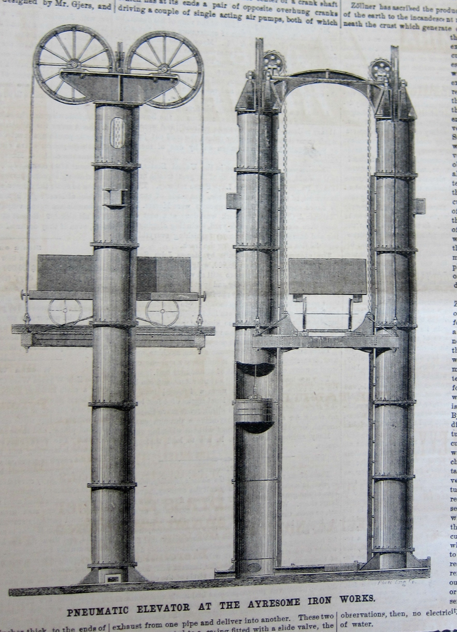
    And from the Scientific American, 18 days before Christmas in 1872, comes this magnificent monster of an elevator that would raise and lower large carts from “the bunkers to the calcinating kilns” (which is almost the title for something). The lifting mechanism were a pair of giant cast iron cylinders 48″ in diameter constructed in 8′ lengths placed 14′ apart, designed to lift 15 tons per lift (6,000 tons per week), raised on a 15′ wooden platform with 14″ thick flooring.  It was a beast. 

    Sci Am 1872 massive elevator


    ·Posted by :

    ·in:

  • The Heavy Stuff, #16–the Big Boom (1872)

    JF Ptak Science Books   Quick Post

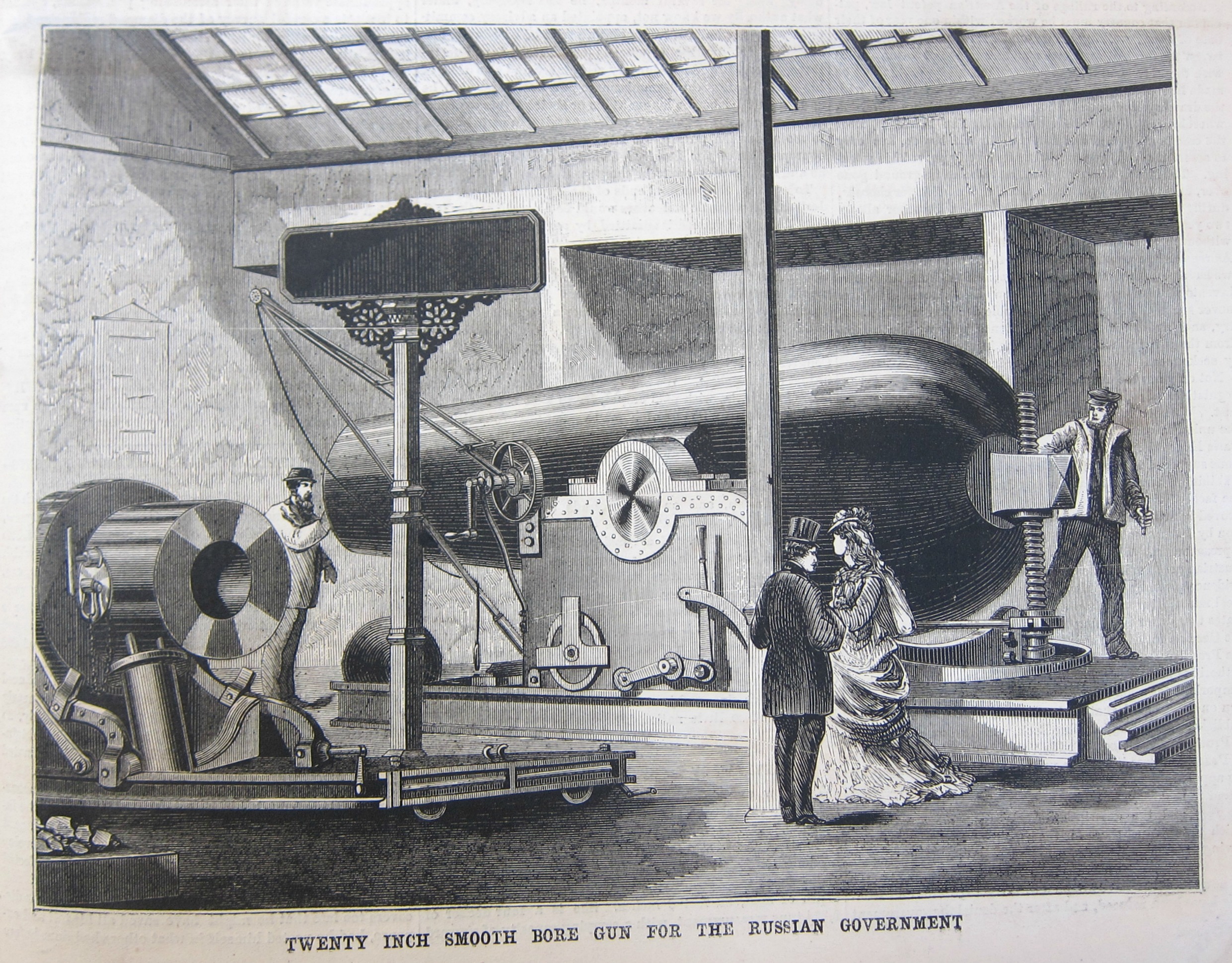
    This Russian 20″ smooth ore cannon weighed 44.5 tons and shot a 900-pound projectile and used 117 pounds of explosive charge to do that. The concussion wave from the firing of this beast was said to be felt 1/3 of a mile away where it would topple bad chimneys.  

    Source: Scientific American, December 14, 1872.  

    Sci Am 1872 Big Cannon

    ·Posted by :

    ·in:

    —
  • Weird Questions and Weirder Answers Department: Curing Insanity

    JF Ptak Science Books  Quick Post

    Pamphlet cover should insanity detail

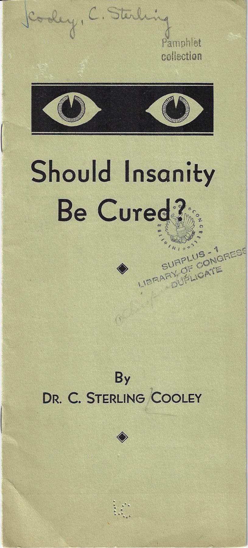
    Pamphlet cover should insanity be curedDr. C. Sterling Cooly wrote an incredibly-titled pamphlet of slim means called Should Insanity be Cured?  How could anyone proceed further than this?  Dr. Cooley wasn’t a eugenic apologist, nor was he an accountant for a life insurance firm—he was advocating a drugless cure for all different sorts of “insanity”, which was a term he doesn’t really stop to identify and classify, which of course is deeply problematic. 

    Or it is so until you hear how one can treat the insane via his new drugless method:  chiropractic.  I didn’t see that one coming.  “An insane mind is a sick brain, a sick body is an insane body” writes Dr. Cooley with leading confidence, claiming that chiropractic can release “the power within…marvels of healing are performed not only in mental cases but in virtually ALL forms of disease”.  That’s a lot to live up to in theory, let alone in practice. 

    Dr. Cooley was evidently a deeply important founder father of modern chiropractic, with a 50  year career in the area (1908-1957), and who was also very prolific–this is one work that he probably should’ve edited out of the publishing phase. 


  • The Coloring Book of Hell–Hell in Black & White (ca. 1600)

    JF Ptak Science Books   Post 2676

    If you were to wish a foul curse upon the soul of the dead in Hell, then it is Prosperine/Persephone who would carry it out. The Hitman of Hades had the capacity to inflict damage upon the already damaged, what with being the Queen of the Underworld and wife of Hades. She is also the daughter of Zeus and the harvest goddess Demeter, so there is also that life/death struggle bit going on in the background. 

    Brueghel hell

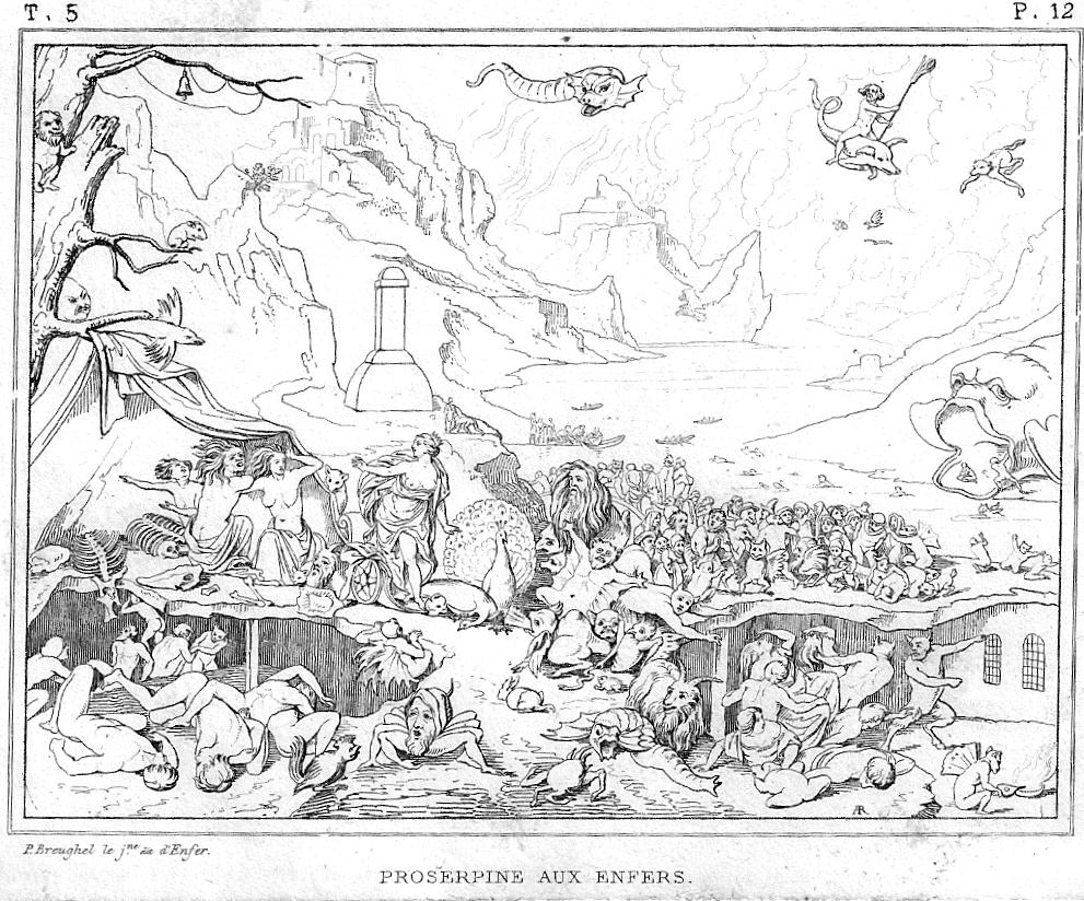
    This image is made from the painting by Pieter Brughel the Younger (1564-1638), son of Pieter Bruegel  and part of the dynastic family of painters. (They spelled their surname differently, depending upon the time and the user.) The legend of the engraving tells us that “P. Breughel [sic] le jne, dit l’Enfer” was also known as the “Hell Brueghel” for his interest in depicting that place, and he certainly does live up to the nickname.  Even though the engraving is pretty small (about 3×5″) it does communicate at least the sense of what the painting delivered, which was a very detailed and massive account of the underworld.  Even though the engraving is only a shadow skeleton of the original, we do get a sense of Mr. Cash’s lake of fire, and though we see the torments of the damned we generally do not see what it is they are suffering from.  Prosperine is at center left, having just arrived in Hell (according to the description1 of the plate found in Museé de peinture et de sculpture, ou, Recueil des principaux ..., volume 12, 18312, and behind her we see a river with boats dispensing new arrivals; at right, background, we see a gaping Hell Mouth though without fangs/teeth, which has at least one newly-damned trying to climb his way back into the mouth to perhaps retrace his steps to the surface of the regular world.  The image is creepy enough without the color and great detail of the original, what with the dozens of horrified dead falling about and a floating pig-snake flying above.  

    The imagination ran high on the imaging of Hell, mostly for ever and ever–Dante, Botticelli, Japanese Hell Scrolls, Bosch, and on and on, though the flavor of it slacks off a bit when most of the image is white.  So, if you were of a mind to do so, here’s your chance to color in one version of Hell as you please.  

    Notes:

    1.  “PROSERPINE AUX ENFERS. Le peintre Pierre Breughel le jeune est souvent désignésous le nom de Breughel d’Enfer parce qu’il aimait à traiter des incendies et des sujetsdiabcliques. On en voit un exempledans ce petit tableau où il a représenté Proserpine à l instant où elle arrive aux enfers tandis que tous les autres artistes anciens et modernes se sont pliis à retracer le moment où Pluton enlève la jeune déesse des riantes plaines de la Sicile. La fille de Cérès descend de son char et parait vouloir s’éloigner de l’ endroit où sont assises les trois furies, Alecto, Mégère et Tisiphone. Mais en détournant la vue de dessus les impitoyables déesses elle trouve partout des figures monstrueuses qui Iourmentent les mortels. Le lointain offre la vue de bautes montagnes d où sort un grand fleuve sur lequel on aperçoit plusieurs barques remplies des âmes des mortels qui viennent de quitter la terre. Ce charmant tableau peint sur cuivre fait partie delà galerie de Dresde. Il n avait jamais été gravé.”

    2.  I have the full set of 22 volumes for sale elsewhere on this blog–if anyone is interested in owning it, send me an email.  


  • Abbreviating Auschwitz: a Construction Agreement for the Construction of the Buna Works (FULL DOCUMENT)

    JF Ptak Science Books   Post 2676 (Note: I wrote about this elsewhere on this blog seven or eight years ago–at that time I reproduced only a handful of pages, beign cautious about damaging the document. I reproduced the whole thing here because, well, it should be, whether the original is damaged or not. I can find no other copy listed in the WorldCat/OCLC, and searches of other sources reveal no other copies as well.)
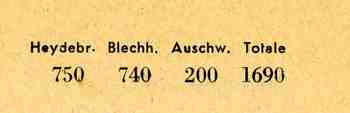
    Auschwitz abbreviation
     

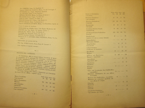
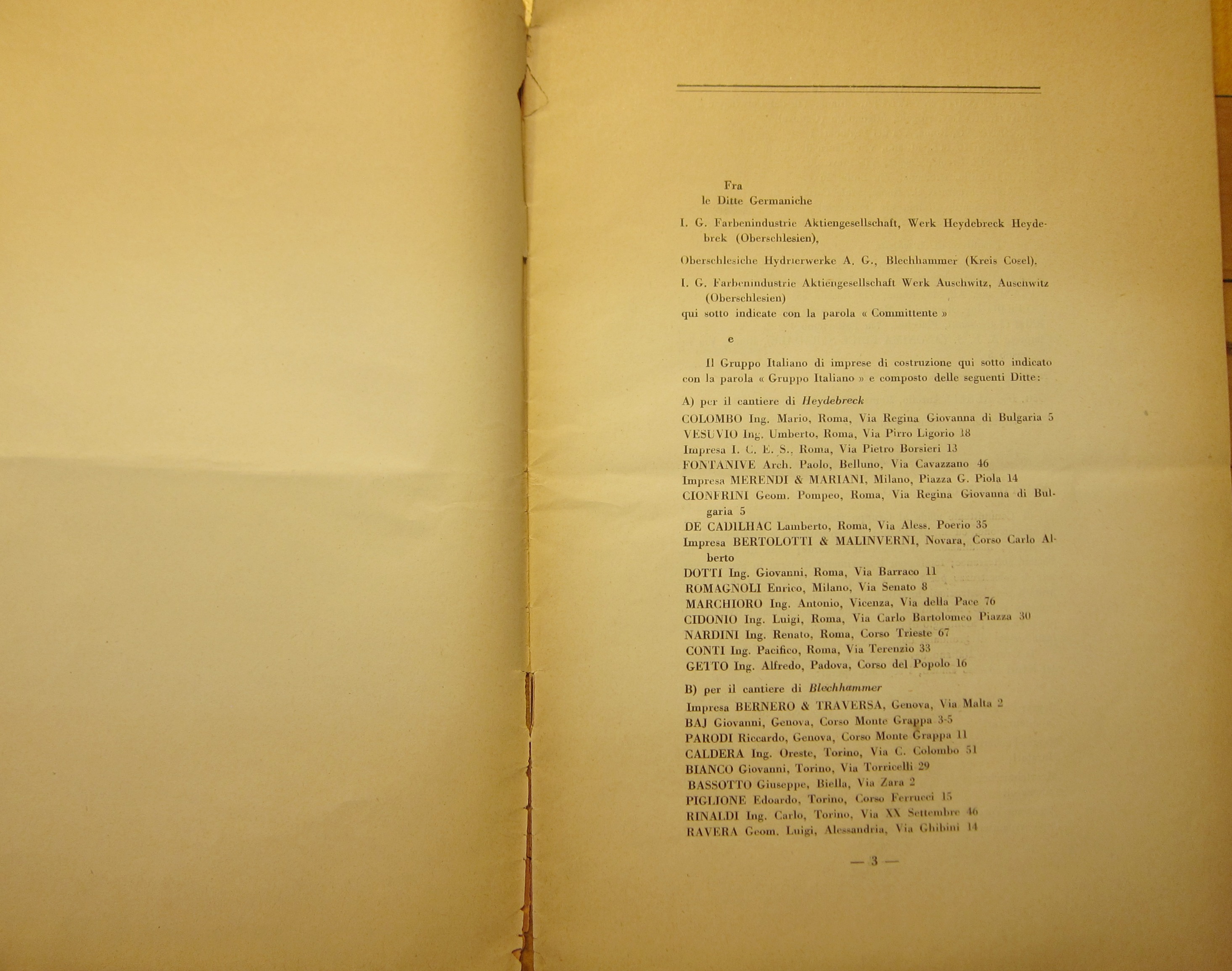
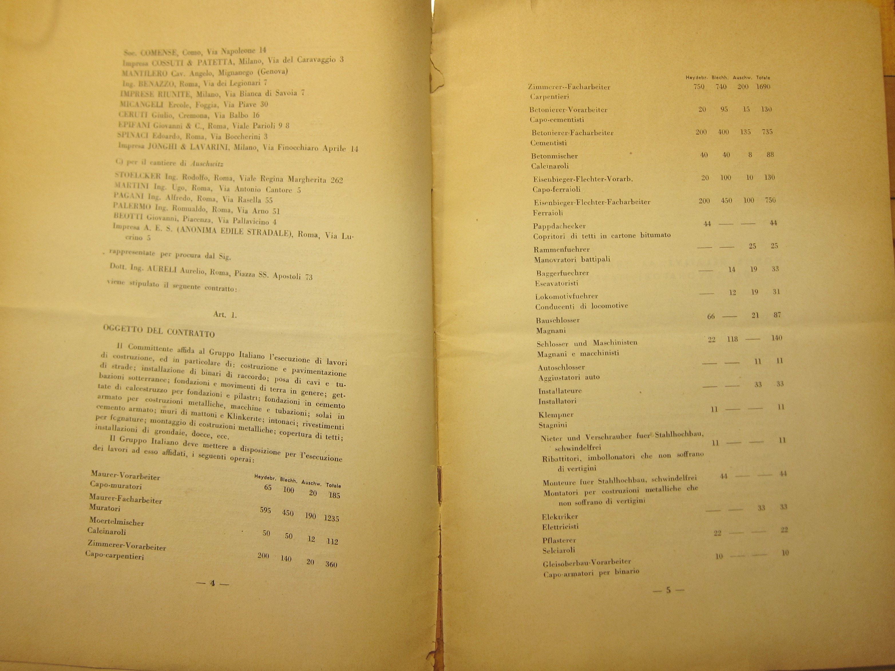
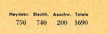
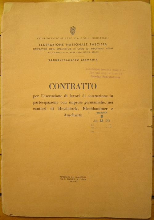
    This seemingly innocuous 1942 pamphlet is an outline of agreements for a contract of labor. The people contracting the work is IG Farben, and the laborers are “foreign worker” Italians (represented by the Confederazione Fascista degli Industriali), and the work to be completed is the Buna Works at Auschwitz (part of a vast complex of slave labor, industry, and death, constituted by as many as supporting camps), as well as other work at the forced labor camps at Heydebrek and Blechhammer.

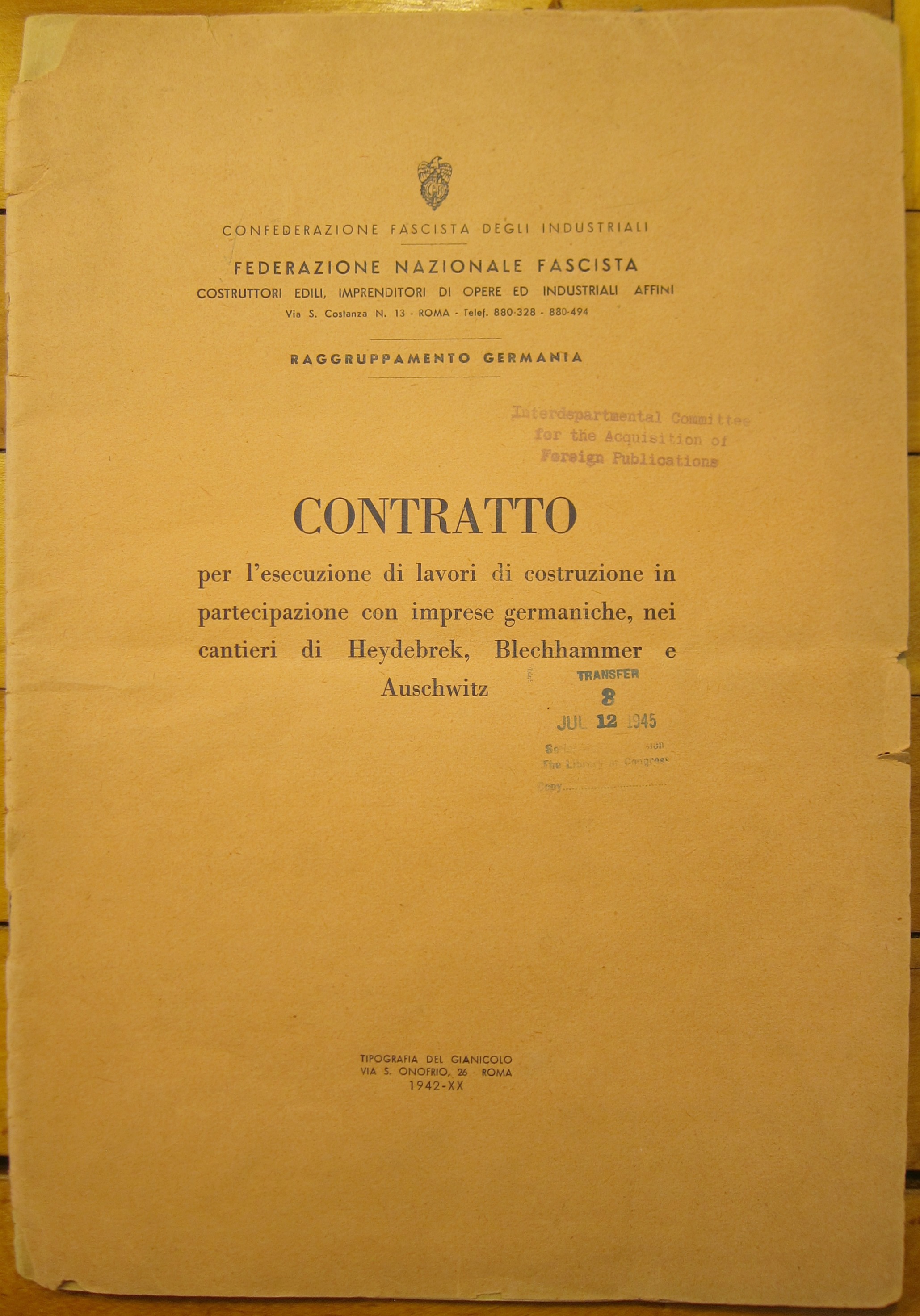
    The full title reads of the work reads:

    Contratto per l’escusione di lavori di construzione in partecipazione con imprese germaniche, nei cantieri di Heydebrek, Blechhammer e Auscwitz (contract to perform construction work in participation with German companies, in the yards of Heydebrek, Blechhammer and Auschwitz) It was printed by Tipografia del Gianicolo, in Rome, 1942, by the Confederzione Fascista degli Industriali, Federazione Nazionale Fascista Raggruppamento Germania.  The document measures a fragile 30.5 x 21 cm,  and is 29 pages long.  Like dozens of thousands of other things here at the store, this was formerly in the “Pamphlet Collection” of  the Library of Congress (which received the publication 12 July 1945) until we purchased the collection at the end of 1999. The full document is reproduced below. 

    Quite apart from what was happening at these place, the Italians and the Germans were doing the complex but simple business of figuring out where to put the thousands of workers, making sure that they get paid, providing for some sort of maintenance for the workers’ health, salaries, benefits, work schedules, breaks, vacations, incentives, mailing and the post, and so on.  All of the bits of the most mundane things that go into a large construction projects, like building a high rise, or a tunnel, or a highway, or a bridge to hell.  This contract could’ve been for just about anything at all.  But it isn’t.  Its for building a part of the Auschwitz complex when anyone with any sense whatsoever knew what was already going on there.

    I suspect that the vast majority of the Italian workers didn’t expect what they were getting into–and from what I have read, they were badly treated, even more poorly fed.

    Of the many terrible things in this document I was really bothered to see Heydebrek, Blechhammer and Auschwitz abbreviated at the top of some of these pages.    This is just so wrong. Wrong on every level, being an attribute of the nothingness, of the emptiness, of this document. 
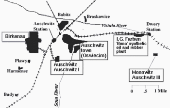
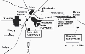
    Auschwitz map

    It is a simple, basic document on one of the least simple and basic things of the 20th century.  The contract detailed labor expectations, needs and regulations from both the German and laboring Italian sides for the construction of these three concentration and slave labor camps in 1942.   Subjects of interest in this document include salaries, housing, vacations, health care and insurance, as well as the application of German laws to the workers, qualifications, and classification of occupations.

    NOTES

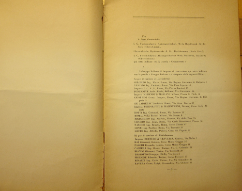
    The names that are attached to this document and signing off on the contract of this agreement (of 2 March 1942  which provided 8,636 Italian laborers for this construction) include:

    1)    for IG Farbenindustrie AG, Heydebreck, Heydebreck OS: Adolf Mueller and (Hans) Deichmann (Hans Deichmann served as (senior) legal representative for IG Farbenindustrie in Rome and Milan from 1942 to 1945 and in 1942 was responsible for recruiting Italian workers for construction in the above-named concentration camps.)

    2)    for Oberschleische Hydrierwerke AG, Blechhammer, Kreis-Consei Schlick

    3)    for IG Farbenindustrie AG Auschwitz, Auschwitz OS: Adolf Mueller and (Hans) Deichmann

    The signatures representing Italian interests include: Aurelio Aureli and Giacomo Milella

    Other Notes:

    –Blechhammer was a satellite camp of Auschwitz III (Monowitz)
    –Auschwitz III, also called Buna or Monowitz, was established in nearby Monowice to provide forced laborers for the Buna synthetic rubber works. The German conglomerate I.G. Farben established a factory in order to take advantage of cheap concentration camp labor and the nearby Silesian coalfields. It invested more than 700 million Reichsmarks (about 1.4 million U.S. dollars in 1942 terms) in Auschwitz III.

    On Italian labor being used at Nazi Concentration camps, as found in Vol  VIII, pg 749, 
    Nuremberg War Crime Tribunals:

    Q. Did you go to ter Meer* to get Italian workers — I am thinking of a prosecution exhibit, the one which was shown to ter Meer on cross examination.

    A. I was told at the time by an official source that Italian industry, after the collapse, would no longer produce because there was no coal, no current, or something. I was also told that since the Italian State obtained goods from Germany — buna, for example — the Italian State would be willing to enter into an agreement with Germany to make labor available, as was always the case from Italy. I said to him: “In case that is so” — neither ter Meer nor I knew whether that really would be the case — I said, “help the people at Auschwitz; help them to get workers if now” — I believe this was in 1944 — “the plants gradually go into operation.” For in these plants we wanted to have skilled workers — as I said yesterday, it is very important whether or not the man in charge has knowledge of the work he is doing.   –Vol  VIII, pg 749,  Nuremberg War Crime Tribunals. 

    *”Fritz ter Meer served on the IG Farben [Farben was Hitler and Hitler was Farben. (Senator Homer T. Bone to Senate Committee on Military Affairs, June 4, 1943.] board of directors from 1926 to 1945 and was the head officer directing the operations of the IG Farben factory at Auschwitz. The Nuremberg War Crimes Tribunal sentenced him to seven years in prison. He was released after serving only four years. Not long after, in 1956, Ter Meer was elevated to the chairman of the supervisory board at BAYER, a position he held for seven years. His grave in Krefeld has a meter-high wreath on it – donated by BAYER in recognition of his services.”
     

    Auschwitz cover

    Auschwitz _3_

    Auschwitz _4 5_


    ·Posted by :

    ·in:

  • Early Data Visualization (1817)


    JF Ptak Science Books   Post 2677

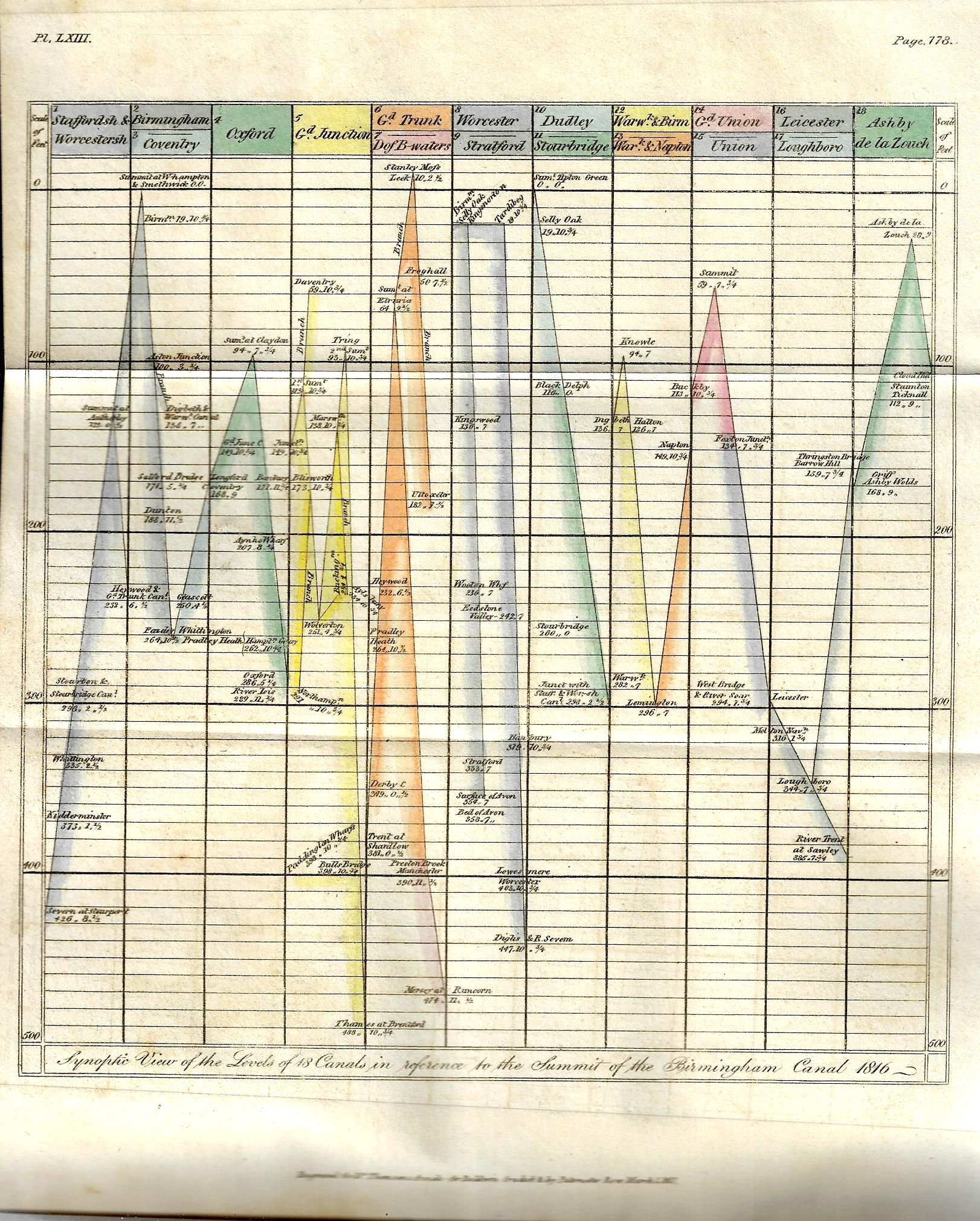
    There have been perhaps 150 posts on this blog relating to data visualization and the elegant display of information–this one, found by chance yesterday while browsing, is really pretty early for its type of accomplishment. The image relates heights of canals in the Midlands, and is one of three illustrations for Samuel Galton’s “On Canal Levels” which appeared in Thomas Thomson’s Annals of Philosophy; or, Magazine of Chemistry, Mineralogy, Mechanics, Natural History, Agriculture, and the Arts1 in the first half of 1817.  The article is illustrated with three plates, including a curiously interesting graph of canal lengths, a cross section of “the line of canal from the river Mersey at Runcorn Gap  to the River Thames at Brenford, with the Branch to Paddington Wharfs”, and finally a glorious hand-colored plate (“Synoptic View of 18 Canals in reference to the summit of the Birmingham Canal, 1816”).

    Galton (1753-1832, of Birmingham) was Quaker arms manufacturer (a not-uncommon occurrence in my experience) and the grandfather of the polymath Francis Galton, a successful industrial who was active in the Lunar Society. This short paper is basically a collection of data, and he presents it in an interesting and provocative way–this in relation to the cross section and graph, which are early means for the time in expressing quantitative data in a more easily-managed and comparable form.  (Galton wrote: “It occurred to me several years ago that the lockage of canals and their plans and sections would afford the means of ascertaining with a considerable degree of comparative precision the relative height or level of all the places immediately situated upon those canals which communicate with one another and that in consequence a number of fixed points would be obtained from which the relative level of any objects in the vicinity of those canals might be more conveniently measured…”)

    • (Apologies for the unevenness in clarity of the sans–the book in which they appear is tightly bound, and I didn’t risk opening the book beyond necessary for fear of damaging it. That said, if you click and expand the images are a lot sharper….)


    Dataviz Canal heights 1817


  • The First Appearance of a Monument in the History of Ambiguity (1832)

    JF Ptak Science Books   Post 2678

    “Hee beganne to stande in great ambiguitee of his saftie.”–P. Vergil Eng. Hist (1846) I. 160, ca. 1560

    “Shall I make spirits fetch me what I please, Resolue me of all ambiguities”– Marlowe Tragicall Hist. Faustus  (1604)   [Both quotations via the OED]

    First Appearance of a Famous Optical Illusion–the Necker Cube (Necker’s Cube), 1832

    Humans do not normally see one thing two different ways at the same time, unless they are confronted with something that Louis Necker thought up 15 decades ago. I am referring to the wide swath of humanity mostly here in the West with a mostly hard pull to binary interpretations, and not so much so for other belief systems that are more accommodating to multi-dimensional interpretations, like  say the clarity/ambiguity inherent in Taoism (though the definition of “Taoism” is usually ambiguous in itself). Also I’m speaking  more physiologically/psychologically than anything else more so than yin-yang metaphysics.  

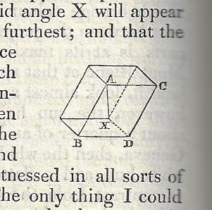
    Buried in an interesting (and illustrated) article in this Philosophical Magazine1 of 1832 is the first appearance of one of the most famous optical illusion images of all time–the Necker Cube. this construction–named for Louis Necker–has now been used for many years in tests on human perception (and in some areas for psychological interpretation, depending on who sees what and when).   In its original appearance the cube is mostly given a textual description but it does appear once as a tiny rhomboid–tiny or not, it really does do the trick.  (“He shows that you may see the Necker cube in either perspective, but that you practically can not see it as a flat geometrical design in the plane of the paper.”–Science 8 Jan. 37/2 . “He did not experience the usual spontaneous depth-reversals of the Necker cube—which appeared to him flat.”–Oxford Companion to the Mind, 96/1, 1987. “The reason an optical illusion such as the Necker cube outline..works is that, in some deep biological sense, you are of two minds on the question of what to see.”–Scientific American, Jan. 18/1, 2001. “It is a simple wire frame drawing of a cube with no visual cues as to its orientation, so it can be interpreted to have either the lower-left or the upper-right square as its front side…”–Wiki) 

    According to the Oxford English Dictionary it turns out “Necker Cube” doesn’t make its first appearance as a phrase for another nearly 70 years, surfacing in 1901 in an article by the psychologist E. B. Titchener in  Experimental Psychology (I. ii. ix. 309):  “The Instructor should have a few prepared as large wall-diagrams:..Schröder’s stair-figure, Necker’s cube,..the Müller-Lyer figure.” In any event, so far as I can determine, this is the first appearance of that famous construction. 

    Optical illusion


Recent Posts

Archives

Categories