A Daily History of Holes, Dots, Lines, Science, History, Math, Physics, Art, the Unintentional Absurd, Architecture, Maps, Data Visualization, Blank and Missing Things, and so on. |1.6 million words, 7500 images, 4.9 million hits| Press & appearances in The Times, Le Figaro, Mensa, The Economist, The Guardian, Discovery News, Slate, Le Monde, Sci American Blogs, Le Pont, and many other places… 5000+ total posts since 2008.

  • Beautiful Circles in Science #1: the Astronomy and Cosmology of Fontenelle and the Plurality of Worlds, 1686.

    Blog26apfontenelleJF Ptak Science Books Post #69

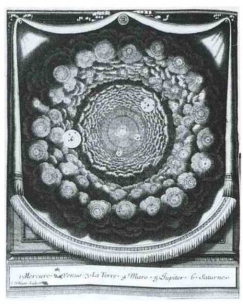
    This first lovely image belongs to Entretiens sur la
    Pluralitie de Mondes
    (Conversations on the Plurality of Worlds), written by the
    great French philosophe Bernard le Bouvier de Fontenelle in 1686 (just a year
    before publication of perhaps the greatest work in the history of science, Newton’s Principia
    Mathematica
    ). The Plurality was a
    best-seller by the best-selling Fontenelle. An excellent attempt by a rather
    restricted writer to engage the population-at-large, writing a high-pop book on
    what was basically the history of astronomy and cosmology of the preceding
    century. Copernicus was a major feature
    of his imaginary conversations with a muse as he wandered through a
    metaphorical garden of questions, with the observations of Galileo and Cassini
    also very prominently featured.

    Fontenelle’s Pluraltiy was amended, added to, and fattened
    up for a long time, the author adding material to it constantly for years to
    come—the book went through at least 33 editions during Fontenelle’s
    hundred-year-long life (1657-1757). This
    engraving was meant to be allegorical, illustrating a Copernican planetary
    system which was surrounded by galactic clouds comprised of other solar systems—prescient
    and forward thinking, as it wasn’t until the last 15 years or so that a solar
    system was discovered outside our own. (This until recently was a tremendously difficult
    feat to accomplish—instrumentation and practices now are advanced, but it is
    still an extremely difficult task to locate extra-solar system planets and
    systems.) 
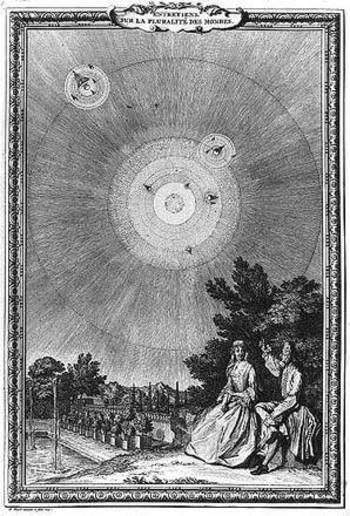
    Plurality
    What makes this engraving so particular and attractive to
    me, and the reason why it is listed first in this series of scientific circles,
    is because of its beauty and “deep depth”. The artist certainly related the compound nature and depth of the
    universe, revealed to us from behind drawn curtains. Our solar system is featured prominently, with hosts of other solar systems borne on each puff of extragalactic clouds, reahcing, or descending, “all the way down Or up)”.  Fontenelle believed in the infinity of world
    and the enormous-by-reason possibilities of the universe, as we see in this
    extra from Plurality:

    I shou’d think it very strange, that the Earth shou’d be inhabited as it is;
    and the other Planets shou’d be so entirely desolate and deserted: For you must
    not think, that we see all the living Creatures that inhabit the Earth. For
    there are as many several species and kinds of Animals invisible as there are
    visible. We see distinctly from the Elephant to the Mite; there our sight is
    bounded, and there are infinite numbers of living Creatures lesser than a Mite,
    to whom, a Mite is as big in proportion, as an Elephant is to it. The late
    invention of Glasses call’d Microscopes, have discover’d thousands of small
    living Creatures, in certain Liquors, which we cou’d never have imagin’d to
    have been there. And it may be the different tastes of these Liquors, proceed
    from these little Animals, who bite, and sting our Tongues and Palates. If you
    mix certain ingredients in these Liquors, (as Pepper in Water,) and expose ’em
    to the heat of the Sun, or let ’em putrefie, you shall see other new species or
    living Creatures. Several Bodies, which appear to be solid, are nothing else
    but Collections or little heaps of these imperceptible Animals; who find there
    as much room, as is requisite for them to move in. The leaf of a Tree, is a
    little World inhabited, by such invisible little Worms:
    To them this leaf seems of a vast Extent, they find Hills and Valleys upon it:
    And there is no more Communication between the living Creatures on the one
    side, and those on the other, than between us and the Antipodes.
    And I think there is more reason, to believe a Planet (which is so vast a Body)
    to be inhabited. There has been found in several sorts of very hard Stones,
    infinite multitudes of little Worms
    ,
    lodg’d all over them in insensible varieties; and who are nourish’d upon the
    Substance of these Stones which they eat. Consider the vast Numbers of these
    little Animals, and how long a tract of Years they have liv’d upon a grain of
    Sand. And by this Argument, tho my Moon were nothing but a confus’d heap of
    Marble Rocks, I wou’d rather make it be devour’d and consum’d by its
    Inhabitants, than to place none at all in it.”

    CONTINUE:
    ·Posted by :

    ·in:

    —
  • Shaping Space and Controlling What We See—Determining What Color “Is”, Emily Vanderpoel and Pre-Kandinsky Art

    JF Ptak Science Books    Post #73

    Blogcolorvander_2poel_063
    The idea of how we put parameters to something like the visual field is a gargantuan topic—it is something that architects and geometers and physicists and mathematicians (in general) have dealt with forever.  Mapmakers have perhaps the most visualized aspect of this on paper, performing the semi-miracle of translating three dimensions into two; physicists have a more difficult time, taking the opposite approach, sort of , and translating two or three dimensional space into x-number of dimensions.  Anatomists had a difficult time of their subject until relatively recently in human history, what with the sublime religious curfews on messy knowledge and all coming into play, poking around into the heart and such as though it was an affront to the sanctity of the creator (M Servetus’ ideas on the circulation of the blood via the heart, making the heart a tool and not the brain or some odd conjunction of creative divine power, cost him his life, burning slowly alive at the stake…how mysterious the whole world of RNA Genotype-Phenotype Mapping and such would seem to him if he could have a peek into the future/present from wherever he is.)
    Blogcolorvanderpoel_062

    Color theory is old and pretty—as a matter of fact there is a very attractive gathering of color theory models (in black and white, though) displaying some two dozen or more color models from the last 400 years.  People like Della Porta (1593), our old friend and resident oddball polymath crank Kircher (1646), the smarter-than-you-could-believe Newton (1660), Waller (1686), Lambert (1772), the wide ranging and again polymathic Goethe (1792), Herschel (1817, who also ushered in our understanding of the other light-sensitive shape spacing medium of photography in 1840), the semi-forgotten Chevreul (1835), the beautiful Maxwell (1857), Wundt (1874, the early experimental psychologist who also looked for spirits/spiritmus and ghosts), von Bezold (1878), Rood (1879), Munsell (1918) Kandinsky (1914 and not decipherable by me) and Klee (1924), and so on towards the present, all tried to analyze the prospects of color.

    Not in this list is the very highly problematic Emily Vanderpoel, who in 1901 and 1903 produced (in two editions) a lovely but mysterious book called Color Problems for the Layman, in which she sought not so much to analyze the components of color itself, but rather to quantify the overall interpretative effect of color on the imagination.  I know this sounds begging and vague, but I really haven’t been able to make much headway in the work.

    Blogvanderpoel_1057
    I’m attracted to this effort because of its attempt at quantifying such abstract thoughts.

    By virtue of this effort, though, Vanderpoel had produced a strikingly illustrated book, with 118 color plates, all very intense, and beautiful, and in its way exceptional—unique perhaps.  Had the book been written thirty years or so hence we’d call it some sort of constructivist/constructionist artform.  But since the artwork in the book comes a decade before the first non-representational artwork in human history (or so), I don’t know exactly what to call it. 
    Blogvanderpoel_2058

    I really don’t know what it is, but I know that it is not entirely accidental, this pre-non-representational artform, because controlled geometrical color art is not accidental. 

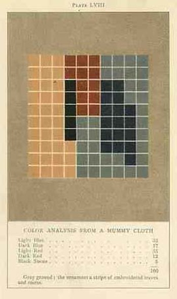
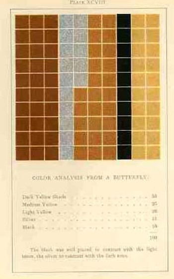
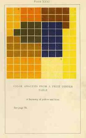
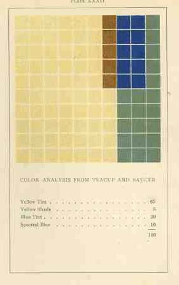
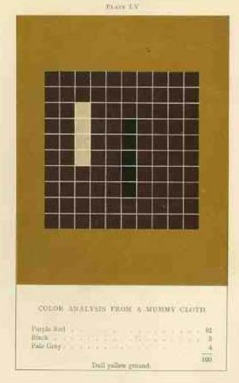
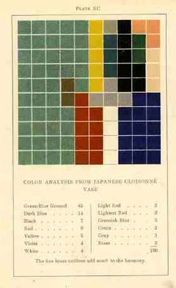
    In trying to quantify the color images of the objects in her study, Vanderpoel establishes a 10×10 square grid, dividing all of the color in that object into individual units numbering to 100.  Then, somehow, she identifies the major colors and places them according to a system that I cannot understand within the grid.

    Blogvanderpoel_3059

    The net effect is glorious.  I just don’t know how she got there—which isn’t normally a consideration in art, except that this work is an instructional on how to understand color in art and nature, and the explanation of the procedure is ethereal.  Vanderpoel was and remains a respected author on porcelains and other applied and plastic arts.  In this work she looked at her fair share of porcelain, limogues, clay pots, burial urns, glass shards, and the like; she also analyzed clouds, mummy cloths (and casings), dew on morning grass, brocade, the eye of a blue jay, feathers, and another hundred or so poetic arragenments of the stuff of teh world.  I still do not know what this book is trying to tell me, but I do know that it is remarkable.   

    Blogvanderpoel_4060  

    ·Posted by :

    ·in:

    — —
  • The Wrong Stuff, Righted–the Attack on Darwin’s Descent, 1871

    JF Ptak Science Books LLC Post 17

    I enjoy the good defense of the wrongfully accused–The Encyclopedia of Incorrect Reviews of Literature andDarwin_first_tree_2
    Science
    is an enormous and multi-generational work, filled to its festering brim with The Bad Stuff:   Everyone is represented here, glory rendered to trifle:  Hamlet was ripped by Voltaire (“vulgar and barbarous”) while Pepys raped Midsummer Night’s Dream (“insipid, ridiculous”); Moby Dick was “trash, bedlam literature”; Kipling couldn’t write in English (SF Examiner 1889); and Max Eastman weirdly and famously trashed Hemingway and his manhood in the New Republic while reviewing For Whom the Bell Tolls in 1940 (“lacks the serene confidence that he is a full-sized man”).   Perhaps one of the very prettiest of the bad/wrong review was made by The Bookman (the professional bookseller’s reviewing organ in the United States) in 1906, in reviewing Sinclair’s The Jungle:  “His reasoning is so false, his disregard of human nature so naïve, his statement of facts so biased, his conclusions so perverted, that the effect can be only to disgust many honest, sensible folk with the very terms he uses so glibly”.  Well put; better still if it were correct.  The list goes on and on and touches, well, just about everyone (including Dr. Seuss).  What I really enjoy is the response to the bad review, especially when the bad review was, simply, bad. 

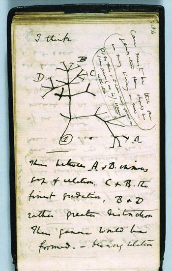
    One good example, .a great example, really, is Thomas Stebbing’s response to an inciting, raw and hateful attack upon Darwin’s Descent of Man by The Times of London newspaper (April, 1871).  Incredibly, or predictably, The Times saw the work as an attack upon society: it accused Darwin of undermining authority and principles of morality, opening the way to “the most murderous revolutions”. A “man incurs a grave responsibility when, with the authority of a well-earned reputation, he advances at such a time the disintegrating speculations of this book.” Stebbing’s  review of the Review is drippingly but properly sarcastic, pointing out obvious errors in specific and the tone of the article in general in the defense of theAntievolutionleague_2
    book. Darwin’s “facile method of observing superficial resemblances” (says The Times) moves  Stebbing to issue the following: “they may fancy that truth is worth discovering , even when it seems to involve some contradictions to our pride and some loss of comfort to our finer feelings…”  It is a gorgeous line ending a proper, staid defense of what would seem prima facie to be something in need of no defense whatsoever—in 1871 or 2008. 

    Reverend Stebbing, a Darwinian, Naturalist and fellow of the Royal College of Surgeons, lived another 55 years after this article was published—one year longer than the issuance of the (negative, anti-Darwin) verdict in
    the Scopes/Monkey trial.  I wonder what he was thinking on that day in 1925…

    ·Posted by :

    ·in:

    — —
  • Blowing Up Hell(gate), 1876

    JF Ptak Science Books  Post 19

    • “A Sharp, but Not Loud Retort”—the cross section of the detonation chamber of the largest pre-Alamogordo man-made explosion, 1876
      Explosion
      Cruising through a box-full (okay, four boxes full) of  the Popular Science Monthly, I came upon the lovely volume for 1876. The November issue (the November 1876 American presidential election bears a very, very close resemblance to the 2000 election) unleashed a bevy of odd, tantalizing articles, demanding their quiet attention:  “the Early History of Fire”, “Prenatal and Infantile Culture”, “Is the Development Hypothesis Sufficient?”, “the Nature of the Invertebrate Brain”, and others).  Just barely bobbing to the surface, riding the velvet coattails of longer articles was as a note in the “editor’s table”: “The Hell-Gate Explosion.”

    Dsc04637

    Aha!
    Hell’s Gate in America (there are bunches evidently in the Netherlands, where term prior to corruption was Hellegat, meaning, well, “Hell Gate”) refers to a body of water high up on the East River in NYC.  It had, before 1876, been a very contentious bit, with a reef at Hallett’s Point that caused all manner of problems for ships and shipping, helping sink perhaps hundreds of ships over the years since the strait was navigated in the early 17th century. 

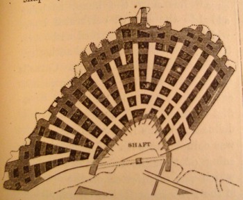
    It came to pass that the Deciding Forces determined that the reef must go.  (RIGHT: the 1-inch square image cross section of the tunnels beneath the ship-catcher.)

    General John Newton (1823-1895, Civil War brevetted Major General)  was placed in charge of removing the mess, a large, 700-foot long ship-sinking croissant, extending 300 feet into the channel, with an area of about 3 acres.  Newton worked on the idea for several years and—to the great trepidation and pre-millenial fears of many—decided to blow it up. Actually, he decided to blow it down—he engineered a submerged explosion such that the charges placed in the numerous and long mine shafts drilled and cut the length and breadth of the reef would effectively sink the reef. With some smart thinking and some 50,000 pounds of explosives, he did just that. 

    Listen to the particulars (and remember, this is 1876, and the waters were treacherous, with ripping currents):  after building a coffer dam a shaft was sunk 33 feet below the surface of the water, from which 10 tunnels were opened, having lengths of 21 to 126 feet. The tunnels radiating from the shaft varied from 9 to 22 feet in height, and 9 to 12 feet wide, with 172 supporting pillars, the total length of the tunnels being 4,857 feet plus another 2,568 feet of offshooting galleries—the entire 7,425 feet of tunnel was drilled with 4,427 blasting holes, the explosive agents being connected to 96 galvanic firing batteries by 220,000 feet of wire. The 160 fuses were simultaneously ignited by 23 groups of batteries.

    Dsc04637fancy

    The main plunger was depressed by General Newton’s 2 year old daughter, who was not named.

    The action was a success, the honeycombed explosion chambers sort of sinking the 51,000 cubic yards of ship-killer under a low, sulfurous fog.  Actually the reef-turned-gravel pit was removed by grapplers, part of the Hell of Hellgate carried away. 

    All things considered, this little cross-section (about an inch square) doesn’t say much about the biggest man-made explosion south the atomic bomb . 

    Explosion_atomic

    Endnote:

    The New York Times screamed the results in a Victorian tremalotto on their front page for 25 September 1876:

    “RENDING HELL-GATE ROCKS; THE SUBMARINE MINE EXPLODED. A COMPLETE SCIENTIFIC SUCCESS. THE TERRIFIC RENDING FORCE LIBERATED BY THE FINGER OF A CHILD–A JARRING TREMOR OF THE EARTH, AND A SHARP, BUT NOT LOUD REPORT–IMMENSE GEYSERS OF WATER THROWN UP–THE FORCE EXPENDED MAINLY IN THE WORK OF BURSTING THE REEF–CONFIRMATION OF GEN. NEWTON’S THEORY OF THE EFFECTS OF THE DISCHARGE–THE RUSH OF THE CURIOUS CROWDS–INCIDENTS OF THE DAY THROUGHOUT THE CITY. BEFORE THE EXPLOSION. THE EXPLOSION. AFTER THE EXPLOSION.”, The New York Times. September 25, 1876. p. 1

    ·Posted by :

    ·in:

  • Homer Simpson on Perspective: the Rare Antique Image Looking Straight Down from a Height

    Blogstraight_homerJF Ptak Science Books LLC  Post 20

    I welcome the chance today to use our non-classical Homer instead of the beautiful Paolo Uccello to look at an issue of imaging a certain form of perspective drawing.  I’ve always been intrigued by antiquarian images that looked straight down, or up, at things–90 degree, perpendicular, real straight-on stuff, giving a feel for depth (or height) and perspective.  Funny thing is that in the wide world of scientific images, they really don’t show up very often.

    A Mock-straight-down is found in this prettily-designed example (French, ca. 1860)–it seems to be view form a height of 250 feet or so down on the square of a low- (Western) renaissance town. That’s partly true, except that it is a mosaic from Pompeii (or Herculaneum), found imbedded in the floor of one of those mummified houses.  Dsc04640

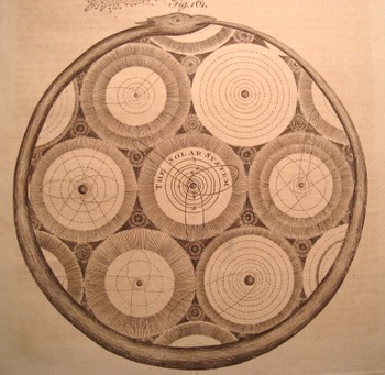
    Another pretender is this god’s-eye view (from Abraham Rees’ mammoth encyclopedia of 1800-1820) of the universe, centered upon our own helio-centric Solar System, which is centered, nested, amidst a whorl of other (contiguous and touching but not overlapping) solar systems, all of which is held in the Dsc04642
    infinite but knowable confines of an ourobus.   This
    again qualifies as a straight-down/up if and only if (iff) you squint real hard and imagine you’re seeing the scene through your CreatorView (TM!) glasses.  (The Creator needs glasses?)

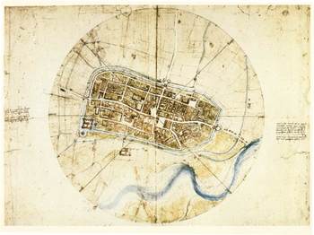
    The drawing by Leonardo of the town of Imola (currently resident with the Windsors) does come quite close to the concept–it has more artistic features than the common city plan , and is definitely at a perpendicular to its subject.Blogstraight_imola

    But it is this that is so terribly interesting to me–a small part of a
    little print from an unidentified encyclopedia from the turn of the
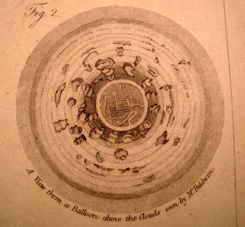
    19th c. It shows a picture of the earth looking straight down from a
    balloon, looking through an opening in the cloud cover, down to a small
    town. There is an iconic work on the representation of the world as known to succeeding generations where the picture of the world is seen through a succession of gradually diminishing clouds (being opened like drapes over time), but I honestly cannot think of an early image of looking at clouds from above and straight down.  My sense is that this image would have caused as much Dsc04639_2
    interest and wonder as the first (Soviet) images of the other side of the Moon (back in 1959). 

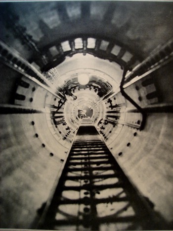
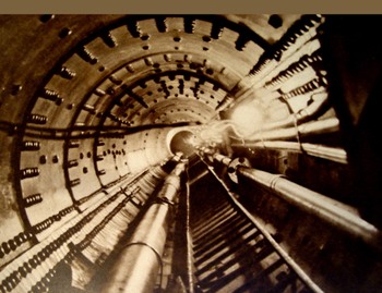
    Even when moving into the pre-satellite 20th century image, the straight-down picture is a rarity. In the last few years after having looked at dozens of thousands of popularly-published images (for another project), the straight-down/up were a scant tenth or perhaps hundredth of a percent of the total. There were a number of photographs made looking straight up (as in the two examples here, looking up the main mast into the crow’s nest of the Queen Mary, and the other with the same view, only in the Bremen. 

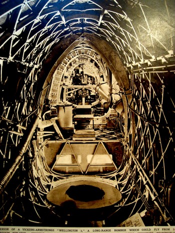
    Occasionally the view like this will show up (looking laterally through the Vickers-Armstrong “Wellington I” bomber aircraft (June 1939)

    I can’t leave this topic without mentioning two recent additions to this genre–the first is the Eames’ wonderful PowerDsc04643_2
    of Ten movie (go to youtube HERE, where in 40 steps we look at existence from quark to quasar. 

    The second is a little goofy but I like it nonetheless–the introduction to the Jodie Foster movie Contact (go to youtube HERE)  built on the bones of the Carl Sagan book. Here we swing out from the Earth and into space, following a broadcast-audio trail of humanity into the not-too-distant time/space (ignoring the signal degradation bit but so it goes), and then leaving that quickly behind, hurling itself backwards, to the outer reaches of the universe, until (and we don’t see this in the youtube clip) we wind up back in the iris of the heroine (and a bit too much like the Dave Bowman trip in “2001 a Space Odyssey”).  Dsc04644

    But we don’t see stuff like this very often, and I’m happy to go along for the ride. It really is just about seeing something new, after all.

    Perhaps the lack of this perspective is summed up by our old friend Homer J. Simpson. In one episode of the Simpsons (long ago and far away…or last week) Homer explains (to Lisa?) why cartoon characters’ faces are always oblique in profile. Homer turns and looks directly into the
    camera,” and his face gets all pancakey. It’s just not done “because it’s goofy” he says. And at least in Homer’s case, the proof is definitely in the puddin’.
    Dsc04645

  • An Analog(ous) Victorian youtube: the Eccentric vs. the Insane in Victorian England

    Insane_darwin_electricalJF Ptak Science Books LLC  Post 21

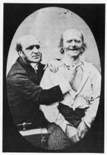
    The “eccentric” versus the “insane” in Victorian England may well have been identified by the amount of available disposable income–if you could afford your whimsy and misery, then you were “eccentric”; if not, then you  were “insane”, which also meant that you were culpable of being scooped up by The Authorities and interned if you turned out to be a larger/smellier/more obnoxious nuisance than a simple dot of the street.   That or you may have wound up as an electrically-prodded subject in an experiment by Charles Darwin (Expression of Emotions….).   In this way the past telescopes nicely into the present, less the electrical stimulation bit. 

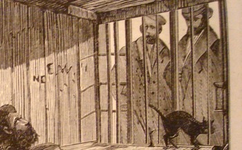
    The image shown here is that of Mr. James Lucas, “the Hermit of Red-Coat’s Green, (near Hitchens)”, living his life inDsc04646_3
    a most uncommon hermit-like fashion, even for a hermit.  Seems to me that a hermit would be removed from society and be away from people; Mr. Lucas may be of a singular caste of that genre, living his life alone in the very midst of society–he lived in the kitchen of his townhouse, in a single room with a window to the street.  There he lived out his life in full and constant view of the passersby on the busy sidewalk.  Crowds would come by and stare, and Mr. Lucas would stare back–he would rarely, if ever, communicate, though he would (“he was not miserly”) give out “farthings and gin” to “swarms of tramps”, no to mention sweetmeats to children.   He’d watch people watching him.

    He also didn’t write (except we are told “upon a check”), and made no physical effort to retain anything that he thought about; nor was the reason for his uncommon lifestyle made known.

    He was one son of “an opulent London merchant”, and in time proved to be an incorrigible and strong-willed non-conformist (with the funds to do so in some comfort).  He evidently went completely over the edge when his mother died, and after a year of keeping her body in the house removed to the kitchen, where he spent the rest of his days (living there from 1850 to 1874).

    Detail
    After he died and his room cleaned out for the sale of the family’s property, it was discovered that the floor was covered in two feet of ashes and soot from the kitchen fireplace.  Without the family money Mr. Lucas surely would’ve wound up on a cadaver table long before his seventieth year, suffering real social Dickensian travail rather than that which existed just in his mind.

  • Underground Horses, 1875

    JF Ptak Science Books   Post 22

    Unusual cross sections have always fascinated me–they are an X-ray of the techy-inards of the physical world , showing you a slice (literally) of the Unseen and Unapproachable. 

    Mine_height_2

    The first engraving here is of an (unidentified) Western-U.S. mine, printed 1869, and shows the comparative depth of an un-effacing mining operation in terms of height, nestling it in against Trinity Church (NYC).  The “21 stories” depth  of this mine would have been astonishing to the 1869 mind thinking of it in terms of height. Few office buildings in NYC for example exceeded 5 or 6 stories at that time. [It was in 1872 that the tall buildings’ fortune turned, as C.W. Baldwin (working for the Otis Company) invented the geared hydraulic elevator, meaning that buildings could now be taller than the strength and endurance of its occupants’ legs.  (Actually, to my mind it is the invention of the elevator safety brake that clinched the deal, making it safe to enter an elevator and expect to survive the experience.  There’s a lot of other stuff that comes into play, not the least of which is steel framing, lightening the buildings weight and displacing the weight from its’ normal receptacle of the foundation, but I digress.) ] So trying to imagine something that was 15 time the height of the spire of Trinity Church was doing some pretty large-scale imagining. 

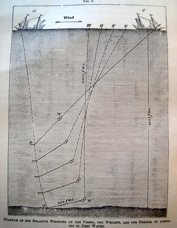
    A corollary the the height of the mine is, perhaps, a cross section of the depths of waters. Here we see an 1877 illustration from an article on new methods of determining the depths of ocean waters, giving a very clear indication of the enormous “height” of the ocean even in its most measurable (and not-so-deep) section.

    Depth_sounding 

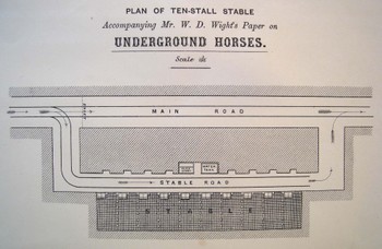
    I simply could not resist this 1875 engineer’s drawing (“Plan of Ten-Stall Stable….for W.D. Wight’s Paper on Underground Horses”)–and yes indeed these were horses kept underground, used for hauling the heavier wagons (on tracks) of whatever, brought out to these larger chambers by men doing the same work with lighter loads in smaller areas.  (For perhaps the best description ever of men at work in a coal mine, see the gorgeous George Orwell’s Down and Out in Paris and London)Underground_horses

    This is one of those images I think that will elicit a pretty light-hearted reaction until your brain catches up to the reality of what the print is really depicting.

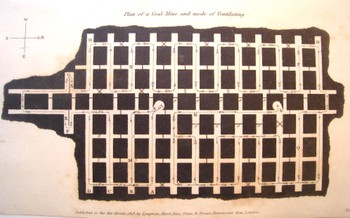
    Coal_mine_black_3


    This  image is actually much rarer than a mining cross section–it is a plan (looking from the top and down) of a mine showing the mode and direction of ventilating the whole bit, printed in 1818.  (As it turns out it is rarer still to see a plan depicting a mine’s numerous layers–I’ve honestly not seen another one of these done before 1900.)  What an incredible image this must have been to the early 18th-century eye, seeing such a novel, and rare, depiction of (important!) data.

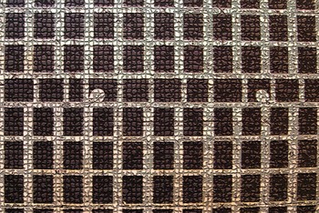
    Mine_cross_mosaic

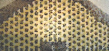
    In the Victorian panoply, the technological temple ma have had an entryway mosaic constructed from the idea of the mine cross section or plan–it is a structural, semi-architectural bit after all, made to withstand advanced weight and pressure.  Or how about a mine cross section template for a stained glass window?  I can imagine the Temple of Technology boasting a design schema of nothing but elements like these–those people trusted, perhaps even worshiped, the small and great mechanical machines and contrivances of their era.  All you have to do is look at the housings for even some of the simplest objects and you’ll find a metallic skin of awe and beauty, a symbol of admiration and respect for analog creativity.


    Mine_stained_glass

  • The Sovietesque Disappearance of Pacioli’s Rhombicuboctahedron

    JF Ptak Science Books LLC  Post 23

    What?

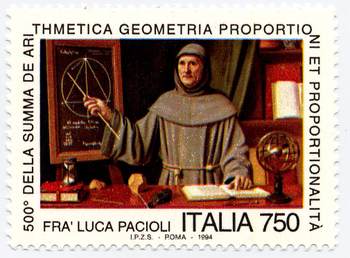
    I’m lodging a complaint, 16 years after the fact (though new to me), about the Italian commemorative stamp honoringBlogpacioli
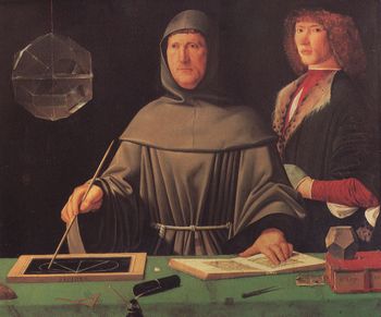
    the great Fra Luca Pacioli—a great mathematician, inventor of modern bookkeeping, and friend and dispersal-agent of/for Leonardo da Vinci—it also seems to be the first representation of a living mathematician.  The stamp is based upon and freely rearranges (to the point of obsidian abstraction) elements of the famous painting by (perhaps) Jacopo Barbari (and painted in 1495), which now hangs in the Museo di Capodimonte (Naples). 

    The painting has been reproduced in mathematics books and such many times over—with good reason, as it is a gorgeous work and is filled with lots of mathematical bits and pieces. 

    The stamp, however, is a curious and annoying work if you are at all familiar with the original.  The most glaring but not most important change is the Soviet-like loss of the figure to the right of Pacioli—althoughBlogpacioli_stamp
    not positively identified, some believe it is Guidobaldo, and others believe it to be the very pretty Albrecht Durer.  He’s gone, replaced by some sort of out-of-century bookcase.  I’m not saying that whoever this happened to be needed Stalinist disappearing  for political reasons, but it upsets the entire composition of the painting, and leads to other more foul errors. 

    The closed red book on the table is moved and an hour glass is placed on top of it, taking up the slate that was there in its place in the original, which is now hanging on the wall.  It is highly unlikely that Pacioli would provide a demonstration in this matter. 

    Also the mathematical notes here are slightly different from the (correct) references to Euclid’s Elements Book XIII, proposition 12 (If an equilateral triangle is inscribed in a circle, then the square on
    the side of the triangle is triple the square on the radius of the
    circle.)

    An armillary sphere makes a curious appearance, and a few of the mathematical tools on the table top make disappearances.  The sphere may be the artist’s attempt to make up for the loss of other symbols, as the sphere represents the Platonic music of the spheres, successive levels of forms being built one on the other and so representing the universe.  (Plato’s
    Republic, where, in the Myth of Er he wrote,
    “. . . Upon each of its circles
    stood a siren who was carried round with its movements, uttering the
    concords of a single scale.”
    [Republic p.  354])

    The important item that is kept on the stamp from the original (though moved) is the polyhedra form, the dodechahedron, one of the great Platonic solids, and a figure composed of 12 pentagons.  It is a highly symbolic link between ancient thought and the rise of the new mathematics and even newer art. 

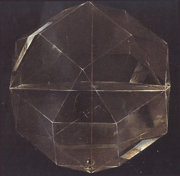
    The most important missing item, though, is the glass object hanging at the left of the painting—it is theBlogpacioli_rhomhb_close
    rhombicuboctahedron.  This object is one of the thirteen semi-regular (or Archimedean) solids, and has 26 faces made of 18 squares and 8 equilateral triangles, with 24 vertices and 48 edges.  It is constructed of glass and hangs by a string, and is half-filled with water.  It is spectacularly shown in the painting by Barbari—it is simply a glorious achievement of perspective and light and shadow.

    And, as it turns out, reflection.   In a superb 90-page article by Nick Mackinnon: (“The portrait of Fra Luca Pacioli”, The Mathematical Gazette, 77 (1993) pp. 130 – 219).  Mackinnon combs through the painting with microscopic precision, and in this case reveals that there is an exterior reflection (of s house) on one of the bottom panels of the figure. (Good work!  He even goes on to try and figure out what it is we are looking at in the reflection.) 
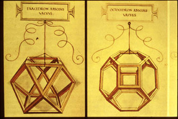
    It is annoying for this figure (or a shadow or hint of this figure) not to be on the stamp because of its beauty and symbolism.  It is none other than Pacioli’s friend, Leonardo, who illustrates his book Divina proportione—a masterpiece of thinking and illustrating, introducing the concept of the divine proportion (phi) and its importance in design and in nature in general. Perhaps of greatest significance though are the illustrations of some of the figures in the book, which I believe are the first time that people are able to see geometrical drawings in perspective, which is a very big deal. 

    Unfortunately this link is pretty much missing without the Rhombicuboctahedron—you don’t have to know how toBlogpacioli_da_vinci
    say it to appreciate it.  (Or as Bernard Malamud writes in the Natural, when discussing a spaghetti dinner “I don’t know how to spell it, but it sure eats good”.)

    All I’m saying is that the designer for the stamp shouldn’t been consulted, and the Italian government should just have used the original as the basis for the stamp.  After all, they didn’t remove the backgrounds of the Mona Lisa or the Last Super because they were too-conflicty with their subjects in those commemorative issue stamps, did they?

    Oh, I forgot–they did. 

    Here are a few good books to consult if you’re interested in polyhedra:

    H.S.M. Coxeter, Regular Polytopes.  Coxeter was perhaps the most impressive geometer of the 20th century.
    Peter R. Cromwell, Polyhedra.
    H. Martyn Cundy and A.P. Rollett, Mathematical Models
    Alan Holden, Shapes, Spaces and Symmetry. (Very pretty!)
    Peter Pearce, Structure in Nature is a Strategy for Design.
    Magnus Wenninger, Polyhedron Models.  (Paper construction!)

    ·Posted by :

    ·in:

    —
  • The X-Ray of the Imagination 2: Phrenology, Chinese Hell Scrolls, and the Beauty of the Thought Balloon

    The X-Ray of the Imagination:  Internal Dialog, Demons, Humors, and Picturing the Stuff of Thought–On the outer shapes of the inner container

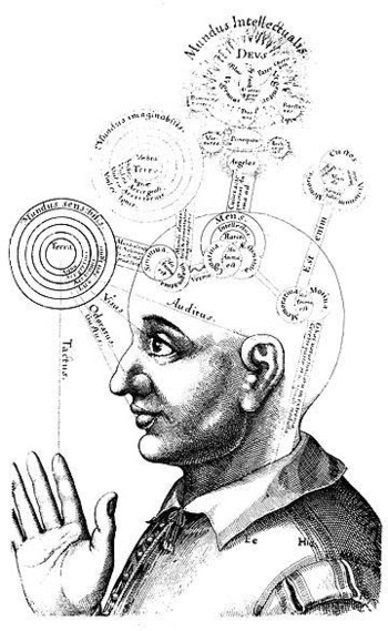
    In an earlier post I wrote about what I thought was the first graphic representation of  the process of forming andBlogxrayfludd
    imaging a complex thought (found in Francis Galton’s Visualizing Numeracy). It is interesting how people tried—over a long period of time—to get at exactly that, the inner process, via some sort of external means, which is almost entirely left in the not-so-exclusive world of the science-like.

    Perhaps the greatest early effort (and certainly the most beautiful yet) to ascribe physical locations and attributes to the mind was the work and drawings of Robert Fludd.  That would be Dr. Robert Fludd (1574-1637), occultist/philosopher, randy logician and hermticist astrologer pseudo-scientist; and maybe the best of his work is found in his fabulously titled work Utriusque Cosmi, Maioris scilicet et Minoris, metaphysica, physica, atque technica Historia (The metaphysical, physical, and technical history of the two worlds, namely the greater and the lesser…), published in Germany between 1617 and 1621.  Things get very deep and complex and confusing, even in the illustrations; so as far as being a key to human knowledge, Fludd probably relaxed the confusion boundaries more than he strengthened insight—but maybe that was supposed to be his job, what with supposedly being a Grandmaster of the Priory of Sion

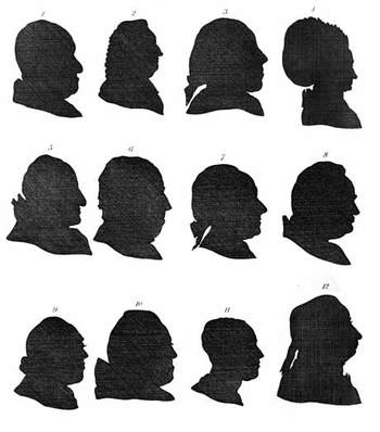
    Another great effort in the attempt to physically determine what might be going on inside someone’s brain and mind were the physiognomists. Physiognomy (does it really matter how it is spelled?  I should think that if I was to try and determine how I should spell the word using the very methods its practioners employed that the spelling might change daily…) from the Greek, basically meaning “nature” and “interpret”, claimed an ability to judge the scope of a brain by the shape of its container—the skull.  If a skull was sunken or distended or high or pretty or what have you then this shape in some way related to the development of that area of the brain.  So a high forehead could mean great insight or knowledge or intellectual ability; a low, sloping forehead meant, well, not, and to steer clear of such people with yourBloglavater
    hand firmly on your purse.  An early practioner was the very formidable Thomas Browne (1605-1682) (in the Religio Medici), but the powerhouse thinker (as it were) was Lavater (1741-1801), who caused and challenged all manner of mischief. The democratic nicety of this pseudo-science is that you didn’t really need to be associated with any extended scientific thought to engage in its application—a nice silhouette-maker would do, along with a series of interpretive and a decent personality was about all you needed.  A nice clear forehead would help.

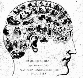
    Nipping at the heels of Johann Caspar Lavater and company was Franz Gall (1758-1828) and the Phrenologists (from the Greek again, “mind knowledge”), who made a slight step beyond simple head shape by “reading” the bumps and indentations of the skull.  Their educated fingers were in this way were supposed to have the capacity to feel the special elements of that part of the brain manifesting itself via cranial nodules or something.

    Blogphren
    Pathognomy was yet another step in the stairs to the flooded basement, where passions and emotions resident in the voice, or gesture, or facial expression, would somehow reveal the structure of the mind.  I found this one pretty curious because it concentrated on the motions of the physical ramifications of the brain, which somehow seemed very elegant in a ghost-like, narcotized way.

    But this is just the attempts to ascertain thought—actually picturing it, literally, was not all that common.  Dreams,Blogxraycruikshank
    fears, thoughts, pain, interpretative inner dialog—seems to have occupied artists far less than love or creed or ambition or devotion.  Being able to “see” someone’s pain, or nightmares, was really quite special.

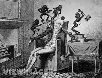
    Thomas Cruikshank made this a sub-specialty for himself, depicting people suffering extreme anguish as a result of gout, or delirium tremens, or fear, and anthropomorphizing them, giving these concerns/fears/pains a human-like quality.  So instead of seeing  a badly inflamed gouty ankle and imaging its pain, we see anti-cherubs, demons, spikey creatures at work on the ankle, pricking it, setting it on fire.

    Bosch of course performed miracles in setting out the fear of the Lake of Fire in very explicit, basic, understandable ways.  In my opinion though the Chinese Hell Screens (as a genre) have Mr. Bosch beat by a long mile, as they were terminally specific in elucidating even what might seem to be trivial transgression for the casual viewer.  (For example, a person who wasted paper would, according to one scroll, spend eternity in a lake of flaming feces, bobbing to the surface occasionally to be stuck in the face by a flaming spear.  Now THAT’S Hell!)

    We have certainly seen people in the throes of nightmare in art, but the relative subtlety of the visions of HenryFuseli
    Fueli (The Nightmare, 1782) and William Blake (“Jeruslaem”, 1820, for example) and of course Fransico de Goya’s “The Sleep of Reason Produces Monsters” (from Los Caprichos) really do wane in comparison to some of the highly explicit horrors of Cruikshank and James Gillray and Thomas Rowlandson.  Perhaps this is so because the later group seems to address the masses and making the nightmare more universal, visiting the ample-butted poor as it would the couch-bound Faintress of the Upper Classes. (I guess I should really remove Goya from the former class, as he really did intend to reach the working poor as much as anyone else.)

    I’ve wondered about the artist Arcimbaldo—the genius portrait painter whose artistic palette was fruits and vegetables—and whether his use of various types and shapes of foods were supposed to correspond to any internal dialogs in the person sitting for him but, well, I think not.  Nice thought, though.

    Most effective though in graphically revealing the inner workings of someone’s mind is, yes, the word balloon, which takes a second seat to its younger sibling, the glorious thought balloon.

    What a fantastic creation!

    The word balloon, or the idea for it, exists for quite some time in Mesoamerica, incised in sculptures from 1000 yearsBlogxrayyellow_kid
    ago.  (See Hull, Kerry Michael (2003). “Verbal Art and Performance in Ch’orti’ and Maya Hieroglyphic Writing”).    Something that we begin to recognize in a more modern form comes up in the 12 th century with word scrolls—elegant, flowing, appealing bits of fabric upon which the words of the person in the painting are written.

    Word balloons really come into their own in political art in the 18th century (and do have a very curious, artistic affect in their longish, elongated appearance with tiny 3-point type inside).  Sometimes the word balloons look like smoke with words in it—these might be my favorite, as they give the clear impression of the immediate and dissipating nature of most speech.

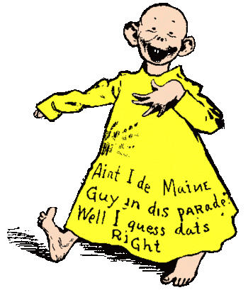
    The Yellow Kid, generally acknowledged as the first “cartoon character”, at first had his speech written directly on his flanged shirt.  It was around 1896 (I think!) that the words moved from his apparel and into a balloon over his head.

    The most beautiful innovation though came a little later (exactly when I’m not sure, I’m sorry to say) with the invention of the thought balloon.   What a magnificent idea!  Why hadn’t this concept been employed earlier, anyway?  How come it took until that unparalled period of time—1895-1915, when virtually everthing became “modern”, when just about everything (save politics, unless you include the creation of the concentration camp) experienced a paradigm shift—and not earlier?  Certainly it is common and debased, and runs amok with the very idea of art and its attempt to show the viewer the inner machinations/beauty of its subject; but wouldn’t it be interesting to have the thought balloon for Lisa Gheradini (the wife of Francesco del Giocondo, “Mona”)?

    Well, probably not.

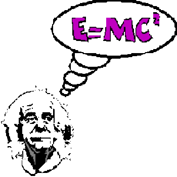
    But the thought balloon–bubbly, cloud-like apparitions above its thinker’s head—certainly has it place, and isBlogthought_bubble
    absolutely a more elegant invention discerning thought than Lavater or even the lovely Mr. Fludd could ever dream.

    ·Posted by :

    ·in:

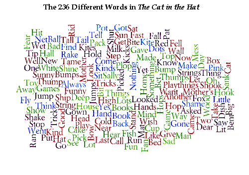
  • Dr. Seuss and the 236 Words that Changed Reading Forever

    JF Ptak Science Books

    I think that it is difficult to overstate the importance and long-term significance of Dr. Seuss‘ (Theodor Seuss Geisel, 1904-1991, son and grandson of brewmasters) contribution to childhood.  I think that it is impossible to calculate the overall impact of his bringing young people to the joy of reading, and to the familiarization  with the bare mechanics of how to read.  Of course he told a great story, but his books were literally page-tuners—they were simply written with words useful to children, with few words per page, thereby allowing the child to see the pictures, read all of the words, and turn the page, giving them a sense of accomplishment along with enjoying  a fine story.   Perhaps it is the getting-the-kids-used –to-reading that was his most fantastic accomplishment—and something that few others have achieved, measuring by just pure numbers. 

    Blogcathatbook

    And the way in which he did this was to artistically use an extremely limited budget of words—Dr. Seuss used precisely 236 different words to write The Cat in the Hat.

    It is certainly true that there have been many sparse, relatively wispy papers in the history of science form which enormous change has sprung..   Pound-for-pound though The Cat in the Hat holds its own. 

    I’ll give the entire list of words below—just have a peek, and try to imagine writing something interesting with just this palette. 

    Wordle--cat in the hat

    It isn’t fair at all to compare this masterpiece with others in different genres, but just to give you an idea of its relative simplicity I’ll quote some numbers taken from an incredible study conducted by Zachary Booth Simpson (“Vocabulary Analysis of Project Gutenberg”).  Simpson’s interpretation is more complex than the story I’ll tell here, but basically he looks at the numbers of words in a piece of literature (for example) and then convenes the number of different words, deducing the actual and then relative density of word usage, which is pretty interesting (and verifies that pit-of-the-stomach feeling about which authors use more words in smaller space). 

    Gibbon’s Decline and Fall seems to lead the way in the absolute number of different words used (43,113!!, which is astonishing), in the 1.5 million word text, while old Uncle Bill uses 4,842 words in the 32,000-word Hamlet—meaning that Measure for Measure (sorry) Mr. Gibbon out-Bills Bill, which I thought was very hard to do.  Other interesting bits are Hugh Lofting’s Doctor Doolittle, who tells the story with 2759 words; Moby Dick, told with a spectrum of 17,227 words; and Les Miserables is painted with 23,334 different words.  The only work that comes close to Seuss in Mr. Simpson’s very considerable list is the New McGuffey Reader, which is really, actually, a tough go, and uses 630 words.

    Unfortunately I do not know about the Dick and Jane readers But they’re no match whatsoever for the Good Doctor.

    So my hat is off and off and off to Theodor Geisel, aka Dr.Seuss—on the anniversary of his anniversary in Seussland, where it is Seussqunetennial every day.

  • The First Photograph of a Smell

    JF Ptak Science Books LLC 

    It leaves me with such a cozy
    feeling to not find what I think is an obvious-but-odd phrase in Google.Dsc04716

     And that’s what happened with
    “the first photograph of a smell” (or “photograph of a smell”
    or odor, for that matter),  as shocking
    to the senses as it might be.

    There are long and interesting lists
    of firsts in photography: the first
    color photograph (Maxwell, 1867, but impermanent), the first photograph of a
    human face, the first photograph of the moon, the first photo of a planet, and
    so on, tirelessly, until we see how many derivations of “firsts”
    there are. (We can go from first photo
    of human to first photo of a human face to first photo of a human in motion to
    the first photo showing human hands to the old human recorded by photography
    tot eh first photo of a couple to the first photo of a human with a tool and on
    and on.) There is a shorter list of “first photographic non-photograph of
    a photograph”
    (?!) that I wrote about in an earlier (illustrated) post,
    but we won’t go there today.

    Here is a “first” though
    that I think hasn’t been dealt with too terribly much: the first photograph of an odor.

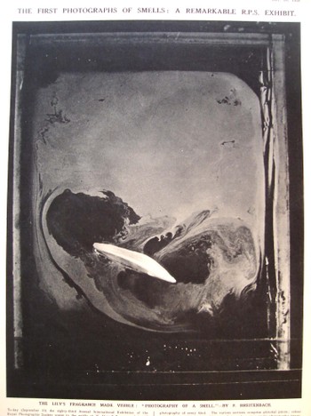
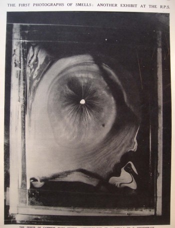
    These beautiful images appeared in the 10 September 1938 issue of The
    Illustrated London News and were exhibited at the 83rd Annual International
    Exhibition of the Royal Photographic Society, and were made by H. Devaux (who
    evidently, according to the snippet of an obituary that I can see from Science
    magazine, was a plant physiologist and “pioneer of surface physics”Dsc04717

    who died in 1956). The note accompanying the photographs read: “The emission of an odor involves
    volatillisation of material. If an
    odiferous material is enclosed in a cell a few millimeters above a clean
    mercury surface, it is possible to collect on the surface of the mercury a
    monomolecular layer of the volatillising or odoriferous substance. If the mercury surface initially is covered
    with talc powder, the gradual formation of the monomolecules layer may be
    observed as the talc is gradually pushed away from the point immediately below
    the specimen of material.”

    The photos
    are that of the odors of a lily and of camphor. I don’t know which is which, and a good story could be made up for
    either photo belonging to either item. Needless to say, these images are as gorgeous as they are unexpected,
    especially considering that they were made in 1938.

    FOOTNOTE:

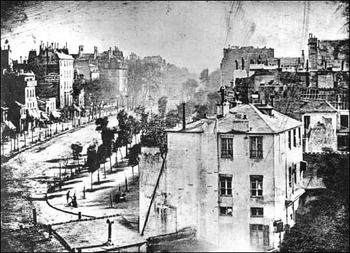
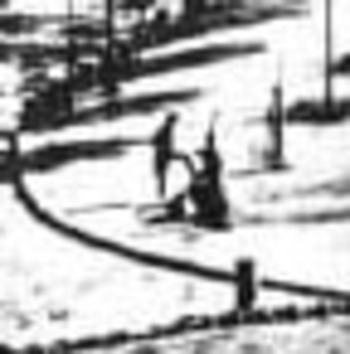
    I’d just like to add here the first photograph of a human being–well, actually, it is the first photograph that just happens to capture a human in the emulsion (discussed Blogoldest_human_photo_2
    very nicely on the Doug’s Darkworld  blogsite.  Since the  exposure time was so terribly long for this image to be made, the moving people and horses and carriages on the street, all of the city-life bits, were necessarily spectral, invisible, to the photograph.  Only the stationary items were captured, and the only people captured here were two figures in the foreground, doing something or other that made them still for at least five minutes–long enough for their anonymous but famous photonic impressions to be captured.   Mr. Doug and others seem to think this is a man getting his boots shined–I agree.
    Blogoldest_human_photo_detail

    ·Posted by :
    ·in:

Recent Posts

Archives

Categories