A Daily History of Holes, Dots, Lines, Science, History, Math, Physics, Art, the Unintentional Absurd, Architecture, Maps, Data Visualization, Blank and Missing Things, and so on. |1.6 million words, 7500 images, 4.9 million hits| Press & appearances in The Times, Le Figaro, Mensa, The Economist, The Guardian, Discovery News, Slate, Le Monde, Sci American Blogs, Le Pont, and many other places… 5000+ total posts since 2008.

  • The World of Words & Some Hidden Future-Physics Poetry of 1826

    JF Ptak Science Books LLC   Post 197

    Blogaugust_13words_small383_2

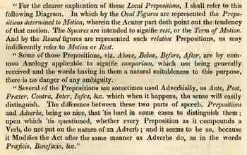
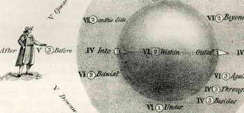
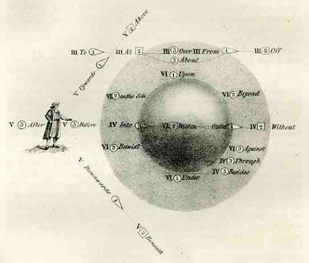
    I found this interesting image in David Booth’s An Analytical Dictionary of the English Language in which the Words are Explained in the Order of their Natural Affinity, Independent of Alphabetical Arrangement...(2nd edition), printed in London in 1836.  In it on page 187 he quotes a long section from an earlier work by Bishop Wilkins Essay Towards a Real Character and a Philosophical Language (1668) on the properties and classifications of prepositions.  Wilks defines prepositions in the following way:  “prepositions are such particles whose proper office sits to joyn Integral with Integral on the same side of the Copula signifying some respect of Cause, Place, Time or other circumstance wither Positively or Privately.”  Indeed! 
    Blogaugust_13words_middle382

    He then spends several pages looking at the combinations of prepositions, distributed into six classes.  The illustration below is meant to illustrate classes 3 through 6:  the third containing the combinations “doth consist of such as respect to Space, in general”; the fourth “in respect to Space, with a particular restriction to the notion of containing, being absolutely determined to Motion; fifth, “doth contain such Prepositions as relate to the Imaginary parts of a thing”; and sixth, “such Prepositions as are applied both to motion and rest, relating to the situation of some third thing spoke of….”

    And so on, and of course it all makes sense in ways that I’ve not about in many years—but I’m just so attracted by the language and the many nearnesses to some very big ideas in physics, and the great and distinctive beauty of the illustrative diagram that I just needed to pass this along before it dipped away forever into the shadows. 
    Blogaugust_13words_text384

    ·Posted by :

    ·in:

  • Atomic Bomb: Operation CORONET, the Japanese Endgame, and the use of the bomb.

    JF Ptak Science Books LLC  Post 198

    Not to be overlooked in this thread on the decision to use the atomic bomb was the long and deadly end-game to the Pacific War planned in pre-use atomic times.  The fact of the matter was that semi-defeated Japan (former Prime Minister Konoye told the Emperor privately in February 1945, “I think there is no longer any doubt about our defeat”), was still not remotely close to surrendering, or at least not abiding the possibility of unconditional surrender, in July 1945.

    The U.S. plans for the final push on Japan began to form in 1944.  It was a massive and complex operation, which was to begin in November 1945, with the aim of subduing the industrial homeland of Honshu, striking a death blow to the teetering ability of the Japanese government to supply civilian goods and metal materiel.  The first stage of the attack was called Operation Olympic, and was to take place at Kyushu; but as large as this attack was it was still preliminary to an ever-more massive Operation Coronet—in all, there was to be a 5-million man combined U.S.-Britain invasion army with the largest air and naval support in the history of warfare.

    “Hell was upon us, when we lost Saipan,” the Chief of the Japanese Naval General Staff told American interrogators shortly after the war. A high-ranking NGS planner explained: “After the Coral Sea and Midway, I still had hope. After Guadalcanal, I felt we could not win, only we would not lose. After the Marianas, we had little chance. After Okinawa, it was all over.”—”Olympic vs. Ketsu-Go”, Marine Corps Gazette, August 1965, vol 49 no 8, by Jack Bauer and Alan Coox.  For the full article see here.

    Whether or not this view was shared with other members of the ruling elite didn’t come into play, as the Japanese high command continued to plan for the defense of the homeland.  There were still 2.3 million Japanese armed forces in the islands (53 infantry divisions and 25 brigades); there was also a 2.25 million force of army workers, 1.3 million Navy workers, and a National Volunteer Militia of 28 million.  There would be a colossal confrontation along the length and breadth of the country of Japan.

    Bauer and Coox continue in their paper (from which I’ll quote at length)
    :
    “The greatest danger to the assault was assumed to come from the air. The Americans expected opposition from 5,000 kamikazes, a realistic estimate in keeping with Japanese plans (KETSU-GO Operation). These called for 5,000 planes to be expended in attacks on the invasion force, whose appearance was expected sometime after September. The Japanese estimated that the assault force would be carried in 1,000 transports and that if half were sunk in the first ten days the landings could be smashed. Using the 1:6 ratio derived from their Okinawa experience, Japanese planners estimated this would require 3,000 planes. They assigned an additional 350 kamikazes to attacks on the carrier forces. The remaining 1,650 included those under repair and lost before the attack. As late as 15 July, however, only 70% of the required planes were in hand so it seems reasonable to assume that aerial opposition would have been less than expected.

    “Covering the Japanese home islands were four ground armies of eight ground divisions (one in Kyushu and five in the Kanto area), plus three brigades, four AAA divisions (with 1200 guns), and 14 cadre divisions.
    “From the outset of 1945 the Japanese High command struggled to improve the defensive posture in the homeland where 2 1/2 million men were supposed to confront an invasion. It was hoped to transfer many troops and munitions home from the Asian continent by autumn, but this task grew more difficult with the acceleration of American assaults, and the consequent decrease in Japanese strength. In January 1945 the first joint Army-Navy operational plan was devised, stressing decisive combat in the homeland but the gaining of time through delaying operations on the periphery, especially Okinawa. Surprise and “special attacks” (a euphemism for suicide assaults) were to be the main points of Japanese strategy. The front line of the heartland perimeter would be southern Kuriles-Bonin-Ryukyus-Taiwan-Shanghai. Operational preparations against American landings would be accomplished in the regions of the Kanto, Kyushu, Eastern Sea (Tokai), and South Korea. Particular emphasis would be ascribed to air defense of these districts and the Osaka-Kobe (Hanshin) section. Every effort would be made to destroy the attackers while they were still in the water, in the main battle theater of the Pacific and the East China Sea.

    “Immense manpower levies were to be raised, on the basis of the new operational plans, within a few months: 56 divisions, 38 brigades, etc.-involving between 1,500,000 and 2,000,000 new men…with 450,000 men on Kyushu with 220,000 of those (including five field divisions) south of the line Minamata-Nabeoka. An additional three or four divisions were believed available in the northern part of Kyushu as reinforcements while a small additional force could be committed from Honshu. Intelligence estimates, however, predicted that few troops would be committed from Honshu in order to conserve them for the defense of the main island.

    “By March 1945 the General Staff had completed an outline for the defense operations (coded as KETSU-GO). All homeland area armies were directed to send their chiefs of staff and key officers to examine the draft informally in Tokyo. Exploiting the terrain of the home islands, and exhorting the fighting spirit and cooperation of the 100 million Imperial subjects, all Navy and Air Force remnants were to tackle the special-attack mission of destroying enemy forces while still at sea. But since Japanese naval power was almost destroyed, and the air units were so weak, homeland ground formations (deployed in depth and massed in decisive battle sectors) would take the offensive against enemy troops who managed to land, and would “recoup in one stroke the declining fate of the Nation.”

    I mean to point out in all of this that the business of attacking Japan would have been a spectacularly costly and monumental military step, and that his was the major thought in the minds of the American decision makers so far as the military use of the atomic bomb was concerned.  Truman had all of this in his head when he authorized the use of the bomb—most of all I am sure he had the hypothesized American casualty reports for these operations, which numbered in the hundreds of thousands and above.  The one thing that all of the major decision makers had in their minds at this time, in July 1945, was that the bomb would somehow be employed, one way or another.  I’m not aware of any major player having any other thought in his head at this time.  (John McCloy was one, but as Asst Secretary of State, he wasn’t a major figure.)  So, when one is thinking about The Decision, one certainly has to be aware of the non-bomb, non-surrender military aspect of ending the war, and this is one part of it. (There were some half-million Purple Heart medals made for this invasion in 1945–these Purple Hearts were subsequently awarded to  the casualties of the Korean War and through most of the Vietnam War until the 1945 medals were depleted.)
    ·Posted by :

    ·in:

  • Empty, Blank and Disappeared Things 7: the Skies of Krazy Kat

    JF Ptak Science Books LLC  Post 199

    The Empty and Blank Thread continues, this time focusing on the blank and empty skies of three cartoon strips from the first few decades of that medium.
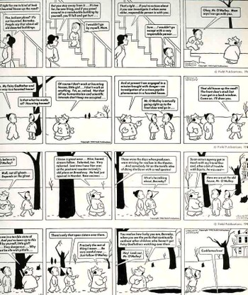
    Blogaugust_14empty_ross387The first of these empty skies comes from the beloved creator of the Harold and the Purple Crayon series, Crockett Johnson (the pen name of  David Johnson Leisk,1906-1975) in his comic strip, Barnaby, which ran from  1942-1952 and 1960-1962.  It was an advanced comic for kids, I think, detailing the adventures of five-year-old Barnaby and his tubby, stubby, stoggie-munching fairy godparent, Mr. O’Malley.  Johnson’s lines were very simple but very supple, taking up a lot of space for its characters and the foregrounds he chose to draw–he just captured a great amount of space with minimal effort, like a good GO player.  The backgrounds were, by-and-large, almost entirely blank, but seemed to fit in perfectly, given the fact that there was also very little detail in what he did draw, making for a mostly-white drawn-upon surface.
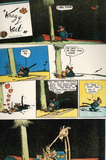
    On the other hand, the skies and backgrounds of Gerorge Herriman’s
    fantastic Krazy Kat were often featureless, but were also quite dark,
    many time just jet black. When I was a kid I found the skies
    scary–somehow they shook the characters “loose” (whatever that
    means)–and even now, even though I find the KK concepts marvelous, I
    still find that the backgrounds leave me a little disjointed.
    Herriman’s (1880-1944) comic, which started in 1913 and ran through the
    1930’s, appeared generally in black and white, though the full flavor
    of the creation is best seen in the color publications from the Hearst
    newspapers.  There was generally not a spec of detail above the
    horizon, unless there was a mountain stuck to it.  Occasionally there
    would be a tiny blotch of a cloud in a flat black (or some contrasty
    color) sky, which I found and find still very unnerving.
    Blogaugust_14empty_krazy385

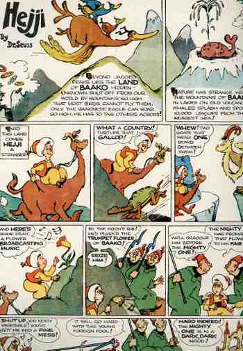
    Thirdly is the strip Hejji by our old friend Theordore Geisel (1904-1991), best known as Dr. Seuss  (Geisel would use his mother’s name, Seuss, which would’ve been pronounced “zoice”, like the great German geologist, but reverted to “soos” for easier consumption by American kids.) It was an early effort by the good doctor, and appeared in the Sunday comic section of teh Hearst chain for about half a year in 1935.  (“Beyond jagged peaks lies the Land of Baako — hidden — unknown. Shut off from our world by mountains so high that most birds cannot fly them. Only the Baakinese eagle can soar so high. He has to taxi others across!”was the introduction to the series.) Here too the cartoonscape ends at the horizon, with almost nothing, blankness, above.  The absence of everything from the sky further heightened the strip’s unusual nature,and to me just calls out for attention for all of the stuff that’s missing. 

    Later on I’ll take a look at some monumental examples of black and empty backgrounds, like Juan Sanchez Cotan and Leonardo, but today let’s just end with Dr. Seuss.  .

    Blogaugust_14empty_seuss386

  • An Answer to Anti-Intellectualism in Wood: the Desk-Cathedral

    JF Ptak Science Books LLC  Post 200

    Blogaugust_14school_desk388
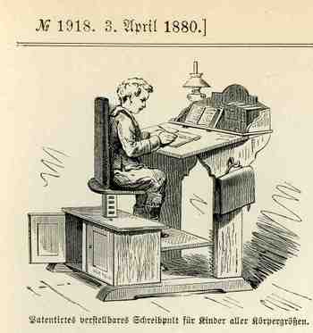
    Richard Hofstadter’s  Anti-Intellectualism in American Life (1963)–an argument establishing the American distaste for intellectual and educational elitism derives from the combat between higher education versus the pragmatic, church-wisdom, common sense Horatio Alger steadfast American legacies–established the American vanity and distrust of intellectual life.  I think.  Maybe what was needed a little more was a little less thinking and distrust of learning and building some greater monuments to the exercise, starting with the very desks that kids use.  For example, this magnificent German school desk leaves nothing to question about the value of learning–the message it delivers is very clear and unapologetic  The desk is its own cathedral, granting the occupier with an instant respect, as in “we take this stuff of learning very seriously, and we take you seriously, too”.  Perhaps if children were granted such a specific importance in the chain of knowledge the overall outcome of education might be a little changed for the better.   After all, isn’t part of the corporate  stick-and-carrot routine the bigger desk? Why wait?  Perhaps if everyone had a proud pulpit to themselves like this from the beginning, we might take the business of learning how to fill up our brains more seriously.  Let’s face it–it would be tough to fool around in surroundings like this. 

    ·Posted by :

    ·in:

  • Propaganda Maps #2: the Nazis. the Big Lie, and Cartography

    JF Ptak Science Books LLC Post 202
    Propaganda_map_czech
    In a quick follow-up to my propaganda post of 4 August I’d like to add a couple of images and also distinguish propaganda maps from anthropomorphic/humorous maps.  Both of the former are Nazi-generated and depict the threat posed by the rest of the world to the German nation.  Somehow, even in 1934, when the first map was published, the German propaganda machine evoked the Big Lie in this depiction of Czechoslovakia’s aerial threat to the Nazi state.  (The Big Lie I’m sure lives in history for time immemorial, but in the 20th century its possession mainly lives in the hands of Adolf Hitler, who in the contemptible and contemptuous Mein Kampf  writes openly and at great length on the importance of using the Big Lie as a propaganda technique. He also recognized and copied the lessons he learned of the plagarized Czarist hate-tool The Protocols of the Elders of Zion, copying the essential elements of its propagandistic techniques. (The Big Lie was called so because it was so huge and incredible that its created statement was thought to be true  because “no one could have the impudence to distort the truth so infamously”.)  This map then is one cartographic representation of the Big Lie.
    Propaganda_nazi_2

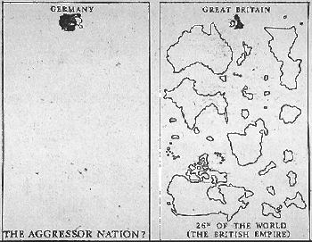
    The second map is a representational presentation of statistical data showing that tiny Germany could in no way be deemed the “Aggressor” nation in the beginning of the war given the colossally disproportionate amount of land masses between themselves and the British Empire.  If you didn’t think about this for more than one second, or if you just needed to believe it,  it would make sense. 

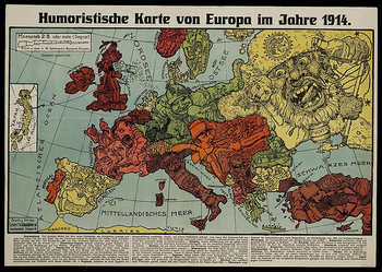
    On the other hand there is a class of maps (such as the following) which may well be very-lightly propagandistic.  (For a wonderful display and description of these maps see the superb bibliodyssey site) These maps are far more intelligent and intellectual than any of the propaganda maps I’ve looked at, and are more satirical in their approach to propaganda and their intent to influence thought and opnion than the outright lies represented in de facto propaganda maps.
    Propoaganda_mapshumorous
     

    ·Posted by :

    ·in:

    —
  • 20th Century Cartoon Outline Art and the Renaissance

    JF Ptak Science Books LLC  Post 200.5
    Blogaugust_15blank_people_barnaby_c
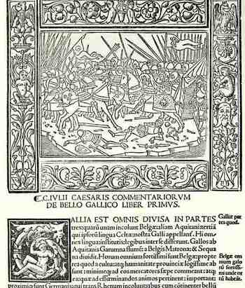
    I just wanted to note that the outline-drawing of Crockett Johnson’s Barnaby (from yesterday’s post)  has some long history.  In just a few minutes I was able to draw on two sources for similar approaches to his art.  The first is from Commentaria..,.(and in the colophon) Impressa mira diligentia Venetiis per Augustinium de Zannis de Portesio….and printed in 1517), and shows a scene from Caesar’s Gallic Wars above the Roman letter text.  The funny thing here is that even these figures are done in very severe outline (and also with a perfectly blank sky), they are surrounded by a very elaborate arabesque floriated border.  (Most of the other woodcuts in this work have shading and other detail work—the blank drawings such as this are certainly outnumbered by them.) 

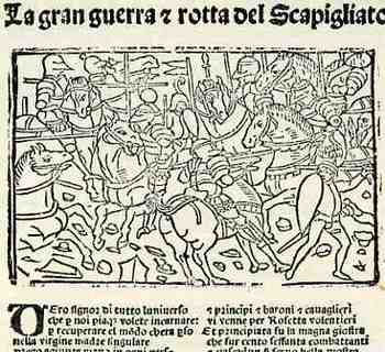
    The second example is a battle scene from La gran Guerra & rotta del Scapigliato (printed in Bressa by Damianum and Jacobum in 1532).  The drawings in the gothic letter text have only brief detail, but the incision is not as clean and crisp as in the earlier work, and simply not as compelling.  There are other earlier examples to be sure, but I just cannot think of them right now.   Suffice to say that the outline drawing has a long history.  The outline drawings themselves are not what I’m referring to in my Blank History, as they are far from being blank, what with the characters having faces and all;  I’m just bringing up some corollary stuff on a bit of the background of outline drawing techniques. 

    Blogaugust_15blank_people_barnaby_2

  • Renaissance Wall Calendar, 1544–a Medical Quack’s Contribution to Astrological/Astronomical Prettiness

    JF Ptak Science Books  Post 203

    Calendar renaissance


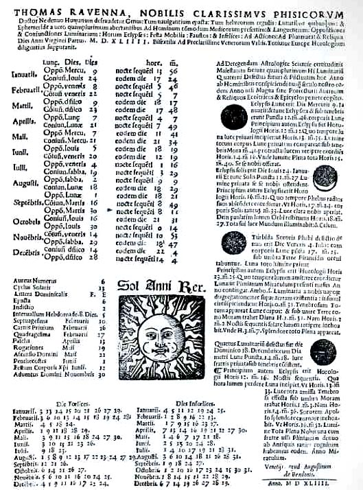
    This is one of the earliest wall-mounted calendars that I’ve seen.  Constructed by Tommaso Gianotti (1493-1577) and printed by Thomas Janothus in Venice in 1544, this astrological wall calender, exhibiting tables of the phases of the Moon, movable feasts, lucky and unlucky days, hours of the sunset, and so on, was a very large, lovely thing of real and soft information.. Gianotti, also know by his more aristocratic name of Rangoni, was a physician of sorts, a man of semi-medicines who practiced some sort of quacky healing arts in Venice.  He was well a very well paid practionner of the questionable arts, evidently surrounding himself with a mixture of mythological care and medicine–so well paid as a matter of fact that he was able to commission several works (on St. Mark) by none other than Tintioretto, paying his way, by the way, to have his own portrait included in the scene, painted by the great master himself. 
    Gianotti did make some minor contributions to medicine, and did study physics and the allied sciences, but his contributions were generally sugary flakes.  He  did make other social, architectural, liturgical contributions–paying for restoration work at the churches of San Guilliano and San Germinamo–though the cost of his generosity was usually a statue of bust of himself, perched above entry ways here and there,    His calendar though was pretty and useful. 


  • The Island of Lost Behavior: Demanded Behavior at the Waldorf-Astoria, 1938

    JF Ptak Science Books LLC  Post 205
    Dsc00021

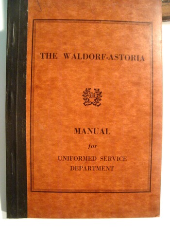
    (The Island of Lost Behavior: Ordained and Necessary Behavior of the Serving Class:  the Manual for Conduct for Employees of the Waldorf-Astoria, 1938.)

    What was the “common sense” part of the instructions for the behavior of employed people to the people they were going to service?  Looking through this manual of corporate correctness it is really pretty extraordinary—sitting here 70 years into the future from this publication—how people were expected and demanded to act in the company of others.

    The Waldorf of course was one of the seminal hotels in NYC at the time and demanded extreme-service behavior of its employees who came into contact with its patrons.  The control of the Waldorf was complete, reaching into the slight depths of performance in all aspects of all jobs.  This pocket handbook was addressed to the uniform staff:  Bellmen, Desk Clerks, Elevator Operator, Bellhops, Doormen, Footmen, Lobby Porters, Service Personnel, Package Clerks and so on came under close control.  In general (and in addition to the House Rules, which was an entrely different publication with other standards of behavior) all uniform staff was supposed to be (sufficiently) kind, semi-invisible until needed, and always quietly helpful–and in the last, to be helpful to a certain point, not helping too much, with a last warning to “give little personal attentions” and  “Never pursue a patron to the point of being officious”.

    Bellmen are to always stand erect and militarily “at ease”, “forbidden to lounge about or lean on counters”.  Professional manners must be maintained at all times, with restrictions on interactions between staff:  “discussions that may be overheard by patrons are not to be tolerated”.  Humming, whistling and using slang are also forbidden, as is checking your hair or clothes in mirrors.  Elevator operators are given even more instructions, and frequently in capital and bold type:  “NEVER START A CONVERSATION” is one, though “do not call a patron by name” is left mercifully unbolded.  “Never look at the patrons” is another must, as is the position of the operator, which is always to have one hand behind his back while the elevator is moving.  When waiting for a patron, the elevator operator is to always stay inside the car, waiting for signals from the elevator starter–and of course it goes without saying that the operator could NEVER leave his car unless in an emergency. (And yes, there was an a position for “elevator starter”, who would direct patron traffic to the banks of elevators and who would also police the actions of the elevator operators.  It is also of slight interest to learn that general elevator service was stopped at 10:00 in the evening (for noise?), with special accommodations made for those wishing to return to their rooms “late at night”.  I really don’t know what that was all about.)    There are strict instructions on how to announce floors, salutations to the patrons according to time of day, and on and on.  It is really quite exhausting–this is just a slight dollop of what is outlined in this 60-page pamphlet. 

    I was talking about this with someone in the service industry–on yachts, to be specific–who, after listening to my quiet screed on the behavior demands of industries gone by, smirked, and asked “you don’t have much contact with the higher-end hospitality game, do you?  Because this sounds exactly the same as what is expected of me.” I was honestly surprised–not being a 5-star guy I didn’t know this offhand, but it of course makes sense that my notions of antiquated expectations weren’t antique at all.

    ·Posted by :

    ·in:

  • Terrific Titles: Gentle Explosives and Flagpole Painting

    JF Ptak Science Books LLC Post 206

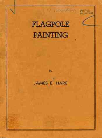
    Blogaugust_18flagpole408 Here are two fantastic (and also completely unrelated!) pamphlets from my Naïve Surreal collection, which have also positively, absolutely never been seen on TV. (As a matter of fact, neither are found in the massive OCLC WorldCat, which librarians use as a cataloging tool and I use as a relative-scarcity engine; and what this means is that neither pamphlet is located in any library collection worldwide.  A bookseller once semi-complained to me that pamphlets such as these which have not been catalogued could very well be in a box in a basement somewhere.  Hm.  That may be true, but what does it matter?  Like  Frenhofer the unfinisher in Balzac’s Unfinished Masterpiece, if it is hidden and unaccountable, it might as well not exist.) 
    Blogaugust_18flagpole_pict410
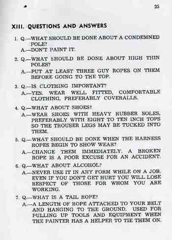
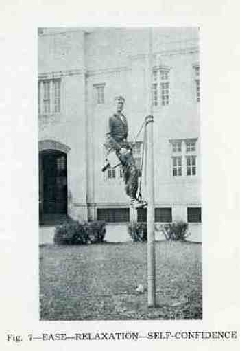
    The first pamphlet, Flagpole Painting, by James E. Hare, is perhaps the Ulysses of works on flagpole painting—according to the OCLC, it may also be the only work ever devoted to the subject.  And it is wonderful!  It is studious and determined, and takes it subject seriously, describing all of the nicks and tucks necessary to do a thorough, correct and injury-free job painting a pole.  The title does produce a chuckle, being so unexpected and seemingly mundane, but it *is* a great work on the subject. 

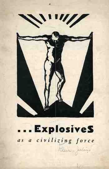
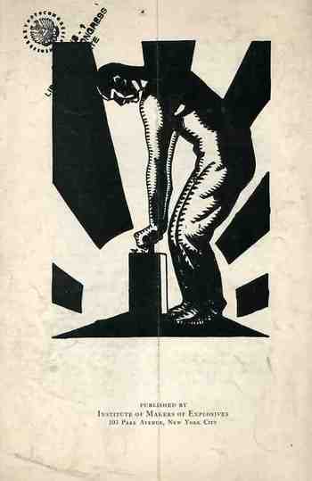
    Even more unexpected is the title of the second pamphlet, Explosives as a Civilizing Force, by the U.S. Assistant Secretary of Commerce, Dr. Julius Klein—a government-endorsed homage to blowing stuff up, published by the Institute of Makers of Explosives (103 Park Ave, NYC).  This is certainly a title you don’t see every day.
    Blogaugust_18explosives411
    Dr. Klein starts off by disabusing the reader of the “bad press” of explosives:  “a good many of us, I imagine, labor under a misapprehension about the explosives industry…we conceive of explosives as an instrumentality of havoc.  But that conception is utterly wrong.”  Utterly?  The man does have a point of course,  which he explains in subject headings like “Dynamite the Liberator”, “Many Unusual Uses”and “Explosives Release Raw Materials”  But “utterly”?  Its a real piece of heavily worked propaganda that makes the case for the economics goodnesses and misunderstood destructive values of TNT. 

    Blogaugust_18explosives_back412

    Blogaugust_18flagpole_text409

    ·Posted by :

    ·in:

  • The Confederacy Surges in 1868–Thomas Nast Buries George McClellan and Andrew Johnson in Southern Soil

    JF Ptak Science Books LLC  Post 207

    Blogaugust_19nast_union413

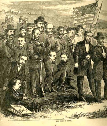
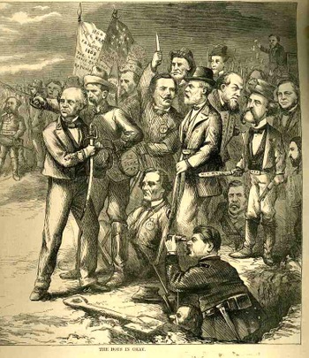
    It is in this complicated, otherwise-involved political graphic statement  that we can find one of the great, quiet put-downs in the history of 19th century political cartooning.  The image belongs to Thomas Nast, a remarkable social artist, who worked very heavily between 1860-1885, producing about 3000 pieces similar to this in level of involvement and complexity—a truly remarkable, verb-laden,  Herculean output.  Very little escaped his microscopic/telescopic vision, capturing interests in the big and small, and also along the way creating our popularly-known images of Santa Claus, the republican elephant, the Democratic donkey, and the Tammany tiger; he also helped to re-elect Lincoln in 1864, destroyed Boss Tweed, and challenged the embarrassing mores on public education, the treatment of African Americans, rights of women, and more. His observations were generally very insightful, mostly cutting, occasionally vicious, but spot-on. He must have lived and breathed his art, because by the time he was 50 he was pretty much done, artistically, after an already 35-year career; he was dead at 62, busted and far from home. 

    In this drawing Nast draws the bead on the 1868 presidential election—the first since the end of the War—between the republican U.S. Grant and Democrat Horatio Seymour.  Nast had no use for the democrats in general, finding them basically odious, and actually treasonous, and he lines the two parties up along the old lines of the Civil War, the Republicans as blue and the Dems as gray (and it is generally true to say that the Democratic Party was closely aligned with the South through this period of time).  In spite of the fact that Seymour (seen here at the head of the jumble of graycoats with the blood-dripping sword) was from Ohio didn’t matter—he was seen by Nast as a continued sympathizer and a wreck on the best thing to do for the South following the war.

    The larger issue for Nast (who pictures himself in the image with the Blues at the lower left, with a steely gaze, sharpening his pencil) goes back to the election of 1864, when Seymour ran as the vice president in the )democrat) presidential campaign of Gen. George McClellan, who is, ultimately, the object of the great putdown.  Nast’s distaste/hate goes far back with the little General, who was at one time not only the commander of the Army of the Potomac but was also Commanding General.  McClellan arrived to the war as a hero of great celebrity, which was wasted in about a year.  As a general in command of the North’s leading army, McClellan suffered as a result of his own meticulous, chess board, keep-it-on-a-shelf strategy of carefully considered inaction; he killed himself, suffocated by his alphabet of cautions and a little bit of Confederate diversionary theatrics.  George never had enough men to suit his attacking the skirting Confederate armies, almost always grossly overestimating the strength of his opponent.  He just wouldn’t go. (Lincoln famously remarked on McClellan: “He has got the Slows!”.)  McClellan was an intelligent and sharp, but he was god-awful immobile and immovable. 

    Blogaugust_19nast_south414_2

    But what really got to Nast was McClellan’s campaign for the
    presidency in 1864 against his former Command-in-Chief. Once he was finally, thankfully, relieved of
    his command, McClellan found political interests, winding up as the Democratic contender
    for the presidency. Early on in his
    campaign McClelland adopted a policy—which was subsequently scrubbed but not
    forgotten—calling for ending the war and negotiating a peace and settlement with
    the Confederacy. Nast hated him for this
    move. McClellan actually received 45% of
    the popular vote running against our best-ever president and with the country
    still at war (although he was obliterated in the electoral college 212 to
    21). I have no idea, really, what
    McClellan was thinking.

    Now, getting back to the 1868 election. Again, the republicans and democrats were set
    out on the battlefield and battledress of the just-finished war, blue and gray,
    respectively. In blue we see US Grant
    and Shuyler Colfax (his VP, standing just behind him), while in the crowd we
    can find

    Sherman,
    Greeley, Burnside and a host of the other Union greats. On the opposite side is Seymour with the dripping sword with the
    backing of his VP Francis Blair ; Jeff Davis
    is sitting on the ground, Lee is otherwise occupied, and a host of other
    Confederate icons stand wide and deep.

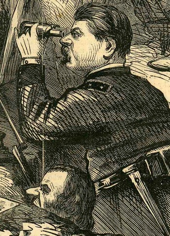
    Nast again is looking with squinty eyes across the field,
    where he has placed, mole-like, the Union General McClellan, emerging from his
    hole, having dug his way over to the Other Side, and now observing the Unionwith a telescope. Such was Nast’s distaste for McClellan that he placed him, before all
    others, on the opposing side, telling us that the man might as well have fought
    with the South. We also see President Andrew
    Johnson peering out of the hole at nostril level—Nast hated him too, finding
    him a repellent appeaser who sold out the Lincoln
    post-war policies. Grant wound up
    winning the election by a slim popular vote margin with 53% (and this without
    three of the Southern states being readmitted), but trounced Seymour 214-80 in the electoral college.

    And so it was that Nast drew the battle lines for the
    election, making it a north-south issue, and burying alive his reviled odd
    couple of McClellan and Johnson, finding them traitors in the end, in an image
    that could be understood by even the illiterate newspaper reader.

    Blogaugust_19nast_south_det415

  • Superior Display of Data: the Dead of the Titanic, April 1912

    JF Ptak Science Books LLC  Post  208

    Ballistics_042

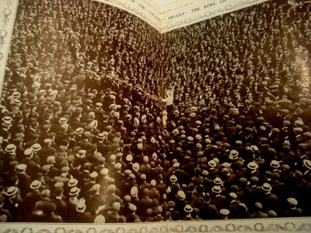
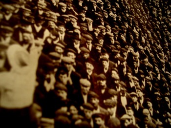
    The photographic editor of The  Illustrated London News came up with this superb illustration of what the 1513 dead aboard the Titanic would look like.  Oddly enough, the photo used for the visualization exercise is of Mr. Ben Tillett, a socialist reformer and speaker, and also the spokesman for the  National Transport Workers’ Federation and also of the Dock Wharf and General Workers’ Union., who at the time was playing an enormous role in the coal handling (and etc.) slowdown, representing the underpaid workers against the shipping companies. 

    The use of Tillett’s crowds to make a case for the shipping industry tells me that The News was oblivious to the attendant ironies. That Tillett was a tremendous thorn in the companies’ paw(s) is beyond question.  Almost immediately after the Titanic disaster he published a statement accusing the White Star Line of trying to save the first class passengers first at tremendous expense of the third class passengers.  “We offer our strongest protest against the wanton and callous disregard of human life and the vicious class antagonism shown int he practical forbidding of the saving of the lives of the third-class passengers.  The refusal to permit other than first-class passengers to be saved by the boats is a disgrace to our common civilization”.  Strong stuff with a huge dollop of truth to it–god only knows why The News would’ve used this picture and this quote as part of a way to concretize what the loss of 1500 lives looked like.  The News did counter the Tillett statement, saying “It need not be said that there is no truth in the allegations thus made…”

    Ballistics_043

    Except, well, they’ve not got the truth under control.  On the one hand
    it is true that the greater indicator of survivability on the Titanic
    was by sex and age variables; on the other, overall, hand Tillett’s
    implied figures are closer to the truth that The News found so repugnant.  Women and children did
    survive in much greater numbers across (voyage) class lines than
    anything else.  Only 3% of first class women perished, followed by 14%
    of second class and 54% of third class. 67% of first class men died,
    followed by 92% of second class and 84% of third; 78% of the male crew
    also disappeared.  So the men did generally go down with the ship, giving their
    places to women and children (and the other 33% of first class men).
    Well, not all of the children:  while no first or second class children
    were lost, 66% of third class kids drowned.  Overall, I’d have to side
    with Tillett rather than a company apologist:  67% of first class
    people survived, followed by 41% of second class and only 25% of third;
    least of all came the crew, with a survivability rate of 23%.

    Tillett would make many observations on the disaster, though one of the most revealing was his observation on the newspapers’ coverage of the heroism of only the first class passengers: ‘I feel glad that the motto “Women and children first” is the great
    call in the hour of danger at sea. Mr Astor’s heroic end was in keeping
    with the heroic end of the humble third class and the members of the
    crew”.  It was an excellent point, and true, and also very uncomfortable stuff to acknowledge in print. 

Recent Posts

Archives

Categories