A Daily History of Holes, Dots, Lines, Science, History, Math, Physics, Art, the Unintentional Absurd, Architecture, Maps, Data Visualization, Blank and Missing Things, and so on. |1.6 million words, 7500 images, 4.9 million hits| Press & appearances in The Times, Le Figaro, Mensa, The Economist, The Guardian, Discovery News, Slate, Le Monde, Sci American Blogs, Le Pont, and many other places… 5000+ total posts since 2008.
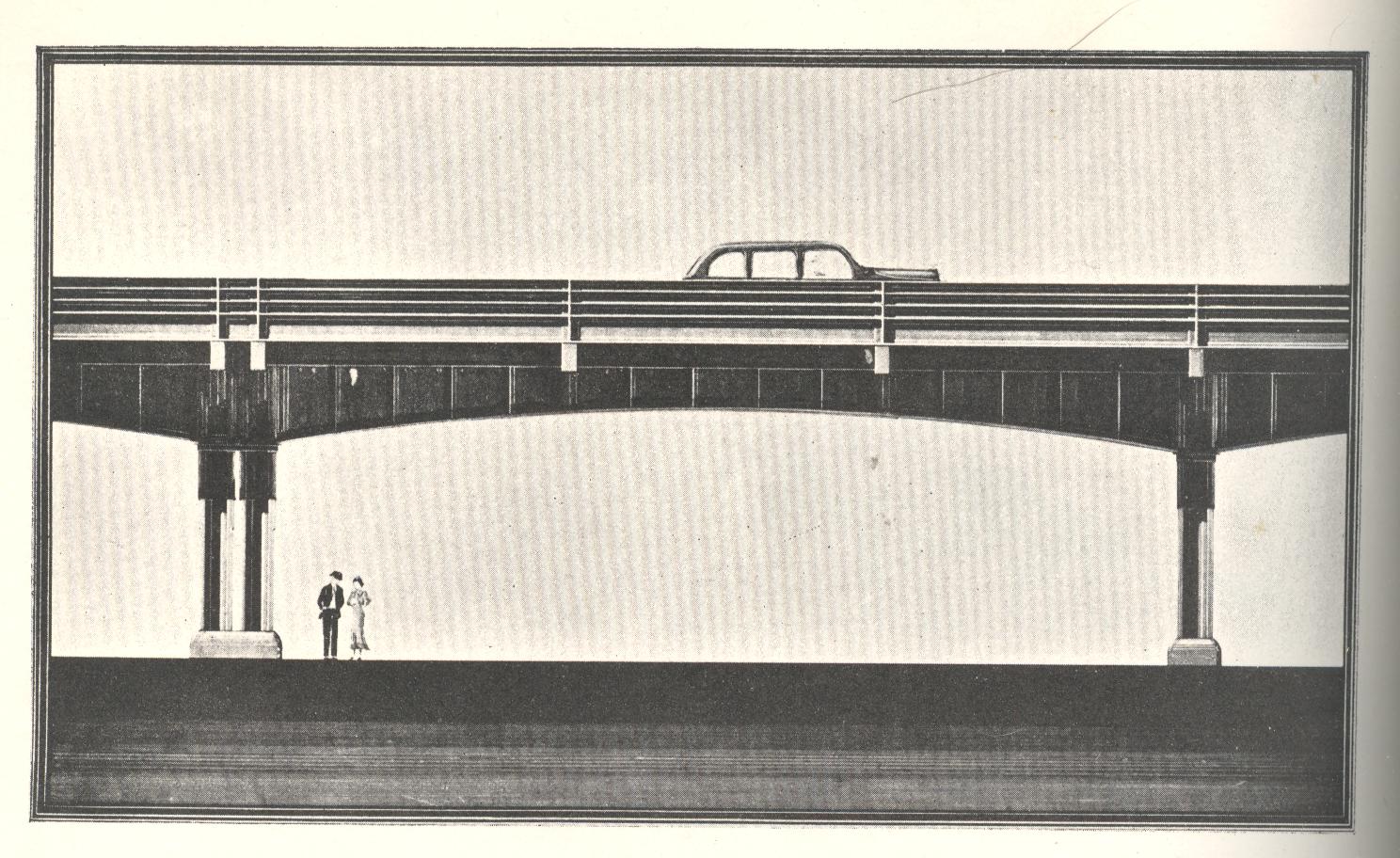
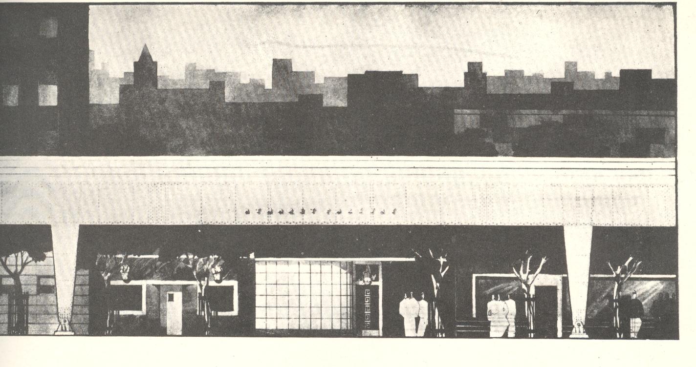
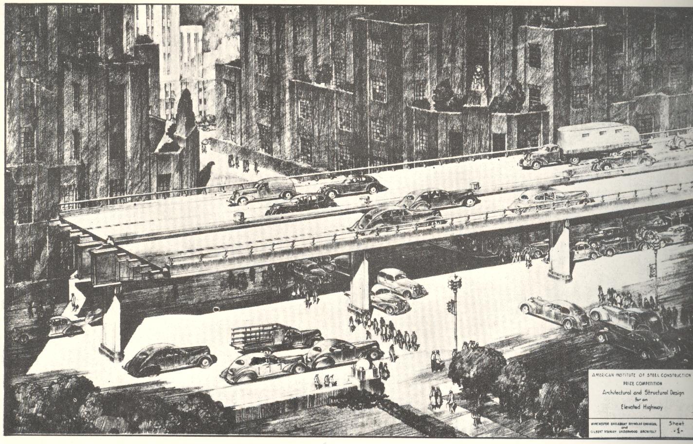
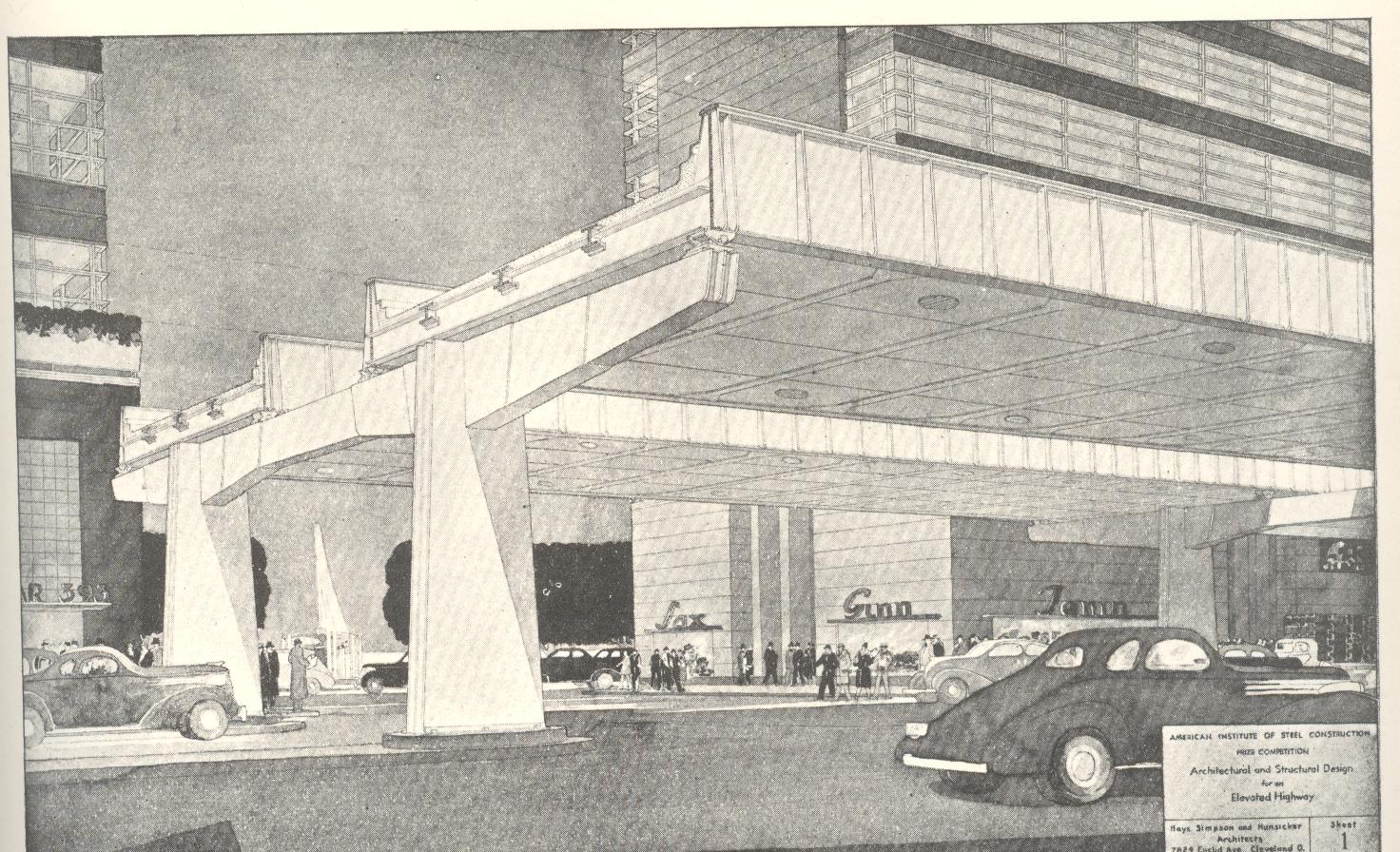
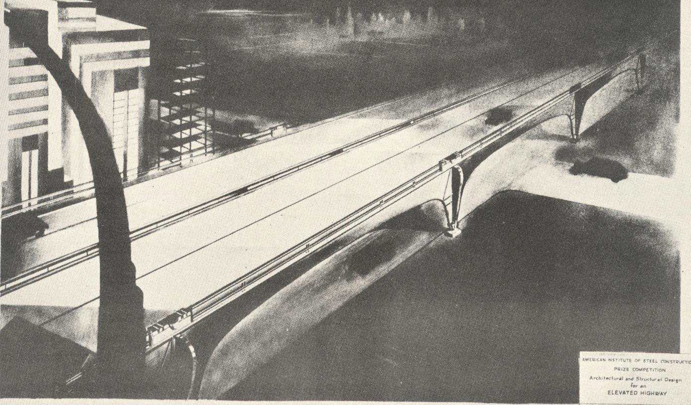
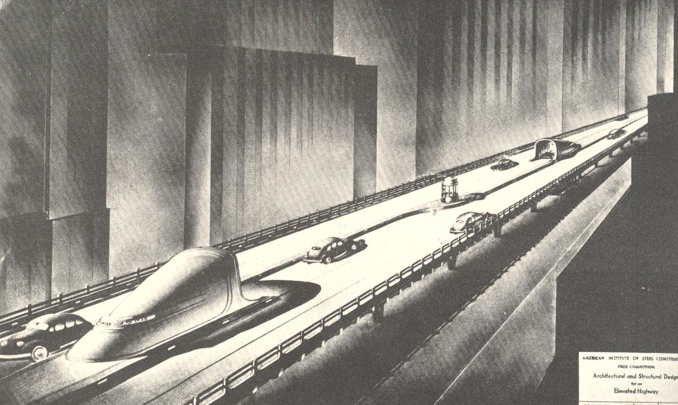
If Edward Hopper was a practicing member of the American Institute of Steel Construction and was a civil engineer, he may have rendered his creations much in the same curious way as those seen below. I found these designs in an obscure publication, Prize Designs Submitted in the Elevated Highway Competition for 1938, and I found them to be utterly fantastic, lost bits of artistic expression and strong emotion sucked into a vortex of automotive steel and concrete. They are just superb examples of found art that seems to play utterly against the purpose of the object, and do seem masterpieces in an unusual (and instantly-created) genre of “Unintentionally Cross-Expressive Art”. They have a feel of Outsidery-Edwardy-Hoppery to them–they feel cold, a wet chill, with a coppery audio quality to them…images that make you want to go home and sit in a comfortable chair.
And not only are they lonesome; they are also foreboding:
Magnificent! And all once hidden away, but no longer.
I’m going to take a drive through five
fifths—all of which don’t come close to making a whole—to get to my ultimate
destination, a ribbon of numbers circling the earth.
In
American law, “taking the fifth (Amendment)” allows you the prohibition of
incriminating yourself, giving the supposed ability to look innocent whole not
saying anything about anything for fear of legal repercussions, though this
sausagey implosion from guilt seldom looks pretty.
There’s
the fifth column (as in Hemingway’s play by this name), the
not-fourth-but-fifth force, the musical perfect fifth of highest consonance,
the Keplerian nestling of the five Platonic solids,Beethoven’s Fifth, a fifth of (good) scotch,
the fifth cardinal direction (the center), the five books of the Torah, the
five pillars of Islam, the worst categorization of hurricanes and tornadoes, living
in the fifth Mayan world, the fifth Fibonacci number, and on and on.
And
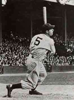
aside from being the number that Joe DiMaggio wore on his pinstripes, it is
also the number of the Euclidean postulate that called to all those who were
interested in the possibilities of the postulate not being so—that there exists
as perfect a non-Euclidean system as there is for the Euclidean.The fact of the matter is that this calls
into question the foundation, the very basis, of mathematics.Or used to.
All
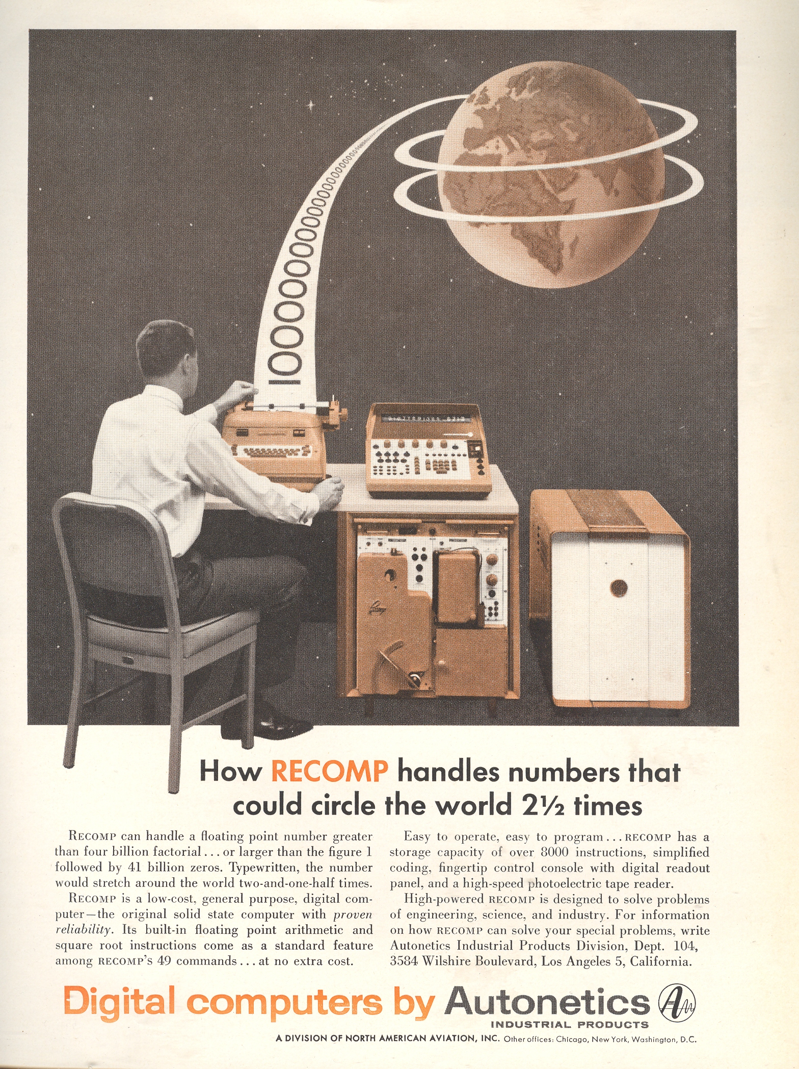
of this was brought into mind by this 1957 ad for the RECOMP computer produced
by Autonetics.The image of a sheet of
numbers circling the earth1, the product of digital computation, suggested
structure, mathematical imperative and solidification of numbers.But the point of this was the bottom line:
what was the point, and for that matter, what was the point?They were hardly physical things floating in
space, but ideas (except of course in the worlds of Flatland).
Euclidean
structure was the infallible, rigid, predictive, explanatory structure and the
most accurate descriptor of physical space. This had certainly been the case for fifteen hundred years or so, or at
least until the struggling fifth postulate of Euclid’s Elements became really, well,
unwieldy.More to the point, the axiom,
the parallel postulate axiom, wasn’t as self-evident as the first four, and
wasn’t provable from the other nine of the first ten axioms.And so came the unbelievable question, what
if the fifth postulate wasn’t true?What
if there were other geometries—non-Euclidean geometries—that were as provable
as that of the Master?The possibility
of relegating the understanding of nature and the physical surroundings to
something other than the existing geometry was simply, positively,
extraordinary.
The
origins for this movement away from Euclid started with Girolamo Saccheri (his
book published in 1733 but not “discovered” for its non-Euclidean importance
for another 150 years) Georg Kluegel (1763), Johann Lambert (Theorie der
Parallellinien, 1766) and Adrien-Marie
Legendre (1752-1833, who was sort of in a similar boat with Saccheri in that
his work wasn’t actually published until after that of the next two
mathematicians); and coming to a point of real invention in the work of Nikolai Lobachevsky (1792-1856) and Janos Bolyai3 (1802-1860). (It would be
incorrect to credit these last two men [plus Gauss] with the creation of
non-Euclidean geometry given the longish and complex history of its
development.)
This
work brought into question the way in which the world was seen, and the very
foundation of recording visualized space. This is all much messier than had been planned (so to speak) by almost all
previous mathematicians, questioning the very foundations of mathematics.The orderliness of the earth-circling numbers
doesn’t seem to be quite as they were, but as Henri Poincare stated, the “new”
system isn’t anything better or worse, just different, a new and more convenient way of looking at
things4.
Notes
To be honest about it, the
foundations of math bit didn’t suggest itself right away.The first thing I thought when looking
at what this paper trail was supposed to represent—a string of numbers 41
billion zeroes long—didn’t look right. Given the size of the numbers coming out of the “printer” there
would need to be five times as many rings around the earth.But when you read the text the numbers
are supposed to be “hand written”. Therefore if you assume the numbers to be less than an inch high
and with no spaces in between, then this 2.5 times around the earth works
out to be accurate to the number of inches in the circumference.
Bolyai’s work—published as an
appendix to his father’s work on the foundations of geometry—was privately
reviewed by the great and impossibly smart Carl Gauss, who gave it a backhanded
series of compliments while at the same time saying “I thought so…”Which was true, evidently, as it looks
as though he was working on the problem beginning in 1799.
“If geometry were an
experimental science, it would not be an exact science. it would be
subject to continual revision … the geometrical axioms are therefore
neither synthetic a priori intuitions nor experimental facts. They are
conventions. Our choice among all possible conventions is guided by
experimental facts; but it remains free, and is only limited by the
necessity of avoiding every contradiction, and thus it is that postulates
may remain rigorously true even when the experimental laws which have determined
their adoption are only approximate. In other words the axioms of geometry
(I do not speak of those of arithmetic) are only definitions in disguise.
What then are we to think of the question: Is Euclidean geometry true? It
has no meaning. We might as well ask if the metric system is true and if
the old weights and measures are false; if Cartesian coordinates are true
and polar coordinates are false. One geometry cannot be more true than
another; it can only be more convenient.” –from: M J Greenberg, Euclidean
and non-Euclidean geometries: Development and history. (1980).
This is a simple image-only post relating the four wood engraved illustrations from the rare Spanish work by Conde (Pedro) Garcia, Verdadera Albeyteria, printed in Madrid in 1685. They were beautiful works, if not exactly correct, or terribly useful–not in the great traditions of veterinary (& etc.) anatomists like Andres Laguna, Leonardo or Vesalius. Oddly enough, Garcia didn’t seem to draw on the very accomplished work of Carlos Ruini (b. ca. 1530-1598) whose earlier work, Anatomia del cavallo, infermit, et suoi rimedii, was a standard font of anatomical and medicinal information on the horse for 75 years. But the illustrations are compelling, and beautiful–just not very helpful.
“…This most noble beast is the most beautiful, the swiftest and of the highest courage of domesticated animals. His long mane and tail adorn and beautify him. He is of a fiery temperament, but good tempered, obedient, docile and well-mannered.”–Conde Garcia.
All image sources via the Cervantes’ Virtual Library site, here: http://www.cervantesvirtual.com/obra/verdadera-albeyteria/
Squidward: What’s that horrible smell?! [sees steam coming out of SpongeBob’s window]
Is Patrick thinking again?
Patrick: [sticking
his head out of the window] I’m making art!
Squidward: Patrick, it smells like something crawled into your brain and died!
Patrick:
That’s the creative process at work!
Like St. Paul warned by
Archangel Michael, and Dante by Virgil, the visions of the Hell they were
touring was also stinky, though the robes they held to the noses did not
prevent them from experiencing the very lofty stench of sin.Perhaps it was something like the
crawled-in-and-died stench made by the beautiful Patrick starfish from SpongeBob
Squarepants, his brain’s intellectual exuda forming a pretty but stench-ridden
experience.
And so to with experiencing the found, unintentional absurd–or
the naïve surreal—in printed material like some of the examples below.Their title pages can be experienced as art
in a way, at least today, so far removed from their original meaning and
context that the words float like disembodied arks of meaning looking for
whatever piece of land/meaning that they bump into.Sometimes their titles are the bizarre-ity,
masking a mundane, pedestrian contents; much of the time the title and contents
emanate the stench of lost meaning through and through.
“… ‘Why us thy mind’, he said, ‘so far away, unlike its usual self, What are thy wits about, where have they fled?’ —Virgil yelling at Dante for asking a dumb question outside the City of Dis,. Inferno, XI, 76-78
“One must go into oneself armed to the teeth”–M. Teste, Paul Valery
“Do what you love. Know your own bone; gnaw at it, bury it, unearth it, and gnaw it still.” –H.D. Thoreau
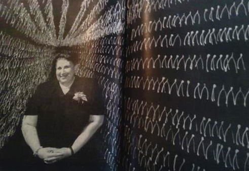
Sometimes odd images just need to be surfaced for the pure sake of it. Such is the case with this glorious photo by Greg Villet1 of Delphine Binger in LIFE magazine for 24 May, 1954 . Ms. Binger (“a Manhattan spinster”) actually collected the wishbones with a business utility in mind, fashioning them into objets d’os. (LIFE unfairly classified Ms. Binger in this way. In other accounts I have read of her she is described as a funny, fun-loving person, and Pete Hamil/Meyer Berger describe her as “generous”, “bubbling” and “caring” in their 1954 Meyer Berger’s New York.)
She purchased the wishbones for nothing, added a few bits of half-penny decorations, perfume, a pin, and SO! a piece of jewelry is born. She evidently was able to sell her creations for $2.10 apiece, which in 1954 translates into 25 2009 dollars; so I guess if she sold some here and there she would be able to supplement her income. Of course there’s the issue of overkill on the bones: she seems to have probably two (or more) orders of magnitude more than she “needs”, so there may have been something else going on there. But then again, at the point where you collect 500k of anything you will have become expert enough to have any mostly-invisible nuance convey a large field of interest to your keen appreciation–the bigger something gets, the smaller it gets, in parts.
An old friend of mine–we’ll call him Mr. Tulipfields, a brilliant mathematician/physicist/compsci guy with a deep appreciation for music–started buying classical cds when cds were a relatively new phenomenon. Rare recorded material was being placed back into “print” at such a rate that he couldn’t really afford the appropriate sound system to actually listen to all of his new purchases. He hurried into buying many of the cds because he thought that they would drop out-of-print again, and that he needed to act quickly. I thought that the cds would stay available basically forever—as it turned out he was right (as usual) and I was wrong (ditto). And so Mr. T amassed an enormous collection of music—in the dozens of thousands—many of which are now impossible to find.
In some ways my friend didn’t need the cd player—he already knew the music, could play it in his head.Somehow he was keeping all of this music on course in forming this fabulous collection And once he had explained his reasoning behind the whole effort, it all made perfect sense, and you’d wonder why he didn’t have 100,000 more choice cds.
On the other hand I’m not sure why Ms. Binger2 needed her extra 497,500 bones—you’d expect there to be not very much difference from bone-to-bone, but there very well may be. A centimeter here and there may make all the world of difference and interest to the practiced eye, particularly if the bones are from many species of animals. Once a collection of almost anything gets to be that big, someone somewhere is going to be interested in preserving it.
And that’s what Ms. Binger did.
See also this note in Popular Science from the Popular Mechanix site (“Wishbones Made Her Dreams Come True”).
Notes:
1. I don’t know much about Greg Villet. He took a lot of preparations for this photo, stringing 5,000 wishbones on black string on a black backdrop–that is considerable dedication to the idea of an image. I also know that he did some very significant documentary photography with Rosa Parks and the Montgomery strikes of 1955/6, which tells you maybe all you need to know about the man.
2. I can’t help but wonder what happened to all of those bones on Ms. Binger’s passing? (She died in 1961, and I can’t find anything about the disposition of the collection. It sounds like the vast majority of the bones were kept with relatives and not in her two-bedroom apartment at 145 W. 96th St in NYC.
I spent 33 years and four months in active military service and
during that period I spent most of my time as a high class muscle man
for Big Business, for Wall Street and the bankers. In short, I was a
racketeer, a gangster for capitalism.–Marine Corps Major General and two-time Medal of Honor recipient Smedley Butler, from his 1935 book War is a Racket.1
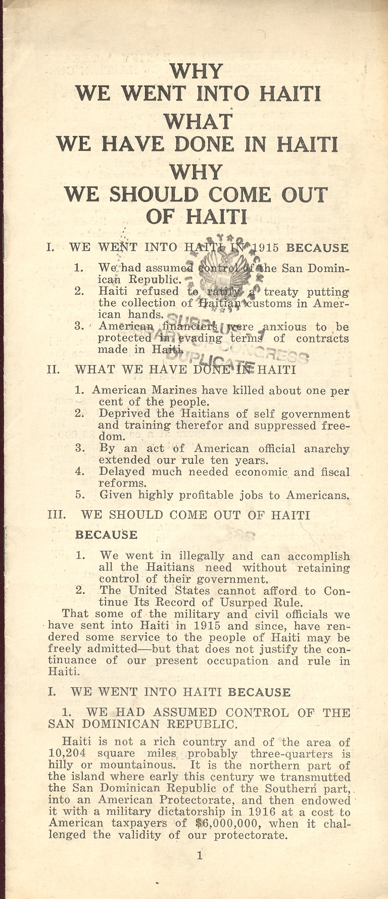
This small pamphlet (reprinted below in continued reading)–printed in 1929 and once owned by H.L. Mencken, and with his annotations–is a gonzo screed against American imperialism in Haiti produced by “The People’s Lobby” and headed by Prof. John Dewey.2
This “intervention”, an extension
of American hegemony in the Americas
known as “The Banana Wars” and a direct relation to Theodore Roosevelt’s corollary
to the Monroe Doctrine (1904), was a movement taken to protect business
interests, infrastructure and investment. And the Haitian debt repayment
structure.
After a series of six failed Haitian
governments in five years, President Woodrow Wilson felt the stinging itch of
capital protection and ordered the occupation of Haiti by the Navy and the
Marines, all in the guise of preserving peace and order and stability (of the Haitian state. “The urge to
save humanity is always a false front for the urge to rule it.” as Mr.Mencken wrote). But this itch had been felt by
a number of presidents over time, what with the many imperialist interventions
and occasional occupations of Panama, Nicaragua, Cuba, Dominican
Republic, Honduras
and Mexico.
The pamphlet is effective as an
anti-Imperialist proto-gonzo work, though it does leave some gaping holes in
fact and some narrow ones in fiction.Be
that as it may the anonymous author incites indignation with the outrages of
the American occupation, not the least of which is the usurpation of Haitian sovereignty.
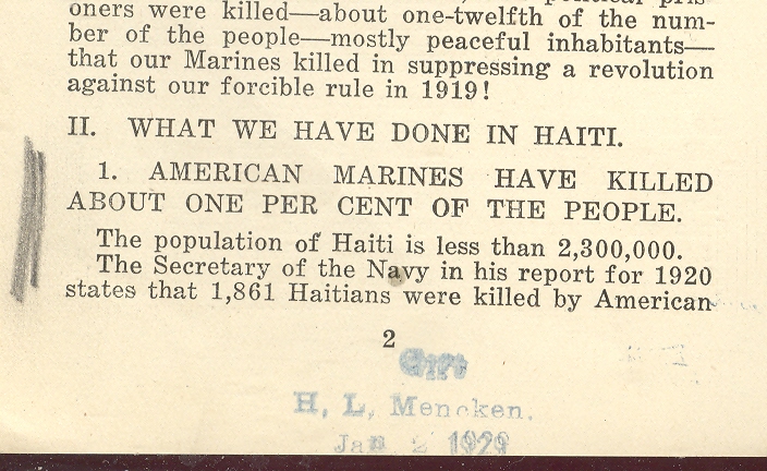
The only annotations of the former owner–Baltimore’s
other great writer, H.L. Mencken– are his characteristic hashmarks in the
margins highlighting the death rate of Haitians killed during the
occupation. According to the pamphlet,
which quotes the report of the Secretary of the Navy (Joseph Daniels) , there
were 1,861 Haitians “killed by American forces in 1919 alone”. The writer makes the acidic point that this
figure represented one percent of the total population of the nation. And that is, perhaps, all that Mr. Mencken3 needed to see.
The occupation of Haiti left broad scars along with the new and vastly improved infrastructure, which was probably just a colonial remnant of the necessities of governance by the occupying force. After all, we needed roads and bridges and such to secure the possession, and it isn’t as though we could role them all up and take them home at the end of the day. They were more cenotaphs to an unwanted and shameful legacy than the betterment of Haiti’s social structure. To close with Mr. Mencken, the flowers that came with the American occupation make us look more for the coffins than anything else.4
Notes:
1. In 1935, Butler wrote in his famous book War Is a Racket: “I spent 33 years and four months in active military service and
during that period I spent most of my time as a high class muscle man
for Big Business, for Wall Street and the bankers. In short, I was a
racketeer, a gangster for capitalism. I helped make Mexico and
especially Tampico safe for American oil interests in 1914. I helped
make Haiti and Cuba a decent place for the National City Bank boys to
collect revenues in. I helped in the raping of half a dozen Central
American republics for the benefit of Wall Street. I helped purify
Nicaragua for the International Banking House of Brown Brothers in
1902-1912. I brought light to the Dominican Republic for the American
sugar interests in 1916. I helped make Honduras right for the American
fruit companies in 1903. In China in 1927 I helped see to it that
Standard Oil went on its way unmolested. Looking back on it, I might
have given Al Capone a few hints. The best he could do was to operate
his racket in three districts. I operated on three continents.
3. Mr. Mencken also made the following Modest Proposal: “It seems to me that the United States would be a great deal better off
today if it had a war on its hands, somewhere or other, all the time.
I do not mean, of course, such puerile buffoonery as now goes on from
time to time in Nicaragua and Haiti, but real war, occupying say a
quarter of a million or half a million men.” “Editorials” in the The American Mercury, Nov 30, p.284
4. As in his Bierce-like dictum “A cynic is a man who, smelling a flower, looks for the coffin”.
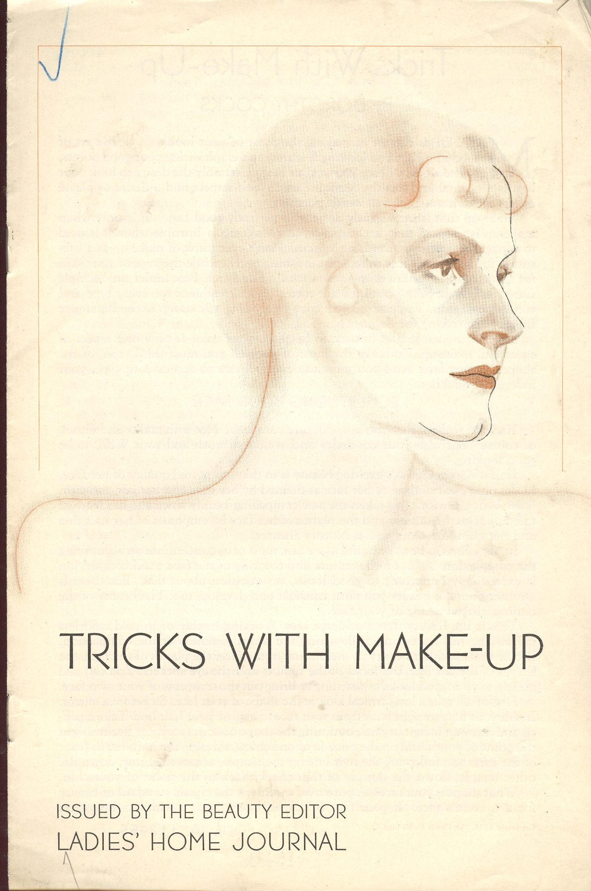
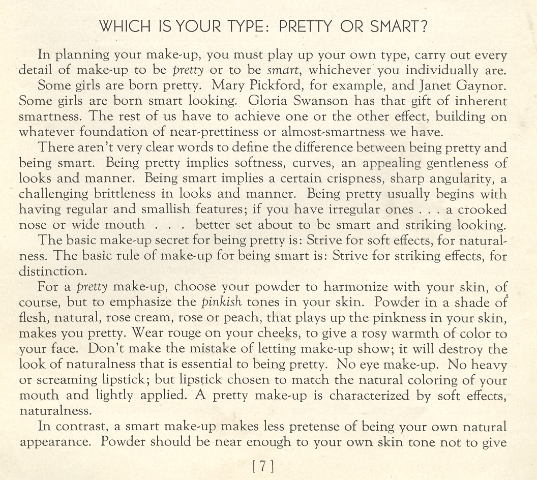
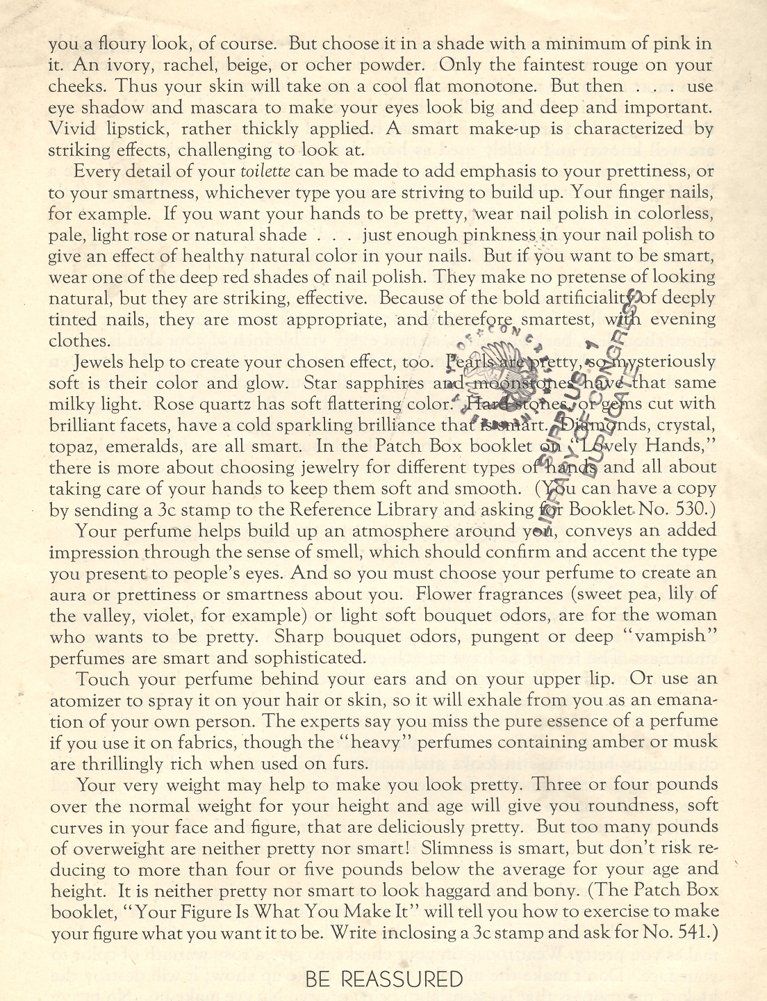
Following on the tall heals of several posts on mid-1940’s social engineering for young women comes this rougey sprite by Dorothy Cocks, Tricks with Make-up. It is one of a long series of quickly-produced pamphlets flung from the presses of the Ladies’ Home Journal under the stewardship of Elizabeth Woodward.
There’s much to learn about what was expected of the social shell of women in this pamphlet, but what I’ve focused on is this jewel on page 7: “Which is Your Type: Pretty or Smart?” And that’s it: no ground in-between, no space for something else, and evidently no room for being smart AND pretty. Here it is:
The advice to “touch perfume behind your ears and above your upper lip” is a new one to me.
The
sweetest pleasures come from unexpected sources. Mozart–who loved the game of billiards
and was an exceptional aficionado1 of the game while playing it with little
skill– enjoyed composing on the table as well, rolling balls in geometric patterns across it
while working. To observers it might have seemed as though he was interested in
the patterns themselves; it delightfully turns out that what he was really looking at were
the changing reflections in the surface of the balls.
Years
ago my wife (Patti Digh) and I visited an artist in his studio at the lovely
high-road-to-Taos town of Truchas, New Mexico.We watched the artist at work for quite some
time—well, actually, we listened to him work. Although he was a lovely painter, the visual impact was overwhelmed by the sounds that he made padding back
and forth (he was working on a big canvas) across an old and musical wooden
floor –it deeply interesting, and the sound stays with us to this day.
I
enjoy these quasi-synesthesic experiences a great deal, though they are very
hard to “find”. Sometime though they slip into the print world, and I include three
examples below.
(1)
Putting the Pulp in Fiction, and Fact: the Sharp First Step in Paper-Making
Just
about the first step in making paper is collecting and preparing the raw
materials from which the paper is made. Linens, cottons, wood and straw (among other things) would be reduced to
a pasty pulp through vigorous pounding, tearing, wetting stabbing and rending,
all of which would be reduced to a pasty, fibrous pulp which would wind up after
a bit spread over a wire mesh until dried and then, through a great
non-miracle, becoming paper.This is a
process that was little changed in the Western world for many centuries.
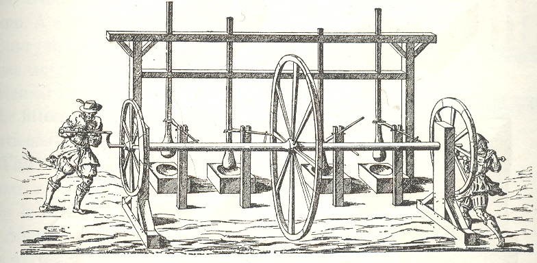
The
most lovely of these early pulp-rendering, “stamping” machines, to me is the
fabulous two-person human-powered stamper/shredder, published in 1579. (I don’t
know the original source for the wood engraving; this image appears in Charles
Singer’s monumental History of
Technology, from the Renaissance to the Industrial Revolution, vol III.
The
men turn crank, crank turns wheels and rod, rod turns arms, arms forced to move
vertical poles up and down, stampers on the end of poles pound the rags.Actually the stampers had changeable stamps
so that the man-machine could start with a spiked stamper for rendering and
then move to a roundish stamp for pounding into decomposition in a wooden bowl
with mushy water.
I
just really like the machine and its representation, and of course the round
stampers and bowls of mush.It all seems
so innocent in a creaking antiquarian way—but the great surprise for me is that
I can just about hear this machine at work. The all-wooden structure with slowing-turning wheels grinding against
its constituent parts, worn smooth from use; the slow pounding of the stampers
into the thick paste; the creaking motions of the too-slender
superstructure.I can hear it about as
clearly as I can hear the soft/high clinking of the bottles in the milkman’s
tray.
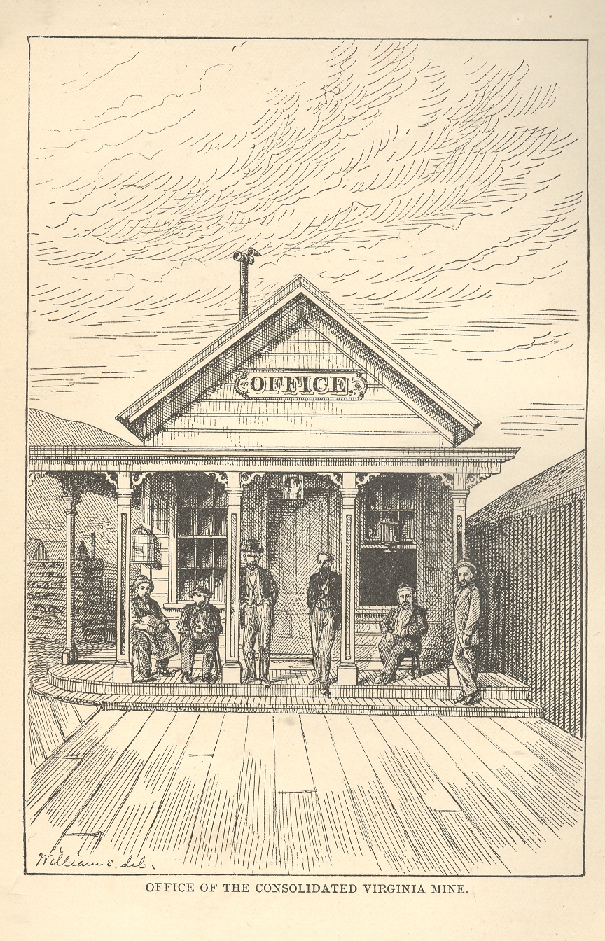
(2)A Scene of Western Quiet
The image comes from William Wright’s The History of the Big Bonanza and was published in 1877.It is a very
simple scene (“Office of the Consolidated Virginia Mine”), nicely and
proportionally arranged, though somewhat challenged by its understanding of linear
perspective. For reasons I don’t quite understand it might as well have been a
picture of the high desert with no settlement whatsoever.It simply seems still, and very quiet.
(3)
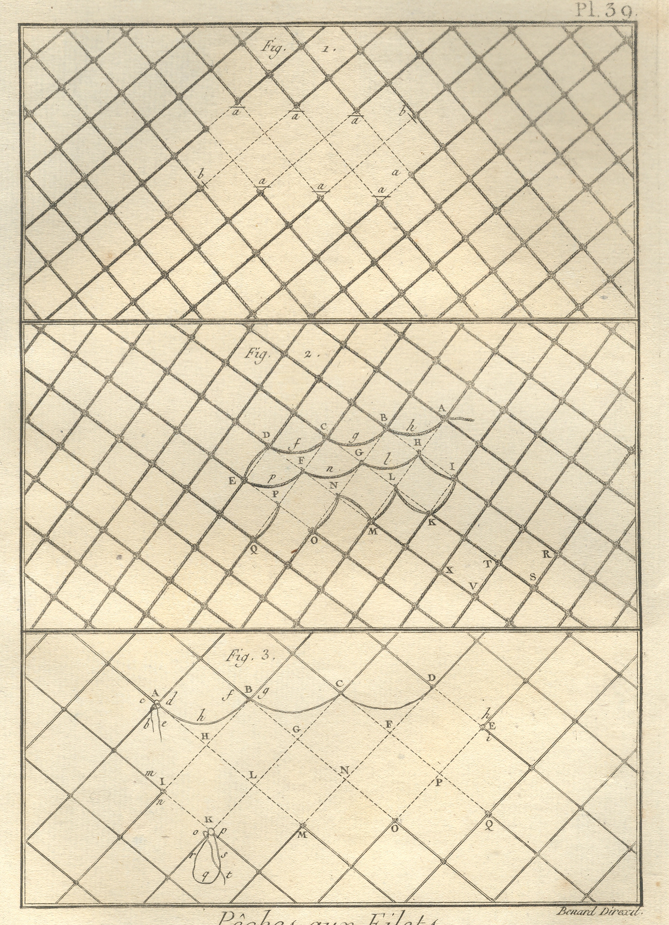
Electrical Hum (and Ozone) Fishing Nets
This
image, from the quarto edition of the great Diderot and d’Alembert Encyclopedie (published over a number of years in the late 18th century), shows (I think) the
ways to mend broken fishing nets. I have a definite sense of a high electrical
hum from this, along with the added whiff of ozone.Its hardly something that was intended by the
artist, but it was the first thing that registered with me when I bought this
print 25 years ago.
Things
like this are available to us all of the time, simply waiting to be heard while
being seen.
Notes
1. After his death Mozart’s estate was reckoned, and the contents of his house and belongings were catalogued. It was recorded that he had a very nice billiard table, and that he also had 12 cues. Now 12 cues might’ve been there because he liked the feel of the wood, or that he liked their artistic merit on the wall or in the corner. That, or he had a lot of people coming over to play. I like the later interpretation. Also, I cannot remember the reference for the ball/reflection story; please don’t tell me that it is wrong.
I
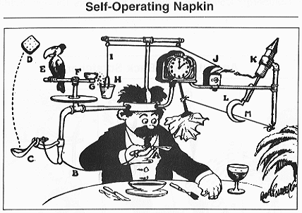
think no plumb line was ever so worked with pulleys and wheels, strings and
catclaws and other Rube Goldberg devices as were the demographic studies of
nuclear warfare.It is as though their
compass rose had no compass, with everything centered on the center, no way
out, no way in. just there.A faceless
clock face describing “G-2 o’clock” whenever it pleased.These studies seem to me the nuclear warfare
equivalent of the Bellman’s map (described earlier in this blog as the most
perfect map ever constructed): a pretty polygon describing a totally blank
surface.
I
have a number of these things here, some of which are restricted-distribution
publications, works of statistical fancy/fantasy meant for other eyes in the
same community dedicated to the fancies described, a tautological audience for
self-referential.
One
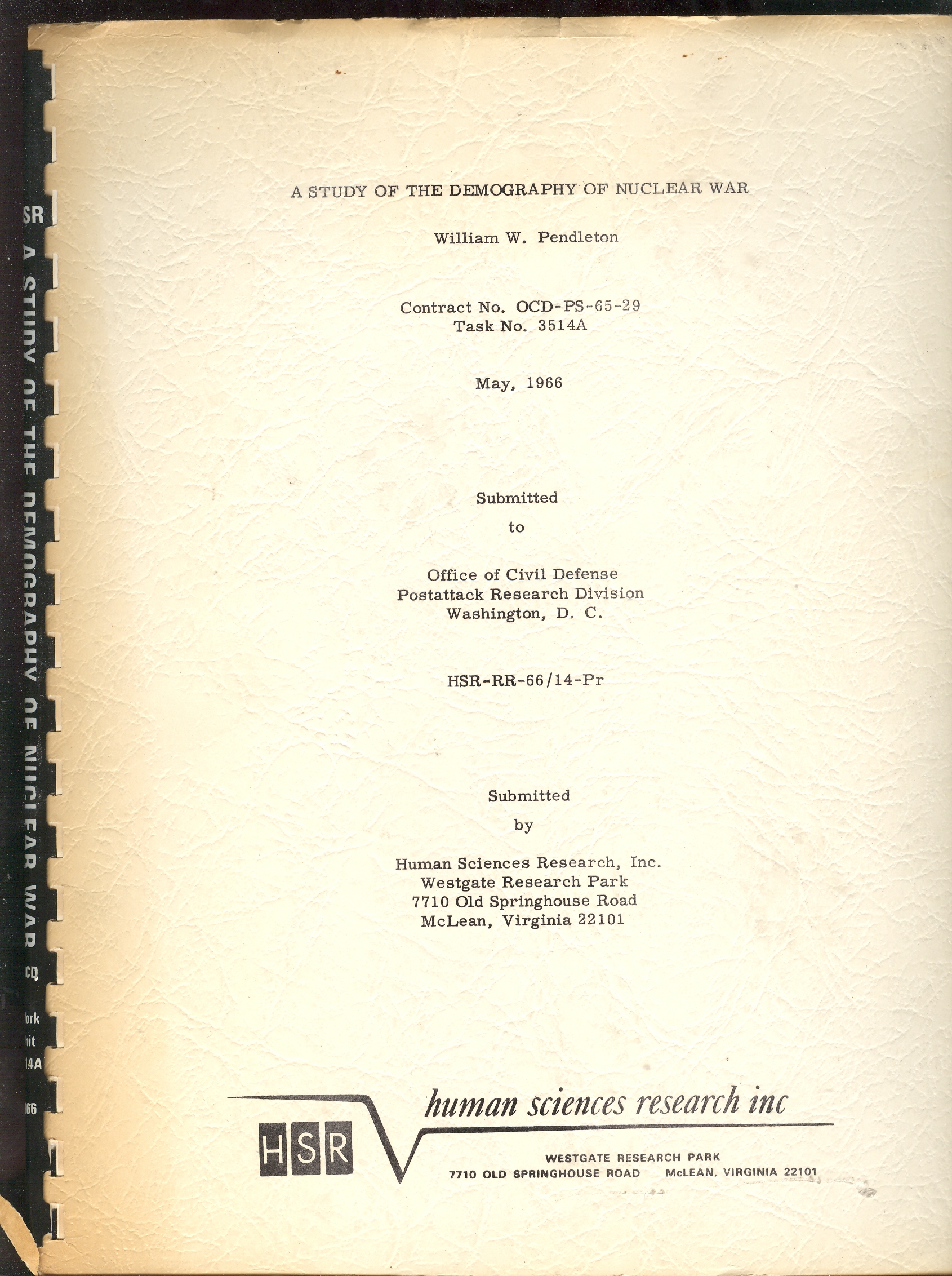
such bit, plucked from this pile is William W. Pendleton’s A Study of the
Demography of Nuclear War produced by “Human Sciences Research, Inc.” Outside
of its statistical foray in survivability and the procreative prospects of the
left-overs of vast nuclear exchanges, the work is a solemn attempt at
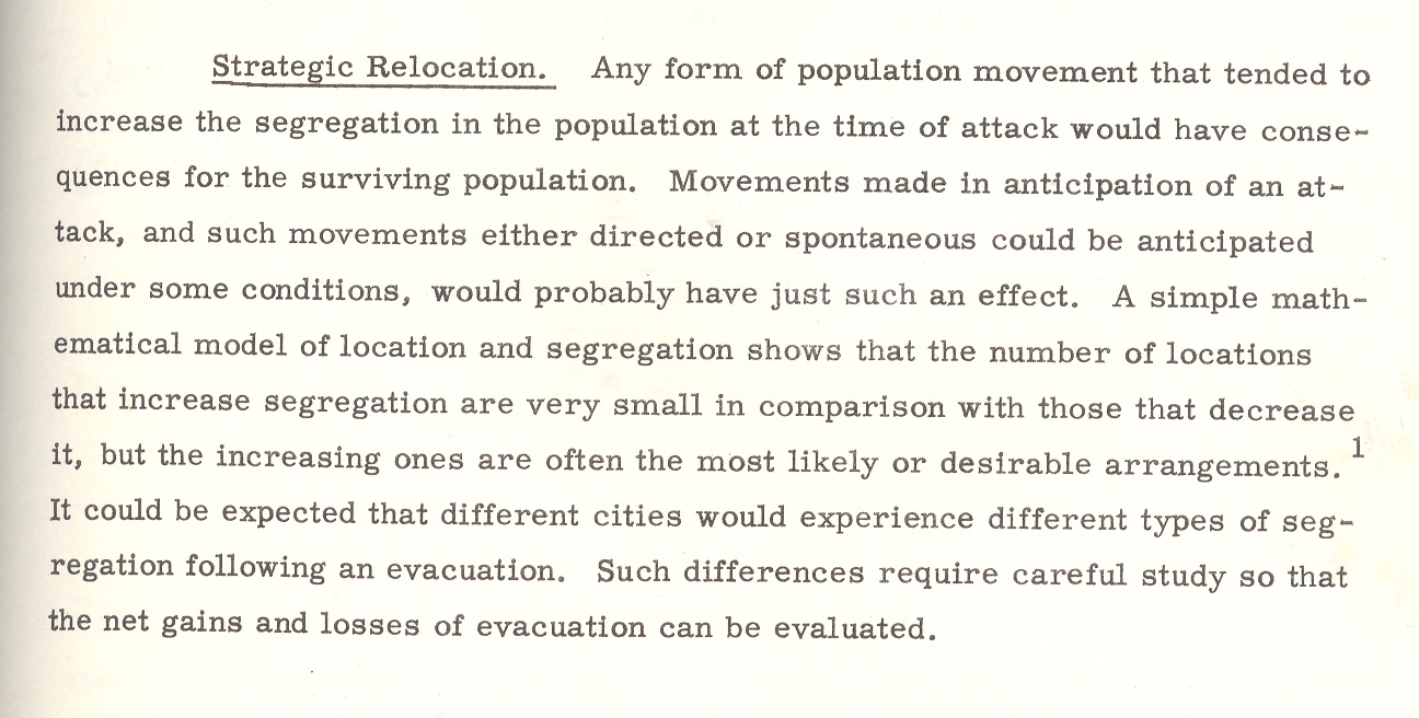
institutionalizing the death requirements of nuclear combat.The necessity of overwhelming carnage is
presented in ironic and underwhelming language, the first bits of which are
seen in the conclusion of pamphlet’s abstract1:
“Cities differ in the kinds and magnitudes of
change to which they might be subjected. Considerable variation in the demography
of surviving populations can be expected; that variation would be related to
policy decisions; and those decisions should therefore be examined for their
demographic implications.” [Emphasis mine.]
Put
another way, the city is the main focus of the survivability equations, and the
chances of the humans being bombed in those cities would change with—god help
us—the amount of bombing.
Cities differ in the kinds and magnitudes of
change to which they might be subjected.
This
is the key I think to understanding documents like this, making a simple
foundation statement so convoluted and tortured that it and most of what
follows make any sense outside of restating themselves. Which I guess is a
strength.
Back
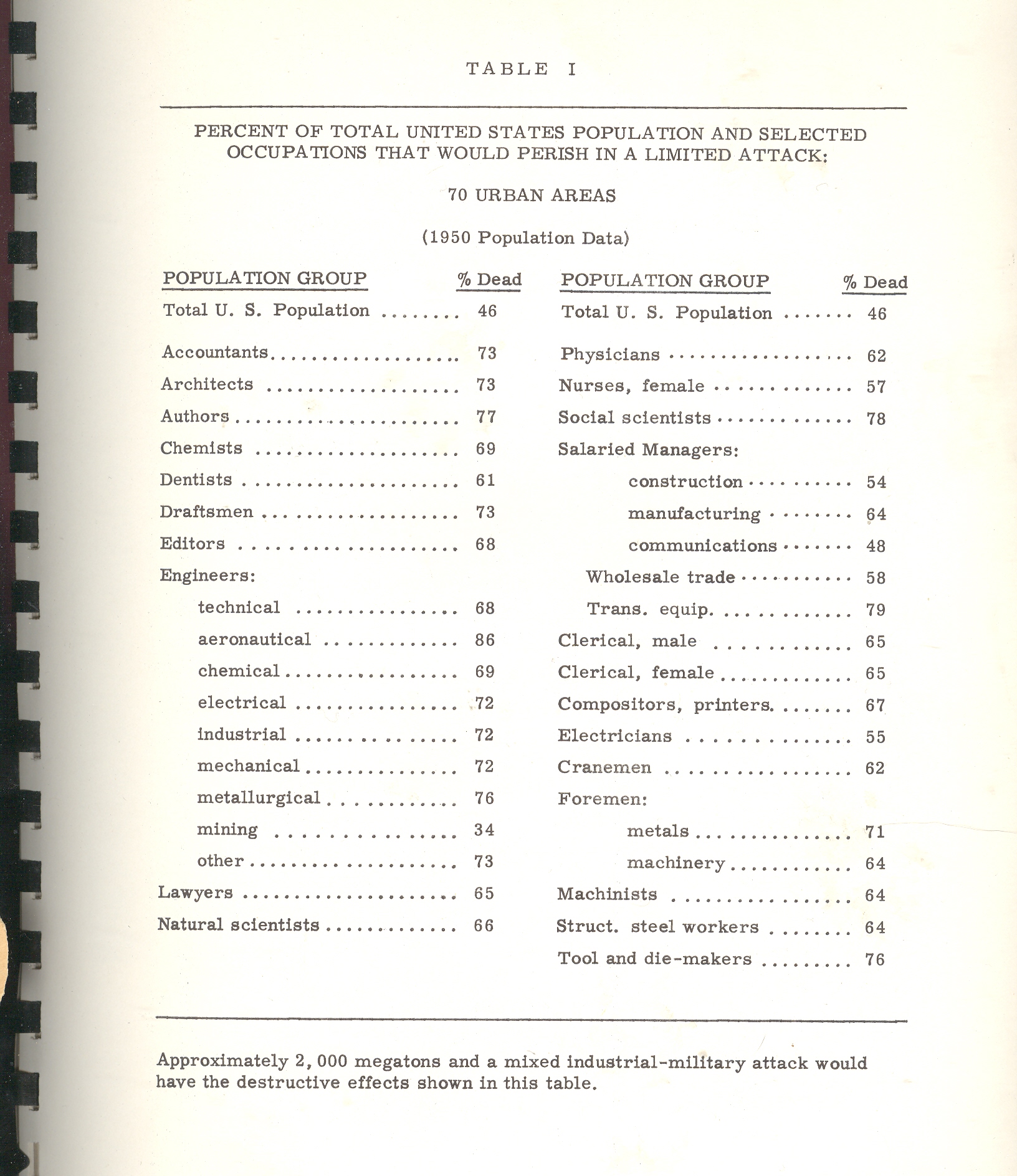
to the pamphlet and the interesting table that attracted my attention.According to one study [and for the sake of
brevity I’m not going to describe the scenarios or data estimation methods and
so on] the U.S. would suffer 46% casualties [meaning immediate deaths and not
as a result of radiation or illness or starvation or the encyclopedia of
whatever that would lead to death somewhere down the road].The resulting demographic of the “perished”
by job description postulates that the most-killed category of worker would be:
(#1) aeronautical engineers, 86% dead; (#2) transportation equipment salaried
manager, with 79% killed; (#3), social scientists, with 78% of them going down
with their clients; (#4), authors, with 76% gone.
Authors?Of what, I wonder?The good ones with the bad?Are authors different from writers?And what do you call folks who produce tv
shows?Since the stats here are for 70
cities there’s no wonder that there aren’t any farmers in this table, as the
majority target areas (some 450 cities cited elsewhere as targetable, including
my own little burgh of Asheville, N.C.) would naturally have city
folk in them.And so I’m guessing that
three-quarters of all “authors” in 1960/6 were living in these target cities
and were going to go up in smoke.The
aeronautical engineers category is more understandable as every one of those
industries employing 50 or more people would be a target; frankly I’m surprised
that given the possible firepower of the Soviet Union
in 1966 that 14% would survive; I’d guess offhand that the number would be
2%.
Even
though this stuff is spread out in only 98 pages or so it would keep a person
busy segregating the Orwellian gems from those not; it would be a tricky
business as most of the “text” in the “not” category would be largely limited
to prepositions.
Here’s
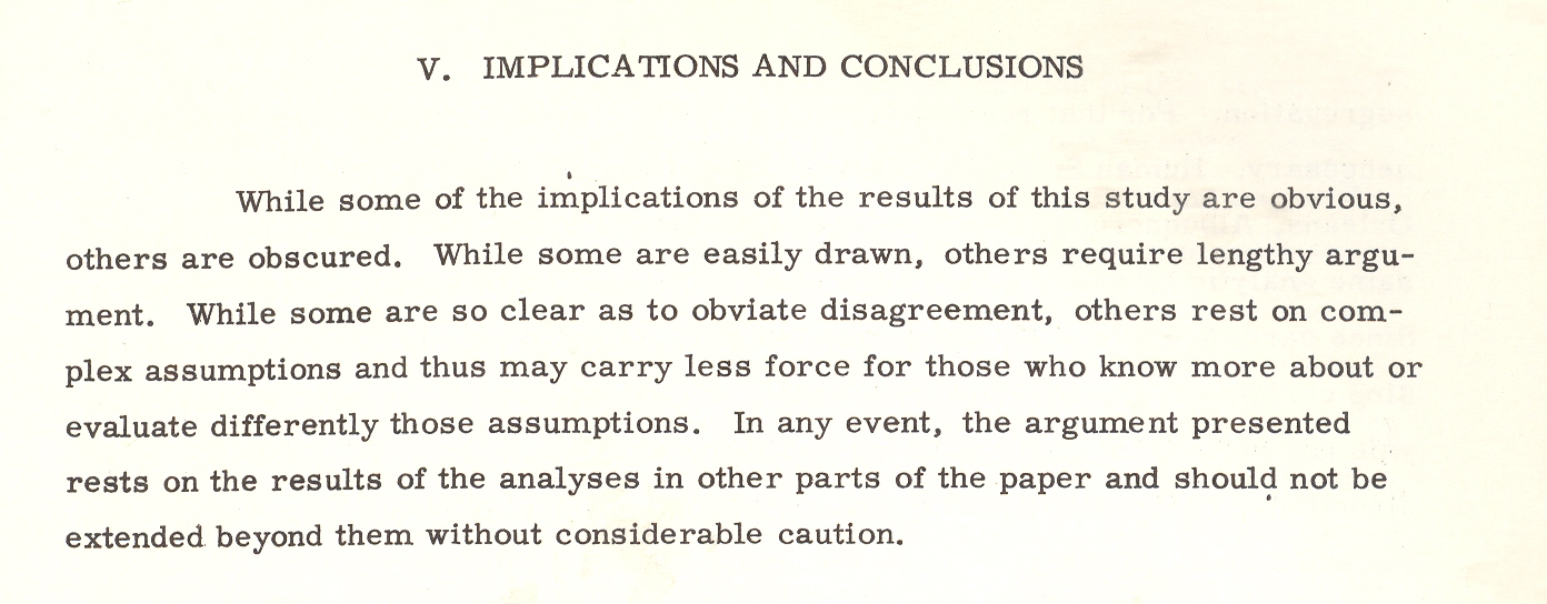
another bit:a parenthetic poke at the
post-attack composition of Congress. It is stated that the “postattack”
(hyphenated no longer) Congress would be “quite different”.It would also be (“in
their eyes”) “more Conservative than the pre-attack (hyphenated!)Congress. It isn’t a cause for great prognosticational (?) liberty to assume that
the Congress might be more Conservative, but why on Earth did the author
qualify the assumption by saying “their eyes”? Pish and posh.
The
paper goes on its merry way, connecting the necessaries of Goldbergian delight,
and somehow nothing ever happened, which to me is a secret miracle.Especially given the weight of papers like
this one, which seems to medicate the effects of war, assuming that there will
be a Congress and that people will report back to work once the factories are
rebuilt and that there will be more segregation in the colossal world of post-attack
America, and on and on into the red dawn.
Mr.
Mencken’s view of Warren Harding comes to mind when I read this stuff and
wonder about how it was that we didn’t blow the whole place up:
“I
rise to pay my small tribute to Dr. Harding. Setting aside a college professor
or two and a half dozen dipsomaniacal newspaper reporters, he takes the first
place in my Valhalla of literati. That is to
say, he writes the worst English that I have ever encountered. It reminds me of
a string of wet sponges; it reminds me of tattered washing on the line; it
reminds me of stale bean soup, of college yells, of dogs barking idiotically
through endless nights. It is so bad that a sort of grandeur creeps into it. It
drags itself out of the dark abysm of pish, and crawls insanely up to the
topmost pinnacle of posh. It is rumble and bumble. It is flap and doodle. It is
balder and dash.”
Notes
1. The
abstract from the above paper: “The basic problem with which this report
is concerned is that of determining the kinds of demographic change that might
result from a range of nuclear attacks, ascertaining the effects of those
changes on the future of the surviving populations, and indicating possible
areas for Civil Defense action and planning. Earlier studies of the demography
of nuclear war were examined and their relevant conclusions and methodology
incorporated in the report. A different methodology–expected to be more
sensitive to compositional effects–was then designed. The new methodology was
tested and found to be more effective than the old. Surviving populations
representing a wide range of variation in attack conditions were created on the
basis of both old and new methodologies, and the demographic significance of
these populations was examined. Assuming a range of post-attack demographic
conditions, a series of projections was made on the surviving populations. The
demographic significance of the recovering populations was then examined. On
the basis of the analysis a series of recommendations relevant to Civil Defense
planning was made: Within the framework of this analysis the crucial variable
is the demographic pattern of the city. Changes in composition, as well as
size, could be of substantial magnitude and would last for generations in some
cases. Cities differ in the kinds and magnitudes of change to which they might
be subjected. Considerable variation in the demography of surviving populations
can be expected; that variation would be related to policy decisions; and those
decisions should therefore be examined for their demographic implications.”
I’ve
written several times in this blog about unusual perspectives in antiquarian
images—namely, views looking straight up and straight down.They really don’t exist, much, in the
post-Daedalus pre-flight days, what with given the difficulty of fabricating non-cartographic
images from the ground.
Next
on what might seem to be a very obvious list of non-obvious interests are images
with layers, levels, sections, plans, projections…sideways columnar views, locating objects
in space and time. But mostly looking at things straight-on, ad then showing
their relational layers.As it turns
out, these sorts of creations aren’t very much seen in the pre-modern
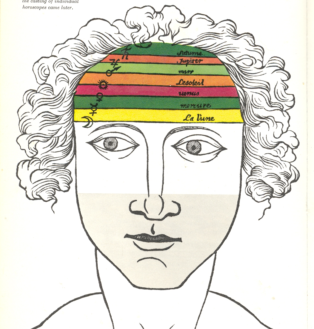
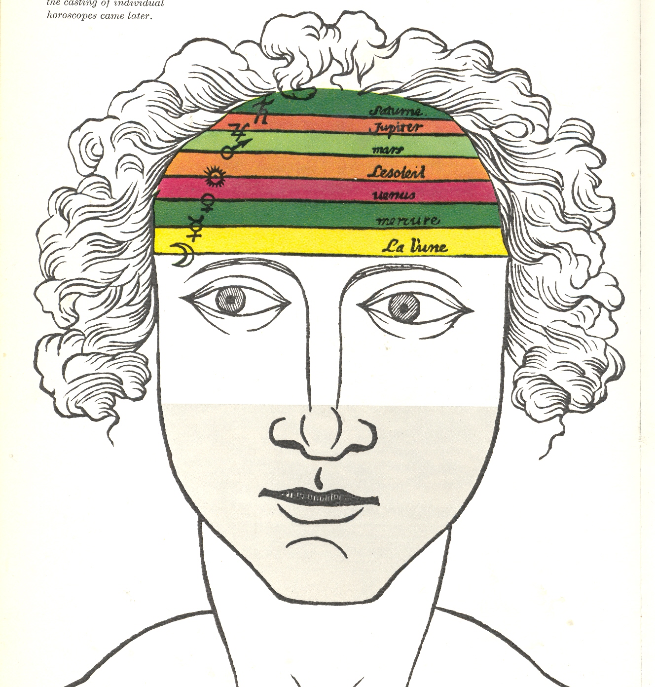
geological era (say, prior to the 1790’s).This is a good example, an astrological man, showing the influence of the planets (and sun and moon) on the different layers of the brain:
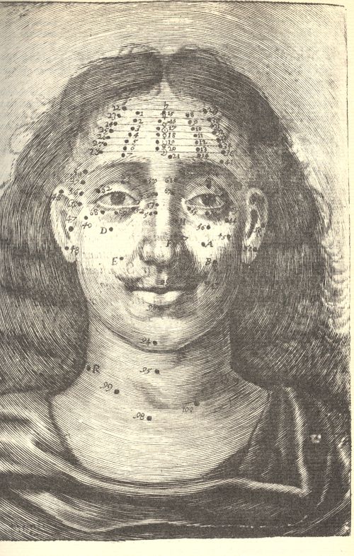
Differentiated, say, from Richard Saunders’ Mole-map man, (right) where facial (and etc.) moles were used as maps to determine some sort of specific actions on the organs underneath (and also by a tea-leaf divination, where the mole lines were connected and disconnected, and interpreted, according to the needs/whims of the observer):
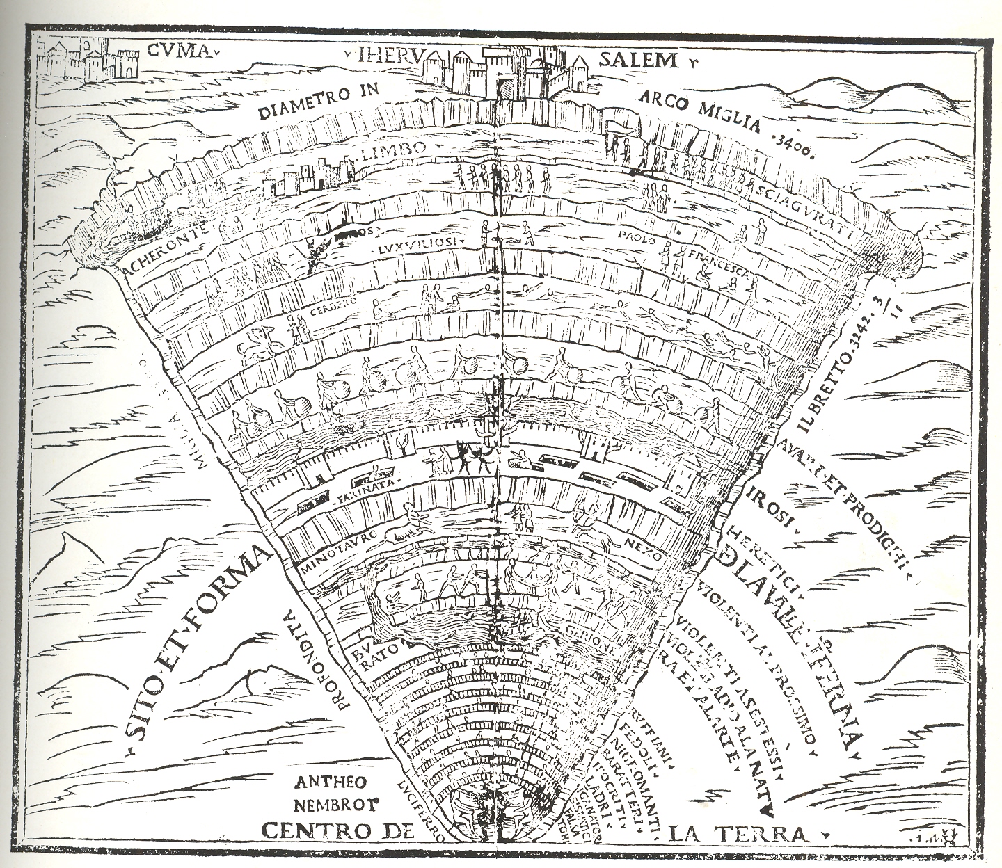
The classic sort of image may be something like this fantastic depiction of the Inferno of Dante (shown here in the Comedia published in Venice by Gregorio de Gregoriis in 1515:
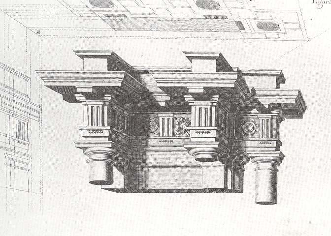
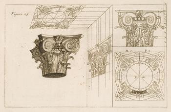
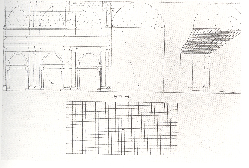
The fantastic Jesuit Andrea Pozzo published results of his researches on perspective in his Perspectiva pictorum et architectoru (1693), explaining how he was able to compellingly, unbelievably represent three-dimensional images on two-dimensional spaces, this image showing plan and projection and profile, effectively giving you a three-dimensional cross section of the architectural element:
And again:
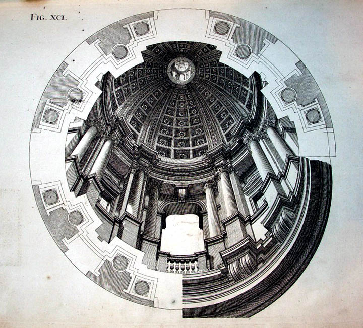
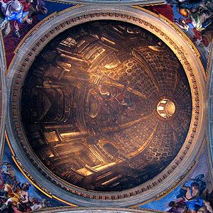
And of course his masterpiece displayed, which is an engraving showing the plan of a flat ceiling of St. Ingacio in which he painted his magnificent trompe l’oeil masterpiece:
Also in a way appropriate to this ramble is the explanation diagram by Pozzo’s found in Martin Kemp’s The Science of Art, Optical; Themes in Western Art from Brunelleschi to Seurat, showing the imaginary depth of a deeply illusory painting on a (basically) flat ceiling surface:
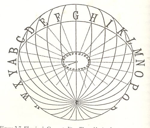
Also in consideration for this area is Sir Sandford –the inventor of Standard Time–Fleming’s wonderful idea for a G-o’clock world, a same-time-everywhere planet, with his 1879 diagram illustrating the earth-penetrating time principles so:
(Image source: “Time-reckoning and the selection of a prime
meridian to be common to all nations” in the Proceedings of the Canadian Institute, Toronto, 1879 published by Copp, Clark)
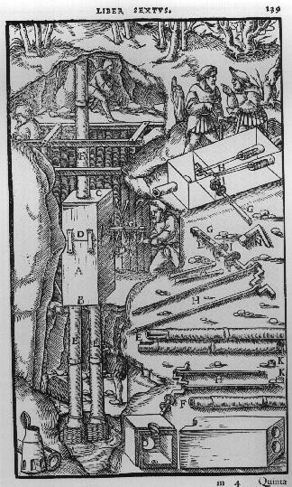
Agricola’s De Re Metallica (from the first Latin edition f 1556) displays many interesting cross sections of Renaissance mines:
There’s much more to come in this area, of course–this is just what I had time to deal with this afternoon, though the this task is much more complicated in the 18th century world than in the 19th, when we find cross sections of the earth and the oceans. But I’ll close here, with all faults.
This confusing title is accurate without very much grant in license and tells a short and true story of three fitful maps, two of which are beautiful and one just so-so.
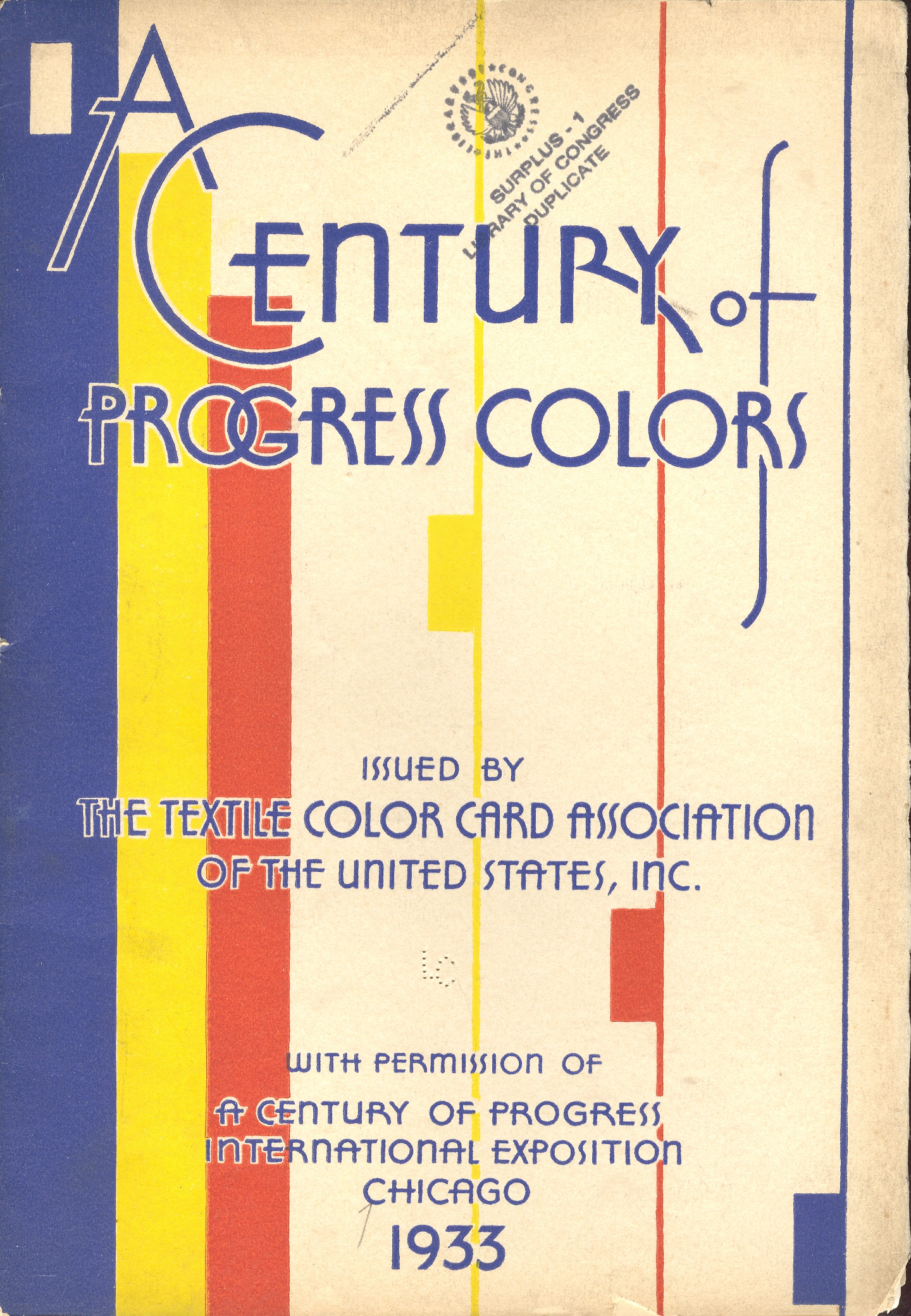
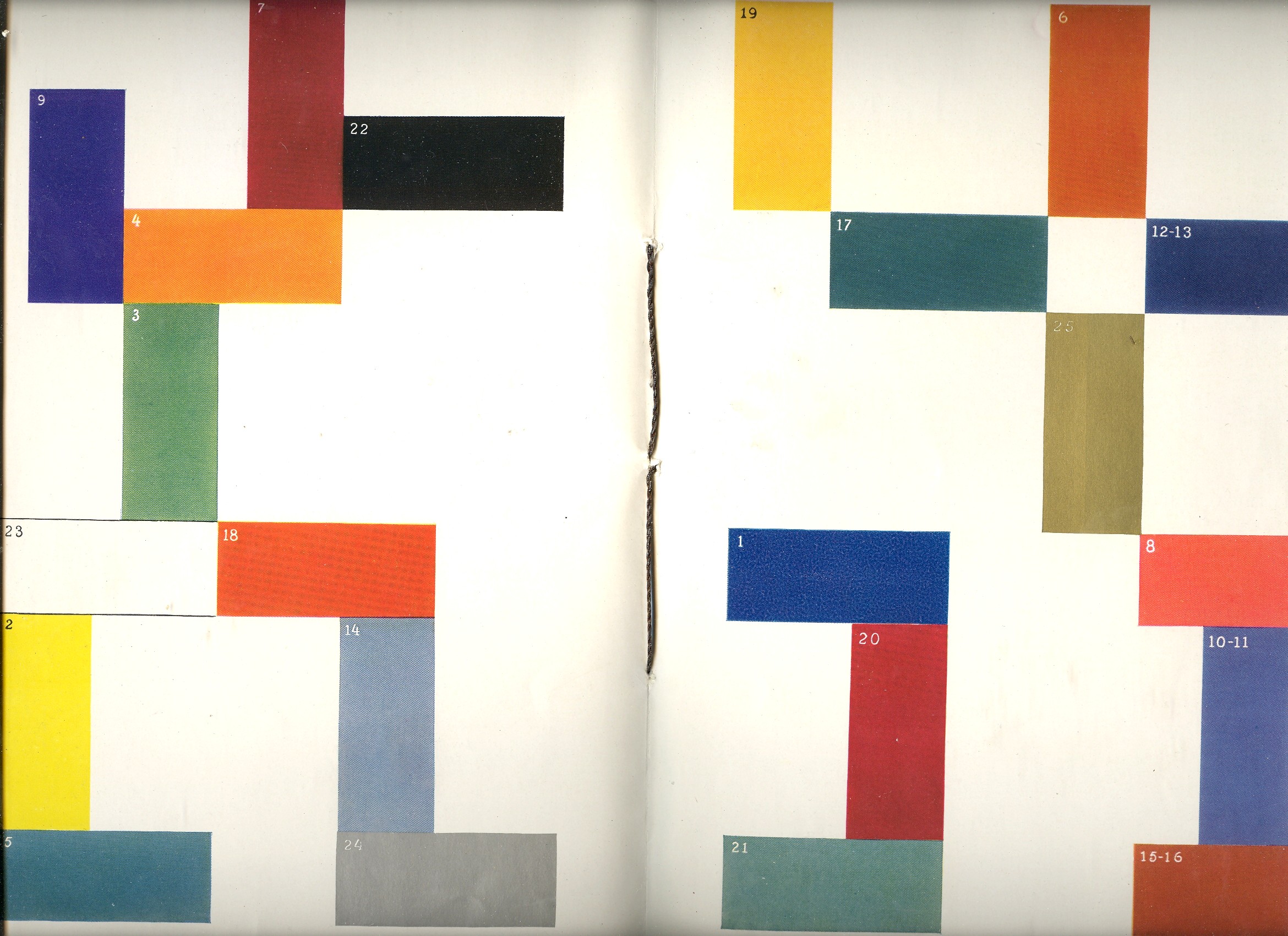
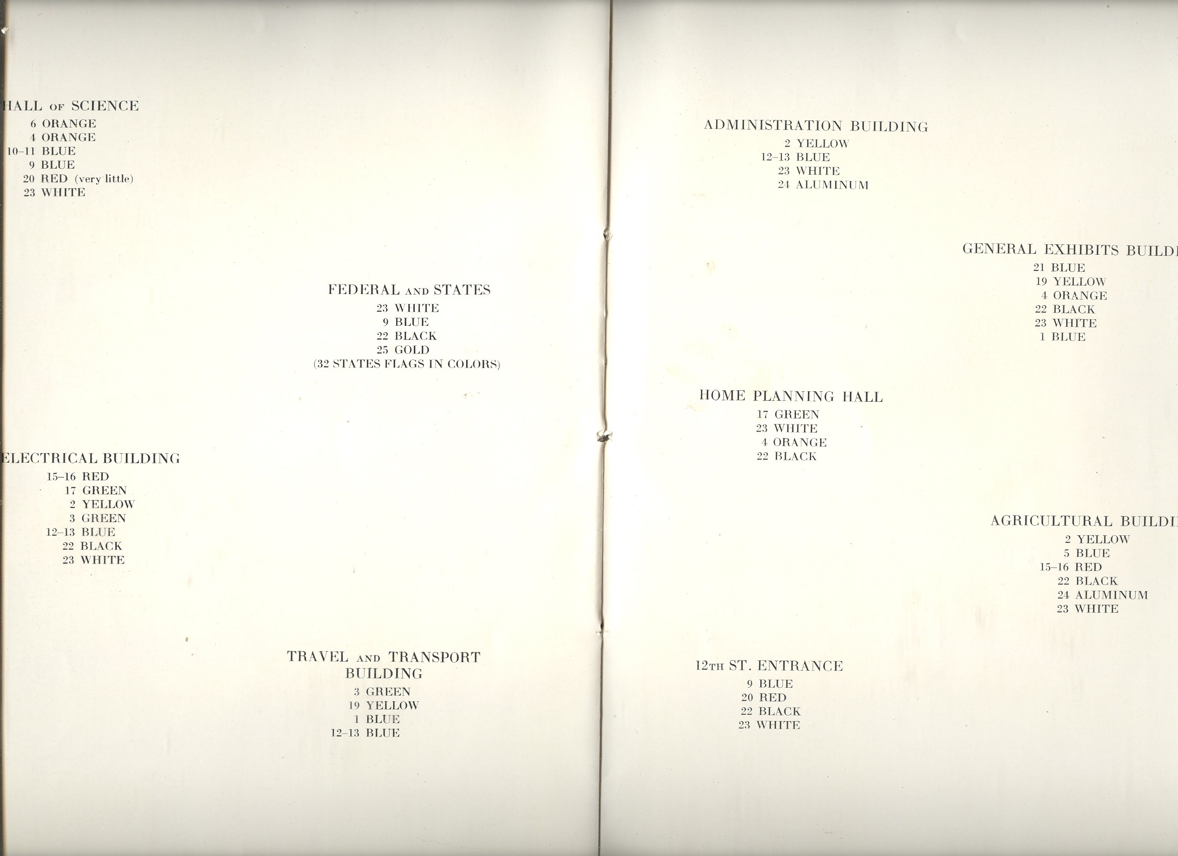
The first map fit is featured in a beautiful pamphlet called A Century of Progress Colors and was issued by the Textile Color Card Association of the USA.(The title being a small play on the 1933 world’s fair in Chicago called “A Century of Progress”. The Textile Color Card Association was created to standardize color nomenclature and composition in industrial colors (and is still in existence.)The map distributed the major pavilions at the fair by their dominating colors, naming those colors in the unusually-sequenced double-page key on the following pages (below1).I can certainly appreciate the effort and the beautiful design it produced, but as a map of the fair it leaves much (if not everything) to be desired.
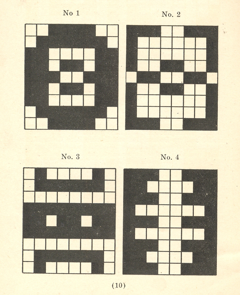
The second map fit belongs to a small pamphlet published by Albert Coble called Games of Colors, Kindergarten and Primary Exercises. Its actually an enterprising little book about reaching into the minds of little ones and explaining how colors are put together and how they relate to one another. It is unfortunate that the drawings used to illustrate the color map part of the pamphlet were done in black and white. Which is a little on the self-defeating side.
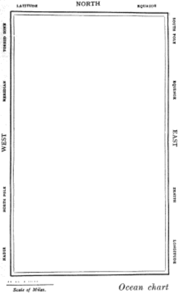
But the finest fit of the three fits is fit number three, which is the map of the Bellman’s tale, starting the second fit of Lewis Carroll’s The Hunting of the Snark, an Agony in Eight Fits.
But the map that I think I love the most illustrates Lewis Carroll’s The Hunting of the Snark, an Agony in Eight Fits, and occurs in the Bellman’s tale, starting the second fit1. It is simply magnificent.
Then, of course, there is this:
Notes:
1. The key:
2. The fit begins so:
The Bellman himself they all praised to the skies- Such a carriage, such ease and such grace! Such solemnity too! One could see he was wise, The moment one look in his face!
He had bought a large map representing the sea, Without the least vestige of land: And the crew were much pleased when the found it to be A map they could all understand.
“What’s the good of Mercator’s North Poles and Equators, Tropics, Zones, and Meridian Lines?” So the Bellman would cry: and the crew would reply, “They are merely conventional signs!
“Other maps are such shapes, with their islands and capes! But we’ve got our brave Captain to thank” (So the crew would protest) “that he’s bought us the best- A perfect and absolute blank!”