A Daily History of Holes, Dots, Lines, Science, History, Math, Physics, Art, the Unintentional Absurd, Architecture, Maps, Data Visualization, Blank and Missing Things, and so on. |1.6 million words, 7500 images, 4.9 million hits| Press & appearances in The Times, Le Figaro, Mensa, The Economist, The Guardian, Discovery News, Slate, Le Monde, Sci American Blogs, Le Pont, and many other places… 5000+ total posts since 2008.

  • Daily Dose of Doctor Odd: Disappeared NYC, 1946

    JF Ptak Science Books   Quick Post

    This is part of a series on destroyed New York City that includes New York City: Attacked by Tentacled Flying Saucers, Giant Flying Snakes, Glaciers, and Mining Missile Space Aliens, 1929-1941 and H-Bomb Wipes out Brooklyn, among others.

    http://static.flickr.com/66/199900324_b6a6863a76_o.jpg


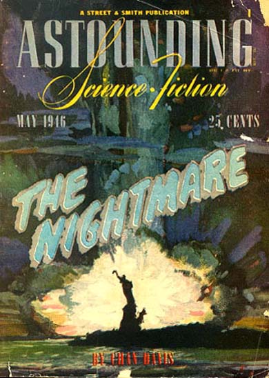
     ”This is a story of the immediate tomorrow – and of civilization headed down the  inescapable road to destruction – down the road that we have, already, selected – and its nightmare end.”

    Chandler Davis wrote this nightmare for Astounding Stories in 1946, and the artwork of the deteriorating-before-your-eyes Statue of Liberty fits this blog’s series of Disappearing New York series. Davis is a very interesting man–Ph.D. mathematics from Havard and professor of math at Toronto, a New York-born man who started his sci fi career early (age 20, with the story above) and who iimmigrated to Canada after his relsease from his HUAC-inspired prison term.  Davis was probably a born Leftie, a radical, and it evidently never left him. 

    The cover art is by William Timmins. 

  • Blank, Empty and Missing Things: a “Missing” Renaissance Masterpiece

    JF Ptak Science Books   Post 1874  [One in a series on the History of Blank, Empty and Missing Things.]

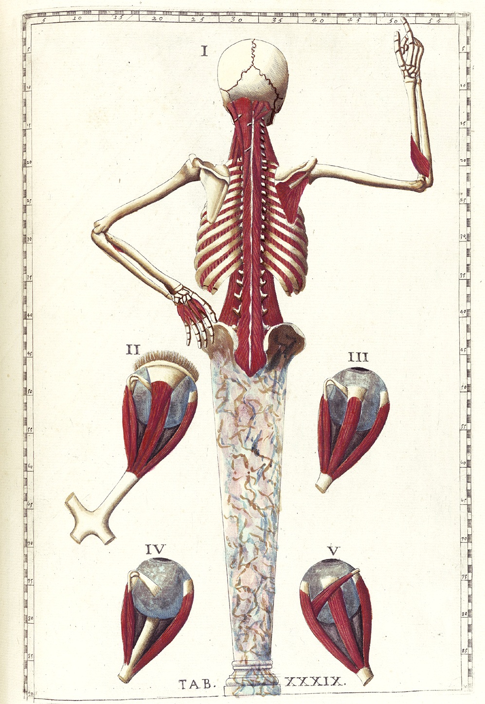
    The remarkable engravings below are even more so when you consider that they were published more than two hundred years afer the death of their originator.  Bartolomeo Eustachi (1500/1524-1574) was one of the founding member of a very small school of modern anatomy (another being Vesalius) who undertook very careful dissections in his study of the body, finishing (in 1552) a work of paramount importance just nine years after the publication of Vesalius’ revolutionary work–it was a work that would remain unpublished for 162 years.  The threat and fear of excommunication and other reprisals at the hands of the Catholic Church prevented its publication, the full work not seeing the light of day until 1714.  It would be published several times more in the 18th century, a great tribute to an anatomist whose work was still being studied more than 200 years after its completion.

    One of the great missing books then belongs to Eustachi, his Romanae archetypae tabulae anatomicae novis…(with the examples of images below being published in Rome in 1783) belongs to a very small class of technical/medical  books published long after they should have been and which still were found to be of great and substantial use. He was an absolutely superb anatomist, using dyes and injections for visually troublesome areas, as well as early versions of “microscopes” to observe miniscule bits.  He was a fine student of his physician father, well-versed in classical education, and by 1549 he was the professor of anatomy at the Archiginnasiodella Sapienza, where he was also able to avail himself of a number of cadavers for dissection.   

    He worked on his anatomy for several years, readying 47 plates for publication.  It would come to pass that only eight of them were published during his lifetime–those on the kidney and teeth, published as De Renum structura (the first work dedicated to that organ), and De dentibus (for the teeth), respectively. 

    The engravings–rather, the incised plates of the engravings–went missing after Eustachi’s death, and stayed so until (as noted above) 1714.  According to faqs.org , Eustachi’s work was still prized 160+ years later for their elegance and beauty and detail because:

    “… they provided some of the best descriptions of the base of the brain, the  sympathetic nervous system (the nerves that control the constriction of  blood vessels, among other things), the vascular system, and the structure of  the larynx.”

    Eustachi_t39 
    [More images below]
    among many other reasons.

    I can’t help but wonder what the result of the publication of this book would have affected if it had been available in 1552.  It stands to reason that if it was still being used in 1789, and still useful and respect and “current”, then it would lead me to believe that it would have had a major impact 227 years earlier.

    (Source: Bartholomeo Eustachi: Tabulae anatomicae. (Rome, 1783), . Historical Anatomies on the Web. US National Library of Medicine.)

  • Truman and the “Cry-Baby Scientist”: Oppenheimer in the Oval Office, October 1945

    JF Ptak Science Books   Post 1875  [Part of a long series on Atomic and Nuclear Weapons]

    There was a short period in July 1945–right after the atomic bombs were detonated over Nagasaki and Hiroshima–that a pervasive, acceptable logic took hold of the minds of many at Los Alamos and Washington D.C. that the  bomb might actually work to prevent war.  Loosely put, the bomb was too terrible to use, too lethal, too destructive, too fantastically bad in its earliest stages of design to actually become part of the world’s military arsenal.  If that feeling was widespread, it lasted abut 72 hours.  Oppenheimer had it for a little while for a few days, until he realized that his expectations were unfounded and that he saw the situation in reverse.  

    It is interesting to set the meeting with Oppenheimer in the course of Truman’s daily day, a pretty busy day, a day filed with stuff and fluff and a meeting with Oppenheimer about the future of the arms race.  Turns out that the meeting with Oppie went as scheduled, ended perfectly on time to accommodate the next Oval Room visitor, the postmaster from Joplin, Missouri.  It must’ve been important to the Joplin man, and I guess to Truman, but not too many others. 

    The meeting between Oppenheimer and Truman did not go well.  It was then that Oppenheimer famously told Truman that “I feel I have blood on my hands”, which was unacceptable to Truman, who immediately replied that that was no concern of Oppenheimer’s, and that if anyone had bloody hands, it was the president.  Oppenheimer felt as though the future was in the balance, and that the American government was using/would use the bomb as a political tool against the Soviets. Actually, the employment of the bomb as a part of American foreign policy was–obviously–a new affair, and the application of it as a sort of Pax Atomica in the early years following the end of the war was a wholly new development.  And applying the threat of the use of the weapon against the Soviets was a natural state, as many military figures (including, for example, General Leslie Groves) considered them as an enemy right from the start.  The fight between the U.S. and the U.S.S.R. started pretty much in 1944, when (with General Groves, again) there was a spearhead movement to control all of the world’s supplies of atomic-bomb-related natural resources.

    That is just a little of the background to the meeting in the Oval Office back there in October 1945.  Truman had very little use for Oppenheimer then–little use for his “hand wringing”, for his high moral acceptance of question in the use of the bomb, for his second-guessing the decision.  Cold must have descended in the meeting, as Truman later told David Lillenthal of Oppenheimer that he “never wanted to see that son of a bitch in this office again”.  Truman would retell the story in different waysm, but with generally the same result, waxing about how he dismissed the “cry-baby scientist”.   

     
    Thursday, October 25, 1945
       
    Executive Orders:  [9646 COAT OF ARMS, SEAL, AND FLAG OF THE PRESIDENT OF THE UNITED STATES]
    Executive Orders:  [9647 REGULATIONS RELATING TO THE GIVING OF PUBLIC NOTICE AND THE PRESENTATION OF VIEWS IN CONNECTION WITH FOREIGN TRADE AGREEMENTS(1)]
    Executive Orders:  [9648 DISCONTINUING THE MATAGORDA BAY DEFENSIVE SEA AREA(1)]
    10:00 am Congressman Carter Manasco, Alabama
    (The President sent out word wanted to see him)
    10:15 am Mr. James S. Lillis of Kansas City
    10:30 am The Secretary of War [Robert P. Patterson]
    (Dr. J. Robert Oppenheimer of University of California
    (Re atomic bomb)
    11:00 am Mr. Leslie L. Travis; Mr. George Spiva.
    (Mr. Travis is Postmaster at Joplin – we wrote him
    the President would be glad to see him when he came
    to Washington)
    11:15 am Hon. Raymond M. Foley, Commissioner, FHA
    11:30 am Congressman William M. Whittington, Miss.
    (The President sent out word wished to see)
    11:40 am Mr. Leon Reliford of Hickman Mills, Mo.
    (With Metal Workers International Union, and knew the
    President in Kansas City at which time he was
    connected with Building Trades Union)
    11:45 am General Henry H. Arnold
    (Re a note which Secretary Stimson left for him to take
    up with the President)
    12:00 pm The Secretary of Labor [Lewis B. Schwellenbach]
    12:30 pm H.E. Hon. Sergio Osmena, the President of the Philippine
    Commonwealth
    The Secretary of the Interior [Harold L. Ickes]
    Hon. Paul V. McNutt
    (Mr. McNutt urged that this appointment be made, as
    he felt it important that they talk to the President)
    12:45 pm The Secretary of the Interior [Harold L. Ickes]
    (Mr. Ickes had earlier asked and secured this appointment
    alone)
    1:00 pm (LUNCH)
    4:00 pm Press and Radio Conference [Public Papers]

    ·Posted by :

    ·in:

  • Bad Ideas Deparment: Scientific Finger Combs

    JF Ptak Science Books   Post 1876

    Hair fingers copy
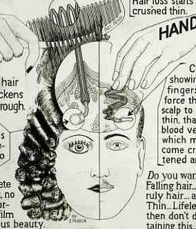
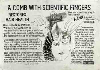
    Well. This item is of course lost on me, but the new “wonder-worker comb” somehow did an anti-crushing  something to the scalp and the hair root that promoted/restored and fictionalized hair health. The secret to understanding  it all, evidently, is that “bad scalp” is “crushed thin”.  This is brought about by “HAND pressure”, from  “strong fingers that mash and force the elastic scalp to become thin and such” causing  hair to be “more crowded, flattened”. For some reason the inventor didn’t speculate on whether other sorts of combs did this, or not; it looks as though he/she was targeting only those who combed their hair with their own non-plastic fingers, clearly elucidating this primal contest in a “wonder worker comb” vs. crushing/flattening comb fingers vocabulary.

     The comb with the adjustable fingers “pulls, exercises, stretches, thickens and loosens the scalp as it passes through” (the hair, the scalp?). It makes the scalp “roomy inside”, allowing the extra room that the hair needs “to function”. These hair restorative miracles is the result of the simple use of the comb, providing “complete results all by itself, no wasted efforts…”.

    The comb also, it seems, controls dandruff, and improves “thin, Lifeless, Dry-hair (sic)”.
    That’s a lot to ask of a piece of plastic.

    Blogcomb_hair230

    This  somewhat-scary item is a photographic postcard sent to the Library of Congress as a Copyright Deposit copy–part of the process of securing protection from intellectual theft via American copyright.  One is set to wonder about who–and why–this idea would be stolen. It would make an interesting story about Really Bad Ideas that were appropriated to no good end.

  • Beautiful Technical Illustration & a Snapshot of Hard Work in 1800

    JF Ptak Science Books   Post 1878 

    There is, buried deep within this engraving, a small but penetrating snapshot of working life in very early 19th century England.  Very working life.  We’ll get to that in a moment, after introductions are made to the brilliant composer of these images.

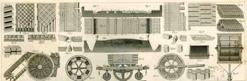
    Blogtunnel_full239 J.G. Heck wrote and compiled a fascinating and complex work entitled The Iconographic Encyclopedia of Science, Literature and Art, and was published in America for the first time in 1851 following Spencer Baird’s translation from its original German.

    The key to his work is the amount of data displayed on each of the 500 engraved plates illustrating this work and the way in which it is arranged.  The design and layout of the 30,000 items on these 500 plates was a work of genius, and for my money it is easily the best-presented complex means of the display of data and objects that was published in the 19th century.   

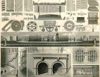
    Take for example this illustration in the technology section (a subdivision of the applied arts which is a sub division of the plastic arts) and, continuing in this complicated scheme, was Plate 1 from Section X Number A1 with a description found in the text on a dozen pages in Section 2 of Volume 2 on section pages 134-150 and overall page numbers 835-851 (!).  The plate contains 35 figures, very finely executed and rendered (many of the other of the 500 plates have 100 or more figures), and is in general related to the construction of roads and tunnels (and further, part of the “communications” section).
    Blogtunnel_top240

    This of course would be a perfect Hypertext candidate.

    The illustration itself contains an enormous amount of information.  The row along the top third or so is dedicated to street construction and paving stone, showing stones in plan and profile, as well as a cross section and ground plan of a “typical” street (including sidewalks).  It is interesting to note the detail of the cross section and the stonework that is placed beneath the horse and wagon section of the street.  There are some other beauties here as well–details of wooden paving blocks, the plan for a Laves of Hanover road, different ways of cutting stone blocks—but we won’t deal with those right now, except to point out that there are several renderings of street cleaners and road rollers (of Shettenmann and another of Schaefer) used to border the street section from the tunnel section. 

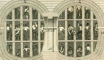
    Blogtunnel_middle241 The middle section of the engraving is of course a cross section of the Thames tunnel of the beautifully-named Isambard Kingdom Brunel (begun in 1825 and completed 1843, the tunnel 35 feet wide (11 m), 20 feet (6 m) high and 1,300 feet (396 m) long, running between Wapping and Rotherhithe at a depth of 75 feet (23 m)).  The representation here is only one inch high and ten inches long but is loaded with just fabulous detail, no the least of which are the (less than) 1mm tall workmen that can still be seen in the tunnel.
    Blogtunnelbig_detailig247  
    The enlarged detail shows a section of the tunnel being built according to Brunel’s new specifications:  a larger, shielded tunnel being constructed around the interior construction of 12 individual tunnels (each about tall enough to allow a (short) man to stand erect. 

    It is unneccessary to say how difficult this work must have been. Cramped, dirty, dark, stale-aired, and dangerous, this was the very definition of a compromised working environment.

    In short, the engraving is a superb example of *correct* design of great artistic  ability, all accomplished while displayed heaps and gobs of interconnected, complex information. 

  • A Sample of Unexpected Design in Paper Bindings of Antique Pamphlets

    JF Ptak Science Books   Quick Post

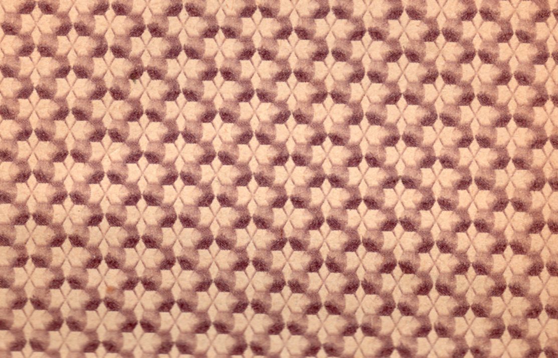
    I wish that I had been keeping track of (pre-1900) pamphlet cover designs over the 30-year period that I have been dealing professionally with books.  There have been so many designs that have popped up with very unexpected flavors that I think an entire exhibition could be made of them.  This idea was brought home–again–with this beautiful cover for an 1825 pamphlet:

    Cover design623
    Which is a detail from:

    ·Posted by :

    ·in:

  • An Orchestra of Child Prodigies, 1876

    JF Ptak Science Books   Quick Post 

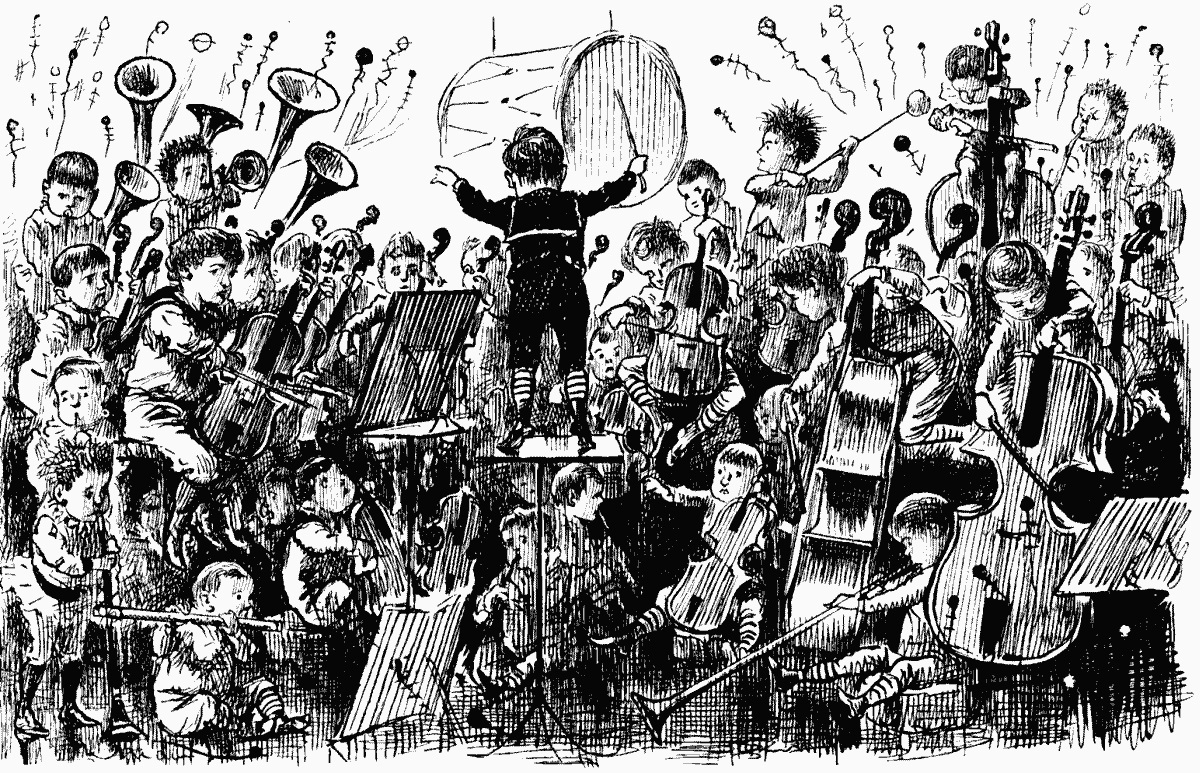
    I am not sure that I have ever seen an image of an orchestra composed entirely of children, so I reprint this, found in the pages of an 1876 volume of Punch Magazine.

    All child orchestra

    “THE YOUNG PEOPLE’S ORCHESTRAL CONCERT.” ALL INFANT PRODIGIES.

    ·Posted by :

    ·in:

  • On the History of Title Pages: the First Image of a Suicide on a Title Page?

    JF Ptak Science Books  Post 1877

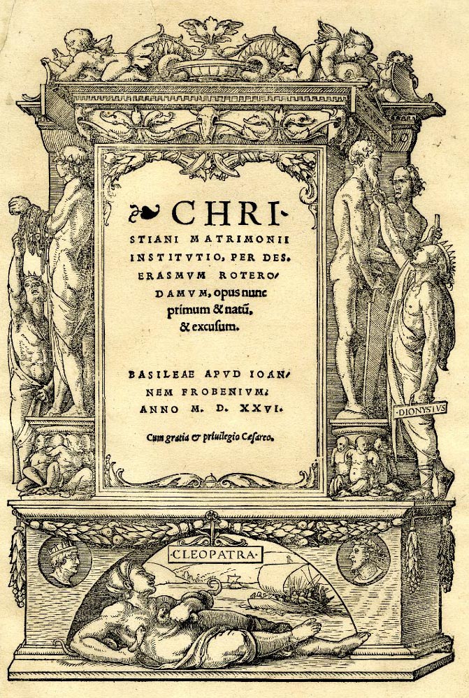
    Books  suicide on a title page_edited-1For a number of years following the invention of the movable type press, title pages were very simple affairs, generally starting with a simple statement of the title (the incipit) and then right off to the beginning of the book, right there on the same page, with the information about who printed the book where and when saved for the final page of text, the colophon.  Ornamentation came a little slowly (or perhaps slowly), with the first recognizable-to -modern-eyes title page appearing in the Calendarium of Regiomonatnus, printed in woodcut and metal-type in Venice in 1476, with the date unusually displayed in Arabic numerals. The issue of more appealing display in book presentation–the approachable title page, illustrations and covers–became a true issue after the printers in Augsburg in the 1470’s revolutionized book production by introducing a more industrialized method of production. 

    The issue of illustration really didn’t start to ramp up until after 1500 when the expensive and time-consuming standard of using woodblocks in the production of images was replaced by the copperplate engraving.  And it was during this time, in the very early 16th century, that ornate and illustrated images began to appear on the title page itself.

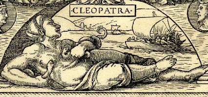
    One example of a curious approach to illustration belongs to Hans Holbein, who created a somewhat  three-dimensional ornamental and cascading title page that also happened to contain an image of Cleopatra in a suicide-by-snake.  The snake may have been an Egyptian asp, and perhaps not, if she committed suicide by this manner at all.  Cleopatra finally was led to this end on 30 August 30 BCE after a long string of affairs and consorts with Rome and its Emperors, failing finally after the death of Marc Antony and the rejection by OCtavian (who later would become Augustus, perhaps the greatest of Roman Emperors).  In any event, we see Cleopatra here committing the deed, with what may be some of Antony’s Alexandria-based fleet in the background.

    The design was copied many times, and used for a number of different title pages–the first time being in a work by Erasmus in 1523, and in the example below, later, in 1526.  Offhand it is difficult for me to say if there are earlier suicides on thte title pages of books, but this would certainly be among the earliest, if not the earliest yet. 

    (Also appearing on either side of the columns in the middle of the page is Dionysius of Syracuse, an autocrat of the highest order, here shown plucking bits of treasure from the statues of gods. There were two rules named Dionysius, father and son, I and II; the elder may have been killed by the younger via physician-assisted poisoning; the younger (of Damocles and the sword fame among other things usually not so pretty) was equally tyrannical and also came to a bad end.)


    Books  suicide on a title page

  • The Discovery of Salad–Massonio, 1627

    JF Ptak Science Books   Continuing Post 718

    “Salad, a term derived from the Latin sal (salt), which yielded the form salata, ‘salted things’ such as the raw vegetables eaen in classical times with a dressing of oil, vinegar or salt. The word turns up in Old French as salade and  then in late 14th century English as salad or sallet.”  —Oxford  Companion to Food, Alan Davidson [Oxford Univeristy Press:Oxford] 2nd  edition, 2006  (Quote found at Food Timeline, here.)

    ===blog==aug 19==salad  I was looking for an antique recipe for pesto and came
    across this remarkable book by Salvatore Massonio, Archidipno overo dell’insalata
    e dell’vso di essa
    , published in Venice by Marc’Antonio Brogiollo in 1627. It
    is in short a philosophical cookbook for salads—and the first of its kind
    dedicated solely, devoted entirely, to the salad.  IT must have been a revolutionary
    publication, and probably intended for the very wealthy.  The book is no slim effort: 68 chapter and
    425 pages long, it describes the stuff of the salad and its dressing.  Actually salad wasn’t limited to just greens
    in this book, and his quasi-vegetarian sentiment was tested by including cold
    salted meats, cold salted tongue, livers and such in the mix.  But Massonio was definitely far ahead of
    anyone else at the time dealing with the benefits of the salad for both health
    reasons, as well as for making the salad not a meal in itself but an appetizer
    for something larger to come.  In another
    great possible “first”, the wonderful Massonio seems to be the first to
    describe the use of garlic in a sauce. 

    Now. About that pesto recipe…all I need is some stuff from Italy
    and a special-marble mortar and I’ll be somewhat on my way, at least as the
    purists are concerned. The birthplace of pesto, Liguria,
    takes its poition as the originator of the great green delicacy very seriously,
    legislating exactly how and with what peso should be made.  And that is as it should be.

    “They say the divine Augustus was preserved in a  time of ill health by the use of lettuce, and no wonder, because it aids  digestion and generates better blood than other vegetables. It is eaten cooked  or raw. You season raw lettuce this way if it does not need washing…put it in  a dish, sprinkle with ground salt, pour in a little oil and more vinegar and eat  at once. Some add a little mint and parsley to it for seasoning so that it does  not seem entirely bland…” —Platina: On Right Pleasure and Good Health, [Italian:1475, original text in Latin], translated by Mary Ellen  Milham [Medieval & Renaissance Texts & Studies:Tempe] 1998.

    ·Posted by :

    ·in:

  • Dorothea Lange, Imperial Valley, California, 1937. FSA Photographs

    JF Ptak Science Books  Post 1878

    Migrant Mother


    Dorothea Lange, a standard portrait photographer-turned-superb-documentarian, had a six-year-run of photographic success and inspiration and energy as few people have ever experienced in the history of photography From her 1936 Migrant Mother, which is perhaps the great photograph of the American Great Depression (which I wrote about in The Best Dollar the U.S. Government Ever Spent) to the wicked sharpness of her documenting the terrible business of relocating Japanese American citizens to concentration camps in 1942. Lange traveled the country recording the state of Americans in what may have been one of the great journeys of th 1930’s. 

    The period in which this was all happening was one of the most chaotic in modern history–at least in the West.  The Depression was full-bore-on, of course; as Germany strained its way into confrontation with the rest of the world, taking its calculated and inexorable steps towards world hemispheric chaos. The other images of these six years are almost a dada-kaleidoscopic  assembly of the believable and the not believable:  Sudetendland, Kristallnacht, Neville Chamerbalin, Austria, Poland, Nanking, Canton, War of the Worlds, Munich Agreement, WWII in Europe, Spanish Revolution, lynching, Jewish explusion, concentration camps, Pearl Harbor. In the United States, there was a certain right-wing element that ran deep into the national consciousness, the worst embodied in Father Coughlin’s filthy radio diatribes on keeping America out of war wrapped in Jew-hating monologues, the ridiculous semi-levitating philosopher-fake and home-town-boy-gone-bad Charles Pelley and his Silver Shirts being part of his support; Henry Ford and his assault on Judaism and insistence on The Protocols of the Elders of Zion, Charles Lindbergh and America First, and so on., and for a divisive time until the crystalizing of Pearl Harbor.

    The literature of this time, of this 1936-1942 period, expressing the soul of the country seems pretty full, with these few works standing as good examples of the work of the period:   John Steinbeck’s beginning in “the Harvest Gypsies”/Their Blood is Strong, The Grapes of Wrath,  Faulkner’s Absolom! Absolom! (1936), Pare Lorentz The Plow that Broke the Plains, Carey McWIlliams Factories in the Field (1939), Taylor/Lange’s An American Exodus (1939), For Whom the Bell Tolls (1940), the New Masses,   Abel Meeropol’s anti-lynching poem “Strange Fruit”, and so on, deeply on.

    But perhaps in all of it, perhaps nothing else quite expresses the emotion of the period than Lange’s Migrant Mother.  It seems to have everything, in one photograph.  In the vast result of Lange’s work during this period it is interesting to have a look at her in Imperial Valley, California, in 1937–it seems less-often mentioned, though the work is very strong.  So I decided to post a few of the images with a link to the rest of the collection (below).

    Lange worte:

    “I was forced to switch from Nipomo to the Imperial Valley because of the conditions there. They have always been notoriously bad as you know and what goes on in the Imperial is beyond belief. The Imperial Valley has a social structure all its own and partly because of its isolation in the state those in control get away with it. But this year’s freeze practically wiped out the crop and what it didn’t kill is delayed–in the meanwhile, because of the warm, no rain climate and possibilities for work the region is swamped with homeless moving families. The relief association offices are open day and night 24 hours. The people continue to pour in and there is no way to stop them and no work when they get there.”

    http://memory.loc.gov/pnp/fsa/8b31000/8b31800/8b31812r.jpg
    Former tenant farmers on relief. LC-USF34T01

    Other samples below but a fuller listing of images is available here.

    Imperial Valley, California, February and March 1937
    Resettlement Administration

    Notes:

    1. Lange was still very new to the FSA project when she made this photograph in the spring of 1936.  On the tail end of a month-long road trip she was nearing the end of her day when she spotted a hand-lettered sign “Pea-Pickers Camp” by the side of the road.  Lange briefly considered stopping but went ahead, questioning her judgment continuously for the next 20 miles, when she finally turned around to find the turn-off for the camp.  She drove down the dirt road and found a ramshackle assembly of tents, one of which contained “an exhausted mother sitting forlornly with her children”.  Lange spent only 10 minutes with the woman, making five exposures.  She learned that “the crops had frozen, and the woman and children were living on vegetables scavenged from the fields, and the few birds that the children managed to catch.  The mother could not leave; she had sold the tires from her car”.

    The images were made using a Graflex camera. The original negatives are 4×5″ film.
    ·Posted by :

    ·in:

    —
  • Post-Renaissance People in Bed on Title Pages

    JF Ptak Science Books   Post 1879  (Following an earlier post on the appearance of the first (?) suicide on a title page, here.)

    Edical bed747

    No doubt there are many examples of finding people in bed on title pages of books printed in the high Renaissance and Baroque–I found two pretty quickly.  Of course it would make sense to look at medical titles, as in the case of many examples where the borderland images of decorated title pages surrounding the text describing the book were often filled with allegrocial tales, which means that at some point in the allegroy involving  medicine that sooner or later someone is going to wind up in bed, overseen by their physician. 

    This is definitely the case with the following image (found at the National Library of Medicine, here):


    The book is by Maritn Pansa (b. 1580), and the title to the  Appendix consilii antipodagrici specialis darinnen X consilia specialissima (printed in 1615) shows lives that were led basically in pursuit of pleasures and vice and crime that would eventually lead to the big bad straight bed at the end of their perceived crooked road.  The title page tells of lives lived in pursuit of hunting, and wine, and women and song, as well as the abuse of children–creature comforts and vices which would eventually lead the practionner  to a sick-bed for their pursuit of foul ends.  The baseline here is a warning for those living a High Life in perhaps-exalted states would more than likely pay for their lifestyles with sickness in the end.

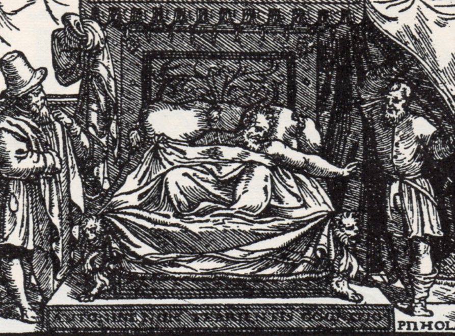
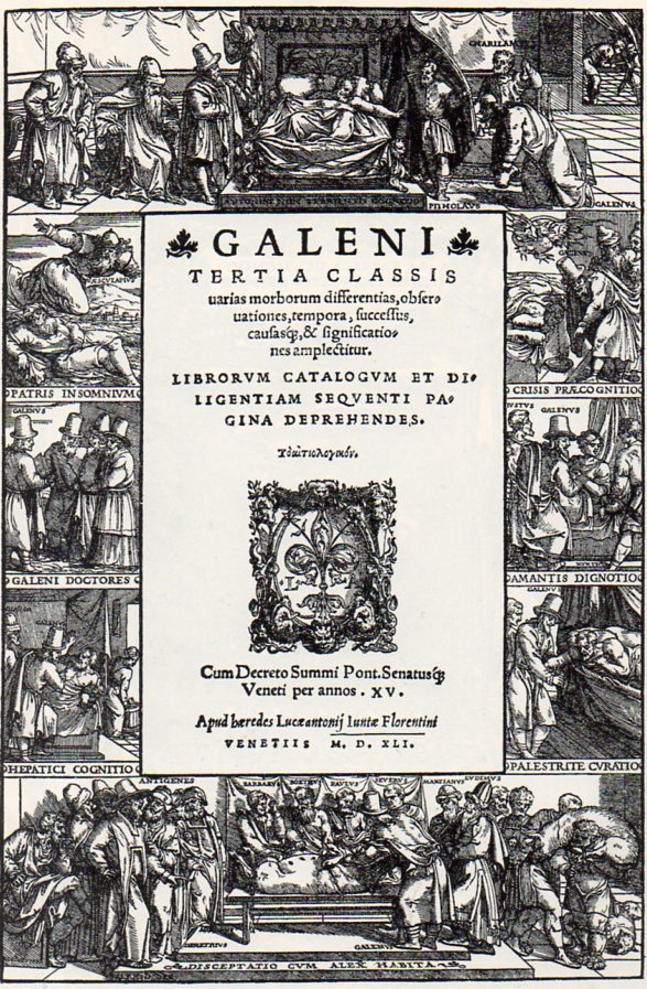
    Another good example is fond in Galen’s Tertia Classis uarias morborum differnetias, obseruationes, tempora, successius, causasqe & signficatio nes amplectitur…, which was published in Venice in 1541 with a beautfiul woodcut title page illustrated by a follower of Titian.  First and foremost, the capstone of the border images shows a sick patient being attended by doctors of classical greatness including Galen himself (at the extreme right of the first image, above). 

    Edical bed746

    Galen (Aelius Galenus or Claudius Galenus (AD 129– c. 200)), was an ancient too, and taking this little trip through time he must’ve seen some surprising things, not the least of which would have included this bed. It should be noted that until the publication of the revolutionary work of Vesalius, Galen was the largely-unimpeachable source of medical knowledge for some 1300 years.

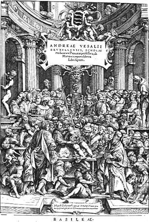
    And of course there is another sort of bed in the Vesalius book’s (De humani corporis fabrica libri septum…) title page, though this is the most uncomfortable of all:

    Medical--vesalius title page

Recent Posts

Archives

Categories