A Daily History of Holes, Dots, Lines, Science, History, Math, Physics, Art, the Unintentional Absurd, Architecture, Maps, Data Visualization, Blank and Missing Things, and so on. |1.6 million words, 7500 images, 4.9 million hits| Press & appearances in The Times, Le Figaro, Mensa, The Economist, The Guardian, Discovery News, Slate, Le Monde, Sci American Blogs, Le Pont, and many other places… 5000+ total posts since 2008.

  • The Eyes of Gemma Frisius

    JF Ptak Science Books   Quick Post

    Gemma Frisius176

    This is a fine detail from a late 17th century print of Gemma Frisius (1508-1555).  He died young but with many accomplishments, not the least of which was being a mathematician of stature.  And a cartographer. And surveyor.  And instrument maker.  And physician. 

    In the original print (available for sale in our blog bookstore) Frisius’ eye occupy less than a half-square inch of paper–still they are powerful and direct in spite of their size.  

    The legend of the engraving read “Gemma Frisius, Doccomiensis, Medicus et Mathematicus.Ut simulat solem radiantis gemma pyropi, Sic Gemmam artifici picta tabella manu: Haec vultum dedit, ipse animi monumenta perennis; Ne quid in exstincto non superesse putes. Vita escessit Louany VIII. Kal., Iun. MCLV, Aet XLVII.”  

    Gemma Frisius175

    ·Posted by :

    ·in:

  • Antique Circles–Astronomical Prints

    JF Ptak Science Books   An expanded version of a post from 2010

    Yes, the heavens are made of circles, somewhat, especially if you were observing a three-dimensional figure in two-space, where all spheres are circles.  But here we’re making those observations the other way ’round.  In any event, these are lovely images taken from a part of the history of astronomy images here in the bookstore–and I should say that they’re all available for purchase from the store as well.  But in the meantime, click away–you’ll find that almost all are expandable and mine-able for design elements.


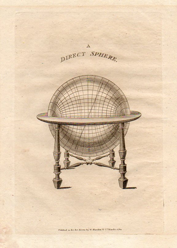
    Circles--direct sphere911

    Armillary Sphere, 1784.
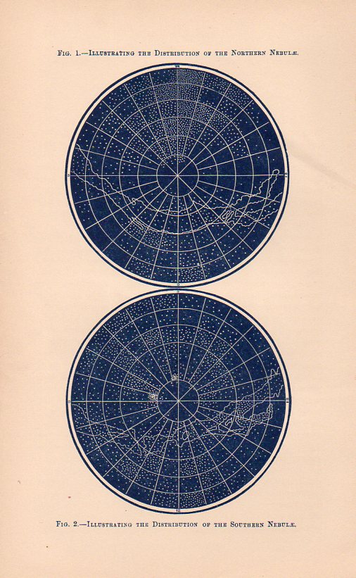
    Circles--distrib north nebulae918

    Distribution of the Nebulae, ca. 1860.
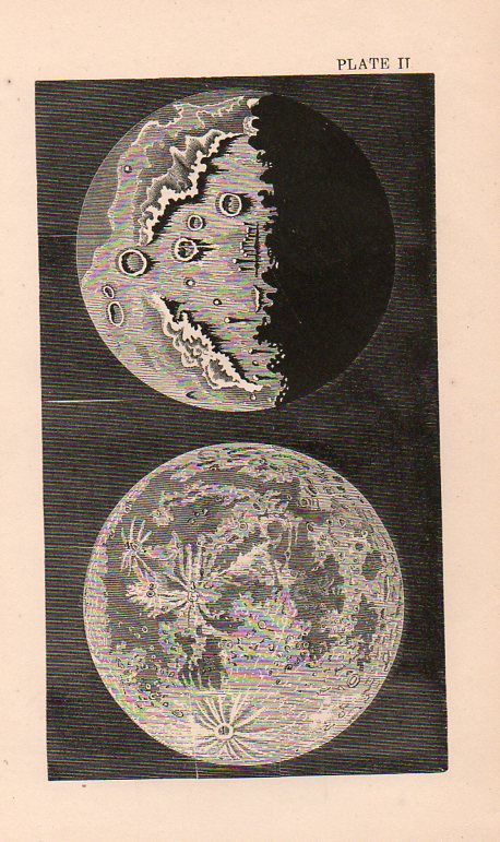
    CirclesDouble Moon908

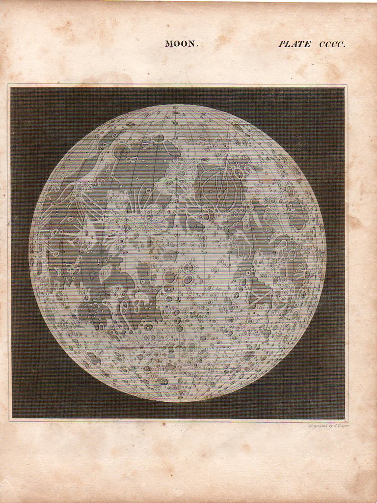
    The Moon, ca. 1850.

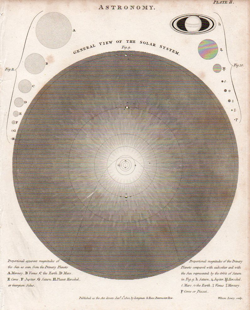
    Circles--general view solar ystem914

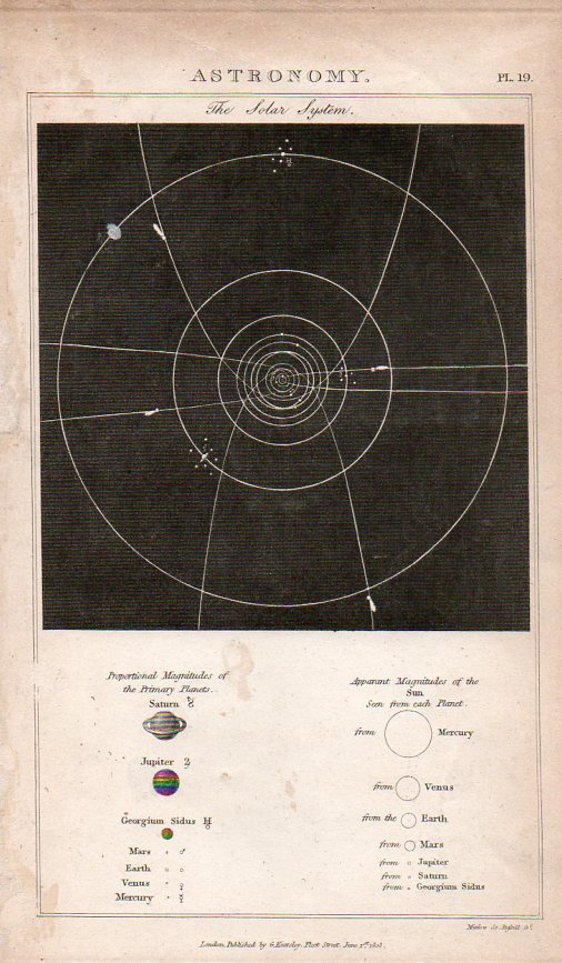
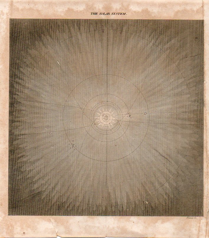
    The Solar System, 1804.

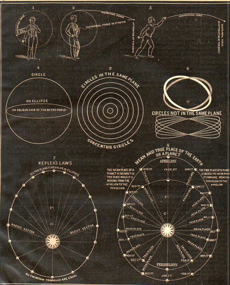
    Circles-in the same plane906

    1855.

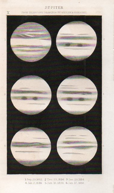
    Circles--jupiter921

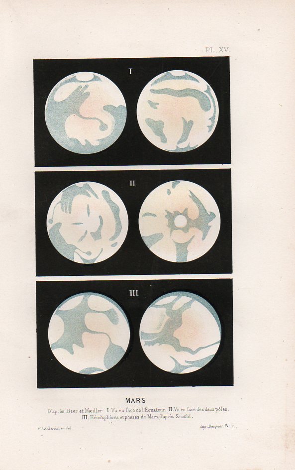
    Jupiter, 1864.Circles--mars913

    Mars, 1864.

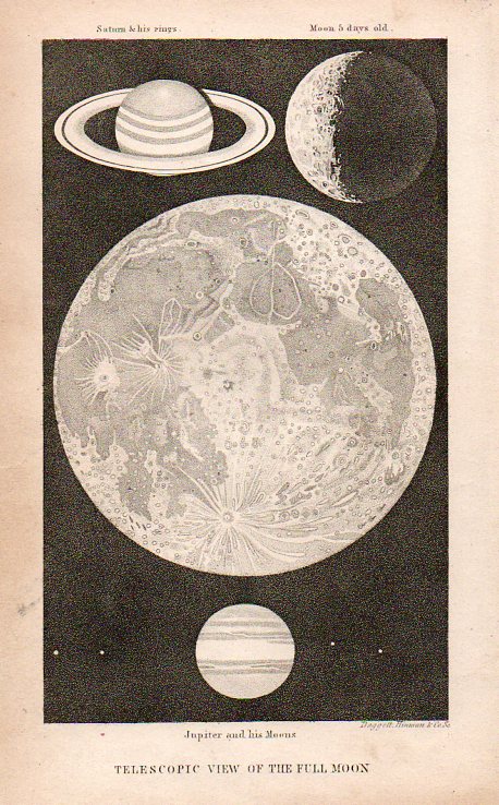
    Circles-Moon and saturn907

    Full Moon, 1836.

    Circles--solar system916

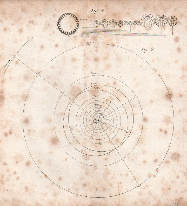
    Solar System, ca. 1820.

    Circles--solar system c919

    Solar System, 1823.

    Circles--solar systemb917

    Solar System, 1808.

    Circles--sun planet comaprison size French902

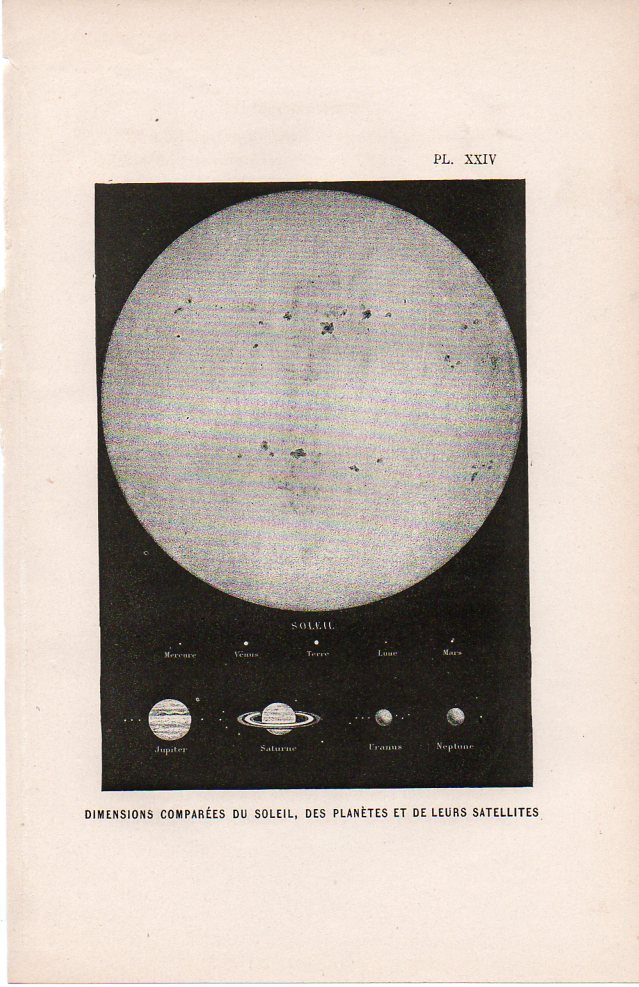
    Dimension of the planets in comarison to the Sun, 1850.

    Circles-the Moon Reesd905

    the Moon, ca. 1810.

    Circles--the solar system912

    the Solar System, ca. 1825.

    Circles--toptal eclipse Moon900

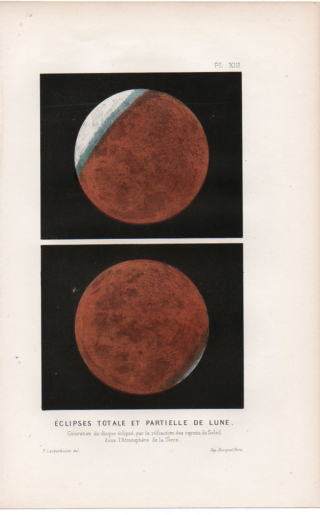
    Partial eclipse of the Moon, ca. 1860.
    Circles--toptal eclipse SUn901

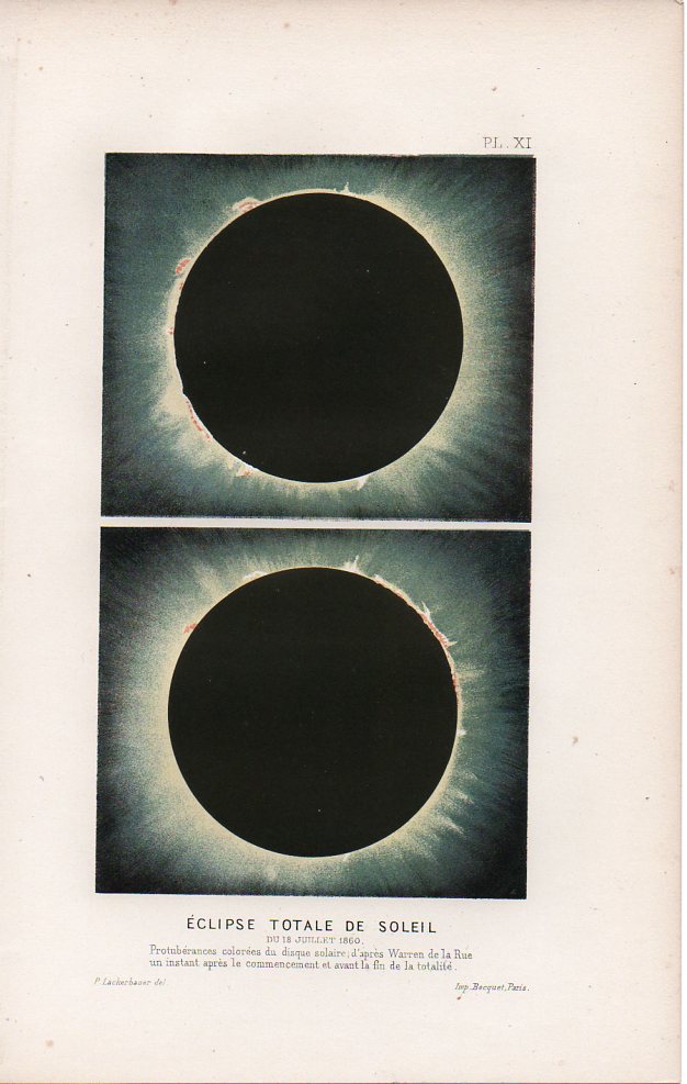
    Total eclipse of the Sun, ca. 1860.

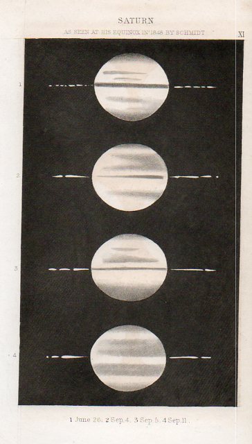
    Circles--saturn922


    Saturn, ca. 1870.

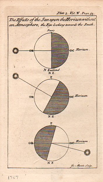
      Circles--effects of sun920
    1757.

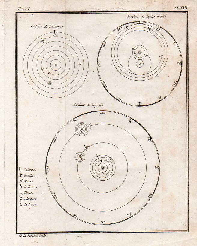
      Circles--comparative systems903

    Comparative cosmologies, ca. 1760.

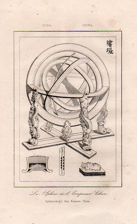
    Circles--chinese armillary910


    ·Posted by :

    ·in:

  • An Unusual Engraved Portrait of Isaac Newton

    JF Ptak Science Books  Quick Post

    Newton engrav larger179

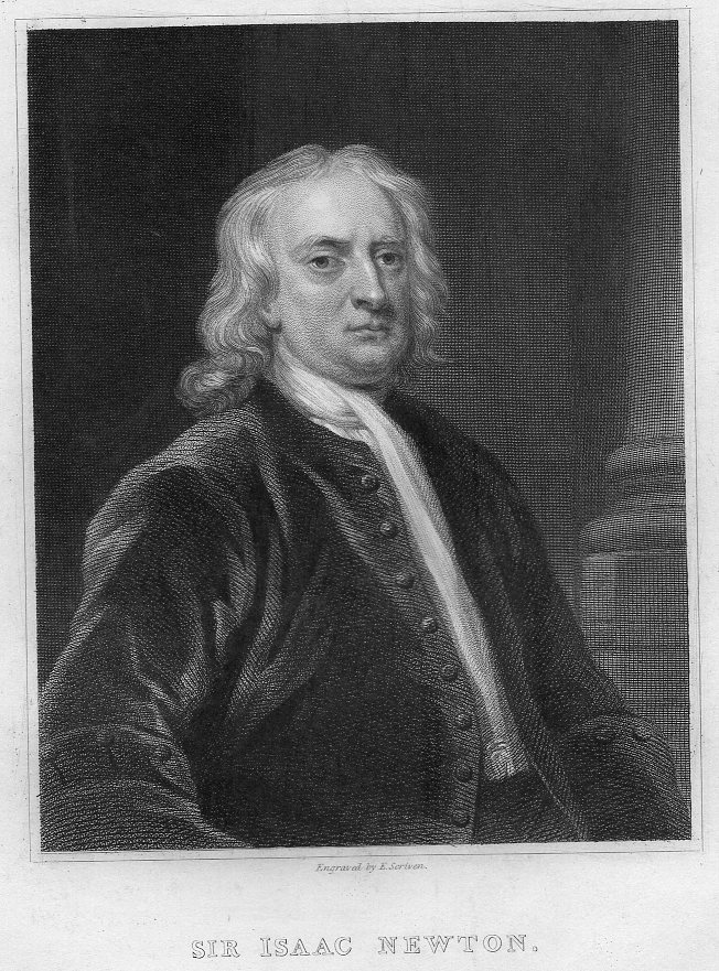
    Of the many portraits painted of Isaac Newton, the vast majority of them came after his death–some were fanciful, some were based on recollection, and others were based on the few examples that have survived painted of him in life.  This happened quite a bit–even someone as esteemed as his semi-counter-rival, the great Robert Hooke, received no attention at all from portraitists during his lifetime.

    I found this lovely portrait of Newton–a miniature, nearly–an engraving by Laderer after the 1726 painting by John Vanderbank, made just  a year before his death, and almost 40 years after he ascent to great fame. 

    Newton Laderer174It is an image I don’t see very often.  

    The original is about 1.5×1 inch on a 10×7 inch sheet, and printed in ca. 1820-30.  I’m unsure of the engraving’s origin. The full version is below.

    THere’s also this engraving, made of the same painting, and executed in the 1830’s, that shows Newton in a little less flattering light–at least here he looks as though he has some decent age on him. 

    Newton engrav larger178

    ·Posted by :

    ·in:

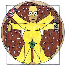
  • Homer Simpson on Perspective: the Rare Antique Image Looking Straight Down from a Height

     JF Ptak Science Books    Revisiting and expanding Post #20 from 2008

    Homer vitruvian

    I welcome the chance today to use our non-classical Homer instead of the beautiful Paolo Uccello to look at an issue of imaging a certain form of perspective drawing.  I’ve always been intrigued by antiquarian images that looked straight down, or up, at things–90 degree, perpendicular, real straight-on stuff, giving a feel for depth (or height) and perspective.  Funny thing is that in the wide world of scientific images, they really don’t show up very often.


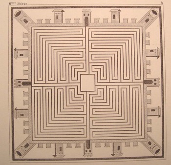
    A Mock-straight-down is found in this prettily-designed example (French, ca. 1860)–it seems to be view form a height of 250 feet or so down on the square of a low- (Western) renaissance town. That’s partly true, except that it is a mosaic from Pompeii (or Herculaneum), found embedded in the floor of one of those mummified houses. 

    Dsc04640

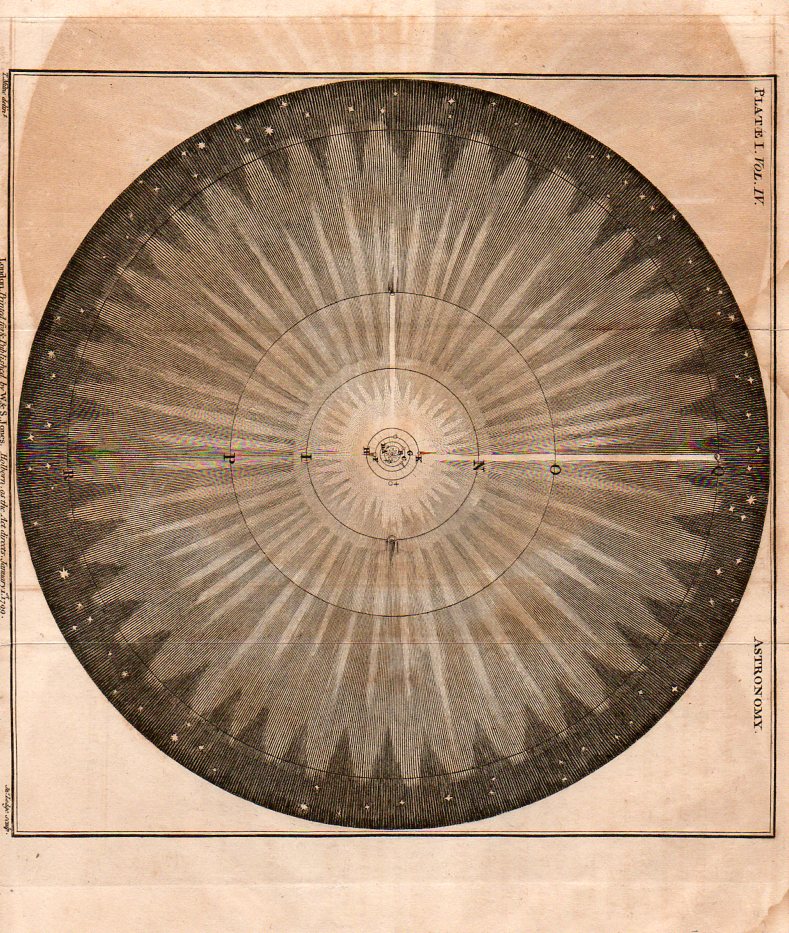
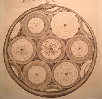
    Another pretender is this god’s-eye view (from Abraham Rees’ mammoth encyclopedia of 1800-1820) of the universe, centered upon our own helio-centric Solar System, which is centered, nested, amidst a whorl of other (contiguous and touching but not overlapping) solar systems, all of which is held in the
    infinite but knowable confines of an ourobus.   This again qualifies as a straight-down/up if and only if (iff) you squint real hard and imagine you’re seeing the scene through your CreatorView (TM!) glasses.  (The Creator needs glasses?)

    Dsc04642

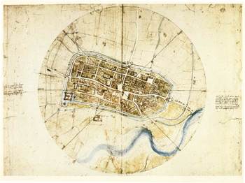
    The drawing by Leonardo of the town of Imola (currently resident with the Windsors) does come quite close to the concept–it has more artistic features than the common city plan , and is definitely at a perpendicular to its subject.

    Blogstraight_imola[Source for Imola image: www.leonardo-da-vinci-biography.com]


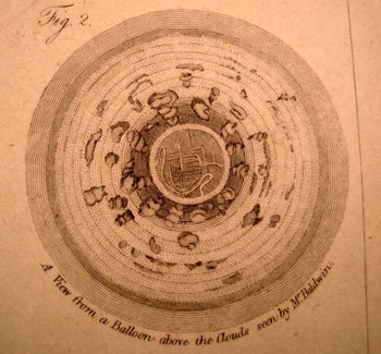
    But it is this that is so terribly interesting to me–a small part of a little print from an unidentified encyclopedia from the turn of the 19th c. It shows a picture of the earth looking straight down from a balloon, looking through an opening in the cloud cover, down to a small town. There is an iconic work on the representation of the world as known to succeeding generations where the picture of the world is seen through a succession of gradually diminishing clouds (being opened like drapes over time), but I honestly cannot think of an early image of looking at clouds from above and straight down.  My sense is that this image would have caused as muchinterest and wonder as the first (Soviet) images of the other side of the Moon (back in 1959). 

    Dsc04639_2

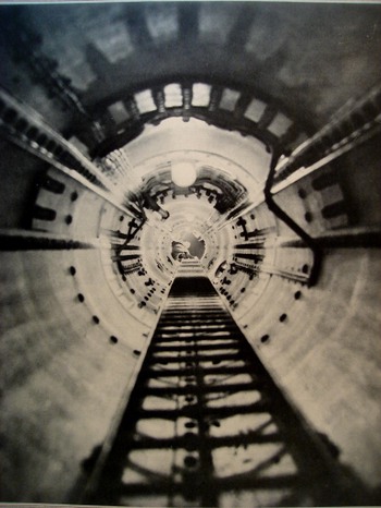
    Even when moving into the pre-satellite 20th century image, the straight-down picture is a rarity. In the last few years after having looked at dozens of thousands of popularly-published images (for another project), the straight-down/up were a scant tenth or perhaps hundredth of a percent of the total. There were a number of photographs made looking straight up (as in the two examples here, looking up the main mast into the crow’s nest of the Queen Mary, and the other with the same view, only in the Bremen. 

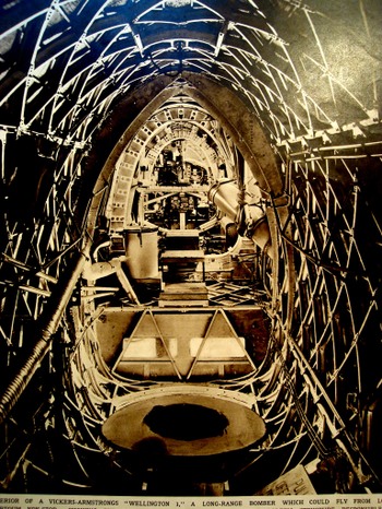
    Occasionally the view like this will show up (looking laterally through the Vickers-Armstrong “Wellington I” bomber aircraft (June 1939)

    I can’t leave this topic without mentioning two recent additions to this genre–the first is the Eames’ wonderful Power of Ten movie (go to youtube HERE, where in 40 steps we look at existence from quark to quasar. 

    Dsc04643_2

    The second is a little goofy but I like it nonetheless–the introduction to the Jodie Foster movie Contact (go to youtube HERE)  built on the bones of the Carl Sagan book. Here we swing out from the Earth and into space, following a broadcast-audio trail of humanity into the not-too-distant time/space (ignoring the signal degradation bit but so it goes), and then leaving that quickly behind, hurling itself backwards, to the outer reaches of the universe, until (and we don’t see this in the youtube clip) we wind up back in the iris of the heroine (and a bit too much like the Dave Bowman trip in “2001 a Space Odyssey”). 

    But we don’t see stuff like this very often, and I’m happy to go along for the ride. It really is just about seeing something new, after all.

    Dsc04644

    Perhaps the lack of this perspective is summed up by our old friend Homer J. Simpson. In one episode of the Simpsons (long ago and far away…or last week) Homer explains (to Lisa?) why cartoon characters’ faces are always oblique in profile. Homer turns and looks directly into the
    camera,” and his face gets all pancakey. It’s just not done “because it’s goofy” he says. And at least in Homer’s case, the proof is definitely in the puddin’.
    Dsc04645


  • Crystallizing a Scarce Perspective: Looking Straight Down & the Art of Photography

    JF Ptak Science Books   Post 2195

    There are many posts to this blog on this Looking Straight Down topic–just enter this phrase in the search box at left for a list.  

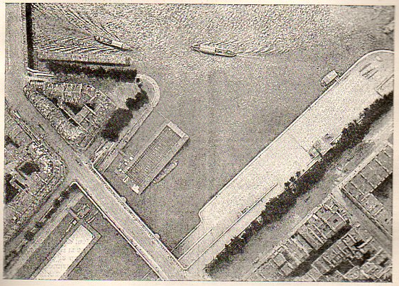
    The idea of representing a view straight down, of looking straight down from some height, is a relatively recent occurrence, this view being somewhat rare in the antiquarian world pre-balloon or pre-heavier-than-air flight.  The pre-human-flight reason for its scarcity is understandable, but even after the first Montgolfier ascension in 1787, there’s another 120+ years of scarcity yet to come before these views would start to pop up in common (and uncommon) literature..  Now I’m not talking about cartography, which is basically a straight-down view of the world—what I’m referring to is that same view but not as a map per se, but what you would see if you were dangling out of a plane or balloon. It is an unusual and scarce perspective.

    Looking down balloon181

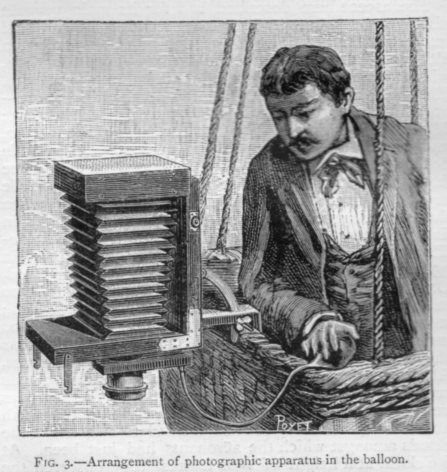
    This series of images was found in Nature (September 3, 1885, and already well established and in its third decade of publication) and shows a very scientific exploration of looking straight down. The images show the pioneer and bibliophile Gaston Tissandier and his equipment and their position in the research balloon engaged in “photographic aerostation”. Their experimentation was a clear success, the results of which were immediately applied to cartography, with the journal reporting “aerostatic photography has a great future”. And so far as the looking-straight-down part is concerned, it certainly crytalizes a moment in time in that part of visual history.


    Looking down balloon182

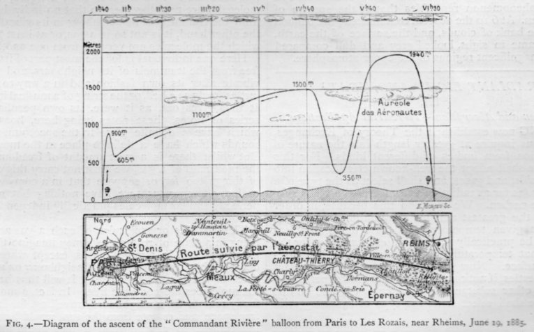
    And the cross-section of the map showing the progress of the Tissandier expedition and of the progress of looking straight down:

    Looking down balloon183

  • Bikes and Bubbles (1884 & 1890)

    JF Ptak Science Books  Quick Post

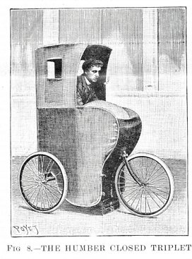
    Bike triplett187


    [Image source: Scientific American, September 15, 1902. This has nothing to do with the following, but it is a neat-looking bike, and I wanted to share…]

    C. Vernon Boys (1855-1944) was a British physicist and fine experimentalist and contributed this exemplary article on the physics of bicycles.  The article–“Bicycles and Tricycles in Theory and Practice”–appeared in the journal Nature (March 20, 1884), when the no-longer new-ish journal rapid-published the breaking and thoughtful science news of the day every week.  Generally articles in the early decades would seldom range over two pages–of course, the pages were dense, and in two columns, with usually 80 lines per column and ten words per line, so each page could be filled with 1600 words, which is four times the general length of a novel.  In any event Boys’ article ran nine columns, or about 7,000 words, which is a fairly meaty article.  

    I should point out that in addition to much else, Boys’ wrote a great classic of popular science, Soap Bubbles: Their Colours and the Forces Which Mould Them, in two editions of 1890 and 1911–and has stayed in print ever since.  It is a great book.  The full text can be found at the Internet Archive, here.

    ·Posted by :

    ·in:

  • A Beautiful Jackhammer–Lovely Design, 1928.

    JF Ptak Science Books    Quick Post

    There are sometimes exquisite images found in the mundane and every-day, beautiful objects hiding in plain site. Perhaps that is all there is, really, everything around us being available for beauty just for the looking-at-it, finding it.  (See an earlier post, The Beauty of Ball Bearings, for example. There is another series of posts on Looking Hard and Closely at Prints, which is more like taking a paper microscope to complex prints and finding the glorious minuatiae lurking in their minimal worlds.) In this quick example here I was stopped by what looks like a fantastic illustration of a jackhammer found in the  Der Bauingenieur, Zeitschrift fuer das Gesamte Bauwesen for 24 February 1928–right there on the front cover.  It is one fine piece of design, and may be the finest imaging of a jackhammer I’ve seen.  

    Pneumatic hammer184

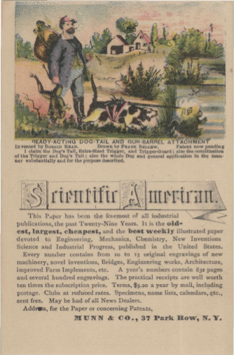
  • Ready-Acting Dog-Tail Gun Barrel Attachment for Frog Hunting

    JF Ptak Science Books   Daily Dose from Dr. Odd

    Sometimes there’s not much needed to say about something after you’re through with the title–and this may be one of those times.  

    Scientific American--frog hunting gun-toting dog[Found at paywall/subscription site, North Carolina State University libraries; another site plus text at the Library Company of Philadelphia, here]

    This is a trade card for Munn & Company, publishers of the Scientific American, then in its 29th year (which would be 1874).  I’m pretty sure that this was all done as a joke, to catch people’s ideal attention–especially since Bellew was a cartoonist, and a very well-known one at that. (For example, he created this iconic image of Lincoln, below.)  But the image is certainly arresting enough, odd enough, semi-insane enough, to have the casual nod turn into observation.

    ·Posted by :

    ·in:

  • The Speed of Stuff, 1: the Speed of Bad Ideas

    JF Ptak Science Books    Post 2164

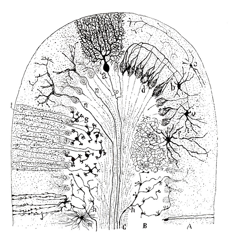
    Johannes Mueller (1801-1858), a heavyweight physiologist/anatomist and idea-adventuring-synthesizer, had the idea that the speed of nerve impulses in humans was about 11,000,000 mps—that’s somewhat like the Enterprise’s Warp 2, almost two orders of magnitude faster than the speed of light. At about the same time the remarkable and thorough Hermann von Helmholtz (1821-1894), a universal knowledge guy who knew pretty much everything, a polymath’s polymath, had a different idea about this speed, performing a series of elegant experiments and showing the speed to be about 150-300mph.

    March 6 sperm cajal[This is a detail from an image by the great Santiago Ramon y Cajal ( 1852-1934), who drew the first accurate picture of nerve cells in the cerebellum (found in one convolution of a mammalian cerebellum), which helped formulate his theory that the basic structural unit of the nervous system as the neuron.] 

    At the time of Mueller’s appraisal the speed of the nerve impulse seemed an unknowable entity. I wonder about other unknowables like this and what their estimated speeds might be that might put us more in touch with the major domo Mueller’s imaging the impossibility of knowing this reclusive and invisible speed?

    What is the speed of attribution? The speed of recognition? Of growth? Of absent love resuscitated? The speed of caring and not so? The speed of being in a space that you want to be in? The speed of imagined motion, of a bending cane, of finding the perfect broken seashell?

     Perhaps though the most interesting thing about the idea of speed is the speed of ideas.

    An Alphabet of the Suggested Speed of Various Types of Ideas

     Abstract idea: 35 mph

    Bad ideas: 375 mph

    Cryptic ideas: 50 mph

    Dangerous ideas: 250 mph

    Envious ideas: 350 mph

    Fanciful and farcical ideas: 100 mph

    Great ideas that are not Your’s: 28 mph

    Half-an-idea: 150 mph and a buck-two-eighty

    Ideas that are not ideas: 200 mph

    Jokingly-said ideas that are taken for real ideas: 200 mph

    Knowledgeable but sniffily restrictive ideas: 30 mph

    Lyrical ideas told in a non-lyrical way: 31.23 mph

    Mincing, broken tea-cup weak-tea ideas: 4 mph

    Nonsensical ideas: 150 mph

    Overheard-from-someone-else’s-cellphone idea: 300 mph

    Practical ideas that have no direct application: 45 mph

    Quixotic, queenly-quizzical, and not understandable ideas: 125 mph

    Random idea: 125 mph

    Salacious ideas: 450 mph

    Tiresome ideas that are really notions: 20 mph

    Underthought and underwhelming ideas: 55 mph

    Vexating, poorly-ventilated, porous ideas of multiple misunderstandings: 44 mph

    Wonderful ideas that belong to someone else: 4 mph

    Zealous and impudent ideas: 75mph

    Of course I’ve had some fun with this idea—but it came to me in a flash (at 250 mph) so I went ahead with it. And possibly it delivers some sense of the impossibility of knowing something that even the leading lights of those fields sensed as being unknowable.


    ·Posted by :

    ·in:

  • An Aggressive Cover Illustration for Sputnik (1957)

    JF Ptak Science Books  Quick Post

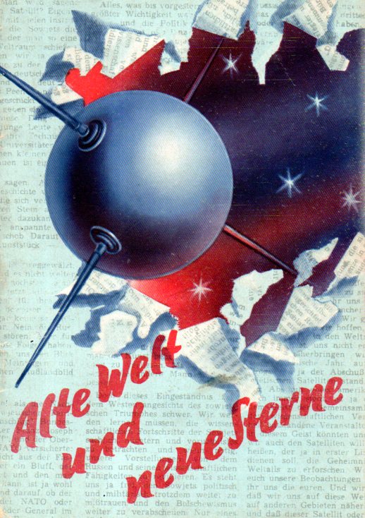
    Sputnik063

    This cover illustration for Alte Welt und Neue Sterne (“Old World / New Star”) really does break through the headlines and into its own space.  It is a DDR publication and although my copy has two outer wrappers for decoration and title it has no title page–the celebration skips the necessaries and gets right into the forward and then the crux of the matter, most of which was a high-principled statement of accomplishment and a low-dark anti-American humor in having “lost” the space race.  (While Eisenhower golfs, the Soviet Union has launches a new moon, losing not only the apce race but prestige as well–one cartoon places a joyous Khrushchev successfully courting a young woman labelled “Lesser Countries” with a beaming gesture to an orbiting Sputnik as Uncle Sam reels on his heels and drops his going-courtin’ flowers in the process. “Wer sonst koennte dir einen Mond schenken” (“Who else can give you a moon?”), proudly offered as commentary that had appeared in the New York Times.

    In any event, I just wanted to share the design, which is pretty strong. (The pamphlet is undated but I suspect it was in print immedaitely following the 4 October 1957 launch.)

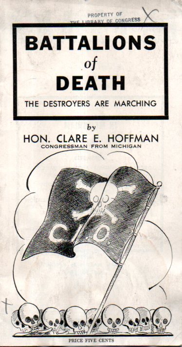
  • Labor Unions as Red-Commie Battalions of Death (1940)

    JF Ptak Science Books   Post 2165

    Battalions of death064

    Representative Clare E. Hoffman wrote (or lent his name to) this insane and blistering attack on the CIO (the other half of the AFL-CIO) which was the Congress of Industrial Organizations founded by John L. Lewis in 1928.  Hoffman (1875-1967) was a conservative “Republican” from the 4th District/Michigan, who was pretty much an outsider to either major party, making and destroying his own roads and bridges in a long Congressional career. He was a recognized anti-Semite, a race-baiter, a leading exponent in the Impeach Roosevelt movement (publishing and distributing by Congressional franking privileges “Roosevelt is Judas”), and a person who supported and spoke for a number of “isolationist” and national socialist-supporting groups.  He saw Soviets/Communists everywhere, including his campaign against polio immunization, which he feared was too heavily influence by commies and Jews.  

    In addition to saving America from Communists and Jews, saving America for the “true American”, Hoffman was strongly aligned with the Constitutional Educational League, which published this pamphlet. The CEL was indicted in 1942 with 27 other groups for sedition and conspiracy and working to aid Nazi Germany and the Axis Powers–which is a tough business, but not too tough for Hoffman.  The CEL and Hoffman and the associated ilk and cancers were associated with a panoply of other Isolationist/Fascist groups operating int he U.S. during the war including such wincingly-named groups as the Christian Mobilizer, Christocrats, American Destiny, National Workers League, Black Legion (perhaps the most infamous of these groups), National American, Silver Shirts (started by bizarro local boy Pelley and very nasty), Citizens USA, and a host of others.  And of course America First, which may have been the most well known of these groups, having the famous affiliation and support of Charles Lindbergh (until Pearl Harbor at which point the Colonel back away).  

    Getting back to the pamphlet–it has the feel of old bad fetish porn, and makes endless claims that the trade unions were thuggy Communist–and even worse, “red Communist”– and would wind up controlling and destroying the U.S., putting the country under control of the U.S.S.R.  The aim seems to be equating the CIO with Communism, and so to stop Communism you must stop the CIO, the great destroyers of the American way.

    I can’t help but seeing many similarities between some current right-wing attacks against unions and pieces of the Hoffman piece–we’ll see how silly/abhorrent these claims really are with historical perspective in another few decades.

    Sources:  Ellen Parsons, “Anti-Jewish Manifestations” in American Jewish Yarbook, 1945/6, pp 135-143; Glen Yeadon, Nazi Hydra in America, p. 151.

    ·Posted by :

    ·in:

Recent Posts

Archives

Categories