JF Ptak Science Books Quick Post Daily Dose from Dr. Odd

Sometimes there really isn’t much to say about stuff.
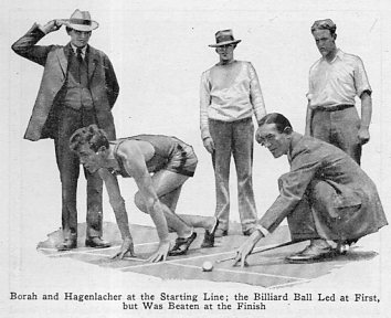
[Source: Popular Mechanics, August, 1926.]
And the text:
A Daily History of Holes, Dots, Lines, Science, History, Math, Physics, Art, the Unintentional Absurd, Architecture, Maps, Data Visualization, Blank and Missing Things, and so on. |1.6 million words, 7500 images, 4.9 million hits| Press & appearances in The Times, Le Figaro, Mensa, The Economist, The Guardian, Discovery News, Slate, Le Monde, Sci American Blogs, Le Pont, and many other places… 5000+ total posts since 2008.
Contact johnfptak at gmail dot com
JF Ptak Science Books Quick Post Daily Dose from Dr. Odd
Sometimes there really isn’t much to say about stuff.
[Source: Popular Mechanics, August, 1926.]
And the text:
JF Ptak Science Books Quick Post
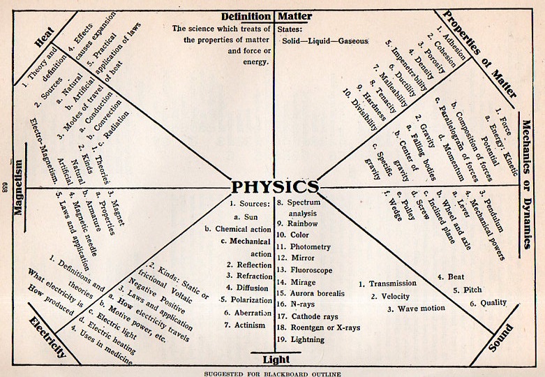
This outline appeared n The New Practical Reference Library, Educator Volume, an Invaluable Aid to the Student...volume VI, and printed in Chicago in 1912. What is interesting is not so much the outline itself, but the expectation that this was being used in 6th grade classrooms. So, while the diagrammatic representation of physics is not so impressive, the intended age of its audience is.
JF Ptak Science Books Quick Post
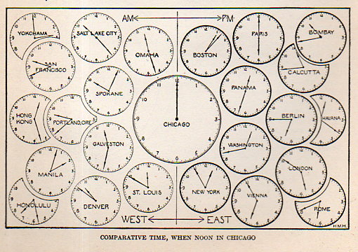
In an earlier post on this blog (A Beautiful Confusion) I wrote about some lovely engravings that attempted to sort out time difference and distance before the adoption of Standard Time. The idea was a little awkward and must have been vexing for folks running the railroads, but the notion of time difference was generally prettily and elegantly portrayed.
I’m including an example of these images that doesn’t work and seems intellectually jiggly to me–it is fairly obscure and meant to clue in schoolkids to the practice of time difference from palce-to-place, and found in The New Practical Reference Library (1912).
This isn’t a terrible thing–it just isn’t that well done, especially in comparison to the lovely images found in that earlier post.
JF Ptak Science Books Quick Post
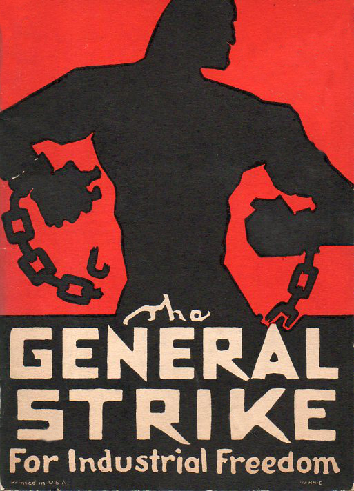 [This is a 1 meg version of the 16 meg finished version of this cover art.]
This is the fantastic artwork for the cover of the pamphlet The General Strike for Industrial Freedom which was printed in Chicago in January 1933 by the Industrial Workers of the World (the Wobblies). The IWW was pretty far left–okay, very far–and was founded in 1905 by Eugene V. Debs, Mary Harris “Mother” Jones, William D. (“Big Bill”) Haywood, Daniel De Leon, Thomas Hagerty, Lucy Parsons, and others. By the ’30’s membership in the organization was off probably an order of magnitude, its heydey more “dey” than “hey”, its flash gone.
JF Ptak Science Books Quick Post
There have been several posts to this blog regarding unusual airport construction–covering part of the Thames, floating in the NYC bay, on top of numerous/differential rooftops, floating and/or moored in the ocean, on top giant airplanes, landing and launched from dirigibles, and so on (including a vertical airport where the aircraft are dropped in tubes). The example I have just found this morning is a mild twist on this topic, as it is a helipad–a futuristic one, judging from the Harley Earle/Buck Rogers-style design.
See, for example:
(There are other examples scattered around the blog–just check out “airports” in the Google search box for more.)
There is also a time/distance map of air travel originating from NYC:
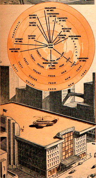
[Source: Popular Mechanics, February, 1945]
·Posted by :
·in:
JF Ptak Science Books Quick Post
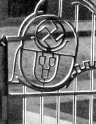
I know this shouldn’t be so semi-surprising and yet so not-unexpected, but it is–finding NSDAP/Nazi symbolism in Germany in the ’30’s embedded in and “edifying” common items and ordinary locations. The thing would just appear, like a little stamp of approval, in advertisements for toothpaste, cars, pins, engines, oil–multiple alphabets of everyday bits made to associate with NSDAP emblems. In this instance the found-swastika caught my eye in a design detail for a gate. The company, Remanit (in Krefeld, northwest of Dusseldorf), specialized in indoor and outdoor stainless steel fixtures–handrails, lighting elements, doors, gates, so on. The gate in the ad–appearing in an oversized magazine on art and taste, Die Kunst, Monatschefte fuer Freie und Angewandte Kunst, volume 74, 1934/5—contained a decoration of a family crest-like design, incorporating a cross; on the other gate, another crest, and almost lost in the shadow was a large swastika. Party members and sympathizers and other passives used the symbol (in its many iterations) quite a bit,adorning their possessions and products with it– and evidently also in one’s stainless steel impervious-to-rusting-but-not bombing gate crest, a stamp of approval for the eclipse of a culture and nearly unprecedented destruction.

And the detail:
JF Ptak Science Books Quick Post

This is a not-frequently-seen schematic of the Royal Air Force’s Sunderland, a flying boat, and the largest airplane in British service, pictured and slightly dissected in Popular Mechanics in 1940. (Apologies for the blurry definition on the left side–the book is huge, and not very friendly to the scanner.)
·Posted by :
·in:
JF Ptak Science Books Post 2427
This graph shows the growing shadow of The End, the falling curtain, creeping across the the vertical and the horizontal. This was published to show the results of the fatal 1933 election–this was the one right after Hindenburg appointed Hitler Chancellor who immediately dissolved the Reichstag and so necessitated a new election. That election followed months later, and in spite of massive Brown Shirt presence, plus NSDAP intimidation, violence, coercion and son on, Hitler’s party did very well, but perhaps surprisingly not as successful given all of those other factors. He didn’t have control of the government as a result of the election that gave the Nazis 43% of the seats in the Reichstag. It would come to develop that Hitler and the party found enough support to implement the Enabling Act, which would give Hitler the power to enact laws without the support of the Reichstag. Four months later, with the political and power struggle over, there were no other parties in Germany besides the Nazi Party, and that would become Hitler’s ultimate power, and the true beginning of the rotting of Germany and the coming of the deaths of dozens of millions of people.
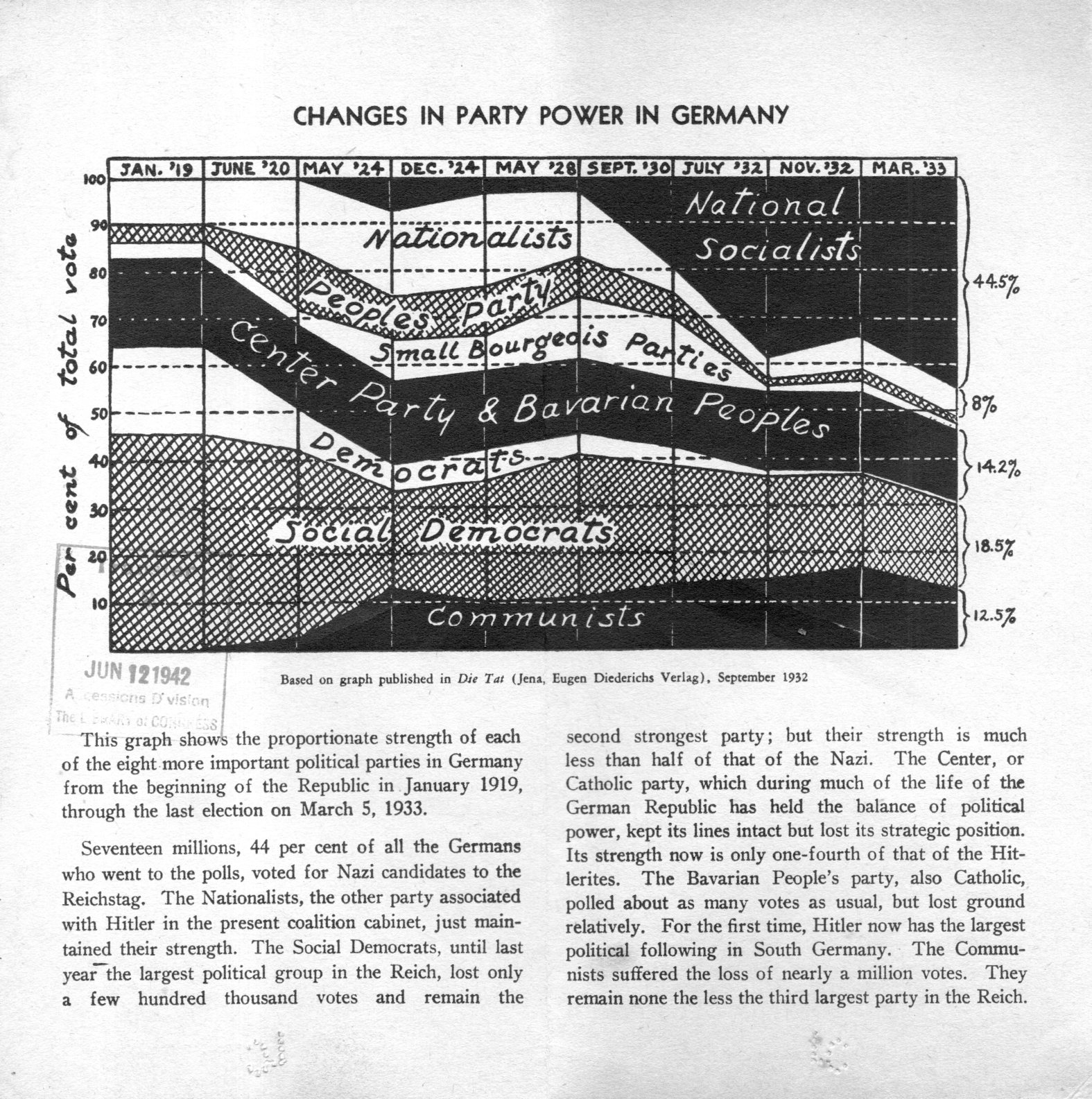
[Source: private, via the Library of Congress from the OSS library.]
JF Ptak Science Books Post 2427
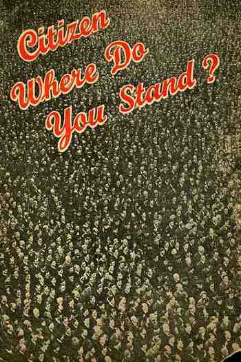
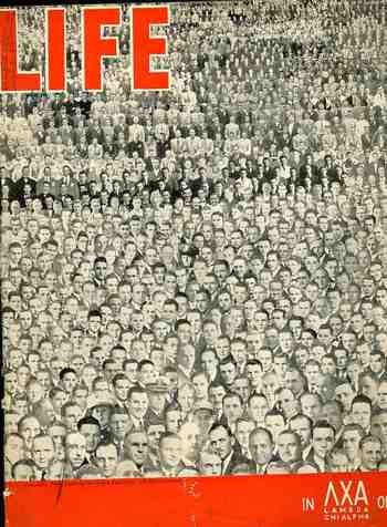
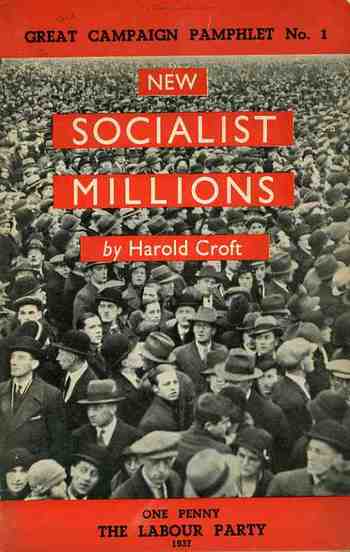
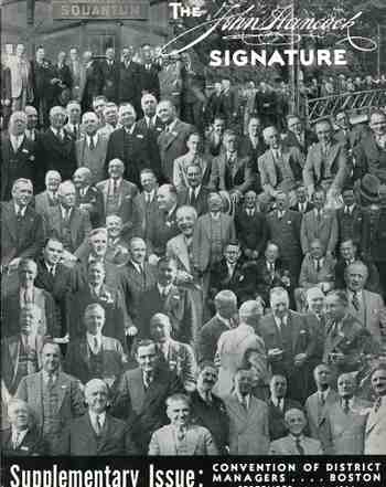
I don’t often see covers of pamphlets or magazines featuring hundreds–or thousands–of people as a part of the design. In my continuing role as finder and re-finder of things found I have re-surfaced four of these designs, and I feel I should post them before they’re captured in the un-finding process. Again. Back to the design: these are very striking, persuasive images, unavoidable in many ways, completely intriguing, beguiling. People just have to look at these things. Look: I made a little experiment today placing ten very interestingly-designed pamphlets on display, all with compelling and distinct merits, and including one with a big spread of humanity on the cover (the “Life” pamphlet). The very unscientific results is that people were generally first drawn to the complex people image, and stayed longer looking at it–by far–than any other image. Perhaps its the same sort of reaction going on when you watch people walking in front of a mirror or reflective surface, with the vast majority of folks checking themselves out in it. Maybe its just people looking for something familiar. Maybe the faces are simply, strictly more interesting than just points o the page. I’m not sure.
The first image is Life, the story of the fraternity lamda chi alpha, published around 1935; second, a one penny Labour Party publication coming from the National Executive Committee of the Labour Party, published in London in 1937; third, a program for the Liberal Party, published in London in c. 1938; lastly, fourth, a program for some course of semi-statistical study with the John Hancock life insurance company. These beautiful designs were much more interesting than the very casual contents they covered.
JF Ptak Science Books Quick Post
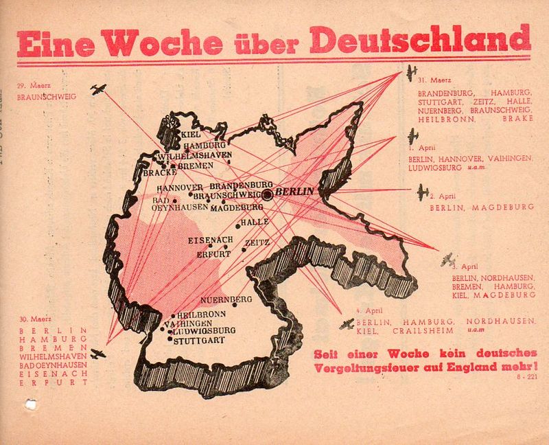
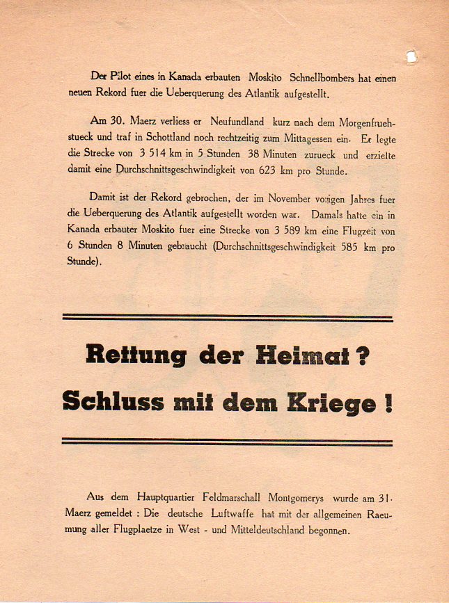
This is a map of The End: “One Week over Germany”…”a week of retaliatory fire” (‘vergeltungsfeuer”). It is a piece of propaganda dropped on Germany along with high explosives, a small convincing element to entice soldiers to surrender and save Allied lives in the final push to Berlin.It is a map that shows much more than just the beginning of the end–it is the ending of the end, two-moves-to-mate. No more failed stalemate, no more breakouts, no more attacks, no more nothing.
I’d find it hard to believe that any Germany soldier would disbelieve what this map represented.
 [Private collection]
And the reverse:
JF Ptak Science Books (Post 193 from 2008) Expanded and with better images.
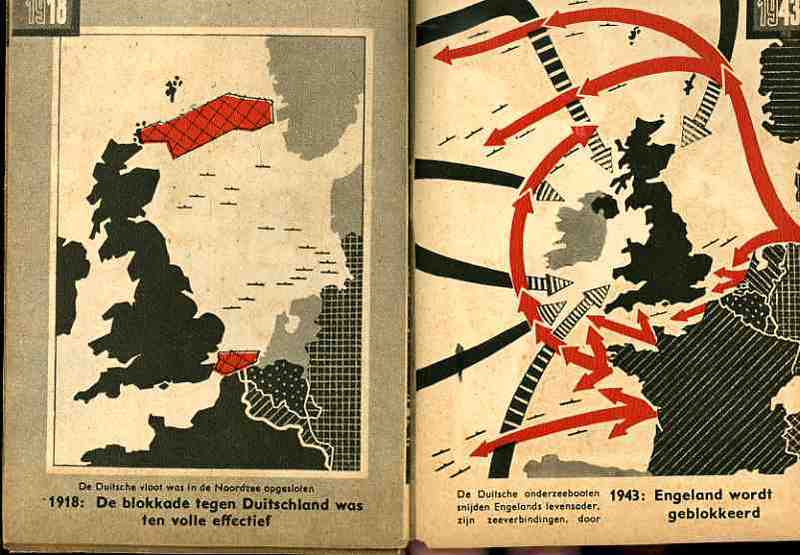
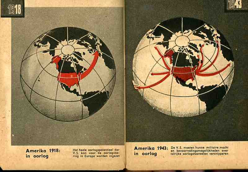
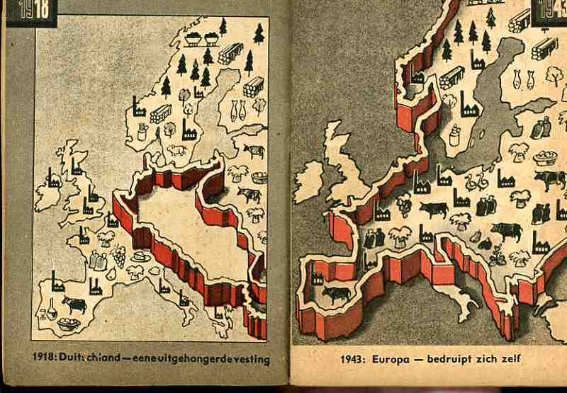
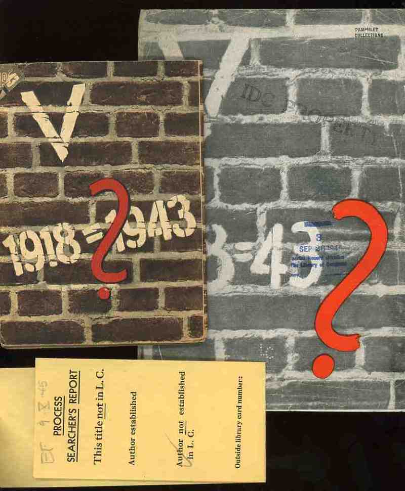
These two, related, pamphlets were the products of the Nazi Propaganda engine and sought to affect the moral and intellectual stamina of the people in the occupied countries of the Netherlands and France in 1943. Each stressed the enormous differences in the German state that took place in the 25 years between the end of World War I and the third year of the Nazi European part of World War II. I’ve no idea whatsoever about the grander symbology (if any) of these numbers associated with these two pamphlets (the Roman numeral for “5” and the 25 years of the difference and the “13” points (of the French propaganda) aside from the obvious mathematical implications.
(The only interesting bit that I can find in the “18=43” from the French pamphlet is Luke 18:43 “Immediately the man could see again and began to follow Jesus, glorifying God. All the people saw this and gave praise to God.”. ) I find it curious that identical symbolism (?) was used for the two countries, and that the French version was simple comparative text (summarizing the differences in the two periods of time) while the Dutch version was mainly a picture book.
I would reprint the French version if it wasn’t so bloodily hateful. (Suffice to say that this is so by looking at one example: in the last of the second issue of 13 points Goebbels et alia wrapped themselves in the insulating fabric of the German “people” in the “resistance” against “Jewish saboteurs”—not the German political machine, and not the German military, but the German people, insinuating that the Nazi annihilation of the Jewish people was de facto sanctioned by the will of the German nation. This is of course part and parcel of the fictitious and loathsome Protocols of the Elders of Zion (of which Henry Ford was a happy reader), a French work that was completely stolen and plagiarized by Imperial Russia in the early 1880’s and which, later, Hitler used to both build his hate against the Jewish people and use (and acknowledge ) as the template for his early actions in the Nazi Party.)
The maps used in the Dutch publication are fairly general and issue a stark warning about the growth of Germany–and how Germany continues to grow through war. The first that we reprint, above, tries to get the point across to the occupied people that England has more problems to deal with than would concern their attention with the Netherlands. The second part of the first map crazily shows the attack upon England and the effectively exhausting attention it has to pay to many points of invasion. Ditto for the second map, showing the spread of American concerns–the U.S. in 1943 would have far more to deal with in many points in a two-ocean war than to concern itself with or have the ability to think about the liberation of Europe and the Netherlands. The last map shows the supposedly extraordinary growth in Germany’s industrial and agricultural capacity.
In short, the maps tell its readers to just keep quiet, the German nation is mighty, and just wait for the end of the victorious German war. The maps also addressed non-readers–of course the Dutch literacy rate was extremely high, but you didn’t have to be able to read the description of the map to understand its blunt message. (This makes me wonder if the maps really weren’t intended for scare tactics against children.) As Boss Tweed once infamously reported–that he had no fear of editorials because his constituency couldn’t read–he hadn’t counted on the political cartoons of Thomas Nast–which could be understood by a non-reader–and which wound up being one of the direct causes of his exposure and downfall.
·Posted by :
·in: