JF Ptak Science Books Quick Post
In an earlier post on this blog (A Beautiful Confusion) I wrote about some lovely engravings that attempted to sort out time difference and distance before the adoption of Standard Time. The idea was a little awkward and must have been vexing for folks running the railroads, but the notion of time difference was generally prettily and elegantly portrayed.
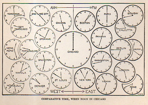
I’m including an example of these images that doesn’t work and seems intellectually jiggly to me–it is fairly obscure and meant to clue in schoolkids to the practice of time difference from palce-to-place, and found in The New Practical Reference Library (1912).
This isn’t a terrible thing–it just isn’t that well done, especially in comparison to the lovely images found in that earlier post.