A Daily History of Holes, Dots, Lines, Science, History, Math, Physics, Art, the Unintentional Absurd, Architecture, Maps, Data Visualization, Blank and Missing Things, and so on. |1.6 million words, 7500 images, 4.9 million hits| Press & appearances in The Times, Le Figaro, Mensa, The Economist, The Guardian, Discovery News, Slate, Le Monde, Sci American Blogs, Le Pont, and many other places… 5000+ total posts since 2008.

  • The Nothing Frontier, 1900

    JF Ptak Science Books   Post 2485   Part of the History of Nothing series

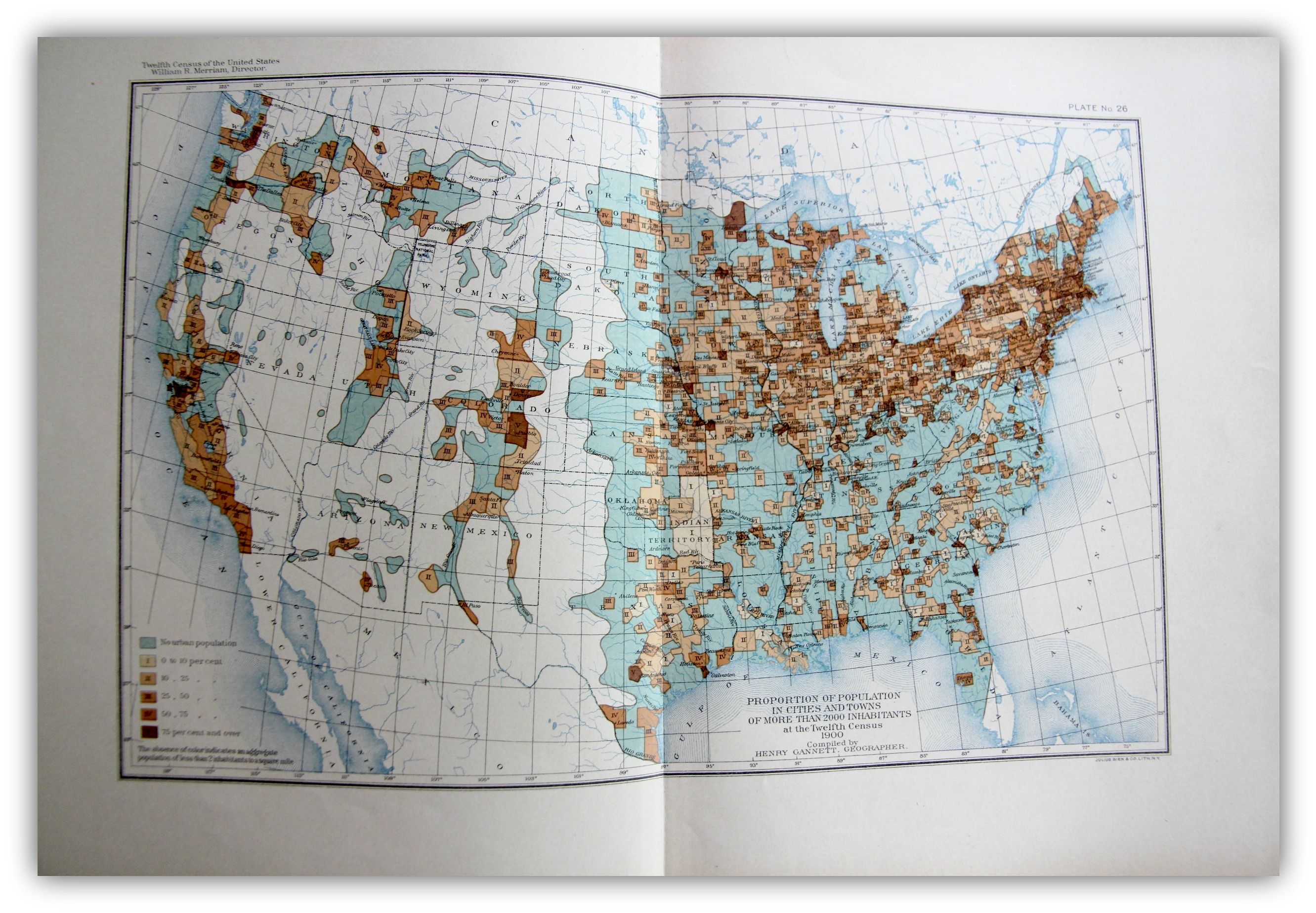
    The “frontier” in the history of the U.S. West is a pretty big deal, and old, the academic concept of  the frontier pressing its way back 13 decades, when for the most part once it was introduced it was pronounced to be “closed” by the man who reinterpreted it, Frederick Jackson Turner1.   On my shelves alone there are books on the mining frontier, the mineral frontier, the transportation frontier, the Indian frontier, the military frontier,the farming frontier, and so on, divisions allotted by wealth, nationality, numerous geographical attributes, and the like. One thing I think that I have not seen was the Nothing Frontier, where there are divisions divided by, well, sort of “nothing”. This is mostly a prosaic statement, slightly poetical, dependent on visual clues. And of course there isn’t “nothing” there because there is always “something”–there just isn’t very much of it.  And when things get colored-coded on map depending upon percentage distributions, and that object of measurement is left to a null color or no color at all, then it appears that the divisions one left to nothing.
    Maps--Census 1900 Urban

    [The image above is very expandable.]

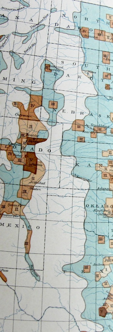
    This can be seen if you squint somewhat you can see an example of it in plate 26, “Proportion of Population in Cities and Towns of More than 2000 Inhabitants…” Statistical Atlas, prepared under the Supervision of Henry Gannett (Geographer of the the Twelfth Census), printed in Washington by the U.S. Census Bureau, 1903. This map–which is part of an historic series of atlases published with U.S. census data–shows the distribution of urban population in five shades of brown (as seen in the legend) plus a blueish color for “no urban population” as well as no color (“The allowance of color indicates an aggregate population of less than 2 inhabitants to a square mile”).
    Maps Census 1900 Urban detail

    It is that absence of color that makes it a frontier-ish sort of frontier, a part of the Made Up Frontier, this one being very straightforward north/south, Big Bend to Montana, pretty much the Lonesome Dove trail from the rough Big Bend Texas to nearly Canada.  

    I know it is just a thing I made up just now looking at the map, but given some effort, maybe the idea actually has some legs.  

    Notes

    1. Turner, Frederick Jackson. The Frontier in American History, Harvard University, 1920, full text via Project Gutenberg,  http://www.gutenberg.org/files/22994/22994-h/22994-h.htm

  • Putting the “IF” in “LIFE”: Welcome to Dystopia! (1950)

    JF Ptak Science Books   Post 2486

    LIFE logo detail

    So, grazing my way through a random issue of America’s magazine, LIFE, for August 28, 1950, I was struck by the profound amount of unhappy welcome-to-your-stinking-future-you-poor-stinking-sod articles contained in its heavy and mostly colorful pages, all packed into a quarter-inch thick package.  

    The issue starts out with a waxy portrait of MacArthur, followed by two big pages of freckly boys modelling Peter Pan Peanut Butter and Ice Cream Dixies, then a big splashy two-page ad for soles for your shoes, then contrasting color combos in a Glidden paints ad, a Swank tie-clip-ruler-mechanical-pencil, Vaseline cream hair tonic, then bits for DeSoto and Chrysler, and Ford.  Ads done, there’s a two-pager on an old lost film starring Babe Ruth, and a  big/weird coverage of people flocking to a far-removed farmlet because the woman living there claimed to see the Virgin Mary.

    LIFE Mag Aug 1950 bomb

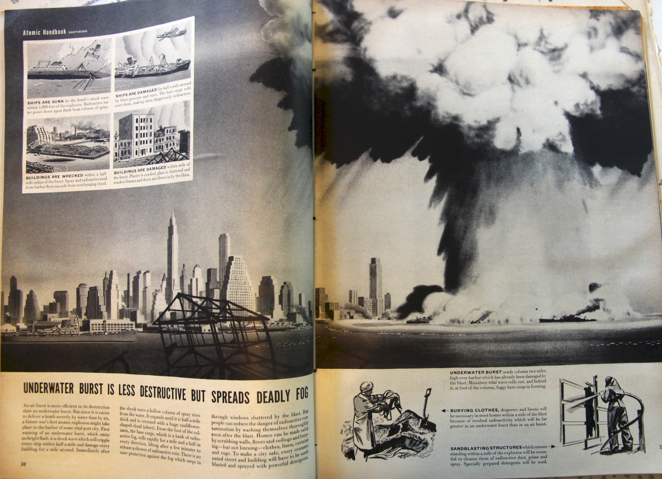
    Then comes the rain:  it starts with a story on an unexpected best seller for civil defense (“Atomic Handbook a best seller”), followed by:

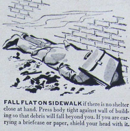
    • A hand-drawn illustrated page on how to protect yourself from nuclear extermination if the bomb catches you unawares on the way to work;
    • the effects of an underwater detonation in the harbor of a large unnamed (ahem, New York) city illustrated by a very forceful two-page drawing;
    • a story on the opinions of New Yorkers on the building of a skyscraper when there is such an imminent possibility of an attack by the Soviets (who had developed their own Fat Man type atomic weapon in the autumn of 1949 and which was announced as confirmed by Truman in early 1950, so the threat as it was was new)
    • then comes a story of bombing patterns in Korea
    • then a short account of a vicious Korean battle at No Name Ridge

    These tales are then interrupted by a full page ad for Old God cigarettes, with a pack of them floating on a lily pad in a pond.

    LIFE Mag Aug 1950 bomb detail

    The salvo is opened again with:

    • a long story on Viet Nam, and the French involvement, and the components of the Foreign Legion fighting there, and how much they need the help of the U.S. to stop this fight for the control of Asia by The Communists, and that it may be a “matter of days” in which we needed to act
    • then a big spread (which will get a blog post of its own) on ramping-up the U.S. air force components for the continuation of the new war in Korea.

    That is where the bad news almost stops, mostly, the rest of the magazine filled out by fluff and stuff, with a lot of ads.  Some of the ads are very puzzling, and some are just disturbing, like the big stretching crotch-shots for jockey underwear for men, and a bra ad featuring a model with Indian headdress saying “How how how”, and a terrifically unsavory racist ad for Dumont televisions featuring a cartoon-clownish minstrel figure for no good reason whatsoever. Reeling in the back of the mag are a bunch of big red ad for bacon and pork and Big Red Meat, PBR, mustard, razor blades, a few movies, and lots of people smoking cigarettes.

    But just when you thought you made it out of the issue pops up two final stories–a boring thing on “War and Politics”, and  a picture essay “Iowa Town Dies a Slow Death”.  

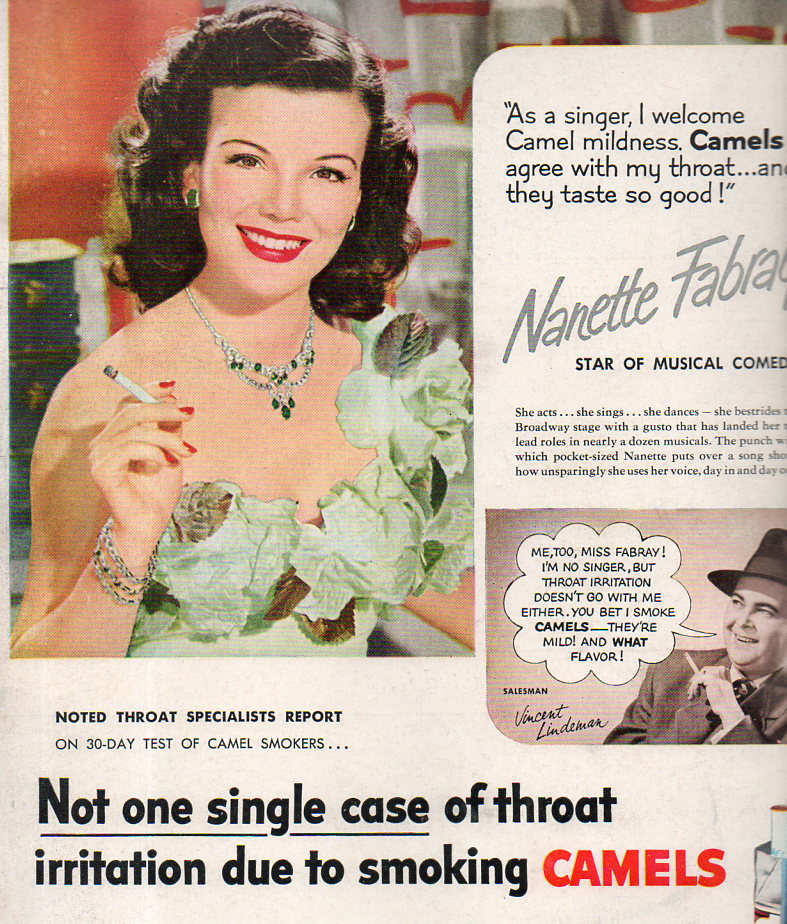
    The back cover features a flat cover ad for unfiltered Camel ciggies, decorated with Nanette Fabray in a cabbage leaf dress,  which loudly states “Not one single case of throat irritation due to smoking Camels”.   Giving the devil its due  they also state that that (quoted?) nugget was for a 30-day trial. Certainly after x-years millions wouldn’t have this complaint because they wouldn’t have any throats anymore, being dead from cigarette-induced cancers and all, so the statement was shown to be not necessarily untrue.

    Ciggie cabbage dress154

    August 28, 1950.  

    All that reading done, you were supposed to keep your eyes on the skies but not let it interfere with your eyes on the prize, which was spending money, and to have you hopefully go out to get some peanut butter that you could put on your new tv, while you and your honey watched it in your new sparkling white underwear, slathered in vaseline hair creme, drinking a PBR, smoking several brands of cigarettes, and thinking about the Parkay margarine-slathered big meat products in the refrigerator.  Just make sure to wash your house after the series of Joe-1 Soviet nukes annihilate the rest of your city.  

    There was a lot of scary stuff in this issue, which certainly helped to put the “if”into “life” in the high summer of 1950–then again, as a summer of fear, there was a lot of it to go around, and with some good reason.  

    LIFE logo156


    Notes

    See here for a good article on the Life article on this town, “Bradgate, the Town that Wouldn’t Die”, at iagenweb.com (Iowa Genealogy) 

  • A Remarkable, Outsidery Effort in Economics, 1934

    JF Ptak Science Books   Quick Post

    Outsider depression ms

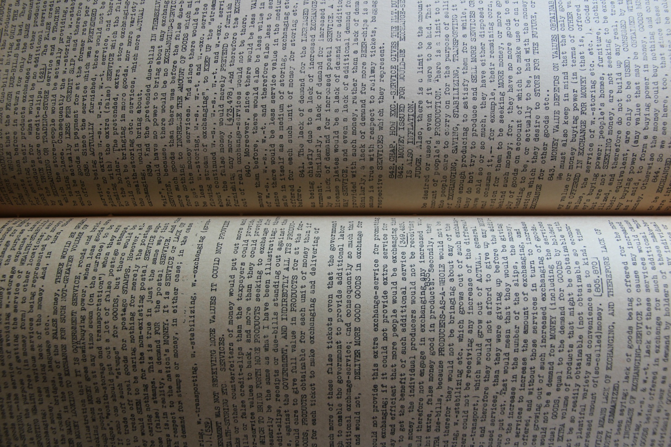
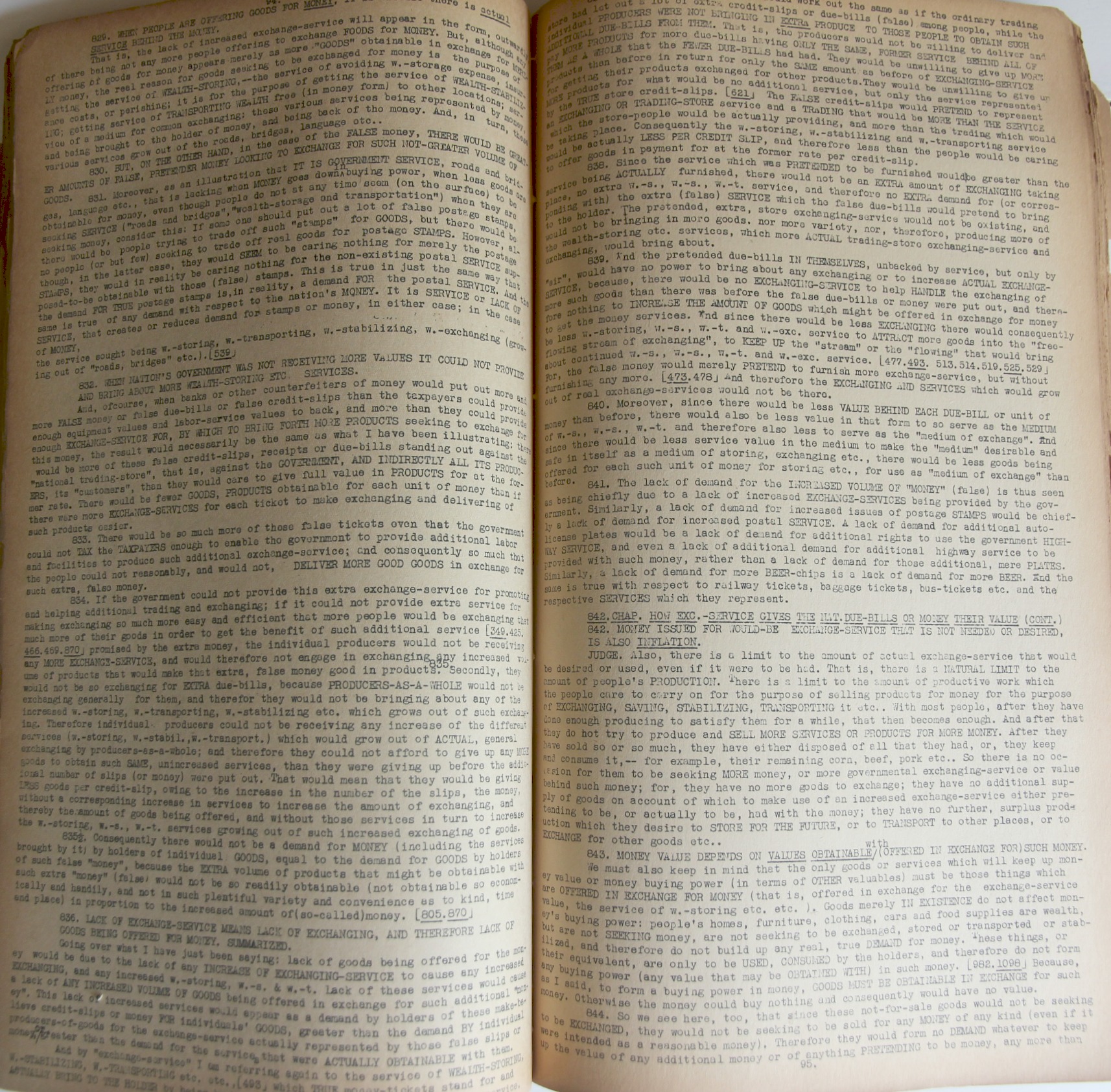
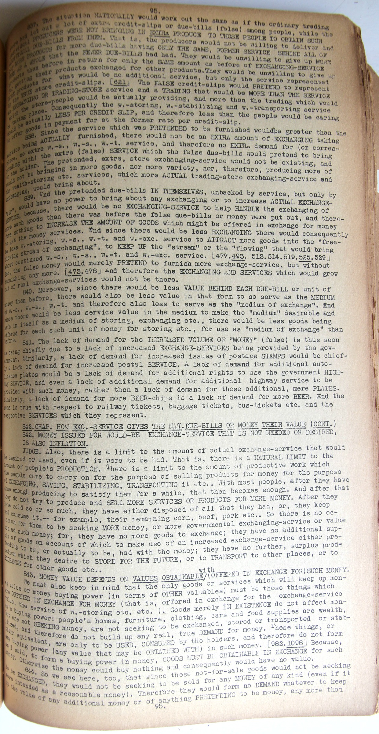
    Hard Times: Cause and Cure, a Bankrupt Farmer and an Honest Judge Talk it Over was written by Tolley Hartwick and published by him in 1934, in the near-height/depth of the Depression.  Hartwick’s work was extraordinary, though perhaps mostly within itself. From what I have read and understand, this may be a semi-private insight into the development of economic systems and the decline of the U.S. economy in 1929.  “Scientific Government/Scientific Taxation/Scientific Money” is the rallying point on the first page of this very long document that claims no title page and but scant  explanation of its origins.  The work is–in an odd and difficult way–an artwork in itself, mostly due to its dense and unrelenting design.  It is 15 inches high and 8.5 inches wide, typed single space so that on the page’s very narrow-margined self there are more than 90 cramped lines of text; and with approximately 15 words per line, that means each page is very heavily worded with something like 1100-1350 words, which is pretty impressive.  And at 210 pages, the document is about 250,000 words long, making it highly combative.  

    Outsider depression ms _2_

    I’ll never come to know what Mr. Hartwick was writing about because of the work’s secret complexities, which is too bad, at least for me.  

    But in its very dense, very full way,  printed on now-crumbling paper, and with a high degree of difficulty to decipher its message, the work presents itself as something larger than what it is–it has a certain look and feel of something very difficult to create, a certain “obviousness” of painstaking longevity that gives it more a feel of an artwork than a book.  

    In any event, I like it. 

    Outsider depression _3_[This may be a unique–with its provenance being the Library of Congress and one of the copyright deposit copies–as I can find no trace of it except for its entry in the Copyright Office publication for materials received in 1934.]

  • When “Bombs” Became “Shells”, 1745

    JF Ptak Science Books  Quick Post

    “Bombing: An attacking with bombs; bombarding; the action or operation of throwing or dropping bombs.”—Oxford Enmglish Dictionary

    • 1691   N. Luttrell Diary in Brief Hist. Relation State Affairs (1857) II. 195   The bombing of which had cost them a good summ of money and men.
    • 1719   T. D’Urfey Wit & Mirth II. 129   The General would leave Bombing, Of Towns in hot Campaigns.
    • 1915   Daily Mail 18 May 6/4   Three Air Raids on Calais. Futile bombing by 3 Zeppelins.

    Technical print canon

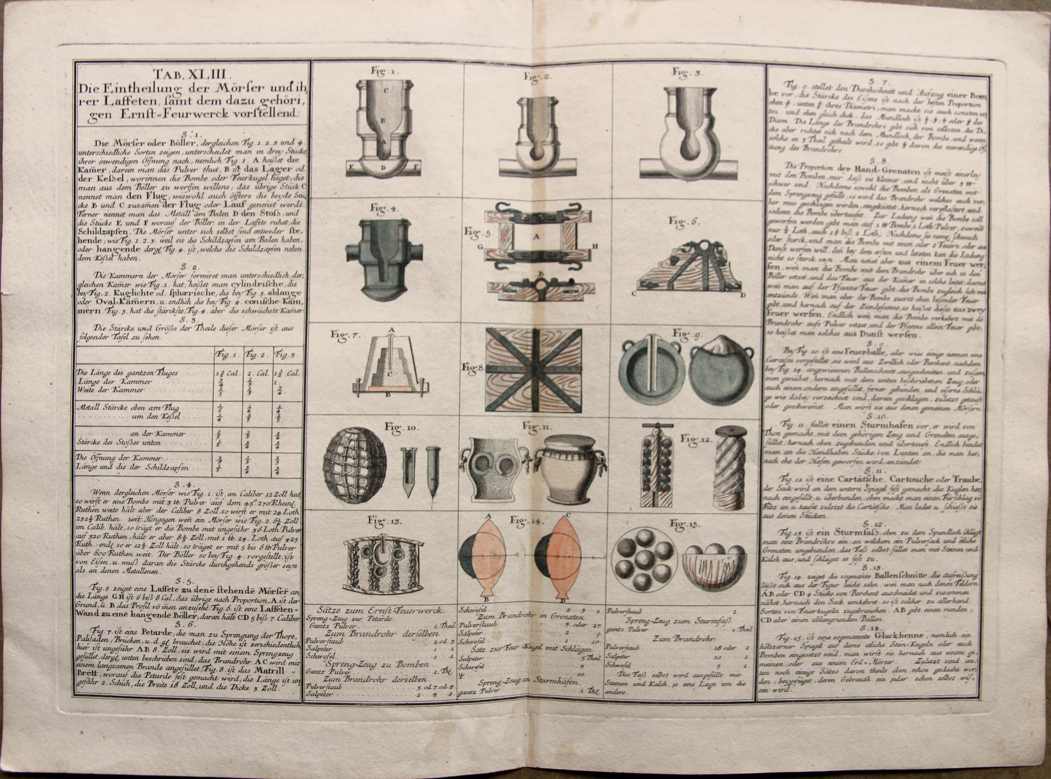
    What I had in my mind when seeing this hand-colored engraving was Sven Lindqvist’s History of Bombing–except that Lindqvist is much more interested in the modern history of bombing, and that mostly by airplane. But these are certainly ‘bombs” described here, shot from mortars. Some folks might not think of this action as “bombing”, but it certainly is according to the OED.  What is remarkable in this image is that there is a description and cross section for exploding and incendiary bombs, which at this point would probably be more accurately described as “shells”.  This is relatively early to see described in a general technical work in 1745, though the exploding shell itself goes back several centuries before this in the West and a little further in the East, so it is not a “first” description of the weapon, though it is a very young appearance of it.  (We’ll not include the flaming/diseased/etc animal carcasses that would sometimes be launched with unholy venom by trebucet or whatever in the centuries before these centuries-before.) 

    The print is entitled  “Die Eintheilung der Mörser und ihrer Laffeten, samt dem dazu gehörigen Ernst-Feuerwerck vorstellend” and is plate 43 in Mathematischer Atlas : in welchem auf 60 Tabellen alle Theile der Mathematic vorgestellet und nicht allein überhaupt zu bequemer Wiederholung, sondern auch den Anfängern besonders zur Aufmunterung durch deutliche Beschreibung u. Figuren entworfen werden, which was assembled by (Dr. Johann) Tobias Mayer (ca.1723-1762) and published in Augsburg in 1745.  

    • This is one of the plates from that work that are in the blogs’s bookstore (and buyable! here).

    Here’s a good link for the entire work, available from the German Digital Library via Goettingen.

    ·Posted by :

    ·in:

  • History of Lines: Chronology of European History, ACE 14-1813

    JF Ptak Science Books  Quick Post      History of Lines series

    MAPS--PANTOGRAPHY 4 DETAIL158

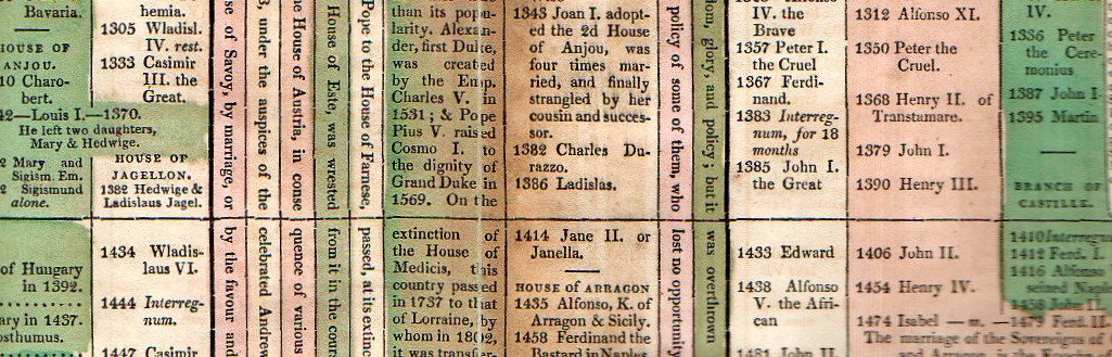
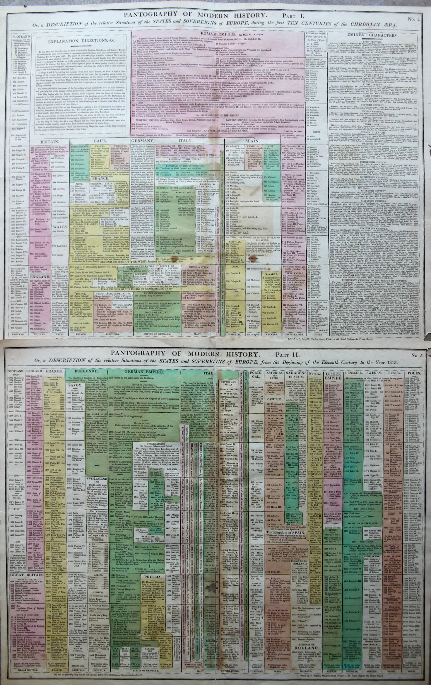
    The “Pantography of Modern History” packs a lot of information into a relatively small space, surveying a good chunk of the history of the West from the year 14 to 1800.  (It is very similar and may be a pirated English version of a French effort that I describe in this post, earlier on this blog.) The sheets are 16×20″ making the full pantography 32×20″ or so–I reckon that there are about 1000 data points on the four square feet or so of paper.  There are some descriptions of events but most of the effort is keeping the ruling heads in order.  This version is a little easier to follow than the French because the design is somewhat sparser, making the bits easier to discern.

    Maps--Pantography _3_

    I’m a big fan of this sort of data display.  

    • Published in Lavoisne’s Complete ….Geographical Atlas, printed by J. Barfield,  1815. “Pantography of Modern History. Or, a Description of the relative Situations of the States and Sovereigns of Europe, during the first Ten Centuries of the Christian Era” Accompanied by “… from the Beginning of the Eleventh Century to the Year 1828”. 
  • The History of Meat Maps: “Fluid Beef” Atlases

    JF Ptak Science Books   Post 2488

    • [Please be aware that there were 75 blog posts and another 30,000 words made on this blog in June, 2015–check them out by going to the Recent Posts block at right]

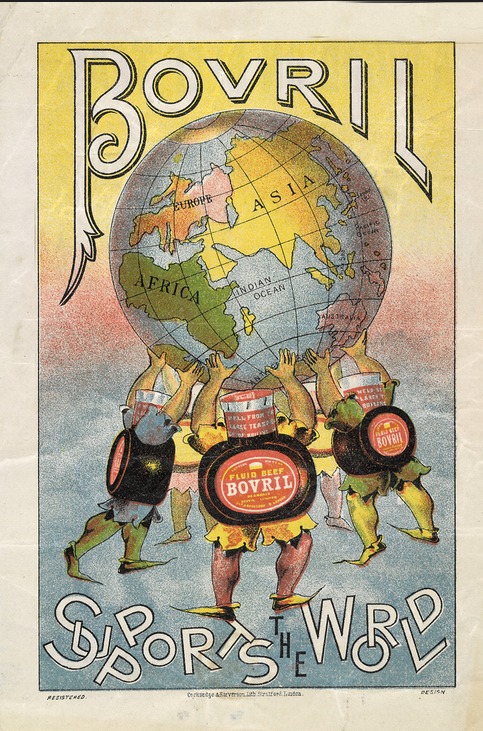
    Meat, seaweed, “beef fluid”, corn, pasta, spices, shrimp, bananas–have all served as a bases for the construction of maps–not maps of _____-producing areas, but the maps themselves being made of the actual thing (or image of it) itself.  Antique examples of this semi-anti-accomplishment are tough to find, with the Moderns being a little more common (as we can see on the Time magazine site, the background of the maps being negatives of antiquarian maps).  

    And so I just had to stop and collect up this image found on Flickr of the rectifying and emboldening Bovril “fluid beef” holding up the world, like an Atlas constructed of water and suspended beef-ish squeezings, which is a lot less appetizing than the original myth.  I can’t think offhand of another atlas-like entity made of meat-things holding up the world. 

    Maps of meat foodI do not know what the land mass is off the African west coast, except that it shouldn’t be there.  Probably it was supposed to be a too-close South America.  

    Also I should point out that the idea for constructing non-food things from food does go back a long way–there are numerous sculptural items in art and architecture that employ food/foodbits going back many century. The most famous of these maps, I guess, is the semi-magnificent The Porcineograph, produced by the Forbes Lithographic Manufacturing Company of Boston in 1876 or so, which defines the states and territories of the U.S. in terms of their regional foods.  

    This porcineograph

    [Map source:  the Library of Congress.]

    And before proceeding any further, I must at least make reference to another master in this field, an earlier, perhaps revolutionary figure (without producing a revolution), Giuseppe Arcimboldo (also spelled Arcimboldi; 1527-1593), who painted (in his non-conventional works) fantastic portraits and images using fruits, vegetables and other natural objects as the sole source of representation.  On the other hand his influence may not have been so very well known, as many of his works were stolen during war time in the mid-17th century, and he fell rather deeply into obscurity until being revived and resurrected by the Surrealists in the 20th century. 

    http://www.lessing-photo.com/p2/400706/40070643.jpg

    [Image source: http://www.giuseppe-arcimboldo.org/]

    Also in a nearby carrot patch lives some of the work of Nicolas de Larmessin (1640-1725)–an enormously creative and productive artist–who in his way created a genre similar to the great and ancient Dance of Death/.Danse Macabre/Totentanz--though his was the Dance of Life, and in some cases he used mostly food to construct and decorate his portraits.  

    There are more of these examples, to be certain, but that’s all there is time for today.  It is probably some sort of bona fide sub genre, although not a big one, and even there it may all be invisible.  

  • Roosevelt as a Proto-Fascist, 1933 (Indictment by a Far-Left Organization)

    JF Ptak Science Books   Quick Post

    Roosevelt Fascist164

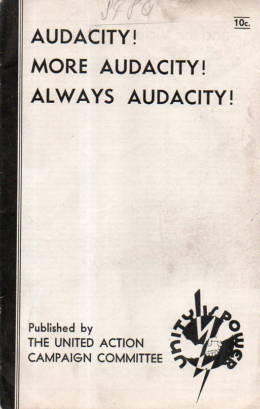
    In the pamphlet collection here there are hundreds if not thousands of odd publications printed int eh 1850-1945 period that have little bits and pieces of design elements–apart from their content–that make them irresistible.

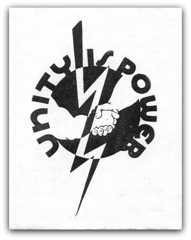
    The logo may be recognized by some of you–it belonged to the League for Independent Action  (LIPA), which was a far-left organization that last for about eight years from 1928-1936 (the last two or three being moribund). LIPA had a number of pretty heavy hitters–or at least the United Action Campaign Committee of LIPA did. The chair of this and LIPA was John Dewy, and among the others involved with the group (it seems as though there were never more than 5,000 dues-paying members) were Charles Beard, Heywood Broun, Stewart Chase, Henry Pratt Fairchild, Fiorello LaGuardia (!), Reinold Niebuhr, and dozens of others.  

    The election of FDR in 1932 seems to have sunk their boat, though in reading this pamphlet a little Roosevelt really wasn’t liberal enough for them–he did though attract a lot of their membership to the Democratic Party, and LIPA in short order shrank and drowned.

    In fact, according to the pamphlet in which this logo was found, Roosevelt was more “a threat than a promise” to American life. And, then this: that the New Deal “if carried to its logical conclusion…will introduce Fascism into the United States”. One part of this was the continued entitlements of the upper classes, “withholding the people from the blessing of security, leisure, and high living standards”. 

    And: “In truth, what President Roosevelt has been doing in Washington…will [transform the old, individualistic laissez-faire] capitalism of yesterday into the controlled capitalism of Mussolini and Hitler”.

    I’ve seen these attacks on FDR before, but  think not this early, not in the first year of his presidency.  

    I guess–given to the limited space given to this post–that it would be mostly fair to say that LIPA was a Socialist organization, at least, and the politics of the Roosevelt administration was not nearly Socialistic for them. There’s much more in this pamphlet, but it will have to wait for another time. 

    Roosevelt Fascist163


  • Among the Earliest Published Images of Chaco Culture, 1851

    JF Ptak Science Books   Post 2467

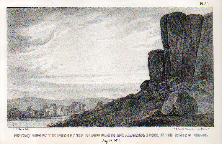
     Pueblo Bonito–built between 840-1100 SCE– is a ruin of the ancestral Puebloan peoples and is located in northern New Mexico. It is situated on a small rise in the long Chaco Canyon, and I’d say that viewing the ruins from photos or maps doesn’t convey the grandeur as you approach it walking up the slight rise–it really does sit prettily in its environment, and is very impressive. (The ruins are about 50 miles east of Canyon de Chelly and about the same distance from the Four Corners.)Kern bonito002

    This image–the first ever published of the structure?–appeared via the military and government exploring expedition and published in the report Journal of a military reconnaissance, from Santa Fé, New Mexico, to the Navajo country, by J.H. Simpson. Simpson was in charge of the exploring party, assisted by the guides Sandoval (Navajo), Hosta (Jemez Pueblo), and Carravahal (Mexico)1.

    The artwork is by Richard Kern (d. 1853) who along with his brother Edward (1822/3-1863) led extraordinary and near Zelig-like lives of exploration, and were among the first to provide accurate, scientific visual reports of the environment, architecture, and people in the Arizona, New Mexico, and southern Colorado areas (and especially in the Four Corners region). 

    • Full text of the report can be found here:  https://archive.org/details/journalamilitar00simpgoog

    This is one of the many images made for the work, undertaken under great duress at times, and under severe hardships, by Richard and Edward Kern during this reconnaissance of the Navajo lands of the Southwest. The remarkable thing is not only how they survived, but also how truthful the published images are to the original drawings.  

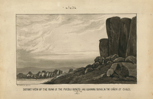
    And the original black+white wash, found int eh collections of the Academy of Natural Science of Philadelphia:

    Kern pueblo bonito

    [Source: Academy of Natural Sciences, Philadelphia, Everett Sale Library  http://www.ansp.org/research/library/archives/0100-0199/kern146/]

    And the text associated with the drawing, pp 40-42: 

  • Superior, Tiny, Mountain Height Profile Insets, 1856

    JF Ptak Science Books  Post 2446

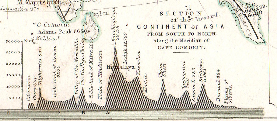
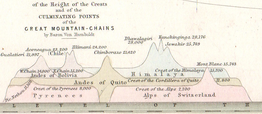
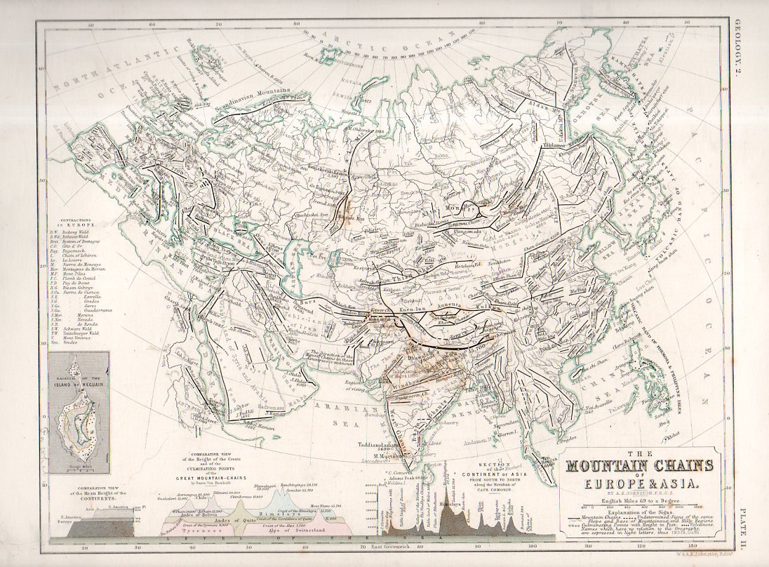
    One of the favorite parts of map reading–especially for 19th century maps–is finding the small, add-on gems of represented data clinging to the sides of the main map, along the margins and in the corners.  Although this map by W. and A.K. Johnstons in itself a fine work of art  and displays some knotty and previously hard-to-com-by data, the two bits at teh bottom of the map just give the overall project a deep lustre.    Alexander Keith Johnston (1804 – 1871) came to this task via the suggestion of Alexander von Humboldt, the results of his own phenomenal research and exploration finding their way into Johnston’s atlas.   

    • The original map may be purchased via our blog bookstore, here.

    Geological mountain ranges934

    This version of “The Mountain Chains of Europe and Asia” is found in the second edition of the Johnston’s The Physical Atlas – A series of maps & illustrations of the Geographical Distribution of Natural Phenomena embracing I. Geology II. Hydrography III. Meteorology IV. Natural History, published in 1856 (following the first edition of 1850).  

    Geological mountain ranges935

    Each of the small inset measures about 1″x1.5″ in the detail of the following:

    Geological mountain ranges933

    Notes:

    Some contemporary notices on the Johnston Atlas: 

    “For the first time, in this country, the principles of graphic representation are here applied to the delineation of the most important facts of external phenomena. Simple but significant symbolical signs have been introduced to an extent, and with an effect, hitherto never contemplated. The contents of the many volumes, formerly the sole depositories of information regarding the different kingdoms of nature, have been condensed and reproduced with a conciseness, precision, completeness, and promptitude of application altogether unattainable by any other agency.”–from a longer description for the atlas found at Chest of Books, here.  

    “This splendid volume will fill a void long felt in this country, where no work has been attainable presenting the results of the important science of Physical Geography in a distinct and tangible form. “–Forgotten Books (here)

  • Under Under-Statements on the Bomb

    JF Ptak Science Books   Post 2447

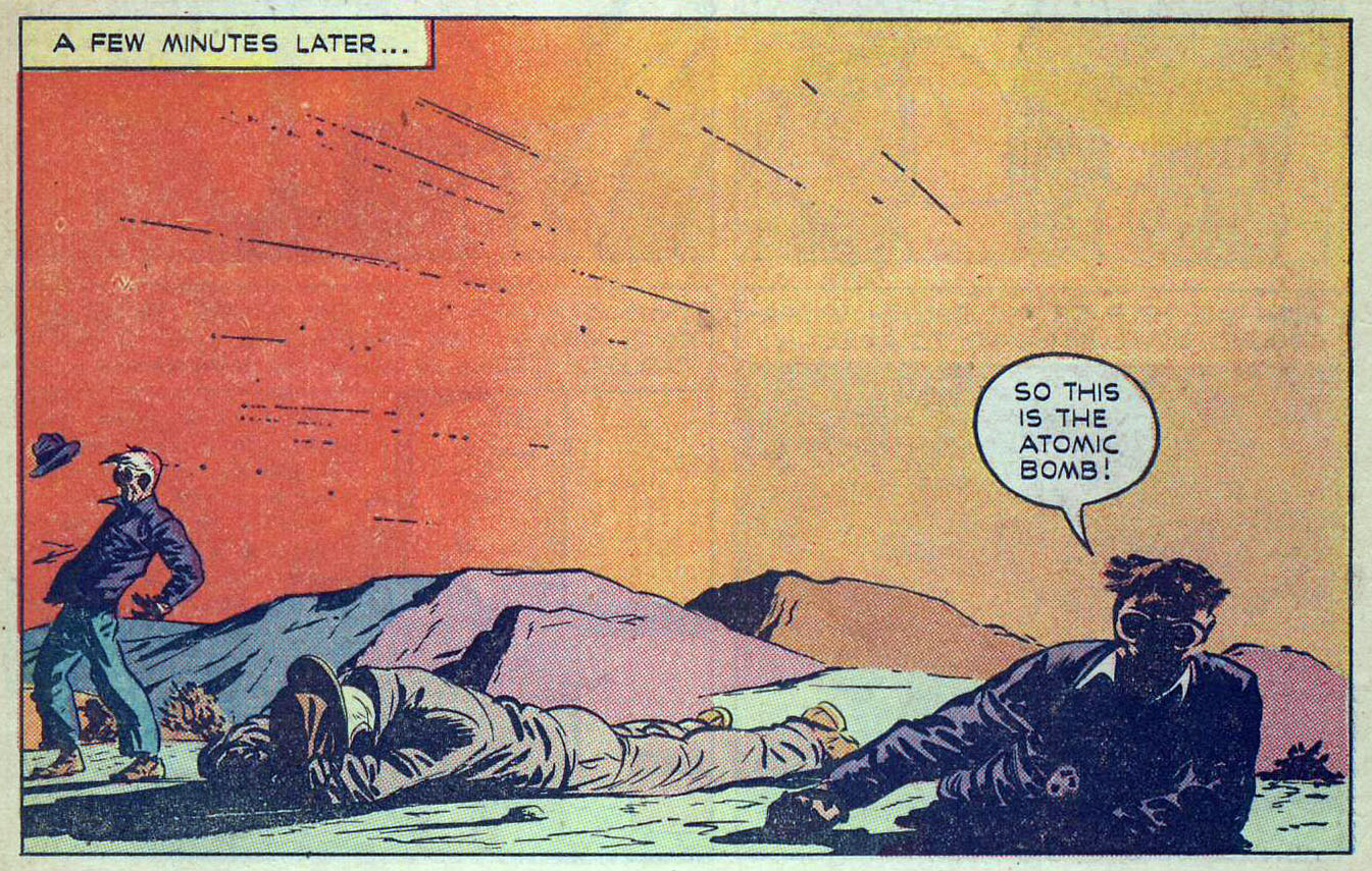
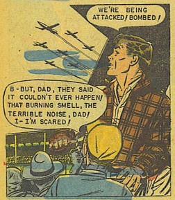
    There’s nothing quite so ironic as understatement when the understatement is understated even in advance of itself.  I’ve noticed this here and there with the depictions of atomic/nuclear war in the bomb’s early history, say 1946-1960, as seen in comic books.  For example, here’s something I posted last week that is a fairly representative understatement done in a small way about a big thing: 

    Atomic_ so this is the atom bomb

    See here.

    It is I think representative of an entire class of mid-century image of atomic understatement.

    Having found this one others were quick to follow. 

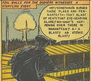
    The comic World War III is a  caustic of advanced crispy-crunchiness, and set in the year 1980, where the future found the Brooklyn Dodgers still playing in NYC.  For some reason, the photographer on the roof of the Polo Grounds takes a slow burn of realization that something big was going on, processing the burned pennants /heat/glare before settling on the enormous mushroom cloud rising four miles above Manhattan… 

    Atomic blast Dodgers game

    [Via the Internet Archive,  full text & lurid illustrations here http://ow.ly/Mqcox ]

    Atomic bomb polo ground

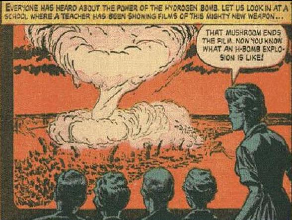
    And another fine example, this graduating to a hydrogen bomb later in the decade, a bomb far more unimaginably powerful than the unimaginably powerful 20kt bombs of 1945. Okay, there are red skies and a firestorm the width of a city, and the “mushroom” ends the film, but there is only a perfunctory statement of the too-close-together heads that they now know what a hydrogen bomb explosion was, or is, or could be:

    Embedded image permalink

    [Source and full text via the Internet Archive,  http://ow.ly/Mqbpw ]

    I know it is difficult to describe the Grand Canyon as it would be to witness a nuclear explosion (let alone be in one).  But these under-nucleated statements is sort of the equivalent of describing the Grand Canyon as something along the lines of “We’re here now and looking down”.  

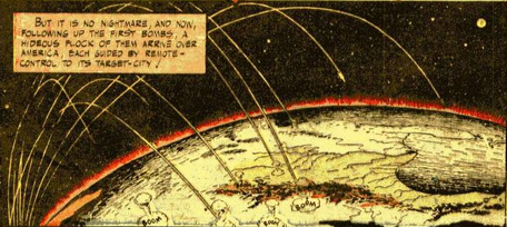
    And this is about as loud as the screaming gets in Capt. Marvel’s adventures with the atomic bomb. This is surprising mainly because the comic was published only about a year after Hiroshima/Nagasaki, and imaging a “flock” of missile launched atomic weapons falling all over the U.S. was a salient look into the possible future.  

    Atomic war capt marvel

    [Source: http://ow.ly/MqlGV] 

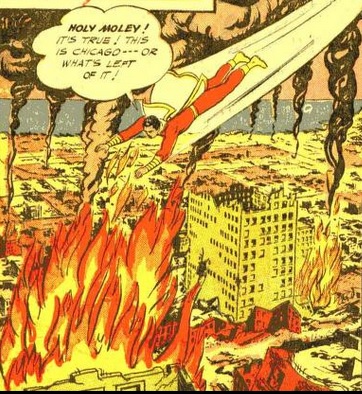
    And in the face of the unspeakable, Capt Marvel seems unflappable:

    Atomic bomb holey moley

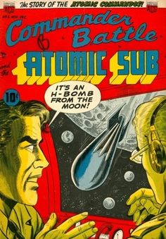
    On the other hand there are excitable statements regarding the bomb:

    Atomic bomb from moon

     But it does make one wonder about featuring shock-of-recognition statements about the apocalyptic  bell ringing of nuclear weapons as expressed in comic books as a comparative whisper in the description of the thing.  It is almost as though if the Cornishman spoke quietly enough he wouldn’t make the wakening giant angry.  

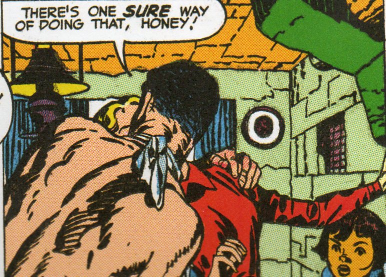
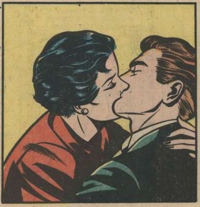
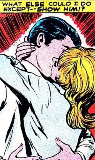
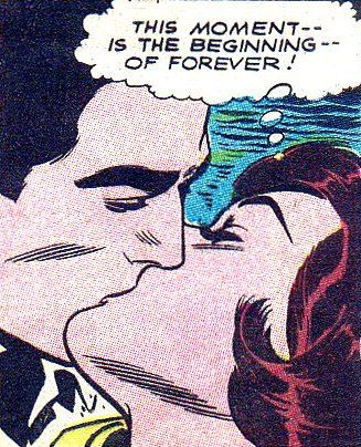
  • A History of Blank, Empty & Missing Things: Lipless Kissing in the Golden Age of Comics (Part 2)

    JF Ptak Science Books   Post 1077 (from 2010, expanded)

    [A History of Blank, Empty & Missing Things, #78]

    Kiss 185
    The indefatigable team of Joe Simon and Jack Kirby (Joseph H. Simon, born 1913 and still going and Jacob Kurtzberg,1917-1994, respectively) produced some of the enduring heroes and ideas of the Golden Age of Comics. In capacities as comic book writers, artists, editors and publishers they knocked the bottom out of the creativity bin, affecting all manner and aspects of that industry, as well as  introducing the genres of horror and modern romance comics.

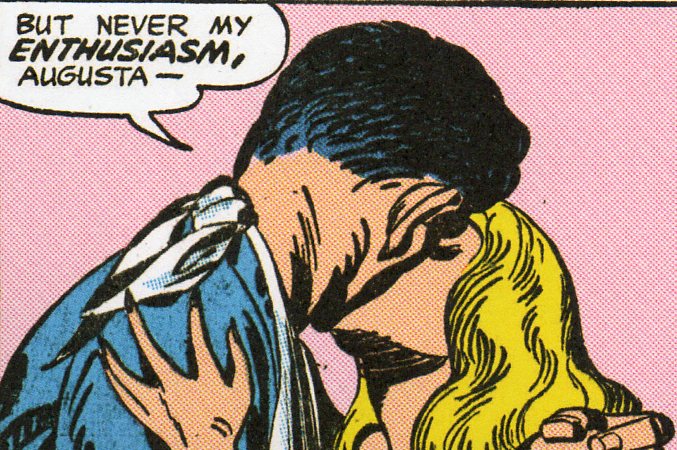
    And as necessary as it is scary, the nearly unrecognizable forensic pathology of the kiss in pink (above):

    Kiss--pink kiss det

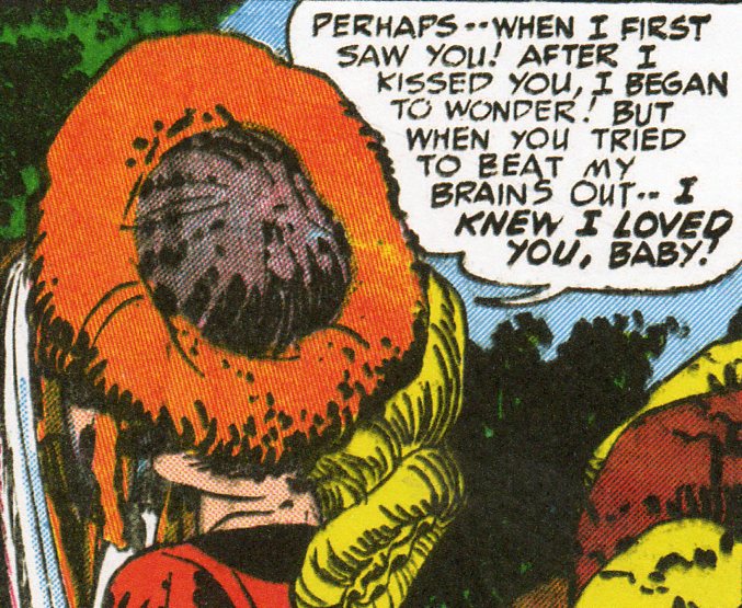
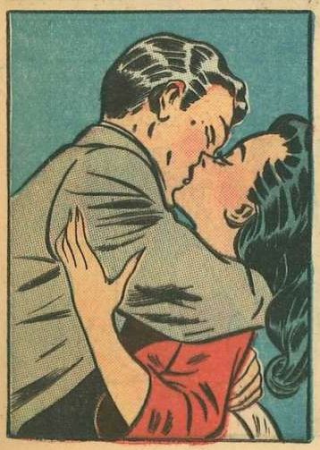
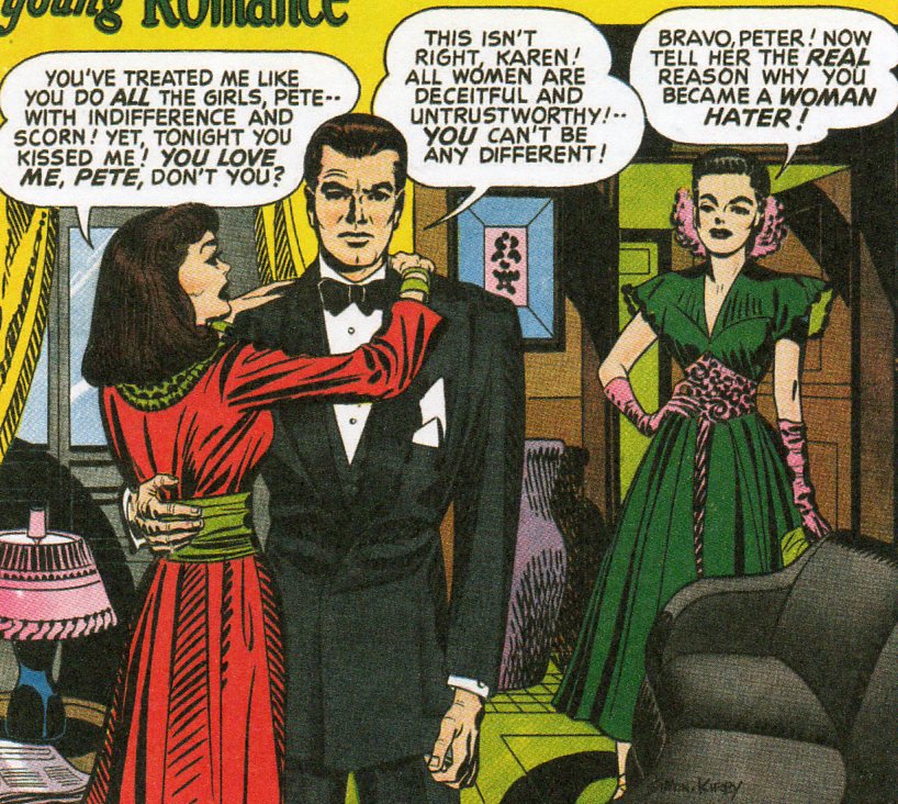
    I was initially drawn to their harsh colors,  blocky characters and un-magnificent dialog looking for wonderbits of non sequitor images and thought/word balloons populated with broken english.  They’re marvelous and easy to find, though I did get distracted by the unexpected part that I’m posting about right now–the missing, blank kiss.  Since they started the romance comics angles there’s plenty of 1940’s kisses to be found, but what I found was that although the kissing aspect wasn’t missing, the act of kissing was.  There’s plenty of heads smashed together that don’t leave a lot of room for faces, and in general it might be the sensitivities of the Golden Age’s age that cast away the kiss itself, their characters rushing face first into bad screen kisses. 

    Kiss 186

    There’s nothing wrong with this, and perhaps the kids never really noticed this, rushing to get ahead to the end of the confusing romantic interests.

    Kiss 187


    Kissing--comic book kiss

    Kissing--what else could I do

    Kissing--begining of forever

    There is a hint of a lip in this one, below, though it wasn’t supposed to be a passionate cheek kiss.

    Kissing in teal

    This one has more to do with anti-kissing than anything else; I’m sorry that I don’t know what the “real reason” was….

    Kiss 189
      

    ·Posted by :

    ·in:

    —

Recent Posts

Archives

Categories