A Daily History of Holes, Dots, Lines, Science, History, Math, Physics, Art, the Unintentional Absurd, Architecture, Maps, Data Visualization, Blank and Missing Things, and so on. |1.6 million words, 7500 images, 4.9 million hits| Press & appearances in The Times, Le Figaro, Mensa, The Economist, The Guardian, Discovery News, Slate, Le Monde, Sci American Blogs, Le Pont, and many other places… 5000+ total posts since 2008.

  • History of Hair, Part 5: Hair Restoration and the Big Giant Suck

    JF Ptak Science Books

    I have written several times on this blog about hair: human hair maps, psycho-babble-istic brain vibrating finger hair restorations, and that sort.  (Just check out “hair” in the Google search box and you’ll find a number of posts.) The fact is that the patent/quack medicines/cures/fix-alls for hair are still entertaining–mainly because though the methods have changed the need still seems to be there and be a constant sorrow.
    Hair vacuum126

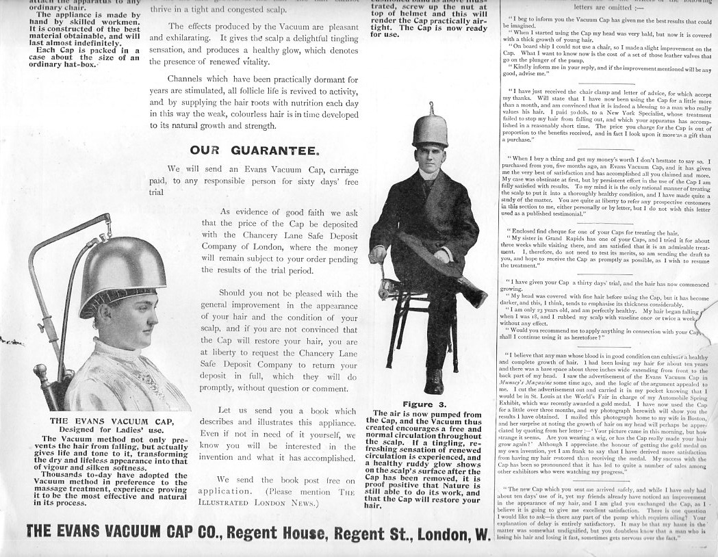
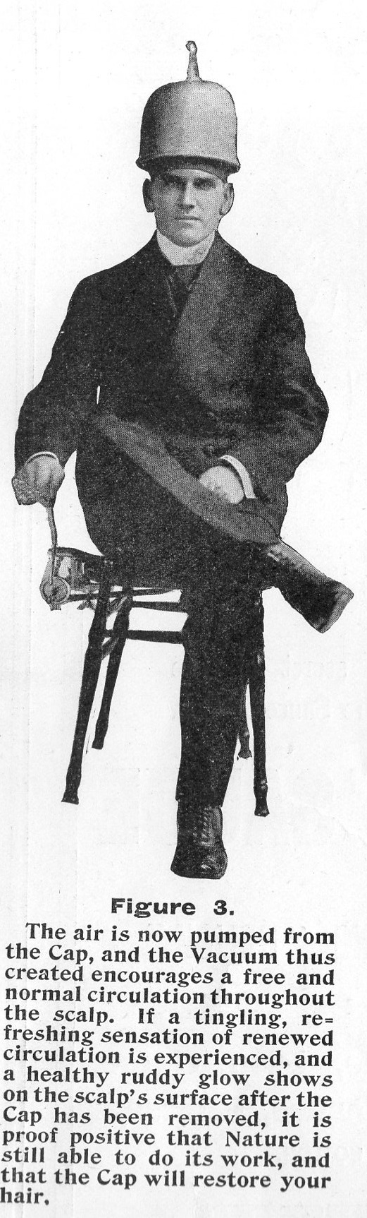
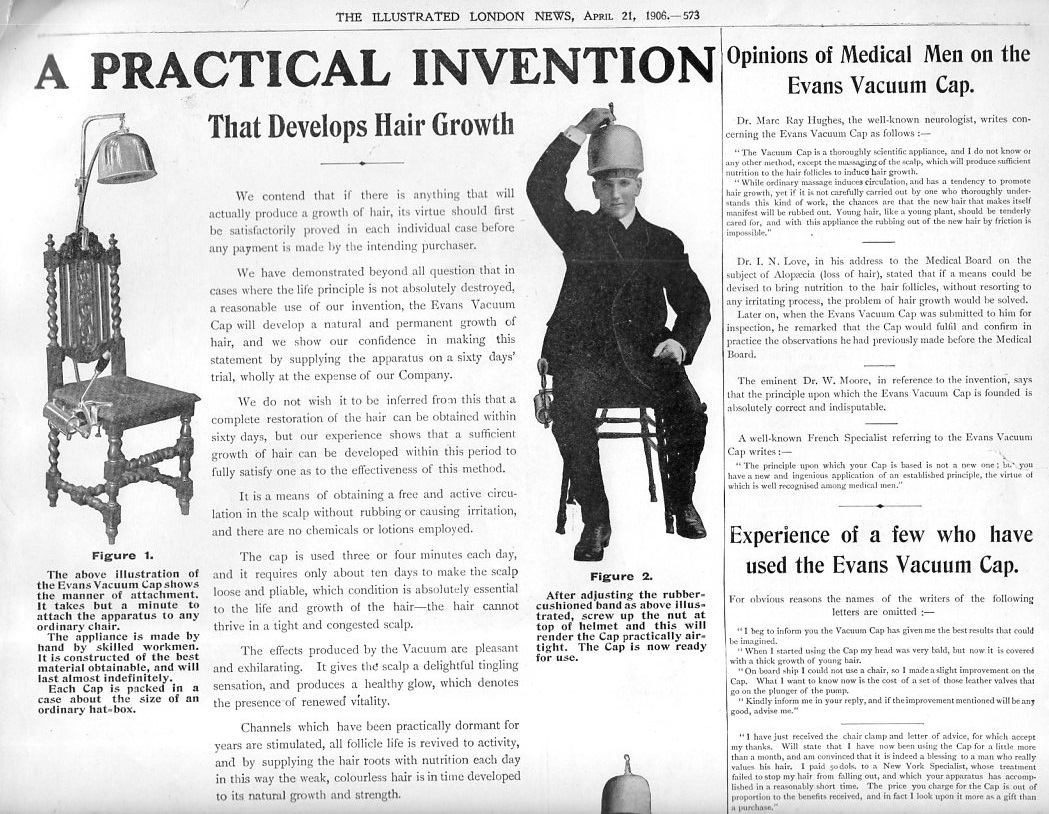
    There is not much to say about this advertisement except that it was a full page in the Illustrated London News (April 21, 1906, p. 573) and was therefore expensive.  The apparatus was basically supposed to suck the hair up and out of its Very Secret Place on the scalp and grow, so we know that the Evans Vacuum Cap Co didn’t spend very much money on research. And the product itself is a chair, the vacuum cap, and a pump, so the engineering part was not very expensive, either. The thing was offered money-back if not delighted after 60 days, so the vacuum must have at least been effective enough to stimulate some sort of sensation on the wearer and maybe even produce a scalp-hickey. Perhaps people were really surprised that after 90 or 900 days that the Hiding Hair was still so. 

    No mention of price, though–that would’ve been nice. 
    Hair vacuum124

    Hair vacuum125

    ·Posted by :

    ·in:

    —
  • Color in Black & White, and Black in Black & Black

    JF Ptak Science Books   Post 2481

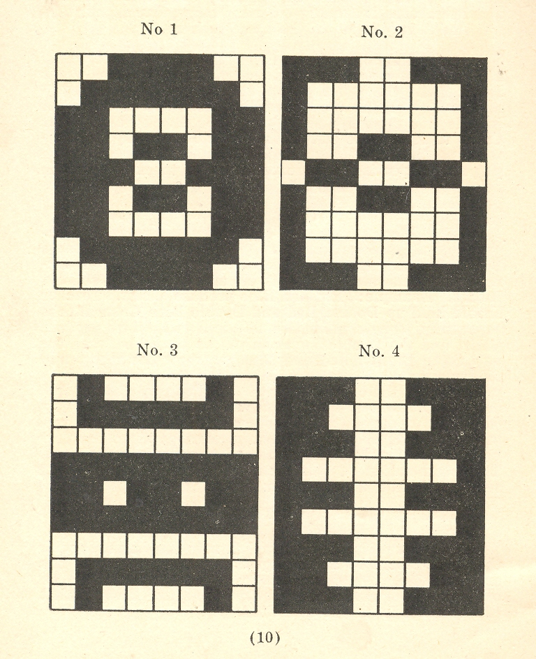
    Earlier in this blog appeared a happy little post of odd uses of color to illustrate color, black and white to illustrate color, and nothing to illustrate something called “Three Map Fits: a Color Map with Color and No Map, a Color Map in Black & White; AND a Black & White Map in White (only)” here. There was an appearance there of a small pamphlet by Albert Coble  (Games of Colors, Kindergarten and Primary Exercises). on the uses of color in kindergartens in which color exercises were presented though no color was actually employed in the illustration, though the general arrangement is clear enough:

        Color--b+w 001

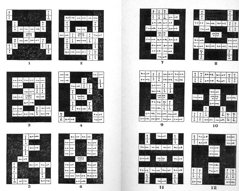
    It is a happy thing that there is a second Coble pamphlet on hand (!, Color Exercises (The Coble Color Tests) Instructions for Primary and Kindergarten Work, 1923 ) and this one though still in black and white now has color designations:

    COlor coble127

    The idea that Coble is writing about (color and kids and the education of young children in the different forms/varieties of color and how colors are produced) is very interesting, and no doubt that the set of color blocks used in the exercises would have been lovely in themselves, but I think the author would have made more headway had he had at least one color illustration. 

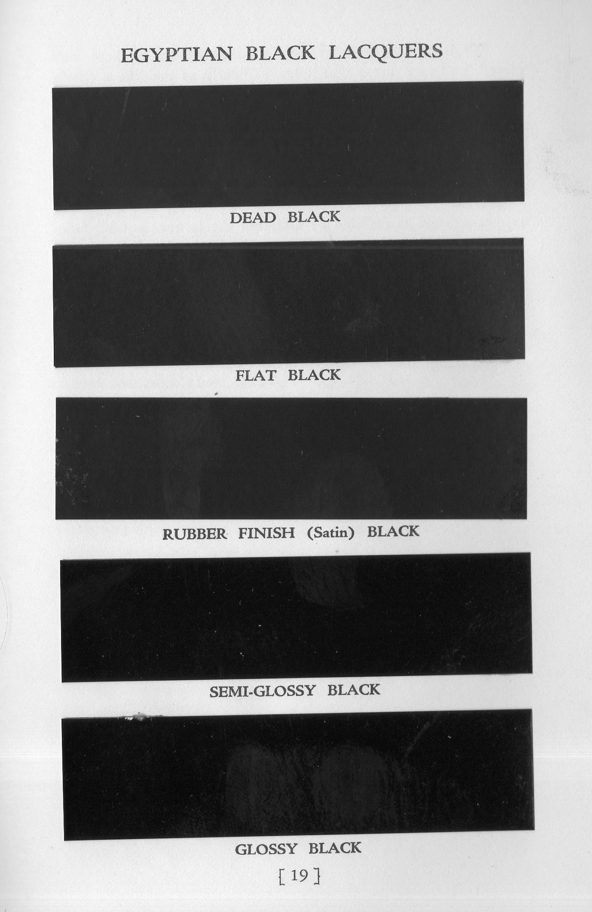
    That said, the world of black & white and grays is a lovely one, and as long as we’re talking about black & white in color, let’s look at a pamphlet that is all about black & black.  Egyptian Lacquer  Manufacturing Company (“Rockefeller Center, NY, NY”) specialized in heavy industrial paints and published some small but fine catalogs to sell their services and products.  One of them, Egyptian Black Lacquer for Industrial Products (1938) contains a paint chip plate to compare its various blacks.  There is nothing finer, really, than a really black black, an all-out black, a midnight-and-no-light-source black, a B-1 stealth bomber black, a Sommerfeld black.  And Egyptian comes really close to a good solid black black, what they called their “dead black”.  I can’t reproduce it here and give this black any justice, as it is hard to reproduce a black with no lustre that isn’t that lacquer/paint itself–but trust this writer, these blacks in real life are as differentiated as their names imply:

    Black black128

    And that dead black?  They mean it.  Or meant it.

  • Concentration, ca. 1572.

    JF Ptak Science Books  Post 2482

    Ioni Maio130

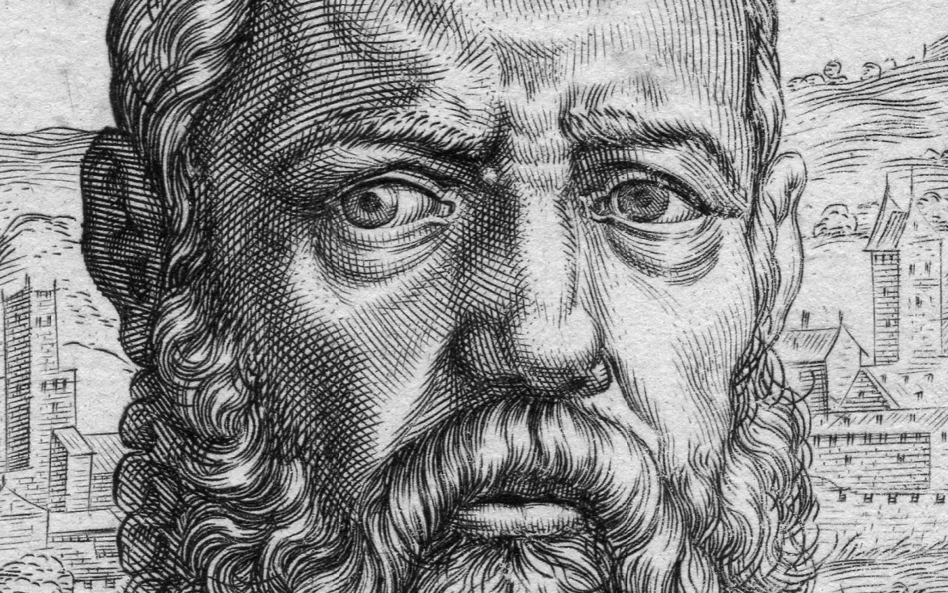
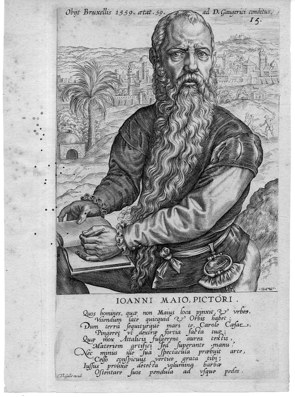
    This engraved portrait of the very striking Jan Cornelis Vermeijen (also “Vermeyer”, and here known as “Ioanni  Mao”) appears in Dominicus Lampsonius (Latinised form of Dominique Lampsone) Pictorum Aliquot Celebrium Germaniae Inferioris Effigies and published by Volcxen Diericx (1570-1600 fl).  (The first edition was published in 1572, and I believe that this image appeared somewhat later in the century as there are some differences in the text around the image.) Diericx was the  “widow of Hieronymus Cock , who took over his business ‘Aux Quatre Vents’ after his death in 1570. She and her new husband, Lambrecht Bottin are mentioned together by Plantijn at the head of a list of printmakers and print sellers in Antwerp, which was assembled between 1577 and 1580. Since the death of Hieronymus Cock in 1570 to her death in 1600 all the prints published by her have the sentence Aux Quatre Vents without the name of Cock”.–British Museum online. 

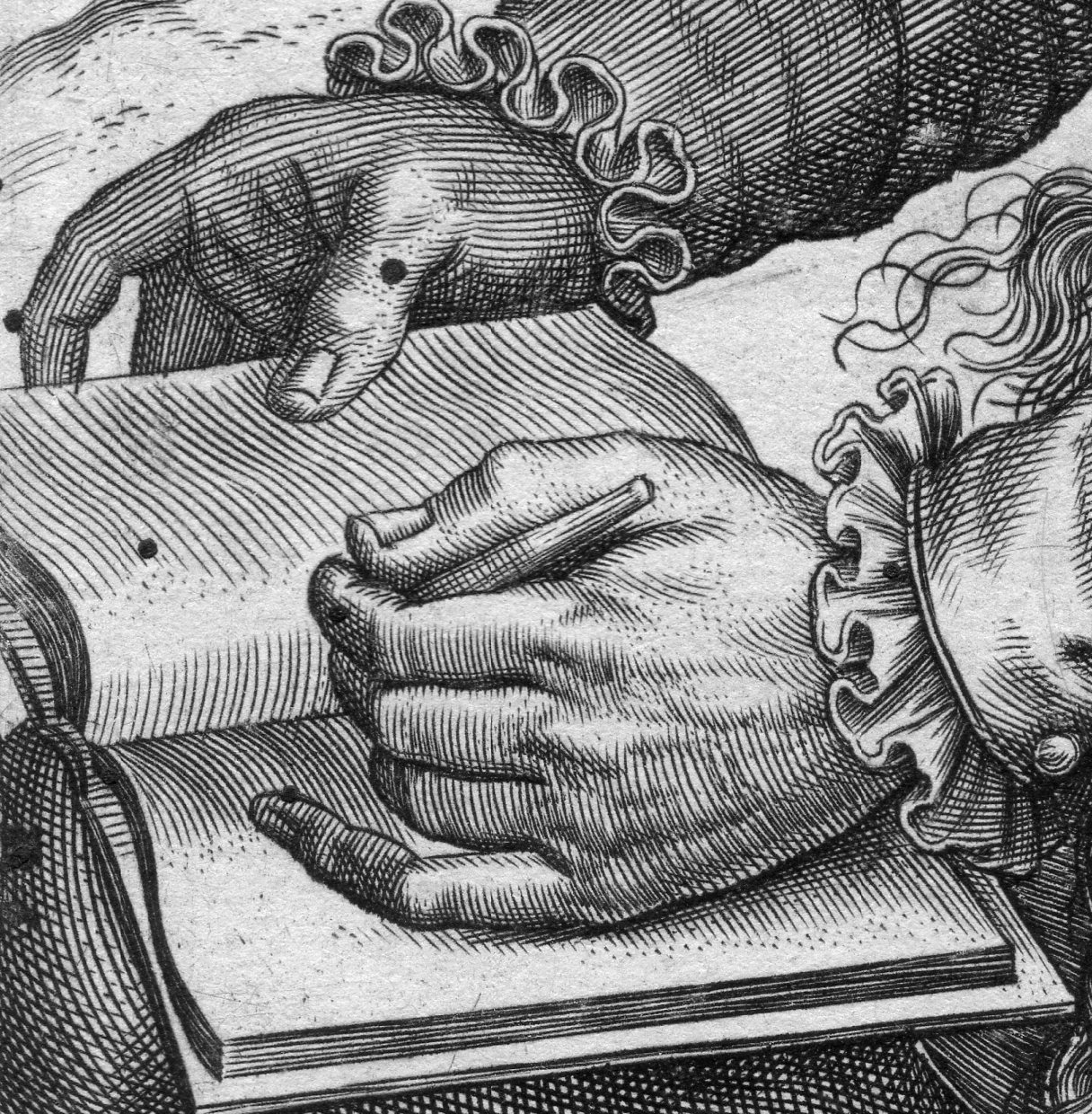
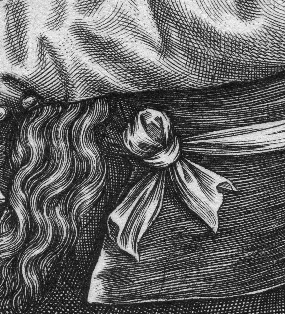
    I’ve long liked this portrait of Cornelis Vermeijen (ca. 1500-1559), I think mostly for his hands and for the ultra-concentrated bit of concentration that is going on in his eye/forehead conversation.  Even though I ‘ve owned this for a long time I’ve never known about the placement of the palm tree over Jan’s left shoulder or the murderous attack going on over his right. 

    The work was executed by Theodore Galle (signed in the plate at very bottom-left) after the engraving by Jan Wierix (1549-1620, who signed his name “I H W” in the bottom right of the portrait.  The other Dutch artists comprising the illustrations include The artists included in the book are (in this order): “Hubert van Eyck, Jan van Eyck, Hieronymus Bosch, Rogier van der Weyden, Dirk Bouts, Bernard van Orley, Jan Mabuse, Joachim Patinir, Quentin Matsys, Lucas van Leyden, Jan van Amstel, Joos van Cleve, Matthys Cock, Herri met de Bles, Pieter Coecke van Aelst, Jan van Scorel, Lambert Lombard, Pieter Bruegel the Elder, Willem Key, Lucas Gassel, Frans Floris, and Hieronymus Cock.” (Wiki)

    Ioni Maio129

    • The original is offered for sale at the blog’s bookstore, here. 

    Ioni Maio131

    Ioni Maio132


    The legend reads “Quos homines quae non majus loca pinacit et urbes Visendum late quicquid et Orbis habet Vum terra sequiturque mari te Carole Caesar Pingeret ut dextrae fortia facta tilt 6 Quae mox Attalicis fulgerent aurea teactis Materiem artifici sed superante manu Nec minus ille sua spectacula praebuit Celso conspicuus vertice grata tib…”

  • Mathematical Beauty, 1840

    JF Ptak Science Books Quick Post

    I’m just revisiting an earlier post about the beauty of a found mathematical notebook–its quiet assuredness, its composition, its care, its trying….just lovely, speaking of the efforts of a young person back in 1840. 

    For more, see https://historyofideasblog.com/thesciencebookstore/2014/03/the-beauty-of-mathematical-manuscripts-1840.html

    Math beauty notebook

    ·Posted by :

    ·in:

  • On Perspective, Comparison, and the Reverse Tower

    JF Ptak Science Books  Post 2483

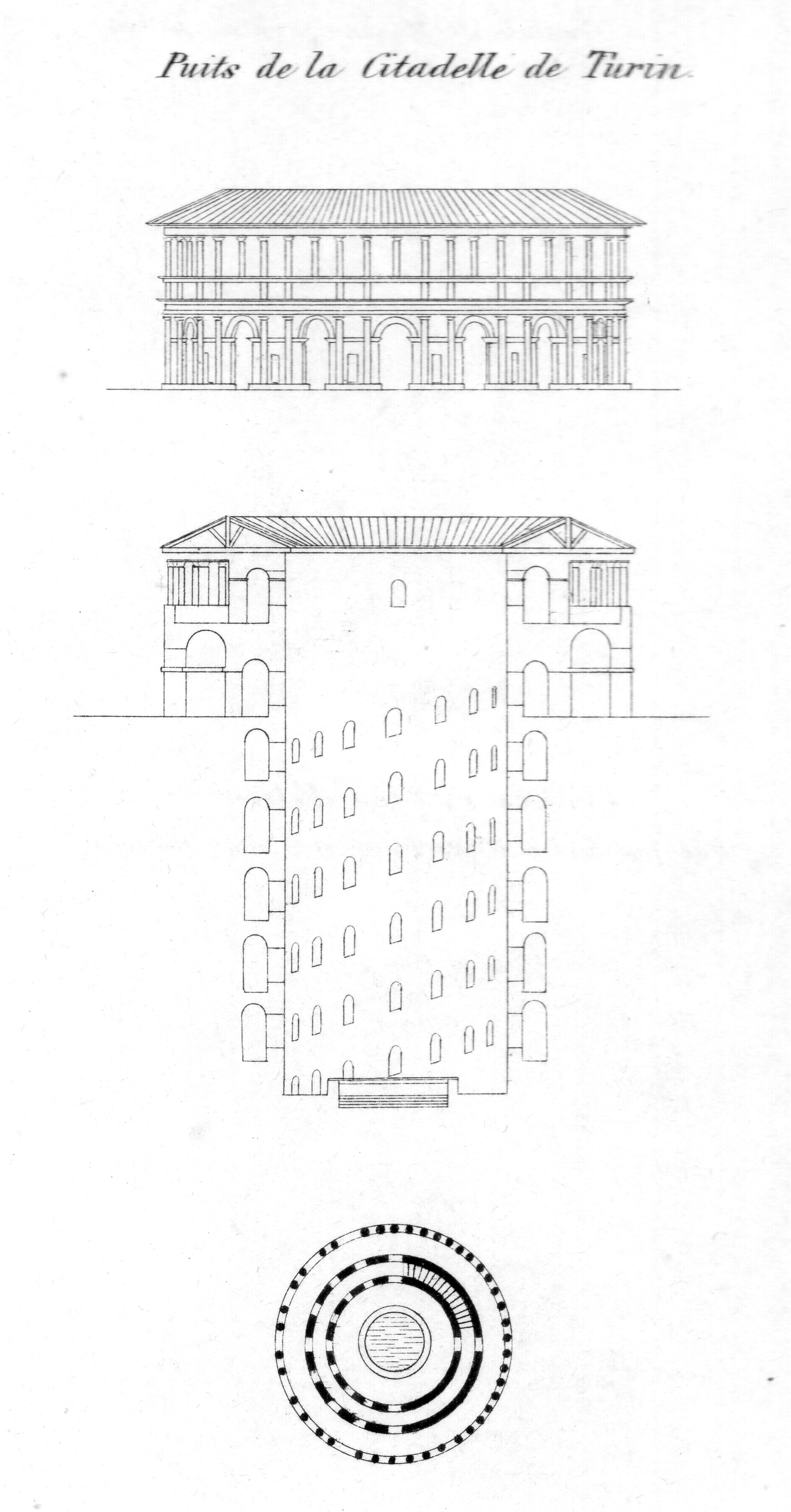
    As M. Chabat writes,”Considérés au point de vue de la forme et de l’ornementation extérieures un grand nombre de puits de toutes les époques peuvent être regardés comme de véritables œuvres d’art…”, which is certainly true of the well at the citadel of Turin–even the elevation and (particularly) the plan of the structure. 

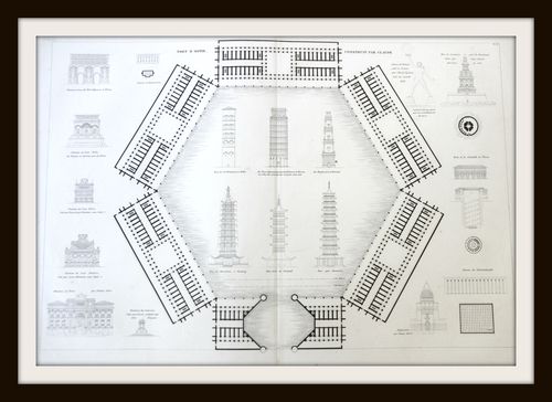
    Turin well133Funny that this is what I find most interesting in this big engraved sheet from Jean Nicolas Louis Durand’s monumental and important semi-biblical work on the history of architecture, but, so it goes.  (The work is Recueil et Parallele des Edifices, and was printed in Venice by Giuseppe Antonelli in Venice in 1833; it comes some 31 years after the appearance of the first edition, greatly expanded, with 273 plates compared to 90 in the first.)

    Architecture Canina towers

    • The original engraving is available for sale at the blog’s bookstore, here. 

    There’s plenty on this sheet worthy of attention–and as the Durand work is concerned, it is one of the few to feature towers. And in the case of the Turin well, it may be considered (here at least and not probably by anyone who knows anything at all about architecture) to be a reverse tower.  This is slim pickin’s so far as engineering reasoning goes–or is it?  Why if it was so removed from logic would the considerable and considered Durant include the thing on his page of towers? 

    One of the remarkable points on this structure was the dual circular staircases that would allow the horses hauling water from the depths for go up and down without having to pass on another. 

    The other thing about Durand was that his work is considered a great scientific improvement in the description of architecture, and seems to me to be the first work to compare different sorts of buildings (and from different periods) all in the same scale, on pone piece of paper, side-by-side.  It seems that in the history of formalization and categorization and classification that this business of comparative architecture that someone would have used a single standard of description for size–but evidently not.

    • See here for an interesting appraisal of Durand along with 90 links for each of the images of the first edition.  (Quandom.com)


    “Le puits de la citadelle de Turin dont la fig 2413 représente la coupe et le plan à une échelle moitié moindre est établi dans les mêmes conditions. On ne saurait oublier de citer également le puits de Bicétre près de Paris achevé en 1735 d après les plans de Boffrand et qui a 57 mètres de profondeur sur 3 mètrrs de largeur L eau s en extrait au moyen de deux seaux contenant chacun près de 270 litres d eau et pesant 600 kilogrammes lesquels montent et descendent ù l aide d une charpente tournante mue par 8 chevaux cette eau est reçue dans un réservoir d où elle est distribuée par des conduits dans les diverses parties de l établissement. Considérés au point de vue de la forme et de l ornementation extérieures un grand nombre de puits de toutes les époques peuvent être regardés comme de véritables œuvres d’art…” Dictionnaire des termes employés dans la construction …: volume G.-Z,  by Pierre Chabat, 1872

  • Found Beauty in Mathematics, ca. 1895

    JF Ptak Science Books   Quick Post

    MATH ART134--dag

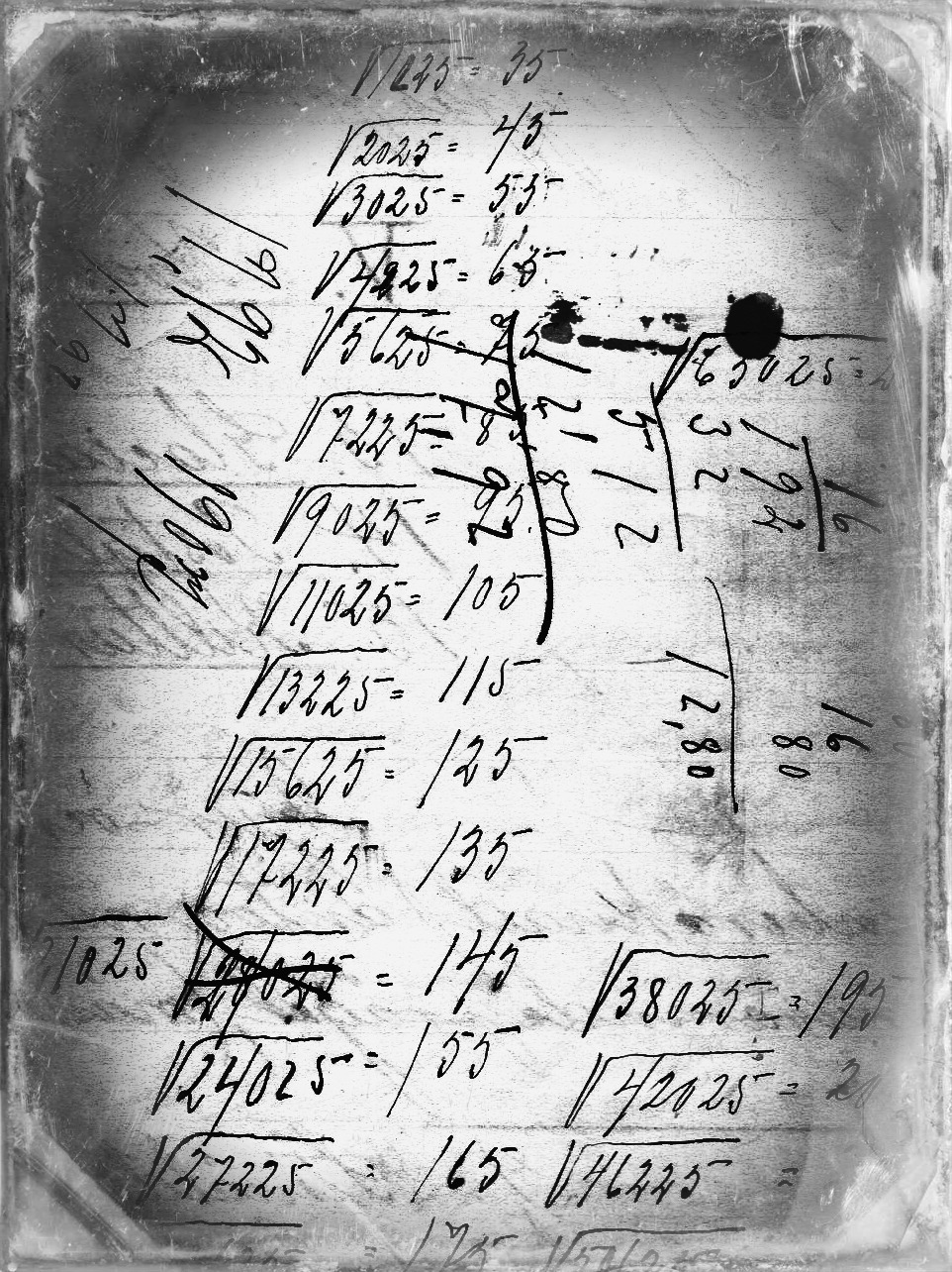
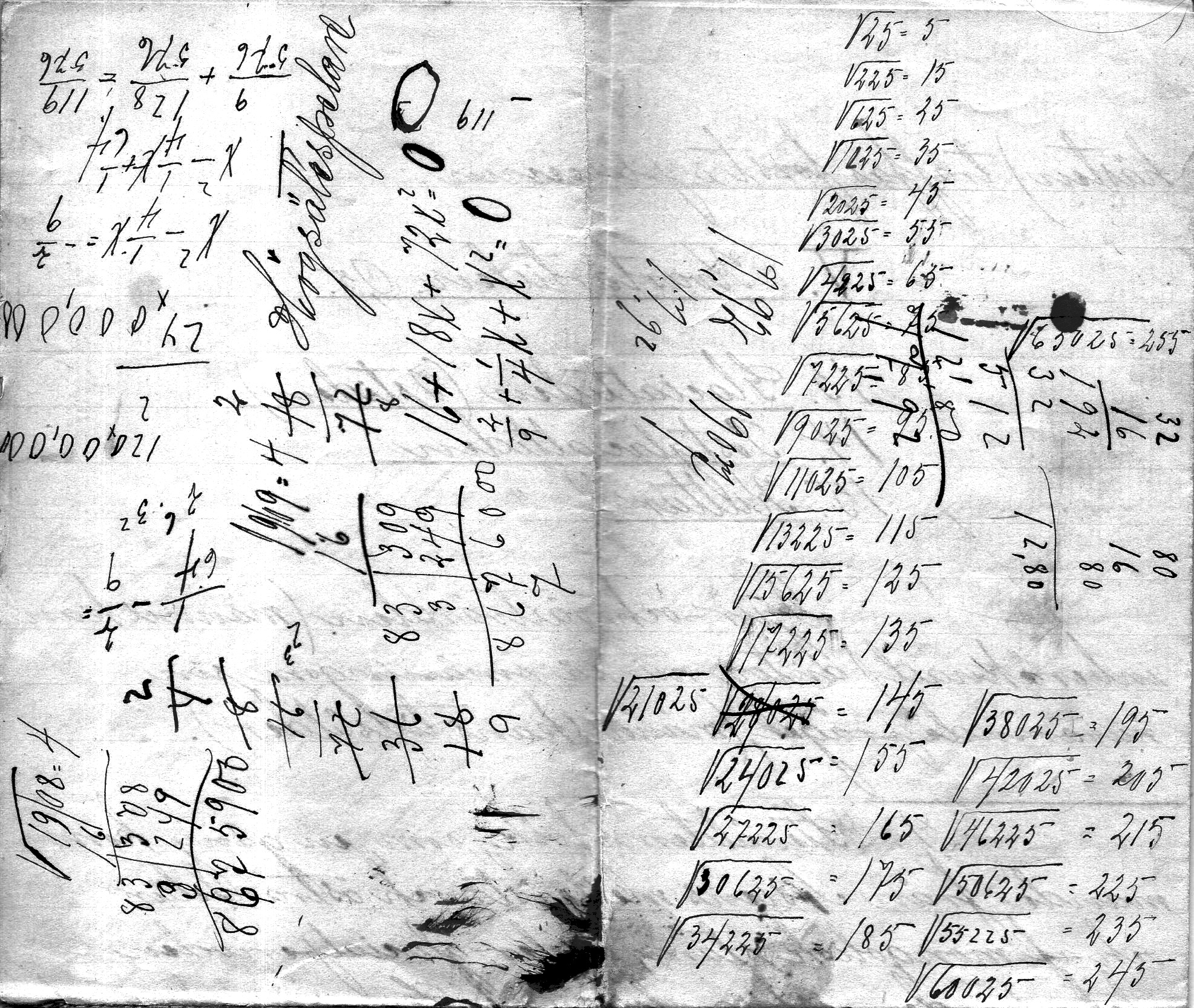
    This is a slightly manipulated image of the original (below) with an overlay of a daguerreotype process.  The math notes (square roots of numbers from 25-60,025 in 25 increments) occurs on the back of several pages of foolscap note “di geologiska formationrma” and by the footnotes it seems as though the notes are from 1893/5 or thereabouts.  In any event the calculations have a certain beauty to them. 

    MATH ART134

    ·Posted by :

    ·in:

  • Pride in a 3mm House on the Dead Man’s Walk, 1855

    JF Ptak Science Books   Post 2483

    Jornada136

    Sometimes maps have an unusual ability they can Maps can record human achievement and anti-achievement and show human impact on the environment and vice versa, which is standard,  especially if you can see a little deeply into it.  Sometimes though there are the little bits–extras–that find their way onto the paper that opens a window to the emotional involvement of people and space, added by the artist or engraver or whoever it might be that last touches the plate before prints are made from it.  

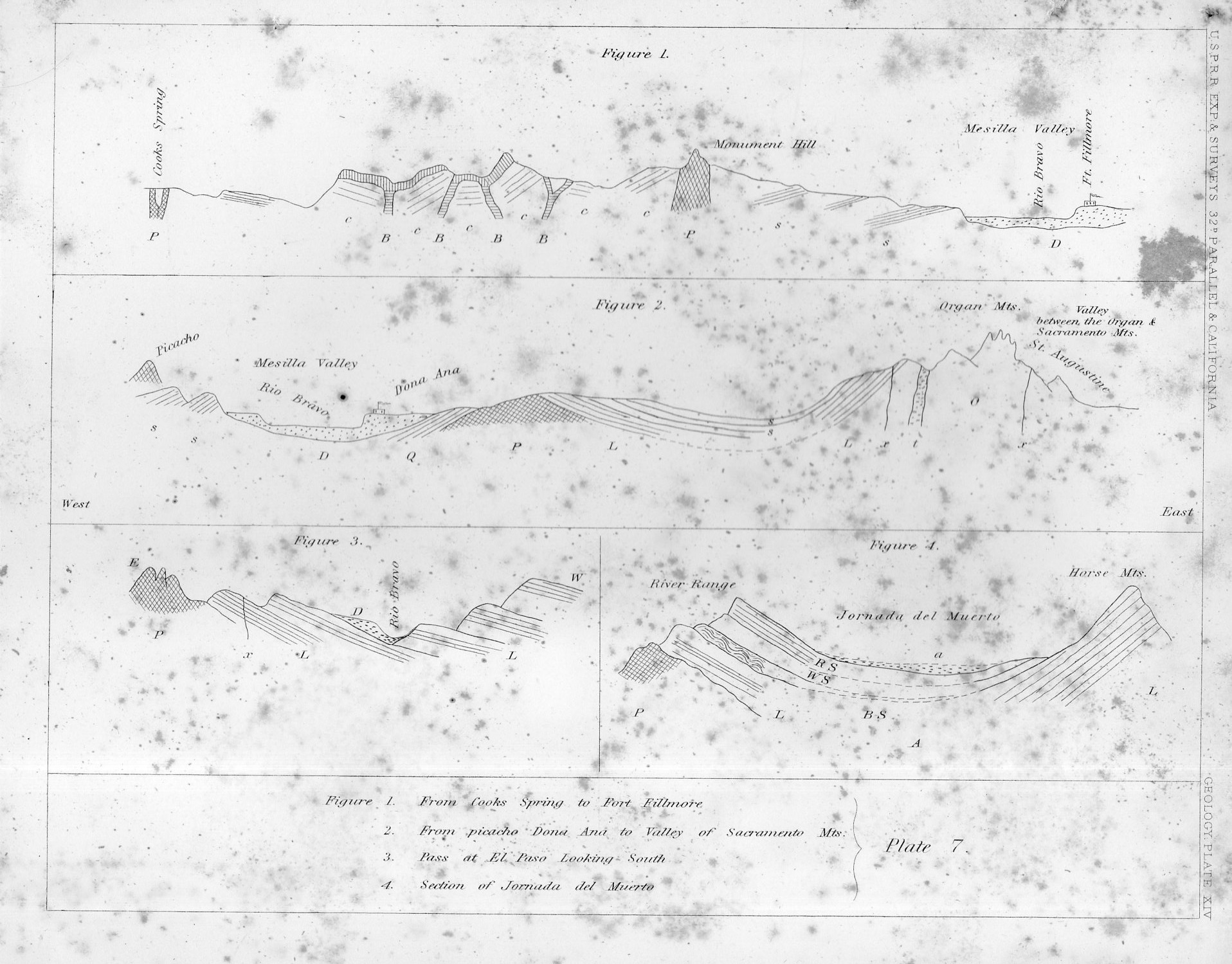
    This certainly seems to be the case in this cross-section of tough New Mexico earth.

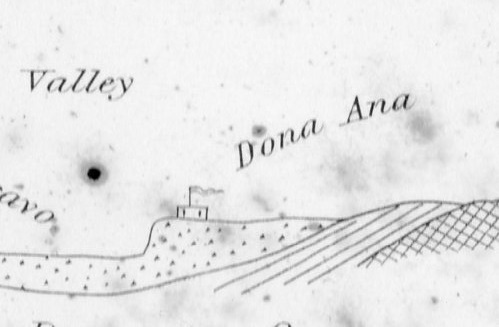
    That little adobe building represents the Dona Ana Land Grant back in 1855, when those pioneers had a few decades of roots in the very hot ground there in New Mexico, across from the Rio Bravo, commanding the Mesilla Valley.  In the original print, published in the great U.S. Pacific Railroad Survey1 in 1855, the structure is only about 3mm long–very easy to miss until you start looking closely at the sheet, which itself is only 2×2.5 cigarettes high and wide.

    I thought the structure had a personality, and looked stolid, strong, and maybe even proud with its long fluttering banner, sitting there in the heights above the river, a strong place perched at the edge of the Jornada del Muerto (“The Dead Man’s Journey” or more prosaically and according to Mr. McMurtry, “The Dead Man’s Walk”)

    Jornada135
    Notes:

    1. The full title of the eight-volume publication, which was an exhaustive treatment of the U.S. west from the mud below to the birds above, Reports of Explorations and Surveys to Ascertain the Most Practicable and Economical Route for a Railroad from the Mississippi River to the Pacific Ocean Made Under the Direction of the Secretary of War, which was published by the U.S. government from 1853-6.

  • New York City Destroyed, Part XV (February 1950)

    JF Ptak Science Books   Quick Post 

    Atom bombs from Russia

     Here’s another maim-and-blame piece of provocative semi-future/tomorrow speculation from Mechanix Illustrated (of all places) in February, 1950, hosted by the wonderful Modern Mechanix website (where the entire War-of-the-Worlds-like article is included).  So February 1950 was pretty early in the development of the brand-new atomic Cold War.  The Soviets had been experimenting since 1946 (thanks in large part to “intelligence received” from agents working in the U.S.)  and in August 1949 successfully detonated their first atomic weapon. This came several years before most experts thought possible, with the weapon (called RDS-1, or “First Lightning”, or in the West, “Joe 1”), which was a Fat Man/implosion device, generating a yield of 22kt.  The news of the test took a few months to filter out to the rest of the world–as the U.S. had previously initiated a bomb/detection plan employing the B-29 Superfortress–with President Truman making an announcement regarding the test on September 23, 1949.  The Soviet had hoped to keep their experimentation “quiet” so that they could have a few more years of catch-up while developing a hydrogen bomb, but that didn’t work out for the evidently surprised Russians.

    In any event this image fits nicely with the other 15 or so depicting a mostly pre-1960 NYC in ruins. (Check the GOogle search box at left for NYC destroyed/attacked.)

    And yes Lady Liberty is facing the wrong way.

    http://blog.modernmechanix.com/can-russia-defeat-us-with-atom-bombs/

    ·Posted by :

    ·in:

  • Another London Underground: Water, 1929

    JF Ptak Science Books  Quick Post

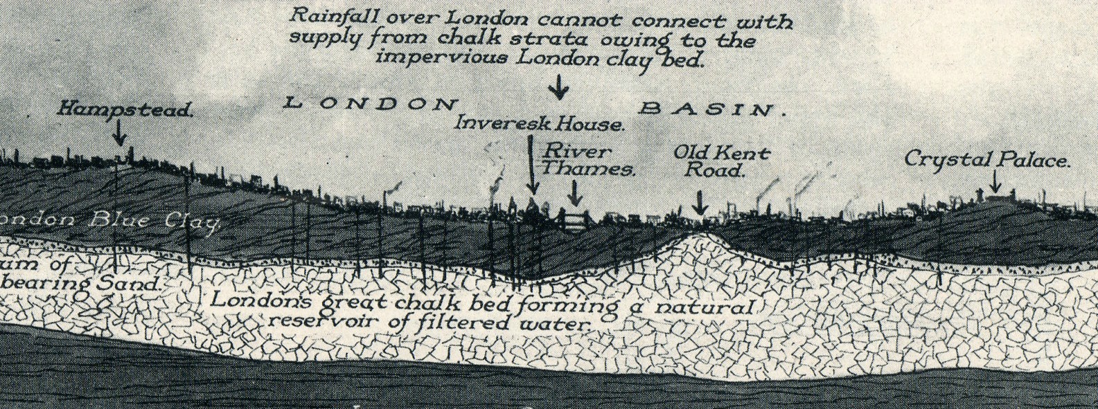
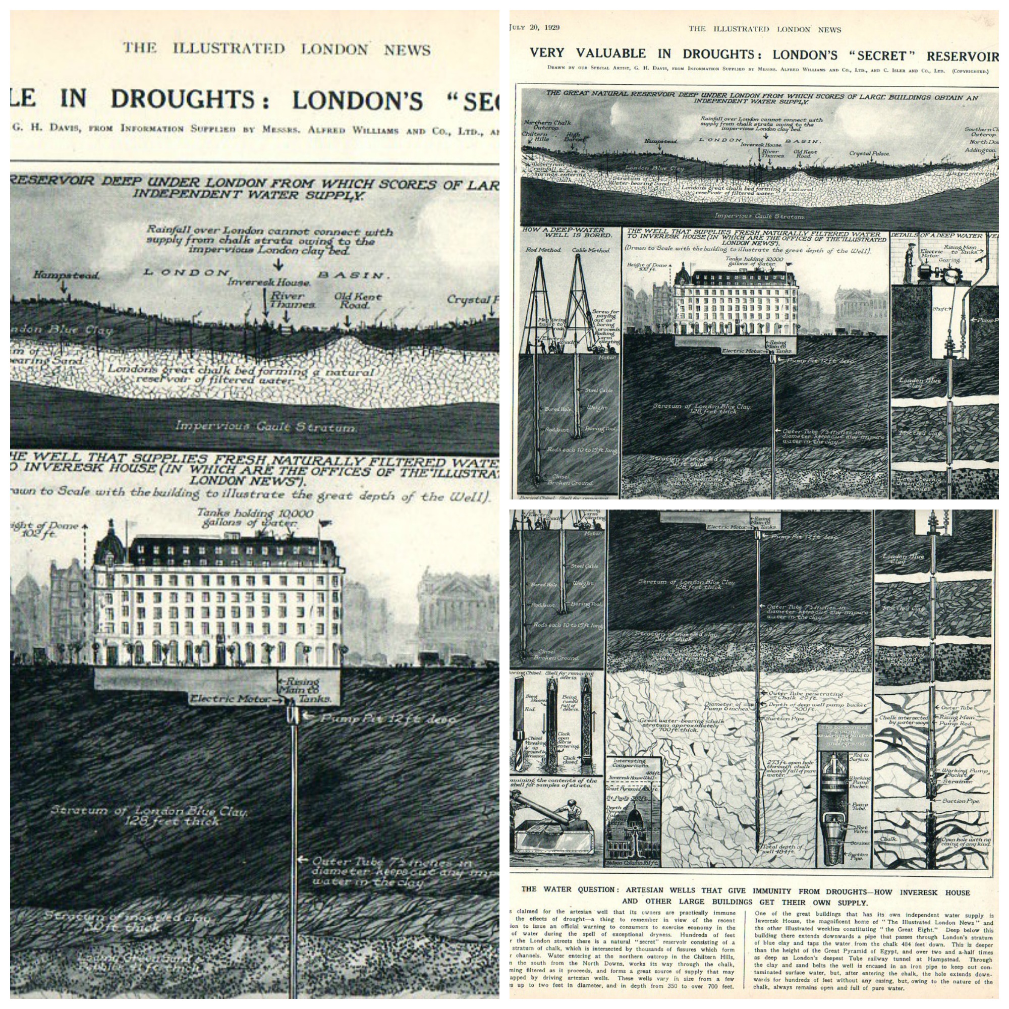
    On the heals of two water-related posts in the last two days (one of the waterless Jornada del Muerto in New Mexico and the other on the well at the Turin citadel as a reverse-tower) comes this fine image of a geological/hydrological cross section of London, from the Illustrated London News for July 20, 1929. 

    London underground water143

    All elements of this collage are very (screen-filling) clickable, and sharp:

    London underground collage

  • Stability and the Unintentionally but Quiet Absurd (1937)

    JF Ptak Science Books   Quick Post

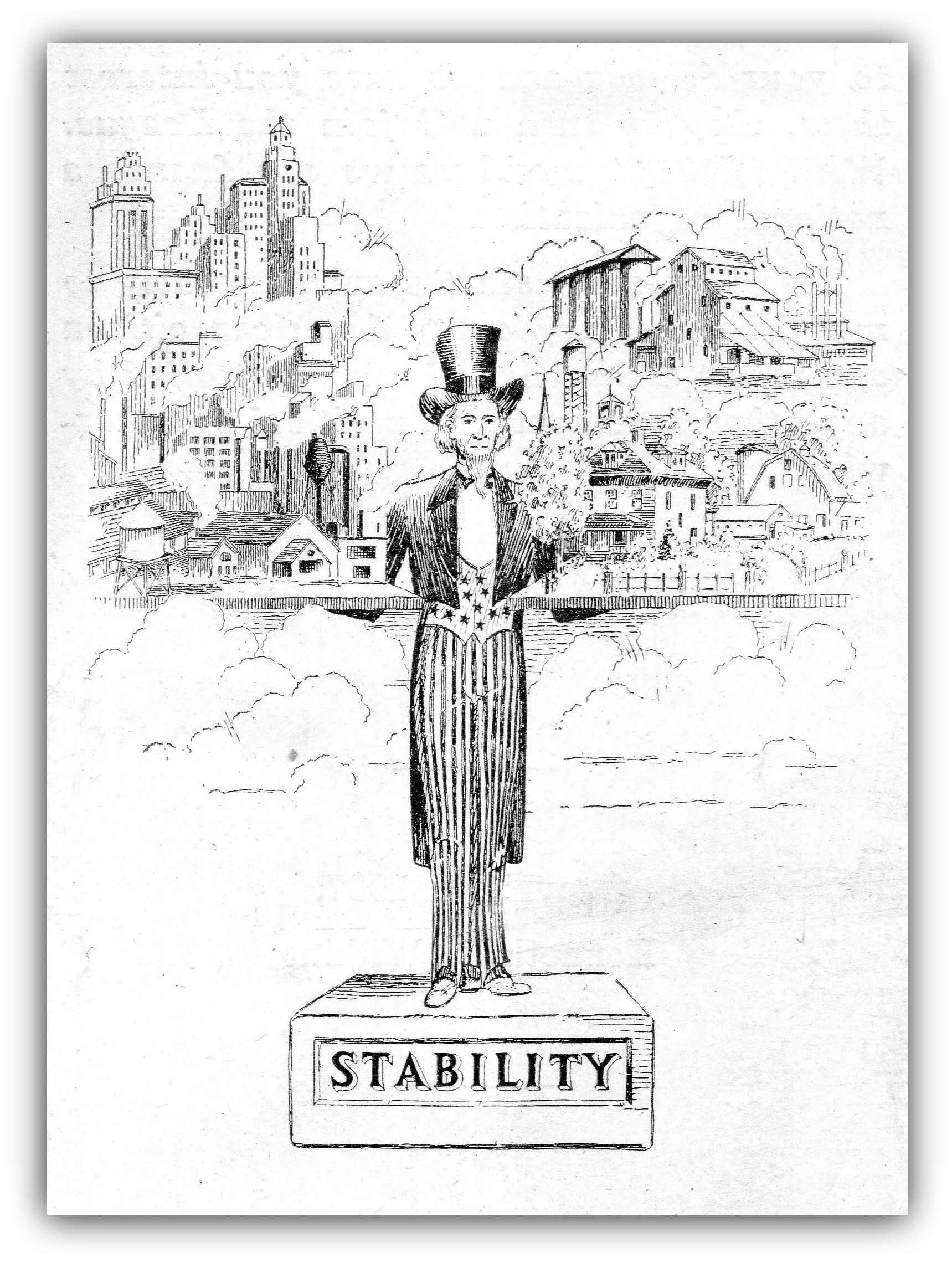
    This fine dream of “stability” decorated the cover of an unusual and grasping little pamphlet advocating “stability” in all corners, so t hat the wind compass would always point to “stable” no matter the origin of the breeze.  The idea of stability is really pretty good for kids and perhaps the elderly, but in between it might not be the most beneficial thing to the creative process.  Stable gets you only so far, except that it did once get the 2006 St. Louis Cardinals to the World Series with a win/loss average just barely above .500–an exception to the rule.

    Stable152

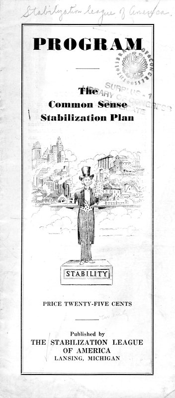
    Stable153The Stabilization League really meant it–“they” thought that by having everything balanced–trade, deficit, foreign matters, immigration, credit, etc–that the U.S. would be a better place, that taxes would be lowered, monopolies broken up, and stabilization of employment.  I’m not sure how, as this skinny pamphlet is only six pages long, and that includes the cover.  This was published in 1937 and copyrighted by Kenneth D. Wilkins–I don’t see any mention of this pamphlet anywhere, and my copy looks like one of the copyright deposit copies, so circulation of this work was restricted. 

    All from:

    Stable151

    The only thing I found looking up “The Stabilization League of America” was a reference to the work when its copyright was published, and that’s it.  The author was looking for “1,000,000” members to “finance a national organization”. I’m pretty sure that didn’t happen.

    There also seems to be something inherently ironic about a massive call-to-action on the idea of “stability”.

    ·Posted by :

    ·in:

  • Inherent Racism and Selling TVs, 1950

    JF Ptak Science Books    Post 2484

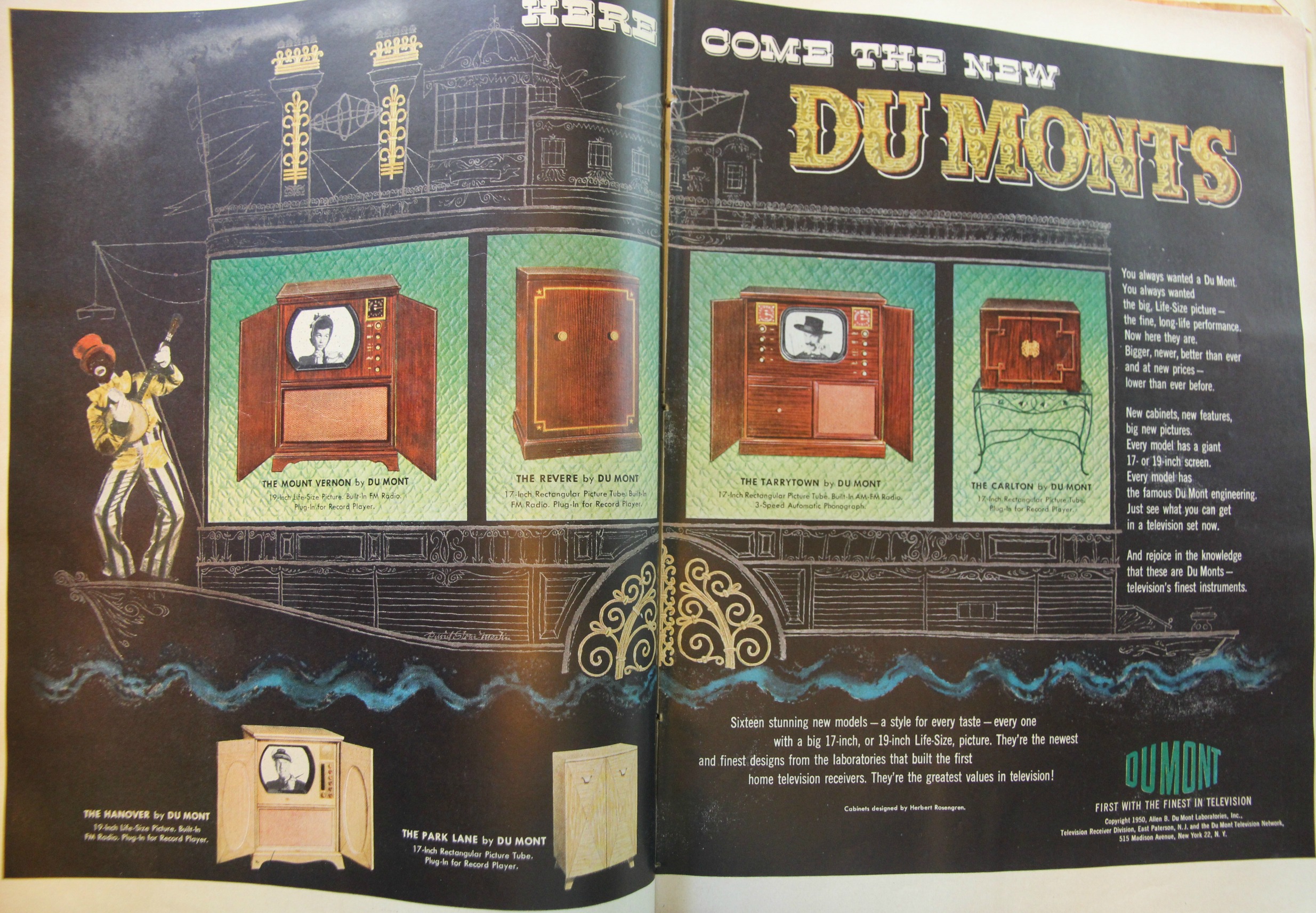
    I’ve written here a number of times on this blog about endemic, inherent, engrained racism, racism that is just so much a part of the culture that it can become an outrageous element  completely obtuse context. Another good example is this ad that I bumped into while looking for a nuclear-attack article in a September 1950 issue of LIFE magazine. It is just an ad for televisions, a big two-page spread in America’s leading popular magazine, which means it was expensive, and which also means that x-number of hours were spent on its production and design, and the best thing that the minds working on this was use that incredible black-face minstrel figure to grab a viewer’s attention to look at the tvs and link them to a particular entertainment-past.  Black-face, minstrel, Mississippi sidewheeler, Dumont. Nobody thought that there was anything wrong with this, and so the television maker connected itself with this visual horrorshow.

    TV Minstral

    Depictions of African Americans in this way came to be seen as wrong, but in another decade or two, probably a few years earlier than the Lovings’ case regarding their rejected attempt to be married because they were an interracial couple was settled in 1967, striking the illegality of interracial marriage.  Probably the offensive intolerances written about gay marriage will be seen in the same league of abhorance as this minstrel figure was seen with a few decades after its publication.  It has taken lifetimes of efforts to legally surpass social condemnation, restrictions and persecutory adjudications of the gay life, the marriage part of which was just today settled by the Supreme Court of the United States, recognizing that not allowing the marriage of two people of the same sex was discriminatory.  There are still horrendous and terrible things being said about that, now, as though (as I heard on a Conservative talk radio station) that “homosexual marriage” could lead to complete subjugation of normalcy, and that we could now well see the marriage of humans and animals. 

    Opinions stated for the public record like that will be hard to explain in the near future, just as the decision to use the minstrel is today.  I hope that it doesn’t take further decades for people to realize that opposition to same-sex marriage will seem just like those opposing slavery, opposing the vote for women, opposing casual relationship between Catholics and Protestants, and opposing interracial marriage, and so on into the unfriendly past; it is all the same argument of opposition and restricting the intellect from one to the next–only the issues change. 


    ·Posted by :

    ·in:

Recent Posts

Archives

Categories