A Daily History of Holes, Dots, Lines, Science, History, Math, Physics, Art, the Unintentional Absurd, Architecture, Maps, Data Visualization, Blank and Missing Things, and so on. |1.6 million words, 7500 images, 4.9 million hits| Press & appearances in The Times, Le Figaro, Mensa, The Economist, The Guardian, Discovery News, Slate, Le Monde, Sci American Blogs, Le Pont, and many other places… 5000+ total posts since 2008.

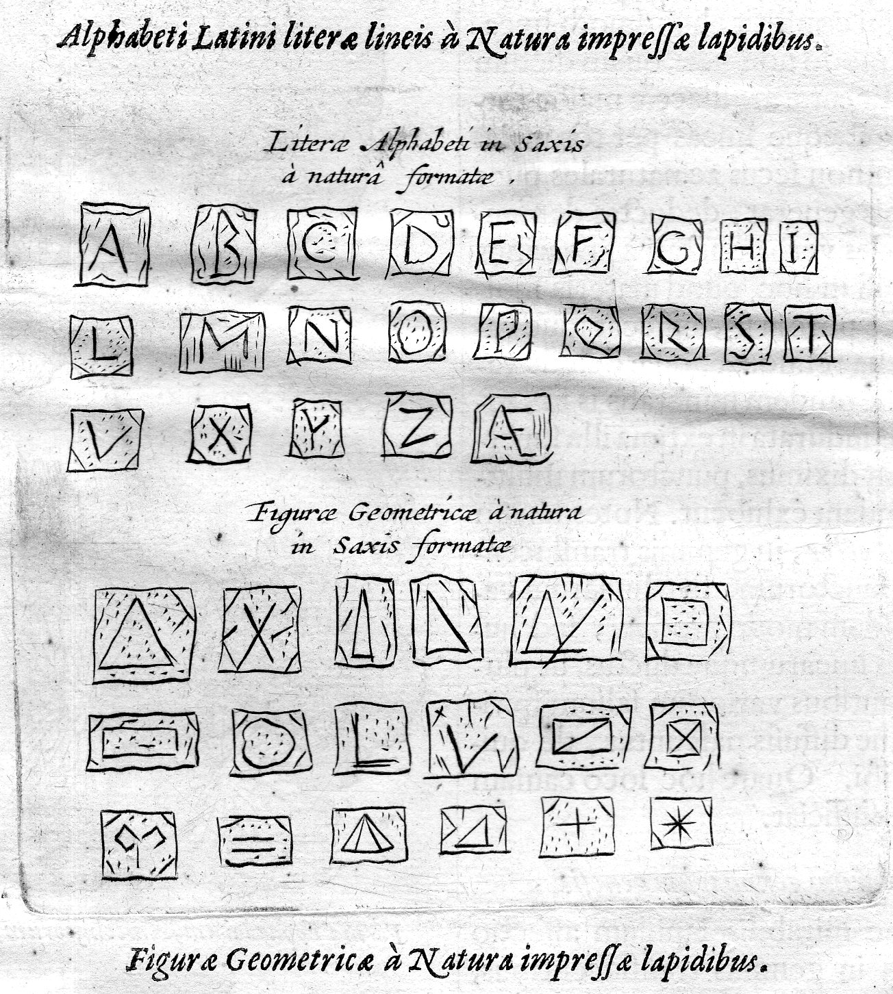
  • A Stone-Cold Alphabet and Geometry from Fr. Kircher, 1668

    JF Ptak Science Books   Quick Post

    This is another in a series of posts on images found in the glorious Fr. Athansius Kircher’s masterpiece, Mundus Subterraneus, printed in 1668. (One of the main posts on these images occurs here; there are many more if your search under Kircher’s name in the Google box at left.)

    This fine example of the depth of his observation finds the great Jesuit finding things in rock and mineral samples like agate–in this case he looks at a collection of samples that display found letters of the alphabet and geometrical shapes.

    Kircher alphabet 085

    • The original of this image may be purchased via the blog bookstore, here.
  • “Fluid Influence”, Magnetism, Clairvoyance, and Chewing Gum (1910)

    JF Ptak Science Books   Quick Post     Daily Dose from Dr. Odd

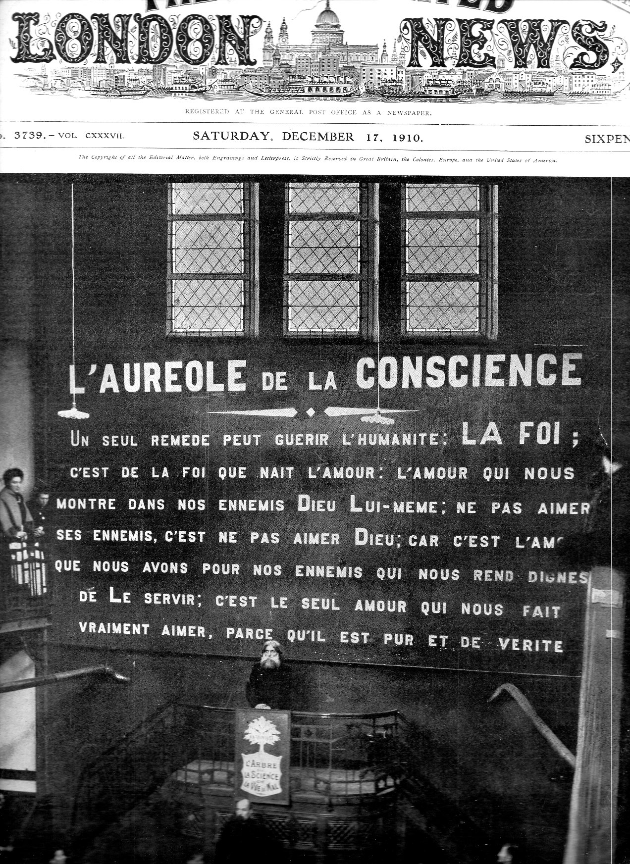
    I was quite taken with the sign behind the preacher in this picture. The photograph decorated the front page of the Illustrated London News, December 17, 1910, and showed the healing/clairvoyant “Antoine the Healer”, with a definite Rasputin-ish look to him. His deal was “fluid influence” in the good and evil fluid influence of magnetism, of reckoning the good/bad magnetism between people, and of course communicating with the good fluids in people.  Or something like that–I have no idea what he was talking about with the fluid/magnetism stuff.  In any event he collected 160,000 signatures of the faithful and whomever to present to the government of Belgian the case for Antoine and his fluids and Antoinettes as a recognized religion.

    Antoine088

    “Antoine’s followers obey him unhesitatingly in everything. In appearance he is a tall, rather round-shouldered man, with grey hair; he wears a black frock coat, but is always without a hat. He chews gum continually.”–The World’s News, January 14, 1911, pg 13. [Source: http://trove.nla.gov.au/ndp/del/article/128264839]

    In any event it was the enormous sign behind Antoine that attracted my attention–the fluid magnetism stuff is not so interesting, or attractive. 

  • Technology–a Beautiful Tunnel Image of 1890

    JF Ptak Science Books   Post 2472

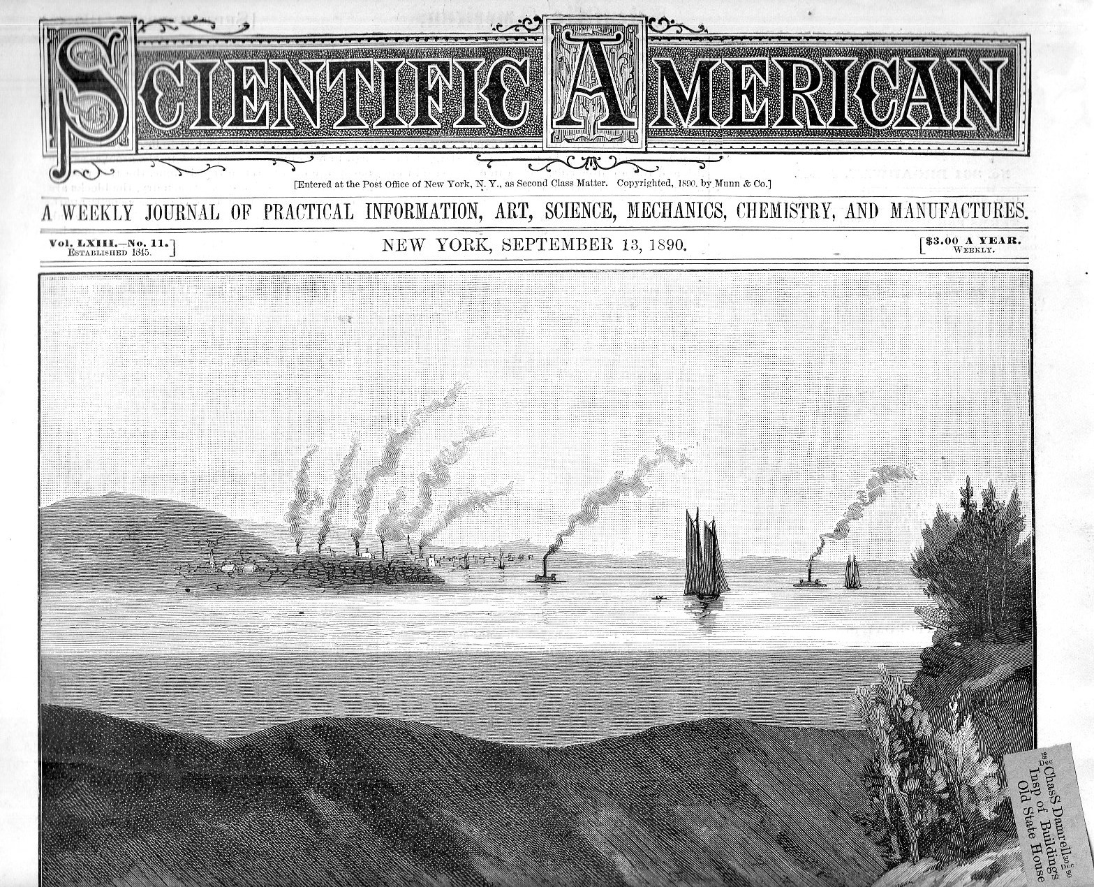
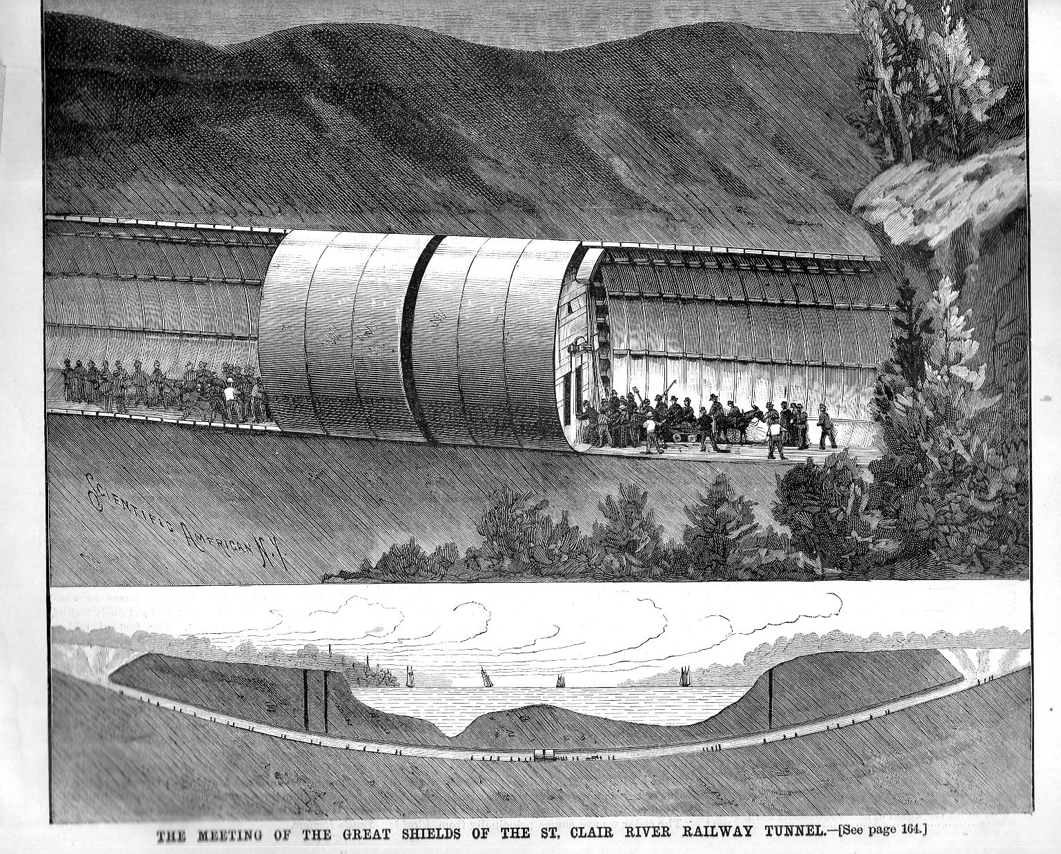
    Life going on underground has always been very interesting to me–particularly so when a good tech story is accompanied by great art.  This is certainly the case with the cover story for the September 15, 1890 issue of Scientific American, featuring the St. Claire Tunnel between Ontario and Port Huron, Michigan. This was the world’s first “full size” (that is, large enough for a train) tunnel and spanned (?) 6,025′ between tunnel portals and 2,290 of river width, making for a great technological achievement.

    [The issue is too large for the scanner so it is reproduced in two scans with a gap in the middle.]

    Sci american 1890 st claire094

    Sci american 1890 st claire092

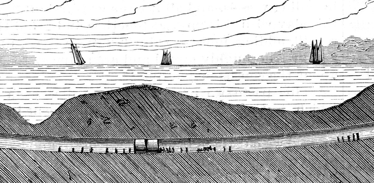
    The Scientific American celebrates the meeting of the two tunneling halves, each just about to join their excavation efforts at midway under the river. It is interesting that the artist would include those 40 tiny figures at work around the “Great Shields”, which were functioning as a sort of enclosure for the working going on to remove the earth.  Better yet is the smallish inset at bottom depicting the scale of the venture–in Real Life those images of people in the inset are only 1mm tall. 

    Sci american 1890 st claire093

    • This issue is available for purchase via the Blog Bookstore, here. 
    • We have nearly 4000 Scientific American issues available, overall, some bound as half-year issues, some as single weeklies, from 1845-1930 or so.  If you have any interest in this journal please send an email…

    ·Posted by :

    ·in:

  • Not-Quite-a-Racing Line of Underpowered Convertibles (1928)

    JF Ptak Science Books  Quick Post

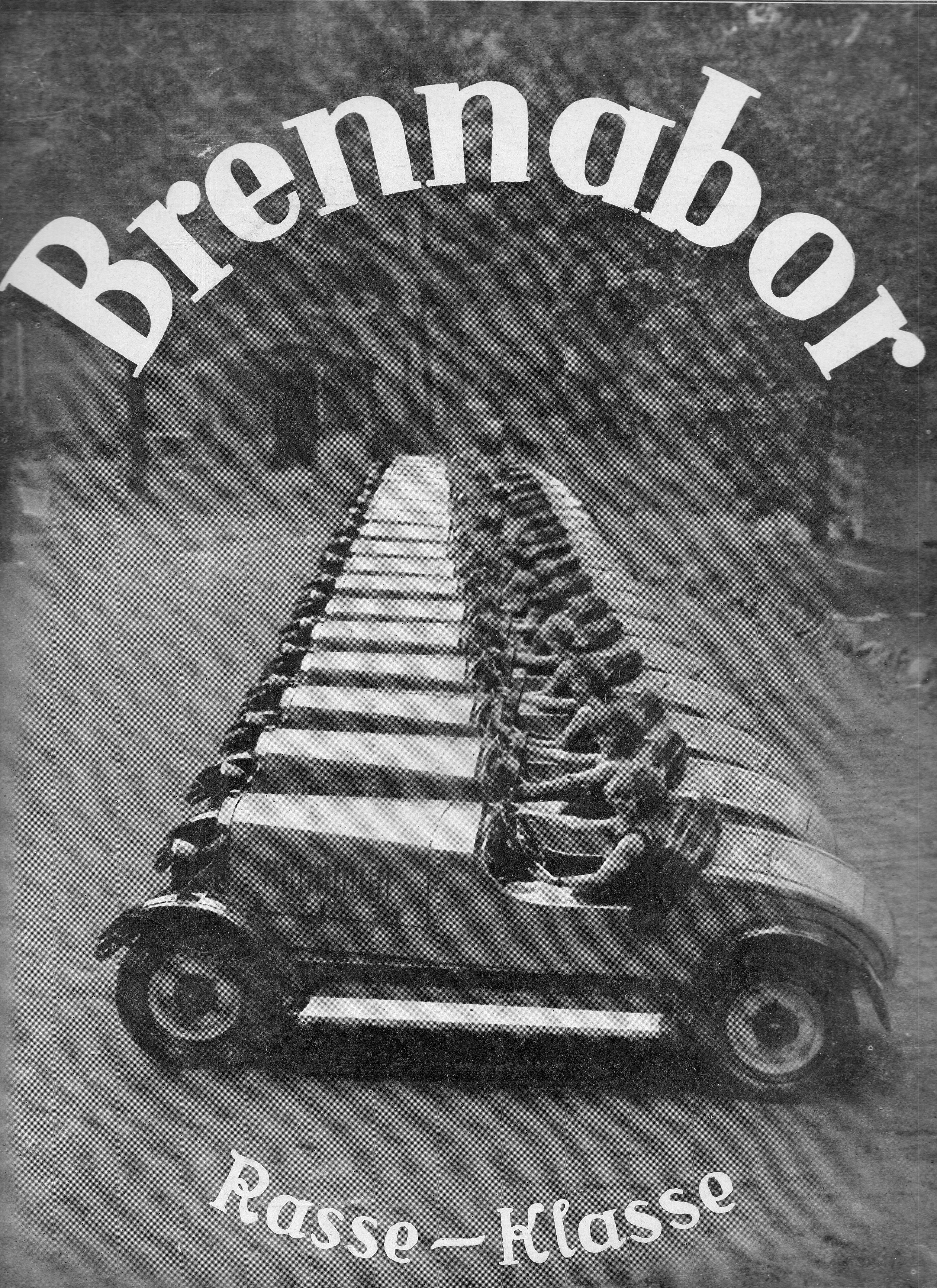
    Well, I really don’t have much to say about this ad except that I like the design and that it is not typical featuring nothing but women drivers in tanktops behind the wheel of the car you’re trying to sell.. It looks as though there are 20 cars in a row here, stretching back like 120′ or so from the camera.  The women are at the wheel of one of Brennabor’s four cylinder, 70 horsepower sports-ish vehicles, capable of seating two (not-big) people.

    Poster  brennabor089

    Source: Illustrirte Zeitung (Leipzig), ca. 1927/8

  • A Remarkbly- and Completely-Disappeared Invention from 1890

    JF Ptak Science Books 

    I’ve written a number of times on this blog about my interest in collecting the artwork of children–kid art from say before 1900–and how difficult it is to actually find examples. Most of that has been serendipitous, finding scribbles and drawings of notebooks, and ledgers,  and free endpapers of schoolbooks, that sort of thing.  There are a number of reasons for this scarcity–the greatest being lack of paper, and pencils, or paints; that, coupled with the stuff needing to survive multiple generations of house cleans and moves and so on, well, it just means that not a lot has survived. 

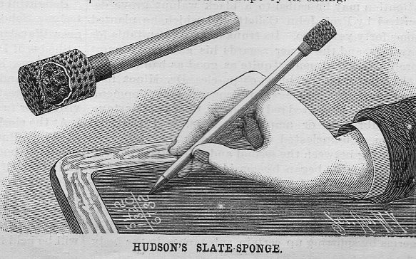
    Scientific american slate pen sponge102[Source: Scientific American, September 13, 1890]

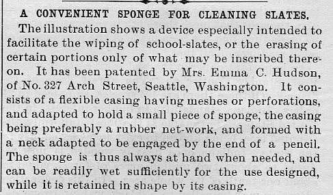
    Lack of paper or paper being too expensive was a big deal, and so kids used slates, which means that very little has survived on the slate itself.  And to further point out the ephemeral nature of slate-written/drawn material, I present the slate eraser sponge! It is a little bit of a thing that fits over the slate stylus and allows a really thorough erasure/sponging of anything on your slate.  No only was the slate stuff gone, it was double-gone. 

    This is also an invention that is remarkably well nested in the dustbin of abandoned and unnecessary useful inventions that worked superbly for about two decades, and were never heard from again. 


    And the text:

    Scientific american slate pen sponge103

  • Daily Dose from Dr. Odd: Japanese Skeleton Cruiser in Californa Desert 1945

    JF Ptak Science Books  Quick Post  Daily Dose from Dr. Odd series

    It seems to me a lot of effort and material went into constructing this mock-up of a Japanese cruiser, but maybe not.  Perhaps that is just what was required.  In any event it is an odd image.   

    Japanese cruiser105Source:  Popular Mechanics, January, 1945.

    ·Posted by :

    ·in:

  • A King-Hell Review of the U.S.: “Who Reads an American Book?” (1820)

    JF Ptak Science Books   Post 2474

    Criticism109

    Sydney Smith was a cleric and critic; I don’t know much about the former, but I have seen some of the later, and it could be insightful and acidic. Here’s an example that I had seen years ago and then bumped into again this morning, a massive and stinging observation on the United States, in general. It comes in a review of a seemingly brickish/factoid work by Seybert, and is a data-trove publication of statistical information, and appears in The Edinburgh Review.

    After a lengthy appreciation of the work, Smith can hold himself no more. It is in the final two paragraphs of the review in which he freezes everything stock still, wanting whomever was reading his words to answer his series of questions so that they can form the answers themselves–but no matter, Smith provides the answer in the end, impatient for someone else to do the thinking.  That’s okay–the man made a good point.  

    In my experience if this wit is remembered at all it is for the opening fragment about the American book–that actually comes way at the end of the page-long paragraph; and it is really in the rejoinder, the final bit of that long sentence ending the paragraph, where the real venom sits, waiting for its victim to step into it.

    “…In the four quarters of the globe, who reads an American book? Or goes to an American play? or looks at an American picture or statue? What does the world yet owe to American physicians or surgeons? What new substances have their chemists discovered? Or what old ones have they advanced? What new constellations have been discovered by the telescopes of Americans? What have they done in mathematics? Who drinks out of American glasses? or eats from American plates? or wears American coats or gowns? or sleeps in American blankets? Finally, under which of the old tyrannical governments of Europe is every sixth man a slave, whom his fellow-creatures may buy, and sell, and torture?”

    “When these questions are fairly and favourably answered their laudatory epithets may be allowed. But till that can be done we would seriously advise them to keep clear of superlatives.” –Review of  Adam Seybert’s Annals of the United States, published in The Edinburgh Review (January, 1820).1

    Ouch.  I wanted to get to the main quote straight-away in this short blog post; it is preceded by some rougher stuff, as insightful as the above but not as committed to the overall social memory:

    “…The Americans are a brave industrious and acute people but they have hitherto given no indications of genius and made no approaches to the heroic either in their morality or character. They are but a recent offset indeed from England and should make it their chief boast for many generations to come that they are sprung from the same race with Bacon and Shakspeare and Newton. Considering their numbers indeed and the favourable circumstances in which they have been placed they have yet done marvellously little to assert the honour of such a descent or to show that their English blood has been exalted or refined by their republican training and institutions. Their Franklins and Washingtons and all the other sages and heroes of their revolution were born and bred subjects of the King of England and not among the freest or most valued of his subjects. And since the period of their separation a far greater proportion of their statesmen and artists and political writers have been foreigners than ever occurred before in the history of any civilized and educated people. During the thirty or forty years of their independence they have done absolutely nothing for the Sciences for the Arts for Literature or even for the statesman like studies of Politics or Political Economy…”

    The entire review is worth a read–it is a good overview of the data, and is also peppered with choice nuggets, like this one on Florida:

     Notes:

    1.  The review is reprinted in The Literary and Scientific Repository, and Critical Review, Volume 1, by Charles Kitchell Gardner, pp 177-186.

    • Read a short, interesting insight into the book that Smith was reviewing here, by Eric Salughter.

    ·Posted by :

    ·in:

  • An Image from the Big Book of Big Groups of Convicts (1911)

    JF Ptak Science Books  Quick Post

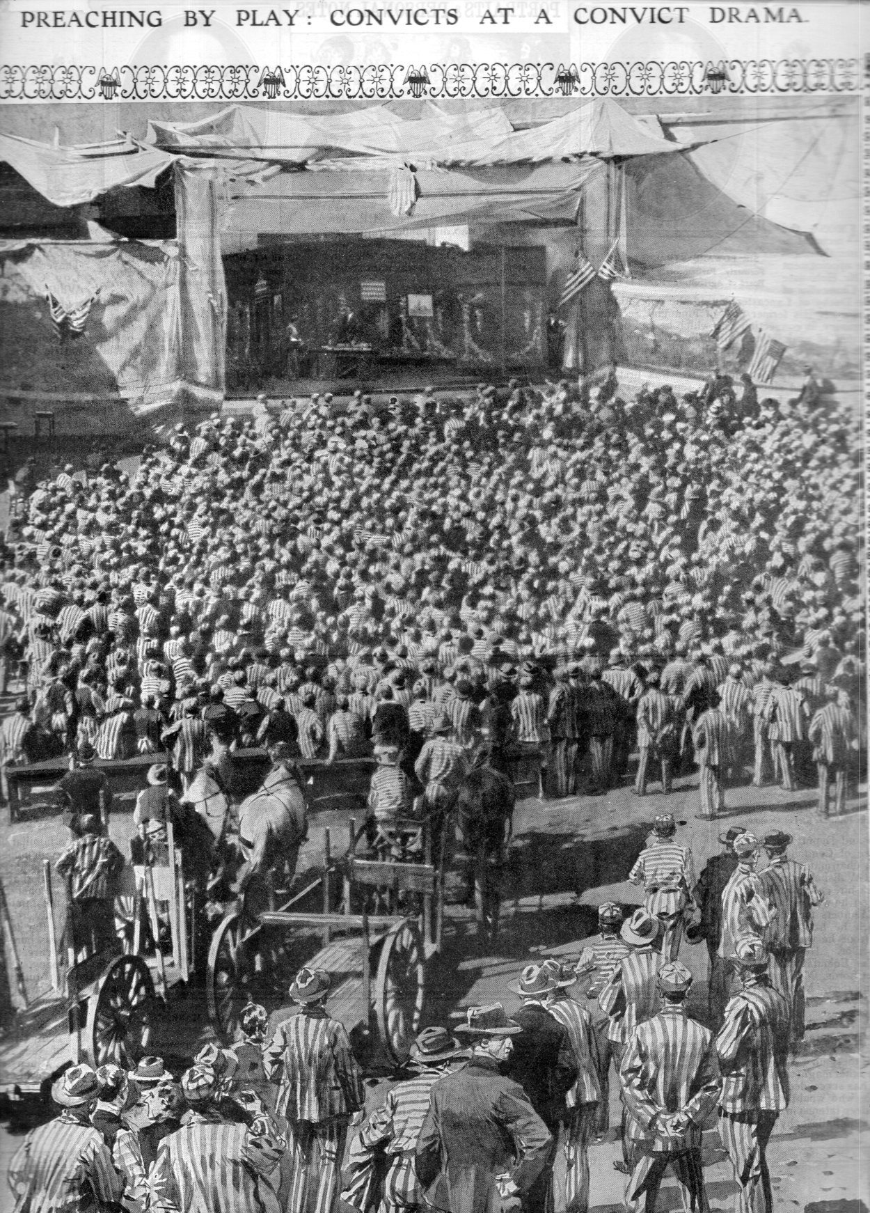
    The imaginary Big Book of Photographic Firsts is thick and brickish with data on the first times “things were done” in photography. That would include processes, papers, uses of chemicals, lenses, materials for the camera, and so on, not to mention the long lists of the first time certain sorts of images were made: the first photograph (and not necessarily the first Daguerreotype), the first photograph of a face/Moon/Sun/Sunset/full-body portrait/first outdoor image/first image from a height/first image from a balloon/first photo of a dead person/and so the list continues. This came up tonight while looking at the photo below, a mass photograph of prisoners, which caused the thought about when the first pictures of convicts were made (and then of course the first images of a prison, and the first for a mass of prisoners, etc.). As it turns out the earliest convict photos are pretty early, in the early 1840’s (Daguerre’s announcement coming in 1839 and almost immediately became an active technological meme). The individual photos of prisoners were fairly haphazard, though, with no forensic value for several decades, when Alphonse Bertillon came by in the 1870’s and created standards by which all prison portraits/mug shots were made. Unfortunately I was not able to find anything on the earliest mass photographs of prisoners by my imaginary “press time”, so I’m posting this photo and its half-story as is—hopefully I’ll come back to it with some data back-fill to make it right. In the meantime, though, all I wanted to do was to share the image, which I think is extraordinary in its own right.

    Convicts108

    [Source: The Illustrated London News, October 29, 1911, page 669.]

    [And to further complicate the story of this photo it seems to be 2/3 photo and 1/3 drawing, making it a montage–the third or so closest to the viewer is definitely a drawing; the rest of it is definitely a photograph. There’s a lot of people in this photo, and almost everyone has a hat.]

    ·Posted by :

    ·in:

  • The H-Bomb in L.A., 1961

    JF Ptak Science Books    Quick Post

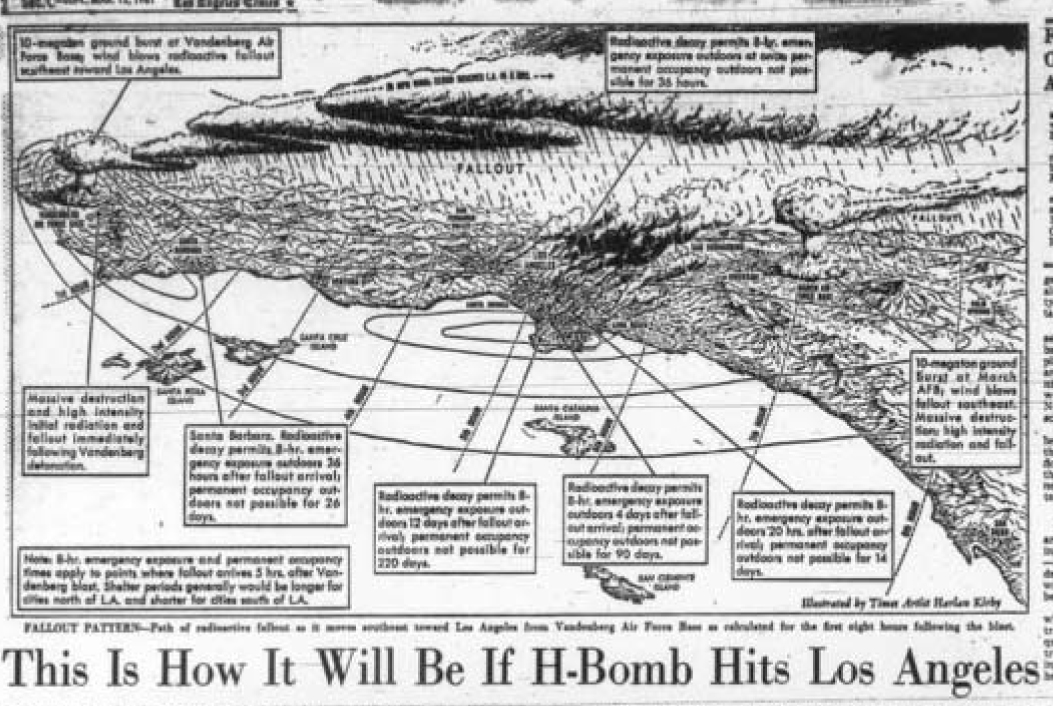
    The illustration below was for the story, “Red Alert. What if an H-Bomb Hit L.A?”which appeared in the Los Angeles Times 12 March 1961, and made no doubt for some very sobering contemporary wake-up-and-die reading.  If you were living anywhere in the country at the time and had never seen a representation of your city in ruins, and you encountered such a story and images before coffee, you might remember that missing cup for the rest of your life.  The dramatization and mapping was done by Harlan Kilby, and it portrayed the destruction of the city and millions of people in the event of detonation of a 10 megaton nuclear weapon–it gave the reader a vague notion of what city-eating looked like, the bomb ‘flattening” everything in a 3-mile radius of its central zone and killing everything in 28 square miles.

    (A little earlier, in 1960, there appeared a work by Harrison Brown and James Real called Community of Fear, which was a sci-fi kill-’em-up that used a kill zone with a 25-mile radius. For more on this film see Kenneth D. Rose One Nation Underground: The Fallout Shelter in American Culture, page 61.]

    LA Bomb bird's-eye copy[Image via the Library of Congress]

    Anyway, waking up to this in 1961 must have been an eye-opener. 

    ·Posted by :

    ·in:

  • Frank Lloyd Wright and the Benefits of a Bombed-Out London, 1940/1

    JF Ptak Science Books  (Expanding Post 1866 from 2012)
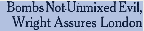
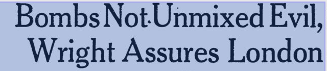
    Wright London bombing–article header from the Milwaukee Journal, 22 June 1941.

    • [I’ve written earlier on a related and very bad idea, Atomurbia, for atom-bomb-proofing American cities, here. The idea was to spread out the population and industry of the United States all over the country, so that there would be no centers of industry and no concentration of population, that every smallish city could be a target, thus making the many thousands of them un-bombable. This idea was the product of very influential people, and did not appear in a comic book.]

    Reading Nicholson Baker’s Human Smoke I found several unflattering and semi-unbelievable quotes from the unpretty Frank Lloyd Wright (see here).  Present at a MoMA exhibition he was sharing with D.W. Griffith (detailed in the publication Two Great Americans published by the museum in 1940), Wright chose the background of the Battle of Britain, in which German bombs were falling on cities in Great Britain cities killing thousands, to promote his city design idea of Broadacre.

    In development since 1932 (appearing in his book The Disappearing City) and kept on until his death in 1959, Wright’s idea for city /suburban development spread a “city” to its limits, nearly stripping it of its citiness and expanding it towards the horizon in a wide and low wave of a complete suburbia.  With this, Wright must have reasoned, Broadacre City must have seemed “bomb-proof” compared to the normal concept of the city, and decided to make the best of a horrible situation to promote his idea.

    And with this, he was quoted in November 1940 in the New York Times, saying:

    “I would not say that the bombing of Europe is not a blessing, because at least it will give the architects there a chance to start all over again”

    Wright is quoted in the Milwaukee Journal talking about the blessing-in-disguise of the terror bombing and the benefits it would give to the future and to city planning, saying that a few nights of bombing would have cleared the “slums and ugliness” that otherwise would have taken “centuries” (“”blasted out of the way in a few days”).

    I’ve never thought of Wright’s buildings as structures for people, even the lovely Fallingwater is iconically beautiful outside but not-so-people-friendly inside–it may be a minority opinion, but so it goes.  It is clear to me that for whatever record he was speaking to here in 1940 that he had no regard for the people who would have been in those destroyed areas; of course that was his executive orders, as all he was interested in was the idea of planning the city and responding to his own genius.

    He went on, this reported in Time Magazine for November 25, 1940, describing his bombing-as-a-benefit idea:

    “Broadacre is going to England as soon as there is a chance for it to be shown there. This will be immensely beneficial to England.” 

    To say that this was an idea best left to the imagination rather than in the pages of the Paper of Record goes without saying.

    And what of the architects whose buildings were lost during the Blitz?  Say, like Christopher Wren?

    “I don’t think that anyone will miss Wren’s work very much” (This, and the quote above, found in Baker, page 248.)

    And also this:

    ‘After all,’ says he, ‘what is St. Paul’s? An imitation of St. Peter’s in Rome. I don’t think anyone will miss Wren’s work much.” —Time Magazine, November 25, 1940

    I’ve had a problem with Wright for a long time, but had never bumped into this part of his thinking before.

    [Wright’s wrongs on the Bombing of Britain are also recorded in Peter Shedd Reed (ed), The Show to End All Shows: Frank Lloyd Wright and The Museum of Modern Art, 1940 (MoMA 2004, here), and here, in the Milwaukee Journal for 22 June 1941, and also in the News Chronicle of London in”How I would Rebuild London”]
     

  • Fine 17th century Etching of a Scholar at Work

    JF Ptak Science Books   Post 2476

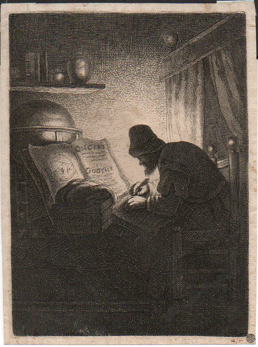
    Etching man in study110

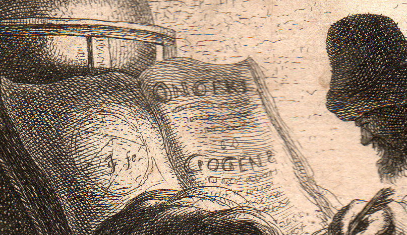
    I’ve long thought that this (ca. 17th century) etching of a scholar in his study was alchemical in nature–that just for the the appearance and sound of the two words printed int he large open book on the table. As it turns out, I cannot find those words, anywhere–at least with meanings that could be related to the book or the scene. 

    • The original print is available for purchase via the blog’s bookstore, here. 

    That said it is still an interesting and very personal scene–one man, still heavily clothed in the dark (and what seems to be late at night, though there is no evidence for that, that is just how it feels t me), working away at something with the benefit of only a single semi-weak light source

    The artist/etcher looks to be “JG”, or “IG” or “GT”, and other permutations and possibilities.  I have not been able to identify who the artist is, having scoured the Big Book of Initials and Monograms: Francois Brulliot’s Dictionnaire des Monogrammes, Marques Figurees, Lettres Initiales, Nom Abreges, etc., avec lesquels les Peintres, Dessinaeurs…. The book is a masterpiece of a type, sorting out the difficult and twisted means by which the originators of artworks identified themselves. It was published in Munich in 1832 in two volumes, and runs an easy 1200pp, though there is probably a half-inch of very thin paper that is unpaginated for various appendices.  (For some reason the letter “T” is represented in only one page in the monogram section. Odd.)

    The artist’s monogram followed by a “fe”, which is an abbreviation of “fecit”, or “faciebat”, which is also abbreivated as “f”, “fac”, and “fect”, which seems to be a kind of ambiguous term, referring to “JG” as being the maker, as either the artist or etcher/engraver, or both.  (This is less seldom scene than the more common indicators like “del” and “delin”, which abbreviates the Latin word for draw/drew, and so indicating the artist; “eng” and “engd” would stand for “engraved”, for the person who prepared and executed the plate made from the artist’s work.)

    Here’s the detail of the open book, as well as the initials of the artist (located on the left-hand page):

    Etching man in study111

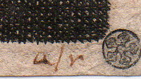
    And an early (and tiny, 2mm)  collector’s mark, stamped in the extreme right bottom corner:

    Etching man in study112I think that we’ll just have to appreciate this print at this point for what it makes us feel–though I am sorry not to have more detail on what it is/where it came from/who made it. 

    ·Posted by :

    ·in:

    —

Recent Posts

Archives

Categories