A Daily History of Holes, Dots, Lines, Science, History, Math, Physics, Art, the Unintentional Absurd, Architecture, Maps, Data Visualization, Blank and Missing Things, and so on. |1.6 million words, 7500 images, 4.9 million hits| Press & appearances in The Times, Le Figaro, Mensa, The Economist, The Guardian, Discovery News, Slate, Le Monde, Sci American Blogs, Le Pont, and many other places… 5000+ total posts since 2008.

  • Outer Space Space Music From Outer Space

    JF Ptak Science Books   Post 2561
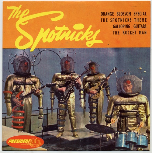
      Spotnicks

    Nothing quite sounds or looks quite so unusual as a forgotten piece of popular culture from a different generation, something that was stretching the boundaries in potentially cringeworthy ways.  Of course everything is removed from context, so the historical/cultural part isn’t immediately neuronally available, though with just a little bit of digging into memory or archives these things would fit the thing nicely in place and time and would recover their sensibilities.

    But as stand-alones, these exemplars of outre thinking might do little more than raise a surprised eyebrow to their unexpected appearance.

    So, while searching for exotica/tiki music online, I stumbled upon and over “The Spotnicks” (read “Sputnik”), a groovy 1961 Swedish band that I guess was a semi-equivalent to a 70’s hair band, except these guys appeared in space suits there at the hot part of the space race.  And:  they were actually very proficient musicians, though, proficiency (and even giftedness) don’t necessarily a good band make.  Never having heard of them before (I grew up in the era of The Rock and the Roll, though the music never really appealed to me much) I came to learn that the band is still around, and has made 42 albums, and sold 18 million copies of their music, which I would never have guessed to be the case.  So, while the music might not necessarily be the stuff of which memories are made, it wasn’t bad, and the players certainly seemed to have some chops.  (And their movement as they played seems to have come a decade or more before Devo.) 


    It turns out that space–themed music was a popular bit in the late 1950’s and into the 1960’s, though it seems from my brief dip into that genre that not a lot of it was outery-spacey, though the album covers were.  (Sort of like “Atomic Cafe” or “atomic cupcakes”, where the idea of the “atomic” part was present but had nothing really to do with anything at all except for the name and signage.)  That this, I did find this album from 1967, produced and sold while Star Trek was experiencing a small spike in the ratings.  There are space-related themes here, present in Mr. Nimoy’s poetry and spoken word, so this at least has something to do with the music:
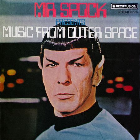
    Music from Spock

    If you’d like, you can listen to it a bit, here: http://www.maidenwine.com/lps.html

    So in my limited walk-about experience, genres like Exotica and Tiki seem to live up to their name beyond the album cover design; the sub-category of “outer space” Exotica  music probably does not, though that might not matter so long as the album design is wicked good.  
  • Early Steps in the History of Photographic Self-Interest: the Photo Booth Pre-Selfie

    JF Ptak Science Books   Post 2562

    Before $999 selfie sticks, and before cell phones, there still was life! The agitations of great need for making self portraits has existed no doubt before this semi-delusional time, except of course there wasn’t immediate and total access to the possibility of addressing the somewhat narco-curiosity to self aware recording. Nowadays you can have your own broadcasting service all about yourself all of the time and share it to yourself or to anyone else who can find your conceptual conceit–in the past, not so much so.  

    The antiquarian notation of the idea of the selfie finds itself in the invention of the photo booth. It is perhaps the first true invention that could address this notion of photographic self-allegiance, except that you can’t fit it into your pocket like a cell/sel(f) phone because you fit inside of it.  But it certainly was the only way that you could halfway address an instant need for making a photo of yourself, and do so without undue muss or fuss, and to be able to do it on your own.

    The photo booth was the early version of radical expression of photographic self-interpretation made possible by a hands-free invention.

    The results of the photo booth (around since about 1890 but not fabulously well accepted and ubiquitous until Mr. Anaotl Josepho with his Photomata in 1925) can be charming, and revealing, and be all that you wished it to be, or not.  I’ve collected some examples (below) from the 1930’s-1950”s–the results can be mixed, but almost always interesting.  

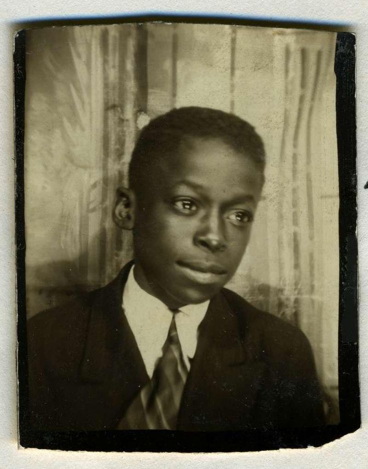
    The young Miles Davis is terrific. 

    Selfies miles davis

    Miles Davis, aged 9. [Source, Pinterest: https://www.pinterest.com/pin/31454897367684842/]

    For an interesting piece on artistic photo booth self portraits by artists, see Jonathan Jones on the Surrealists and the first photobooth in Paris, 1928, in The Guardian, here: http://www.theguardian.com/culture/2004/jun/16/1

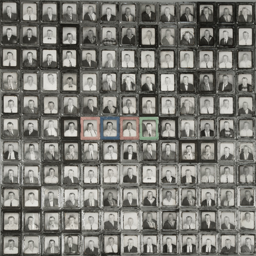
    This is fascinating: 445 photo booth images of/by one unidentified man:

    Selfies 445

    •  See the article by Pricilla Frank, “Exhibition Features 445 Vintage Photobooth Portraits From A Single Unknown Man” in the Huffington Post, here: [http://www.huffingtonpost.com/2014/04/04/445-photobooth-portraits_n_5077544.html]

    Selfies Tanguy

    Yves Tanguy [Source, PBS, here: https://pbs.twimg.com/media/CO-mBeXUEAASyM8.png]


  • Fantastic Stadium-Seating Skyscrapers: Imaginary New York City, 1938

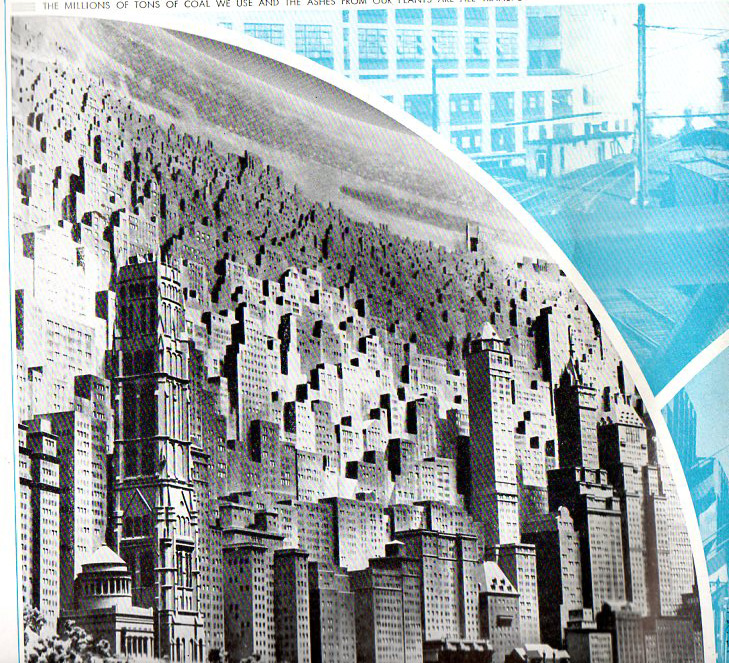
    Imaginary New York City Landscapes from CON-ED, 1938

    JF Ptak Science Books  Quick Post   

    These lovely images are found in a long, shining and slightly darkroom-scented The City of Light, which was a pamphlet made for the Consolidated Edison exhibition at the New York City World’s Fair of 1939.  Con Ed I think just wanted to get the point across that they saw into the future and were getting ready for it, NYC being stuffed to the gills with buildings and each window stuffed and outlined in Con Ed-supplied electric light.  The vision is vaguely threatening to me, though, the buildings are drawn in a very odd perspective giving the city a stadium-seating arrangement that is unsettling, like they’re part of our robot-overlord future–someone or something must be living in those room filled with Con Ed light, though…

    Nyc544

    Nyc547
    Nyc548
    Nyc546


  • The Anatomy of Creation: the Brilliance of James Ussher

    JF Ptak Science Books   Post 2563

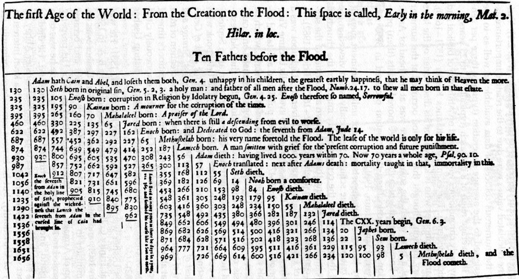
    Ussher

    [Source: undetermined, via Twitter]

    [“Ten Fathers Before the Flood”–what a great title for a book!]

    Dublin-born James Ussher (1581-1656) was born into a well-placed family and achieved high theological orders, being the Irish Archbishop of Armagh and the Primate of All Ireland, and of course a polyglot and scholar above all. What he is remembered most for today–at least outside of Ireland–is his chronology of the world which placed the creation of all things at a very specific time, on the evening of 22 October 4004 b.c.e. (I guess the b.c.e. should be redundant, but it isn’t.) 

    I should point out that I’m writing about this today because Thony Christie (of the excellent Renaissance Mathematicus blog https://thonyc.wordpress.com/) shared a  tweet of Ussher’s table of chronology from Australian Peter Harrison and it brought back memories of dealing with Ussher from years ago.  It is easy now to take a few potshots at the man and his work, daring to think that Ussher could figure this out using Biblical chronology and establishing the date of the creation of all things to an afternoon 6019 years ago.  

    The thing about Ussher is that he was a very smart guy–very.  His work puts me in the mind of Robert Burton and his Anatomy of Melancholy, which is a great and probably unreadable book, filled with a staggering amount of everything. Ussher as it turns out uses the Bible of course but uses a vast amount of secular references as well, reaching out to all sorts of important and obscure sources, some of which have disappeared over the last 470 years.  As a piece of scholarship (he wrote on general history from Gensis to the destruction of the temple at Jerusalem) and the product of the mid-17th century, Ussher’s work (completed evidently in just four years, though how long the overall research took is anyone’s guess) is a tremendous accomplishment. All it takes is a little dip into it (forgetting the modern knowledge of geology etc.) to realize that this is a fantastic work.  

    •  Full text of the Annals of the World appears here: https://archive.org/stream/AnnalsOfTheWorld/Annals_djvu.txt

    In his introduction/epistle Ussher remarks that many of the great historians considered marking the event of creation to be an impossible task, some saying that only divine intervention would lead to the ultimate cause. He cites the preface of Censorinus in his (fantastically titled) Explication of Times Intervals: “If the origin of the world had been known to man, I would have started there.” (Consor. in c. 20.)  And also Ptolemy in his Astronomical Supputations on the impossibility of this knowledge, “To find the details of the history of the whole world or such an immense period of times, I think it is beyond us that desire to learn and know the truth.” (Ptolem. 1. 3.)

    Ussher calmly explains how he did came upon doing it for himself without much fuss: “Anyone can do this who is well versed in the knowledge of sacred and profane history, of astronomical calculations and of the old Hebrew calendar. If he should apply himself to these difficult studies, it is not impossible for him to determine not only the number of years but even the days from the creation of the world. Using backward calculations, Basil the great, told us we may determine the first day of the world.”

    Ussher signs off from the epistle to start his work so: “Other things the prudent reader will figure out for himself. I wish you the enjoyment of these endeavours and bid you farewell.”  Even if you don’t get past this intro you’ll still get a decent understanding of how deep Ussher went, and why he should be remembered for the content of his work in context of his time rather than just that beginning-of-creation date.  

    Notes:

    1. And we wont discuss here the whole end-of-creation thing, which should have come to pass about 11 years ago, if not earlier (if using the calculation of others), as found in 2 Peter 3:8King James Version (KJV) “8 But, beloved, be not ignorant of this one thing, that one day is with the Lord as a thousand years, and a thousand years as one day.” So six days of creation=6,000 years, 4004bce+6k=2004 ace.  

    2. Other early estimates of Creation include:

    • Bede 3852 bce
    • Scaliger 3949 bce
    • Kepler 3992 bce
    • Newton ca. 4000 bce
  • What Poison Gas Warnings Sounded Like, WWI

    JF Ptak Science Books    Post 2564

    I posted this thinking that I had never heard the sound of a gas warning siren–or any other noise-making instrument–signifying the onset of a poison gas attack during WWI.  So I went poking around the web, looking for an audio recording of one.  I did find contemporary audio of an antique instrument–this was a dreadful sound, sounding somewhat like a high-pitched pulse-jet engine.  It is an awful sound (linked below) though I am sure that it did its job very effectively.  

    I haven’t yet found a contemporary recording, though I’ve got a notion that if no audio recording was made for training films and such that they may exist in movies.  

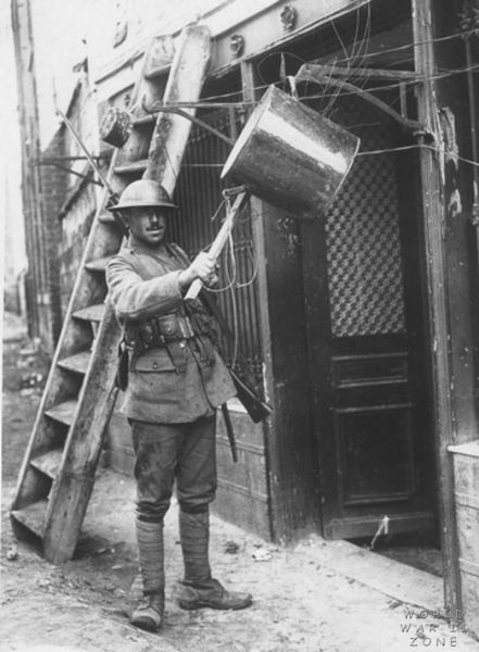
    Sirens of course was one method of alerting troops to a gas attack–there were also bells of all shapes and sizes, and kettles, wooden clappers, rattles, empty shell cases, and other such things. 

    Here’s a compelling image of conflicting emotional input, this showing a kettle with a clanger attached by a wire:

    WWI Project gas alram kettle

     [Source: http://worldwartwozone.com/forums/index.php?/topic/8851-cloud-of-terror-gas-warfare/]

  • U.S. Military Throws Its Black Soldiers Under the Bus, 1918

    JF Ptak Science Books   Post 2564

    “The increasing number of Negroes in the United States about 15,000,000  [sic] would create for the white race in the Republic a menace of degeneracy were it not that an impassable gulf has been made between them…”–“Secret Information Concerning Black American Troops”, Crisis, 1919

    During WWI U.S. troops included dozens of thousands of African Americans. Unfortunately a sizable percentage of the U.S. Army’s leadership perception of these fighters was that they were not dependable, and the difficulties of having Blacks fight alongside (or near) Whites was an issue too great in many cases to bear. So in order to send these troops into battle some were reassigned to the French army. And so it came to pass that regiments would be formed of U.S. soldiers wearing French helmets, carrying French weapons, using French kit, eating French rations, fighting with French soldiers under French leadership, but wearing U.S. Army uniforms. Many of these men went on to high honors, and some–like those comprising the 369th Infantry Regiment of the 93d Division (the Harlem Hellfighters) who were attached to the French 161st Division would achieve renown for never losing a man to capture, and never giving an inch of ground. 

    What were we thinking?

    That question is now easily answered, but not so much in 1918.  In 1919, however, W.E.B. DuBois published (and made “infamous”1) a 1918 memo that was intended for French military leadership on how to deal with the American Negro, a document known as “Secret Information Concerning Black American Troops”.  It was signed by a Colonel (Jean L.A.) Linard, who was a French liason officer at the AEF headquarters, and was a document detailing American expectations of the French in dealing with the Black soldier, and “which carried the imprimateur of Pershing’s staff”2. The document was signed by Linard and had a very whispy feel of it being of French origin, but the implications were that it was the U.S. Army communicating their interests to the French rather than Linard’s own initiative in translating U.S. attitudes towards Black people.  DuBois himself wrote in introducing the piece that “no one for a moment supposes he [Linard] was the author of it”3,4. 

    The French were being instructed on American interpretations of White-Black race relations, and to remember that extensions of social freedoms to the Black soldiers was unacceptable as “intolerable pretensions of equality”, and to abide by the guidelines in the corrupting document, as the French treatment of our Black soldiers was seen as being liberal and equal and so therefore divisive and dangerous.

    It is a miserable exhortation–so much so that after the war, when the French National Assembly was told of the Secret Information, the matter became a scandal.5 The contents of the document and the general awareness of the U.S. military to instill a Jim Crow existence in France was not entirely as “secret” as its name implies, as it was evidently known at least to the 369th in the spring of 1918. (Richard Slotkin wrote that “Harlem got hold of it within the month”6.) No doubt that this had a very negative impact on the soldiers who were being described in it and at the same time fighting and dying for their country.

    The introduction ends informing the French that their equal treatment of Black people was an “indulgence” that caused “grievous concern” and was an “affront” to U.S. national policy.  It really is nothing but all shades of bad:

    [Source, W.E.B. DuBois, The Crisis, volume 18, #1, overall number 103, May 1919. Full text here via Google Books: http://tinyurl.com/new4ppe]


    ·Posted by :

    ·in:

    —
  • The Shadows of a Color “Photograph”, 1436

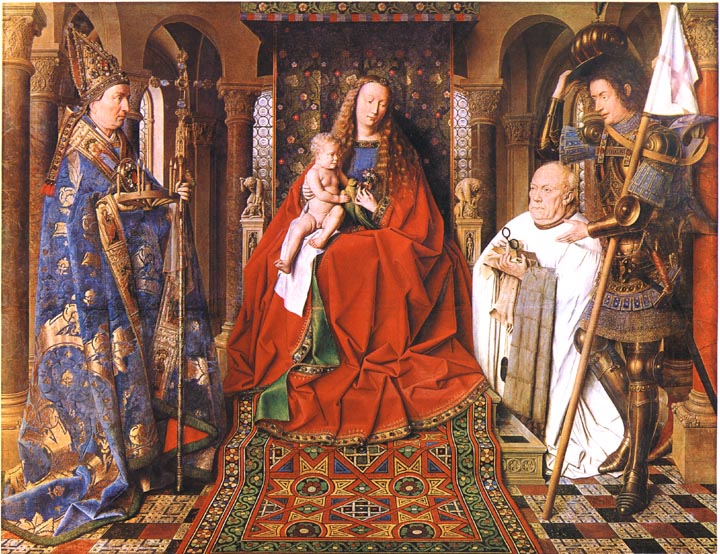
    Was it really Jan van Eyck and not J.C. Maxwell who produced the first color photograph?  Van Eyck’s after all is hanging up in Bruges in the Groeninge Museum, and Maxwell’s, well, Maxwell’s dissipated in about half an hour, leaving only an historical trace.  The problem of course is that Van Eyck’s oil (“Virgin of the Canon  van der Paele”) was done 403 years before the Daguerre invention (building of course on the work of others, notably Niepce, his former partner), so it really doesn’t count because it really doesn’t exist.  His work though *does* exist, but not as a photo—it was, is, a painting, finished in 1436, and it stands in my mind as looking so much like a perfect capturing of a moment that it seems a (luscious) snapshot. 

    Van Eyck virgin of the canon[Source: Victorian Web, http://www.victorianweb.org/painting/whh/replete/P40.html]

    In her book Color and Meaning, Practice and Theory in Renaissance Painting (1992), Marcia Hall makes the point (on page 69) that it is the lighting in this painting that makes it so extraordinary—and differentiates it entirely from the predictable light or “stage illumination of the Italians”.  Its an excellent point.  The light source in the painting is emanates as though it were a half-hour before sunset in Santa Fe; or here, in Hendersonville N.C., when there is a very low and nearly complete cloud ceiling and the sun manages just before sunset to peek through between the mountains and the cloud layers to blaze its extraordinary, horizontal-like brilliance making everything and anything that reflects that light into a work of private art. The figures in this painting by Van Eyck reflect a softer version of that light in such a manner—they are sharply illuminated, luminous, in all of their very human glory and frailty.  We have sharp relief, great detail, deep shadow—and much of that is missing in Italy at this time.

    The photo parts come in here:  the characters are caught in the middle of some very small, obscure action, and the smallness of their movements are captured perfectly

    Even though they are emotive of course the faces of the great Masaccio are relatively plain; Gozzoli, Fra Lippi, the magnificent Fra Angelico, Pisanello, Ghirlandaio, della Francesca, Veneziano, di Credi,. Perugino, and even the emotive and colorful Rafael, all working in about the same decades as van Eyck, simply do not give this anatomical expressiveness to the faces of their subjects.

    Van eyck virgin of the canon detail[Source: Jan Van Eyck . org, www.jan-van-eyck.org]

    So the extreme light and the detail in the faces gives the van Eyck this fantastical quality—on the other hand the perspective and the proportions of the characters in relation to the objects in the room and the room itself are off, secondary, not important—this too in sharp contrast to the great inventors, re-discovers, innovators of the scientific perspective.  (This homage belongs to a slightly earlier time, to Giotto and Uccello, but their work is just a bit to early for discussion with van Eyck.)  Marcia Hall goes on in her appraisal about the way in which van Eyck applied his color (“binding his pigments in a drying oil”) to give his subjects their incredible color depth, and this of course is a major element in understanding the picture (coming as it does from a stone-cold expert). 

    What I’m thinking now, the aspect that is giving this painting its “photographic” quality, its supra-realistic event, is this new use of light, new angle, with the immersion of anatomical detail and the “different”–Northern–perspective. 

    This is a very, overly, simple observation and simplification, but I think in general that it is true.

    ·Posted by :

    ·in:

    — —
  • When Did Kids Start Saying “Dada” And Mean it as Art?

    JF Ptak Science Books (Updated and enlarged Archive Post)

    I guess “Dada” and not “da da” came a little before MoMA–one is from the 19-teens and the other 1929. ()I know this is a horrible joke but I’ll never have a chance to use it again…)

    In a sub-sub-sub category of the sub-category of “Books that I Want to See” comes Dada-ist books for children, and less loosely, modernist books for kids.  Or students.  I’m not sure how close I can define this field because, well, I know basically nothing about it, but I am interested in how long it took for the bits of created modernism (1895-1915 or so) to reach the level of publications intended for children.  And by Modernism I’m talking about the epochal changes in nearly all disciplines brought about by people like Einstein, Ibsen, Klee, Kandinsky, Braque, Stravinsky, Woolf, and so on. Blogdadanemo

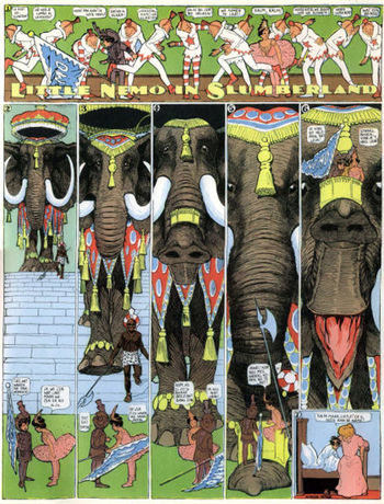
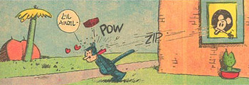
    I’ve started thinking about this in Europe but the first thing that comes to my mind is Little Nemo (and Dreams of the Rarebit Fiend too, while we’re at it), the fantastic creation of Michigan-born (Ypsilanty-schooled) Windsor McKay (1867-1934), which I think is definitely modern but not at all necessarily related to Dada, and which came to life in the miracle year of 1905.   McKay just happened to be years above and away from whatever his contemporaries were doing.  No one came close to McKay, in my opinion, until Ignatz picked up his first brick, and George Herriman drew Krazy Kat for the first time in 1913. 

    Blogdada_herriman

    Still skirting the Dada part, I’d love to see Konvolut von 14 russischen Kinderbuchern der Jahre 1930-32, a spectacular constructivist work aimed at children and from what I can see is a treasure trove of  Malevichian insight. 

    Blogbooks_wantdebussy
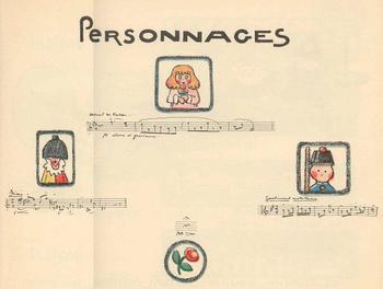
    Andrew. Helle’s La Boite a Jouhoux, (“The Box of Toys”) Ballet pour enfants (Paris, 1913), is a beautiful composition, a modernist construction, using the idea and artwork of illustrator Helle and the music of Claude Debussy.  The score is witty and has a very light touch, Debussy pleasingly borrowing from himself and his friends in a work partly inspired in a Milneian way by 7-year-old Chouchou Debussy (and her toys and dolls).  It’s a beautiful work that I’d love to have in my hands.

    Blogbdad_kid_debussy294

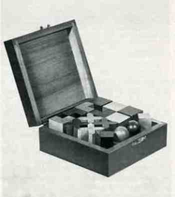
    Another magnificent-looking object that I’d like to see is the box wooden Bauhaus-inspired shapes, pictured in Junge Menschen kommt ans Bauhaus//Werbeprospekt, published in Dessau in 1929 and featuring work by Klee, Kandinsky, Albers, Ridel and Meyer.  The well-made box of shapes is to die for, and it seems as though it offered new geometrical toys/tools  for the inquiring mind in the last year of the ‘twenties.

      Blogbooks_wanted_kids291

    But I’m no closer to Dada for kids than at the beginning of this post, hoping as I was that something might shake loose if I thought about it some.  Its an interesting question to me, and I’d really like to return to it when I actually know something. 

  • Book Fists

    JF Ptak Science Books  Quick Post      Daily Dose from Dr. Odd

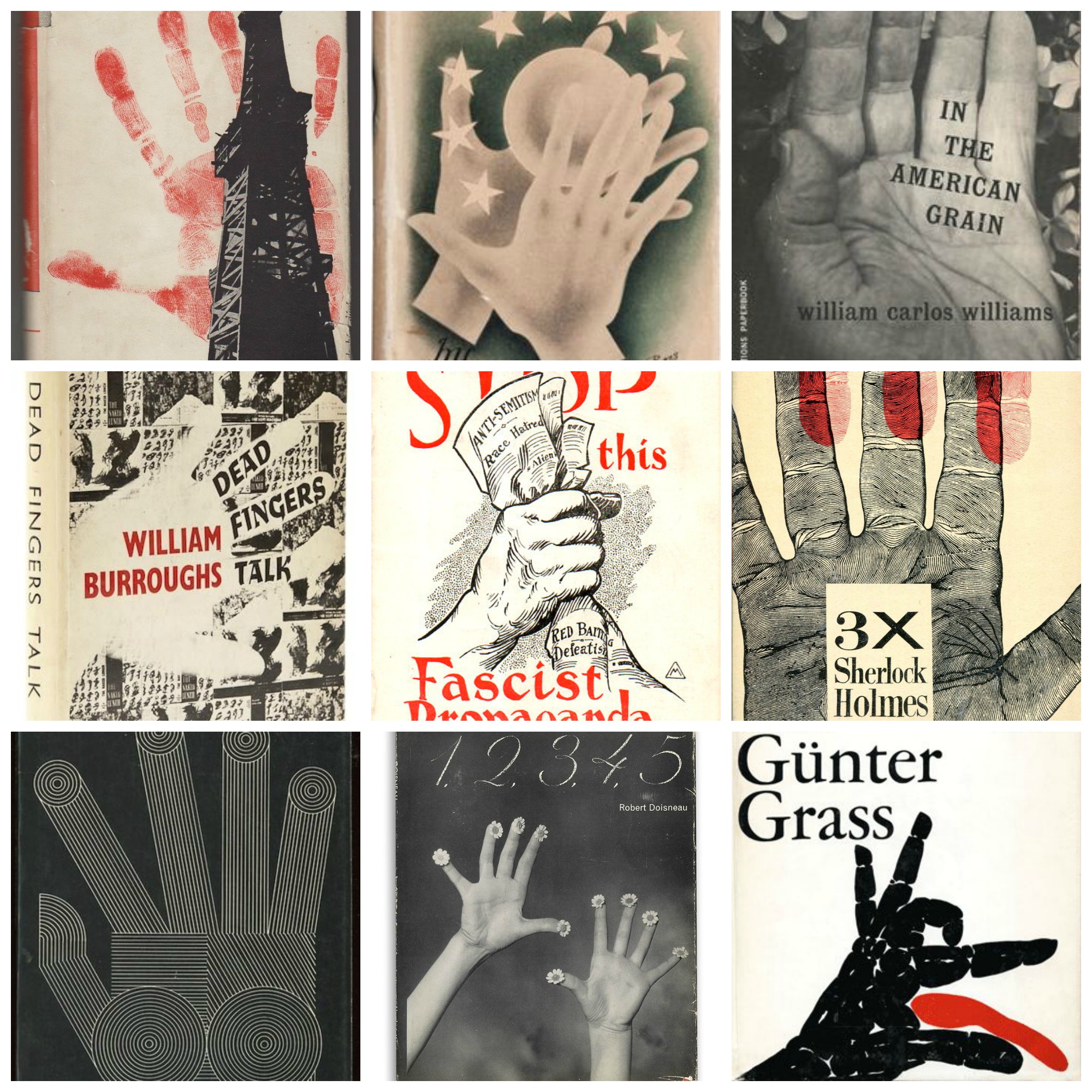
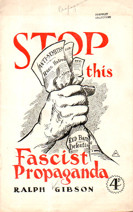
    Just a collection of hands on the covers of books and pamphlets. I guess it is sort of interesting that the hands that started this small collection in the first three examples are two fists and a gloved half-fist snuffing out a lamp; the fourth example is a power thumb, and the the rest of the examples I came up with were almost entirely open-handed. I’m sure that there must be plenty of fist images on book covers out there, but in my brief soiree I only found a few.  

    Books hands montage


    Books hands fascist prop293


  • What Relaxation Looked Like for Soldiers, 1918

    JF Ptak Science Books   Quick Post 

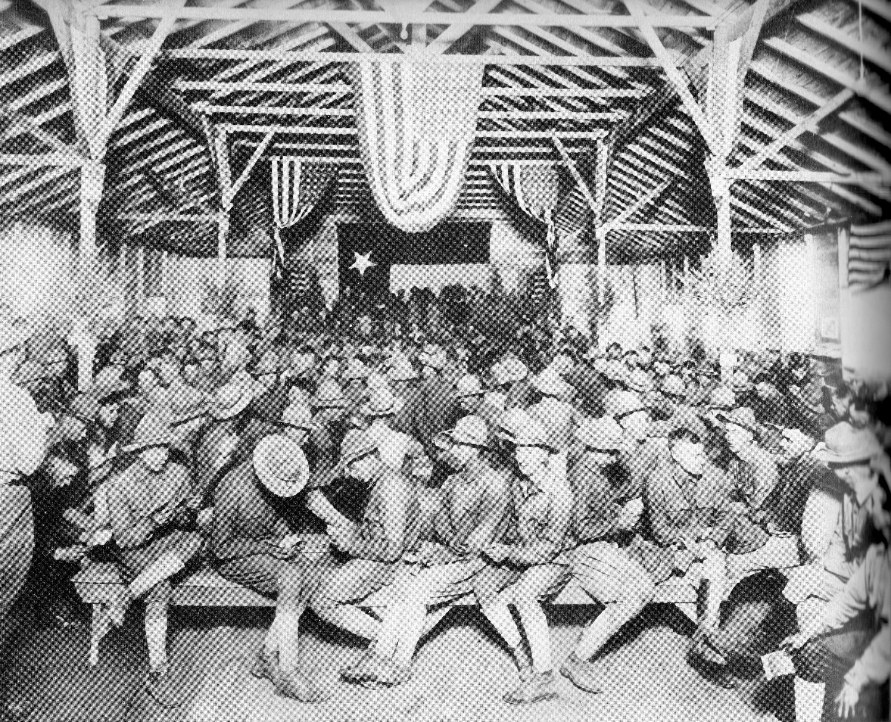
    WWI project doughboy loumge286

    The caption to this photograph read that these soldiers “have other advantages of a clubhouse and social centre”, which on the face of its seems like an outrageous statement, but when you compare this to whatever else was available to these soldiers, then this seems to be not far from the truth.  After all, these soldiers were warm, dry, and nobody was shooting at them.  

    Source:  War of the nations: portfolio in rotogravure etchings  compiled from the Mid-week pictorial; New York Times, 1919. (The original of this is available and not terribly uncommon; it is a big book–500+pp–and about 16 inches tall, and makes for a great breeze-through.)

    • An online version is found here: https://archive.org/details/warofnationsport00unse

    ·Posted by :

    ·in:

  • What They Carried, Part IV: U.S. Soldier, 1917

    JF Ptak Science Books   Quick Post

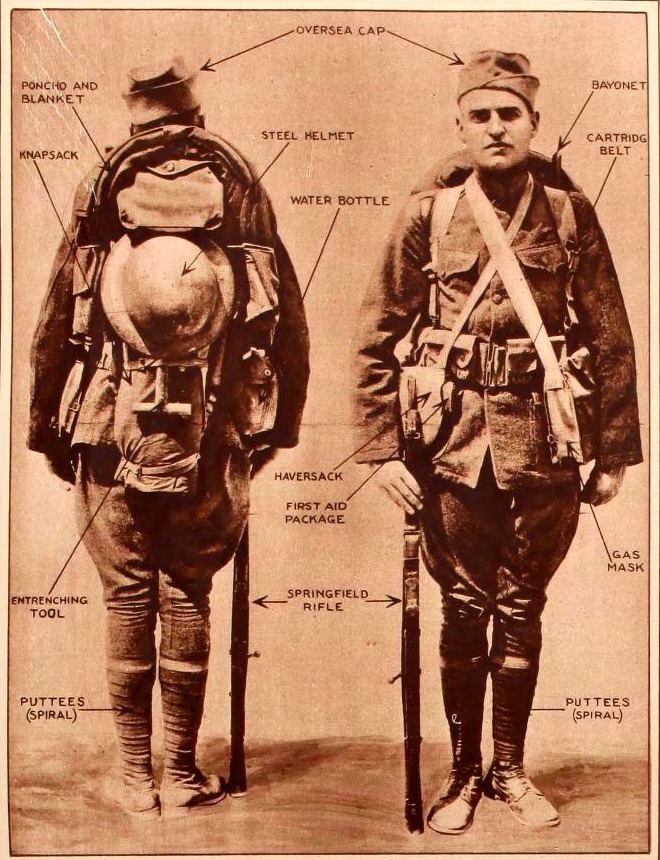
    I found this in The War of the Nations, a Pictorial Portfolio of World War I, published by the New York Times (originally in 1919). I’m not too much of a fan of big picture books of big events, but this one is really very provocative and useful in spite of the heritage of such publications.  This image of what the U.S. foot soldier carried off to war is vexing, mainly because it shows both a lot and a little–first it looks as though there are too many straps and bits that would get in the way, too much motion of too many things; and then it looks like what they carried was hardly anything at all, compared to the modern soldier.  Either way, it looks like a tough go.  

    See also the following posts for what soldiers carried into battle:

    • “What They Wore, 1941”  https://historyofideasblog.com/thesciencebookstore/2015/05/what-they-wore-the-us-soldier-may-1941.html
    • “Things They Took to War, 1915”  https://historyofideasblog.com/thesciencebookstore/2010/01/things-they-took-to-war-1915-officialissue-pocket-contents.html

    WWI Project What they carried  front+back detail

    ·Posted by :

    ·in:

Recent Posts

Archives

Categories