JF Ptak Science Books Post 1129
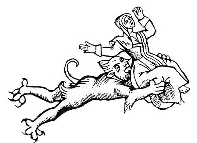
In the earliest part of the printed history of picturing scary things everything left the printer in black and white. The colorist added the necessary tinting and fright stuff, though it seems to me that the sheets that made it through to binding in black and white were the most disturbing of them all. Most of the time and for several centuries color was left to the desire of the individual, the purchaser of the book; the green of dragons or the reds of monster men or yellows of serpents were mostly given life by the buyer. Color printing had to wait more than three hundred years
 after Gutenberg’s Bible–there was some multi-color printing for grammars and the like where words and phrases were printed in multiple colors, requiring numerous passes through the press, but by and large the color printing of artwork was more a 19th century thing more than anything else.
My own preference is for black and white images that let the mind fill in the beasts from outside in, allowing the imagination to run with the text and the description of the beast, rather than fast-forwarding to the completed images. It is these images, the black and whites, which have retained some element of scary or creepy over the years; the colored images don’t make it quite so well.
Color does makes some unexpected contributions to scariness, and in uncommon places. For example, this photo
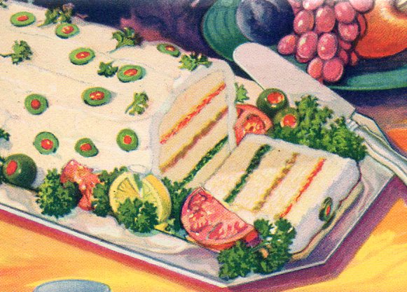 from a 1933 Chicago World’s Fair pamphlet for the exhibitor Durkee Famous Foods fits the ticket perfectly. It is an image of a sandwich loaf that is made mainly with scrapings of ham and lots of Durkee products, which were things like mayonnaise, oleomargarine, cheese squeezings, tapioca, coconut oil, salad dressings and vegetable shortening. The color of the object only heightens the creepiness of its contents, all of which was topped by a layering of mayonnaise and cream cheese studded with olives.
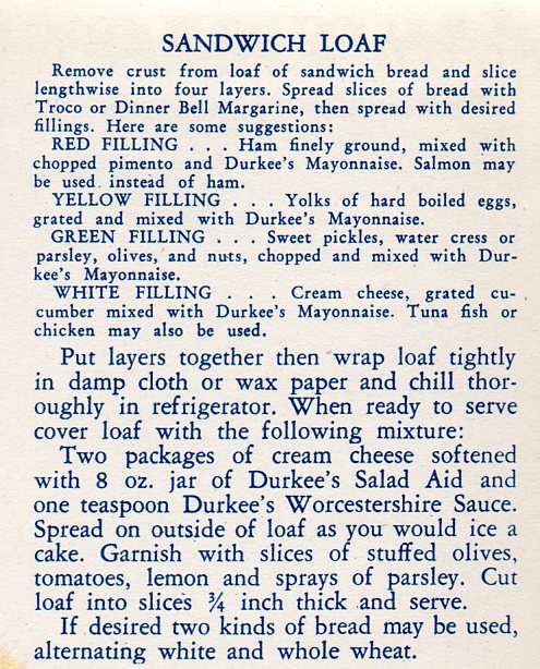
Admittedly this color photograph comes at the earliest stages of the modern aspect of color photography, and perhaps the engineers were a little too anxious at spreading their food-color, it still just isn’t good. Here’s the recipe:
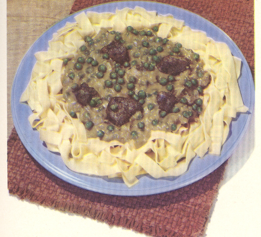
There’s also this incredible plate (below), having some sort of internal color dialog with itself, though manifested externally–it must not be a pretty conversation. House of La
Rosa. 101 Ways to Prepare Macaroni seems
about as benign and forgettable a title that one could write; that said, once
opened, this little pamphlet poured its heart out to the Naïve Surreal in us
all with the unforgettable (and accurate) color images of the promised linguine
delicacies.
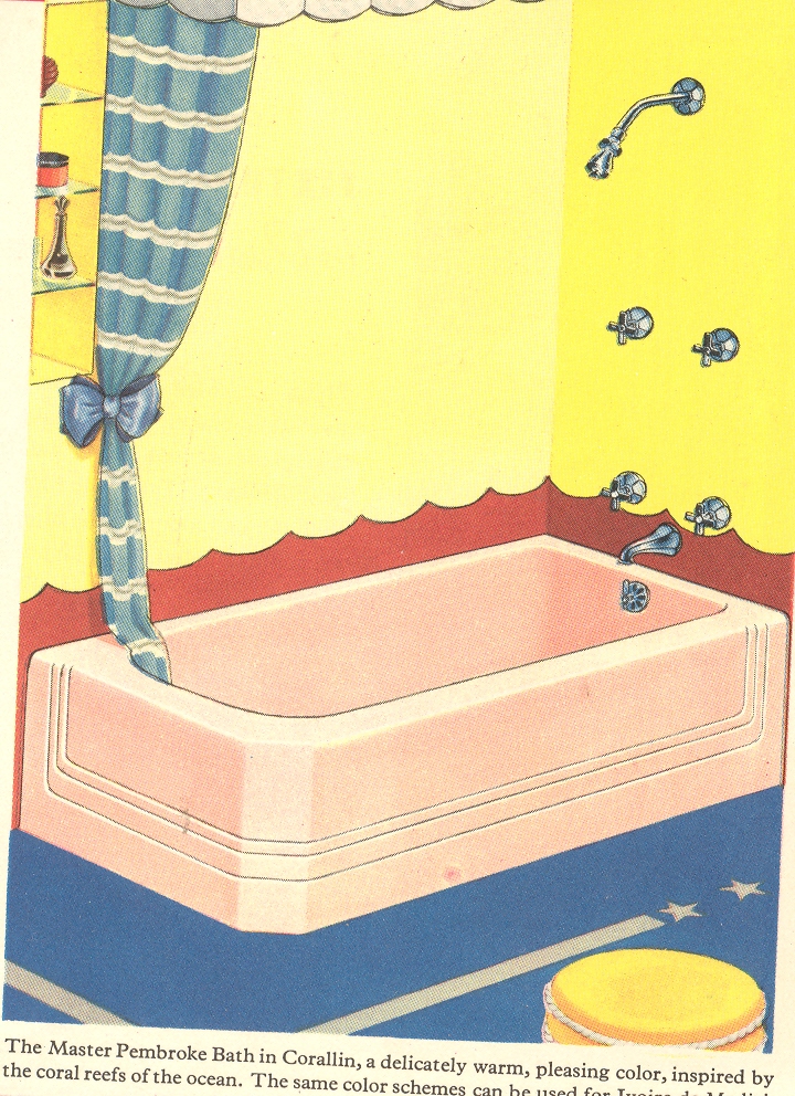
And of course there are innumerable examples of architectural bits:
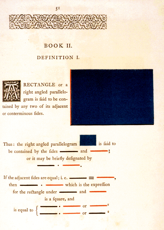
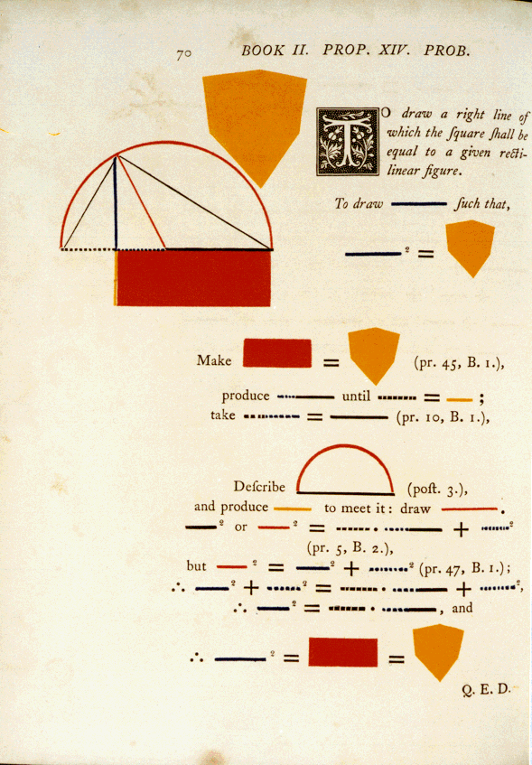
And even when beautiful, color can be scary, as in the case of the very highly problematic Oliver Byrne, whose work restructuring the explanation of the first six books of Euclid is inversely useful to its great beauty.
As unsettling as these color images may be, none come quite so close to being a truly visceral experience as does the Durkee sandwich loaf. These other color examples are just simply wrong; but the Durkee food product, slathered in oil and leftover, is just so wrong it isn’t even wrong anymore.