JF Ptak Science Books Quick Post
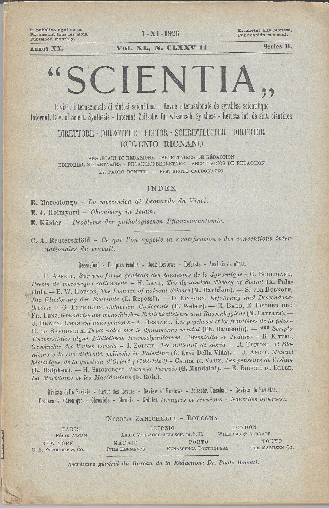 At first blush this cover design doesn’t seem to be very involved or complex–after all, there is a lot of “blank” space even though there is a lot of text. This is the front cover to Scientia, of Bologna, for 1926, and when you really look at it, the cover is impressively busy–even the volume/publication data is complex, or at least far more so than the vast majority of the journals that I have had experience with…for example, this issue for November 1, 1926 is “I-XI-1926 Annus XX, Series II, Vol XL, N. CLXXV-14”, which all makes sense, except that it seems a little dense. Title pages can become very ornate and complex and highly illustrated as you go back farther into the printing past, and even non-illustrated titles can put a lot of ink on the page in forms of letters, what with 100-word titles and all…in this case, I just wanted to share this attractive example. Oh yes–it is an interesting journal, as you can see by the contents…