JF Ptak Science Books Quick Post
Here’s a wonderful British-stiff-upper-lip poster, a play on the Alec Guinness The Mouse that Roared, replacing the “mouse ” part, and winding up with The Lion That Roared. The poster comes from 1942 and for all intents and purposes is correct, except that the lion was roaring at least since 1940–the difference is that the lion got bigger and roar-ier. The British navy was always far and away more powerful than Germany’s, and although out-numbered in aircraft for the first year and a half or so of the war, Germany was pretty much hopelessly behind by late 1941 and certainly 1942. In any event the poster tells a good and fairly accurate story to the passersby in London in 1942.
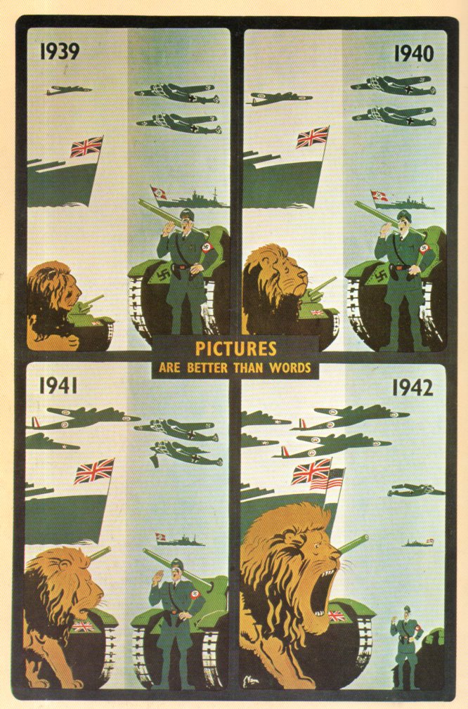
[Source: Z. Zeman, Selling the War, Art and Propaganda in World War II (1978).]