JF Ptak Science Books Quick Post
I have posted many times to this blog over the last eight years on interesting examples of the graphical display of information (mostly in the category of “Information, Quantitative Display of”) that included subjects like the comparative heights of mountains and lengths of rivers, ocean depths, divorce rates, fatalities from various diseases, literacy, the location of the population centers of the U.S., what 50,000 B-17s looked like if they were to fly at the same time, and so on. Most of these are 19th century vintage, though there are a fair number now from before WWII, though the more recent varieties show unusual bits like the amount of food consumed by an average family over the course of a year, the history of hemlines in dresses, the changes in the vital measurements of the White Rock girl, and the like.
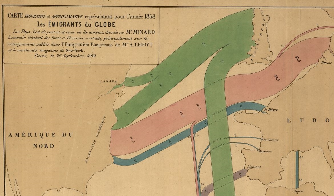
The following map–depicting immigration origins and relative amounts and destinations–is somewhat unusual not only for the early date and manner in which the info is displayed, but also in the design–the data is not crowded out from the field of vision by anything but the broadest outlines of geography, almost all details are left off the map, which also uses two pale colors to set off the land and the sea, allowing the graphed colors to stand brilliantly apart.
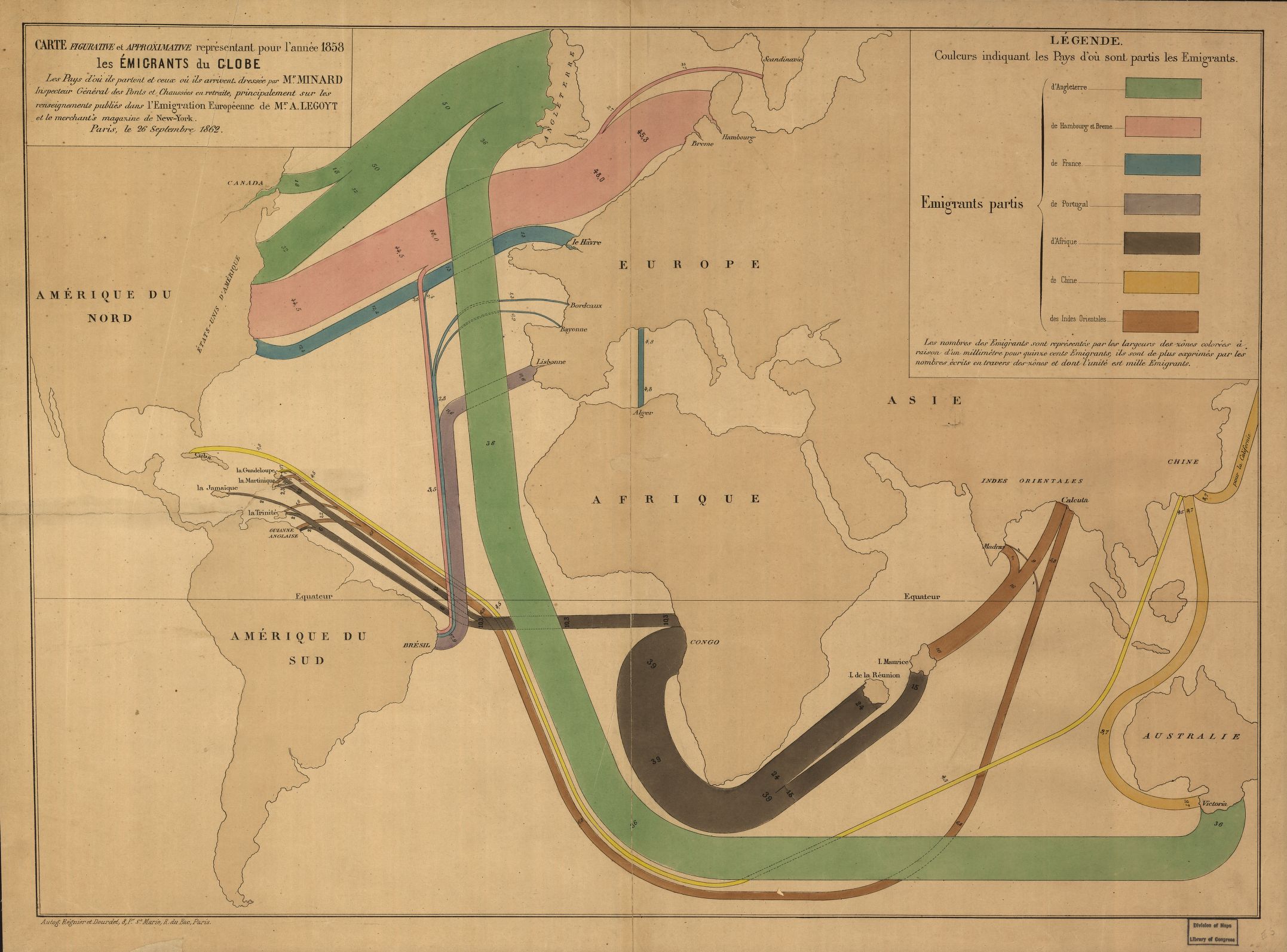
[Map source–the Library of Congress, http://tile.loc.gov/image-services/iiif/service:gmd:gmd3:g3201:g3201e:ct000242/full/pct:25/0/default.jpg]
The map is the work of the early innovator and information-explorer Charles Minard, who is most known for his famously ubiquitous depiction of the death of Napoleon’s army in its advance upon and retreat from Moscow (see https://robots.thoughtbot.com/analyzing-minards-visualization-of-napoleons-1812-march).