JF Ptak Science Books Quick Post
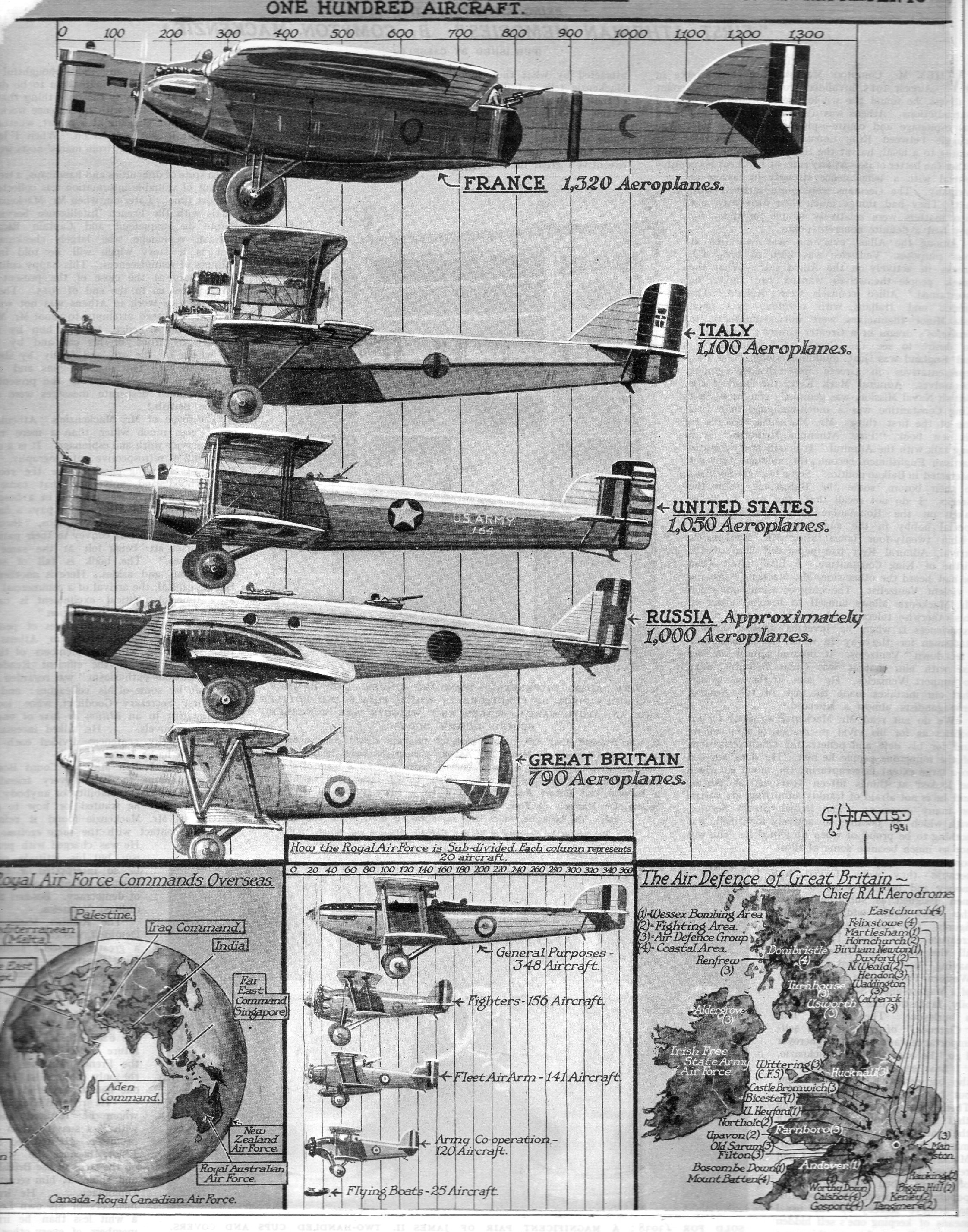
Isn’t it grand to be charting variations on a graph using different-sized aircraft from 1935? Sure, a line would be fine, but this is so much prettier–and of course a simple line is a line and would not display the workhouse military aircraft of the national quantity it was depicting. This appears in the Illustrated London News for September (or thereabouts) 1935–this is the magazine I think that may have been the King/Queen of graphically/representationally displayed data of the 1920s/30s/40s. The interest here of course is British-centric, comparing the air force of Great Britain to the rest of the world, but that is to be expected given the source of the images. It is also remarkable how much this graph would be changed in the next ten years…
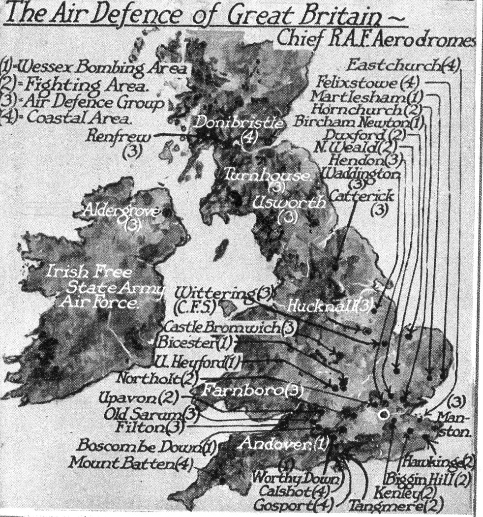
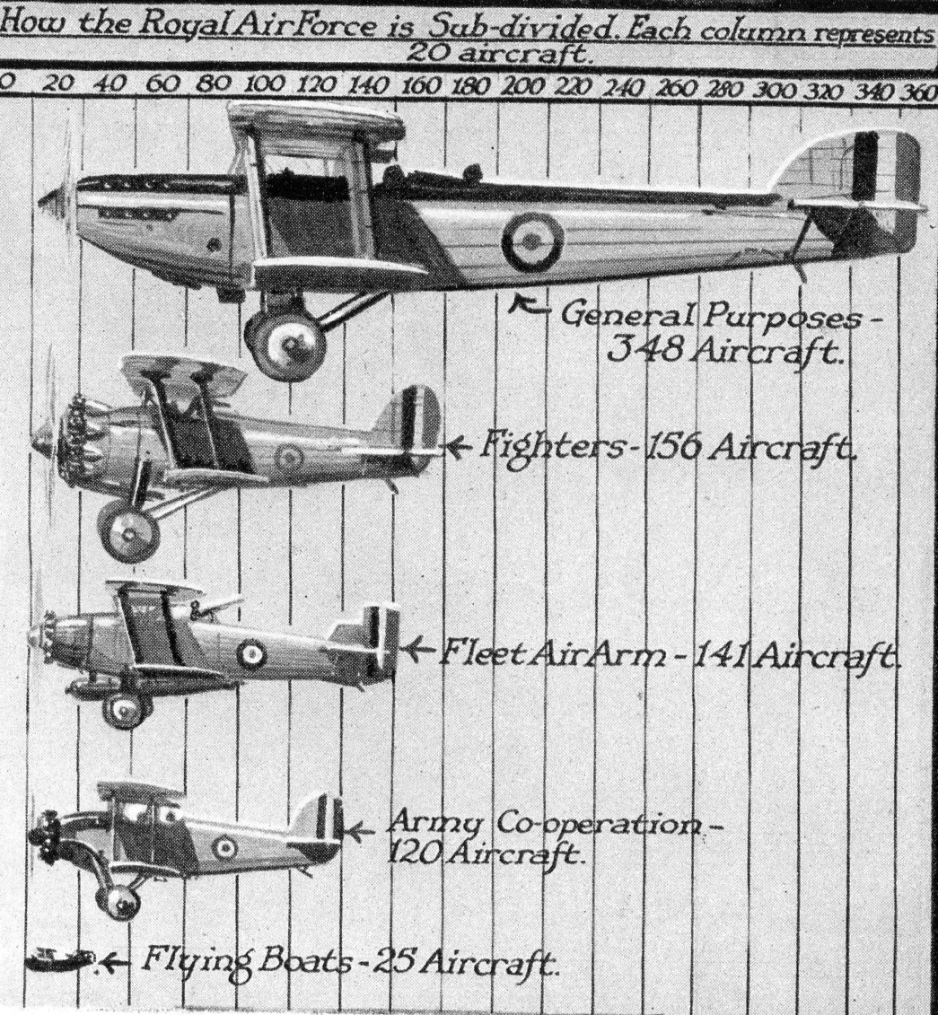
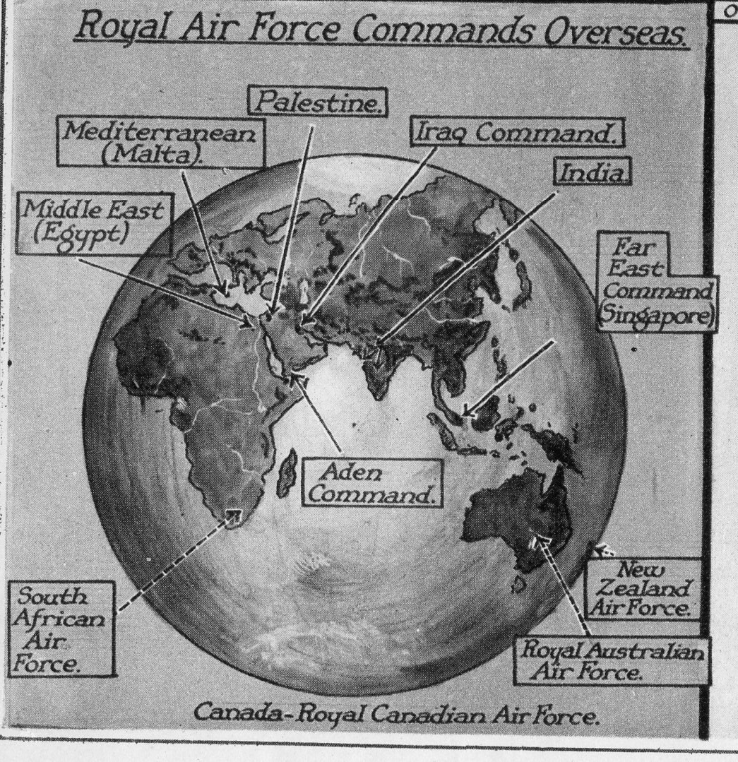
There are also three fine inset images at bottom (about 2 x 2.5″ in real life) that I’ve carved out and enlarged–they are all fine works in themselves.
And the details:
And the cool hemispheric map:
And the text:
