JF Ptak Science Books Quick Post
In the world of the history of heavy, nothing quite spells it so correctly in typography than some of the German entries in the 1920’s. Big, thick letters, jumbo arms and legs with little breathing space, and no design to get in the way of letting gravity do its work, and place often on jet-black backgrounds, these alphabets are a perfect answer to the weight of the decade.
Here is a good example of mid-heaviness, expressed in type and in a map and the overall design. This is an ad onthe front cover of ZFM Zeitschrift fuer Flugtechhnik und Motorluftschiffahrt (14 April 1926) and for the leaving-the-ground aspect of the journal the design work couldn’t be much heavier.
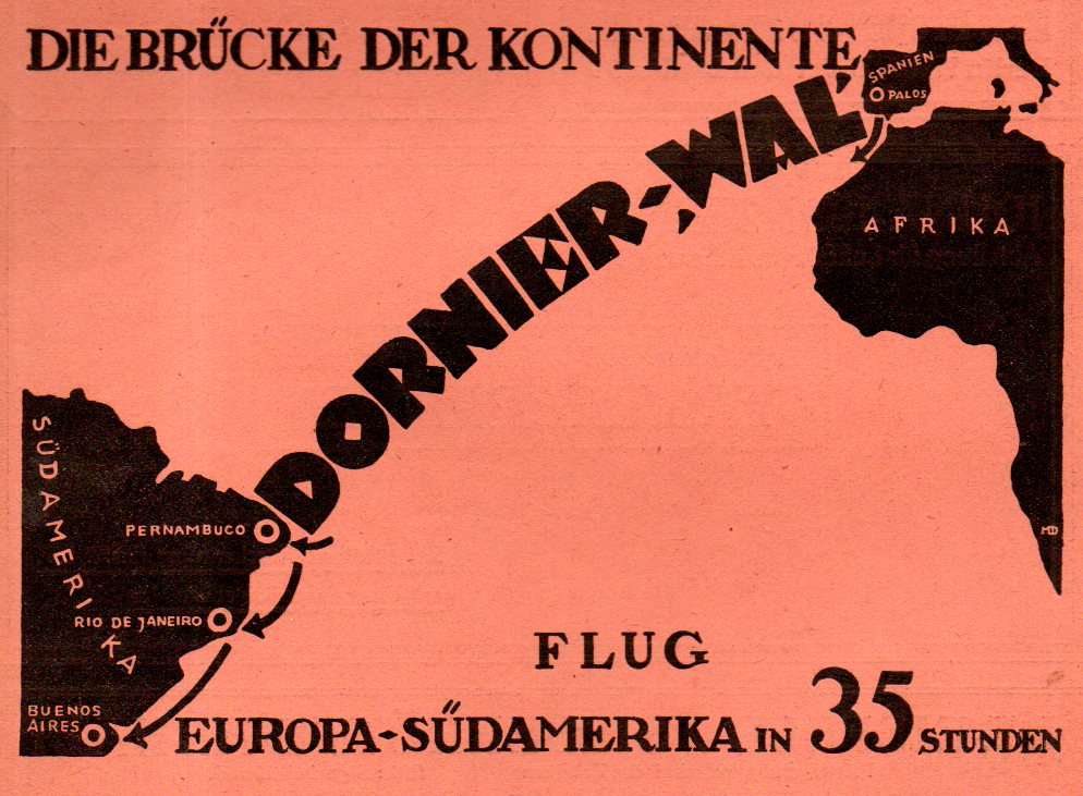
This air travel ad posts the Dornier-Wal seaplane, the “Bridge of the Continents”, getting you across the Atlantic to South America in 35 hours. (The Dornier -Wal was a flying boat, a metal monoplane with above-the-wing twin engines and a maximum speed of about 180km/hr, which means I guess that the aircraft was making on average about 90mph on its trip across the Atlantic.) And the ad–well the ad is bold, and slightly spartan, and still very heavy for the amount of blank space in it.