JF Ptak Science Books Quick Post
Display of Quantitative Information series.
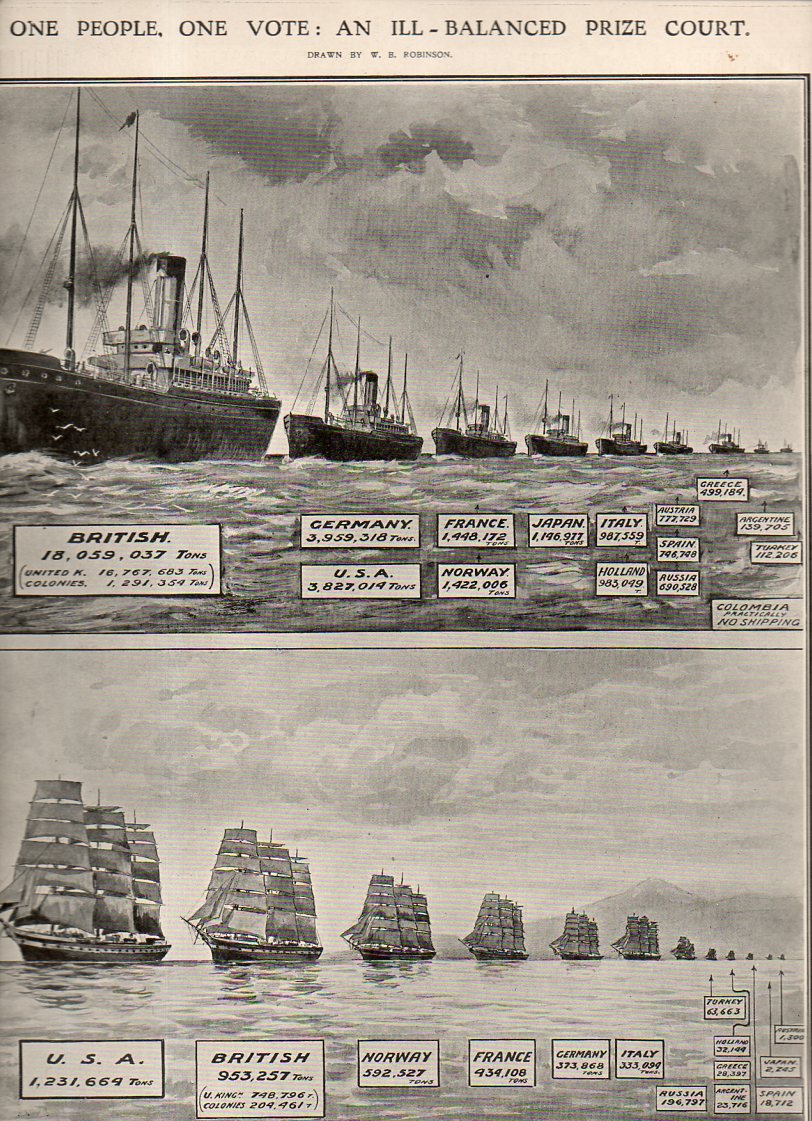
I found this interesting and lovely display of empirical data, and I like it quite a bit, even though it really isn’t a good example of a graphical display of information. The chart was intended to show the differences in the profiles of British destroyers, and not much more. The image appeared in The Illustrated London News, April 23, 1949.
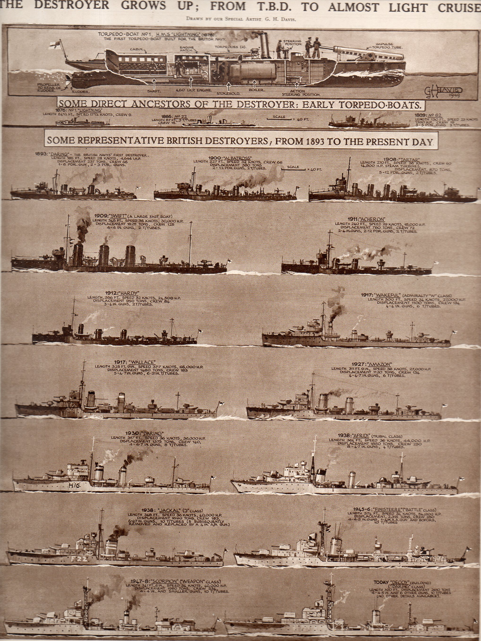
And the text:
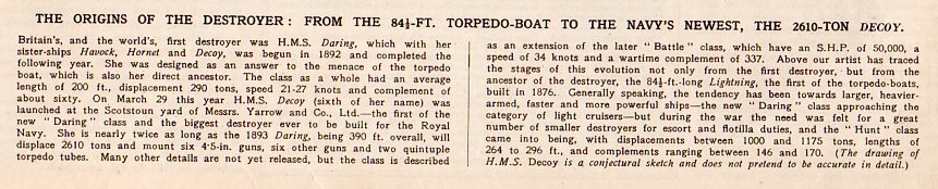
Then there’s this (below) a good graphical representation of the size of fleet strengths, steam and sail, appearing in The Illustrated London News for January 28, 1911, just a few years before the start of WWI: