JF Ptak Science Books Quick Post  Part of a Series on Unusual Book Titles & Design

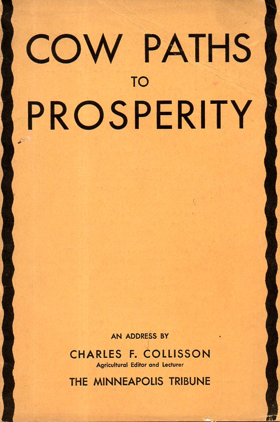
This is another entry in a developing thread on marvelous/incredible/Outersider-y book covers and the ideas that go with them. “Butter Tub” units of comparison jumped straight into my brain when I flipped through the pages of Cow Paths to Prosperity (1934), which is basically a very sober appraisal of the cattle industry for the smaller rancher–except of course that it has a fabulous cover and also has a bar graph employing tubs of butter. The Butter Tubs makes perfect sense, of course, but if view just slightly out of context the graph sustains a slightly covert semi-absurdist feel to it.
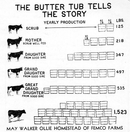
The graph comes from this jumpily-designed pamphlet:
And not to be outdone in the serendipity department, I offer this unusually-titled effort from the other side of the Meat Spectrum Civil War between beef and chicken:
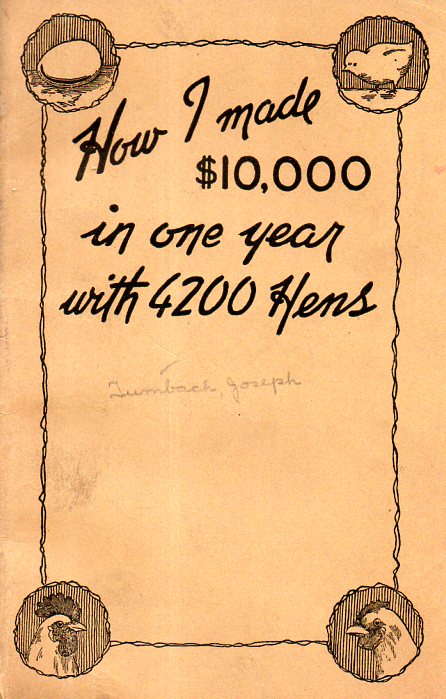
$10 grand doesn’t sound like a lot in today’s money for having to put up with 4000 modern dinosaurs on an egg farm–but when this pamphlet was printed in Pasadena in 1925, it was a 300+% increase over the average American yearly income. I think the money was a little better and certainly much cleaner for writing about making chicken money than it was to actually do it.