JF Ptak Science Books Post 1640
[Continuing the post The History of Cigarette Eyes and part of the series on Blank, Empty and Missing Things.]
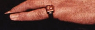
What is it about the pinky ring that makes you want to smoke? And makes you want to smoke the cigarette in the pinky-hand’s counterpart?
The psychology of advertising in cigarette ads in the 1940’s or thereabouts is a strange thing to me. The secondary items in the ads–the stuff there besides the cigarette–are sometimes baffling and occasionally troubling, disquieting, unusual things sent to capture the attention once the cigarette has been removed from the field of attention. I’m pretty sure why those things are there–because of their suggestive natures and their attempt to relate directly with cigarette smoking–but I’m not aure how that connection between the object and the suggestion (of power, or control, or social beauty, or sex and so on) takes place. The meaning and connection can be forced out with a little muscle, but that wasn’t supposed to be so hard for the viewing public back there eight decades ago. The social contrivance of the connection seems to have slipped over time into a smoky nothingness, and I think that it would be interesting to try and restore it, if only for the sake of understanding that lost part of advertising’s quadratic equation.
And so on to a few examples from the advertising world, all of the images coming from the great cigarette advertising archive at Stanford University (here). Removing the cigarettes as a main focus of attention in the following ads leaves us with pinky rings, puffy man-ladies, cigarette holders, close touching, electronics, stub-handed stubby cigarettes, wedding rings and suggestive “product placement”.
The vast smokey elegances of pinky ring (from above):

The smokey, puffy man-lady (“so round, so firm, so fully packed”):
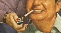
Phil Harris just looks entirely and completely out of place, and not comfortable, though perhaps he just wanted to “feel pretty” getting a light from man-handed Alice Fayew?
