JF Ptak Science Books Post 1351 (revisiting the post from 2012 with a few additions).
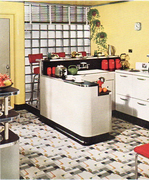
Anticipated but unexpected color expectations sometimes don’t quite make it through the ordinary vocabulary of color names and descriptors. Such was the case for me when looking through this Armstrong Linoleum Catalog from 1941–the brightness and color range was remarkable, and, even if the color in the magazine existed only in the complicated color separation technical efforts on its pages, it still stays remarkable for the colors that they may or may not have represented.
- The catalogs from which these images are sampled are all available for sale at the blog’s bookstore, here.
The colors seem “pluump” (yes, with two “u’s”) to me, like a big man in a little man suit, suggesting a too-ripeness, the colors too much in themselves.
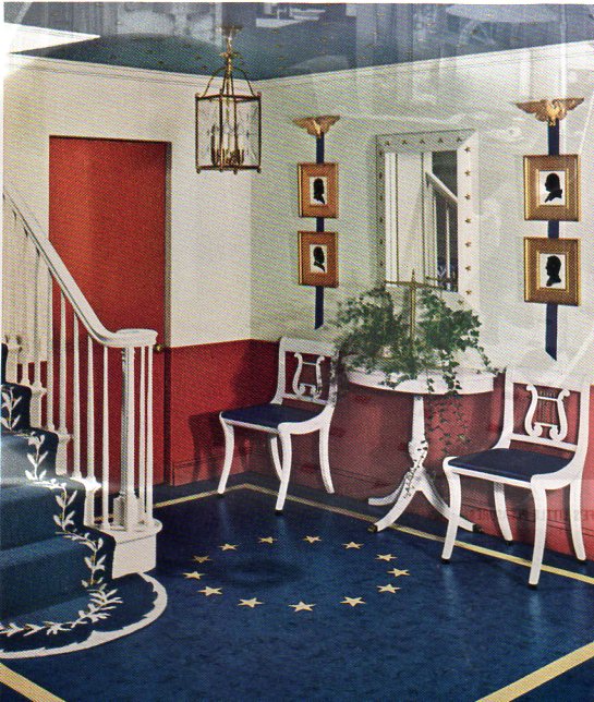
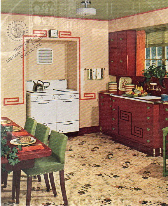
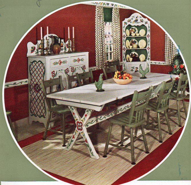
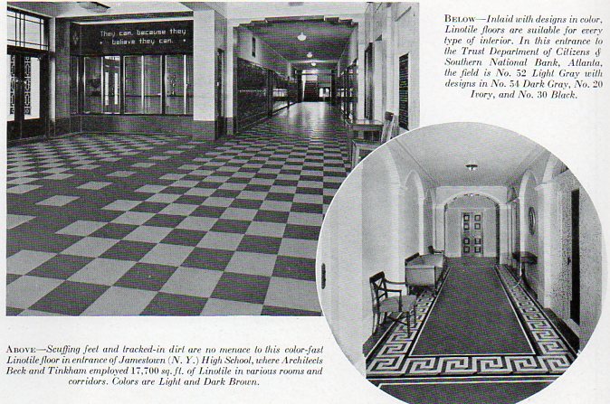
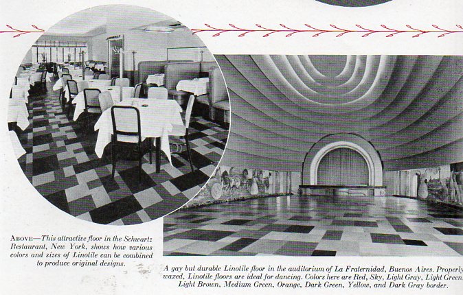
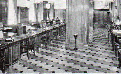
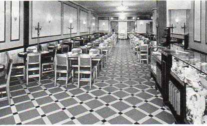
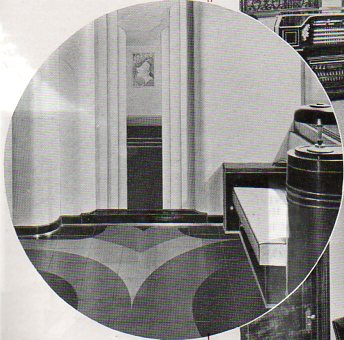
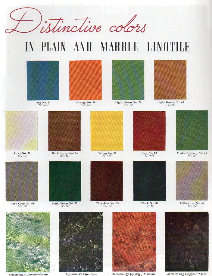 Then, on the other end of anticipation is the Armstrong Distinctive Interior Finishes and the Individuality in Handlaid Floors of Armstrong’s Linotile catalogs of 1935 and 1937 (respectively). They offer the hope for color but don’t illustrate it, giving their reader a color palette of the possibilities for decoration, but then providing black and white photographs for the imagination. (I’ve seen other examples of color theory done in black and white–they are not common.)
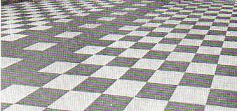
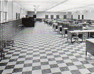
Part of the many opportunities for Glorious Color are here at left; examples of their use (in Glorious B+W) are below, illustrating an imagination that was still in black and white in 1935.
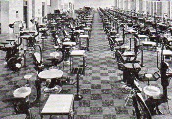
[The last illustration is interesting in itself, being a fading-into-the-horizon image of a lab at a dental school.]