A Daily History of Holes, Dots, Lines, Science, History, Math, Physics, Art, the Unintentional Absurd, Architecture, Maps, Data Visualization, Blank and Missing Things, and so on. |1.6 million words, 7500 images, 4.9 million hits| Press & appearances in The Times, Le Figaro, Mensa, The Economist, The Guardian, Discovery News, Slate, Le Monde, Sci American Blogs, Le Pont, and many other places… 5000+ total posts since 2008.

  • A Cardiac Chronology (Beginning): 27 Heart Anatomies, 14th century-1897


    JF Ptak Science Books   Post  1367


     This is the first installment of a chronology of the anatomical representation of the heart, along with a few metaphorical images tossed in.  No commentary yet–just a quick post.  All images are either from the Wellcome Institute or the National Library of Medicine.  (I’m not sure that I’ve seen a timeline of these images before…)


    14th Century

    NLMNLM~1~1~101435831~140121

    Mansur ibn Muhammad ibn Ahmad ibn Yusuf
    Contributor:
    ibn Faqih, author. fl. 14th c.,
    Publication Information:
    [1488]
    Appears In:
    Tashrih al-badan.

    Ca. 1440

     image for id L0034716

    “Woodblock illustration from Zhengtong daozang (Daoist Canon compiled during the Zhengtong reign period [1436-1449] of the Ming Dynasty), depicting the ‘internal topography’ (neijing) of the human body from the front and back view.”

    ·Posted by :

    ·in:

  • An Alphabet of Unintentionally Semi-Absurd Motivational Images, Business Publications, 1930’s

    JF Ptak Science Books   Post 1367

    Biz alphabet--e014

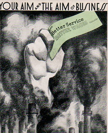
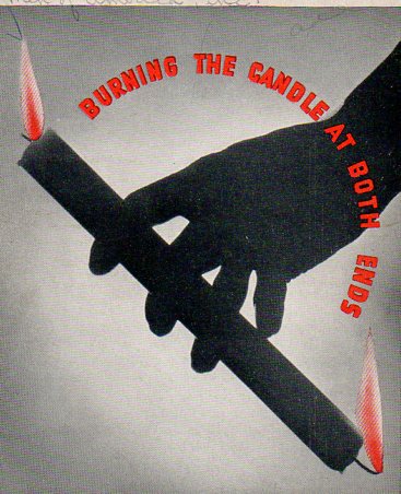
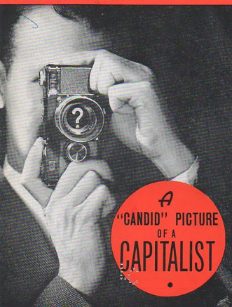
    This alphabet fell into place almost by itself as I wandered through this maze of business motivational pamphlets published by Men of America Inc (of Chicago), all printed in the late 1930’s to about 1941.  The design of the covers of this series is sensational (and I gulp wind as I say this) in very short and limited ways, just like it is sensational to watch a motionless penguin for a long time and then to see it suddenly turn its head to the left.  But these images served a very dedicated purpose when they were printed, and were even perhaps useful,or successful, as this publication saw at least 500 different numbers in this series.

    Perhaps more interesting–where did these models come from? 

    I think many of these covers are fantastic: charmingly naive, naively bizarre, cluttered with fantastically abandoned sentiments, and dripping with design elements all but forgotten and/or abandoned.  They are beautiful in their own special way.  And I’m not so sure that I wouldn’t want to go back in time, read them and take their lesson to heart. (All are available for purchase via our blog bookstore.)

    A is for AIM to keep workers happy and profit happier

    Biz alphabet--a007

    B is for BURN and hoping for a better-built candle

    Biz alphabet--b008

    C is for CAPITALIST, an exclamation point in a land of question marks

    Biz alphabet--c010

  • An Alpha-Vile Alphabet Autopsy of Lost Emotions

    JF Ptak Science Books

    Alpha-vile alphabet038

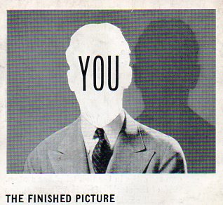
    Following yesterday’s post on semi-indulgent expressions from pamphlet covers printed at the end of the Depression of business motivational ideals come these images, found as text illustrations to these marvelous non-sequitur works.  Although only four pages long, these pamphlets (leaflets, really) have provided–pound-for-pound–more images of quietly bizarre, unexpected images than just about any source that I have seen.  Taken out of context these posed photographs ask more questions and provide for more imaginative jungle trots than their disappointing original intentions.

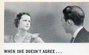
    A is for Annoyed, which Mrs. Harrison is, annoyed that Mr. Harrison has yet again forgotten to paint his bald spot.  He thinks that his wife is over-reacting, pushed over the edge of reasonableness from her quack prescription of Neck-So-Thin dietary supplements.  He keeps his opinion to himself. 

    Alpha-vile alphabet q034

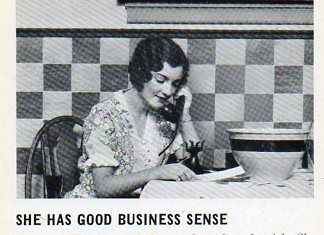
    B is for Bowls of Business–there is no telling what the kitchen scene means so far as business is concerned for this woman in 1937.  Perhaps she is calling in a good deal from her bra-phone  (the ‘phone cord seems to be going right into her heart) on a sale on bed pillows for bowls.  I know that when she pushes back from the table her wooden chair will make a high-skreetching sound against the linoleum uni-fit flooring; her merchant husband, Mr. Beemish, will be awakened from his late sleep by the sound, again, and demand that she return the bowl to bed, pillow or not.  Mr. Beemish was slightly feverish, wondering if he should go to his shop with window displays of nothing.  The milkman–late again–shares a cigarette on the front porch with the ice man.  The cigarette smoke rises to Mr. Beemish’s  bedroom window as he strains against his own miniature pillow to hear what the men are saying, while thinking of nothing but his ice melting and his milk getting warm.  And his pillow-less bowl. 

    Alpha-vile alphabet 031

    ·Posted by :

    ·in:

    —
  • The Great French Wine Strike of 1907

    File1190detail

    What would be more intractable to the public mind in general than a wine strike in France?  I think that it trumps by far a yellow cab strike in NYC (or anywhere), a beef strike in Buenos Aires, and maybe even a rice strike in Tokyo.  It seems unthinkable.

    But this fabulous image shows  the event in full force, with “Marcelin Albert, the Napoleon of the South” up to his elbows in a sea of French wine producers and suppliers, drawing the group together in a very solid and unified strike front, demanding more of the French government back there in 1907.  Albert is administering an oath of allegiance to the Wine-Growers’ Federation at Montpell, the listeners’ outstretched arms showing their acceptance of whatever it was Albert was preaching.  The picture  was printed in  London by the Illustrated London News on June 22, 1907, months into the wine-grower’s striking reign. M. Albert certainly had the attention of the French legislature at this time,  speaking in small towns and cities across the breadth of the south of the country,   getting huge crowds–at the fabulous Medieval fortress city of Carcassonne, for example, which had a population of about 30,000, more than 200,000 people came ro support the strike.  Albert  (b. 1851 and looking a little like a thin Castro) is shown speaking to a part of a dense crowd estimated in the hundreds of thousands; the crowds of growers (labeled “agitators”)  in front of  raised ALber to a person of high importance in France.  I have no idea how the idea of a wine strike was tolerated by the people of France, in general.

    Note:  Marcelin Albert led campaigns for the defense of vine growers in 1900, 1903 and 1905. He headed an association of Languedoc vine growers in the great agitation of 1907 (against restrictions on home distillers, taxes on sugar, etc) that led to his distinctions and high social position as representative of hundreds of thousands of working Frenchmen.

    ·Posted by :

    ·in:

  • The Problem of the Expanding Universe, 1943

    JF Ptak Science Books    Post 1368

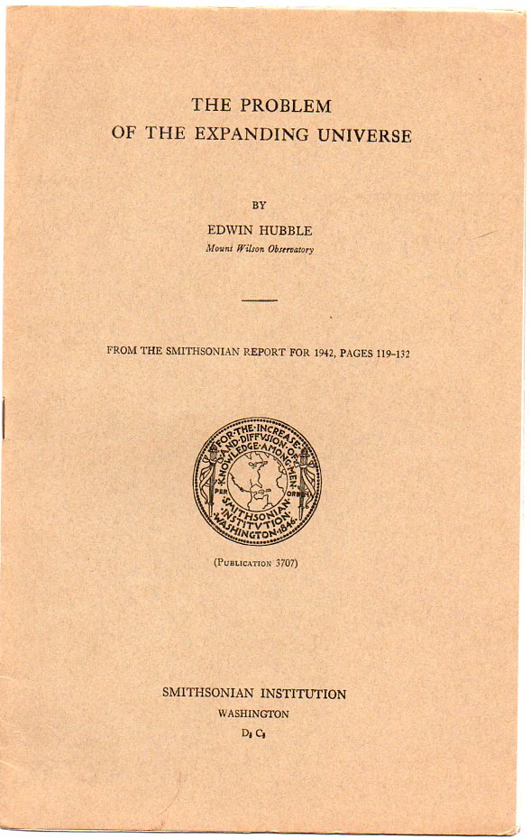
    Hubble expanding052 In his great summary (The Problem of the Expanding Universe) of the development of the velocity-distance relation, the Big Bang and all that,  Edwin Hubble offers concise appraisal of the research to this point (in which Hubble and his assistant Milton Humason were prominent members of its founding studies). Hubble provided the first experimental data supporting the expanding universe theory of Georges Lemaitre’s cosmology (the “hypothesis of the primeval atom”), Einstein’s GRT and the mathematical equations of Alex. Friedmann, finding that the distance of galaxies were proportional to their redshifts (Hubble’s Law, 1929).  The whole thing enjoyed a bigger, more explosive life once it had been given its  more provocative and user-friendly name by Sir Fred Hoyle, who called the idea “the Big Bang” in 1949.  (Sir Fred was actually attacking the idea and must’ve thought his tag was to be demeaning, but as a proponent of the steady state theory, Hoyle’s plan backfired, a proof that irony exists.) The steady state model was more or less put to sleep when the cosmic microwave background radiation (first proposed by George Gamow, Ralph Alpher and Robert Herman in 1939) was “discovered ” in 1964 by Penzias and Wilson, this providing further experimental confirmation for the Big Bang hypothesis. 

    In his characteristic way, Hubble summarized the whole package so, in the conclusion of the 13-page paper [the original of which is available for purchase from our blog bookstore]:

    “Meanwhile, on the basis of the evidence now available, apparent discrepancies between theory and observation must be recognized. A choice is presented, as once before in the days of Copernicus, between a strangely small, finite universe and a sensibly infinite universe plus a new principle of nature.”

    It is an excellent approximation for a semi-general-public speech (to the Smithsonian Institution crowd during the war in 1943), and reminds me of one of his other, similarly spot-on statements, one of the greatest understatements in 20th century astrophysics The statement appears in a further report on Hubble/Humason studies in The Velocity-Distance Relation Among Extra-Galactic Nebulae  (Mount Wilson Observatory,  1931) ,  a regarding their understanding of the phenomena and the expanding universe, the authors take many steps back, and say in the concluding paragraph:

    “…the writers are constrained to describe the apparent velocity-distance displacements without venturing on the interpretation and its cosmological significance”.

    They basically lay out the functioning of the universe and the best understanding of how we got to where we are in the cosmos (Vesto Slipher notwithstanding), and how according to their understanding that the universe is expanding and is consistent with all known laws, that they decide to not say anything, um, philosophical, in the light of disrupting the idea of the creation of all things.

    Hubble did have a way with words, his own way, though he was able to communicate a difficult series of ideas simply, as we can see in the opening of his Expanding Universe paper: 

    “Mathematicians deal with possible worlds, with an infinite number of logically consistent systems. Observers explore the one particular world we inhabit. Between the two stands the theorist He studies possible worlds but only those which are compatible with the information furnished by observers. In other words, theory attempts to segregate the minimum number of possible worlds which must include the actual world we inhabit. Then the observer, with new factual information, attempts to reduce the list still further. And so it goes, observation and theory advancing together toward the common goal of science, knowledge of the structure and behavior of the physical universe.”

    And this lovely summation:

    “Current theory starts with two fundamental principles : general relativity and the cosmological principle. General relativity states that the geometry of space is determined by the contents of space, and formulates the nature of the relation. Crudely put, the principle states that space is curved in the vicinity of matter, and that the amount of curvature depends upon the amount of matter. Because of the irregular distribution of matter in our world, the small scale structure of space is highly complex. However, if the universe is sufficiently homogeneous on the large scale, we may adopt a general curvature for the universe, or for the observable region as a whole, just as we speak of the general curvature of the earth’s surface, disregarding the mountains and ocean basins. The nature of the spatial curvature, whether it is positive or negative, and the numerical value, is a subject for empirical investigation.”

    “The second, or cosmological principle is a pure assumption – the very simple postulate that, on the grand scale, the universe will appear much the same from whatever position it may be explored. In other words, there is no favored position in the universe, no center, no boundaries. If we, on the earth, see the universe expanding in all directions, then any other observer, no matter where he is located, will also see the universe expanding in the same manner. The postulate, it may be added, implies that, on the grand scale, the universe is homogeneous and isotropic – very much the same everywhere and in all directions.”

    “Modern cosmological theory attempts to describe the types of universes that are compatible with the two principles, general relativity and the cosmological principle. Profound analysis of the problem leads to the following conclusions. Such universes are unstable. They might be momentarily in equilibrium, but the slightest internal disturbance would destroy the balance, and disturbances must occur. Therefore, these possible worlds are not stationary. They are, in general, either contracting or expanding, although theory in its present form does not indicate either the direction of change or the rate of change. At this point, the theorist turned to the reports of the observers. The empirical law of red shifts was accepted as visible evidence that the universe is expanding in a particular manner and at a known rate. This arose the conception of homogeneous expanding universe of general relativity.”

    I like Hubble.

    Notes:

    The paper begins:

    “I PROPOSE to discuss the problem of the expanding universe from the observational point of view. The fact that such a venture is permissible is emphatic evidence that empirical research has definitely entered the field of cosmology. The exploration of space has swept outward in successive waves, first, through the system of the planets, then, through the stellar system, and, finally, into the realm of the nebulae. Today we study a region of space so vast and so homogeneous that it may well be a fair sample of the universe. At any rate, we are justified in adopting the assumption as a working hypothesis and attempting to infer the nature of the universe from the observed characteristics of the sample. One phase of this ambitious project is the observational test of the current theory of the expanding universes of general relativity. ” [The entire paper is located here.]

    ·Posted by :

    ·in:

    — —
  • World War I Photos–Fifth Avenue and Not FIfth Avenue, July, 1918

    JF Ptak Science Books  Quck Post

    WWI--great images--traffic control053
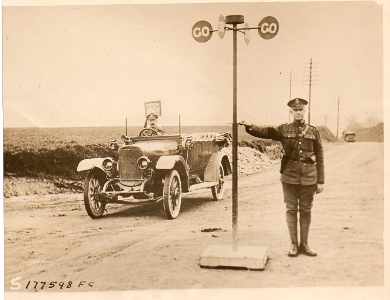
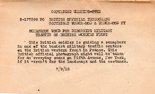
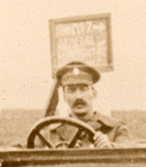
    This news photo service image (available from our blog bookstore) shows the action in “one of the busiest military centers on the British Western Front in France”, with a British soldier using a traffic semaphore to take care of the hustle and bustle.  The caption–almost always supplied with these photos as they were made by a pool of uncredited photographers covering the war for a consortium of newspapers and paid subscribers providing images and content for paying media–reads that the picture “might well be taken for an everyday scene on Fifth Avenue, New York, if it weren’t for the landscaping and the costumes”. 

    WWI--great images--traffic control054
    Indeed.  Actually, if you removed the landscaping, the vehicles, the background and the uniforms (clearly whoever wrote this copy had no feel for the fact that actors wear “costumes” and soldiers wear “uniforms”), and replaced it with paved roads, buildings on all sides, crowds of people and packed it all with automobiles and placed the scene on Fifth Avenue, then the scene would have looked like Fifth Avenue. 

    On the other hand, even if it were never to look at all like Fifth Avenue this intersection would have been exceptionally busy from time to time; I’m sure it could have seen thousands of troops per day, particularly since the Brits fielded probably a million troops in this region alone, and those troops needed to be fed and cared for, which means there would’ve been a constant flow of people, and machines, and materiel. 

    This is a fantastic photograph,though, though the captioning folks did it little justice. 

    WWI--great images--traffic control055

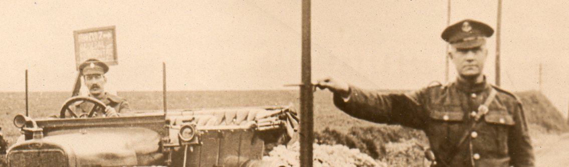
    I can’t quite make out the BEF-made sign in the background, placed for the use of the troops. 

    WWI--great images--traffic control056

    ·Posted by :

    ·in:

    — —
  • World War I Photographs–Parade of Military Snow

    JF Ptak Science Books  Quick Post

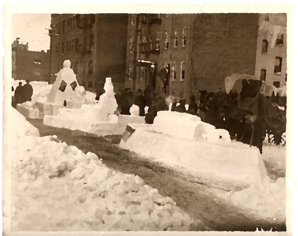
    WWI--great imagessnow parade059

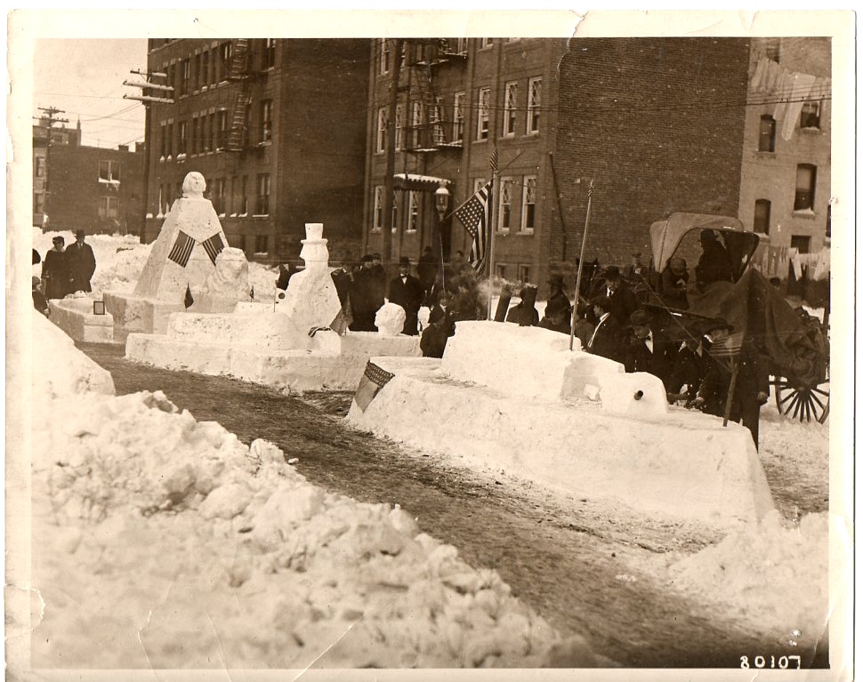
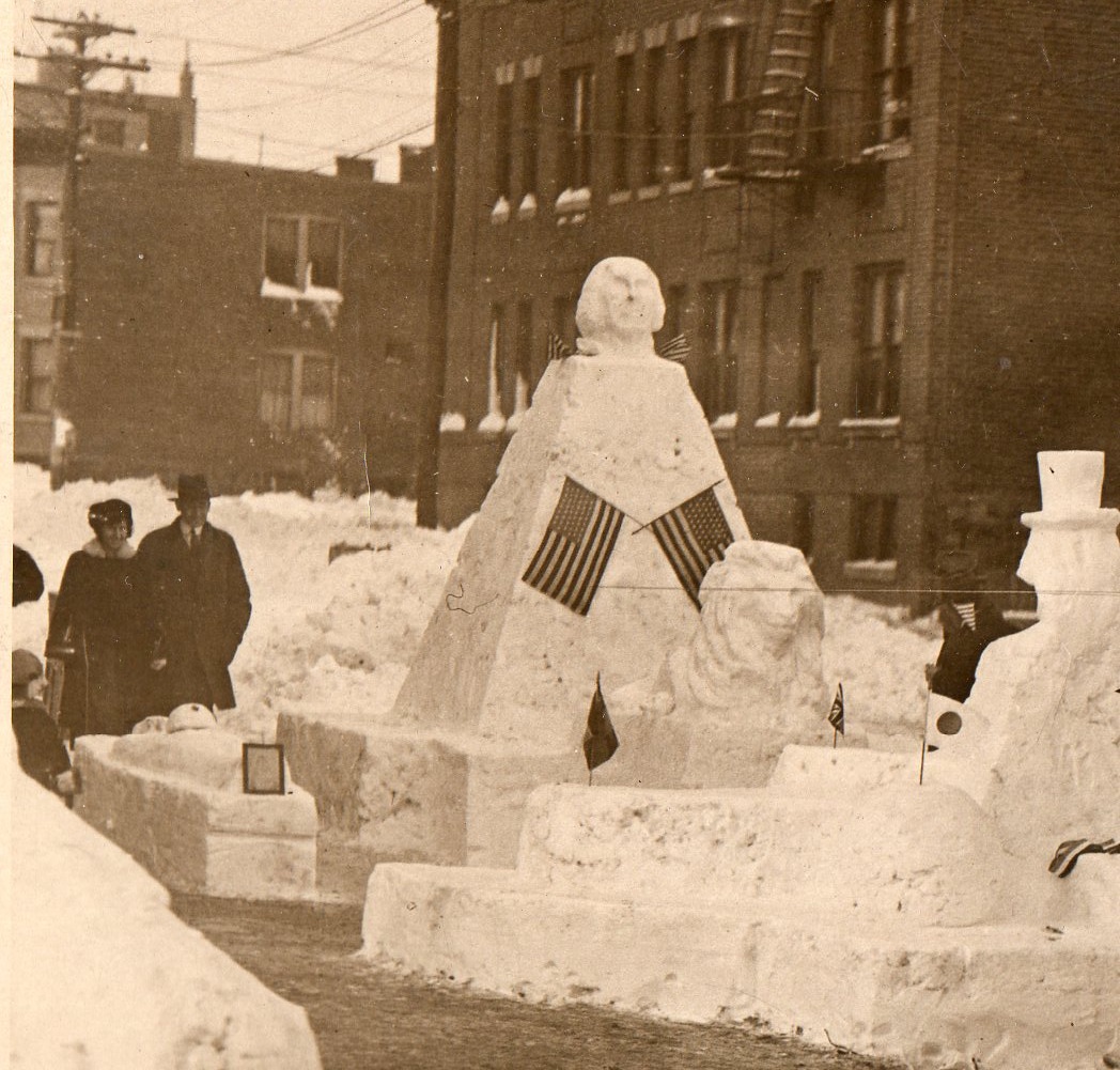
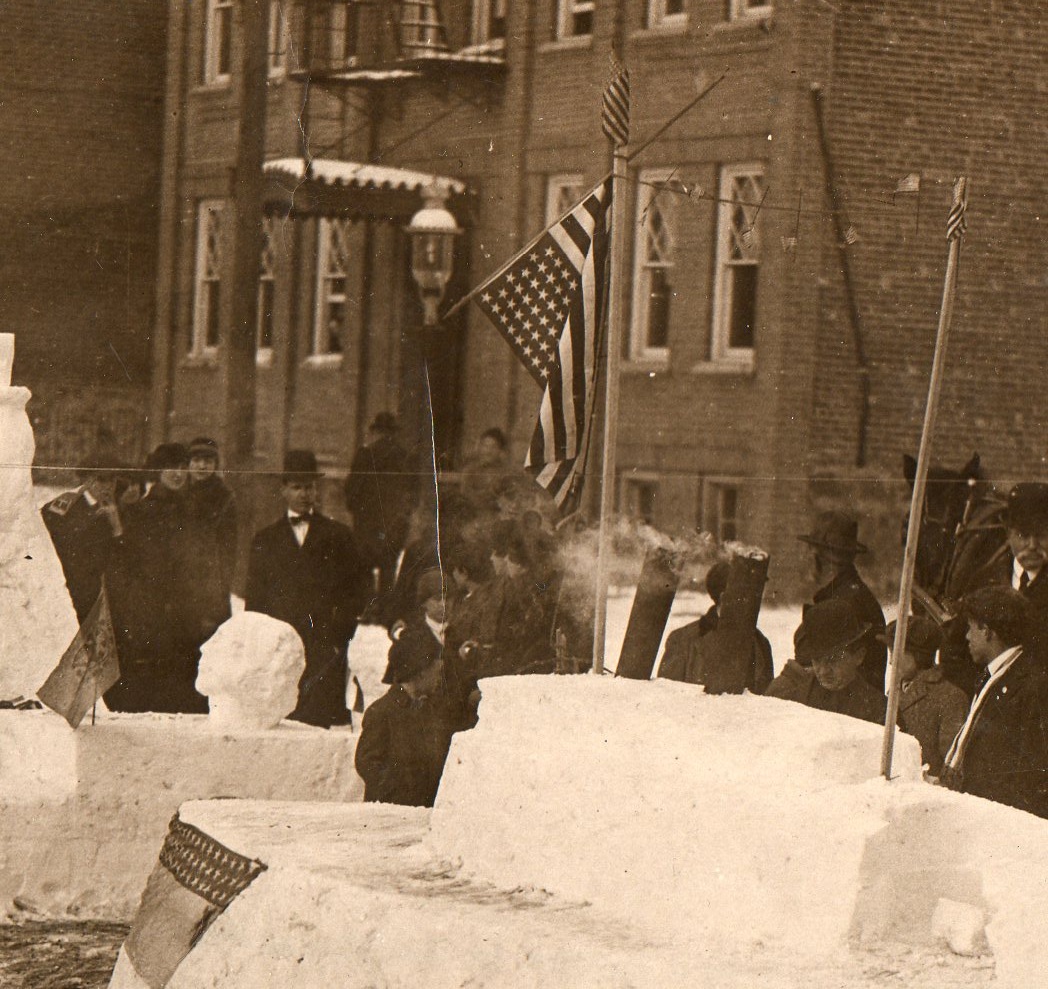
    This news photo service image–stamped “Hearst-Pathe News Agency” on the back–is frm the winter of 1917/1918 and shows a patriotic snow parade somewhere in the United States.  The snow looks prodigious, judging from the piles in the foreground and also the accumulated snow on the windowsills, and I imagine that all of the snow floats were sculpted mainly out of exiting snow in the street.  It is a delightful scene, to me, and hosts a variety of smaller, lovely images in vignette. (The original is available from our blog bookstore.) For example:

    WWI--great imagessnow parade060

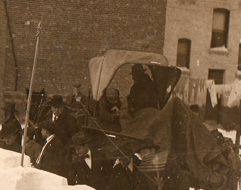
    The man in shadow and sleeping figure (boy) in the buggy complement the white-mustachioed bowler-wearing man to the left; the men looking on in the foreground are interesting, too–plus there’s that laundry in the background.  Given that the laundry is out (and wasn’t just left out during the storm) and that no one seems to be particularly bundled up against cold, I’m going to guess that there was a break in the weather that pushed the temperature higher than normal, with almost everyone taking advantage of the warm snap, as people do everywhere, all the time.  I also like the tiny American flag on the tall pole at left.

    And so:

    WWI--great imagessnow parade061

    And again:

    WWI--great imagessnow parade062
    I’m not sure what the flag is on the side of the Dreadnought, and it seems as though someone has stoked a small smoking fire in the metal tubes functioning as the ship’s smokestacks–a nice touch!

    Also I like this quickly-produced oil painting version of the photo–I knew that there was a very nice overall composition to the image, but really couldn’t find it until I did this:

    WWI--great imagessnow parade  OIL 059

    ·Posted by :

    ·in:

  • A Note on Alchemy and Gravitation

    Belief systems like alchemy and intelligent design have dialogues of persuasion; the sciences on the other hand explain rather than persuade.

    I’m not sure why this hasn’t occurred to me before, but there is a crucial element of Paracelsian philosophy and alchemy that is sort of correct, in a way. The map of the universe that they sought to drawn on the human body to represent the macrocomos in the microcosmos, the influence of the stuff of creation on our daily life, was correct in a way that they hadn’t suspected. And it was brought about by a man who vigorously pursued alchemy for decades, hoping that it would provide a link to the vast pool of somethingness that he didn’t yet have answers for, as well as the questions he didn’t yet know that he wanted to ask.

    Newton had abandoned alchemy completely by 1696, nine years after the publication of his Philosophiae Naturalis Principia Mathematica, the great “external” influence of the universe coming to bear on humans on earth. The alchemists would be shocked perhaps by this connection, and I’m sure that what they were looking for wasn’t that physical bodies attract with a force proportional to their mass as a consequence of the curvature of spacetime which governs the motion of inertial objects, let alone that it was one of four fundamental forces.

    But the alchemists were on the road to someplace, just not the Royal Road. I imagine too that transmutation must’ve taken it squarely on the chin in 1818, when Berzelius published his findings of the atomic weights of 45 (of 49) known elements, showing that atoms (thank goodness we did not call them “seeds” like some) existed and the elements were entirely different…meaning that the very basis for transmutation was removed, that mercury could never be made into gold, owing to the differentiation of the nature of the elements themselves. That must’ve been a crushing experience, making alchemy a harder persuasion to perpetrate.


    ·Posted by :

    ·in:

  • An Elementary and Perhaps Useful Cheat Sheet for Names of Big Numbers

    JF Ptak Science Books

    I thought to include this little cheat sheet for the names of large numbers—I didn’t know the name for some big number, and had to go and find it. Here’s a bunch that I cobbled quickly together to serve as a recipe should you ever need a big-number-name and not know it.  I’ve only used the modern American and British versions of these names, and I’ve avoided numbers that just won’t work for me here (as I’m just looking for simple stuff) like

    10^{10^{10^{10^{10^{1.1}}}}} (~ googolplex1,941,887,670,000), (years),  which is the “scale of an estimated Poincaré recurrence time for the quantum state of a hypothetical box containing a black hole with the estimated mass of the entire universe, observable or not, assuming a certain inflationary model with an inflation whose mass is 10−6 Planck masses.”  so says University of Albert physicist Donald Page, quantum cosmologist and Stephen Hawking co-author. 

    A googol is already a big number at 1×10100; a googolplex is terrifically larger, being 10googol,  or. 10(10100).

    I’ve left out almost everything, actually, including the beautiful numbers from ancient India, including the sublimely-named “untold” as exactly 1010*2122  appearing in Bodhisattva‘s maths in the Avataṃsaka Sūtra..

    Hindu theology incorporates spectacular leaps of time, numbers which jump geometrically, reaching ever greater heights, describing a small part of a small bit of teh beginning of the Cycle of Brahma.  (See far below.)

    I’ll save the suspense—the largest number identified here is 1×10^3003, which is a millinillion, and it looks like this:
    100.000.000.000.000.000.000.000.000.000.000.000.00 0.000.000.000.000.000.000.000.000.000.000.000.000. 000.000.000.000.000.000.000.000.000.000.000.000.00 0.000.000.000.000.000.000.000.000.000.000.000.000. 000.000.000.000.000.000.000.000.000.000.000.000.00 0.000.000.000.000.000.000.000.000.000.000.000.000. 000.000.000.000.000.000.000.000.000.000.000.000.00 0.000.000.000.000.000.000.000.000.000.000.000.000. 000.000.000.000.000.000.000.000.000.000.000.000.00 0.000.000.000.000.000.000.000.000.000.000.000.000. 000.000.000.000.000.000.000.000.000.000.000.000.00 0.000.000.000.000.000.000.000.000.000.000.000.000. 000.000.000.000.000.000.000.000.000.000.000.000.00 0.000.000.000.000.000.000.000.000.000.000.000.000. 000.000.000.000.000.000.000.000.000.000.000.000.00 0.000.000.000.000.000.000.000.000.000.000.000.000. 000.000.000.000.000.000.000.000.000.000.000.000.00 0.000.000.000.000.000.000.000.000.000.000.000.000. 000.000.000.000.000.000.000.000.000.000.000.000.00 0.000.000.000.000.000.000.000.000.000.000.000.000. 000.000.000.000.000.000.000.000.000.000.000.000.00 0.000.000.000.000.000.000.000.000.000.000.000.000. 000.000.000.000.000.000.000.000.000.000.000.000.00 0.000.000.000.000.000.000.000.000.000.000.000.000. 000.000.000.000.000.000.000.000.000.000.000.000.00 0.000.000.000.000.000.000.000.000.000.000.000.000. 000.000.000.000.000.000.000.000.000.000.000.000.00 0.000.000.000.000.000.000.000.000.000.000.000.000. 000.000.000.000.000.000.000.000.000.000.000.000.00 0.000.000.000.000.000.000.000.000.000.000.000.000. 000.000.000.000.000.000.000.000.000.000.000.000.00 0.000.000.000.000.000.000.000.000.000.000.000.000. 000.000.000.000.000.000.000.000.000.000.000.000.00 0.000.000.000.000.000.000.000.000.000.000.000.000. 000.000.000.000.000.000.000.000.000.000.000.000.00 0.000.000.000.000.000.000.000.000.000.000.000.000. 000.000.000.000.000.000.000.000.000.000.000.000.00 0.000.000.000.000.000.000.000.000.000.000.000.000. 000.000.000.000.000.000.000.000.000.000.000.000.00 0.000.000.000.000.000.000.000.000.000.000.000.000. 000.000.000.000.000.000.000.000.000.000.000.000.00 0.000.000.000.000.000.000.000.000.000.000.000.000. 000.000.000.000.000.000.000.000.000.000.000.000.00 0.000.000.000.000.000.000.000.000.000.000.000.000. 000.000.000.000.000.000.000.000.000.000.000.000.00 0.000.000.000.000.000.000.000.000.000.000.000.000. 000.000.000.000.000.000.000.000.000.000.000.000.00 0.000.000.000.000.000.000.000.000.000.000.000.000.

    000.000

     And the rest (I’m sorry to say that one cannot make columns in typepad posts):

    106 Million

    109 Billion

    1012 Trillion

    1015 Quadrillion

    1018 Quintillion

    1021 Sextillion

    1024 Septillion

    1027 Octillion

    1030 Nonillion

    1033 Decillion

    1036 Undecillion


    ·Posted by :

    ·in:

  • Why I Like Pictures

    JF Ptak Science Books  Post 1369
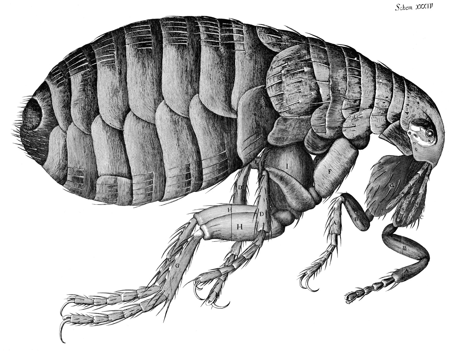
    Hooke--flea


    Printed images are interesting in that they exist at all, at least in pre-modern (ca.1900) times. When you think of the total amount of time that humans have been thinking–like the possibilities of all total ideas for all people for the past, say, 10,000 years—and think about the 10×10^9 neurons firing for everyone all the time, and the numbers of books and pamphlets and journals and such printed before 1900, the access to the archive of the human condition looks a little paltry compared incomprehensible amount of good thinking that has gotten away. (Humans haven’t helped themselves all that much in this regard, given the deep, long, wide history of the planned destruction of libraries throughout time.) 

    There are more stars than books. Lots more—10^22 stars versus 1.3×10^8 books (or the stuff that an odd Google study classified as “books” for their scanning and advertising appetites). There’s also bacteria and other microorganisms alive in/on the human flora than books (and blood cells too for that matter). Until the 18th century (and really into the 19th) the practical means of producing a book were set to restrictive, upper-class access. For most of human history the ability to even record a thought on transportable material was a deep issue; getting it reproduced somehow was extraordinarily difficult, especially if you belong to the not-yet-existent working class. Even if we just consider works that are 1455-1800 era the illustration was not a common thing, which is odd to me since it seems the image could show in less space what was being described in the text (and for argument’s sake here we’ll just say that production facility for the illustration and a page of text were equal). I have a funny feeling that if you weighed all of the pages of text against all pages of illustration in all books published from1455-1800, illustration would be enormously, fabulously outweighed.

    Which is why in my mind “pictures” are so interesting—they are rare, and so that when they were published they were deeply considered objects.

    All this changes though in the nineteenth century when production facilities increase, costs go down, the finished product is available more cheaply to a growing class of people who work for a living and have a disposable income. Newspapers and magazines begin for real in this century, paper costs go down, ability to print at high speeds goes up, and suddenly there exists an addition to the concept of “disposables” —information commodities. For the first time a mass of material is produced to be replaced in the next day or week, disposable reading material. There are more images reproduced and distributed in this century than in the entire history of man on earth. Of course all of this look like nothing, today, now that almost everyone in the U.S. (at least) can be their own publisher/producer of original or found work, which means of course that people in 2086 will look back oat our abilities as we do on the 19th century. And so it goes.

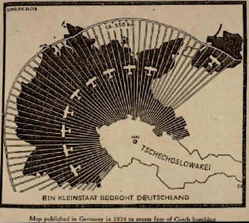
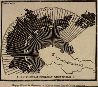
    This is why I like pictures—they’re comparatively rare, and the tell as much of a story as you will allow. I enjoy scientific and technical images as much as anything, for their dreamy amount of detail and revolving possibilities of 3-D display and such; maps too, for pretty much the same reasons (and that one usually doesn’t memorize them, at least not the detailed ones). Of particular interest on this blog has been maps-with-a-purpose, particularly  cartographic propaganda, like this 1937 Nazi-published map showing the “danger” posed by the Czechoslovakian air force to Germany.  Blog jan 3 czech airIt is a graphic representation of the Big Lie, an element of design intended to transmit an idea to a reader who really doesn’t need to do so, being able to get the idea of the the data being presented in the map in one quick visual.
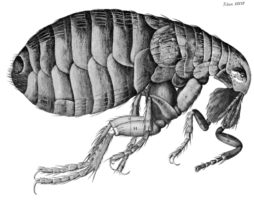
    The scientific images demand that you see the difference with what came before to truly appreciate them—one of my favorite examples of this is Robert Hooke’s engraving of a magnified flea. The microscope was brand new, and this image, which appeared in Hooke’s magisterial,epochal work Micrographia1, presented as much of a new world to people in 1665 as Galileo’s reporting in Siderus on the massive number of new stars that he had seen with the telescope he used to look up rather than just across. People would have had no idea that such a magnificently detailed creature such as this flea existed, as they simply couldn’t see it. Same too for the stars, which (with the exception of Brahe’s Nova and such) had been seen to be “perfect”, an harmonious fixed number, though a relatively simple innovation using materials that had been around for centuries brought a new world to bear. (One is tempted to say that in his new, massive book that Hooke included “only” 38 images; but one has to remember that Hooke did all of the drawings by himself, and actually rushed the book into print as he sensed a market for it which combined nicely for his need for money..Hooke was correct about the market for the book.)

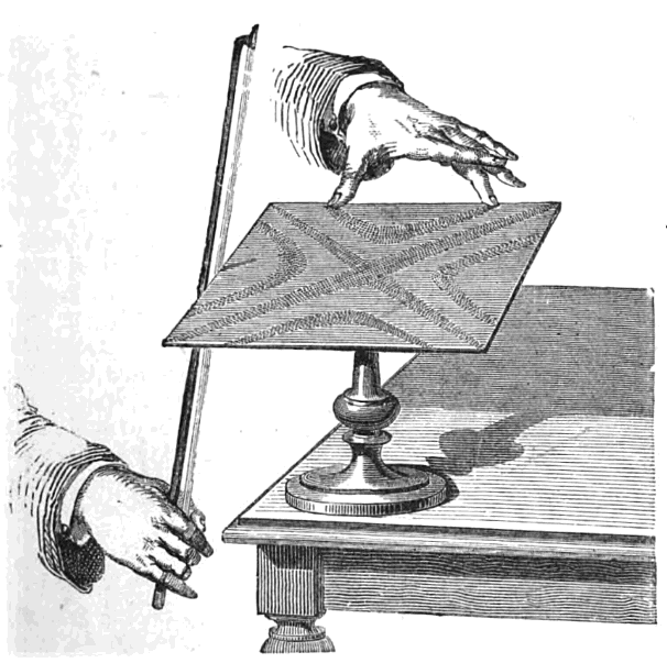
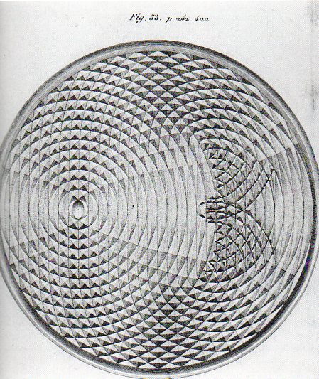
    The purpose of some scientific images are difficult to identify when faced with them for the first time and out of context, but once rectified they can be beautiful renderings of complex relationships, like Ernst Chladni’s patterns of vibration revealed to us via sand on metal plates (in his Discovery of the Theory of Pitch, 1787), and the Weber brothers’ exacting drawings of wave forms  (from 1825) (and shown below, respectively).
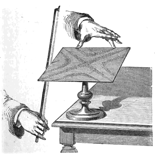
    Bowing_chladni_plate

     
    Adding mercury to mercury: the sensational drawings by the Weber brothers as they observed the changing wave fronts made by a drop of mercury into a pool of mercury:
     
    Weber acoustics461

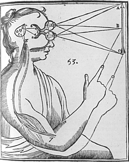
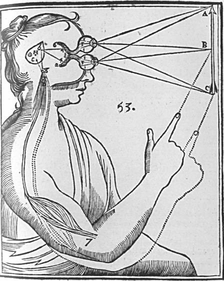
    Rene Descartes depicted the interpretation (in his  Principles of Philosophy of 1644) of light and its physiological reaction in the brain in this iconic image, as follows:
    Cartesian_Vision

    the lines of sight depicting binocular vision, observed (and compressed) by the eye’s “particles” and processed by the pineal gland which in turn manipulate the “fluids” in the control of nerves and muscles. 

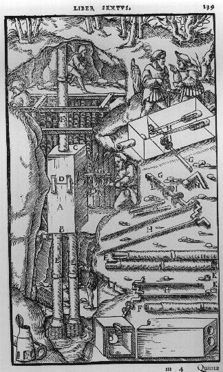
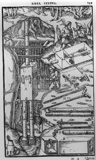
    Agricola’s De Re Metallica (from the first Latin edition f 1556) displays many interesting cross sections of Renaissance mines:
    Agricola

    There is so much more, and it may be possible that there were millions of pages of illustrations during our time period.  Harvey’s demonstration of the flow of blood in the human body pictured by fingers and a forearm (in his On the Motion of the Heart and Blood, 1628), Descartes’ analysis of how the human eye “sees” (An Analysis of the Eye, 1637), Agricola’s cross sections showing how to construct mines (1556), Scheiner’s illustration of the apparatus he built to observe sunspots (1611),  Borelli’s study of the mechanics of the human body (1680), Rosalind Franklin’s x-ray photograph of DNA (used by Watson and Crick to depict the structure of DNA), Thomas Young’s illustration of light-wave interference (1803)

    Then there are the pictures of the interior of the Fizeau apparatus as it captured the velocity of light so:
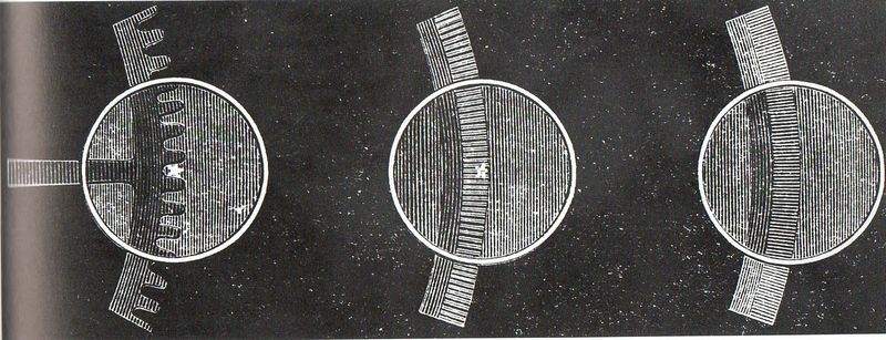
    Aaa-light fiz gears158


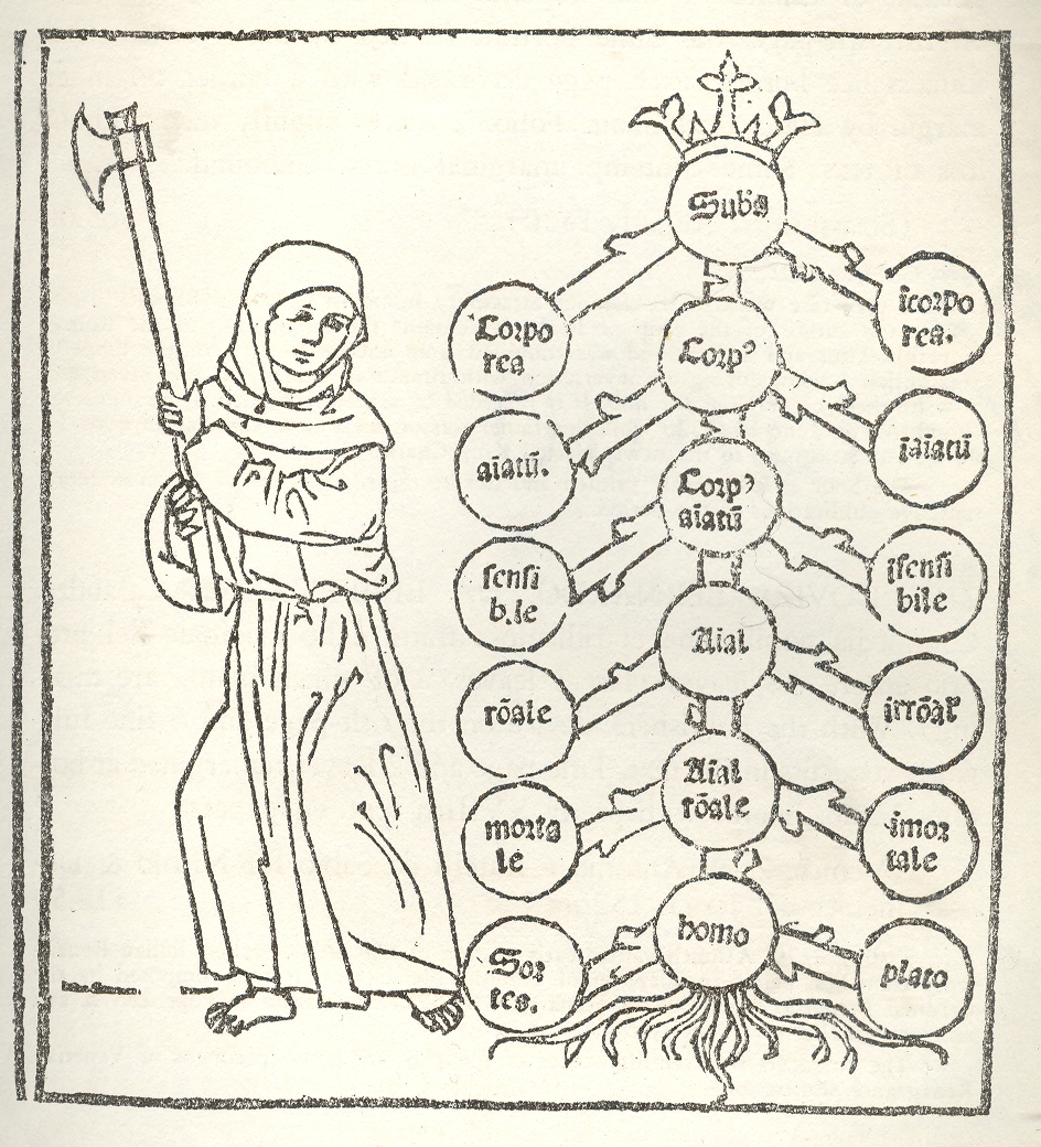
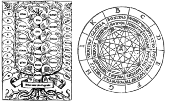
    Classifying images, like this of Porphyry’s (logic) Tree and Raymond Lull’s diagrams of life and decision, are in constant appearance for centuries, excellent ways to provide method and organization to large quantities of information and for problem solving. While not exactly a generator in the sense of Jorge Borges’ Library of Babel or Jonathan Swift’s take on Lull’s writing machine, the antiquarians did produce very interesting, elegant, beautiful ways of story information and ordering information.  The Tree of Porphyry is far more concise–an abbreviation–compared to the infinitely expanding hexagonal rooms filed with books and attendant librarians in  Borges’ universe. 
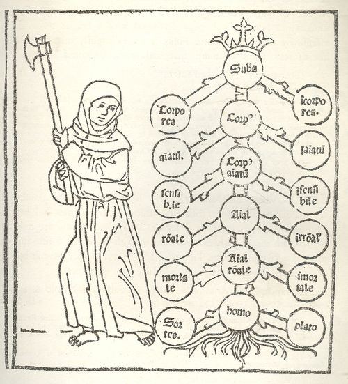
    1--logic tree

    The Ars Magna/Thinking Machine of the 13th century Lull (also known as Ramon, Raimundo and Raymond, Raimundus and Raymundus Lull, Lully and Lullus and Lulio), was the ultimate organizer of how sentences can be made and knowledge produced/uncovered (particularly if you want to please the logic of the church and the Creator), and which was also written about, described and worried-over by Borges.  There are many other early figures in this category to be sure (Lewis Carroll, William Jevons, and even in a way Mr. Venn, not to mention Leibniz and his calculator,  and all of the changes in scientific method and (English/Dutch) mathematical concentration on applied mathematics of the 17th century that made thinking about the industrial revolution possible.
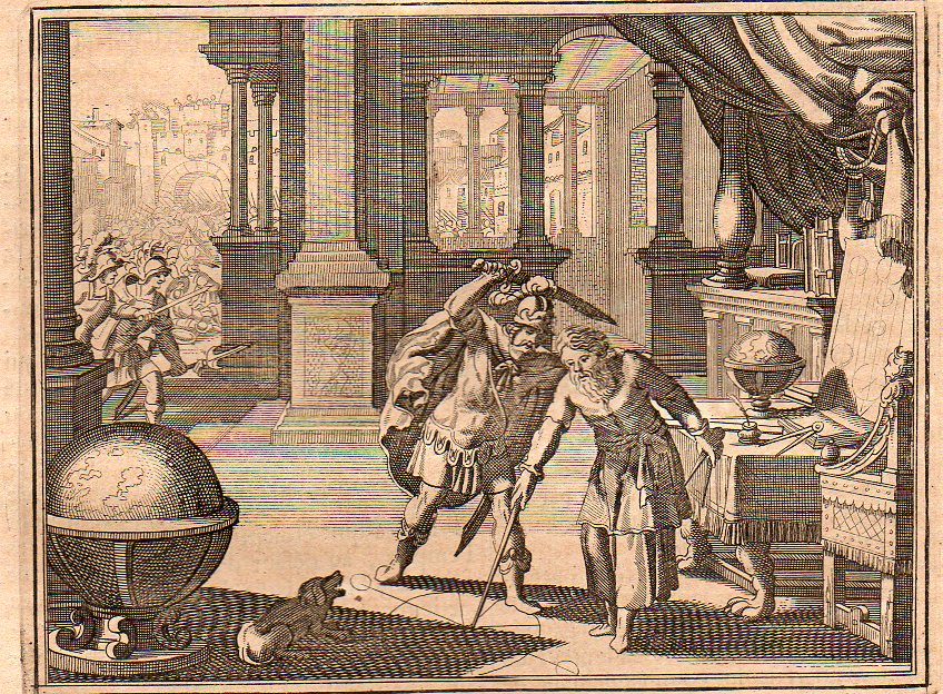
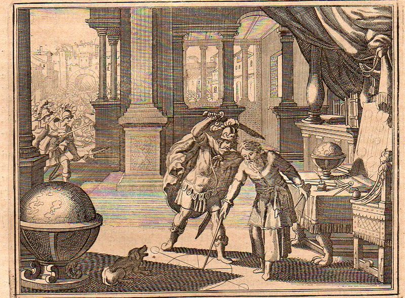
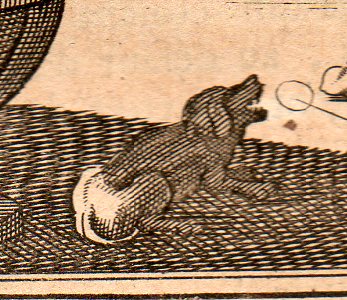
    Images of ebb and tide, of cause and effect, of bones inscribed in clouds and solids manufactured of gas, of the steps of discovery, of the integral drawing of the integral pieces, of cross sections detailed enough so that you too could build your own locomotive, or guide yourself through a paper transverse dissection of the human brain–this is the great essence of images. It is interesting to look at these things forensically, to identify all of their components and articulate the symbolism, to look at the image cautiously, judiciously–sometimes this just results in insights into the artist who may have been tired and was working through just another piece of drudgery and tried to make their work a little more entertaining.  This doesn’t add much to the understanding of the event, but it does give the scene a fullness,  like, for example in this image of the killing of Archimedes from  Histoire Universelle published by the ubiquitous Peter van der Aa in Amsterdam at the turn of the 18th century–it falls in line with many of its comrades of this event  in that it depicts the tragedy in the second before it occurred.  One thing it has that other scenes do not–a barking dog.  Maybe it belonged to Archimedes, maybe not.  But there was a dog depicted here, and it was barking at the scene, probably barking at the man about to stab the mathematician, which means it would’ve been the mathematician’s dog.  But Archimedes certainly didn’t hear the dog if he couldn’t be interrupted by the battle outside his door or the Roman who yelled at him to turn.
    Archimedes 1705348 

    Archimedes dog 1705349


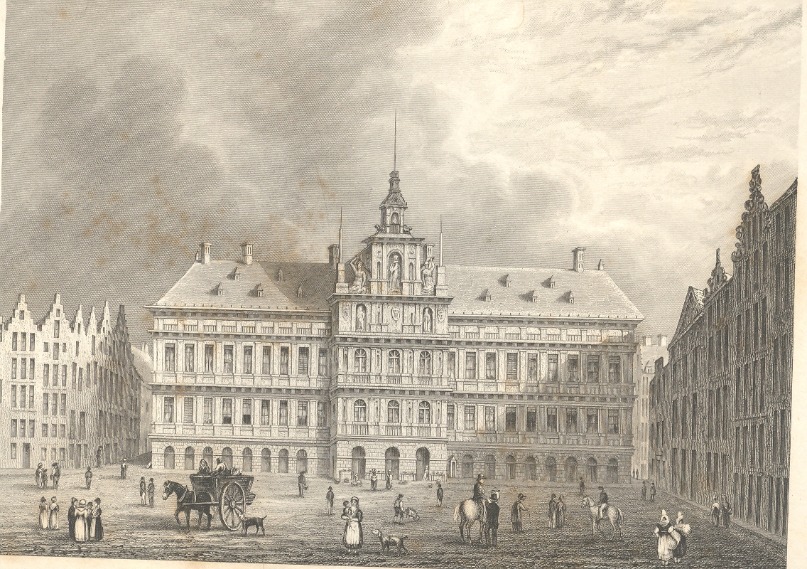
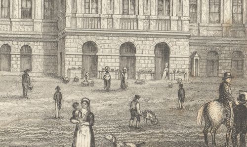
    This blog is written and illustrated around the very loose idea of “the history of ideas”, and is quite image-driven–there are probably about 5,000 pictures reproduced here now, a wide selection of illustrated thinking in the sciences and many other fields.  This includes one classifications of an image series that really don’t exist—I mean they were images intended for one purpose but for the passage of time (and sometimes removing them from context) they become something completely different, entirely new, providing unintentional insights into their artists and times.  I find exploring in images this way to be fascinating, noticing the semi-hidden and/or unnecessary, extravagant, extra-necessary bits that were intentionally placed by the artist, as in this example of Archimedes’ dog, or with the characters that are sometimes found as “filler” and which are basically wholly unrelated to the intention of the illustration.  For example in this application of the imaginary forensic arts microscope, we see this series of pictures of a standard view of the town hall of Antwerp; but what we see advancing under magnification is a very interesting set of occupations displayed in absolutely minute detail.

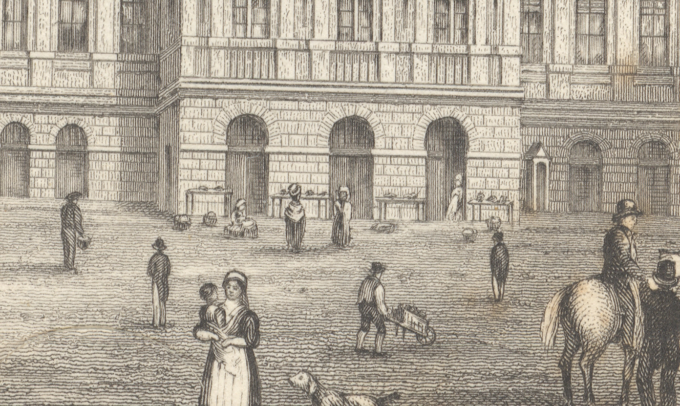
    First, the majority of the engraved image, followed by a close-up of the center of the building (the three doorways), and then by a closer view still of doorway three:
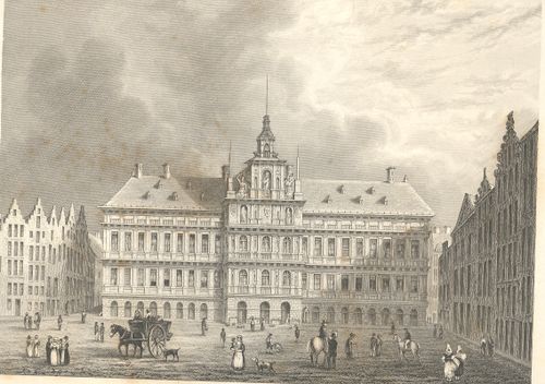
    +++looking closely

    +++looking closely detail

    The truly interesting bit here is barely observable in the original; but, under magnification, we see a very rich and minuscule “engraved photograph” of a slice of daily commerce and street life in Antwerp.  If you look at the central entrance to the town hall you can see three main (and large) doorways, and if you look clos+++looking closely detail2er still, you’ll see something leaning against the portal at right.
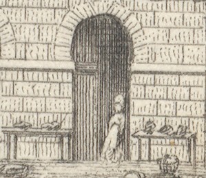
    Extraordinarily, what the artist snuck into the original is a tiny (2mm) figure watching over several tables of her (fruits?/vegetables?) ware, waiting for a customer. There doesn’t seem to be much interest in her stuff, currently, and she has allowed herself a little relaxation, leaning against the doorway.  I’ve found this sort of extremely minor subject matter and its ephemeral connection to the larger work at hand to be just fascinating.  I wonder why such detail would be added–why would the artist, or engraver, take such care and interest in such minor visions.  Perhaps this is just what was at hand on the days the artist fleshed out his work; perhaps it was the work of the engraver, alone, incising yet another semi-boring architectural image; desperate for a little artistic activity, adding some interesting, almost-invisible touches, here and there.  Perhaps no one would ever really notice them, but whoever was responsible for adding such incredible, extra-dimensional details would certainly enjoy knowing they were there, recognized or not.

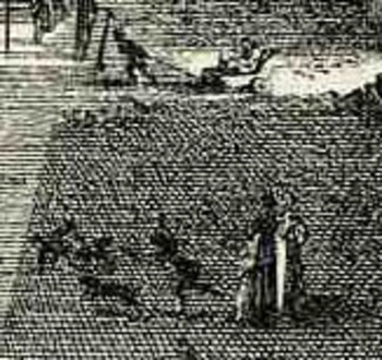
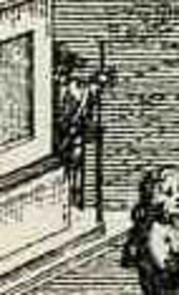
    Another good example is found in Guiseppe  Zocchi,Veduta della Piazza della SS Nunziata Statua Equeftre di Ferdinando Primo, Fonti, e Loggie Lateral,shows more good work with the possibilities of ephemeral populations, where among the many details we see an invalid being pulled in a small cart, and a half-obscured  man with a staff leaning against the back of the monument.  And of course there’s much more–you just need a little magnification to see the human element of the artwork. 
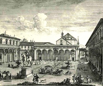
    Bloglooking_closely_1_96123

    Bloglooking_closely_1__carriage_2

    Bloglooking_closely_1__man_caneAt the end of the day one of the most enjoyable of all image classifications for me  are the classifications of image series that really don’t exist—I mean they were images intended for one purpose but for the passage of time (and sometimes removing them from context) they become something completely different, entirely new, providing unintentional insights into their artists and times. They are also on the outer-edge of being pre-Outsdider Outsider art.  One of my favorite examples in this genre is this 1941 pamphlet which isn’t so much “interesting” as it is interestingly illustrated, where all of the semi-coherent  interest resides, the text having left coherence far behind, somewhere, in it own intergalactic dust. When I first encountered it this was the only instance that I had ever seen of New York City floating in space with the Earth floating happily in the background–now I’ve collected at least three other extra-New-York-City’s-in-space in the last few years. 
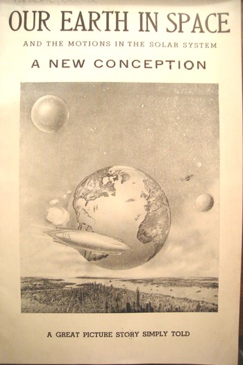
     

    Dsc04543


    This is also a nice example of extra-NYCs, where there are several other instances, balancing out the larger collection of the opposing missing-NYCs, like this 1902 example showing the city sunken and out-of-sight, disappeared under its own weight:
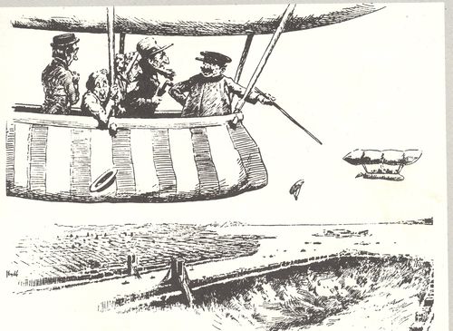
    3--nyc gone

    There’s also the sub- or  supra-category of extra-Earths department, where I have at least five other examples, including this remarkable effort by Victor Segno of Los Angeles, who in 1929 published this fantastic image depicting extra-human empty alien souls being dropped on the earth to repopulate the place after it had been cleared out by “brain waves”.

    And so I guess that would be the perfect place to exit this short appreciation of pictures. 

    ____

    Notes.

    1.  As Hooke states at the end of the 28-page introduction  to the work: …”it is my hope, as well as belief, that these my Labours will be no more comparable to the Productions of many other Natural Philosophers, who are now every where busie about greater things; then my little Objects are to be compar’d to the greater and more beautiful Works of Nature, A Flea, a Mite, a Gnat, to an Horse, an Elephant, or a Lyon.”.

  • The First Photo Inside of the Information Revolution–the Transistor, 1949

    JF Ptak Science Books  Post 1370

    Transistor 066

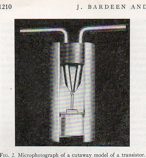
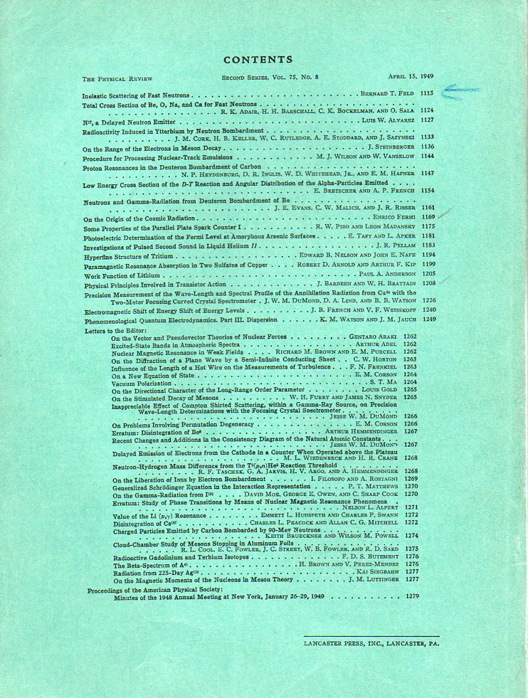
    One of the things I love about working my way through old scientific journals is when I find the issue that I’m looking for and scroll down the list of contributors to find the significant article that I want.  Long list, usually; and then, after making my way through 30 or 40 lines of tight type of the index I find it. [This by the way is one of those experiences that is being replaced by the digital library.]   Even though the paper on pp 1208 through 1226  of the 15 April 1949 issue of The Physical Review looks like any other, it is today seen as revolutionary. The entry for “Physical Principles Involved in Transistor Action” by John Bardeen (two-time Nobel in physics) and Walter Transistor 064 Brattain (Nobel ’72) shows up about halfway down the index, sandwiched in some very good company (Enrico Fermi’s “Origins of Cosmic Radiation” and a number of others), and does not show up bolded, or highlighted, or with an asterisk.  Such is the nature of publication in the academic journal world, everything delivered with equal weight. (The original publication is available for purchase here at our blog blookstore.)

    It makes me wonder though how it would’ve felt to open this journal for the first time back there in mid-April ’49, turning to page 1210 to see the microphotograph of the cutaway of a model of the transistor.  This was the defining technical publication on the transistor1, which was the first massive step towards microminiaturization and the explosive new growth in the computer, allowing far more powerful machines to be designed in far less space, in far less amounts of time, and on and on.  It is one of the first steps in the Information Revolution, moving the computer from massive racks of electronic tubes to more simple, elegant, nimble and by-far faster circuit boards with transistors (and resistors, capacitors, inductors, diodes, etc.) to make an electronic circuit.  This would be the standard for computer construction, only supplemented by Jack Kilby (TI)  and Robert Noyce (Fairchild Camera) in 1958/9 with the integrated circuit, where transistors are made smaller still and produced in groups on circuit boards rather than individually.

    The photo above shows a cutaway of the transistor, and is the first time it was published–the first photo of what was one of teh 20th century’s greatest inventions. 

    Transistor 065

    Notes

    1.  The paper was published simultaneously in the Bell System Technical Journal; Bardeen and Brattain were with the Bell Labs.  The Bell journal also contained another revolutionary paper in the same volume, Claude Shannon’s “Communication Theory of Secrecy Systems”, which is one of the most important early papers on electronics and cryptology.  (We also have a copy of this classic paper for sale at our blog bookstore site.)

Recent Posts

Archives

Categories