JF Ptak Science Books LLC Post 913
Continuing
a long, developing thread on the graphical display of quantitative data–and
especially that which uses man-made objects for comparison—is this interesting
bit from a Romanian mining publication from 1933.
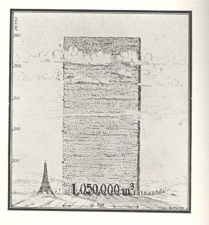
The
huge mound next to the
ten year period, a stack of wood 700 metres long and 1500 metres high. Evidently this wall has only the most rudimentary depth of a metre, as the legend reads that the volume of the woodpile is 1,050,000 metres cubed, which is the same as its square area. So somebody missed something, here, though the artist did supply some nice shadowing.
Just
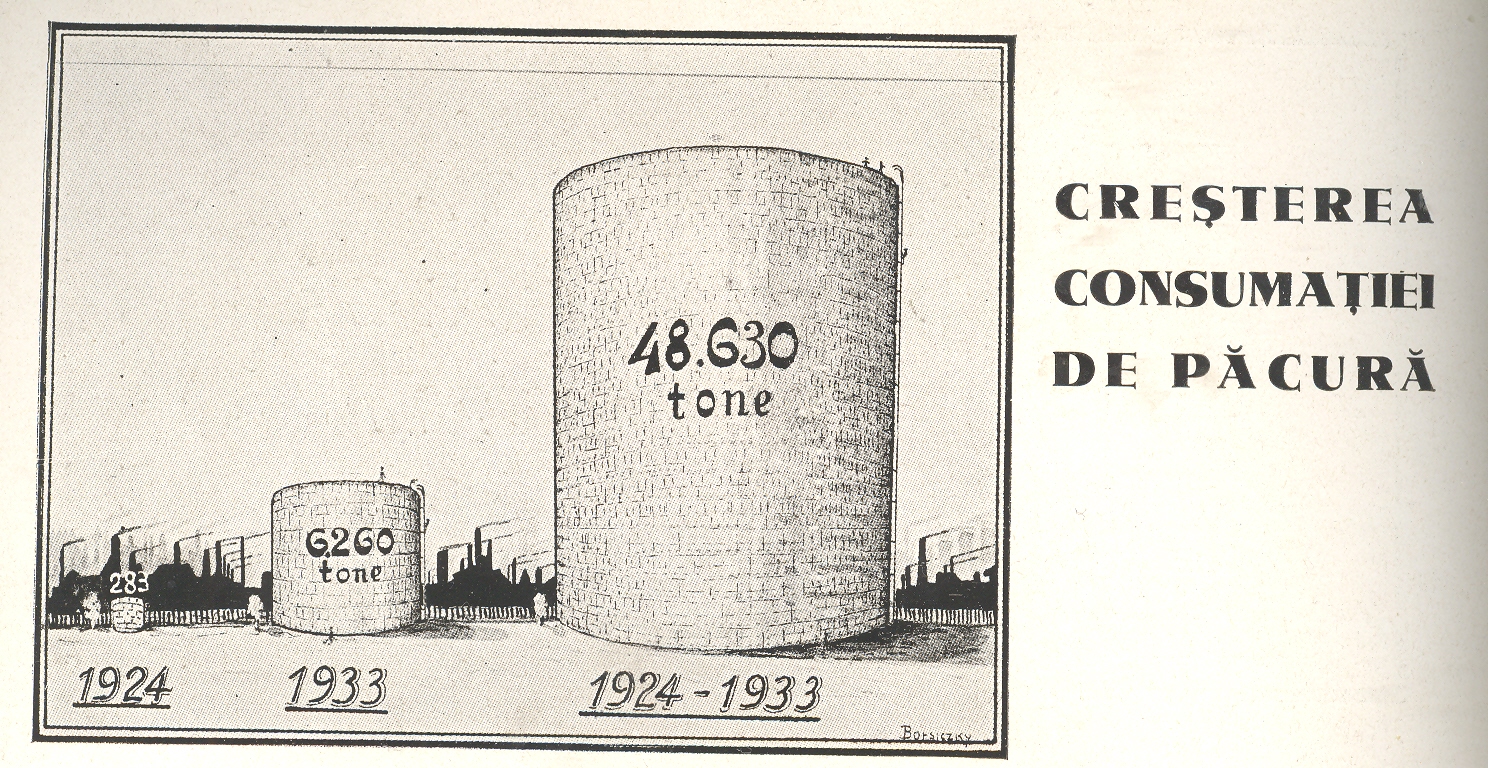
above it appeared this comparison for the amount of oil consumed over the same
ten year period
I’m
not sure why this comparison was being made.
This does come in the interwar period which saw a great expansion in
Romanian territory and a vast modernization effort following the country’s devastating
experience in WWI. Maybe it was illustrating modernization from wood-burning power/heating sources to oil-based. I really don’t know–I just liked the Eiffel Tower being dwarfed by a massively tall and impossibly skinny woodpile.