JF Ptak Science Books Quick Post
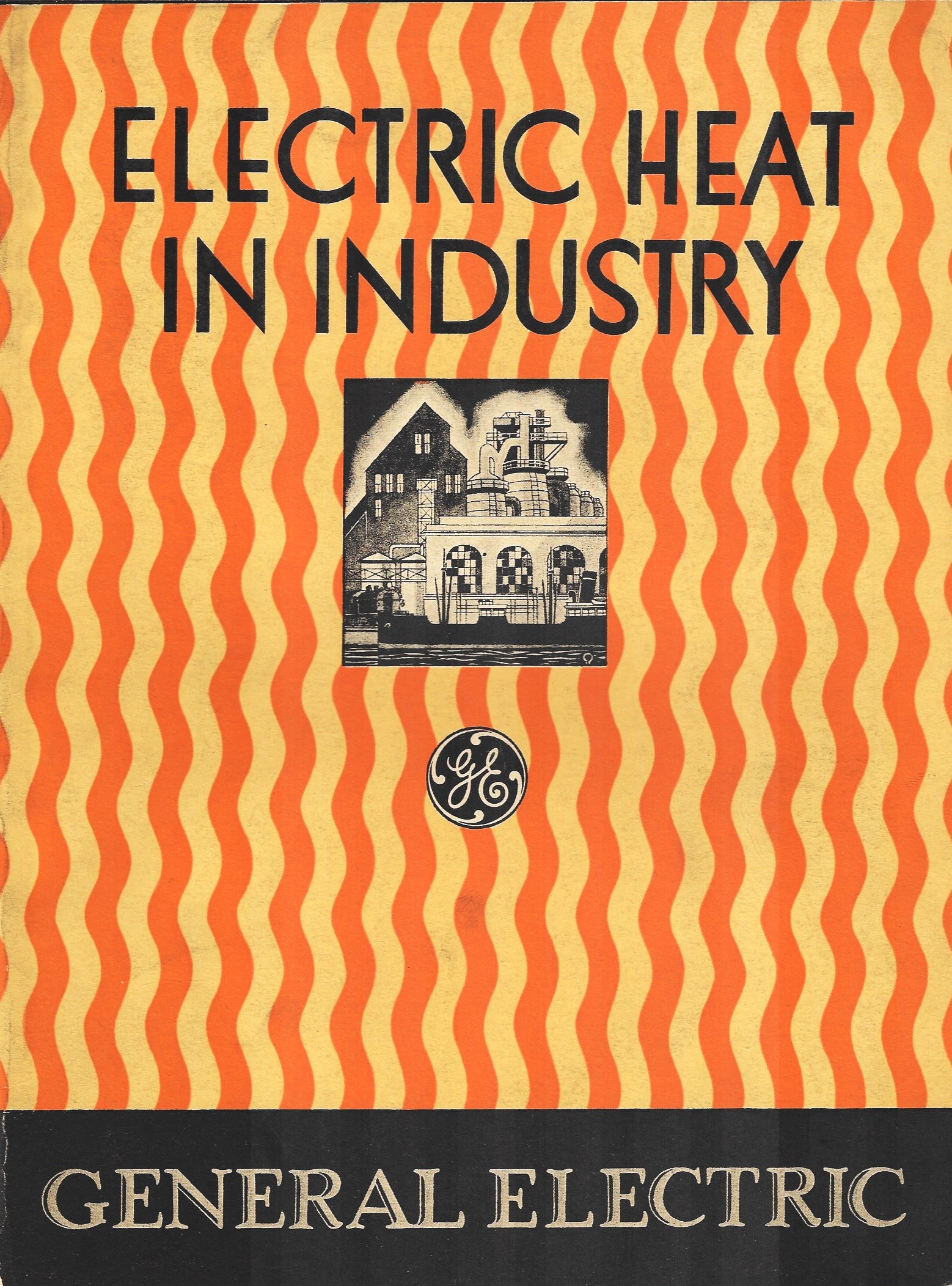
I’ve not made a study of this, but it seems to me that of the industrial-related pamphlets and manufacturer catalogs and such that I have here the majority of their covers show as big/heavy/bulky. Perhaps this is just a function of what my mind tells my brain to tell my eyes what to see, which is possible. In any event, the selection of what I’ve dealt with here on the blog over the years bears out the Heavy hypothesis.

(1941)
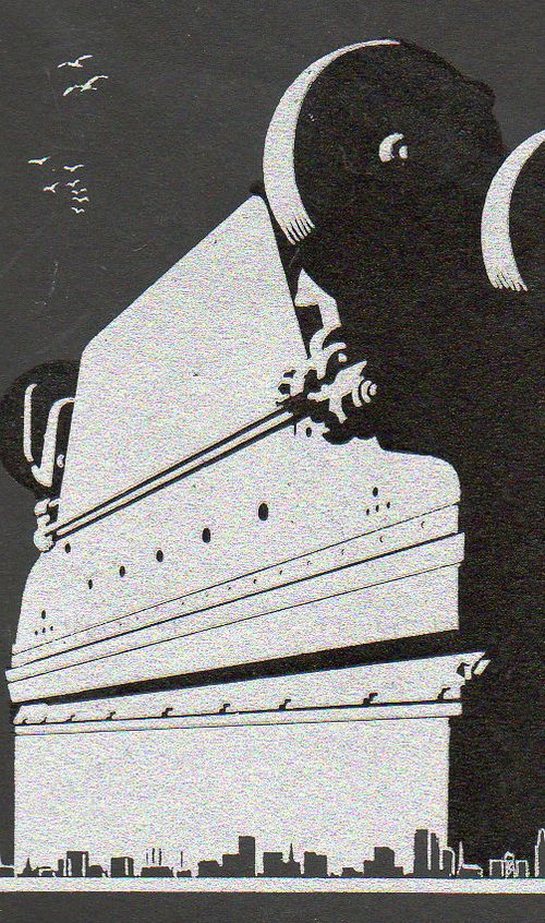
This imagery bears out remarkably well in this catalog for press brakes from 1935, with an overwhelming image of the machinery, which, when you look at it in a certain way, takes on an athropomorphic and/or utterly massive gecko-like facial persona: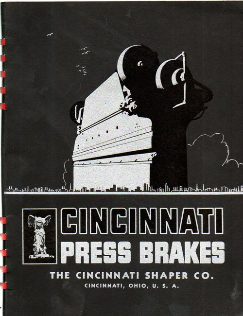
(1935)