A Daily History of Holes, Dots, Lines, Science, History, Math, Physics, Art, the Unintentional Absurd, Architecture, Maps, Data Visualization, Blank and Missing Things, and so on. |1.6 million words, 7500 images, 4.9 million hits| Press & appearances in The Times, Le Figaro, Mensa, The Economist, The Guardian, Discovery News, Slate, Le Monde, Sci American Blogs, Le Pont, and many other places… 5000+ total posts since 2008.

  • A Scientific/Industrial Vision of the Future City (1842)

    JF Ptak Science Books  2723

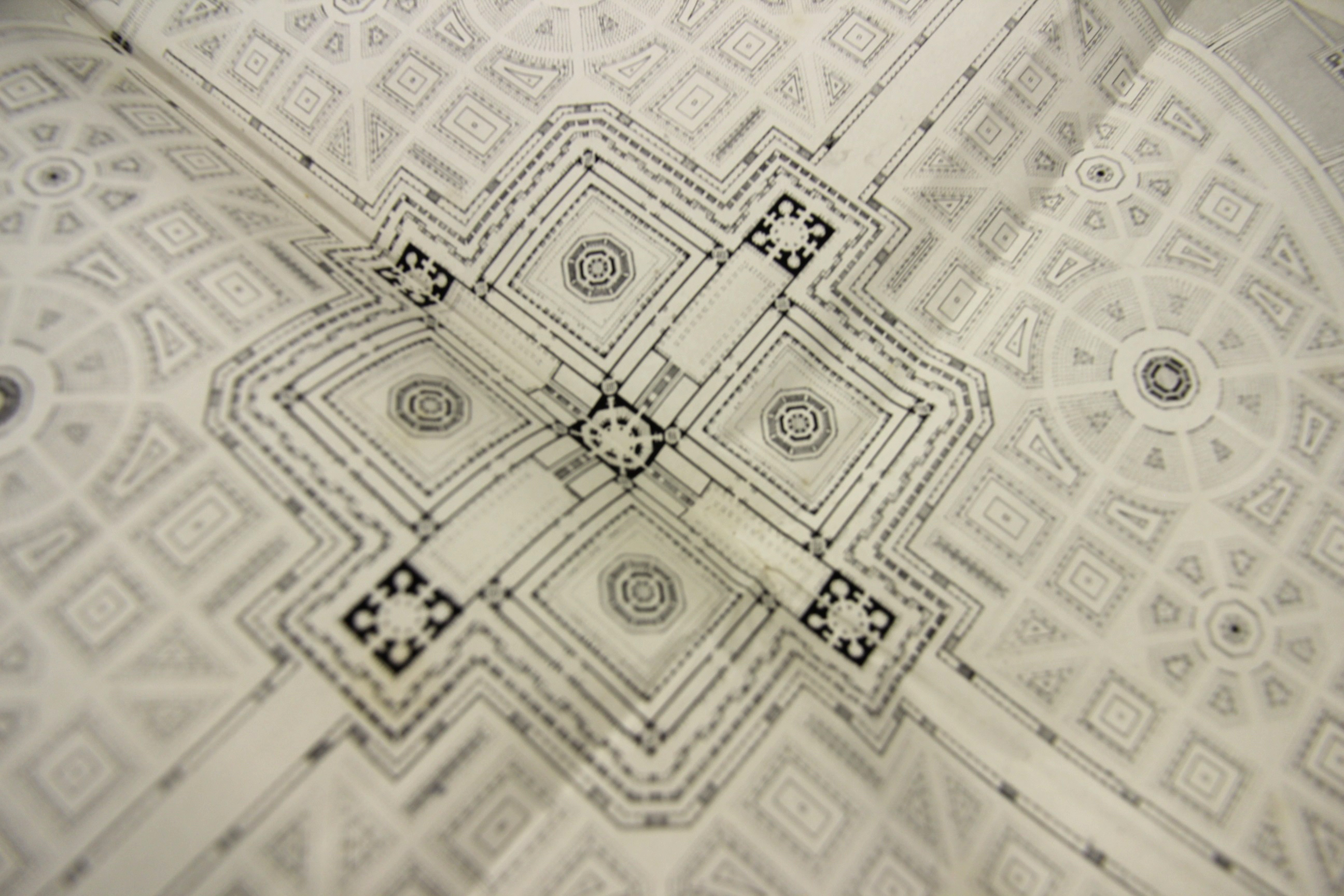
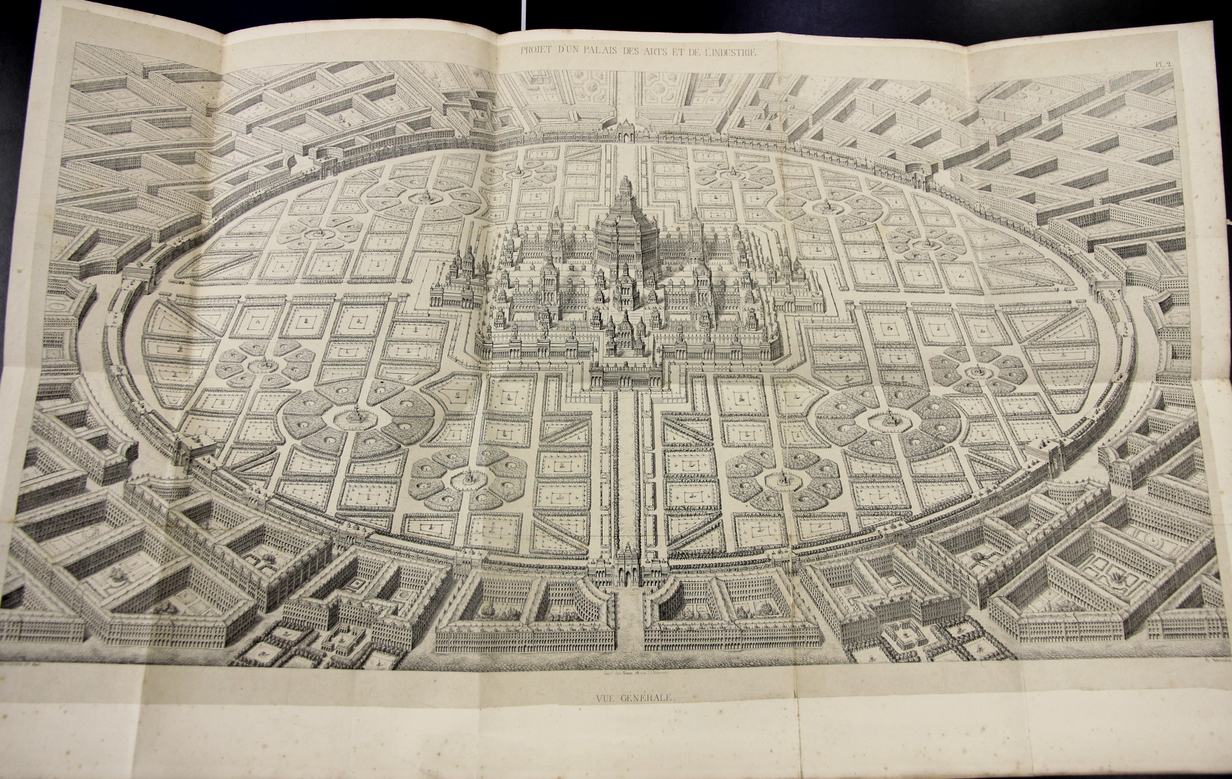
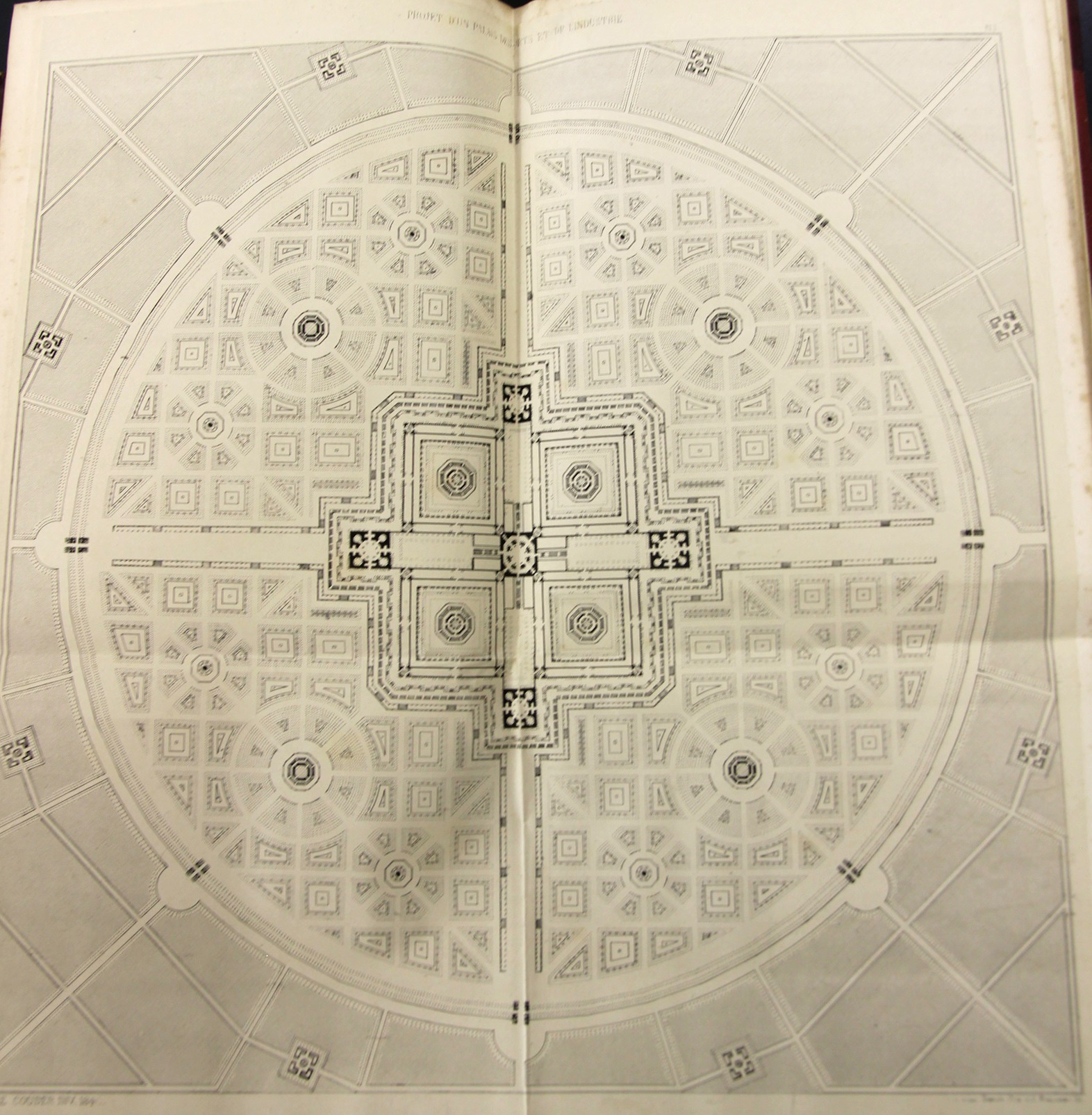
     Amédé Couder wrote L’Architecture et l’industrie comme moyen de perfection sociale, a fine work that was published in Paris (by Brockhaus et Avenarius) in 1842.  The work presents Couder’s rather stroing visionary plans for a perfect city of industrial and scientific harmony, laid out in suggestively-fractal harmony, with the suggestions of a Renaissance-laden snowflake design. Whatever it was, it was beautiful to look at, at least on paper, though I’m not so certain that I’d care to live in the canyonlands of stone and shadow on the other side of the garden wall of the perfect scientific-industrial conclave. 

    Couder 1

    Couder 2 detail

    Couder 5

    ·Posted by :

    ·in:

  • The Effigies of Sidney Greenstreet, The Beaver, and Raymond Loewy: from B+W to Color (1944)

    JF Ptak Science Books  Post 2723

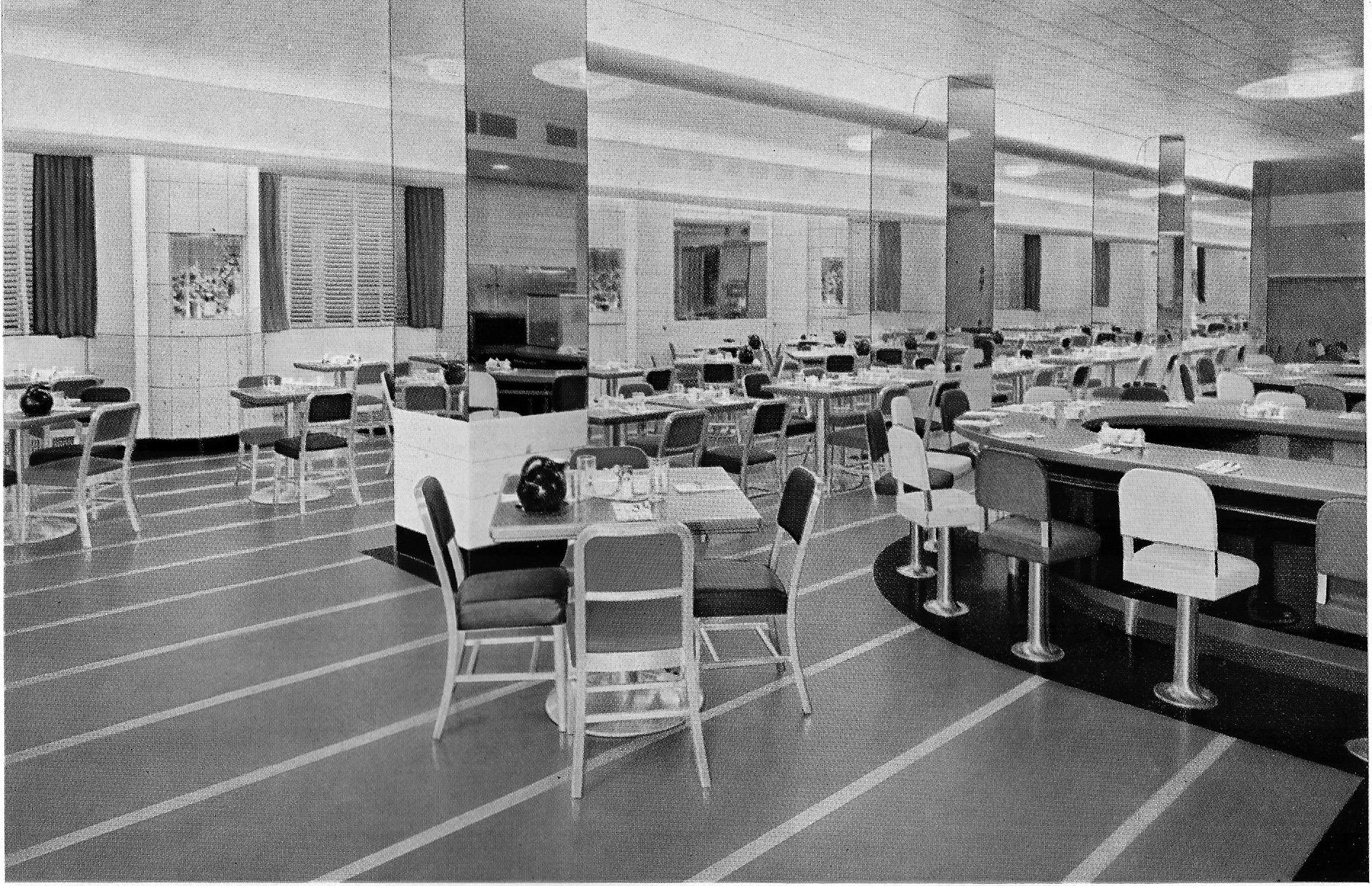
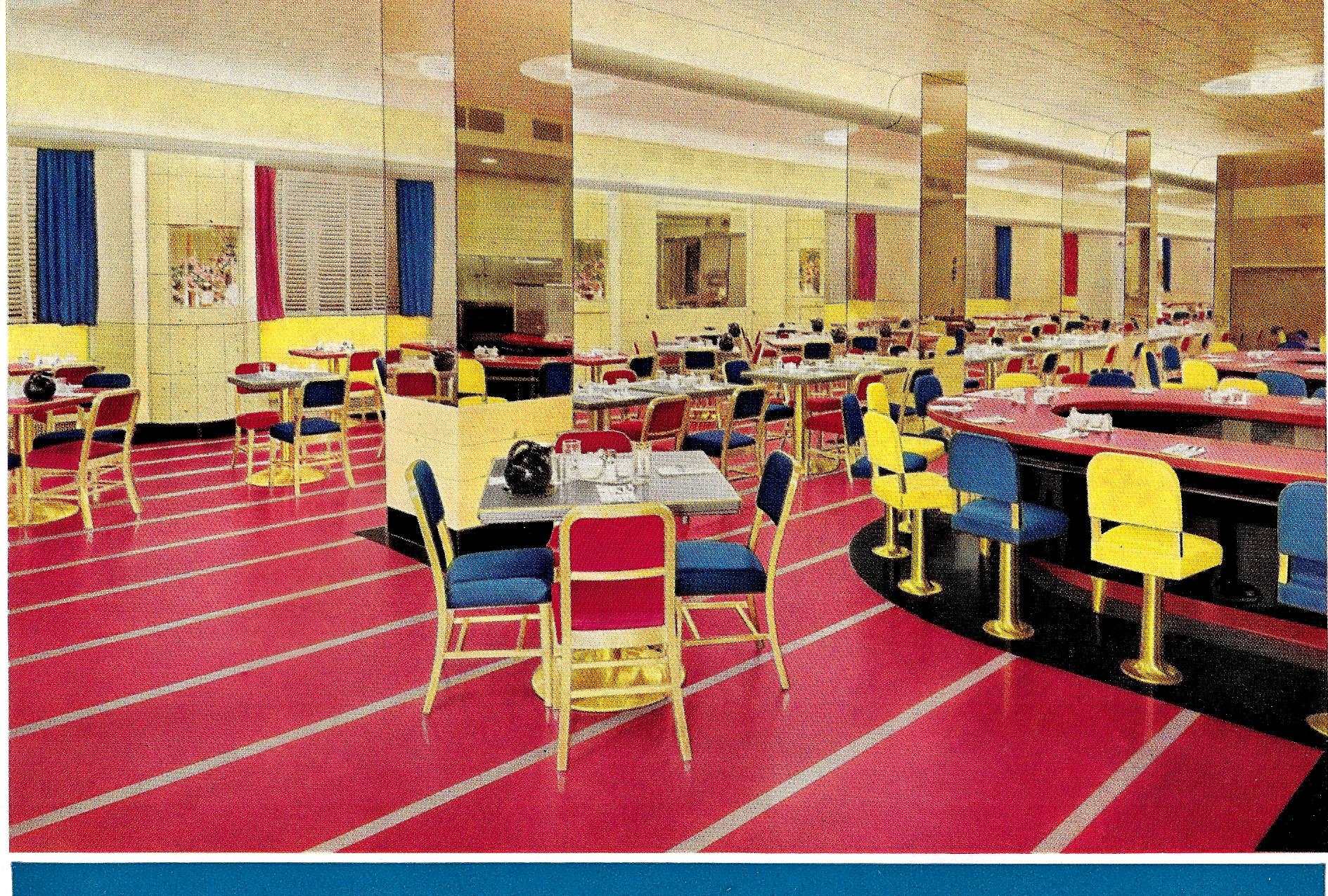
    Here’s another in this series of fabulous color in 1930’s and mid-1940’s designs, and the third from the Armstrong Cork Company and their sales pamphlets for their linoleum flooring (Better Floors for Better Business, printed in Lancaster, Pa.).  As I’ve said earlier, it is somewhat jarring to see these designs in color when we’re so trained from the pre-color movies to see them in all of their tremendous facets of black & white mixes. It is hard to think of Sidney Greenstreet gliding across a room or through a restaurant that is bathed in nothing but shades of gray, when in fact he could’ve been wearing a brilliant plum-colored suit and moving across a flaming red floor. And in this case, with Armstrong, they did indeed make flaming red flooring–and in stark contrasts with yellows and blue designs.

    So I decided this time to take five examples of these designs and contrast them in color and then in black and white–it is an interesting little exercise in expectation and what our heads have been trained to see in old films. (All of the color images are as found in the Armstrong catalog–no enhancement.)

    So, for example, the Hotel Pennsylvania coffee shop, NYC (a Raymond Loewy design!), as expected:
    Color armstrong _1_ bw_0001

    And then, the shock of non-recognition (apologies to Edmund Wilson and William Gaddis):

    Color armstrong _1_ color_0001

    Unexpected, no?  It reminds me of seeing a b+w episode of Leave it to Beaver, where the Beaver buys himself a suit and his parents are completely done-in by its color, which of course on the tv looked like pretty much everything else. 

    Here’s four more, including Postman’s Specialty Shop, 5th Ave, NYC:

  • On Children’s Games in NYC, 1914

    JF Ptak Science Books  Post 2724
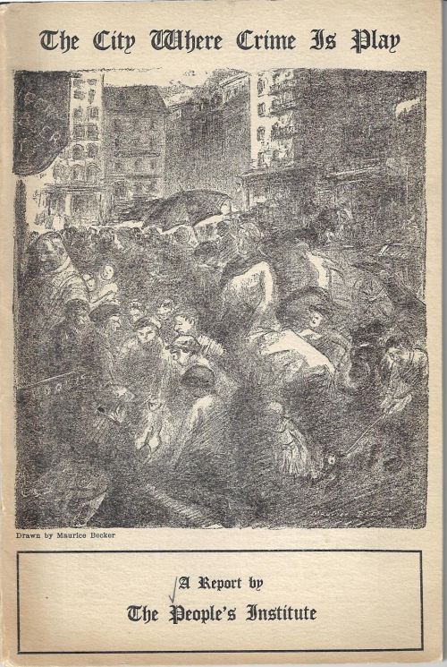
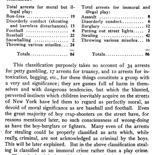
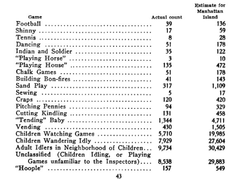
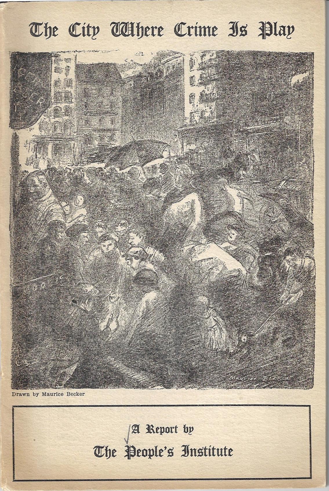
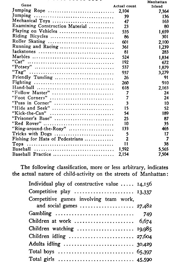
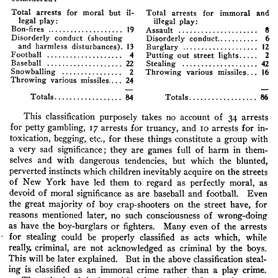
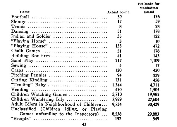
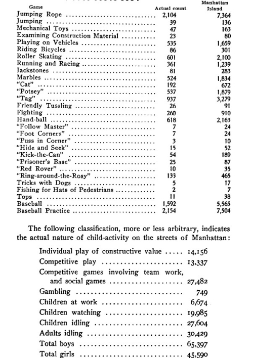
    City where crime is play _5_ cvrIt was the provocative and strong cover art was the work of Maurice Becker, 1889-1975, ( who “…was a radical political artist best known for his work in the 1910s and 1920s for such [seminal] publications as The Masses and The Liberator”–Wikipedia) that drew me into this pamphlet. John Collier’s1 The City Where Crime is Play, a Report by The People’s Institute2 is a slim pamphlet with an odd and I thought metaphorical title, though it turns out that this is exactly the subject of the work. Collier collected data from 400 or more collectors who made what sounds like fairly unscientific surveys of children’s games in the Middle West Side of Manhattan on how kids played and the possible connection between that “play” and crime. He evidently finds something there, some sort of correlation that I do not understand and really don’t need to, presently, though the games that he collected where of interest. In general though The People’s Institute and Collier worked for the social welfare, and especially so for immigrants (Collier going on to become the Commissioner of Indian Affairs under FDR), and perhaps this was a simple work to parents on keeping a watchful eye out on the kids so that their play didn’t veer into truancy, or something along those lines.


    In some ways the listing of children’s games and gamey-truancy and petty crimes, as well as the quality of the morality of their play puts me in mind of the vast and complex paintings of the Netherlandish Renaissance master Brueghel the elder in depicting the very busy town life and children’s games of 16th c Holland. The 80 or so identified games in the Brueghel are indeed games, and is a more complete identifier of children’s activities in 1560 than the lists that appear in the Collier work.  Sending out hundreds of people to observe or question kids about the games they were playing on the streets of Manhattan in 1914 sounds a bit like a time capsule, and so the connection to Brueghel, who definitely painted a time capsule encyclopedia of the games children played.Collier’s is not nearly as complete, and Brueghel made no connection to crime 
    City where crime is play _4_
    City where crime is play _4_
    City where crime is play _4_

    City where crime is play _4_

    Notes

    1. John Collier (May 4, 1884 – May 8, 1968), a sociologist and writer, was an American social reformer and Native American advocate. He served as Commissioner for the Bureau of Indian Affairs in the President Franklin D. Roosevelt administration, from 1933 to 1945. He was chiefly responsible for the “Indian New Deal,” especially the Indian Reorganization Act of 1934, through which he intended to reverse a long-standing policy of Cultural assimilation of Native Americans.” “From 1907 to 1919, he worked as secretary of the People’s Institute, where he developed programs for immigrant neighborhoods, emphasizing pride in their traditions, sponsoring lectures and pageants, and political awareness…”–Wikipedia

    2. “The People’s Institute was founded in 1897 by Charles Sprague Smith to teach the theory and practice of government and social philosophy to workers and recent immigrants in New York City. It sponsored lectures, classes, concerts, and other community activities at Cooper Union and throughout New York City, though principally on Manhattan’s Lower East Side. The Institute ceased operations in 1934. The People’s Institute is recognized most often for its contribution as a community educational center for working class adults and immigrants. It sponsored lectures, craft guilds, art and music leagues, a training school for community workers, and adult education classes in history, social science, literature, as well as nutrition and health…The Advisory Council comprised over forty [strong]  individuals including Lyman Abbott, R.R. Bowker, Nicholas Butler Murray, Andrew Carnegie, R.W. Gilder, Samuel Gompers, Jacob A. Riis, Jacob H. Schiff, Anson Phelps Stokes, J.G. Phelps Stokes, Oscar S. Straus, and Lillian D. Wald.”–Historical note on the People’s Institute Archives at the NYPL. 
    ·Posted by :

    ·in:

  • Technocracy, Debt, and the Glorious Inferno

    JF Ptak Science Books   Quick Post  

    Smyth inverted pyramid

    There’s was something striking in this representation of Big Money and the Common People that reminded me of other inverted pyramids. The weight of debt image appears on the back cover of what might well be an Outsider approach to reorganizing society, created  by William H. Smyth and surfaced in a number of slim pamphlets in the 1920’s and ’30’s. Smyth is all but forgotten save for the word he coined–“Technocracy”–which itself is not too-well remembered; Technocracy itself was a form of (somehow) democratic form of government ruled by engineers and scientists, and so on, who would somehow relieve us all of the tremendous burden of national debt.  And since this particular pamphlet Technocracy Explained by its Originator William H. Smyth (and then re-titled on the next page as Technocracy by its Originator Reorganization of National Energy Aim of Theory [sic] was printed in 1933 in a particularly bad year of the Great Depression, Smyth might have attracted a number of other-involved citizens who were now paying attention for some sort of anything that might relieve society of its monetary golem. 

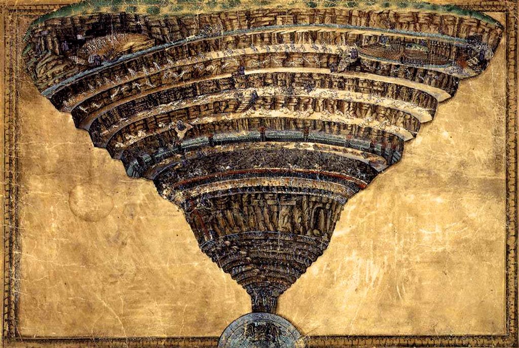
    In any event, the image on the rear cover was pretty striking, though I can’t find reference to it in the text (even though there is a reference here to this book itself, a piece of advertising in the book that someone has already found and perhaps purchased). It reminds me slightly of something else, a popular renaissance depiction of Dante’s inferno, by Sandro Botticelli:

    Inferno botticelli

    [Source: https://commons.wikimedia.org/wiki/File:Sandro_Botticelli_-_La_Carte_de_l%27Enfer.jpg]

    It is common to see the Inferno structured this way, as is the depiction of debt heaped on the back of ordinary people, another inverted pyramid–now that I said that, I can’t think of another image. That said, I know it has nothing to do with the pyramid on the U.S. one dollar bill, as that didn’t make its first appearance for another two years after the Smyth paper. So there’s that.  

    ·Posted by :

    ·in:

  • We Can’t See Martians Because We Can’t See Them (1944)

    JF Ptak Science Books   Post 2725

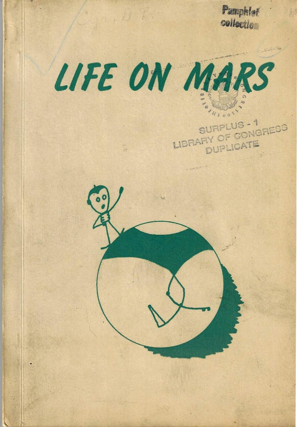
    MArs life on 1944Mr. Cyr made some very wide and radical remarks and observations in this pamphlet on life on Mars1, which he is convinced exists, and on an advanced level. The problem is that we can only see the results of the civilization, and not the society itself. The Martians, I (quickly and haphazardly) read can’t be seen because they can’t be seen (“like atoms”), “only the collective efforts of Martians are visible”.  And some of the “collective efforts” of the Martians can’t be seen, either, like the canals (which run 1000′ deep and cross the planet)  which are invisible not because they are so small as to be invisible, but rather it is due to the vegetation growing on their walls that obscure the structures themselves. The canals are also filled with water, or they are canyonlands, with animals using them as a highway. In another found paragraph we are told that “two or more craters near each other have an economic effect on Martian inhabitants”, which must give rise to speculation of some sort.  And in my last bit of random reading, I saw that the canal networks of Ascraeus Lucas (“the Wall Street of Mars”) are more than likely built upon earlier trails, and that “the only comparable highway network on earth [sic] is that radiating outwards from Indianapolis”. 

    It seems that Mr. Cyr was an observer of Mars, and then went well beyond the observable to make his deeper observations.  

    Also in 1944 Mr. Cyr printed the oxymoronic Saturn Has Rings. Sometimes publications have absolutely no pretense, stating exactly what it is that sleeps between their covers. And sometimes these titles seem more like declarative broadsides or posters and not books at all, the “book part”, or any writing furthering the cover’s statement,  being unnecessary, their contents being obvious. This other work by Mr. Cyr is a good example, the title of which begs the response “Yup!”.  Saturn Has Rings, should’ve stopped at the end of the title of chapter one, “A Rose has Petals”, and probably could have ended on the title page.  But no, it didn’t, and stretched itself over another fifty thin pages.

       blog mar 10 obvious sublime saturn679

    Notes:

    ·Posted by :

    ·in:

  • A Fine RADAR Map of NYC, 1945

    JF Ptak Science Books

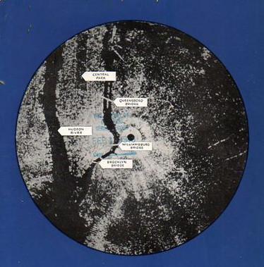
    Radar map nyc

    The history of RADAR (RAdio Deection And Ranging, and something I’ve always written in caps, for whatever that is worth) is absolutely not what I’m thinking about now–that is a long story with lots of twists and turns, complicated, complex–and it ranges depending upon location as for the most part RADAR (from the 1930’s anyway) was developed in secret, kept as a military secret.  And that’s because it was a very important development, with the victor of the Battle of the Beams being the possible victor, period.  

    Radar246

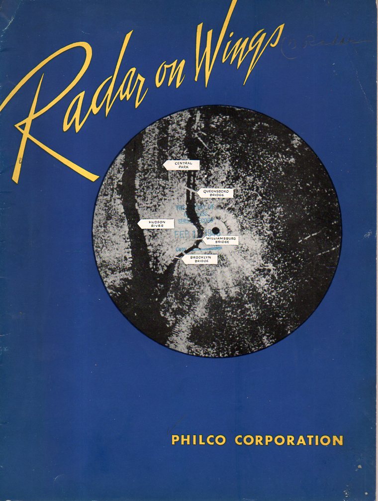
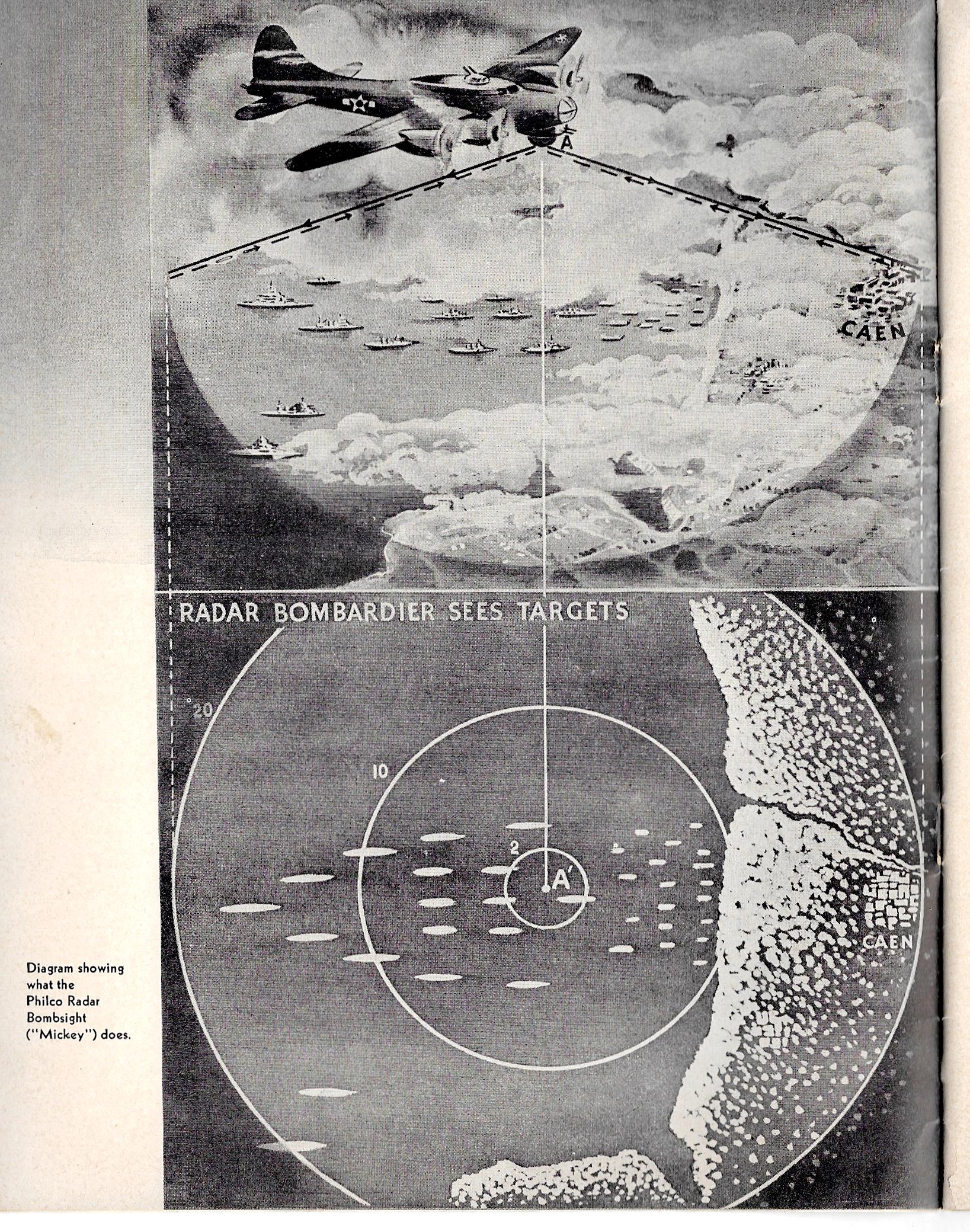
    All I want to do presently is note the significance of this particular pamphlet in the history of RADAR. This work was printed by PHILCO Corporation, (and dated December, 1945), and has an inserted leaflet stating that this “makes public for the first time the salient facts about the Corporation’s development and production of airborne radar equipment for the United States Army and Navy”.  PHILCO and other companies made significant contributions to the war capacity of the Allied forces, and–for this company in particular–much of that went unknown for quite some time afterwards, and of course there are some stories that just won’t get told. But for PHILCO the story gets told here.   RADAR 1945

    This is also a fabulous nighttime map of NYC–produced by RADAR.  

    [RADAR on Wings, Philco, 1945.  10×8″, 30pp (unpaginated) with lots of photographs and an occasional schematic.]

    ·Posted by :

    ·in:

    —
  • Hammer, Sickle, Skull (1919)

    JF Ptak Science Books  Quick Post

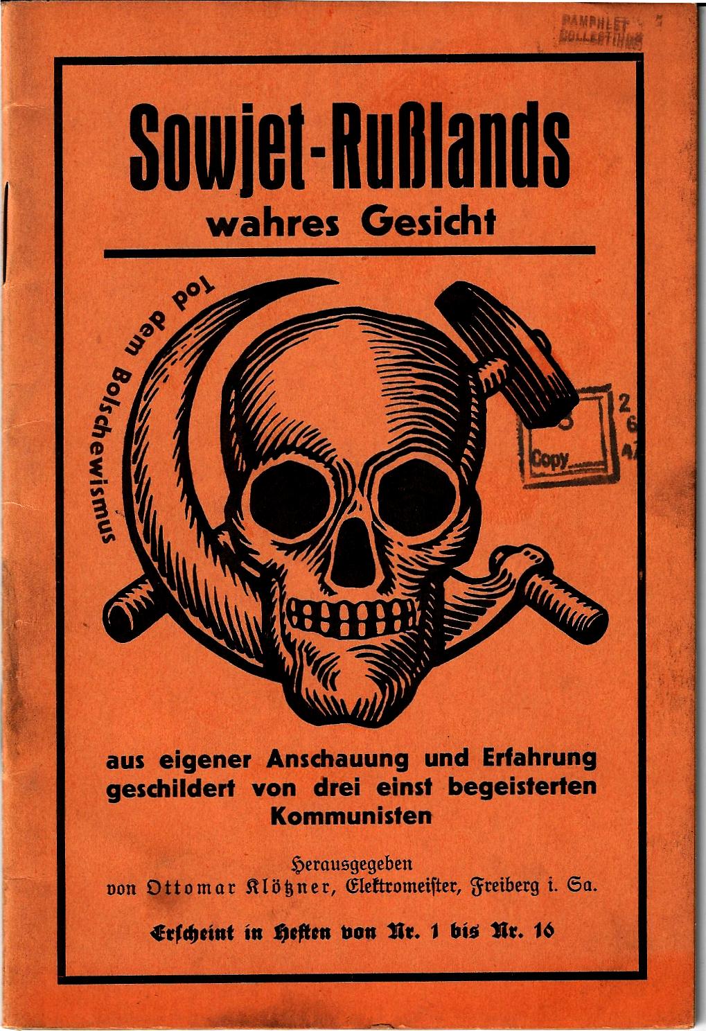
    Here’s a very provocative piece of design meant to equate death and communism–and in that there is no question.  Sowjet-Rußlands wahres Gesicht, aus eigener Anschauung und Erfahrung geschildert von drei einst begeisterten Kommunisten,  (“The Real Face of Communism, as Told from the Personal Experiences and Intuition of Three Once-Enthusiastic Communists”) was written by Friedrich Oskar Kloetzner in 1919 in the bad days of early social struggle that led to the bad days of middle and later struggle and then Apocalypse. Here, in 1919, just after the end of the war, the great supposed golem was Communism–that would of course morph and change and accommodate other fears and hatred, but for now, there were things needed to fill the vacuum left by defeat and the coming of a bad peace, and the Communists served to fill at least one of the many niches to come. 


    SOwjet-russlands


    Notes:

    The pamphlet measures 7×5″,  and is paginated 223-256. Provenance: Library of Congress.  This has a funny record in WorldCat—there seem to be 21 results in the search on this title, though this looks like a cataloging error–for all of the different “references” there are only eight libraries locating copies of this pamphlet, with half of those in Europe.) 


  • A Map of Drunken England (1908)

    JF Ptak Science Books  Quick Post

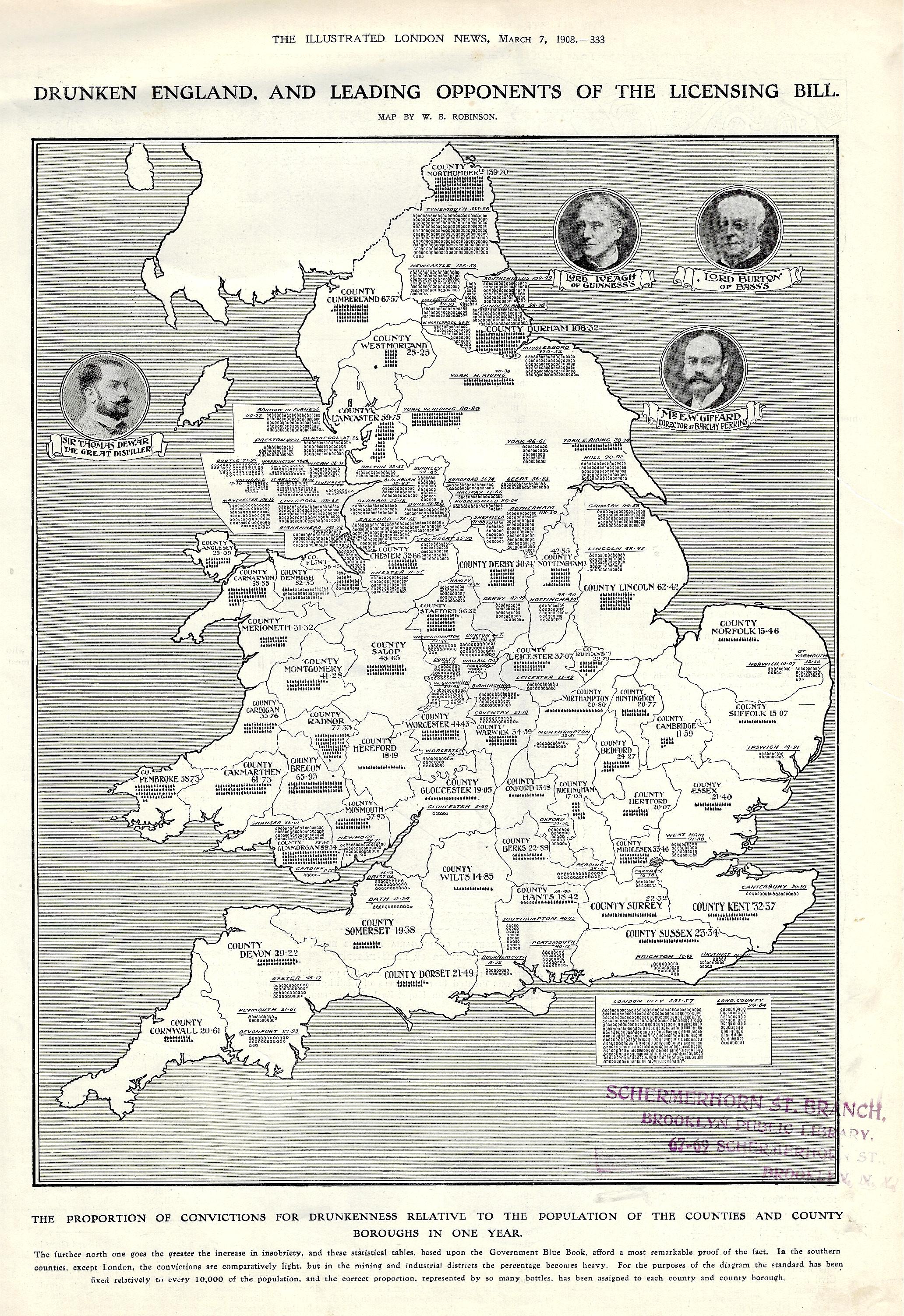
    And so, here we are, my first ever encounter with a map of drunken England, printed in the Illustrated London News om March 7, 1908.  As a data visualization element in a pretty buttoned-up periodical printed during a pretty buttoned-up period, it carries a provocative title using “Drunken” and “England”.  

    The subtitle reads: “the proportion of convictions for drunkenness relative to the population of the counties and county boroughs in one year”. It continues: “the further north one goes the greater the increase in insobriety, and these statistical tables, based upon the Government Blue Book, afford a most remarkable proof of the fact. In the southern counties, except London, the convictions are comparatively light, but in the mining and industrial districts the percentage becomes heavy. For the purposes of the diagram the standard has been fixed relatively to every 10,000 of the population, and the correct proportion, represented by so many bottles…”  

    Maps Drunken England and Wales

  • Missing the Fog for the Mist–Where was Fog in Renaissance Painting?

    JF Ptak Science Books   Post 2713

    If there is one thing that you can say about Renaissance art is that it was determined to represent nature–in form, color, perspective–as truthfully as possible.  Except–so far as I can tell–in some cases, like, say, fog.  And mist. I’m not sure why this is so, but once I started looking for examples of major and then minor cases showing fog in painting in the 1400-1550 period…and then later.  Much later.  Fog–and mist–seem to pop up regularly in the  mid-19th century, along with the new genre of Impressionism, which seems to be when people became more more comfortable with nothingness and the suggestion of things that may or may not be present or in existence. 

    There are examples of suggested forms in the Renaissance where the outlines of forms come to life without their detail, as with the great Paolo Uccello (and the solids in the horses in the Battle of San Romano, ca. 1450s), but for the most part, where detail was supposed to be, there was detail. 

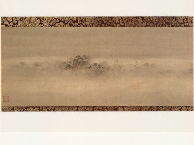
    Fog _2_ evening bellLeaving elements of an artwork open to interpretation was not a problem with other cultures at this time, as in China and Japan, where fog and mist and rain and obscurity were very comfortable elements in artwork, and for centuries earlier than the Western Renaissance. The classic rendering say of a swath of fog obscuring everything but the top of a mountain was a “comfortable” mode of expression that can be seen in a number of landscapes that are listed as national treasures of Japan. For example, the “evening Bell from Mist-Shrouded Temple” and one of the Eight Views of Xiaoxiang is attributed to to Muqi Fachang (or Muxi Fachang) and was painted in the mid-13th century. 

    Another interesting example of countless others (and which like the Muqi Fachang is counted as a Japanese National Treasure) is that by  Sesshū Tōy, in a landscape with broken ink/splashed ink (“hatsubokun, evolving an abstract simplification of forms and freedom of brushwork”–Wiki), and created ca. 1495. The dreamy landscape and the sparse and (somewhat aggressive) brushwork of the “broken ink” seem more a creation of Zen and meditation than anything else.

    Like the rarity of the full-toothed, open-lipped smile, the image of fog and mist and the difficulty in representing what it is that they are mostly-hiding seems to be a not-at-all popular genre in Western art for hundreds of years. This is of course all conjecture on my part and is based mostly upon a little research and a lot of what is probably faulty memory, but it does at least seem to be an observation worth a little thought.  After all, clouds had their many champions for long periods of time, though they served mostly to frame and accentuate the subject of the painting rather than being subjects in themselves (or at least so until the 18th century).  Fog couldn’t even exist in the West as a major part of paintings even as clouds-on-the-ground until the 19th century, when painting was catching up to work done by the Chinese and Japanese in the 13th century.

    I suspect I’ve gotten a lot wrong in this speculation, and I’d like to hear about it as a form of conversation. 

     Image: https://en.wikipedia.org/wiki/List_of_National_Treasures_of_Japan_(paintings)


    ·Posted by :

    ·in:

    —
  • Unusual Maps Department: (1) Map of Brunetness and (2) Heights of the British Isles (1897)

    JF Ptak Science Books   Quick Post

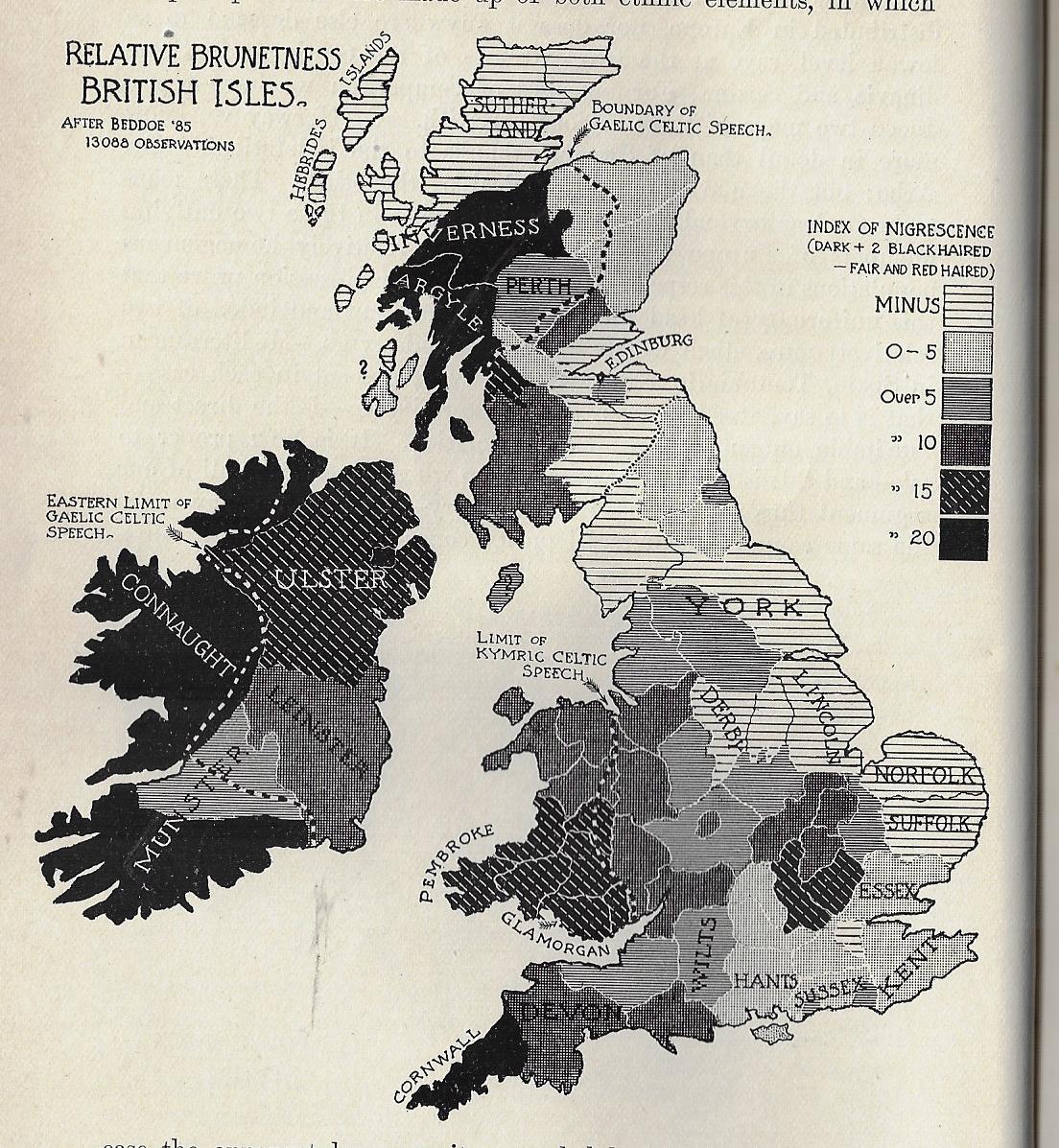
    I must say that I’ve never seen a map of “Relative Brunetness” before finding this one, today. It occurs in a little bit of a wincing article by William Ripley (Ph.D., and assistant prof of sociology at (surprisingly) M.I.T) called “The Racial Geography of Europe”, and appearing in Appleton’s Popular Science Monthly for December 1897.  Here we see the “Index of Nigrescence”, which I take is a measure of blackness of the hair (in this case), with light to dark meaning, well, light-to-dark measures of hair, this taken from 13,000 observations.  A few pages away comes a map of the stature of adult males in the British Isles, locating the averages between the gross average of 5’6.5″ to 5’10” and over. 

    I don’t have anything to say about the maps, but I thought that it was worth reproducing them.  

    Maps of Brunetness of British Isles

  • Measuring Things with the Hindenburg (1936)

    JF Ptak Science Books   Quick Post

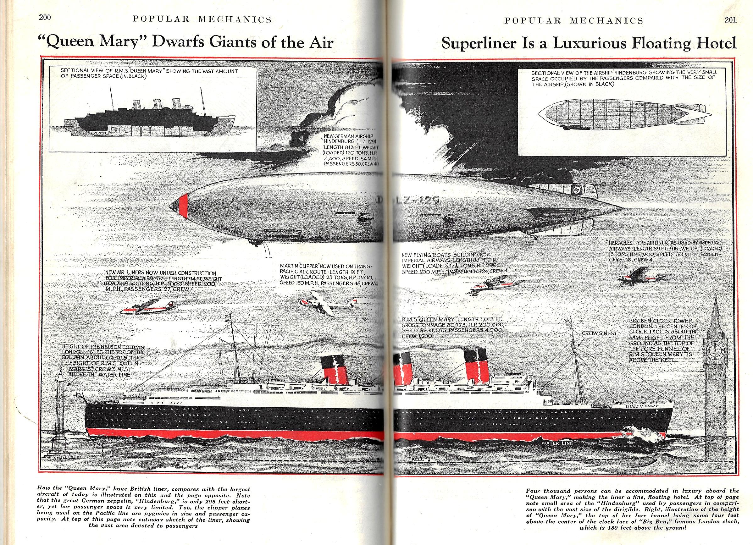
    There have been a number of posts to this blog on “Measuring Stuff With Unexpected Things” (a collection that never became its own category and which is basically folded into the “Display of Information” series) where there are graphic displays of objects being unexpectedly measured with known but unusual units of measure. The Eiffel Tower seems to be a favorite (seeing a stacked column of them showing how deep the Atlantic Ocean is, for example); there is also occasional use of the Great Pyramid, the Woolworth Building, the Titanic (up to a certain point), the Hoover Dam, rows of the Great Pyramid filled with Dirt (!), and so on. It is actually a useful tool, even though I’m having a bit of fun with the idea right now–people might not be able to comprehend how much xxx-tons of dirt is that was excavated from the Panama Canal, but if you put it in terms of filling the Great Pyramid and having a row of them going from one end of Manhattan to the other, then there is some sense made of a big number. 

    Tonight’s example is much simpler than most of the other entries, as we’re simply measuring the new ship Queen Mary against the Hindenburg had newly burst onto the fame stage, and became an instant well-known entity, a manufactured mountain in the sky, an impressive sight to everyone–and so when it is compared to the Queen Mary and found to be smaller, everyone knew instantly how big the ship must be–making this mode of comparison a useful tool.

    The Hindenburg had been first launched just months before it appeared in this piece in the August 1936 issue of Popular Mechanics; it would famously crash just seven months later.

    The other reason I decided to share this image is that it is simply a wonderful design, something that would look fantastic enlarged to 4’x8′.  

    Pop Mech 1936 Queen MAry Graf Zep

Recent Posts

Archives

Categories