JF Ptak Science Books LLC Post 562

Few
things capture the attention of the general reader quicker than a comparative
display of what mass casualties looks like.
Putting an organized, recognizable face to concepts that are vastly
removed from the common experience is very compelling, and demands
thought. (I’ve made a small number of
posts on the display of quantitative data via the use of crowds and masses of
people “The Department of What Things Look Like: the
Casualties of the Somme, Visualized “,
as well as the general confusion in images of enormous crowds “Crowds and the
Press of Humanity: WWI German Prisoners, November, 1918″ ,
and also as the history of crowds in art “Clarity and Confusion in Displays of Human
Masses “.)
large-scale death looks like. The first, montaged, photographic image depicts the number of people killed (20,169) in Britain over a three year period in automobile and other traffic/roadway accidents. This does not include the number of people injured, which would be ten times greater than this image. (I’ve included a magnified view of a small section just to show that this was not a picture of dots, but actually a lot of people, men mainly, wearing hats.) In contrast, the caption-writer points out that this three-years period produced more deaths among the British than all years of the Napoleonic Wars (1793-1815) combined. This comparison was made in a plea for safety on the roads. 
And as a matter of fact, deaths on the roads in the U.K. significantly decreased over the years: from about 7,000 a year in 1932 to 2,900 or so in 2007. In 2006 in the United States, on the other hand, more than 13,000 people were killed in alcohol-impaired traffic accidents alone; that represents about 30% of all traffic fatalities, which numbered about 52,000. A year. This is also nearly the same number of all American service people killed in the Vietnam War. For the same period of time, driving deaths in the U.K numbered 2,900 people in a population of 61 million and for 230,000 miles of roadway; there were 52,000 deaths in the U.S. in a total population of about 300,000 driving on 4 million miles of roads. When you look at the deaths per miles of roadways, the two country’s statistics are very similar
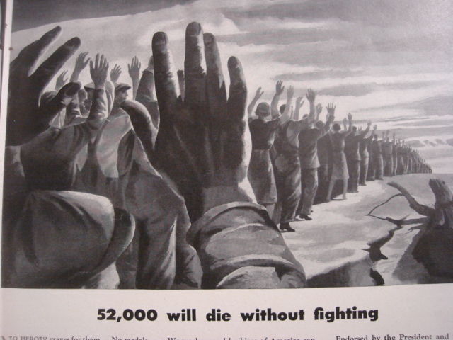 The second image comes from an ad for American Locomotive in LIFE magazine for 11 January 1943.I t was a plea for industrial safety during a period of war, stating that in 1940 there were 52,000 people killed on the job (!) in the United States, with more than 2 million injured. American Locomotive pointed out that this was equal to the loss of some 500 million man-hours (sic), which was not affordable to the country while fighting a two-front war. It is a striking image, and must’ve commanded a fair amount of thought to anyone seeing it. The 52k figure sounds very big and too-strong to me, given that the American population was 132 million, meaning the work force was around half of that.
A “Safety First” motto was developed from this effort. (Say it and it’s so (?))